KJV Paragraph-Style Large Print Thinline Bible Review
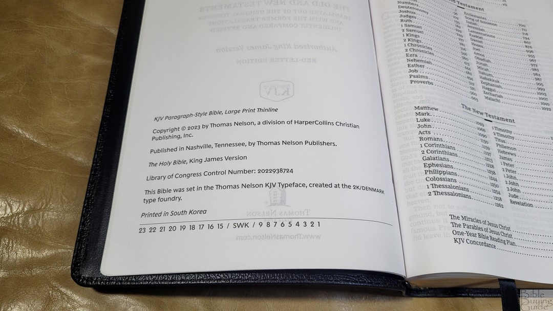
The KJV Paragraph-Style Large Print Thinline presents the KJV text in a double-column layout with poetry in stanzas and personal letters indented. The layout closely follows the NKJV, making a highly readable edition of the KJV. It’s available in hardcover, Leathersoft, and genuine leather. In this Bible review, I’ll look at all three types of covers. All were printed in South Korea.
_________________________________________________________
This Bible is available at (includes some affiliate links)
Amazon
(not available yet)
and many local Bible bookstores
_________________________________________________________
Thomas Nelson provided these Bibles in exchange for an honest review. I was not required to give a positive review, only an honest one. All opinions are my own.
Table of Contents
- Video Review
- Binding
- Paper
- Typography and Layout
- Cross References
- Translation Footnotes and Glossary
- Book Introductions
- Extras
- Concordance
- Bible Atlas
- Comparisons
- Conclusion
Video Review
Binding
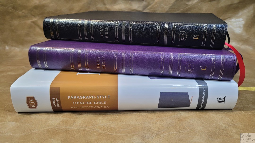
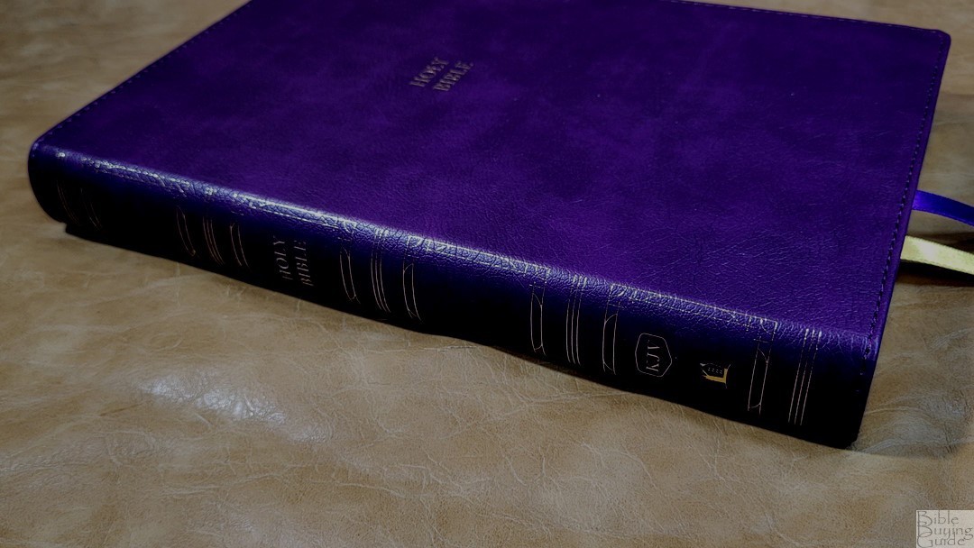
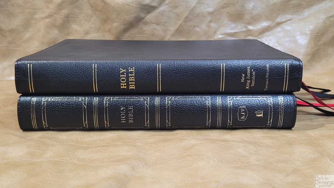
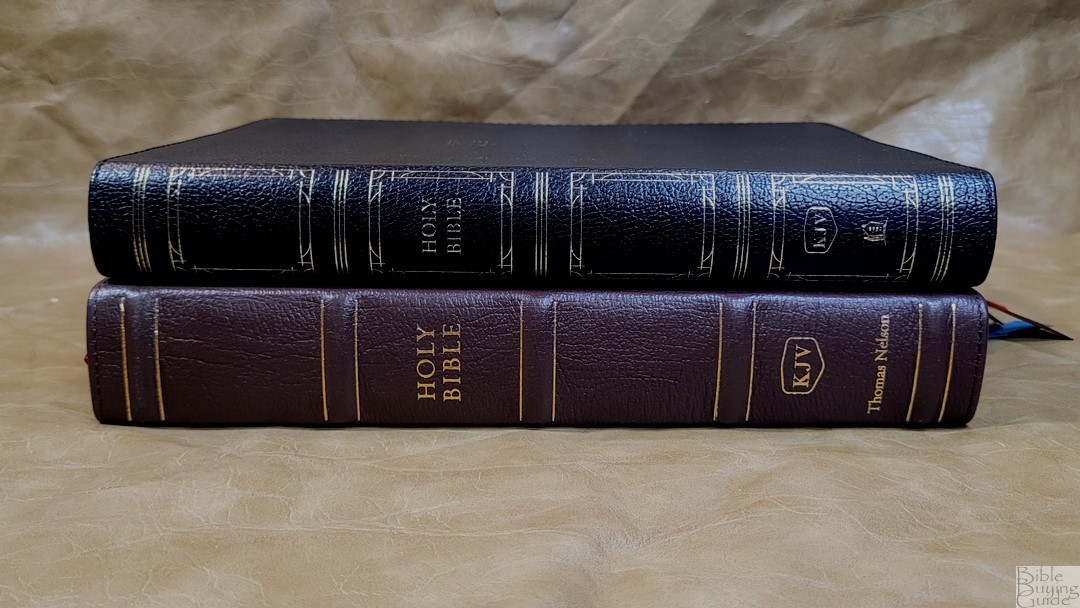
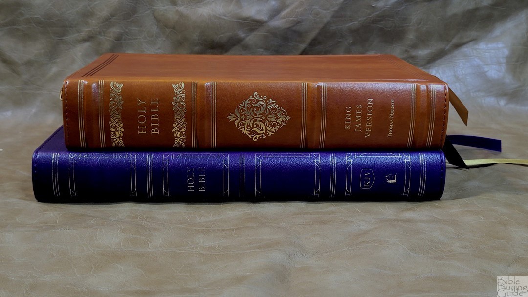
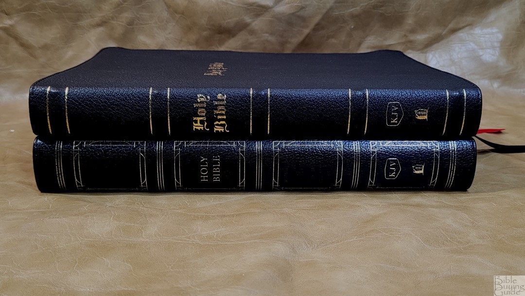
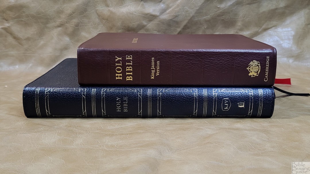
Each edition is Smyth sewn and all of them, including the hardcover, have overcast stitching in the front. The spine is rounded on all three, which is my personal preference. They’re around the same size and weight: 6.6 x 9.6 x 1.1.25″, 2lbs, 1 oz, which is great for carry and reading.
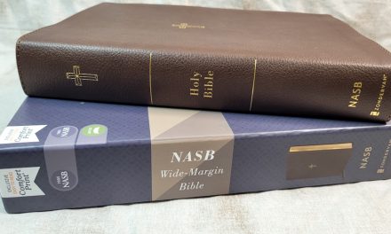
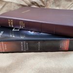
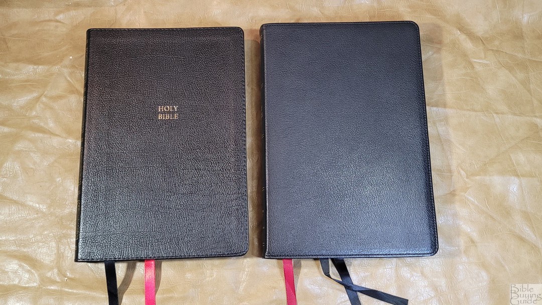
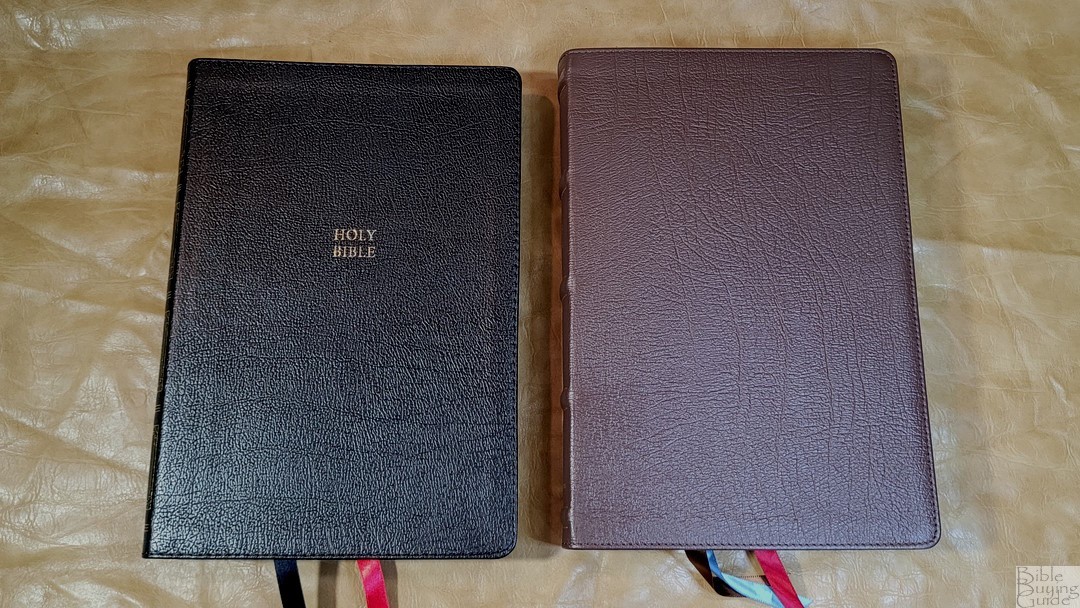
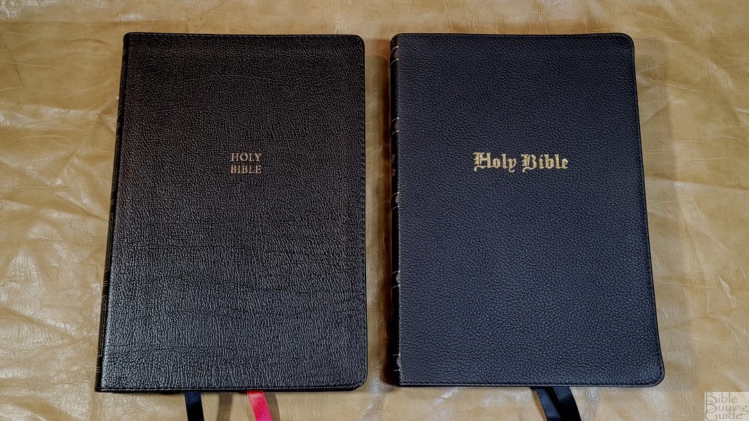
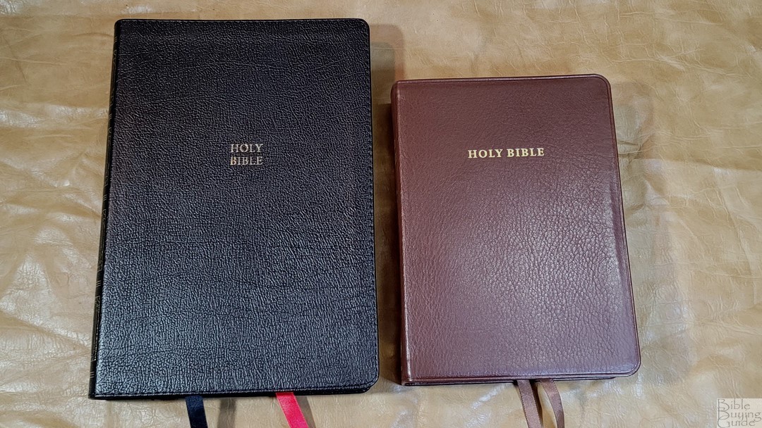
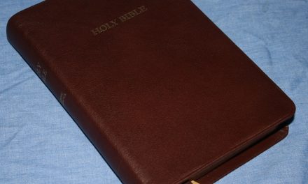
Black Genuine Leather
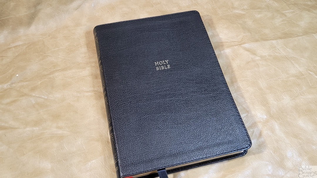
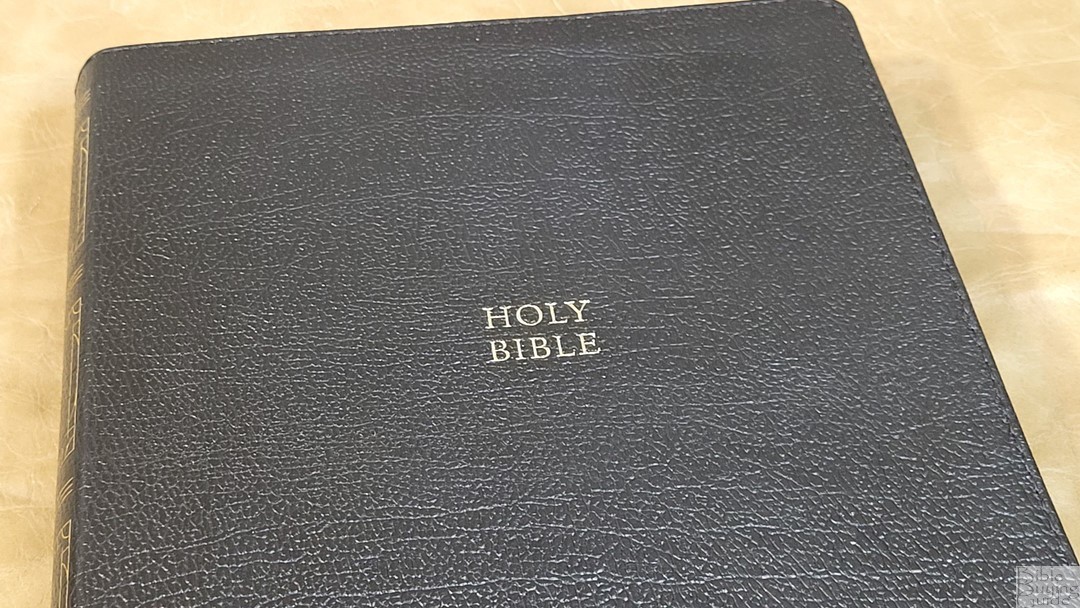
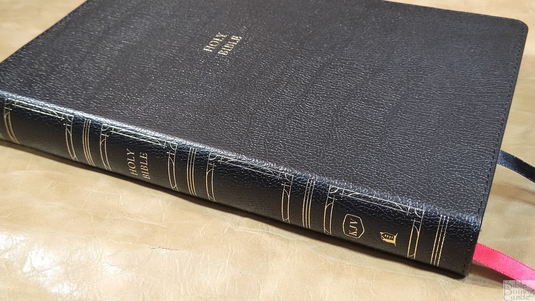
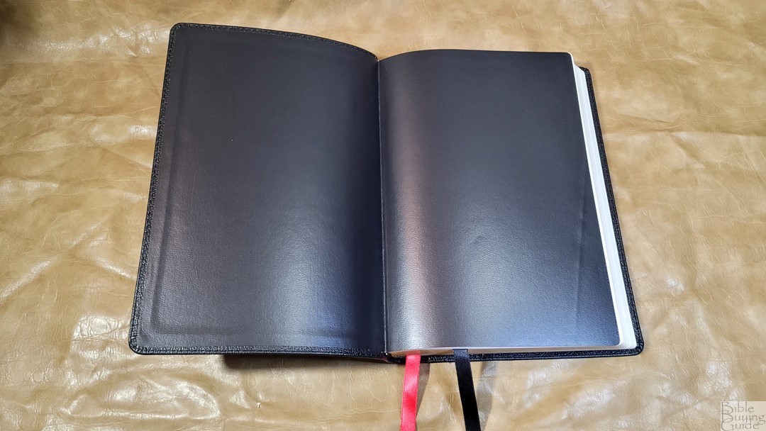
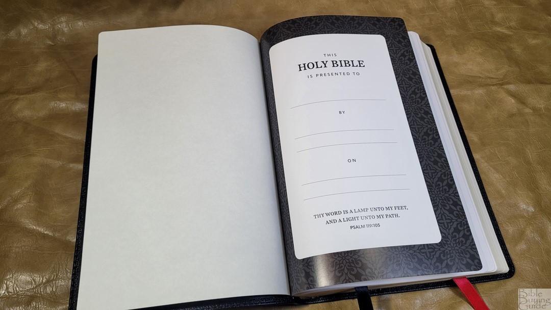
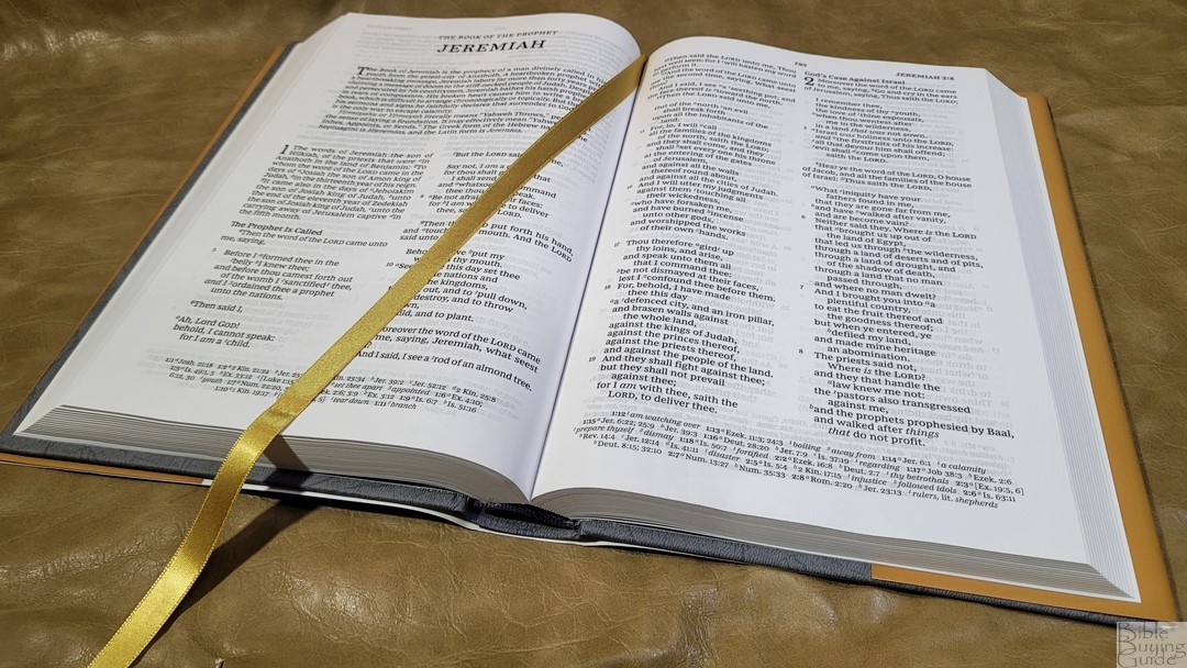
This black genuine leather has a stamped grain that’s pronounced and looks great. It has perimeter stitching. Holy Bible is printed on the front in small text. The spine includes HOLY BIBLE, KJV, Thomas Nelson, and spine block decorations and hub indications printed in gold. The liner paste-down black vinyl. The cover is flexible for paste-down. It was stiff at first but it broke in quickly and now has no trouble staying open on the first page. This edition has overcast stitching in the front. It includes 2 satin ribbons with black for the OT and red for the NT.
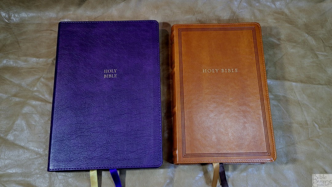
Purple Leathersoft


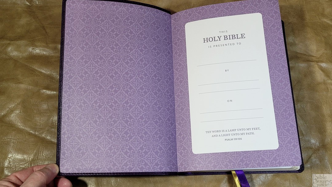
The purple Leathersoft has a texture that looks like calfskin leather. It has some color It includes perimeter stitching. The front has Holy Bible printed in small gold text. The spine includes gold decorations to indicate spine hubs and blocks. This edition includes a paper paste-down liner with a purple pattern. It doubles as the presentation page. It’s a touch stiff at first, but it does stay open well once it’s broken in. It has two ribbons: purple for the OT and gold for the NT.
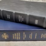
Hardcover
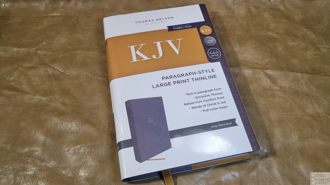
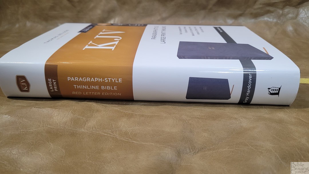
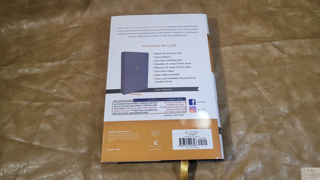

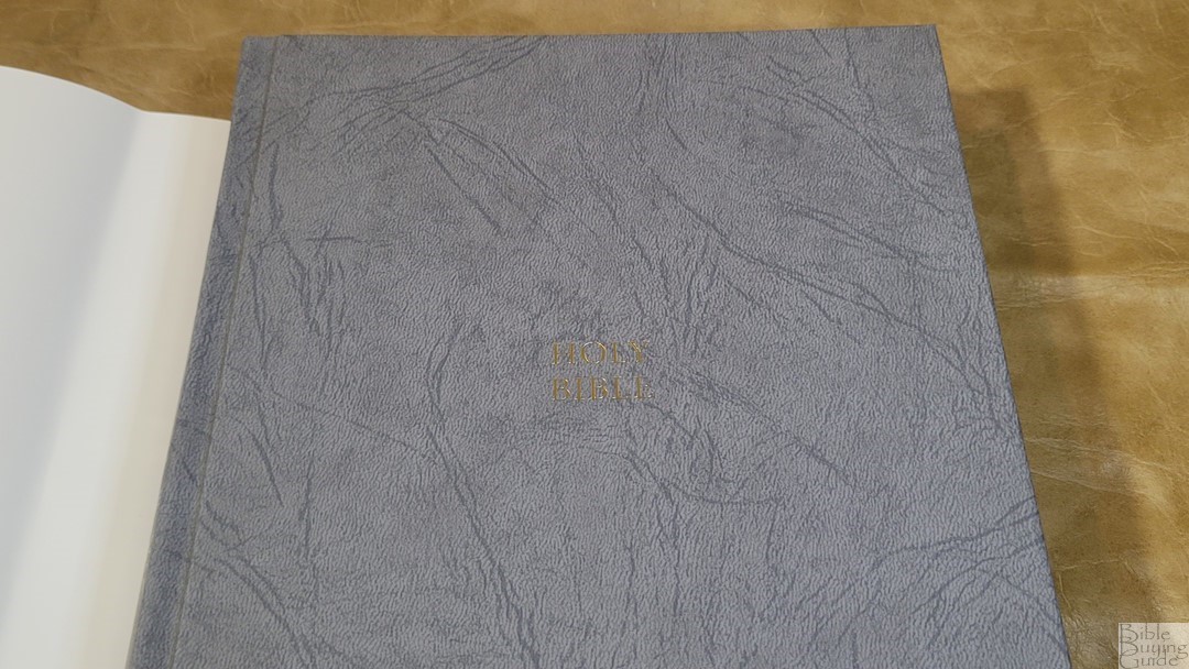
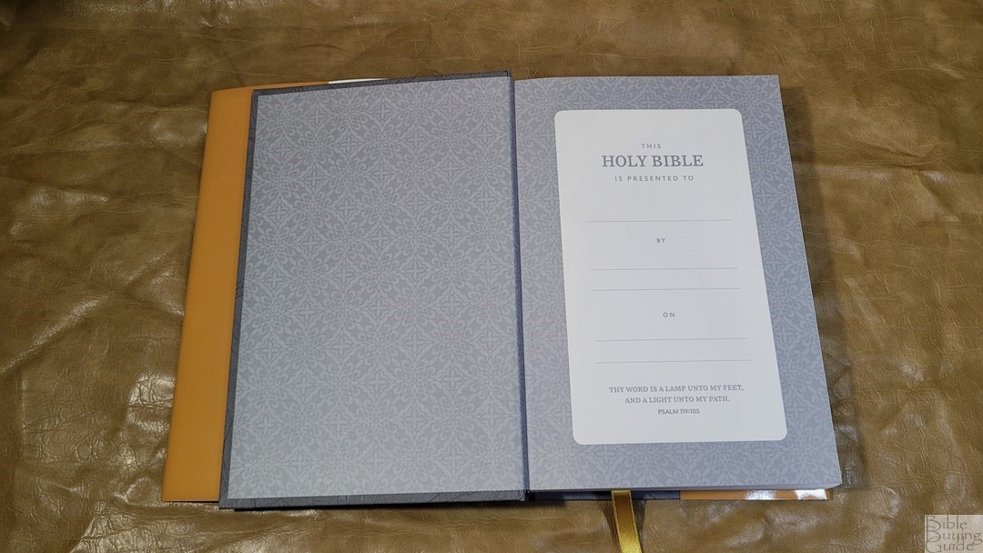
The hardcover includes a dust jacket that matches the boxes of the other editions. The cover itself is gray with gold printed. The gray has a textured look. This edition includes a paper paste-down liner with a gray pattern. It doubles as the presentation page. It stays open perfectly to every page. It also includes the overcast stitching. It has one gold ribbon.
Paper
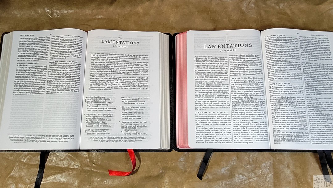
The paper gsm is somewhere in the 30s. I’ll add the info here if I find out the exact gsm. It’s smooth to the touch. I find it easy to separate between my fingers to turn with one hand. It feels more premium than the paper used in the Maclaren and Sovereign editions. Although, it’s not as high of quality as the Premier Collection. It’s off-white and highly opaque, making it great for long periods of reading. The show-through is easy to ignore. It’s only noticeable in the poetic settings, which is something I’m glad to have in a KJV.
Typography and Layout

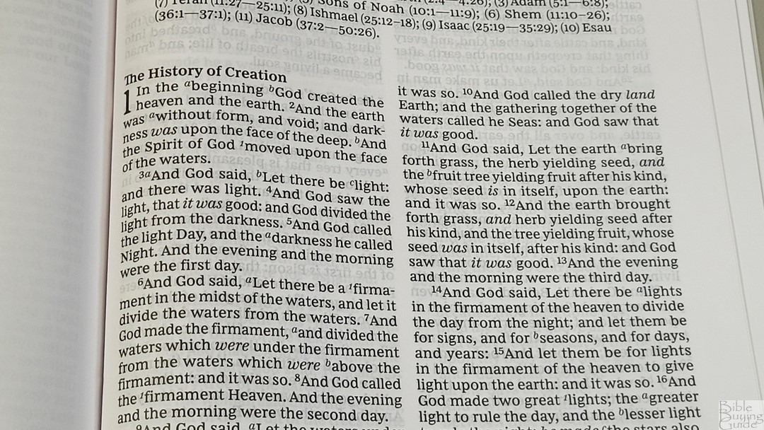
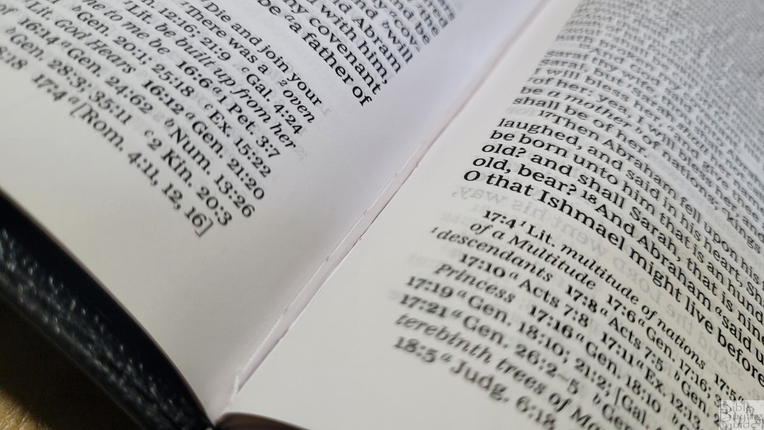
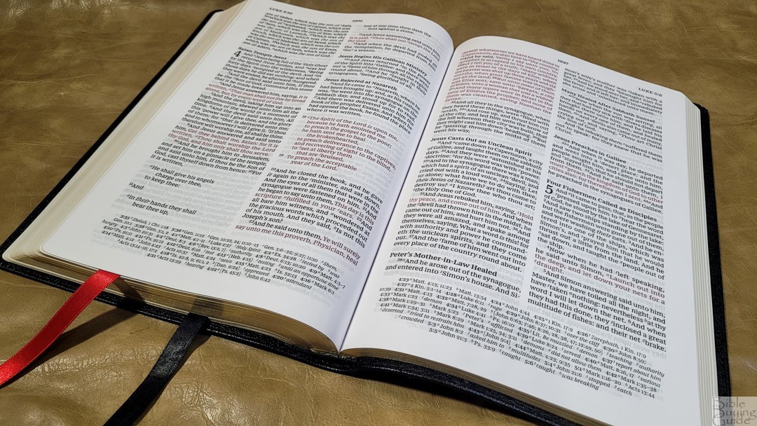
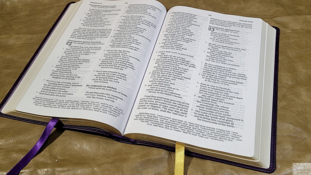
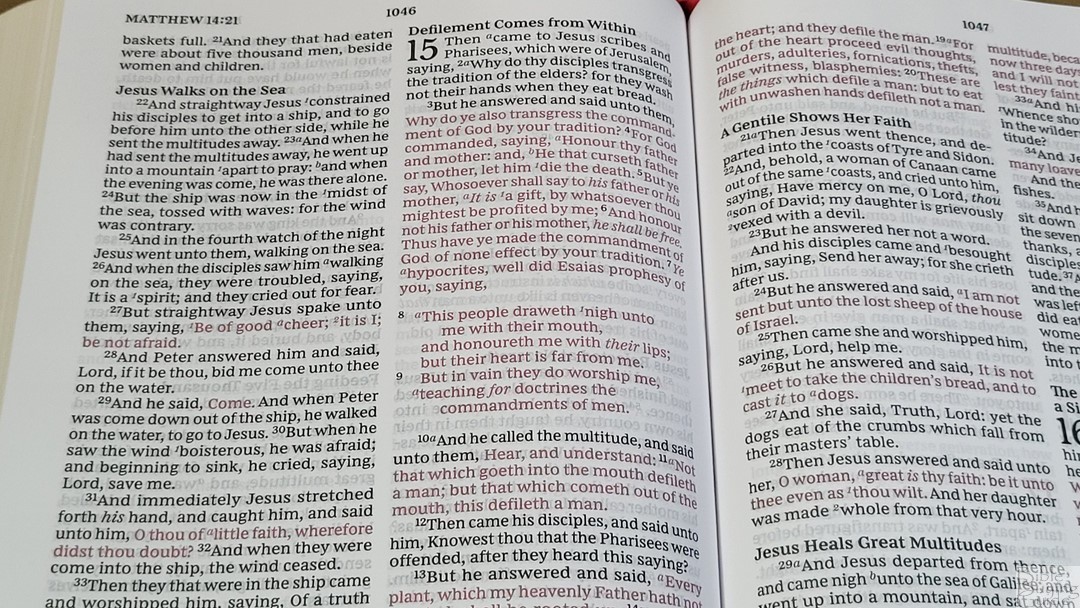
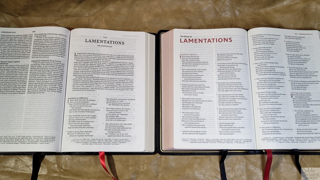
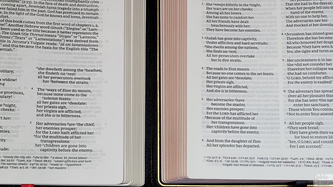
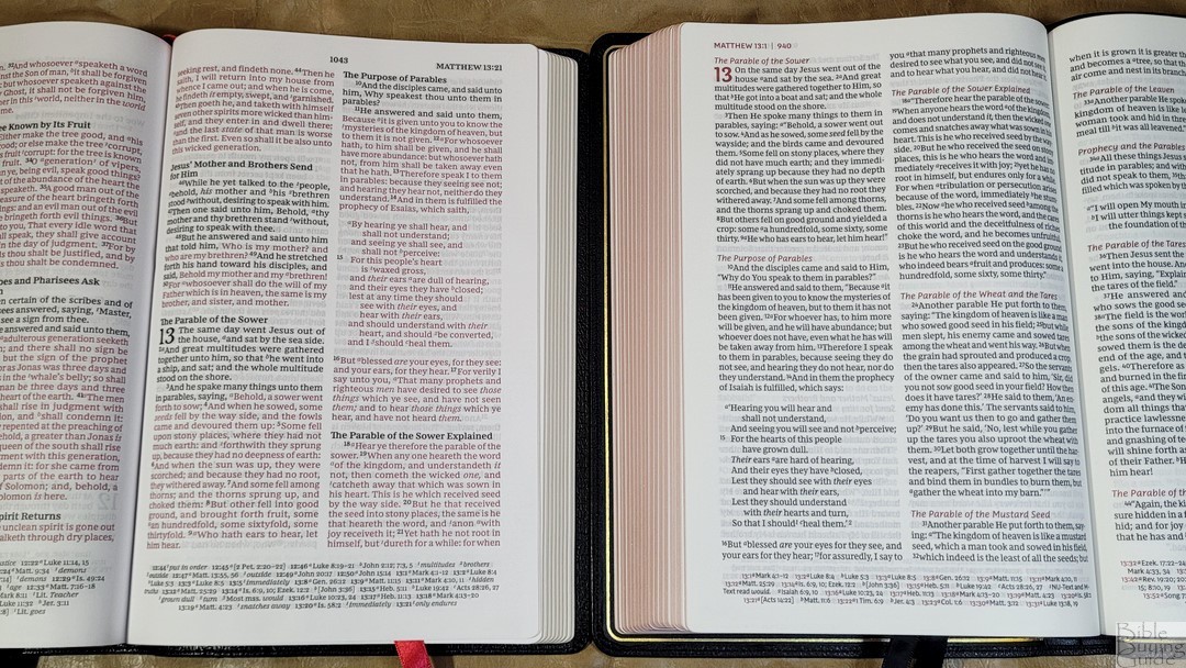
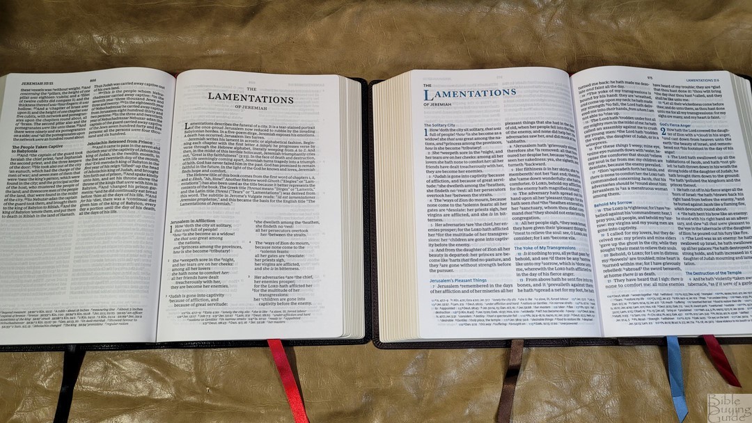
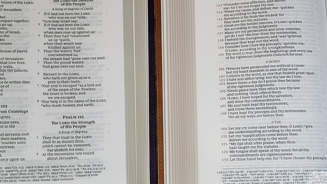
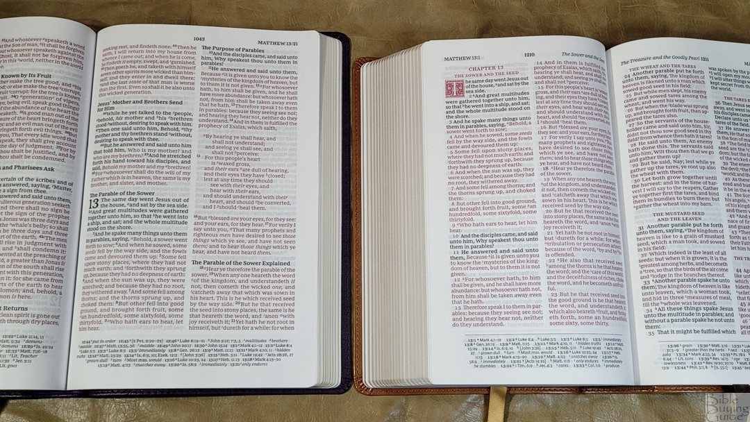
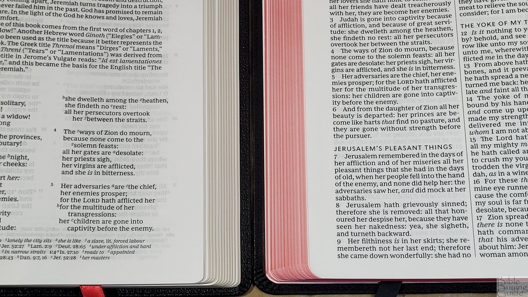
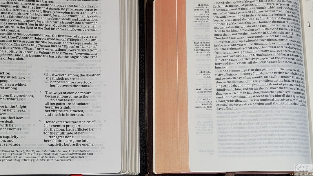
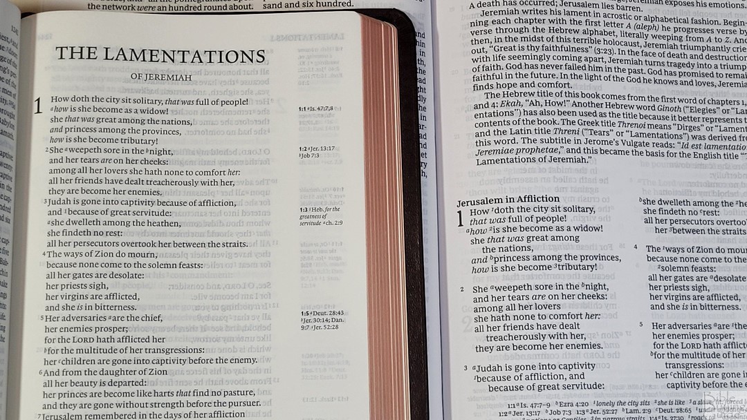
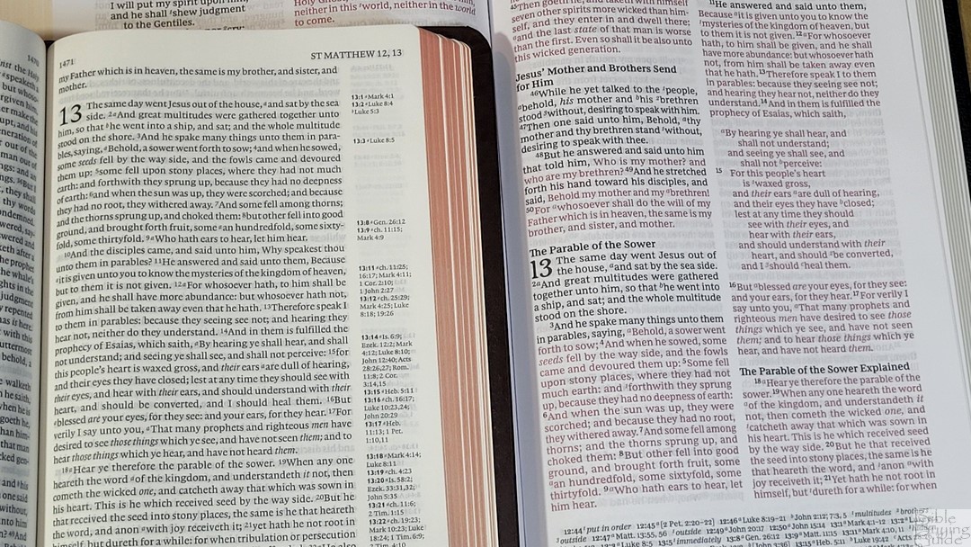
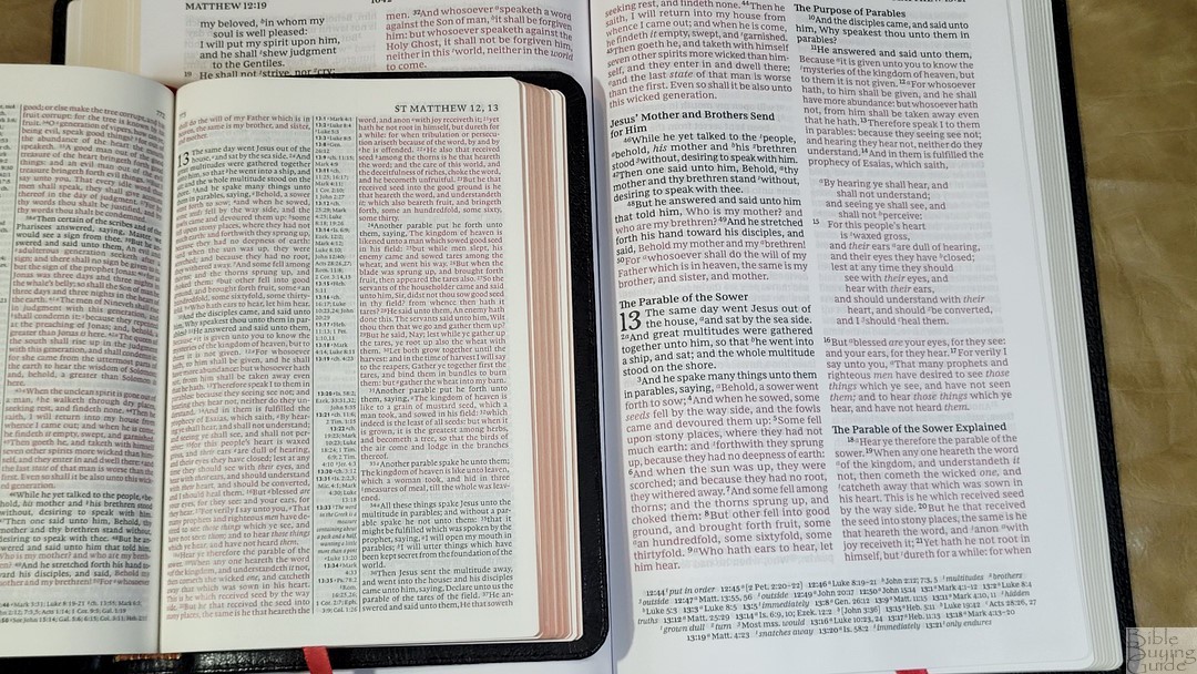
The text is presented in a double-column paragraph format that closely follows the NKJV. Poetry is set to stanzas and letters are indented. The references are placed in the footer across the page. The header shows the book name and chapter numbers in the outer margin and the page number is in the center. Section headings are in a large bold text, and they’re from the NKJV.
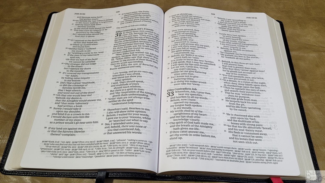
The typeface is the Comfort Print designed specifically for the King James Version by 2K/Denmark. It’s 10-point with the words of Christ in red. It’s printed with line matching. This means the lines of text are printed in the same location on both sides of the page to reduce show-through and make the text as readable as possible. This does improve readability, and show-through is minimal due to the paper’s opacity.
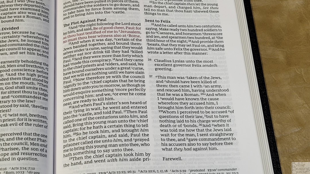
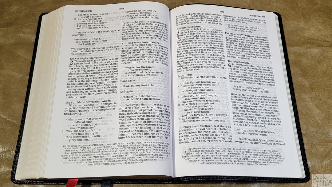
It has between 8-10 words per line on average, making it great for reading and ideal for a poetic setting. Like its NKJV counterpart, the poetic letting has excellent line breaks. This makes the poetic setting look clean and balanced. Indented letters (like those in Ezra and Acts) are indented the same amount as paragraphs and are not right-justified. They stand out enough to be easy to identify. The first word in each verse is capitalized even if it continues the sentence from the previous verse. I would like the see these letters in lowercase because it would improve readability for modern readers.

I love reading from this Bible. I can tell the genres at a glance. I’ve preached from it several times. It does take an extra second to find verses, but I found them easily enough. I look at the first verse of the paragraphs until I find the paragraph I need, and then search for the verse based on how far away the number is from that. There are a few places in the red-letter sections where the black verse numbers are too close to the first word of the verse. It isn’t bad, but it is noticeable. This has now become my primary Bible.
Cross References
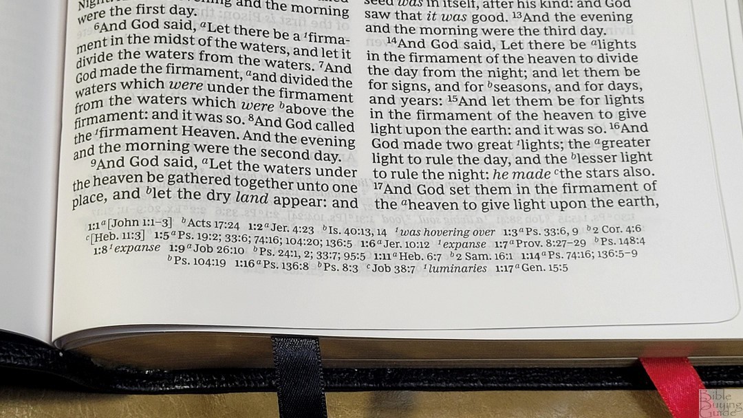

The references match those of the Sovereign. This is fewer than most Thomas Nelson KJV reference editions, but there is enough here for basic study. Here are a few examples to help you compare:
- Genesis 1:1 – Jn 1:1-3, Ac 17:24
- Deuteronomy 6:4 – 1 Cor 8:4, 6
- Isaiah 9:6 – Lk 2:11, Jn 3:16, Mt 28:18, Jd 13:18, Titus 2:13, Eph 2:14
- Matthew 28:19 – Mk 16:15; Lk 24:47
- Mark 12:29 – Dt 6:4, 5
- John 1:1 – 1 Jn 1:1, Rev 19:13, Jn 17:5, 1 Jn 5:20
- John 3:16 – Rom 5:8; Is 9:6
- Acts 2:38 – Lk 24:47
- Romans 10:9 – Lk 12:8
- 1 John 1:1 – Jn 1:1, 14, 2 Pet 1:16, Lk 24:39, Jn 1:1, 4, 14
Translation Footnotes and Glossary
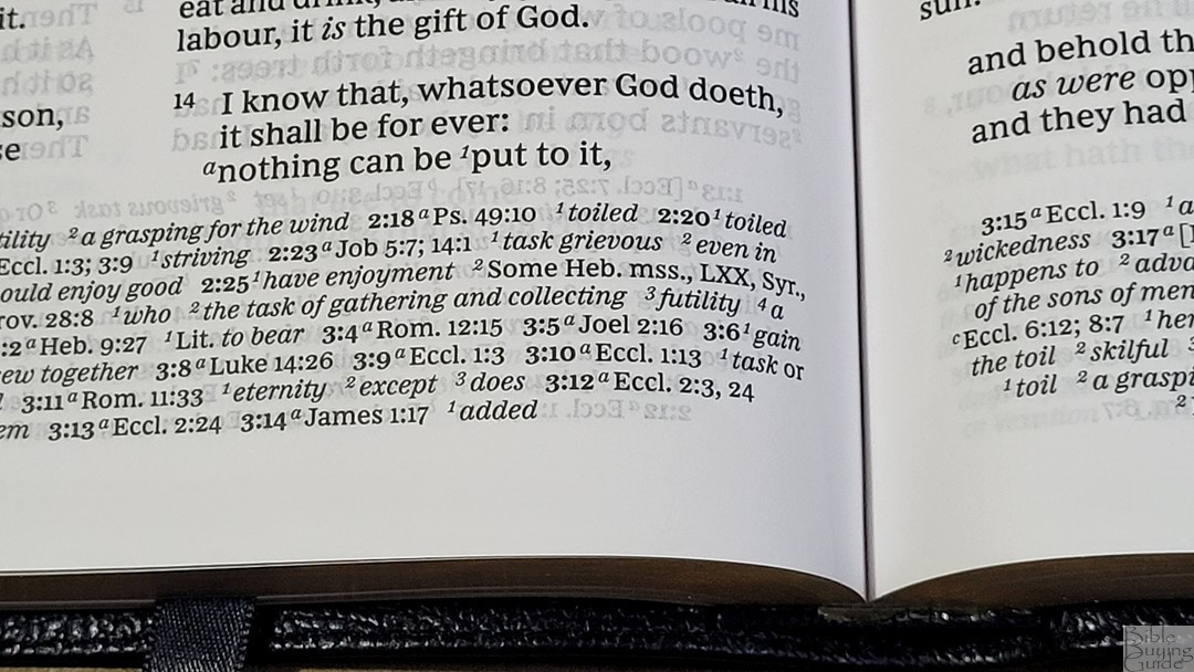
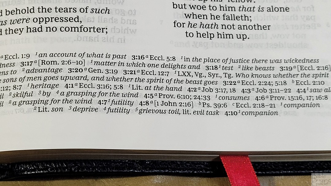
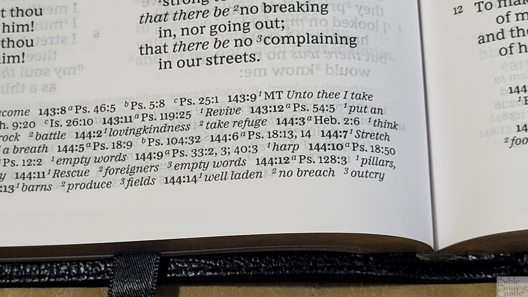
The KJV translation footnotes include a glossary supplied by Thomas Nelson with the modern equivalents of archaic words. Some include literal renderings. I did see a few notes, such as Psalm 143:9, with an alternate rendering from the Majority Text. They’re placed on the page where you need them. This is my preference and makes the Thomas Nelson editions stand out among KJVs, making them easier to read and understand. They’re placed with cross-references, but they’re printed in italics. This makes them easier to locate at a glance.
Book Introductions

Book introductions are the same as those used in other Thomas Nelson KJV reference editions. They’re small with 2-3 paragraphs and include an overview of the book, discuss the main characters, provide insights into the book’s name, etc. Some have a simple outline with references to the major portions of the book, a sentence about the author, or discuss other features of the book. They’re simple, but they have enough information to be helpful.
Extras
In the back are several tools to help in reading and studying.
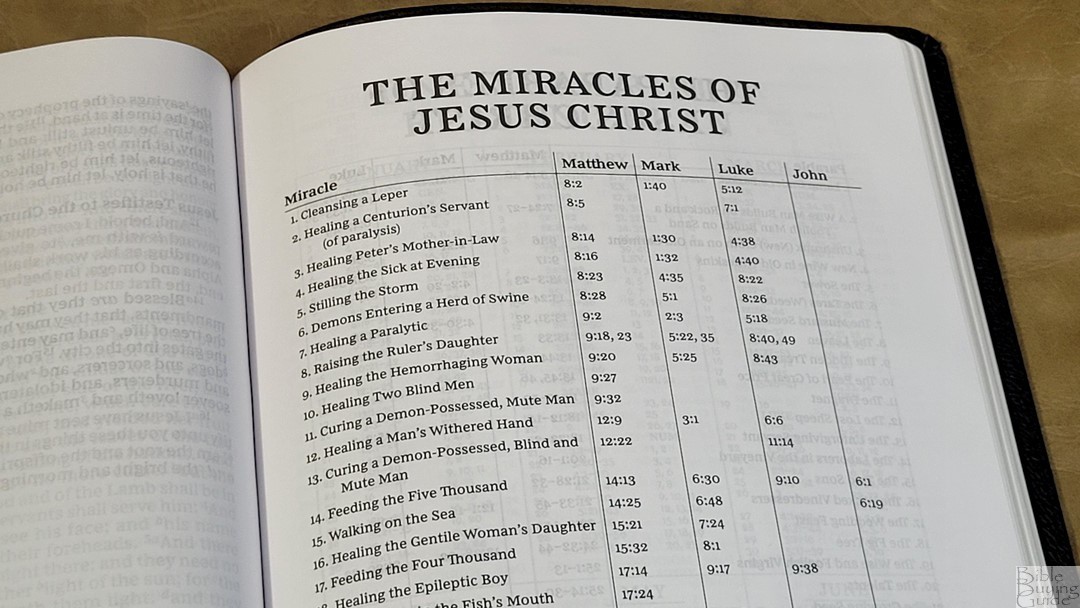
Miracles of Jesus – This is a one-page table with 37 miracles and references for each of the Gospels.
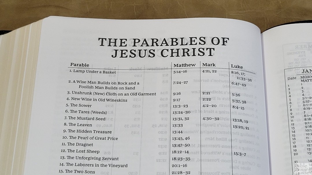
Parables of Jesus – This is a table with 39 parables with the verses where they appear in the Gospels.

One-Year Reading Plan – This is a 2-page reading plan that shows the month, date, and reading for each day. It includes 2 readings per day to take you through the Old and New Testaments every day. February includes the 29th, so you’ll need to read extra for three out of four years.
Concordance
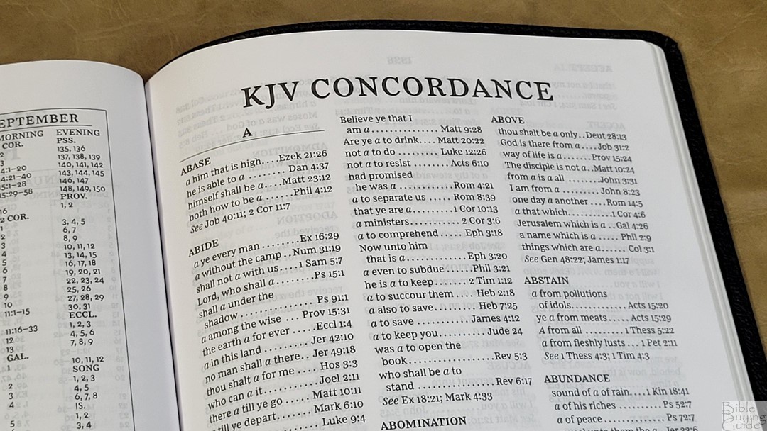
The concordance is 93 pages with 3 columns per page. It has a decent amount of references for study and sermon prep. Here are a few example entries with their number of cross-references to help you compare:
- Christ – 18
- Christian – 3
- Faith – 96
- Faithful – 41
- Faithfully – 1
- Faithfulness – 6
- Faithless – 3
- God – 58
- Godhead – 3
- Godliness – 11
- Godly – 11
- Praise(n) – 32
- Praise(v) – 15
- Pray – 38
- Prayer – 36
Bible Atlas
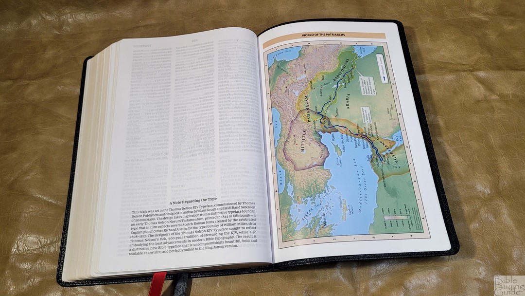
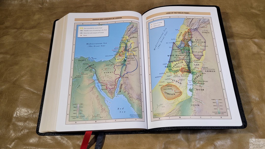
In the back, you’ll find the Bible atlas with 7 full-color Zondervan maps printed on 8 pages of thick non-glossy paper. They’re printed with bright earth-tone colors that look great and are easy to read. It does not include an index but they are annotated well. I find them easy to use. They show topography, distance, routes, borders, possible locations of lost places, battles, elevation, cities, and locations for the events of Jesus’ ministry.
Maps include:
- World of the Patriarchs
- Exodus and Conquest of Canaan
- Land of the Twelve Tribes
- Kingdom of David and Solomon
- Jesus’ Ministry
- Paul’s Missionary Journeys
- Jerusalem in the Time of Jesus
Comparisons
Here’s how the KJV Paragraph-Style Large Print Thinline compares to a few other popular large-print reference editions that are about the same size, as well as a few paragraph KJVs.
Premier Collection Large Print Thinline NKJV

The Premier Collection Large Print Thinline NKJV is the Bible this KJV is modeled from, which makes me very happy. This is one of my favorite NKJVs. The paragraphs, poetic setting, and personal letters match the layout of this NKJV. This NKJV does not include book introductions.
KJV Maclaren

The KJV Maclaren is a verse-by-verse edition. It has the same footprint, but it’s a lot thicker. The paper is thicker, the text is larger, and it has more cross-references. It doesn’t include a concordance, introductions, or other tools. It’s great for preaching and study. I prefer the Paragraph-Style for reading.
KJV Sovereign

The KJV Sovereign has a smaller footprint but it’s a lot thicker. It has the same book introductions, cross-references, and tools in the back. It only has Psalms and Proverbs in a poetic setting. It also adds decorative drop caps and all the highlights are in red. Its paper is thicker but doesn’t feel as elegant to my fingers.
KJV Large Print Thinline

The KJV Large Print Thinline has the same footprint and is a touch thinner. The text is slightly larger and darker. It’s a v-b-v edition with no references. It does include some of the same tools in the back.
Cambridge Clarion

The KJV Clarion has a smaller footprint and is a lot thicker. The layout is a single-column paragraph with poetry in stanzas and personal letters indented. It doesn’t include section headings. The font isn’t as dark, but it’s close to the same size. It doesn’t include space around the indented personal letters. Also, it doesn’t include most of the poetic setting for the New Testament.
KJV Pitt Minion


The KJV Pitt Minion is the only other reference KJV in print that I’m aware of with a paragraph setting, poetry in stanzas, and personal letters indented. It’s a lot smaller and not recommended for older eyes. The formatting follows the Clarion, so it doesn’t include much poetry in the NT.
Conclusion
The KJV Paragraph-Style Large Print Thinline is a beautiful edition of the KJV. I’ve wanted this layout for 40 years. I’ve always said the KJV is the most poetic translation, but it has the least poetic layout. This Bible fixes that with the most poetic setting of all the paragraph KJVs that I’ve seen. It’s designed well and made well, and it’s available in several covers to fit any budget. Anyone interested in reading the KJV should buy the Thomas Nelson KJV Paragraph-Style Large Print Thinline.
_________________________________________________________
This Bible is available at (includes some affiliate links)
Amazon
and many local Bible bookstores
_________________________________________________________
Thomas Nelson provided these Bibles in exchange for an honest review. I was not required to give a positive review, only an honest one. All opinions are my own.


Thanks again for your labors, Randy. Great review. Normally I wait until after your review to make a purchase, but not this time! Had to get my hands on this. It certainly met my expectations. And it’s a great price point, especially for some who are a little uncertain about the paragraph layout. I love it. Even the gray hardback is kinda nice (and very affordable).
Thank you Randy for yet another excellent review! This has become my favorite Bible even though it is not as high quality as many of the other editions I own. The paper is actually easier on my eyes than the Canterbury and I absolutely adore the poetic layout. I got it on sale in imitation leather and I must say this is the best imitation leather I have ever seen. I wish that the liner wasn’t paper but the imitation leather feels so much like real leather and looks great. And to think I got it for $15! What an amazing deal for an amazing bible.
That’s an amazing deal! I’m glad you like it. It’s become my favorite KJV.
Hi Randy!
I love your reviews. This KJV Paragraph Bible by TN has hit all the right notes. I believe this bible can fall in the goldilocks catagory of an everyday carrying bible. Please ask the “powers that be” at TN, if this bible can receive the premier treatment, in a special color, that can be rendered as a limited run edition, just like the NKJV. I believe this can be another wonderful marketing opportunity, if TN can release this in the premier catagory. And YOUR suggestion on this DOES matter to them!
Thank you!! I’ve seen sevreal requests for this edition in the Premier Collection. I’ll be sure to mention it.
Hi there. Thanks for your review of the KJV Paragraph Bible. Is there any other KJV that has poetic setting?
Hi Chris. There are a few from Cambridge: New Cambridge Paragraph Bible in large size or personal size, Clarion, Pitt Minion. Hendrickson has a few in paragraph, but they don’t include a poetic setting.
I just want to second the motion for a Premier Collection version of this Bible. Had planned to use a study Bible this year, but love the formatting of this Bible. Curious though, would you rather have this or the Treveris for a Reader?
Hi Adam. I love both, but I prefer this one. It has more poetry in the NT and includes a glossary on the page.
Hi Randy,
I don’t see this Bible on Thomas Nelson’s website anymore, has it already gone out of print by the publisher? I hope not, such a great layout.