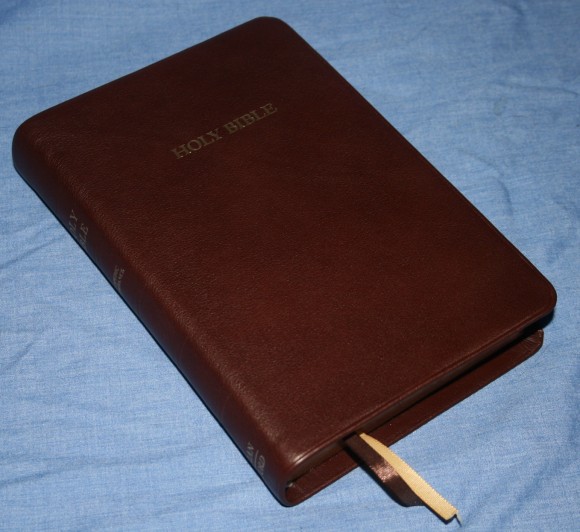
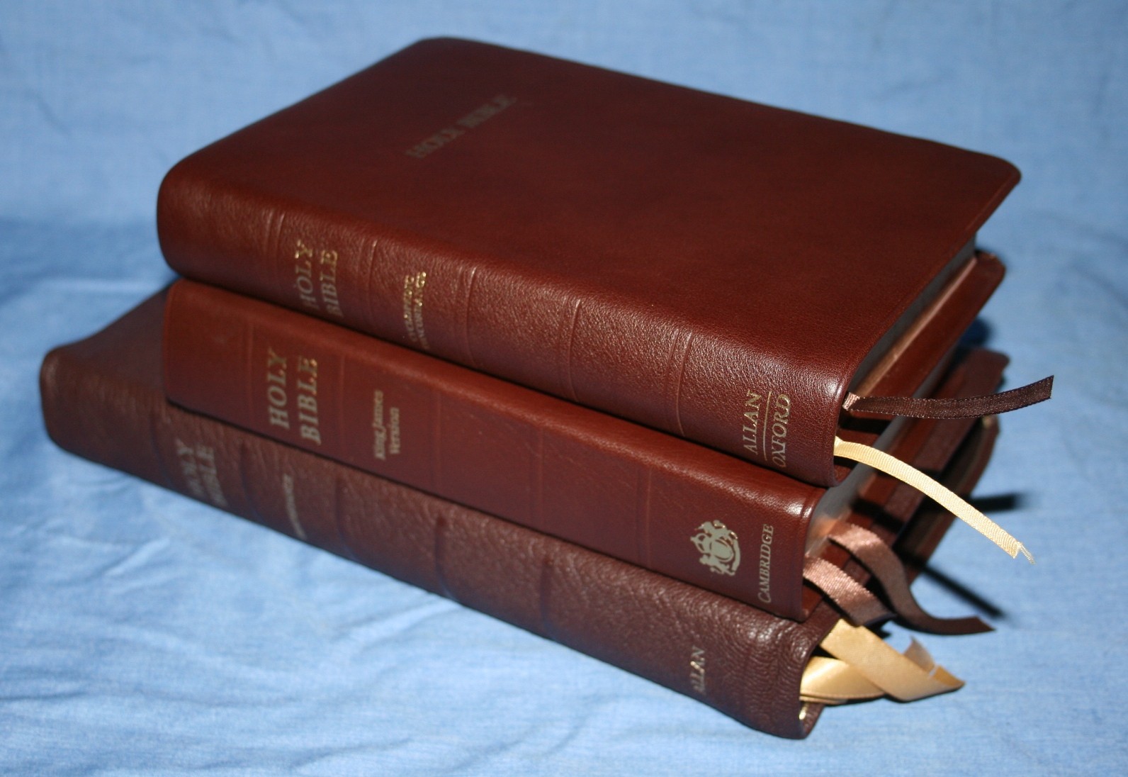
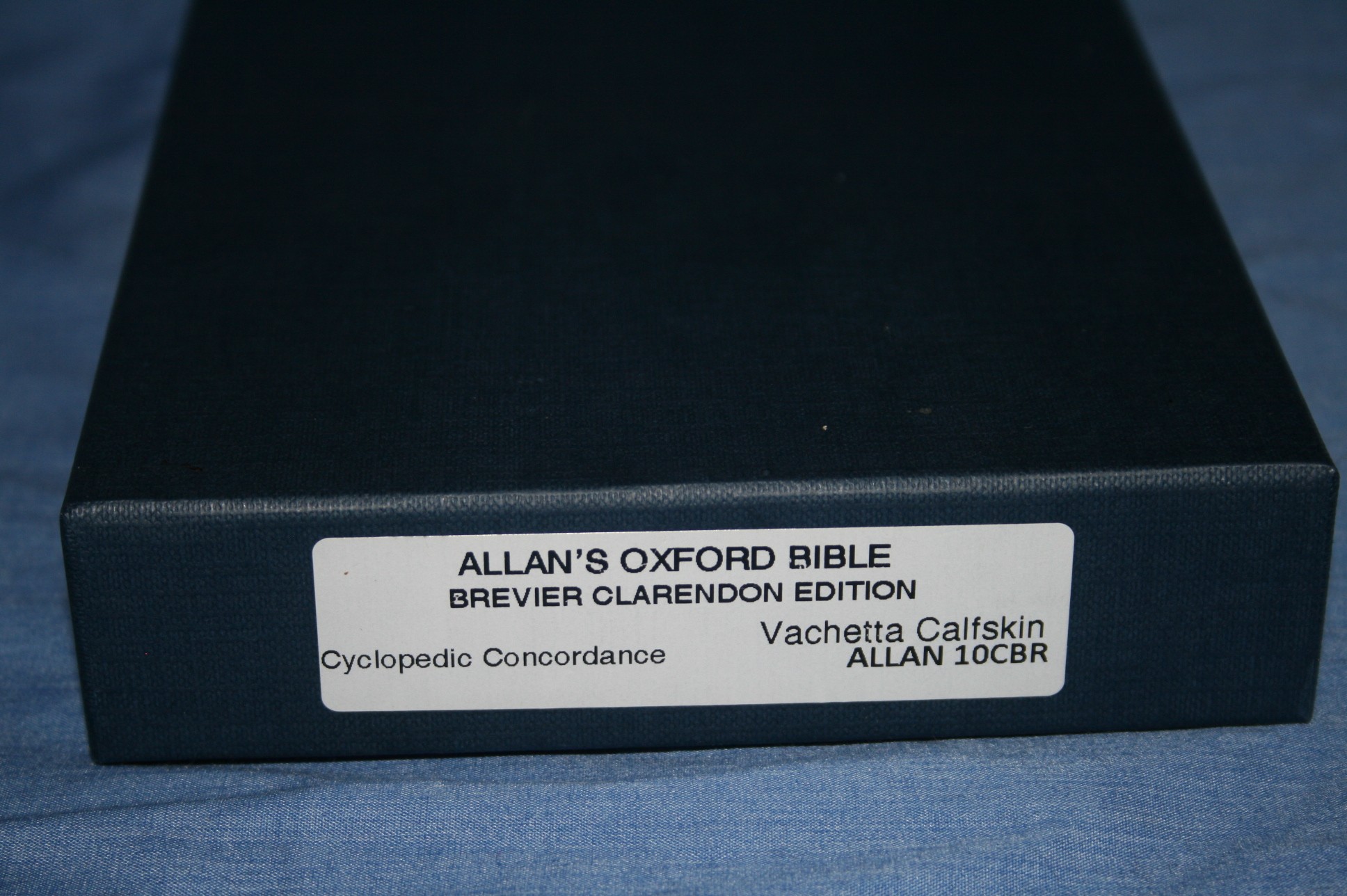
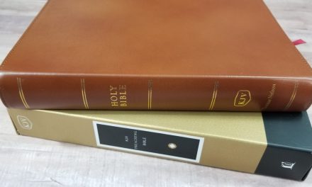
I previously reviewed RL Allan’s wide margin edition of the Brevier Clarendon, so I thought it would be nice to take a look at the regular edition. This is a true hand-size Bible with enough punch to serve as a primary Bible for both the layman and the minister. The edition I’m reviewing is the brown Vachetta calfskin – 10CBR.
Pros
- Cyclopedic concordance
- Printed and bound by Jongbloed
Cons
- Paper is thin
Features
- KJV
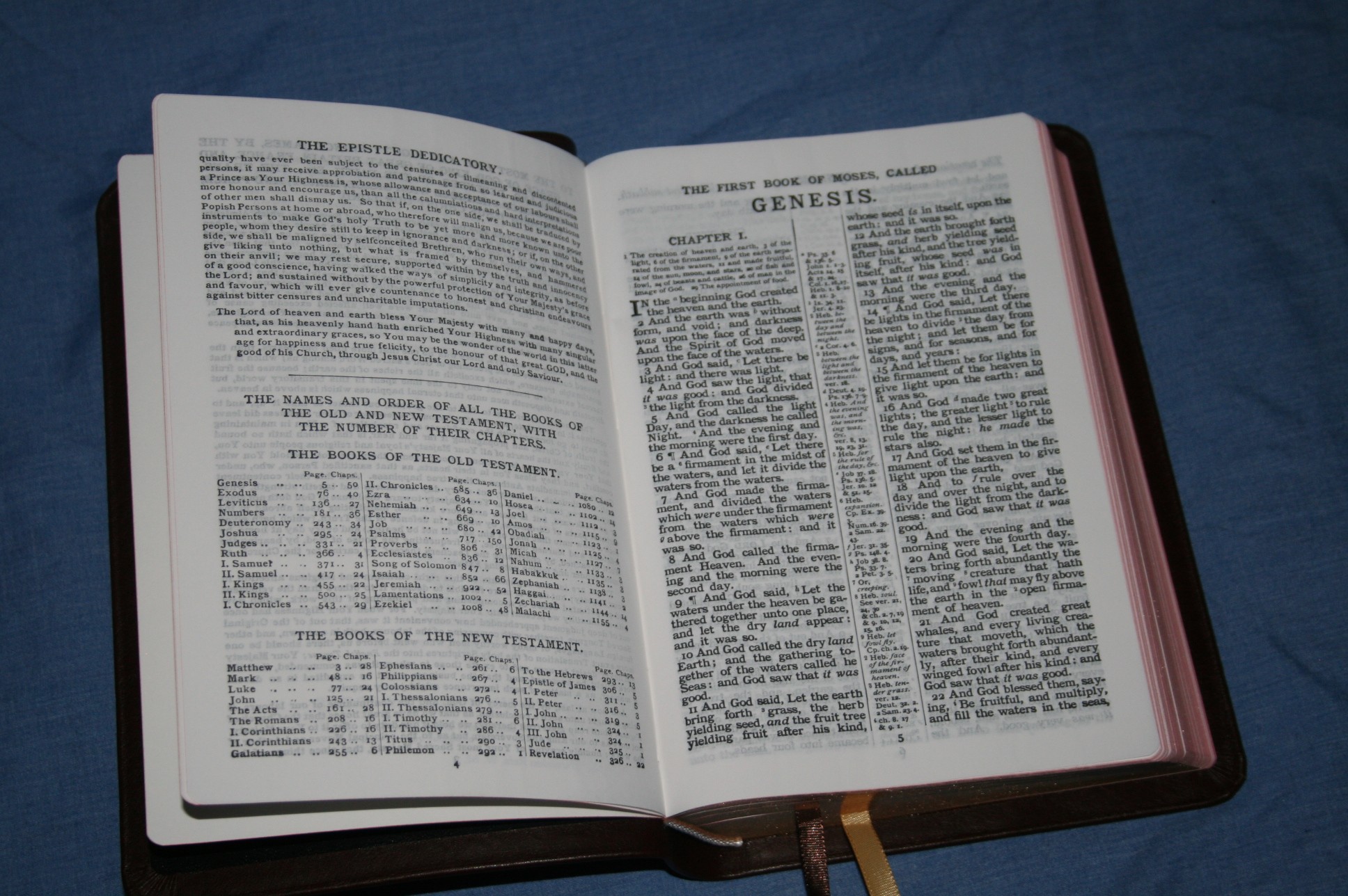
- Epistle dedicatory
- Brown Vachetta Calfskin
- Sewn binding
- Ultrathin paper
- 8-point font
- Black letter
- Center-column references with notes
- Chapter summaries
- Page summaries
- Cyclopedic concordance
- Index to maps
- 16 pages of maps
- 2 ribbons
- Art-gilt edges
- 7 5/8 x 5 1/8 x 1 1/4
- Printed and bound in the Netherlands by Jongbloed
Click here to buy from Bibles-Direct: Brevier Clarendon in Brown Vachetta Calfskin
Cover and Binding
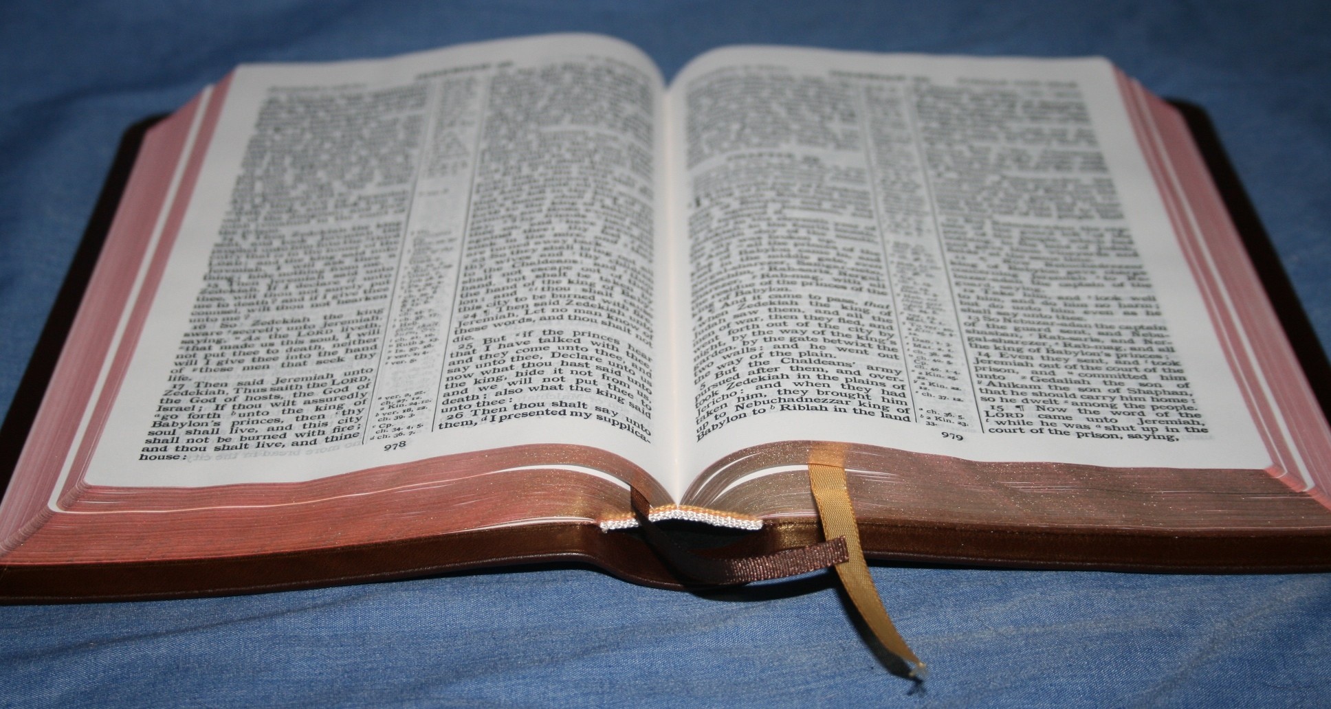
The brown Vachetta calfskin is thick and soft to the touch, but at the same time it’s not overly flexible. It’s the right kind of flexible for me. It feels soft and still lays flat in the hand. It is a light grain that looks tight and pebbly. The liner is black vinyl/card stock. It’s Smyth sewn and has no trouble lying flat on the first page.
Paper and Print
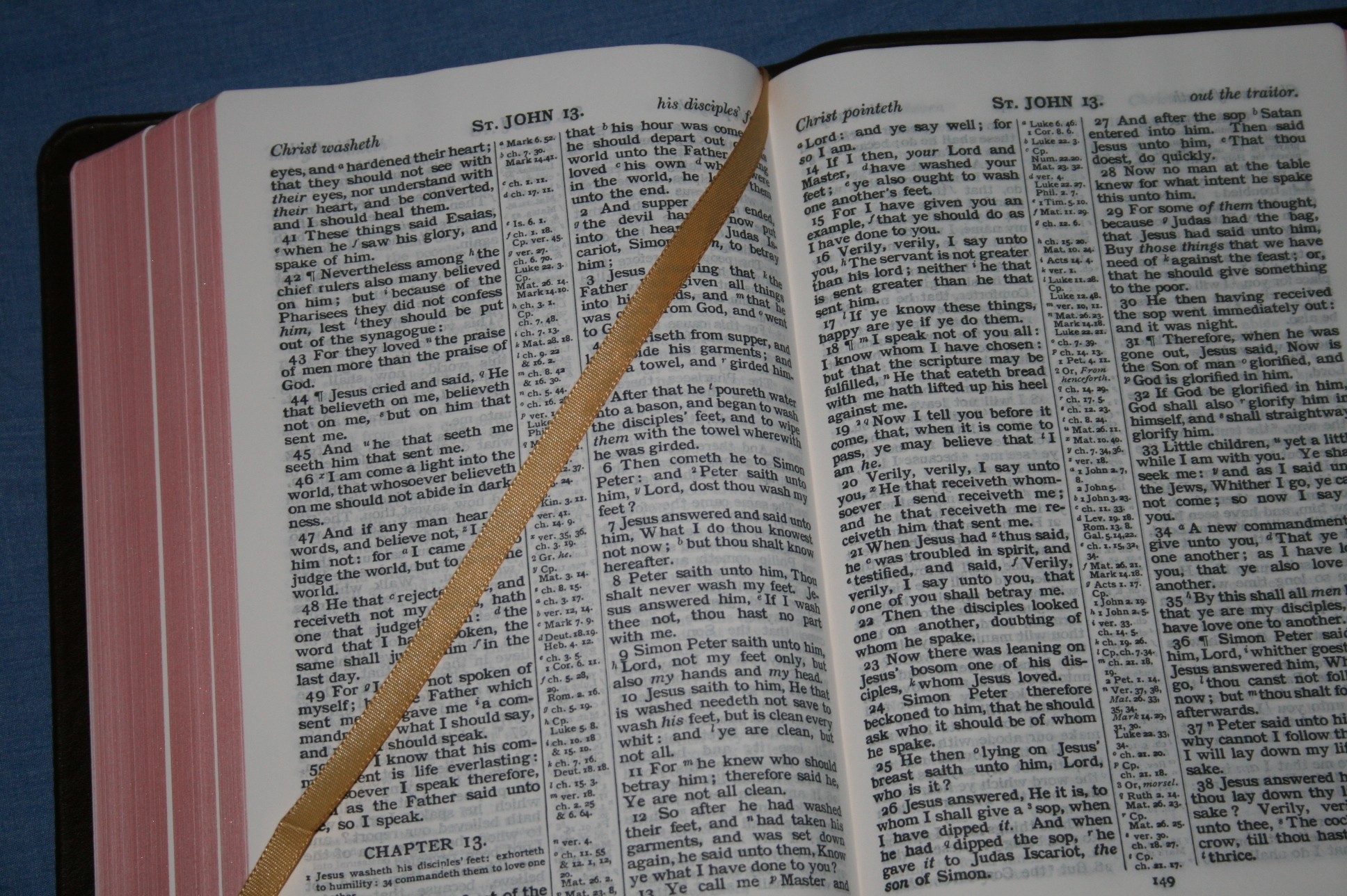
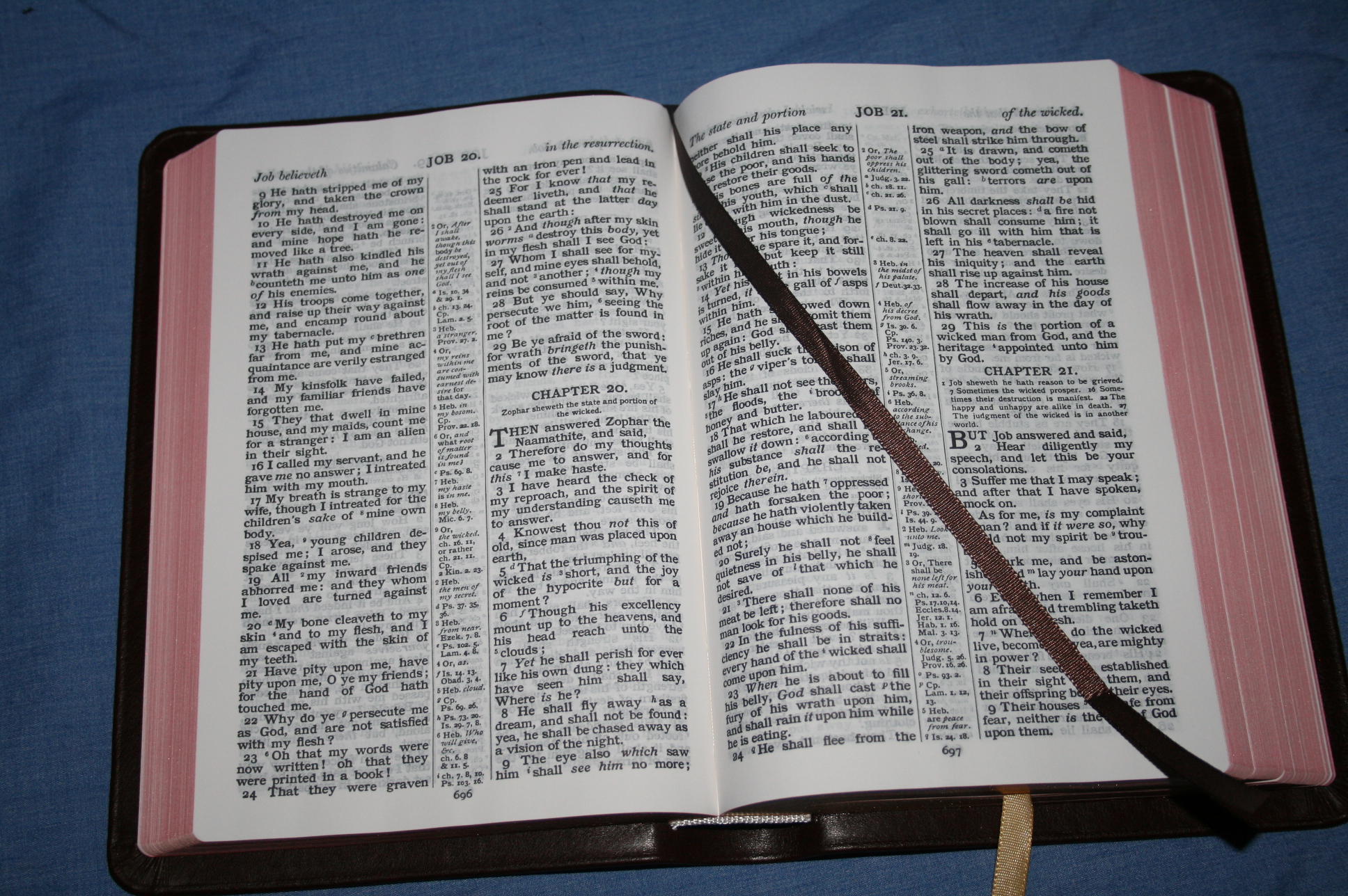
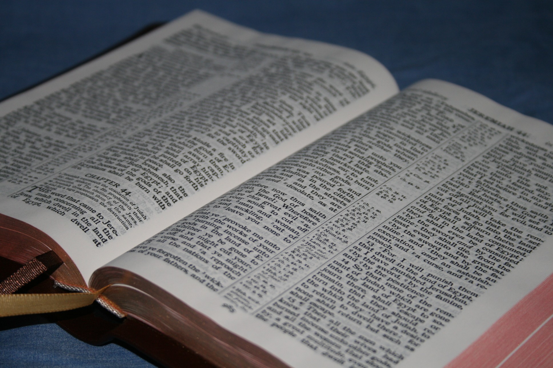
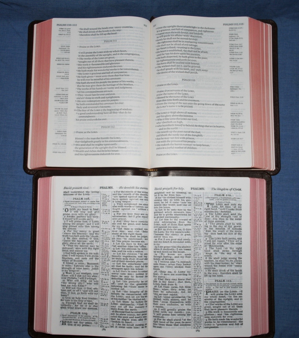
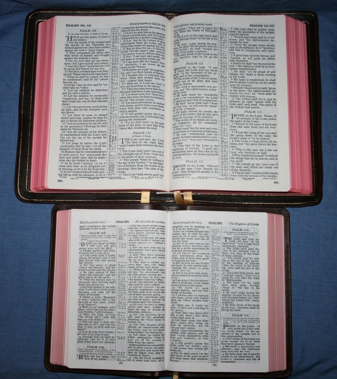
The paper is extremely thin but still fairly opaque. It’s so thin that I don’t think I want to write in it. The pages were stuck together and I crinkled several of them trying to get them apart. It does help in making this a lightweight and thin Bible while still providing lots of supporting material. Line-matching would improve readability, but it’s not that bad.
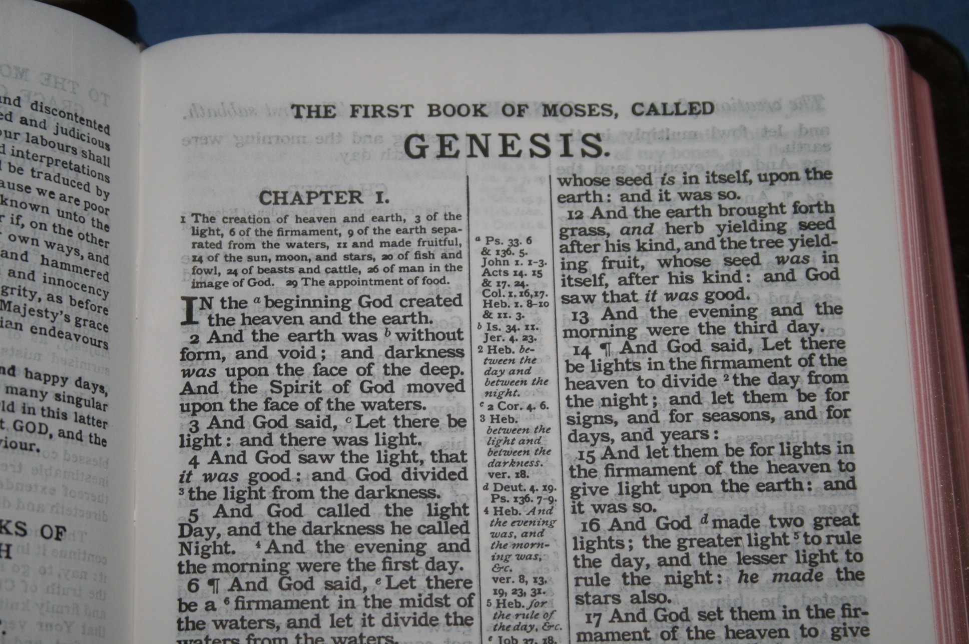
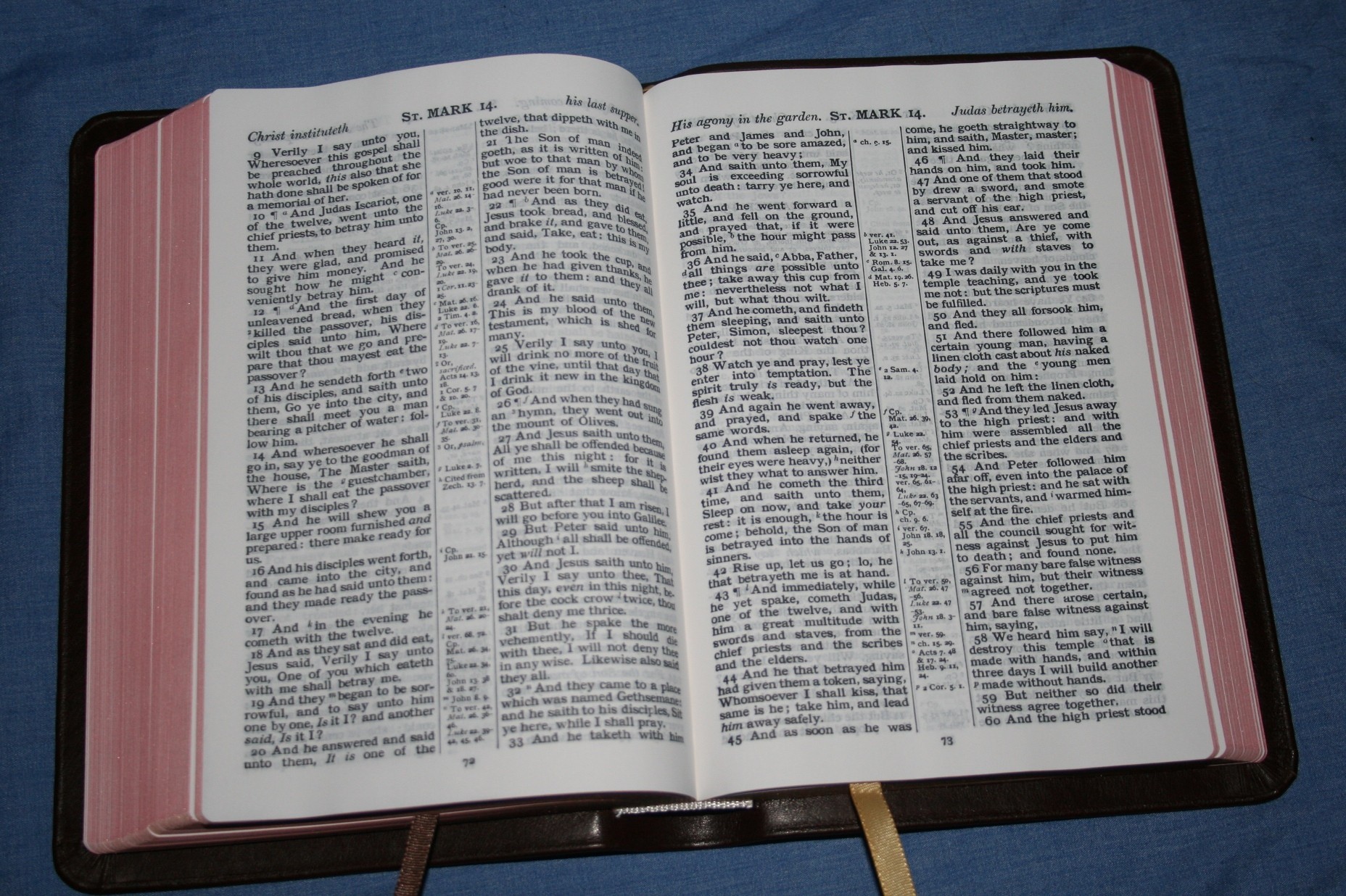
The print looks like the old printing-press style of publishing. The font is the old Clarendon style and is 8-point with 9-point leading (8/9). It’s bold and very consistent throughout. This is a black-letter edition. It doesn’t have self-pronouncing marks but it does have italics for supplied words.
References and Notes
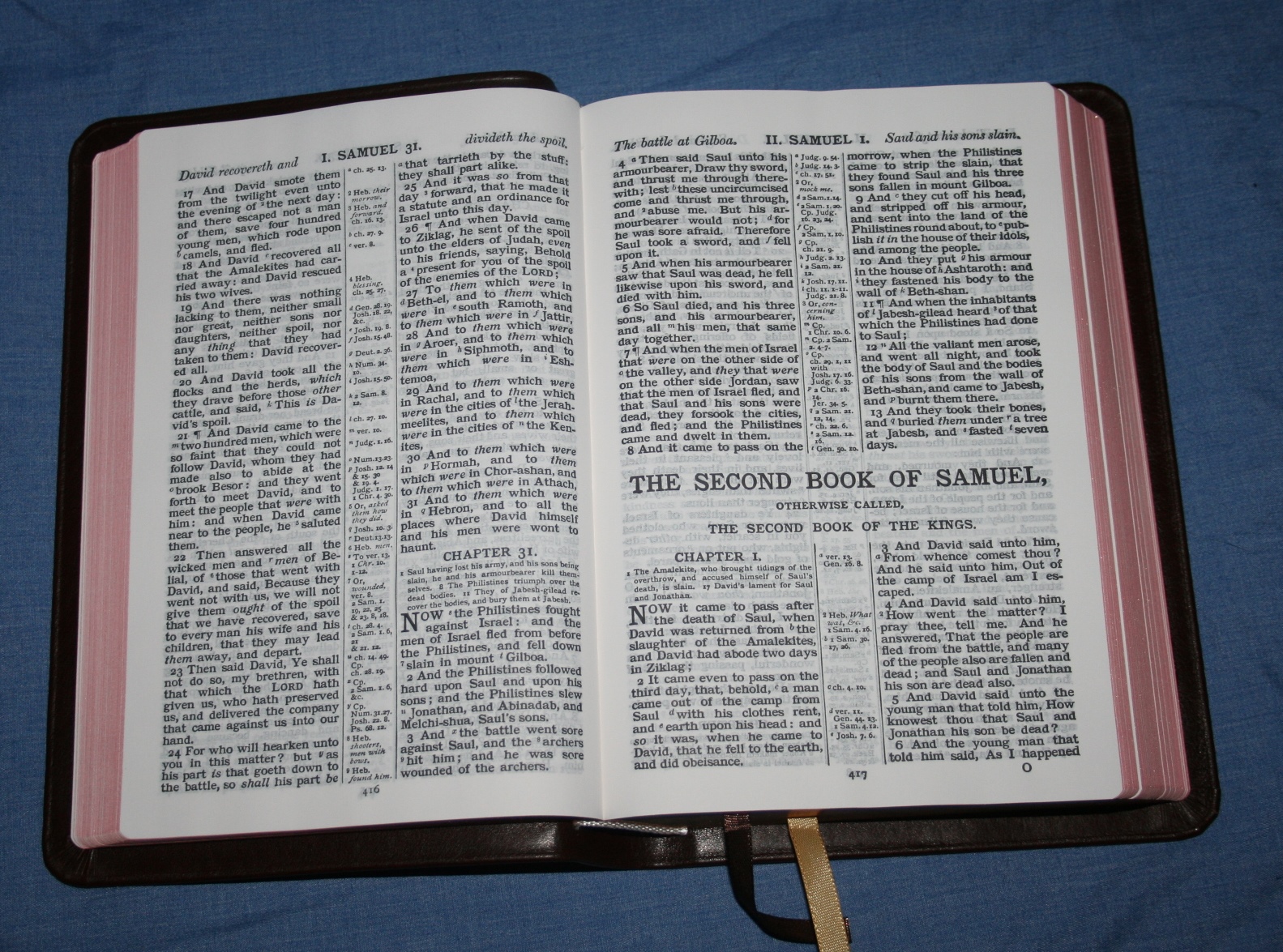
I don’t know how many references there are. They’re in the center column and almost every page has the column completely filled with references. There are 15 references for Genesis 1:1. Translator’s notes are also included. References are keyed to the text with letters. Notes are keyed with numbers.
The letters and numbers for the references and notes are tiny. They are sometimes too hard to read. Since the print style looks like it was printed on a press, some of the fonts have the look of too much ink when it was pressed. For fonts that are circular (c, s, d, b, etc.), the ink can smear and make the font unreadable. This is also true of the wide margin edition.
Summaries
There are two types of summaries: chapter and page. Chapter summaries appear under the chapter number. They work like section headings, only they’re all in one place. They have verse numbers that show which part of the chapter they go with. Page summaries appear at the top of each column. There are two per page – one for each column of text. The summaries are useful for scanning the pages and chapters for something specific.
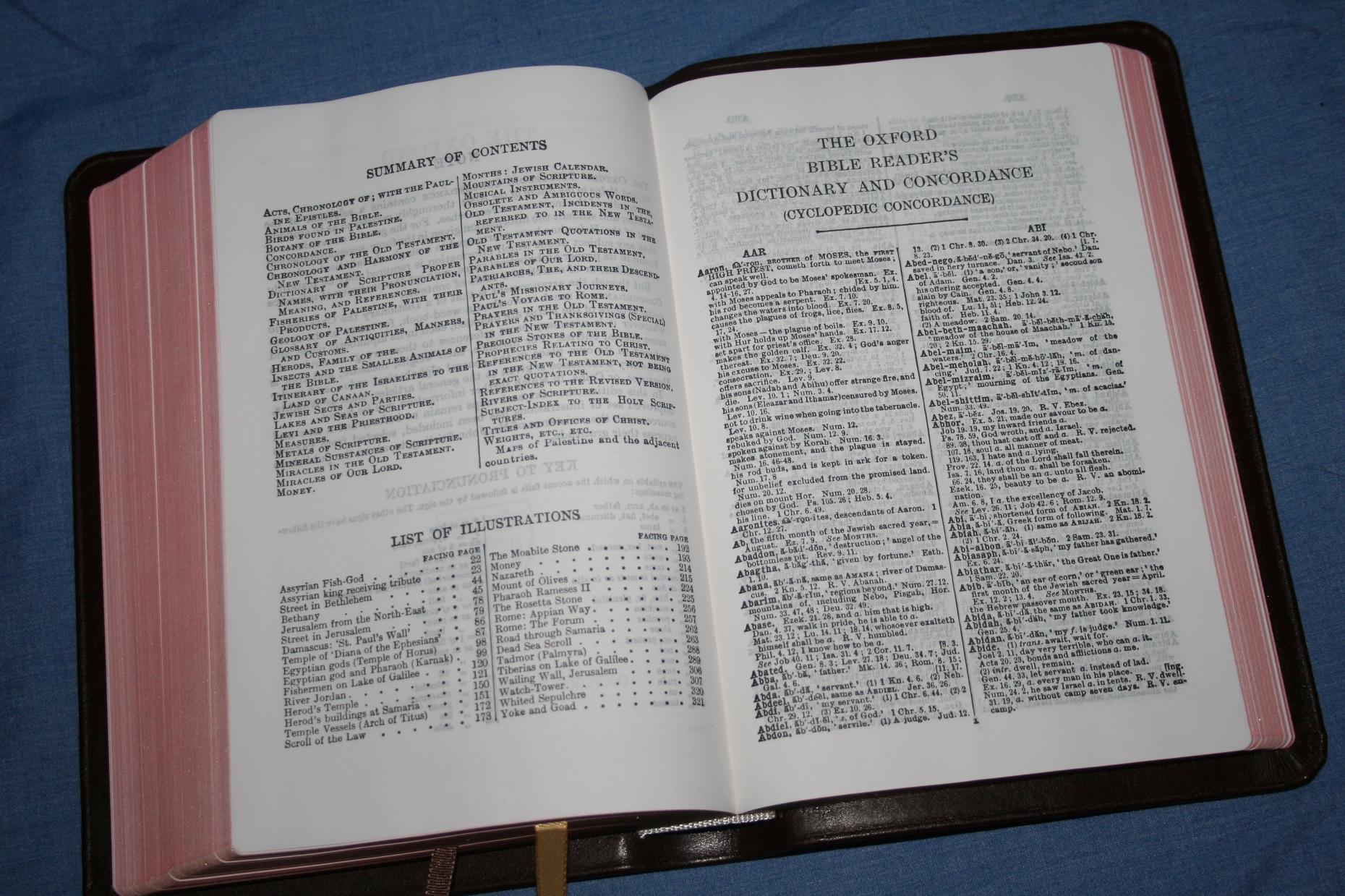
Cyclopedic Concordance
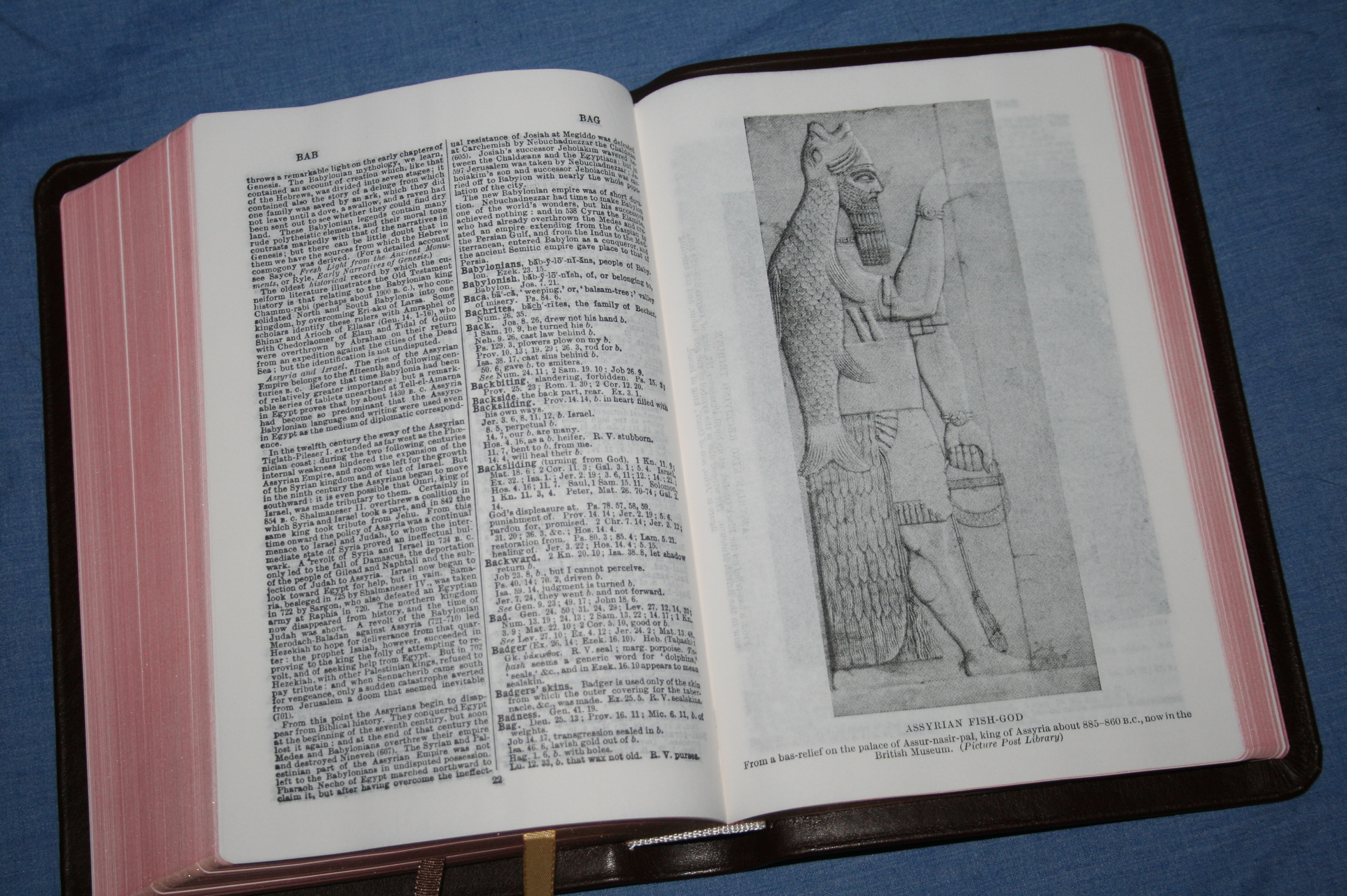
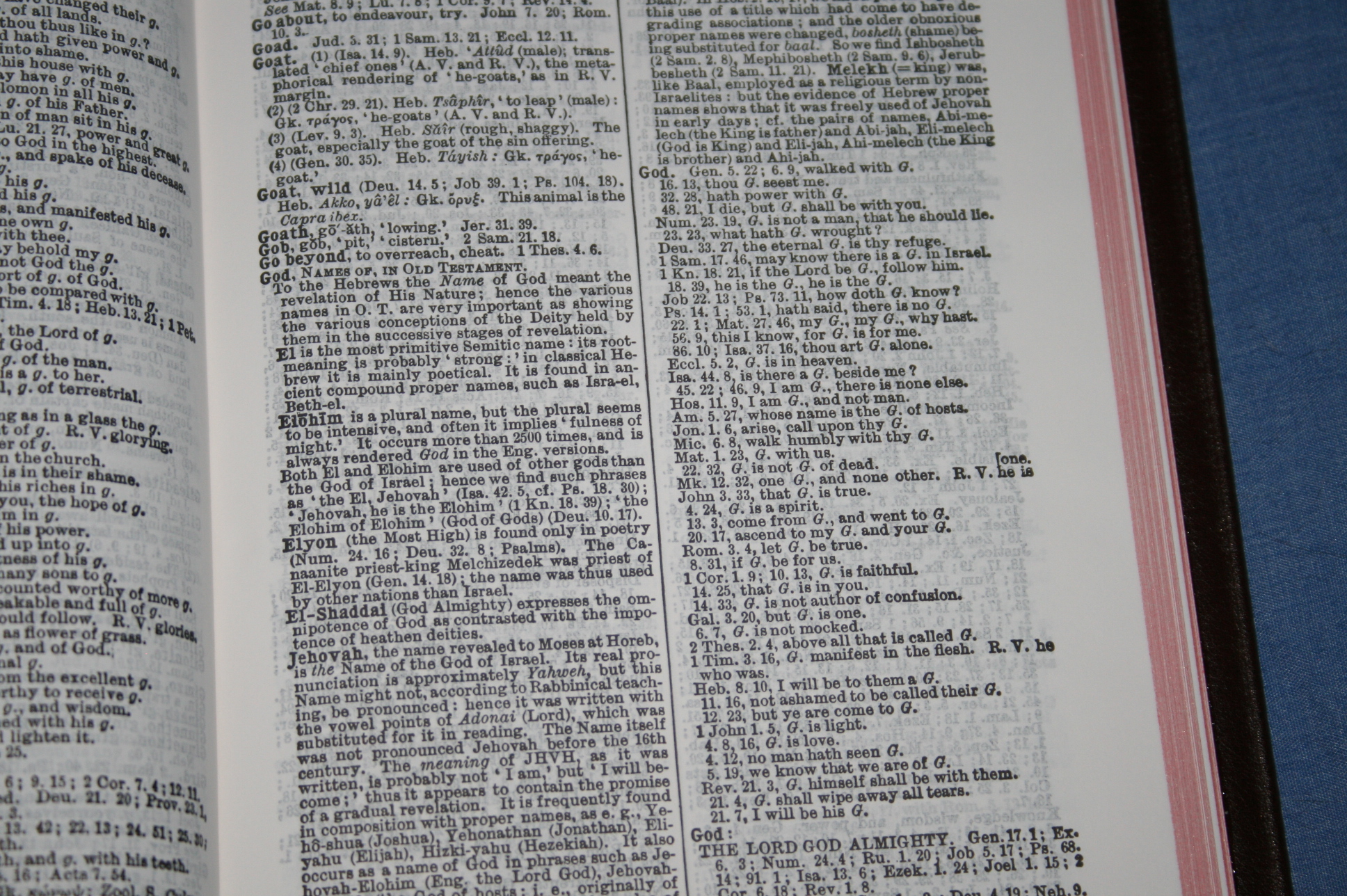
The cyclopedic concordance is 324 pages. It’s a concordance that has cyclopedic entries before the references. I like cyclopedic concordances because they work like a dictionary and topical index. It has a lot of info including archaeological information and tables. There are six full columns (two columns per page) of references to God. The cyclopedic concordance sets this Bible apart and makes it a great choice for Bible study and sermon prep.
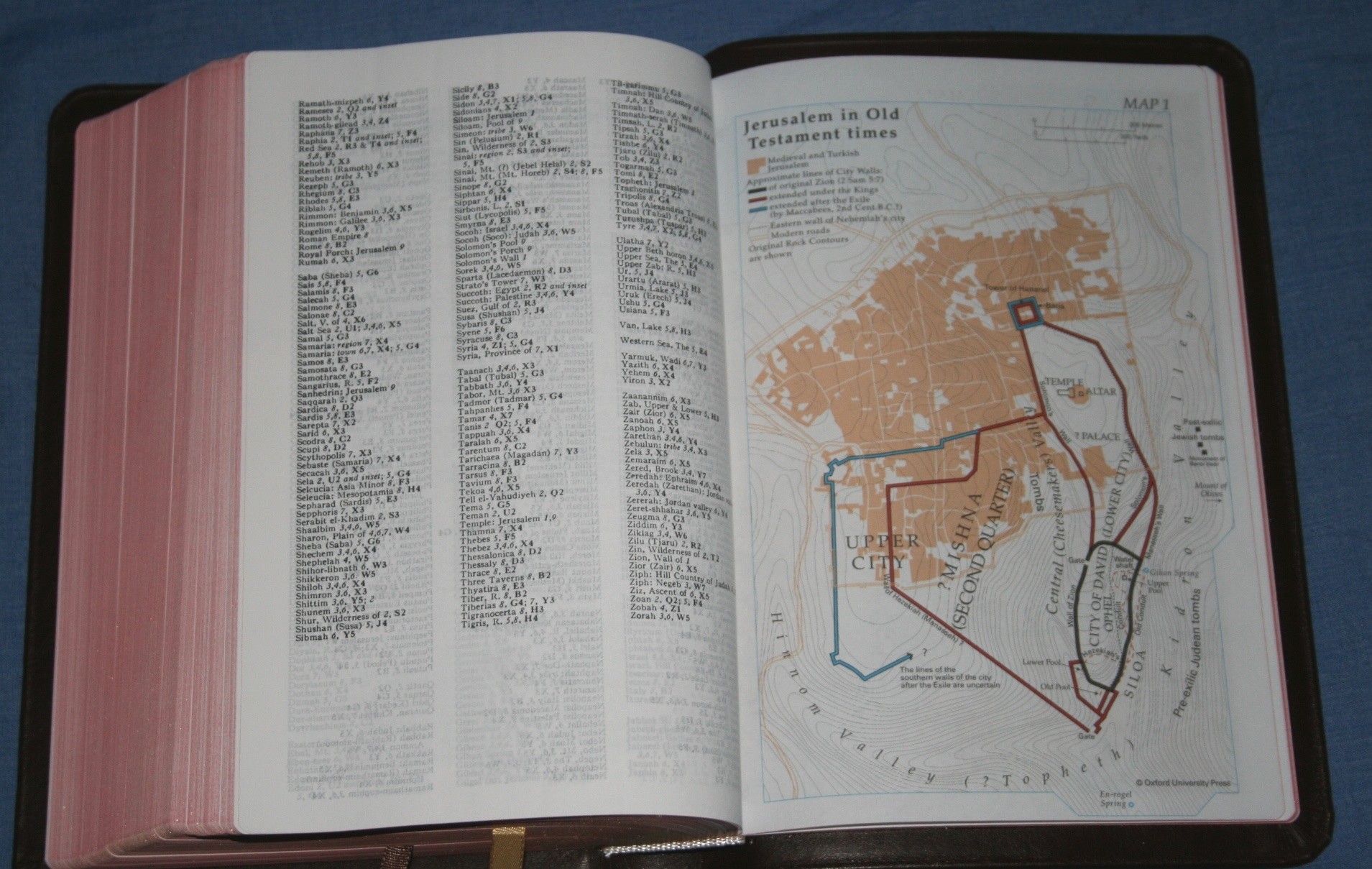
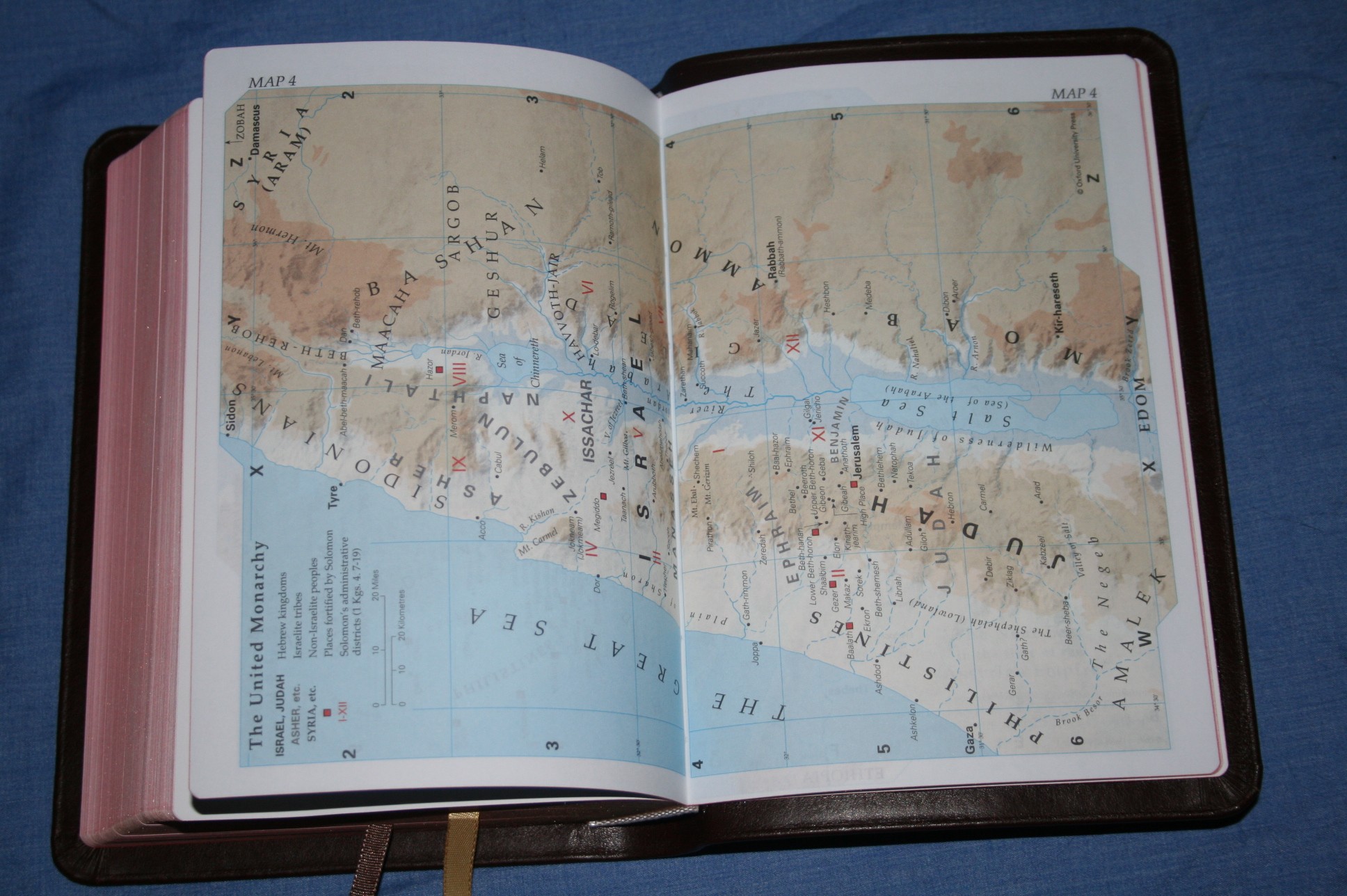
Maps
There are 16 pages of beautifully colored maps and there is an index! This should be standard in all Bibles with maps. They’re printed on thick paper that’s not glossy. I like that it’s not glossy (I’m not a fan of glossy paper for maps). The maps are colored to show topography. They look great and are easy to use.
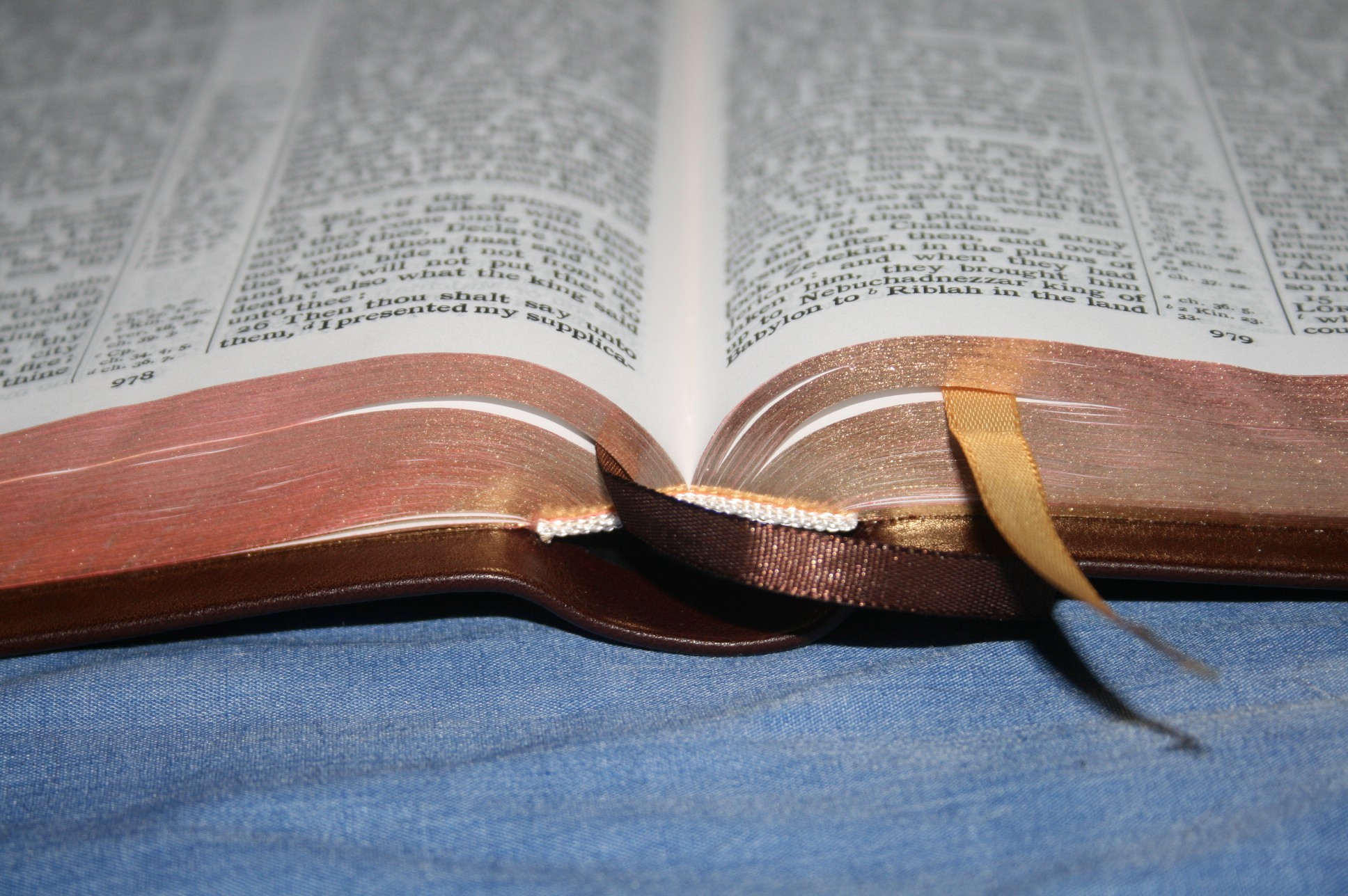
Ribbons
There are two ribbons. They are much thinner than the other Allan Bibles that I’ve seen. It makes sense for them to be thin considering how small this Bible is. One ribbon is brown and the other is gold. The gold ribbon is slightly wider than the brown one. I usually like everything symmetrical, but this adds a little character.
Conclusion
The Brevier Clarendon is a great choice for carry, reading, study, and sermon or class prep. It has enough to serve as your ‘one Bible’. It’s a great companion to the wide margin edition.


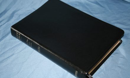
from the top: Brevier Clarendon, Clarion, Longprimer
Clarion and Brevier Clarendon
Longprimer and Brevier Claredon


Dear Randy:
This looks like an almost perfect bible for me! I have other bibles that are used for serious study while at a desk or table, the TBS Westminister, and LCBP’s Thompson Chain Reference. The Westminister is ALMOST small enough to read for long periods while seated, but sadly is large enough that it becomes fatiguing after half an hour or more (I will read for hours without pause except for restroom breaks). I have been looking for one bible that will work for everything, and have found that none do, the long sessions while seated and handheld is the most severe test and eliminates most offerings. The closest so far is Cambridge’s Personal Concord, it has everything the Concord has except for a decent type size, it is about perfect for hand held reading except for the font size (6.5) which becomes fuzzy after an hour or so, even in the best light. It seems to me that a font of 8 as in the Concord or the Cameo and the Brevier is about minimum in size for reading in all light for extended reading sessions.
I have come down to two competing bibles for my final choice, the Brevier Clarendon, or Cambridge’s Cameo, also in Brown Vachetta Calfskin (the Brevier is available also in a mid-grain goatskin binding that has almost as much body as the calfskin). I am leaning towards the Cameo most of the time because of the familiarity I have with the Cambridge text block acquired with my reading of the Personal Concord. The Cameo also has a large Concordance, and a Dictionary that has lots of tables etc. just like the Concord. I had just about decided to buy the Cameo when I read your review on the Brevier, now I will have to re-think it for a while longer.
FYI Alans offers the Brevier in Blackface Type that is vibrantly clear, almost to a fault.
Which of the two, the Brevier or the Cameo do you prefer and why?
Yours in Christ
Don Denison
Hi Don. Great question. My Cameo doesn’t have a dictionary but it does have a really good concordance. These two Bibles make for a good comparison. They’re almost exactly the same size with the same(ish) font. There are things about both that I like better than the other:
Paper – Cameo. It’s a little thicker and more opaque. I think it would be better for reading for a long period of time, but only slightly (though not as good as the Windsor).
References – Brevier Clarendon. The Cameo has a lot of references but the BC has even more.
Concordance – BC. My Cameo has an awesome concordance, but no dictionary.
Chapter summaries – BC. The Cameo doesn’t have them (but I don’t really use them anyway).
Construction – tie. They are both printed and bound by Jongbloed and it’s obvious. Their construction looks and feels the same.
If I could only have one I would have to decide if I wanted the slightly better paper or the cyclopedic concordance and a few more references. I prefer the BC, but only because of the cyclopedic concordance.
A cheaper option for the Cameo is the LCBP version. The paper looks a little too shiny for me though, so it might not be as good for reading.
Dear Randy:
Thanks. It is too bad that the Cameo doesn’t have all the features that the Concord and Personal Concord has, I love the dictionary in the personal concord, but I admit I go to the Westminister for that kind of information most of the time because of its many appendices. Oh how I wish the Personal Concord had at least 8 point type.
Yours in Christ
Don Denison
Hi Don,
You have probably thought of this, but what about a book stand (reading stand)? This is a book stand that allows you to sit an open book in it and read from it. I have a wooden one with a flat base that easily sits on my lap. A large print bible can sit open there all day long and cause no fatigue. Pages can be turned easily. There are many types of book/reading stands to choose from.
I also find them great for my study desk as I can have concordances and other study books open and readable from my chair while I have a bible closest to me.
John
Dear John M.:
Actually I hadn’t thought about it. Thanks for the suggestion I’ll investigate, I really, really like that Westminister Reference Bible, as well as Cambridge’s Concord. I’ll see what I can find that will work with a recliner or Morris Chair. Thanks. Still there remains the problem of the bible resting on its lower margins both cover and pages, that’s where most of them wear out. I will investigate this, it remains a fact that wear will happen when the bible is read, can’t be avoided, I will still read it regardless, that is what a bible is for.
Yours in Christ
Don Denison
Dear John M.:
Before shutting down, I did a quick search and found “English Lap Secretaries”, they are as I described though made of Rosewood and priced at $675. The one I remember was the same though made of pine with a slate writing surface and was made of light and thin wood, I would think one building one could opt for a hard and dense wood like Maple for the writing surface. I really appreciate your mention of a bookstand. I’m convinced we, as a race, forget at least as much as we learn.
Yours in Christ
Don Denison
I think buyers should beware, before they buy, that throughout the Old Testament this bible advocates the heresy of replacement theology. The page headings and chapter summaries replace Israel and the Jewish people with the church. A prime example is Isaiah 45.
Hi J.R.,
I have the wide margin version of this and I see you are correct. I generally ignore these summaries but I wonder who is the author of them. I think this is originally an Oxford text but I can see no information on the notes.
Thanks for pointing this out.
John
Dear J. R.:
I took the time to look up and study the term of Replacement Theology. I found that rather than being heresy that it is a valid viewpoint of many theologians, Church Fathers and most well respected bible scholars. I suppose if you are an advocate of Dispensational Pre-millennial theology and/or can’t see that there are other valid scriptural positions to take, that one might think that it is heresy. This is the sort of thinking that got us the religious wars during the Reformation, not everyone who disagrees with us is a heretic and Satan’s servant, moreover, “no one fights in a burning house”; I retired a Schofield Reference Bible because of the biased notes. Many folks believe that Schofield’s notes are as valid as Holy Writ, my parents were among them. This issue frequently causes hard feelings, has even split churches unnecessarily. Replacement Theology is not heresy, a differing informed opinion is more like it. This is not an issue that salvation hinges upon, there are valid arguments for both positions and good Christians can agree to disagree about it and focus their energies on important issues. Heresy is something that removes us from communion with the Church and perhaps excludes salvation, the Arian heresy that asserts a hierarchy in the Godhead is an example. I believe that the term Heresy in the case of Replacement Theology is misapplied. I would be pleased to be raptured before the Tribulation and witness Gods separate/parallel work with the Church and Israel, I wouldn’t though, label those who do not agree, Heretics, it is a bit much, don’t you think? Darby, Schofield, et al were not writers of the Holy Cannon, nor do their opinions have that authority. I am happy to wait and see how all this is going to be worked out in God’s plans. Meanwhile there are important issues to contend with in my personal life and in the Church.
Yours in Christ
Don Denison
Don,
One definition of heresy is,”The Scriptures being the standard of faith, any opinion that is repugnant to its doctrines, is heresy.” Replacement theology is a doctrinal error that came into the early days of the church. Early writers decided that God had replaced the Jewish people with the church, and all the promises to the Jews and Israel, even for the last days, are now given to the church. These were also know as the dark ages. Replacement theology is easily disproved by going to the scriptures. But let’s start with the first example I gave of Isaiah 45. The chapter clearly is referring to God calling Cyrus the Persian long before he was born, to let the Jewish people go back and rebuild Jerusalem and the Temple after the Babylonian captivity. But look what the page heading and chapter summary says,”God calleth Cyrus for the Church’s sake”. The church isn’t even involved here. The church isn’t even revealed until the New Testament. Turn back a page to Isaiah 44 and the page summary says, “The Church Comforted.” Once again we find replacement theology.
Here’s a few scriptures that totally discredit replacement theology:
Rom. 11:1-2 “I say then, Hath God cast away His people? God forbid. For I also am an Israelite, of the seed of Abraham, of the tribe of Benjamin. God hath not cast away His people which He foreknew”
Rom. 11:25 “For I would not have you ignorant, brethren, that ye should be ignorant of this mystery, lest ye should be wise in your own conceits; that blindness in part is happened to Israel, until the fulness of the Gentiles come in.
Rom. 11:29 “For the gifts and calling of God are without repentance.
1 Cor. 10:32 “Give none offense, neither to the Jews, nor to the Gentiles, nor to the church of God.
There are 3 people groups on earth according to the scriptures.
There are no “other valid scriptural positions” to take.
Ever since the diaspora in A.D. 70 the Jewish people have been persecuted, maligned, tortured, and murdered through such atrocities as the Crusades, the Spanish inquisition, and the Holocaust, all under the sign of the cross. Replacement theology is both heresy and blasphemy because it calls God a liar.
Judges 2:1 “Now the angel of the Lord came up from Gilgal to Bochim. And he said, ‘I brought you up out of Egypt and led you into the land which I have sworn to your fathers; and I said, ‘I will never break My covenant with you’.”
Jer.31:35-36 “Thus saith the LORD, which giveth the sun for a light by day, and the ordinances of the moon and of the stars for a light by night, which divideth the sea when the waves thereof roar; The LORD of hosts is his name: If those ordinances depart from before me, saith the LORD, then the seed of Israel also shall cease from being a nation before me for ever.”
Israel becoming a nation again in 1948 is direct fulfillment of Bible prophecy concerning Israel and the Jewish people. There are so many scriptures, I’ll just give a few:
Amos 9:14-15 “And I will bring again the captivity of my people of Israel, and they shall build the waste cities, and inhabit them; and they shall plant vineyards, and drink the wine thereof; they shall also make gardens, and eat the fruit of them. And I will plant them upon their land, and they shall no more be pulled up out of their land which I have given them, saith the LORD thy God.”
Ezek. 37:21-11 “And say unto them, Thus saith the Lord GOD; Behold, I will take the children of Israel from among the heathen, whither they be gone, and will gather them on every side, and bring them into their own land: And I will make them one nation in the land upon the mountains of Israel; and one king shall be king to them all: and they shall be no more two nations, neither shall they be divided into two kingdoms any more at all”
Ezek. 39:28 “Then shall they know that I am the LORD their God, which caused them to be led into captivity among the heathen: but I have gathered them unto their own land, and have left none of them any more there.”
I may be late to reply, but I’m pretty sure the Clarendon chapter headings date back to 1611. (The Isaiah 45 heading in the 1611 reads: “1 God calleth Cyrus for his Church’s sake. 5 By his omnipotency he challengeth obedience. 20 He convinceth the idols of vanity, by his saving power.” (I don’t yet have a Clarendon.)
Dear J.R.:
I must be dense in some way. I can’t remember seeing any advocacy of Replacement Theology in the Brevier Clarendon. Is there something I missed?
Yours in Christ
Don Denison
Dear John M.:
I’ve been doing some thinking about a reading stand. My grandparents generation and earlier called a similar piece of furniture a “Lap Desk” it had support for books and writing paper, a small storage compartment filled with ink, pens, postage stamps etc. I remember seeing these and wondering why folks liked them so. Age, experience, old bones, weakening eyes, and a desire for comfort is teaching me what my grandparents knew as a matter of life. We often throw out the baby with the bath water when trying to improve things. If I can’t find my families “Lap Desk”, I think I’ll build one, I believe that I saw a building print for one somewhere.
Yours in Christ
Don Denison
Don,
Sounds like a great project. John
Dear J.R.:
You have just proven my point. The thrust of the Gospel is that it is available to all peoples. We were all blest through the seed of Abraham, this was culminated in Jesus and his unspeakable gift to us. This is reinforced throughout the New Testament and in the Old Testament. There are good scriptural reasons for your position if you ignore the other passages. We don’t know what the Lord has planned for the nation of Israel, we do know though that he planned to and did bless us all through the seed of Abraham. What the passages you quoted state have been taken different ways by good Christians for good and sufficient reasons. This is not the beach to die on! How God will work out his promises, or possibly has worked some them out already in will be revealed as they unfold. How we respond to Jesus Christ is the important issue.
Christians of good will killed each other by the hundreds of thousands, perhaps millions, going into battle singing hymns to God. Do you really believe God looks with favor on such quarrels? Whether one believes that the Church replaced the Jews or not is not important compared with the question of what have we done with Jesus. Dispensational Theology has lots of holes in it, I would be pleased to be raptured before the Tribulation and witness from heaven Gods work with Israel, I don’t think it is going to work that way, and can’t find it in scripture, but that doesn’t make me a heretic, nor does your position make you one. There are good and sufficient scriptural passages to support at least three or four scenarios of how God will deal with the End Times and Israel. It is not worth fussing about among Christians and surely no reason to call other people heretics.
The reasoning goes something like this: I know I am right, I have read, prayed, and talked with God about this matter(whatever it is) these other(s) disagree with me and since there are only two sides, good and evil, that makes that other fellow evil and a servant of Satan I must eliminate him, or he will contaminate all Christianity, it is my duty to either convert him or kill him. From this kind of thinking, all religious wars come. I agree there are heresies, but this is not one of them. Not a good beach to die on!
Yours in Christ
Don Denison
Don,
You keep going on about “not a good beach to die on” and “fussing”, when I ignored your first question to me, and your second question to me I finally answered soundly by the scriptures. It seems anyone that you don’t agree with is “fussing”. It’s obvious you have your own staunch beliefs.
You stated, “There are good scriptural reasons for your position if you ignore the other passages.”
Yet, you didn’t tell what other passages I ignored that affirm replacement theology, instead going on about the rapture and other things. If you don’t believe the scriptures I gave you, then you don’t take God’s Word seriously, in which case, our friendly correspondence is over.
Dear J. R.:
I’m not going to go chapter and verse with you about this, it would be unproductive. We, all of us, seem to ignore contradiction (seeming contradictions) in the pursuit of doctrine. On this subject there seems to be a lot of them. Rather than jump on a soapbox and claim rather imperiously that only your viewpoint has validity, further reading may enlighten you. There are at least 4 views of how God is going to deal with Israel in the end times, Rapture is only one aspect of these views. FYI, I believe the Church endures the trials of the Tribulation, this view is supported by scripture. I would like to be able to believe that the Church will be Raptured before the Tribulation, and the time that God deals with Israel during the Millennial kingdom, but find scant evidence in scripture to support that view. I haven’t ignored the selected passages you quoted, I only respond that there are various opinions on their significance bearing on Israel’s role and the time frame involved, other passages indicate alternative scenarios. It is pretty clear in the Gospel that there is one Salvation available to both the Jew and the Gentile. The apostles, especially Paul, wrote about the Gentiles being grafted into the tree, the Old Testament is full of the blessing of the Gospel being for all peoples through Abraham’s seed, this did come about by Jesus’ work on the cross.
Rather than forming an opinion, then go shopping, looking for scripture to support that opinion, and either omitting or downplaying other passages that give another view, (some won’t even bother to read anything contrary to their opinion), one should read the bible as a whole, paying careful attention to the context in which passages are found and using the cross references diligently. Many things can be “Proven” by selecting readings that seem to agree with your doctrine, some of these are quite bizarre. I recommend reading the bible to discover God’s Truth, not to use it as a tool to support pre-conceived opinion about doctrine. I once had this habit, but now try to avoid it as it leads to error. Taking ideas and forming Doctrine then gathering pet verses and passages to support that doctrine leads to all kinds of inappropriate thinking, and actions. For instance a group of Frenchmen were discovered on a beach in Florida during the age of exploration. These men were all executed by the Spanish on the spot without benefit of trial, not because of a state of war between the countries, not for trespassing in Spanish territory or being spies, but because they were Hugeunots (Calvinists)! There seems to be no end to the thinking that is created this way, nor sad examples of the results. Perhaps it is best to approach the Bible with an open mind and a vigorous use of cross references, keeping in mind other good Christians may understand scripture differently than you, this is why we read and re-read God’s word allowing the Holy Spirit to guide us, not our pre-conceived opinions.
J.R. I do take the word of God seriously, I resent attacks of heresy being made on issues that good well respected Christians understand differently. Heresies are out there, but there is insufficient evidence that “Replacement Theology” is one of them. Again this is how Churches get split, and even religious wars fought, being right or wrong on this issue is to me a matter that further study of the bible may resolve. Sometimes there is enough information in scripture to cause a different viewpoint to emerge altogether, also supported by scriptural passages. Are we to break into little groups all convinced of the correctness of each one’s position, all quoting the passages that we think supports our opinions, then pointing our fingers at others and calling Heretic over matters that are not crucial to the Church or God’s plan of salvation, or that God chose for his perfect reason, to appear to be somewhat unclear. Christ himself spoke in Parables lest those who were not elect understand and be saved. Further scholarship, not a rant about Heresy is appropriate. We have enough real Heresies to deal with, this “Replacement Theology” tempest in a tea pot is surely not heresy, it was followed by enough of the apostles and early church fathers to be considered sound doctrine. There are other matters, important ones, to deal with, real heresies that do have an affect on Salvation, the Christian Walk, patience, what I’m doing with my Church etc.. There are a few obvious heresies out there, but to take a doctrinal difference about a matter like this and proclaim that it is heresy is way out of line. Do some reading, not just your own “safe” readings, read those with whom you disagree, passages that you have skimmed over and forgotten because they question your doctrine, you might learn something from them. You might discover that there are other positions than Dispensational Pre millennialism. I’ll give you a clue, the other three do not constitute Heresy.
Yours in Christ
Don Denison
To Gary… I responded to your email, but it came back as undeliverable.
It doesn’t have a footnote of any kind for John 1:5.