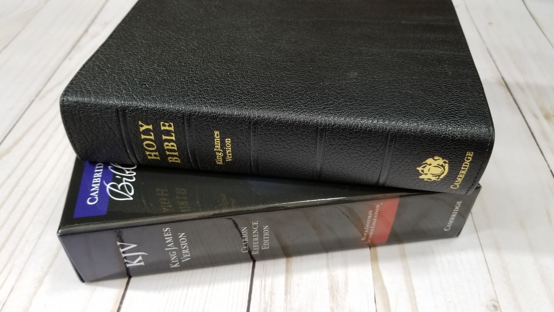
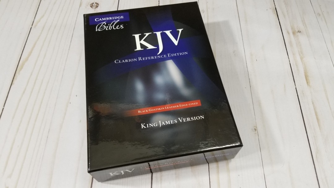
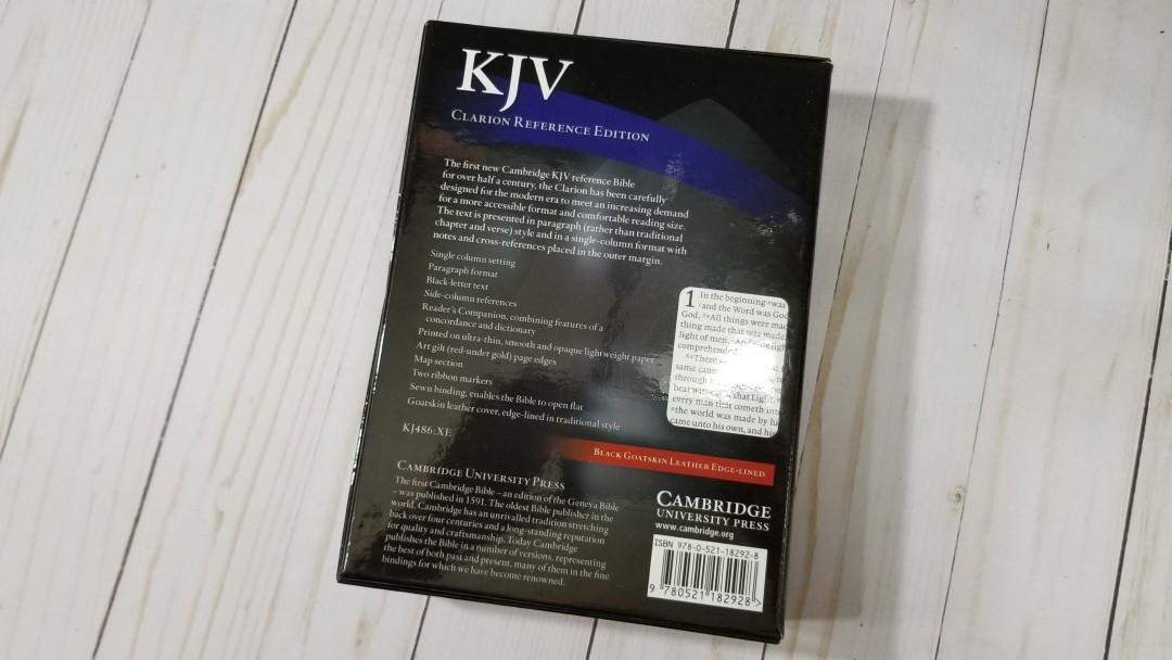
The KJV Clarion Reference Edition was Cambridge’s first new KJV design in 50 years when it released in 2011. I reviewed the brown calfskin when it released and it’s been one of my primary Bibles for the past few years. After a lot of use I kind of wanted better paper. Since then Cambridge has upgraded the paper to the Indopaque from France (at least for the goatskin model), so I had to give it a try. In this review, I’ll take a look at the goatskin edition, ISBN: 9780521182928, printed and bound in the Netherlands by Royal Jongbloed.
Cambridge provided this Bible in exchange for an honest review. I was not required to give a positive review, only an honest review. All opinions are my own.
_________________________________________________________
This book is available at (includes some affiliate links)
and many local Bible bookstores
_________________________________________________________
Video Review
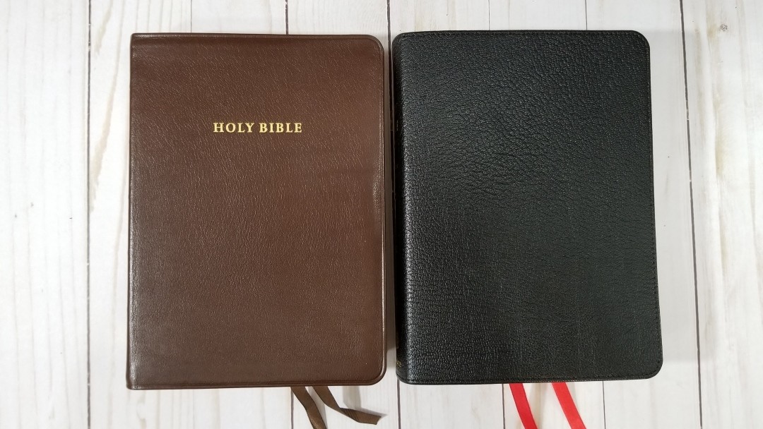
Cover and Binding
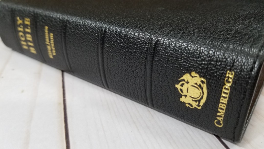
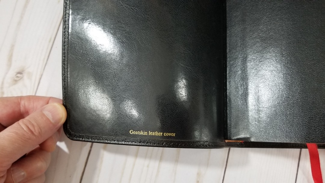
The cover is goatskin. It’s edge-lined with a synthetic liner. It has a pebbly natural grain. It has perimeter stitching. The front has no printing. The spine includes HOLY BIBLE, King James Version, the KJV seal, and the Cambridge logo printed in gold. The text-block is Smyth sewn. The edge-line tab will need to break in with some use before it will stay open in Genesis.
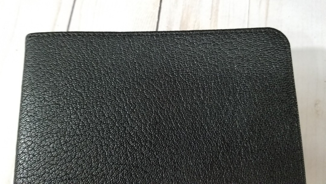
The goatskin is floppy, but I didn’t find it to be unwieldy. It is slippery though, so my usual tilting it forward with one hand to read is more difficult. When opened, the spine doesn’t rise as high as the calfskin and calf split editions; however, the difference is small. This makes the page curve a little more into the gutter and makes it easier to lose my place. It’s not that bad, though. I sometimes hold it in a way that keeps the page I’m reading flat while the other page conforms to my hand. It shifts easy and I do this without even thinking about it.
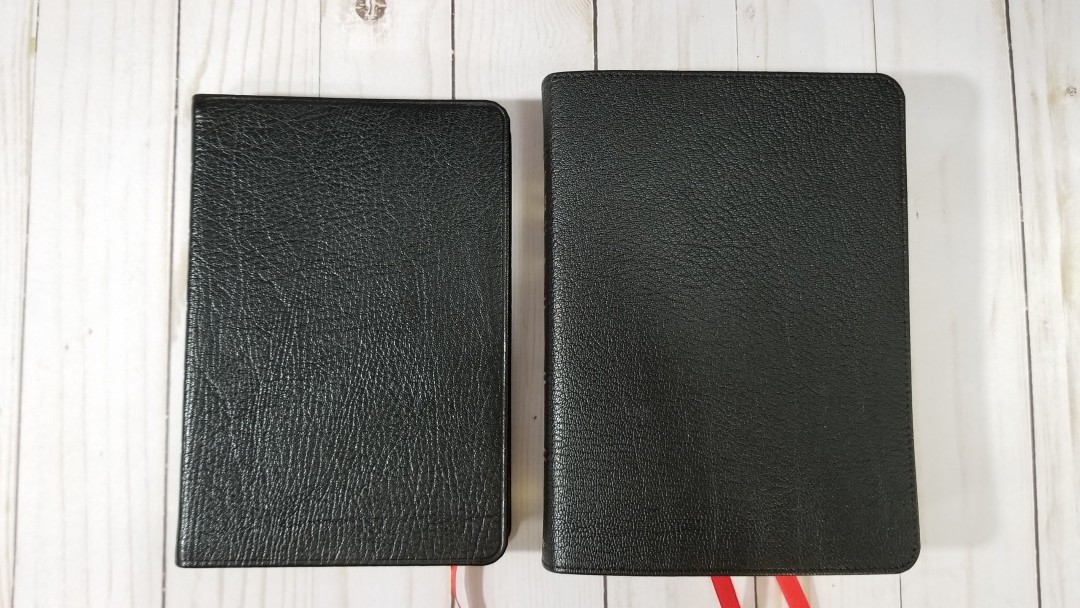
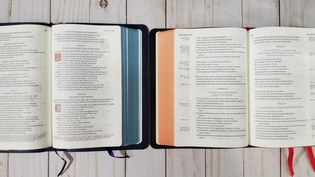
It has red and gold head/tail bands and 2 thin cardinal red ribbons. The ribbons are long enough to pull to the corner to open the page. Their width feels natural for the size of this Bible. The overall size is 5.5 x 7.5 x 1.5″ and it weighs 1lb, 12oz. The footprint and thickness feel a little chunky until you get used to it. I find that this size is great for carry and holding to read.
Paper

The paper in this edition is the 28gsm Indopaque by Papeteries du Leman, Thonon-les-Bains, France. This is the premium paper used in the Turquoise, the newer Pitt Minion editions, Schuyler Personal Size Canterbury/Quentel series, Crossway Heirloom series, and many others.

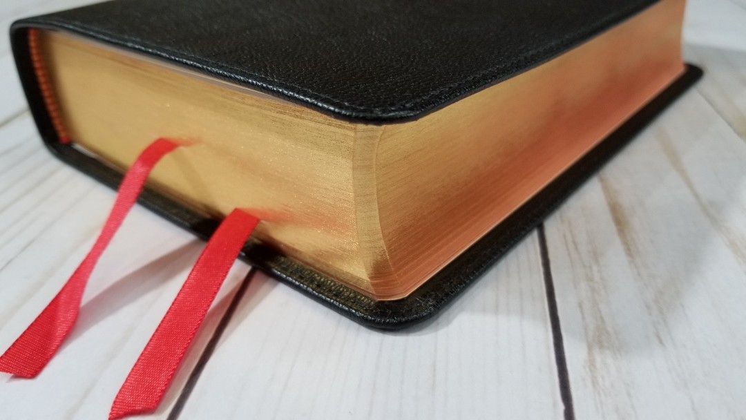
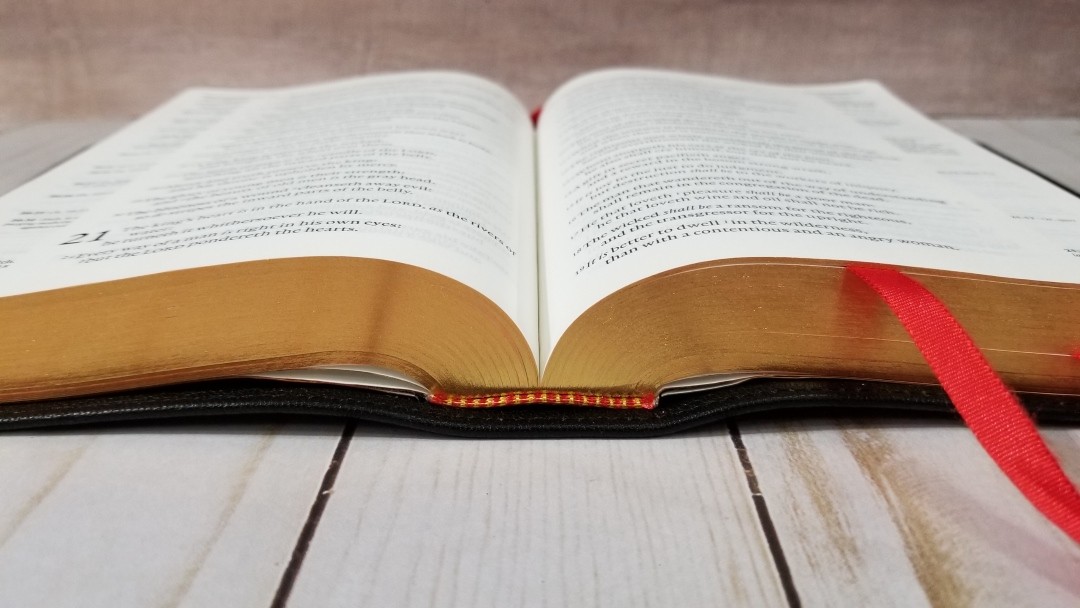
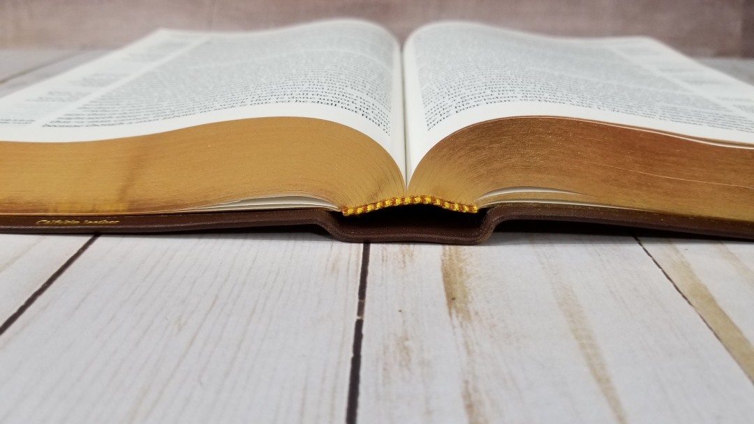
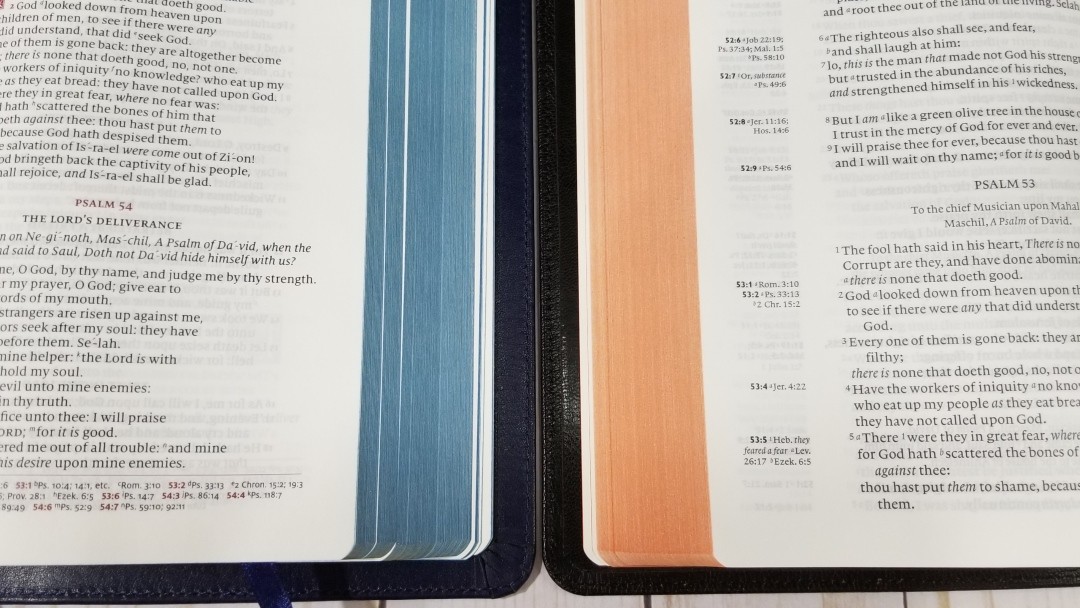
It has an ivory color and it’s very opaque for how thin it is. It has no glare under direct light. It feels elegant. It can be a touch difficult to grab a single page when it’s new, but it does get easier as you use it and I think it’s worth it to keep the size smaller. The pages are art-gilt with red under gold.
Typography
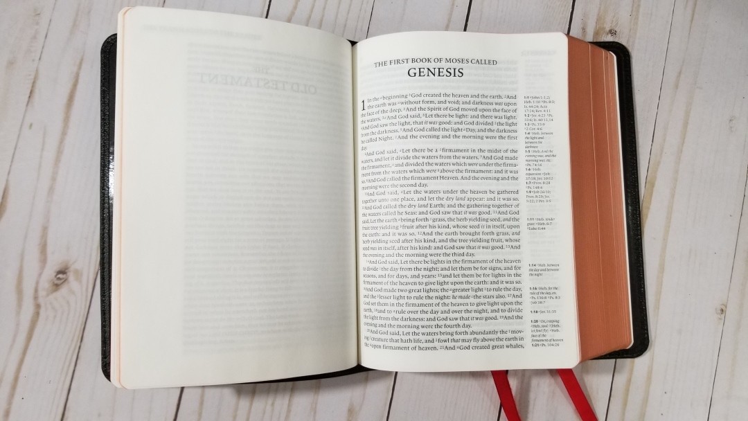
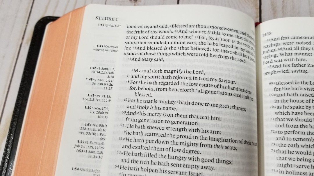
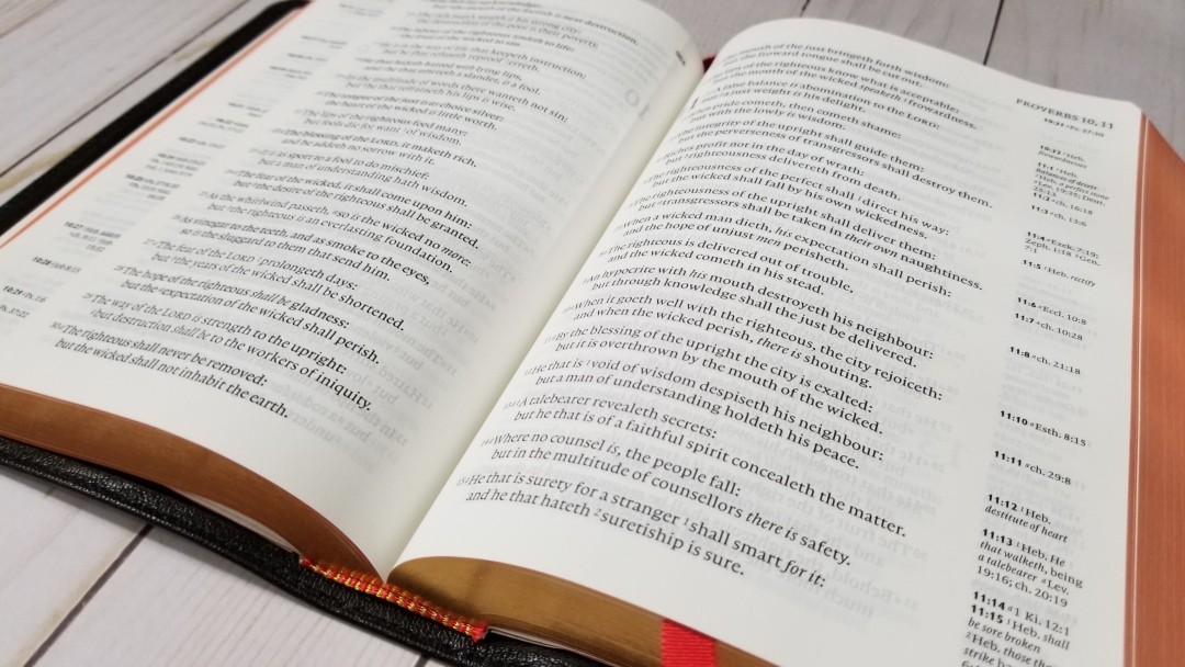
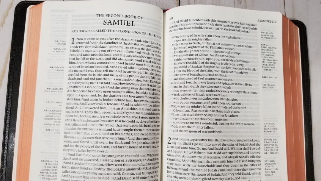
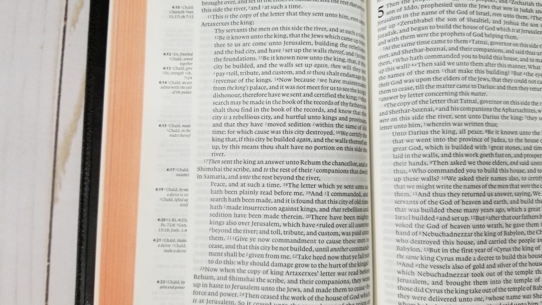
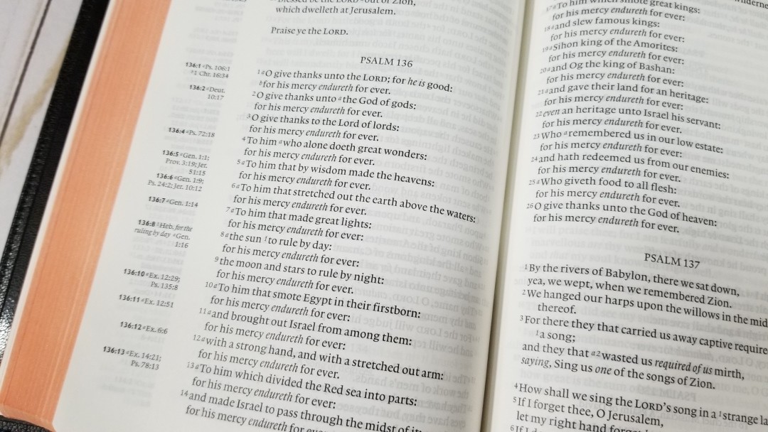
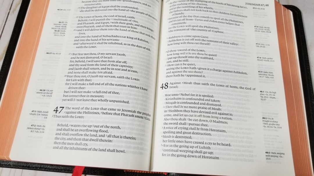
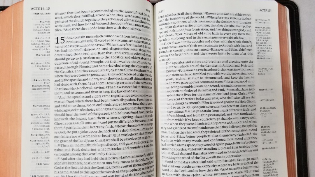
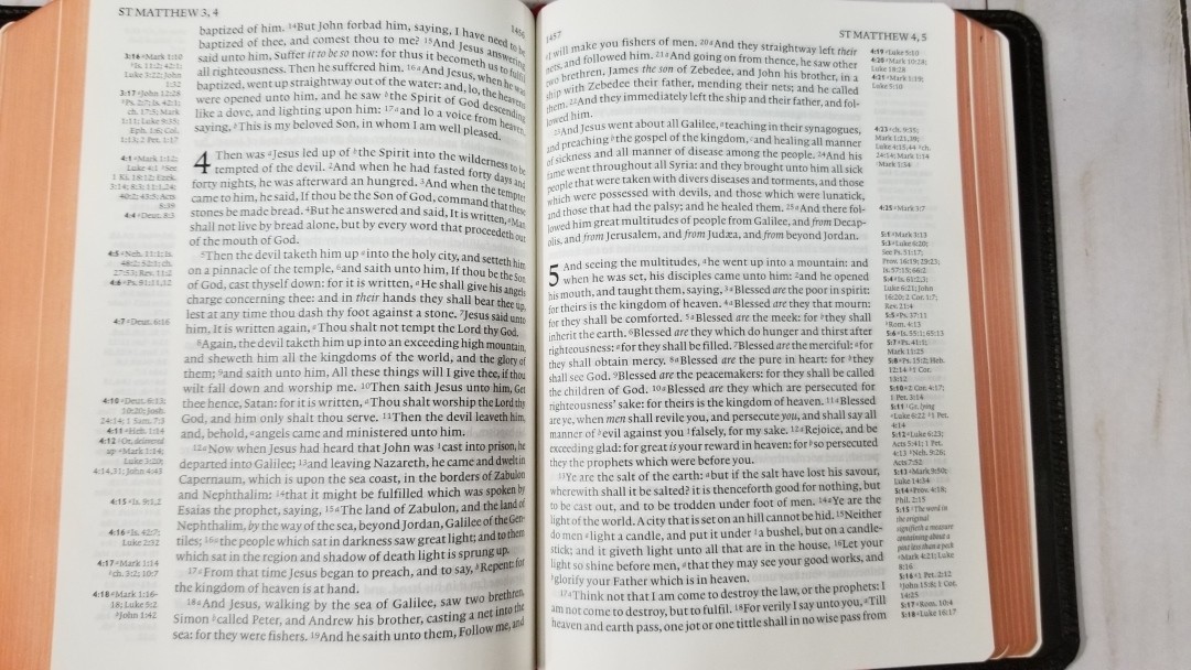
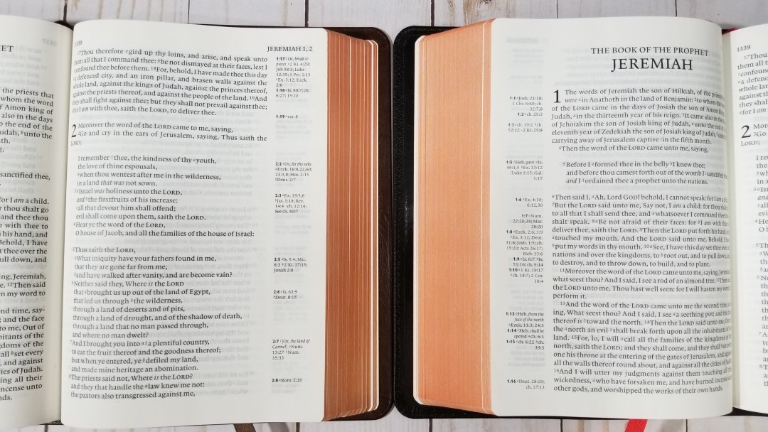
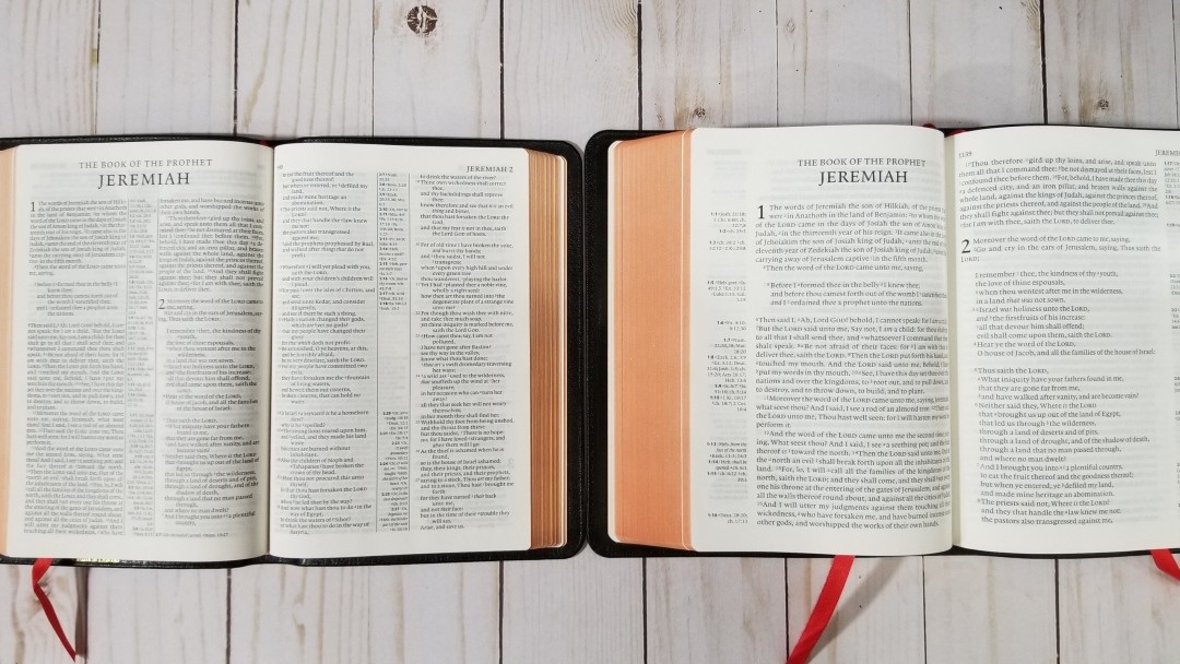
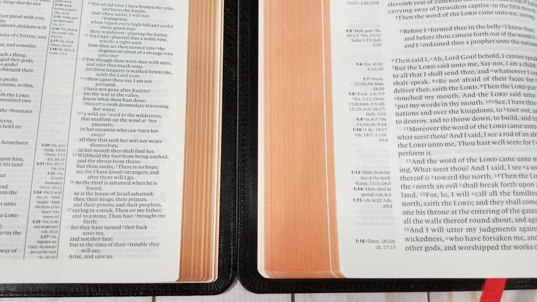
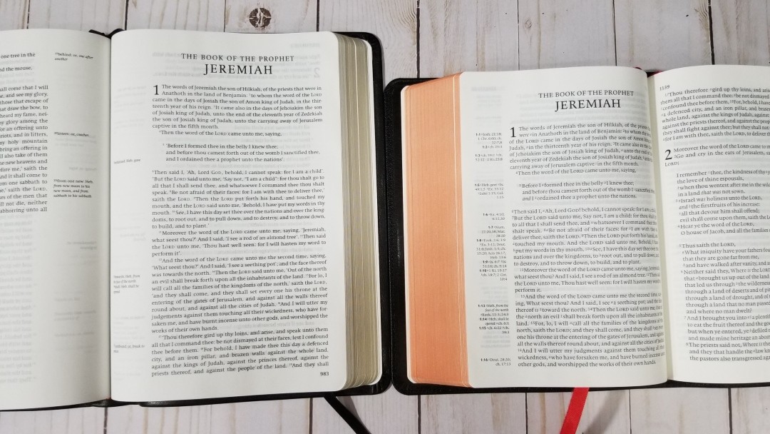
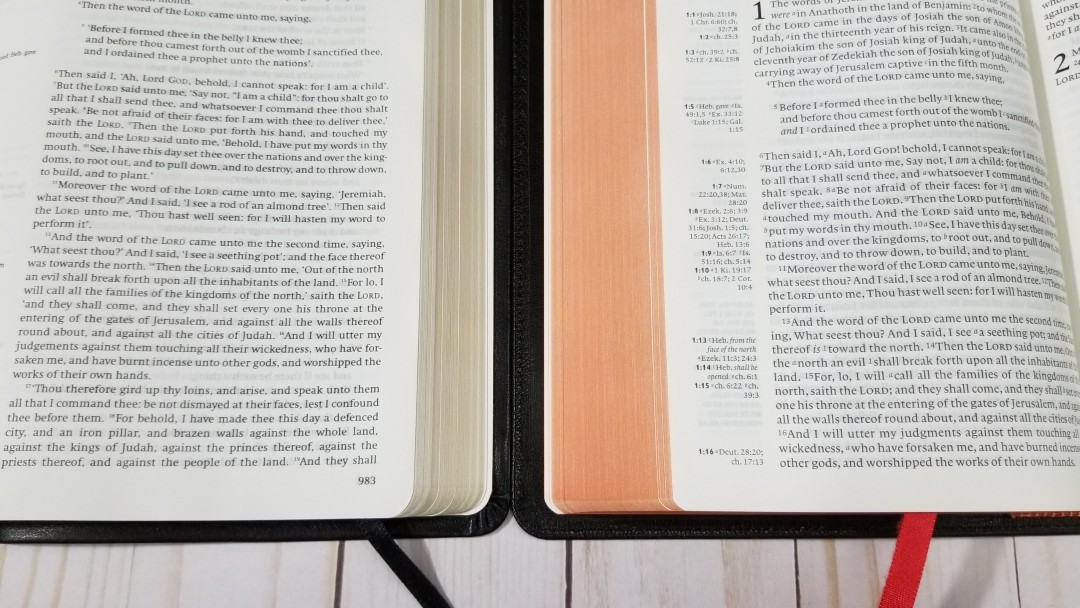
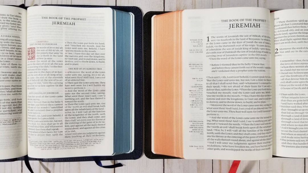
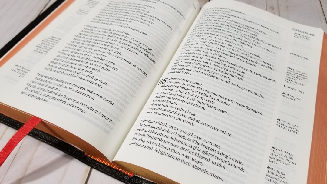
This is a single-column paragraph layout with poetry in the OT (and two places in Luke) in stanzas and letters indented. Cross-references and footnotes placed in the outer margin next to the verses they correspond to. The header includes the book name and chapter numbers in the outer margin, and the page numbers in the inner margin.
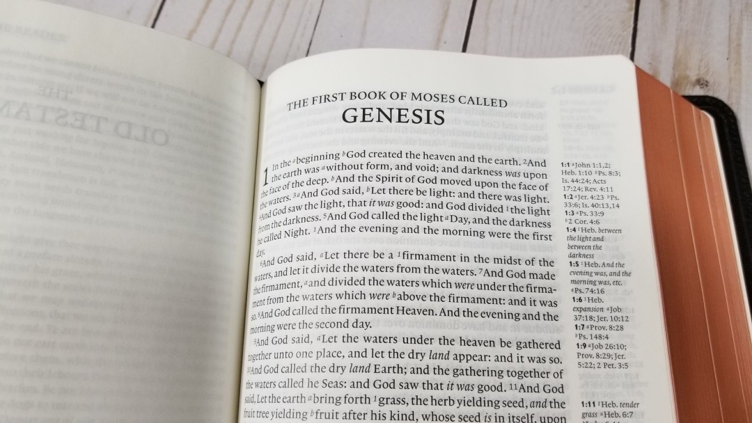
The font is 8.75 Lexicon No. 1. It was typeset by Blue Heron Bookcraft. It has a generous leading of 10.5, making the text comfortable to read. It’s a black-letter text with about a medium darkness. It’s consistent throughout. It has around 12-14 words per line. Poetry especially looks beautiful in this layout. The text also includes cross-reference and footnote keys. It has italics for supplied words, but does not have self-pronouncing marks.

It’s printed with line-matching, so the lines on both sides of the page are printed in the same location. This greatly improves readability, but if the paper has too much show-through then the text can look gray. This edition doesn’t have that problem. The paper is more opaque than my older edition and it a lot more readable. There are a couple of places, such as a few pages in Proverbs, where the line-matching could be improved.
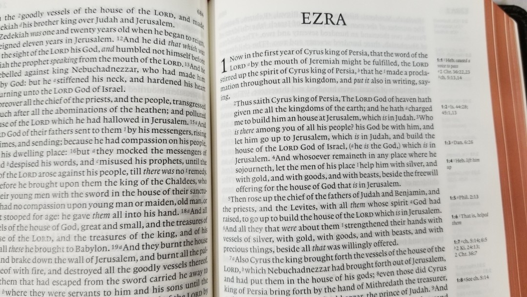
The design utilizes a text-first approach. It fixes broken sentences, regardless of verse breaks, and then adds the verse numbers back in. Verses that don’t start a new sentence begin with a small letter because they continue a sentence. The result is a readable text with beautiful prose and poetic lines for the Old Testament. I’d like to see poetry in the New Testament set in a poetic setting, but this is better than nothing. It also indents letters, so they stand apart. It doesn’t ignore chapter breaks, so it isn’t as readable as the New Cambridge Paragraph Bible, but this is still a great design for reading and referencing.
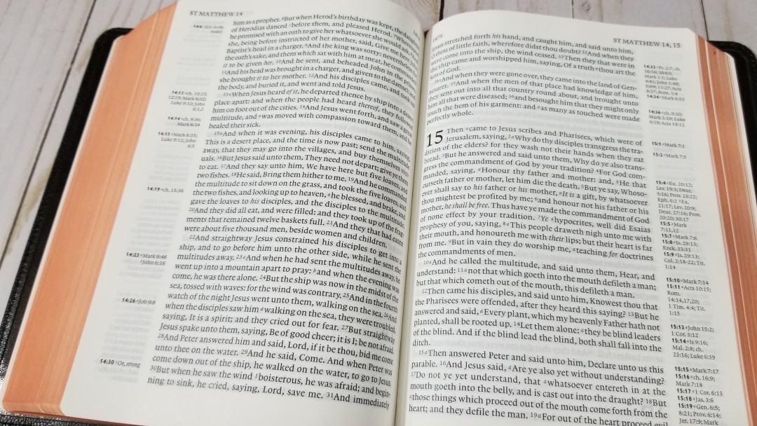
The verse numbers are light so they don’t stand out. At first, this makes the references difficult to find quickly. Then I realized that the references are printed in the margin in bold. I just look down the outer margin until I find the verse number I’m looking for and then look at the line of text next to the bold reference number. It does take an extra second to find them, but for me, it’s worth it in order to keep the text from being broken up.
References and Footnotes

It has 45,000 references from Zondervan. These are the same references as the Pitt Minion. Cross-references and translator’s footnotes are placed in the outer margin as close as possible to the verses they correspond to. The pilot verse in the margin is bold. I use this bold reference to find verses quickly in the text.
Here are some examples to help you compare:
- Genesis 1:1 – Jn. 1:1, 2; Heb 1:10; Ps 8:3; Is 44:24; Ac 17:24; Rev 4:11
- Deuteronomy 6:4 – Jn 17:3; 1 Cor 8:4, 6
- Isaiah 9:6 – ch 7:14; Lk 2:11; Jn 3:16; Mat 28:18; 1 Cor 15:25; Judg 13:18; Titus 2:13; Eph 2:14
- Matthew 17:20 – ch 21:21; Mk 11:23; Lk 17:6; 1 Cor 12:9; 13:2
- Mark 11:23 – Mat 17:20; 21:21; Lk 17:6
- Mark 12:29 – Dt 6:4; Lk 10:27
- John 1:1 – Pr 8:22; 1 Jn 1:1; Pr 8:30; ch 17:5; 1 Jn 5:7
- Acts 2:38 – Lk 24:47; ch 3:19
- 1 John 1:1 – Jn 1:1; 14; 2 Pet 1:16; Lk 24:39; Jn 20:27
Reader’s Companion
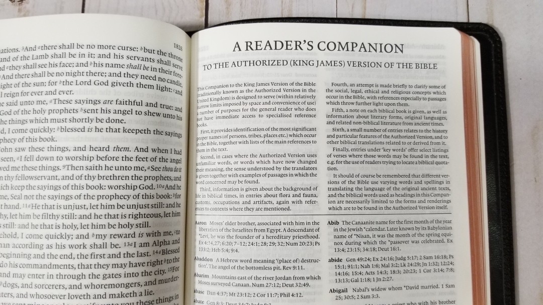
Rather than a concordance and a separate glossary or dictionary (like the Concord, which has all three), the Clarion combines them into one resource called the Reader’s Companion. It provides entries, gives definitions and explanations, and lists references. Unlike a standard concordance, the references do not include a portion of the verse.
It covers significant names, unfamiliar words, words that have changed in meaning, backgrounds of biblical times, concepts, biblical books, history, and keywords. They also include suggestions for similar keywords.
I like most of the content in this resource and I’m glad it’s included. I especially like the updated words. It does have a few entries that are controversial. For example, it mentions that 2nd Peter may have been writing by someone else in the first half of the second century. Even though I personally disagree with this point, I think most of the content is good and worth using. I think it’s like any study Bible where the good parts outweigh the bad. And, just like any study Bible, it’s useful for reference.
Here are a few example entries with the number of references to help you compare:
- Christ (see also anoint, Jesus Christ) – 15
- Christian – 3
- Faith – 26
- Faithful, Faithfulness – 31
- God (see also Almighty, Immanuel, Jehovah, Lord) – 37, as creator 2, as father 3, Eternal 1, Glorious 1, Inscrutable 1, Jealous 2, Just 1, Loving 2, Merciful 1, Omnipotent 1, Unique 2, His name 4
- Goddess (see also Ashteroth) – 3
- Godly, Godliness – 8
- Gods (see also Baal, Chemosh, Dagan, devil, idol, Molech, etc.) – 21
- Praise (see also Aleluia) – 30
- Pray, Prayer – 51
Maps
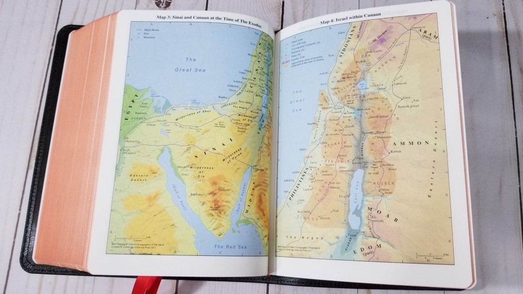
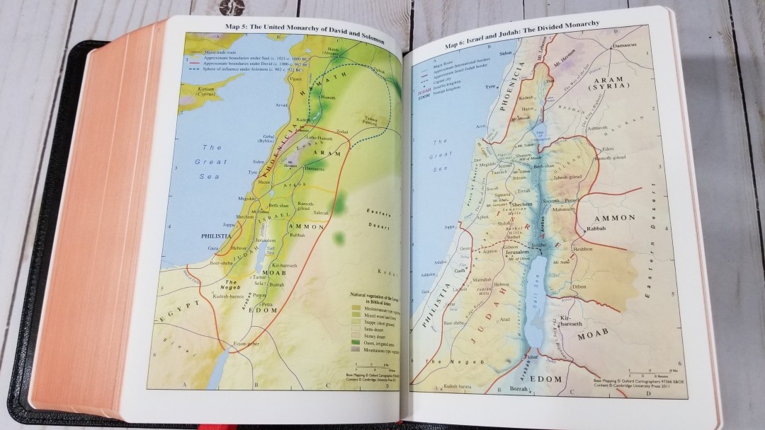
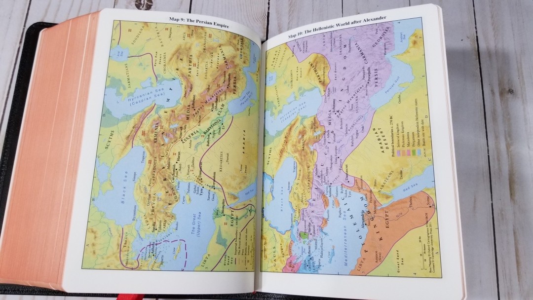
In the back are 15 pages of maps on thick, non-glossy, paper. The maps are bright and colorful, but not as colorful as the Turquoise, but they are the same maps. They include borders, import commodities, dates, routes, passes, settlements, distance, topography, mountains, cities of refuge, cities, tribes, vegetation, kingdoms, battle sites, satrapy, cities walls, city gates, older city walls, seven Churches of Asia, etc.
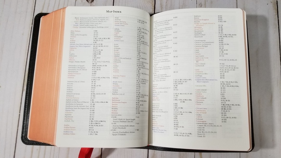
It also has an 8-page color-coded index to maps. The color-code identifies settlements, political (nations, provinces, and regions), physical land, physical water, travel, and Jerusalem. I’m glad it includes the index. I find the Cambridge color-coded index to be one of the best available.
Maps include:
- The Ancient Near East in the Late Bronze Age
- Regions of Palestine and Surrounding Areas
- Sinai and Canaan at the Time of the Exodus
- Israel within Canaan
- The United Monarchy of David and Solomon
- Israel and Judah: The Divided Monarchy
- The Assyrian Empire
- The Babylonian Empire
- The Persian Empire
- The Hellenistic World after Alexander
- Jerusalem in Old Testament Times
- Jerusalem in New Testament Times
- Palestine in New Testament Times
- The Roman Empire
- The Eastern Mediterranean in the First Century AD
Comparisons
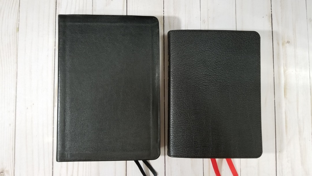
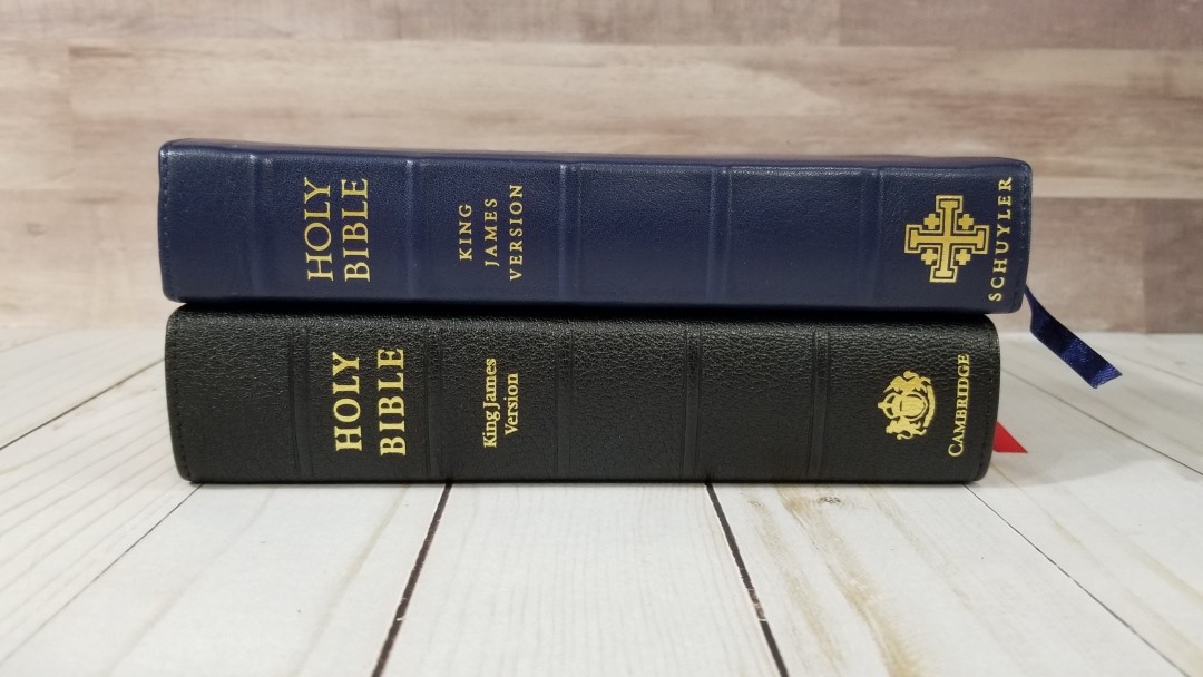
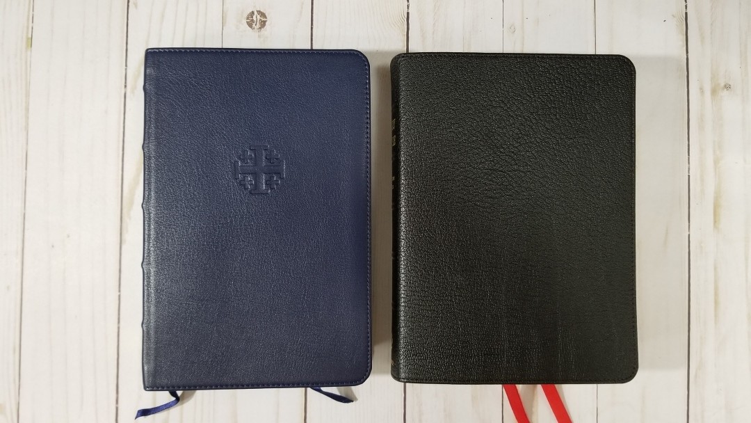
Here’s a look at how the Clarion compares with the calfskin Clarion, Pitt Minion, Personal Size New Cambridge Paragraph Bible, and the Personal Size Canterbury. The goatskin Clarion is on the right.
Calfskin Clarion
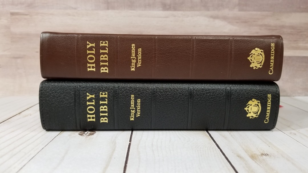


The paper in the calfskin KJV Clarion isn’t as nice as the goatskin. The cover is easier to hold, but I like the paper enough to make the switch.
Pitt Minion


The KJV Pitt Minion has close to the same footprint, but it’s half the thickness. It has a really nice two-column layout and includes a paragraph setting with poetry and letters identified. It also has the same references, Reader’s Companion, and maps. The font is 6.75 and is red-letter through Revelation. This is an excellent Bible for anyone that can read the smaller print.
Personal Size New Cambridge Paragraph Bible
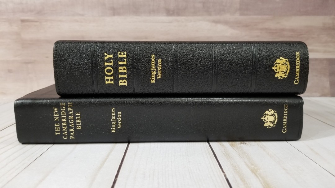
The Personal Size New Cambridge Paragraph Bible is taller and thinner, but it doesn’t include references, concordance, or maps. The font design reads slightly smaller. The paper is slightly thicker. It does include the translator’s footnotes, which are placed in the inner column. This brings the text to the flat part of the page. Unlike the Clarion, it even fixes paragraphs and sentences through chapter breaks. It’s available with or without the Apocrypha, and in calfskin, hardcover, and paperback.
Personal Size Canterbury
I included the Personal Size Canterbury because they have a similar size and both use digital fonts. The Canterbury is verse-by-verse in double-columns, single-column Psalms, places the footnotes at the bottom, and is thinner than the Clarion. It does have a glossary and maps but not a map index or concordance.
Conclusion
I love the Clarion’s design. It presents the most poetic translation in a poetic setting, while still providing a reference system that’s easy to use in a Bible that’s easy to carry. It does this without making the text tiny. Poetry looks like poetry and letters look like letters. I’d like to see more poetry formatting added to the New Testament. The construction and materials are high-quality. I do prefer holding the calfskin rather than the goatskin, and I like that the calfskin lets the spine rise up in the center when opened allowing the page to lay flatter. Even with this preference, I like the paper enough better in this edition that I’m willing to use the goatskin instead.
The Cambridge KJV Clarion is the best compromise between a reference Bible and a reading Bible in the King James Version that I’ve seen. The focus is on readability first, and then the verse numbers and references are added rather than the text being secondary to the referencing apparatus. The second best is the Pitt Minion, which uses the same references and Reader’s Companion. Its reference placement doesn’t help in finding the verses and it’s poetic layout breaks the poetic lines where it’s convenient for printing rather than a poetic stanza.
The KJV Clarion Reference Bible is one of my all-time favorite KJVs and I recommend it, especially the goatskin edition with the better paper, to anyone interested in a hand-size KJV in paragraph.
_________________________________________________________
This book is available at (includes some affiliate links)
and many local Bible bookstores
_________________________________________________________
Cambridge provided this Bible in exchange for an honest review. I was not required to give a positive review, only an honest review. All opinions are my own.


Hello, thank you for the excellent review and comparisons.
Do all the goatskin KJV Clarions have the upgraded paper? I have a goatskin KJV Clarion with the same ISBN number but I’m not sure if it has the indopaque paper or not. I am curious if there is a way to tell a difference between the old paper and new paper versions. Thank you!
Hi Benjamin. The older editions didn’t have the upgraded paper. I’m not sure when they changed to it and I don’t think it’s not marked in any way. The Indopaque feels smooth to the touch. The older paper was slightly rough.
“Maps include:
Regions of Palestine and Surrounding Areas
Palestine in New Testament Times”
Are these Bible maps? Can someone show me where in the Bible that Israel is ever called “Palestine”? I find “Israel” 2568 times; “Palestine” 0.
It looks like Cambridge is supporting Islam. This needs to be corrected along with the Reader’s Companion on 2 Peter.
(2 Pet. 1:1, 3:1) “Simon Peter, a servant and an apostle of Jesus Christ….This second epistle, beloved, I now write unto you”
I don’t know how much more Peter could have given us to authenticate his own second letter, or what exactly Cambridge needs to believe the bible.
“Things to do” for the editors at Cambridge: 1. Get saved 2. Actually read the Bible before you make ridiculous false suppositions for the so-called Reader’s Companion.
Any and all other entries denying authorship and plain Scriptural evidence should also be revised ASAP.
You mentioned in your NASB Clarion brown calfskin review last year that it has 28 gsm paper. Is it the Indopaque? If not, how do the papers compare?
Hi Denise. I can’t say for sure if it is Indopaque. When I compare these two side-by-side the NASB has a little more cream color and it’s just barely rougher to the touch. I’m not sure I’d notice the difference if I didn’t have them next to each other. The opacity seems to be the same. It could just be from a different lot. They’re close enough that I’d be happy with either one.
I’m trying to determine if the paper upgrade in the goatskin Clarion KJV (and the goatskin Clarion ESV) has made it to the NASBs, particularly the brown calfskin. If it hasn’t, but it’s coming, I’ll wait to buy one. Does your Clarion NASB mention the paper coming from France? And is the paper better than in your calfskin Clarion KJV?
Thanks for your time. I enjoy reading your Bible reviews; very helpful!
It doesn’t say where it’s from. It’s by far better than my calfskin KJV. I could be convinced it’s Indopaque. It’s possible the goatskin has it even if the calfskin doesn’t. Unfortunately, I haven’t seen it to compare them. I’m glad you like the reviews!
I want a red-letter edition with 36-38 gsm paper.
I contacted Cambridge about the Bible maps and Reader’s Companion. Here was their astonishing reply:
“The detail in the maps in our Bibles (and with most Bibles) is created discretionarily and drafted to appeal to as many customers as possible. Though, we cannot guarantee consideration of future changes, we appreciate your giving us the feedback. If my colleagues, who I have sent the comments to, feel the need to follow up with you, they will.”
Translation: “We here at Cambridge don’t care what the Bible says. Never mind the fact that Israel is never called Palestine in the Bible. Never mind Peter clearly identifying himself and explicitly stating it’s his second epistle. We aren’t going to change anything. Don’t contact us again, we’ll contact you — Cambridge”
Cambridge are notoriously snobbish – I still like their bibles as they are much cheaper than Schuyler and more varied than Allan – but they certainly aren’t as high a quality as either Allan nor Schuyler.
I just like to mock them every now and again with an email. As long as you are polite you can slide some little digs in there hehehe!
You can also copy and paste their replies on Facebook and YouTube
I agree somewhat with Magneto though without the slightly caustic spite!
Have you preached much from this bible? And if so, do you like preaching from it and what are some of the pros and cons? Thanks
Hi Justin. Yes, I’ve preached from this a lot. I like it. If I had to choose just one Bible, this might be it.
For preaching, pros would include seeing the context as actual paragraphs, recognizing the types of text at a glance, finding verses quickly by using the verse numbers in the margin, having all of the references and footnotes next to the verses they correspond to, having access to a dictionary/concordance in the back, and the overall size is perfect for any pulpit.
Cons would include the font size being at the bottom of my preferred size and having to follow the text with my finger as I read so I don’t loose which line I’m on.