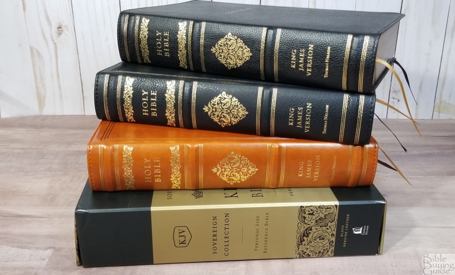
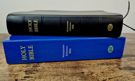
The Thomas Nelson Sovereign Collection was designed to provide elegant designs and higher-quality materials at low to mid-range prices. Similar to the Schuyler Canterbury, the Sovereign Collection blends classic and modern design elements that present the King James Version in an interesting format that’s both elegant and usable. The Sovereign Collection is available in multiple cover styles. In this review, I’m looking at three editions: one in genuine leather and two in imitation leather. All are made in China.
Thomas Nelson provided these Bibles in exchange for an honest review. I was not required to give a positive review, only an honest one. All opinions are my own.
_________________________________________________________
This Bible is available at (includes some affiliate links)
and many local Bible bookstores
_________________________________________________________
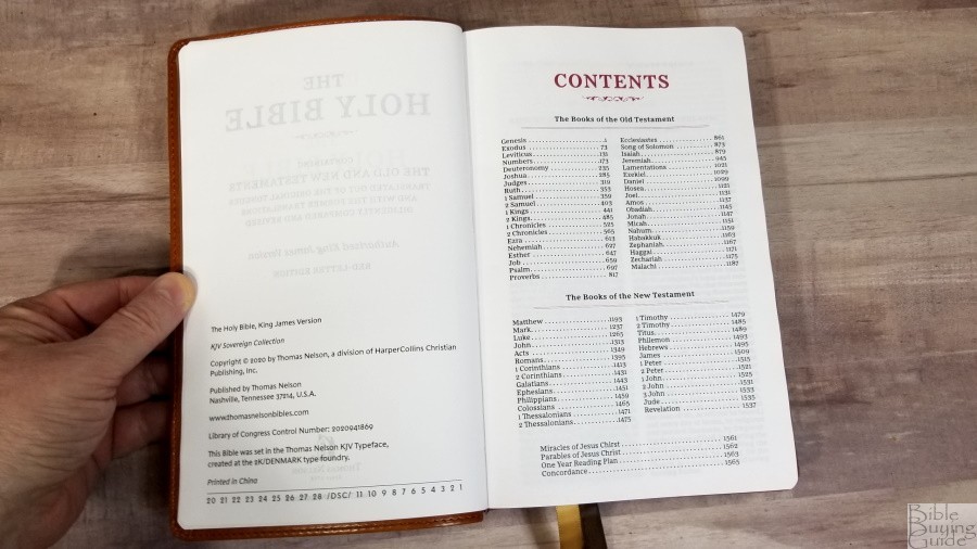
Table of Contents
- Video Review
- Binding
- Paper
- Typography and Layout
- References
- Book Introductions
- Extras
- Concordance
- Maps
- Comparisons
- Conclusion
Video Review
Binding
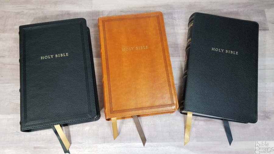
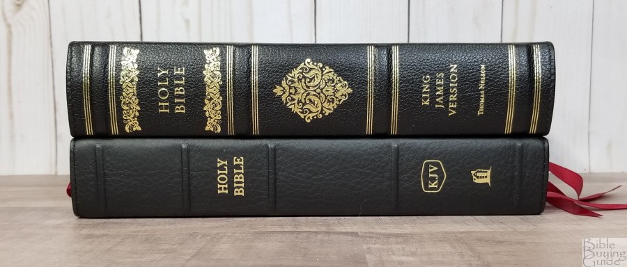
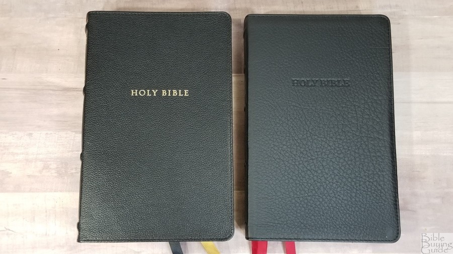
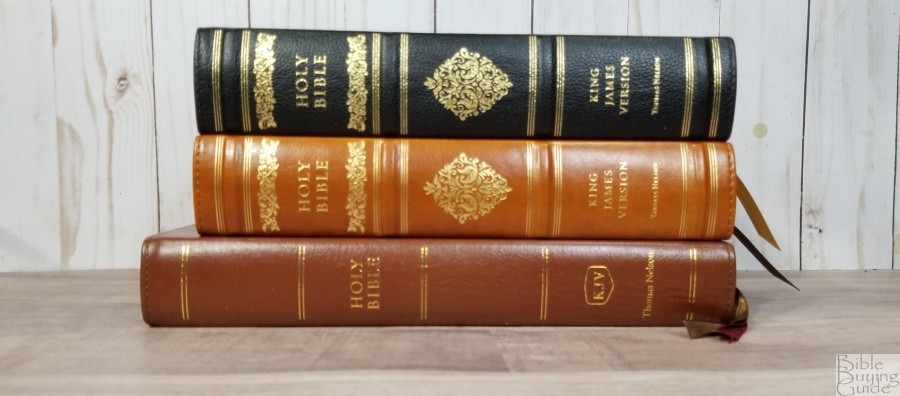
The Thomas Nelson KJV Sovereign Collection is available in genuine leather and Leathersoft. I’m reviewing back genuine leather, black Leathersoft, and brown Leathersoft.
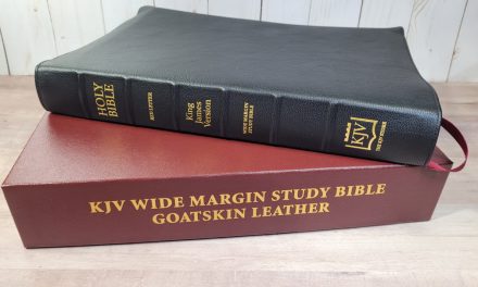
Genuine Leather
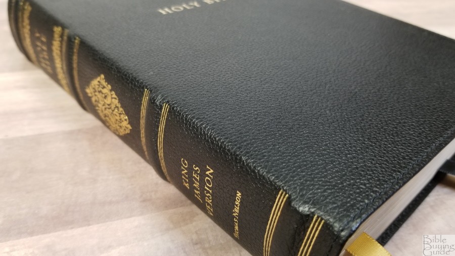
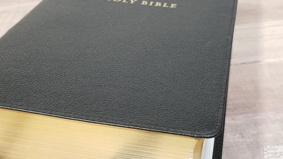
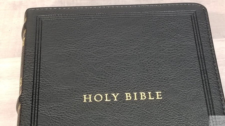
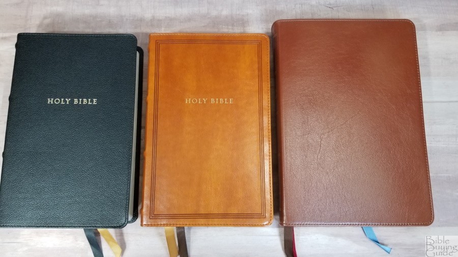
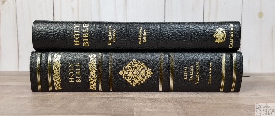
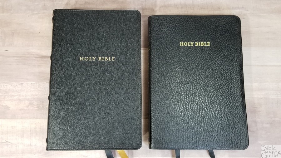
The black genuine leather has a pebbly grain that looks and feels elegant. It has perimeter stitching. The front includes Holy Bible printed in gold. The spine has 4 thick raised hubs with gold at the top of the bottom of each hub. A fancy decoration is printed above and below Holy Bible and a diamond decoration is printed in the center in gold.
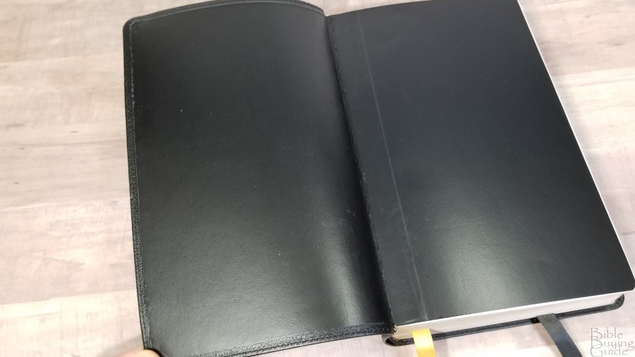
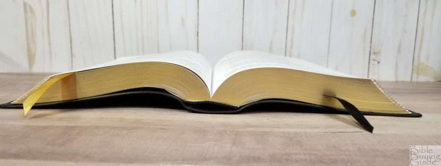
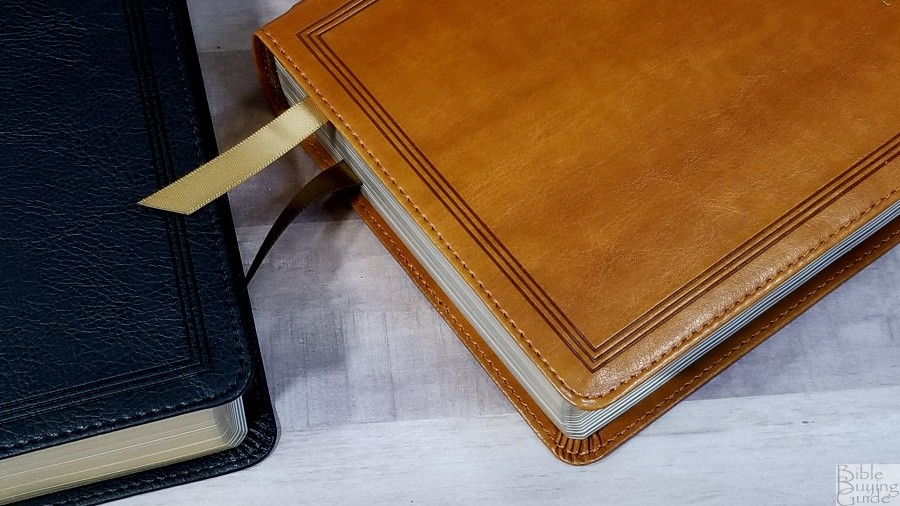
The liner is edge-lined imitation leather. It’s flexible but not floppy. It’s sewn. The edge-lined tab is a touch stiff, so it will need to be broken in well before it will stay open in Genesis. It has black head/tail bands and two thick double-sided ribbons: 1 gold and 1 black. The overall size is and it weighs 2 lbs, 4.7 oz.
It comes in a one-piece box that’s black on the inside.
Leathersoft
Both imitation editions have a few things in common and a few differences. Both have perimeter stitching. The front and back include three lines debossed around the edges. On the front is Holy Bible printed in gold. The spine has 4 thick raised hubs with gold at the top of the bottom of each hub. A fancy decoration is printed above and below Holy Bible and a diamond decoration is printed in the center in gold. Both are sewn and will need to be used a little bit before they’ll stay open in Genesis. Their overall size is 5.75 x 8.8 x 1.5″ and they weigh 2 lbs, 3.1 oz.
Black Leathersoft

The black Leathersoft mimics goatskin. It’s imitation leather, but the outer shell doesn’t look or feel like imitation leather. It has a grain that looks like natural goatskin. I think most people would assume it was leather just by looking at it.
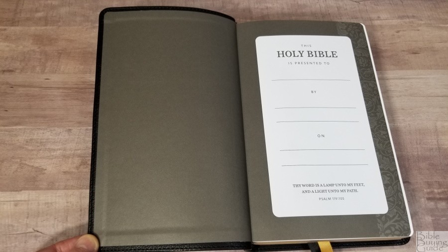
It has a dark gray pasted paper liner that works as the presentation page. The back end sheet has a floral decoration down the outer edge. It includes black head/tail bands and two thick double-sided ribbons: 1 gold and 1 black.
Brown Leathersoft

The brown Leathersoft has a smooth grain. It looks like a carmelized tan. It has a little bit of visual and tactile texture that draws me to it. You can tell that it’s imitation leather, but it looks elegant for imitation.
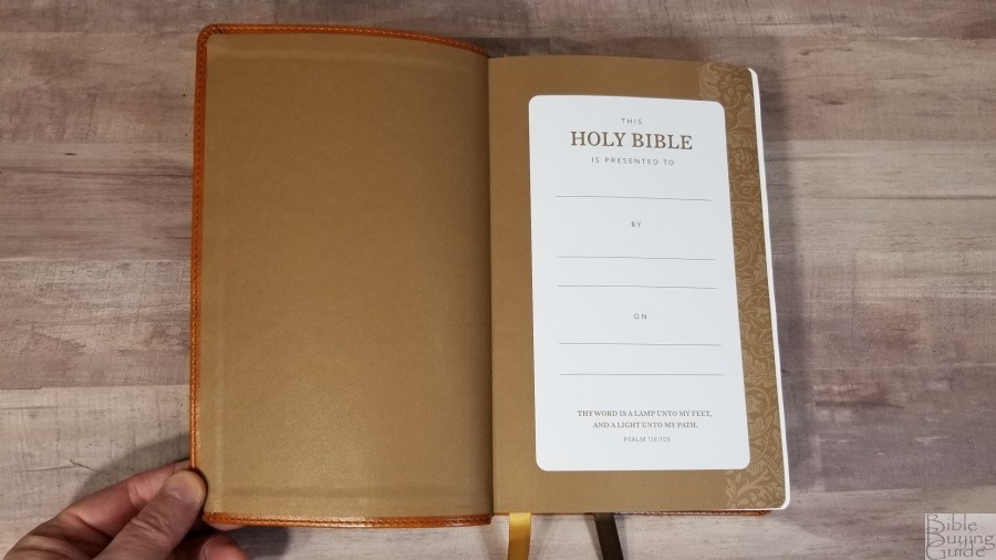
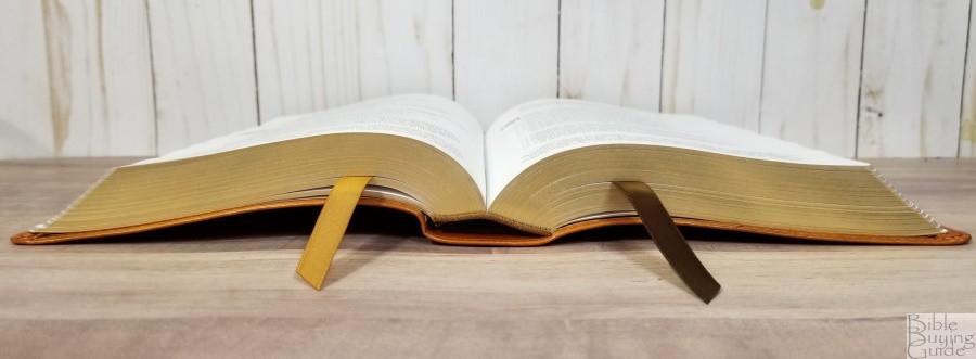
It has a brown pasted paper liner that works as the presentation page. The back end sheet has a floral decoration down the outer edge. It includes brown head/tail bands and two thick double-sided ribbons: 1 gold and 1 brown.
Paper
The paper is 36gsm. It’s white in color and it’s highly opaque. It has a rough texture that I find to be easy to turn. This isn’t a premium paper like the paper found in the Premier Collection editions, but it’s an excellent paper for this price-point. It’s similar to the paper in the Preaching Bible, but it has a rougher texture. I prefer this paper to that used in the thinline editions.
Typography and Layout
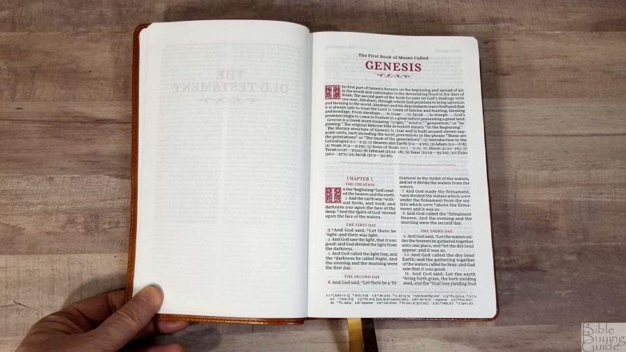
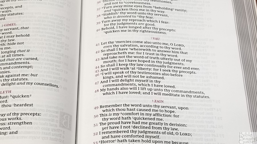
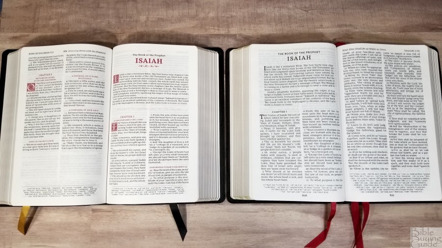
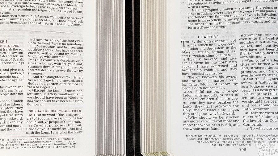
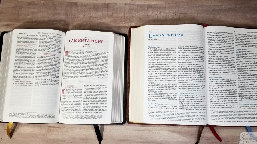
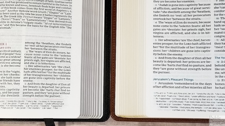
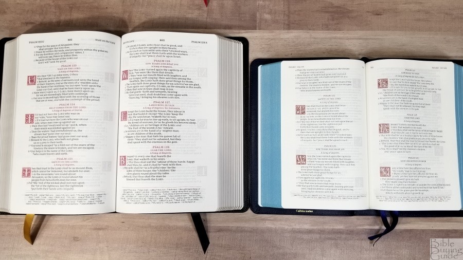
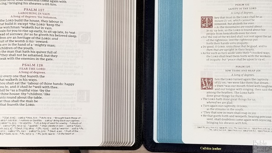
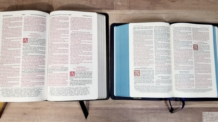
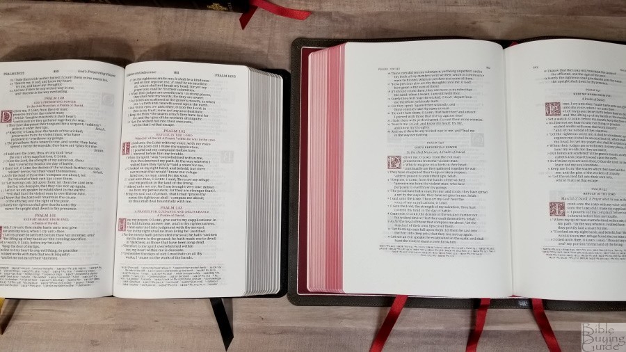
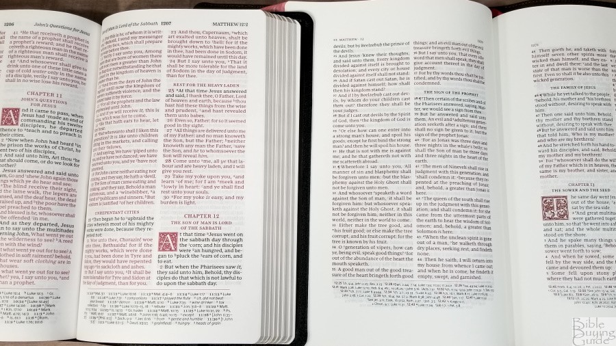
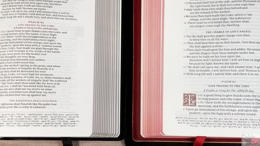
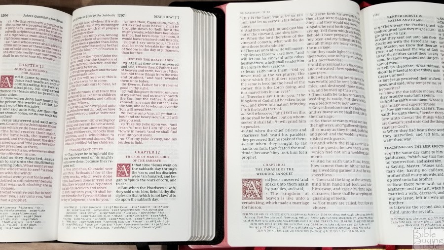
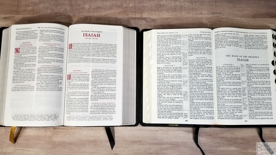
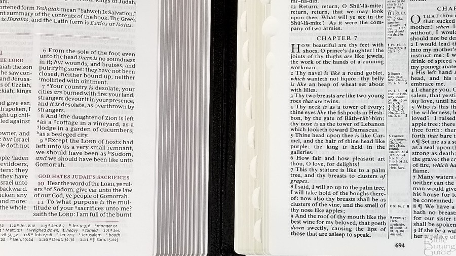
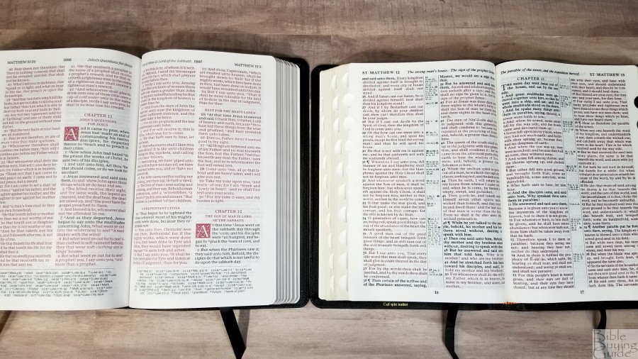
The text in the Sovereign Collection is presented in a double-column, verse-by-verse format with poetry set in a single column in stanzas. Cross-references, translation footnotes, and a glossary are placed in a single column in the footer. The header shows the book name, chapter, and verse number in the outer margin, the page number in the center, and a page summary in the inner margin. This and the Thomas Nelson Personal Size Giant Print Deluxe Reference Bible are the only editions that I’ve seen that includes both section headings and page summaries. Highlights in the text are in red. The layout closely follows the design of the Schuyler Canterbury.
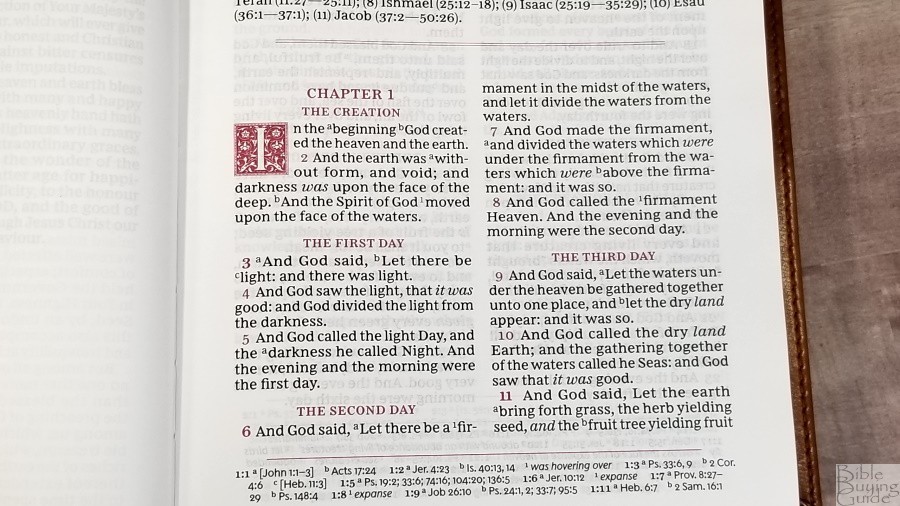
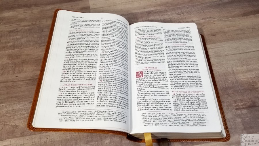
The font is 9.5-point Comfort Print designed for the Thomas Nelson KJV by 2K/Denmark. It’s printed with line-matching. This means the lines of text are printed in the same location on both sides of the page to improve readability. Paragraphs are marked with bold verse numbers.

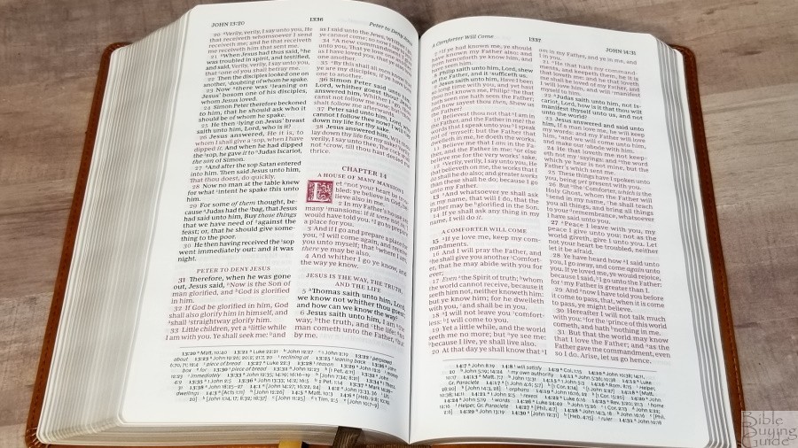
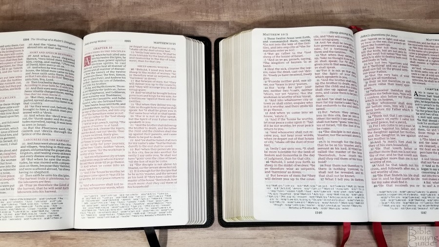
It has between 6-8 words per line on average. This is a red-letter edition. The black and red are highly consistent throughout. The red is about a medium/dark in darkness. The text looks lighter than the section headings and drop-caps. I think the darker highlights are semi-bold. Also, the drop-caps have a lot more ink, so that adds to the darkness. It has a wide enough inner margin to bring the text out of the bend. It does bend into the gutter a little, but it isn’t bad.
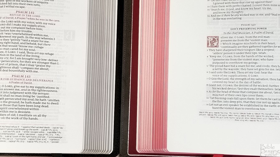
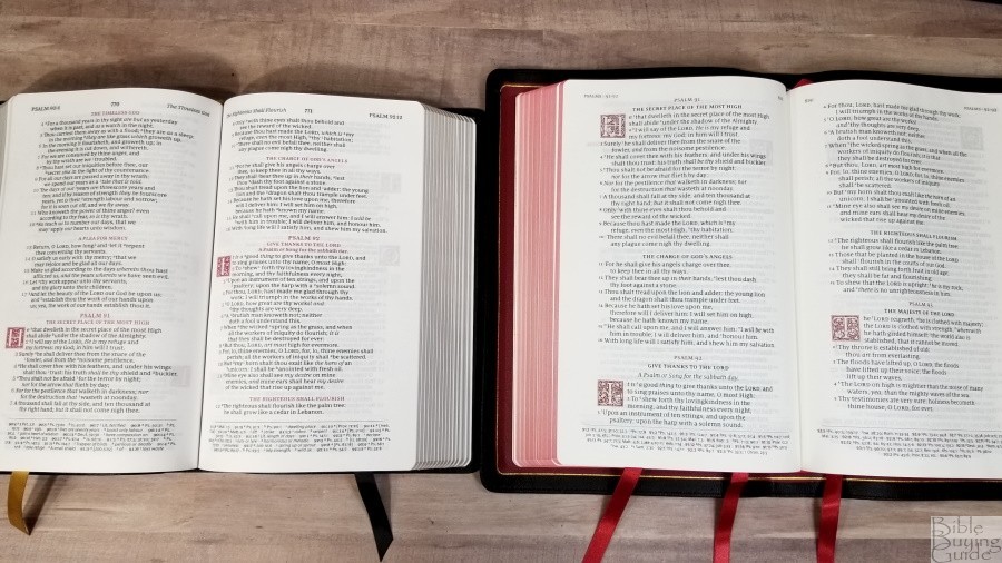
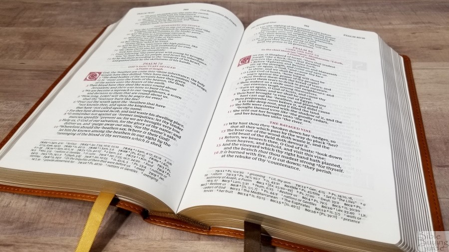
Psalms and Proverbs
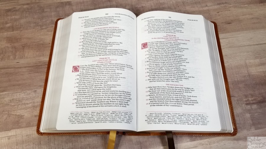


Psalms and Proverbs are in a single column with each poetic line divided into stanzas. This is highly readable and looks much better than verse-by-verse with no formatting. The drop-caps are placed to the left of the text so the text doesn’t indent too far. This keeps it uniform. It’s good to see some of the poetry placed in a different setting from the rest of the text. I’d like to see special formatting applied to all poetry throughout the Bible to keep it from blending in and its impact getting lost in the formatting. I’d also like to see formatting applied to personal letters like those in Ezra or Acts.
References and Footnotes
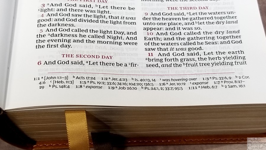
Cross-references are placed in the footer in a single column. References and footnotes are mixed together.
It has fewer references than many of the other reference editions from Thomas Nelson. The references and footnotes match the Personal Size Deluxe Reference Bible. It has enough for simple study, but you’ll need other resources for deeper study.
Here are a few example references to help you compare:
- Genesis 1:1 – Jn 1:1-3, Ac 17:24
- Deuteronomy 6:4 – 1 Cor 8:4, 6
- Isaiah 9:6 – Lk 2:11, Jn 3:16, Mt 28:18, Jd 13:18, Titus 2:13, Eph 2:14
- Matthew 28:19 – Mk 16:15; Lk 24:47
- Mark 12:29 – Dt 6:4, 5
- John 1:1 – 1 Jn 1:1, Rev 19:13, Jn 17:5, 1 Jn 5:20
- John 3:16 – Rom 5:8; Is 9:6
- Acts 2:38 – Lk 24:47
- Romans 10:9 – Lk 12:8
- 1 John 1:1 – Jn 1:1, 14, 2 Pet 1:16, Lk 24:39, Jn 1:1, 4, 14
Book Introductions

Each book has a short, 2-3 paragraph introduction. They include a short overview of the book, discuss the main characters, give insights into the book’s name, and include a simple outline with references to the major portions of the book. Some have a sentence about the author or other features of the book. Book introductions are short and concise. This keeps them from getting in the way while providing enough information to be helpful.
Extras
In the back are a few extras for reading and study.
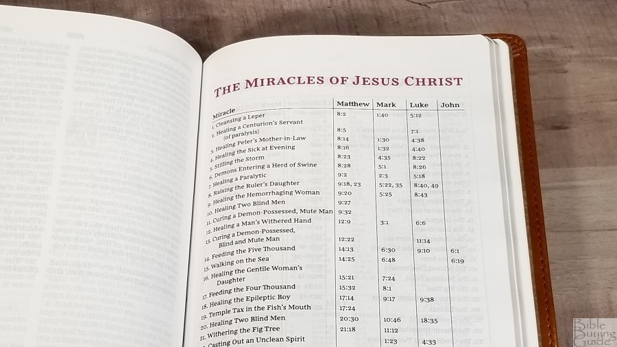
Miracles of Jesus – A one-page table with 37 miracles with lists of references for each of the Gospels.
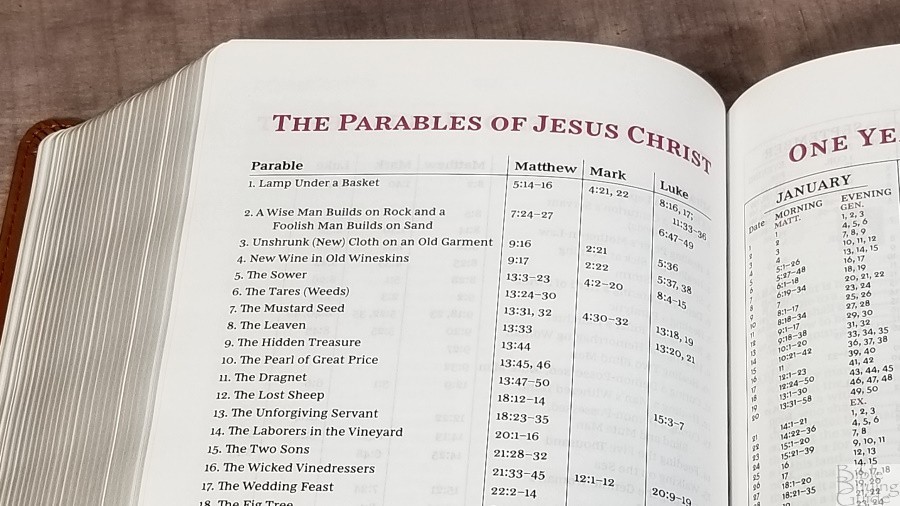
Parables of Jesus – A table with 39 parables that lists the verses where they appear in the Gospels.
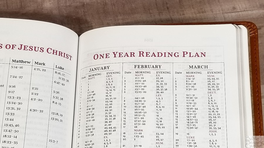
One Year Reading Plan – A 2-page reading plan with the month, date, and reading for each day. It includes 2 readings per day to take you through the Old and New Testaments every day.
Concordance

The concordance is 120 pages with 2 columns per page. It includes the decorative drop-caps and the entries are in red. It doesn’t include names (with the exception of Jesus, which has 3 entries), but it does have a decent amount of references for study. Here are a few example entries with their number of references to help you compare:
- Christ – 18
- Christian – 3
- Faith – 96
- Faithful – 41
- Faithfully – 1
- Faithfulness – 4
- Faithless – 3
- God – 56
- Godhead – 3
- Godliness – 8
- Godly – 11
- Praise(n) – 32
- Praise(v) – 15
- Pray – 38
- Prayer – 36
Maps

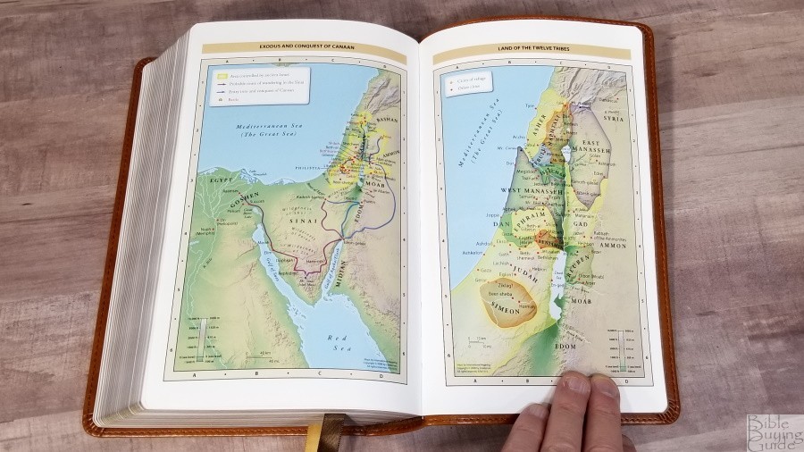

In the back, you’ll find the standard Zondervan maps that Thomas Nelson uses. They include 7 full-color maps on 8 thick, semi-glossy pages. The maps do not include an index, but they are annotated well. They include distance, elevation, topography, ancient cities, journeys, battles, events, dates, and Scripture references. They’re bright and colorful without being cartoonish.
Maps include:
- World of the Patriarchs
- Exodus and Conquest of Canaan
- Land of the Twelve Tribes
- Kingdom of David and Solomon
- Jesus’ Ministry
- Paul’s Missionary Journeys
- Jerusalem in the Time of Jesus
Comparisons
Here’s how the Sovereign Collection compares with the Personal Size Giant Print Reference, Preaching Bible, Canterbury, and Concord.
Thomas Nelson Personal Size Giant Print Deluxe Reference Bible
The Personal Size Giant Print Deluxe Reference Bible seems to be the Bible that the Sovereign is an update of. It’s the same size and has the same layout, references, footnotes, and book introductions. The paper and print quality are greatly improved in the Sovereign.
Thomas Nelson KJV Preaching Bible
The Thomas Nelson KJV Preaching Bible has a larger footprint and a much larger text. It’s noticeably thinner (which is my preference). The paper is the same gsm, but it’s smoother than the Sovereign. Both have a similar layout in the double-column setting, but the Preaching Bible doesn’t have decorative drop-caps or book introductions. It has blue highlights. Both have the same glossary on the page, but the Preaching Bible has a lot more cross-references. The Preaching Bible has none of the material after the book of Revelation. I’d like to see the concordance and maps added because it would make the last few books easier to turn to.
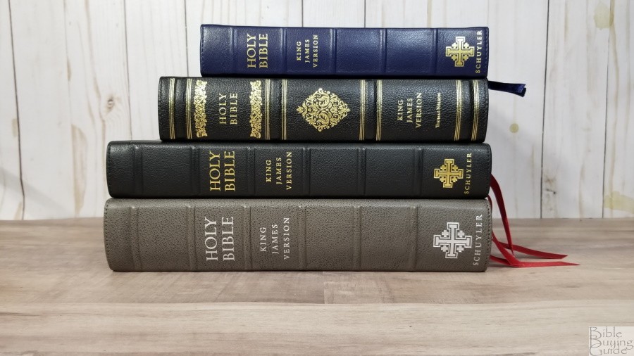
Schuyler Canterbury
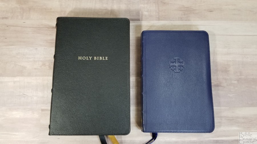
Personal Size Canterbury on the right
The Personal Size Canterbury is on the right
Personal Size Canterbury on the right
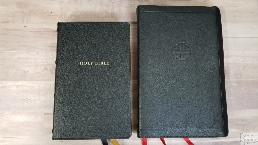
Wide Margin Canterbury on the right
The Wide Margin Canterbury is on the right
Wide Margin Canterbury on the right
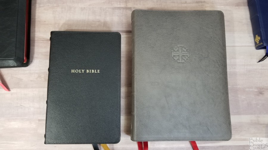
Regular Size Canterbury on the right
The regular Size Canterbury is on the right
Regular Size Canterbury on the right
The similarity to the Schuyler Canterbury can’t be understated. Any one of the design elements, such as decorative drop caps and single-column Psalms, have been done before and wouldn’t stand out, but the Sovereign includes all of the Canterbury design elements including red highlights, single-column references in the footer, decorative drop-caps that take more lines than most, and Psalms in a single column. The Canterbury is more minimalistic in its design. It doesn’t include footnotes and its reference keys in the text are easier to ignore when reading or preaching. The Canterbury is made with higher-quality materials and construction quality, and it’s available in a large size, personal size, and a wide margin edition.
Cambridge Concord
The Cambridge Concord has a similar footprint and font size. This might be the closest competition for the Sovereign in size and features. The Concord is made with higher quality materials and it’s a lot thinner. Both make a good choice for a hand-sized Bible for carrying and ministry.
Conclusion
The Thomas Nelson Sovereign Collection is an interesting design. It does seem to be an updated Personal Size Giant Print Deluxe Reference Bible and it follows many of the Canterbury design elements. This provides a setting that looks elegant at a lower cost. It has fewer references than most reference editions from Thomas Nelson, but it does include the updated words in the footnotes. This is helpful for identifying words that have changed in meaning or are no longer in use. The overall size is excellent for carry and the font size is perfect for reading and preaching. I think anyone looking for a KJV for everyday carry would like the Thomas Nelson Sovereign Collection.
_________________________________________________________
This Bible is available at (includes some affiliate links)
and many local Bible bookstores
_________________________________________________________
Thomas Nelson provided these Bibles in exchange for an honest review. I was not required to give a positive review, only an honest one. All opinions are my own.


Great review as always, Randy! I was holding my breath, hoping for single column throughout. Didn’t happen. But… For someone, this looks like a really good deal! I checked out the pricing. Hard to beat. For me, I’m spoiled with single column now. And I can’t stand red letter bibles.
Thanks Brian! I’d love to see this in a single column.
This is outrageous. This is not the Authorized KJV. The book titles are not from the 1611 KJV. Neither are they from the 1873 Scrivener. Nelson has overstepped their bounds and changed the translation. Randy have you told them about this? Thomas Nelson has no right to change the KJV and deceive the reader. If that weren’t enough the New Testament book introductions presumptuously tell the reader the “ancient” book title is something according the minority critical text. Then the marginal translator’s notes are not from the KJV. These “modernized” notes incessantly tell the reader what the NKJV says. The original KJV translator’s notes are superior and were never supposed to be removed.
Good afternoon,
Well, Mr. Brown, CBC had another great sale on the KJV Sovereign wide margin bible for a genuine leather at 34$ and I couldn’t say no to myself. This bible is a super good value. But for folks complaining about “coccling” I never heard such a word, I say go buy a Schuler, but I can’t, Yet I do know that I have worn out Nelson, Broadman/Holman, Zondervan, Crossway, Moody and Oxford bibles; but, I still buy Nelson’s KJV or NKJV because I really enjoy their value and wonderful options.
Thank you,
Prentiss Yeates