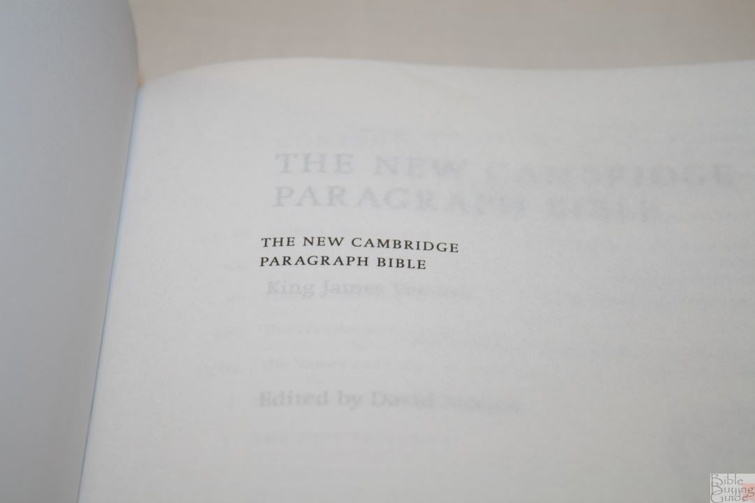
The New Cambridge Paragraph Bible is a revision of the King James that, instead of revising the later revisions, returns back to the 1611 edition in an effort to produce a text the translators had in mind. Spelling and punctuation are updated to today’s English. The original New Cambridge Paragraph Bible was produced in 2005. The 2011 personal size edition makes several corrections and, as the name suggests, reduces the size to something more manageable for everyday use.
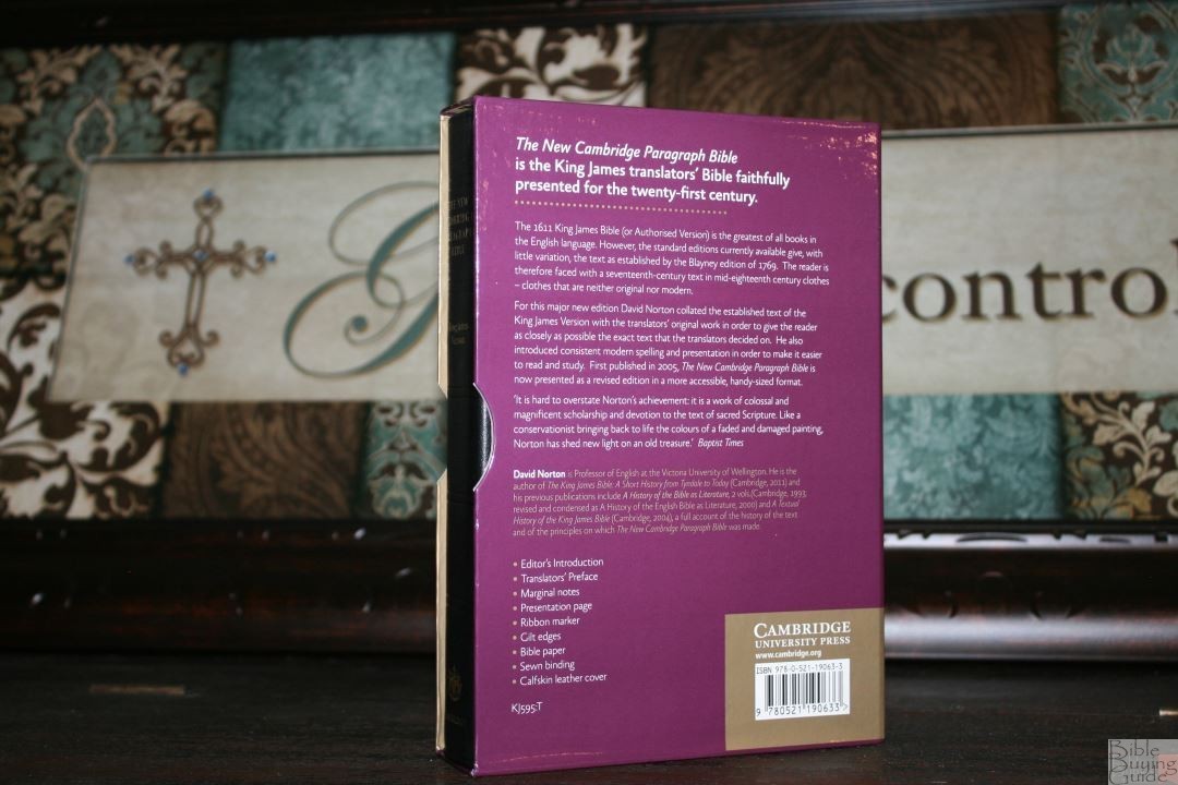
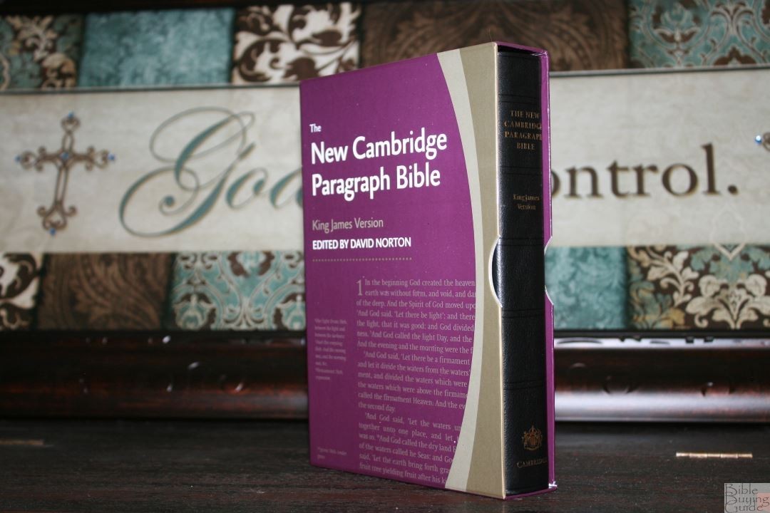
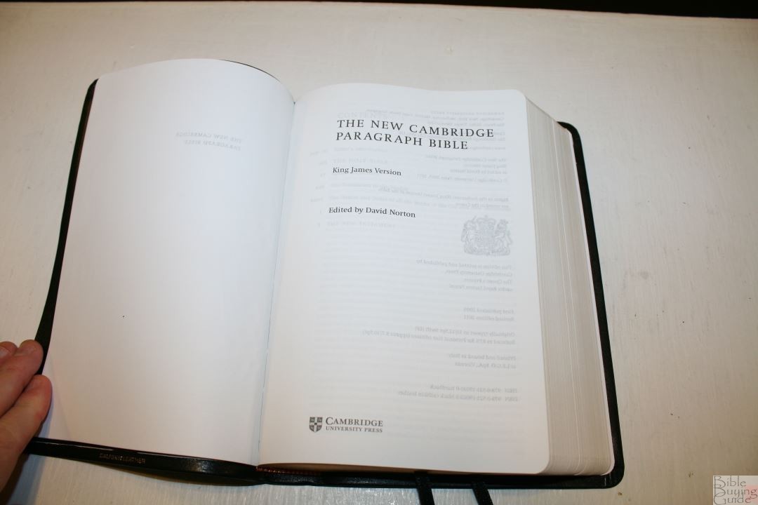
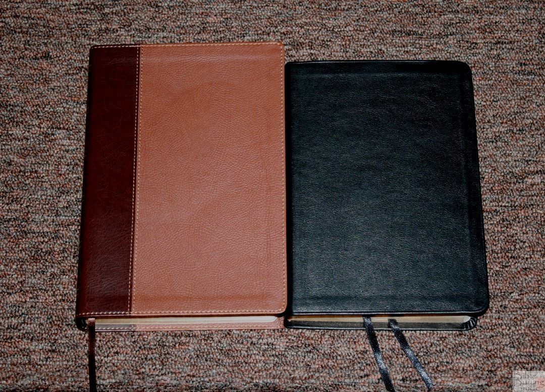
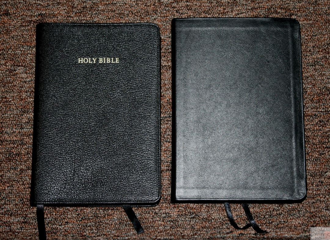
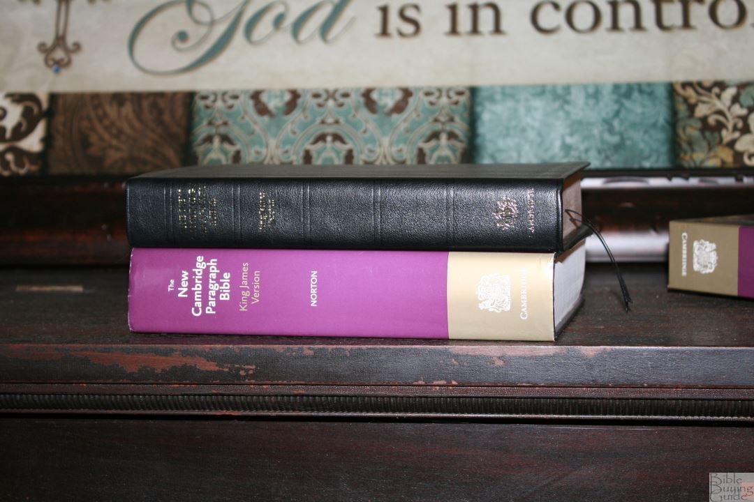
The New Cambridge Paragraph Bible is basically a text edition with translator’s footnotes that sets the standard for a modern KJV layout design. It includes David Norton’s preface, the Epistle Dedicatory, and Translator’s to the Reader, but it has no other tools. You won’t find a glossary, concordance, or maps. It’s available in hardcover and calfskin, both with and without the Apocrypha. I’m reviewing the black calfskin edition without Apocrypha, ISBN: 9780521190633, made in Italy by L.E.G.O.
__________________________________
Buy from:
__________________________________
Cambridge provided this Bible free for review. I was not required to give a positive review – only an honest review. My opinions are my own.
David Norton’s Revision
The purpose of this revision was to go back to the 1611 printing and produce an edition that was closer to what the KJV translators intended. This means that later revisions are ignored and the original words are restored. The punctuation was restored and updated where needed to modern standards. Spellings were also updated where it doesn’t change the word. Words with -eth endings have not been changed. We’ll look closer at the revisions throughout the review. Professor Norton discusses the revision in my interview with him: David Norton Interview
Cover and Binding
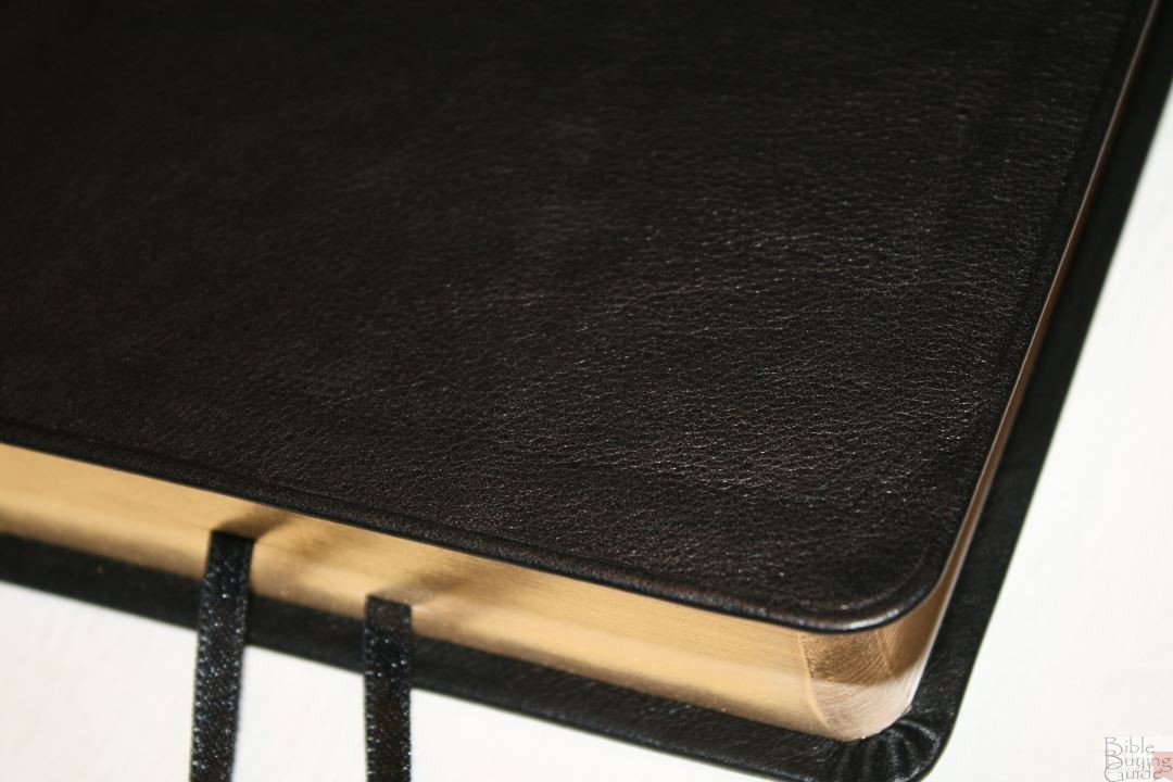
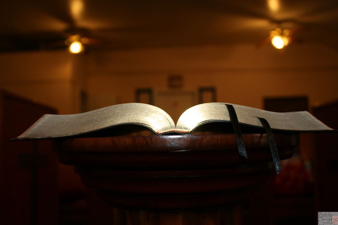
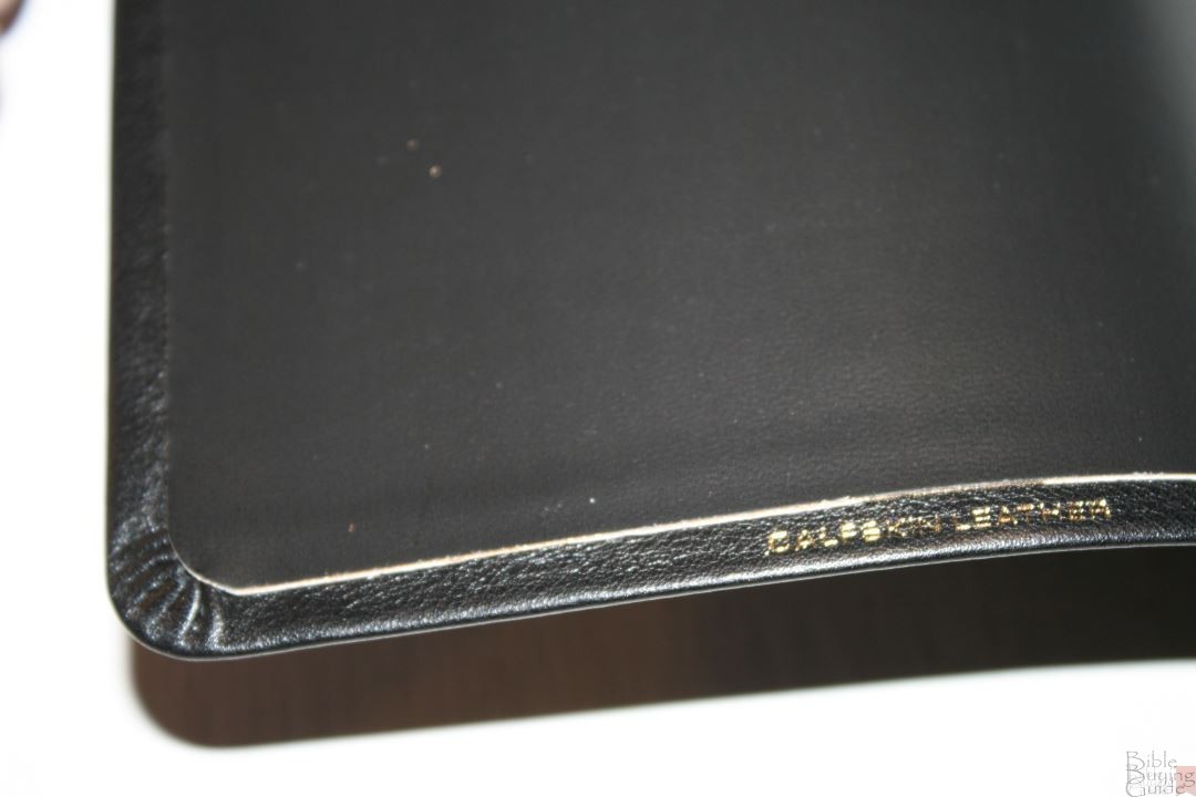
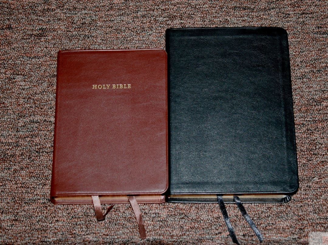
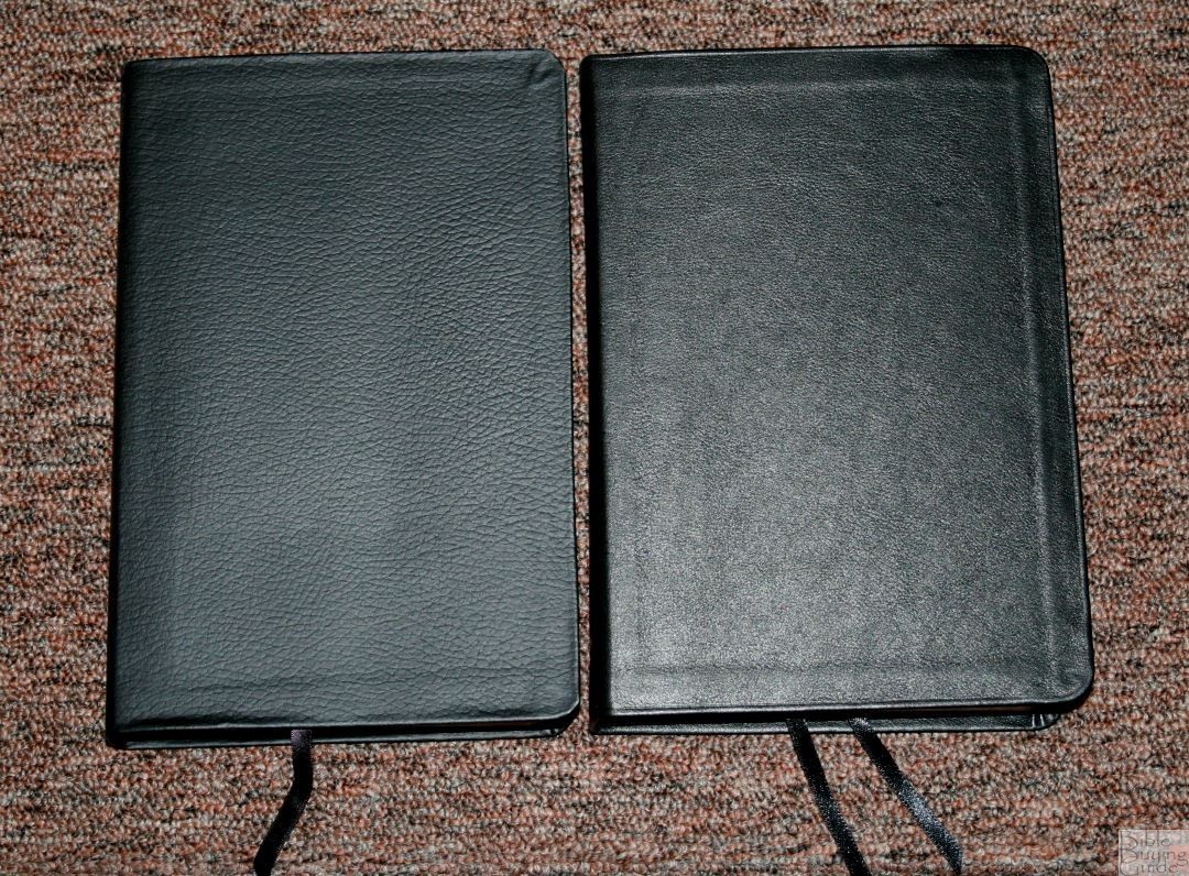
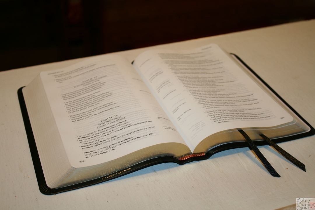
The cover is calfskin with a vinyl paste-down liner. It has a fine natural grain. A line is tooled into the perimeter. The leather is thin enough that you can see the edges folded under. The reason for this is it doesn’t have a card between the outer cover and the liner. This creates squared-off ridge that I don’t find appealing, but it also makes the cover soft and highly flexible even with the paste-down liner. At the same time, it isn’t so floppy that it’s difficult to manage. It’s easy to hold open in one hand for reading (which is my preferred reading method). I’ll keep that squared ridge in order to have this flexibility.
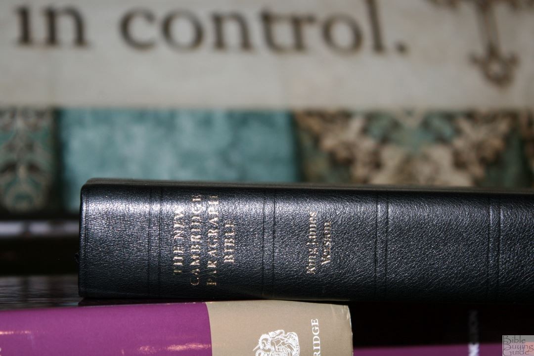
Nothing is printed on the front. The spine has THE NEW CAMBRIDGE PARAGRAPH BIBLE, King James Version, the official seal, and CAMBRIDGE printed in gold. Five spine ridges are marked into the spine. They’re not raised but they do look good.
Of course it’s Smyth sewn. I thought it was going to take a while to break in but it’s so flexible out of the box that it feels like I’ve used it for several years already. The first few pages do want to close but I can already tell the difference in just a few days. I’m sure it will lay completely open on page one in no time.

The overall size is 8.6 x 6 x 1.3″ and it weighs 1 lb 14 oz. I like the size of this Bible. It doesn’t feel too large to carry and use. It’s about the perfect size for me. It’s around the size of a Concord. I prefer this height to thickness ratio to the Clarion (which can feel a little too chunky for its height).

It has 2 black ribbons and red and yellow head/tail bands. They look great against the black calfskin.

It comes in a slipcase that has the box art on the front and back and matches the dust jacket on the hardcover edition. It’s fairly sturdy and is great for standing the Bible upright on a shelf.
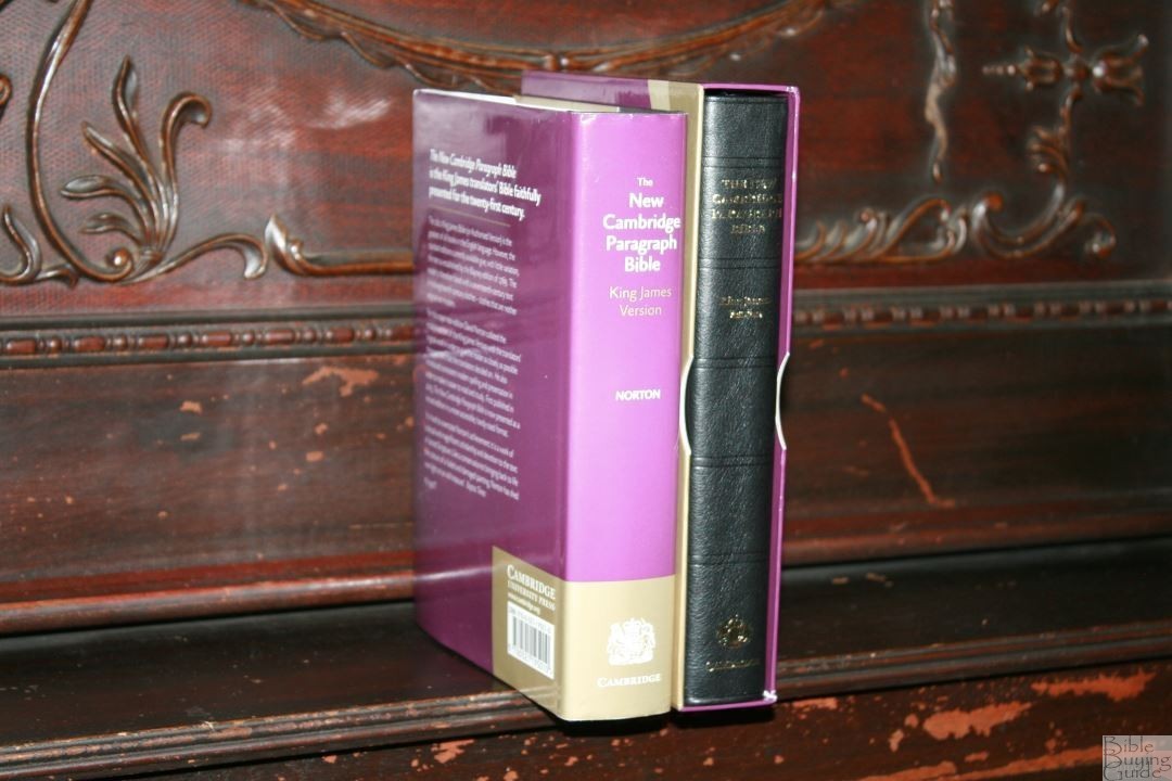
I love that it’s available in hardcover. This makes it more affordable to those that can’t purchase a premium edition. It’s also available with and without the Apocrypha.
Paper
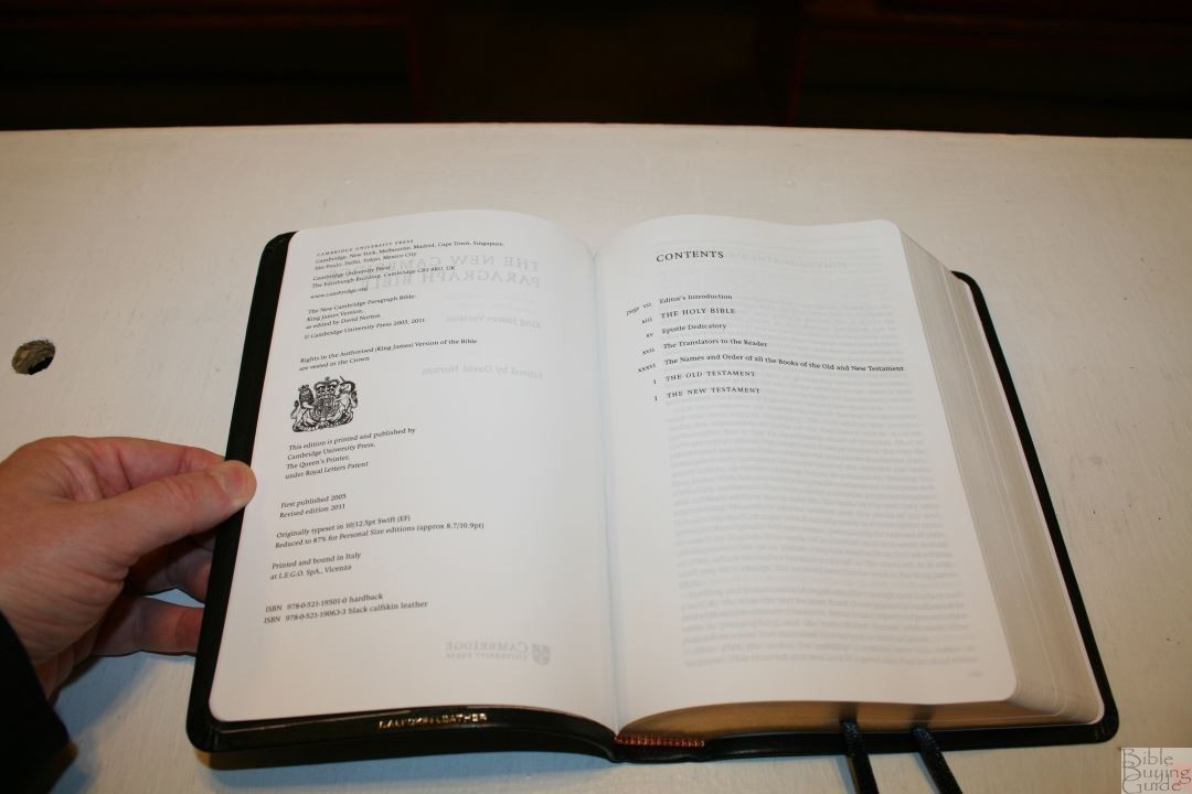
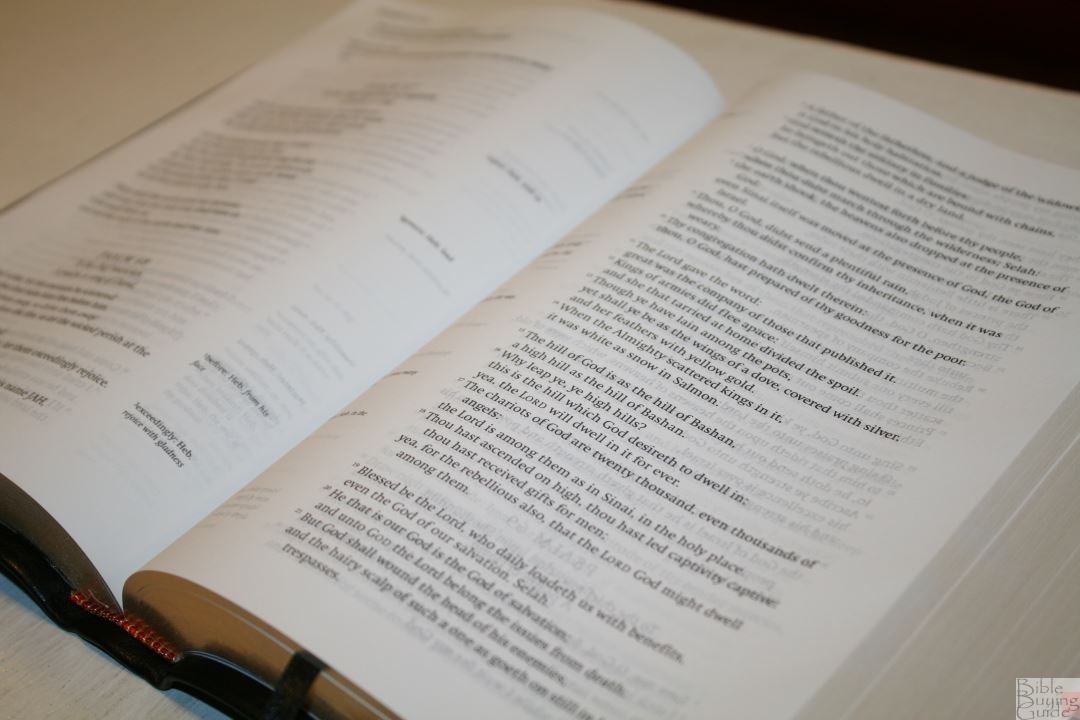
Cambridge classifies this paper as “Bible Paper”, and describes this as “over 30-gsm” which means this paper is 31gsm or above. It’s definitely thicker than the 28gsm of the Clarion. It’s white in color. It does have some show-through that’s mostly noticeable in the poetic settings or on the first page of every book. It has 1863 pages of text and 1904 pages all total, including front matter and several blank pages at the end of the Old Testament. I found the pages easy to turn.
The gold gilt isn’t even. It has a smeared pattern that looks like it wasn’t applied evenly or possibly the edges have a variation to the texture that reacts to the gilt differently. The edges were stuck together from the gilting. They were easy to separate. They were mostly stuck in the corners, which are bent as if they were placed within a jig that wasn’t completely flat when they were cut. This creates a bent edge within the corner that can be a little difficult to grab while turning pages. I usually grab the pages just past the corner, so it didn’t cause any issues for me. It isn’t enough to keep me from using it, but I wanted to point it out.


I had no page-curl when using this Bible at times when I did have page-curl with my Clarion. The extra paper thickness helps.
Typography
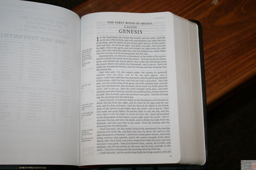
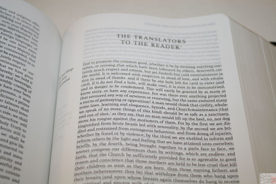
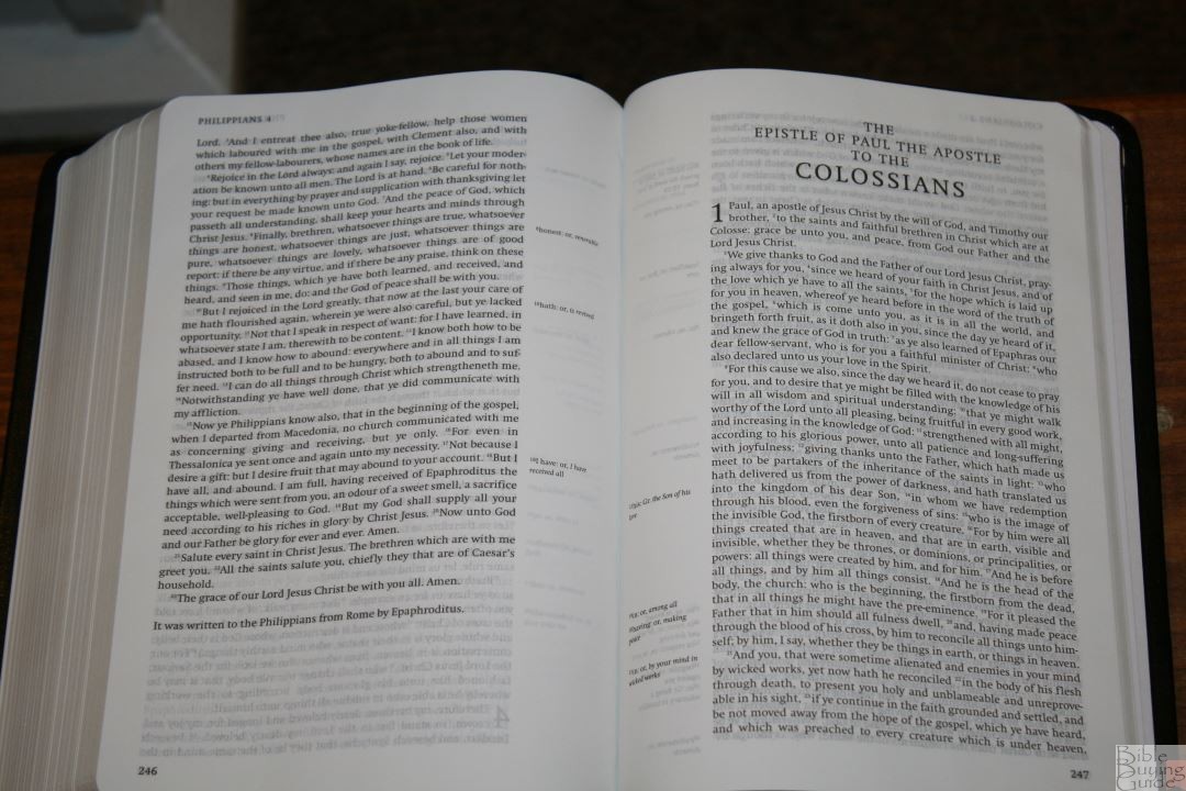
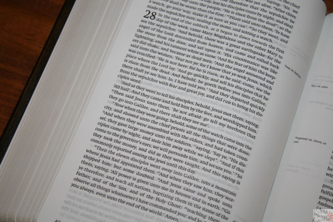
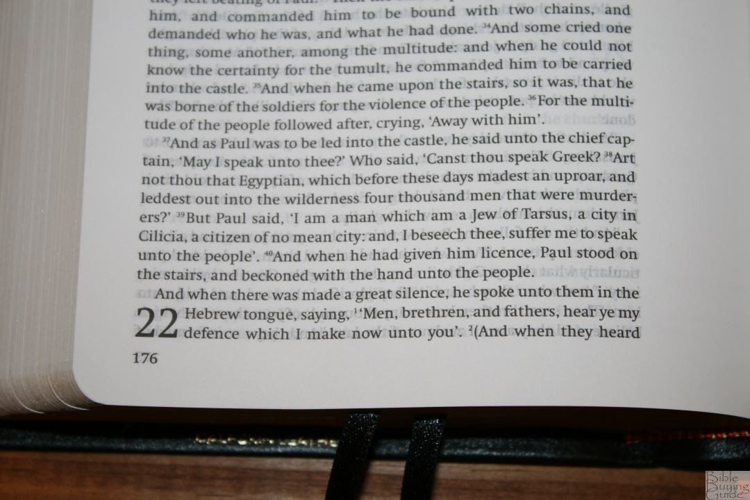
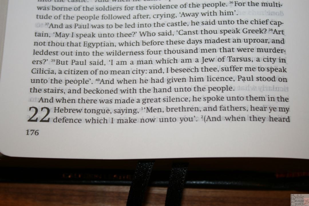
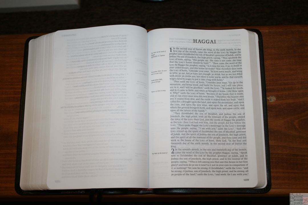
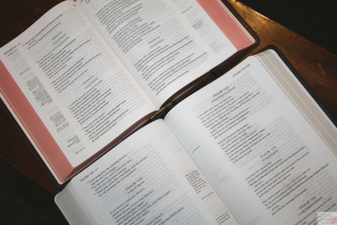
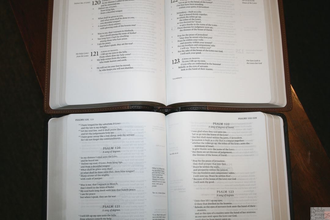
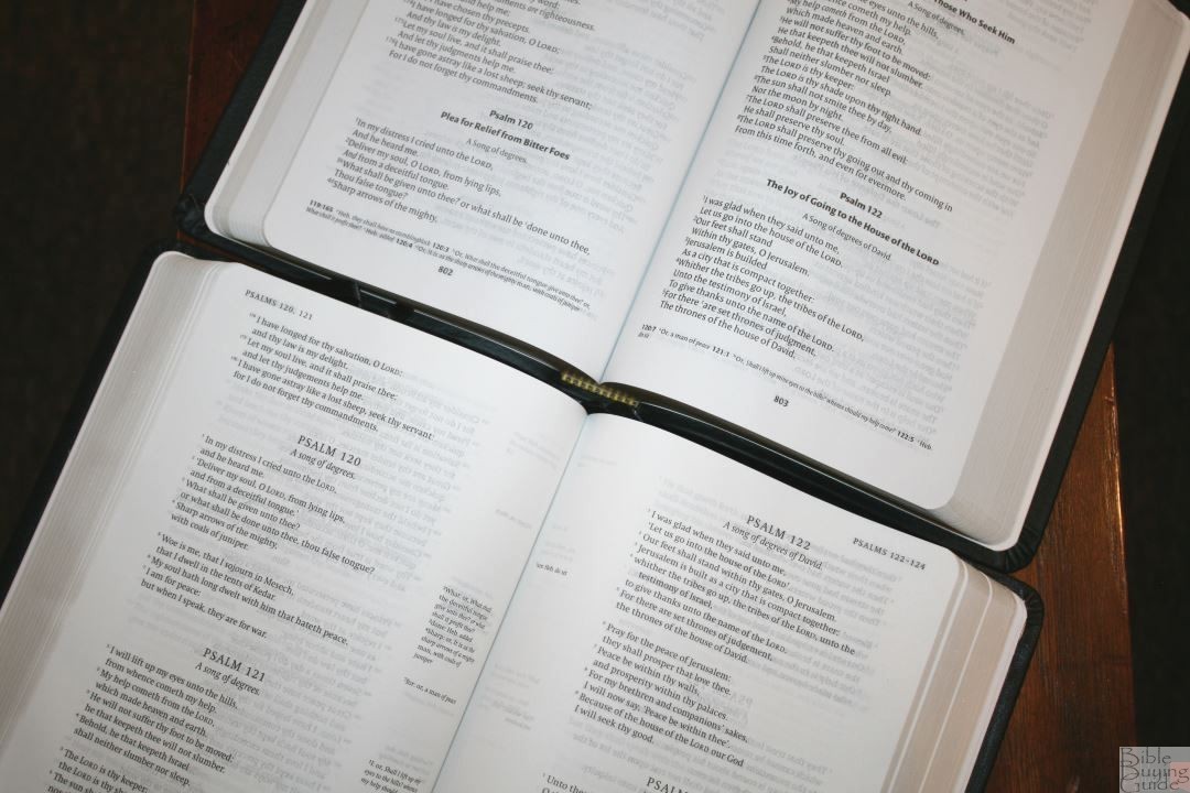
The text is presented in single-column paragraph format, poetry is set to stanzas, and letters are indented. The header shows the book name and chapter number in the outer margin. The footer shows the page number in the outer margin. Footnotes are placed within the inner margin. Needless to say, this isn’t a typical design for a KJV. The layout was designed for optimal readability.
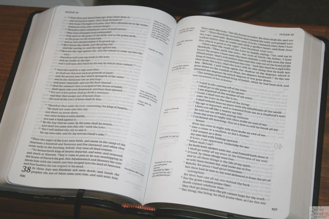
The font is 8.7 Swift with a 10.9 leading. I like the design of the font. It reads a touch smaller than the Clarion, but not by much. It’s sharp and is about medium/dark and consistent throughout. It has around 68 characters per line with 12-14 words per line and 48 lines per page. The text is clean of distractions and is highly readable.
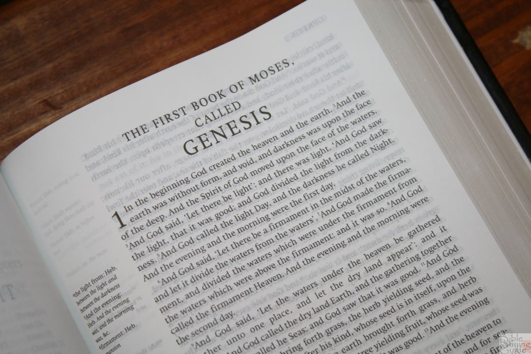
Most pages are printed with line-matching. There are a few pages here and there without line-matching, but the main pages without it are the first page of each book. Show-through is distracting on those pages. I don’t notice it on other pages except for in the poetic settings, which doesn’t bother me much. I do find the show-through on the first page of each book distracting though. Psalms lines up nicely. Proverbs could be improved.

Verse numbers are tiny. This makes them extremely easy to ignore. It also makes them hard to find. I prefer this for reading but it can be difficult to find verses quickly. Reading is what I do the most, so this works for me.
There are no footnote keys in the text, keeping the text clean of distractions. The footnotes are in the margin next to the verses they correspond to and they include the words that the footnote belongs with, but there’s nothing in the text drawing you to them. I like this because it’s easy enough to keep reading without it feeling like someone is trying to disrupt your reading time – making it better for reading that study. Footnotes are placed in the inner margin, keeping the text on the flat part of the page. I like that they keep the text out of the gutter, but I almost want them in the outer margin so I can use the extra space for notes.

Poetry in the Old Testament and Mary’s song in Luke are set to stanzas. The poetic settings look amazing. Poetry looks better in single-column and this is an excellent example. One of the things I like is the next line starts with a small letter. I find it awkward when the next line in poetry is a capital letter when it continues a sentence (like those in the NKJV). Once I read Psalms in this format it’s hard to read it verse-by-verse. There are a few places where the line will continue past the normal width of the column, but not to an extent that it looks awkward. This keeps the line from having a hyphen, being crowded, or having too much space between the words. I like this. There are a few places where this isn’t used even though there’s enough room for it. This could be an effort to keep consistent line-spacing. That’s just a guess though.
Supplied words are not in italics. The reason for this is italics draws attention and emphasizes the words to modern readers. They aren’t complete anyway (take a look at the Hebrew and Greek and you’ll see how many words are not in italics even though they’re not found in the original languages), plus we have digital tools, Strong’s Concordances, interlinears, and other tools that are far better for study of the underlying texts than the italics can provide. Again, the focus is on readability rather than study.
Dialog is placed within quotation marks. It’s the British style of using a single quote rather than the American style of using double quotes, which is to be expected considering this is a British production. Some don’t like the use of quotation marks because we can’t always know when someone is talking, when their speech ends and the narration begins, etc. However, even the 1769 edition identifies dialog. It uses an older style of identifying dialog by printing the beginning of dialog in a capital letter. That method of identifying dialog was acceptable several hundred years ago, but this is not how a modern reader understands when the text is identified as dialog. Capital letters in the middle of a sentence confuse the modern reader and hamper readability.
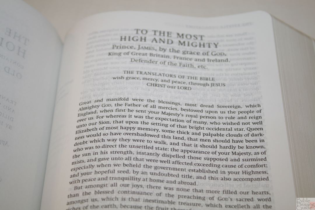
Punctuation follows the modern style and is more similar to that of the 1611 edition than later revisions are. Today’s readers don’t really understand how to interpret the colons and semi-colons that we’ve seen for the past few centuries. Colons within parenthesis look like smileys to today’s reader. I like this update. I appreciate seeing the modern punctuation that I’m used to.

Broken verses have been fixed. This includes the thousands of verses that usually start with capital letters but should be lowercase because they continue a sentence, and several places where there’s an unnatural break in the middle of a sentence such as Psalm 98:8-9, Col. 1:21-22, and Acts 21:40-22:1. These are where a sentence continues through verses or chapters. Breaking them up breaks the flow of thought or dialog. I’m pleased to see them fixed as this improves readability. This is why I prefer reading paragraph editions over verse-by-verse.
The purpose of the spelling changes is to create an edition that’s faithful to the 1611 while at the same time easy to read for today’s audience. The spelling updates look and read much better for modern readers. If it doesn’t change the word then I prefer to use today’s spelling. For example, I’m glad we don’t spell son as fon. I prefer ‘show’ to ‘shew’ (such as Ps 19:1). When I see ‘shew’ I pronounce it as ‘show’ anyway, so it looks better to me to have the spelling updated. It’s the same word. ‘Shew’ is how show was spelled in 1611 and there have been a lot of changes in spelling since then, and since the 1769 edition.

There are a few updates that do feel out of place (not that I would argue with David Norton – I’m just pointing out what I’m used to). For example, thine and mine have been changed to thy and my. I’m so used to reading thine and mine that I read it as the older words instead of the updated words. Thine and mine sound more familiar to me.
The most controversial spelling change is Hosea 6:5 where Professor Norton used shown (the modern spelling of shewn) rather than hewn. Professor Norton makes the case that the notes from the translators use shewn and it’s the word they wanted.
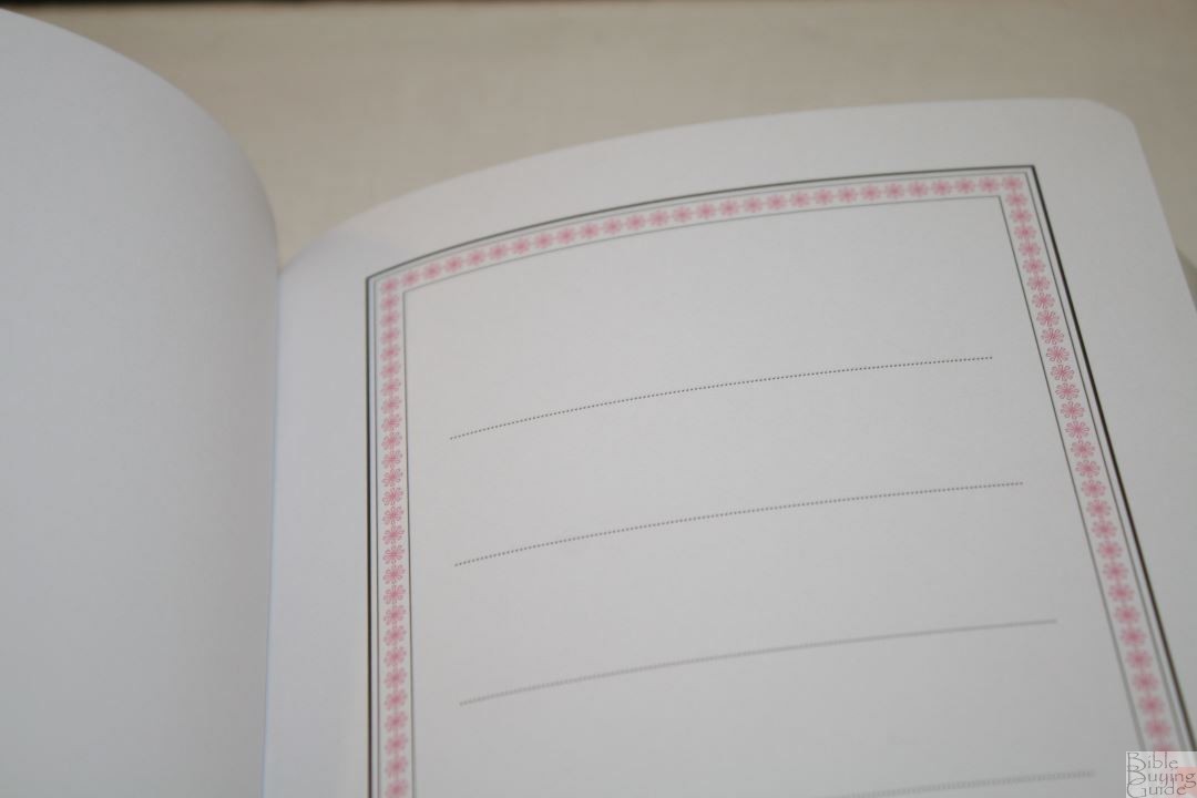
Books start on a new page (mostly, but there are a few exceptions), which leaves several blank pages on the left side. These can be used for lists, notes, sermon outlines, etc.
Footnotes
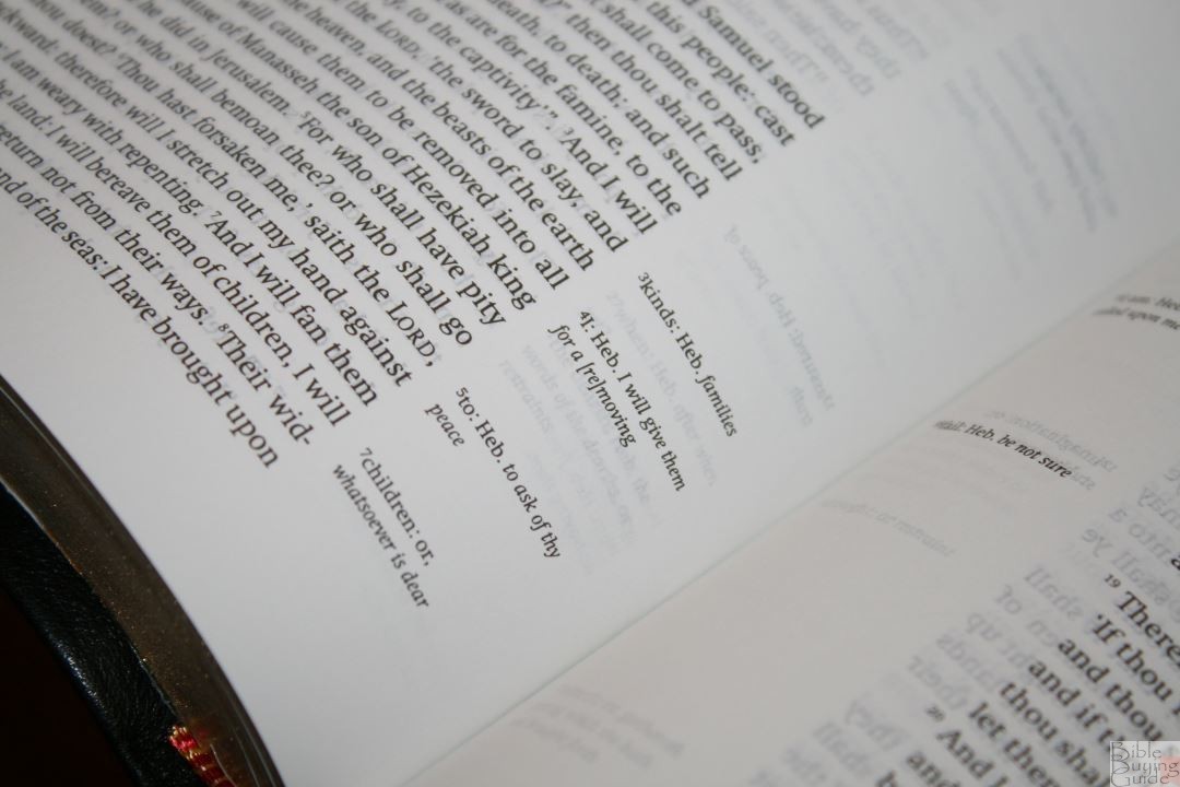
The original footnotes from the translators are included as well as footnotes that were added in later editions. They’re placed in the inner margin and include the verse number (which can be used to help you find verses quicker) and the word or phrase within the verse they related to. The original footnotes are printed in regular text and the notes that were added through later editions (such as the 1769 Blayney) are printed in brackets.
None of the footnotes are from David Norton, and none are critical of the text. In other words, David Norton did not add footnotes to the text. They are the footnotes that we’ve seen in respectable KJV’s for years. They’re just identified as to which footnotes are which (something that isn’t usually done in KJV’s). They cover alternate renderings, explanations of the Hebrew and Greek, and literal renderings.
Comparisons
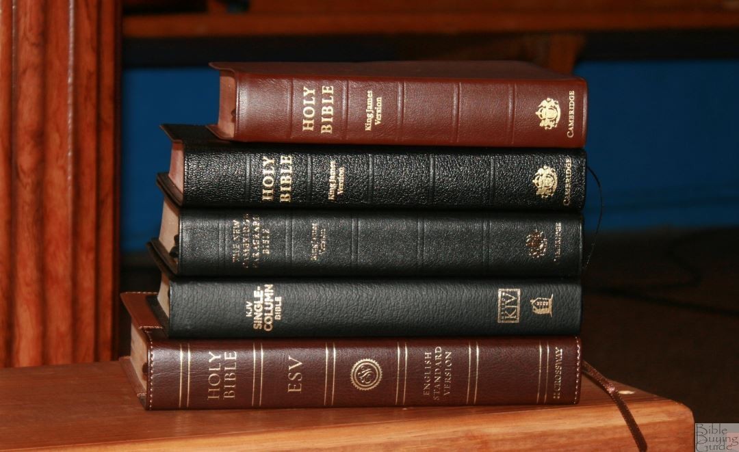
Here’s a look at how the New Cambridge Paragraph Bible compares to the KJV Clarion, ESV Legacy, Thomas Nelson Single Column, and the Cambridge Concord.
Clarion
The Clarion is obviously shorter, but the font size doesn’t suffer for it. I prefer the color of the Clarion’s paper, but the footnote and reference keys within the text make it less readable. It doesn’t include the fix for Acts 21:40-22:1 that the NCPB has, but it does include the fix for Ps 98:8-9 and it has poetry in stanzas, letters indented, and small letters at the beginning of a verse when it continues a sentence.
I prefer the references and footnotes in the outer margin like the Clarion. I use them to help me find the verses faster. If you want a reference edition with concordance/dictionary and maps the Clarion is a great choice.
Legacy
The Legacy from Crossway is very similar to the NCPB. The primary difference in the layout is the location of the margin. In my opinion, this layout is easier on the eye and is better for notes. This paper is more opaque, but that also makes this Bible is larger.
Single Column
Thomas Nelson’s Single Column has a similar design to the NCPB. For KJV’s I’d say it’s the closest in size and paper quality. It doesn’t fix broken verses like Ps 98:8-9, but it is a very readable text – especially where the lines match on both sides of the page.
Concord

I included the Concord because they’re almost identical in size. The Concord, like the Clarion, has references, footnotes, etc., and material in the back. I prefer the color and texture of the Concord’s paper (at least the goatskin edition) but I’ve had more page-curl with the Concord than with the NCPB.
Using the New Cambridge Paragraph Bible
Here are a few ways that I used the NCPB and my thoughts for each.
Reading

I love reading from the NCPB. The overall size is excellent for holding and reading. The font doesn’t feel too small to my almost 50-year-old eyes (I have to use my bifocals though). The layout is nothing short of beautiful. The verse numbers are so small that they didn’t distract me when reading. It’s almost like a reader’s edition. Reading is what I recommend the NCPB for the most. My only complaint with reading is show-through. It isn’t bad enough to keep me from reading it, but if I could change one thing I’d make the paper more opaque.
Carry

I carried the NCPB around and it performed as nice as most of the Bibles I use on the go. Its size and shape is about the equivalent of carrying a Concord. Holding it in the car (usually when sitting in a parking lot) was easy to handle even with the floppy cover. It never felt too heavy to hold or carry.
Preaching
I was surprised at how easily I found the verse numbers, but I do have bright lighting above my pulpit so that helps. I usually prefer larger fonts for preaching but I didn’t feel a strong need for a larger font the few times I preached from it.
I don’t think most people would notice the revisions if you taught or preached from it. I already say “show” and update words to make them easier to say. My Church would just assume I’m saying it differently and wouldn’t give it a second thought.
If you wanted everyone in your congregation to use a standard edition then the NCPB wouldn’t be a good choice for you. It’s only available in one font size in three different covers counting the Penguin Classics paperback. There aren’t any editions such as a large print, compact, wide margin, thinline, reference, or pew Bibles available. The hardcover isn’t expensive, but it’s probably more than most Churches would spend on a pew Bible. The paperback edition is priced right, but it’s too thick to fit within the Bible-slots of pews and many Churches prefer large print for pew Bibles. For these reasons, I can’t recommend using the NCPB as your Church’s standard edition.
Ending Thoughts on the New Cambridge Paragraph Bible
I’m far more impressed with the personal size New Cambridge Paragraph Bible in calfskin than I expected to be. I’ve read the hardcover edition but the calfskin makes this feel like a completely different Bible. The calfskin is soft and flexible and the overall size is within my range of perfection for my primary Bible. The font is clean and decently dark and I completely love this layout. The NCPB seems like a reader’s edition. I didn’t miss references or a concordance but I wouldn’t mind having a glossary and maps.
To me, the revision doesn’t seem overdone. I especially like the updates to spelling and punctuation as they don’t change the meaning of words. Each time the KJV has been revised, spelling and punctuation were updated to the current standards of the time. This is what the NCPB does with spelling and punctuation.
Regardless of what we think about the changes in the text, the effectiveness of the layout to readability can’t be overstated. The NCPB sets a standard for the KJV in layout design that’s sadly lacking in modern Bible publishing. While other translations are seeing beautiful layouts that focus on readability, the KJV still gets the standard 400-500-year-old verse-by-verse layout that isn’t made for reading.
I’d like to pose a challenge to Bible publishers to rethink KJV Bible design and take a close look at the NCPB’s layout. At best they produce the KJV without interruptions in the text. At worst it retains capital letters for every verse regardless of whether it starts a new sentence, sentences are broken in the middle, chapters are broken in the middle of a sentence, the text is cluttered with numbers, letters, and pronunciation marks, some even add section headings to break up thoughts (sometimes in the middle of a thought), and on and on.
It’s time that KJV’s were made to be read. I want a KJV with a layout that’s readable. It wouldn’t seem as archaic and difficult to read if it was presented in a readable format. The KJV can be a readable translation, but it’s made unreadable by its design. The NCPB fixes the design issues, presenting the KJV in a highly readable format. A glossary would help though – especially for words that have changed in meaning but we don’t notice because it seems to fit the context.
The New Cambridge Paragraph Bible gets my vote for an affordable multi-volume set and a Jongbloed goatskin edition. I’d love to see this Bible with high-end paper, goatskin cover, elegant ribbons, and a multi-color interior with red Psalm headings (okay, I got carried away, but this is close to my dream Bible). As it is it’s a nice functional Bible that’s made well. I especially like that it’s available in a hardcover edition as well as calfskin, making it available in an affordable edition and a higher quality edition.
I consider the NCPB to be the hidden gem of KJV Bible design and recommend it to every KJV reader. I’d like to see this exact layout available in the 1769 edition (the last official update to the KJV) for those who prefer it to a newer revision. I especially recommend this edition to anyone that’s used to modern layouts but is new to the KJV.
__________________________________
Buy from:
__________________________________
Photography by hannah C brown
Cambridge provided this Bible free for review. I was not required to give a positive review – only an honest review. My opinions are my own.


A great review as always. One nit to pick, however, you say that it has 2 red ribbons but your photos show 2 black ribbons.
Thanks! I’ve updated it.
I have a giant first edition of one of these that’s a burgundy hardcover and its become my favorite bible for study. A smaller edition would be nice as well but I can’t decide between calfskin or hardcover.
Nice! I’d love to have the larger edition. As far as calfskin vs hardcover, I’ve had the hardcover for several years and used it little. The calfskin drew me in. It just begs to be used. If the money difference doesn’t matter then I would go with the calfskin. Otherwise, the hardcover is an excellent choice for the money.
Hello brother Randy!
Thank you for this review!
Tell please, is the paper, printing (ink amount) and the binding quality in Hardback and Calfskin editions the same?
Thank you!
Hi Yura. Yes, they are the same.
An extremely belated comment about the ribbon colours as I’ve recently seen the same thing mentioned elsewhere, mine has the red ribbons rather than black; I wonder if it might represent a difference between the KJV+Apocrypha and the low calorie option? (As an aside, one of my ribbons is also quite frayed and was like that out of the box; based on my albeit rather limited experiences, it seems that L.E.G.O.’s quality control is a bit more eclectic than Jongbloed’s.) My copy (2020 print) is also very slightly larger than the dimensions indicated here, around ¼” bigger in both height and width, though it may still be within the margin of what might be expected; my major source of confusion was the significantly different spine width as mine is a noticeably chunkier 1.7″… until I realised that the extra 10mm is apocryphal.
I appreciate the review. My feelings as a not-exactly-habitual KJV reader are that the modern layout (albeit perhaps closer to what was originally intended) definitely makes a refreshing change: while the more traditional verse-by-verse with pronunciation and italics and what-not is useful for reference, I find it to be a rather overbearing reading experience. This is a lot nicer and lets you focus on the actual text. Shame they didn’t add some pictures, tho’.
“Today’s readers don’t really understand how to interpret the colons and semi-colons that we’ve seen for the past few centuries.”
As a 26 year old b- man, who hardly reads, mind you, I think the semicolon is the single greatest bit of punctuation invented; often do I type run on sentences, so the semicolon makes my typing grammatical correct! For an example: my above comment and this last bit to try to use the eyes-of-a-smiley-face punctuation mark correctly. 🙂
I have nothing constructive to add, other than a bit of humor. Thank you for the review; there’s not much out there regarding this translation, and I’m enjoying what little I’ve read so far.