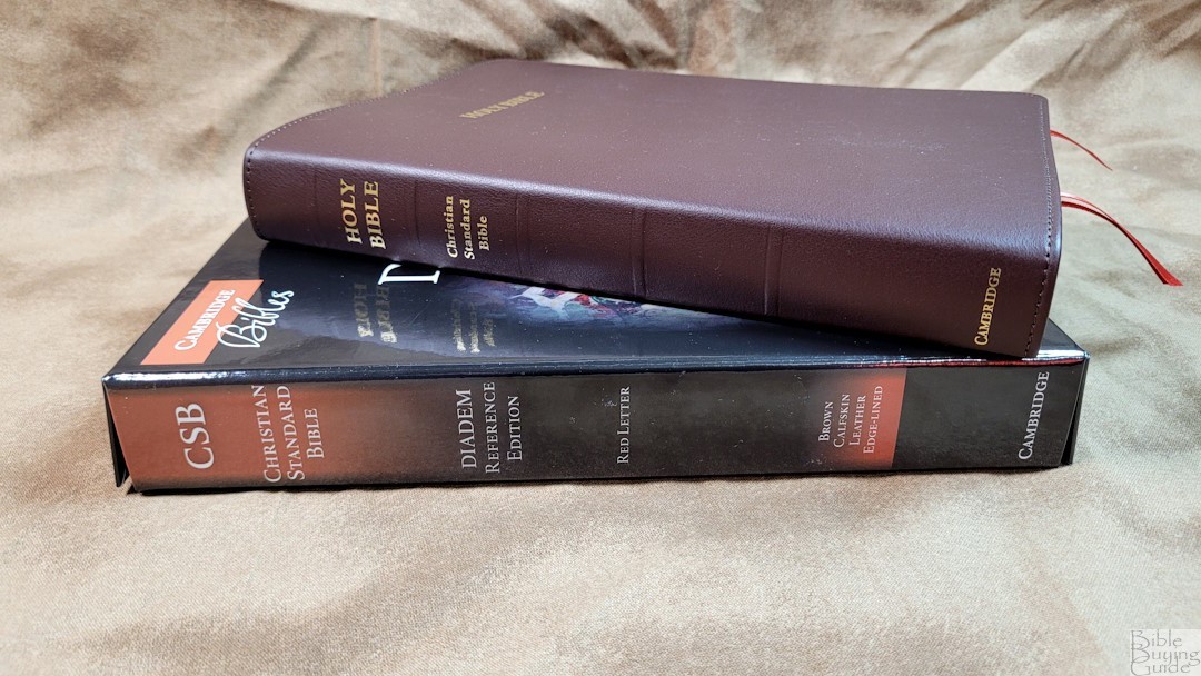
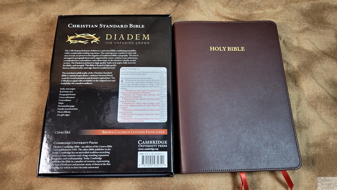
Up to this point, the Cambridge Diadem series has been a larger version of the popular Pitt Minion series. Now, Cambridge has released a Diadem in the CSB. This is not only Cambridge’s first CSB, but it’s also the first Diadem that isn’t based on a smaller Bible. It’s available in several covers. I’m reviewing the CSB Diadem in brown calfskin. This is model CS545:XRE, ISBN: 9781009435741. It was printed and bound in the Netherlands by Royal Jongbloed.
Specs
- 2020 CSB
- Brown calfskin
- Synthetic edge-lined liner
- Sewn binding
- 3 1/4″ ribbons
- 6 1/4 x 8 3/4 x 1 1/8″overall size
- 1 lb, 11.5 oz
- 32GSM French paper
- Art gilt page edges
- Double-column paragraph layout
- Line matching text
- 8.2 Lexicon No. 1
- Red letter
- Center-column reference
- Family pages
- Large concordance
- 15 maps
- Printed in the Netherlands
- $315
Cambridge provided this Bible in exchange for an honest review. I was not required to give a positive review, only an honest one. All opinions are my own.
_________________________________________________________
This Bible is available at
and many local Bible bookstores
_________________________________________________________
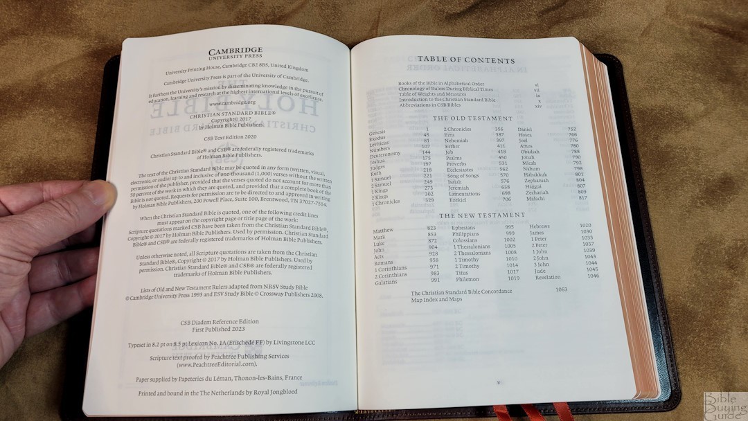
Table of Contents
- Video Review
- Binding
- Paper
- Typography and Layout
- References and Footnotes
- Concordance
- Bible Atlas
- Comparisons
- Conclusion
Video Review
Binding
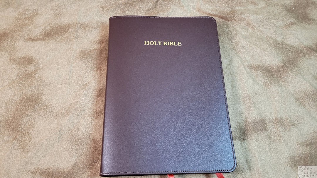
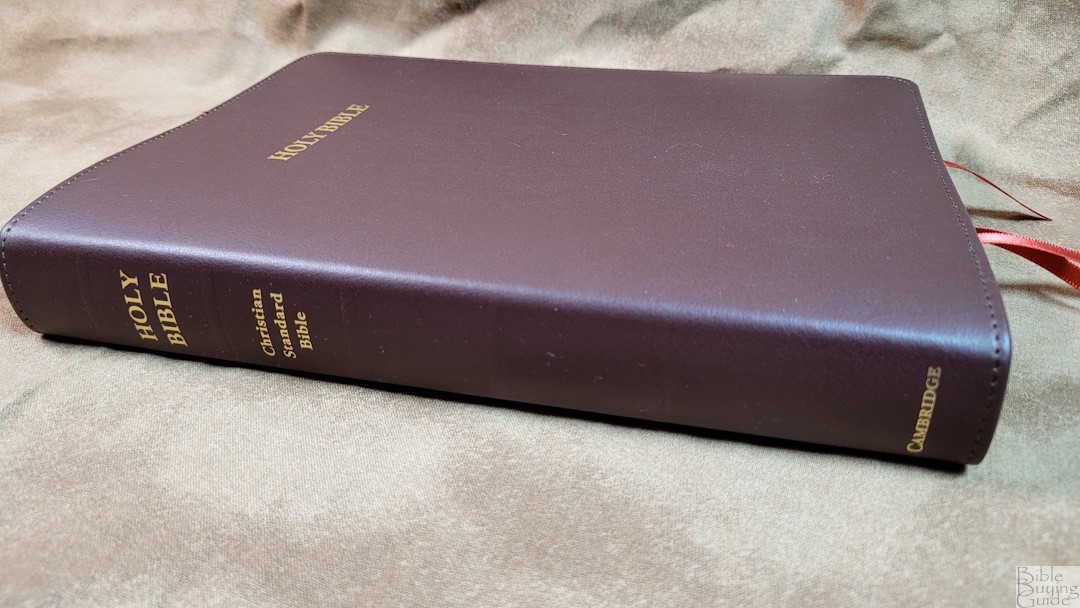
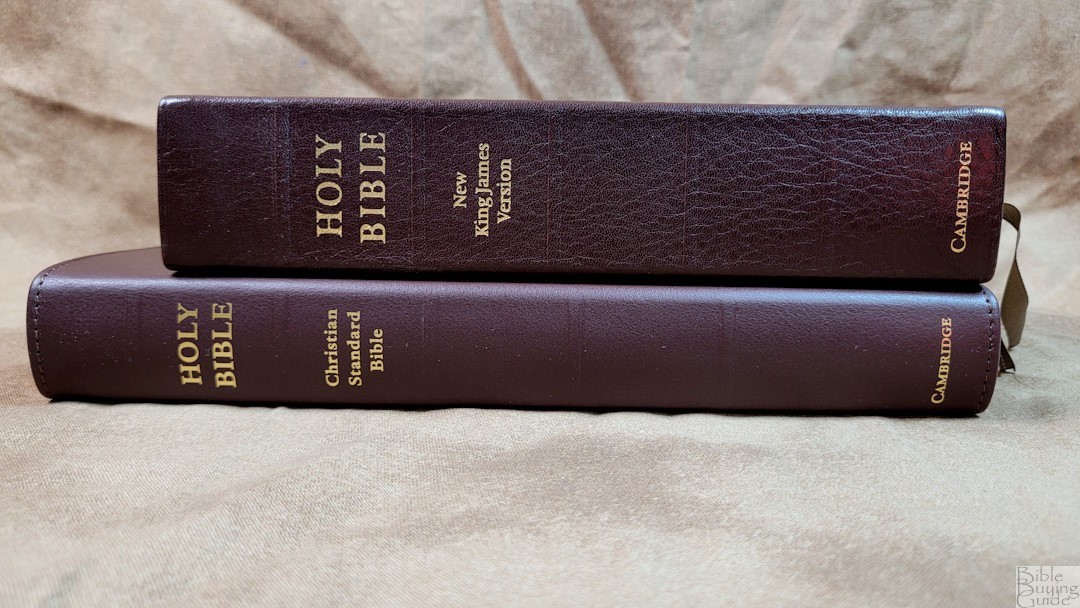
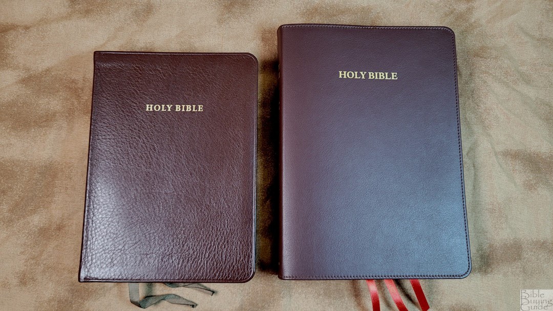
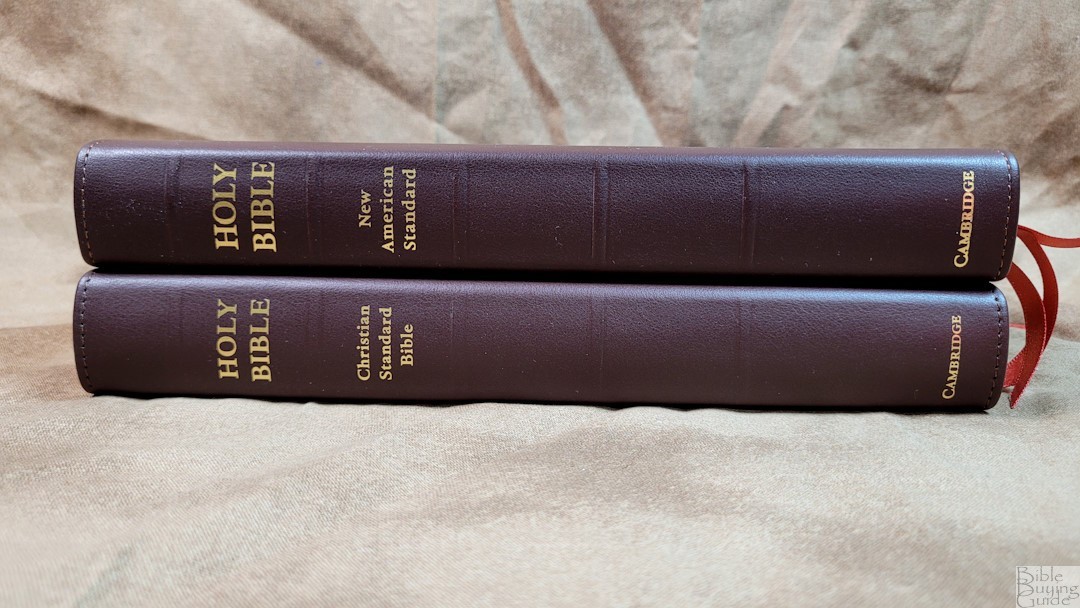
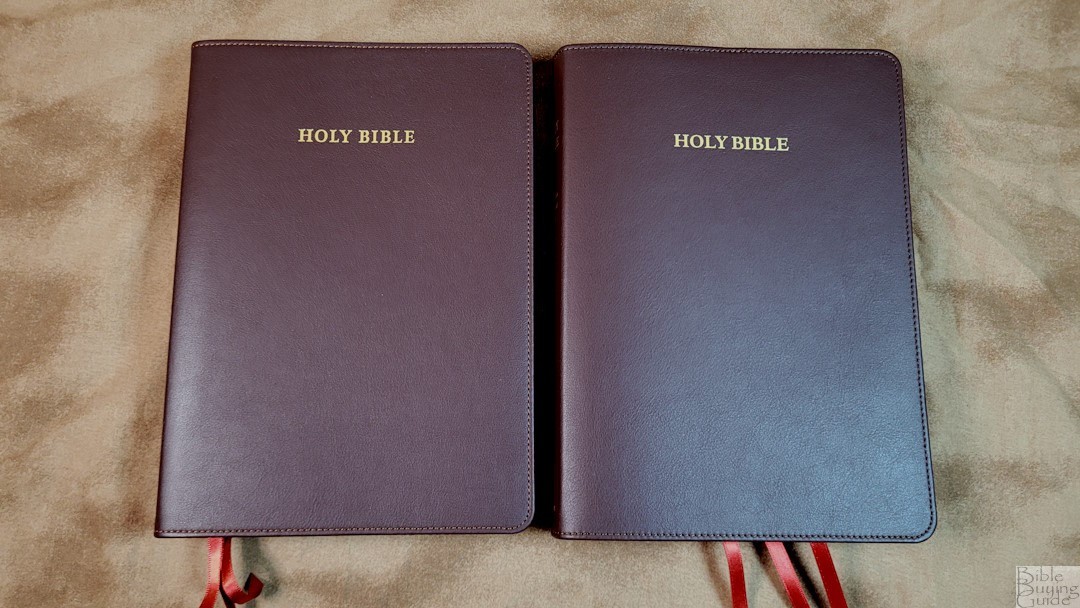
The brown calfskin has a smooth grain and texture. It’s soft and flexible, giving the Bible a little bit of flexibility without being floppy. It includes perimeter stitching and a 3/8″ yapp (overhang). The front has HOLY BIBLE printed in gold. The spine has HOLY BIBLE, Christian Standard Bible, and CAMBRIDGE printed in gold. It includes 5 slightly raised spine hubs.
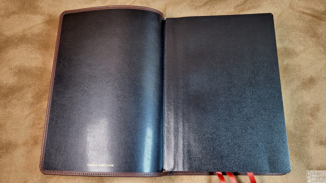
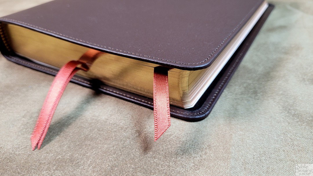
The liner is edge-lined with a synthetic material. The edge-lined tab is a little stiff, so it has trouble staying open in Genesis. It will require enough use before it will stay open in Genesis 1. The text block is sewn. It has 3 copper/rust 1/4″ ribbons They’re long enough to pull to the corner to open the Bible. The overall size is 6 1/4 x 8 3/4 x 1 1/8″ and the trim size is 5 3/4 x 8 1/4″. It weighs 1 lb, 11.5 oz.
Paper
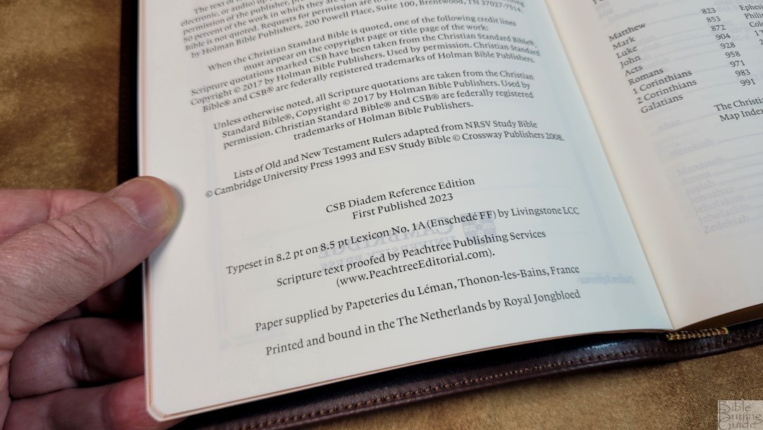
The paper is 32 gsm from Papeteries du Leman, Thonon-les-Bains, France. It includes a premium coating, making this premium paper look and feel elegant. It’s highly opaque and has a slightly cream color that I prefer for reading. I had no trouble turning the pages. The page edges are art-gilt with red under gold.
Family Pages
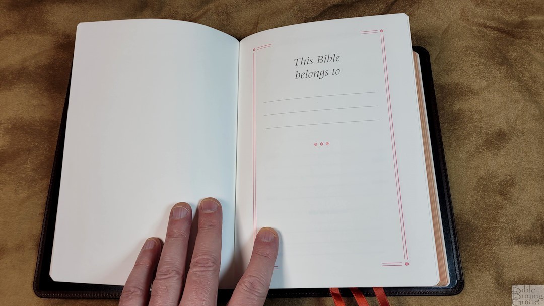
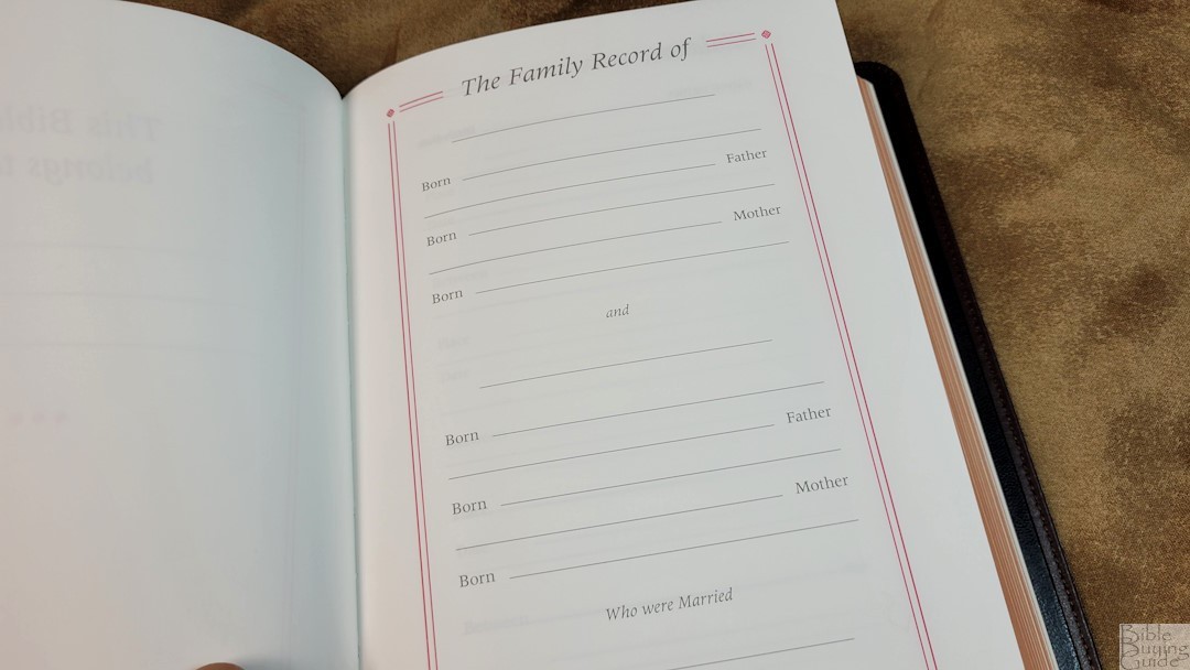
In the front are the Cambridge family pages. They include a presentation page, family records, children, marriages, and grandchildren, all with red borders, and deaths with black borders. These are printed on thick, non-glossy pages that are easy to write on.
Chronology of Rulers During Biblical Times
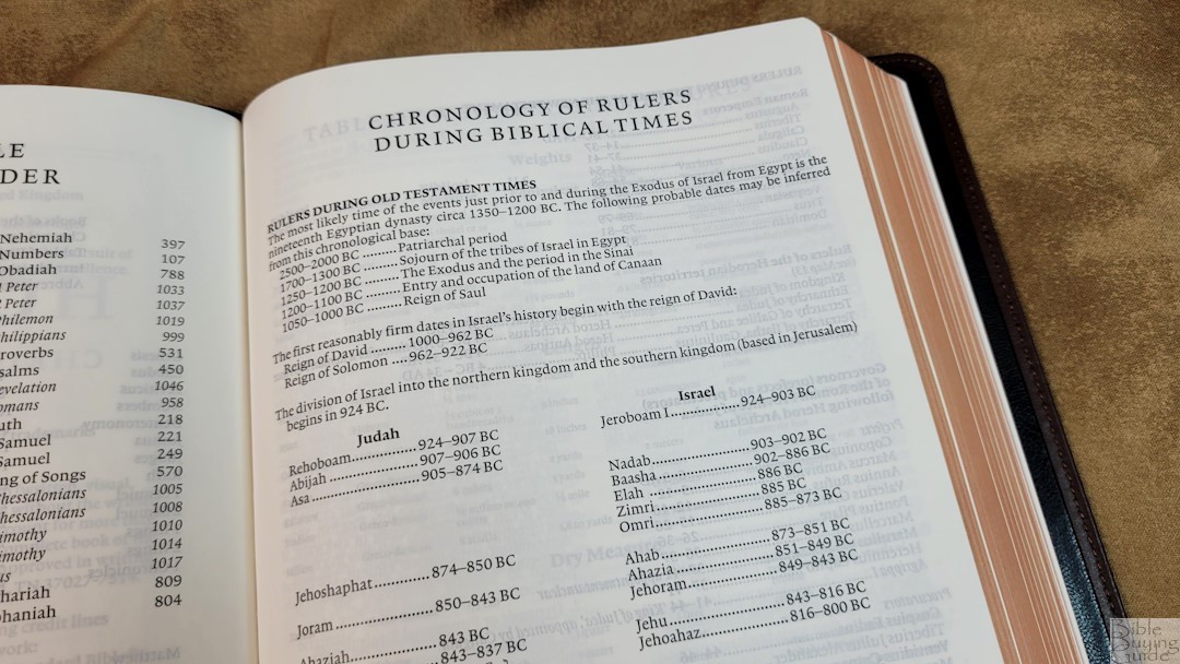
This is a table that divides the rulers into two categories. It shows the name and date they ruled. Categories include:
- Rulers During Old Testament Times
- Judah
- Israel
- Rulers During the Time of the New Testament
- Roman Emperors
- Rulers of the Herodian Territories
- Governors
Table of Weights and Measures
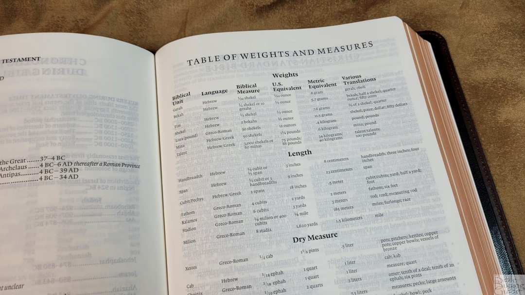
This is a one-page table with the biblical unit, language, biblical measure, US equivalent, metric equivalent, and various translations. It includes weights, length, dry measure, and liquid measure. There is a lot of information in this table.
Typography and Layout
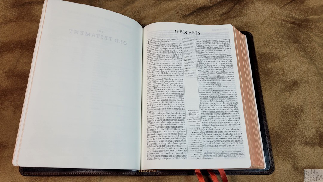
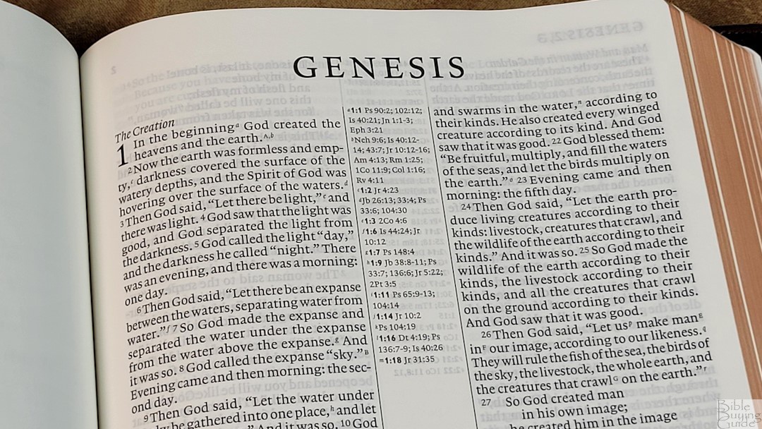
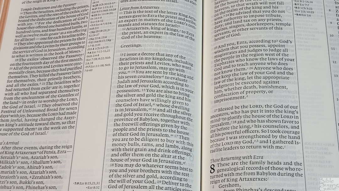
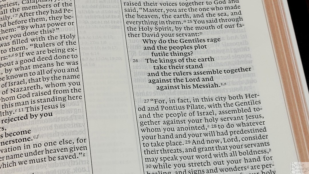
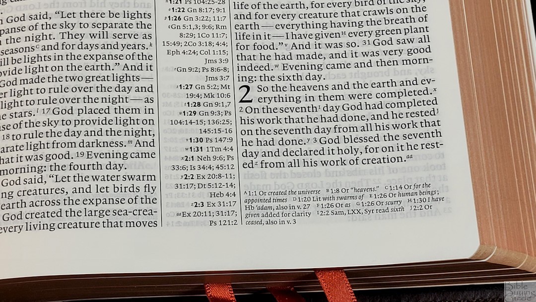
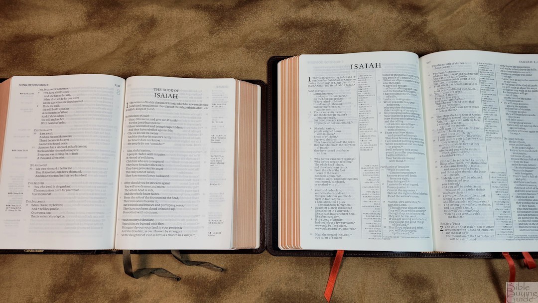
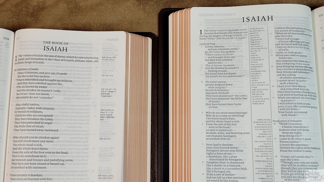
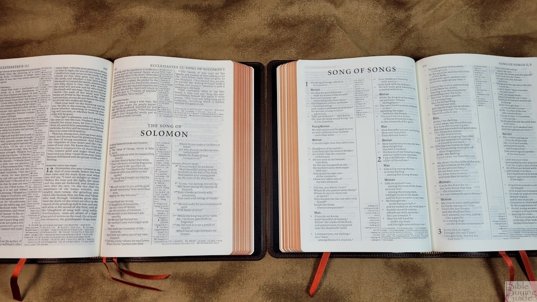
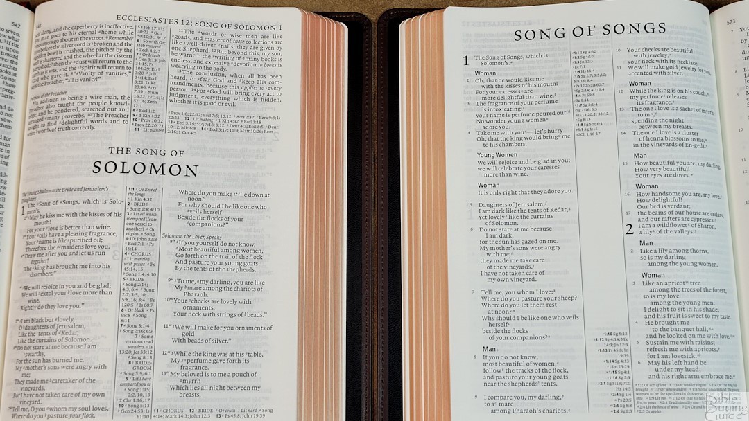
The CSB text is presented in a double-column paragraph format. Poetry is set to stanzas, lists are presented in a list format, and personal letters are indented. Old Testament quotes are printed in semi-bold. Section headings are in italics and don’t stand out too much. Cross-references are placed in the center column. Footnotes appear under the last verse on the page in a smaller font. The header shows the book name and chapter numbers in the outer margin and the page number in the inner margin. Books start on a new page rather than on the page where the previous book ends.
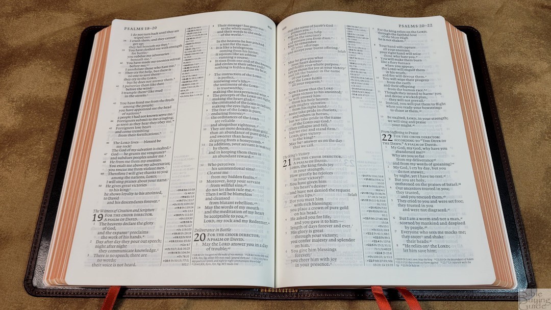
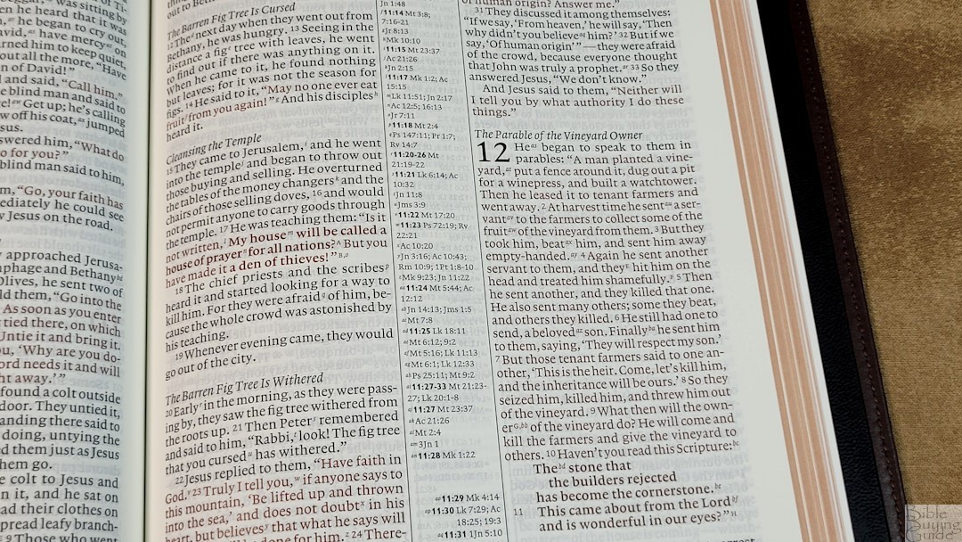
The font is 8.2 Lexicon No. 1 with an 8.5-point leading, typeset by Blue Heron Bookcraft. I like this typeface. It’s not a thick typeface, but it’s also not too thin. This is a red-letter edition. Both the black and red letters are dark and the print quality is consistent. The text is printed with line-matching, so the lies appear on the same location on both sides of the page to keep the show-through minimal. The text averages between 7-9 words. There’s enough space between them so the lines are not too crowded. It has enough inner margin that the text doesn’t get lost in the bend of the gutter.
Verse numbers are light and small and can be difficult to find quickly. The footnote and reference keys are numbers and letters. They’re italics and are printed small and light. I found them easy to ignore while reading. I like having the references and footnotes separate. This makes them much easier to find. The poetic settings have better spacing than most of the Pitt Minion series. There are a few lines with a single word, but most have two or three at a minimum.
References and Footnotes
Footnotes are placed under the last verse on the page. They’re printed in a small typeface. OT textual footnotes show differences among manuscripts and ancient versions including the Vulgate and Septuagint. NT footnotes show the differences in manuscripts including variations, additions, and omissions. They also show literal renderings, alternate renderings, and equivalence, when the word that’s given is actually from the original language and provided with English letters, where the text is difficult to translate, etc. The footnotes are helpful in getting insights into the translation.
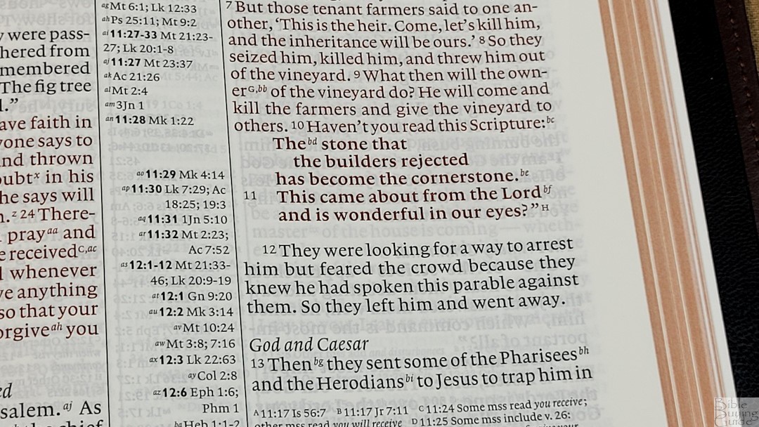
The references are placed in the center column. Those for the left column are aligned at the top of the page while those for the right column are aligned at the bottom of the page. There are a lot of cross-references, making this an excellent Bible for study and sermon prep. Here are a few examples to help you compare:
- Genesis 1:1 – Ps 90:2; 102:12; Is 40:21; Jn 1:1-3; Eph 3:21; Neh 9:6; Is 40:12-14; 43:7; Jr 10:12-16; Am 4:13; Rm 1:25; 1 Co 11:9; Col 1:16; Rv 4:11
- Deuteronomy 6:4 – Zch 14:9; Mk 12:29, 32; Rm 3:30; 1Co 8:6; Eph 4:6; 1Tm 2:5; Jm 2:19
- Isaiah 9:6 – Is 7:14; 11:1-2; 53:2; Lk 2:11; Jn 3:16; Is 22:22; Mt 28:18; 1Co 15:25; Is 28:29; Dt 10:17; Neh 9:32; Is 10:21; 63:16; 64:8; 26:3, 12; 54:10; 66:12
- Matthew 28:19 – Mt 10:42; 28:19 (not sure why this is included); Lk 14:26; Jn 8:31; 13:35; 15:8; Ac 6:1; Mk 16:15; Lk 24:47; Ac 2:38; 8:16
- Mark 12:29 – Col 4:1; Ja 5 (no verse given); Dt 6:4
- John 1:1 – Gn 1:1; Col 1:18; Jn 1:14; 1Jn 1:1; Rv 19:13; Jn 20:28; Php 2:6
- John 3:16 – Jn 12:43; 1 Cor 13:1; Gl 2:20; Col 1:13; 3:12; 1 Th 1:4; 2 Th 2:13, 16; 1 Jn 4:7-12; Ja 1(no verse given); 1 Jm 4:9; Jn 5:19; Heb 1:2; Jn 12:25; ; Rm 5:8; 1 Jn 3:16; 4:9-10
- Acts 2:38 – Lk 24:47; Ac 3:19; 26:20; Ac 8:12; 22:16; Ac 3:16; 15:14
- 1 John 1:1 – Jn 1:1; 1Jn 2:13-14; Ps 119:25; Jn 1:1, 4; 5:24; Php 2:16
Concordance
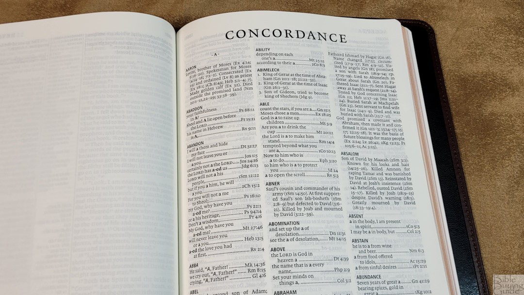
The concordance is 119 pages with 3 columns per page. The text is the same size as the biblical text. It includes biographical information with lots of character studies. This is a good concordance for study and sermon prep. Here are a few example entries with the number of references they have to help you compare:
- Christ (see also Messiah) – 35
- Christian – 2
- Faith – 34
- Faithful (see also Faithfull Love) – 15
- Faithfull Love – 15
- Faithfulness – 6
- Faithless – 1
- God – 78
- Goddess – 2
- God-Fearing – 1
- Godless – 1
- Godlessness – 2
- Godliness –
- Godly – 4
- Praise (n) – 8
- Praise (v) – 5
- Pray – 14
- Prayer – 6
Bible Atlas
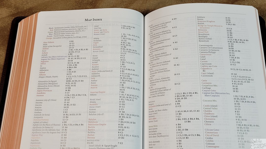
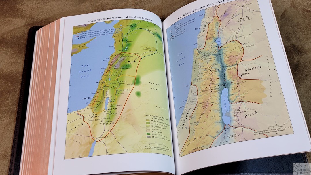
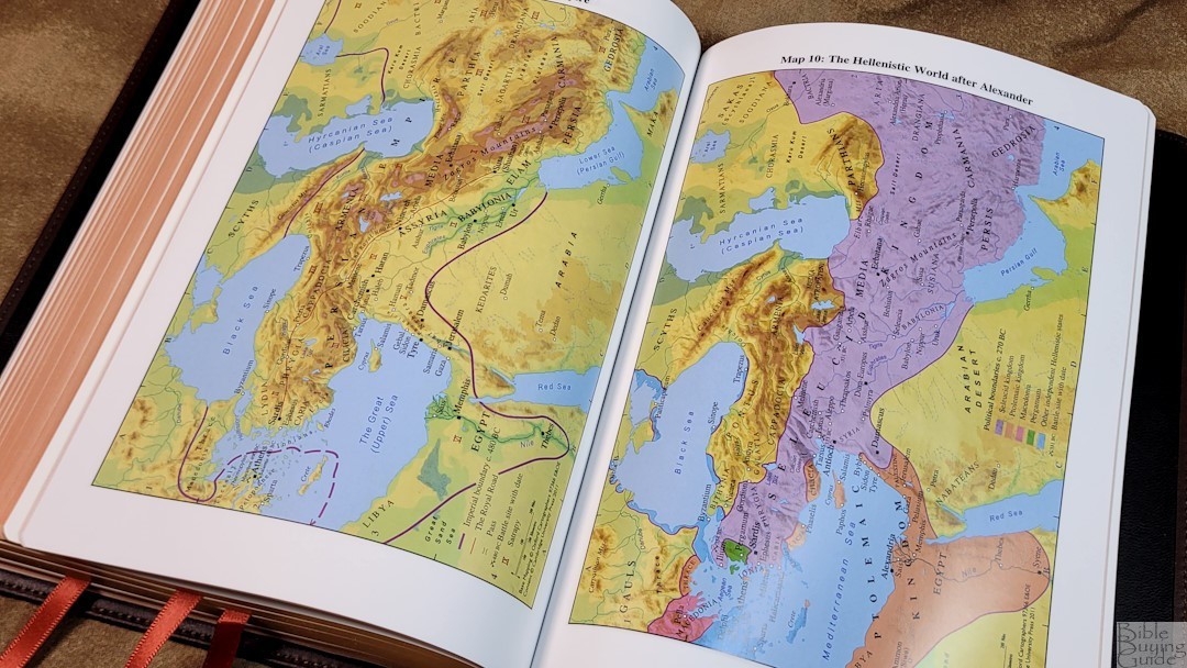
In the back are 15 full-color maps with an 8-page color-coded map index. The maps are colorful. I love the colors and I find them easy to read and use. They’re printed on thick, semi-glossy paper. They show routes, birders, water, distance topography, vegetation, cities, dates, battle sites, etc. This edition has a color-coded index that shows settlements, political, physical land, physical water, travel, and Jerusalem. I prefer this type of index and I always appreciate it when it’s included.
Maps include:
- The Ancient Near East in the Late Bronze Age
- Regions of Palestine and Surrounding Areas
- Sinai and Canaan at the Time of the Exodus
- Israel within Canaan
- The United Monarchy of David and Solomon
- Israel and Judah: The Divided Monarchy
- The Assyrian Empire
- The Babylonian Empire
- The Persian Empire
- The Hellenistic World after Alexander
- Jerusalem in Old Testament Times
- Jerusalem in New Testament Times
- Palestine in the New Testament
- The Roman Empire
- The Eastern Mediterranean in the First Century AD
Comparisons
Here’s a look at how the CSB Diadem in brown calfskin compares to several other Bibles from Cambridge.
Cambridge Pitt Minion
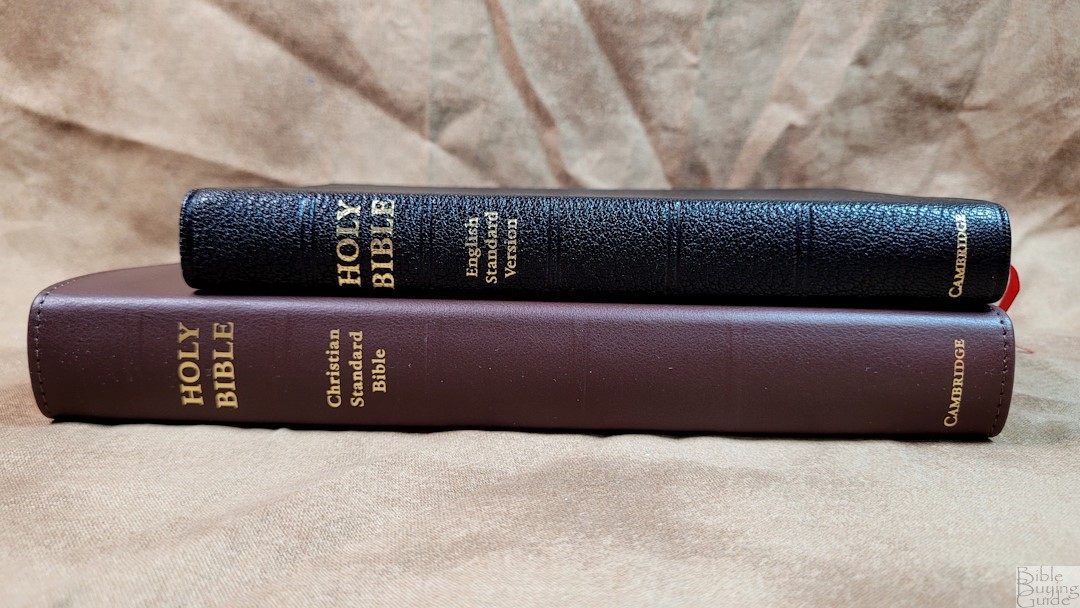
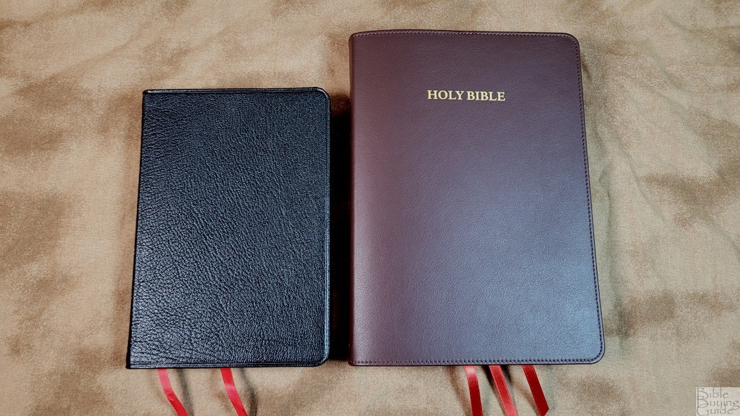
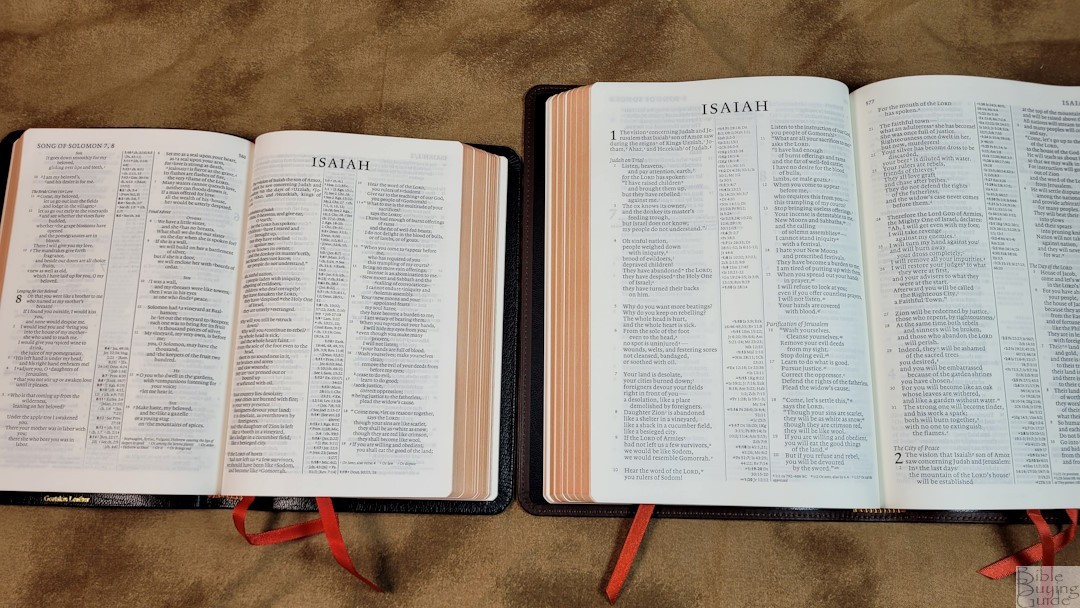
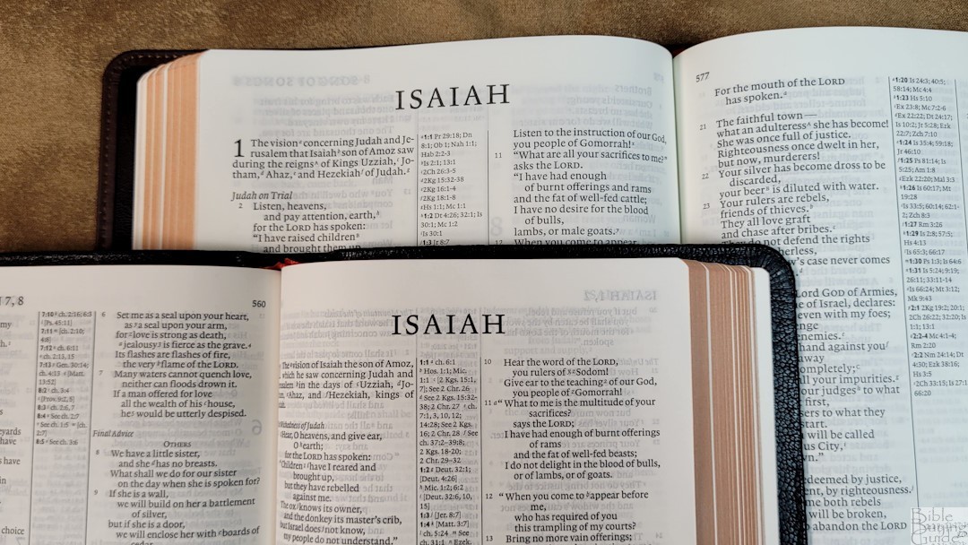
The Pitt Minion is the series the Diadem is normally based on. The CSB is not available in a Pitt Minion. Here’s the ESV Pitt Minion to show the size comparison. It has a smaller footprint and it’s thinner (it has 28gsm paper vs the 32gsm in the Diadem). The font size is 6.75 with a 7-point leading. If the Pitt Minion was available in the CSB, its concordance would have the same entries, but the PM is normally in two columns. The maps are the same. The PM has two ribbons instead of three.
Cambridge Clarion
The NKJV Clarion is also available in brown calfskin. This calfskin is stiffer with a paste-down liner and a more pronounced grain. It has a smaller footprint, but it’s a lot thicker. The font is noticeably larger and the single-column poetry is cleaner. If the Clarion was available in the CSB, it would have the same references, footnotes, concordance, and maps. The paper is 28gsm Indopaque. The print isn’t as dark as the Diadem.
NASB Diadem
The NASB Diadem is almost identical to the CSB. The CSB includes the Table of Weights and Measures but doesn’t have the pages for notes or the extra space at the top and bottom of the concordance. The brown calfskin is the same.
Conclusion
The CSB Diadem in brown calfskin is an excellent hand-size Bible for all-around usage. It’s thinner than the Clarion, making it easier to handle. It’s larger than the Pitt Minion, so it’s easier to see and use. Unlike the other Diadem editions, this one doesn’t have a matching Pitt Minion or Wide Margin edition, but it’s always possible that Cambridge would print them if this edition is popular enough. Even if they don’t produce a matching Pitt Minion, the CSB Diadem is an excellent Bible on its own.
_________________________________________________________
This Bible is available at
and many local Bible bookstores
_________________________________________________________
Cambridge provided this Bible in exchange for an honest review. I was not required to give a positive review, only an honest one. All opinions are my own.


Good review, Randy. I recently purchased the CSB Diadem in red calf split leather. It’s a wonderful Bible. I’d like to see Cambridge publish a CSB Topaz as well as a Clarion version.
Great Review, Randy. I debating on purchasing a CSB Diadem, i honestly wish they would publish it in the Clarion it is my favorite bible profile