What better gift could you give for Christmas than a nice copy of God’s Word? There are lots a good quality Bibles to choose from and making a choice can be extremely difficult. To help make a choice I’ve compiled my list of 12 Bibles that I think make the best gifts. Prices range from around $30 to over $200. They’re in no particular order.
Clarion
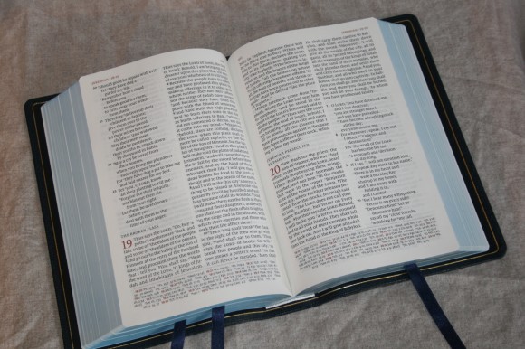
The Cambridge Clarion is a candidate for the most beautiful Bible layout. It presents the text in a single-column paragraph format with references in the outer margin. It’s a hand-sized Bible with close to a 9-point font. The focus is on readability. The text uses line-matching to improve readability. Poetry is set in stanzas and all but the KJV has section headings that create a lot of white space on the page, which helps add to the beauty and usability.
It’s available in KJV, NKJV, ESV, and NASB. In 2016 it will be available in NIV. Covers include paste-down, calf split, calfskin with art-gilt edges, and edge-lined goatskin. The overall size = 7.5 x 5.5 x 1.5.
It’s best for reading, carry, and study. Here’re the reviews: KJV, ESV, NKJV
Pitt Minion
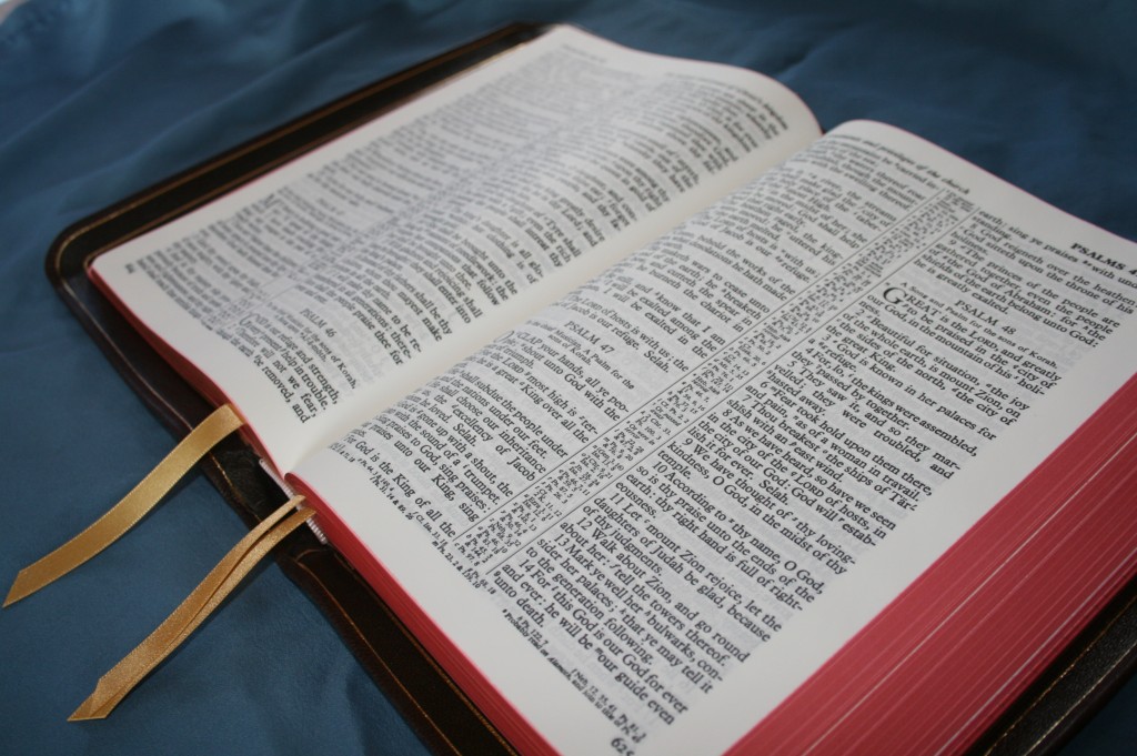
Cambridge’s Pitt Minion is a full reference Bible in a pocket-sized edition. It has references, footnotes, a concordance, and maps with an index. They’re printed in double-column paragraph with center-column references. At 6.75 x 4.75 x .8, it’s a small Bible that’s easy to carry. The font is small (6.75-point) but dark and sharp. If you can read the small print then the Pitt Minion is a winner.
It’s available in several translations (KJV, NKJV, ESV, NASB, NLT, and NIV). Covers include paste-down calf split and goatskin.
It’s best for reading, carry, and study. Here’s the review: KJV
Concord
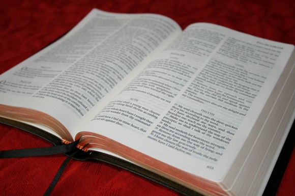
The Cambridge Concord is a setting from the 1950’s. It’s a reference KJV Bible with concordance, dictionary, glossary, maps, and an index to maps, etc. It has a clean and bold typeface that’s free of distractions and a joy to read. It’s a thin hand-size Bible that’s perfect for multi-use. The Concord is often considered Cambridge’s flagship Bible.
You can get it in paste-down calf split and edge-lined goatskin. It’s also available in personal size and wide margin editions. The overall size = 5.5 x 8.25 × 1.25 (regular), 7.75 x 9.6 x 1.6 (wide margin), and 5 x 7.25 x 1.5 (personal size).
It’s best for reading, carry, study, and preaching. Here are the reviews: Concord, Wide Margin, Personal Size
Cambridge Wide Margin
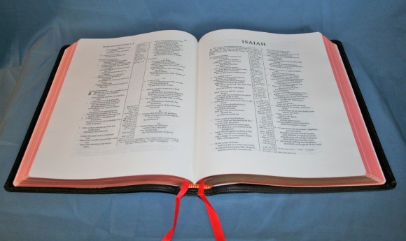
The Cambridge wide margin line has wide margins on all four sides, 38gsm paper that’s perfect for writing, and plenty of blank and lined pages in the back for notes. All are double-column editions with center-column cross references. Most have the same layout as the Pitt Minion. Once you’ve read your Bible on this 38gsm paper it’s hard to be satisfied with anything else.
The Concord edition matches the regular Concord but without the dictionary. It has more pages for notes than the other editions. All other editions match the Pitt Minion. The fact they match makes for a great carry/study combo.
It’s available in several translations (KJV, NKJV, ESV, NASB, and NIV). Covers include hard cover (except KJV), bonded (ESV only), calf split, and edge-lined goatskin. I consider the Cambridge Wide Margin Bible a must-own. The overall size = 7.75 x 9.6 x 1.6 (KJV), and around 7.75 x 9.6 x 1.4 (the rest).
It’s best for study, marking, and preaching. Here’re the reviews: KJV, NKJV, ESV
Windsor
The TBS Windsor is the cleanest text-only edition available in KJV. The verse-by-verse double-column format is completely free of distractions. The typeset is a gorgeous and sharp 9/10 with line-matching and the paper is creamy and opaque. The calf skin is stiff and lays flat in the hand. It contains a pronunciation guide, glossary, and a 2-year reading plan (the actual plan my family uses for out nightly reading). It has 2 ribbons. This Bible was made for reading and I can’t think of a better choice at 3 times the price. This is my personal favorite text-only Bible.
It’s available in imitation and calf skin. It’s only around $35 for a calf skin leather edition. The overall size = 7.5 x 5.25 x 1.
It’s best for reading, carry, and preaching. Here’s the review: Windsor
Westminster / Classic Reference KJV
The Westminster KJV Reference Bible has 200,000 cross references, translators’ notes, and glossary in the margins – all next to the verses they correspond to, making a functional layout. In the back it has pages for notes, a pronunciation guide, 2-year reading plan, extensive concordance, and maps. It has 4 ribbons. It has creamy paper and an elegant font. This is without a doubt one of the best KJV’s ever produced. It’s my personal favorite reference KJV and for the money it’s hard to beat.
The TBS edition is available in hard cover and black paste-down calfskin. The Schuyler edition is available in edge-lined goatskin with several colors to choose from. It also has art-gilt edges and 4 elegant ribbons. The overall size = 8.5 x 6 x 1.5.
It’s best for reading, carry, study, and preaching. Here’re the reviews: TBS, Schuyler
NLT Select / Caxton
If the Clarion isn’t the #1 most beautiful layout, it’s probably because the NLT Select is. The same basic layout is there: single-column paragraph with references in the outer margin. The Select is taller. The verse numbers are slightly bolder so I can find them easier. The section headings stand out just a touch more. It has more room in the inner margin which brings the text further out of the gutter. Footnotes are marked with an asterisks and parallel passages have // in the margin. It was designed in-house by Tyndale. Well done, Tyndale design team!
The Tyndale edition is available in black edge-lined goatskin with art-gilt edges and 2 basic ribbons, and in calfskin with gold gilting. It also has art-gilt edges and 3 elegant ribbons. The Schuyler edition is available in edge-lined goatskin with several colors to choose from. The overall size = 5.25 x 8.25 x 1.5.
It’s best for reading and carry. Here’s the review: NLT Select
Quentel
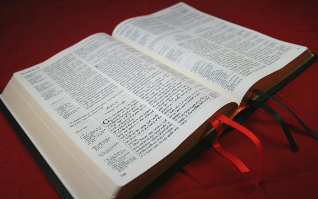
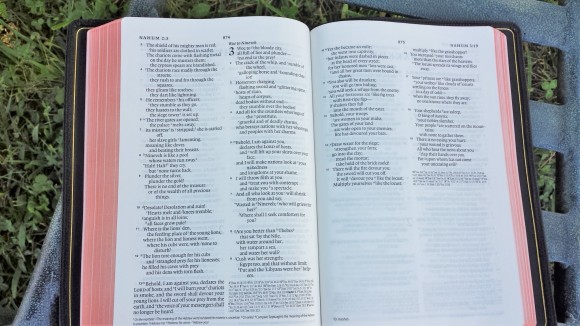
The Schuyler Quentel was designed to be elegant and it sets the bar high. It has a double-column paragraph format with references and footnotes in the footer. It has a large 11-point print with 38gsm paper and line-matching. It’s about the size and weight of a study Bible with the focus on the text. This layout is a beauty to behold and the double-column is easier on my bifocals than single-column editions. It includes an extensive concordance and lots of maps. Even though it’s large I prefer this font and paper for reading.
It’s currently available in NASB and ESV, and will soon (in 2016) be available in NKJV. It has edge-lined goatskin with several colors to choose from. It also has art-gilt edges and 3 elegant ribbons. The overall size = 6.5 x 9.75 x 1.87.
It’s best for reading, study, highlighting, and preaching. Here’s the review: ESV
Longprimer
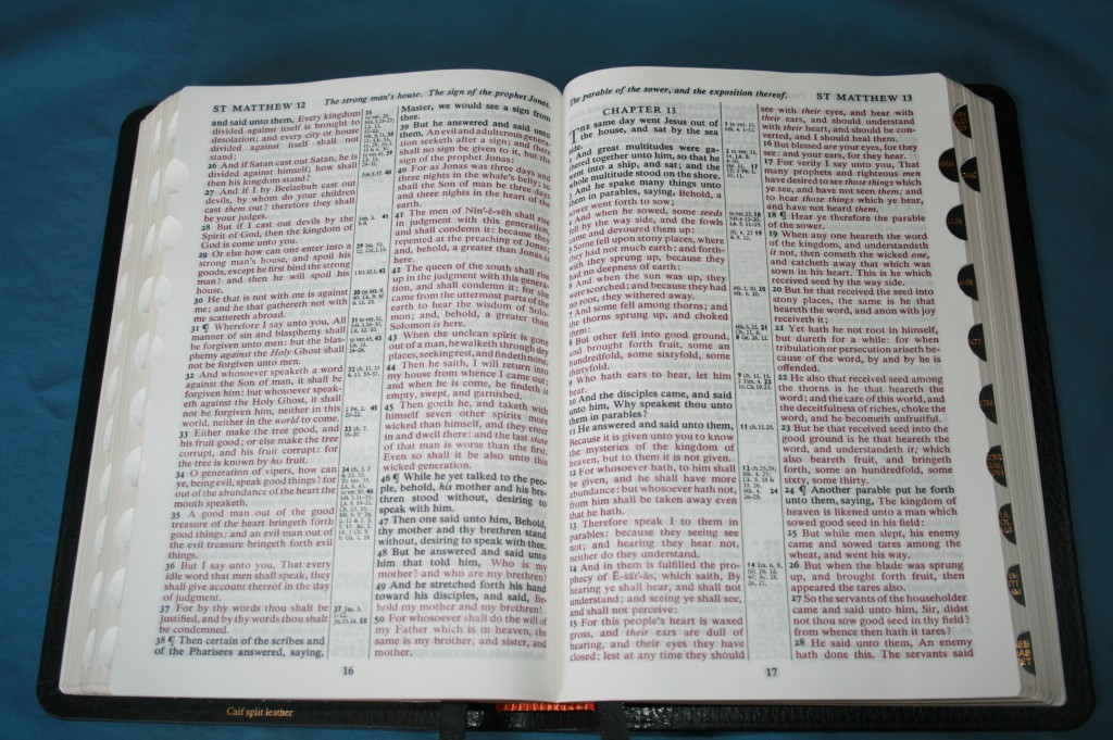
The Allan Longprimer is R. L. Allan’s printing of the Oxford Long Primer and is considered the Rolls Royce of Bibles. It’s an older double-column setting with a 10-point bold font and 100,000 center-column chain references. It’s printed on opaque 32gsm paper. It has an extensive concordance, name index, topical index, and Oxford maps. It even has 32 ruled pages in the back for notes. There’s another edition called the Sovereign that has 38gsm paper and 1” outside and bottom margins.
It’s available in several covers including calfskin and goatskin with a yapp with multiple colors. It has 3 elegant ribbons. The overall size = 8.75 × 6 (plus yapp) × 1.5.
It’s best for reading, carry, study, and preaching. Here’s the review: Longprimer
Omega Heirloom
I’m calling the Omega Heirloom the ESV equivalent to the Longprimer. It’s roughly the same size and has a similar layout. In reality its layout is cleaner. It has paragraph instead of verse by verse, and references are under the last verse on the page instead of in a center column (which gives the focus on the text). It has a nice concordance and 8 pages of color maps. Being a thin-line it’s easy to handle.
It has edge-lined goatskin in black or brown with a yapp and has art-gilt edges and 4 thin ribbons. The overall size = 6 5/8 x 9 ¾ x 1 1/8.
It’s best for reading, carry, study, and preaching. Here’s the review: Omega Heirloom
Single Column Legacy
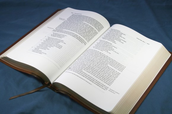
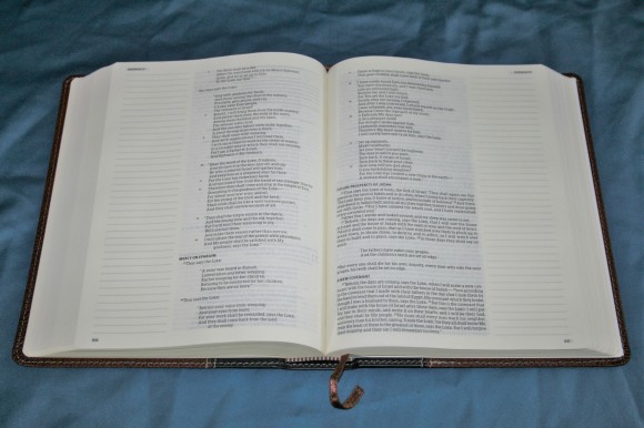
The Single Column Legacy was designed with the idea of the perfect page in mind. The page proportions use design principles from the renaissance. It has a wide outer margin where the section headings are placed. It doesn’t have references. You could use this as a wide margin Bible if you wanted to.
The Heirloom edition has edge-lined goatskin in black or brown and has 4 ribbons. The paper is 28gsm which makes this edition thinner than the regular edition. Other editions include TruTone and genuine leather. The overall size of the standard edition is 9 x 6 x 1.5, and the Heirloom is 9.5 x 6.5 x 1.25.
It’s best for reading, carry, study, and preaching. Here’re the reviews: Single Column Legacy, Heirloom Edition
Single Column Journaling Bible
This is a single-column setting with a 2” outer margin that’s lined for writing. The paper is very thick and opaque and has deep cream color that’s close to yellow. Each edition includes section headings. The ESV, HCSB, and NKJV have paragraph and KJV is verse by verse. It has a 7.5 font and red letter. There are no references in the text.
It’s available in the ESV from Crossway and HSCB, NKJV, and KJV from Holman. Zondervan is working on an NIV Single Column Journaling Bible. The overall size = 8.25 x 6.5 x 1.5.
It’s best for reading, marking, and journaling. Here’re the reviews: ESV, NKJV, KJV
Thoughts on Design and Quality
Verse by verse layouts place function over form in making each verse easy to see, whereas paragraph layouts place reading first. The one you need depends on how you plan to use it. I love paragraph Bibles for reading, but I find verse-by-verse easier to preach from. I prefer paragraph formats if the verse numbers are easy to find because paragraphs help keep passages together in complete thoughts.
Single column editions have the advantage of having more space on a line. This means fewer words that are too close together, no awkward spaces between words, and fewer hyphens. For editions that place poetry in stanzas this gives more room per line which makes the poetry prettier. Verse numbers are typically harder to see. I prefer this for reading. Some publishers have slightly bolder verse numbers. When this is the case I would prefer the paragraph setting for general use.
Wide margin editions are great for study and preaching. I personally think everyone needs a wide margin Bible, but Bible students and preachers especially need them.
The Bibles on this list represent high quality materials and design in virtually every price range. Most of the newer editions use line-matching to improve readability. The older editions rely on the opacity of the paper to help with readability. Most of my favorite editions were printed in the Netherlands by Jongbloed and designed by 2K-Denmark. When you put these two together on a Bible project you’ve got an elegant edition of God’s Word that you will cherish for a lifetime.
Did I leave out your favorite? Is there a Bible you would like to give for Christmas? Let us know in the comments.





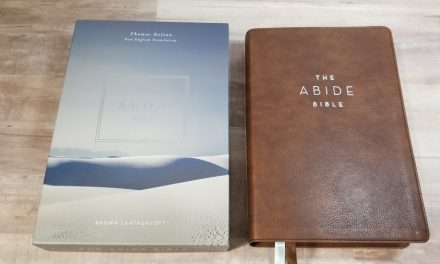


Personally I would have included the Transetto in this list. I know it’s not a luxury goat skin edition but as a gift, I can’t imagine anything better. It’s such an amazing little Bible.
Ken
The Transetto is a neat little Bible. My wife has carried one for several years. It’s a good one to have with you.
Brother, thanks for taking the time to do this. I so enjoy reviewing different Bible form factors. I have been using my new Longprimer for a few months now, and find that with preaching the pages are so thin, they can be difficult to turn. they also are curling/wrinkling very easily. While I purchased a Pigma Micron to mark in it, I haven’t brought myself to do so. This Bible is so “pretty” I have hesitated…..not good I know. Not a relic, but a tool.
I used an old Cambridge Cameo wide margin for years, that has worn out. My question for you relates to font readability. Is the Concord WM acceptable for preaching/viewing from pulpit? (Compared to Longprimer) My eyes are getting older, so I have long term in mind. Is the Concord similar to Cameo? If so, I have the Cameo for comp.
Thanks again! Brian
Hi Brian. I haven’t written in my Longprimer yet either. It’s so pretty to look at that I’m not sure I want to see my handwriting along with the text. That’s actually one of the reasons I went to wide margin editions for my writing. I preach from the wide margin Concord a lot. I usually prefer 12 point fonts for reading and preaching, but the Concord is so dark and sharp that I don’t have any issues reading from it behind the pulpit. I do get a little closer to the page than I would if it were a larger font, but I probably don’t really need to. It’s thicker paper does make it easier to turn pages. The boldness of the font is about the same as the Longprimer, but its paper has an eggshell/ivory color that makes the font easier to read. Also, it doesn’t have any reference or footnote keys in the text. I find the wm Concord to be easier to read even with the smaller print. The same goes for comparing it to the Cameo. Also, the Cameo has instances where there are too many words crammed on a line, making two or more words look like oneword. The Concord doesn’t do this. The Concord’s font is sharper than the Cameo’s. My Cameo isn’t the wm edition, but I’ll try to post a comparison photo today that shows all three Bibles together.
Here’s the LCBP 120 (Cameo), Concord, and Longprimer
Wow, how helpful! Thanks so much. That LCBP is identical to my old Cambridge Cameo WM. It is so nice that LCBP is producing these old text blocks at such reasonable rates. This photo does show the improvement of text layout in the Concord vs Cameo. Increased line spacing certainly helps to reduce the “clutter” effect, which is what I struggled with in reading from the pulpit. The better paper is also a seller. Now it comes to the tough decision of Goatskin or Split Calf?? I have been spoiled by the Allan limpness, but wonder if that would be a disservice with the larger Concord….so maybe I go with Split calf and then get the Concord Reference for reading…(okay dreaming here.) 🙂
Thanks again, and Merry Christmas!
Brian
I don’t like writing in my Bibles, although I recently got myself a LCBP 400 note taker, to me if you going to write note, put down thoughts or simply study the scriptures, this has to be the most perfect layout for it. The layout lends itself so much so to note taking, that you actually feel bad not adding notes to the bible. Not to mention how well made it is, although I did replace the 2 thin ribbons with 3 x 10mm premium ribbons. I highly recommend the 400 note taker for anyone who wants space to write in their Bible, especially sermon preparation.