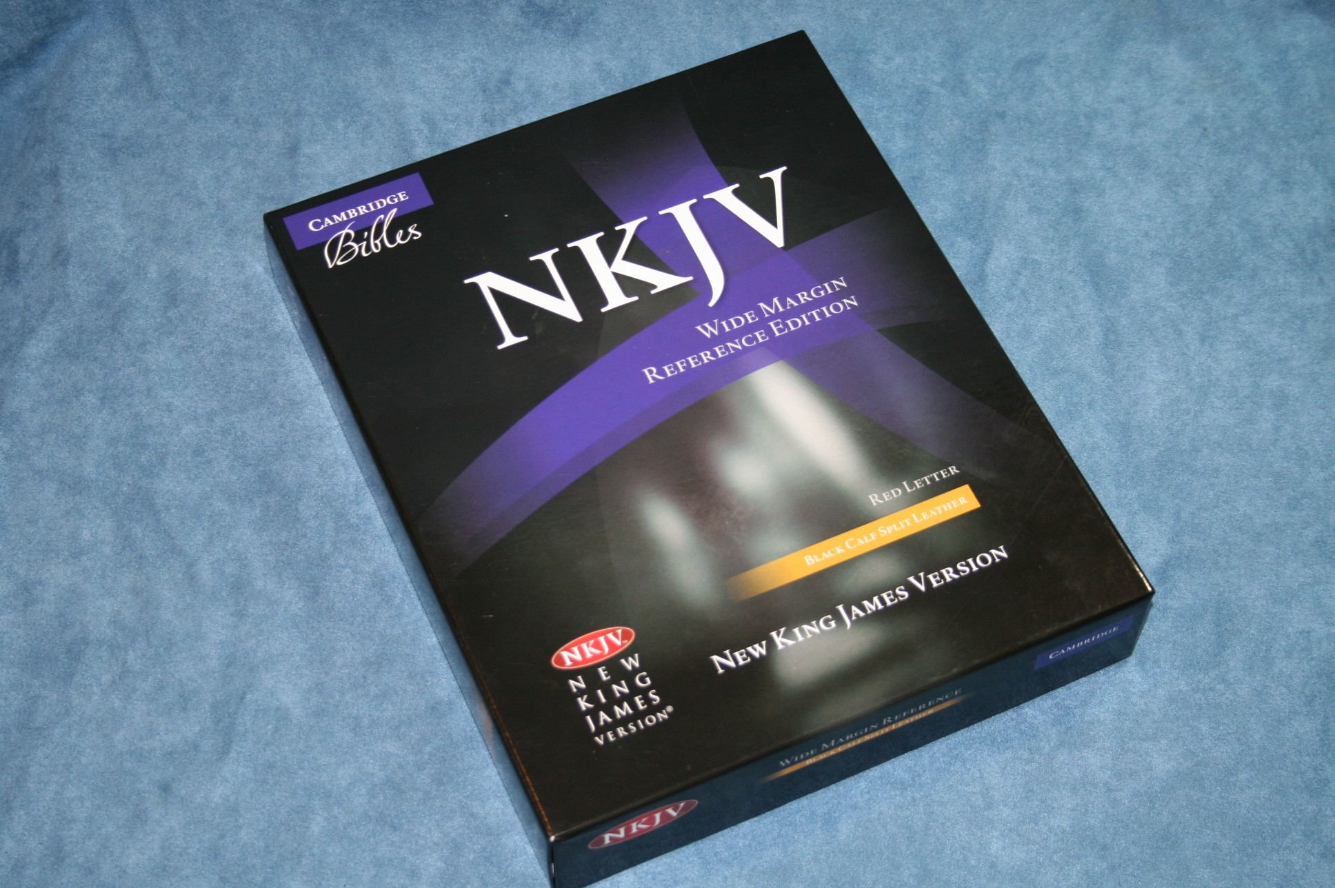
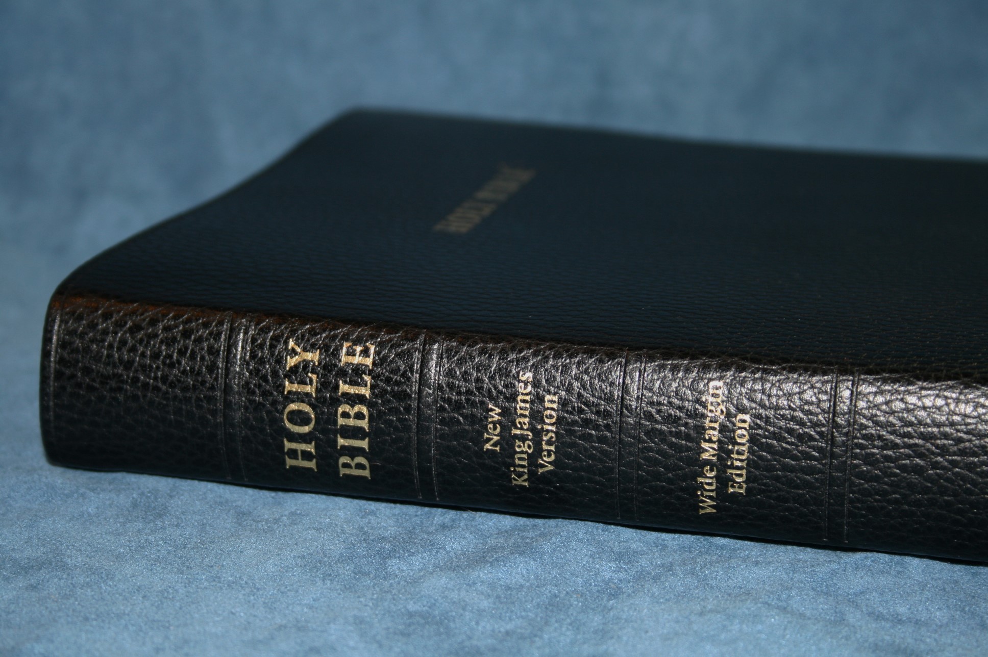
The New King James is sadly lacking in premium editions. I can count them on one hand. There is only one wide margin edition available. Fortunately it is available in two different covers: calf split and goatskin. Both are excellent editions. In this review I take a look at the Cambridge NKJV Wide Margin in black calf split leather.
Pros
- Wide margins
- Thick paper
Cons
- Font could be larger
- Inner margin is tight
Features
- NKJV
- Calf split leather
- Sewn
- 7.9 font
- Red-letter
- 2 column
- Paragraph
- Center-column references
- Translation footnotes
- Concordance
- Maps with index
- Index to notes
- Notebook paper
- 2 ribbons
- 9 5/8 x 7 ¾ x 1 7/16
- ISBN: 9781107604124
- MSRP $210.00
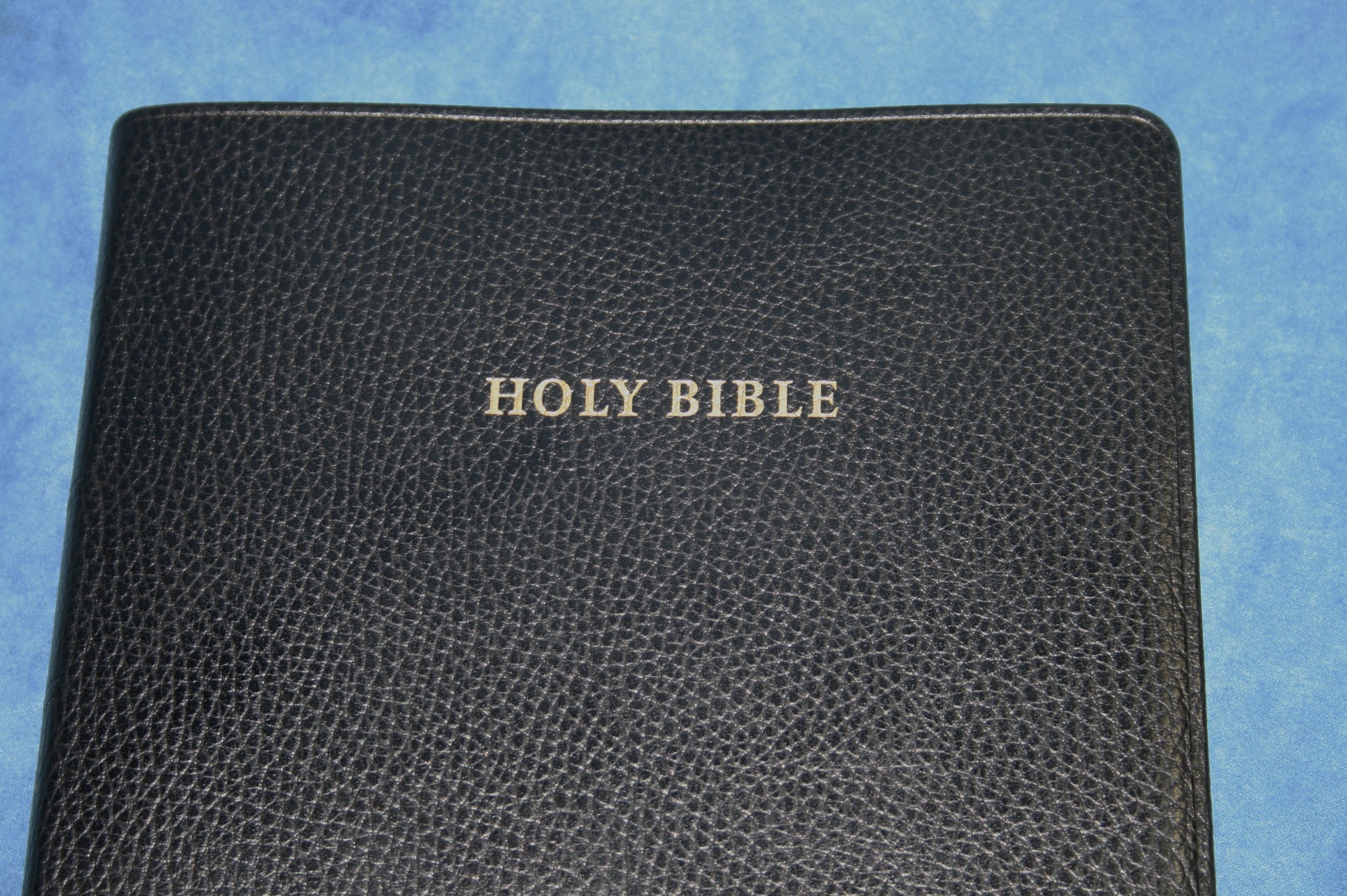
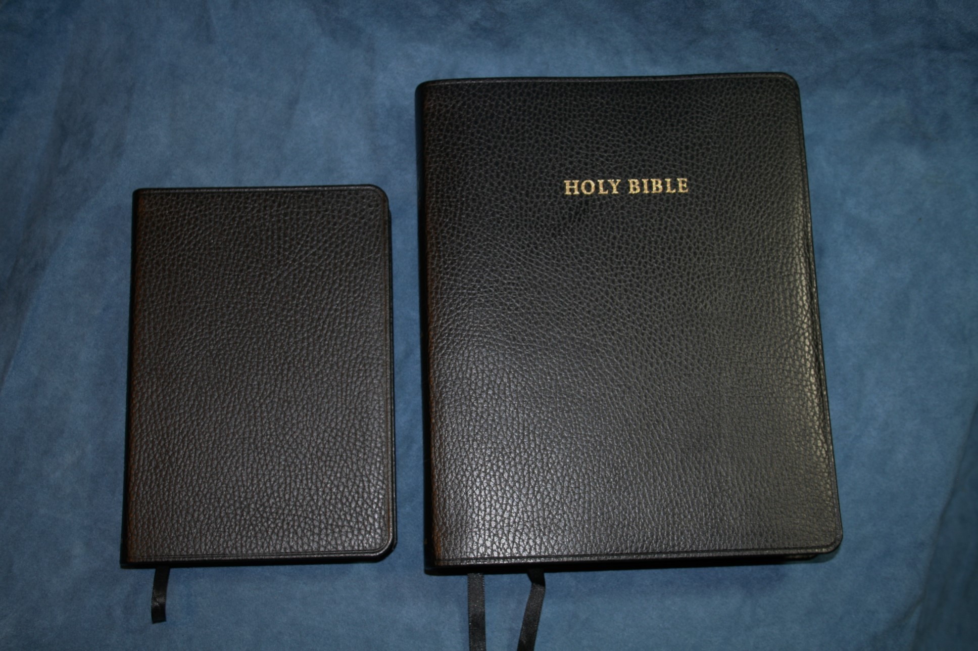
Cover
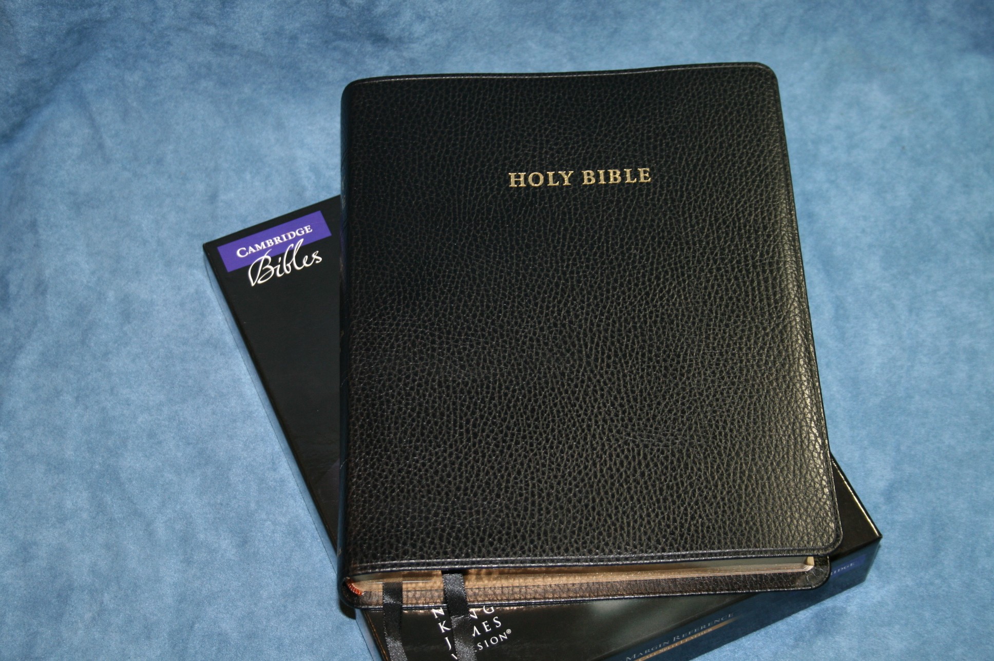
This edition is calf split. The leather is split into two pieces. The top portion is removed and sent to automakers to be used to make car seats and various other industries that need the softer leather. This is the bottom portion of the leather, which includes a stamped grain and has a tougher feel to it. It’s a feel that I happen to like a lot.
It’s not as flexible as goatskin, but that’s not a bad thing. Sometimes goatskin feels a little too floppy and unwieldy. This is especially true on larger Bibles and even truer on wide margin editions. The liner is paste-down vinyl.
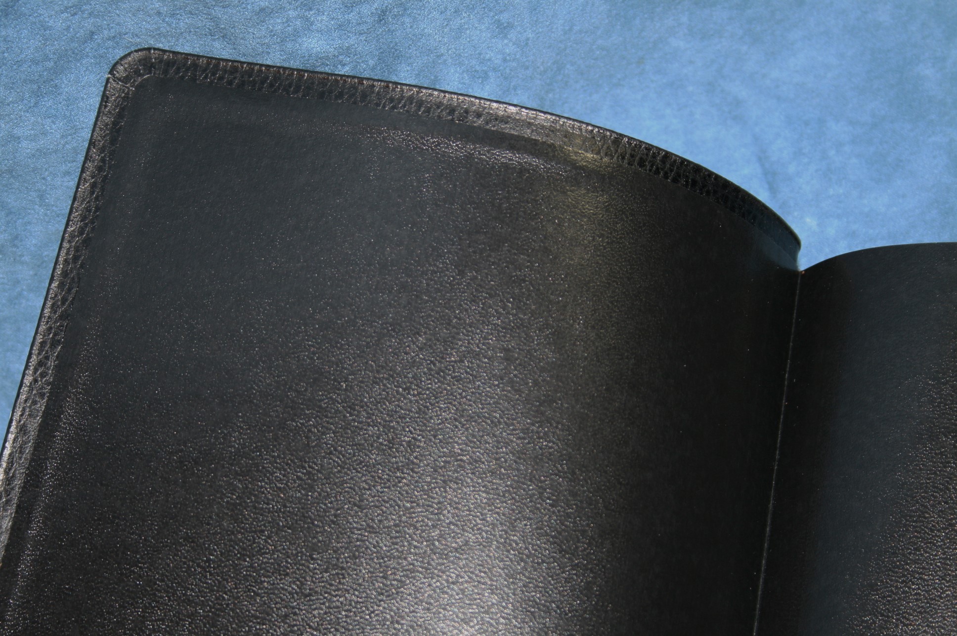
The cover opens to the first page with no trouble at all. The text-block is sewn, like it should be, and has no trouble lying flat.
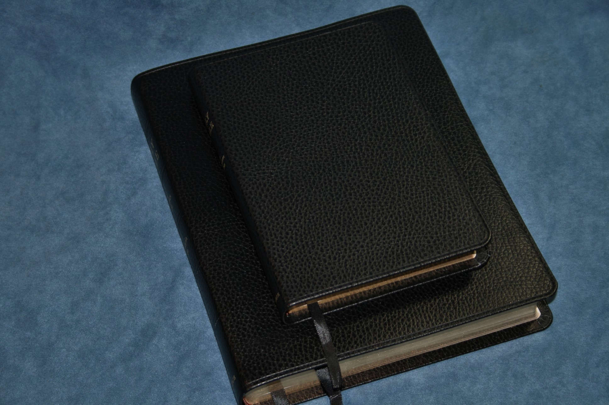
As far as size, it’s a little thinner than the Concord wide margin and about the same size as the ESV wide margin.
Paper and print
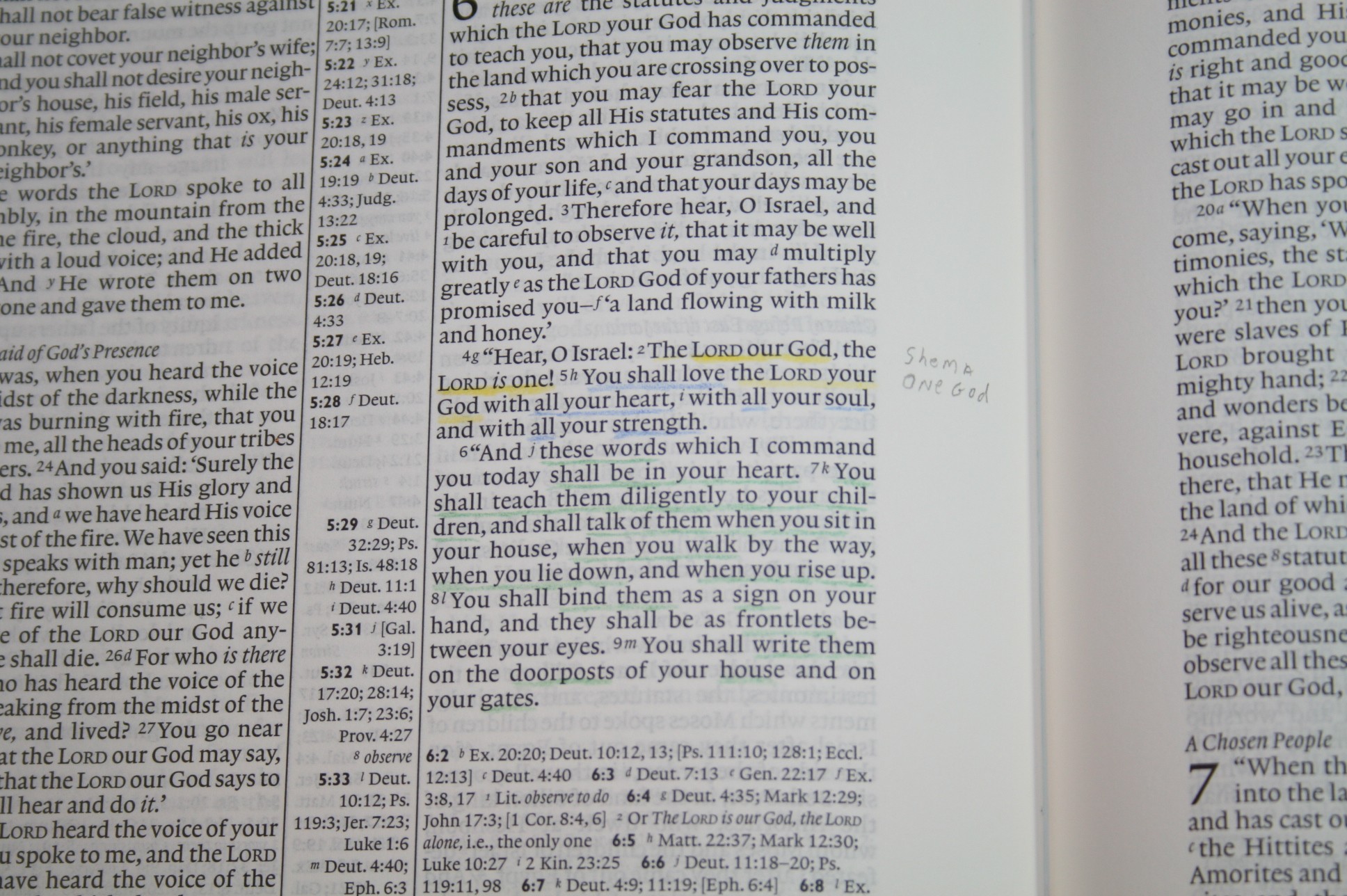
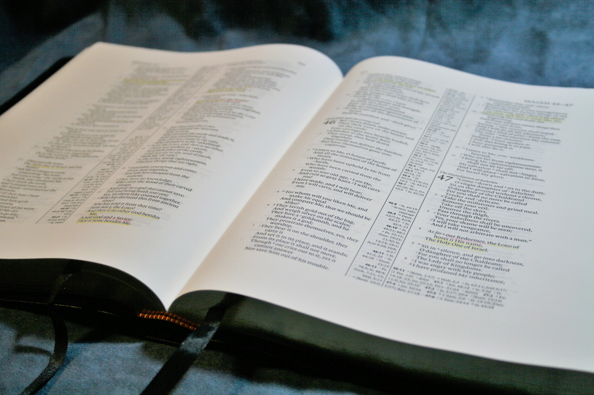
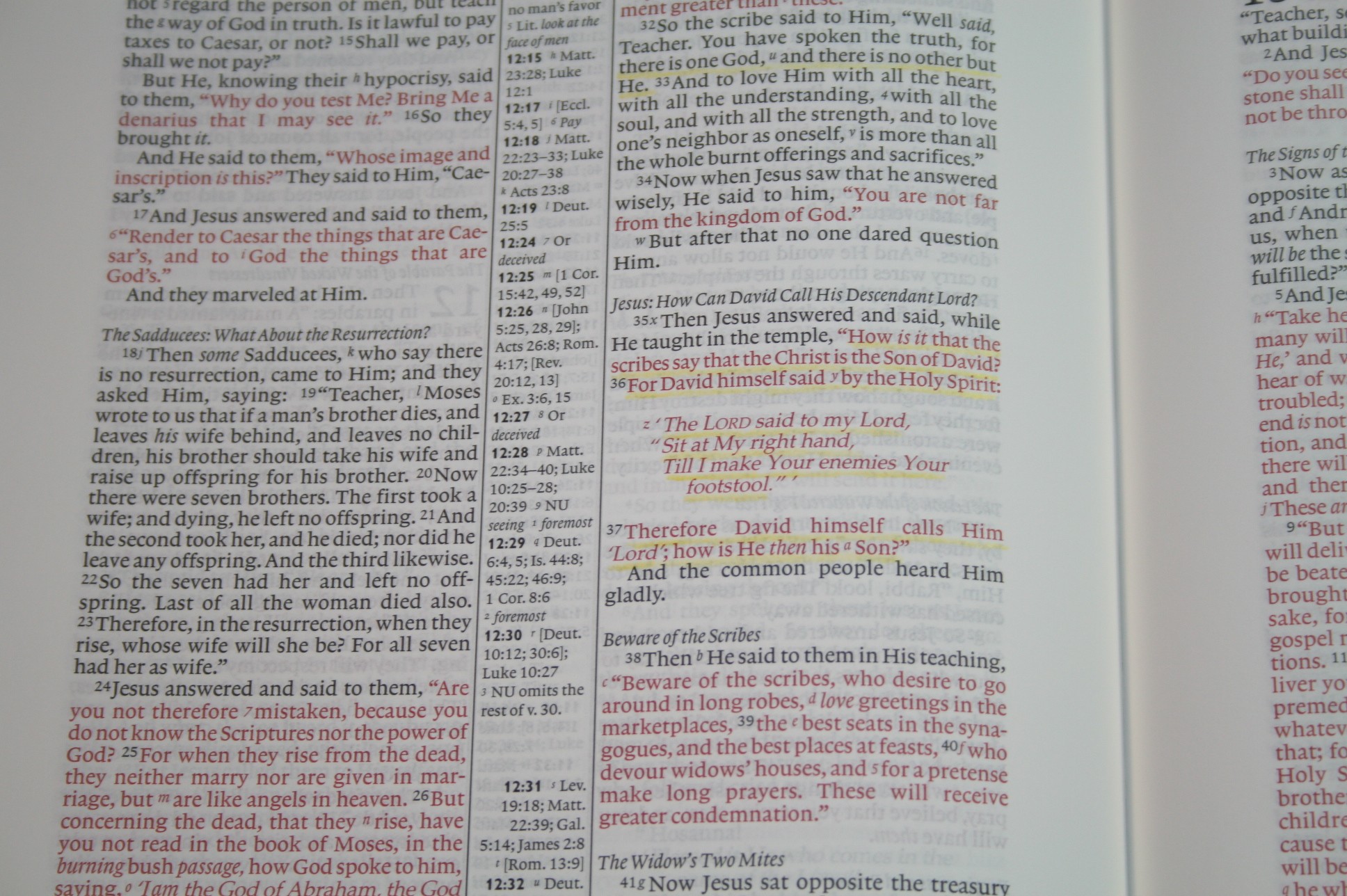
The paper is 38gsm and very opaque. This is the same paper as found in all Cambridge wide margin editions. It’s my favorite Bible paper for writing. It takes color pencils really well. I’ve tried regular mechanical pencil and had no issues. I’ve also used Pigma Microns and they were awesome. This paper doesn’t have a shine at all.
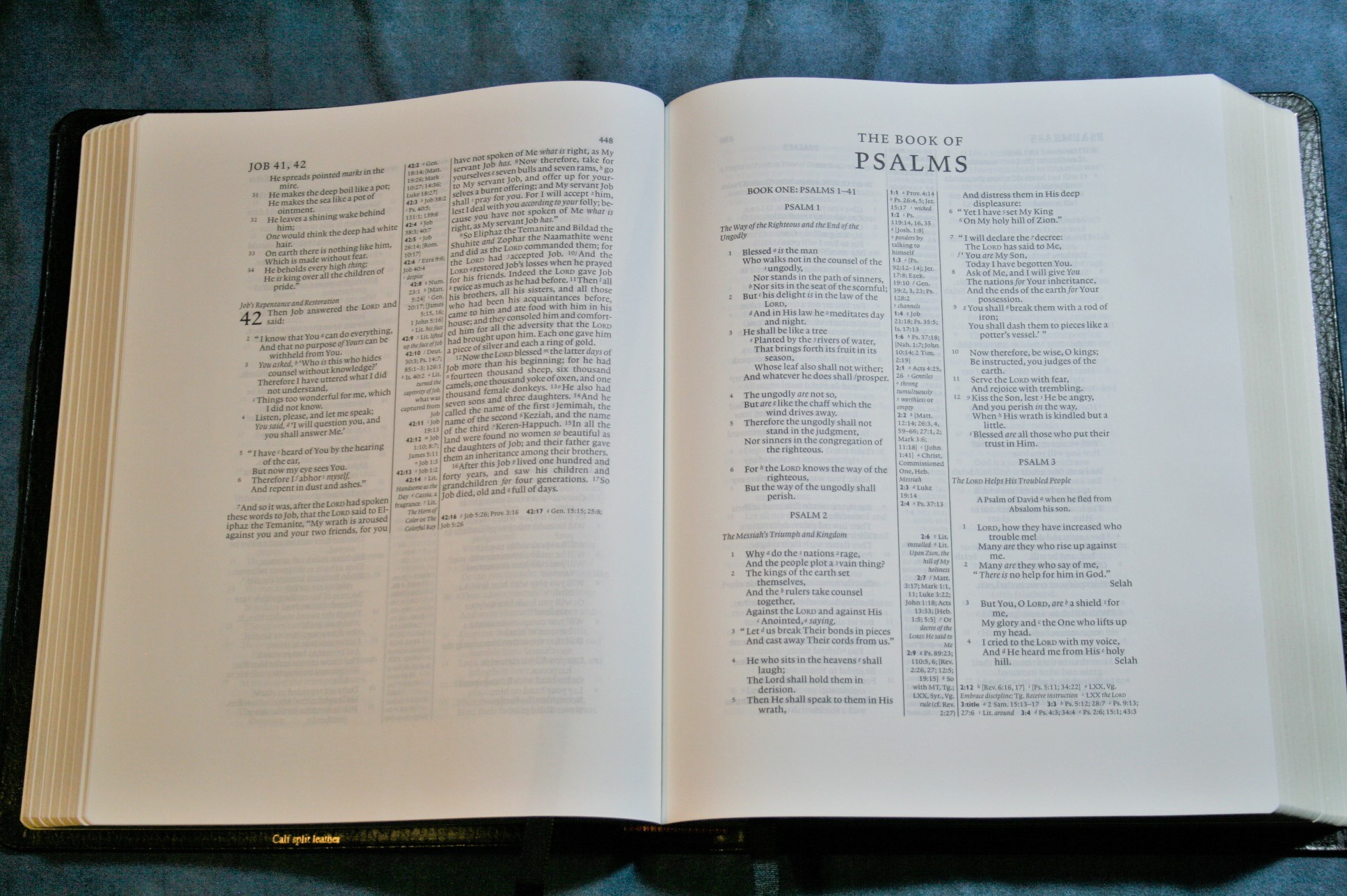
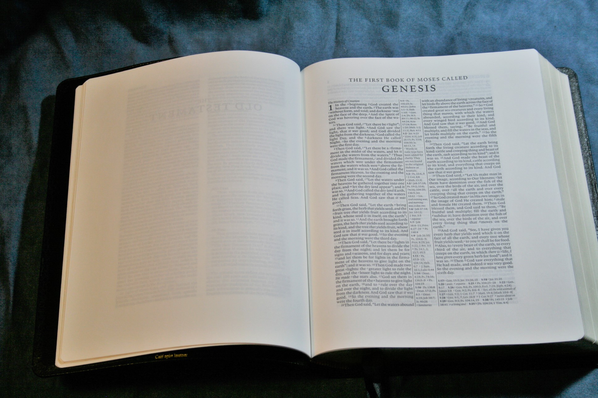
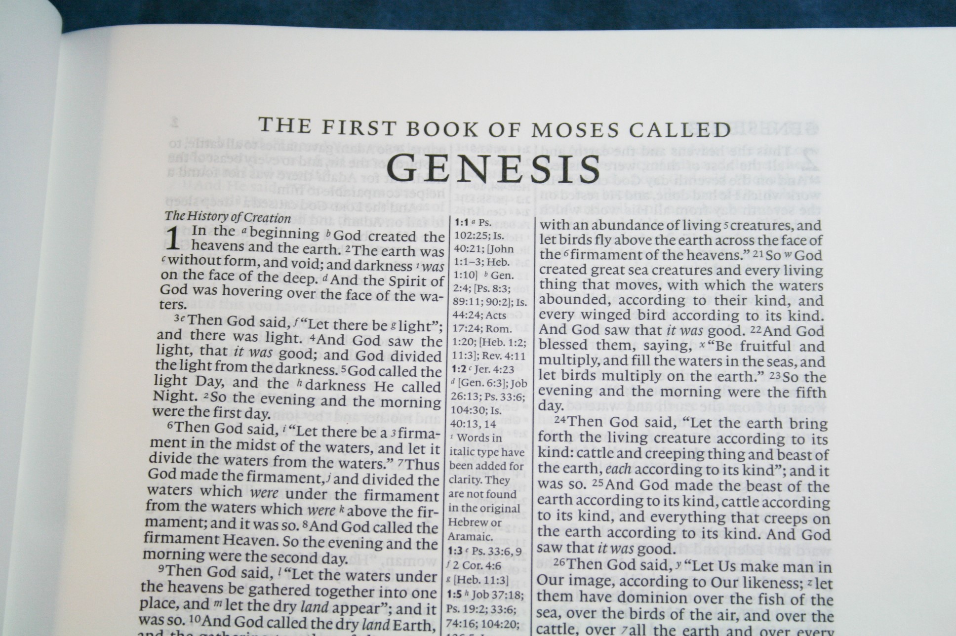
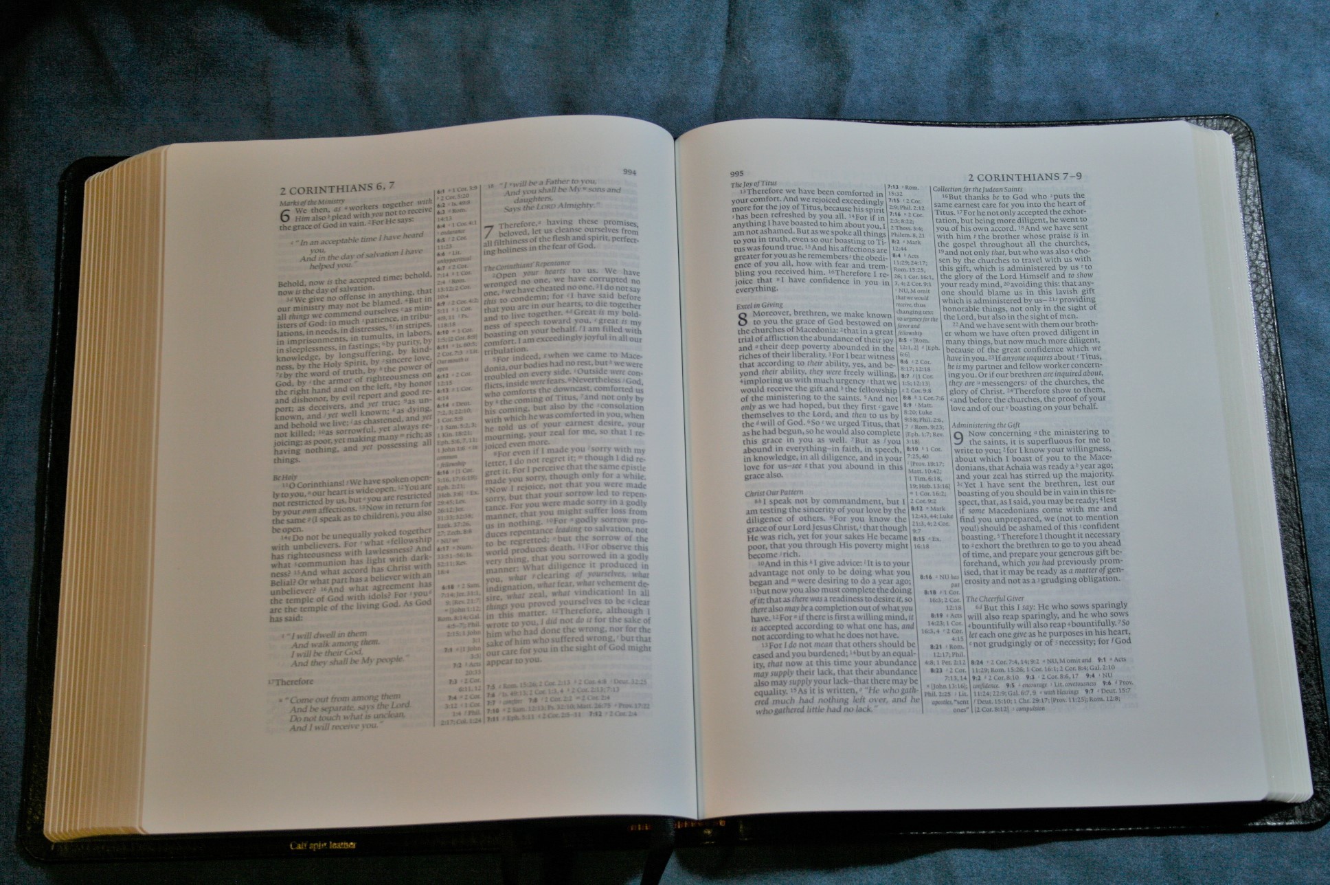
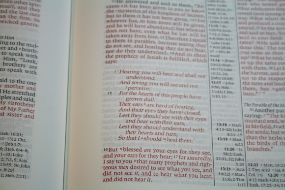
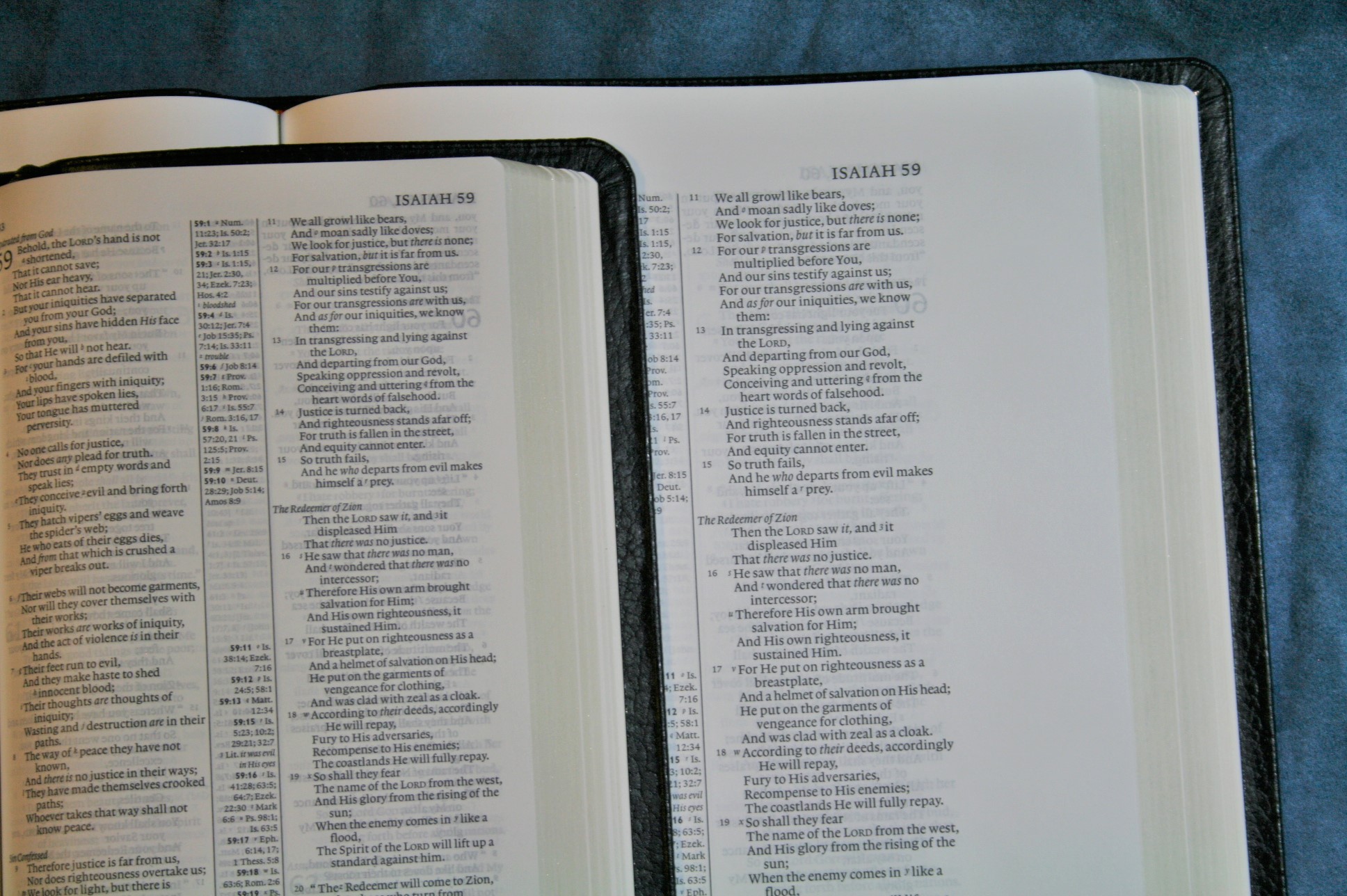
The font is a 7.9 Lexicon Number 1 with an 8.2 leading. It was designed by Blue Heron Bookcraft in Washington. For me the font could be a little larger and there could be more space between the lines. I’d like to see a 9/10. The font is good and dark, though not as dark as the Concord. I’d call is semi-bold. It’s consistent throughout. Even the red-letter is consistent. It’s about a medium/dark red and is probably my favorite red for a red-letter edition. Red continues through Revelation (like all red-letter editions should).
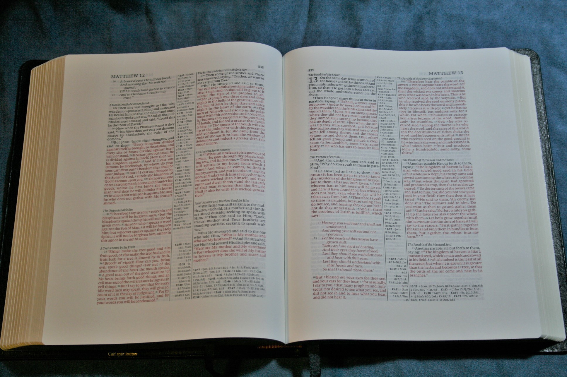
Section headings are in italics. There are lots of them throughout the text. They stand out just enough to not be a distraction and still be useful.
Layout
First, the NKJV in general is my favorite layout for any Bible whether it’s a single or a 2-column setting. Here’s why:
- Paragraph
- Poetry in verse (even in the NT)
- OT quotes in oblique type
- Letters are indented
Many settings, such as the Cambridge ESV wide margin, have a lot of these features. The ESV does not indent letters. There might be others with this exact setting, but this is the one I’m the most familiar with. This is my favorite setting.
I want a KJV with this exact setting. In fact, if Cambridge would replace the NKJV text with the KJV text and leave everything else the way it is it would make the perfect KJV and my hunt would be over. It should be easy to do and it would make a perfectly matched set.
This is the same layout as the Pitt Minion, only larger. If you have a Pitt Minion, then you know this layout. The pagination is exactly the same.
The margins are:
- Upper – ¾”
- Inner – 1”
- Outer – 1 1/2”
- Bottom – 1 1/8”
If I could make one change in this Bible I’d make the inner margin just a touch bigger.
The columns are 2” wide with 38 characters. The center column is 5/8”.
References and Footnotes
These are the standard references and footnotes for the NKJV from Thomas Nelson. The one thing that I find a little difficult about using the references and translation notes is when there are too many to fit in the center column. The rest are placed under the last verse on the page. This means there are two places to look for them. I almost always look in the wrong place first. I’d rather have them than not, but I think it would be better if they were all placed under the last verse, or under both columns with that columns references and notes under the last verse of that column.
Here are some counts for references:
- Genesis 1:1 – 16
- John 1:1 – 8
- 1 John 1:1 – 11
- Matthew 17:20 – Mat 21:21, Mk 11:23, Lk 17:6, 1 Cor 12:9
- John 2:19 – Mat 26:61, 27:40, Mk 14:58, 15:29, Lk 24:46, Acts 6:14, 10:40, 1 Cor 15:4
Footnotes include manuscript variances from:
- NU Nestle-Aland / United Bible Societies
- MT Majority Text
- LXX Septuagint
- TG Targum
- VG Vulgate
- SYR Syriac
There may be others, but these are the most prominent. They also include literal renderings from Hebrew and Greek. I’ve always found the NKJV footnotes to be interesting and helpful for study.
Concordance
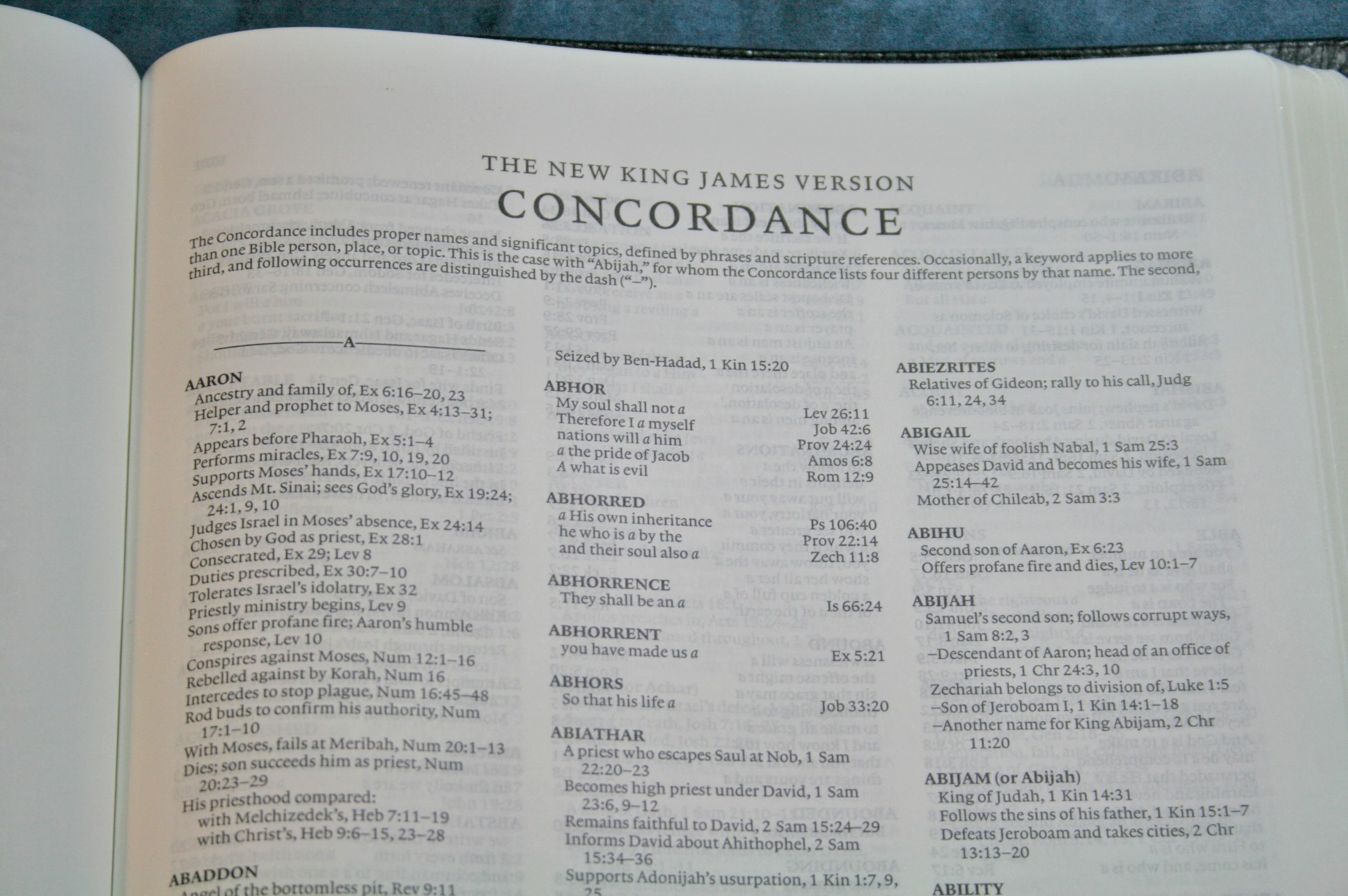
The concordance is 165 pages and has 3 columns per page. The concordance takes up the full page, so there is no margin space around them. There is an inch at the bottom if you want to add anything. This is a different concordance than the one in the Pitt Minion. Here are some of the entries and their counts:
- Faith – 56
- Faithful – 26
- Faithfulness – 9
- Faithless – 2
- God – 70
- Goddess – 2
- Godhead – 2
- Godliness – 6
- Godly – 6
- Gods – 7
- Praise – 38
- Praised – 6
- Praises – 5
- Praiseworthy – 1
- Praising – 3
- Pray – 22
- Prayed – 3
- Prayer – 21
- Prayers – 8
Maps
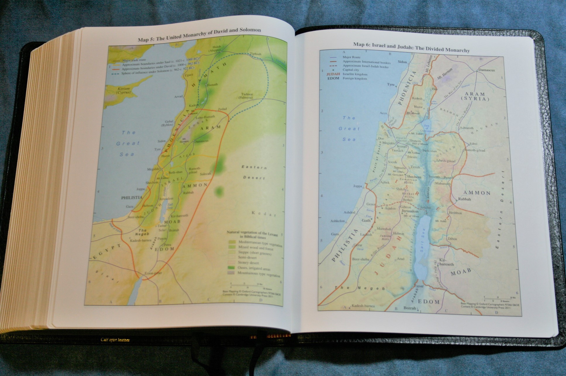
There are 15 maps printed in thick, non-shiny paper. They take up the full page, so they’re not just Pitt Minion maps with wide margins. Maps include:
- The Ancient Near East in the Late Bronze Age
- Regions of Palestine and Surrounding Areas
- Sinai and Canaan at the Time of The Exodus
- Israel with Canaan
- The United Monarchy of David and Solomon
- Israel and Judah: The Divided Monarchy
- The Assyrian Empire
- The Babylonian Empire
- The Persian Empire
- The Hellenistic World after Alexander
- Jerusalem in Ole Testament Times
- Jerusalem in New Testament Times
- Palestine in New Testament Times
- The Roman Empire
- The Eastern Mediterranean in the First Century AD
There is an 8 page index to maps that is color-coded:
- Black: Settlements
- Red: Political
- Green: Physical Land
- Blue: Physical Water
- Purple: Travel
- Orange: Jerusalem
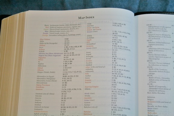
The index makes using the maps a snap. The maps are very detailed and colorful.
Writing Paper
There are two different sections of paper for writing your own notes. The first section is 13 pages and is called Index to Notes. There are two columns per page with a letter of the alphabet over each column. One way to use this is to write where your notes appear for each topic. For example, I you’ve written notes on Creation, under the column “C” you would write – Creation – Gen. 1:1, Ex. 20:11, etc.
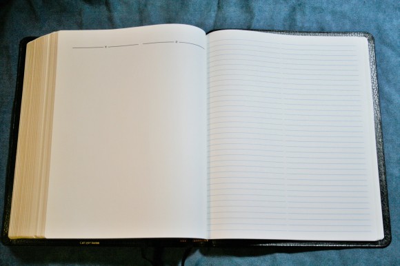
The next section is 32 pages of notebook paper. The paper is thicker than the rest of the Bible. The lines make 2 columns per page. This is great for any kind of notes such as word studies, lists, topical studies, facts, etc. I plan to use this for outlines for teaching. Another thing I’m planning is to write studies. For example, study 1 would give the first verse and the topic. When I turn to that verse it would have a 1, give the note, and then give the next verse. Using this I could have as many studies as I wanted, which would make this an amazing teaching Bible.
Using It
Reading
I enjoyed reading from this Bible. I like to lay it across my lap to read. The paper is so opaque and the font was dark enough that I could read it with my bifocals without having to hold it closer. I usually need a larger font for that. The layout of course helps with readability. This Bible makes a great reader when reading on your lap or on a table. I don’t recommend holding it to read for very long.
Carry
I don’t really like using wide margin editions as my carry Bible. However, if I were going to carry one this might be the one I chose because it’s not as large as the Concord and the cover is easier to handle than goatskin. I did carry it in the car and around the land (in my prayer pasture) and had no problems carrying it. It doesn’t feel heavy and it isn’t much different than a study Bible. Proportionally it’s a little thinner and wider than a standard sized study Bible. If anything it’s light for its size.
Study
I prefer a wide margin Bible to study in and study from. I like wide margins, thick paper, great tools, and a readable font. This Bible delivered on all accounts. I always use multiple tools for study, but this Bible gets me a lot of study because of the footnotes and concordance.
Preaching
I had no issues with preaching from this. I expected the verse numbers to be hard to find, but I found every single one of them. This was particularly impressive to me considering that I went through a session where I read dozens of verses and found them with no trouble. I’m planning on switching from KJV to NKJV and this will be the primary Bible I use for preaching.
Suggestions for Marking
I’ve marked this with PrismaColor pencils. Before, I’ve colored over the text with color, but I’ve decided to underline in this one. I’ve underlined according to topics. For example, for the Godhead I’ve underlined in yellow, for salvation I’ve underlined in red, and for holiness I’ve underlined in blue. The paper has taken the color perfectly. Another option is to underline with Pigma Microns. I haven’t tried highlighters, but I think they would work just fine on this paper. Just be careful and try a page in the back first.
The Wide Margin and Pitt Minion Combo
Besides the awesomeness of having a wide margin edition, you can easily pair this with the Pitt Minion for a combo (the NKJV, NASB, and ESV having matching Pitt Minion/wide margin editions, and the Concord wide margin has both the regular and personal size editions.). This makes a great combo because you can get used to a single layout and pagination and have a smaller edition to carry.

I would love to see this Bible available as a regular edition: same paper, same print (maybe a touch larger), without the wide margins. That would give a perfect set: small carry size, larger everyday use and carry Bible, and wide margin edition.
Conclusion
The Cambridge NKJV Wide Margin is an excellent Bible for personal study, preaching, and teaching. It’s perfect for laymen, students, and those in ministry. Anyone interested in a wide margin NKJV wont’ be disappointed. I can’t recommend it enough.
Cambridge provided this Bible free for review. I was not required to give a positive review. My opinions are my own.


I agree with BibleBuyingGuide’s excellent review. Cambridge – for Pete’s sake increase the print size from 7.9 to 9pt, and increase the line-spacing. I also would love to have this in the KJV with 9pt print.
Dear Rcal:
Good clear print is always nice. Having said that, every publisher has to make a trade off with size and type size. Perhaps my most heavily used bible and still the King of the Lampstand is a Personal Concord with a well printed and generously leaded 6.5 font. The reason I use it so much is because it has the same features as the full sized Concord in a size I can easily handhold, and keep from resting on my body during extended reading sessions. If the type was even 8 point, it would have to be at least the size of the full sized Concord, and would not be so easily read hand held. Sitting in my chair under excellent lighting the smaller Personal Concord works just fine, I leave it home when I go where the lighting is not so good like in the Sanctuary of our Church. I like The Westminister Reference Bible best for features, print size and layout, and if I had to have only one bible, that would be the one, yet that little Personal Concord is the one I reach for whenever I have time to sit in my recliner and read.
Yours in Christ
Don Denison
Thank you for the great review!
Would love to know how much it is on weighing scale.
Anyways, thanks again!
Thanks Stanley! I’ll add that as soon as possible.
Thanks for your review of the Aquilla NKJV and for all your reviews. I went with the Aquilla NKJV in large part because of how thorough your reviews are, and, most importantly, in my opinion, you include how the Bible “handles” preaching from it!