
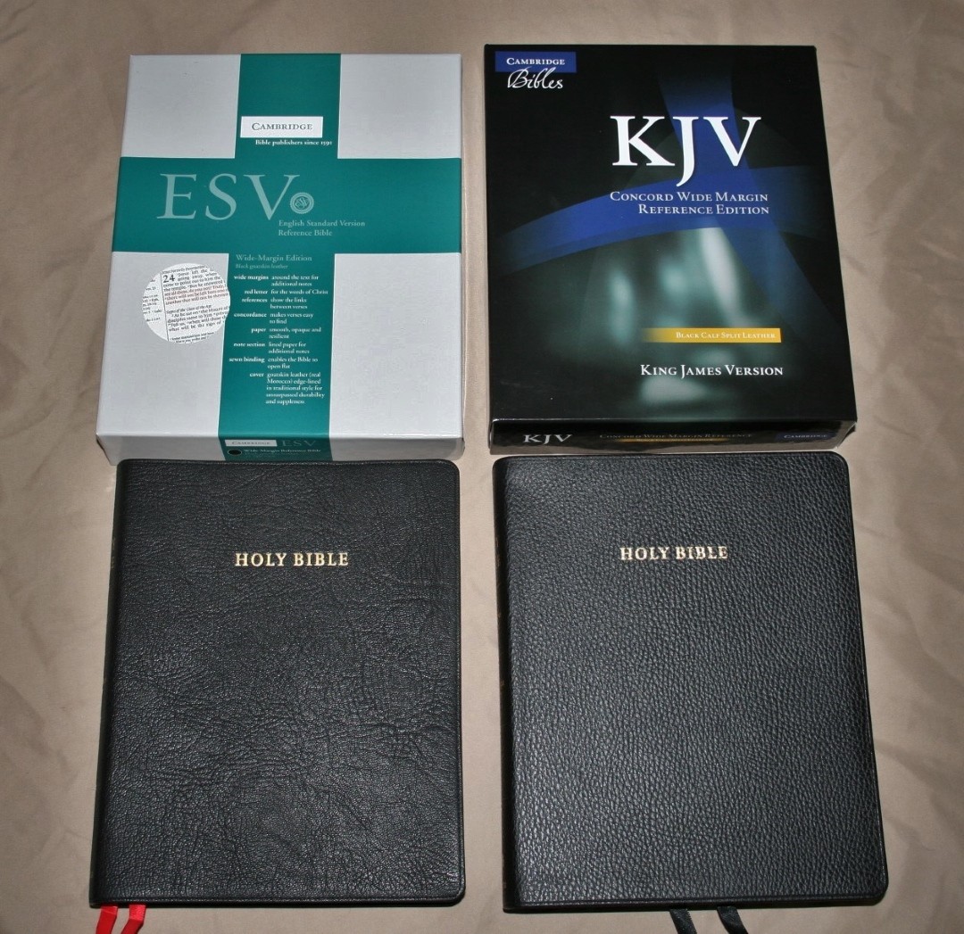
The Cambridge Concord is a popular setting from the 1950’s. The wide margin edition takes that setting, places it on writable paper, and adds wide margins and paper in the back to create a note taker’s dream Bible. It has long been the Bible of choice for both scholars and preachers. In this review, I take a look at the calf split edition.
Pros
- Paper
- High-quality construction
- Semi-bold font
- Wide margins
- Paper
Cons
- Might be too large for carry
- Expensive
Features
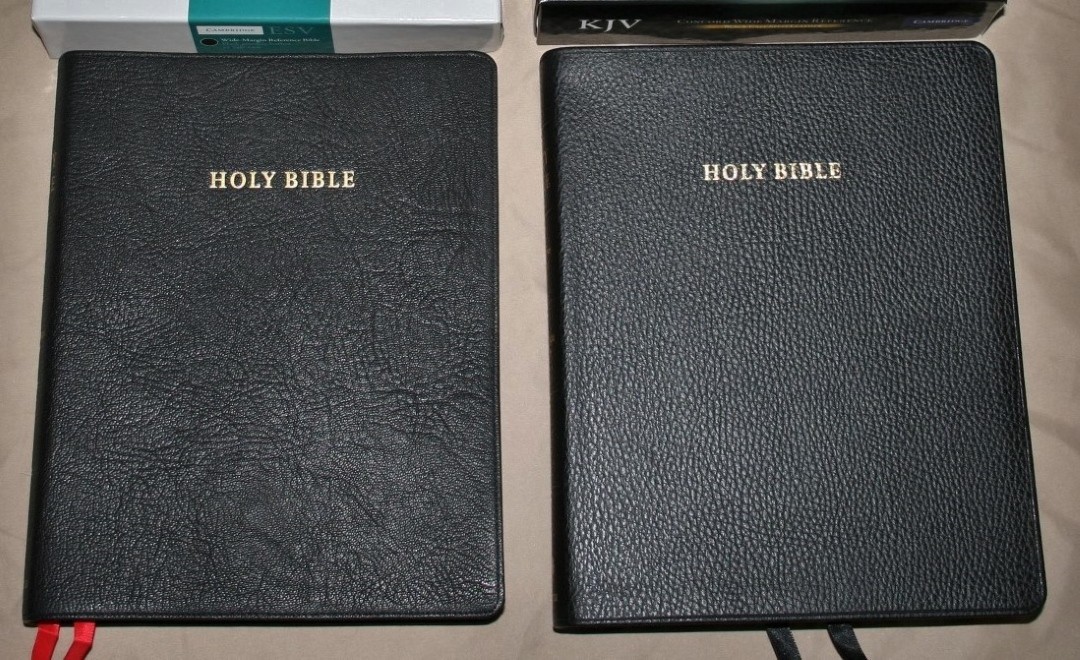
- KJV
- Calf split leather
- Sewn binding
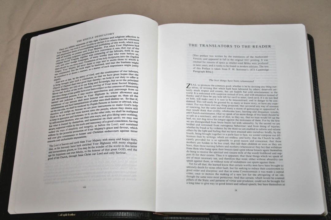
- Translators to the Reader (every KJV reader should read this)
- Epistle Dedicatory
- Wide margins on all sides
- Black letter
- 8 point font
- Semi bold
- 38gsm writable paper
- Center column references and footnotes
- 7-page glossary
- 94 Pages for notes
- 137-page concordance
- 15 Maps with index
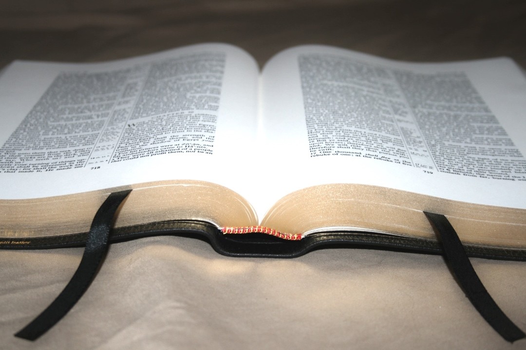
- 2 ribbons
- Red and black head and tail bands
- Gold gilt
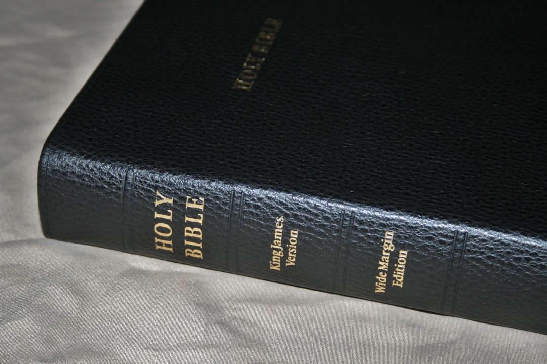
- Cover size 7 ¾ x 9 5/8 x 1 5/8
- Paper size 7 ¼ x 9 1/8
- Printed and bound in the Netherlands by Jongbloed
- ISBN: 9781107696013 Model: KJ764:XM
Where to Buy
- Amazon $144.83
- Evangelical Bible $158.99
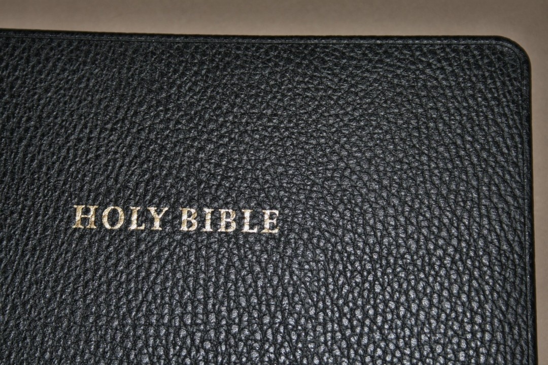
Cover and Binding
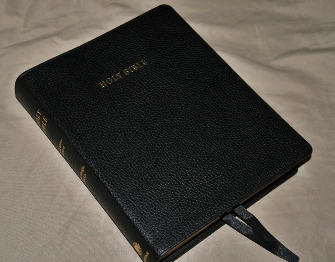
The cover is calf split with a pastedown liner. It has a pebbly grain and a matte finish. It feels tough like it can take any beating I can throw at it. It’s more economical than goatskin but it’s still a high-quality leather. The text block is Smyth sewn. The quality of materials and craftsmanship are very high.
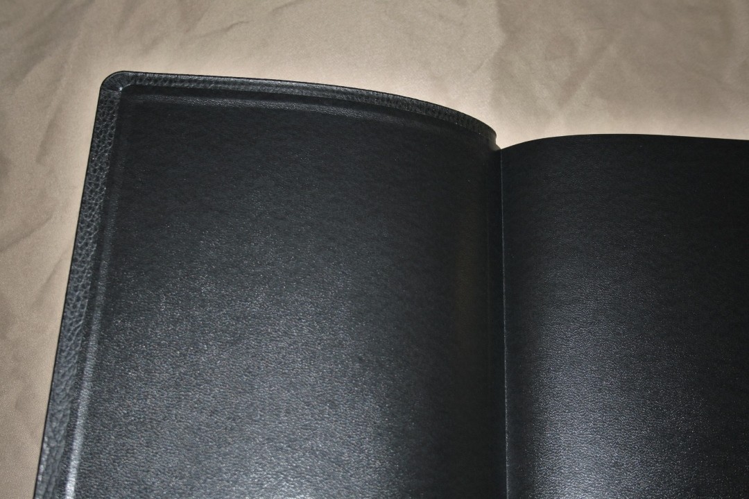

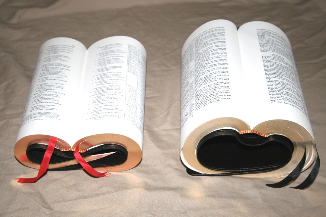
The obvious question is how it compares to goatskin and which should you get. I don’t have the Concord in goatskin, but I do have the ESV Wide Margin in goatskin. The goatskin is edge-lined, meaning that it has the hinge that causes the cover to not lay open as easily (at least until it’s broken in). The paste-down liner in the calf split lays open with no problem at all.
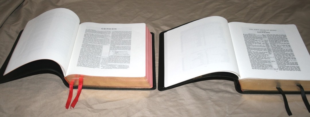
My guess is the goatskin will last longer. I think the stiffer calf split is easier to handle – for the Concord at least (it’s larger and heavier than the ESV). Goatskin is floppy which would be more difficult to handle. Not that it’s bad and too hard to handle, but this is a large Bible and the goatskin could work against you rather than help you. The calf split is my personal preference with wide margin editions, but they’re both amazing.
Here’s how I would choose between the two: if you want a luxuriously soft cover and art-gilt edges then go with the goatskin. If you like a slightly stiffer cover and don’t care about art-gilt edges then go with the calf split. I find the calf split a little easier to toss around and use without worrying about it. I tend to baby the goatskin editions.
Paper
The paper is 38gsm Tervakoski Thinopaque. Cambridge calls it “Bible paper”. It’s extremely opaque and the perfect choice for writing. It has a slight egg-shell, off-white, ivory, creamy tint. I prefer this to white paper because it adds to the readability. It isn’t shiny and takes color from my color pencils the best of any paper I’ve used. It’s easy to read from in the pulpit or at my desk. After using this paper it’s hard to go back to anything else. I want a regular Concord with this paper.
Paper in the Back
In the back are two different types of paper for notes. You can use them any way you want. They total 94 pages (I counted them myself) not counting the thick end-sheets in the front and back.
Index to Notes
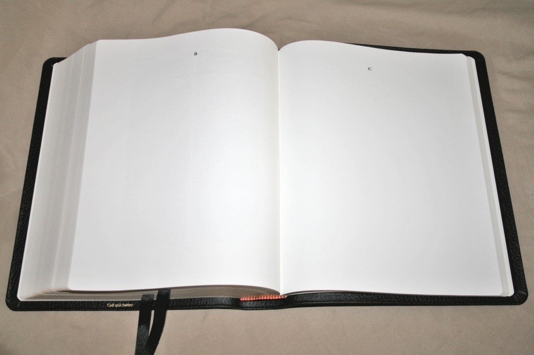
The first is called Index to Notes. This is 26 pages of blank Bible paper with a different letter of the alphabet at the top of each page. In addition, there are 4 other blank pages: the title page (which is blank except for the title Index to Notes), and a blank page after the page with Z. This brings the total to 30 pages (counting both sides of the page).
You can use this to show references where your notes appear. Of course, you can just use it for charts, drawings, notes, definitions, lists, studies, or anything else you can think of. You can also use them the same way you use the ruled pages.
Ruled Note Paper
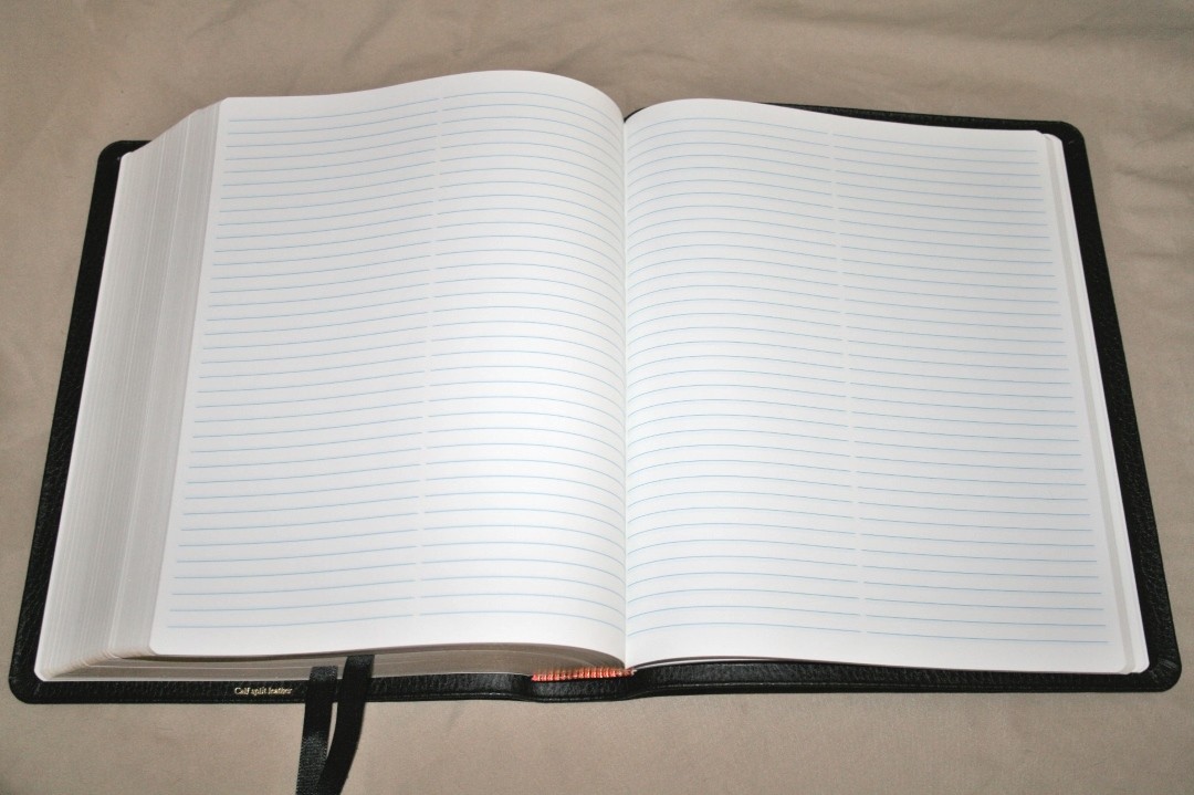
There are 64 pages of ruled notebook paper with two columns per page. This paper is thicker than the Bible paper. This is great for outlines, definitions, studies, sermons, notes, facts, lists, character studies, charts, tables, prayer requests, quotes, etc. I’m planning to use them for lists of references for specific topics. The line-spacing is like regular notebook paper. I write small, so I would like to see the lines be a little closer like college-ruled paper.

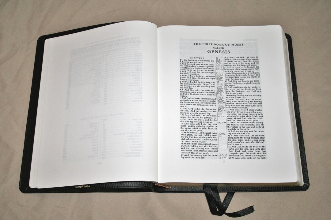
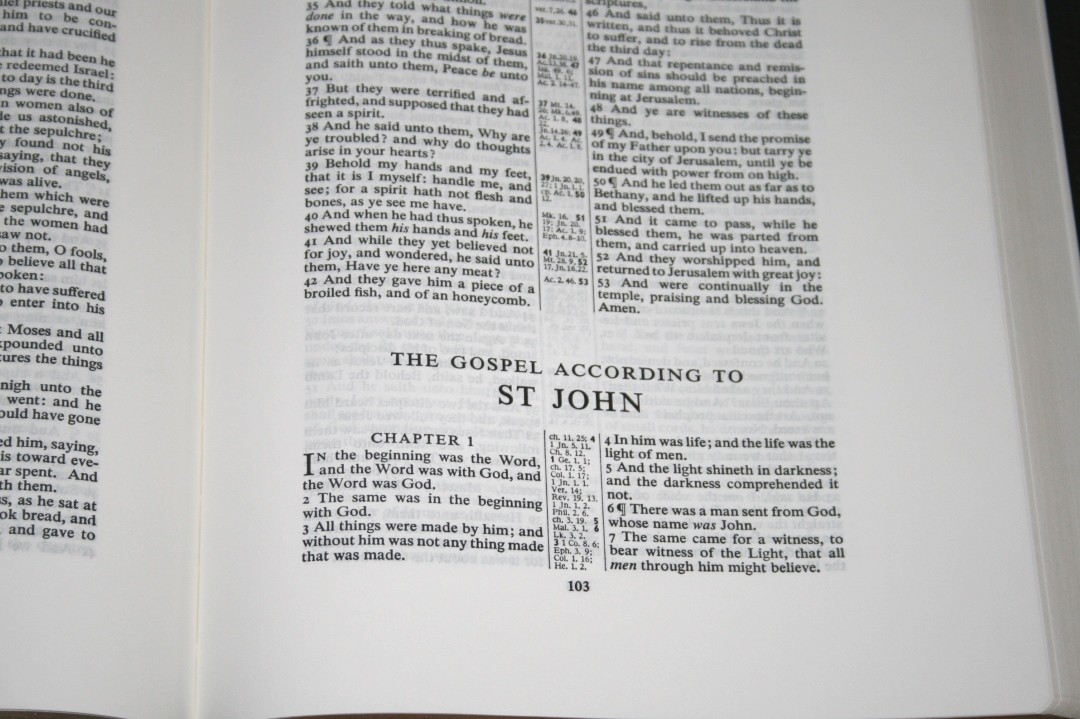
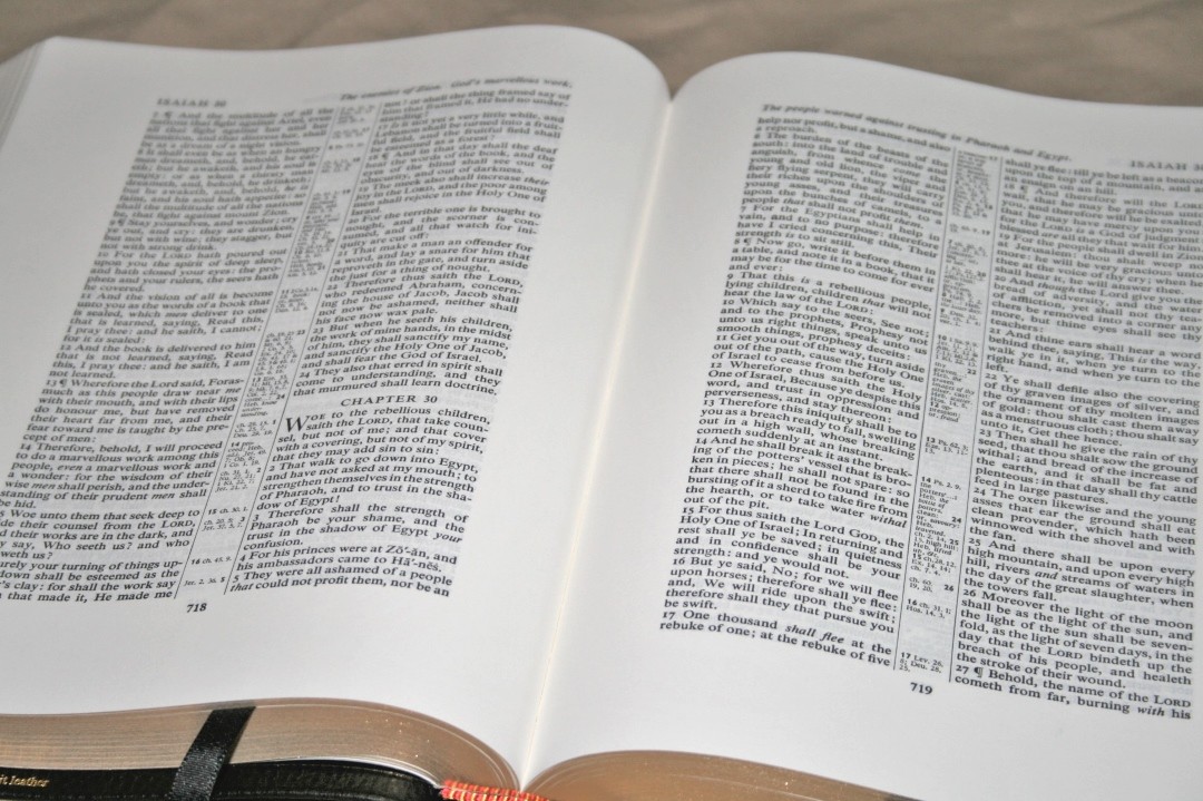
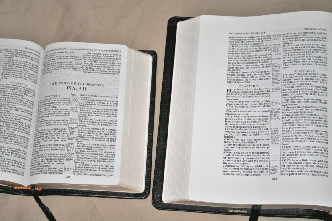
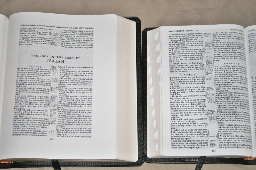
The font is 8/9 point Times Semi Bold 421 in black letter and it’s printed in verse-by-verse double column format. The print is very consistent throughout and is one of the most readable fonts I’ve seen. I’m a huge fan of semi-bold fonts. If you give me a choice between a dark font and a medium font, I’ll take the dark font every time. It has italics for supplied words.
There is enough space between each word to make it comfortable to read. None of the words feel squished in order to get more on a line. I’ve seen other Bibles where words are too crowded and a line will look like a single word. That doesn’t happen with the Concord text. It has around 38 characters per line.

The font’s not exactly an 8-point. At least it’s not if the regular Concord is 8-point. It’s more like a 7.8/8.8 (100% guess, but I think it’s close). The columns were shrunken just slightly to make the margins wider and taller. I didn’t notice the size difference until I saw them side by side. Even though the font is slightly smaller I find that the paper makes it easier to read. I prefer the larger margin, so this works for me.
The columns are 1 15/16 (4.5 for both columns and references) wide and 6 ¾ high. For comparison, the regular edition columns are 2 1/16 (4.75 for both columns and references) wide and 7 ¼ high. It actually doesn’t have that much of an impact on readability.
The text is self-pronouncing. I prefer self-pronouncing for preaching and reading aloud. I want to pronounce the names correctly and self-pronouncing is the only way to ensure that (sure, I could learn to pronounce it ahead of time but that would require a higher memory capacity). I don’t need this in every Bible (the text looks cleaner without it) but I do want it in the Bible I’m preaching from and a wide margin with thick paper is my favorite for the job.
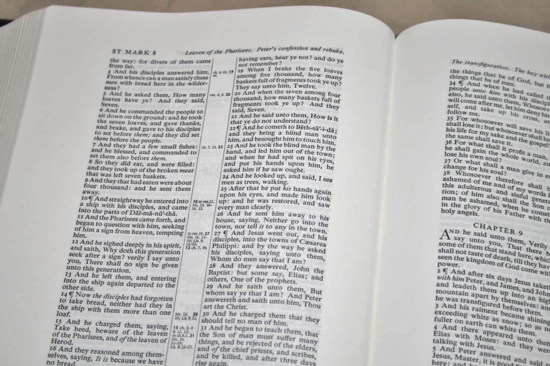
There are no reference and footnote keys in the text. This makes a clean text that’s easy to read. At first, I wanted the keys, but when I consider that I rarely use the references and I don’t need the distraction of having to always see the footnotes (squirrel!), I was glad they’re not included. The text is clean. I can read it without a single distraction. This makes it easier to read aloud because I don’t add an awkward pause thinking that the next part of the sentence needs to be separated just because of a letter causing an unnatural space that my mind reads as a stop in the sentence structure. Although it does make it more difficult to know which reference goes with which portion of the text it’s not that difficult to figure out and this is the format that I personally prefer.
The header includes book name, chapter numbers, and a page-summary of each column. Books start on the same page the previous book ended rather than on a new page.
Margins
Margin widths are:
- Outer – 1 7/16”
- Inner – 1 ¼
- Upper – 13/16
- Bottom – 1 5/16
Of course, the inner margin is more difficult to use than the outer margin. This is just a by-product of having inner margins. These inner margins are large enough and the pages lay flat enough to get a decent amount of notes in there.
References and Footnotes
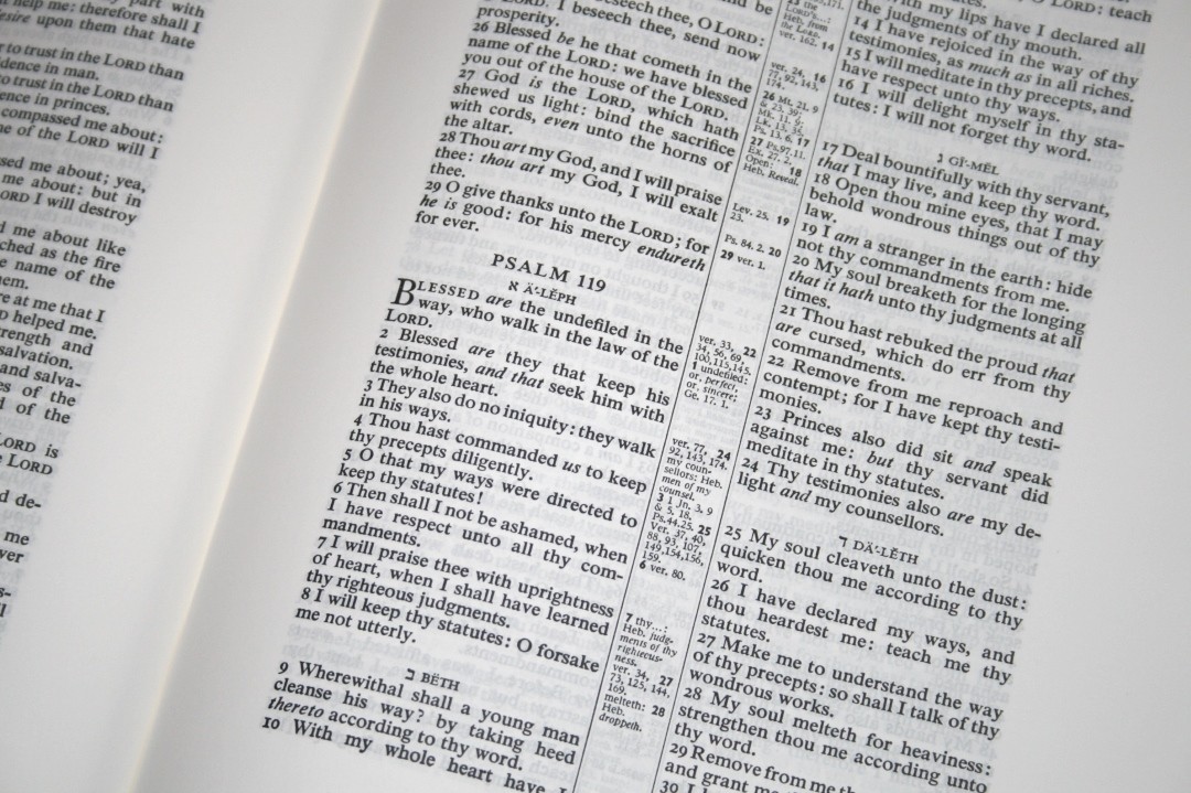
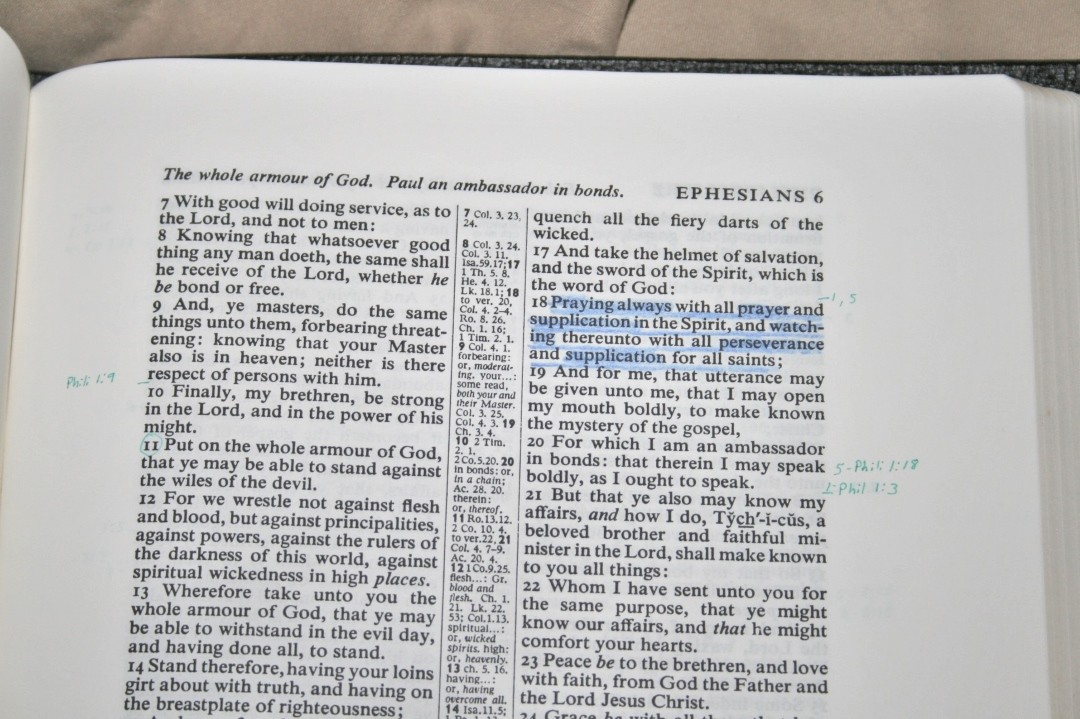
References and footnotes use a system known as Bold Reference System. This means they’re placed next to the verse they correspond to and they’re marked with the verse number. The verse number appears on the side of the column that the verse is in. I like them being next to the verse. This makes them much easier to use. I’m not fond of having to look up and down through a center column to find where the references are. As I’ve stated they’re not keyed to the text, which keeps the text clear of distractions. I’m not alerted to a reference or note and that’s not a bad thing.
Cross References
There are around 40,000 cross-references in the center column. They include where passages were quoted from and a few parallel passages.
Some examples include:
- Gen 1:1 – Psa 136:5; Jn 1:1-3; Col 1:16, 17; He 1:8-10, 11:3
- Matt 17:20 – ch 21:21; Mk 11:23; ch 13:31; ver 9
- Mk 11:23 – none (I want this one fixed. There’s plenty enough space beside this verse.)
- Jn 1:1 – Ge 1:1; ch 17:5; Col 1:17; 1 Jn 1:1; ver 14; Rev 19:13; 1 Jn 1:2; Phil 2:6
- 1 Jn 1:1 – ch 2:13, 14; Rev 1:2; Jn 1:14; Lk 24:39; Jn 1:4
Translator’s Footnotes
It includes the translator’s footnotes which include explanations on Hebrew, Aramaic, and Greek. It gives alternate renderings. The word is placed in italics and then the alternate rendering is given.
Glossary
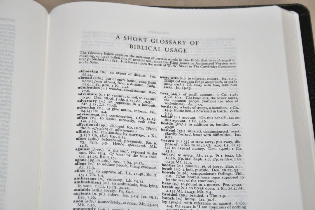
There’s a 7-page glossary that gives the meanings of words that have changed in meaning or have fallen out of use. It includes the part of speech and verses where the words are used. I find this essential for words that I think I know but are used differently than I realized. Here are a few examples:
- Beside (prep) – in addition to, besides. Lev 23:38
- Careless (adj) – free from care, secure. Jud 18:7, Eze 30:9
- Close (adj) – secret. 2 Sa 22:46, Ps 18:45, Lk 9:36
- Describe (v) – to mark out. Jos 18:6 & c
- Prevent (v) – to go or come before, to anticipate. Ps 18:5, 119:148, 1 Th 4:15
- Rereward (n) – (old spelling of rearward) rearguard. 1 Sa 29:2, Isa 52:12, 58:8
The glossary also has wide margins so you can add more if you need to.
Concordance
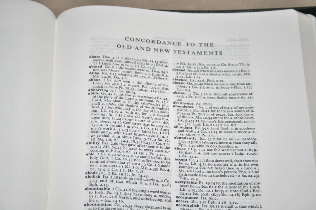
The concordance is 137 pages with 2 columns per page. The layout is interesting. It’s in paragraph format. I find this to be more difficult to use, but it makes more room for the entries so there can be more of them. It has lots of entries and is one of the better concordances in a Bible. It also shows the parts of speech for some words.
Here are some counts for entries:
- God – 76 (shows upper or lower case g in the text)
- Faith – 55
- Faithful – 25
- Faithfully – 3
- Faithfulness – 6
- Faithless – 4
- Praise (n) – 11
- Praise (v) – 14
- Pray – 45
- Prayer – 22
The concordance also has wide margins so you can easily add references to the concordance. You can also use this space for Hebrew and Greek definitions.
Maps

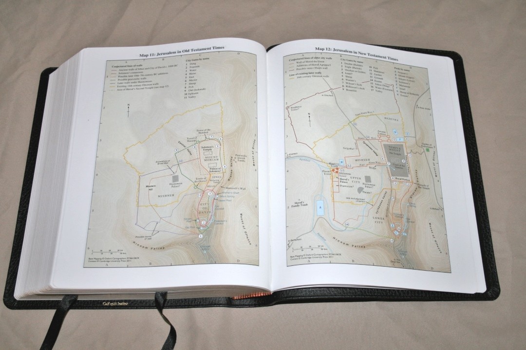
These are the newer updated maps with the color-coded index. There are 15 pages of maps on thicker non-glossy paper. They are bright and colorful. Maps include:
- The Ancient Near East in the Late Bronze Age
- Regions of Palestine and Surrounding Areas
- Sinai and Canaan at the Time of The Exodus
- Israel with Canaan
- The United Monarchy of David and Solomon
- Israel and Judah: The Divided Monarchy
- The Assyrian Empire
- The Babylonian Empire
- The Persian Empire
- The Hellenistic World after Alexander
- Jerusalem in Old Testament Times
- Jerusalem in New Testament Times
- Palestine in New Testament Times
- The Roman Empire
- The Eastern Mediterranean in the First Century AD

There is also an 8-page index to maps. I’m a huge fan of indexes to maps. They should be included in all Bibles with maps because they make maps so much more useful and keep them from having to be cluttered by annotations. The index is color-coded with 6 colors:
- Black – settlements (towns, cities, fortresses, etc.)
- Red – political (nations, provinces, regions, etc.)
- Green – physical land (mountains, deserts, etc.)
- Blue – physical water (rivers, seas, etc.)
- Purple – travel (roads, routes, etc.)
- Orange – Jerusalem (urban places, buildings, areas)
Preaching, Teaching, Study, Reading, and Carry
I love preaching from the Concord Wide Margin. I like to have references and notes in the margin so I know the main point I want to make or what verse goes with the one I’m reading. I also like to have definitions or facts that I want to make about the text. The font is smaller than most Bibles that I preach from, but the paper is so opaque that I don’t have any issues reading it from the pulpit. I do find that I lean closer to the text to read it though. The note paper is great for sermon outlines.
I teach in much the same way that I preach. I leave the Bible laying in front of me and read from it while standing or sitting in place. The paper in the back comes in handy for outlines, topical lists, etc.
The Concord Wide Margin is the perfect study Bible – just fill in all the empty spaces and you’re good. The regular Concord has the dictionary where the wide margin edition has notepaper. This is a good reason to have both. Once you have your margins and pages filled with information the wide margin edition becomes your very own study Bible, but until then the regular edition’s dictionary might make it a better choice as a study Bible. I like referring back to my notes and material that I’ve written in the back.
The paper and dark font makes the Concord WM work as a reader. I like laying it across my lap for general reading. The inner margins keep the text from getting lost in the gutter. It’s also good to read from while it lays on the table or desk. I usually like reading from larger fonts, but this one is easy to read.
It’s a little on the large side for general carry (but how can it not be?). If you’re used to carrying around a large study Bible then you won’t have any issues carrying the Concord wide margin around. I don’t really need to take my notes with me unless I’m going to preach or teach. That’s where the regular or personal edition comes in handy as carry Bibles. This creates a large/small combo that works great and gives you the best of both worlds.
I’ve tried using the wide margin in the car and out in my pastor pasture next to my house. Handling it in the car is a little difficult due to its size but the calf split helps because it lays a little flatter than goatskin. I didn’t have any issues carrying it around outside but obviously, I do notice the size and weight more than I do the other editions.
Tips for Marking
My standard marking is to use Pigma Microns for notes in the margins and PrismaColor pencils to underline and highlight keywords. The PrismaColor dark blue has a tendency to show through a little darker than I like. I’m considering only using Pigma Microns in this one and just underline. Of course, PrismaColor pencils would work well for that too. I’m also considering using highlighters.
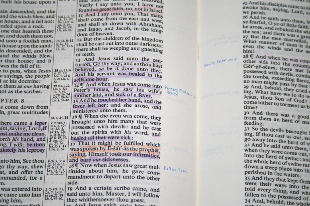
I use the margins for notes, cross-references, chain references, bullet points, facts, definitions, section headings (it helps me in describing the context when preaching and teaching), and chain studies.
The chain studies is something I borrowed from three different Bibles: The Men’s Study Bible, The Full Life Study Bible, and the Sword Study Bible. Basically, they have a topic with a number. In front of the Bible is the topic and the first verse for that topic. I go to that verse and write the number for the topic. At the end of the passage, I write the next reference. When I get to the last reference I write the first reference again – creating a circle.
Most Bibles with this type of system draw a line down the margin. I usually don’t, but this means that I have to write the topic number again at the end of the passage so I know which reference goes with which topic if they overlap. Also, these Bibles will show all of the references in the front or back. I just have the first one and use the margins to take me to the next verse. If there’s room I write them all, but not writing them gives me more space for more studies. You could just write them in the front or back as a list and not have them in the margins. You would just have to go back to your list for each verse. There are lots of good choices and plenty of writing space for them all.
Conclusion
The Cambridge Concord Wide Margin KJV is one of those Bibles that sets the bar high and the calf split edition makes it more affordable without sacrificing quality. There is enough space throughout – not only the text but also the tools – that you can truly make this your very own study Bible. To really get the best use out of the Concord Wide Margin you’ll have to put in some serious hours of Bible study. This is time well spent and will make a Bible worth leaving to your loved ones.
I recommend the Cambridge Concord Wide Margin Bible in calf split to anyone in ministry that teachers or preachers, students, and anyone that loves marking their Bibles and making notes. It’s the perfect study Bible – just add study.
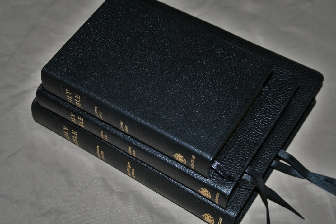
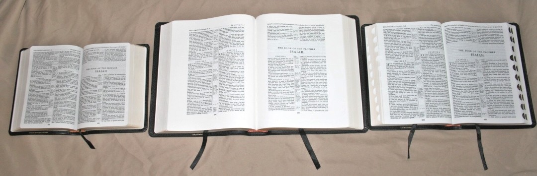
Here are some comparisons with the regular Concord in black calf split with red-letter and thumb-index, and the Personal Size Concord in French Morocco. All three serve different purposes and I can recommend owning all of them. You would have the advantage of visual memory because they have the same pagination and you will be able to take at least one of them practically anywhere. I can even visualize some of my notes from the wide margin while reading the other editions. Also for the sake of comparison I’ve thrown in the Cambridge ESV Wide Margin Bible in edge-lined black goatskin to give you an idea of how the flexibility and texture compare.

Cambridge University Press provided this Bible free for review. I was not required to give a positive review – only an honest review. My opinions are my own.


Great review as usual. Had an opportunity to purchase one of these a couple of years back. It was marked up too high in the Christian book store I saw it in and I knew I could get it cheaper online. Thinking about giving that calf split a try. It has a very durable look to it. How does it compare to the Bearing Precious Seed Wide Margin in terms of thinness? There is something about the form factor of the BPS wide margin that makes it feel slender to me for a wide margin Bible. I can easily carry it without feeling as though I have a massive Bible with me. That would influence my decision to spring for it.
HI Charles. Thanks! I’ve never seen the BPS so I can’t make a comparison. I know what you mean about carrying something smaller. There’s always trade-offs. Thicker paper + references + pages in the back + concordance + maps vs thinner paper minus everything else. This is where I have to decide what I really need in my Bible. I’m still evaluating that myself.
An Unabashed, More Comprehensive Con List
1. The bold-figure cross reference system is rubbish. Instead of simply linking the notes within the text, they restate the entire word or words in the margin taking up space, followed by the marginal note, which forces the reader to find the word, match the word in the text, and then finally read the footnote. The notes also have an unnecessarily tiny font size because of this.
2. The layout of the verses are all left-justified making it look crowded and visually unappealing. Compare this to any other bible that has a normal verse number indentation.
3. There’s no red-letter edition available. Yet the Nasb, Niv, Esv, NKJV all get red-letter editions.
4. Print quality is like rolling the dice. If you order online you never know what you’re going to get.
5. Maps incorrectly label Israel as “Palestine”. Israel was never called Palestine in biblical times, nor does the Bible ever call Israel Palestine.
The Concord should have been redone long ago.
Thornton, Thanks for the feedback. It’s helpful to Cambridge to hear other views.
I have tendency to agree, the goatskin Concord wide margin is a 8.5 font everything is crammed together, it makes it were you can not read it for more than 5-10 minutes I paid £220 Sterling for this at Cambridge University bookstore. I do have the standard Concord red letter that is a 9.3 font. I wish these publishers would get it right.
Nice detailed review Randy.
How do you rate this bible compared to the Allan Oxford Clarendon wide margin KJV that you reviewed?
Is the font larger/better? Easier to read?
I’m a bit disappoint in the Clarendon in that I regularly find words that have a partially printed letter. Your pics of the Cambridge show clean and crisp text.
Hi John. They are very similar. The primary difference with the text is the Concord is self-pronouncing with no other distractions in the text, and the Brevier Clarendon doesn’t have self-pronouncing but does have reference and footnote keys. In the back the Concord has a concordance and the BC does not. The font’s themselves are about the same. Between the two, the BC is a little more narrow so it might be easier to handle.
Here’s a comparison: https://biblebuyingguide.com/note-takers-concord-brevier-clarendon-wide-margin-bibles-compared/
When will they ever make a wide margin KJV Bible in the RED LETTER edition that is self-pronouncing?
Do you have one in the future..maybe?
Hi Reuben. I asked my contacts at Cambridge this question. They don’t have plans to produce a red-letter edition.
Excellent review…as usual…very frustrating not to have a note section in the back of the Concord Reference. I really like my notes with me when I’m out here and there…JW knocks on my door, non-believer wants to talk shop…etc, I need quick access to my doctrine notes, plan of salvation, etc. I just can not figure for the life of me why most Bibles don’t have an area of at least 10 pages of notes where someone can write down their ‘go-to’ issues that are important to them. Even Cambridge? Granted, I love the WM, but it’s not always so easy to carry that around. I have an Allan 7c that has notes in the back and an Allan 5w. But, I actually like the Concorde WM better…not so thick and regal, has far more note paper, glossary, etc. At a crossroads…I’m reading up on some YouTube videos on how to add note paper…maybe I can add some in the Concorde Reference…idk, thinking about it. That would the winning ticket for me. I was even looking at the CBP 120 WM…amazing size of 9×6.5.1.5 with bold 8 pt font with 1″ space all the way around…but guess what’s missing? Notes! They have 4 pages of notes?! What?! Give me a break…they could corner the market as no one has a Cameo WM Bible with such a “friendly” size. Oh well…looks like I’m still searching for “THE ONE”. lol lol…
Hi Adam. Thanks! Also, I feel your pain. The Concord with note pages is one of my dream Bibles.
The Concord Wide-Margin is long overdue for a new typsetting in a red-letter edition.
Hello Randy,
I am considering purchasing a KJV wide margin from Bible Buying Guide.
Prior to me doing so I currently hold a Cambridge KJV w/ Apocrypha Calf Skin Red Letter which I truly enjoy. Unfortunately there is not much room for notes there. Is there a Cambridge wide margin red letter that also contains the apocrypha?
If so please let me know the type of Bible I should request, or any suggestions you may have.
K/r
Vernon
Hi Vernon. Cambridge doesn’t have a red-letter edition with Apocrypha. I’m not aware of one from any publisher. I’ll be sure to let you know if I see one, though. Just to clarify, we don’t actually sell anything. We just have affiliate links to online shops.
I use an older burgundy wide margin concord, but am considering the task of transferring my notes into the goatskin wide margin concord. Although it’s been sitting on the shelf the synthetic liner is showing signs of deterioration. I know Cambridge has released the turquoise and the standard concord both with leather liners. Before I begin making my “home” in the goatskin with the already peeling liner would you know if Cambridge has any plans of publishing the kjv wide margin concord with a leather liner. Thanks for being a blessing to the body of Christ.
Thanks Debbie. I haven’t heard one way or the other. I recommend contacting them about this. It’s possible they would cover this under warranty. I don’t know if they would, but it’s worth checking.