
The Cambridge Clarion KJV Reference Edition is the first new Cambridge KJV reference Bible in 50 years. It is designed with many of the features that modern readers are longing for: single-column paragraph format, modern font, black-letter text, references on the outside margins, and a sewn binding that opens flat. With all of this, the Clarion still has a few surprises that make this Bible one of the most unique and desirable editions in many years.
Contains affiliate links
Here are the major features:
- Single-column text
- Paragraph format
- Side-column references
- 8.75 Lexicon 1 font
- Black letter
- Lightweight paper
- Art gilt pages
- Translators to the Reader
- Reader’s Companion
- 16 pages of Maps with an index
- 2 ribbon markers
- Sewn binding
- 3 cover styles- black goatskin, black calfskin, brown calfskin
- Presentation page
- 7.5 x 5.5 x 1.5
Paragraph Format
What sets this Bible apart is the single-column paragraph format. This is the format we’ve been waiting for in a high-quality KJV. The verse numbers are small and can be difficult to find when searching for them, but it is nice for reading because they do not get in the way. Poetry is set in a different format, which makes it easy to identify quickly. I’m very glad to see this format in a KJV. It will make a nice reading Bible.


Font
The 8.75 font looks much larger due to the modern font style and white space surrounding the font. It is Lexicon 1- a digital font designed for easy reading, and it is very readable. The Clarion does not have self-pronouncing text. The added words are in italics so you can easily identify the supplied words.

Paper
The Clarion uses India paper. It is thin and lightweight. It’s not as opaque as I expected, but it could be much worse. I don’t think my pens (Pigma Micron) or colored pencils (PrismaColor) would bleed through too badly, but I’m not sure I want to write in this Bible any time soon. I may just keep it nice and clean for reading (something this Bible would excel in). If I do want to write in it, there is plenty of room between the lines for underlining and there is some space at the bottom of the page and between the references. The paper has a very slight cream tone, which I like very much.
References
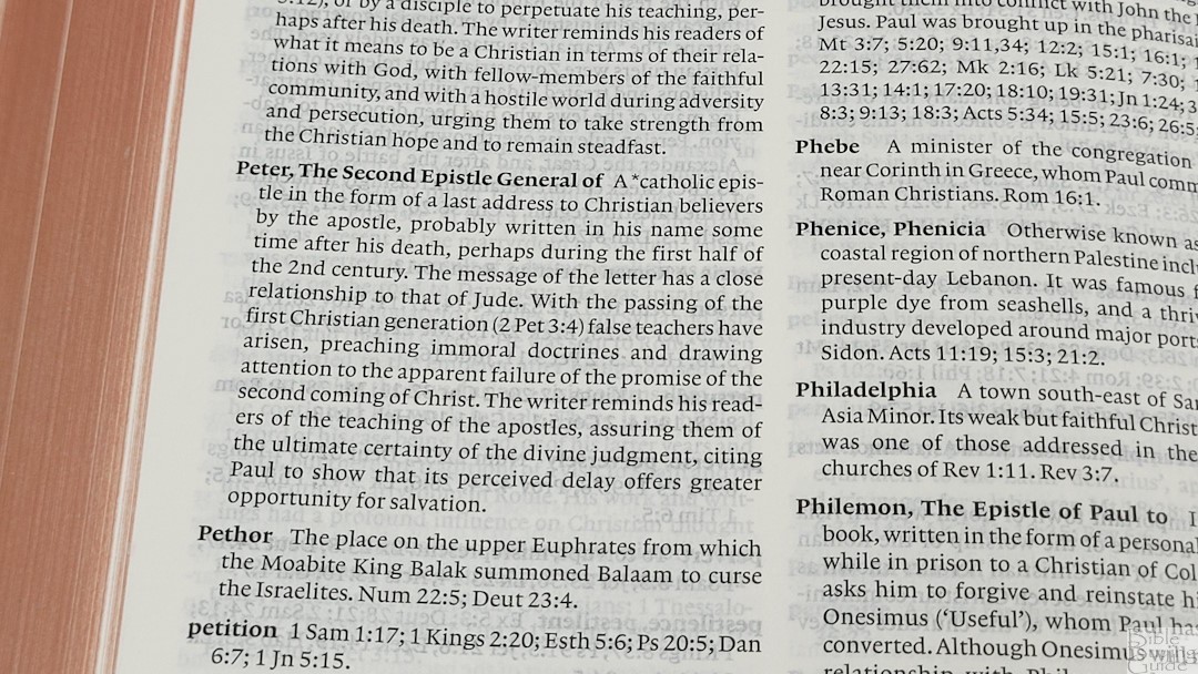
The references are placed along the outer margin of the page. There are also translation notes for Greek and Hebrew, and alternate readings (something I really like in Cambridge KJVs). The references are slightly smaller than the Bible text, but they are still larger than other Cambridge editions (Cameo, Concord) and there are plenty of them. The references and notes are keyed to the text with letters and numbers. Due to their style and size, they are not noticeable while reading, so you can read without the text feeling interrupted.
Binding
The binding is Smyth sewn, allowing the Bible to lay flat. You can open the Bible to the first page right out of the box and it will stay open with no trouble at all. This feature is a must and the Clarion does it well.

Cover
This edition is in brown calfskin. It is very soft, but slightly stiff. I’m sure it will become more flexible with use, but I actually like it the way it is. The goatskin of my Cameo can be a little too flexible while holding the Bible in bed. The stiffness of this cover seems to solve that ‘problem’ for me. I can lie on the bed with the Clarion in my chest and it keeps its shape nicely. It feels great. For me it’s just the right amount of flexibility and softness. It has no trouble with yoga poses. The grain is smooth and looks nice. It is edge-lined.

Ribbons
The brown calfskin edition comes with 2 brown ribbons. They are more than long enough. They are 5/8 inches wide, which feels perfect for the size of the Clarion.
Maps
There are 16 pages of full-color maps. They are the same maps as the Cameo and Concord Bibles.

Translators to the Reader
I’m glad to see the Translators to the Reader in KJV editions. For me, it is an important document that gives the reader the thoughts of the translators on the translation of the KJV and Bible translation in general. I like that it is included because it shows the difficulty of the work of translation and the purpose and need of other translations and updates.
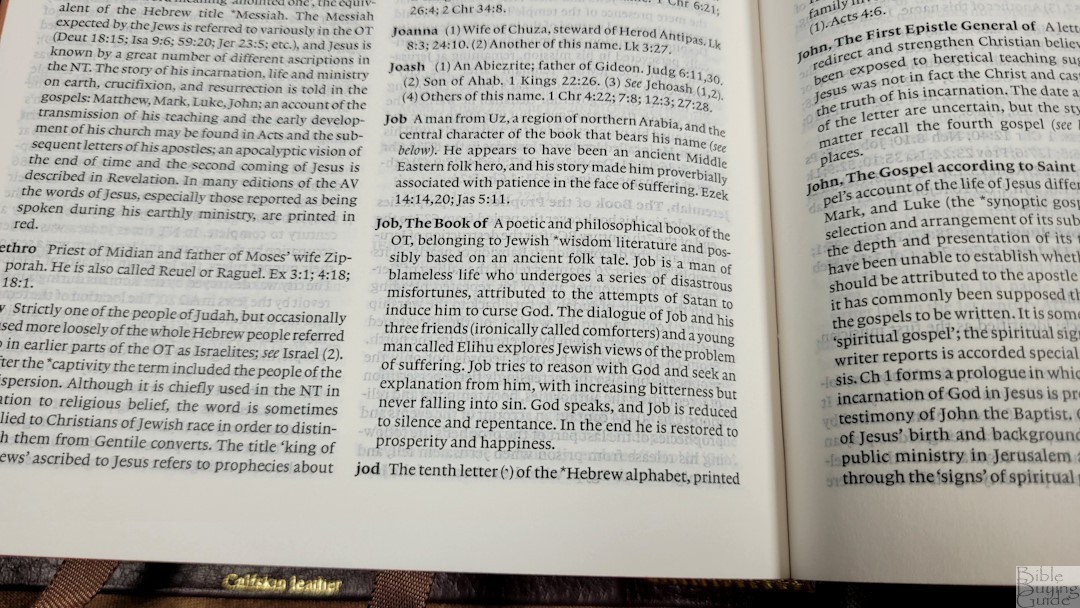
Reader’s Companion
What? No concordance? Don’t worry, the Reader’s Companion provides more than what you would get from just a concordance. It serves as a concordance, topical index, and dictionary, all in one. The Reader’s Companion combines these features in a single place. It includes the prominent proper names, words that have changed the meaning and their definitions, unfamiliar words, customs, occupations, background information, social, legal, and religious concepts, the books of the Bible, literary forms, the original languages, non-biblical literature from ancient times, translation information including the KJV and other derived translations, key words, and more. There is a list of verses for each entry (except book names) and 144 pages of entries. This is much better than a concordance. You don’t get the small clipping of the verse like you would in a concordance (it’s just the references), but with the awesome information in the Reader’s Companion, this is a trade I’m willing to make.

Size
The size of the Clarion is interesting. It’s slightly larger than the Cameo at 7.5 x 5.5 x 1.5, making it a hand-size Bible. However, it doesn’t feel small on the inside. For me it’s the perfect size- both inside and out. Here are some comparisons with the Cameo:


Conclusion
Cambridge has just upped the ante for KJV Bible formats. They’ve given us a single-column paragraph format, a nice readable font, side-column references, and a very nice reader’s companion. The Clarion is the perfect update to the KJV format and the perfect Bible to celebrate the KJV’s 400th anniversary.
Purchase from Amazon (affiliate)
Baker Publishing provided this Bible free for this review. I was not required to give a positive review- only an honest review.


Hi Randy,
This is a beautiful bible. If only the paper was more opaque. I found it so difficult to read that it now sits brand new in its box unused. Sad!
Thank goodness for my 1990s era Presentation Reference. Everyone loves that bible. Clean dark text on paper that is a joy. And the goatskin still has a wonderful smell after all these years.
Alec
Alec, are you interested in selling your Clarion?
Dear Randy and others,
Is the Clarion worth the investment as a pure reading bible? I’ve seen online reviews raise concerns about the pages being too thin and curling. Is this an issue?
I have a very nice large print text bible from LCBP (#215) that is good for reading but I like the idea of paragraphs and hand size.
Nice review.
John
Hi John. To me it’s worth it. The paper is thin and it does have issues with the pages curling. Some are worse than others. I see the most curl when there is air (from an air conditioner or fan) blowing across the pages. I’m not sure why that is, but if there’s no air stirring, the pages lay flat. Mine isn’t bad. I don’t remember noticing it while I was reviewing it. A bigger issue for me with the thin paper is the opacity. There is more show-through than I would like…but – it’s still not that bad. The line-matching helps that a lot. I love the layout and the font. The references and translation notes are some of the best. The Reader’s Companion is a combination dictionary and concordance and is a great tool for study. It’s one of the best for holding in one hand to read. It’s my favorite for general reading. The paragraph format makes finding verses a little difficult, but that’s because I’m used to verse-by-verse format. I’ve been using it in group study and I’m starting to get used to finding the verses, but verse format is still easier.
I’ve considered getting the LCBP 215. How bold is the font?
The font is very bold and has good contrast with the paper. For me it is the best plain text for reading that I’ve seen. No self-pronouncing text either. The font size is maybe a bit larger than the new notetaker from LCBP. I doubt you would be disappointed.
This has become my favorite reading bible. For some reason I am able to get drowned into reading for long periods of time while still getting more out of what I am reading. It took a little bit for me to adjust, but now its hard for me to think any other format can compare to the Clarion. I have the calf split version and I have marked up like crazy. I will be byuing another one some day in the future. I highly recommend this bible.
Hi Christopher. I love the Clarion for reading. Now that I’ve used it as my daily reader it’s hard to read anything else. I haven’t been brave enough to mark in mine. How has it held up to marking? What are you using? Does it bleed through? I’d like to post some pictures of it if you don’t mind.
I use the Micron 01 and a Zebrite medium bible highlighter. The pen has no more bleed through than the type inside of the clarion. The highlighter does a great job. The paper in the Clarion is way better than most give it credit for. I have had some curling issues, but not enough to bother me. I have a few pics, but for some reason I cant transfer them to this site. If you like, I can email them to you.
I wouldnt recommend using anything other than bible pens or highlighters though, but with the proper pens, it really holds up well. I will also add that a little bleed through doesnt bother me as long as it doesnt interrupt the reading
Sorry for blowing up posts on the page, but I want to add one more thing. I use this bible also in Sunday School at church. I find that marking in it has helped me tremendously with finding passages that were tough to find originally because of the paragraph format. It has almost turned the Clarion into a scripture map.lol
I plan on buying a new Bible soon to replace my Cambridge Presentation Bible(10 pt. font)as my main study Bible. The photos of the Clarion look interesting, as the focus is on the text, not notes.
Here are a few questions about the Clarion: (1) Will the Clarion font seem large enough for someone used to 10 pt.? (2)Are the pages thick enough to be marked up with underlining and some notes in pen? (3) Is the see-through be too distracting?
Thanks for your input.
Mark
Hi Mark. I haven’t seen the Presentation Reference, but I’ll try to make a comparison based on the Concord and Longprimer. I don’t think the text-size will be as much of an issue as will the boldness of the text. The font is large enough I think, but it’s about a medium boldness where the Concord and Longprimer are closer to bold- making them easier to see. The Clarion is still easy enough to see and read, though, but if you’re used to something like a Longprimer it will take some getting used to. The Clarion’s text is sharp and clear. The show-through doesn’t distract me at all. I use it as my daily reader and I love every minute of it. As far as marking it, here are some pictures of Christopher Lewis’ marked-up CLarion: https://biblebuyingguide.com/write-cambridge-clarion/
Here is the Clarion compared to other Bibles (some are NKJV or ESV, but the font and paper is identical):
https://biblebuyingguide.com/cambridge-kjv-comparison/
https://biblebuyingguide.com/rl-allan-nkjv-bible-comparisons/
https://biblebuyingguide.com/single-column-legacy-heirloom-comparisons/
The paper is on the thin side and if air blows across the pages you will get an annoying page-curl. Its not bad, but it is there sometimes. That would be my only complaint.
Randy,
Thanks for those links about the Clarion. They were very helpful.
It appears that part of the Clarion show-through concern is because there is so much more white space on the page due to the paragraph format.
Just some comments on marking up a Bible. My general practice is to underline in pen, and make notes with a mechanical pencil. If I receive better insights or applications later, the old notes are easy to remove and replace.
God bless,
Mark
Randy,
I was wondering how you would compare the readability of the Cambridge Clarion vs. the TBS Westminster. The Westminster supposedly has a larger font, but in pictures it doesn’t seem as large as the Clarion. If you had to choose one bible over the other, which would it be and why?
Thanks,
Mark
Hi Mark. Great question! As far as the size of their fonts, to my eye they look so close that it doesn’t make much difference. What does make a difference is the paper. The Clarion has a slightly darker print and the paper is whiter, making the font stand out just a little more. However, it also has more show-through (it isn’t bad though). The creamy paper of the Westminster is my favorite, but the font needs to be slightly darker for me to read it comfortably in low light. In normal light it’s fine.
As far as which I would choose, it would come to how I’m personally using it. They both have great tools for study and they’re both fine for reading. I prefer paragraph for reading and verse-by-verse for preaching. The Clarion is awesome for holding in one hand and reading. It’s even good for study. I tried preaching from it once, and I’ll never try it again (that’s just me not having enough experience preaching with paragraph format). I’ve preached from the Westminster and my only complaint is I wanted the font darker (we need an extra light, so that won’t be a problem when I get the light installed).
The Clarion has a dictionary/concordance, references, and translation notes that are great for study. The Westminster has references, translation notes, definitions in the margin, and the same concordance as the Concord and Cameo, so it’s also great for study. The Westminster also has paper in the back for notes, a pronunciation guide for names and places, and a reading plan.
I think it would come down to paragraph vs verse-by-verse and what it would be used for. Paragraph is better for keeping verses in context. Verse is easier to find things quick. For me: Clarion as a reader and study, Westminster for preaching and study. If I only had one… I don’t think I can choose. The Clarion is the one I carry everywhere and the Westminster is the one I preach from.
They’re both good choices. Sorry I couldn’t make a definite choice. I’ll do a few comparison photos and make a comparison post.