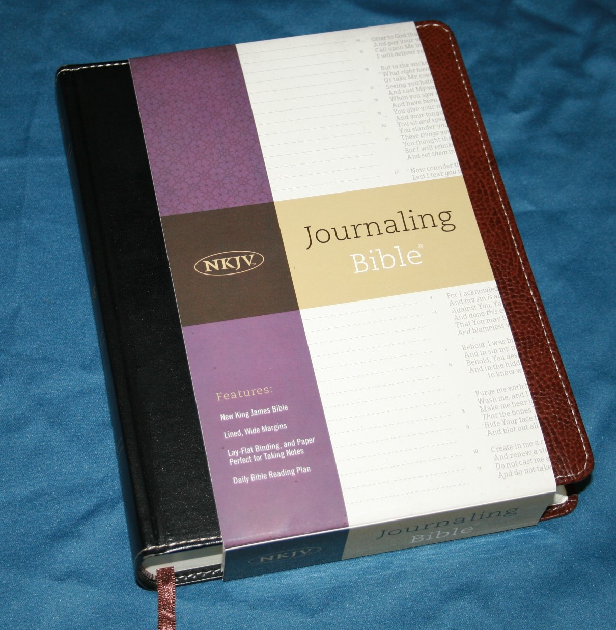
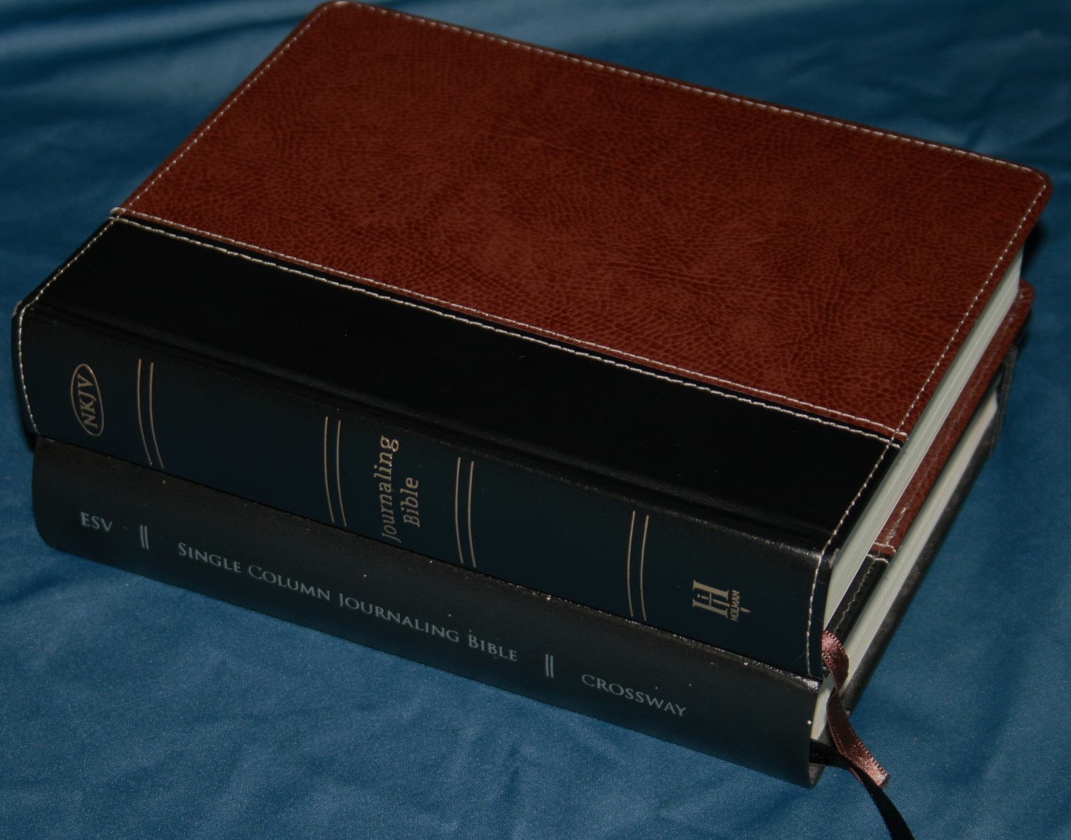
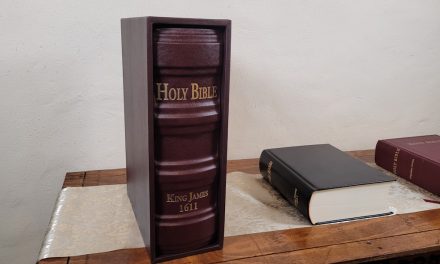
Holman has gone and done something that that is sure to make a lot of Bible journaler’s happy – they’ve licensed Crossway’s Journal Bible design to produce their very own journaling Bible in some of today’s top translations – the HCSB, NJKV, and KJV. It has a few differences. Some very good. Some not so good (depending on your point of view). In this Bible review I take a look at the NKJV edition.
Cover and Binding – Bonded Leather Over Board

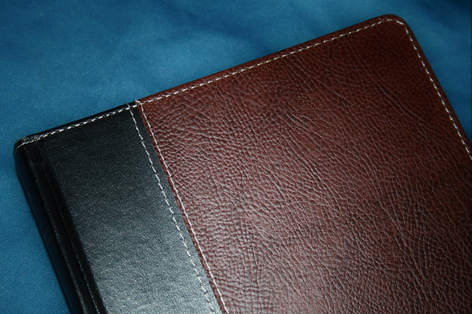
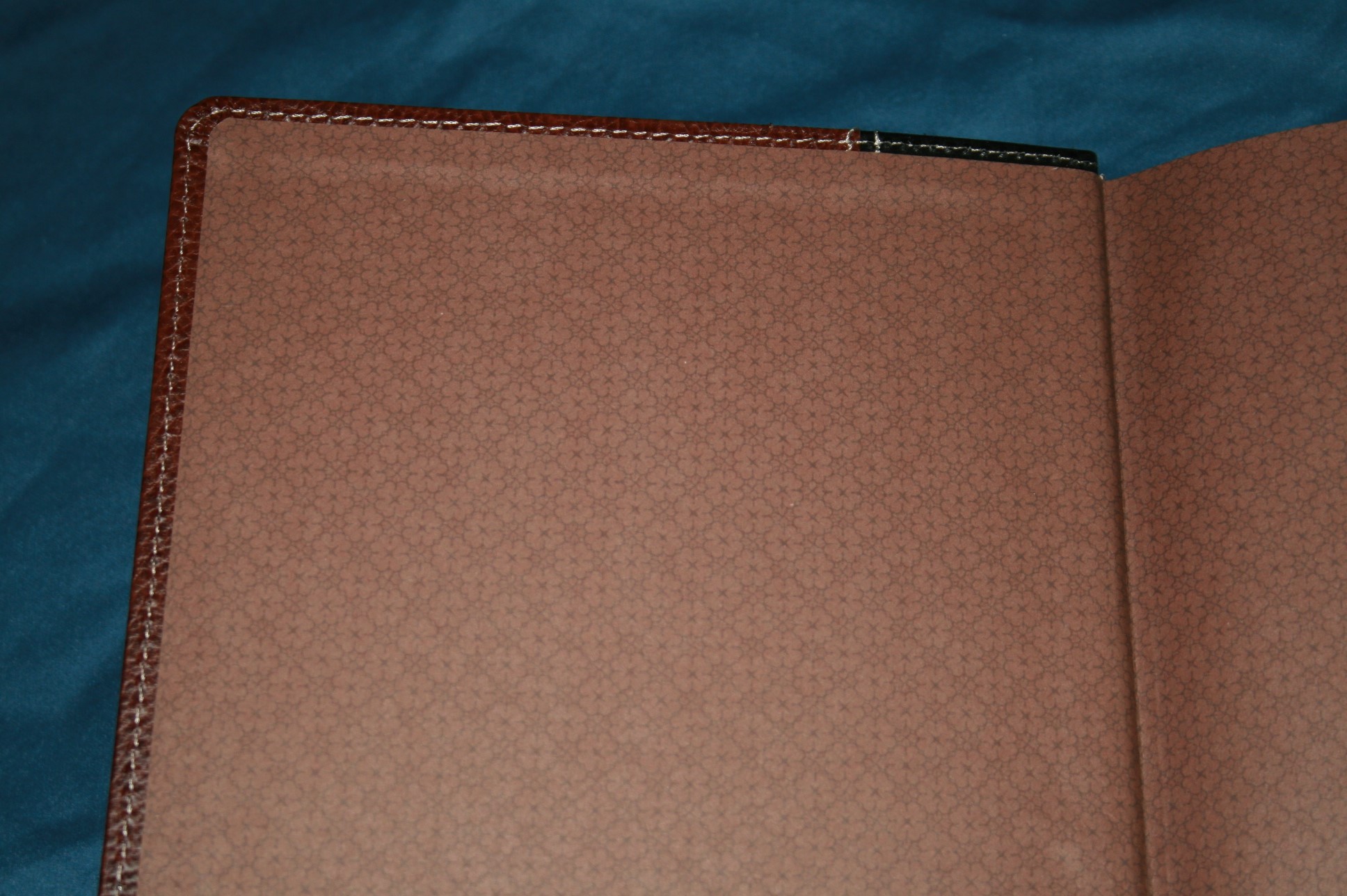
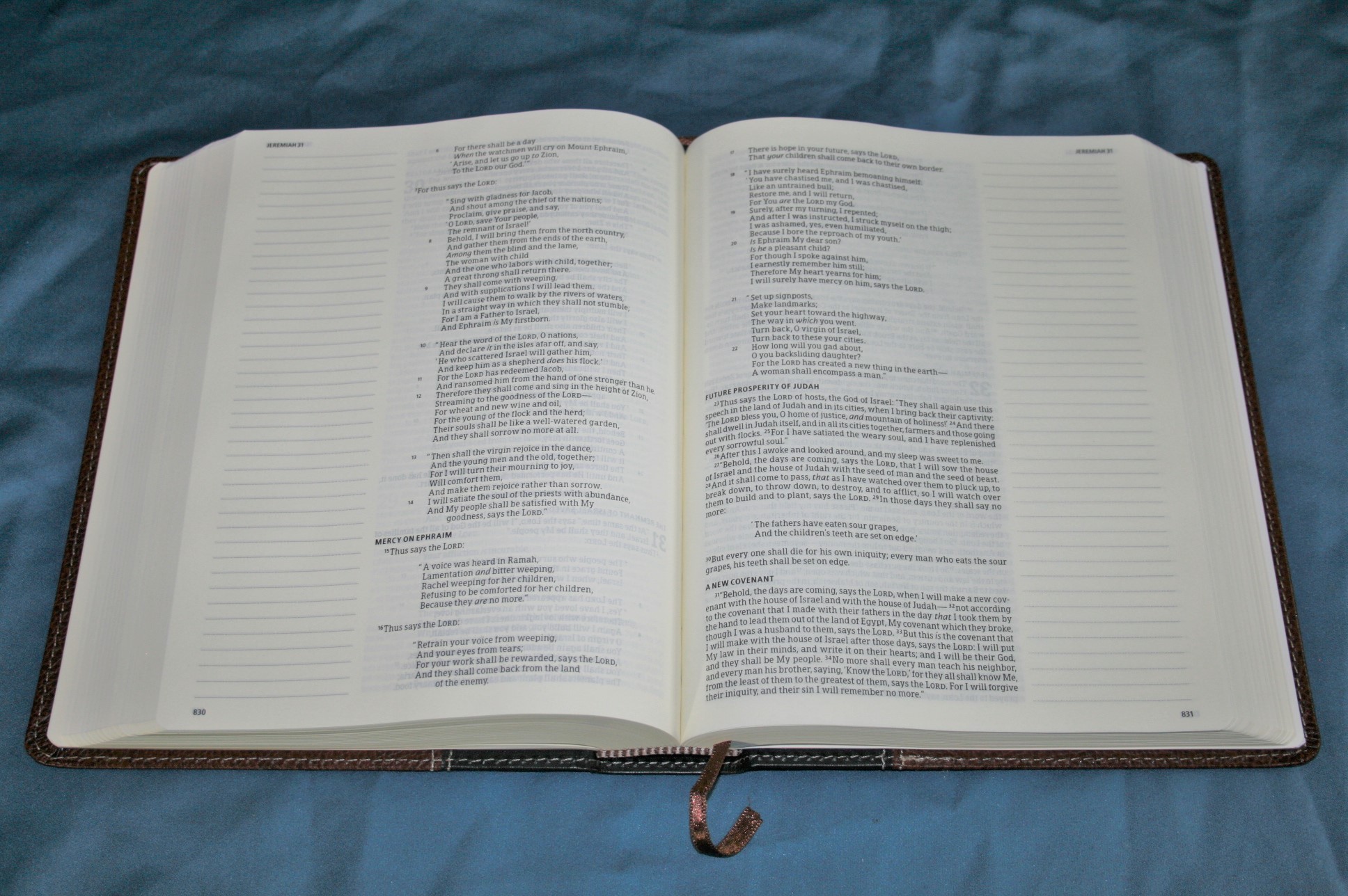
The cover is bonded leather over board. I’m not sure if it is, but it looks and feels like Cromwell leather. If that’s the case then it has more leather fibers than most other bonded leathers. It has a black spine with brown bonded leather front and back. It has a nice grain with a pebbly texture. It’s sewn around the perimeter. The liner is a decorated brown paper that matches the cover well. The binding is sewn and has no trouble lying flat out of the box (or sleeve). It even has overcasting (at least in the front). Overall size is the same as the Crossway – 6.5 x 8.3 x 1.5, making it excellent for carry.
I love this cover. I love the color, the texture, and the fact that I can hold it flat in one hand. It makes it easy to hold and read. It also helps for writing, drawing, taking notes, coloring, etc. It’s not completely rigid, but it isn’t floppy either. I do like floppy covers, but for practical use I prefer a stiffer cover like this one.
Paper – Parchement(ish)
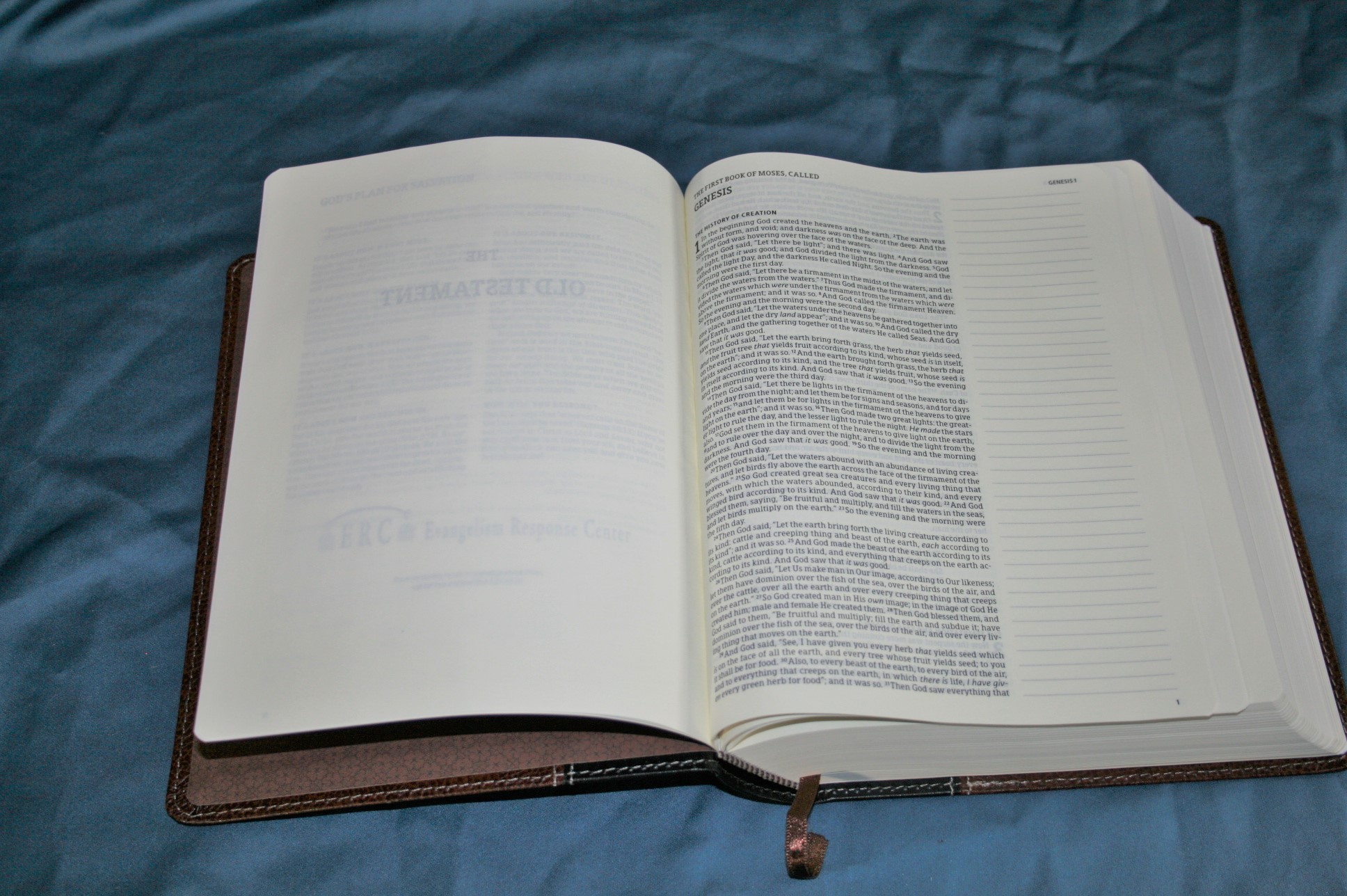
The paper is thick writable Bible paper with a deep cream color that’s between white and yellow. It’s much creamier than most Bibles that have an off-white color. It doesn’t look that dark until you place it next to white paper. It’s about the color of parchment. I love this color-range for paper. My dream Bible would be parchment.
It’s the same thickness as the Crossway edition (upper 30’s gsm, but that’s just a guess) but it does have more show-through than my older edition of the Crossway Single-Column Journaling Bible (I don’t know how it compares to the current edition of the Crossway. It might even be the same). It isn’t bad at all and I would say it’s opaque enough to take the pretty colors that I’ve seen in the world of Bible journaling on Illustrated Faith, Pinterest, and Facebook. I haven’t tried this myself (yes… I’m scared. There, I said it). I plan to use mine for preaching notes rather than journaling. I will buy another and try journaling, but I plan to do that in a notebook first.
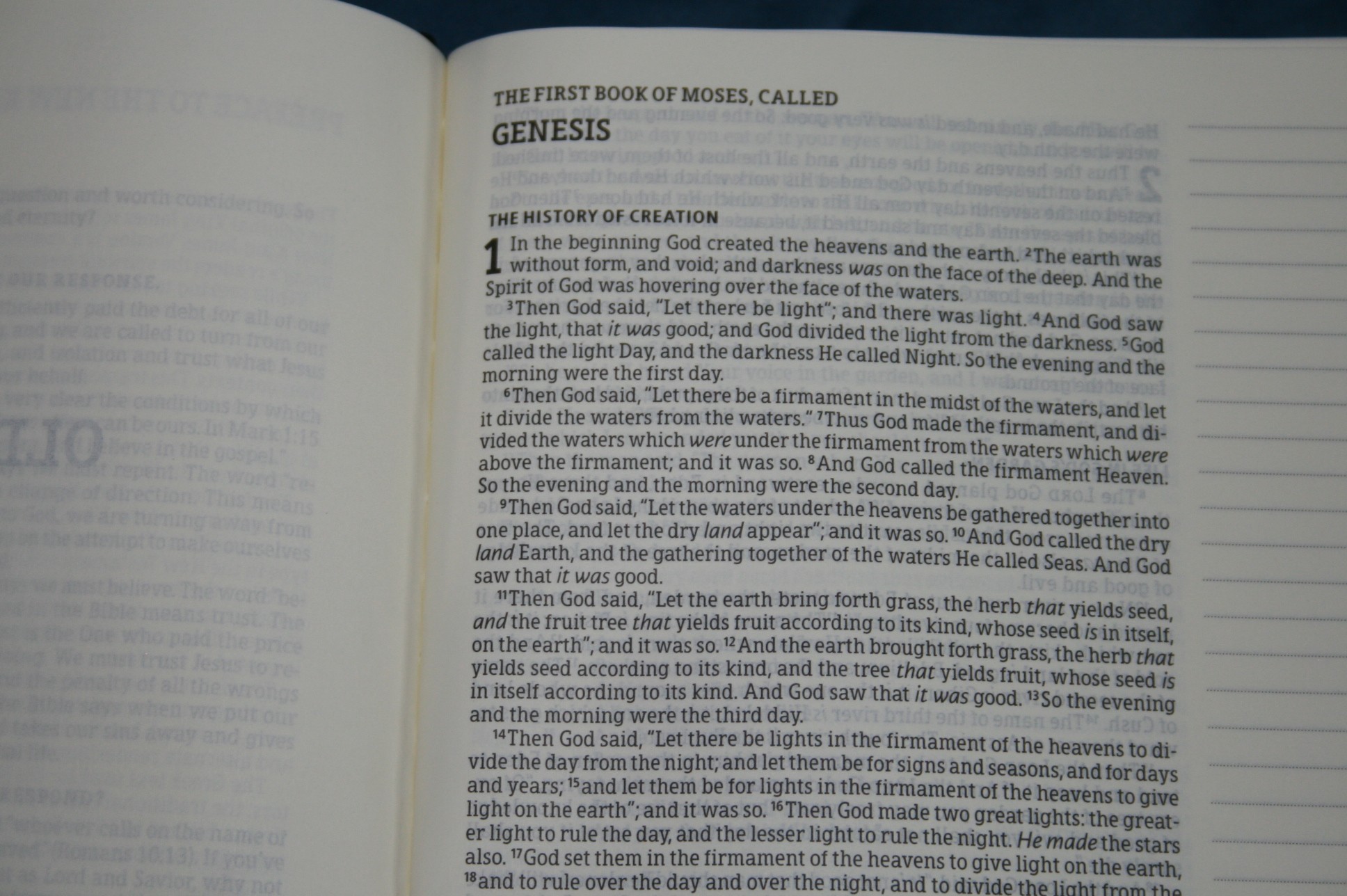
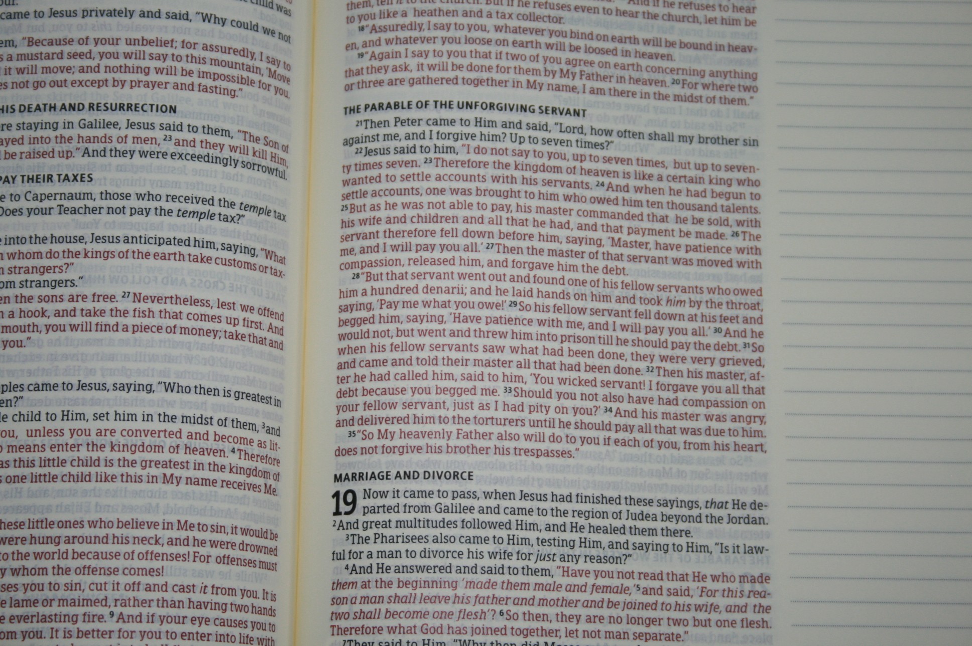
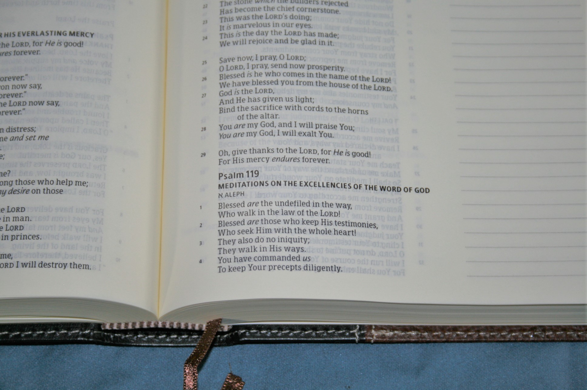
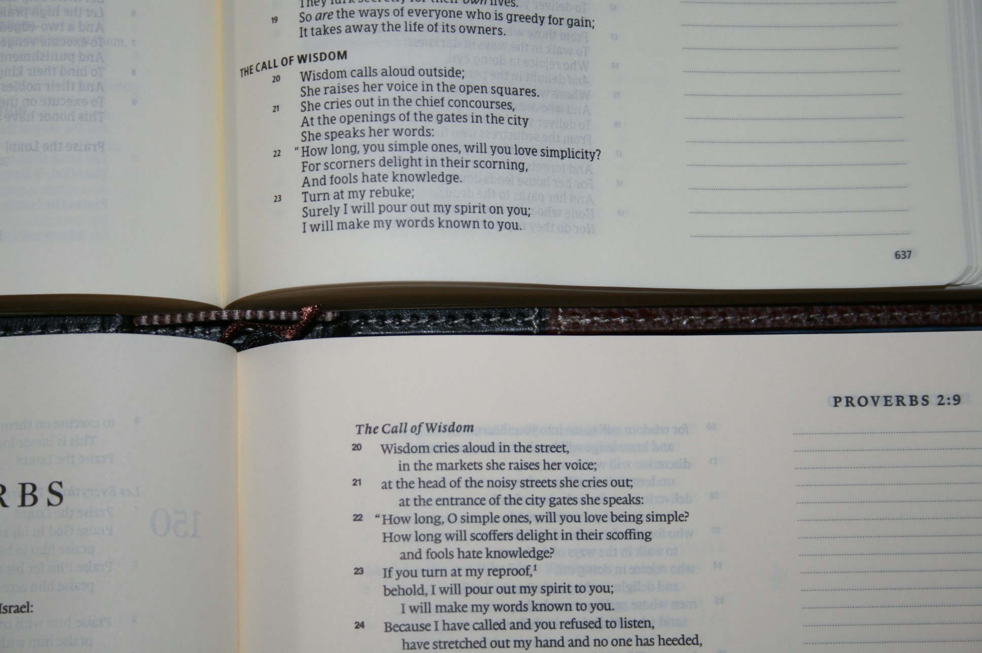
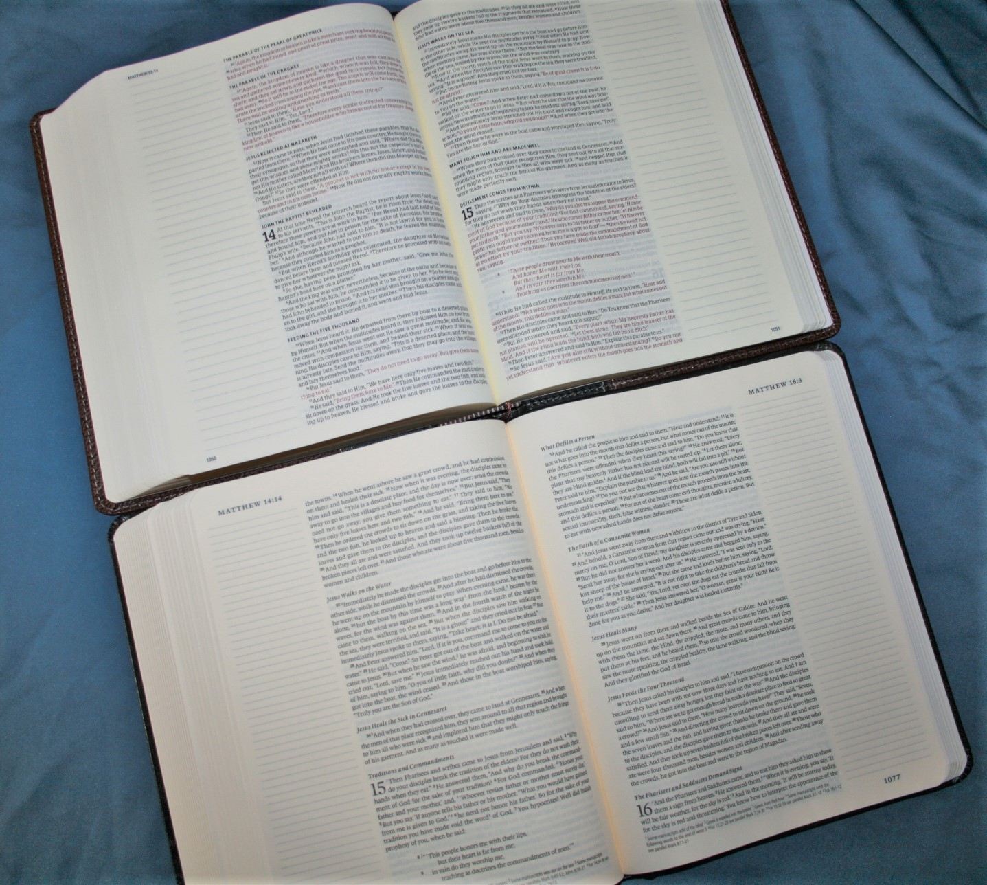
The font is around 8-point or a touch smaller. It has a decent leading. The font is sharp and dark. It’s not as dark as my older Crossway (again, not sure about the current edition). It has around 80 characters across with an average of 15 words. The column is 3.4” wide. The red letter is extremely dark. The red letters go all the way through Revelation. I like this color for red letter. Both black and red are consistent throughout and very readable. Verse numbers are superscript and not too difficult to find. This is a text-only edition, so there are no distractions for reading.
Although I usually like larger fonts for reading and preaching, I had no issues with using this in the pulpit. When preaching, I never had any trouble finding the verse numbers and I never needed the font to be larger. The word and line spacing feels just right for reading. And it should be – it’s designed by 2K/Denmark (same goes for the KJV and HCSB edition).
Layout
This is a single-column setting in paragraph format. It also has line-matching. This setting is gorgeous. The columns are wide enough that poetry looks smooth and natural. I love the NKJV layout – OT quotes are in oblique type, poetry is set to verse, and letters are indented. All of the NKJV section headings are here too. They’re presented in bold text, which sets the sections apart beautifully.
There is one thing missing from the NKJV though – footnotes. The footnotes are a part of the translation. The Crossway edition has them. The Holman’s do not. Why? I can’t imagine why they would be left out. I’m guessing it was to get the overall size right, but I would like to see them added in.
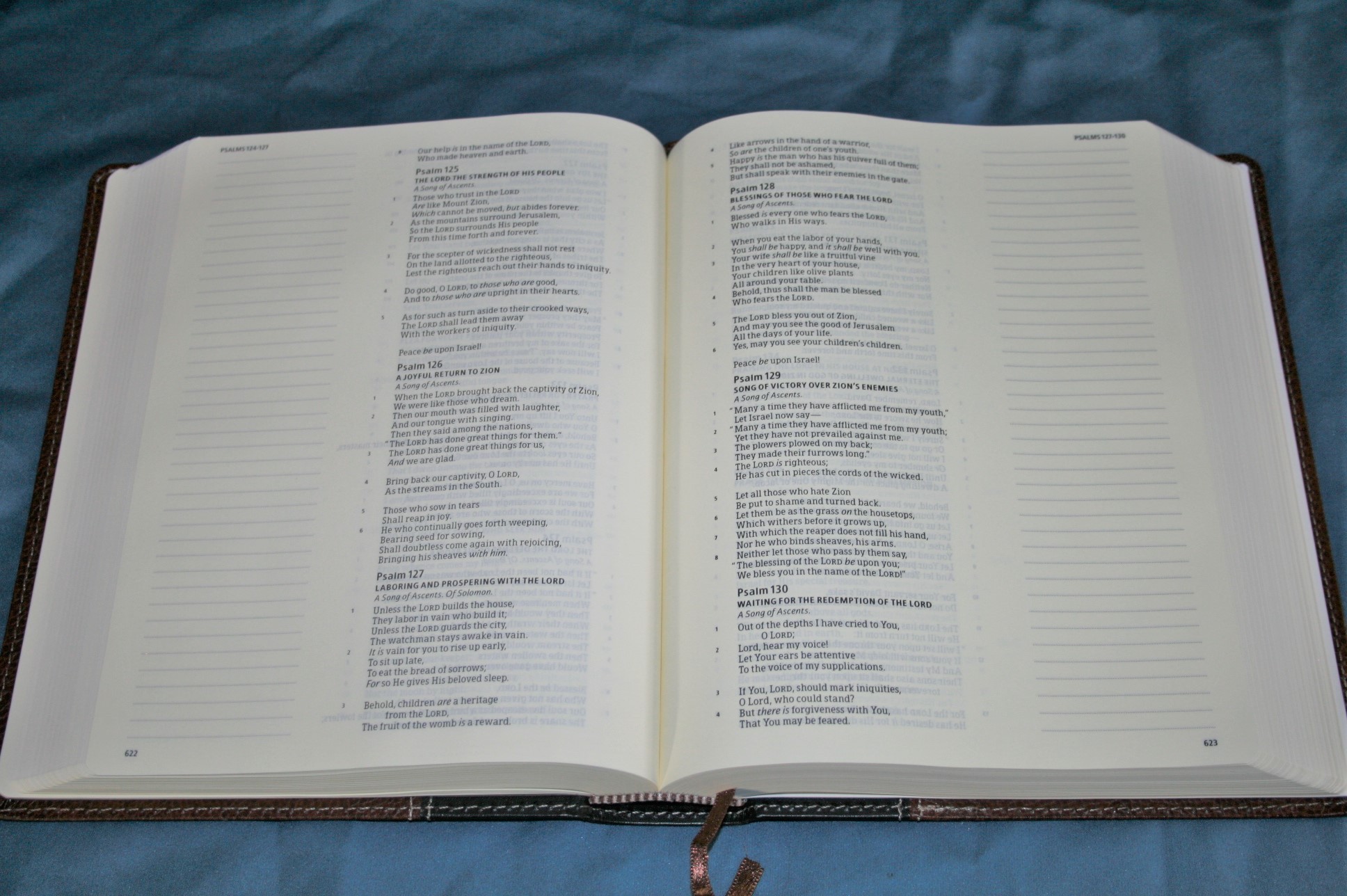
And of course the whole point of this layout is the wide outer margins for journaling. The lines are 1.68”. The margin itself is 2.25” overall. This is the real star of the show. These margins have been home to some of the prettiest artwork I’ve seen in a Bible (search for journaling Bibles on Pinterest and Facebook and you’ll see what I mean). I plan to use them for preaching and study notes. I’ll create my own topical studies, chain references, bullet points, add definitions, quotes, add the translators’ notes that I find helpful, cultural notes, facts, and if I have room left I’ll try my hand at drawing. I’ve always liked teaching from drawings.
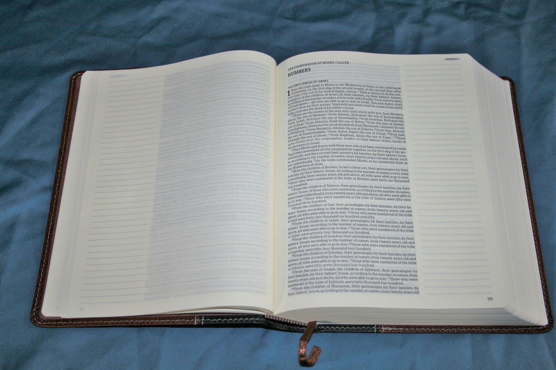
One more thing this Bible does right… all new books start on a new page on the right. If the book ends on the right page, the left page is blank. Actually, it is lined in two columns for notes. This happens often enough to give plenty of room for notes, charts, lists, outlines, full-page drawings, etc. I wish all Bibles did this.
There’s also enough inner margin to bring the text away from the gutter, making it easier for reading, marking, and preaching. The header includes the book name and chapters that appear on that page. Page numbers appear in the footer on the outside corner.
A Thought About the KJV Edition
I have one other disappointment, but it’s not with the NKJV edition… it’s with the KJV edition. The NKJV layout is gorgeous. The KJV goes back to verse-by-verse. Sometimes that’s needed, but we have a major shortage of pretty settings for the KJV. I hoped this would be it. I hoped this would be the prettiest KJV layout on the market. I would finally have that perfect KJV that I could add my notes to and grow old with. I’ll buy it anyway (that’s how much I love the single column journaling setting) and make my notes in it, but I will always wish it looked as good as the NKJV. But, I digress…
Daily Reading Plan

The included reading plan gives you a reading from both testaments for Monday through Saturday, and a reading in Psalms for Sunday. It also explains that you can read through the Old Testament in one year and the New Testament for the next year if you want to read the Bible through in 2 years instead of one.
Concordance
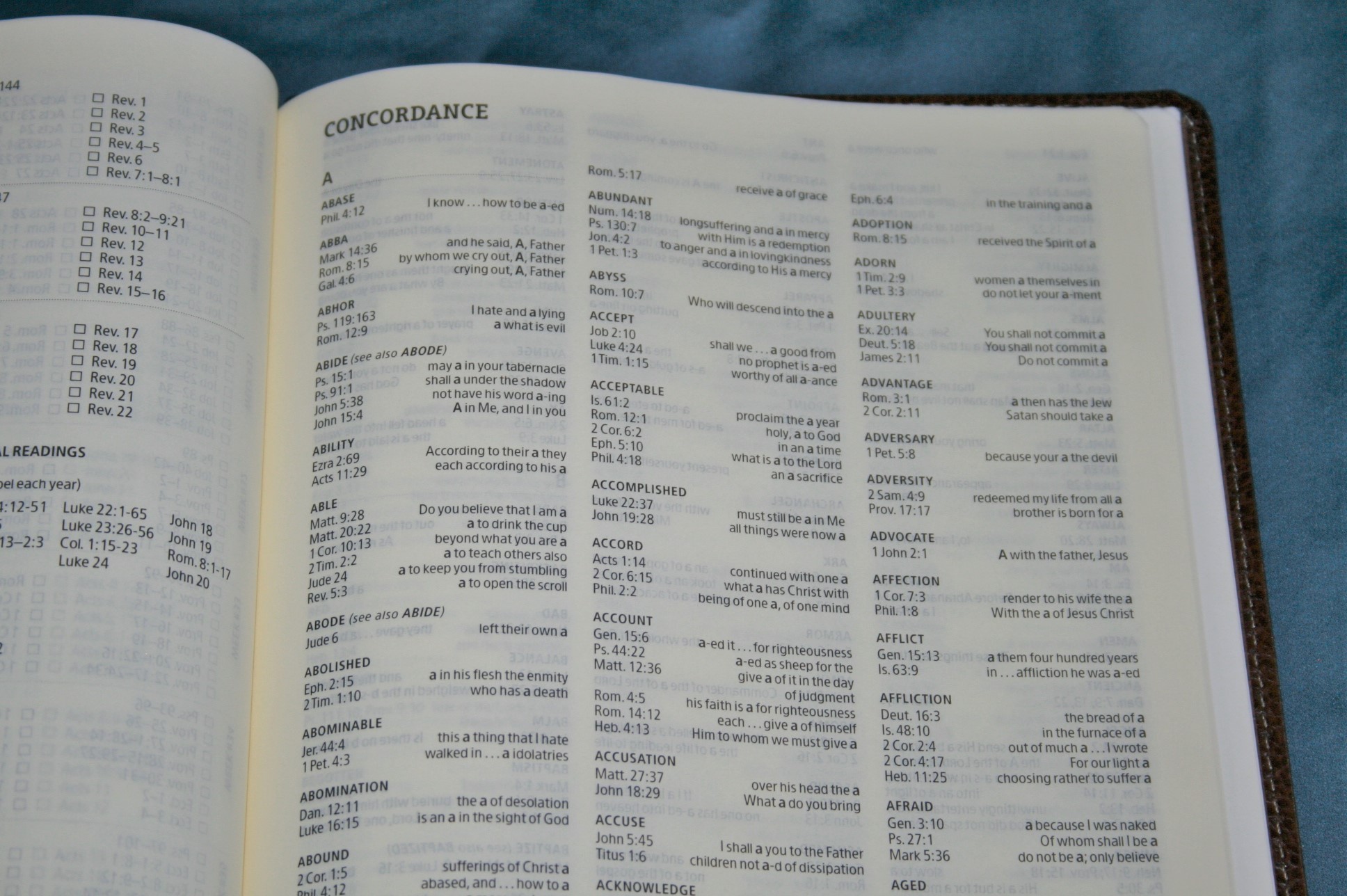
Unlike the Crossway edition, the Holman has a concordance. The NKJV edition is 30 pages with three columns per page. Here are some example entries:
- Faith – 12
- Faithful – 6
- God – 12
- Godhead – 2
- Godliness – 4
- Godly – 1
- Gods – 3
- Praise – 2
- Pray – 8
- Prayer – 5
This isn’t the kind of concordance that I would use for sermon prep, but if I’m out somewhere and need to look up something it might be helpful.
Maps

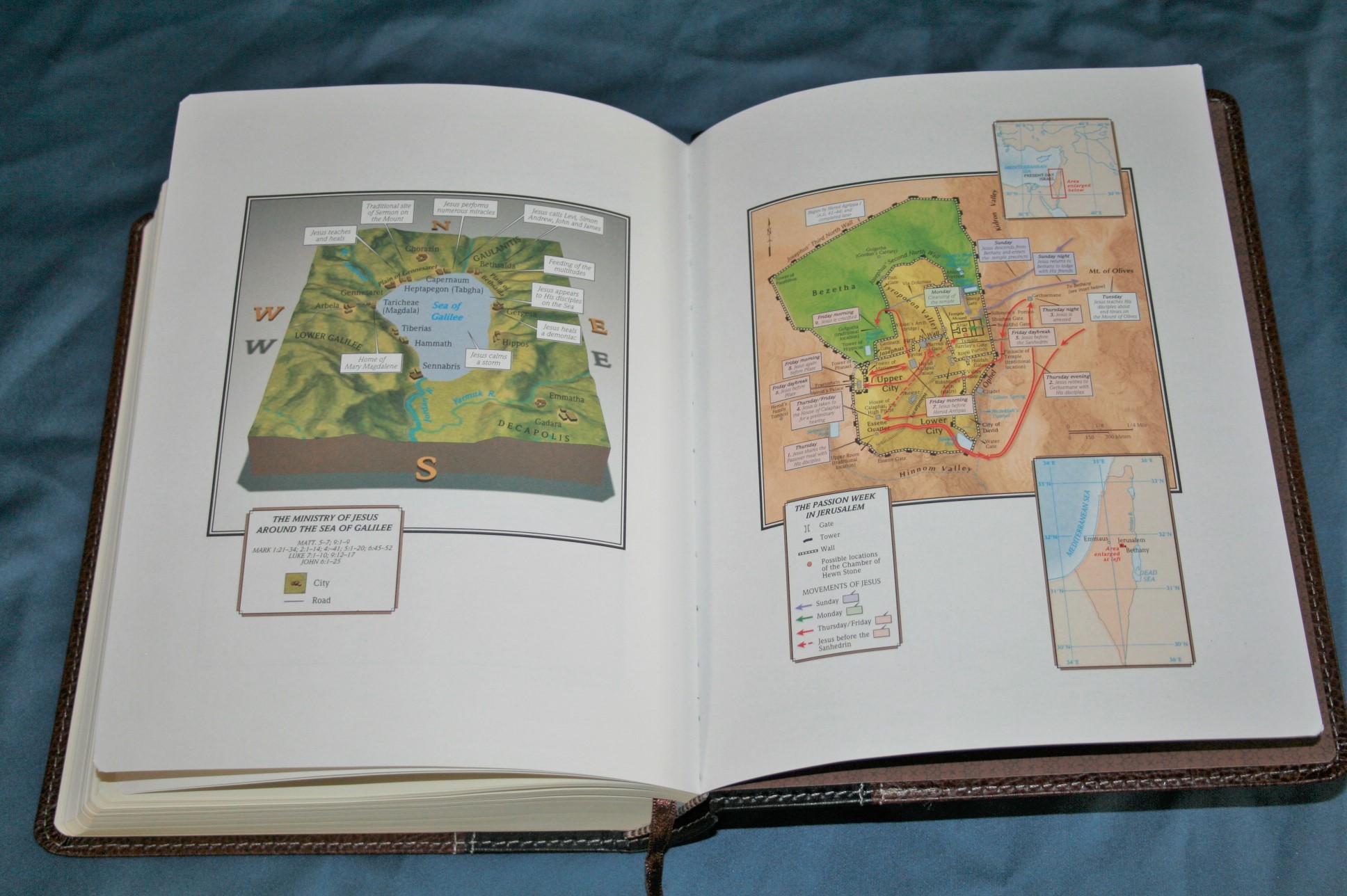
There are 8 pages of maps on thick non-glossy paper. They’re colorful and look great. I like that it actually shows a possible location for the Red Sea crossing. Maps include:
- The Migration of Abraham
- The Route of the Exodus
- The Tribal Allotments of Israel
- The Kingdoms of Israel and Judah
- Israel in the Time of Jesus
- The Ministry of Jesus Around the Sea of Galilee
- The Passion Week in Jerusalem
- Paul’s Missionary Journeys
For some of the maps you have to turn the page sideways. One thing I like is that all of the maps that are sideways are facing the same direction. I wish there was an index to maps. The maps are labeled well and easy to read and use.
Comparisons – the ESV

Conclusion
The Holman Journaling Bible is a winner in my book. I’d like to see the translators’ footnotes added, but that’s not enough to make me dislike it. There is plenty enough space to add them if I want them bad enough. The construction is top-notch (for the record it’s made in Korea). I love the layout, the paper, and the font. This would make a fine Bible for carry, reading, study, teaching, preaching, and of course journaling. I’d love to see this available in NASB. I highly recommend the Holman Journaling Bible in NKJV. I plan to buy the KJV edition use both as wide margin preaching Bibles.
Holman Publishing provided this Bible free for review. I was not required to give a positive review- only an honest review.


@Holman has gone and done something that that is sure to make a lot of Bible *journalers* happy –
When I ordered this Bible, back in April, I could not wait to receive it! Then getting it was an experience!
Hi Dewey. How do you like it so far?
Randy,
Which is easier to read from the pulpit: this Journaling bible, or the Cambridge NKJV Wide Margin?Their font sizes on paper are the same but not all fonts are equal. Which does your eye prefer?
Hi Nathaniel,
That’s a touch one. In this case the fonts actually look very similar. The Holman might be a touch darker, but so is its paper. To me what makes the biggest difference is the layout and its design features.
The Holman paper has a darker cream tint (almost yellow). It’s not as opaque as the Cambridge. The Cambridge font stands out because of more contrast against the white paper.
The headings in the Cambridge almost blend in with the text. The Holman headings are in bold and stand out – making it easier to identify and find specific sections quickly.
The Holman column is much wider and sometimes I almost lose which line I’m on when the text wraps into the gutter. It isn’t a bad problem, but I do have to stop and think about which line to read next. I’ve never had this problem with the Cambridge.
The Holman red letter is a little darker (which I prefer).
I can find verses a little easier in the Cambridge. There’s a little more space between the verses and verse numbers.
As I compare them I keep going back to the Cambridge, but that’s partially because I use bifocals and the narrow columns are easier for me to read. I could just as easily pick up the Holman and be happy with it. Overall I’m calling them equal. The only way I can decide is to choose which advantages I prefer over the other.
How do I purchase the NKJV bible and what is the purchase price, shipping etc. Than you, Ivan
You can find it at any local Christian book store (Lifeway),or order online from christianbook.com and Amazon. Retails for $44.99. I got mine for $29 since I had a 40%off coupon at my local Christian book store.
I’m have never been more grateful for this Bible. I love finally having a journaling Bible in my preferred translation. As a woman though, I have to admit, I almost got an ESV Journaling Bible just because Crossway had some pretty covers available. Crossway definitely knows how to market.
Yes they do! They cover everything from inexpensive to premium and offer several colors in each.
I do want to add that I find the spacing between lines to be much smaller than in the ESV journaling Bible. This makes the text feel cramped while reading. I still enjoy this Bible but with the small font and cramped text it can be a little difficult to use for long periods of time.