Cambridge NIV Clarion in Goatskin and Calf Split – Review
The Clarion has become a staple design for Cambridge. It’s a paragraph edition with reading in mind, placing the focus on the text with a comfortable font size, without sacrificing references. It has a single-column format with references in the outer margins. This hand-size Bible is now available in the NIV.
Features
- NIV 2011 text
- Goatskin cover
- Edge-lined
- Art-gilt edges
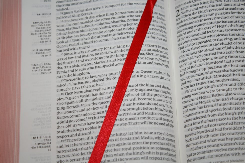
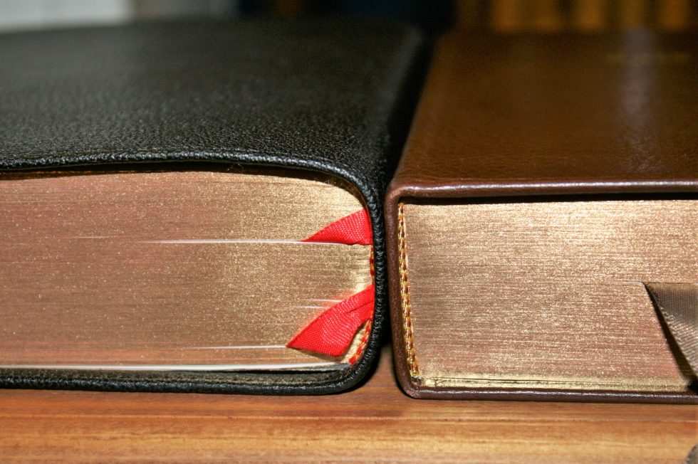
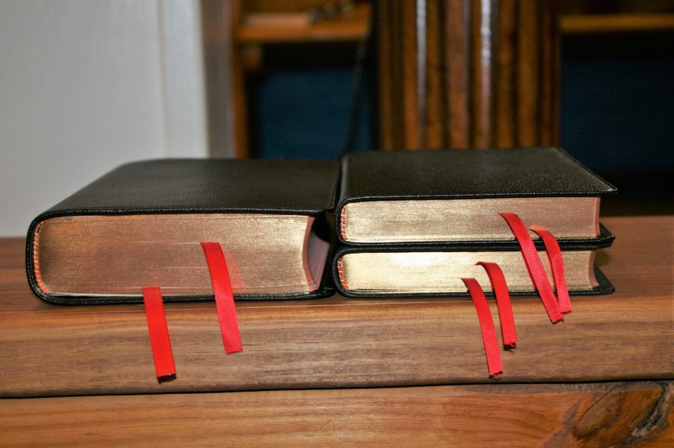
- 2 cardinal red ribbons
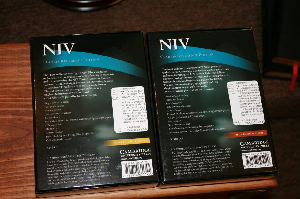
- ISBN: 9781107595149
- Model: N1486:XE
- Calf Split cover
- Paste-down
- Gold gilt
- 2 black ribbons
- ISBN: 9781316601341
- Model: NI484:X
- 8.75 black letter font
- Single-column paragraph
- Side-column references
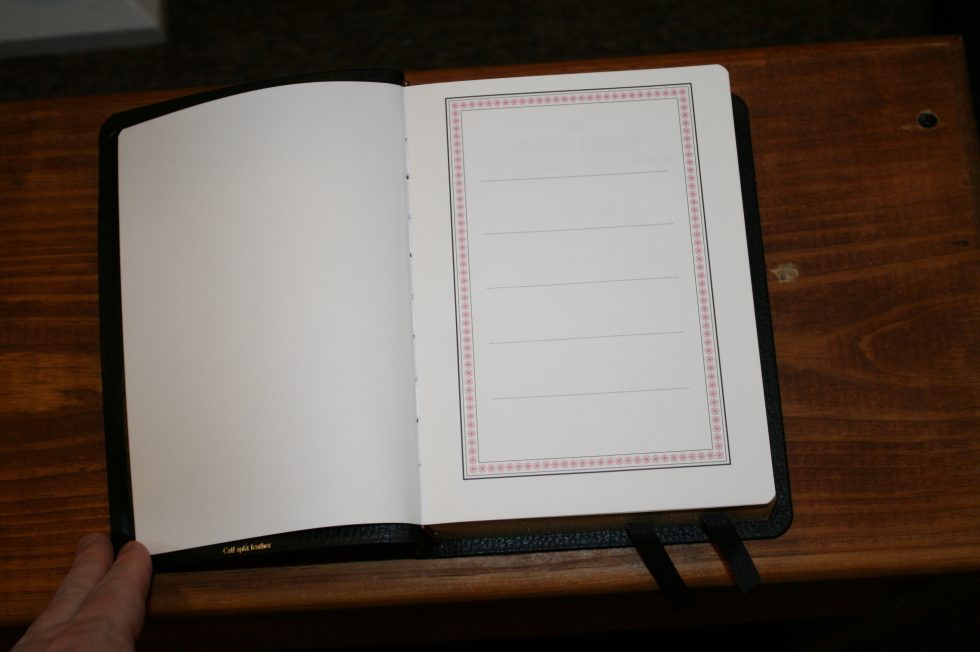
- Concordance
- 16 pages of maps
- Map index
- 2186 pages
- Red and black head/tail bands
- Overall size
- 61 x 5.61 x 1.62
Binding
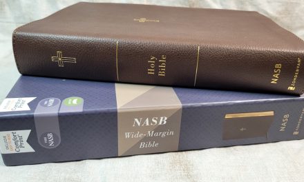
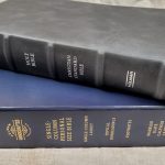
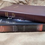
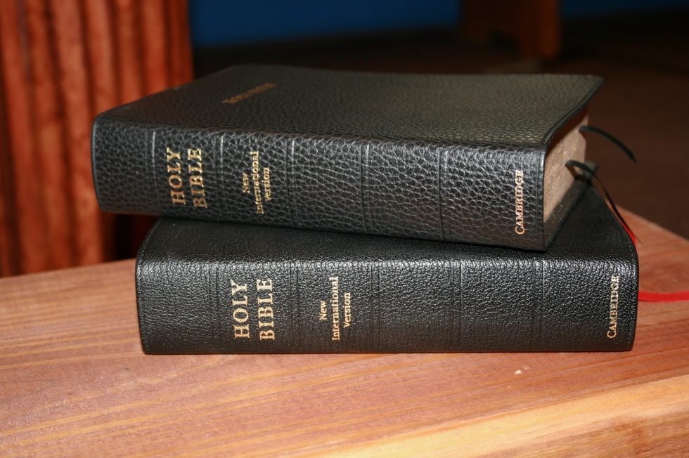
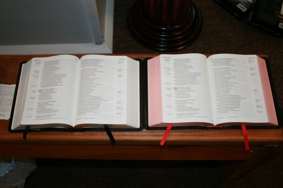
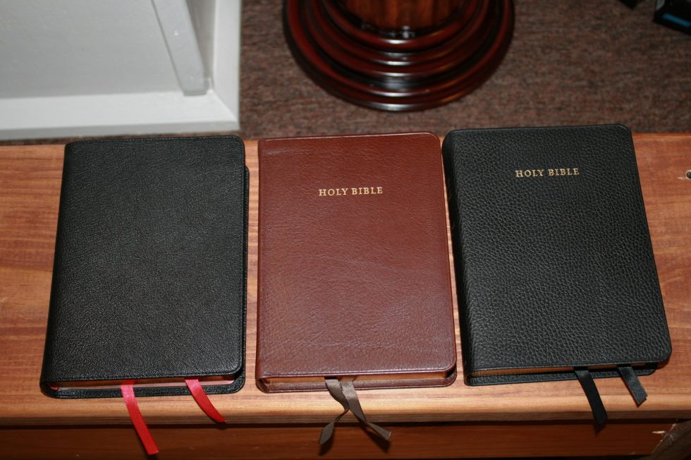
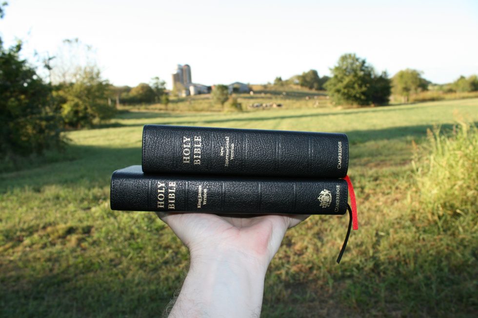
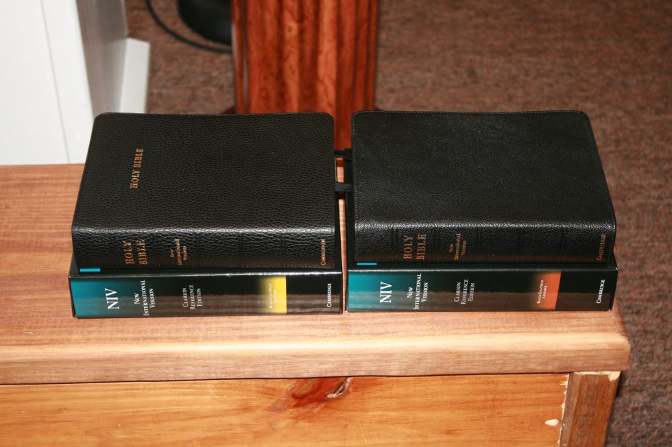
The Clarion is available in calf split and goatskin. In this review I’ll take a look at both editions. For other translations see my other Clarion reviews: KJV, NKJV, ESV.
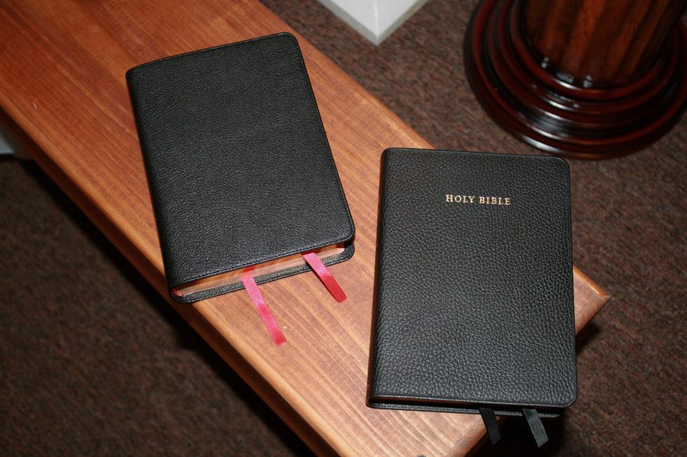
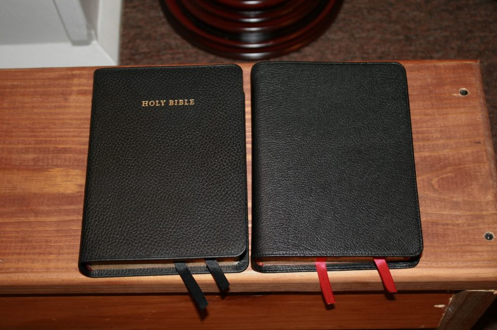
Goatskin
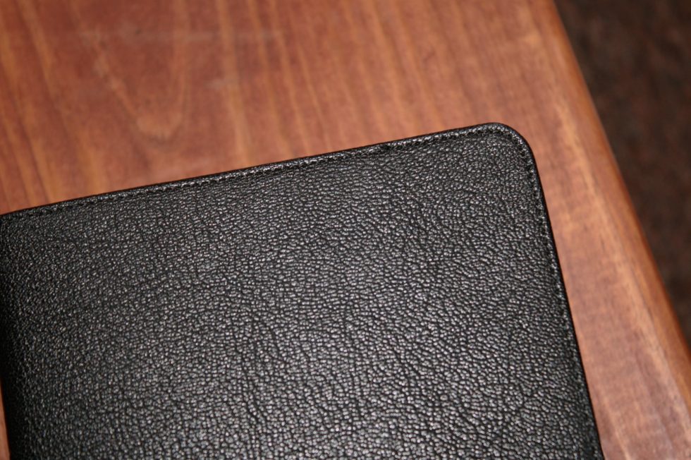
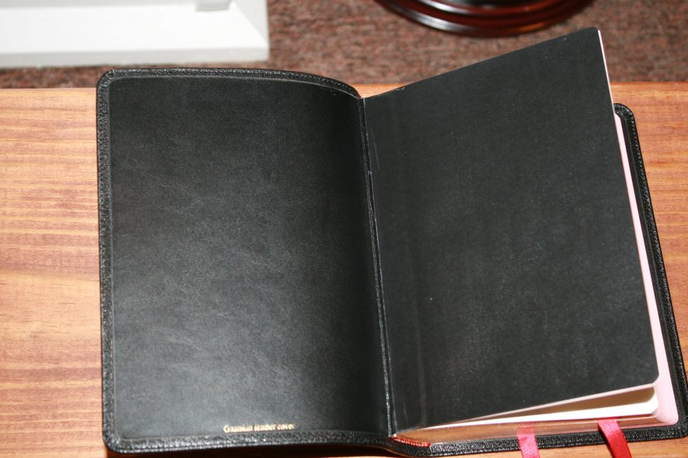
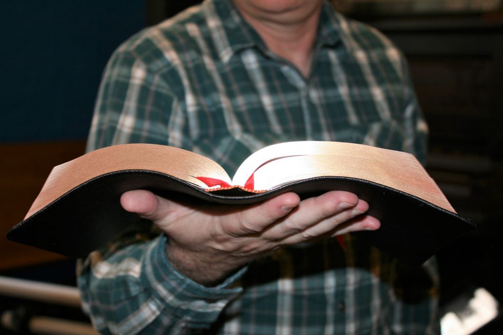
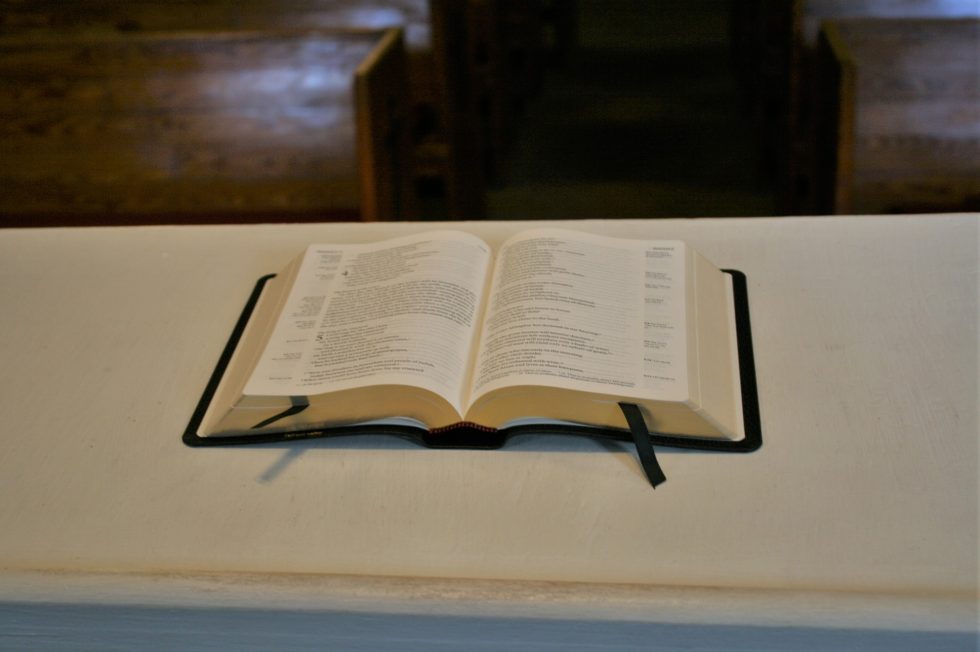
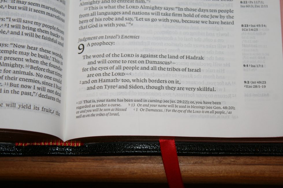
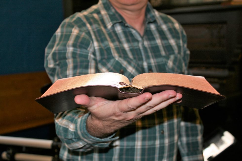
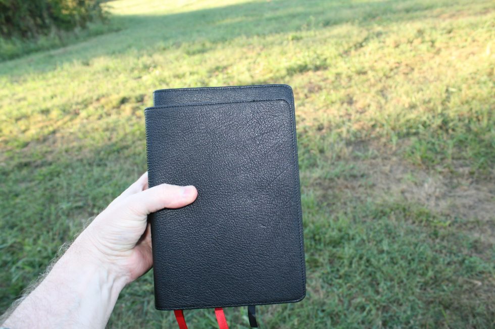
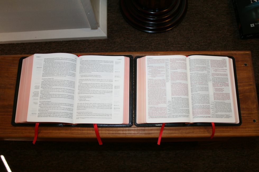
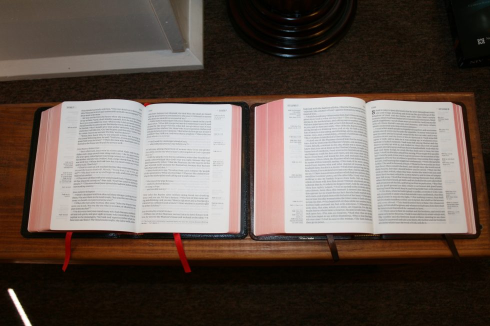
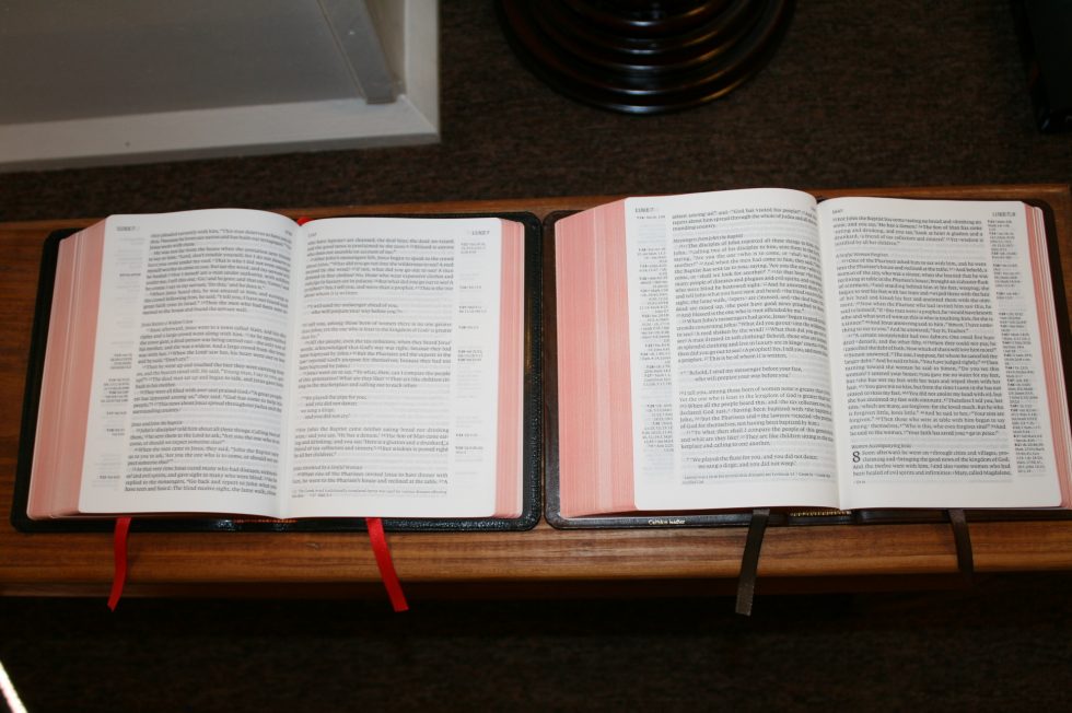
This edition is black goatskin with a synthetic edge-lined liner and perimeter stitching. This cover is as flexible as any goatskin that I’ve seen from Cambridge. For me goatskin can become unwieldy but the Clarion isn’t so large that it’s too difficult to handle. I do find the calf skin and calf split editions easier to handle than the goatskin but the goatskin is far more elegant and I’m sure will last longer due to the construction design.
The grain is natural and is much tighter than the calf split. The finish is close to satin. It’s flexible and soft to the touch. It feels smoother than the calf split.
The cover doesn’t have anything printed on the front. The spine has Holy Bible, New International Version, and Cambridge printed in gold. It has indications for spine ribs etched into the spine but they’re not pronounced. It does give it a better visual appeal than no etching at all.
It is floppy but it’s not too difficult to hold open in one hand. I find that I sometimes lay it across my arm when reading. I haven’t felt the need to use two hands to hold it. This cover is the most elegant of the three. The edge-lined tab does attempt to close in Genesis 1, but I can tell it’s breaking in and near the end of Genesis I can’t even tell it’s there. The flexibility of the cover is more apparent than the tab is.
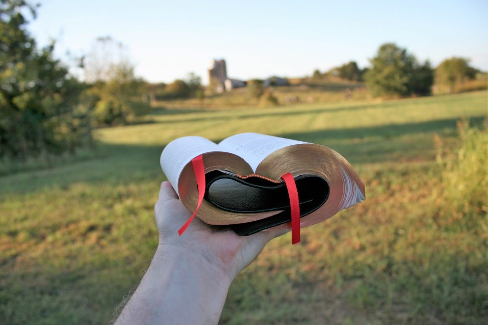
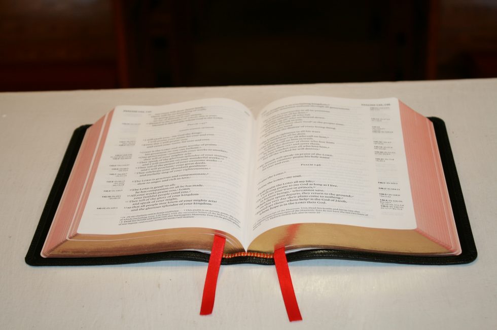
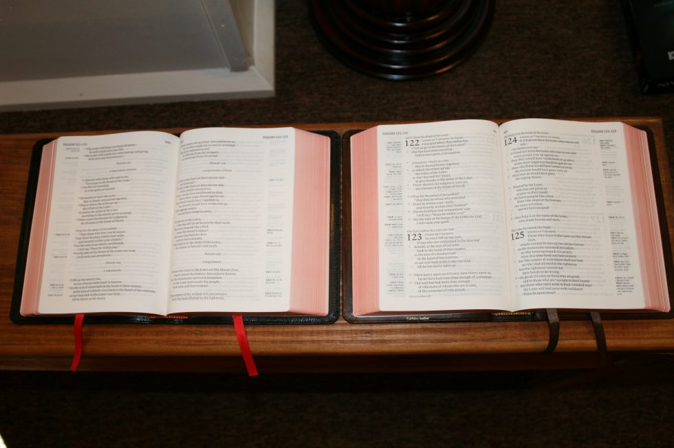
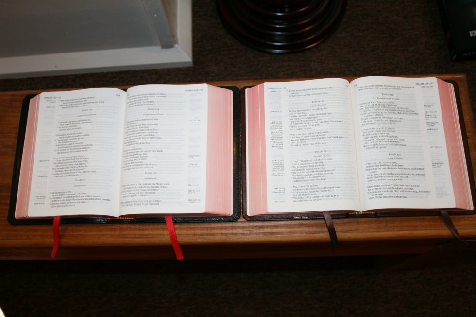
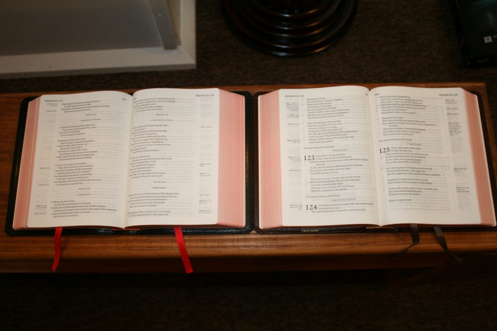
This edition has two cardinal red ribbons and art-gilt page edges.
Calf Split
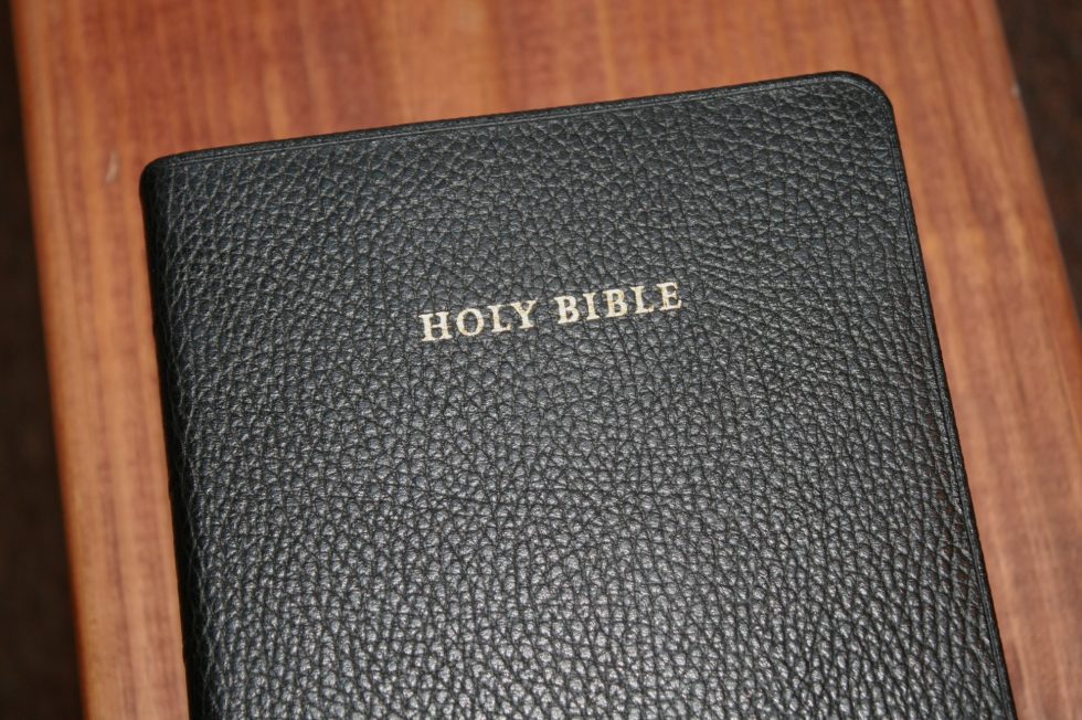
The calf split edition has Holy Bible printed on the front in gold and the spine has Holy Bible, New International Version, and Cambridge. It has marks to indicate spine ribs stamped along the spine. These help give it some aesthetic texture.
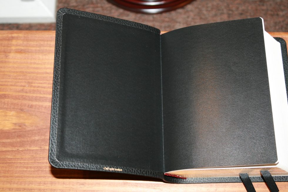
The finish is similar to satin. It has a tight grain that looks similar to cow hide. It’s actually more pronounced than the goatskin. It has a paste-down vinyl liner. For reading I actually think this edition is easier to handle. The cover isn’t soft to the touch like the goatskin or calf skin is, but it’s much less flexible and the extra stiffness allows it to lay flat in the hand. The rougher texture of the leather keeps it from trying to slide out of my hand when I tilt it toward me.
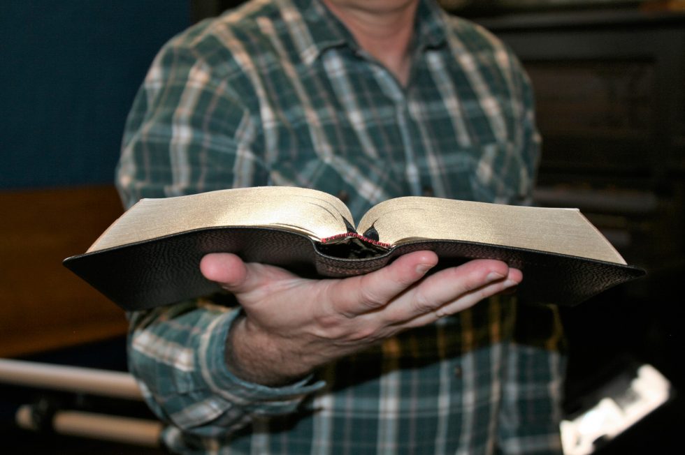
This edition has two black ribbons and gold-gilted page edges.
Paper

The paper in the NIV Clarion is 28gsm. This is a different paper than the 27gsm in the other Clarions that I’ve reviewed. It’s more opaque and the thickness feels the same to my fingers at 27gsm. It has a whiter color than the other editions and feels smooth to the touch while the others feel rough. There is no glare even under direct light. The extra opacity makes it much easier to read than the other editions. The thickness difference is minimal. This Bible is thicker mostly because it has more pages.
No Page Curl – this paper doesn’t have the page curl issues as the other editions. I took the NIV and the ESV outside with the wind blowing to compare how they responded to the wind. I was able to get the ESV to curl and immediately opened the NIV. The NIV did not curl. I went back to the ESV and it had instant page curl. I set it down and opened the NIV and it had no page curl. I tested this for many days and never got page curl when the other editions did have it.
UPDATE – Now that we’re in the cooler months (October) here in east TN I’ve seen a very slight amount of page curl in the corners. The other editions (ESV, KJV, NKJV) are curling so bad that I don’t want to use them, while the NIV remains usable.
I know a lot of people have highlighted previous editions of the Clarion. I personally haven’t tried it and I don’t recommend highlighting in Bibles that were not made for it. If you do highlight in yours please share your experience in the comments.

Typography
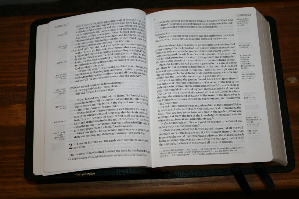
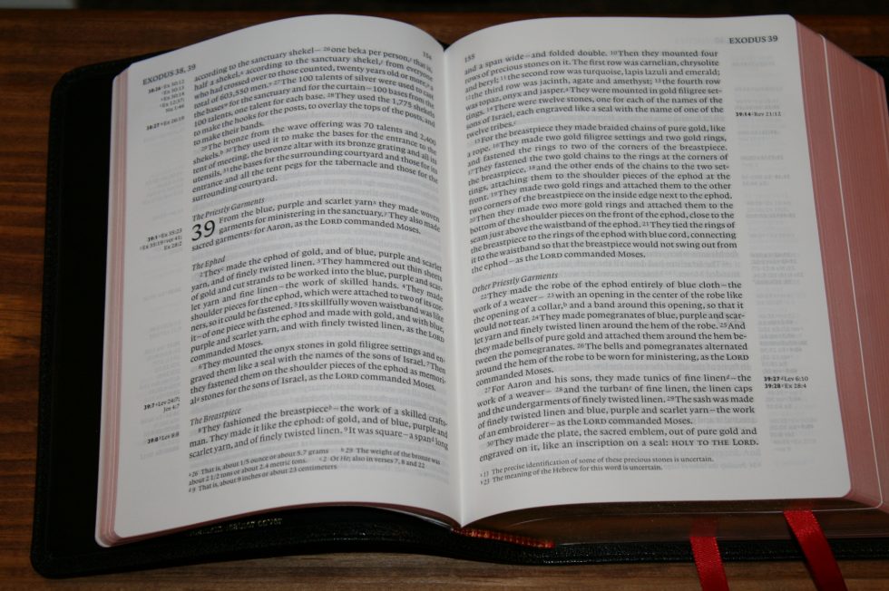
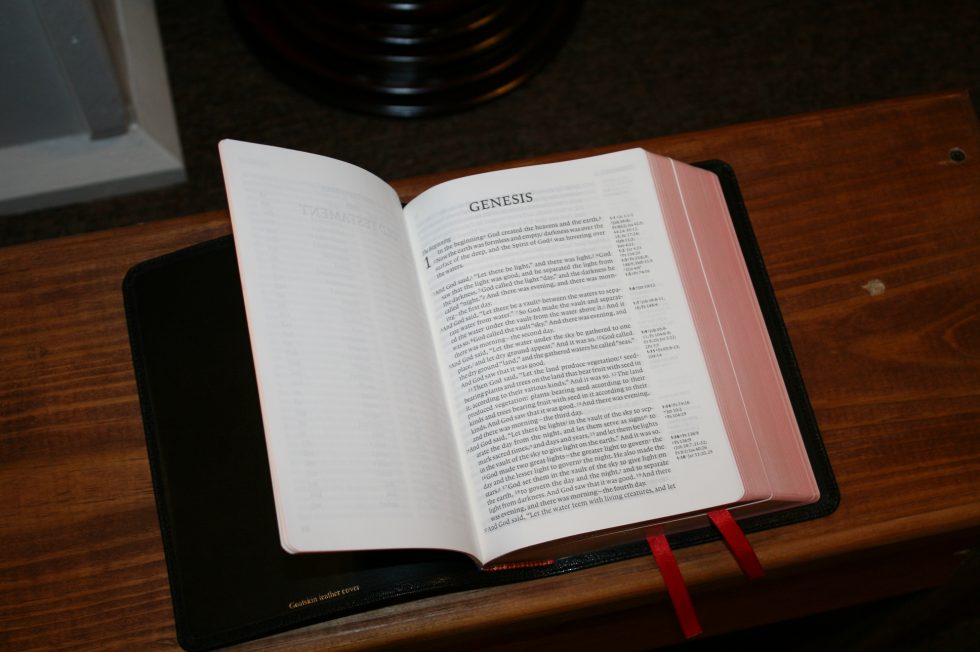
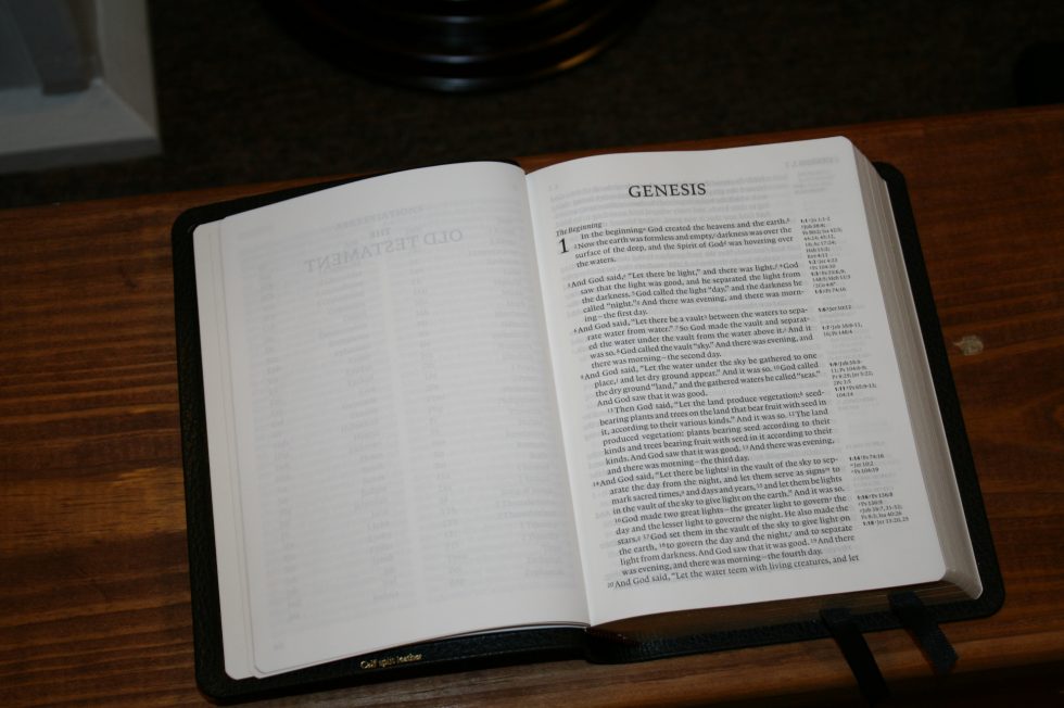
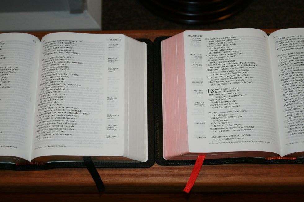
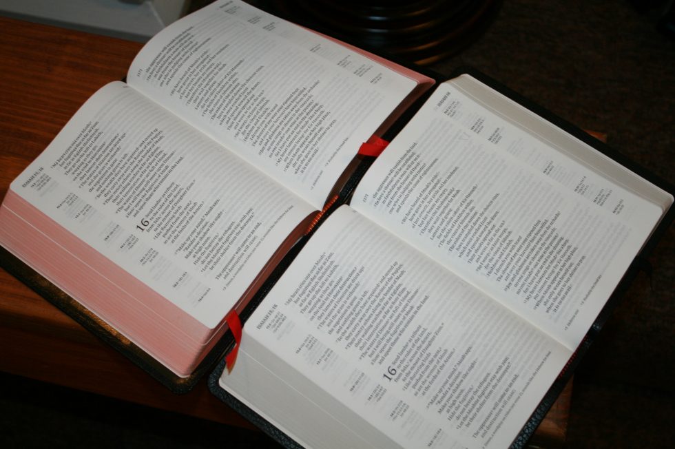
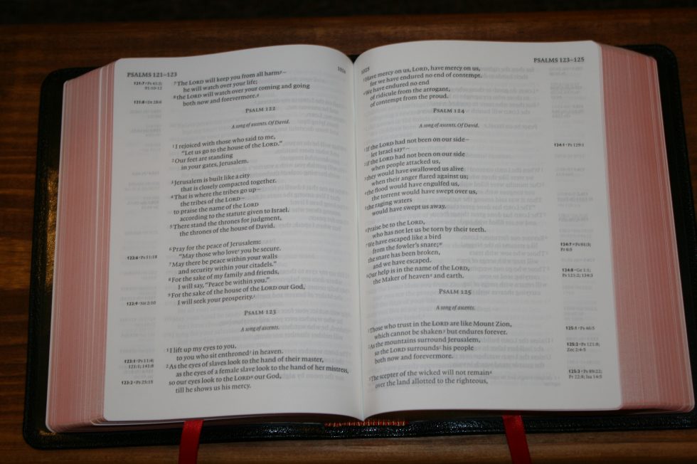
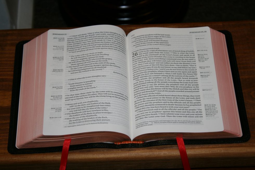
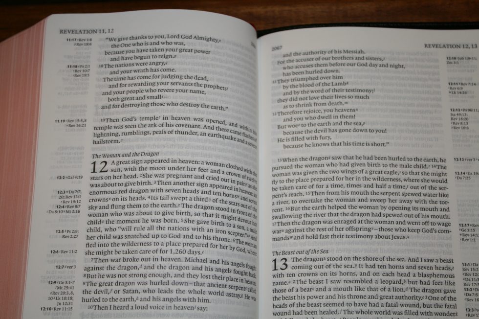
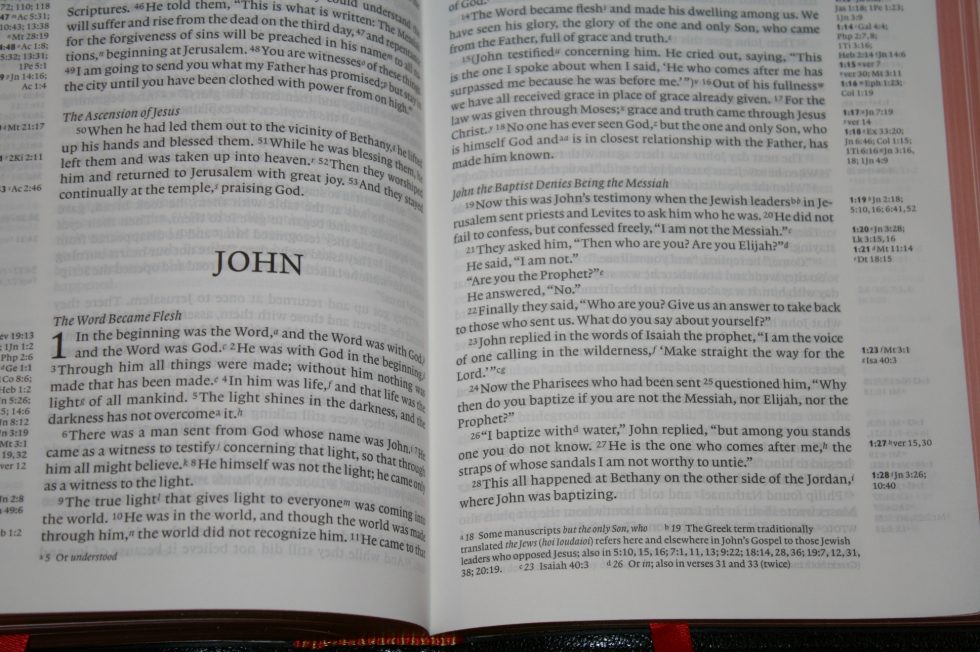
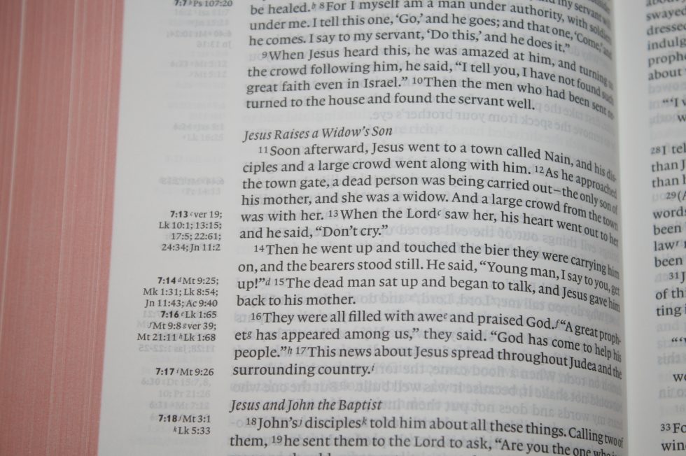
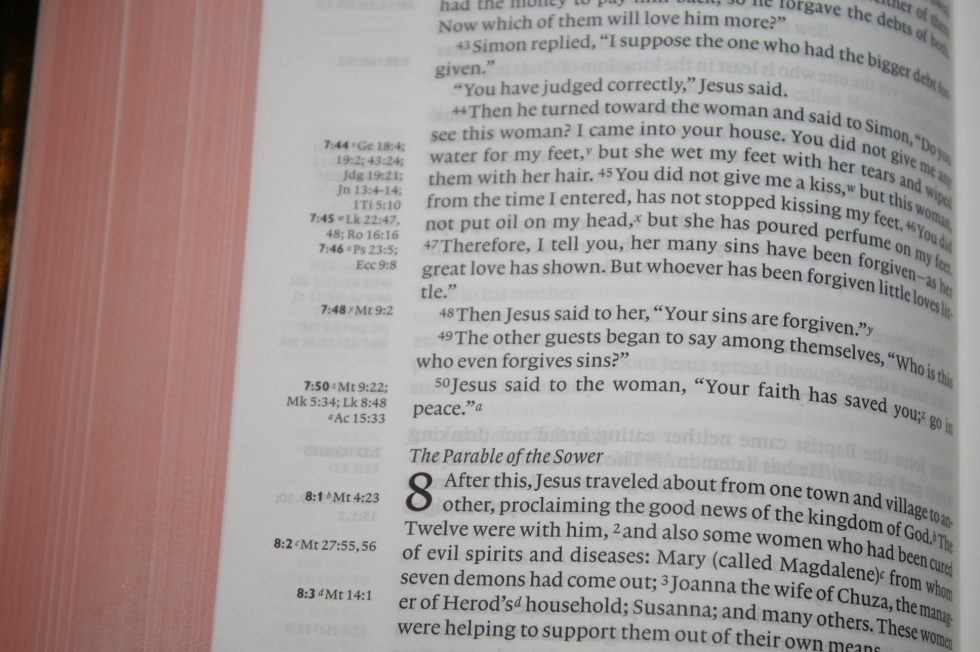
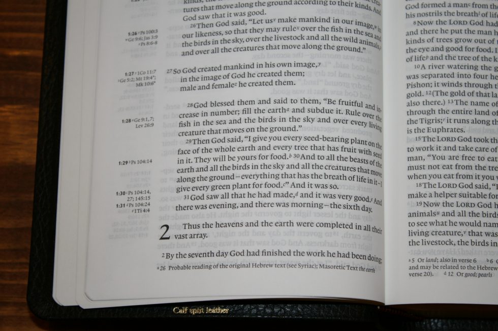
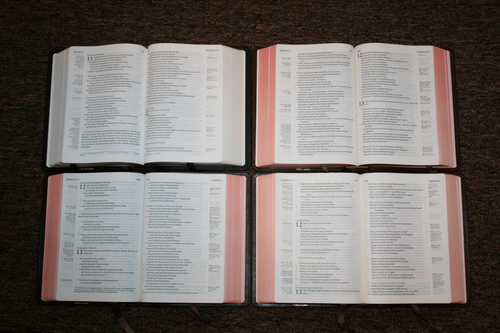
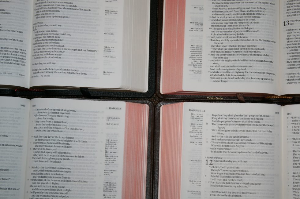
The text is presented in single-column format with poetry in stanzas. Cross references are placed in the margins near the verses they correspond to and footnotes are placed in the footer. The header shows the page number in the inner margin and the book name and chapter in the outer margin. They’re close enough to the outer margin that it’s easy to thumb through and find the book you’re looking for.
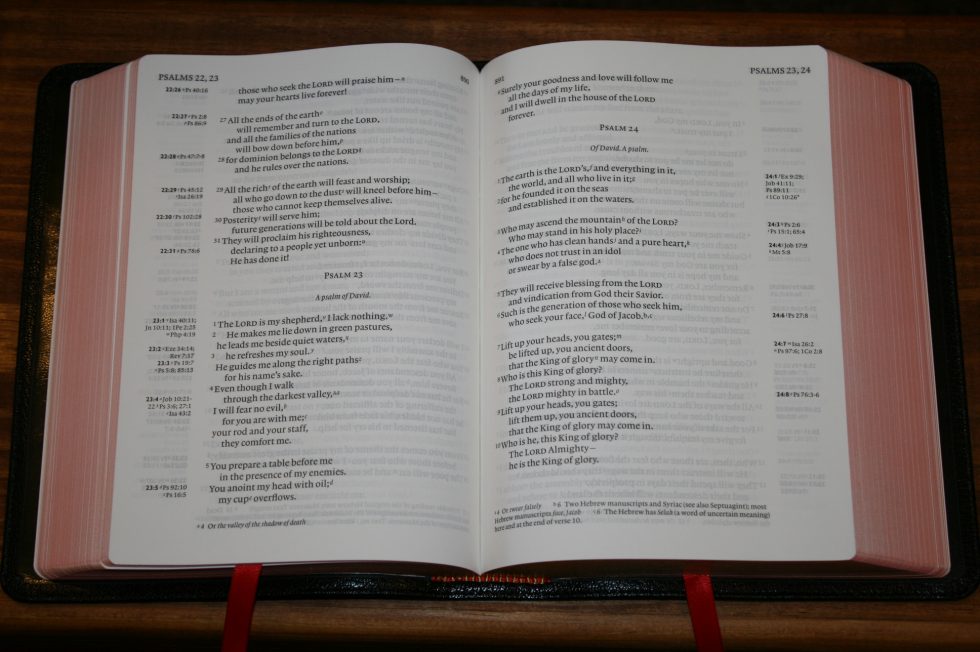
The font is the Clarion standard 8.75/10.5 Lexicon No. 1A. 8.75 refers to the font itself while 10.5 is the leading (the size of the font plus the size of the space between the lines). I find this to be one of the most readable fonts in any Bible I’ve read. It’s medium/dark and consistent throughout.
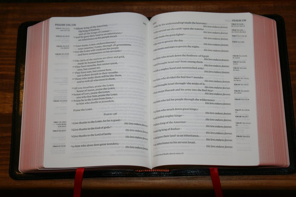
The text is line-matched on both sides of the page to reduce show-through. The paper is opaque enough that I don’t notice the lines on the back of the page except for in the poetic settings.
The references and footnotes are keyed to the text with letters. Footnotes are regular letters and references are italic. Although I have to remember which is which this keeps me from confusing a verse number for a footnote.
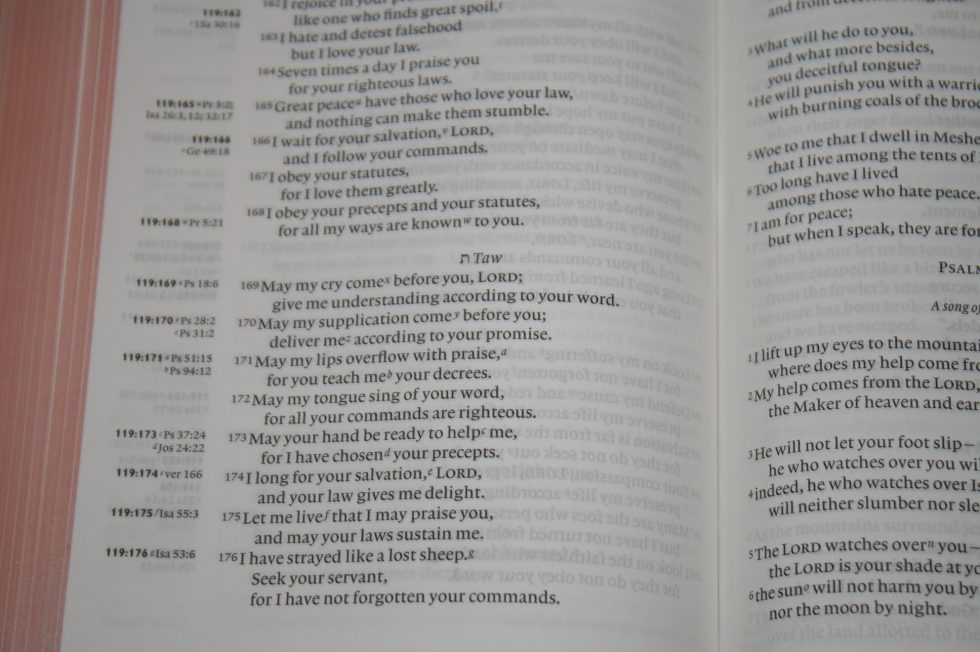
Verse numbers and footnote/reference keys are small and can easily be ignored while reading. Some Bibles make them more prominent, which makes it easier to see them, but they also get in the way when reading. I find them easy to ignore in the Clarion and I don’t pause while reading aloud when I stumble across a letter or number. I don’t get distracted by every single footnote when I read.
The columns are 3.5” wide and have around 64 characters across, allowing for 12-14 words per line. The word-spacing feels natural. No words are too close and there are no extra spaces between them. The inner margin is just wide enough to keep the text from bending too far into the gutter. I still end up flattening the page though to make it more readable.
The NIV edition has my favorite layout of the Clarions that I’ve reviewed. My previous favorite layout was the NKJV. The text has more white-space than the other editions. For example, the NIV spaces out the Psalms into thoughts with spaces between the stanzas, and dialog is set on individual lines. This is why the NIV has more pages than the other Clarions.
My perfect Bible would remove the footnote and reference keys from the text. This would make them more difficult to use but I read the text more than I look for footnotes or references. I don’t think it would be that difficult to use. The references footnotes already show the verse number they correspond to. The footnotes would need the word it corresponds to. The Clarion needs this less than other Bibles though.
References
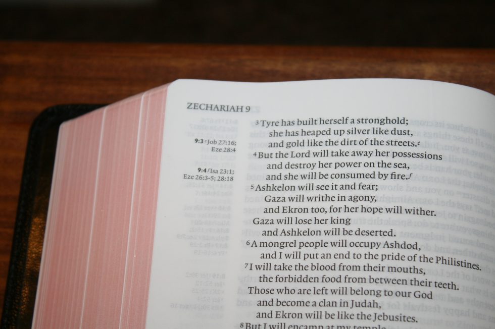
The NIV cross-references are placed in the margins as close to the verses they correspond to as possible. They’re tagged with the chapter and verse numbers in bold. This gives an added benefit of being able to scan down the margin to find the verse number and then you can look across the verses to easily find any verse. It uses the Zondervan 1984 cross reference system.
Here is a sample of references to help you compare:
- Genesis 1:1 – Jn 1:1-2; Job 38:4; Ps 90:2; Isa 42:5; 44:24; 45:12, 18; Ac 17:24; Heb 11:3; Rev 4:11
- Deuteronomy 6:4 – Mk 12:29; 1 Co 8:4
- Matthew 17:20 – Mt 21:21; 13:31; Mk 11:23; Lk 17:6; 1 Co 13:2
- Mark 11:23 – Mt 21:21
- Mark 12:29 – x
- John 1:1 – Rev 19:13; Jn 17:5; 1 Jn 1:2; Php 2:6
- 1 John 1:1 – Jn 1:2, 14; 2 Pet 1:16; Jn 20:27
Footnotes
The NIV footnotes appear in the footer and are keyed to the text with regular letters. The footer shows the letter and verse number the notes correspond to. The footnotes are the standard NIV footnotes and include information about the original languages, alternate renderings, weights and measures, alternate names, information such as diseases, flora, fauna, musical instruments, clothing, etc. These are useful because they shed light on the text and can help in understanding the culture.
Concordance
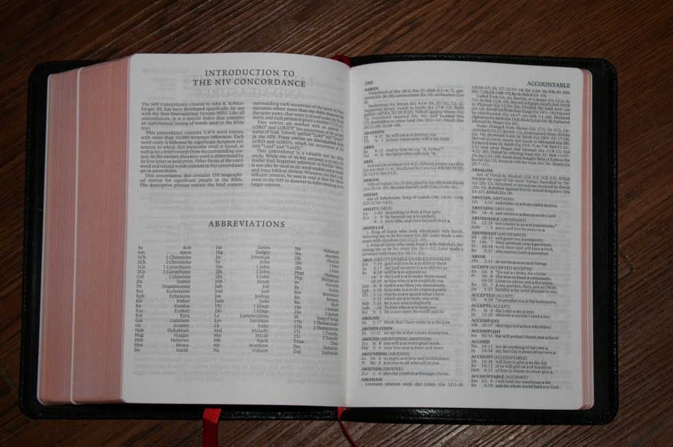
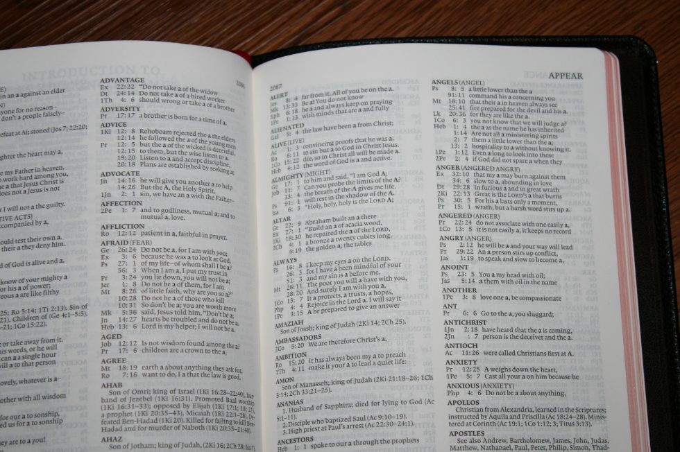
The concordance is 102 pages in double-column format. It includes a topical index of people. Most are a paragraph or two but it has enough to help with study and sermon prep. It places similar words in parenthesis to help give you ideas to expand your searches. It uses the 2011 Zondervan concordance.
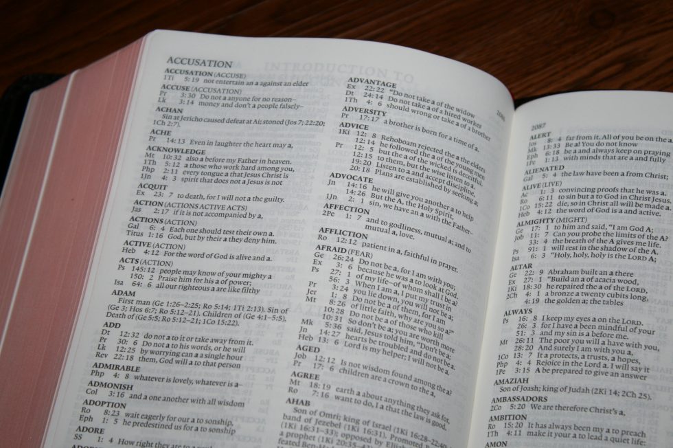
Here are a few sample entries with the number of references to help you compare:
- Christ (Christ’s, Christian, Messiah) – 69
- Christ’s (Christ) – 3
- Christian (Christ) – 1
- Faith (faithful, faithfully, faithfulness, faithless) – 65
- Faithful (faith) – 31
- Faithfully (faith) – 3
- Faithfulness (faith) – 15
- Faithless (faith) – 3
- God (God’s, godliness, godly, gods) – 5 columns
- God-breathed (breathed) – 1
- God’s (God) – 28
- Godliness (God) – 4
- Godly (God) – 4
- Gods (God) – 2
- Jesus – 5 major topics with multiple sub-topics and many Scripture passages and reference within each one
- Life
- Miracles
- Major Teaching
- Parables
- Disciples
- Praise (praised, praises, praising) – 32
- Praised (praise) – 5
- Praises (praise) – 4
- Praising (praise) – 2
- Pray (prayed, prayer, prayers, praying) – 17
- Prayed (pray) – 3
- Prayer (pray) – 13
- Prayers (pray) – 4
- Praying (pray) – 4
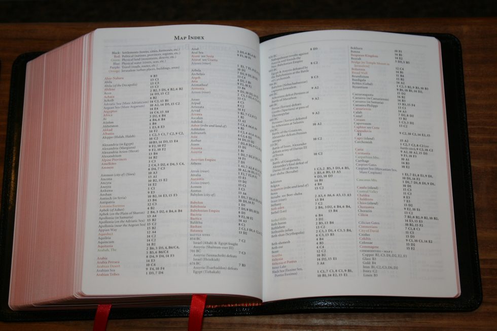
Maps
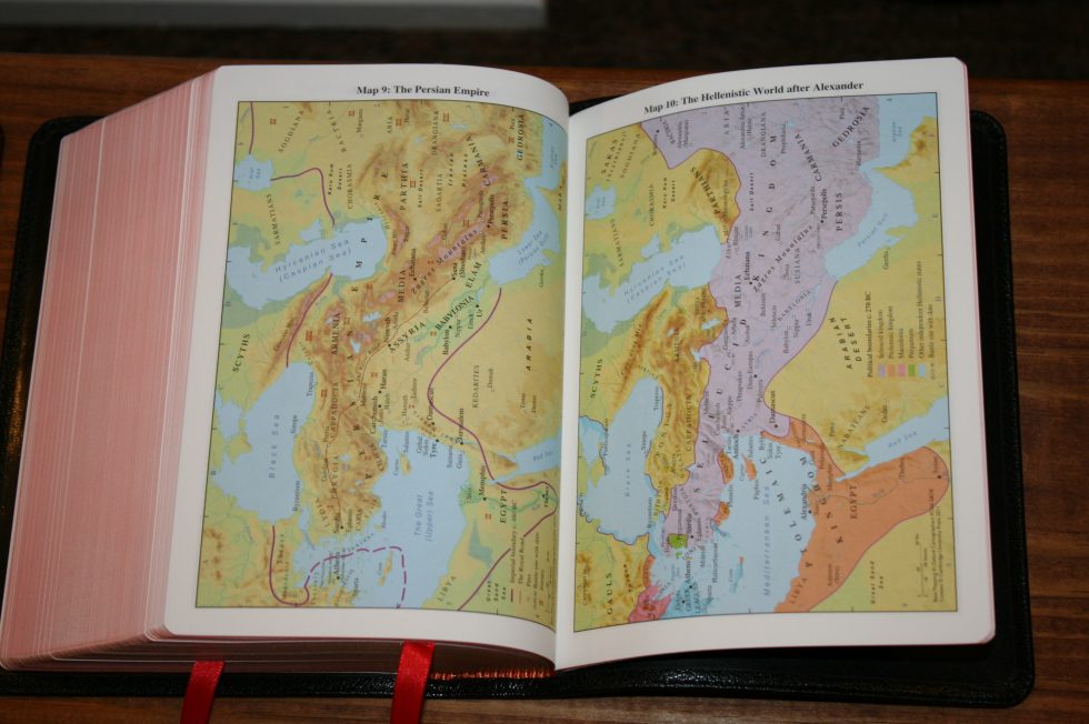
There is an 8 page color-coded map index to help you quickly find anything in the maps. It’s printed on the same paper as the maps. The index is color-coded to highlight:
- Settlements
- Political
- Land
- Water
- Travel
- Jerusalem
There are 16 pages with 15 full-color maps on non-glossy paper. This paper isn’t the heavier card stock in other Bibles but it’s not thin either. They are more colorful than most maps. They include annotations, routes, borders, water, topography, dates, distance, cities, vegetation, battle sites, and more.
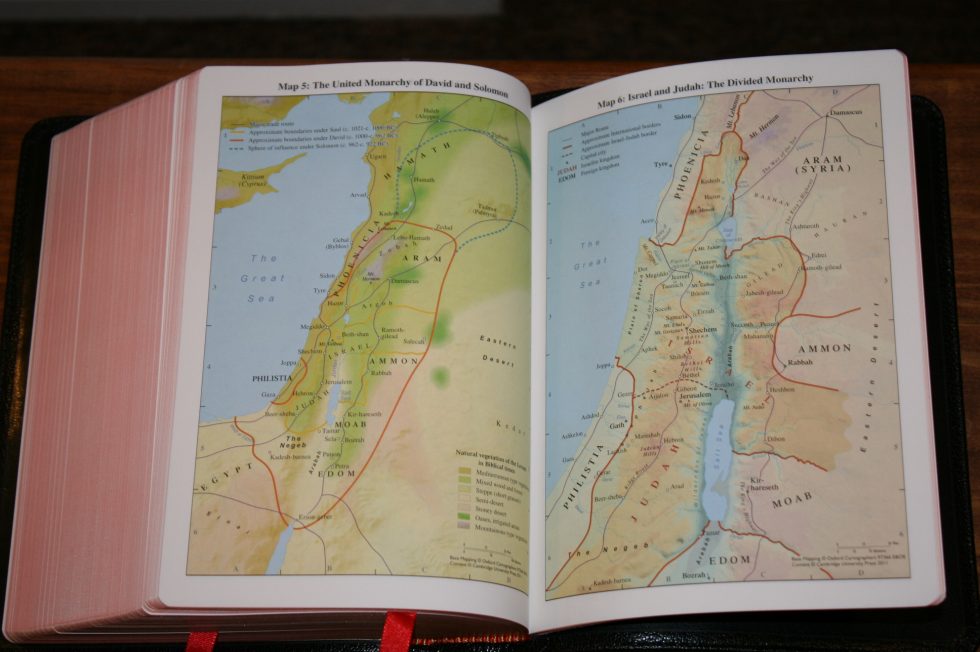
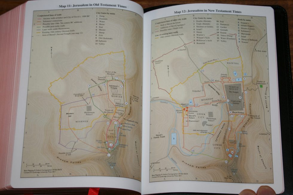
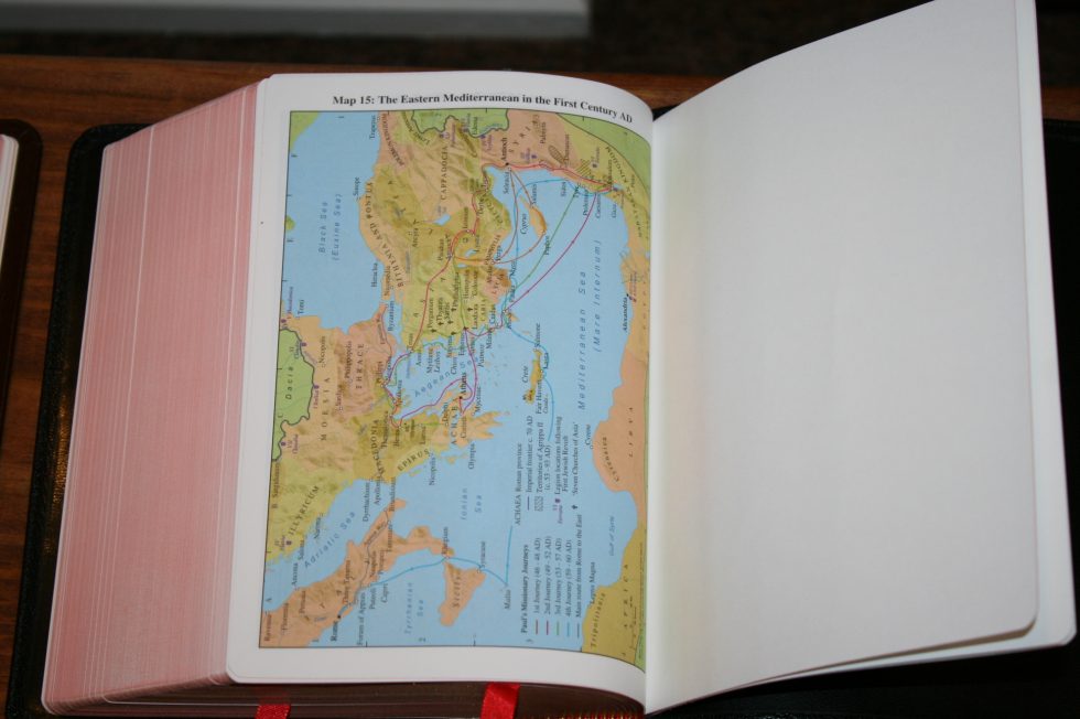
Maps include:
- The Ancient Near East in the Late Bronze Age
- Regions of Palestine and Surrounding Areas
- Sinai and Canaan at the Time of The Exodus
- Israel within Canaan
- The United Monarchy of David and Solomon
- Israel and Judah: The Divided Monarchy
- The Assyrian Empire
- The Babylonian Empire
- The Persian Empire
- The Hellenistic World after Alexander
- Jerusalem in Old Testament Times
- Jerusalem in New Testament Times
- Palestine in New Testament Times
- The Roman Empire
- The Eastern Mediterranean in the First Century AD
Using the NIV Clarion
Carry
It feels a little chunky because of its thickness but it really isn’t that difficult to carry around. I carried both editions around with me and used them in the car. Their size make them great choices for carry Bibles. It isn’t as easy to carry as a thinner edition like a Pitt Minion but it doesn’t feel like a large Bible.
Reading
The opacity of the paper makes the line-matching almost invisible where the lines are printed. The text remains dark and sharp. The chapter numbers and reference/footnote keys are easy to ignore. I had no issues reading from this for long periods of time. The thickness of the paper does away with page-curl which makes the NIV Clarion much easier to use in the car than the other editions.
I prefer to hold a Bible while reading. The form factor isn’t as easy to hold as a Concord. I would consider the Concord closer to the perfect size. The Clarion is shorter but a lot thicker. This makes the pages sag if you tilt the Bible too far toward you for reading. It also makes it a little more difficult to hold, but I never wanted to stop reading so it never got too difficult to manage.
Both editions are easy enough to handle but I found the calf split easier to hold and read than the goatskin. The goatskin lets the sides of the pages fall away from you which bends the text while the calf split keeps the pages flat and the lines straight. The width of the column can make it difficult to find the start of the next line if the line isn’t straight.
I found that I shifted the weight of the Bible so that the page I’m reading was flat. This is easy to do with either cover but the calf split was a little easier to handle. This isn’t a problem if you read while holding the Bible with two hands or laying it on a table.
Study
The NIV Clarion uses the Zondervan cross references and concordance. Combined with the NIV footnotes they make the Clarion a nice choice for basic study. I find the paragraph layout conducive to study because it helps keep verses in context.
The topical information about people in the concordance is a big help for study. For example, I wanted to read about the miracles of Jesus. The concordance has a list under the entry for Jesus called Miracles. This lists 34 miracles that Jesus did with references to every gospel where they’re found.
The topical lists for the apostles is much less detailed but there’s enough here to get you started. Each apostle is listed separately and the list is a basic outline of events. Most of the people in the concordance have a couple of paragraphs for their list. Jesus has several paragraphs and is the most detailed.
Preaching
I love paragraph format for reading but I was never a fan of using them for preaching until the Clarion came along.
Preaching from the NIV Clarion is easy. I’m not used to preaching from a paragraph edition but I can find the verses easier by looking for the verse number in the references in the margin. Then I look across the text and find the verse I want.
The font size feels much larger than it is and I had no issues finding the next line. I did sometimes use my finger to help me keep my place though if the text would bend into the gutter. The wide leading (the space between the lines) helps a lot.
There are several advantages of the Clarion as a preaching Bible:
- Decent size font. Unless you need giant print I don’t think the font size will be too small for preaching.
- Seeing the verses in paragraphs help you see the full context.
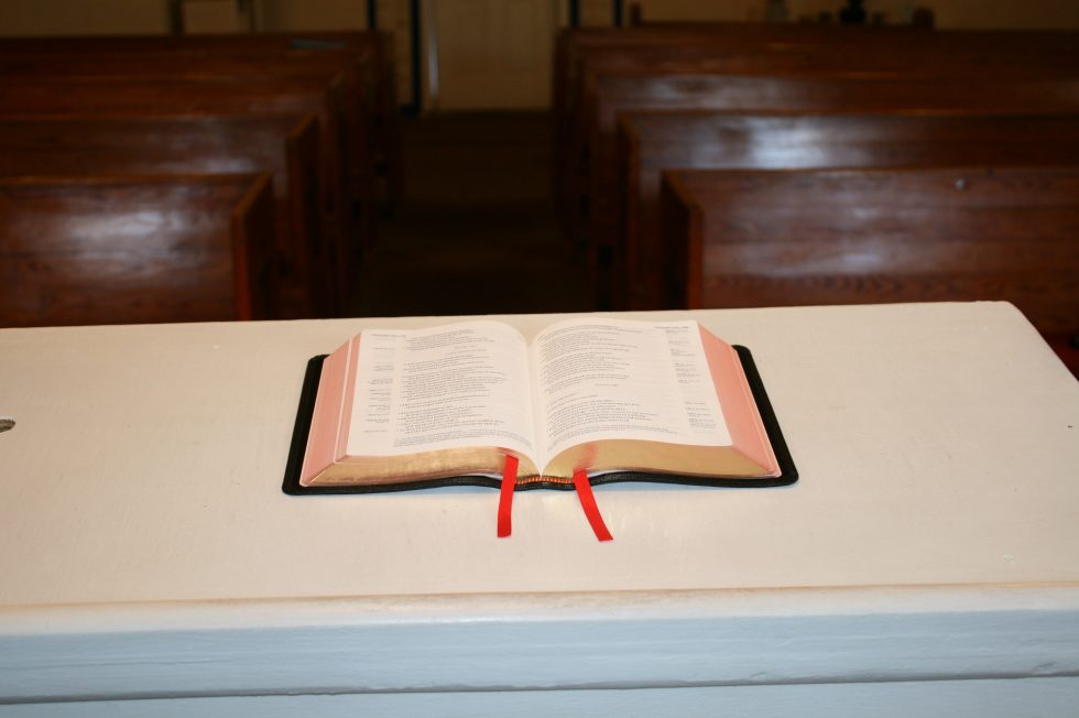
- The overall footprint of the Clarion is perfect for small pulpits.
- It’s a reference edition with plenty of tools for study.
- The distractions in the text are minimized.
This makes the Clarion a perfect choice to carry with you on preaching trips. I highly recommend using the Clarion for preaching.
Comparisons
Here’s a look at how the NIV Clarion compares to the calf skin ESV, NKJV, and KJV editions. I may have even included a Concord and a Pitt Minion or two.
 Conclusion
The NIV is my favorite edition of the Cambridge Clarion. It has a nicer layout and by far better paper than my older editions. It’s a little thicker, but that can’t be helped with the current height and width and it’s worth the extra thickness to have the white space in the poetic settings. The text is highly readable and the tools are good for study, making the Clarion a good all-around Bible. Both covers that I reviewed have their advantages and disadvantages and l like both for different reasons.
In my opinion the NIV edition of the Cambridge Clarion is the best NIV available. If you just want something rugged than I recommend the calf split edition. If you want elegance then the goatskin is your best choice. Both are great choices. I highly recommend the NIV Clarion to any fan of the NIV.
Cambridge provided these Bibles free for review. I was not required to give a positive review – only an honest review. My opinions are my own.


Great review!! I have been using the goatskin version since mid-August and your observations are spot on. I had been considering getting the calf-split version and I think you convinced me to go ahead and do it. I think the NIV is the best Clarion yet. Not having the page curl makes a big difference to me. From day one my only complaint about the Clarion, in general, has been putting the references on the outside versus the inside of the text block. I think having refernces on the inside would have made for a better reading experience as the text block would be on the flat part of the page. I think Crossway got it right with ESV PRB. But the NIV Clarion is now my Bible for everyday use, and I appreciate Cambridge finally publishing it. . Thanks for your reviews.
Thanks Rod! I love the PRB. It’s my favorite size overall.
Thank you for the review. I have been looking for the elusive perfect Bible. Thought it was the Pit Minion, but the size and font is just to small. This one seems like it could be good, but I’m not sure About the text layout or which cover to go with. Regarding highlighting, I use colored pencils, “Polycolor” is the brand, from AC Moore, and underline phrases and or verse numbers. The orange, pink and blue seem to work well. There’s no.
Bleeding with pencils and they have sharpeners specific for this type.
Hi Randy, I love your reviews!
I’m in search of the perfect NIV. I am tossing up between this one and the Schuyler Quentel NIV (maybe in personal size but that’s another decision!). You say this is the best NIV available but given it’s a review from a few years ago, I thought I’d check if this has changed.
Thanks!
Celina
Thanks Celina! My favorite would be between the Clarion and Personal Size Quentel. I think this changes depending on the one I’m using and I’m not sure I could choose between them. 🙂 I love the size of the PSQ the best, but I love the layout of the Clarion. It really comes down to single column vs double column. An advantage in the PSQ is that it’s also available in a larger size so you can have a combo. That might be something to keep in mind.
Randy,
I recently purchased a used KJV Goatskin Clarion but was totally bummed out when I received it because it came with the same paper quality that I have in my Calf skin. I read your KJV Clarion review posted Feb 27, 2019 where you responded to a gentleman named Benjamin asking something very similar (below link). Since this post was Sept 24, 2016, do you think it’s logical that Cambridge started using the same 28 gsm paper found in the NIV in the KJV? Is is safe to say it’s the same paper or is the KJV upgraded paper different than what’s used in the NIV?
https://biblebuyingguide.com/cambridge-kjv-clarion-in-black-goatskin-review/
P.S.
I ended up returning the used KJV Clarion on eBay and purchased a new one from Amazon… it will arrive this coming Wednesday. I am really hoping it has the upgraded paper!
Hi Joseph. The paper in my NIV and goatskin KJV are the same. Cambridge has used 27 and 28gsm in the KJV and some retailers might have older stock. If it’s the 28gsm Indopaque like the NIV, it will have the French name of the paper in the front on the copyright page.