
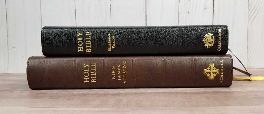
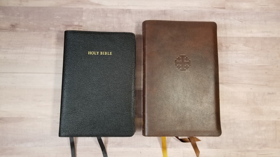
The Schuyler Treveris, named for the British printer Peter Treveris from the 1400-1500’s, is a new Bible that was designed primarily to be a reader. It’s clear of all the human intervention and clutter than gets in the way of reading. They also wanted it to work for study and following along with others, so they placed the verse numbers in the margin on the line where the verse starts. The result is an interesting hybrid that works well for both. It’s meant to be a companion to the Quentel series and will most likely be available in several translations. The first translation, to my personal delight, is the King James Version. The Treveris is available in several colors of goatskin and calfskin. I’m reviewing the Marbled Mahogany Calfskin, made in the Netherlands.
Schuyler provided this Bible in exchange for an honest review. I was not required to give a positive review, only an honest review. My opinions are my own.
_____________________________________
This Bible is available at Evangelicalbible.com
_____________________________________
Table of Contents
Video Review
Cover and Binding
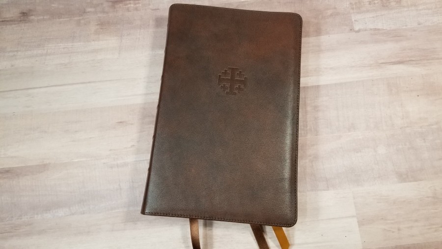
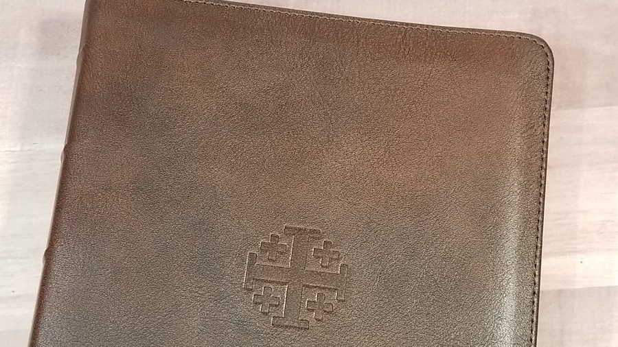
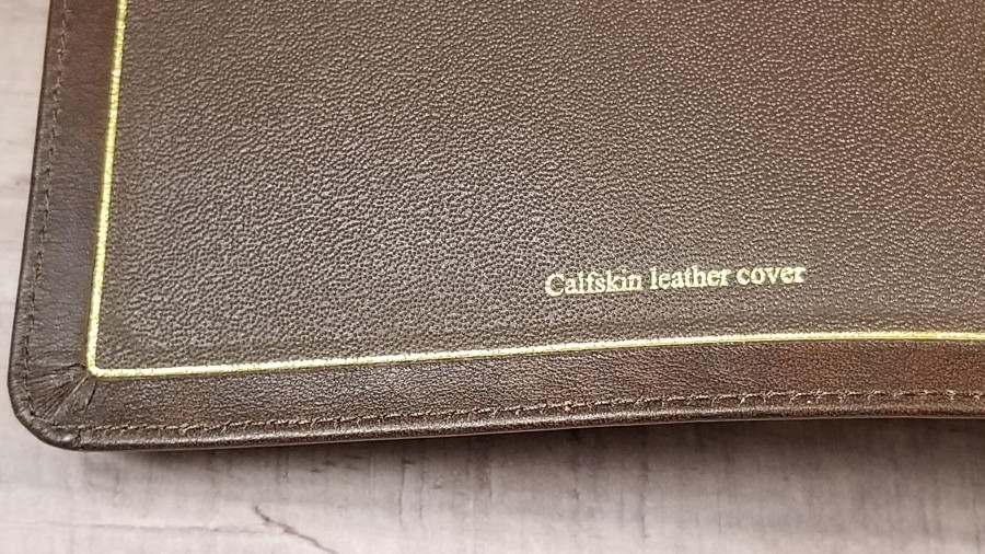
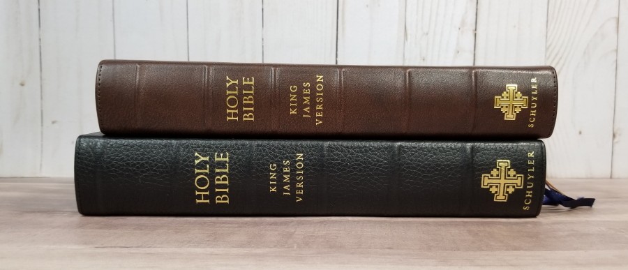
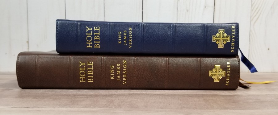
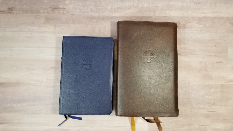
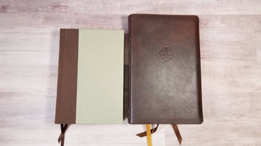
The cover is natural grain calfskin in marbled mahogany. I love this grain and color. The grain is smoothish with enough bumpiness to to feel elegant to the touch. It has a lot of color-texture within the brown. It’s thick and feels durable. It has a generous yapp with stitching around the perimeter. The front includes the Jerusalem Cross debossed into the cover.
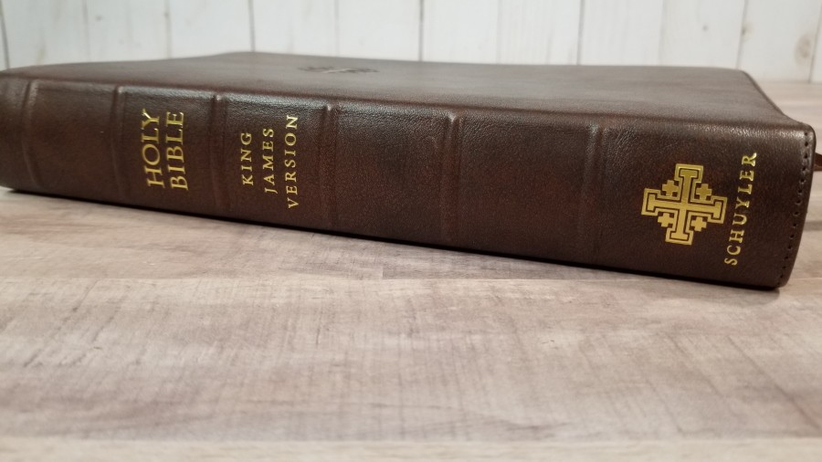
The spine includes 6 raised ribs and has HOLY BIBLE, KING JAMES VERSION, the Jerusalem cross, and Schuyler printed in gold.
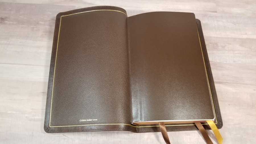
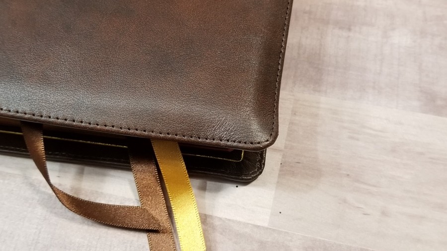
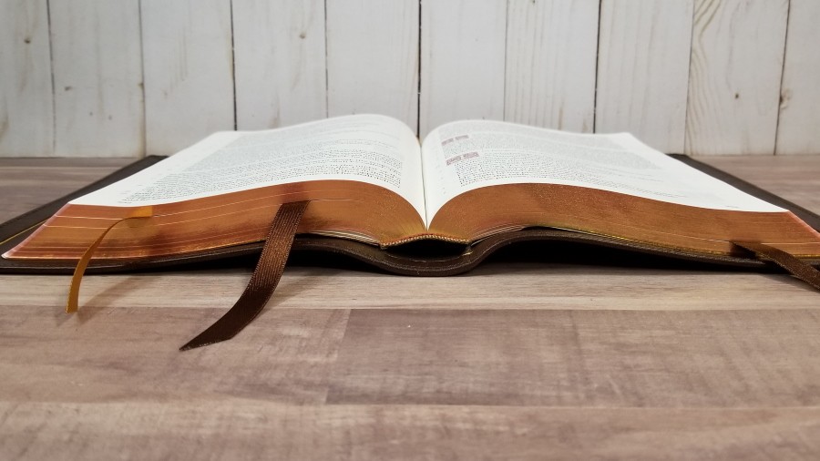
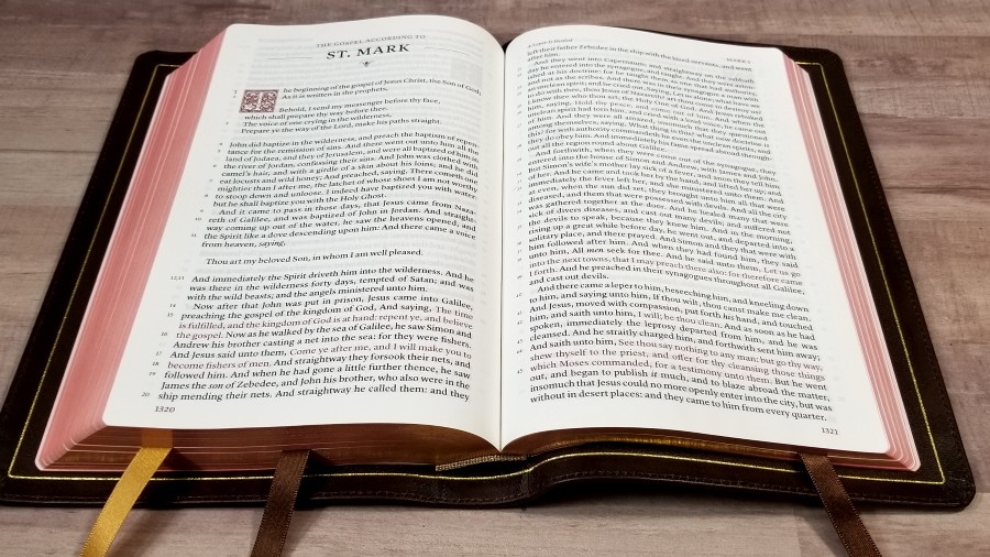
The liner is edge-lined leather. A gold gilt-line decorates the liner. The block is Smyth sewn and it has no trouble staying open to any page.
It has 3 ribbons: 2 brown and 1 gold. They’re long enough to pull to the outer corner and open the Bible easily. The trim size is 5.5″ x 8.5″ x 1.1″. The overall size is 5.75 x 9 x 1.25″. It weighs 2 lbs, 1.4 oz.
Paper
The paper is Indopaque. This is a 28gsm premium paper from France. It’s off-white in color. It’s highly opaque, but the darkness of the font does show-through more than most Bibles with this paper. I prefer the darkness of this font, so I’ll take the trade. The paper is easy to turn. It has no glare under direct light.
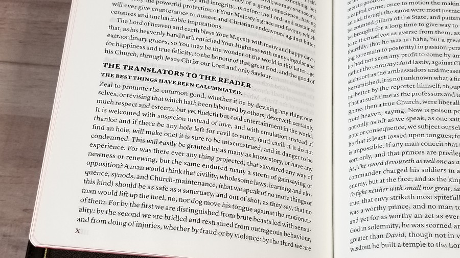
Here’s a look at the Epistle Dedicatory and Translators to the Reader. I’m glad to see this is included.
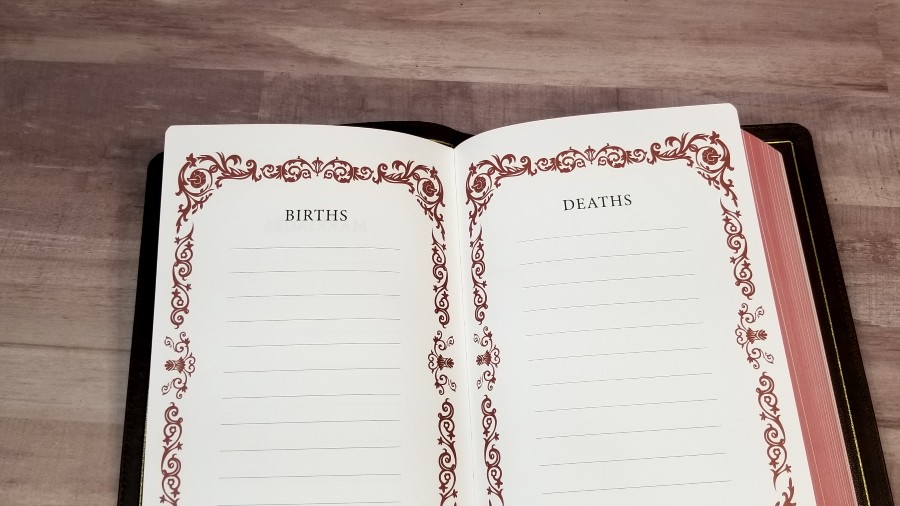
It includes several thick presentation and family pages in the front.
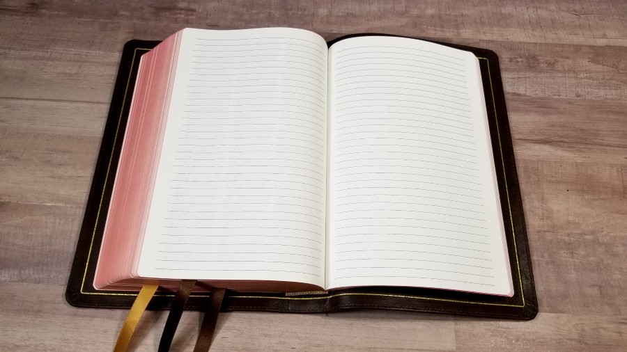
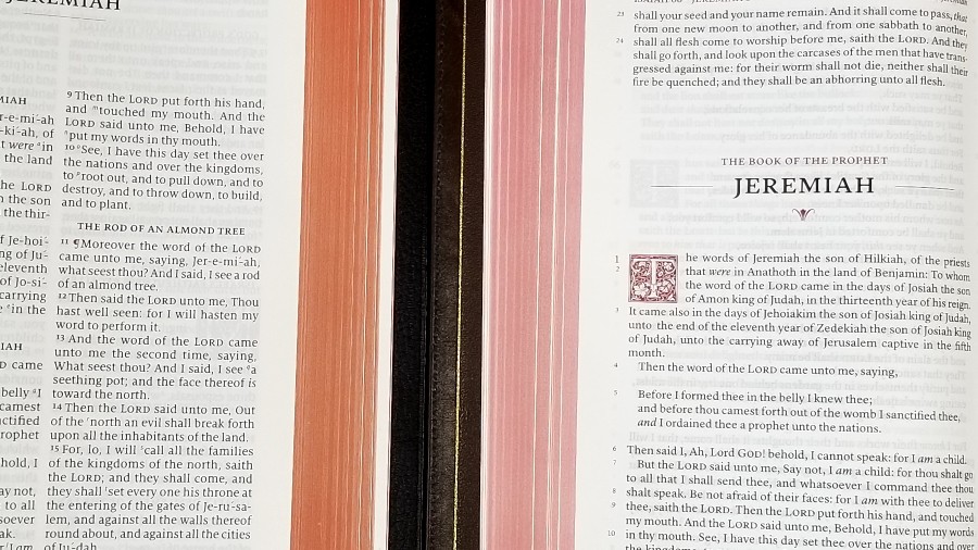
In the back are 12 pages for notes. The page edges are art-gilt with red under gold.
Typography
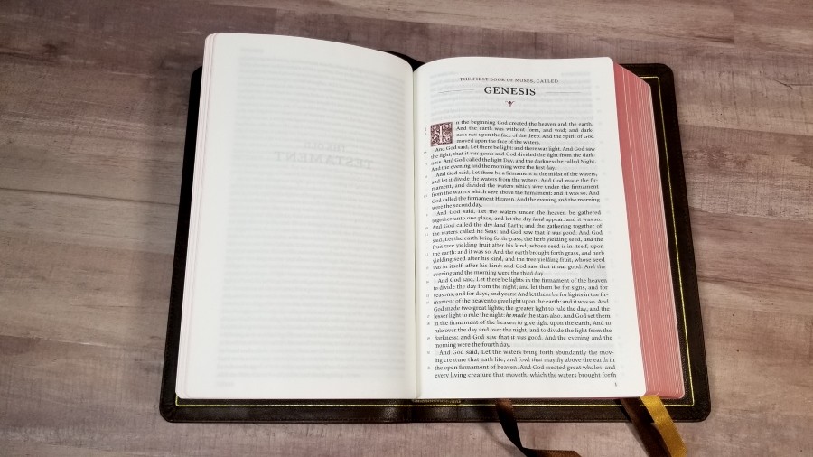

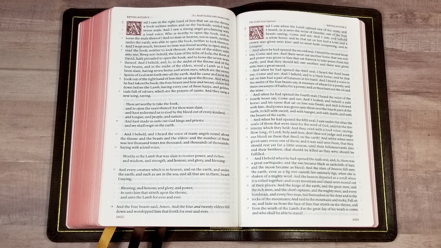
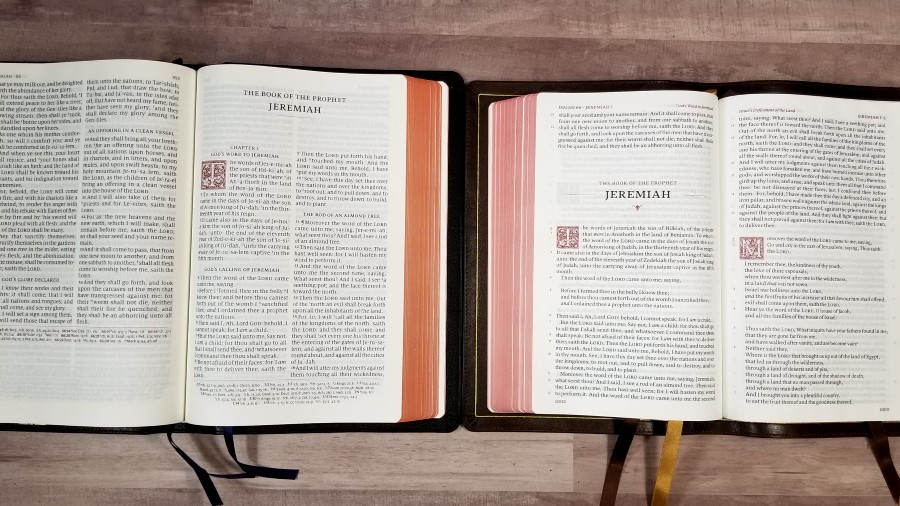
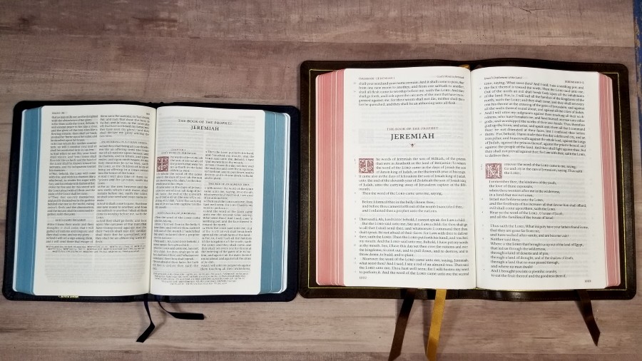
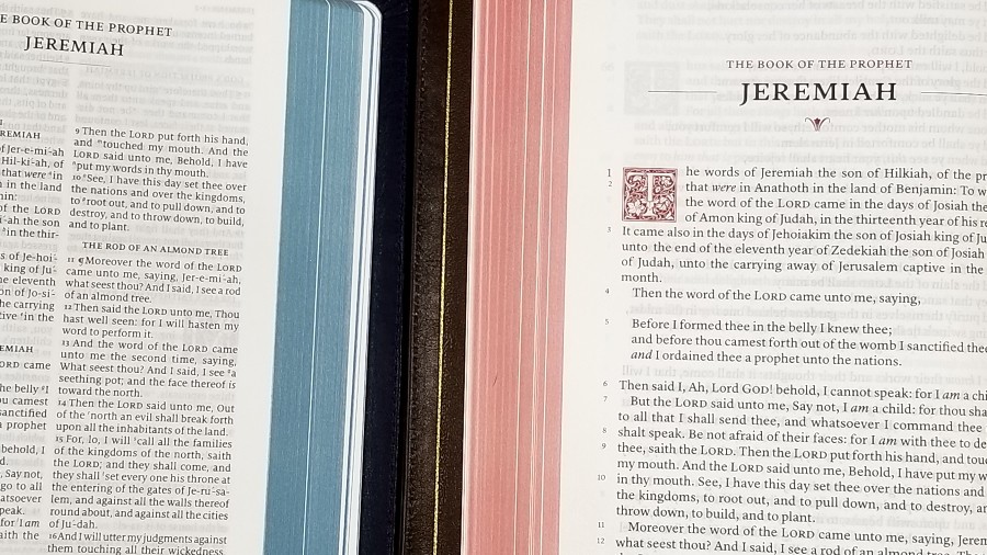
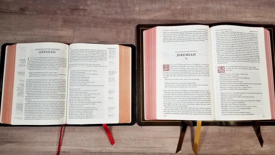
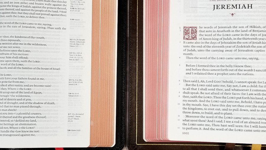
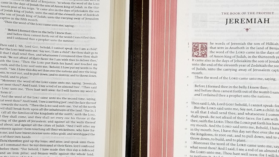
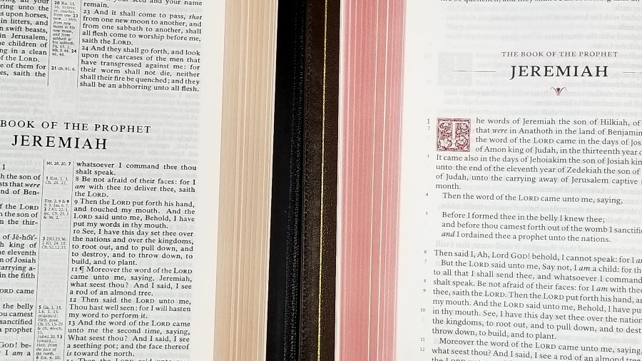
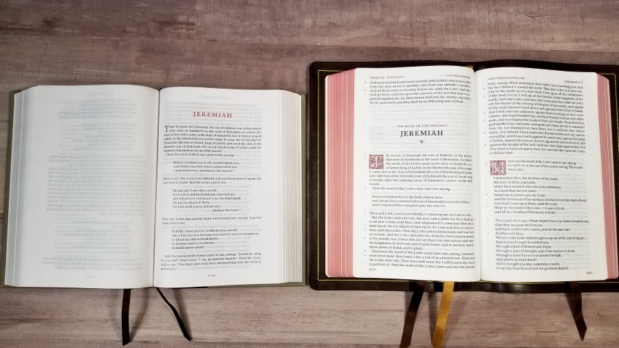
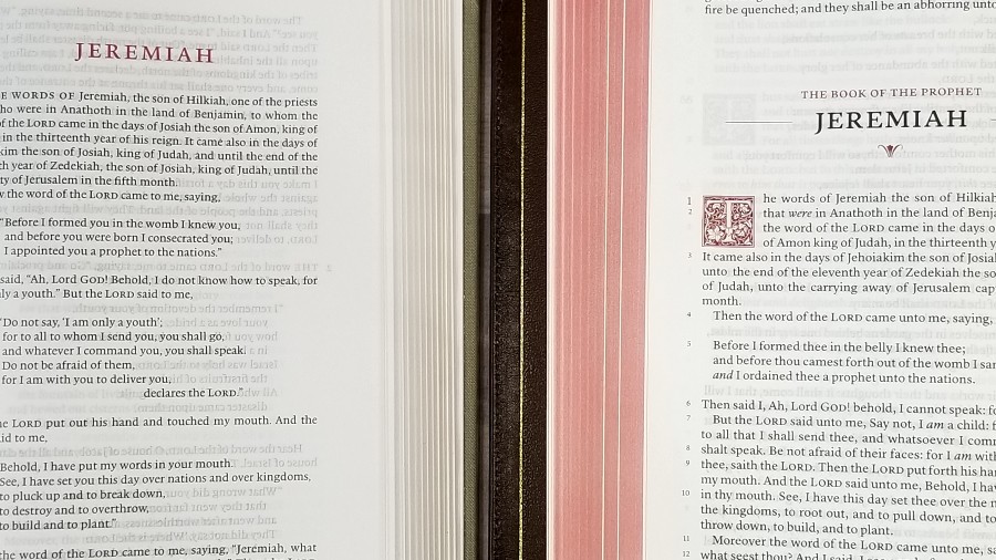
The text is presented in a single-column paragraph setting with poetry and quotations set to verse. Chapters start with decorative drop-cap. The header includes a page summary in the inner column and the book name and chapter numbers in the outer column. The footer includes the page number in the outer column. The drop-caps, header, and footer are printed in a deep red.
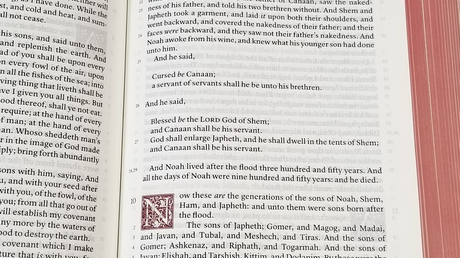
The font is 10-point red-letter for the words of Christ through Revelation. The font is large and dark. The red is also dark. Both are consistent throughout the Bible. The text is line-matched, meaning that the lines are printed in the same location on both sides of the page to improve readability. It has 45 lines per page. Most lines have between 12-14 words.

Chapter numbers and verse numbers are moved to the left margin. Chapter numbers are larger than verse numbers (about the same size as the text) and they’re printed in red. The verse numbers are printed in black.
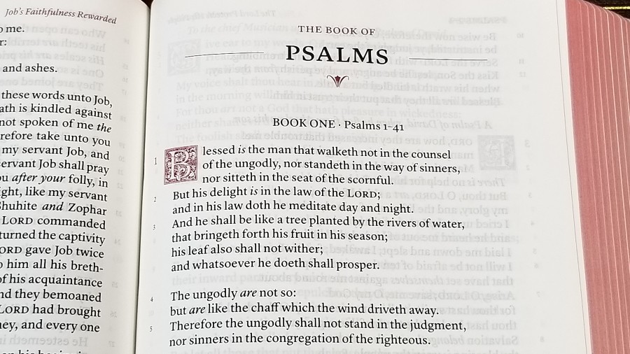
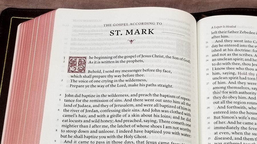
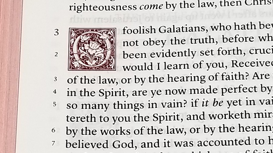
It has a decorative drop-cap for the beginning of each chapter and italics for supplied words. The ornamental drop-caps are LTC Goudy Initials fonts. They’re printed in red and include designs such as flowers, leaves, and vines. Most take 4 lines. Psalms take 3 lines. Following the standard KJV verse-by-verse format, the first word of each verse has a capital letter, even if it continues a sentence. These are the only distractions within the text.
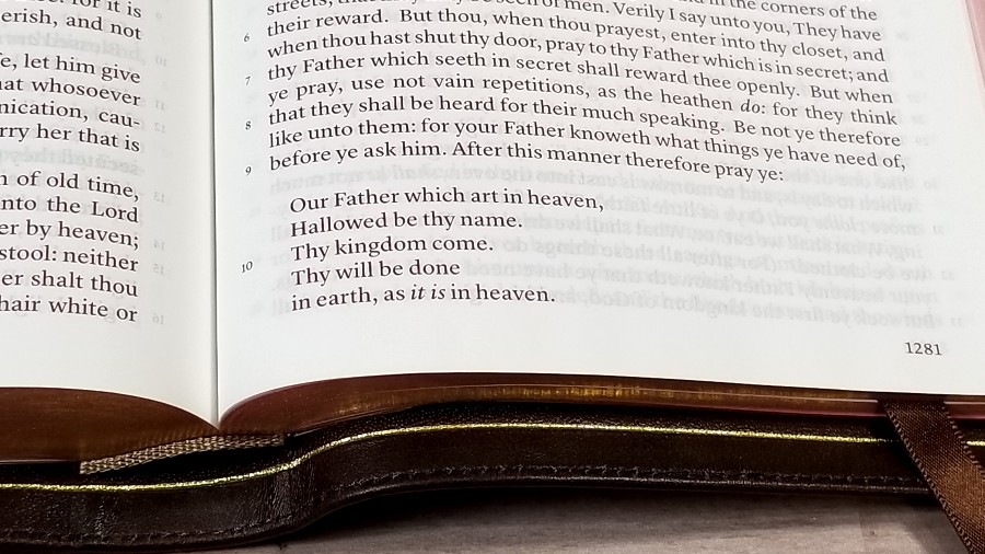
The capital letters make the verses easy to locate. I actually find them easier to locate than a standard paragraph edition that has small verse numbers that are meant to blend in, like the Clarion or Legacy. With this design, I just look down the side of the page until I find the verse number I want and then scan the line until I find a capital letter. It’s really that easy. It doesn’t take much more time than a standard v-b-v setting, and I’d much rather read this setting than a v-b-v. Poetry is even easier. The KJV’s capital letters are usually something I’ve thought of as a fault, but they’re an advantage in this case.
Concordance
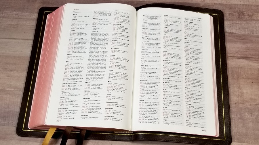
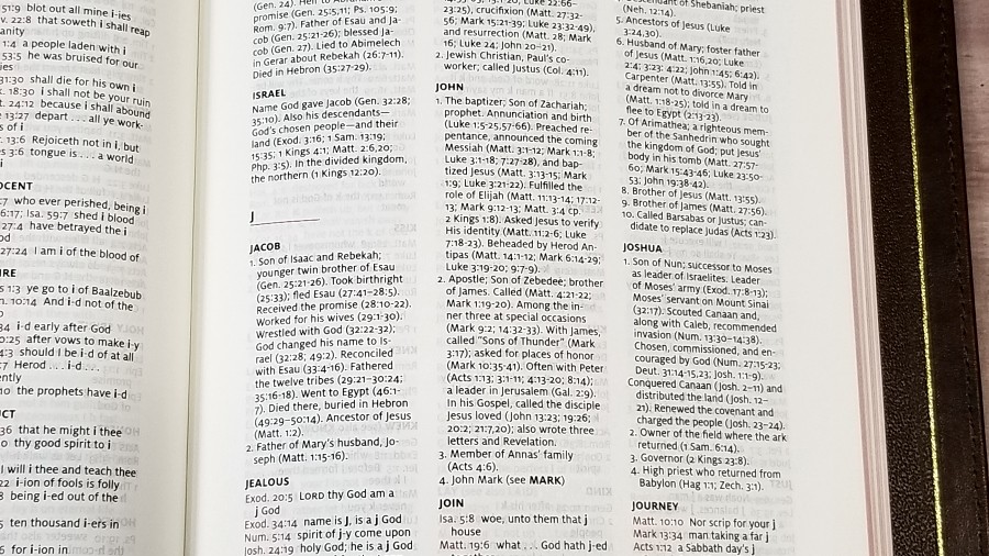

The concordance is 63 pages with 3 columns per page. The entries are in black and the references are in red. It includes biographies of key people and includes references for the key events in their lives. This is an excellent concordance for study and sermon prep, which is especially helpful considering this Bible doesn’t include references or translator’s footnotes. It’s the same concordance as the Canterbury, but they’ve increased the font size to make it more usable. I find it a lot easier to use.
Here are a few example entries with the number of references for each one to help you compare:
- Christ – 6
- Christian – 3
- Faith (see also Faithful, Faithless) – 40
- Faithful – 26
- Faithless – 2
- God (see also Gods) – 40
- Godhead – 2
- Godliness – 5
- Godly – 4
- Gods – 7
- Praise – 7
- Pray (see also Prayer) – 17
- Prayer – 12
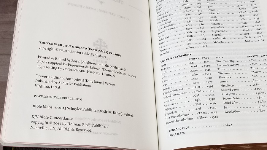
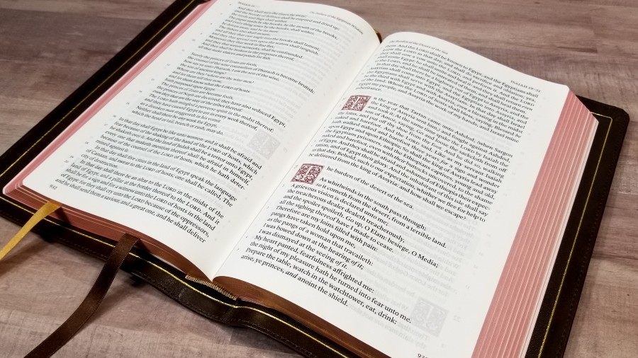
Maps
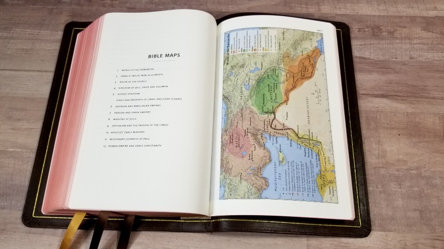
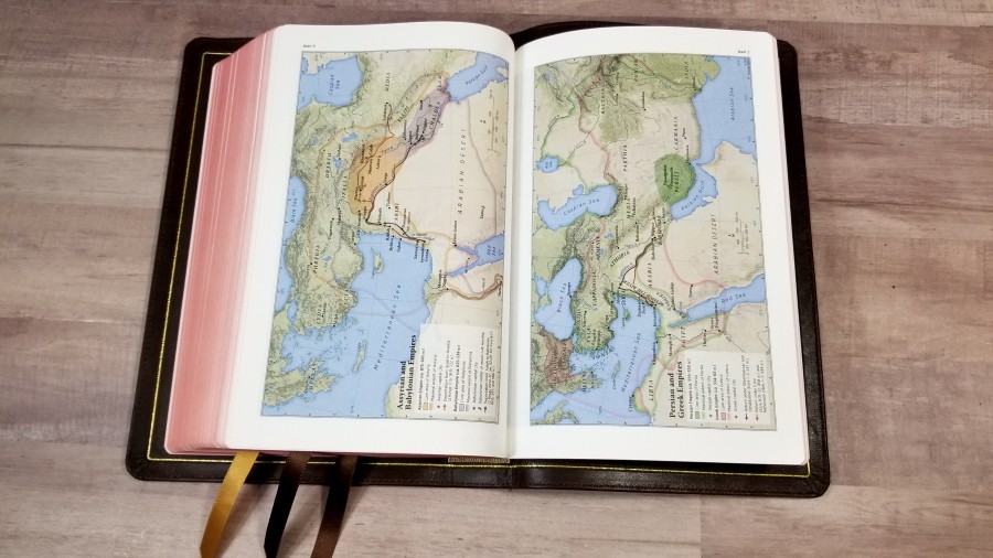
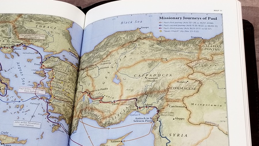
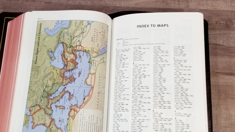
It has 12 maps printed on thick non-glossy paper. The maps are colorful and look elegant and I’m grateful they included them. One of my habits is to look up locations when reading so I can have a better idea of the terrain and distances. The maps are annotated well and include borders, cities, distance, topography, Scripture references, places of worship, capitals, water, roads, canals, seaports, ancient inscription sites, events of Jesus’ life, Apostles’ ministries, places of writings, etc. It also has a 3-page index to maps, which is another tool I’m always grateful to see included.
Here’s the list of maps (and one chart):
- World of the Patriarchs
- Israel’s Twelve Tribe Allotments
- Route of the Exodus
- Kingdom of Saul, David and Solomon
- Divided Kingdom
- Kings and Prophets of Israel and Judah (Chart)
- Assyrian and Babylonian Empires
- Persian and Greek Empires
- Ministry of Jesus
- Jerusalem and the Passion of the Christ
- Apostles’ Early Ministry
- Missionary Journeys of Paul
- Roman Empire and Early Christianity
Comparisons
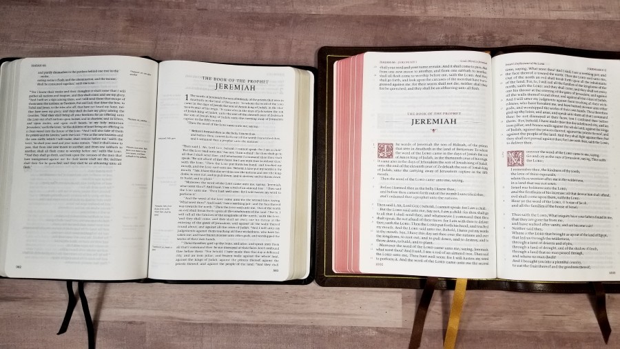
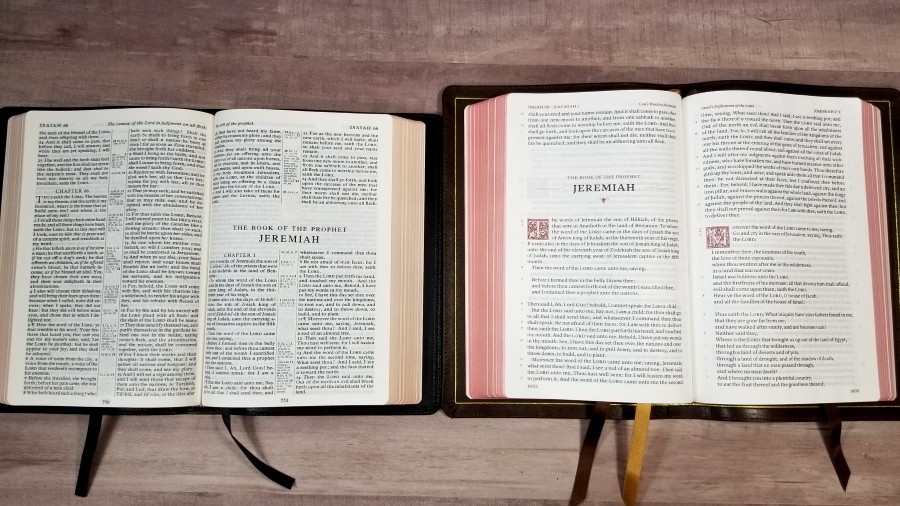
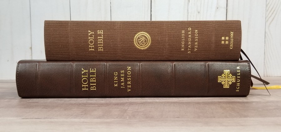
Here’s a look at how the Treveris compares with several popular Bibles. I’ve lined them up so the bottom of the text-blocks are matched. The yapp makes the Treveris look larger than it is.
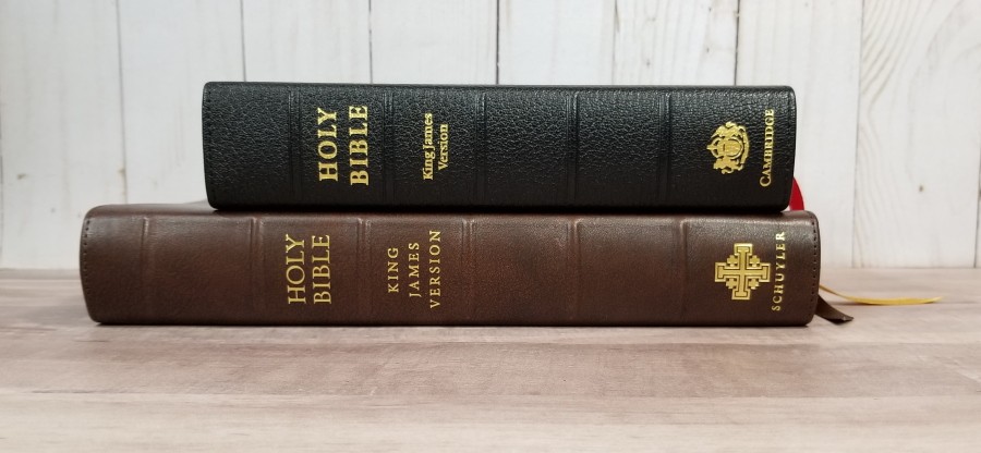
Canterbury

The Canterbury is Schuyler’s large print KJV. It’s one of the most elegant KJV’s on the market and makes a great companion to the Treveris. It’s a larger Bible with larger print, 55,000 cross-references, a glossary, and the same concordance and maps. It’s ideal for preaching and study.
Personal Size Canterbury
The Personal Size Canterbury is an excellent companion to the Treveris. It has references, a glossary, and the same maps as the Treveris. Its format that’s ideal for preaching or following along with others. The size is excellent for carrying. It has the same paper.
Clarion

The Clarion is a paragraph KJV with poetry set to stanzas. has 42 lines per page vs the Treveris’ 45 lines. It has a much smaller print. The text-block is shorter and thicker. The goatskin edition has the same 28gsm paper. It has 45,000 references, a reader’s companion (dictionary/concordance). and maps.
New Cambridge Paragraph Bible Personal Size
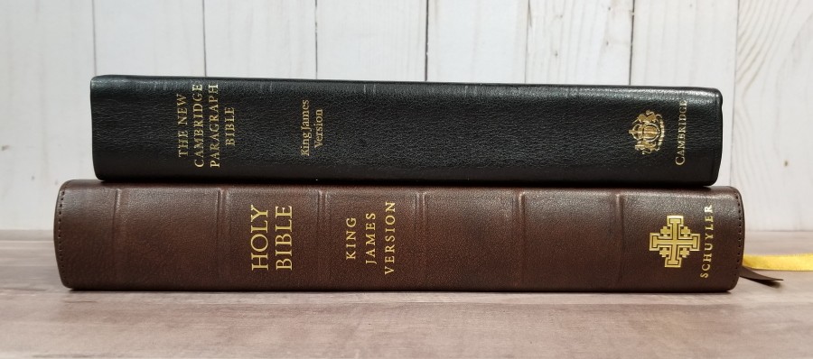

The Personal Size New Cambridge Paragraph Bible is the next best paragraph layout for the KJV. It doesn’t include any poetic settings after Luke 2. The text-block is about the same size, but the font is a lot smaller. It has the translator’s footnotes and the translator’s to the reader, but no other tools.
Concord
The size of the Concord was part of the inspiration for the size of the Treveris. This is my favorite size for an all-around Bible. It’s large enough to use for preaching and study, but not too large to carry. If I had to choose just one Bible to use for everything, it would probably be this size. Of course, their designs are completely different, but I wanted to show how they compare in size. The Concord is slightly smaller and its font is noticeably smaller. It’s the only Bible in this comparison with a darker font.
ESV Reader’s Bible
The ESV Reader’s Bible removes all of the verse numbers and section headings to make the text more readable. It does identify the chapter number in the margin. The font is a lot smaller. It has a nice layout for reading, but it’s difficult to use it for anything else.
Conclusion
The Treveris is an amazing Bible. As expected, the materials and construction are as high-quality as it gets. The design is where it really shines. It does remove a lot of the roadblocks that hinder readability, but it’s also useful for following along with others and with reading plans. The verse numbers in the margin are easy to ignore, but they’re also easy to use when you want them. The Treveris doesn’t feel like one of those specialty Bibles that you can’t use for more than one thing.
This layout is what I’ve wanted for years for the KJV. The KJV has mostly stuck with a setting that’s based on man’s verse divisions rather than the context of Scripture. All modern translations are produced in a readable format, but the oldest and most poetic translation that’s widely available usually has the least poetic and least readable layout. The typical KJV is designed for preaching, not reading. The few that do have a paragraph layout, and even a poetic setting, do not include poetry past Luke chapter 2. Other paragraph KJVs have poetry in paragraphs. The Treveris is the most readable and most poetic layout for the KJV available.
It was slightly more difficult to preach from, but not for the reason I expected. I knew the beginning of a verse would be easy to spot. I expected that the width of the column could make it difficult to find the start of the next line. It wasn’t as difficult as I expected. What I didn’t expect is it was a touch difficult to find the end of a verse to know where to stop. Some verses cover more than one sentence, so I couldn’t just stop at the first capital letter I came to. I’d have to scan the line to make sure. Sometimes this meant looking back at the margin to see if it had a verse number and then finding my place again. This only took a couple of seconds and wouldn’t be a problem if I was more used to this Bible. My intent is to either read or study from the Bible I present with, so I’d be more familiar with the text as it’s presented in that Bible. I liked preaching from this enough to keep using it.
I think this type of layout is more useful than a reading edition that has everything removed. Those layouts are great for reading, but they’re not useful for much of anything else. I’ve never used one for study, preaching, or following along in a group setting. They can even be difficult to use with a reading plan that’s not custom made for that specific Bible. The Treveris works for all of these.
I would like to see the glossary from the Canterbury added to the back. That would make it better for reading in my opinion. I plan to write detailed word studies on the paper in the back and then maybe write short definitions at the bottom of the pages or make a mark in the margin so I’ll know to look in the back for words that are archaic or have changed in meaning.
I love the Schuyler Treveris. This is the kind of Bible that draws me to it and I want to carry it everywhere. If you’re interested in a Bible that focuses on reading but usable for following along, has a large dark font, and is great for carry, I think you’d love the Treveris. I recommend it without reservation. My gratitude goes to Schuyler for this exceptional design.
For more information about the Treveris design, read my interview with Sky Cline.
_________________________________________________________
This Bible is available at Evangelicalbible.com
_________________________________________________________
Schuyler provided this Bible in exchange for an honest review. I was not required to give a positive review, only an honest one. All opinions are my own.


I love everything about the Terveris except the version. If it were available in NASB or ESV I would purchase today. I do not understand the decision to publish an archaic version first.
Agreed, but easy to understand. There are a lot of folks out there who honestly believe that all the modern versions are “corrupted” They’ve been taught that and never seriously questioned it. Lots of people can lead to lots of sales. They’ll get to the NASB and ESV soon, I’m sure.
It is the most popular English translation in use, it makes perfect sense to publish the most widely used translation first.
Many of us LOVE older English and its construct. Our reason for loving the KJV isn’t from a legal-standpoint, but a romance with the language! I’ll read any version, but nothing melts in for me as well as KJV. If one can read older English well (I’m one of those that hunt first edition Puritan books, usually facsimile for cost reasons) and rather enjoy tying it all together. If one find that older English gets in the way, I’d recommend NASB of NJKV myself.. =)
Only the KJV is the true word of God. Its not hard to read and its not even old English. Lots of misinformation and lies about the KJV these days.
Thank you for an excellent review, Randy. Schuyler publishes lovely bibles, but their maps leave much to be desired. Several of them, like the one shown in your review ‘Missionary Journeys of Paul’, run into the gutter. This is not an issue with Cambridge bible maps which makes them, in my humble opinion, superior.
It seems like a bad design IMO- just too big.
If the 8.5 font with the PSQ was very readable yet so portable they should of set a goal to deign a Bible more portable with this paragraph style.
The Clarion is too bulky width wise for me but the new Thomas Nelson NKJV Single Column is a great size. I think they should of designed the Treveris with this same footprint yet just much thinner with say a 9 point font size.
Picture a Bible slightly bigger than the PSQ yet very readable and portable with this paragraph style.
This is just me, some may love this design, but again just too big IMO.
Thank you all for reading and thank you very much Randy for your excellent reviews.
I have been waiting for something like the Treveris for a long time. It looks like my dream everyday reading format! Now I wonder how long I’ll have to wait to get the NASB??? I’ll be happily using my Cambridge Clarion goatskin NASB in the meantime, which I really like a lot. It’s close to my ideal for a reference bible, but not quite perfect for my preferences. Thank you for the terrific in depth review!!!!
Thank you sir for another fine review. A small suggestion for you to consider. Would it be possible to show the same page in both bibles at the same time? i.e. both on Psalm 1 or both on Isaiah 53 That way we could truly see a comparison between the text blocks. Sometimes it’s hard to visualize when both bibles are on different sections of text. Thank you for all your time and effort!!!
Really great review, awesome job! My only decision is now between Schuyler’s Goatskin or Calfskin… could you please describe for me the differences between the two skins? Is one more durable than the other? Is one softer than the other? Is one thicker than the other? Why choose one over the other? I’m planning on having imprinting done on the one I get, would calfskin be better than goatskin for this? I know it might just be preference, but I’d love to hear your thoughts on which skin you prefer. Thanks brother. God bless you
Thanks Ethan! I’m not exactly sure what the goatskin for the Treveris is like, but I can compare to the Wide Margin Canterbury in Slate goatskin. The thickness is almost identical. The goatskin might be slightly thicker, but it’s hard to tell. The softness feels the same. I’m not sure about durability. Both feel durable to me, but I’d need to use the calfskin for a lot longer to know for sure. The only real difference I notice is the grain. The calfskin is mostly smooth while the goatskin is pebbly. The pebbly grain isn’t highly pronounced. I think both would be fine for imprinting. Until I have a reason to think the calfskin isn’t durable enough, I recommend making your choice based on the color you want (which is what I did).
Randy this Bible review is top notch work. You always tell me exactly what I am wanting to know about a Bible. The Bibles I use are the older style Cambridge type settings for the KJV. I do love them as they are timeless and masterfully created. However this Bible could really be a complimentary add to my collection as it would be the only Bible I have that presents the text free of verse partitions. I think this will be my first Schuyler. Picking color will be a challenge. So far I like the calfskin in your review and the gray one with the red or cranberry liner.
This is an excellent review. Although, I have to say, all of your reviews are. In fact, after seeing you review the New Cambridge Paragraph Bible it motivated me to pick up a copy of the large format 2005 edition, which I really love.
The only thing that puts me off Schuyler, and this is just nit picking and highly subjective, is that I don’t like to see the embossed Jerusalem cross on the front cover. I much prefer a Bible with nothing imprinted on the cover at all.
I wish Schuyler would offer an option to not have the cross embossed on the leather.
Aside from that, the KJV Treverris looks like a wonderful Bible and deserves to do well.
Hello,
Is there anyway I could get a picture of the Treveris vs the Personal Size Canterbury KJV? My perfect Bible, which I have been waiting for, for many years, would be the Treveris in a personal size. Thank you so much
Hi Bryan. It is in the comparison section, but was there something specific you wanted to see?
The Treveris KJV in a personal size would be a great addition.
Thanks a lot Randy for your review. It has helped me make a decision in buying the Treveris KJV.
In this Reader’s Bible, is the S in Spirit in 1 John 5:8 capitalized or lowercase? Thank you.
Hi Chris. It’s lowercase.