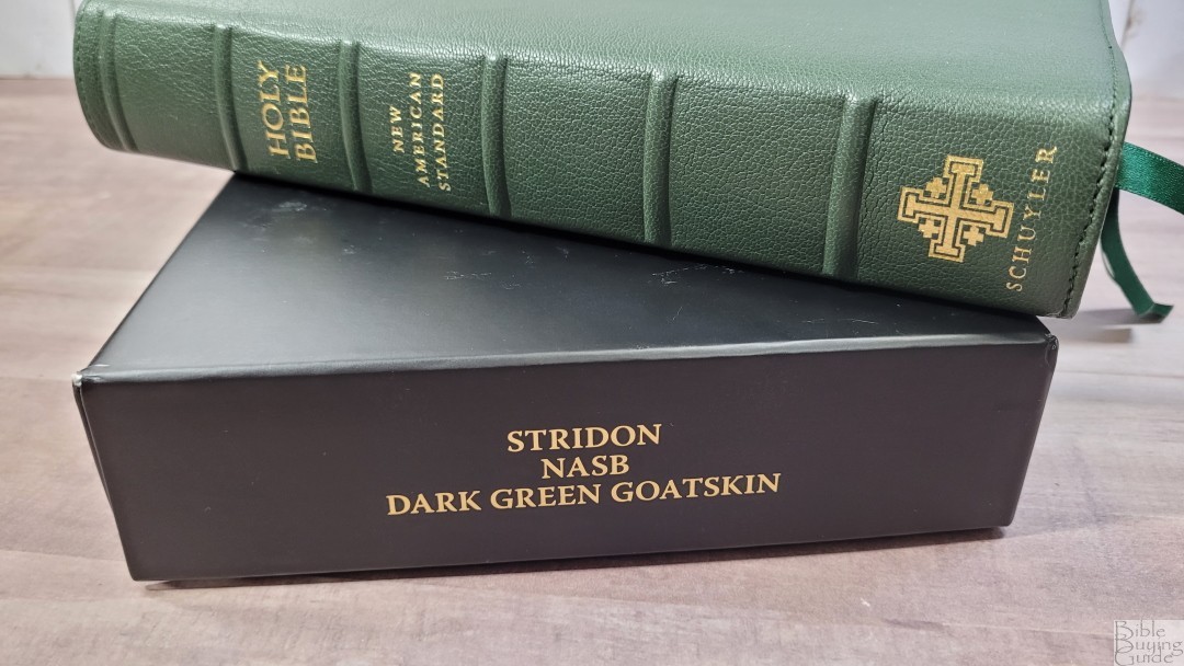
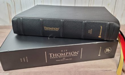
The Stridon is Schuyler’s latest Bible design. This is a verse-by-verse single-column layout with wide outer margins and a few design elements that make it stand out among its peers. The first Stridon is in the 2020 NASB. It’s available in goatskin in several colors. Eveangelicalbible.com asked which I’d like to review, so I chose the one Schuyler color I’ve never reviewed- dark green. It was typeset by 2K/Denmark and made in the Netherlands by Royal Jongbloed.
Specs
- 2020 NASB
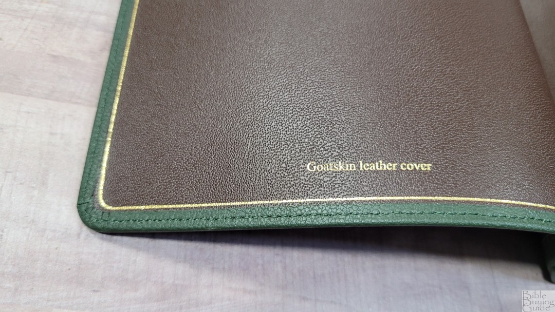
- Goatskin leather
- Leather liner
- Single-Column layout
- 7/8″ wide outer margin
- References and footnotes in the footer
- Regular edition imitation leather
- Sewn binding
- 3 3/8″ ribbons
- 6.5 x 9.75 x 1.5″ overall size
- 2 lbs, 11 oz
- 28gsm Indopaque French paper
- Line matching text
- 10-point typeface
- OT quotes in all-caps
- 95k references
- Full set of footnotes
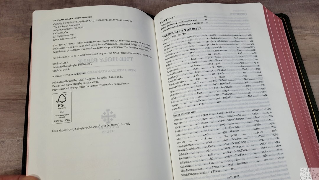
- 105-page Lockman concordance
- 12 maps
- Map Index
- Printed in the Netherlands by Royal Jongbloed
- Current price – this color is currently not available, other colors from $190-205
Evangelicalbible.com provided this Bible in exchange for an honest review. I was not required to give a positive review, only an honest one. All opinions are my own.
_________________________________________________________
This Bible is available at Evangelicalbible.com
_________________________________________________________
Table of Contents
- Video Review
- Binding
- Paper
- Typography and Layout
- References and Footnotes
- Concordance
- Bible Atlas
- Comparisons
- Conclusion
Video Review
Binding
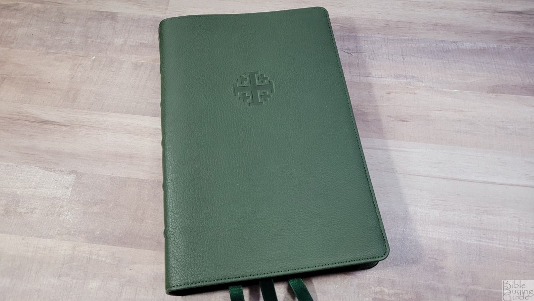
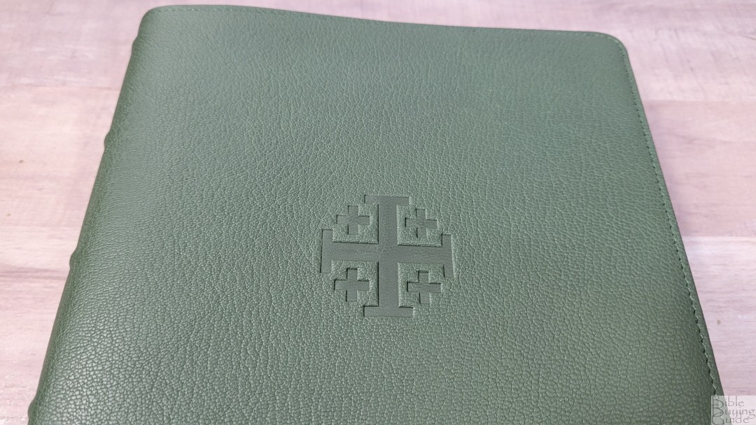
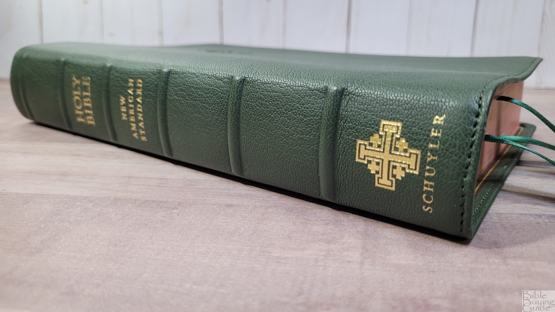
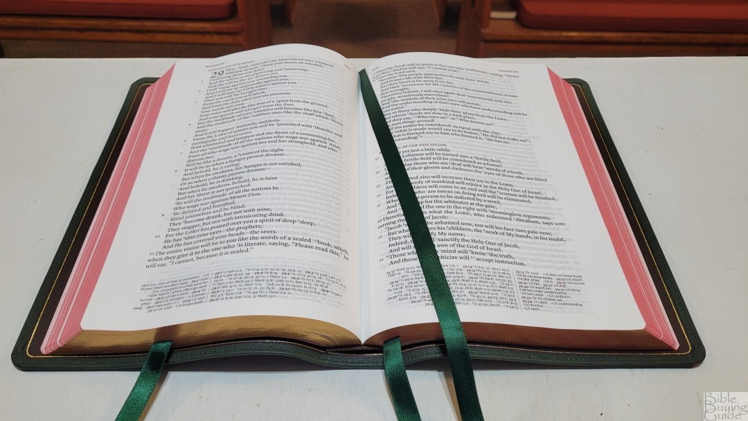
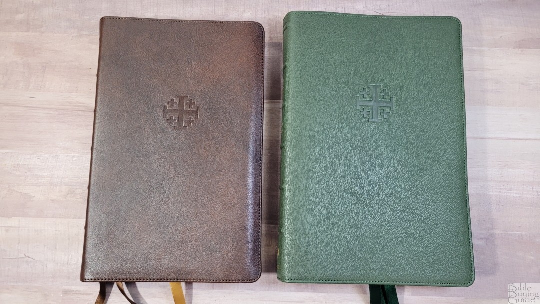
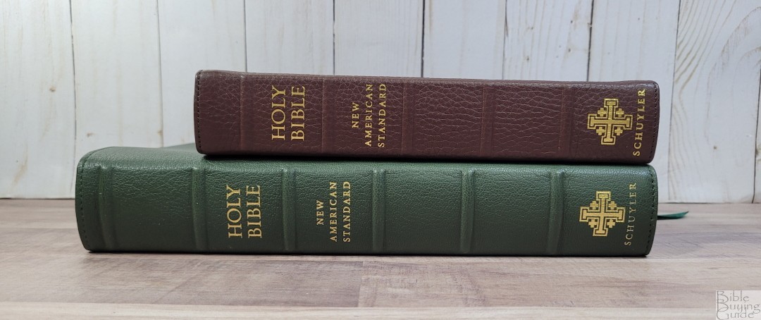
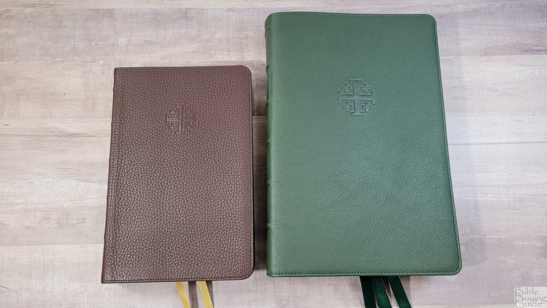
The cover is green goatskin with a brown edge-lined leather liner. The grain is deep enough to easily feel with your fingers. The leather is soft and pliable, making it floppy. I can hold it open well enough in one hand to keep the pages flat enough to read, so it isn’t too floppy for me. It has perimeter stitching. The Jerusalem Cross is stamped on the front. The spine includes 6 raised hubs. The text on the spine is stamped in gold.
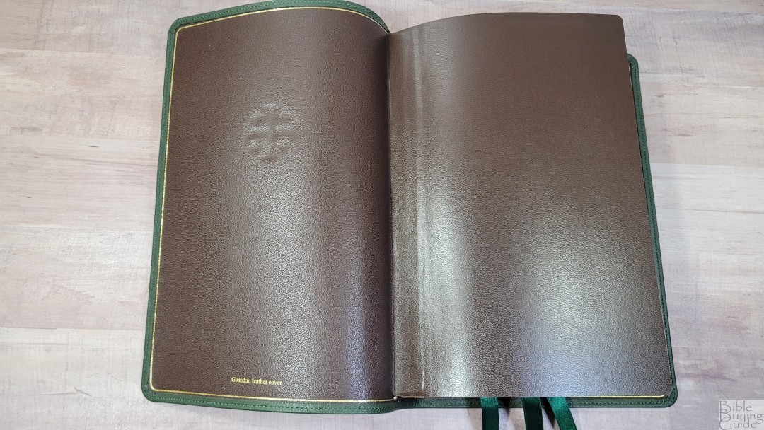
The liner is brown calf-split leather. It includes a gilt line around the inside perimeter that almost touches where the outer leather folds over the liner. The edge-lined tab is a touch stiff, but it doesn’t close when opened to Genesis 1, although it does try to. I’ve only used it for a week, so it will probably break in with some more use.
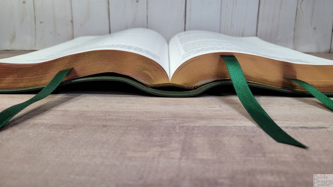
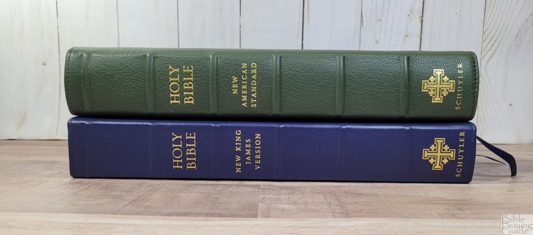
It has three 3/8″ double-sided satin ribbons in a dark green that matches the cover. They come 3.5″ out from the block and are cut at an angle. The head/tail bands are dark brown. The overall size is 6.5 x 9.75 x 1.5″. This size is excellent for reading and preaching. It weighs 2 lbs, 11 oz.
Paper
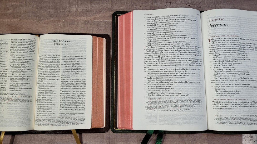
The paper is the 28gsm Indopaque, which is milled in France and is a Royal Jongbloed exclusive. This is the same paper found in most of the premium Bibles printed by Royal Jongbloed. It’s only slightly less opaque than 36gsm due to the titanium pigment. The special coating gives it a smooth and silky feel, but it doesn’t stick together when trying to separate the pages. Like all thin paper, it can be a touch difficult to turn at times, but I usually had no issues turning it. I actually found this paper slightly easier to turn than most other thin paper. It’s ivory in color and is great for reading.
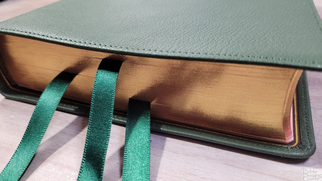
The page edges are art-gilt with red under gold. When closed it has a deep copper color, and it’s red when opened.
Typography and Layout
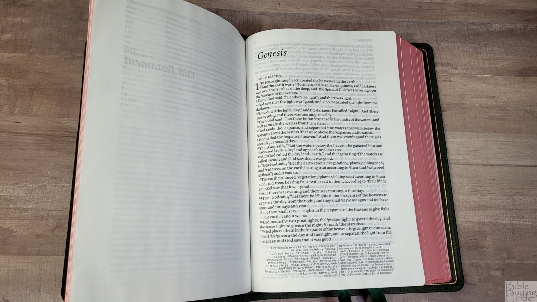
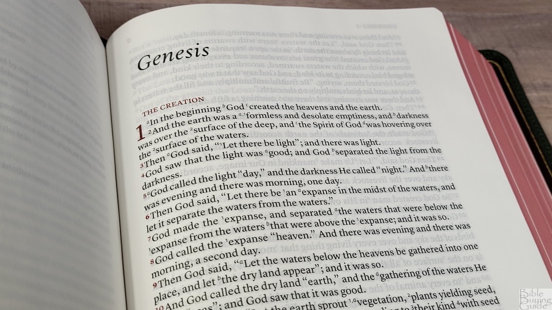
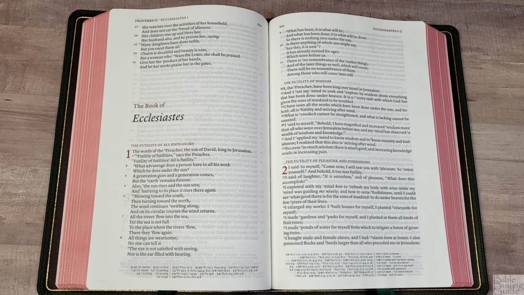
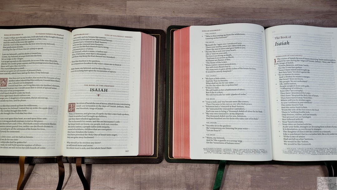
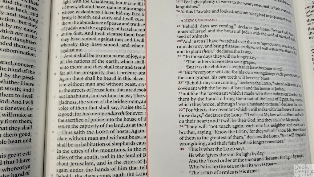
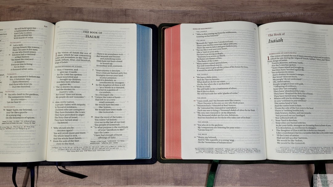
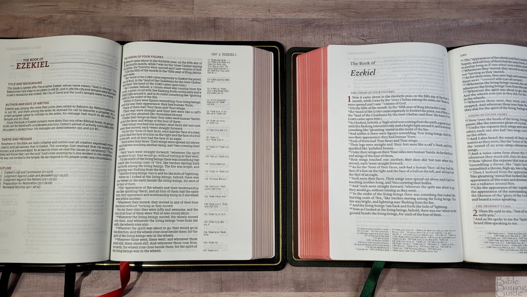
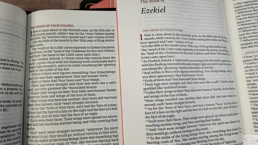
The layout is what makes the Stridon unique. It has a single-column, verse-by-verse setting with poetry set to stanzas. The header displays the book name and chapter number in the outer margin and the page number in the inner margin. The footer contains the cross-references and translation footnotes. They have a unique 2-column layout with references on the inside and footnotes on the outside. The header text, section headings, chapter numbers, verse numbers, and chapter/verse numbers in the references are in a dark and bold red.
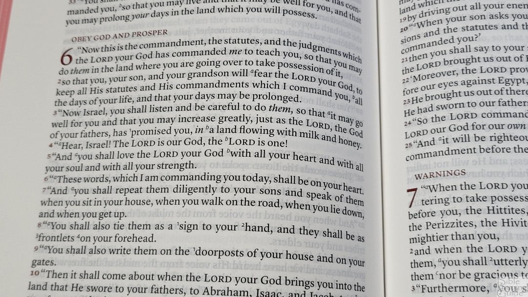
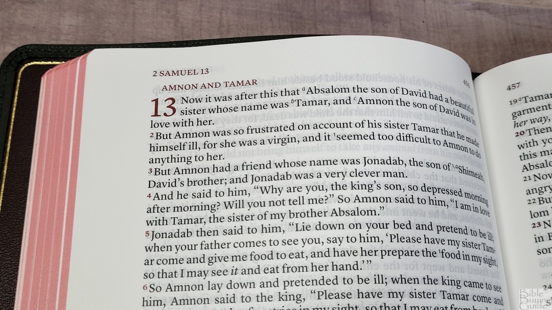
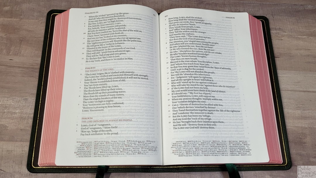
The typeface is 10-point, black-letter. The black text and the red highlights are dark and consistent throughout. Spacing gives the text enough room to be easy to read. It has around 14 words per line. This is great for poetic settings. It has a large inner margin to bring the text out of the bend of the gutter. The text was printed with line matching, meaning that the lines on both sides of the page are printed in the same location on the page. This improves readability and reduces show-through. Show-through is only noticeable where nothing is printed on one side of the page, but it’s not enough to be distracting.
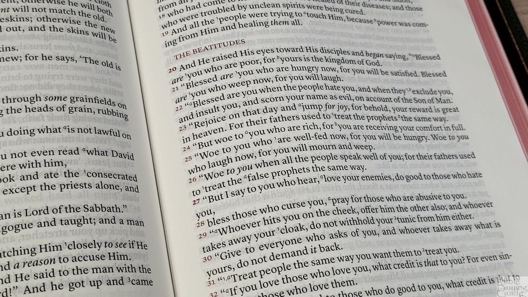
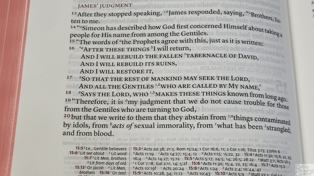
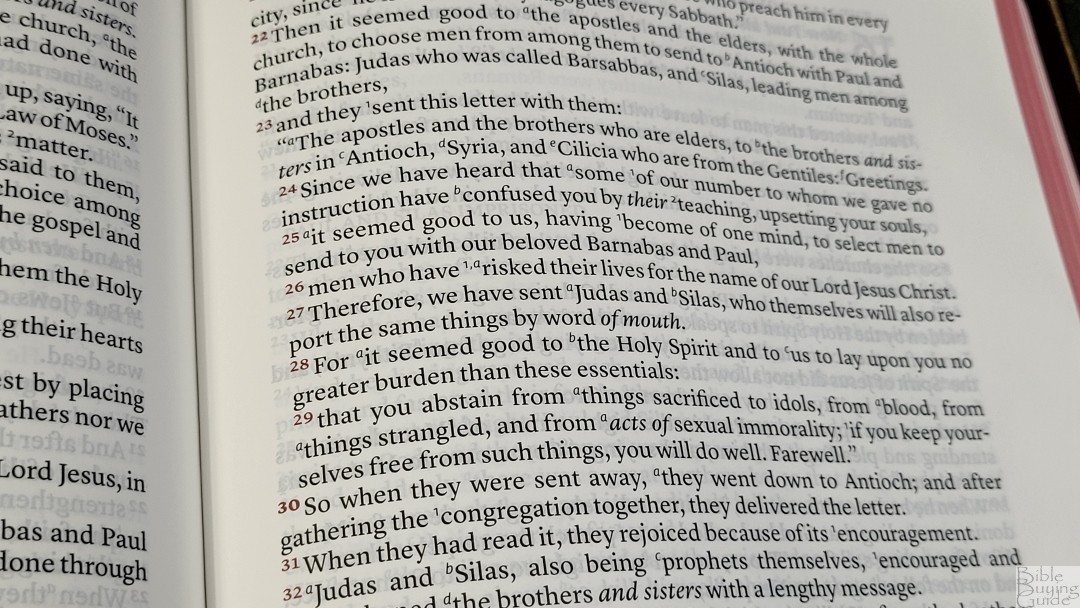
Supplied words are in italics. Old Testament quotes are in all caps. The reference and footnote keys use the Lockman style guidelines for the NASB. They start over with a and 1 for each verse. Books start on the same page the previous book ended. Letters, such as those in Acts 15, are indented. Even though it’s v-b-v, each verse that continues the sentence from the previous verse starts with a lowercase letter. This is my preference and it improves readability. Paragraphs are marked with a bold verse number.
Wide Margins
It has a 7/8″ wide outer margin. This isn’t enough room for anything extensive, such as long explanations or sermon outlines, but it is enough for small notes, references, and symbols. At the same time, the margins aren’t so large that it feels like a wide-margin Bible, which is ideal if you don’t want to write in it.
Family Pages
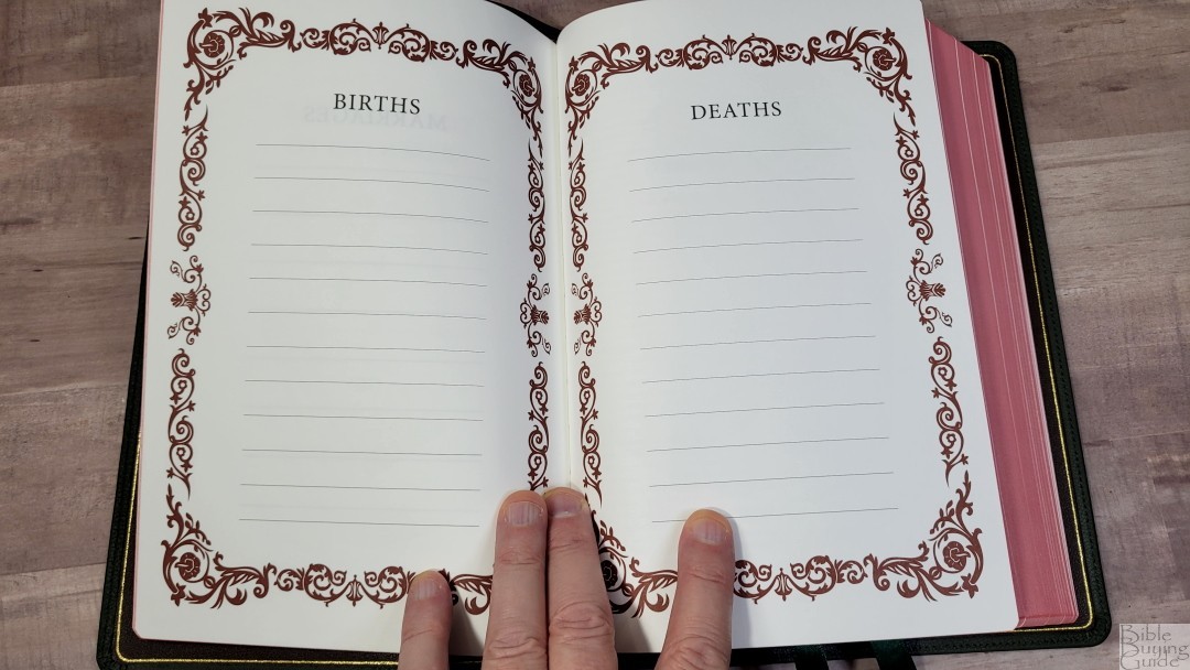
In the front is a presentation page and family pages printed on thick non-glossy paper. The family pages include marriages, births, and deaths. The thick pages also give it structure.
Thoughts on Reading and Preaching
I had no issues with reading it. I usually forgot that it was v-b-v. The extra white space at the end of most verses actually helped me keep my place on the page. Without it, a paragraph setting just looks like a page of text, which can be great for reading but difficult to use for study or preaching if you’re not used to it. The poetic layout looks amazing.
For preaching, I did have to keep my finger under the line I was reading to help me keep my place the first time I preached from it. That’s probably just me not being used to preaching from a Bible with a column this wide. The second time I preached from it, it was a lot easier. I could tell I was getting used to it. The v-b-v setting helps a lot when preaching.
References and Footnotes
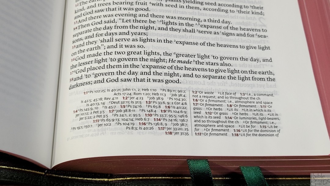
The Stridon contains the full set of Lockman cross-references and footnotes. This means there are 95,000 cross-references. This is excellent for deep study. The cross-references and footnotes are placed in the footer with references on one inside and footnotes on the outside. They’re separated by a red line. They’re printed horizontally within their column. The pilot chapter and verse numbers are in red, which helps locate them. It’s not as fast as those that are stacked, but it’s much faster than those that take the entire width of the page and have the references and footnotes together. I like this design.
Here are a few example references to help you compare:
- Genesis 1:1 – Ps 102:25; Is 40:21; Jn 1:1, 2; Heb 1:10; Ps 89:11; 90:2; Ac 17:24; Rom 1:20; Heb 11:3; Job 38:4; Is 42:5; 45:18; Rev 4:11
- Deuteronomy 6:4 – Mt 22:37; Mk 12:29, 30; Lk 10:27; Dt 4:35, 39; Jn 10:30; 1 Cor 8:4; Eph 4:6
- Isaiah 9:6 – Is 7:14; 11:1, 2; 53:2; Lk 2:11; Jn 3:16; Mt 28:18; 1 Cor 15:25; Is 22:22; Is 28:29; Dt 10:17; Neh 9:32; Is 10:21; Is 63:16; 64:8; Is 26:3, 1254:10; 66:12
- Matthew 28:19 – Mk 16:15; Mt 13:52; Ac 1:8; 14:21; Mt 25:32; Lk 24:47; Ac 2:38; 8:16; Rom 6:3; 1 Cor 1:13, 15; Gal 3:27
- Mark 12:29 – Dt 6:4
- John 1:1 – Gen 1:1; Col 1:17; 1 Jn 1:1; Jn 1:14; Rev 19:13; Jn 17:5; 1 Jn 1:2; Ph 2:6
- John 3:16 – Rom 5:8; Eph 2:4; 2 Thes 2:16; 1 Jn 4:10; Rev 1:5; Rom 8:32; 1 Jn 4:9; Jn 1:18; 3:18; 1 Jn 4:9; Jn 3:36; 6:40; 11:25
- Acts 2:38 – Mk 1:15; Lk 24:47; Ac 3:19; 5:31; 20:21; Mk 16:16; Ac 8:12, 16; 22:16
- Romans 10:9 – Mt 10:32; Lk 12:8; Rom 14:9; 1 Cor 12:3; Phil 2:11; Ac 16:31; Rom 4:24; Ac 2:24
- 1 John 1:1 – Jn 1:1; 1 Jn 2:13, 14; Ac 4:20; 1 Jn 1:3; Jn 19:35; 2 Pet 1:16; 1 Jn 1:2; Jn 1:14; 1 Jn 4:14; Lk 24:39; Jn 20:27; Jn 1:1, 14
Concordance
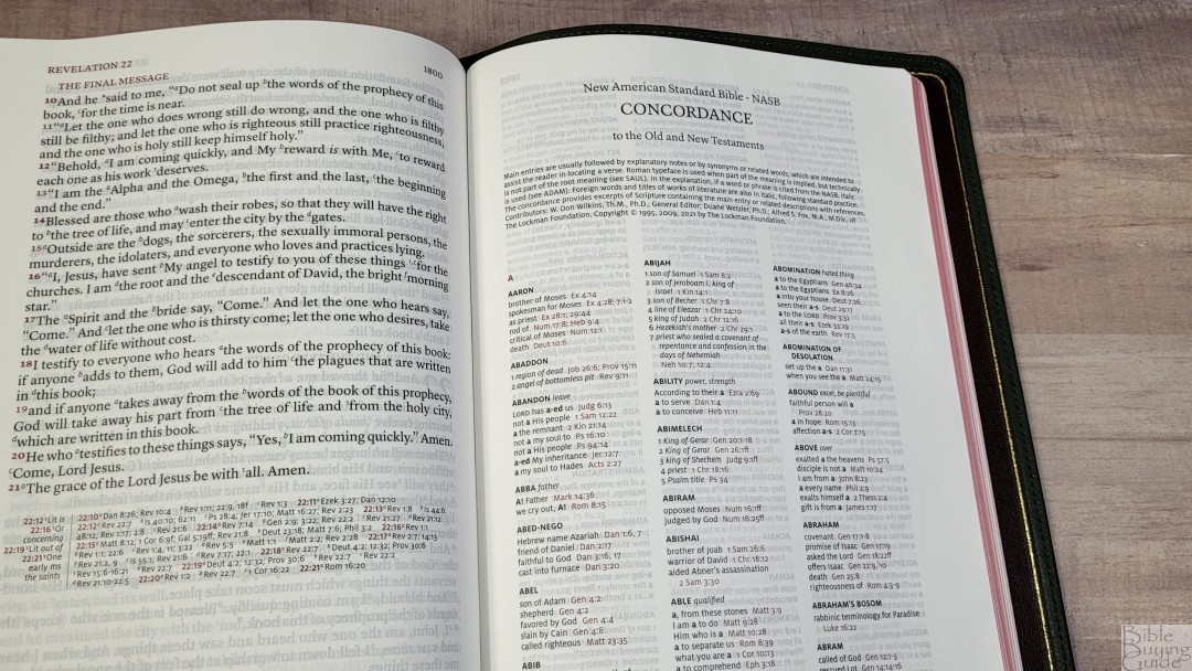
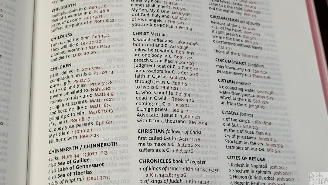
The concordance is 105 pages with 3 columns per page. This is the concordance from Lockman. It includes explanatory notes, synonyms, and related words. The Scripture references are in red. This is an excellent concordance for study.
Here are a few example entries with their number of references to help you compare:
- Christ Messiah – 16
- Christian follower of Christ – 3
- Faith – believe, trust – 36
- Faithful – loyal, trustworthy – 15
- Faithfulness loyalty – 7
- Faithless unbelieving – 2
- God Deity, Eternal One – 37
- God false deity, idols – 8
- Goddess female deity – 3
- Godless pagan, without God – 5
- Godliness holiness – 5
- Godly holy – 6
- Praise (n) acclimation, honor – 11
- Praise (v) glorify – 11
- Pray ask, worship – 19
- Prayer – 14
Bible Atlas
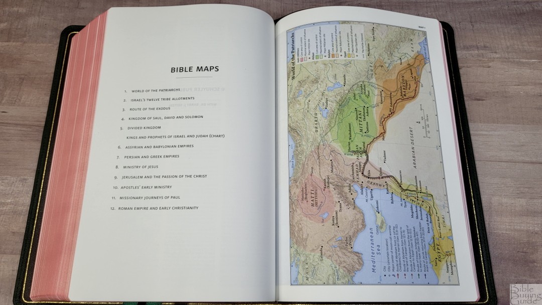
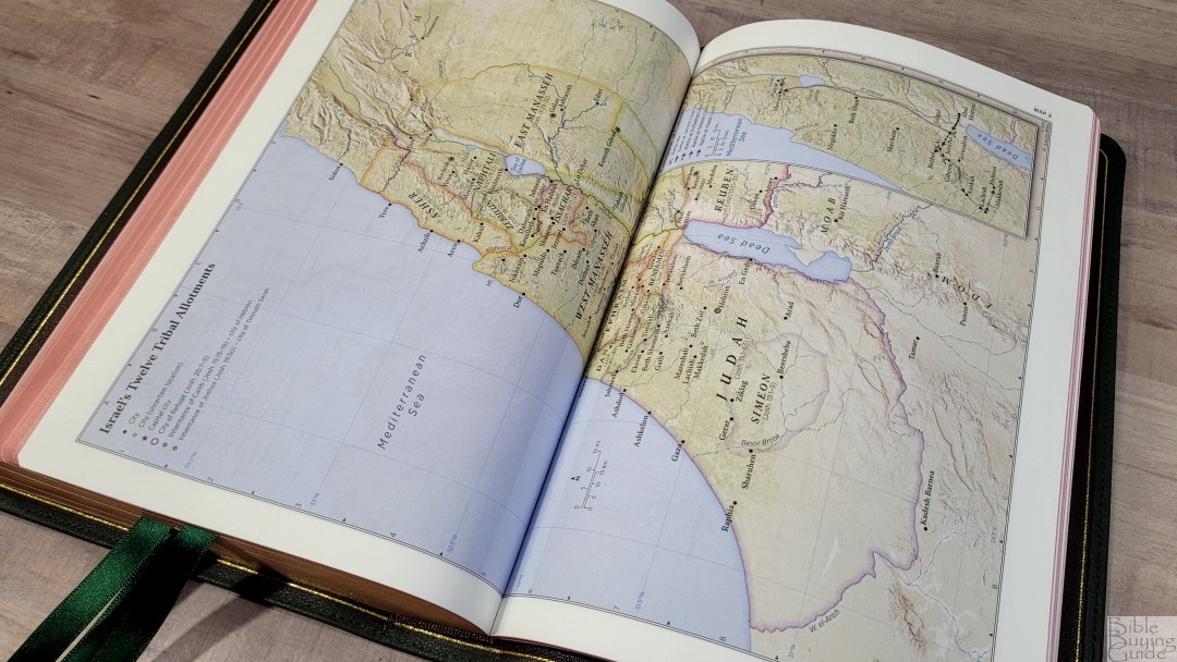
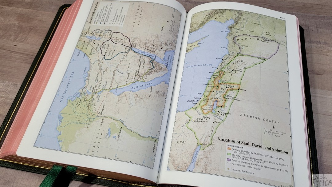
In the back are 12 Schuyler maps printed on thick non-glossy paper. These are the same maps printed in all Schuyler editions for the past several years. They’re elegant and colorful. They’re annotated well and include borders, cities, distance, topography, Scripture references, places of worship, capitals, water, roads, canals, seaports, ancient inscription sites, events of Jesus’ life, Apostles’ ministries, places of writings, etc. It does have two that span across two pages with no space between them. This can make them difficult to use in the gutter.
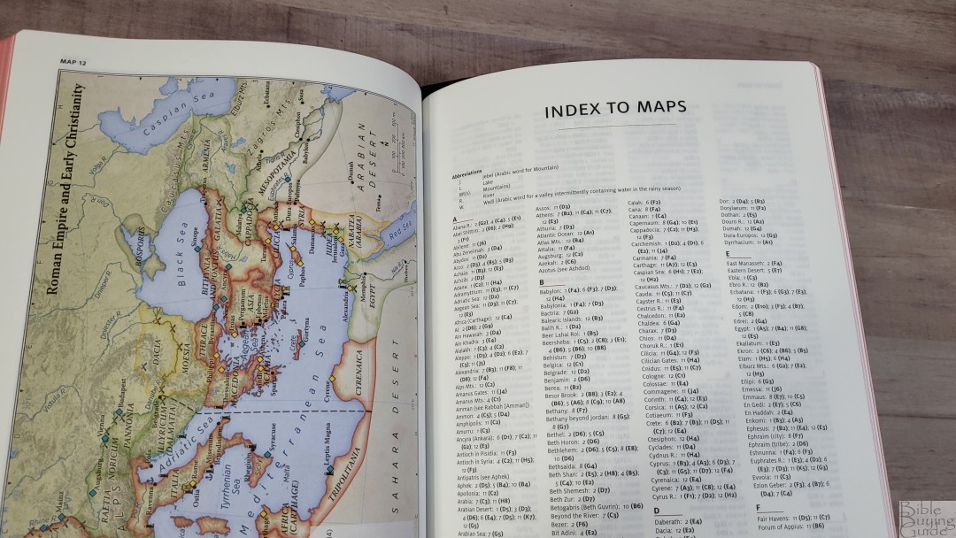
It also includes a 3-page index to maps. It includes a short key to abbreviations. This makes the maps much easier to use and I’m always glad to see an index included.
Here’s the list of maps (and one chart):
- World of the Patriarchs
- Israel’s Twelve Tribe Allotments
- Route of the Exodus
- Kingdom of Saul, David and Solomon
- Divided Kingdom
- Kings and Prophets of Israel and Judah (Chart)
- Assyrian and Babylonian Empires
- Persian and Greek Empires
- Ministry of Jesus
- Jerusalem and the Passion of the Christ
- Apostles’ Early Ministry
- Missionary Journeys of Paul
- Roman Empire and Early Christianity
Comparisons
Here’s how the Schuyler Stridon compares to several other editions from Schuyler and the competition.
Schuyler Treveris
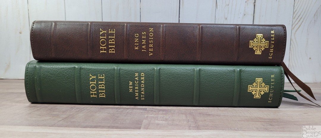

The Schuyler KJV Treveris has a paragraph layout with verse numbers in the margins. The text block is smaller, but the font size looks to be the same. Both have the same paper. Mine has a full yapp, which makes it look larger than it is. They make a great pair with the Treveris designed for reading and the Stridon designed for everything else.
Schuyler NKJV Quentel


The Schuyler NKJV Quentel is about the same overall size, but it’s a touch thinner. It has a larger font in a paragraph, double-column setting. Both have the same paper.
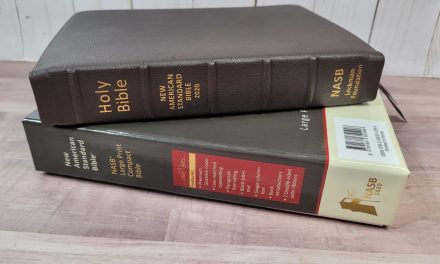
Schuyler NASB Personal Size Quentel

The Schuyler NASB Personal Size Quentel is a lot smaller. It’s a better choice for carry, but not as good for all-around use due to the small font and lack of concordance. It has the same paper.
Zondervan NASB Side Column Reference
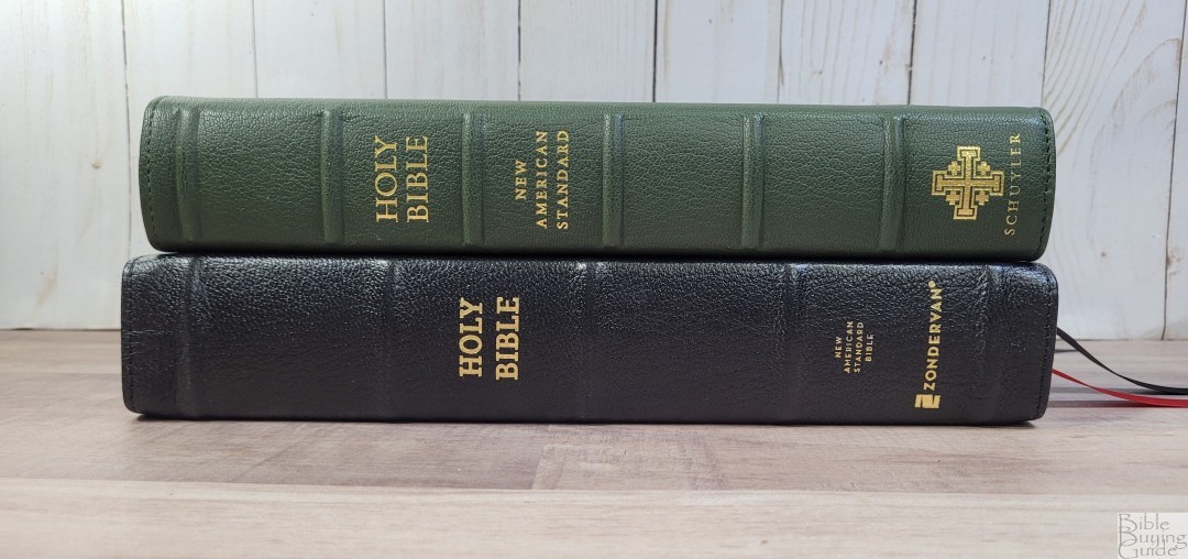
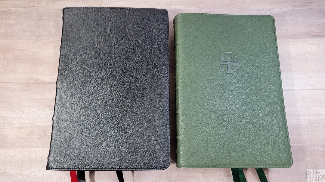
Zondervan’s NASB Side Column Reference in the Premier Collection is the only other reference NASB that I have with a single-column, v-b-v layout, and a wide outer margin. The fonts are about the same size. The Zondervan’s font is a touch darker and it has fewer words per line, but the text is denser. The Zondervan has 36gsm paper and it has a thicker text block. It’s made in China and is at least a notch under the Schuyler in quality.
Conclusion

The Schuyler Stridon is an excellent design. The font size is the same as the Treveris, which is between the regular size and personal size Quentel. Even though it’s verse-by-verse, I found it great for reading. The white space in the text helps make it easy to preach from. Separating the references and footnotes in the footer is something I’ve wanted to see for a while, but I wasn’t sure how it should be done. This design works great. The wide outer margin isn’t enough for extensive notes, but it’s great for small notes and it doesn’t have an awkward amount of space in places you wouldn’t need it. All of these design elements make the Stridon an excellent all-around Bible. I hope to see this design in all translations.
_________________________________________________________
This Bible is available at Evangelicalbible.com
_________________________________________________________
Evangelicalbible.com provided this Bible in exchange for an honest review. I was not required to give a positive review, only an honest one. All opinions are my own.


Excellent review as usual! I when I’m looking for information on any particular edition, I always check your reviews first.
Nice review. I’m in the market for a NASB. I was on the fence because I have a Schuyler RSV. I love the feel of the bible, the cover and softness of the paper is amazing. I’m not happy with the internal set up. It has LONG paragraphs with no breaks or no subject headings, verse numbers buried in the text. It’s hard to find things in it and it’s actually hard to read because of the long paragraphs and only chapter numbers listed. I may have to pick this one up!
Randy, If they offered it in 36 gsm would that be your preference?
Hi Brian. I actually prefer the 28gsm. The coating is elegant, making the paper feel silky smooth but still easy enough to turn. I like thinner Bibles and this paper lets me have a thinner Bible without sacrificing opacity or elegance. I might want a thicker paper if taking notes was my goal, but I haven’t tried writing on this paper to know for sure.
Its a shame they opted for the inferior NASB 2020 instead of the 1995.
When the 1995 version replaced the 1977 version, there was a loss of readership in the UK. Now that the 2020 and the Legacy Standard versions have appeared, there has been a further loss of UK readership of the NASB. I’m afraid that the NASB, which always had only a tenuous foothold in the UK, is sinking even further. With the loss of the excellent and inexpensive (£15/$20) hardback NASB Side-Column Reference Bible, the most-appreciated edition that I have ever placed with serious students both Christian and other, I have had to turn to an/other version/s for placing with such students. Sad beyond words!