
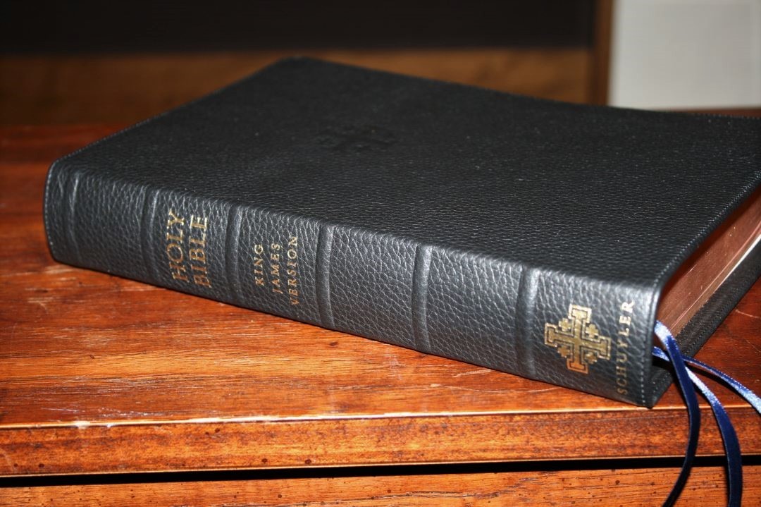
Schuyler Bible’s first KJV was their own production of the TBS Westminster. The Canterbury is Schuyler’s first originally designed King James Version. It follows a similar pattern of their Quentel series but has a few design features that are unique in modern Bible publishing, creating a unique blend of old and new.
The design of the Canterbury makes me think of modern retro cars. Cars like the Mustang and Challenger are patterned after the classic designs but they have modern refinements. The Canterbury is patterned after the KJV’s of old, but with modern fonts and paper, making it feel like a new version of the old.
- The name Canterbury was chosen because the name goes back to the olden times to match the old style of the KJV. It’s meant to evoke that old time period.
Pros
- Beautiful Milo font
- 36gsm paper
- Psalms in single column
- Ornamental drop-caps
- Lots of section headings
Cons
- No translator’s footnotes
- Cross references and concordance feels light when compared to the Quentel series
Features
- KJV
- Sewn binding
- Calfskin cover
- 11 point font
- Double column format with Psalms in single column
- 36gsm paper
- Ornamental drop-caps
- Epistle Dedicatory
- Translators to the Reader
- Glossary
- 3 ribbons
- Concordance
- 12 maps with index
- Page size 9.125 x 6.125″
- Overall size 9.8 x 6.75 x 1.625”
- Elegant gift box
- Layout designed by 2K/Denmark
- Printed and bound in the Netherlands by Jongbloed
_______________________________
Buy from Evangelical Bible
_______________________________
Binding
The Canterbury is available in several covers and styles:
- Goatskin (edge-lined leather): Black, Dark Brown, Dark Purple, Firebrick Red, Imperial Blue
- Calfskin (paste-down): Black, Dark Brown, Dark Red, Forest Green
- Leather over Board (coming soon)
I chose the black calfskin. I considered the brown and the red, but eventually the black won me over. I chose calfskin because I’m partial to stiffer covers. I find them easier to hold in one hand to read. I don’t roll my Bibles like a newspaper. Instead I prefer to hold them open and see both pages. I also like how paste-down liners lay open and flat. Being half the price doesn’t hurt either and it’s still a Smyth sewn premium Bible.
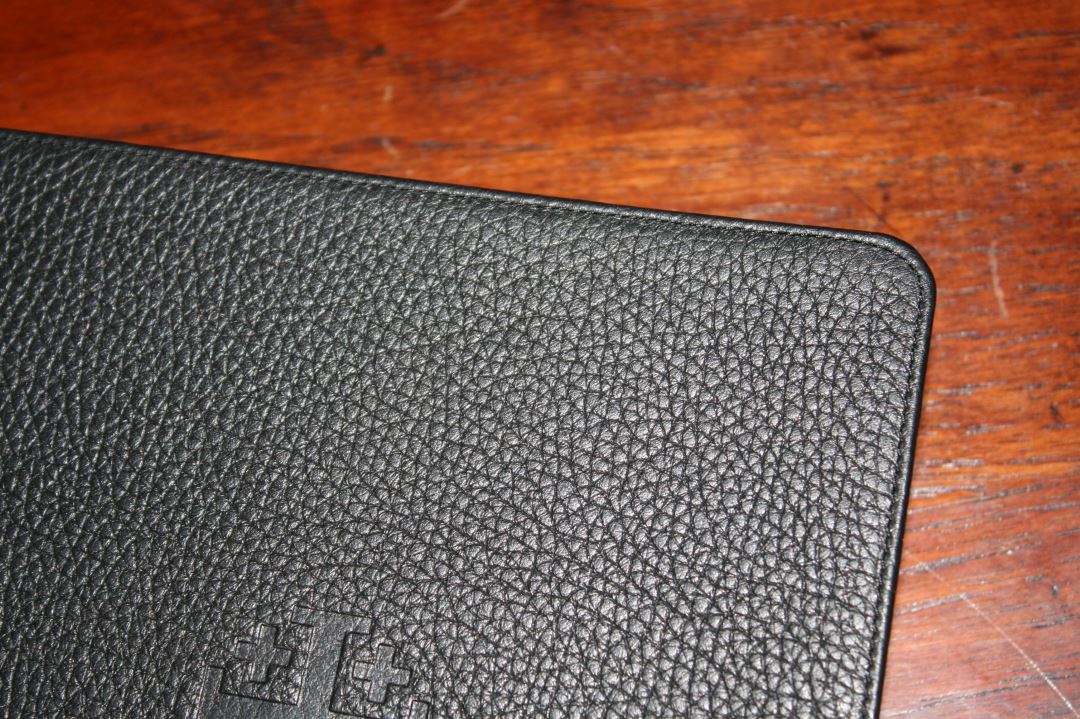
I’m not disappointed by getting the calfskin over the goatskin. It’s soft to the touch and has a matte finish. The grain is pronounced and looks pebbly. It looks similar to the calfsplit leather used by Cambridge but it’s a lot softer to the touch. It even has perimeter stitching even though it has a paste-down liner. I find it much easier to handle while reading.
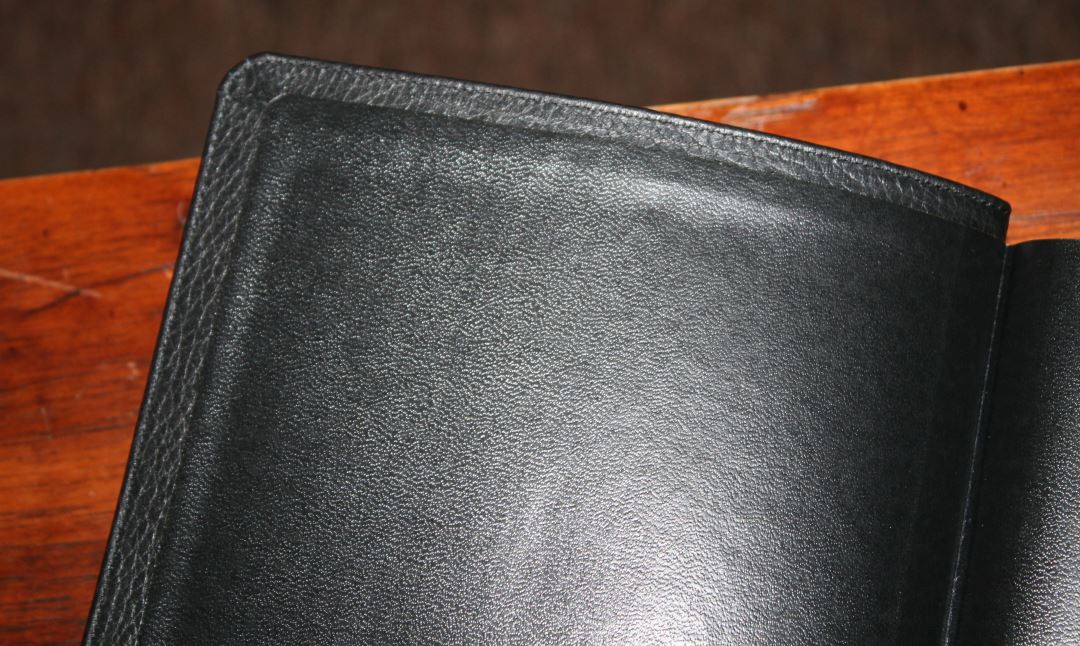
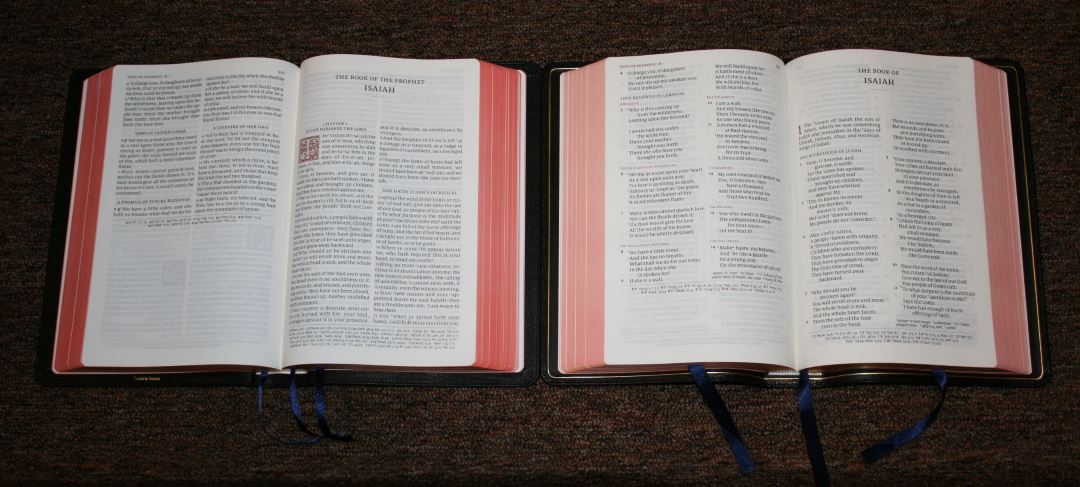
The cover lays open more naturally than just about any Bible I’ve reviewed. There isn’t a tab in the liner to keep the first few pages from lying completely flat. It lays flatter than my goatskin Quentels.

The Jerusalem Cross is debossed into the front of the cover. The spine has Holy Bible, King James Version, the Jerusalem Cross, and Schuyler in gold. It has 6 raised hubs, giving it an elegant look.
Paper

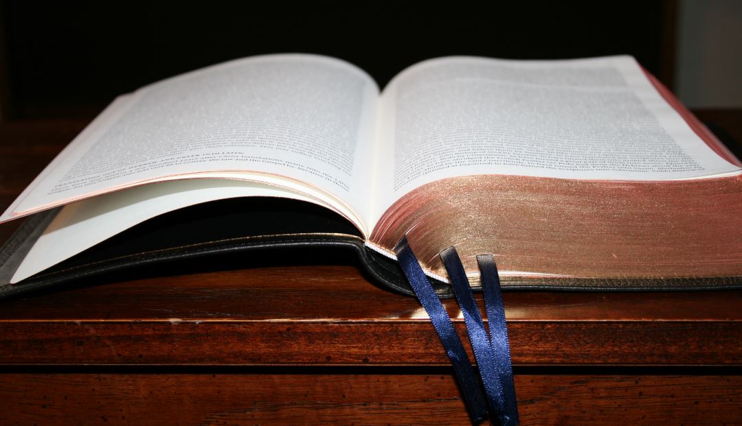
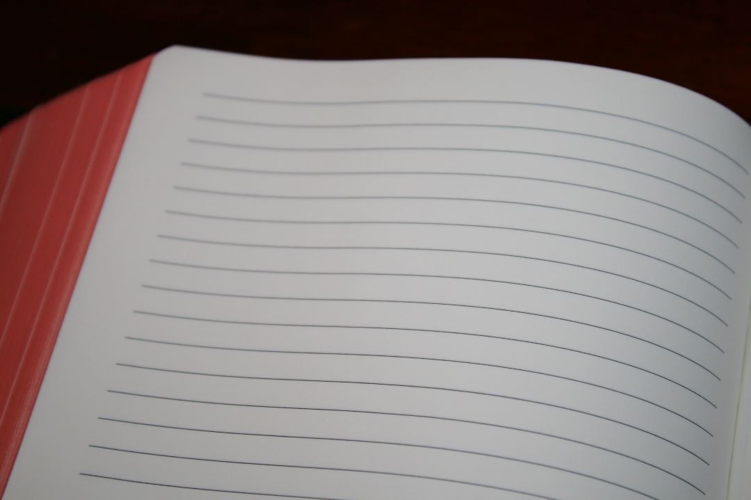
The paper is 36gsm. It’s smooth to the touch and has a slight cream color with no glare. It’s highly opaque and a joy to read and touch. Even the red doesn’t show through enough to matter. If you like highlighting you’ll love this paper. It’s thick enough that I had no issues turning pages. It has 11 lined pages in the back for notes that use the same paper as the rest of the text.
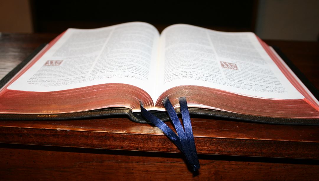
The art-gilt edges darker than any other Bibles that I’ve seen from Schuyler. To my eye they look burnt orange (which happens to be one of my favorite colors).
I’ve seen some page curl maybe twice, but in the winter months in TN it’s harder to find a Bible without page curl than one with it. This won’t be an issue in the warmer months and isn’t that bad. Most days there isn’t any page-curl.
Typography
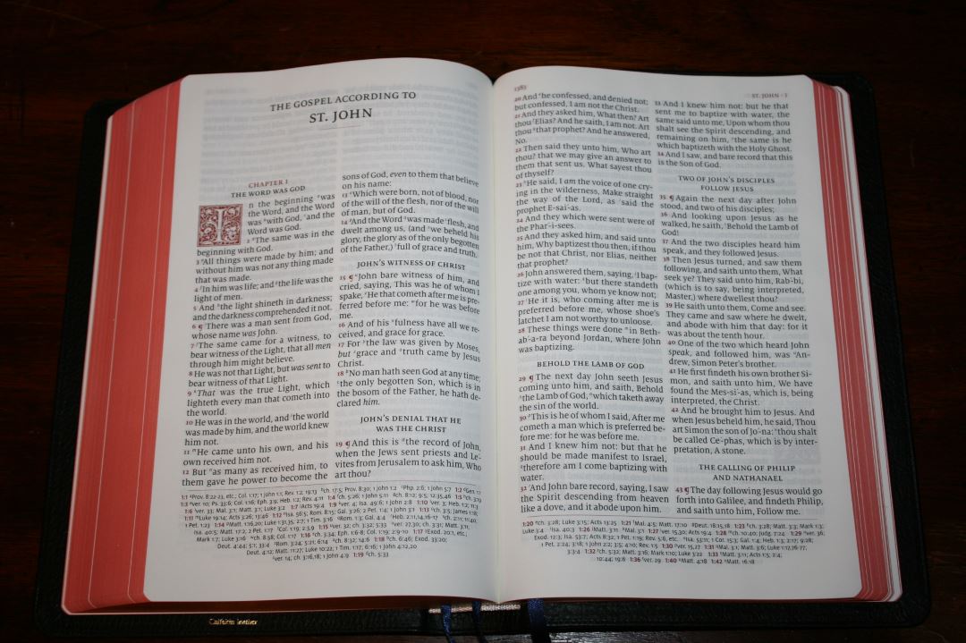
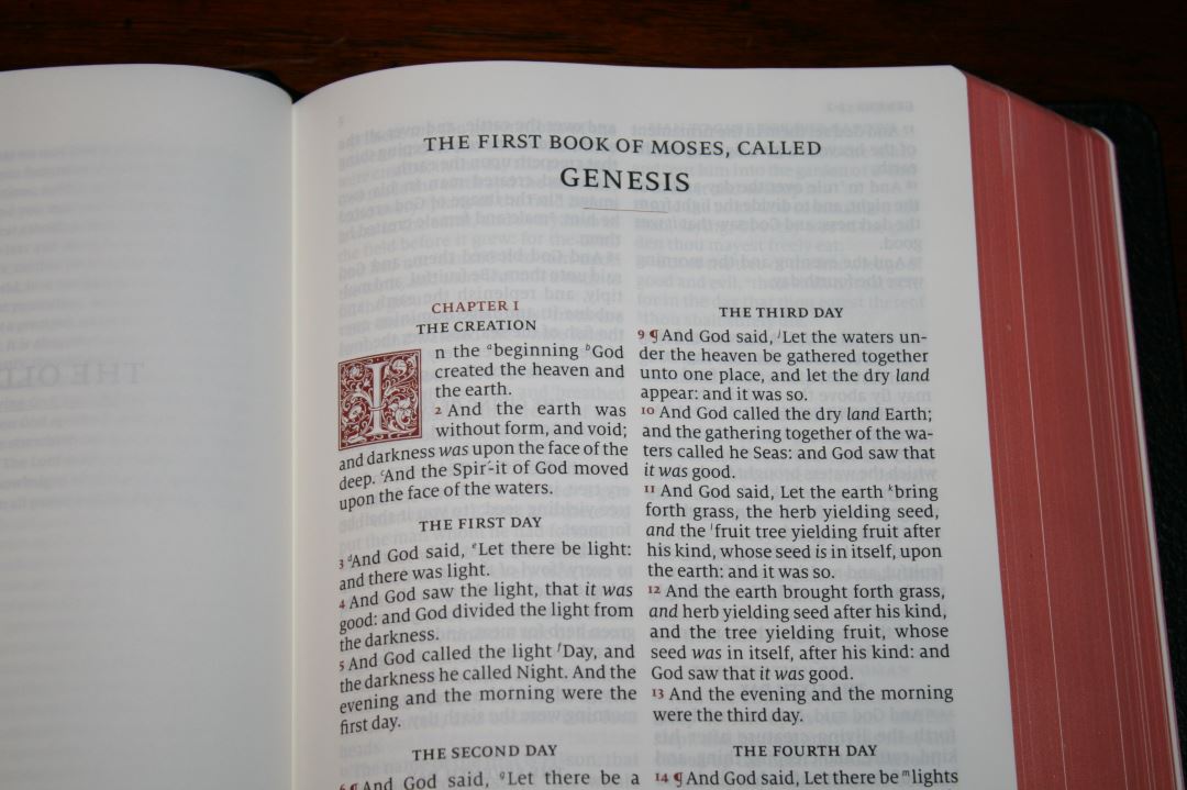
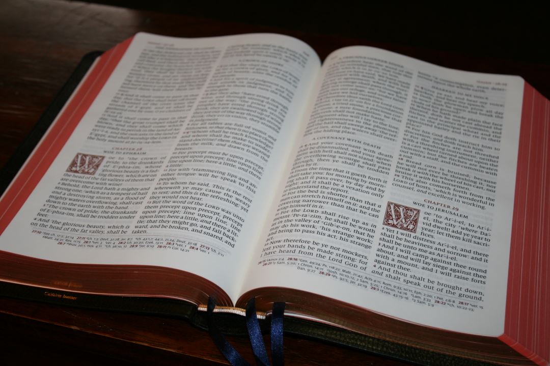
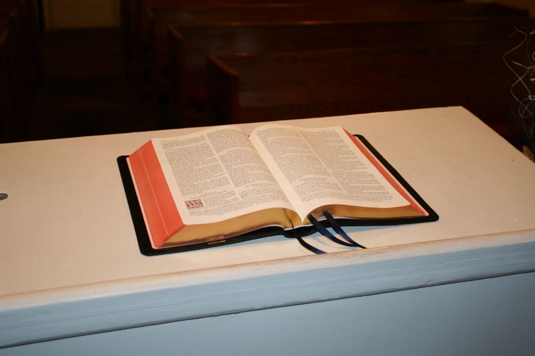
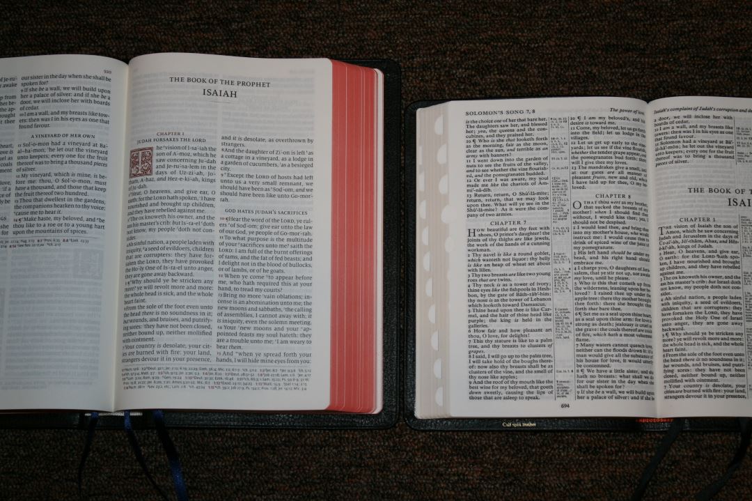
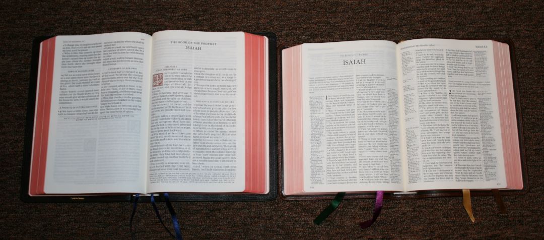
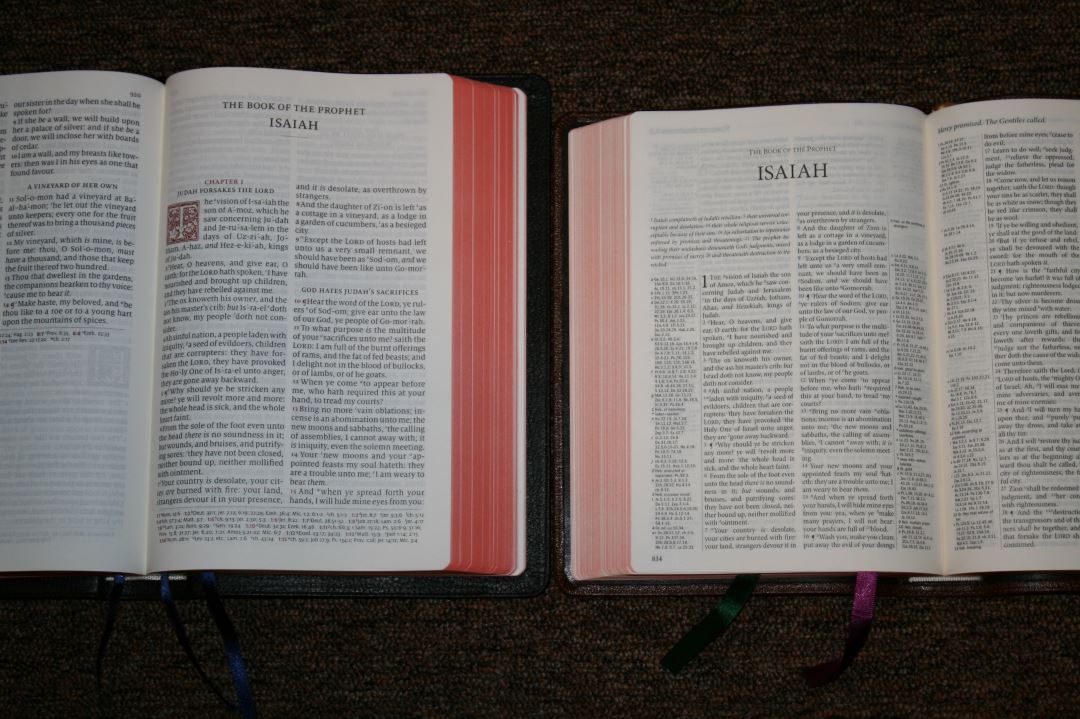
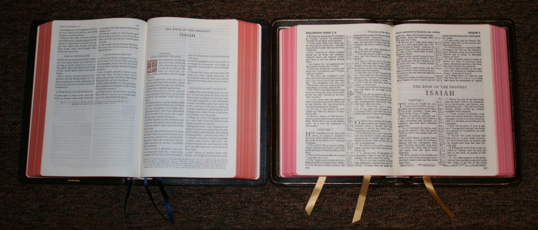
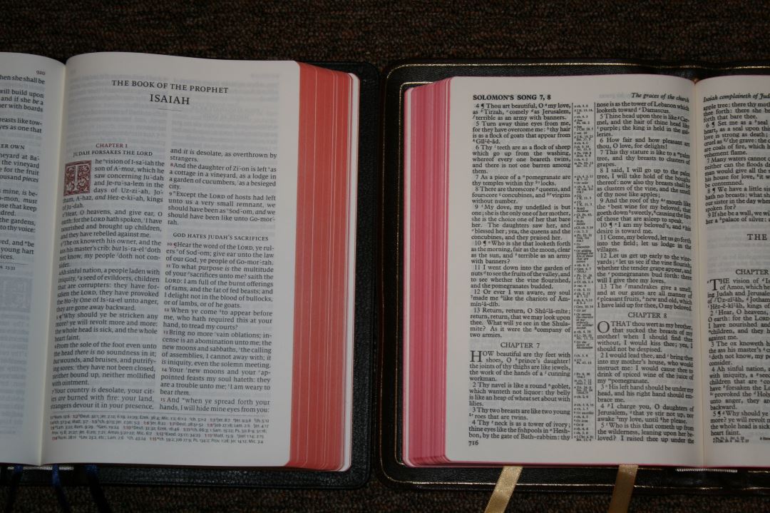
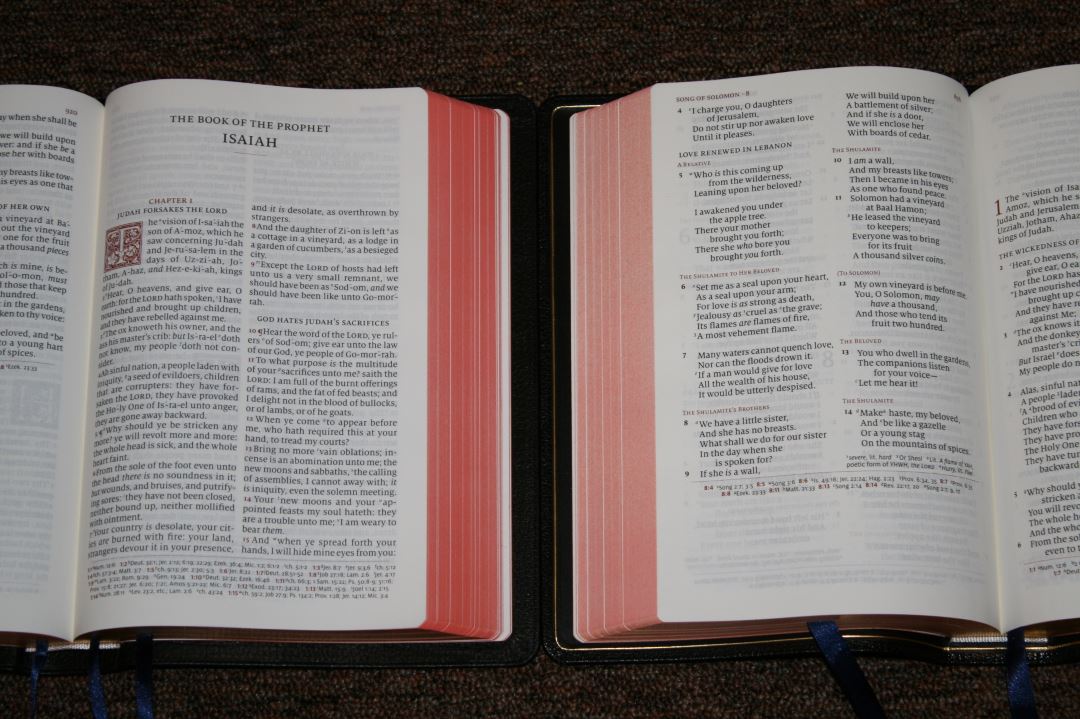
The text is presented in double column verse-by-verse format with Psalms in single column. It doesn’t have poetic settings but it does have Psalms in single column. All highlights are in a bold red. The header includes the page numbers in the inner margin and the book name and chapter numbers in the outer margin. Cross references are placed in the footer. I like that cross references are placed in the footer because the text doesn’t have to share horizontal space with anything. This allows for a larger font and a cleaner design.
The font is the same 11-point Milo font as the Quentel series. It’s black letter and line-matched so the lines on both sides of the page are printed in the same place on the page, which greatly improves readability. It has the same comfortable leading as the Quentel. To my eye the font and paper have the perfect contrast. The Concord can sometimes look too bold and the Westminster can sometimes look too light. The Canterbury’s typeface has the right amount of weight for the perfect boldness.
It has italics for supplied words and simplified pronunciation marks which break down the syllables and places a stress mark over the prominent syllable. There are more than I personally need but at least they don’t include Jesus and other common names in the New Testament. For me these are more useful for preaching than personal reading. References are keyed to the text with letters. The letters are small enough to be easy to ignore but still readable at the same time.
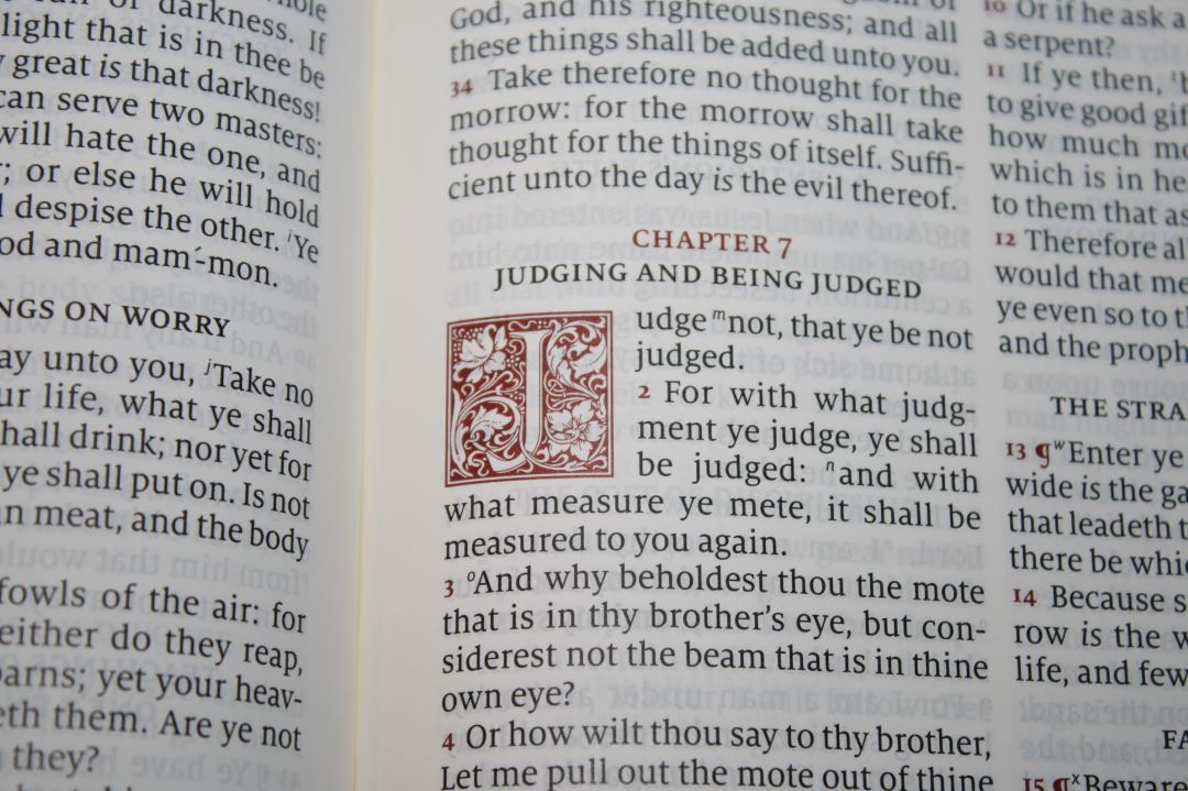
I love the ornamental drop-caps. The red looks outstanding. I call them Canterberries (I know. I thought it and now I can’t unthink it. Sorry). They’re the first letter from the first word of a chapter. They’re printed in red with flowers, leaves, and vines. The ornamental drop-caps take 5 lines everywhere with the exception of Psalms which takes 4 lines. They’re the LTC Goudy Initials fonts.
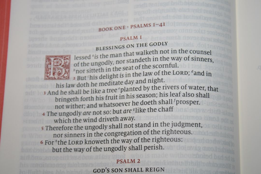
The columns are 2 3/8” wide with around 38 characters and 6-8 words. The words are spaced apart comfortably without any words too close together or too much space between them. Most pages have around 45 lines, although this does change depending on the number of cross references in the footer. The outer margin is ½”. The inner margin is a touch wider than the outer margin by enough to bring the text out of the gutter. The text never gets lost in the bend. Books start on a new page, leaving room for notes.
Can Double Column Verse by Verse Still be Relevant?
When it came time to produce a KJV, Schuyler decided to break from their Quentel design of paragraph editions and go back to the old verse-by-verse design. I have personally moved on to paragraph editions with a focus on readability and context. I’ve always considered the paragraph design, along with modern punctuation, to be ideal. With that in mind, is the Canterbury still relevant? In my opinion it is.
I do believe single column paragraph with translators’ footnotes and no numbers within the text is the ideal design for comprehension, but that design doesn’t fit every purpose. We still need editions with verse numbers, chapter numbers, two columns, and even verse-by-verse. Here are a few reasons:
- Not everyone agrees with every paragraph choice. I prefer small paragraphs to large paragraphs, which is closer to verse-by-verse. I read in large chunks, so I already ignore the verse divisions. The Canterbury’s section headings help create paragraph separations.
- Not everyone can find verses easily within paragraphs (although the red verse numbers of the Canterbury are ideal for paragraphs).
- Some find poetic settings difficult to read (especially for reading aloud).
- Some prefer to preach, or follow a preacher, using v-b-v because it’s faster.
With that said I would have preferred the Canterbury to have been in paragraph format. I believe the advantages of paragraphs outweigh v-b-v and the red verse numbers in the Canterbury would have overcome any issues in searching for verses. However, there are a few advantages to this layout:
- It has more white space rather than the page just looking like a sea of text.
- There’s some room to add small notes after most verses if you want to.
- Verses are easy to find because they’re lined up horizontally.
I like the Canterbury enough to use it even though I want paragraphs. My advice for reading any verse-by-verse Bible is to be mindful of sentence structure. Don’t just read a single verse because it’s too easy to miss the overall message and context. Look at the punctuation. Does the verse start at the beginning of a sentence? Many sentences take three or four verses. Don’t start or stop at a comma or colon. Read from the beginning of the sentence to the end regardless of how many verses it takes. The same goes with section headings. Don’t assume the topic started with the new heading. Read before and after the verses, section headings, and chapter breaks to help keep things in context.
Now, with all of that said, I still want a KJV Quentel. I still want a KJV in paragraph format. The Canterbury doesn’t take the place of a Quentel in my mind. There’s still a need for a paragraph KJV complete with translator’s footnotes. Another good choice would be a Schuyler or Allan edition of the Nelson Paragraph KJV like the NKJV. I want these to use along with the Canterbury – not replace it. This is my dream anyway and this is the direction Cambridge has been going in with the KJV Clarion and Pitt Minion.
References
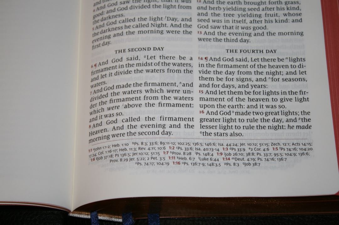
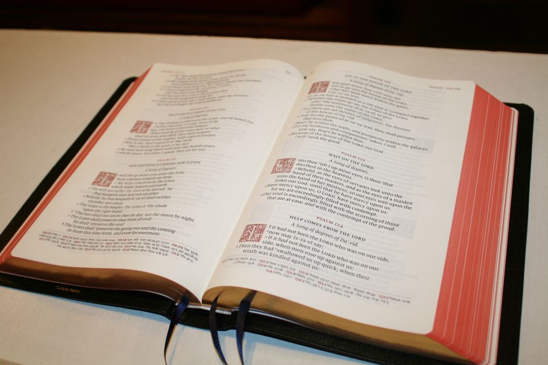
There are 55,000 cross references that appear in the footer and are keyed to the text with letters. The footer includes the chapter and verse numbers in red. They’re separated from the text by a red line. The references follow the Quentel’s design of tapering toward the bottom of the page, giving the page an elegant look and grounding the page.
Here are a few verses as examples:
- Genesis 1:1 – Jn 1:12; Heb 1:10; Ps 8:3; 33:6; 89:11-12; 102:25; 136:5; 146:6; Isa 44:24; Jer 10:12; 51:15; Zech 12:1; Acts 14:15; 17:24; Col 1:16-17; Heb 11:3; Rev 4:11; 10:6
- Exodus 20:3 – Deut 5:7; 6:14; 2 Kings 17:35; Jer 25:6; 33:15
- Deuteronomy 6:4 – Isa 42:8; Mark 12:29, 32; John 17:3; 1 Cor 8:4, 6
- Isaiah 9:6 – ch 7:14; Luke 2:11; John 3:16; Matt 28:18; 1 Cor 15:25; Judg 13:18; Titus 2:13; Eph 2:14
- Matthew 17:20 – ch 21:21; Mark 11:23; Luke 17:6; 1 Cor 12:9; 13:2
- Mark 11:23 – Matt 17:20; 21:21; Luke 17:6
- Mark 12:29 – Duet 6:4; Luke 10:27
- John 1:1 – Prov 8:22-23, etc; Col 1:17; 1 Jn 1:1; Rev 1:2; 19:13; ch 17:5; Prov 8:30; 1 Jn 1:2; Php 2:6; 1 Jn 5:7
- Acts 2:38 – ch 3:19; Lk 24:47
- 1 John 1:1 – ch 2:13; Jn 1:1; ch 4:14; Jn 1:14; 2 Pet 1:16; Lk 24:39; Jn 20:27
Glossary
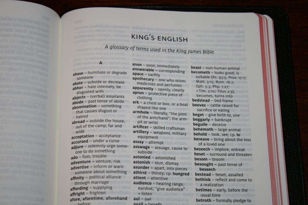
The glossary is the King’s English Glossary from Holman Publishers. It’s 9 pages with 3 columns per page and covers words that have changed meaning or are no longer in use. I’m glad this is included because many people that I talk to don’t realize that some words have changed meaning and it’s not always easy to pick up on that from the context. I see the glossary as essential for KJV’s. I highly recommend spending some time going through this glossary.
Concordance
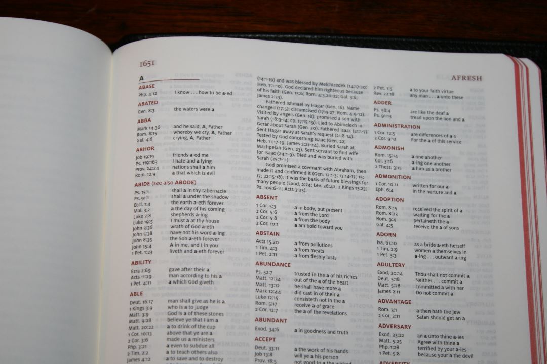
The concordance is 43 pages with 3 columns per page. It’s actually more than just a concordance. It has biographies of key people and includes Scripture references for key events in their lives. This is very helpful for study.
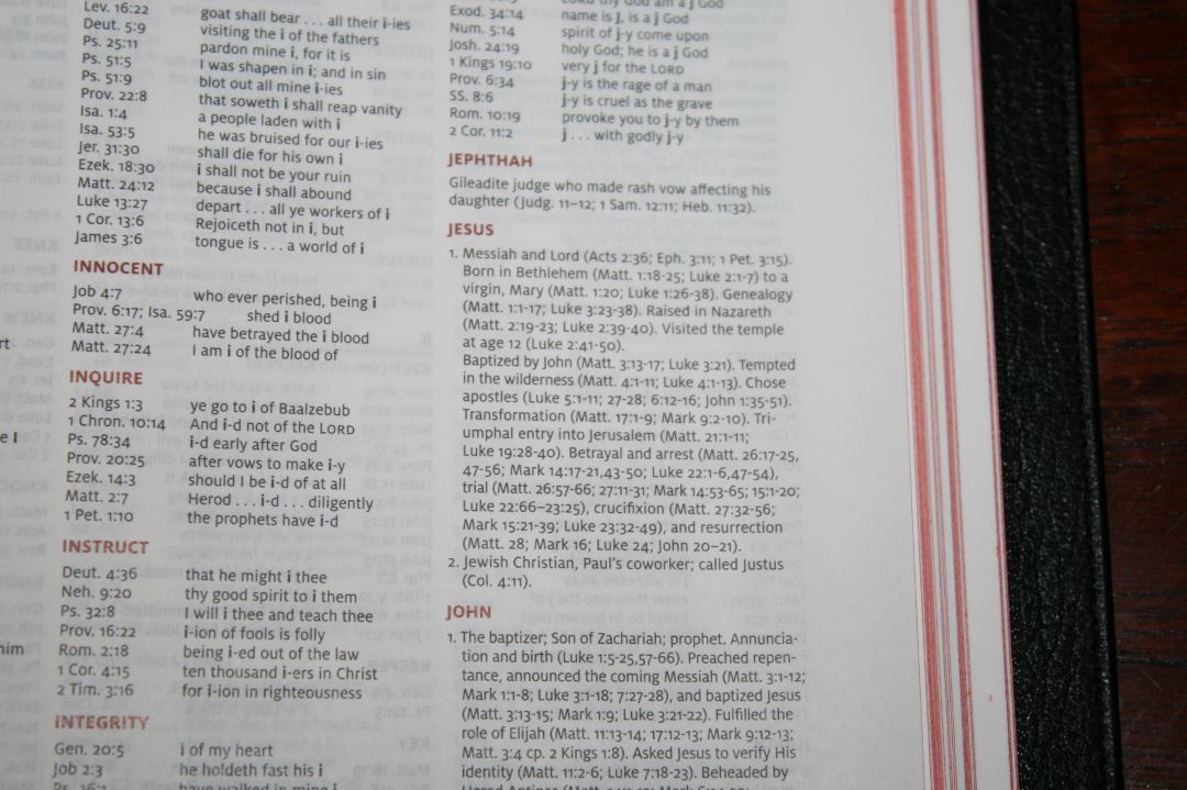
The entries are in red. The concordance uses the same small font that is found in the Quentel series. It is a small font, but I do find it to be readable and I don’t use a concordance enough to want it larger. If it were larger that would just add to the bulk of this already large Bible.
Here are a few example entries with the number of references for each one to help you compare:
- Christ – 6
- Christian – 3
- Faith (see also Faithful, Faithless) – 40
- Faithful – 26
- Faithless – 2
- God (see also Gods) – 40
- Godhead – 2
- Godliness – 5
- Godly – 4
- Gods – 7
- Praise – 7
- Pray (see also Prayer) – 17
- Prayer – 12
Maps
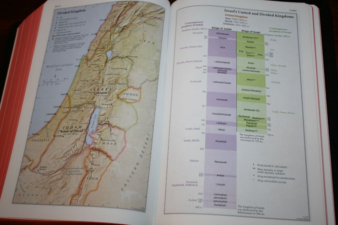
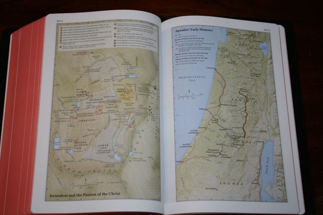

It has 12 maps and a 3-page index to maps. The maps and the index are printed on slightly thicker paper than the text. They are colorful but not overdone. These are my favorite colors for maps. They’re also annotated well. They include borders, cities, distance, topography, Scripture references, places of worship, capitals, water, roads, canals, seaports, ancient inscription sites, events of Jesus’ life, Apostles’ ministries, places of writings, and more.
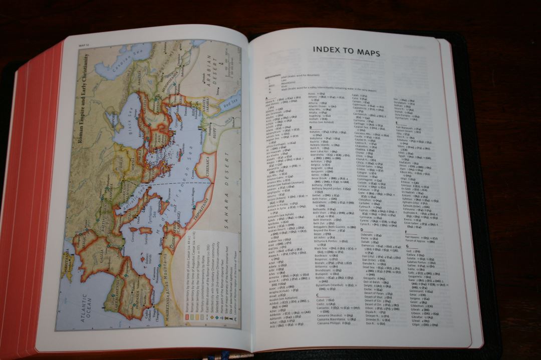
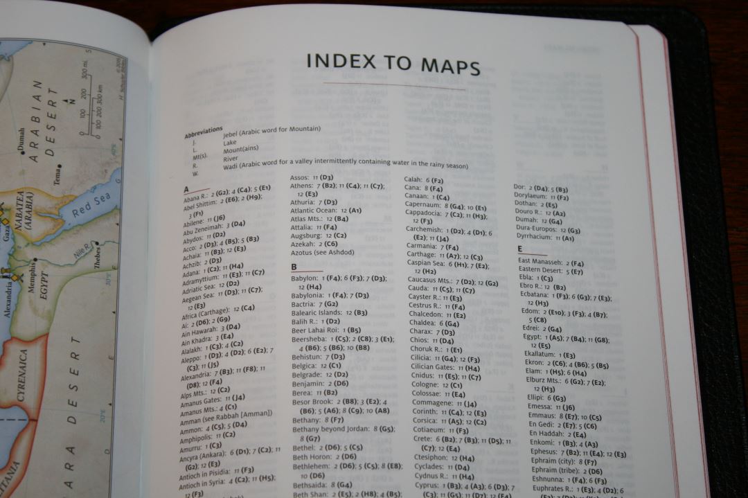
Here’s the list of maps (and one chart):
- World of the Patriarchs
- Israel’s Twelve Tribe Allotments
- Route of the Exodus
- Kingdom of Saul, David and Solomon
- Divided Kingdom
Kings and Prophets of Israel and Judah (Chart)
- Assyrian and Babylonian Empires
- Persian and Greek Empires
- Ministry of Jesus
- Jerusalem and the Passion of the Christ
- Apostles’ Early Ministry
- Missionary Journeys of Paul
- Roman Empire and Early Christianity
Ribbons
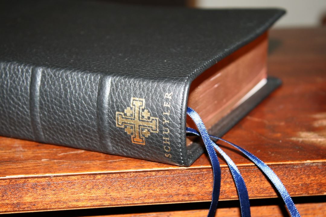
It has 3 navy Berisfords ribbons. They look and feel elegant and they’re long enough to pull to the corners to open the Bible.
The calfskin edition has 7mm Berisfords ribbons rather than the 10mm that the goatskin has. The reason for this is the calfskin is machine-bound and the 10mm doesn’t fit in the machine. I’ll admit that I contemplated the brown calfskin just because of the different colored ribbons. After using it for a while I actually prefer the smaller ribbons. I find them easier to deal with if they’re on a page near the page I’m using.
Gift Box
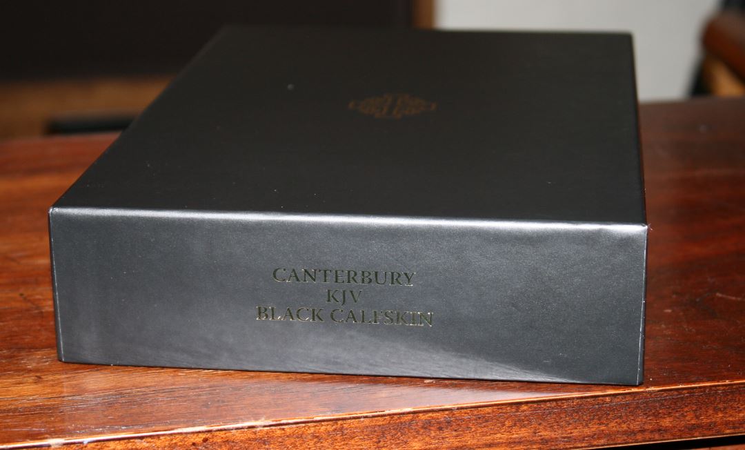
I usually don’t mention the box a Bible comes in but this one is unique enough that I have to talk about it. It’s a two piece box in black with gold printing on the top and two sides. The top has the Jerusalem Cross while the sides tell the model including the color and type of leather on one of the sides. The gold printing makes it the most elegant box I’ve seen for a Bible.
Using the Canterbury
My primary use for the Canterbury has been reading at home and preaching. Here are my thoughts on using it so far.
Reading
In my opinion, verse-by-verse and pronunciation marks are not ideal for reading, but I did find reading the Canterbury to be enjoyable. The font and paper are perfect for reading and I love the single column Psalms. The section headings do help because there are so many that they work like paragraphs. I was surprised at how easily the verse numbers are to ignore while reading.
Carry
The Canterbury is a large Bible. It isn’t quite as thick as the NKJV Quentel but it has the same footprint. It’s still large enough to feel like I’m carrying around a study Bible. It’s around the size of a Thompson Chain Reference. If that’s comfortable for you to carry around then you won’t have any issues carrying this one. I had no trouble carrying it and I even read from it in the car with no issues. However, I do prefer to carry smaller Bibles, so I’ll probably leave the Canterbury at home for our shopping trips.
Study
Material to help in study includes cross references, glossary, concordance, and maps with an index. The concordance is especially helpful because of the biographical information of key people. There are enough references (55,000) to get your started in study or sermon prep, but you’ll need other resources if you want more depth. I would like to see a table of weights and measures added. It’s probably enough for most beginner/intermediate-level study. I did end up using the Westminster to help on my New Year’s sermon.
Preaching
I’ve found the Canterbury to be an excellent Bible for preaching because the font is dark and sharp and the reference keys are so small that they don’t cause me to stumble while reading aloud. The pronunciation marks are not overdone. The cover stays completely open at Genesis 1, so I never had to fight with it to read from the pulpit. The text doesn’t bend into the gutter. The 7mm ribbons never got in the way like 10mm ribbons have for me.
The section headings are great for giving the immediate context. This helps for teaching and preaching when you want to give a quick overview of what’s happening around the verses that you’re reading. They also help for find things quickly. They break up the page and help make the verse-by-verse layout easier to follow because they work like paragraphs.
What About the Lack of Translator’s Footnotes?
There are no footnotes in this edition. I don’t think every edition needs them (they wouldn’t really fit into the design and purpose of text-only and reader’s editions) but I do think they should be included in a reference edition. I consider the translator’s footnotes to be part of the translation and I can’t help but notice they’re missing. Even though I would like to have them included in the Canterbury, this won’t keep me from using it.
The footnotes do help with study but for reading I find them distracting. For me this makes the Canterbury better for reading than study. I think the Canterbury is still worth buying even without the footnotes and if you want them badly enough then I recommend adding them to the footer of each page. There aren’t that many and some might not make enough difference, so you might not even need them all. I plan to write those that are the most important to me.
- Here’s the list of footnotes if you’re interested: An exhaustive listing of the marginal notes of the 1611 edition of the King James Bible
If you don’t want to write the footnotes and you still want them, then I would recommend the Schuyler Classic KJV (Schuyler’s edition of the Westminster). The Westminster is still a good choice and I don’t see the Canterbury as a replacement because they both serve a different purpose. If it’s one or the other then here’s how I would choose: If you prefer footnotes, more cross references, and a larger concordance then I recommend the Westminster. If you prefer section headings within the text, larger print, and better paper then I recommend the Canterbury.
Comparisons

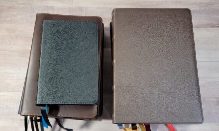
From the top down: Concord, Classic KJV, Longprimer, NKJV Quentel, Canterbury.
Inevitably readers will want to know how the Canterbury compares to the Quentel and the top 3 KJV’s currently on the market. Here’s how it compares with the NKJV Quentel in black goatskin, the older Longprimer (with the thinner 32gsm paper and older print quality) in brown highland goatskin, the Concord in calfsplit, and the Schuyler Classic KJV. When the Presentation Reference releases I’ll include it as well.
Concord

Classic KJV
Longprimer
NKJV Quentel
Conclusion
I’ve been into paragraph editions so much lately that I thought I couldn’t enjoy using a verse by verse layout, but the Canterbury surprised me. The Schuyler Canterbury is a beautiful Bible. Between the paper quality, readability, and calfskin that lays completely open, this is a Bible that entices me to read and use it. 2K/Demark’s design along with Jongbloed’s production has created a top-notch KJV that I will use for years to come. I highly recommend the Schuyler Canterbury in calfskin to anyone looking for a large print KJV with highest quality paper and print in an affordable price-point.
_______________________________
Buy from Evangelical Bible
_______________________________
Do you have a Schuyler Canterbury? Tell us how you like it in the comments below.


Thank you Randy so much for your time and effort in reviewing these Bibles.
Greatly appreciate it. My favorite part is the comparison pictures at the end of the review.
This Bible appears beautiful, though not for me. So many nice KJV out there atm.
I am so glad this will add to the joy of many brothers and sisters in getting the living word mixed with faith in their hearts.
For the sake of discussion concerning the Milo Font.
I have a Schuyler NKJV. This Milo Font actually hurts my eyes. I so want to like the Bible but I am an old school font person myself and have such a hard time with this font.
Even when compared to other Bibles that have 1-2 words less per line, this Milo Font still hurts my eyes.
But again to each their own and Schuyler sure has stepped up their game.
I am very curious how the hand size NASB will turn out considering they will most likely produce other Quentel Versions with the hand size as well.
Side Note- Are you going to be getting a review copy of the new Allan NKJV Single Column Text Edition?
Hi James. I’m glad you liked the review and the comparison photos. Thanks for letting me know. I can’t wait to see the hand size Quentels. I’d love to review the Allan NKJV. I’m not sure I’ll be able to get one, but it is one my wishlist 🙂
This bible is an all around disappointment. Schuyler published a KJV costing XXX.XX and couldn’t even include the translator’s notes. There are too many just to “write in”. Just browse the Psalms for example. Schuyler’s other “classic kjv” doesn’t have the words of Christ in red and has other problems. Schuyler still has nothing for my money.
You’re right Don, that is too many to write in.
Well, I am glad I spend my money on this Bible, it is a treat for me.
Thank you for this excellent review. A question – from the photos it seems the text might be tight in the gutter, towards the spine. Does it fly flat enough that his is not a problem?
Hi Steven. It does look like it would be an issue from these images. Fortunately it does lay flat enough that it’s not a problem. It has a wide enough inner margin so that it’s usable out of the box and it flattens out a little more with use.
Great review. Thank you. I have the very Bible you’ve presented on the way at the moment. Do you know if there are any plans to release a red letter version later on?
Thanks Andy. Unfortunately they are no current plans for a red letter edition. Here’s the info I got from Schuyler: “We haven’t ruled out a red letter edition, but it would require some tweaking of the design, as there is already a significant amount of red on each page. It’s not in our immediate plans.”
I’ve just ordered the Canterbury a few days ago, and looking forward to receiving it. Thank you for your detailed review and photo comparisons–– very helpful. I purchased the black goatskin as there were no calfskins available. I am in my mid 50’s and the eyesight isn’t what it used to be. The paper quality, font size and layout were a big selling point for me. As a pastor, I may even use this in the pulpit. But, that’s a wait and see. This will be my first Schuyler, and I have high hopes based on the majority of what I’ve read about it. Thanks again for an outstanding review. Blessings.
That’s excellent! I’m sure you’ll like it. I use mine in the pulpit and I find it one of the most readable Bible’s I own.
Dear Randy:
It has been a while since I have been on the website, I’ve been really sick, nearly lost my leg, and spent 6 months in the hospital, obviously the Lord wasn’t ready for me to go home yet, and I’m beginning to get back into living again.
Looking at this fine new bible and your review, I am a little puzzled as to why it was produced. From what I can see, Cambridge’s Concord has every feature that this one has, and some that this doesn’t have, for instance it is available with the words of Christ in red, or not, as the buyer prefers. I find the Concord very readable, even in relatively dim light found in some sanctuaries, it is smaller and easier to handle and carry around, the Concord’s font and printing is equal or superior in my opinion, not in size but in readability. If one is looking for additional helps that the Concord or the Canterbury provide, the Westminister is superior in my view to anything of it’s kind on the market, with it’s imbedded dictionary and the huge number of cross references, and other features, to both the Concord and the Canterbury, I admit I’ve not actually looked at and handled this Bible. For me the Concord is superior and indeed the imminent version of the traditional Authorised version of God’s Word. I wish Schyuler well with this Bible, but for myself, a dyed in the wool Traditionalist, I’ll stick to the Westminister and the Concord for fullsized Bibles in this translation. Indeed the only other translation that I will use is the Douay Rheims, (I know, this, to some, smacks of Heresy) and that only for a slightly different take on different passages. I do not want in any way denigrate or belittle the Canterbury, it appears to be a fine Bible, and very attractive, but it does fall into the same niche as the Concord, and to my mind does not do the job quite so well, I may change my mind when I actually can look over, handle and read this new edition of the Bible, but I don’t believe that it will change my mind.
I just noticed that your fields for our names and e-mail addresses will not allow lowercase characters, I hope that your app will convert these.
Sincerely Yours
Don Denison
Hi Don. It’s great to hear from you again! Where the Canterbury shines is the paper and large dark font. But you’re correct – the Concord is much easier to handle because the Canterbury is a large Bible, and it’s hard to beat a Concord or Westminster. Sorry to hear about your sickness. We’ll keep you on our prayer list.
Dear Randy:
Thanks so much for the good wishes and the prayers. For a 75 year old guy I’m doing OK I guess, I still have a small wound on my foot that refuses to heal, and limits my activity, this does though, provide time to pick my music, and to read my Bibles. My Westminster is already beginning to show the wear, I suppose that is what we hope for every Bible that is out there isn’t it. The Lord has been good to me throughout the recent personal tragedies, I was sure that he was taking me home to be with him and my late wife and other loved ones, but He has made it abundantly clear that was not what He wanted. Thanks again for your kind words and prayers, I have been enjoying the new look of the website though I admit it is taking me some time to adjust to it.
Yours in Christ
Don Denison
Hi Don. I’m glad you like the new site design. I still have a few tweaks I want to work on, but it will take a while. We’re keeping you on our prayer list. I”m glad you’re getting the chance to wear out your Westminster :-). I’ll probably wear mine out since we just started an in-depth study of the book of Acts. The references are invaluable.
Randy
is this another china bible
This one’s made in the Netherlands by Jongbloed.
How does the binding compare to a Local Church Bible Publishers binding? I know that LCBP has the first few pages in front and back unusable, due to the past down for the binding. Certainly no worries about those covers coming undone. Curious how the Schuyler Canterbury compares. Thanks.
Hi Roger. I haven’t seen LCBP’s paste-down linings yet. The Canterbury is built well. I haven’t had any issues with it. If I have signs of wear I’ll be sure to write a post about it.
A mention of the personal size Canterbury on the Evagelical Bible’s Facebook page! Excited! If you get the chance, please let us know of any pertinent news, Randy.
I will. I’ll be watching that one closely 🙂
Randy, Tanner here, i am curious, how much different this Bible is from the LCBP Large Print Bible? Is there much difference in the font and text block? Which one would you pick if you only could go with one?
Hi Tanner. That’s a tough one because both have things I love about them. The LCBP has a nice layout, excellent typeface and print quality, clean text, thick paper, and edge-lined calfskin. It’s less expensive too. The Canterbury has better paper, references, pronunciation marks, and section headings. If you’re looking for cleaner I’d go with the LCBP. It’s also available with wider margins if you like taking notes. The Canterbury has more clutter, but the references and section headings can be better for study and preaching/teaching. I prefer the Canterbury’s typeface but not the pronunciation marks. I also like that it has a glossary. It has better maps too. Both have a good concordance. If I was forced to choose one (and this is a HARD choice – it’s like choosing between a Ferrari and a Lamborghini – there isn’t a bad choice), I’d go with the Canterbury because paper is high on my list and I love that paper.
Hey Randy, you’re probably getting tired of my frequent commenting, but I have another question about the Canterbury before I buy one. Where does the Canterbury’s font size and darkness compare to the LCBP Large Print and other Large print KJVs (Turquoise, Longprimer) and on the same note, which one would you deem more readable or more of a joy to read?
Hi Tanner. I’ll never get tired of your comments! That’s why I started this site in the first place :-). All four of those have excellent large and dark fonts. The color, contrast, and finish of the paper has an effect on readability too, so they’ll be some differences between the editions of Longprimers (it’s available in several thicknesses of paper). Mine uses paper that isn’t available anymore and I haven’t seen the newer editions, so I won’t be able to compare with it. The same goes for the old Turquoise, CBP reprint, and the new one that’s coming out next year. The CBP is okay, but not on the same level as the others on this list.
Between the LCBP and Canterbury, the LCBP’s paper is about as opaque, but has a slight shine which will affect the readability. The LCBP has no markings in the text (which is far better for reading). It almost has too much space between the words. Both are about the same in darkness. The Canterbury is sharper and I think the typeface design is better. I prefer no markings in the text, but I still like reading the Canterbury over the LCBP. It’s the one I’d read the most.
It’s a shame they left out the translators notes, as well as the proper intro pages to the Old and New Testaments, i.e the Old and New testament translated out of the original tongues…original Greek, etc… It really takes away from the authenticity of the AV.
It would appear they were hard pressed to put the Epistle dedicatory and the translators to the readers in as well, but they wanted to sell a KJV Bible. The surveys they took from their readers, who said they wanted those included, must have been too many for them to ignore.
The other issue is the “Jerusalem cross.” This should have been left out and the other things stated above included instead. Symbols always carry an exoteric meaning, as well as an esoteric meaning.
“Thou shalt not make unto thee any graven image, or any likeness of any thing that is in heaven above, or that is in the earth beneath, or that is in the water under the earth…”
We don’t need symbols to enhance our faith and walk with the Lord Jesus Christ, we need faith in the divinely preserved Word of God. Faith cometh by hearing, and hearing by the word of God. That’s the power of God to be born again through faith in the death and bodily resurrection of the Lord Jesus Christ by the incorruptible Word of God, and from there to be conformed to the image of Christ through daily sanctification.
I recently got a 36 GSM Schuyler Canterbury in firebrick red goatskin in a trade and absolutely love it! The thickness doesn’t bother me like I thought it would. The same goes for the self pronouncing text. It’s a great Bible. It makes an excellent companion to the Personal Size Canterbury. I do wish that Schuyler would bring the Firebrick Red colorway back.