
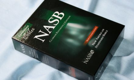
The Zondervan NASB Giant Print Thinline Bible presents a highly readable New American Standard Bible Comfort Print text in a low-cost edition that’s thin enough to be easy to carry and use. The verse-by-verse setting is a great choice for study, teaching, and preaching. It’s available in bonded leather and several imitation leather covers. I’m reviewing the bonded leather edition, ISBN 9780310451075, made in China.
Zondervan provided this Bible in exchange for an honest review. I was not required to give a positive review, only an honest one. All opinions are my own.
_________________________________________________________
This book is available at (includes some affiliate links)
and many local Bible bookstores
_________________________________________________________
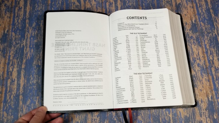
Table of Contents
Video Review
Cover and Binding
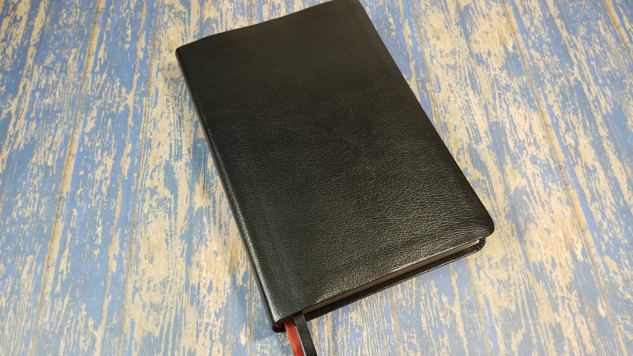
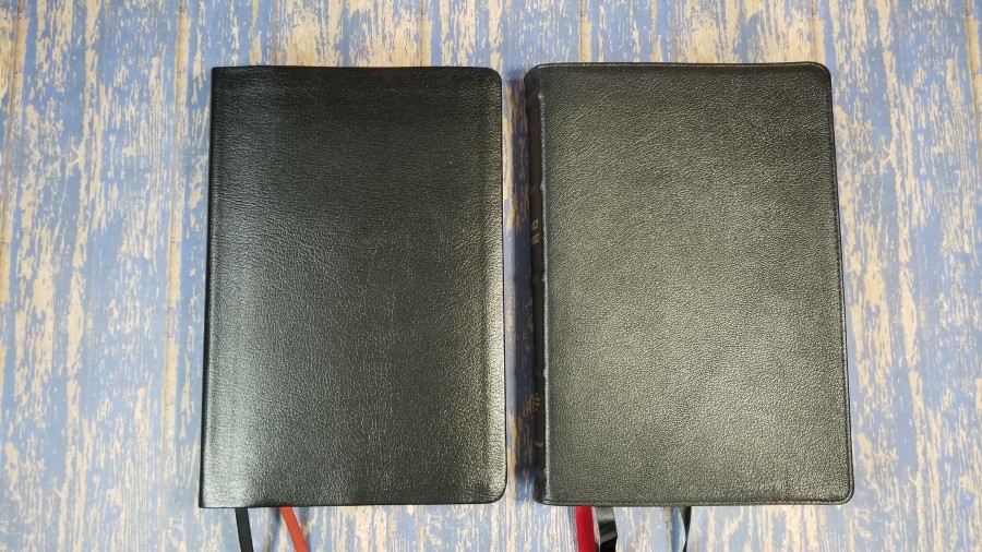
The cover is black bonded leather. It has a pressed grain. The cover is thin and fairly stiff. This isn’t the kind of cover that would last for years, but it’s great for its price and it’s a good choice to take along anywhere you don’t want to risk taking a more expensive Bible. It will need to be used for a while before it will stay open in the first few chapters of Genesis. Mine has greatly improved since I first started using it.
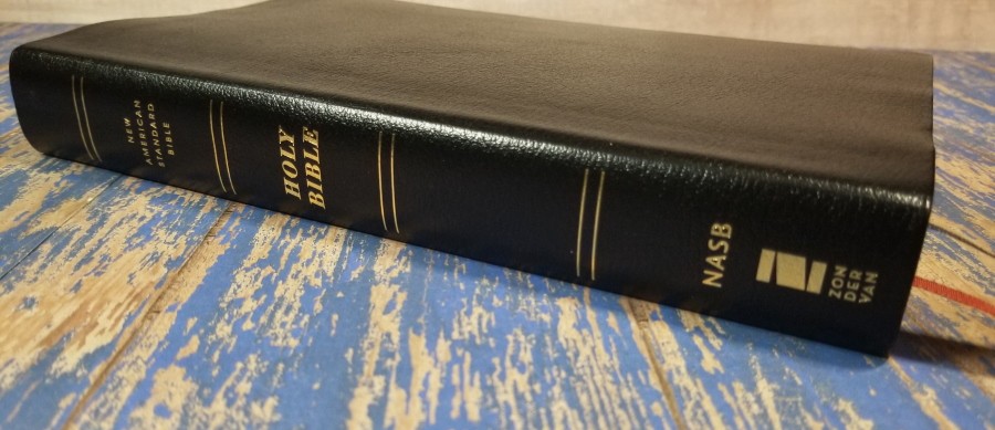
There is no printing on the front. The spine has HOLY BIBLE, New American Standard Bible, and the Zondervan logo printed in gold.
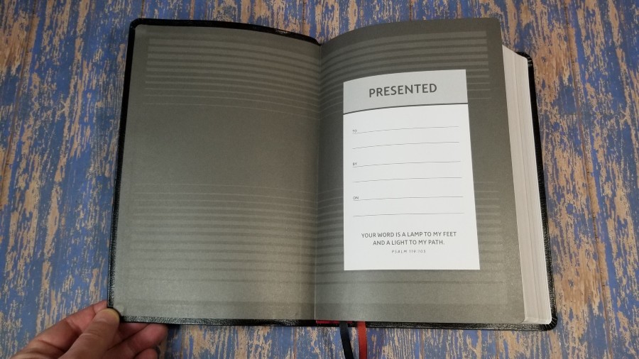
It’s Smyth-sewn, so the text-block should outlast the cover. The liner is paper and doubles as the presentation page.
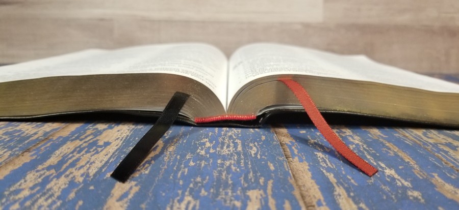
It has two 1/4″ satin ribbon markers: one black and one red. The ribbons are extra-long and are easy to use. It also has red head/tail bands. The overall size is 6.5 x 9.625 x 1.25″. It weighs 2 lbs, 1.6 oz.
Paper
I’m not sure of the gsm, but to my fingers, it seems to be in the low to mid 30’s (but that’s just a guess). It’s off-white in color and has a slightly rough texture that makes it easy to separate to turn. It does have some show-through, but it’s better than many Bibles I’ve seen in this price range and it isn’t bad enough to keep me from using it. It has no glare under direct light.
Typography
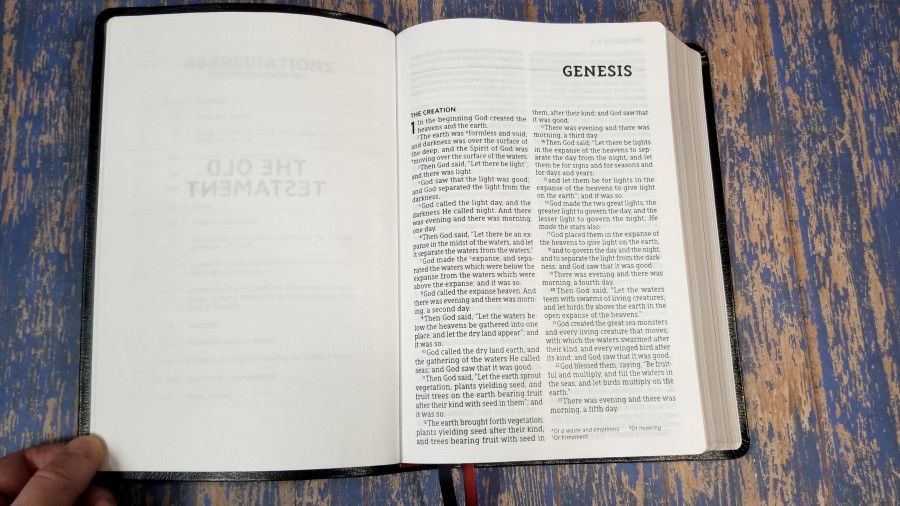
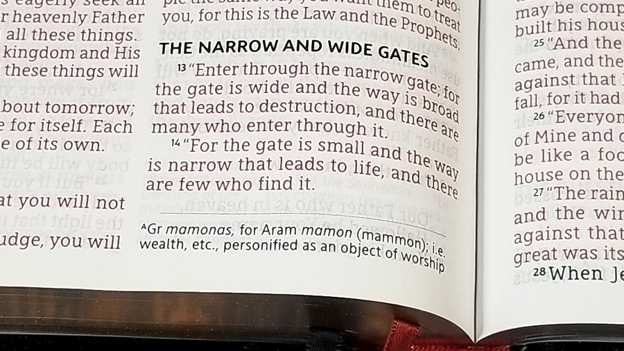
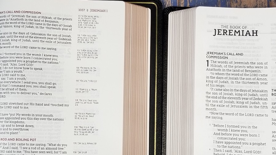
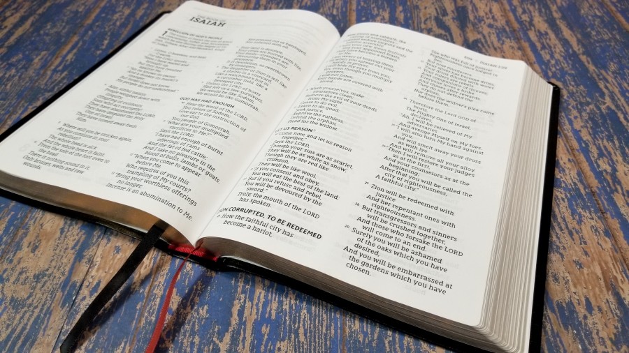
The text is presented in a double-column, verse-by-verse format with poetry is set to stanzas, lists look like lists, and the letters in Acts are indented. The header includes the page number, book name, and chapter number. The page number and the book name are separated by an icon. The footer shows the translation notes under the last verse on the page. They’re separated from the text with a line. Section headings are bold in all-caps.
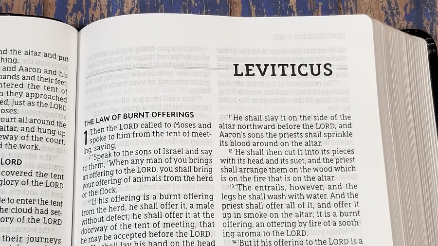
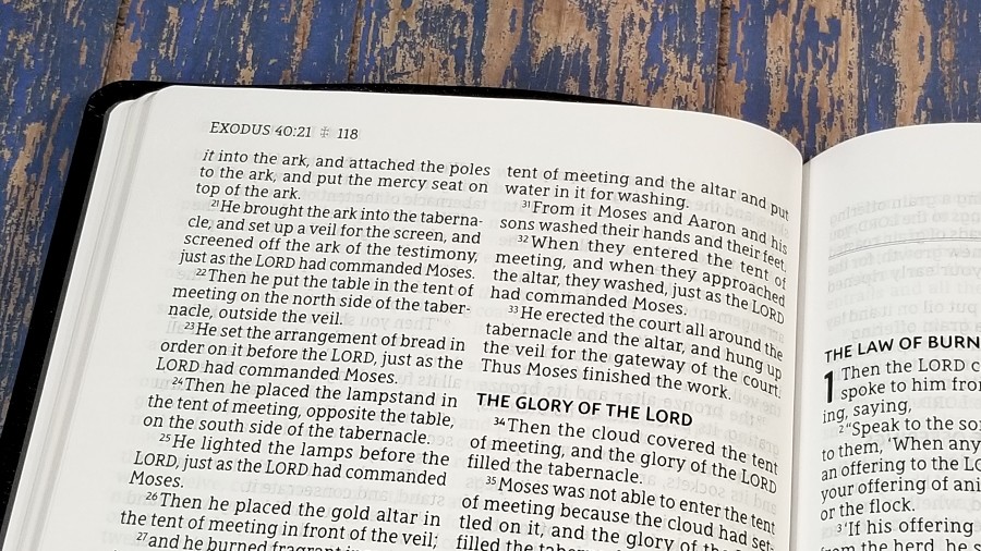
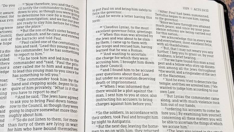

The typeface was designed exclusively for the Zondervan NASB by 2K/Denmark. It’s 12-point and it’s red-letter for the words of Christ. The print for black and red is dark and consistent throughout. It has around 8 words per line. It’s line-matched, meaning the lines on both sides of the page are printed in the same place on the page to improve readability.
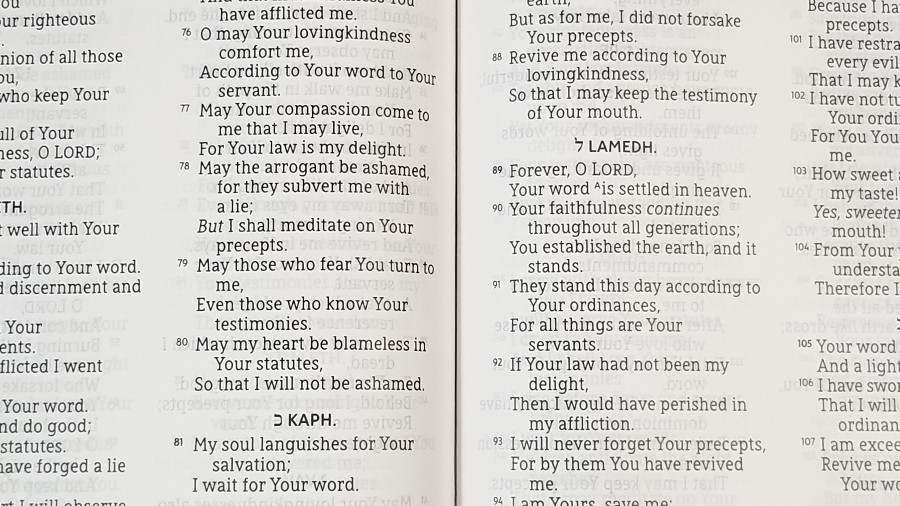
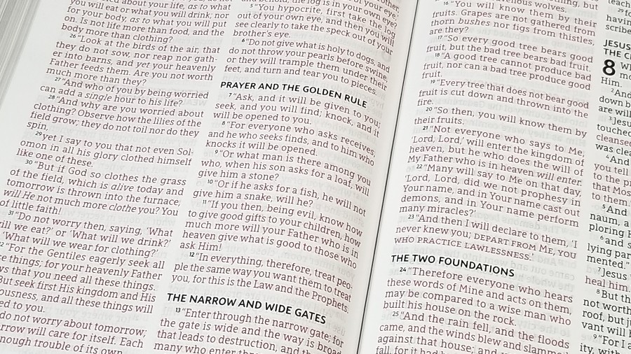
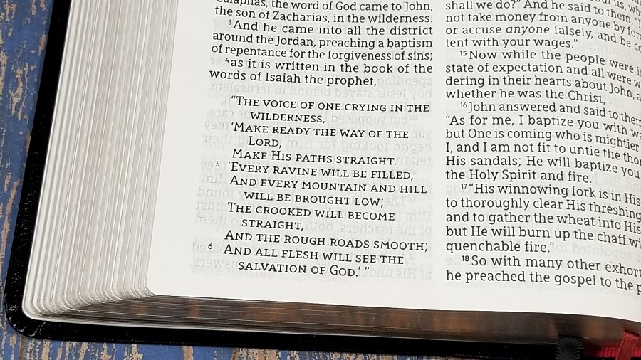
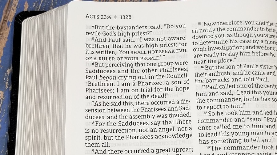
It places Old Testament quotes in the New Testament in all-caps, supplied words in italics, footnote keys in upper-case letters, and the verse numbers for the start of a paragraph are bold. Words in Greek that are historical presents that have the English in the past tense are marked with asterisks. Anything that doesn’t appear in the Critical Text is in brackets.
The translation footnotes are the reduced set that Zondervan uses. They include insights into alternate renderings, the meaning of words, weights and measures, manuscript notifications, etc. I find them helpful for study and I’m glad they were included.
Extras
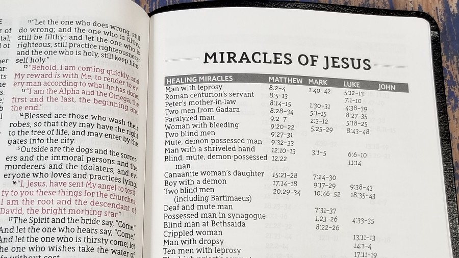
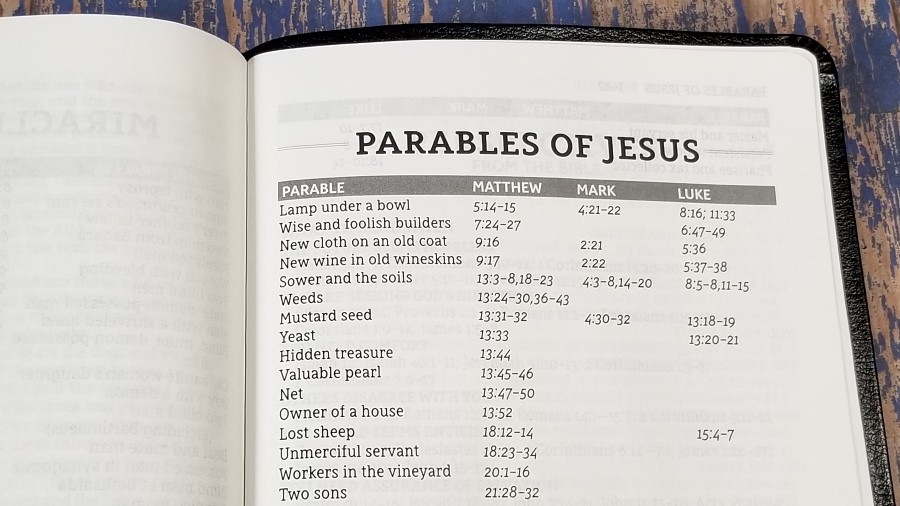
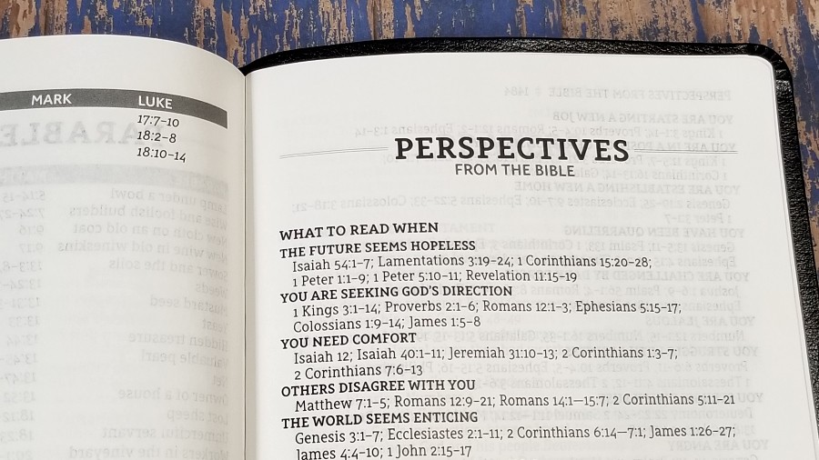
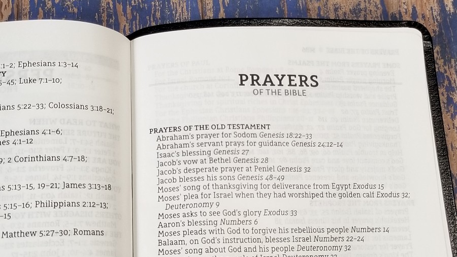

In the back is a section with several lists of Scriptures for different topics. They’re simple, but I do think they’re helpful to get you started on study or sermon prep. They’re good for a quick reference. Most are a single page. They include:
- Miracles of Jesus
- Parables of Jesus
- Perspectives from the Bible
- Prayers of the Bible
- Promises from the Bible
Comparisons
Here’s how the NASB Giant Print Thinline compares with several other NASBs from Zondervan.
NASB Preacher’s Bible
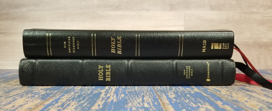
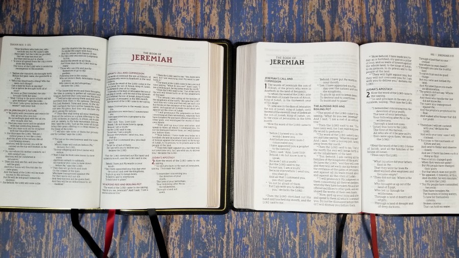

The NASB Preacher’s Bible is an edition in the Premier Collection. It was built with higher-quality materials and is in a different price category, but I did want to show how the font size compares. The layouts are similar and it has the same footprint. The Giant Print is a touch thicker. If you want a great preaching Bible but find the Preacher’s Bible font on the smaller side, the Giant Print is a great alternative.
NASB Single Column Reference Premier Collection
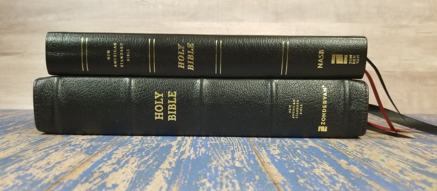
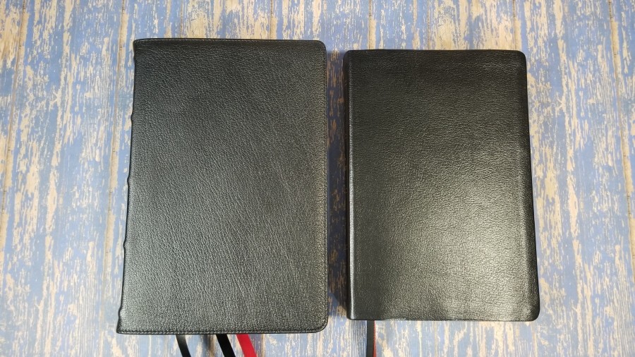
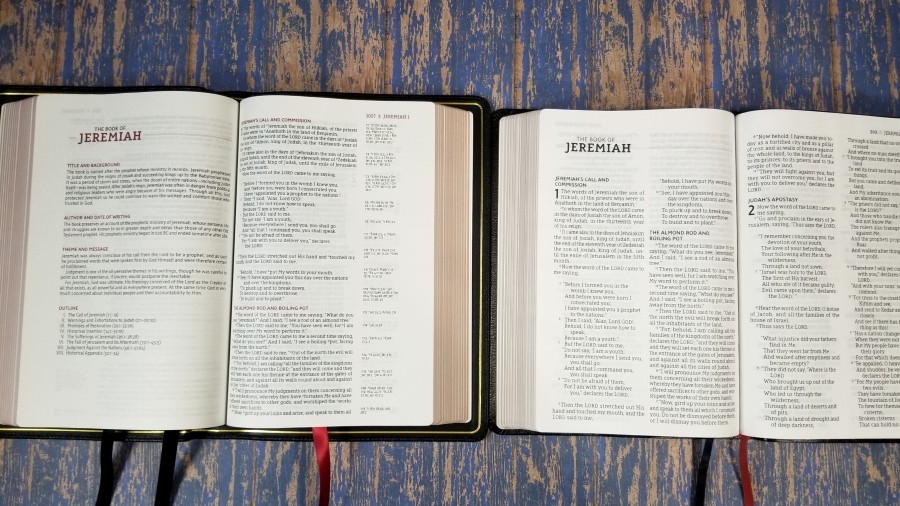
Zondervan’s NASB Single Column Reference Premier Collection Bible has about the same footprint, but it’s a lot thicker. It has a slightly smaller font, cross-references, and wide margins in the outer column. It’s a great choice if you prefer wide margins or want references.
Conclusion
The Zondervan NASB Giant Print Thinline Bible is an excellent design. I love the overall size and font size. I don’t expect the cover to last for years, but it’s a good place to start if you want to try this Bible for a while to see if it works for you. The paper is easy to turn. The show-through was slightly distracting, but it was better under certain lighting and I never wanted to stop reading it because of show-through. The font is a joy to read from. I found it to be a great option for preaching. I’d love to see this available in the Premier Collection. If you’re interested in a giant print NASB at a price that makes it easy to use and replace, Zondervan’s NASB Giant Print Thinline Bible is an excellent choice.
_________________________________________________________
This book is available at (includes some affiliate links)
and many local Bible bookstores
_________________________________________________________
Zondervan provided this Bible in exchange for an honest review. I was not required to give a positive review, only an honest one. All opinions are my own.


There does not appear to be enough demand in this class of Bible for a genuine leather or higher quality leather cover. I would also note that the Lockman Foundation’s Giant Print has a larger font size making it easir tonread even than the Zondervan.