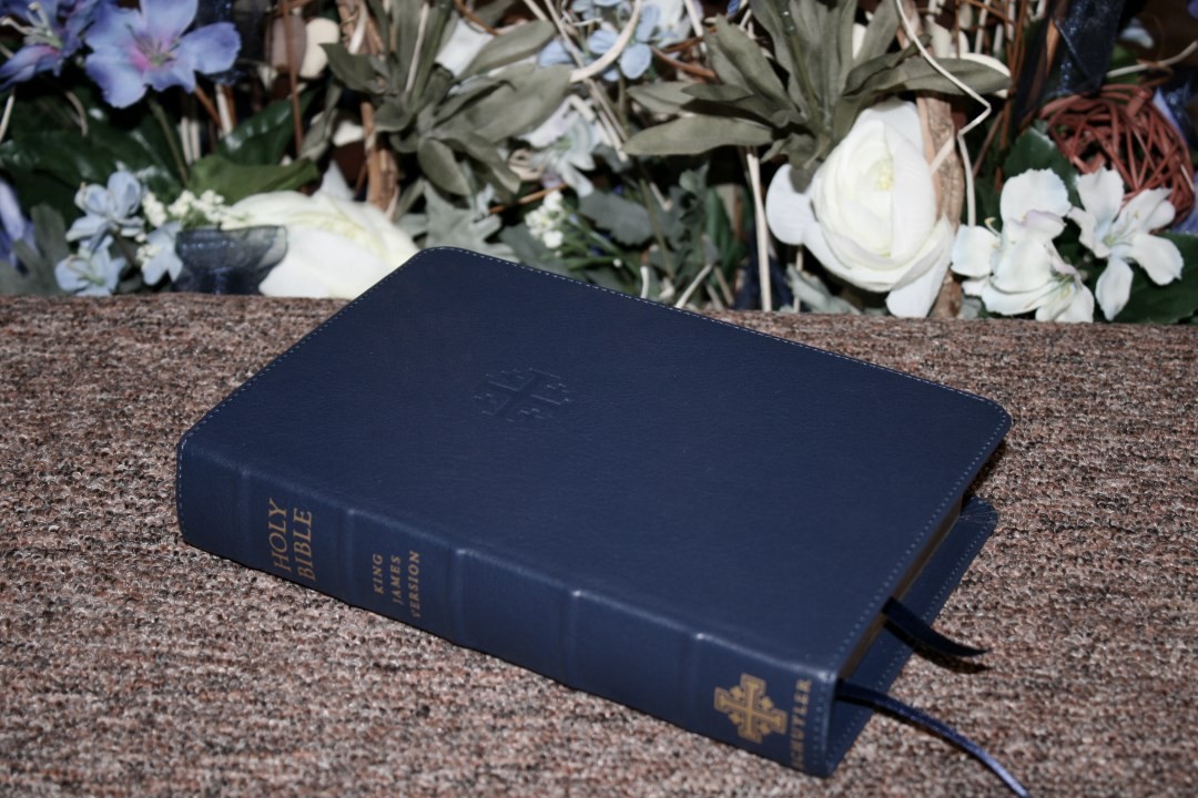
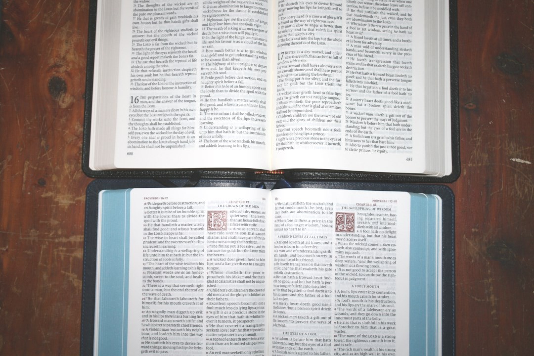
The regular size Canterbury was Schuyler’s first originally designed KJV and it was one of their most popular Bibles. It’s similar to their Quentel series but adds ornamental drop-caps and retains the verse-by-verse setting- creating a unique blend of old and new. Schuyler has now produced the Canterbury in personal size, which is a reduced version of the regular size Canterbury with a couple of differences: the Personal Size Canterbury has 28gsm Indopaque paper instead of 36gsm, it has 2 ribbons instead of 3, it has red letter for the words of Christ, the grain of the leather isn’t as deep, and it does not include a concordance. I’m reviewing the navy blue calfskin edition, made in the Netherlands by Royal Jongbloed and designed by 2K/Denmark.
This Bible was purchased for review.
_______________________________
Buy from Evangelical Bible
_______________________________
Video Review
Binding
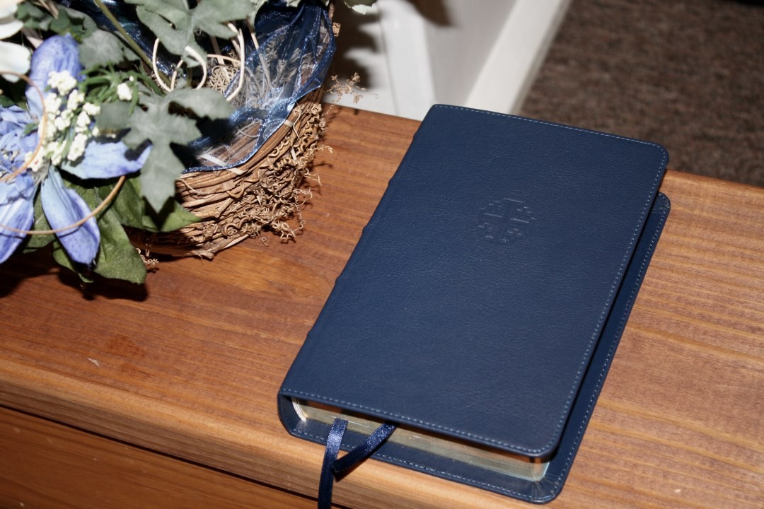
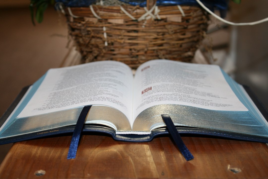
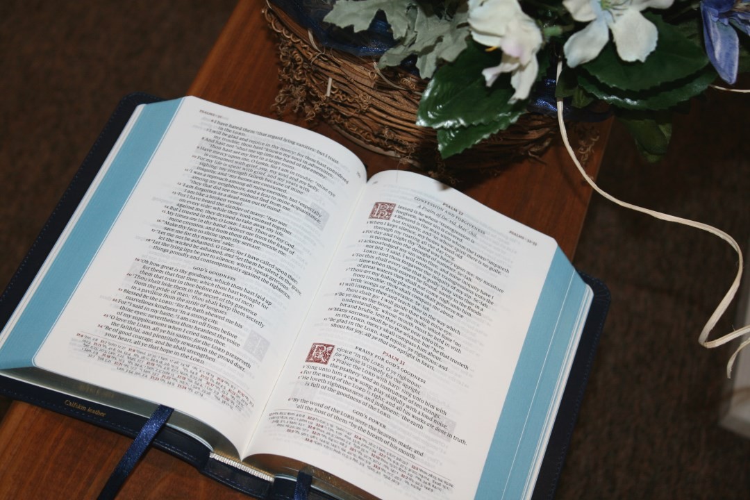
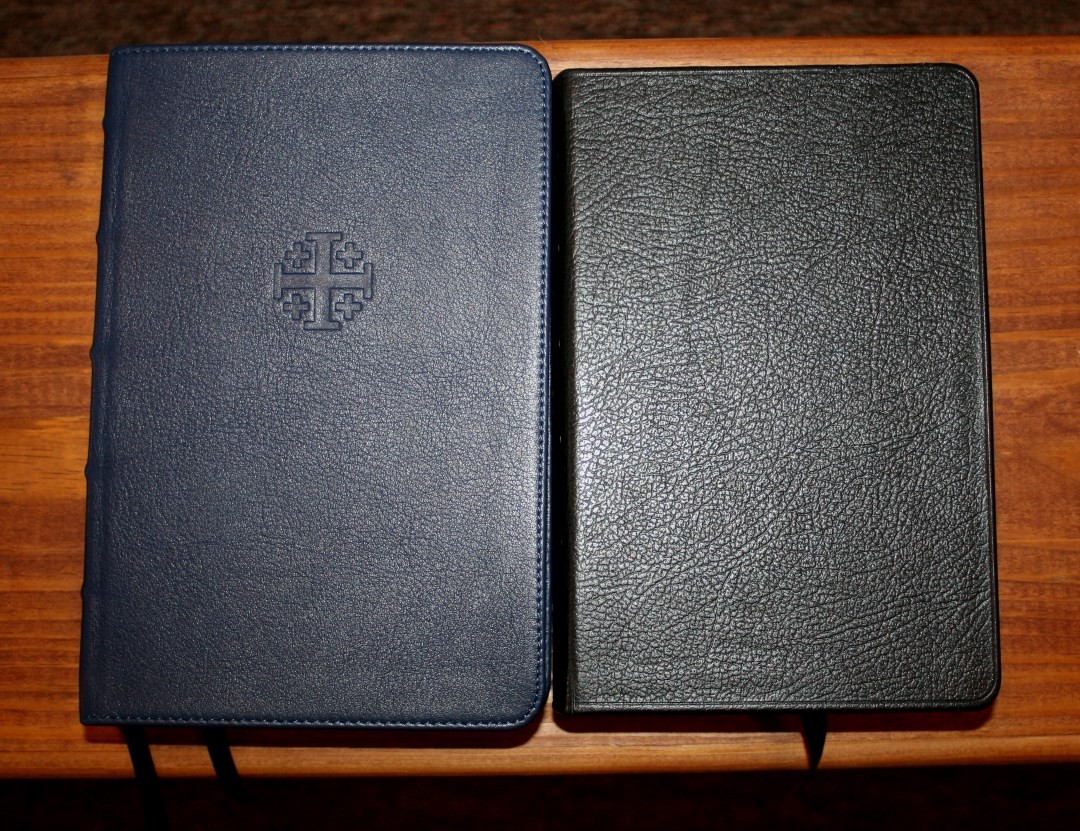
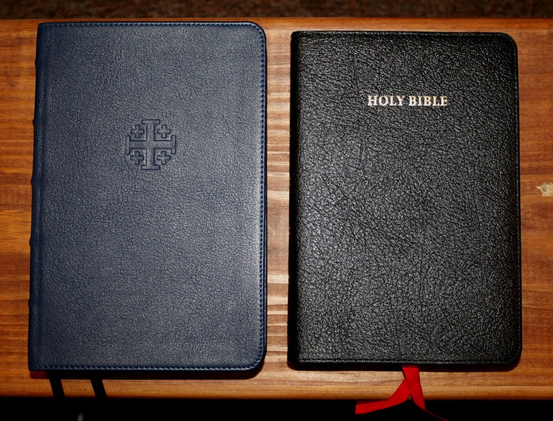
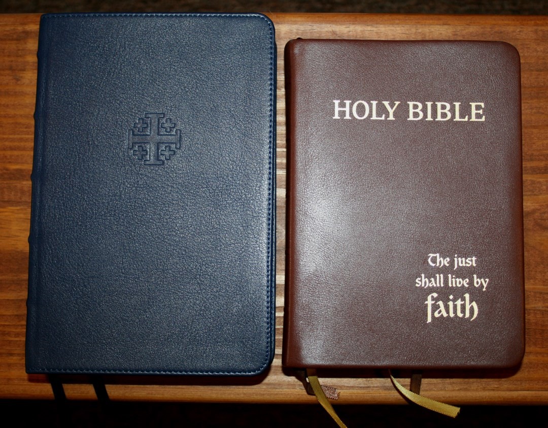
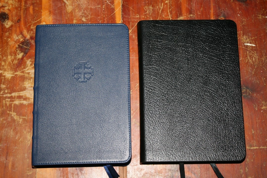
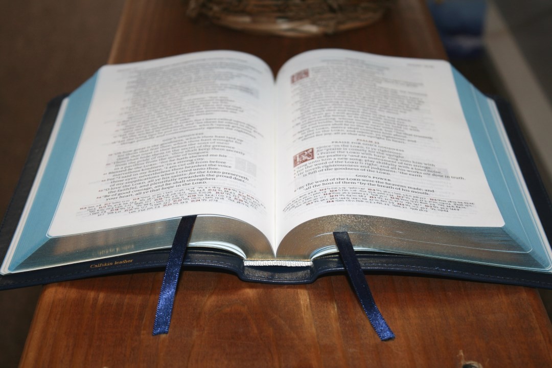
The cover is a soft navy blue calfskin. It has a matte finish and looks elegant. The grain isn’t as pronounced as my regular Canterbury. It looks similar to the calfskin leather used by Cambridge, RL Allan, and TBS but it’s a little softer to the touch. It has perimeter stitching and a paste-down liner. It has the Jerusalem Cross debossed into the front cover. The spine includes five spine ribs and the text printed in gold. The cover lays open but it might need to break in before it will stay open in Genesis. The overall size is 7.8 x 5.25 x 1.3″. It weighs 1 lb 7 oz.
It includes two blue ribbons. For me, this is the perfect size to hold while reading and for carry. This size is ideal for any use on the go, for carrying to Church, visitations, funerals, weddings, home Bible studies, study groups, etc.
Paper
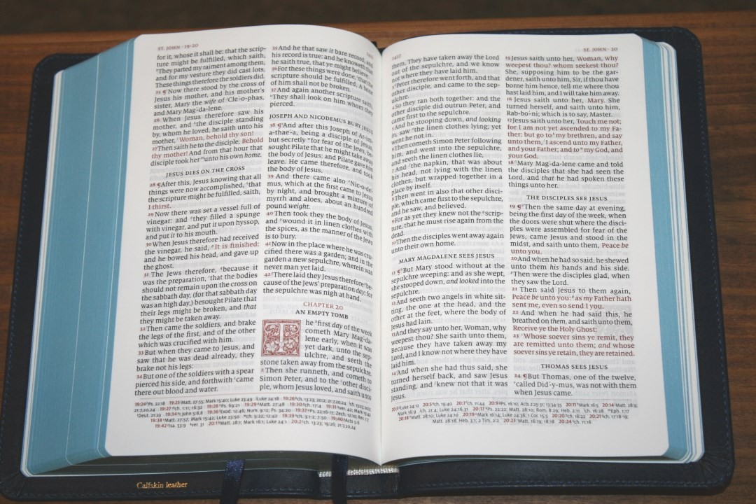
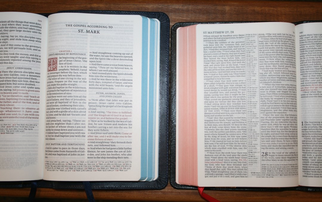
The paper is 28gsm Indopaque. It’s smooth to the touch and has a slight cream color with no glare under direct light. It’s highly opaque and it’s an excellent color for reading. I had no issues turning pages. The art-gilt is blue under gold. This is my favorite paper in the 28gsm range and I’m glad they used it to help keep this Bible thin.
It has 22 lined pages in the back for notes that use the same paper as the rest of the text. I plan to use this for notes for home Bible studies.
Typography
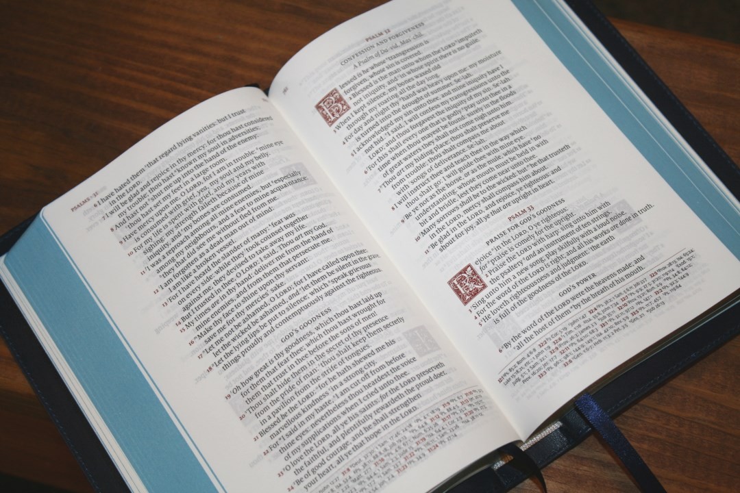
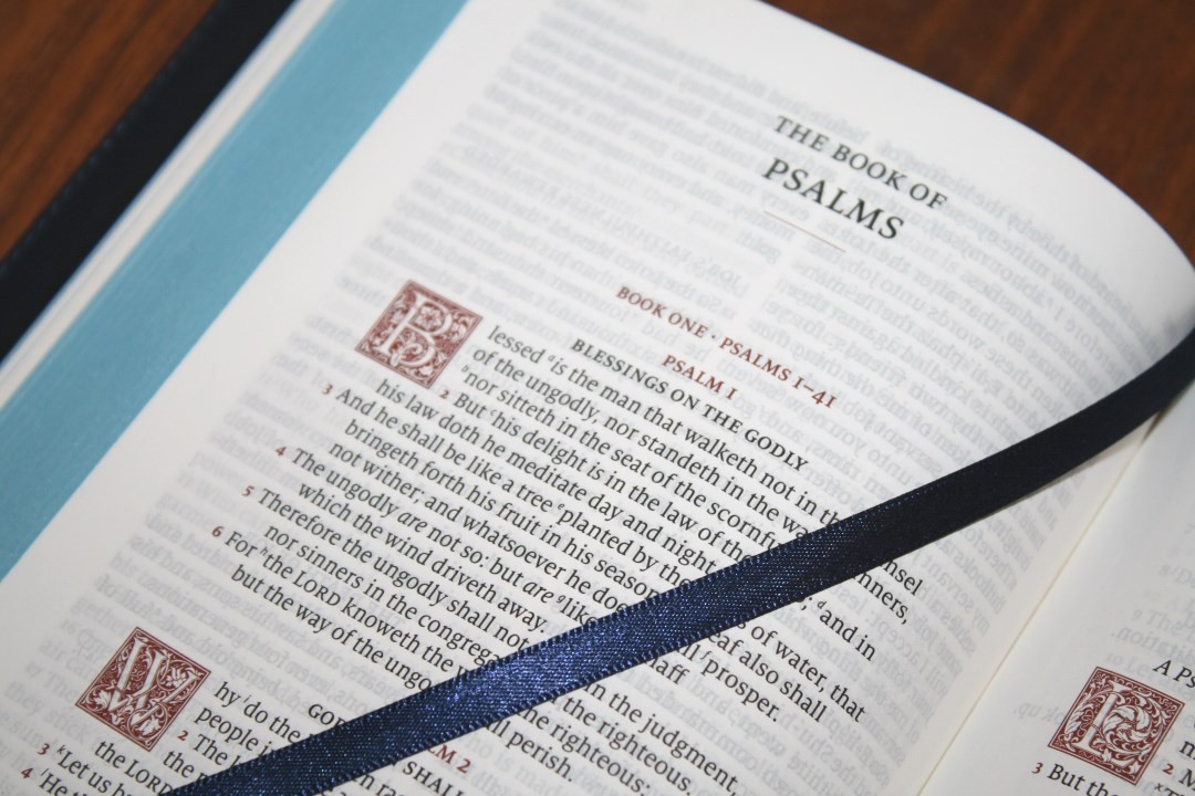
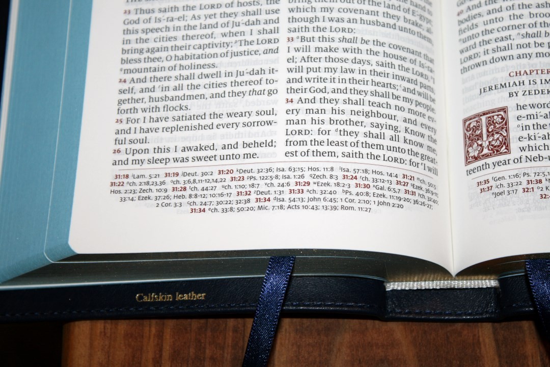
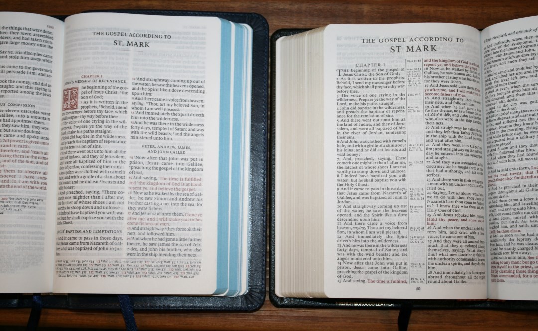
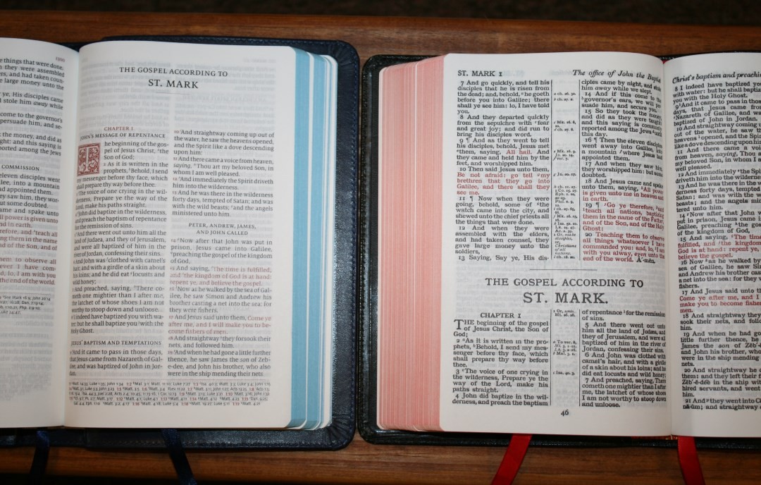
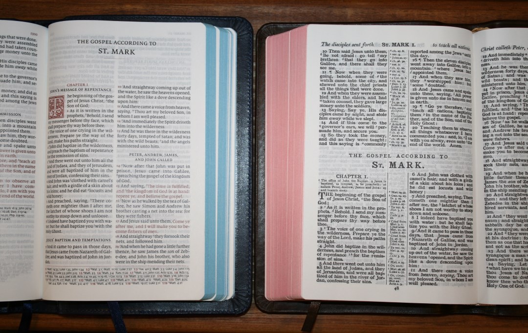
The text is presented in double column verse-by-verse format with Psalms in single column. All highlights are in a red. The header includes the page numbers in the inner margin, and the book name and chapter numbers in the outer margin. Cross references are placed in the footer and are separated from the text with a red line.
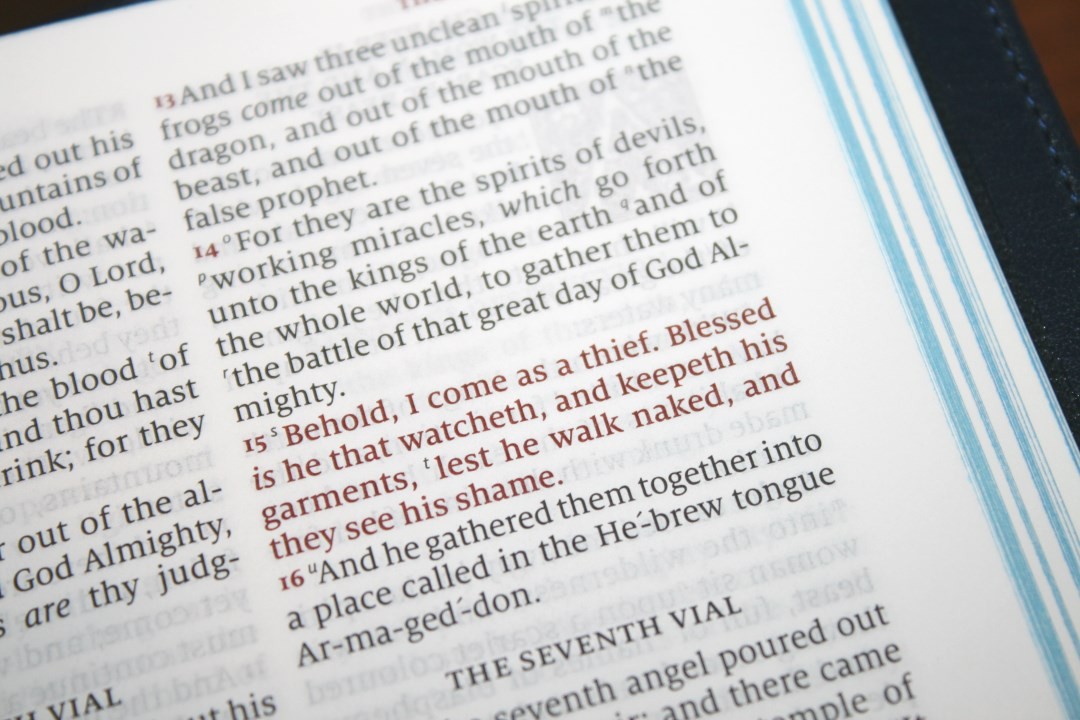
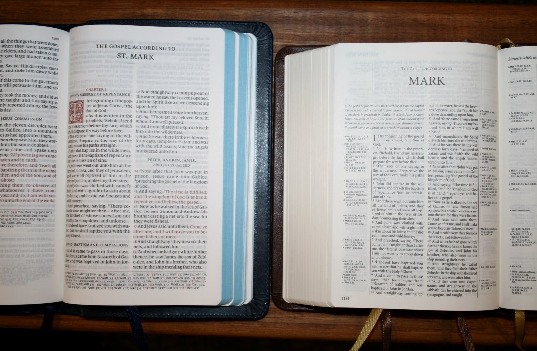
The font is 8.5-point Milo. It has a good amount of space between the lines. It’s red letter and line-matched so the lines on both sides of the page are printed in the same place on the page, which greatly improves readability. To my eye, the font and paper have the perfect contrast. It’s comfortable to read for long periods of time. I like that they used red for the verse numbers. It makes them stand out when I’m looking for them and it makes them easy to ignore when reading.
The columns have around 38 characters and 6-8 words. The words are spaced apart comfortably without any words too close together or too much space between them. Most pages have around 45 lines, although this does change depending on the number of cross references in the footer. The inner margin is wide enough to bring the text out of the gutter. The text never gets lost in the bend. Books start on a new page, which can be used for notes if you want.
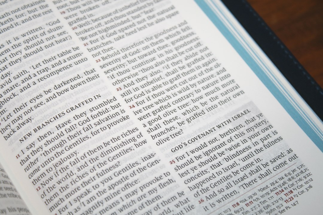
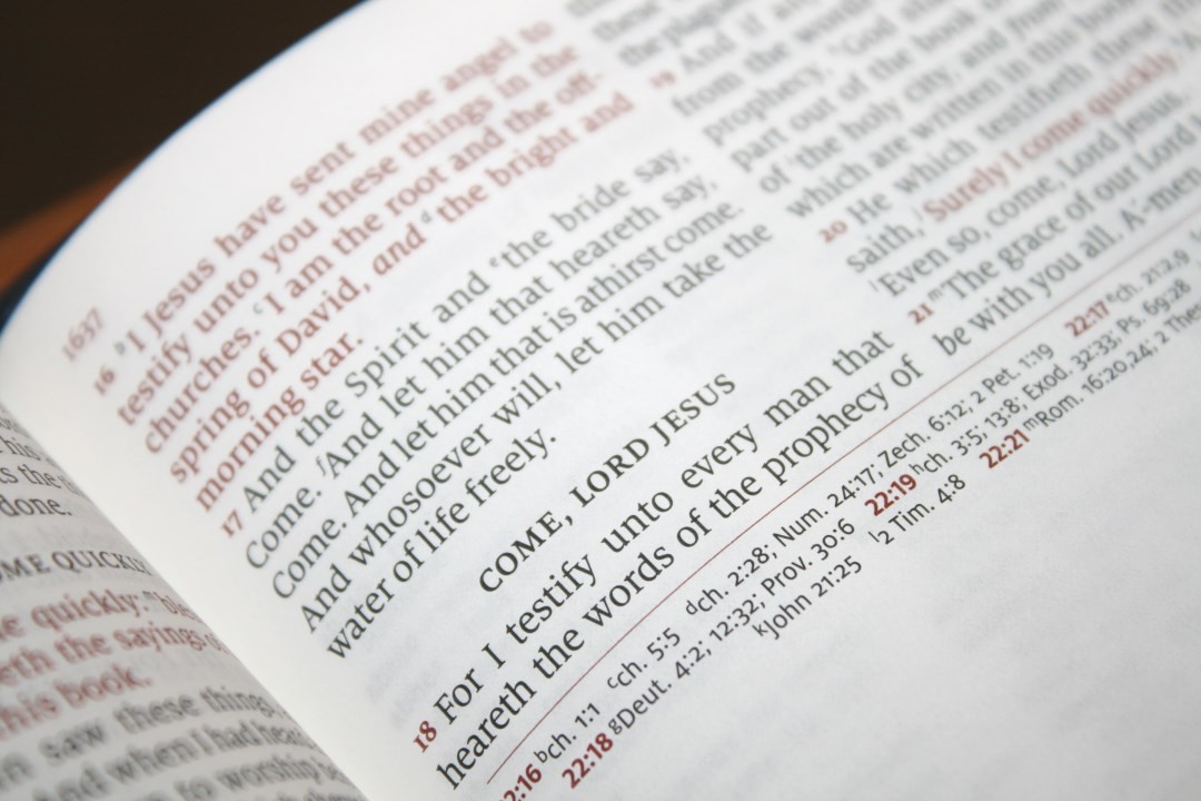
References are keyed to the text with letters. The letters are small enough to be easy to ignore but still readable at the same time. I like that cross references are placed in the footer because the text doesn’t have to share horizontal space with references, allowing for a larger font and a cleaner design.
It has italics for supplied words. It also has simplified pronunciation marks that break down the syllables and places a stress mark over the prominent syllable. They do include some common names in the Old Testament but they don’t include the most common names in the New Testament. For me, these are more useful for preaching than personal reading.
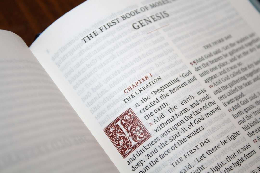
The ornamental drop-caps are he LTC Goudy Initials fonts and are printed in red with flowers, leaves, and vines. They take 5 lines for everything except Psalms, which takes 4 lines.
References
There are 55,000 cross references. They’re keyed to the text with letters and include the chapter and verse numbers in red. They are small but I still find them easy enough to read with my bifocals. The references taper toward the bottom of the page, giving the page an elegant look and grounding the page.
Here are a few verses with their references to help you compare:
- Genesis 1:1 – Jn 1:12; Heb 1:10; Ps 8:3; 33:6; 89:11-12; 102:25; 136:5; 146:6; Isa 44:24; Jer 10:12; 51:15; Zech 12:1; Acts 14:15; 17:24; Col 1:16-17; Heb 11:3; Rev 4:11; 10:6
- Exodus 20:3 – Deut 5:7; 6:14; 2 Kings 17:35; Jer 25:6; 33:15
- Deuteronomy 6:4 – Isa 42:8; Mark 12:29, 32; John 17:3; 1 Cor 8:4, 6
- Isaiah 9:6 – ch 7:14; Luke 2:11; John 3:16; Matt 28:18; 1 Cor 15:25; Judg 13:18; Titus 2:13; Eph 2:14
- Matthew 17:20 – ch 21:21; Mark 11:23; Luke 17:6; 1 Cor 12:9; 13:2
- Mark 11:23 – Matt 17:20; 21:21; Luke 17:6
- Mark 12:29 – Duet 6:4; Luke 10:27
- John 1:1 – Prov 8:22-23, etc; Col 1:17; 1 Jn 1:1; Rev 1:2; 19:13; ch 17:5; Prov 8:30; 1 Jn 1:2; Php 2:6; 1 Jn 5:7
- Acts 2:38 – ch 3:19; Lk 24:47
- 1 John 1:1 – ch 2:13; Jn 1:1; ch 4:14; Jn 1:14; 2 Pet 1:16; Lk 24:39; Jn 20:27
Glossary
It has a 9-page glossary that covers words that have changed meaning or are no longer in use. This is the King’s English Glossary from Holman Publishers. I’m glad this is included because we don’t always realize that some words have changed meaning and it’s not always easy to pick up on that from the context. A good glossary as essential for KJV’s. I highly recommend reading through it since the text doesn’t alert you to the words.
Maps
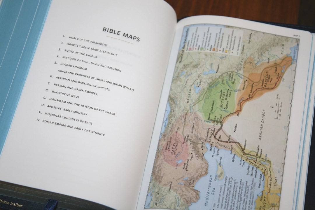
It has 12 maps and a 3-page index. They’re printed on slightly thicker paper than the text. They are colorful and look elegant. These are my favorite colors for maps. They’re annotated well and include borders, cities, distance, topography, Scripture references, places of worship, capitals, water, roads, canals, seaports, ancient inscription sites, events of Jesus’ life, Apostles’ ministries, places of writings, etc.
Here’s the list of maps (and one chart):
- World of the Patriarchs
- Israel’s Twelve Tribe Allotments
- Route of the Exodus
- Kingdom of Saul, David and Solomon
- Divided Kingdom
- Kings and Prophets of Israel and Judah (Chart)
- Assyrian and Babylonian Empires
- Persian and Greek Empires
- Ministry of Jesus
- Jerusalem and the Passion of the Christ
- Apostles’ Early Ministry
- Missionary Journeys of Paul
- Roman Empire and Early Christianity
Using the Canterbury
My primary use for the Canterbury has been reading at home, carry, and preaching. Here are my thoughts on using it so far.
Reading
Verse-by-verse and pronunciation marks are not ideal for reading, but I do like reading from the Canterbury. The font and paper are excellent for reading (unless you need large print). I love the single column Psalms. The section headings work like paragraphs. The red verse numbers are easy to ignore while reading.
Carry
The Personal Size Canterbury excels as a carry Bible. I had no trouble carrying it to read from it in the car, taking it on short trips, and carrying to Church. This is a great size for witnessing.
Study
Material to help in study includes cross references, glossary, and maps with an index. There are enough references (55,000) to get your started in study or sermon prep. I would like to see a table of weights and measures added. It’s probably enough for most beginner/intermediate-level study. I do have trouble reading the small references when my eyes are tired. It doesn’t have a concordance, so you’ll need other tools.
Preaching
I’ve found the Canterbury to be an excellent Bible for preaching. Even though the font is smaller than I prefer for preaching, it’s dark and sharp and the reference keys are so small that I don’t even notice them. The pronunciation marks are not overdone. The cover doesn’t want to stay completely open at Genesis 1, but I don’t have to fight with it to read from the pulpit. I’m sure it will break in easily. The text doesn’t bend into the gutter. The pages are easy to turn. The section headings are great for seeing the context and for finding things quickly. They break up the page and help make the verse-by-verse layout easier to follow. I’m more likely to preach from it if I preach at someone else’s Church because I like larger print for preaching, but I have no issues preaching from it.
Teaching
The size is great for teaching small groups, home Bible studies, witnessing, teaching during lunch breaks, etc. It’s a good size for teaching while holding the Bible in one hand. The pages in the back are good for outlines, notes, lists, etc.
Comparisons
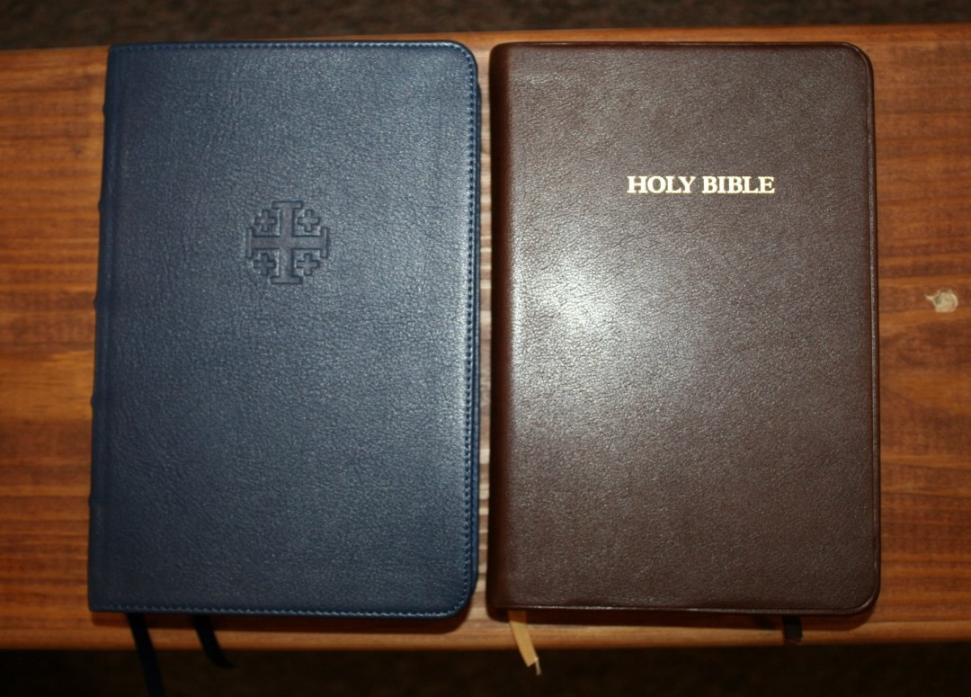
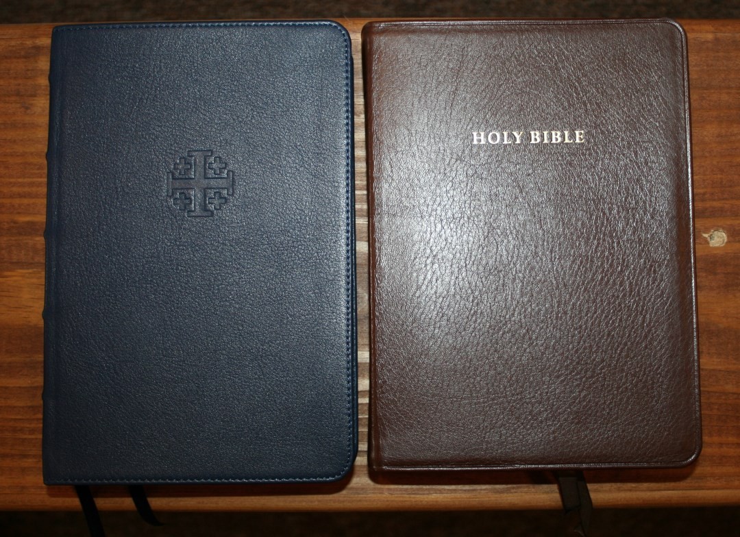
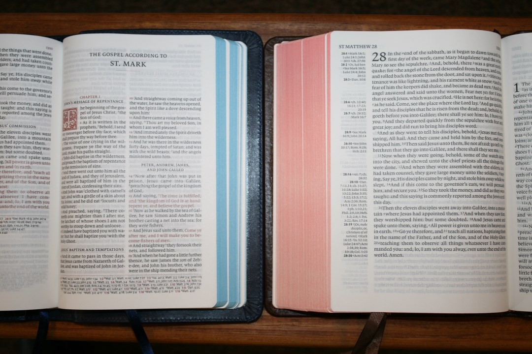
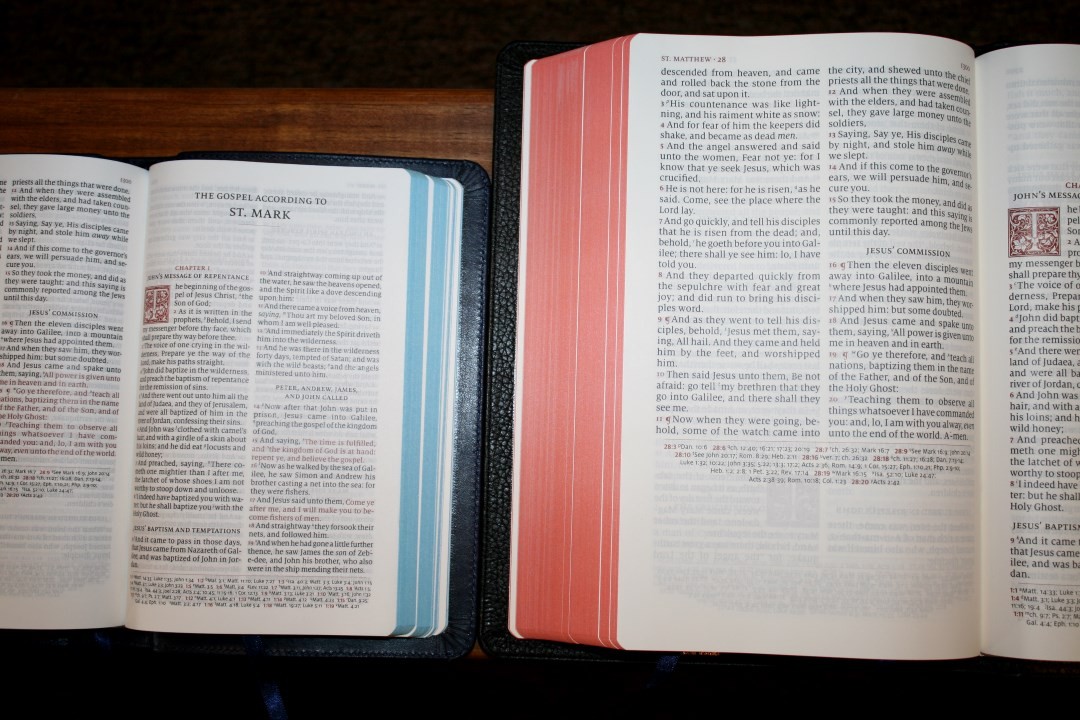
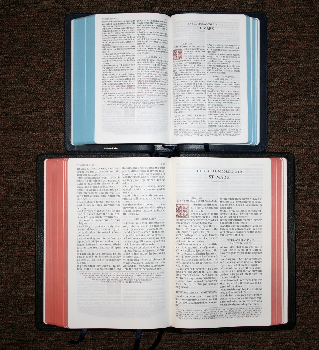
I’m comparing the Personal Size Canterbury with the most popular personal size reference editions with similar construction and materials. I’m also including the full size Canterbury so you can see the size difference.
Personal Size Concord
The Personal Size Concord is smaller. It’s still easy enough to read because of how dark the font is, but the stiff cover can make it difficult to use. It includes a dictionary, concordance, and glossary.
Cameo
The Cameo is slightly smaller and has a darker font. It doesn’t look as clean. It includes a concordance.
Brevier Clarendon
The Brevier Clarendon is the equivalent to the Cameo. It has a dark font but the paper is much thinner and isn’t as clean. It includes a cyclopedic concordance.
Compact Westminster
The Compact Westminster is smaller but also has a digital font and thicker paper. It also lacks a concordance.
Pitt Minion
The Pitt Minion is half the thickness and has a similar footprint. The font is much smaller but it’s clean and is presented in paragraph format. It also includes a concordance/dictionary combo.
Clarion
The Clarion is probably the closest to the size of the PSC. The digital font is slightly larger and the text is presented in single column paragraph. The paper isn’t as opaque. It also includes a concordance/dictionary combo.
Canterbury
The full size Canterbury has everything the PSC has, but adds a concordance, has 36gsm paper, and has 3 ribbons instead of 2. It’s large and heavy, but it’s a great choice for reading, study, and preaching. The two make a great combo.
Windsor
The Windsor is similar in size. Its paper is a touch creamier. The font styles are different, but they’re close to the same size. It does include a glossary, pronunciation guide, and reading plan, but it has no concordance, maps, or references.
Conclusion
Everything about the Personal Size Canterbury looks and feels elegant. I love the paper quality, readability, the calfskin cover, and the overall size. The lack of a concordance or translator’s footnotes might make it difficult to use for some. I’m glad that it has the glossary. I’m always impressed with 2K/Demark’s design and Jongbloed’s production and this edition is a good as any I’ve seen. I highly recommend the Schuyler Personal Size Canterbury in calfskin to anyone looking for a compact KJV with the highest quality paper and print at an affordable price-point.
_______________________________
Buy from Evangelical Bible
_______________________________
Photography by hannah C brown
This Bible was purchased for review.











I have and love the full sized Canterbury. I have used it regularly since I received it. I also now have a personal size, and for me, everything I could want is there, and it has instantly become my #1 carry everywhere, daily reading bible. I am wowed by the aspects of this bible that make it the Canterbury. It makes reading God’s word even more enjoyable than just the text.
Randy,
Excellent and thorough review. I appreciate your having taken the time to write it.
I am fortunate enough to have the Canterbury in both the full and personal sizes.
I am finding that the more I use them the more my admiration for this edition grows.
I cannot recommend them highly enough.
How does the paper compare to the cameo? Also how well does a micron pen do with bleed through with the paper?
How is the calfskin paste down holding up? Is it worth the extra money for the goatskin version?
I saw you also compared the regular size Canterbury, how does this compare in size to the longprimer? Is it as portable as a longprimer 52?
Thank you again
Hi John. The paper is far better than the Cameo. It has a smoother feel and has less show-through. Also, it doesn’t page-curl when the Cameo does.
The calfskin is holding up beautifully, but I haven’t used it as an everyday Bible. I do expect it to last many years, but I don’t think it would last as long as the goatskin.
As far as the Longprimer, I only have the 53BR. The PSC is about 1/8″ thinner, 1.5″ shorter (2″ if you count the yapp) and 1″ narrower (1.25″ with yapp).
How is the paper holding up on this bible? was going to purchase this as a take with me on the go bible, I was looking for some durability as well that’s why I ask about the paper. If you had a choice between this and the Thomas nelson Ministers bible , which would be your first choice? I have a main bible I take notes in already about the size and weight of a Canterbury, just not very portable all the time.
Hi John. The paper is holding up well. It doesn’t feel as thin to me as the gsm number suggests. It feels like it has a coating which makes it feel elegant. Between the two, I use the Personal Size Canterbury the most. I love the smaller footprint.
Thank you for the great info! that gives me more confidence. last question , do you have the goatskin version at all? I like the idea of an edge line bible for longevity and durability , but sometimes the goatskin edge line bibles make the bible to floppy and becomes a hassle to carry , in the end I’m looking for longevity between the calfskin and goatskin choices,. Not to mention the goatskin being an extra 70! I’m just hoping that the paste down holds up after regular daily use, if not I’m busting out the duck tape!
Unfortunately, I don’t have a goatskin edition. I agree with you – I prefer calfskin because they’re easier to handle. So far, I haven’t had any issues with the paste-down liners but I have to swap the Bibles around to review them, so I don’t use one as a daily-use Bible. They are built really well. I’m sure they won’t last as long as goatskin, but I do think they will last for a long time.
I am curious whether the Schuyler KJV’s use English English or American English spelling. I am assuming the former. These look like beautiful editions that will make a great addition to a collection.
It uses English English spellings. I agree. These are beautiful editions.