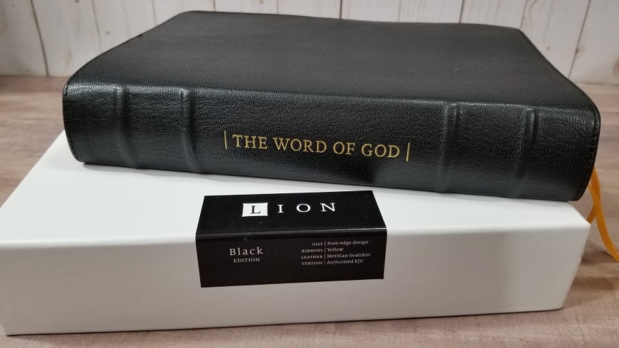
The KJV Lion is Humble Lamb’s first KJV. It follows the traditional presentation, with verse-by-verse, but places cross-references in the footer in a unique layout that makes them easy to use. It adds definitions to the page from authoritative sources. It also includes artwork from Gustave Doré and decorative drop-caps. It’s available in Sahara Blue, Forest Pine, Amethyst, and Black. I’m reviewing the black with lion fore-edge art, made in China.
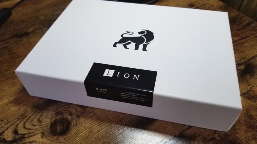
It comes in a thick 2-piece box. It feels sturdy and has a sharp design.
Humble Lamb provided this Bible in exchange for an honest review. I was not required to give a positive review, only an honest one. All opinions are my own.
_________________________________________________________
This book is available at Humble Lamb’s website
_________________________________________________________
Table of Contents
- Video Review
- Binding
- Paper
- Typography
- Definitions
- References
- Illustrations
- Concordance
- Maps
- Comparisons
- Conclusion
Video Review
Binding
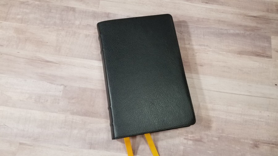
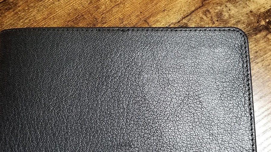
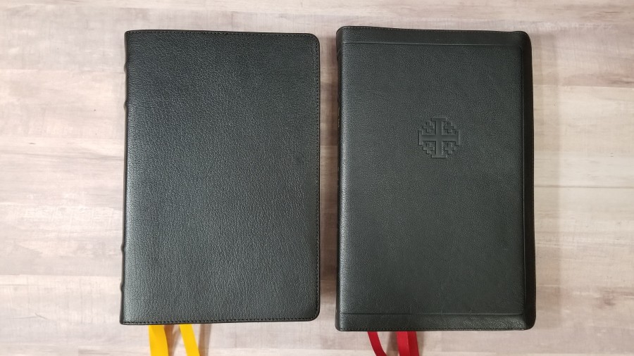
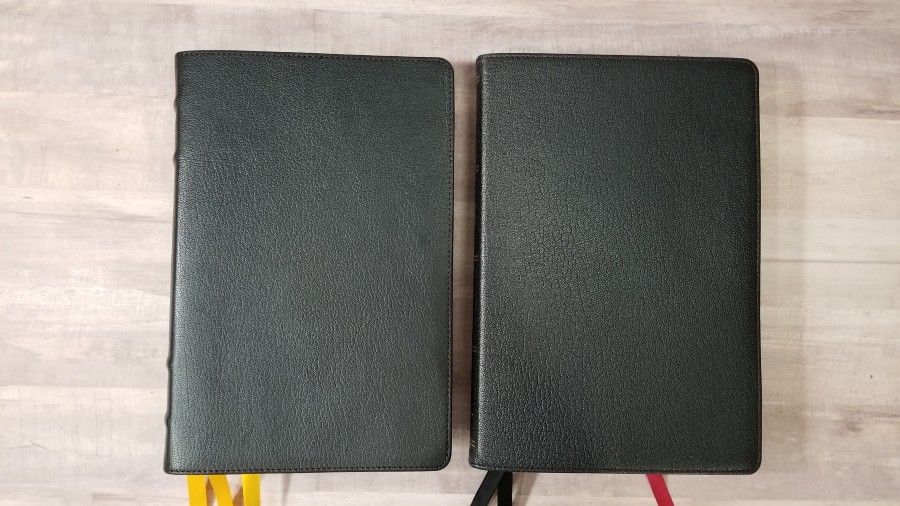
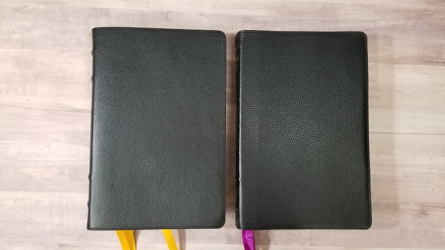
The cover is black Meritian goatskin. It has an almost smooth pebbly grain. The leather is flexible, but it feels stiff compared to other goatskin editions that I’ve seen from China. It doesn’t have a cushy sponge between the cover and liner. It has perimeter stitching.
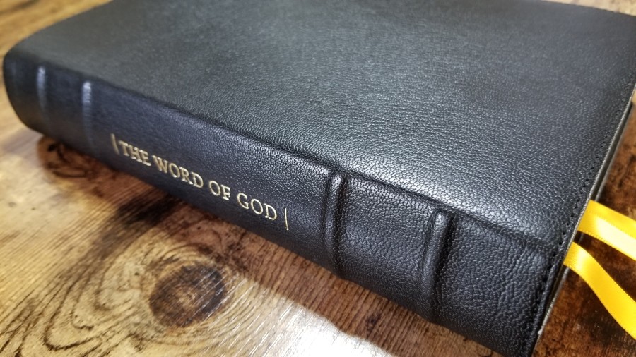
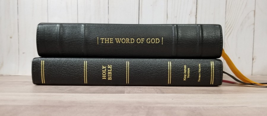
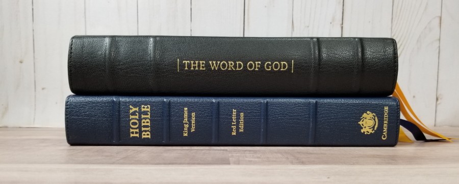
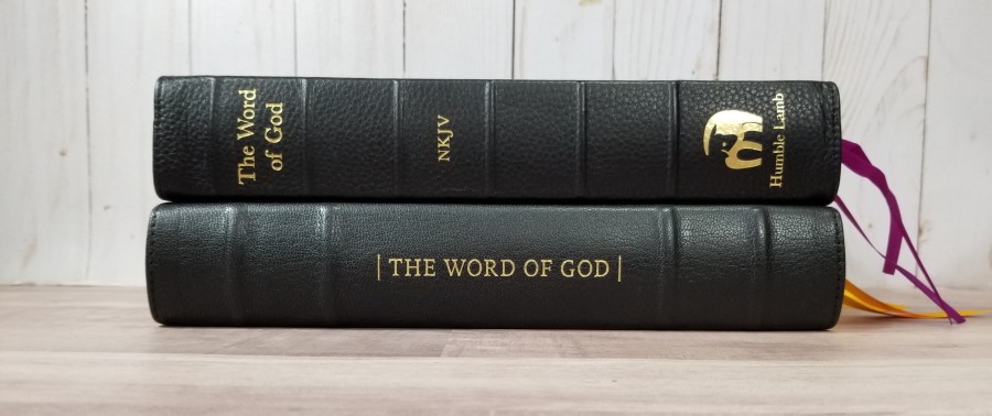
The spine takes design cues from the MacArthur Study Bible from Thomas Nelson. It includes 4 raised hubs, two that are close to the top, and two that are close to the bottom, leaving the center clear for the text. The title, The Word of God, is printed so it’s upright when the Bible is laying on the table. The title includes a verticle line on each side, all printed in gold. It doesn’t include the translation or publisher’s logo.
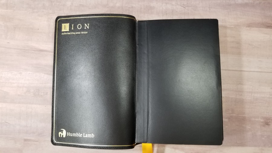
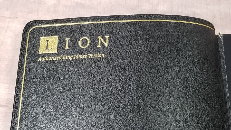
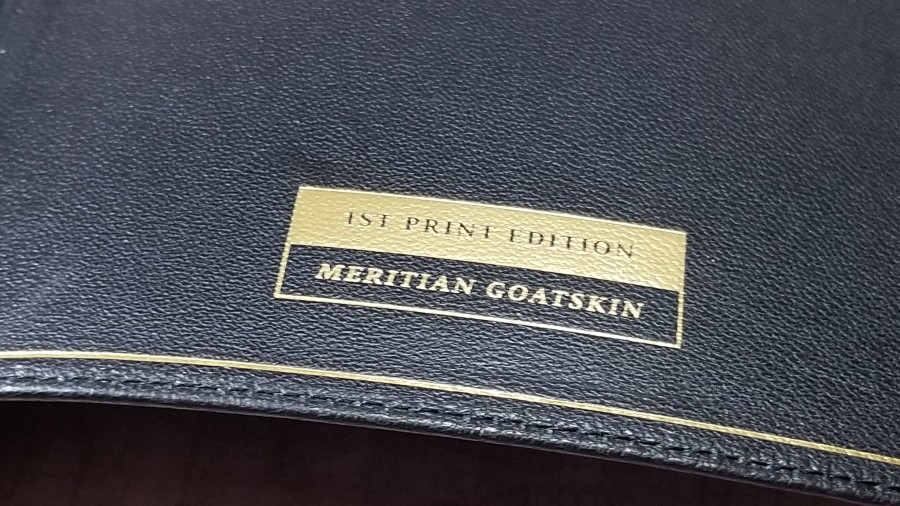
The liner is edge-lined goatskin. The liner includes a gilt line around the inside perimeter. The front includes the Lion logo at the top and the Humble Lamb logo at the bottom printed in gold. The back has a stamp that shows this is the first printing and the name of the leather printed in gold. The block is Smyth sewn. It stays open on every page, without trying to close.
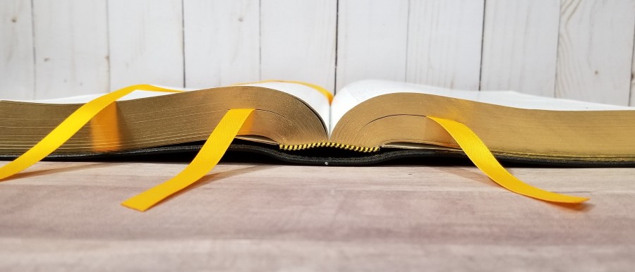
The pages for the edge-lined tab are glued all the way up. This makes the tab a little stiff. It doesn’t have a bad effect on the text-block though. It still stays open with no problems. It has 3 double-sided yellow satin ribbons. It’s a bold yellow that looks nice with the black leather. It has yellow and black head/tail bands. The overall size is 6 3/8 x 9 5/8 x 1 3/4″ and it weighs 2lbs, 15.4 oz.
Paper
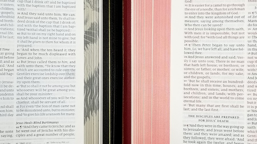
The paper is European, 36gsm. It’s similar to the paper that’s used in the Thomas Nelson Premier Collection. It’s off-white in color and it’s highly opaque. The only time show-through was an issue was when preaching from a text that had a drawing on the other side of the page. That made the page gray. The texture is the right amount of roughness to be easy to separate and turn with one hand. At the same time, it still feels elegant. This is some of the easiest paper to turn that I’ve used.
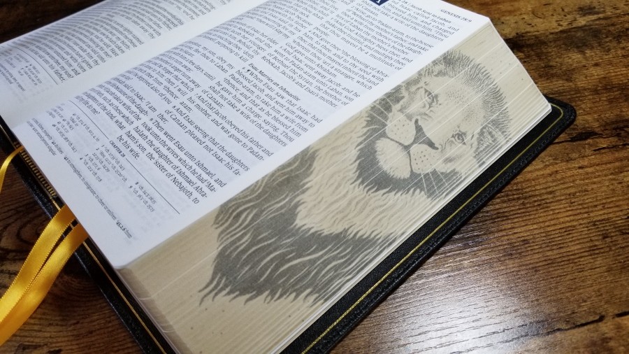
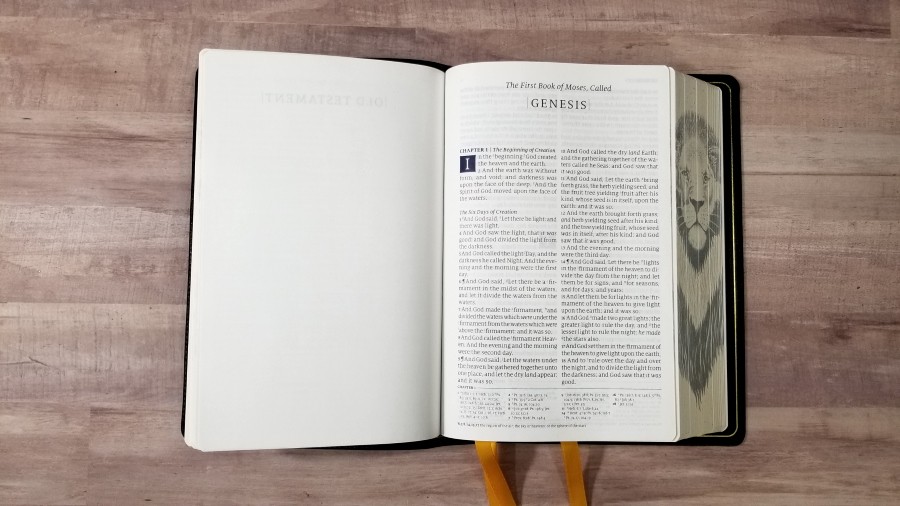
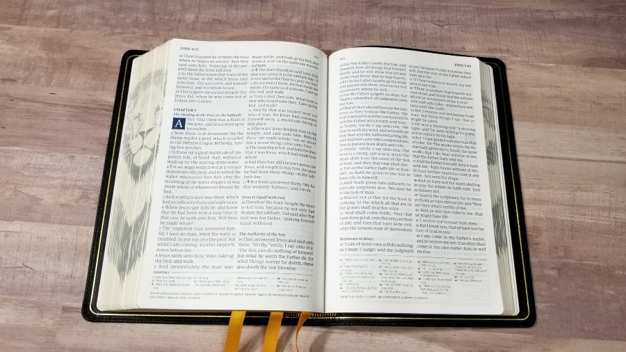
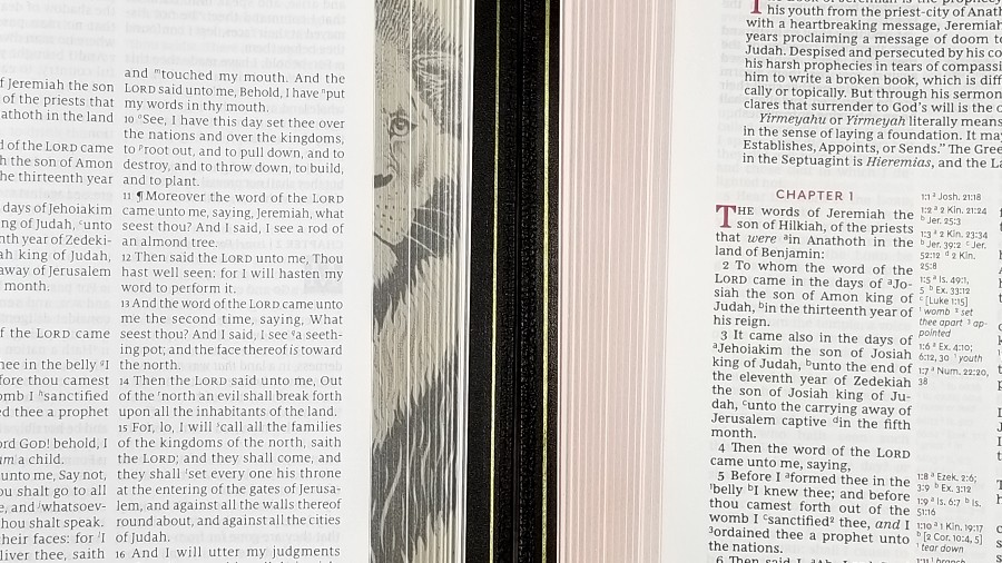
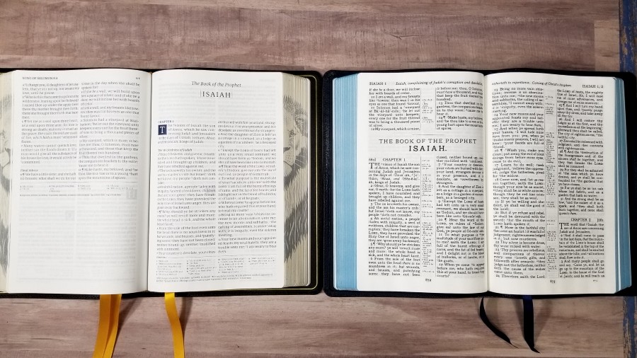
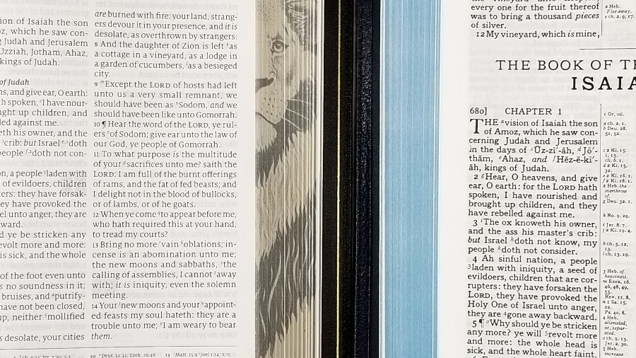
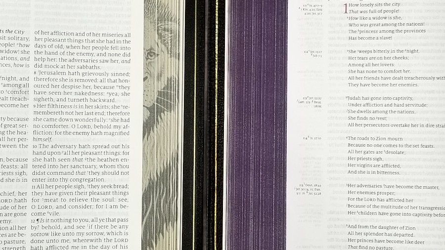
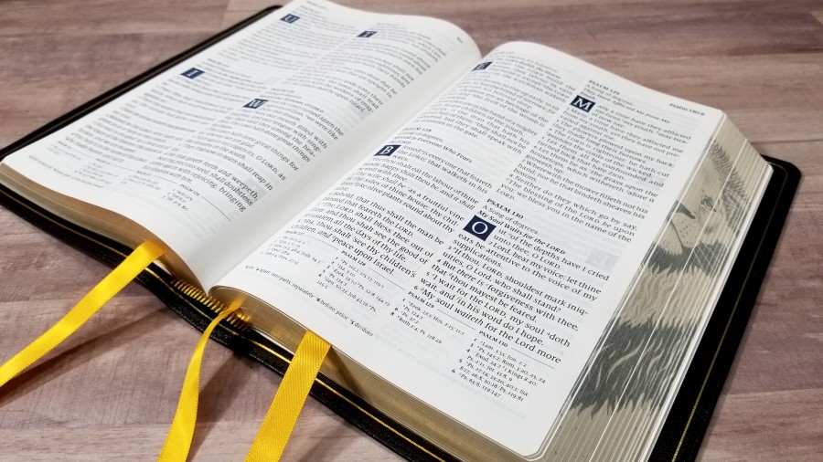
The edges include fore-edge art of a majestic lion. It uses the pointillism technique of using small dots to create the image. It looks hand-drawn to my eyes.
Typography
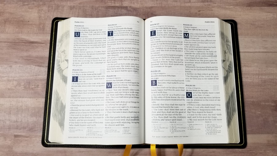
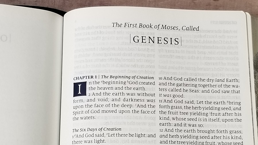
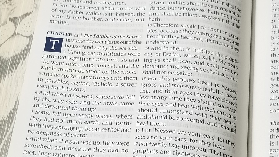
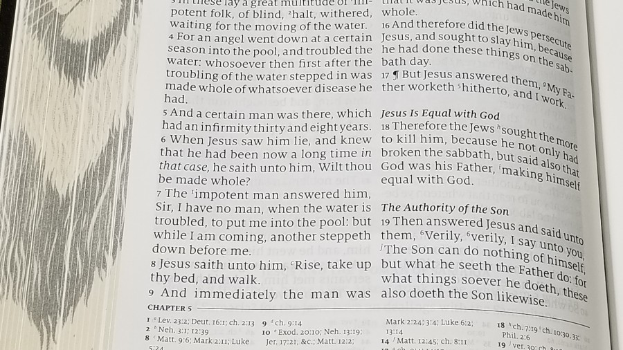
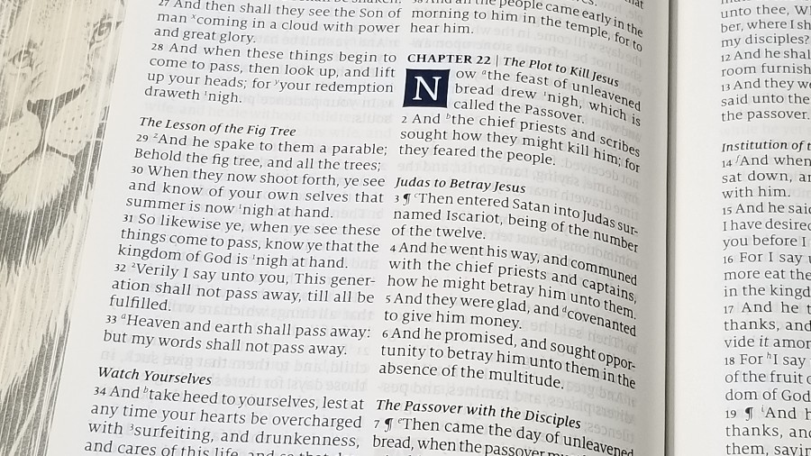
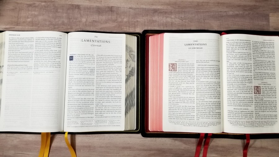
The text is presented in a double-column, verse-by-verse format. It has no special formating to indicate poetry, letters, quotes, etc. Section headings are in italics. Those at the beginning of a chapter are placed on the same line as the chapter number if there’s enough room. Drop-caps take three lines and include a blue background and curved edges. The header shows the book name, chapter, and verse number in the outer margin and the page number in the inner margin. References are placed under the text in four columns and are separated from the text with a line. Footnotes are placed at the bottom of the page in a single column.
The font is 11-point Milo serif. It’s about a medium shade of black. It isn’t as dark as most editions published today. This does reduce show-through, but it can be more difficult to read if you prefer darker fonts. It’s especially noticeable with artwork on the other side of the page. It has blue for the words of Christ. The blue is close to black, making it hard to see the difference without bright lighting even when blue and black are next to each other. The larger font size does make the type seem dark enough. I don’t actually need it much darker. It does have to variation in the print darkness, but it isn’t a lot. I only noticed because I was looking for it.
It has around 8 words per line and a good amount of space between the lines. The text never feels crowded. Extra space in the inner margin brings the text out of the gutter. This does make the outer margin a little narrow, though. Paragraphs are marked with pilcrows. It doesn’t include them beyond Acts 21. It doesn’t include self-pronouncing marks. It does include italics for supplied words.
It’s printed with line-matching, meaning that lines of text are printed in the same location on both sides of the page. This greatly reduces show-through. Considering how opaque this paper is, and the fact that the print isn’t overly dark, there’s barely any show-through at all except for the art-work.
Definitions
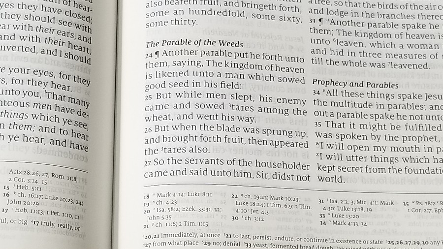
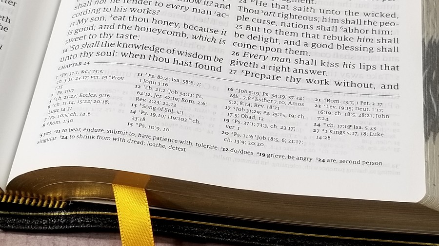
Rather than the translator’s footnotes, it includes footnotes that provide definitions of archaic words. Definitions are taken from authoritative sources including Webster’s 1828 and 1913 English Dictionaries and Wright’s 1876 Bible Word-Book. The definitions are keyed to the verses with a number. The number in the text is large and easy to see. The number in the footer is extremely small and it’s used as a superscript to the verse number which is printed in bold. This makes the definitions difficult to locate. There are lots of them throughout the Bible. I’m glad they’re included because definitions of archaic words are one of the most important tools for the KJV.
I like that the definitions are on the page where the words are used. This makes them much easier to use, and since the words in the text include footnote keys we’re alerted to the fact that there is a definition available. I’d just like to see the superscript larger so they’re easier to find quickly. They’re difficult to find quickly for study. They’re difficult to locate quickly while preaching or teaching. It does help that they’re separate from the cross-references and that they include the verse number.
References
Cross-references are placed under the text in four columns. Each chapter starts with a new column. A chapter number appears above the columns where a new chapter starts. This makes them much easier to use than a single column layout. This design is the easiest to use of any references that I’ve seen in the footer. Like the definitions, the keys to the text are small superscripts that can be difficult to read. I’m not sure of the number of references, but it does have a lot. Here are a few example references to help you compare:
- Genesis 1:1 – Jn 1:1, 2; Heb 1:10; Ps 8:3; 33:6; 89:11, 12; 102:25; 136:5; 146:6; Is 44:24; Jer 10:12; 51:15; Zech 12:1; Ac 14:15; 17:24; Col 1:16, 17; Heb 11:3; Rev 4:11; 10:6
- Deuteronomy 6:4 – Is 42:8; Mk 12:29, 32; Jn 17:3; 1 Cor 8:4, 6
- Isaiah 9:6 – ch 7:14; Lk 2:11; Jn 3:16; Matt 28:18; 1 Cor 15:25; Judg 13:38; Titus 2:13; Eph 2:14
- Matthew 28:19 – Mk 16:15; Is 52:10; Lk 24:47; Ac 2:38, 39; Rom 10:18; Col 1:23
- Mark 12:29 – Dt 6:4; Lk 10:27
- John 1:1 – Pr 8:22, 23 &c; Col 1:17; 1 Jn 1:1; Rev 1:2; 19:13; Pr 8:30; ch 17:5; 1 Jn 1:2; Phil 2:6; 1 Jn 5:7
- John 3:16 – Rom 5:8; 1 Jn 4:9
- Acts 2:38 – Lk 24:47; ch 3:19
- 1 John 1:1 – Jn 1:1; ch 2:13; Jn 1:14; 2 Pet 1:16; ch 4:14; Lk 2439; Jn 20:27
Illustrations
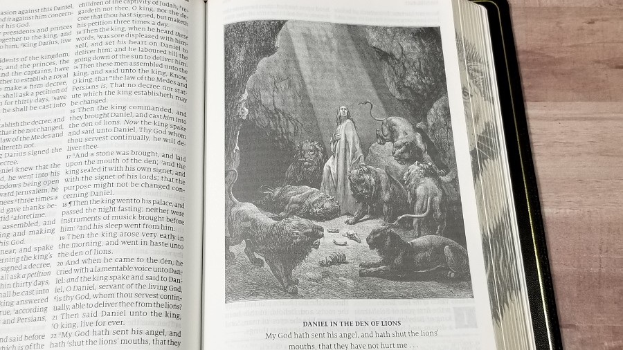
It has 66 full-page illustrations by Gustave Doré. They’re placed throughout the Bible in proper context, so they’re near the pages where the events take place. Each one includes a title and verse to show what the art is in reference to. I’m a fan of good quality artwork through the text and the Lion does it well.
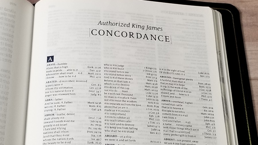
Concordance
The concordance is 91 pages with three columns per page. The entries include definitions, so it doubles as a large glossary. It has fewer keywords than a lot of concordances, but it has more references than most. This is an excellent concordance for study and sermon prep. Here are a few examples of entries to help you compare:
- Christ – 11
- Christian – 3
- Faith – 51
- Faithful – 31
- God – 84
- Goddess – 3
- Godhead – 3
- Godliness – 6
- Godly – 5
- Gods – 7
- Praise – 12
- Prayer – 15
Maps
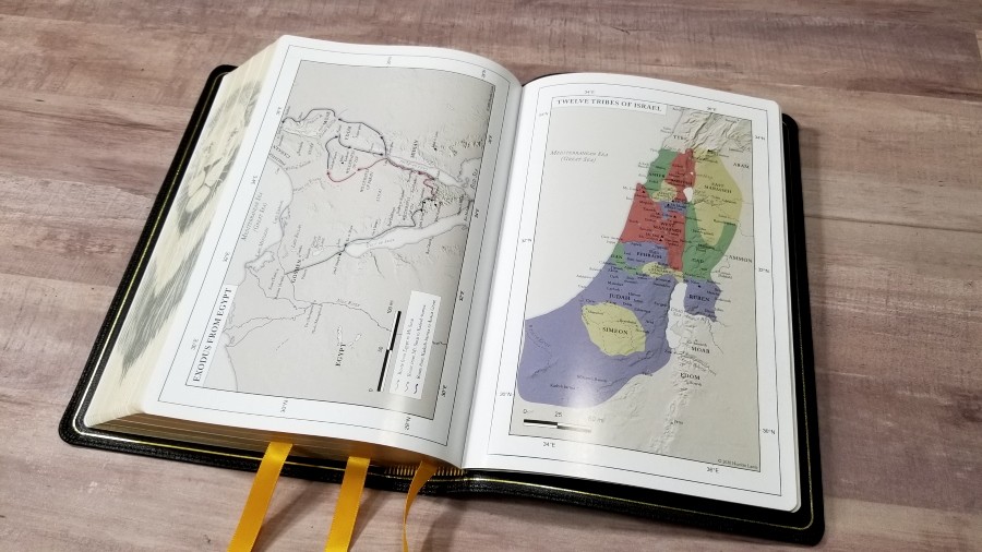
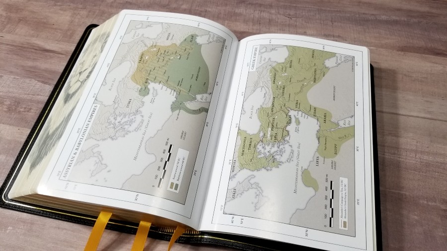
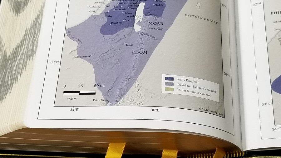
It has 14 maps on thick glossy pages. They’re designed by Humble Lamb. The colors are earth-tones and include red, green, blue, yellow, and gray highlights throughout. Maps include degrees rather than the typical A1-style grid. This is interesting because the maps can actually be used for navigation.
They include topography, distance, journeys, routes, cities, kingdoms, seas, dates, names of rulers, events with Scripture references, etc. They do not include an index. Major locations are printed in large text. Some of the locations are in a small text that doesn’t stand out from the backgrounds, but I still found the easy enough to read. I found the maps easy to use. I like them a lot.
Maps include:
- World of the Patriarchs
- Exodus from Egypt
- Twelve Tribes of Israel
- Kingdom of Israel
- Divided Kingdom
- Assyrian and Babylonian Empires
- Greek Empire
- Topography of Israel
- Israel at the Time of Jesus
- Jerusalem at the Time of Jesus
- The Life of Christ
- Paul’s Missionary Travels
- Spread of Christianity
- Roman Empire
Comparisons
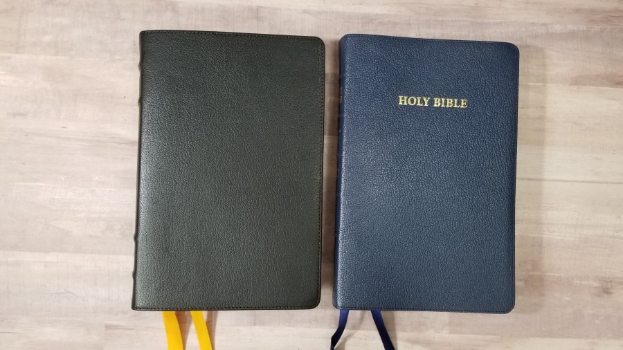
Here’s how the Humble Lamb Lion compares to the Schuyler Canterbury, Thomas Nelson Giant Print Reference Bible in the Premier Collection, the Cambridge Turquoise, and the Humble Lamb NKJV.
Canterbury
The latest version of the Schuyler Canterbury has 28gsm Indopaque paper. It’s thinner, but it’s a higher quality paper. The font is a touch darker. The layout is similar, but the references are in a single column. It has a glossary in the back. It’s made in the Netherlands by Royal Jongbloed.
Thomas Nelson Giant Print Reference
The Thomas Nelson Giant Print Reference also uses 36gsm European paper, but it has a coating. The font is much darker. It includes book introductions, translator’s footnotes, and definitions on the page. The leather is similar, but it’s slightly more flexible. The build quality and materials are similar. Like the Humble Lamb, it’s made in China.
Turquoise
The Cambridge Turquoise uses 28gsm Inodopaque paper. The font is the darkest in this article. It doesn’t have a glossary. It’s red-letter and has the translator’s footnotes. It was made in the Netherlands by Royal Jongbloed.
Humble Lamb NKJV
The Humble Lamb NKJV was their first Bible. It has a single-column layout, a smaller font, rougher paper, and thinner leather. It was made in China. The Lion’s materials and build quality is a noticeable improvement over the NKJV. The spines are so different that there is brand inconsistency, but this is only their second Bible. It makes sense to adjust designs until you get what you want.
Conclusion
The Humble Lamb Lion looks and feels like a quality Bible. The materials and build quality are excellent. The paper is among the easiest to turn of any I’ve used. The overall design is clean. Placing references in four columns does make the references easier to use. I love that the definitions are on the page where they’re needed. The definitions in the concordance make it a great tool for study and sermon prep. Gustave Doré’s artwork looks great and helps visualize the setting. The fore-edge art stands out and draws people to it.
I’d like to see the font a little darker and the blue a little bluer. I’d also like to see the superscripts for the cross-references and footnotes a little larger. Humble Lamb’s Lion is an excellent KJV that only needs a few minor tweaks to be one of the best KJV’s available.
_________________________________________________________
This book is available at Humble Lamb’s website
_________________________________________________________
Humble Lamb provided this Bible in exchange for an honest review. I was not required to give a positive review, only an honest one. All opinions are my own.











Mr. Randy Brown;
My wife and I got each other this Bible for Christmas, 2020. and I just happened across your Critique of the Word as I was shutting my computer down. We both got the, ” Humble Lion” better known as the King James Lion which cost somewhat less, and has some what less frills.
That being said we like the Bibles except for the coloring in the wording. I myself had to ask my wife what collar her ” Words of Christ” were? I bought the Fire Brick Bound which is very beautiful, and the Goatskin Leather is very supple.
She told me that her ” Words of Christ” were Blue; I told her mine were not. she looked at mine and said they were and must be my cataracts.
To make a Long story short I used a small magnifying glass and the flash light on my cell phone to try and see the difference.
Hers was very light blue and I do believe you mentioned that in your review.
Otherwise we really Like the Bibles, like our Cambridge and Schuyler Bibles .
I read your blog almost daily and do like it.
God Bless
In His Matchless Grace
Louis and Lorraine
The De Marco’s
P.S I forgot to post your Review was Four Stars from me
Thanks!
Thanks for sharing and for reading!!
Read your entire review on Humble Lamb which in reality it was more than that it included comparisons with several other Publishers. It was in the comparisons the improvement required became obvious. Now I can say THOSE improvements have been completed. May I invite you to re-evaluate these same Bibles. Be sure to compare the same caliber of Bible. Thanks for letting me leave a comment. 12/2023