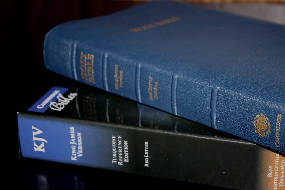
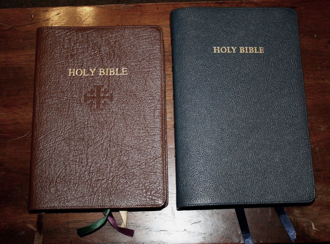
The Cambridge Turquoise (named for the gem, like many older Cambridge editions) is a large print KJV reference edition from the 1920’s. It’s been one of the standard premium reference Bibles for many generations and is a favorite among preachers because of the large dark typeface. The Turquoise has been out of print for several years and now Cambridge has re-released this traditional vintage design in a premium edition with top of the line materials. It includes the Translators to the Reader, a newly redesigned concordance, and colorful maps.
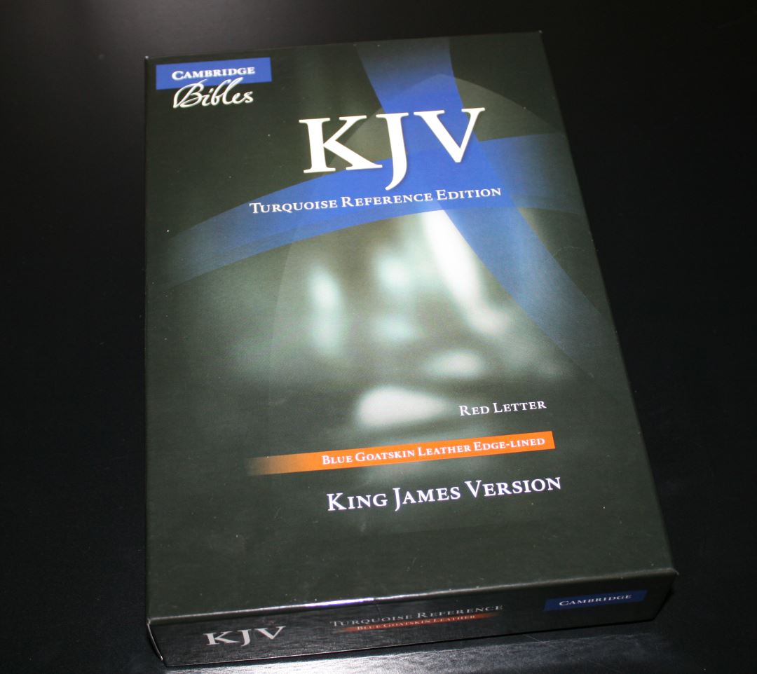
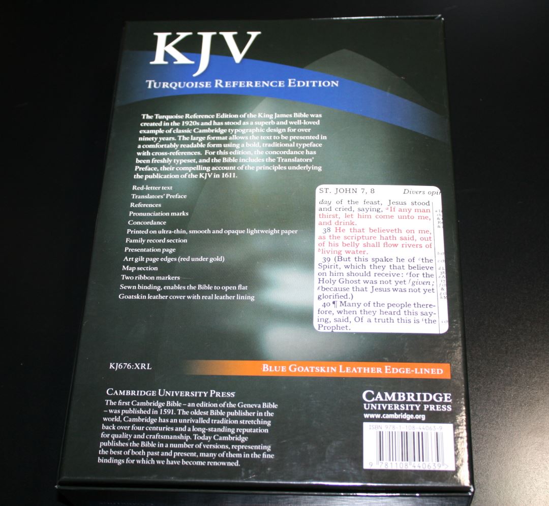
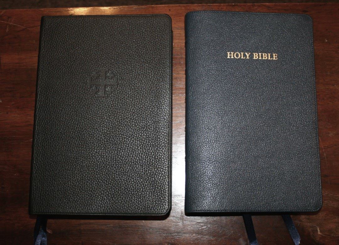
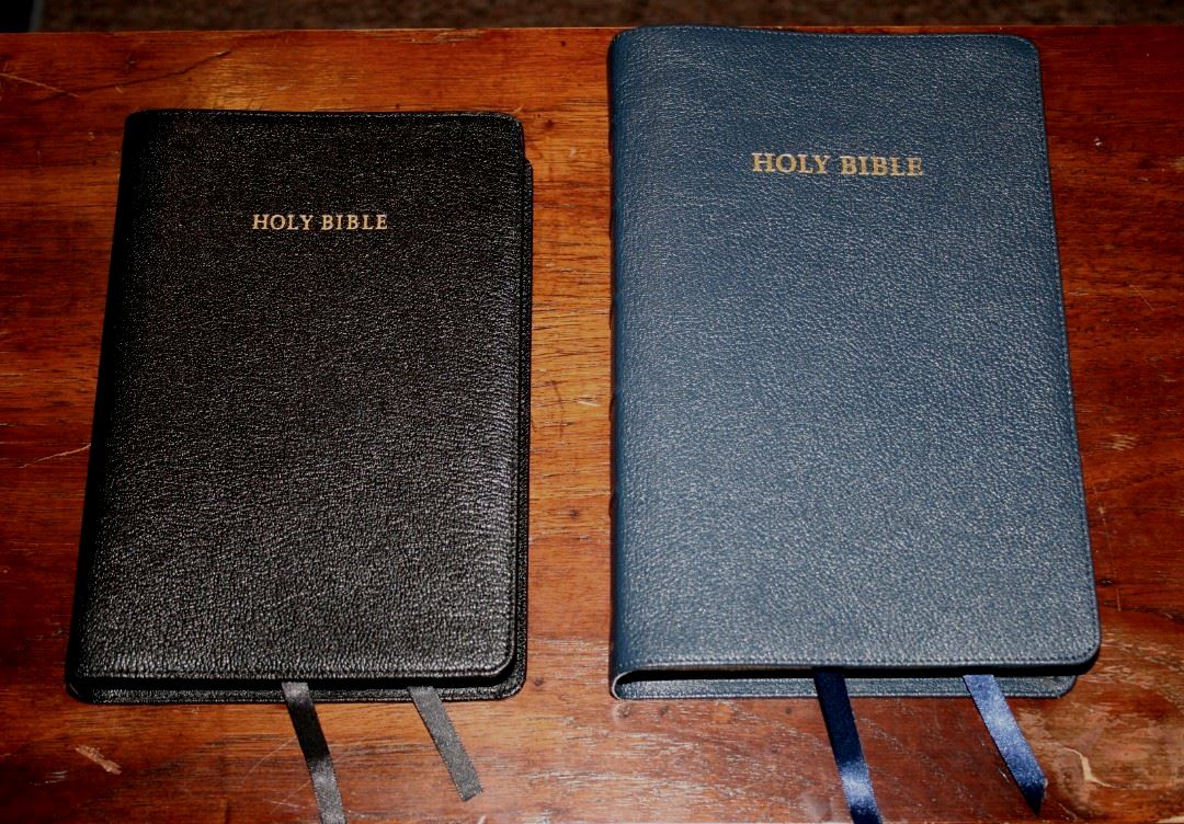
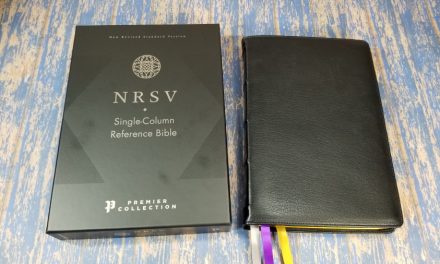
It’s available in black, brown, or blue goatskin with a calfskin line (the brown and blue editions are evangelicalbible.com exclusives), and black calfsplit with a paste-over (also called paste-off or paste-down). It comes in the standard Cambridge clamshell box. I’m reviewing the blue goatskin, ISBN: 9781108440639, Model KJ676:XRL, made by Royal Jongbloed in the Netherlands.
______________________________________________________________
The Cambridge Turquoise is now available in blue or brown at EvangelicalBible.com
Also available in black goatskin or black calf split at Amazon (affiliate links)
______________________________________________________________
Video Review
Cover and Binding
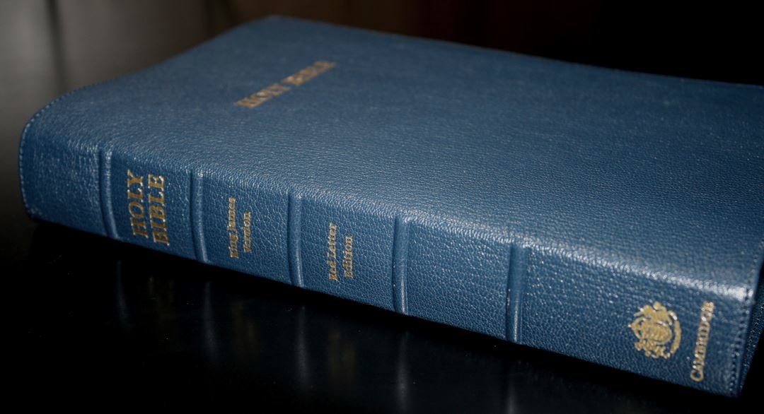
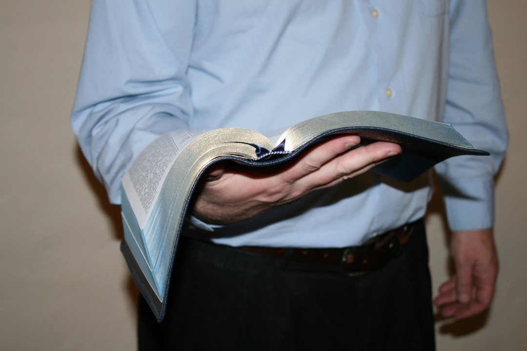
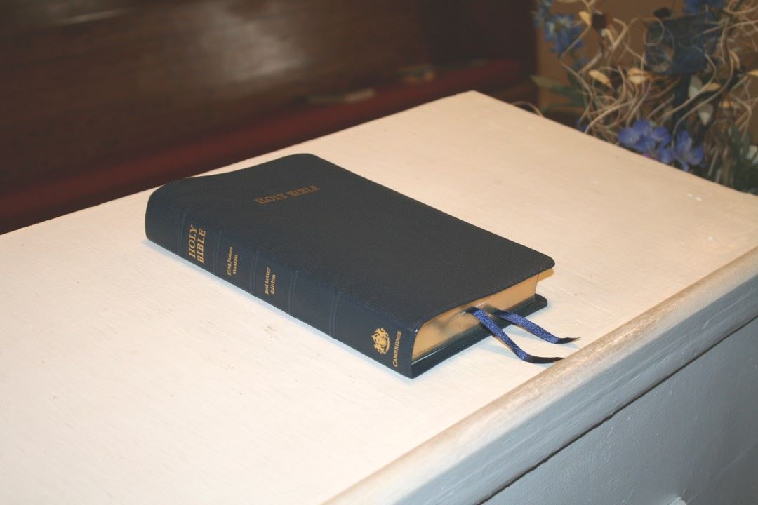
The cover is navy blue goatskin. The blue (and the brown) were produced in collaboration with Schuyler Bibles and are exclusive to EvangelicalBible.com. It has a deep pebbly natural grain with excellent texture and a shiny finish. It’s flexible enough to roll like a newspaper but not so flexible that you can’t hold in open in one hand (my preferred method because I don’t like holding the paper). It has enough structure to hold its shape but it’s not stiff at all. It has perimeter stitching with blue thread that blends with the cover.
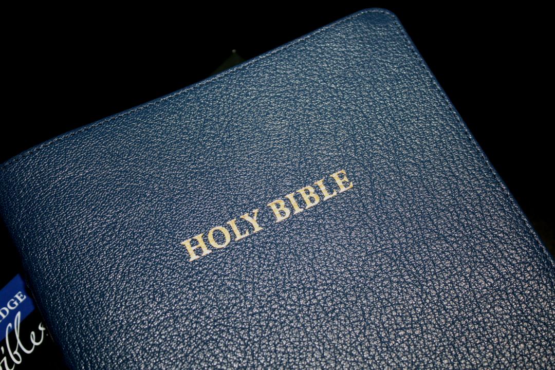
The text on the cover is gold. The front of the cover has HOLY BIBLE while the spine has HOLY BIBLE, KING JAMES VERSION, RED LETTER EDITION, the Cambridge KJV seal, and CAMBRIDGE. It also includes 5 raised spine ribs (which helps protect the text on the spine from scuffs. It smells great.
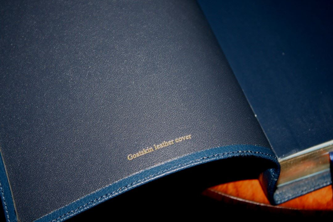
The text-block is Smyth sewn. The liner is edge-lined calfskin leather with a thick vinyl-coated paper glued to the leather edge-lined tab (hinge). At first, I thought the hinge was a little stiff, but once I turned to Genesis 1 the hinge allowed the pages to lie flat out of the box with no trouble. It didn’t have to break in before I could read or preach from the first page of Genesis 1 (which I did the first time I preached from it).
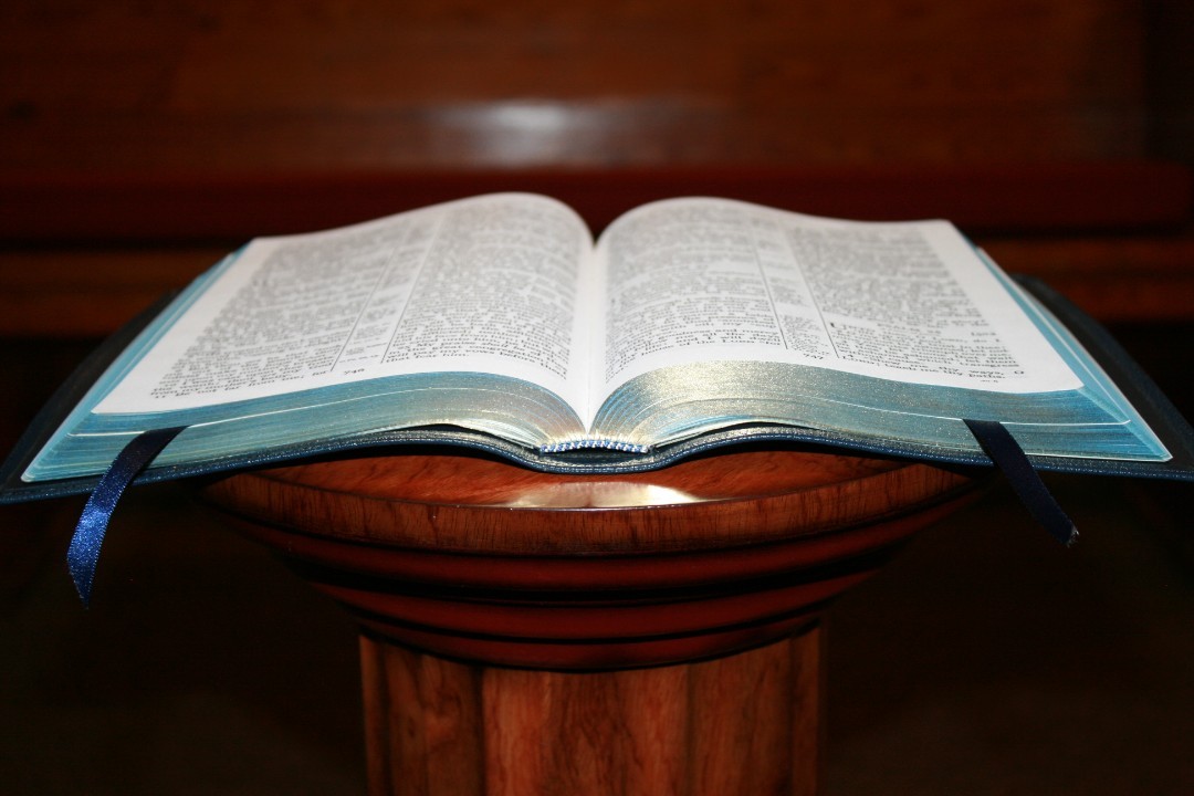
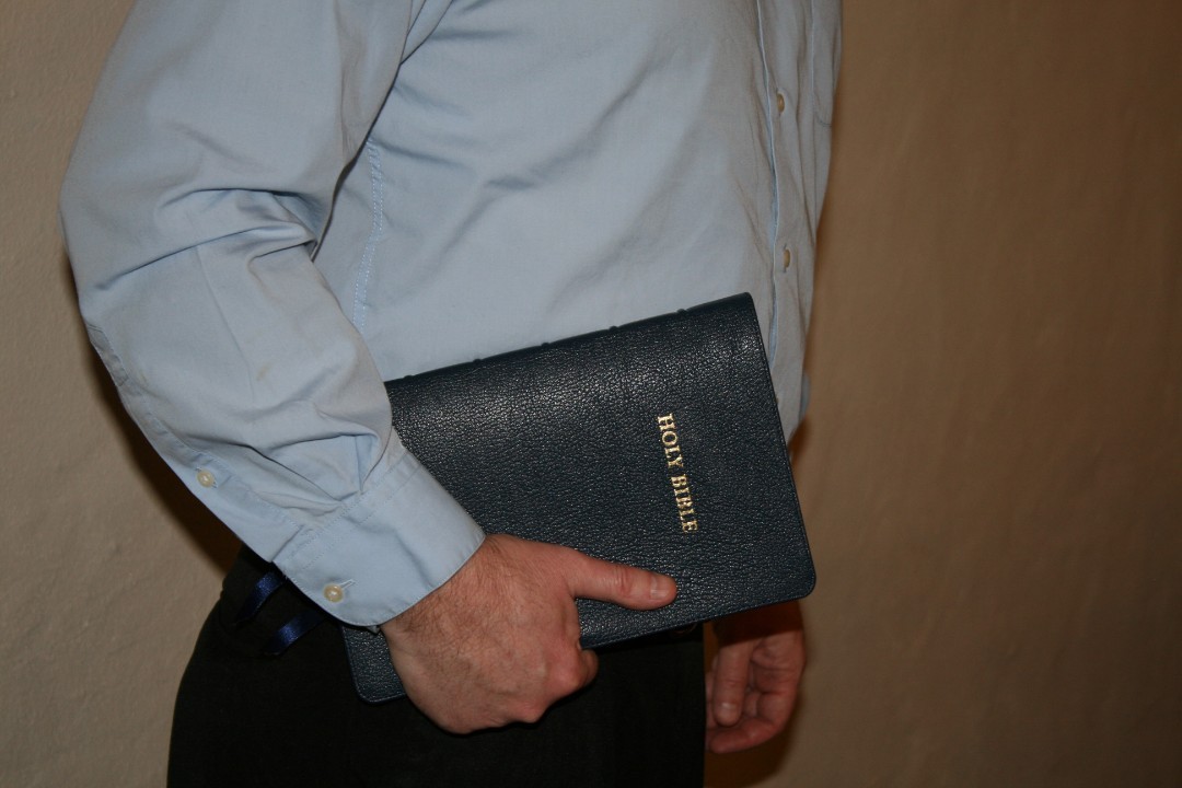
It includes two 8mm dark blue Berisfords ribbons. It also has silver and blue head/tail bands. The text-block size: 9.2 x 6 x 1.3″. The overall size is 9.8 x 6.37 x 1.37″. It weighs 2lbs, 5.8 oz. Even though this is larger and heavier than most Bibles that I carry, I had no trouble carrying this one and holding it for reading.
Paper
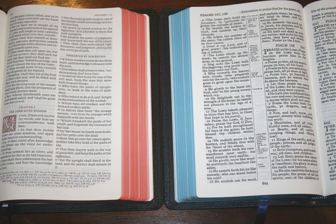
The paper is 28gsm Indopaque from Papeteries du Léman, Thonon-les-Bains, France. It has an ivory color and is extremely opaque – which is especially impressive considering how thin it is. To my fingers though, it feels thicker than the 30+gsm in the Concord. It has no glare or shine under direct light. I love the color of this paper. It’s white without being too bright, and it isn’t so off-white that it looks dirty, gray, or yellow. This is my favorite color for Bible paper. It makes me want to read it.
Even though it’s 28gsm, I had no issues turning pages. The paper is smooth but still has enough texture that I can separate the pages easily with one hand. The page edges are art-gilt with blue under gold. The blue looks great while reading.
Typography
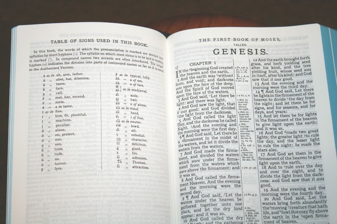
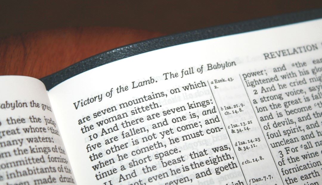
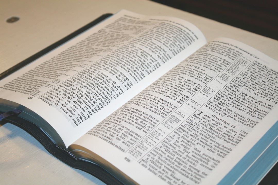
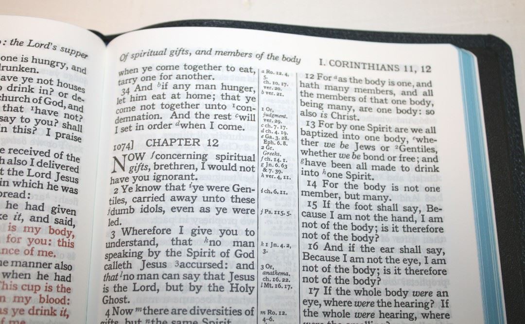
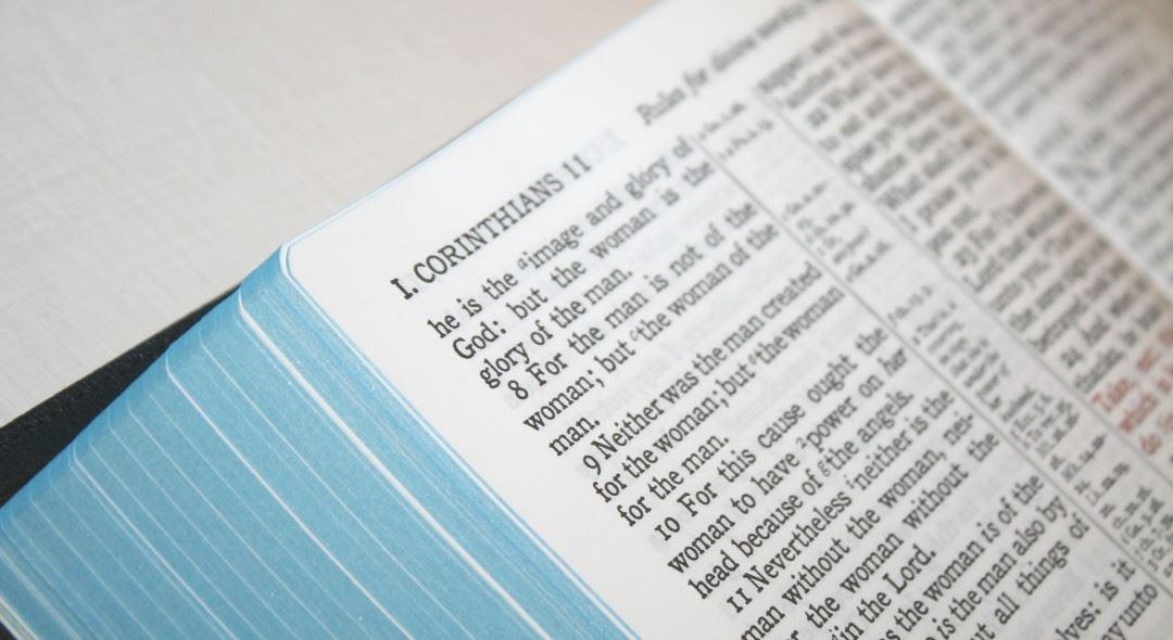
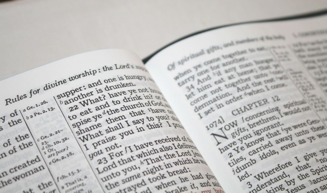
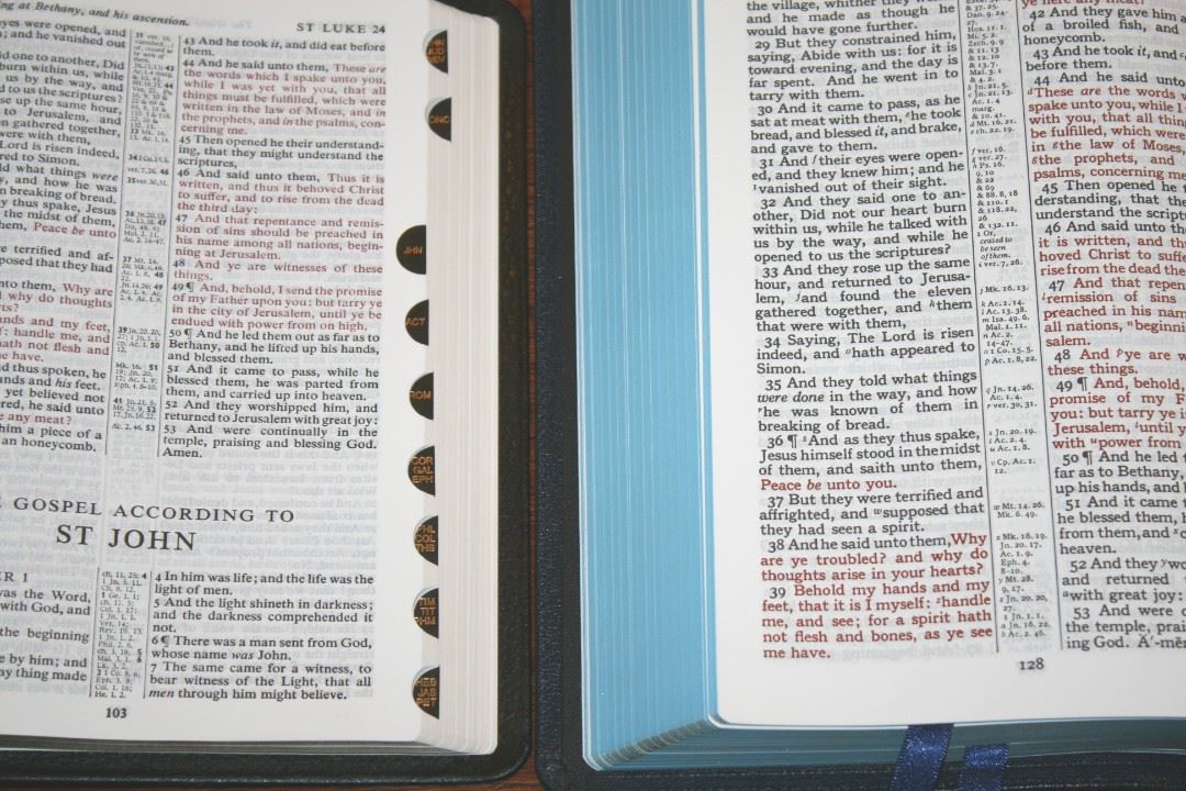
This is a vintage setting with the text presented in the traditional verse-by-verse double column layout with center column references. The header includes the book name and range of chapters on that page in the outer margin and two page-summaries in the inner column (one summary for each column). It only includes the books that start on that page. I think showing the range of books would have been helpful too, but there is limited space so it makes sense why they wouldn’t. The footer has the page number in the center. The page counts start over in the New Testament.
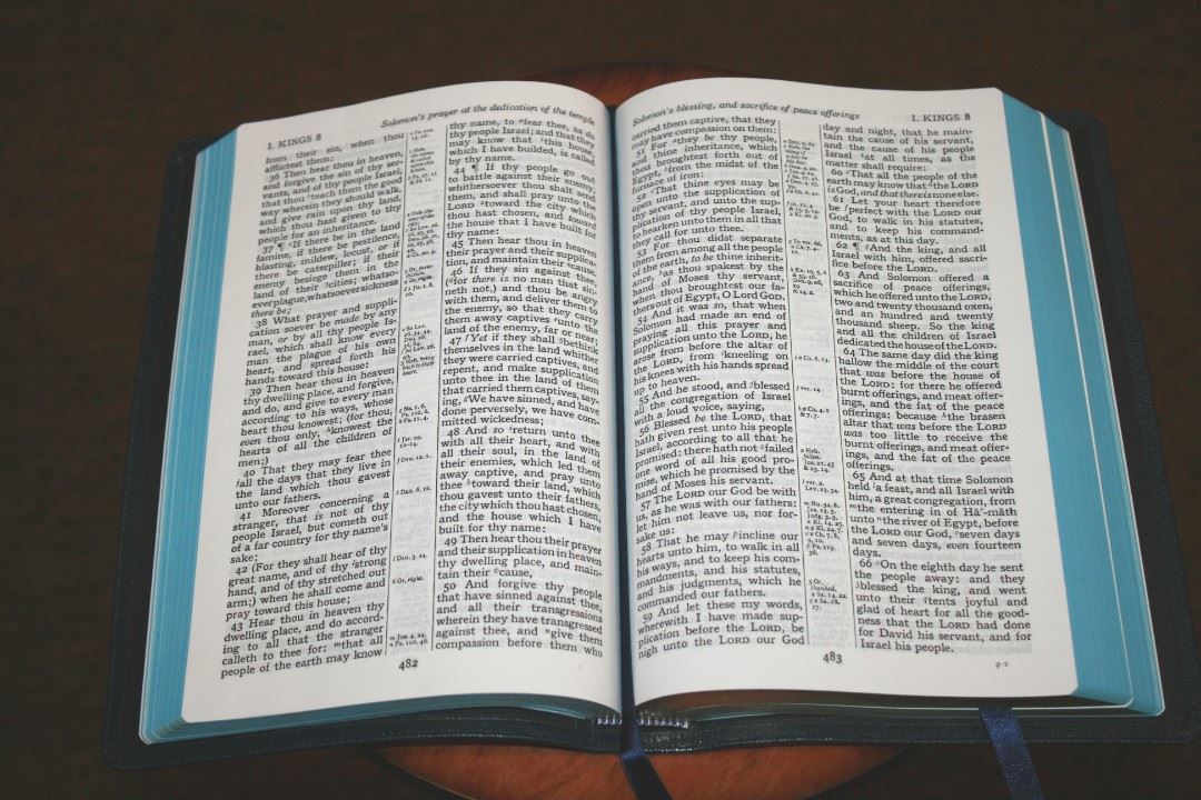
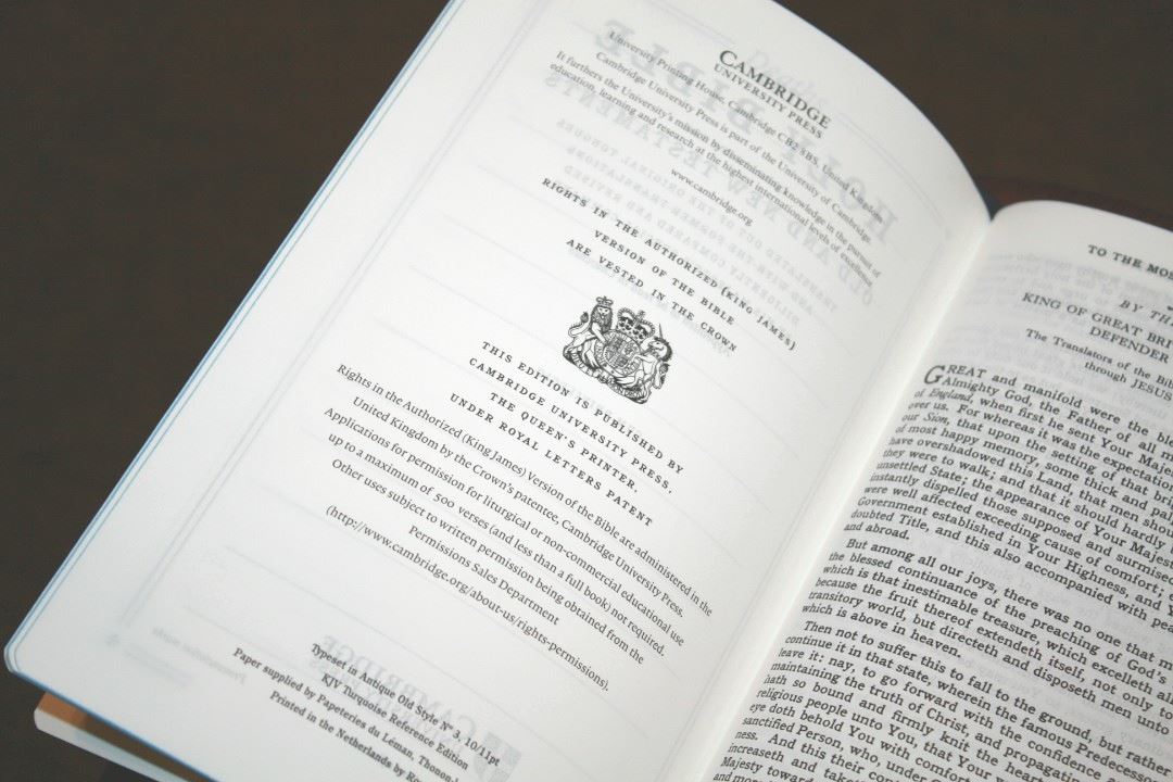
Rather than producing a digital edition, Cambridge has gone back to the old metal-press style. This edition looks to be a scan of a clean edition. I haven’t seen many broken fonts or smears that are typical of metal press printings or typical of scans of later editions. It does have a few (very few) places where ink didn’t cover the font 100% perfectly, but the few I saw are very small and is a reminder that this is a vintage setting- not a digital setting. The scan itself is so clean that it doesn’t look like a scan at all. Nothing from the back side of the page was copied. If they told me they got out their metal plates and printing press I’d almost believe them. Even the tiniest text in the center column is clean and legible.
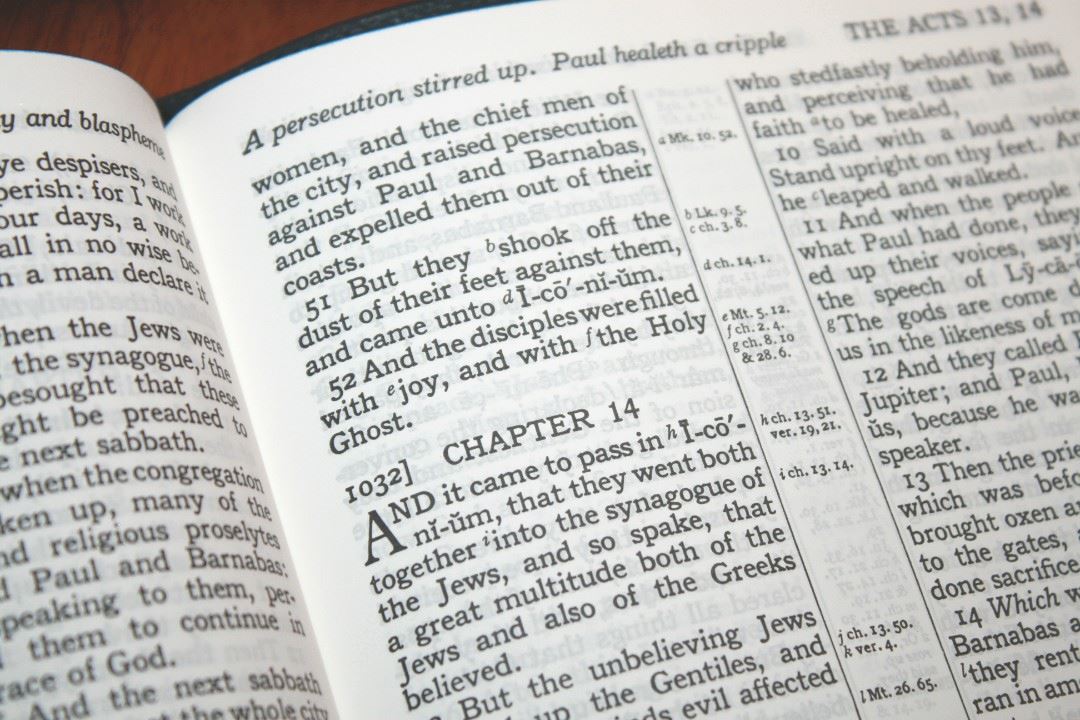
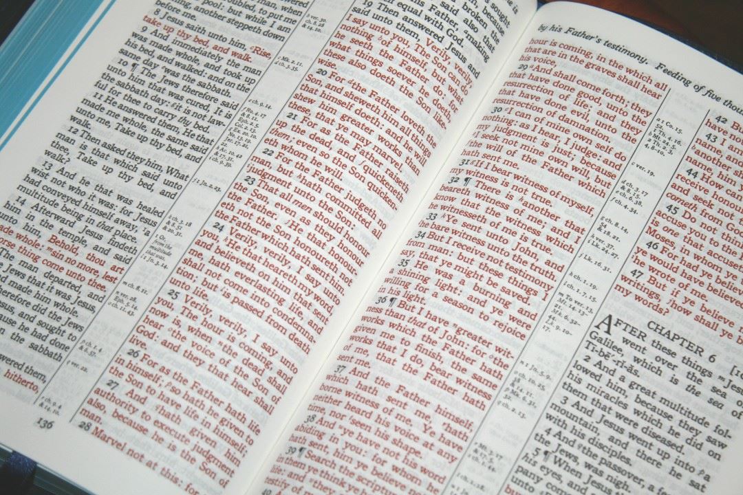
The typeface is a bold Antique Old Style No. 3 at 10/11 point (10-point for just the font, and 11-point when you include the leading (space between the lines)). This is a heavy font, which makes it darker than most fonts. This is the largest print I’ve seen in a premium reference edition. Due to the typeface design, it actually reads more like an 11 point. It has a lot of white space around the text (more than most reference KJV’s), making this text easy to read. In my opinion, this is the easiest text to read of any premium KJV.

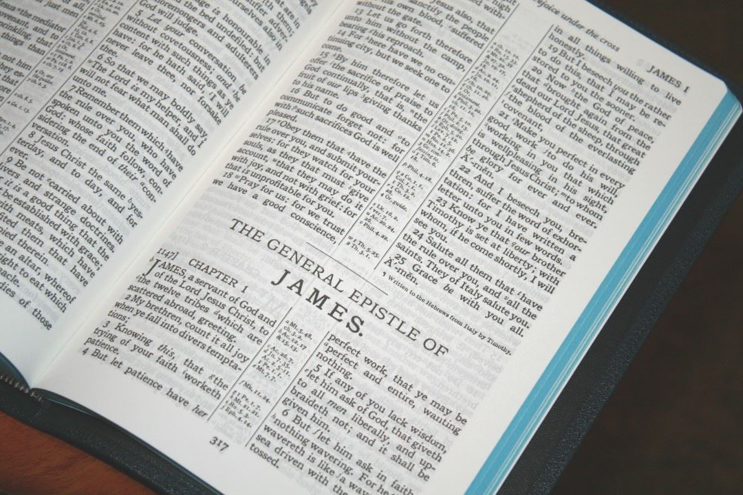
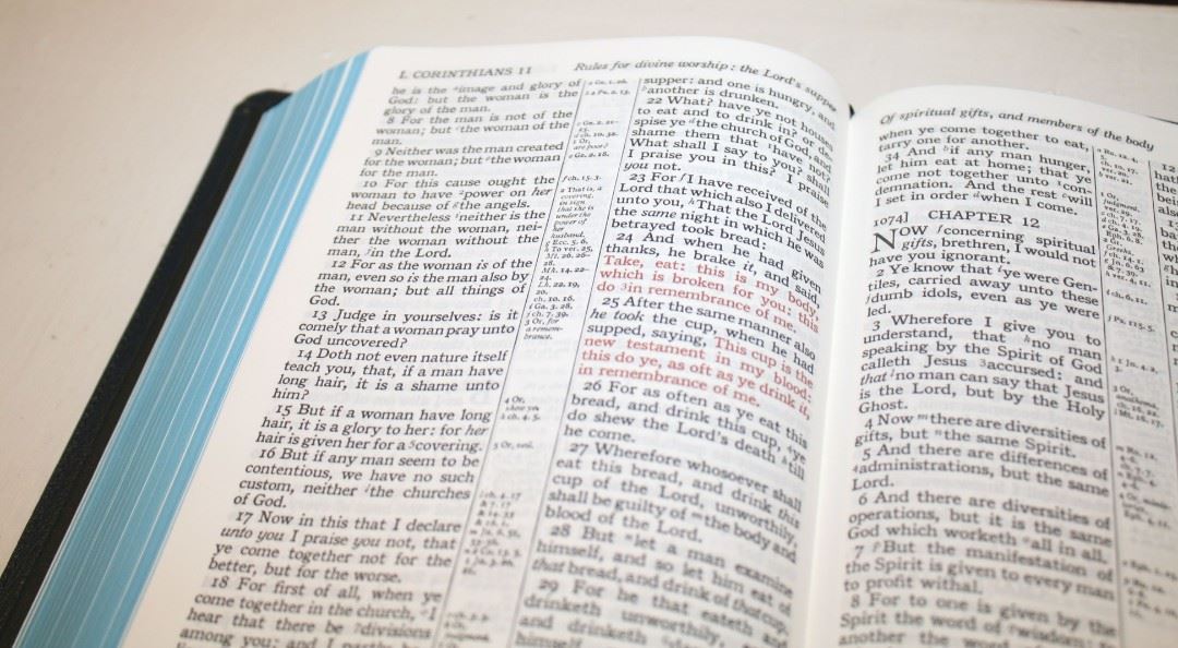
This is a red-letter edition. The red is dark and easy to read. There’s no fading with either the red or the black. Being a bold font makes it great for reading in bad lighting. I could almost read this by moonlight. At the same time, it’s not so dark that it hurts my eyes to read for long periods of time. This is the perfect font for my 50-year-old bifocaled eyes.
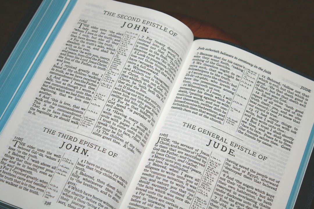
This is a self-pronouncing text. There’s a guide in the front that shows how to pronounce each of the symbols. I like that it isn’t overdone. It has a few names I don’t need but it doesn’t include common names like Jesus, David, Israel, Judah, and Jerusalem. This is most helpful for public reading. Italics are used for supplied words. Paragraphs, all the way to Acts 20, are marked with pilcrows.
One thing unique about this design is that chapters are numbered. Next to the chapter number is a bracket with a number that shows which chapter this is in the Bible. It’s interesting to know that John chapter 3 is the 1000th chapter in the Bible (at least in the common English book order), but I’m not really sure that I can use this information for anything valuable. I did mention the chapter number when preaching though, just in case. I actually do find it interesting.
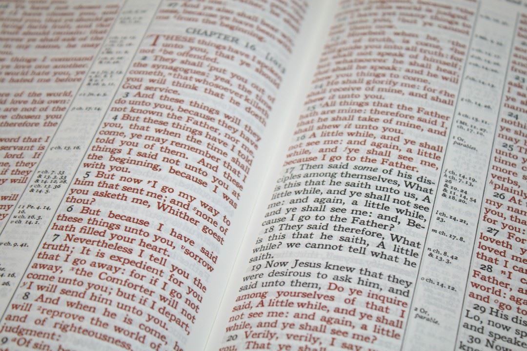
Although I don’t think it’s on purpose, the text is mostly line-matched (meaning the lines on both sides of the page line up to each other- which improves readability). This greatly improves readability. Even where they don’t line up, the paper is opaque enough that the show-through of this dark print is minimal.
It has around 32 characters across, making room for around 5-7 words per line. This layout was done by hand, so there are a few places where the words are jammed together a little too close, and there are places where there’s a little extra space between the words. This is noticeable but I never had any issues reading it. Even when preaching from it I haven’t had to think about what the words are.
It does have footnote and reference keys within the text. The keys (numbers for footnotes and letters for references) are large. This makes them easy to see, but it also makes them difficult to ignore. I have to check the footnotes out of curiosity almost every time. That’s not a complaint though.
It has .5″ margins, which helps bring the text out of the gutter and even provides a little space for small notes or symbols. Instead of bending out of view, the text stays almost perfectly flat.
I’ve found the large print to be perfect for preaching. It’s the perfect size for reading too, but the KJV vbv layout doesn’t work as well for reading (look at Ps 98:8-9, Col 1:21-22, the thousands of sentences that start with capital letters even though they continue a sentence, and many others for examples).
References and Footnotes
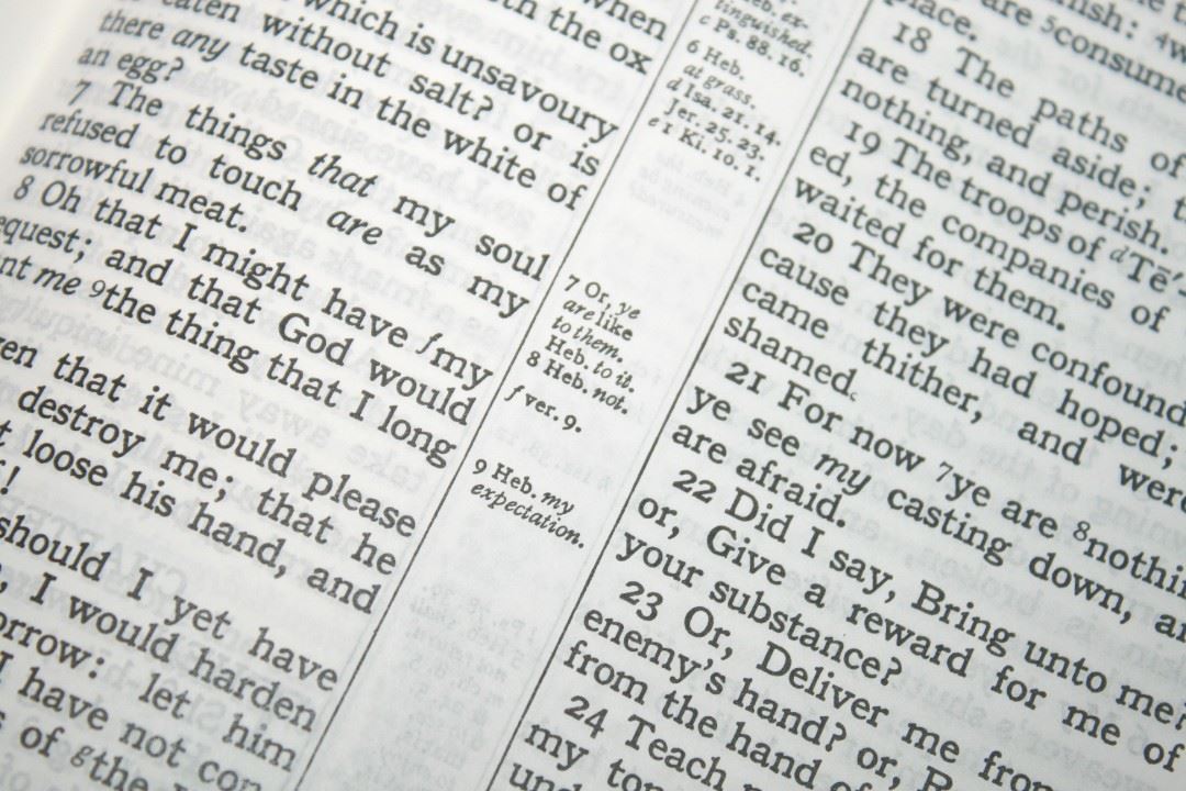
Cross-references and footnotes are placed next to the verses they correspond to, making them easy to find at a glance. This is my preference. Many verses have a little bit of space in the center column that can be used for small notes. They include the letter or number keys. Unlike the Concord, which places the verse number on the side of the column it matches, there’s no way to tell at a glance which column they go to. This actually keeps the center column a little cleaner when you consider that it includes the keys. They’re labeled within the text from left to right- across both columns. This means you might have a, b, and d in the left column and c and f in the right column.
I’m not sure how many references there are, but it’s probably in the 45k range. It does have enough for some basic study and sermon prep. Here are some example references to help you compare:
- Genesis 1:1 – Ps 136:5; Jn 1:1-3; Col 1:16,17; He 1:8-10; 11:3; Jer 4:23
- Deuteronomy 6:4 – Mk 12:29; Isa 42:8; Jn 17:3; 1 Co 8:4,6
- Isaiah 9:6 – Lk 2:11; Isa 7:14; Mt 28:18; Judg 13:18; Eph 2:14
- Matthew 17:20 – Mt 21:21; Mk 11:23; Mt 13:31; Mt 17:9
- Mark 11:23 – N/A
- Mark 12:29 – Deu 6:4,5
- John 1:1 – Ge 1:1; Jn 17:5; Col 1:17; 1 Jn 1:1; Jn 1:14; Rev 19:13; 1 Jn 1:2; Phil 2:6
- John 2:19 – Mt 26:61; 27:40; Mk 14:58; Jn 10:18
- Acts 2:38 – Lk 24:47; Acts 3:19; 20:21; 8:15,16; 22:16; Mt 26:28; Acts 10:45
- 1 John 1:1 – Jn 1:1; 1 Jn 2:13,14; Rev 1:2; Jn 1:14; Lk 24:49; Jn 1:4
The footnotes are those from the translators and include alternate renderings and explanations from the original languages. I’m glad to see they’re included. For me that makes this Bible that much more valuable for study.
Family Records
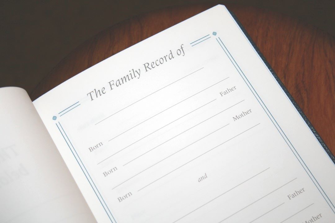
In the front are several thick, non-shiny, pages for family records. It includes a personal page to show who this Bible belongs to, the family record of the father and mother, children, marriages, grandchildren, and deaths. All of the pages have blue highlights, except for the deaths page which has black.
Concordance

The concordance is 112 pages with 3 columns per page. This is a newly typeset version of their older paragraph concordance using a digital font. It retains the paragraph setting but has three columns instead of two and the keywords are not in bold. The entries are still indented to help the keywords stand out.

I find the three columns easier to use than the two-column concordance. Although, I am kind of surprised to see Cambridge go back to the standard concordance. I actually expected to see the Reader’s Companion that’s found in the Clarion and Pitt Minion. It makes sense though, considering that the Turquoise is a vintage edition, for it to include the vintage tools. With this in mind though, I would have liked for them to have included the glossary and possibly the dictionary that many of the vintage editions had.
Words with more than one part of speech are marked with their part of speech and have separate entries for each. For example, praise can be either a noun or a verb. Both are included separately and marked with (n) or (v).
Here are a few examples with their number of entries:
- Christ – 36
- Christian – 3
- Faith – 54
- Faithful – 27
- Faithfully – 3
- Faithfulness – 6
- Faithless – 4
- God – 76
- Goddess – 3
- Godhead – 3
- Godliness – 4
- Godly – 2
- God-ward – 3
- Praise (n) – 11
- Praise (v) – 14
- Pray – 45
- Prayer – 22
Maps

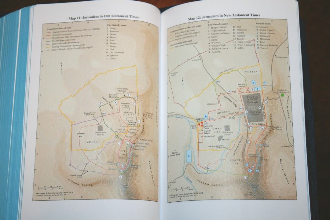
It has 15 pages of maps on thick, semi-glossy, paper. The maps are bright and colorful. These are the same maps from my goatskin Concord, but the semi-glossy paper makes the colors much more vibrant. They cover borders, import commodities, dates, routes, passes, settlements, distance, topography, mountains, cities of refuge, cities, tribes, vegetation, kingdoms, battle sites, satrapy, cities walls, city gates, older city walls, seven Churches of Asia, and more.
It doesn’t show any of the possible Exodus routes at all, so there’s Red Sea crossing highlighted. I’d rather see this than for them to show a route without it or a route that took them to the Reed Sea.
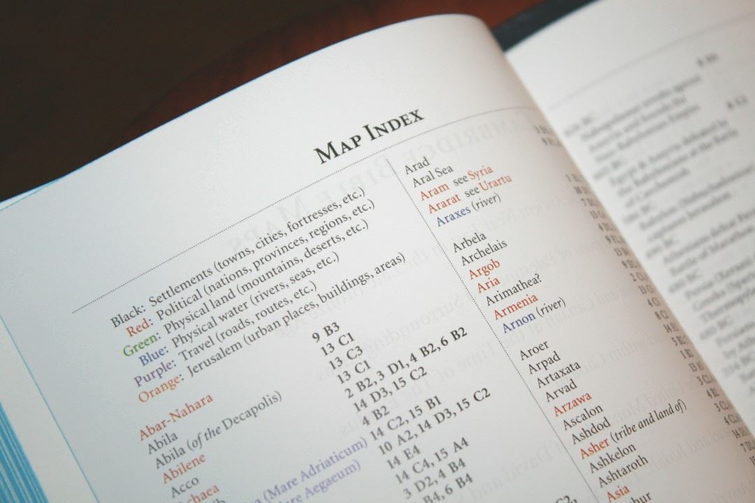
It includes an 8-page color-coded index to maps. The colors show settlements, political (nations, provinces, and regions), physical land, physical water, travel, and Jerusalem. I’m glad they included this. I prefer maps to have an index and I find the Cambridge color-coded index to be one of the most useful.
Maps include:
- The Ancient Near East in the Late Bronze Age
- Regions of Palestine and Surrounding Areas
- Sinai and Canaan at the Time of the Exodus
- Israel within Canaan
- The United Monarchy of David and Solomon
- Israel and Judah: The Divided Monarchy
- The Assyrian Empire
- The Babylonian Empire
- The Persian Empire
- The Hellenistic World after Alexander
- Jerusalem in Old Testament Times
- Jerusalem in New Testament Times
- Palestine in New Testament Times
- The Roman Empire
- The Eastern Mediterranean in the First Century AD
Comparisons
Here are a few comparisons with the most prominent premium KJV’s. These are not the best photos (sorry about that). I’m planning a much more extensive comparison article that will give a better view of each Bible and include a few more than I’ve included here.
Longprimer

Canterbury
Schuyler Westminster

Concord
Final Thoughts on the Cambridge Turquoise
I’m glad to see the Turquoise back. I’ve been looking forward to the return of the Turquoise for many years and Cambridge has exceeded my expectations. My main concern was the paper and print quality, and I’m glad to say that both are of the highest quality. Together they make the perfect combination for readability.
Even though it doesn’t have cross-references in the 6-digit range, it is a good reference edition and the concordance helps make up the difference. I like that the references and footnotes are next to the verses they correspond to. This makes them much easier to find at a glance. The maps are well-drawn and it has an extensive index to maps. I would like to have a glossary for words that have changed their meaning or are out of use. The Concord has this and I see it as one of its strengths.
It still looks like an old Bible, and I believe that it will appeal to many KJV readers that prefer the traditional verse-by-verse layout. The large, dark typeface combined with the Indopaque paper is perfect for reading in public, making the Turquoise an excellent preacher’s Bible, and is a great choice for anyone interested in a large print reference KJV in red letter with the traditional layout, footnotes, and italics for supplied words. I highly recommend the Cambridge Turquoise.
My personal preference has leaned toward large and dark fonts and the Cambridge Turquoise, and especially this EvangelicalBible.com exclusive blue goatskin is my favorite choice. I’ll be using this Bible for many years. I’d like to thank Cambridge for making the Turquoise available again and Evangelical Bible for making it available in blue and brown goatskin.
______________________________________________________________
The Cambridge Turquoise is now available in blue or brown at EvangelicalBible.com
Also available in black goatskin or black calf split at Amazon (affiliate links)
______________________________________________________________
Photography by hannah C brown
Evangelical Bible provided this Bible free for review. I was not required to give a positive review, only an honest one. All opinions are my own.


Randy being robbed…..”Take my keys here’s my wallet, but please don’t take my Turquoise”
Exactly!
What input did Schuyler have in the brown and blue that’s not found in the black?
As far as I understand, the black goatskin is the same. The calfsplit won’t have the spine ridges, as much overhang, and larger ribbons.
Yes, it’s back!! Must. Have. One. Please Cambridge, please don’t take this one away!
I REALLY wish they offered a black letter option!
I wish too!! I’ve bought old Cameos on eBay instead of new ones because of this.
Excellent Bible review. I’ve watched it several times. Thank you for such detail and great pictures. I have pre ordered this Bible and can’t wait to receive it.
Thank you again for all the details and pictures.
Thanks Nancy! I’m sure you’ll love it!
Would it be possible to get a picture of the Turquois next to the Sovereign? Are there any major differences between those two bibles? Thank You!
Hi Carla. I love that idea, but unfortunately I don’t have access to a Sovereign. If I can ever get one I’ll be sure to add it. I do have the older Longprimer with 32gsm paper, which has the exact same features as the Sovereign. The main differences are the Longprimer’s font is smaller, it has more references but they’re not near their verses, it has notes on the manuscripts, and it has a few more features in the back including a name index, topical index, and lined notebook paper.
28gsm paper is what holds me back from this Bible. I will stick to the CBP turquoise I use. I thought they would at least go 32gsm or even 36gsm like Allan does in their best Bibles. I really use my Bible so durability is big for me. But if your buying it to keep it on a shelf as a collectors item I can see it’s place.
But great review by the way!
Thanks John! I know what you mean about the paper. This paper surprised me though. I would have guessed it to be 32 gsm if I didn’t know it was 28. I do like that it helps make this edition slimmer. I would like to also see it in a 36gsm version. I think it would be a good idea to have multiple options.
Hey Randy, I came back to read your review again, I am blessed to have one that’s on back order, so now I’m using your review as a pacifier Anyways I’m happy to see them using real leather for the liner this time, I don’t mind the synthetic but real leather matters esp on on an old classic like this.
I’m amazed at the boldness of this text, seeing it next to the Longprimer is eye opening, I’m pretty sure this bible is going to become my main KJV for life. The red letter and blue combo is frosting on an already delicious looking text, THANK YOU SO MUCH for your awesome reviews. This will be the longest bible junky wait I’ve ever had to deal with….pray for me brotherLOL
Praying! I feel your pain! Now I’m going to go read my Turquoise 😀
Hi. I hope this is not a silly question… But i am aware of the bible version issue. Is this the 1611 version? (nothing added or taken away).
It looks amazing, Worth paying for something that is going to be used hundreds of hours
Hi Benidk. It’s a 1769 KJV (the most common edition of the KJV).
A 1611 with nothing added or taken away would include the Apocrypha! Sadly only one high end KJV has that–the Cameo.
Is Revelation in red? Or just the gospels?
Would also be curious to see photos of this Bible next to the old one you picked up on ebay from circa WWII. To see what the text and paper looks like next to each other.
Sure! I have a few others I’ll compare it with also including one from 1969. It will take a few days (the older editions are at the Church in another town).
It’s black letter in Revelation. Acts 1 and 1 Corinthians 11 are also in red.
As you know this is my favorite reference Bible on earth. As much as I love my Church Bible Publishers (CBP) Turquoise I have not written in it due to my anticipation for this release and a potential review from you. So glad you reviewed this for us. Your excellent review exceeded my high expectations! It is like you read my mind and answered every question I had about this Bible. Will start saving up to purchase this one in brown. My favorite thing about this Bible vs. my CBP is the non reflective paper. It is why the CBP Notetakers is not my main plain text study Bible. It reflects at the worst spot on the page making it difficult to read on my desk under a lamp.
Thanks Blake! I have the same issue with CBP paper. love this paper. This is a keeper.
By the way Randy I just received one of these Cambridge Turquoise in the mail today. I got the brown goatskin. While I regularly used and love my CBP Turquoise the Cambridge is definitely a significant step up in paper and cover quality. Same paper opacity but thinner while still being easy to turn pages to search and find verses. And yes the Cambridge is non reflective paper. It is a very beautiful Bible with the red art gilding being a darker red than I am used to seeing with Cambridge which is a pleasant surprise The Cambridge is considerably thinner than the CBP making it more comfortable to hold and transport for sure. KJB readers have much to be thankful for when it comes to excellent Bible options these days. Much better situation today than it was just 5-10 years ago.
Thanks Blake. I agree 100%.
I have an older version that is my go to Bible. It is an English Hand Grained Morocco Leather Lined black leather edition. You wouldn’t believe how well it has held up and how beautiful the Turquoise 8vo refs. India paper actually is and how flat it lays open. It was purchased by myself in the late 1970s or early 80s.
Black letter, not leather, although the leather is indeed black!
Hi Randy. I know what you mean. I have an old edition from around 1969. It’s too bad they don’t make that paper anymore.
How did you get a copy of this Bible before it’s release date? I was just wondering where I could possibly purchase it now.
Hi Becky. Publishers sometimes send us pre-release copies to help inform the public about their Bibles so they can make an informed decision of whether or not to pre-order. Unfortunately it won’t ship until late April.
OH Brother RANDY! You had me captivated all the way through. In my 47 saved years I have never found a reading/preaching Bible equal to the Turquoise. There is also another, very rare edition of the Turquoise, and we have 2 of them. It is model 20D XRL “Lectern Edition”, issued in the late 80’s and early 90’s. It is a black-leather-over-boards Turquoise with a no extra features except the very fancy 3D iridescent end papers in black and the red letters (which I LOVE). The 20D XRL also has the true India Paper, and these things make it lighter and thinner, and it lays flat when open. Since the cover is rigid, the pages lay out as flat as can be done before you when the Bible is held in one hand. It has a pronounced, deeply engraved gold cross on the cover. I have never yet met another person who has even seen or heard about one of these Bibles. Back in 1992, our Local House Church took up offerings but paid no bills or salaries. The money piled up. We decided to buy everyone in the congregation a super-fine quality Bible (all Cambridge) . We found 5 of these Turquoise Lectern Editions in a Quaker bookshop, and we bought all of them for $75 each, as well as a B/L Presentation Turquoise with some introductory paperwork and a fancy box, for $130 in 1992 money. Everyone got the sort of Bible they asked for, with most of them engraved. My best Christian buddy and I each got 1 of the 20D XRL models, and we both preached out of them for a long time. Now we have them stored (in the original boxes) and just take them out to look at them again. We bought 3 of the CBP Turquoise copies – and for the money, that was the best deal in all the world. I just wish they would offer some cover options, like blue, brown and red, with red under gold edges or blue under silver. I also wish for leather covers with some grain/character in them. The calfskin on the CBP feels luxurious but is BORING to look at, and I also want red letters wherever red letters appear in the Holman Bibles. ANYWAY, myself and my best Sainted Friend of 42 years will both want the new Turquoise, myself the brown and he the blue – for sure – but I suspect I will take a little shock when I learn the prices! Thanks for the excellent review, and I can see why they were willing to give you a review copy in exchange for your evaluation. Please continue doing such reviews.
Thank you! Wow, that Turquoise sounds amazing! I’d love to see photos 🙂
Now that you have had this for a while, which do you find yourself picking up more… the concord or the torquoise? Thank you for your time.
Hi Julie. I love this question. I grab the Turquoise more. I still love the Concord, but that large print grabs me.
Last question…. With the concord, which binding would you recommend to last for the long haul… Do you see a significant difference in durability after using both the goat and calf split? I know the calf split will be stiffer and better for one handed use. Thanks again.
The goatskin should last longer because of the edge-lined construction. The stress is placed on the tab instead of the text-block. The paste-down liner in the calf-split attaches the text-block to the cover with book-binders tape (which is still a strong binding). Paste-down liners typically come apart, even if it takes many years of use.
Hi Randy!
Thank you for your review. I was wondering if the text is considered a Pure Cambridge Edition (“S” in Spirit in 1 John 5:8 and Acts 11:28)? It’s not a big deal, but I was just wondering. I heard CBP was printing PCE texts in some of their printings. Thank you.
Hi Chris. Acts 11:28 is a small s, while 1 John 5:8 is a capital S.
We’re in the process of moving this site, so if your comment disappears that is why. Hopefully it won’t, but I just wanted to mention it just in case.
Excellent review like always.
Do you know if they have any plans for releasing this in black text?
I don’t think they do. I’ll ask to make sure.
Hi Randy,
Thanks for this review! My wife bought me one in blue a few months ago and it’s gorgeous. So very easy to read. My one issue is the gilt edging which leads to a question. My Turquoise has gold flecks on the inside back cover, as well as the exterior. Not a lot but noticeable. And it appears streaked – not consistent at all. I’ve had an Allan ESV for 9 years that still looks perfect. I don’t know much about the gilting process, but is my experience with the Cambridge unusual?
Thanks again for all the great reviews!
Thanks Stephen! I think yours is unusual. I don’t remember seeing any flecks or streaks in mine.
After looking at this video, I have never drooled about owning a Bible (or any other book for that matter) as much as this Cambridge Blue Turquoise Bible.
I just received my copy from EVBible.com yesterday morning from their new batch. My very high expectations for this Bible have been exceeded. Videos and picture of this Bible can only help you so much (and I have looked at just about every YouTube video on the Turquoise, most multiple times).
Thank you.
That’s awesome! I’m glad you like it!!
Hey, Good afternoon Randy I purchased the CBP. Turquoise Reference in lambskin leather size 10/11font and it really is a wonderful Bible, I went from the Thompson Chain Reference because of the print it says it is large print but at a 9 not sure. But my Turquoise is beautiful. Thank you for your review Randy.
Hope that you and your family had a great Christmas holiday.
I have a question. I love my Turquoise (I have the blue one from evangelical bible), especially the paper and color of the paper (it is a bit creamy). I have every Cambridge KJV except the Pitt Minion and the Topaz. But I am mostly picking up the Turquoise because of its paper. But I am no fan of the self-pronunciation in the text. I was not too fond of the Clarion either, i thought that I would like to read the paragraph setting but I prefer verse by verse.
Is there a KJV Bible which have such nice paper as the Turquoise, around that font size, with italics, without chapter headings, edge lined, preferably with a black text? I would buy that in a heartbeat.
Hi Martin. I think you’d like the Thomas Nelson Premier Collection Giant Print Reference Bible. It’s very much a modern Turquoise, and it’s available in black or brown.
The Cambridge Turquoise is just as Pastor Randy has reviewed it – e.g., high quality materials, superb workmanship, and an incredibly readable Bible.
My Cambridge Cameo may be my bedtime Bible, but this Turquoise is a my “lap dog!” The print font is bold and clear.