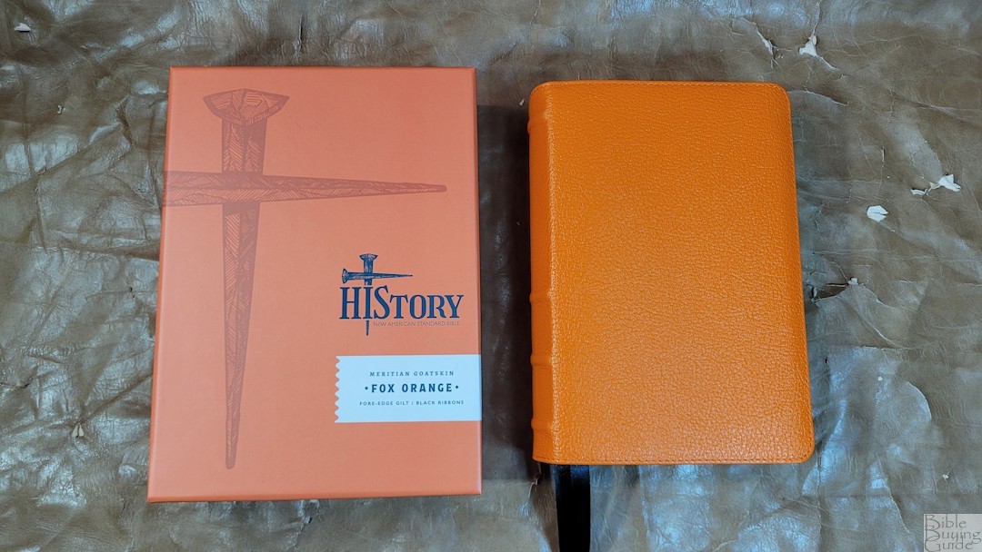
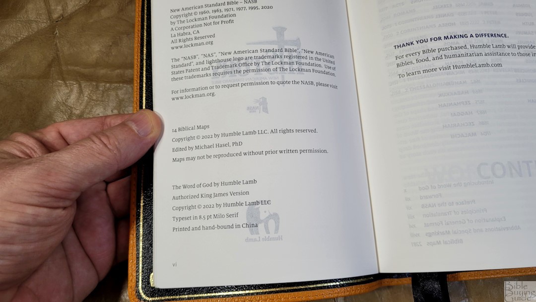
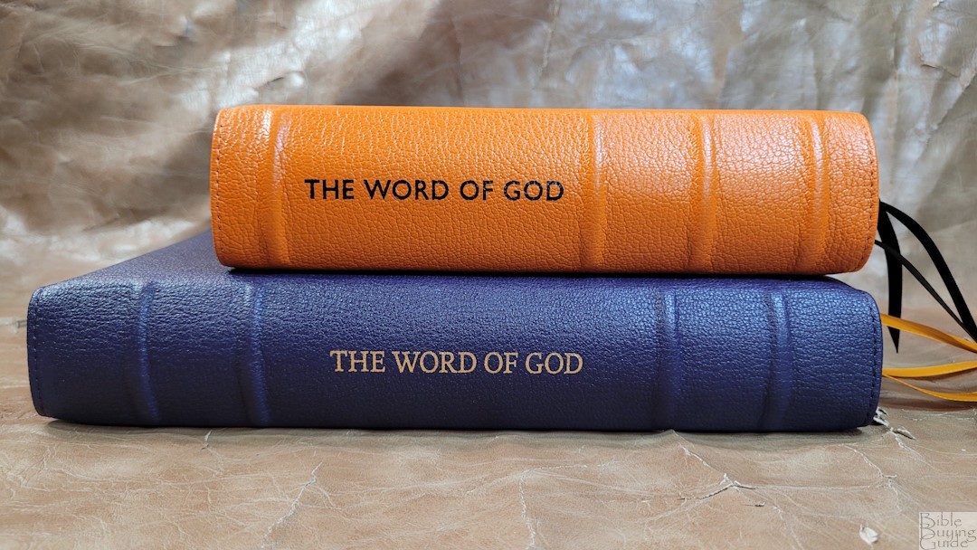
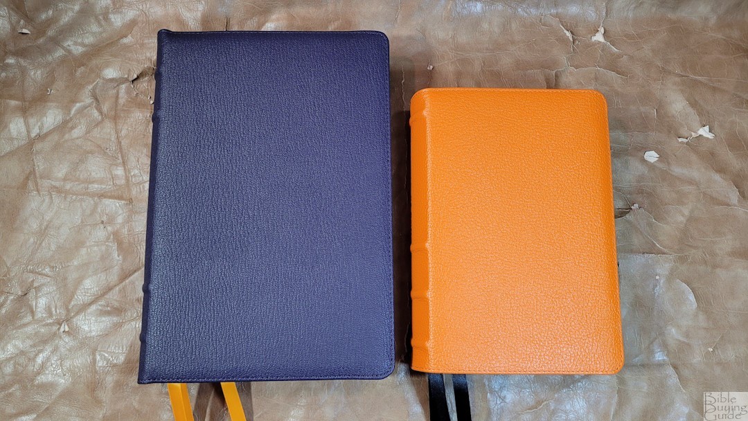
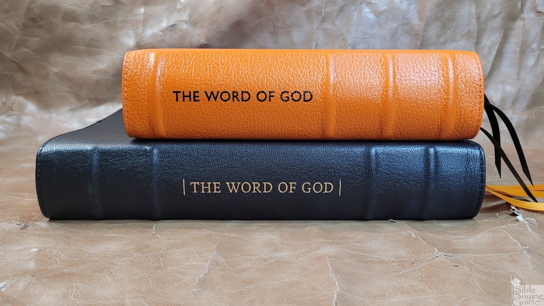
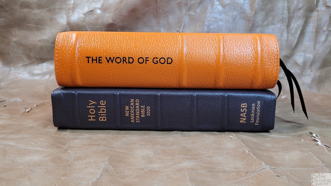
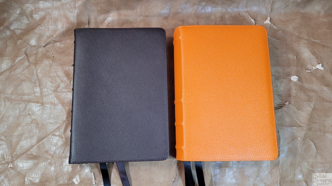
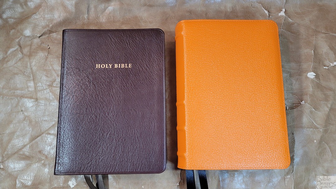
HIStory is a new Bible design from Humble Lamb. It was just released in the 2020 NASB. This is a compact-size edition with several unique design elements that stand apart. It’s available in several colors. I’m reviewing the Fox Orange. It was printed and bound in China.
Specs
- 2020 NASB
- Fox orange goatskin
- Leather edge-lined liner
- Sewn binding
- 3 10mm ribbons
- Overall size is 7 3/4 x 5 1/2 x 2″
- 1 lb, 9.6 oz
- 32GSM paper
- Fore-edge art page edges
- Single-column paragraph layout
- Line matching text
- 8.5 Milo typeface
- Blue letter
- 95k outer margin reference
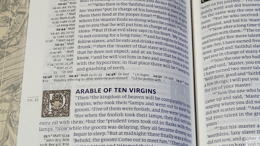
- Section heading drop caps
- 220 Gustave Doré illustrations
- 14 maps
- Printed in China
- Currently $220
Humble Lamb provided this Bible in exchange for an honest review. I was not required to give a positive review, only an honest one. All opinions are my own.
_________________________________________________________
This Bible is available at Humble Lamb for $220.
_________________________________________________________
Table of Contents
- Video Review
- Binding
- Paper
- Typography and Layout
- References
- Bible Atlas
- Illustrations
- Comparisons
- Conclusion
Video Review
Unboxing video:
Binding
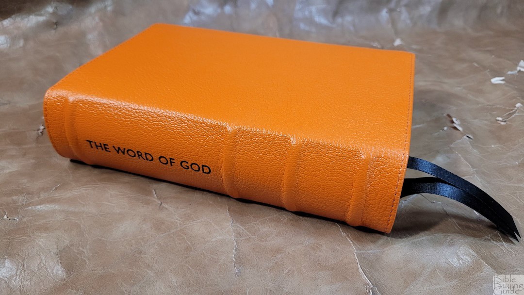
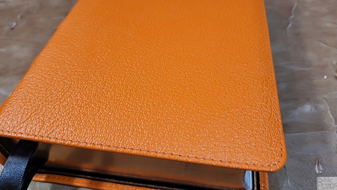
The cover is Meritian goatskin in Fox Orange. I love this color. It’s bright and vibrant without looking like a cartoon. The leather is thick and the grain is deep and pronounced. It has perimeter stitching. There’s nothing printed on the front or back. The spine includes 4 raised hubs, and the spine is slightly rounded just the way I like it. The text “The Word of God” is printed between the first and second spine hub and is upright when the Bible is lying on the table. It’s flexible but stays open flat in the hand.
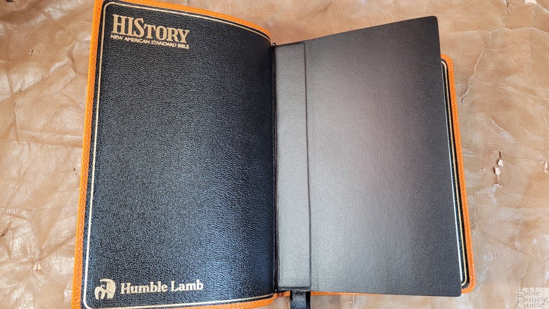
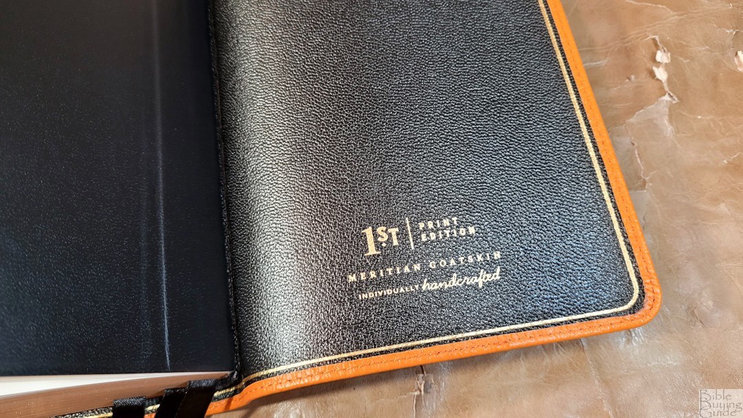
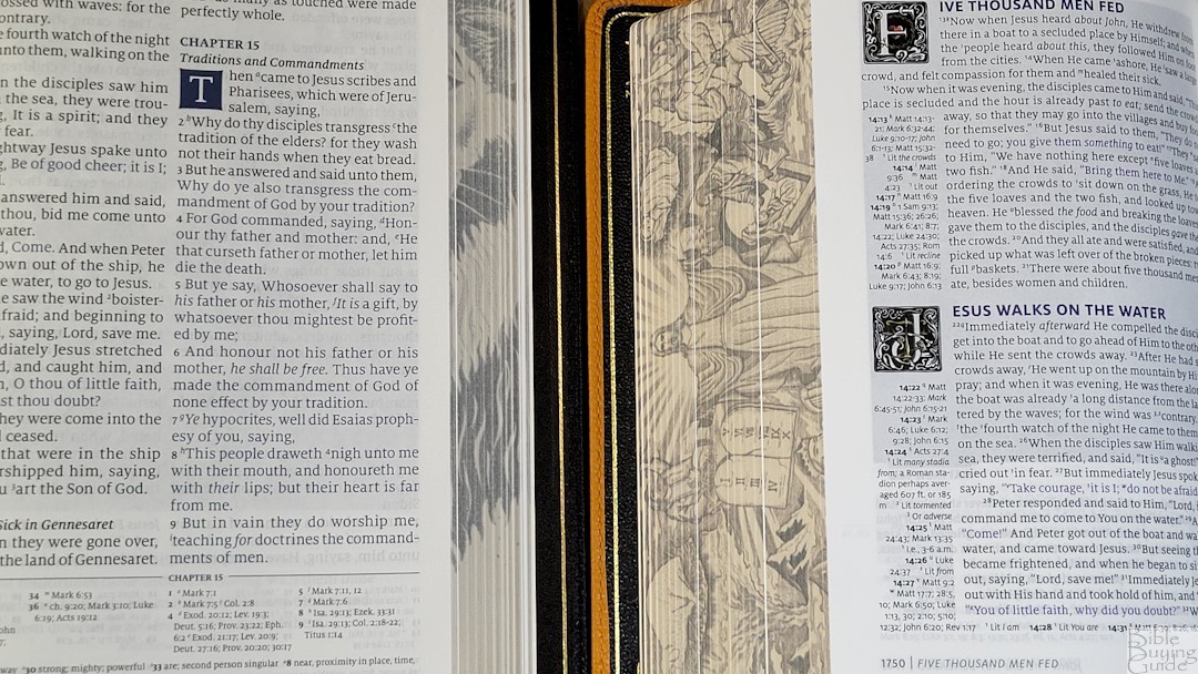
It’s edge-lined with leather, and the leather liner also has a deep grain. The front liner includes the title of the Bible, the translation, and the Humble Lamb logo. The back liner shows that it’s a first print edition, the type of leather, and that it’s handcrafted. A gold line traces the inside of the cover. The edge-lined tab is large for the size of the Bible. It’s a touch stiff, so it will need to be broken in before it will stay open at the beginning of Genesis. It includes 3 black 10mm double-sided satin ribbons. They’re long enough to use easily. The trim size is 7″ x 4.75″. The overall size is 7.75 x 5.5 x 2″, and it weighs 1 lb, 9.6 oz.
Paper

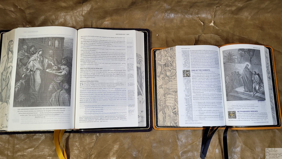
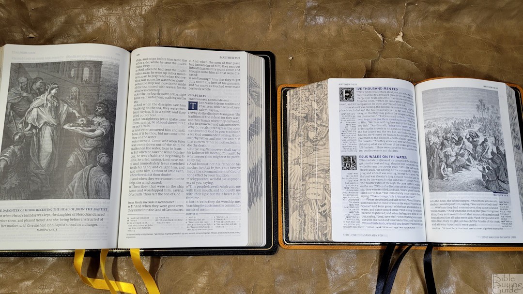
The paper is 32gsm. It seems to be coated, which makes it feel thicker than it is. This is some of my favorite paper. It’s slightly ivory in color and has a touch of a cream tone that you can see in the gutter. It’s highly opaque. The main show-through is the illustrations.
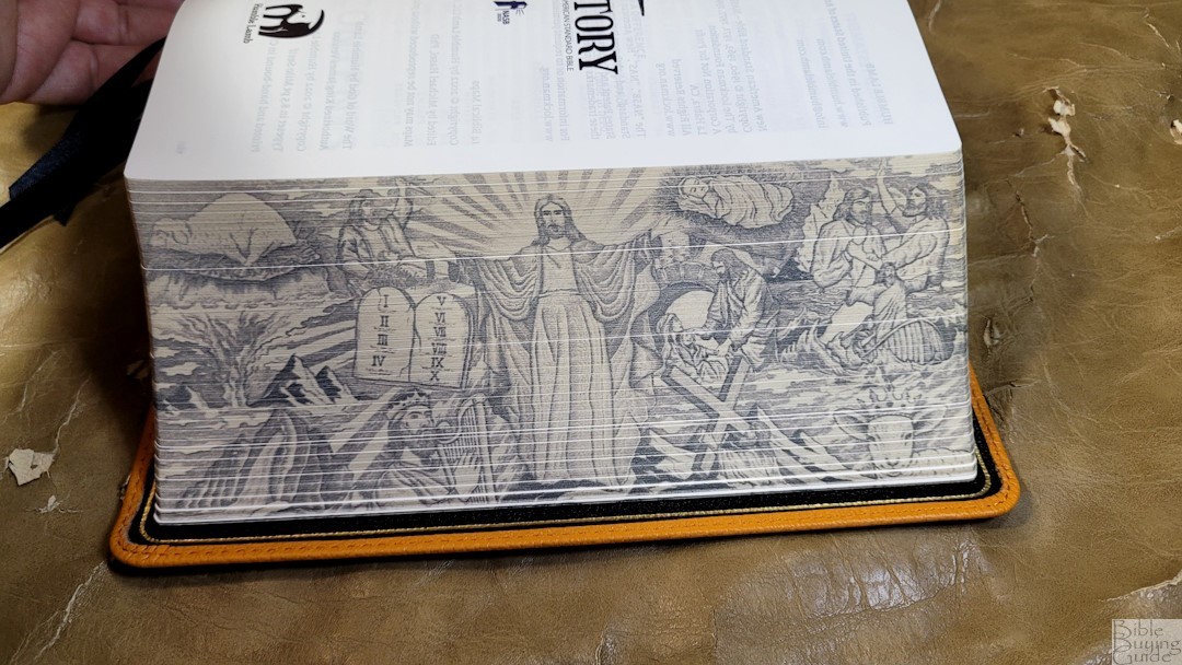
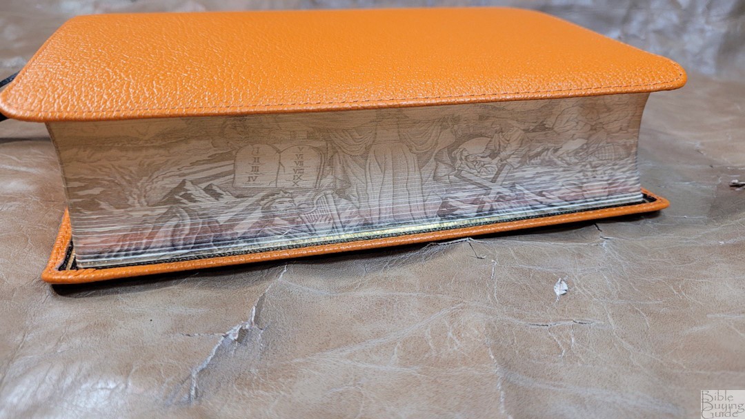
The edges include fore-edge art-gilt using pointalism. They got an artist to illustrate representations of Christ including symbolism from the Old and New Testaments. The illustrations are similar to the style of Gustave Doré.
Typography and Layout
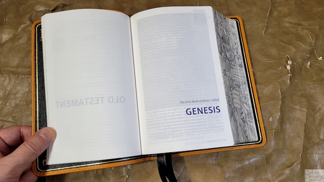
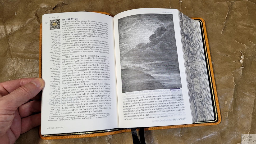
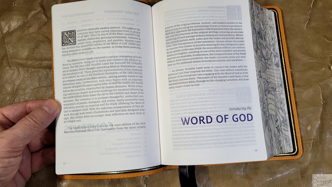
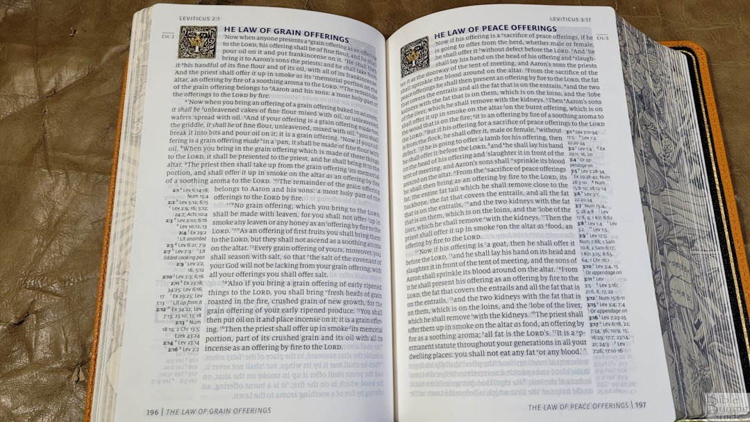
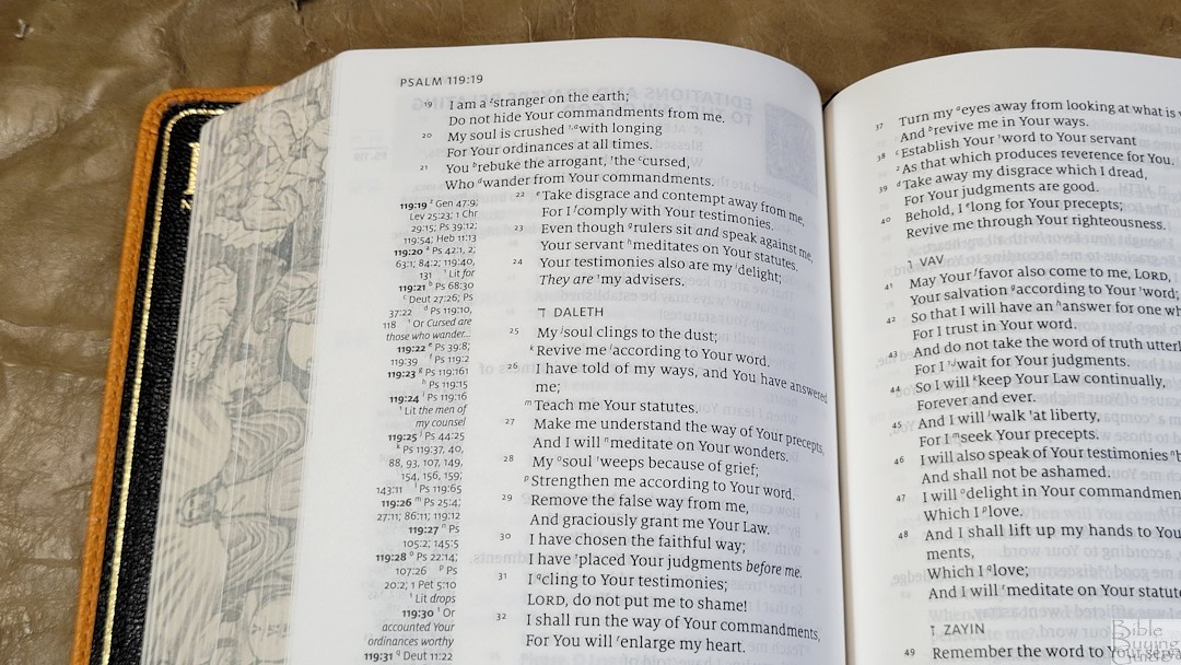
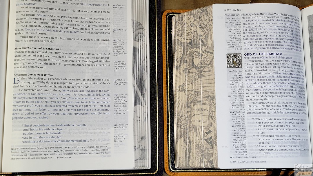
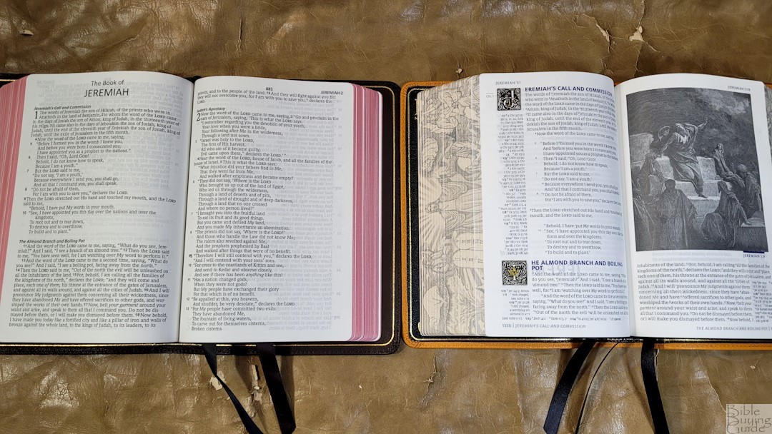
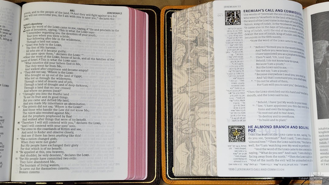
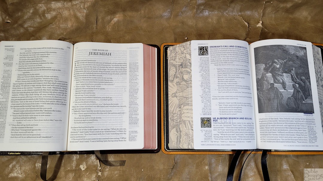
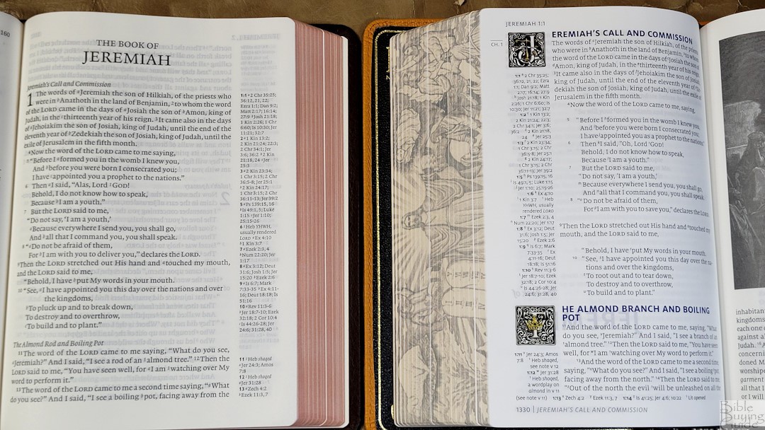
The layout has a lot of unique designs. It presents the 2020 NASB in a single-column, paragraph layout. Poetry is set to stanzas, OT quotes are in all caps, and the words of Christ are in dark blue. Chapter numbers are printed in the margin in a small text. Cross references are placed in the outer margin within the section they correspond to. The header shows the book name and reference in the outer margin. The footer shows the page number in the outer margin next to a page summary. The title page of every book shows the book name near the bottom of the page. The rest of the page is blank.
The typeface is 8.5 Milo with the words of Christ in blue. The blue is hard to tell apart from black, and in certain lighting, I can’t tell the difference. I’d like to see the blue a little brighter. Both the black and blue text have some variation, but it’s just noticeable.
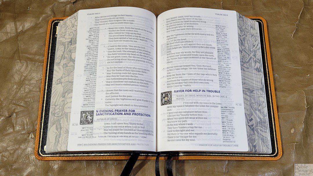

Where the page would normally be empty because of no cross-references to fill it, the text fills in that space. This gives the text two different column widths. It also means there are three things that appear in the margin: references, drop caps, and Bible text. If there are more references than will fit in a section, they’re placed under the text. This divides the text even more than the section headings. The text was printed with line-matching. It has around 14-16 words in the text without references and around 10-12 words in the text next to references.
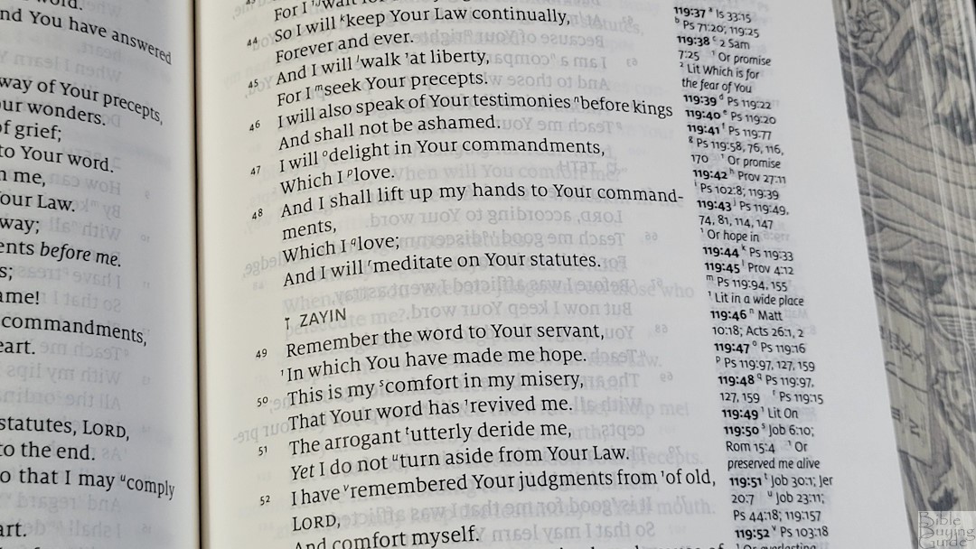
Rather than dividing poetic lines into good places, poetry wraps to the next line. This leaves some lines with a single word. It sometimes hyphenates the last word, placing half of a word on a line by itself. This can look awkward when the line above it goes to the edge of the page.
I find the text easy enough to read. The text wrapped with the references and the sometimes large number of drop caps on a page can make the text look a little busy. Verse numbers are small and thin, so they can be a touch difficult to find in a hurry.
Drop Caps
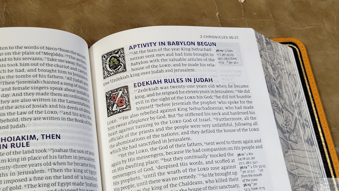
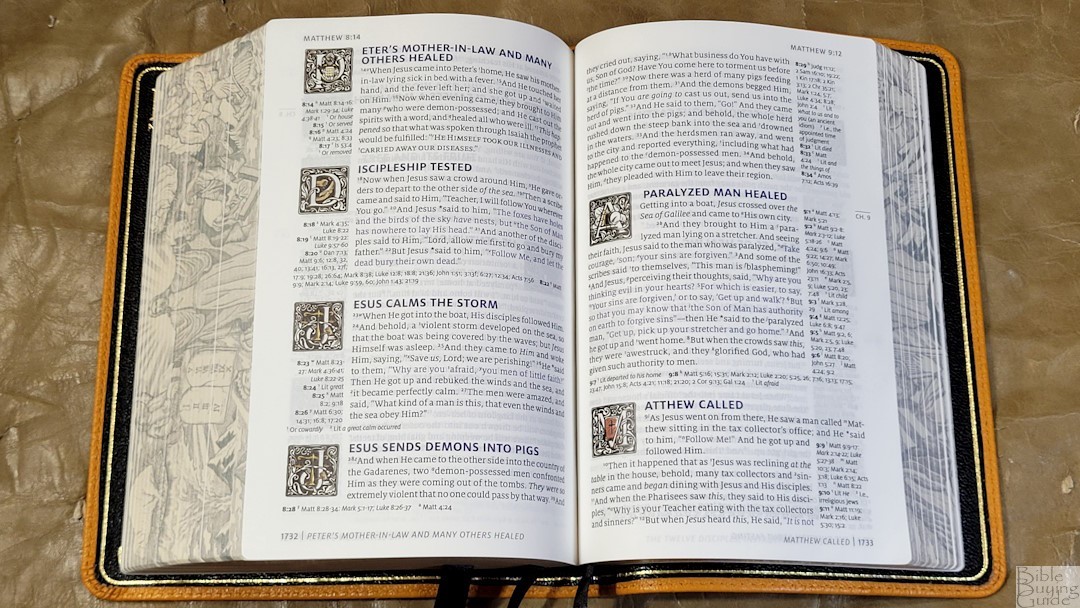
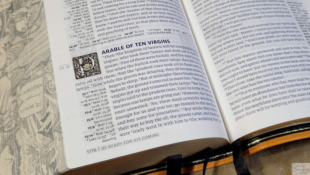
The drop caps are tied to the section headings rather than the text. The first letter of a section heading has a drop cap. They take five lines counting the section heading. They’re placed within the references on the left page and within the text on the right page. They’re black with lots of designs in white within the drop cap. In the center is a graphic that has a splotch of color. Since they’re tied to the section headings, there can be a lot of them on a two-page spread.
References
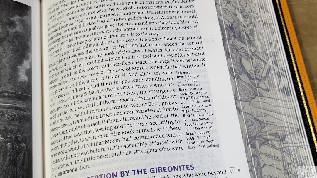
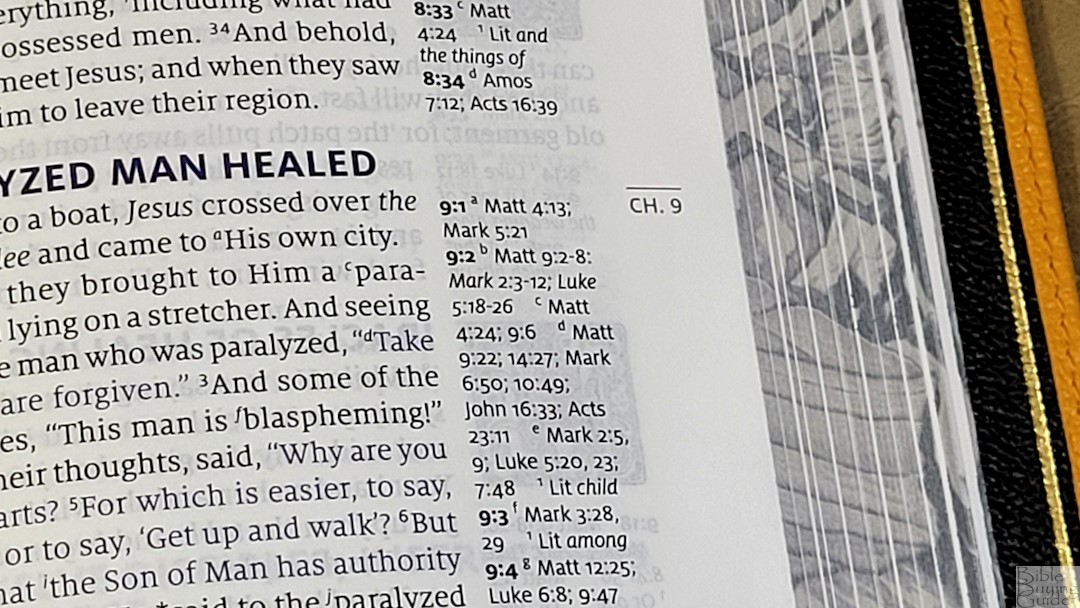
The NASB HIStory includes the full set of Lockman 95,000 cross-references. It also includes the full set of Lockman translation footnotes. They’re excellent for detailed Bible study. They’re placed within their section heading, starting at the bottom of the section. If there are more than will fit in the margin, the rest are placed under the text in that section. If there is extra space above the references, the NASB text takes that space.
Here are a few example references to help you compare:
- Genesis 1:1 – Ps 102:25; Is 40:21; Jn 1:1, 2; Heb 1:10; Ps 89:11; 90:2; Ac 17:24; Rom 1:20; Heb 11:3; Job 38:4; Is 42:5; 45:18; Rev 4:11
- Deuteronomy 6:4 – Mt 22:37; Mk 12:29, 30; Lk 10:27; Dt 4:35, 39; Jn 10:30; 1 Cor 8:4; Eph 4:6
- Isaiah 9:6 – Is 7:14; 11:1, 2; 53:2; Lk 2:11; Jn 3:16; Mt 28:18; 1 Cor 15:25; Is 22:22; Is 28:29; Dt 10:17; Neh 9:32; Is 10:21; Is 63:16; 64:8; Is 26:3, 1254:10; 66:12
- Matthew 28:19 – Mk 16:15; Mt 13:52; Ac 1:8; 14:21; Mt 25:32; Lk 24:47; Ac 2:38; 8:16; Rom 6:3; 1 Cor 1:13, 15; Gal 3:27
- Mark 12:29 – Dt 6:4
- John 1:1 – Gen 1:1; Col 1:17; 1 Jn 1:1; Jn 1:14; Rev 19:13; Jn 17:5; 1 Jn 1:2; Ph 2:6
- John 3:16 – Rom 5:8; Eph 2:4; 2 Thes 2:16; 1 Jn 4:10; Rev 1:5; Rom 8:32; 1 Jn 4:9; Jn 1:18; 3:18; 1 Jn 4:9; Jn 3:36; 6:40; 11:25
- Acts 2:38 – Mk 1:15; Lk 24:47; Ac 3:19; 5:31; 20:21; Mk 16:16; Ac 8:12, 16; 22:16
- Romans 10:9 – Mt 10:32; Lk 12:8; Rom 14:9; 1 Cor 12:3; Phil 2:11; Ac 16:31; Rom 4:24; Ac 2:24
- 1 John 1:1 – Jn 1:1; 1 Jn 2:13, 14; Ac 4:20; 1 Jn 1:3; Jn 19:35; 2 Pet 1:16; 1 Jn 1:2; Jn 1:14; 1 Jn 4:14; Lk 24:39; Jn 20:27; Jn 1:1, 14
Bible Atlas
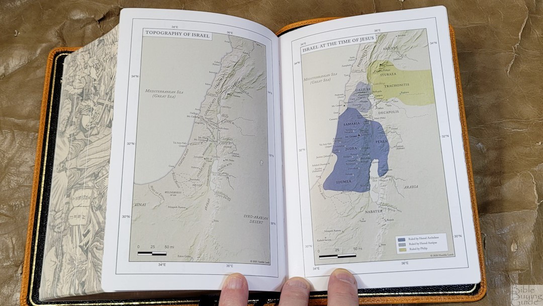
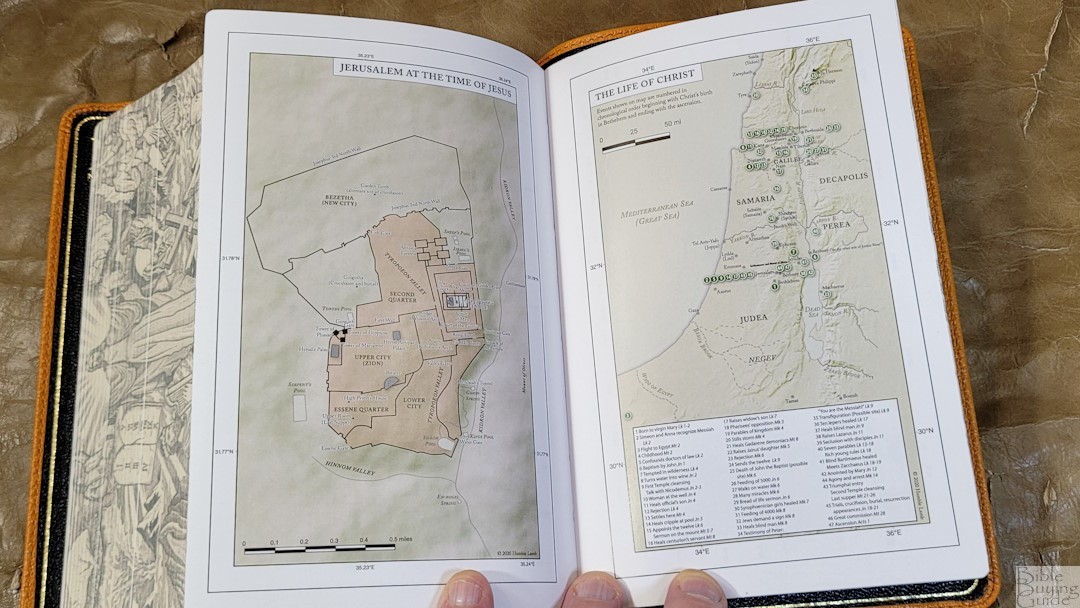
In the back are 14 full-color maps designed by Humble Lamb. It includes longitude and latitude. The colors are earth tones and include bold red, green, blue, and yellow, over tan backgrounds. They show distance, routes, events with Scripture references, borders, dates, territories of rulers, etc. It does not include an index.
Maps include:
- World of the Patriarchs
- Exodus from Egypt
- Twelve Tribes of Israel
- Kingdom of Israel
- Divided Kingdom
- Assyrian and Babylonian Empires
- Greek Empire
- Topography of Israel
- Israel at the Time of Jesus
- Jerusalem at the Time of Jesus
- The Life of Christ
- Paul’s Missionary Travels
- Spread of Christianity
- Roman Empire
Illustrations
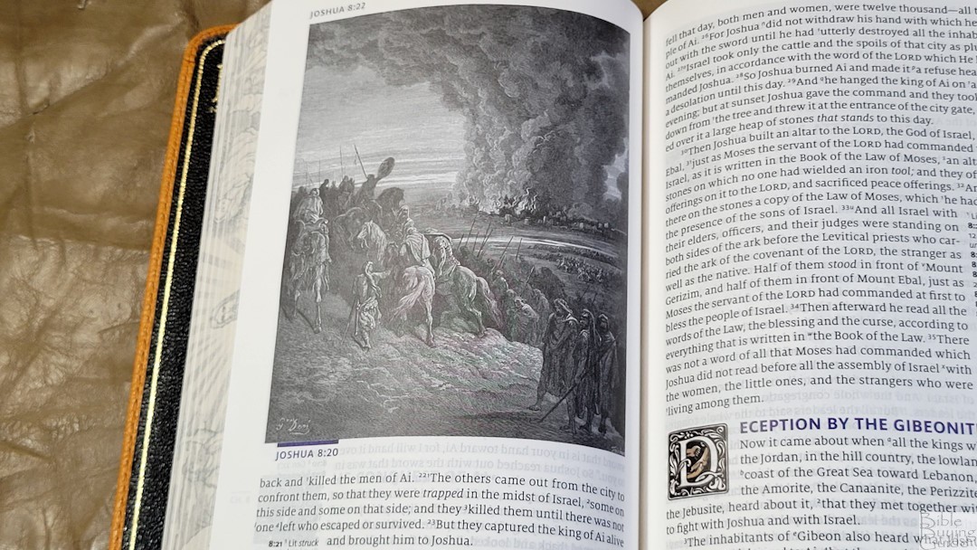
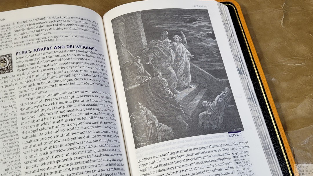
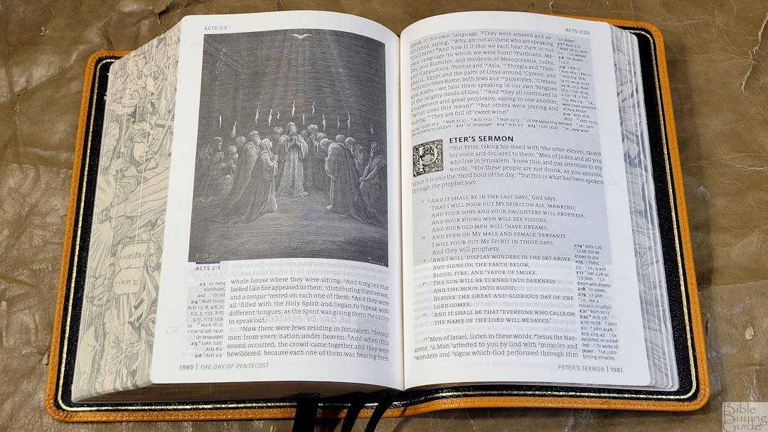
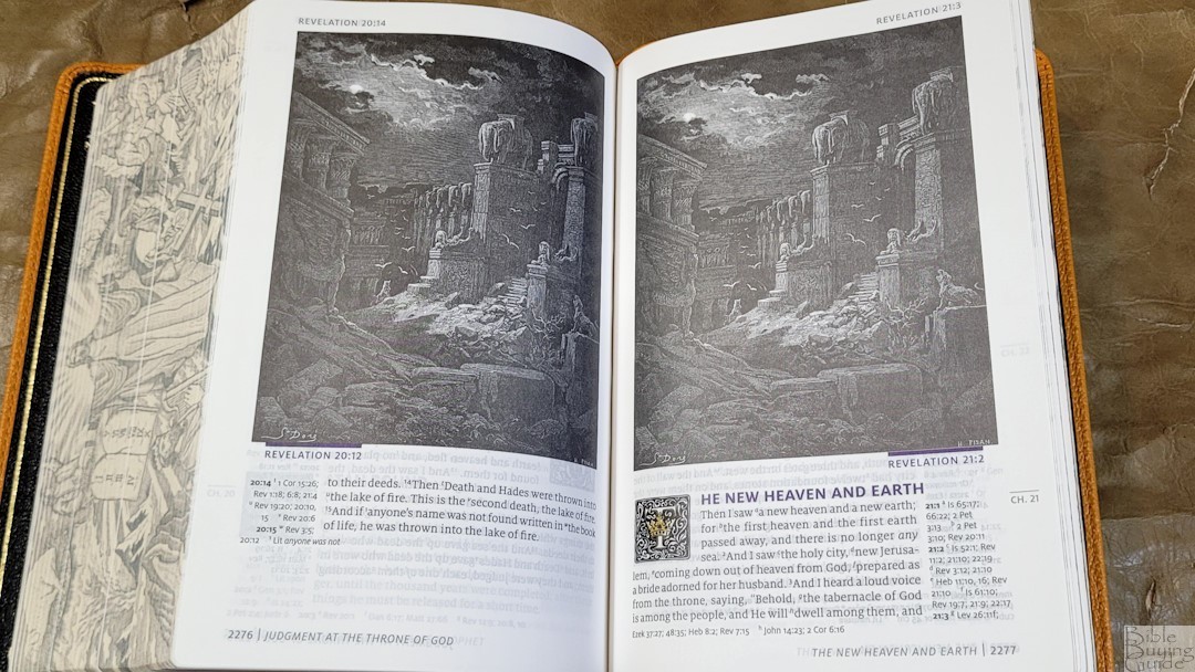
Throughout the Bible are 220 illustrations by Gustave Doré. They’re placed near the text they correspond to and take around two-thirds of the page. They include the verse printed under the illustration. They do show-through enough to darken the page on the other side. I didn’t find them too distracting, but the darker page can be slightly more difficult to read. They’re printed well and they’re great for understanding the setting. Unfortunately, there are a few that appear multiple times. The last three of Revelation were supposed to be different illustrations, but instead, they repeat. It stands out because the last two are next to each other. This will be fixed in the next print run, but that might take a while.
Comparisons
Humble Lamb Shepherd
The Humble Lamb Shepherd has a larger footprint and a slightly larger font. It’s also a single-column reference edition with references in the outer margin, but it places references next to their verses. The layout is cleaner with more white space. It uses the same paper as HIStory. The words of Christ are in blue, and this blue is the easiest to notice of the three HL editions. It has fewer ill
Humble Lamb Lion

The Humble Lamb Lion is a lot different. It’s larger and has a traditional double-column v-b-v KJV with a larger font. References and a glossary are placed in the footer. Drop caps are smaller and simplified. It also has the words of Christ in blue.
Lockman Prime Edition Compact Single-Column
The Lockman Prime Edition Compact Single-Column has a similar footprint. It’s also a single-column paragraph edition, but it doesn’t include cross-references or anything fancy. It has a thinner block, thinner paper with a touch more show-though, a larger and darker font, and more words per line. It’s great for reading and carrying.
Cambridge NASB Clarion

Even though the Cambridge NASB Clarion is the 1995 NASB, it’s the most similar to HIStory. It has the same footprint, but it’s thinner and has 28gsm paper. The layout is a single column with cross-references in the margins. It has a larger text with more white space, making it great for reading and study.
Conclusion
Humble Lamb’s HIStory is an interesting design. It can look busy on certain pages, but it’s not distracting when reading. The illustrations from Gustave Doré look the best of any Bible from Humble Lamb so far. I’d like to see some adjustments to Psalms, a brighter blue, and a few other minor adjustments here and there, but the reading experience is excellent. It does have three print errors, but none are in the text. The materials and construction are excellent. It’s easy to forget that it wasn’t made in the Netherlands. If you’re interested in a 2020 NASB compact reference, Humble Lamb’s HIStory is worth a look.
_________________________________________________________
This Bible is available at Humble Lamb for $220.
_________________________________________________________
Humble Lamb provided this Bible in exchange for an honest review. I was not required to give a positive review, only an honest one. All opinions are my own.


