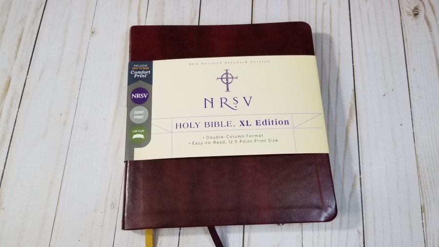
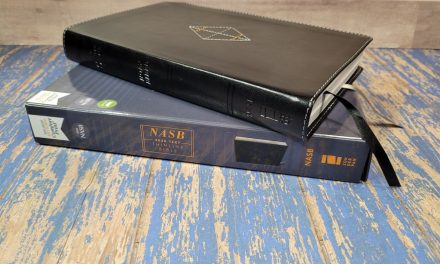
With the NRSV Holy Bible, XL Edition, Zondervan has found a way to produce a large print thinline Bible with wide enough columns to create a great layout for both prose and poetry. It has a square shape that works well with the Comfort Print typeface from 2K/Denmark, and it’s easy to carry, hold, and preach from. In this Bible review, I’ll take a look at the burgundy Leathersoft edition, ISBN 9780310454342, made in China.
Zondervan provided this Bible in exchange for an honest review. I was not required to give a positive review, only an honest one. All opinions are my own.
_________________________________________________________
This book is available at (includes some affiliate links)
and many local Bible bookstores
_________________________________________________________
Table of Contents
Video Review
Cover and Binding

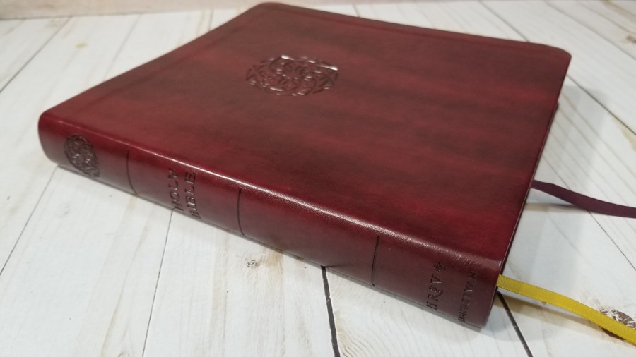
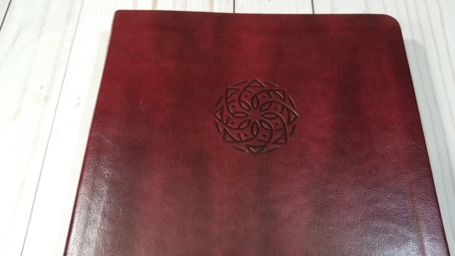
The cover is burgundy Leathersoft (imitation). It has a rich color with darker areas to give it visual texture. It also has a little bit of grain that makes it look elegant. The front has a rosette design debossed into the cover that’s darker than the rest of the cover. The spine includes the rosette along with the text and spine rib indications.
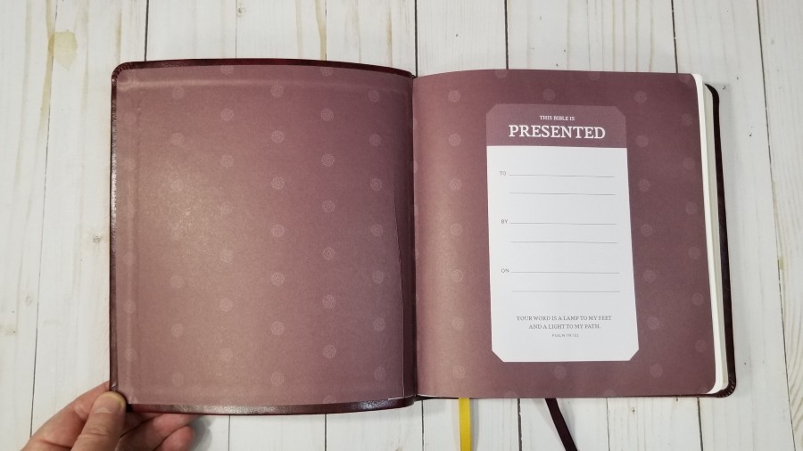
It has a burgundy paste-down paper liner with rosettes and includes the presentation information. It’s Smyth sewn. The size and shape of the cover help it to stay open to any page.
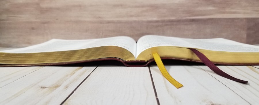
It has two satin ribbon markers. One is burgundy and the other is gold. They’re extra-long, so there is plenty of room to pull them to the outer corner to open the Bible. It has a square shape that’s much wider than most Bibles. These dimensions do make it a little awkward to hold sometimes. The overall size is 7.75 x 8.25 x 1″. It weighs 1lb, 13.2 oz.
Paper
I’m not sure of the gsm, but the paper is thin. It’s the same paper that Zondervan and Thomas Nelson use is their standard thinline editions. It does have a noticeable amount of show-through, but it’s not bad enough to keep me from using it. It’s mostly visible in poetic settings. It’s off-white in color and has a slightly rough texture that helps in turning pages. There is no glare under direct light. The page edges are gold gilted.
Typography
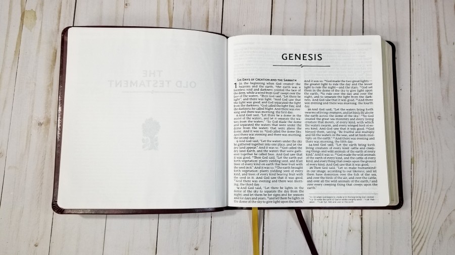
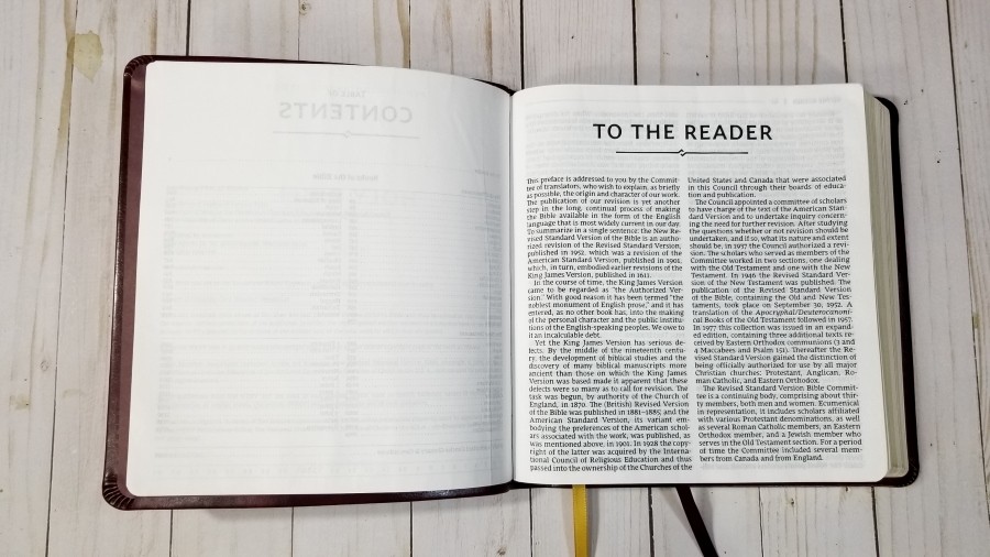
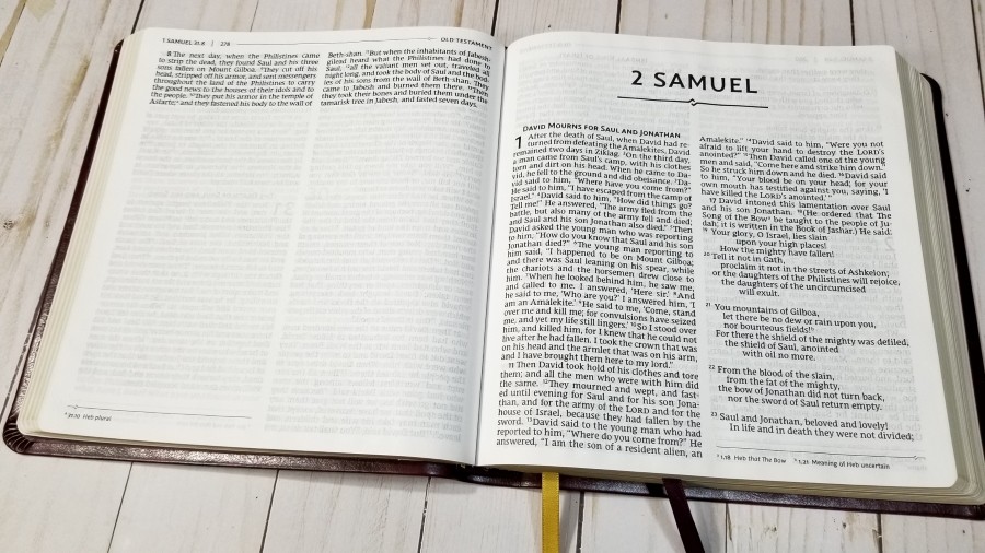
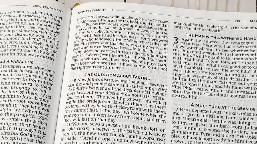
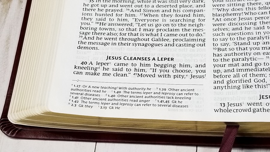
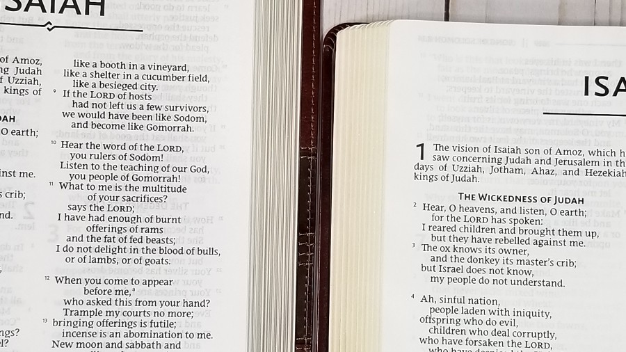
The text is presented in a double-column, paragraph format with poetry in stanzas. The header shows the book name, chapter, and verse, a horizontal line, and the page number, in the outer margin. Next to the page number is a horizontal line that’s drawn across the header to the inner margin where it identifies either the Old or New Testament. It has a small design that’s also used in the footer and under the book names. The footer prints the footnotes under the text in the outer margin. Section headings and the first verse of each paragraph are large and bold.
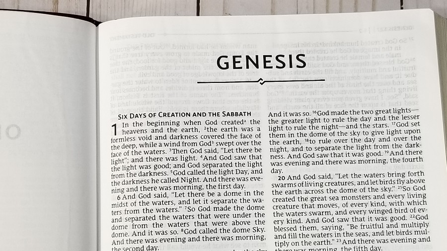
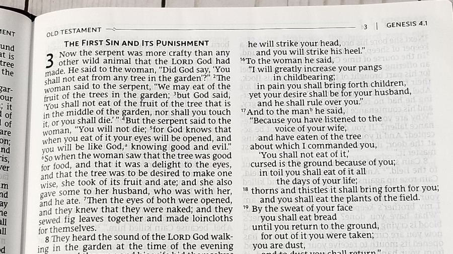
The font is 12.5 point print. It’s the NRSV Comfort Print typeface designed exclusively for Zondervan by 2K/Denmark for the NRSV. The font is dark and easy to read. The text is black-letter and it’s consistent throughout the Bible. It has around 10 words per line. This is the perfect balance between prose not having so many characters that I lose my place, and poetry having enough characters that poetic lines are not chopped in odd places. This line-count works well.
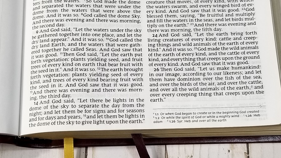
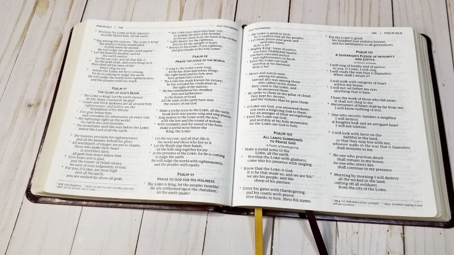
It’s printed with line-matching. Fortunately, the paper is opaque enough that the text on the other side of the page doesn’t become distracting or make the background behind the text too gray.
Glossary and Concordance
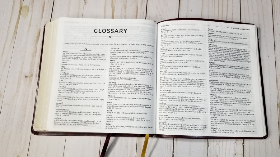

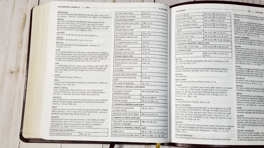
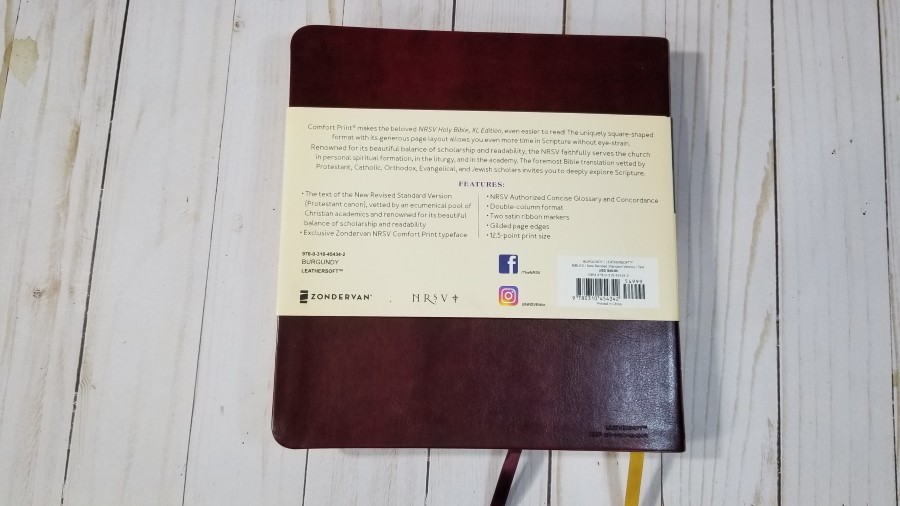
In the back is a large 75-page glossary. This is the NRSV Authorized Concise Glossary and Concordance. It includes names, places, items, terms, tables, etc. If a place has a different modern name, then both names are included. Terms are biblical words rather than theological concepts. It provides the word, a definition, and references. This is an excellent glossary for study and sermon prep.
Comparisons
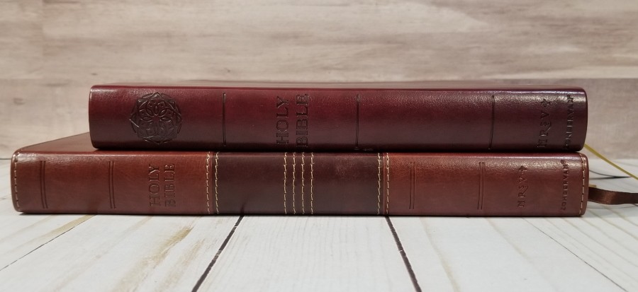
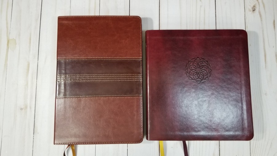
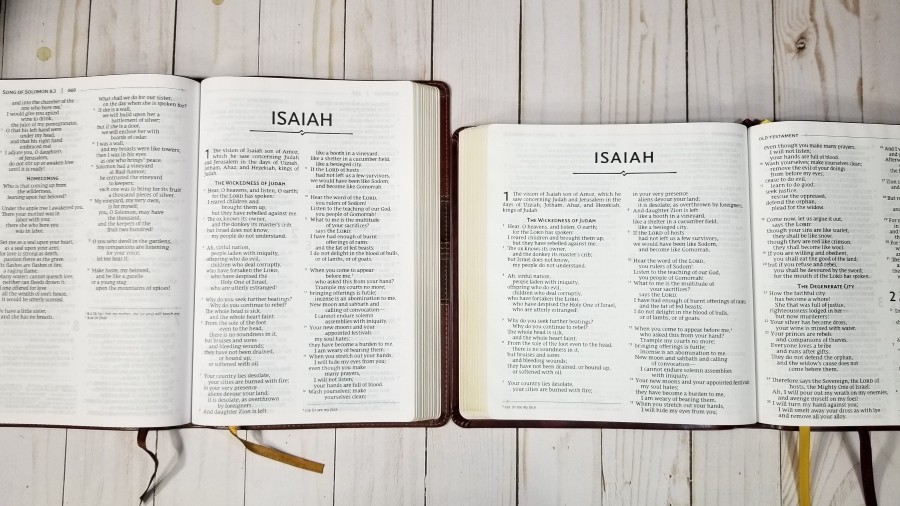
Here’s how the NRSV Holy Bible, XL Edition compares to the NRSV Thinline Large Print. The Large Print has a more traditional size and shape. Its font is slightly smaller, but not enough to notice. Rather than a glossary, it includes a reading plan and several Scripture lists. The materials are the same.
Conclusion

The Zondervan NRSV Holy Bible, XL Edition, is an interesting Bible. The imitation leather looks elegant. The paper isn’t my favorite, but I can live with it in this price range. The size and shape are easy enough to carry and hold, and the font size is excellent for reading and preaching. I especially like how the wide shape allows for wide columns with 10 words and a large print. This is unique and it makes for a great reading experience. If you’re interested in a large print NRSV, I highly recommend NRSV Holy Bible, XL Edition from Zondervan.
_________________________________________________________
This book is available at (includes some affiliate links)
and many local Bible bookstores
_________________________________________________________
Zondervan provided this Bible in exchange for an honest review. I was not required to give a positive review, only an honest one. All opinions are my own.


Great review, as always. Looks like an interesting Bible; however, it has one flaw: the lower-case “g” is missing half of its loop. I know this is part of the 2K/Denmark design, but I find it a major distraction… so much so, that it’s a “deal-breaker” for me. (I own an NRSV with this font.) I have heard that Zondervan does plan on modifying future Bibles to include the lower loop on the “g.”
It looks to me that this XL edition does have the updated “g”. You can see it on the right in the second to last photo.
I have the Large Print Thinline and it appears that this edition suffers from the same flaw in my eyes and that is that the line spacing is too tight. I like this Comfort Print font but there’s something about it that appears cramped in the current layouts. Hopefully the premium edition coming in September will be a little more generous with the spacing.
What’s happening, in many modern Bibles, to the necessary marginal notes and the desirable cross-references?!