The classic KJV Pitt Minion has now been updated to match the current line of Cambridge Pitt Minions. This is a new edition of the KJV Pitt Minion with many updates including the layout, font, and the addition of the Reader’s Companion.
Pros
- Digital font is sharp and print is consistent
- Paragraph format with poetry in verse format
- Reader’s Companion
- Small size is easy to carry
Cons
- Small text might be difficult for some readers
Here are the major features:
- Paragraph format
- 6.75-point Lexicon No. 1 digital font
- Red-letter (also available in black)
- Black Goatskin (other covers available)
- Center-column references
- Art-gilt edges
- Sewn binding
- 15 Maps with index to maps
- Reader’s Companion
- Red ribbon marker
- Epistle Dedicatory
- 1120 pages
- Ultrathin opaque paper
- Presentation Page
- 6.75 x 4.75 x 7/8
- 14.4oz
What is a ‘Pitt Minion’? That’s the question I get from everyone when they first hear about the Cambridge Pitt Minion. ‘Pitt’ comes from the Pitt Building. This is the building that houses the Pitt Press, named for William Pitt, the Prime Minister of Britain and Member of Parliament for Cambridge University. ‘Minion’ is the traditional term for a font in the 7-point range. (For more see BBH blog)
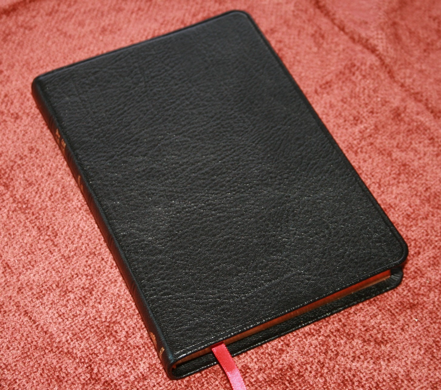
Cover and Binding
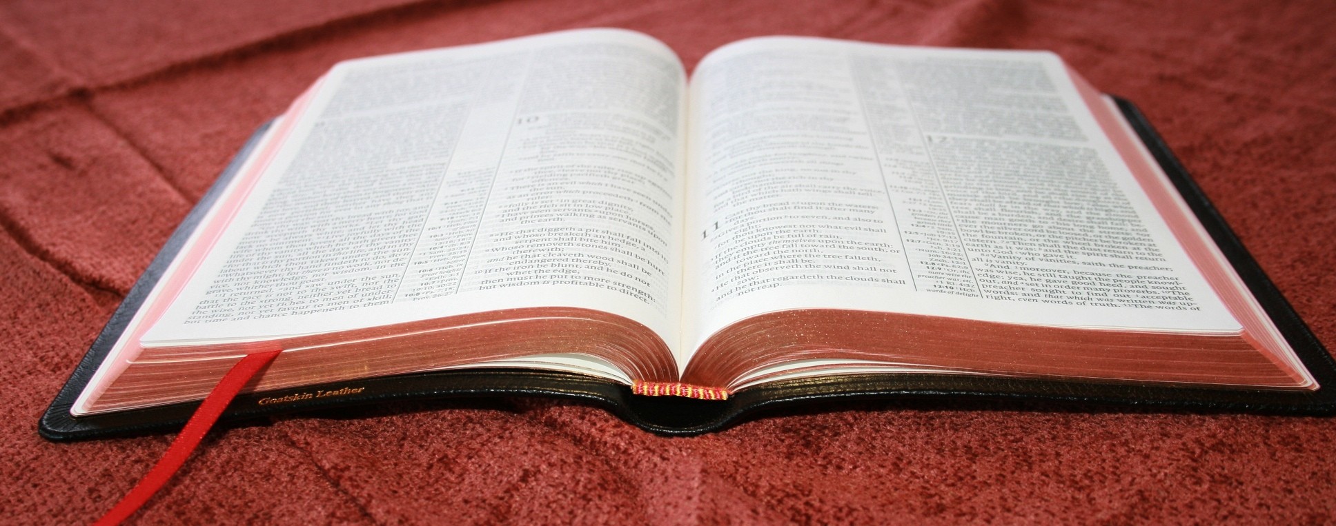
The edition I’m reviewing is black goatskin. It has a sewn binding, so it lays flat. The goatskin has a soft and elegant feel to the grain. Unlike the goatskin Cambridge Cameo, which is edge-stitched and leather-lined, the liner is synthetic and glued to the cover. This makes the cover not as flexible as the Cameo, making it easier to hold open in one hand. A Bible this size doesn’t need to be floppy (in my opinion). This is part of the price difference between the two Bibles.
Font
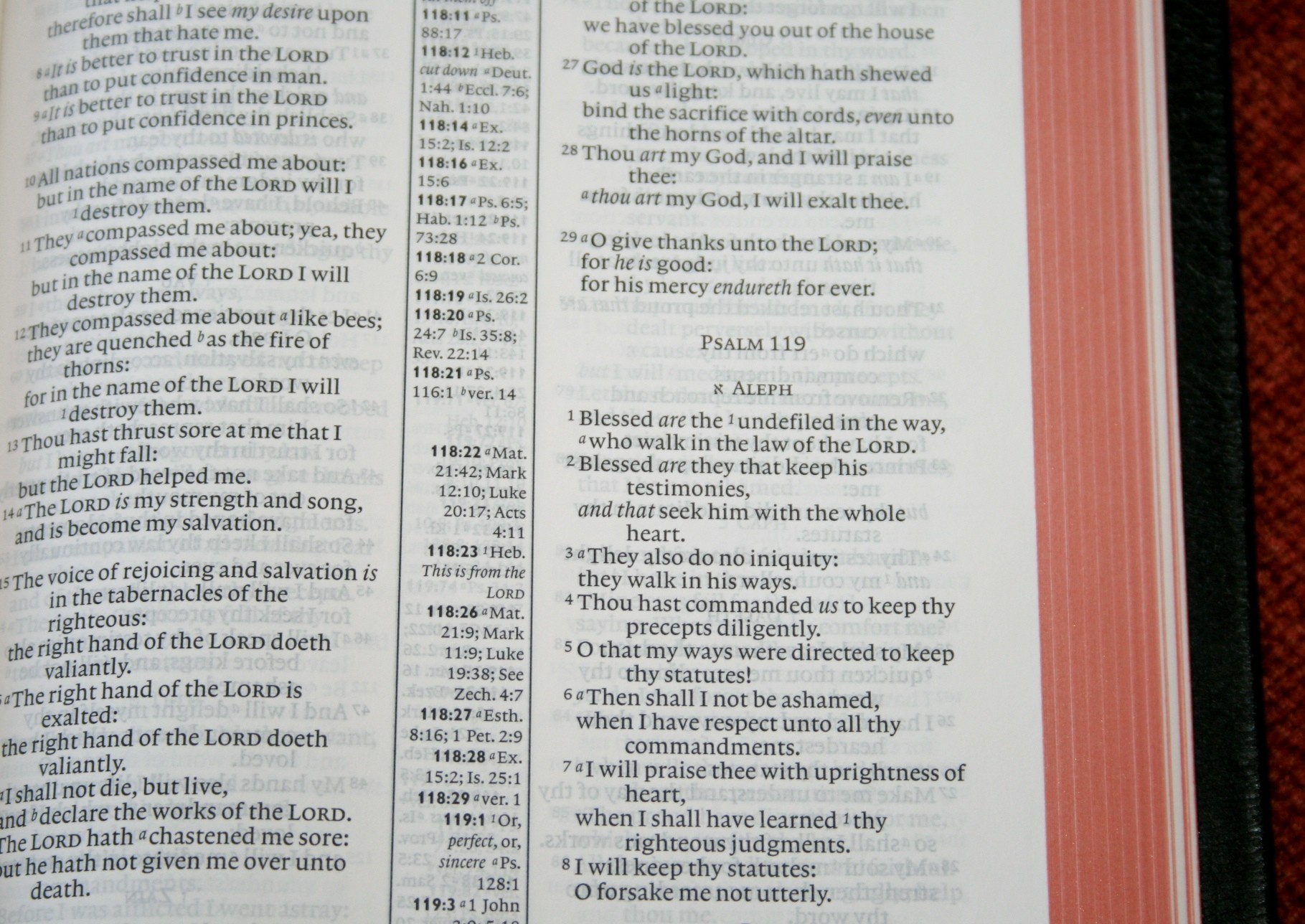
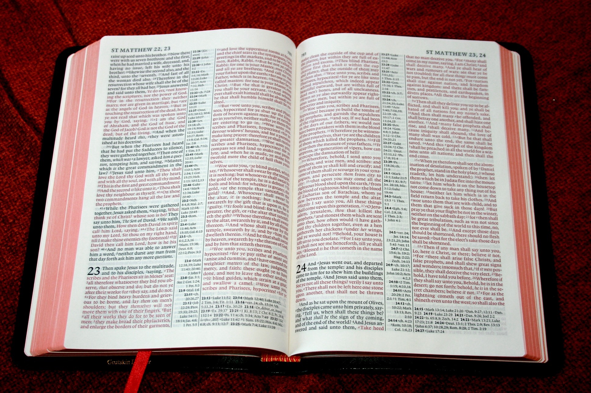
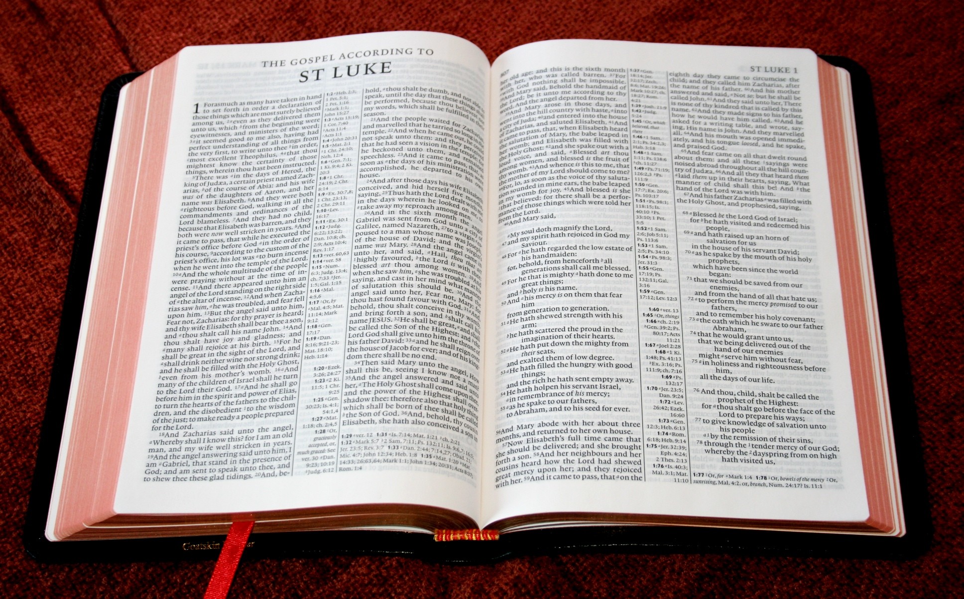
The font is larger than the original at 6.75 Lexicon No. 1 with 7-point leading. It is on the small side, but the sharpness and boldness helps make it readable. It has around a medium boldness and is very consistent throughout the Bible. The words of Christ while on Earth are in red-letter. The red-letter is about a medium shade of red and is equally consistent. I usually don’t like small text, but given the print and paper quality, I didn’t have any problem reading this text.
Layout
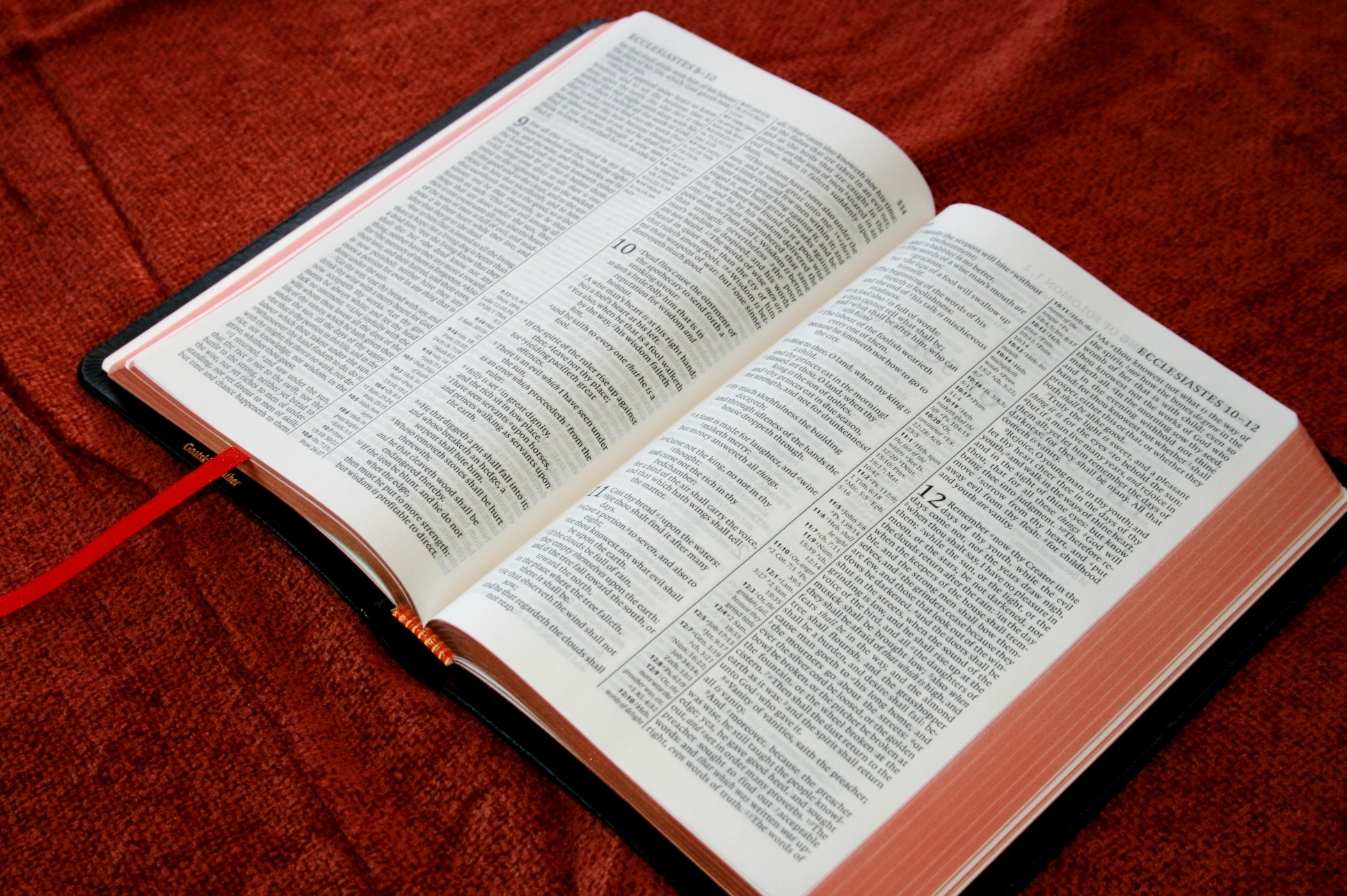
The layout for the new KJV Pitt Minion is beautiful. This edition is in paragraph format with poetry set in verse format. Searching for verses is a little more difficult because the verse numbers are not in bold. This makes the Pitt Minion a great reading Bible. I suspect we’ll see more KJV’s in this format.
Cambridge continues the layout/printing method they started with the Clarion with printing each line of text over the same area on both sides of the page. This adds to the readability because the white space between the text is cleaner, making the space between the lines seem larger. It looks better in the Pitt Minion because of the greater opacity of the paper.
Thumbing through to find specific chapters is easier since the top outside corners of each page has the range of chapters that appear on that page. I’ve used many Bibles that only give you the chapter that starts on that page. This cause’s unnecessary page turning because I was already on the page I needed, I just didn’t know it since the top of the page only showed the chapter that started on that page. I like the way this is solved in the Pitt Minion. At I wish this were standard in Bibles.
References
The references are from Zondervan. They are center-column and keyed to the text with letters for references and numbers for translation notes. There are verse numbers in bold in the center-column with all the references for that verse. References for verses in the left column appear at the top of the center-column, and references for the verses in the right column appear at the bottom of the center-column.
Paper
The Pitt Minion uses India paper. It is ultrathin and lightweight, and is much more opaque than the Clarion. Since the paper is so thin it does have some slight curling on the edges, but it is very slight. Edges in the goatskin edition are art-gilt, which gives the edges a red tone when the Bible is open. I love the elegance that art-gilt gives.
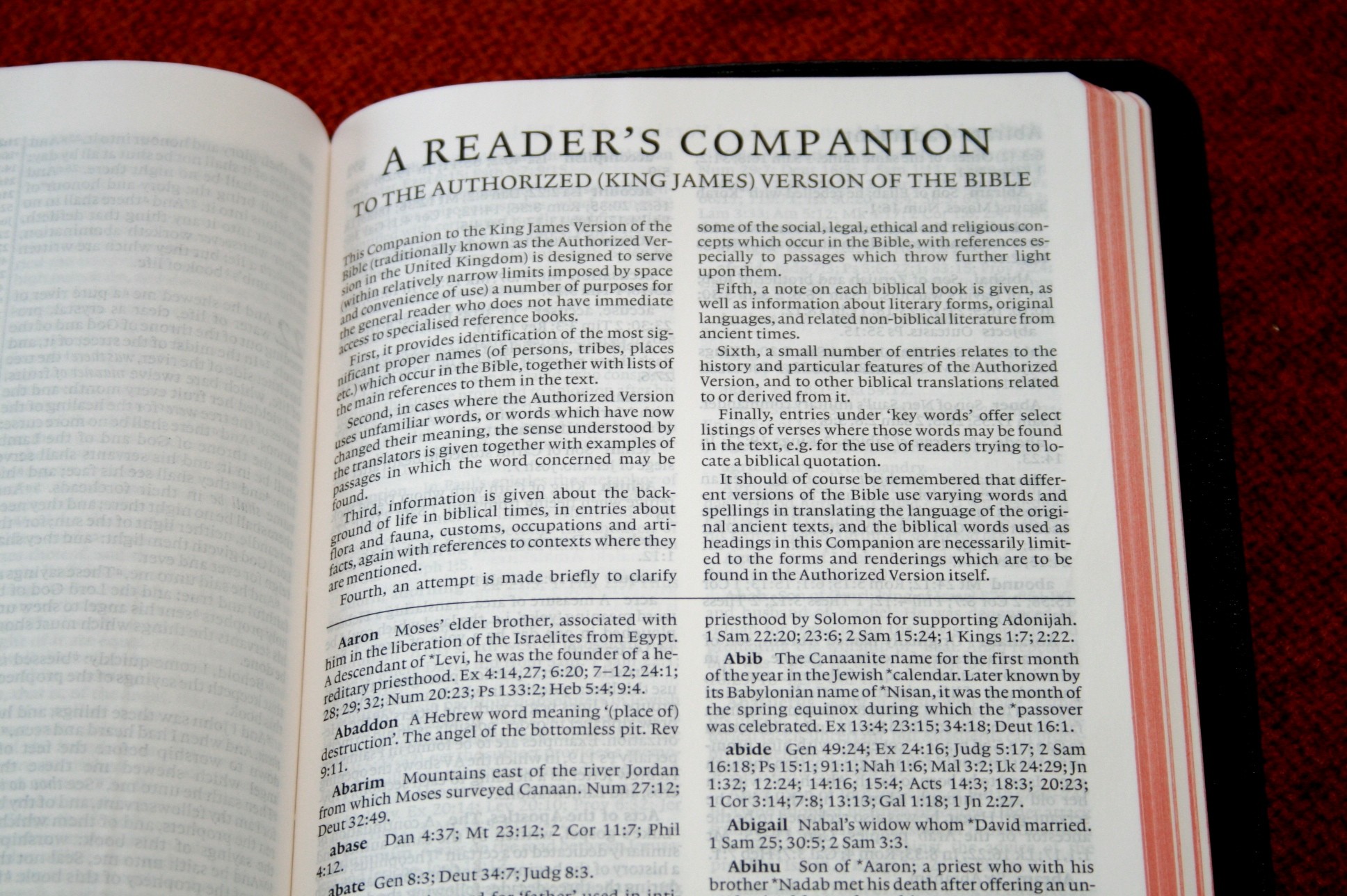
Reader’s Companion
Rather than having a concordance, the Pitt Minion now has the Reader’s Companion, which first appeared in the Cambridge KJV Clarion. It’s a combination of a concordance and a dictionary. I’m very glad that Cambridge is placing the Reader’s Companion in more KJV editions. Where it differs from a concordance is it only gives the reference and not a portion of the text. What it gives instead is a Bible dictionary entry. It includes introductions to the books of the Bible, short biographies of Biblical characters, and much more. I’ll take the Reader’s Companion over a concordance any day. I hope it becomes standard for all Cambridge KJV editions.
Maps
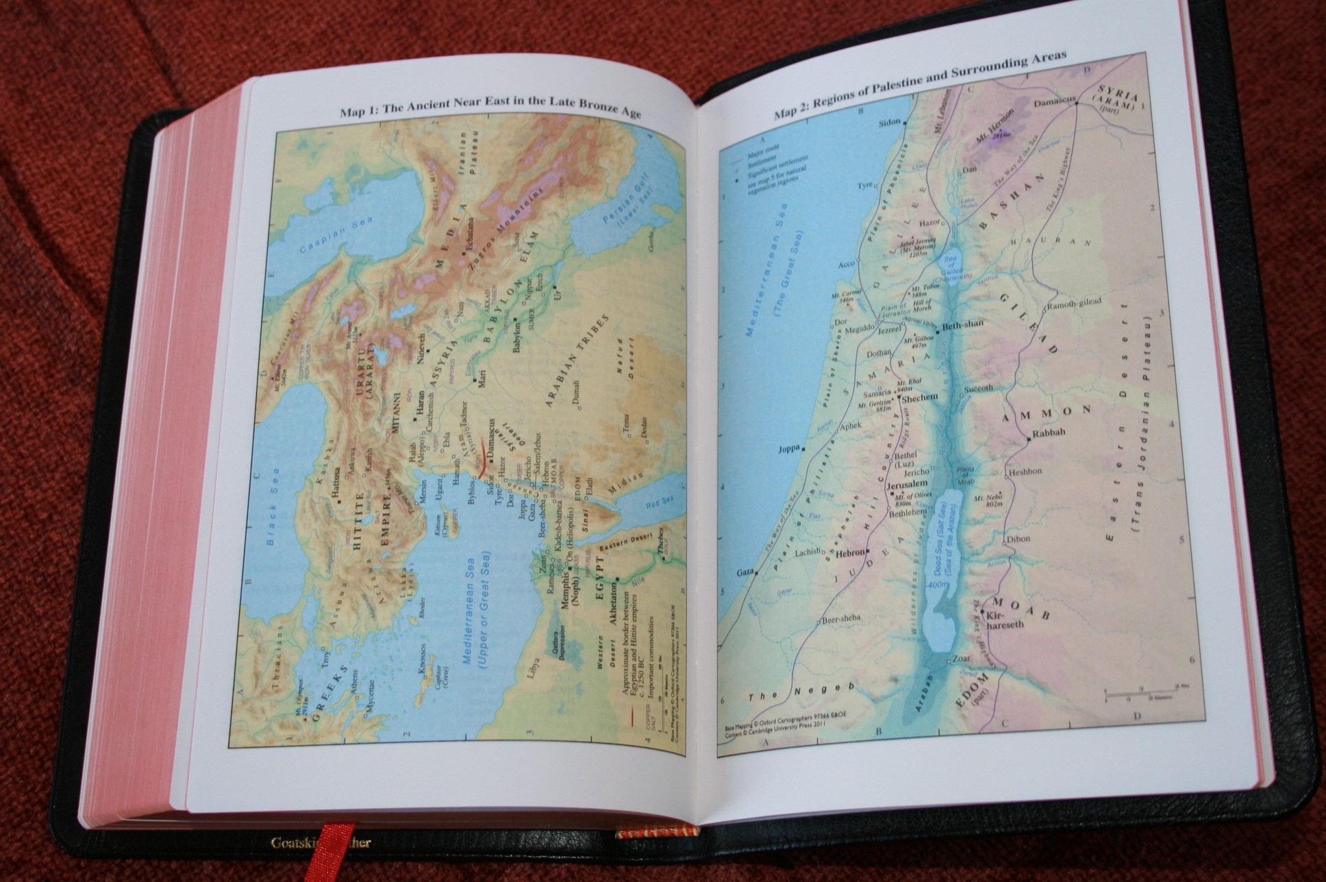
There are 15, newly updated, full color maps. There is also an 8-page index to maps that’s color-coded for Settlements, Political, Physical Land, Physical Water, Travel, and Jerusalem.
Conclusion
The 2nd edition of Cambridge’s KJV Pitt Minion is a beautiful edition of the King James text. It has many features that I’d like to see in all KJV’s. The text, even though it is small, is sharp and easy to read. The paper is thin and still opaque. The Reader’s Companion, being a combination between a concordance and a dictionary, is much more useful than just a concordance. The goatskin is soft and the sewn binding adds to the durability. The Cambridge 2nd edition KJV Pitt Minion is an excellent Bible to read and carry. Highly recommended.
Baker Publishing provided this Bible free for review. I was not required to give a positive review- only an honest review. My opinion is my own.






Being in my mid 40’s and wearing bifocals, I’m sure the print in the Pitt Minion is to small, for me anyway. What peaked my interest about your review was the new formatting. I wonder if Cambridge plans this for the Concord Reference? You touched on this but, how does the new Pitt Minion print/font compare with the original, darker lighter etc.?
Hey, we’re the same age. The text of the Pitt Minion is very small. It’s easier to read than other Bibles with the same size text because of the quality of the digital font, but it’s still hard to read. The formating is awesome. I asked my friends at Baker Publishing if there would be a wide margin coming soon (since they have other wide margins with Pitt Minion counterparts). They tell me there are no plans for it. I’m working on them. I also talked to my friends at Cambridge in UK, trying to get them to produce a large print KJV with references. This Bible with a 10-point font would be perfect. As far as comparing the Pitt to the original, I haven’t seen the original, but I did see a picture online this week that compared the two. I’m having troubling finding it. If I can find it I’ll post a link here. I think the 2nd edition has slightly larger text.
It seems as though I saw a side by side comparison of the two pit minions somewhere online? If I remember correctly someone mentioned that the text in the original was bolder? Yes, I really don’t understand why Bible Companies are so hesitant to make a good quality large print Reference bible. I just find it hard to believe there’s no market for this type of bible, although the up and coming Schuyler Quental series sounds promising.
I stumbled upon this Pitt Minion comparison by accident, not sure if it’s the same one you referred to.
https://www.facebook.com/photo.php?fbid=478574668881533&set=pb.167039706701699.-2207520000.1368969363.&type=3&theater
Hi Norm. This isn’t the one I saw but it does show a good comparison. Thanks for the link.
Here’s a video on Youtube of Brian McClurg where he compares the two:
Hey thanks for the link, it seems as though Mr. McClurg gives his approval for the new Cambridge Pitt. I’ve been thinking about buying one for my niece as she’s scheduled for a missions trip next month. According to her she has worn out her $3.00 ESV and she was looking to replace it with a NKJV. I figured she’s do for an upgrade and might appreciate a Cambridge. In response to your Large print Cambridge reference check the link below and let us know if you find out anything further.
http://www.bibles-direct.co.uk/products/?c=45
Hey Norm. Thanks for the link. I’ve actually been talking to the folks at Cambridge about this one (called Turquoise in UK and Presentation Reference in US). It’s out of print but they are considering reprinting it. It has an older style font (similar to the Cameo, but larger). I’m trying to talk them into producing a new large print with a modern, digital, font (a larger version of the Pitt Minion would be nice). I’d say there’s a better chance of getting a reprint of the Presentation Reference than a new setting (it’s much cheaper to produce). They haven’t decided yet. If I hear anything I’ll be sure to pass it along.
Hi Randy,
Very much enjoyed your review. Here’s a vote for a reprint of the Presentation Reference/Turquoise. The copy I have from the 1990s is exceptionally easy to read and printed on paper that seems more opaque than anything available from Cambridge now. Ghosting is minimal.
Would the Pitt Minion be your recommendation for a legible small carry bible?
Thanks for your blog.
Alec
Thanks Alec. I could recommend the PM as a small carry Bible as long as you don’t have a problem reading tiny text. It’s 6.75. Most of the Bibles I read from are 8-point. It’s very sharp, so it’s easy to read for small text, but my eyes are getting too tired to read text that small for long periods of time. I recently read from it in a Bible study and found it difficult to read and I couldn’t see the verse numbers at all, so I kept reading the next verse. That was after staring at a computer monitor all day (AutoCAD and Excel), so I won’t have that problem every time. Unfortunately, that’s probably most days. I have read from it on other occasions and not had any problem. I love the layout and the features. If you’re OK with a small font it’s a great choice.
Randy
Okay I didn’t pick up on the concept for a Larger Print Pitt for some reason. I was thinking along the lines of a Larger Print Concord, but your idea of a larger print Pitt Minion does sound interesting to me. Tell Cambridge to put me down for a copy. Also, the idea of Cambridge offering those in the KJV, ESV, NASB, and NKJV should generate a lot of interest. Now, where do I sign the petition?
Brother Brown,
My son was given a smaller format Cambridge as his birth 14 years ago. Over time is has failed in the spine workmanship. I recently contacted them (Baker) and was instructed to send it in for review and warranty consideration. They sent me a new copy of this very Bible and I am so impressed. It is a beautiful copy and such a handy size. The service that Baker provided was amazing. Thank you so much for your detailed reviews. They are very helpful, since we typically cannot put our hands on these expensive Bibles prior to purchasing them.
Brian
Randy, maybe I missed it, but I’m wondering about the parahraghing. Does this have paragraphs all throughout the NT? Is it modern paragraphing or does it just follow the pilcrows of older printed KJV Bibles?
Hi Cory. It has modern paragraphing all the way through the NT. The paragraphing matches the Clarion.