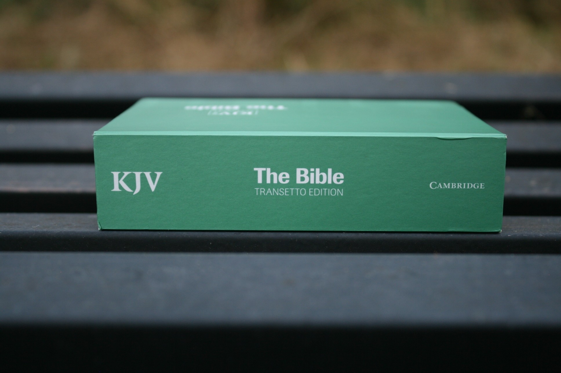
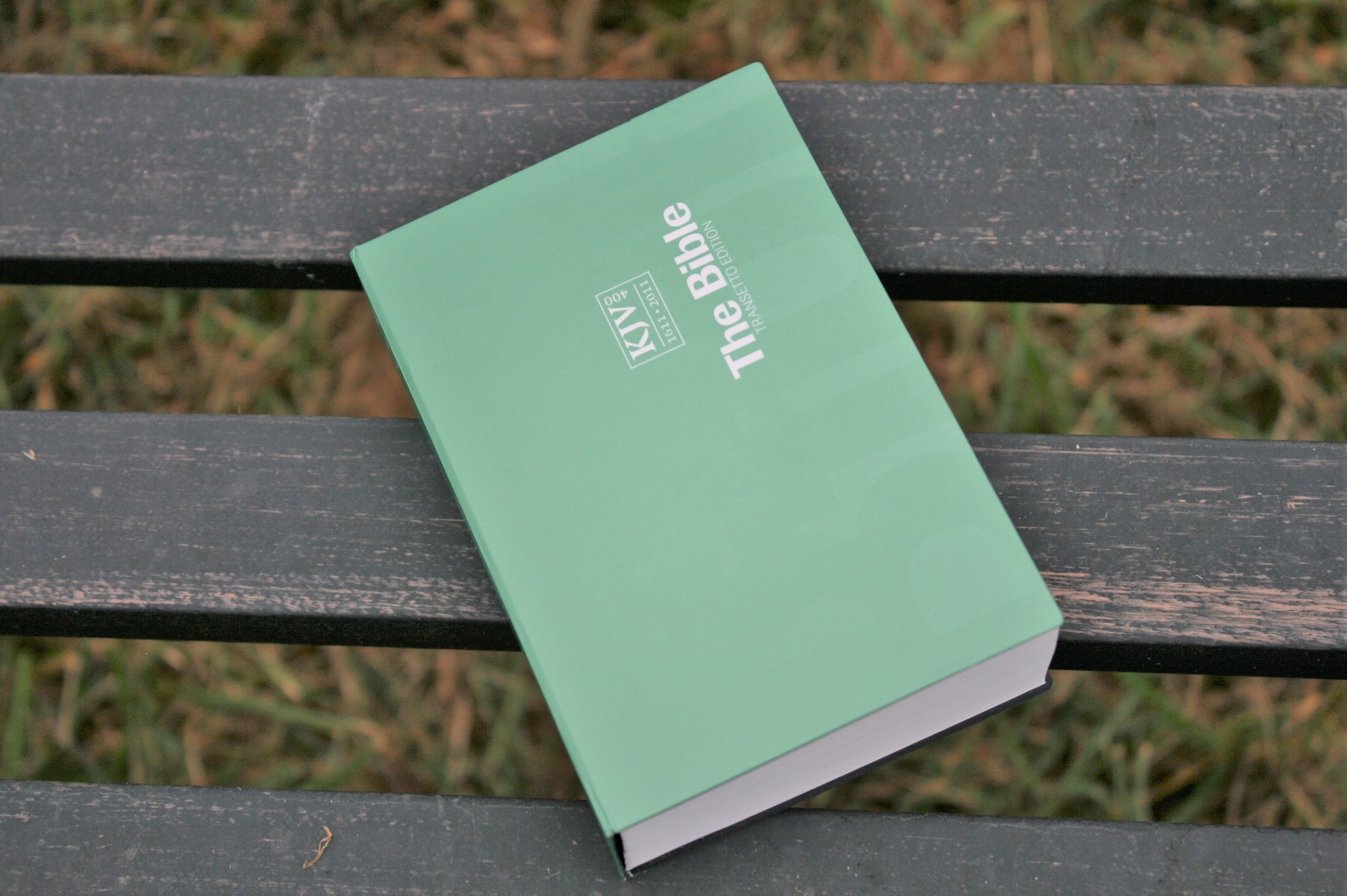
The Cambridge Transetto is an ultra-portable KJV with a unique design. It’s meant to be the ultimate balance between portability and readability. I reviewed this Bible when it released in 2011 but my wife claimed it because it’s so portable. At this year’s ICRS the Cambridge crew was kind enough to give me another one. Now that I have it in my hands again I wanted to write a new review.
What is a Transetto? In this Bible the book-block is turned 90 degrees. What would normally be the left and right are the top and bottom. Due to the binding design the pages are as flat as possible, making the two pages lie together as a single page. This is known as a flipback design and it’s portable, easy to handle, and readable. It was designed by 2Krogh and printed by Jongbloed in the Netherlands.
_________________________
_________________________
Binding
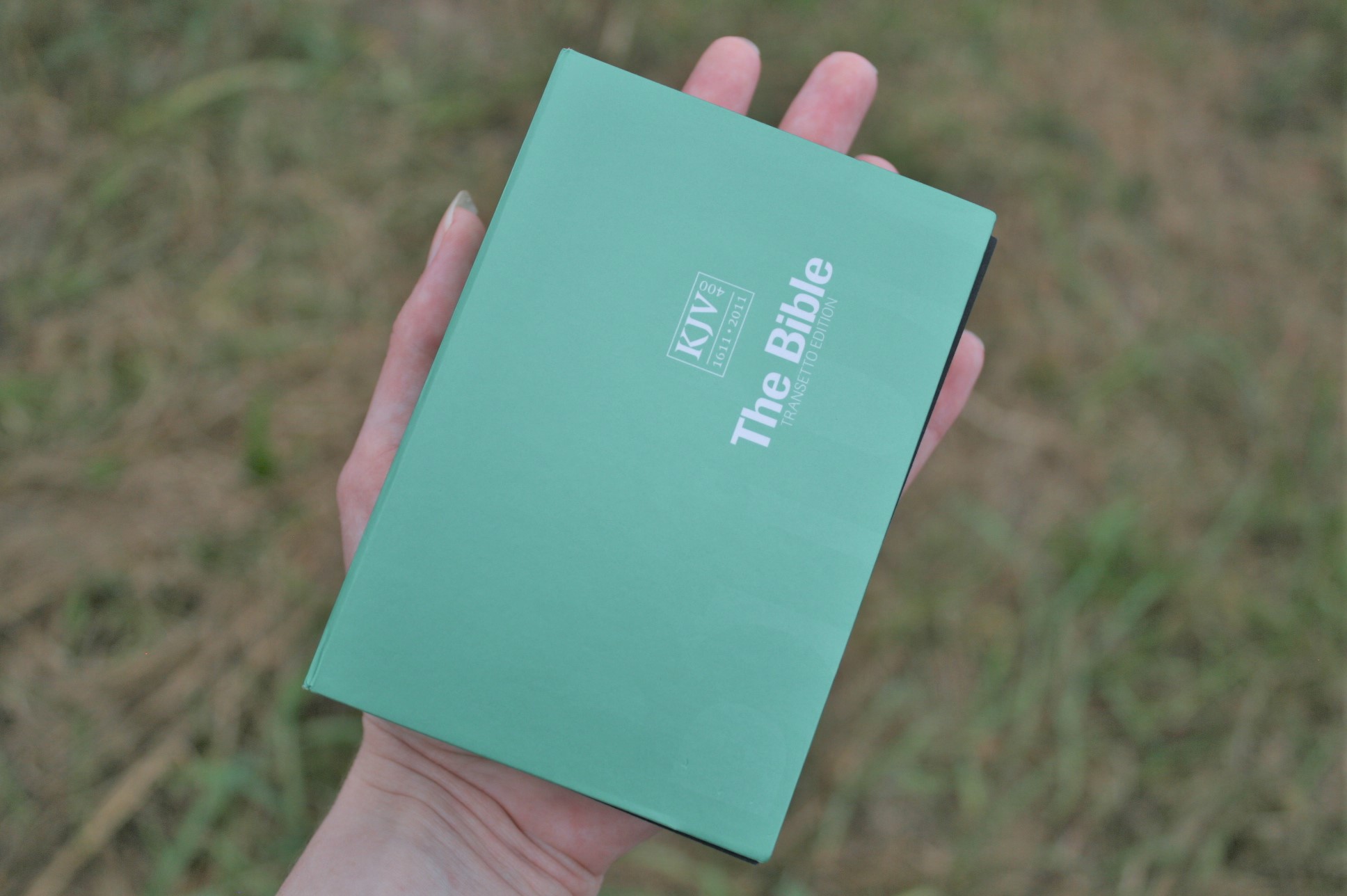
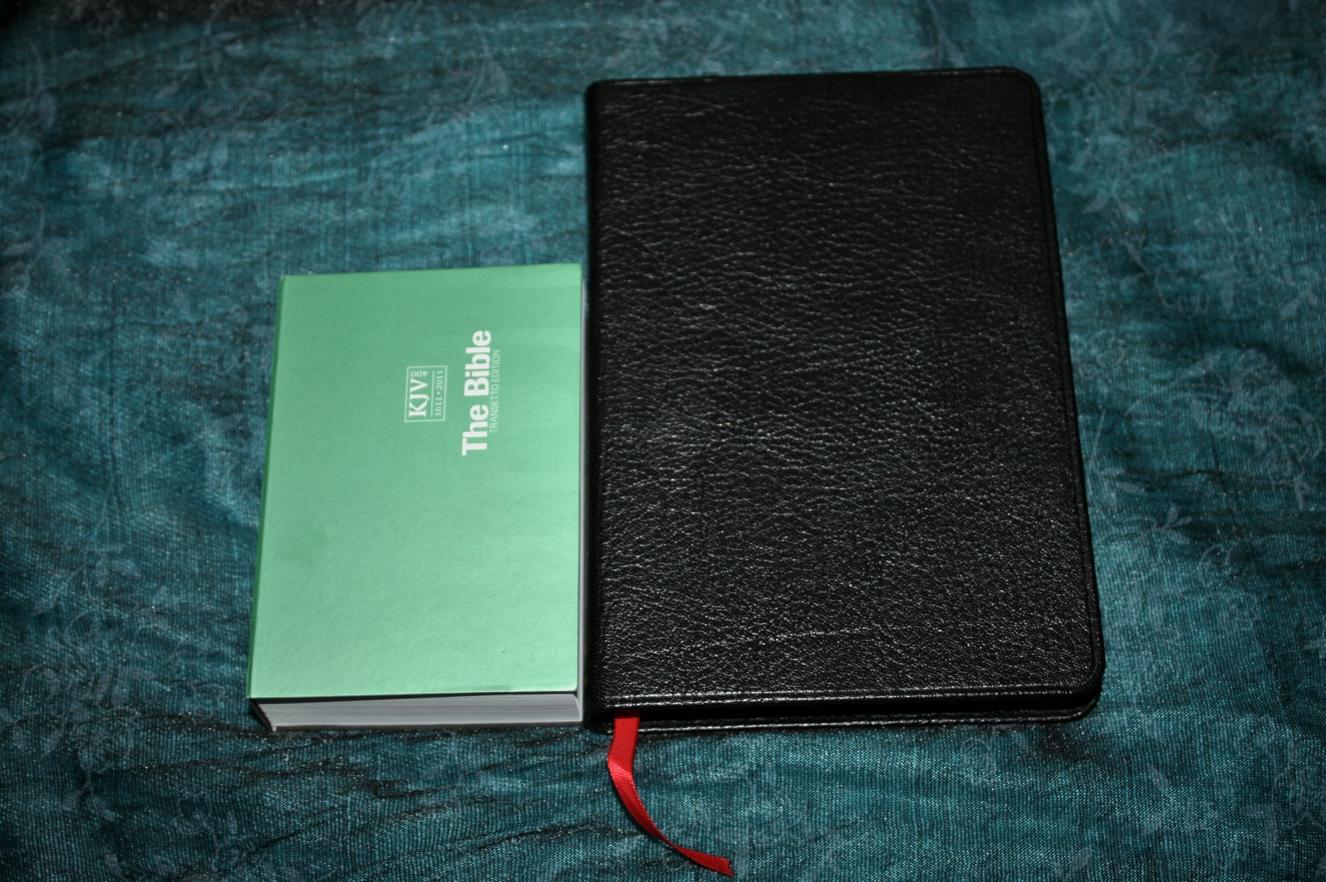
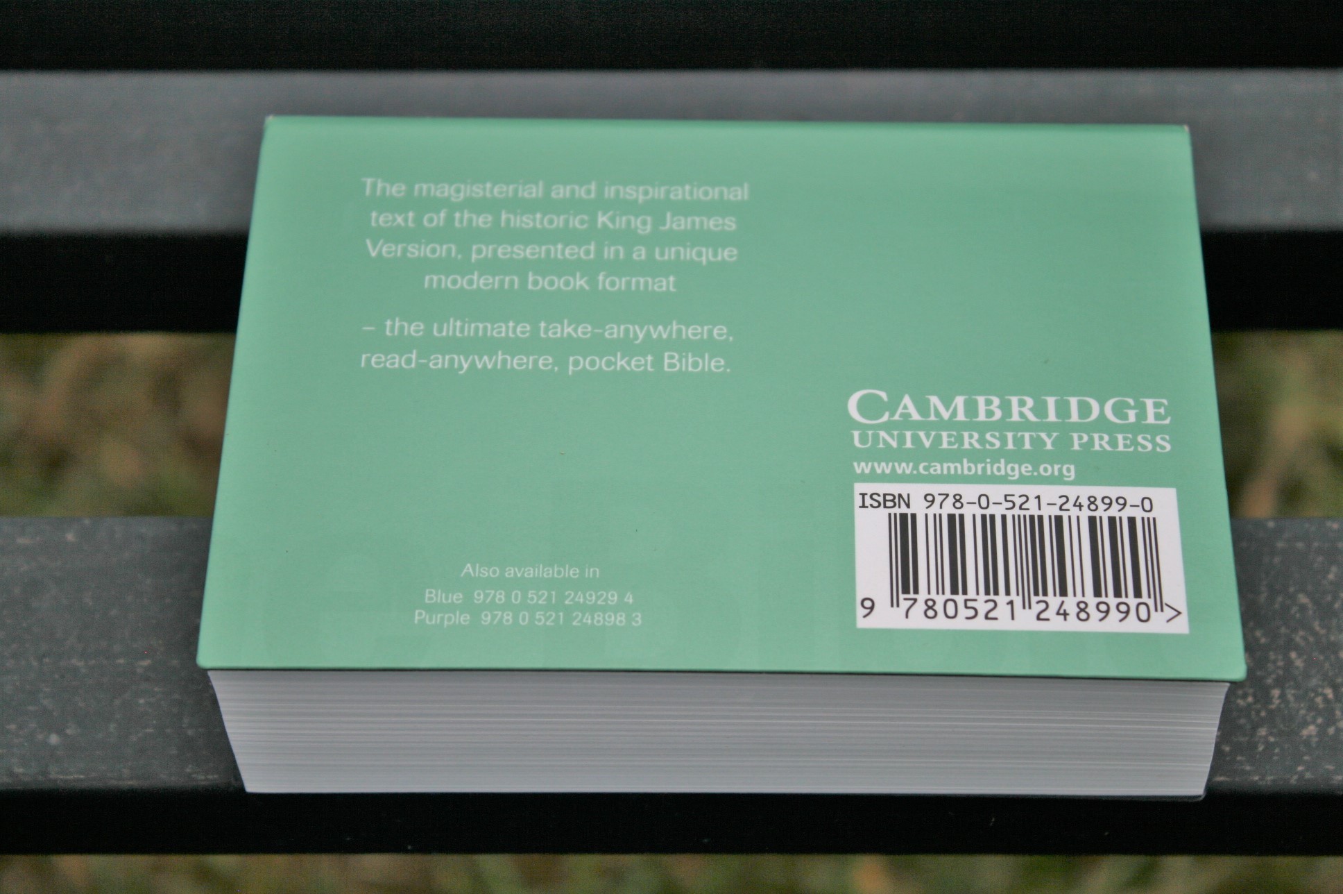
The cover is considered a soft-cover or paperback, but it’s basically a hard cover with three heavy cards (for the front, back, and spine) with a coated covering holding them together. It’s not flimsy like a paperback. This is the green edition (ISBN: 9780521248990). It’s also available in blue and purple.
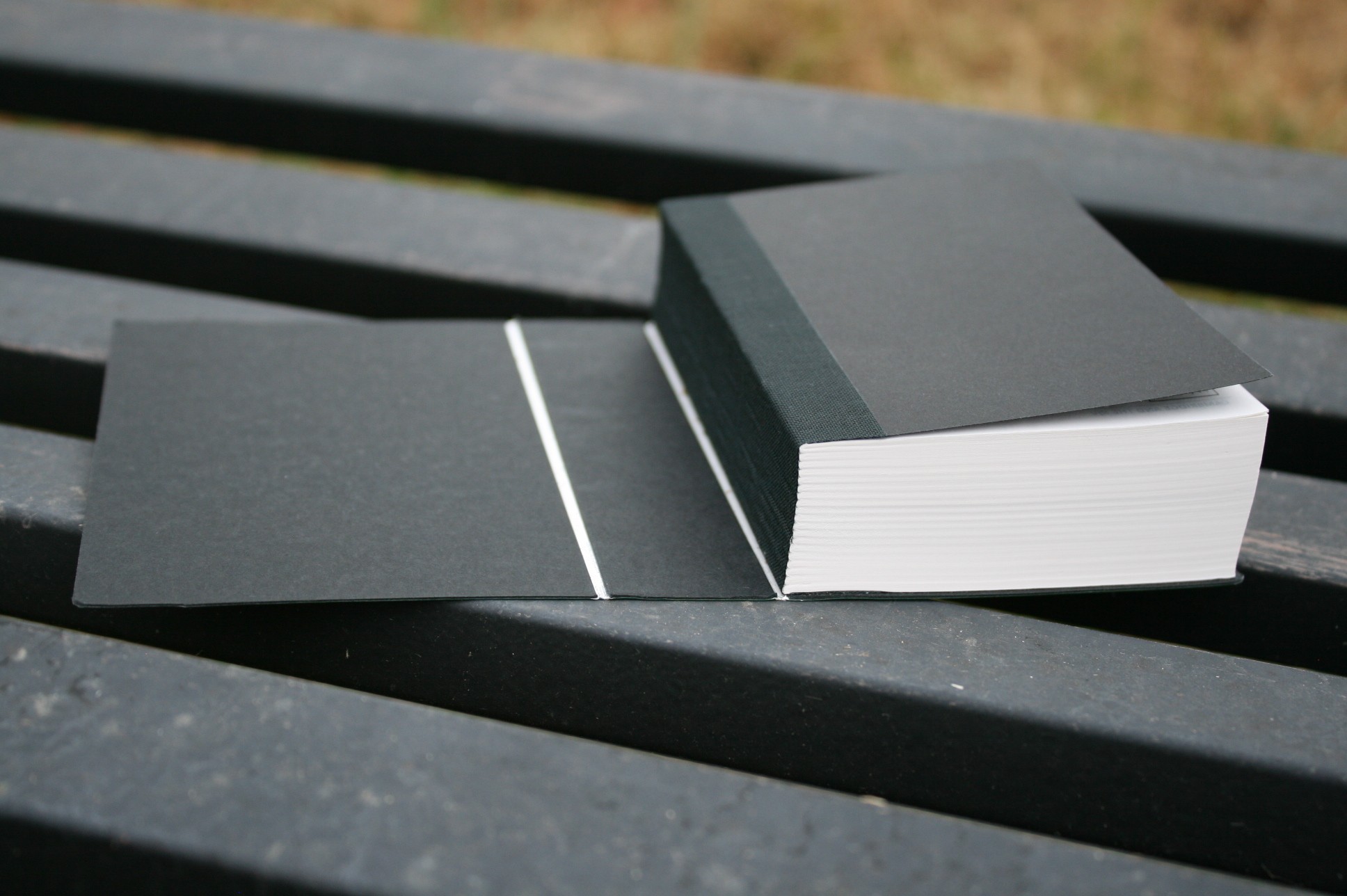
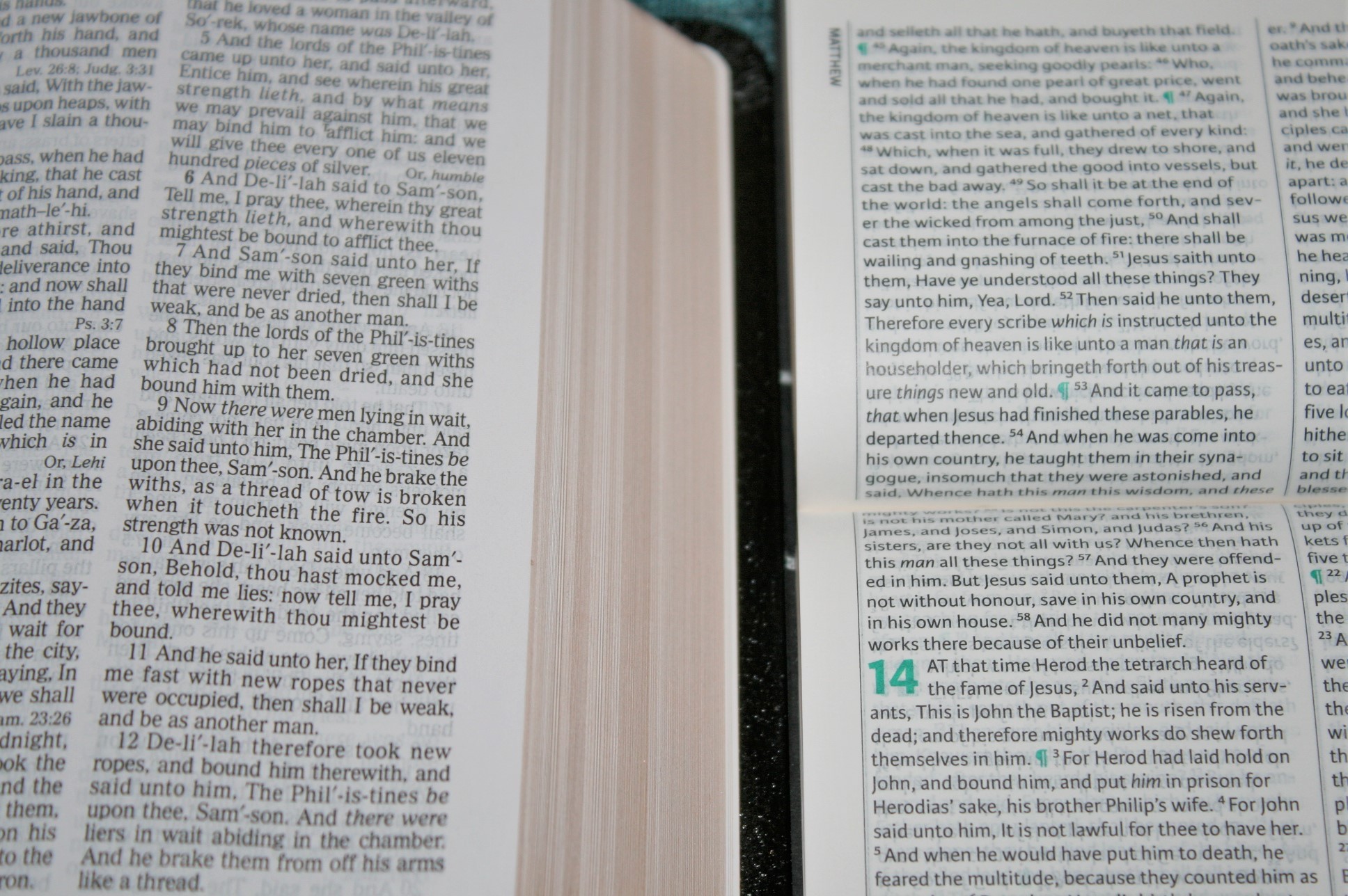
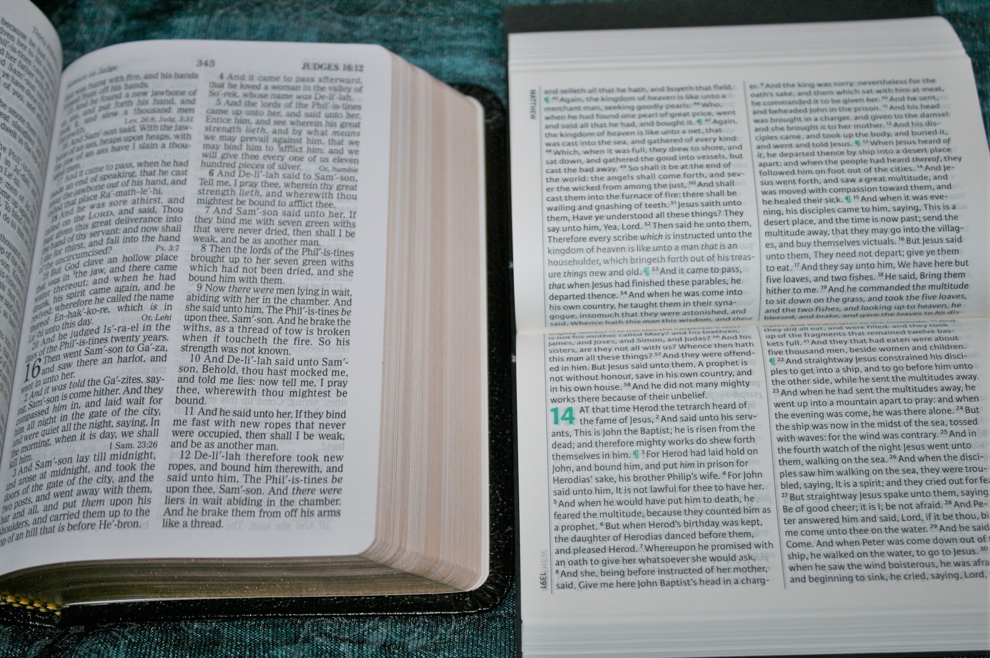
This is a sewn binding and lays flat. When I say it lays flat I don’t mean like a regular Bible. This one has a unique feature: one side of the cover and the spine are not attached to the book-block. This lets the book-block slide closer together as the Bible is opened, making a U shape and allowing the pages to flatten and create the effect of a single page. This can’t be done with a cover that’s attached on both sides of the book-block. It isn’t perfectly flat, but it’s good enough for the effect to work.
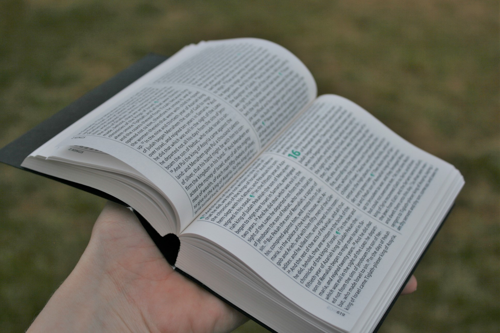
The Transetto’s overall size is 4.68 x 3.25 x 1.18”. It fits great in large pockets. It can be a little tight in smaller pockets due to its thickness. Holding it feels natural. It lays perfectly across my hand and in my fingers just right. I do have to move my fingers to read the text though and my hands are holding the actual paper. Fortunately there was never any smudging or wrinkling.
Paper
The paper is 27gsm thin India paper with a slight cream tint. It’s highly opaque and the show-through is barely noticeable. The pages are easy enough to turn, but with the flipback design and the small size I find it easier to thumb through the pages rather than turn them. Side-to-side motion is easier than up-and-down motion for turning pages in books.
Typography
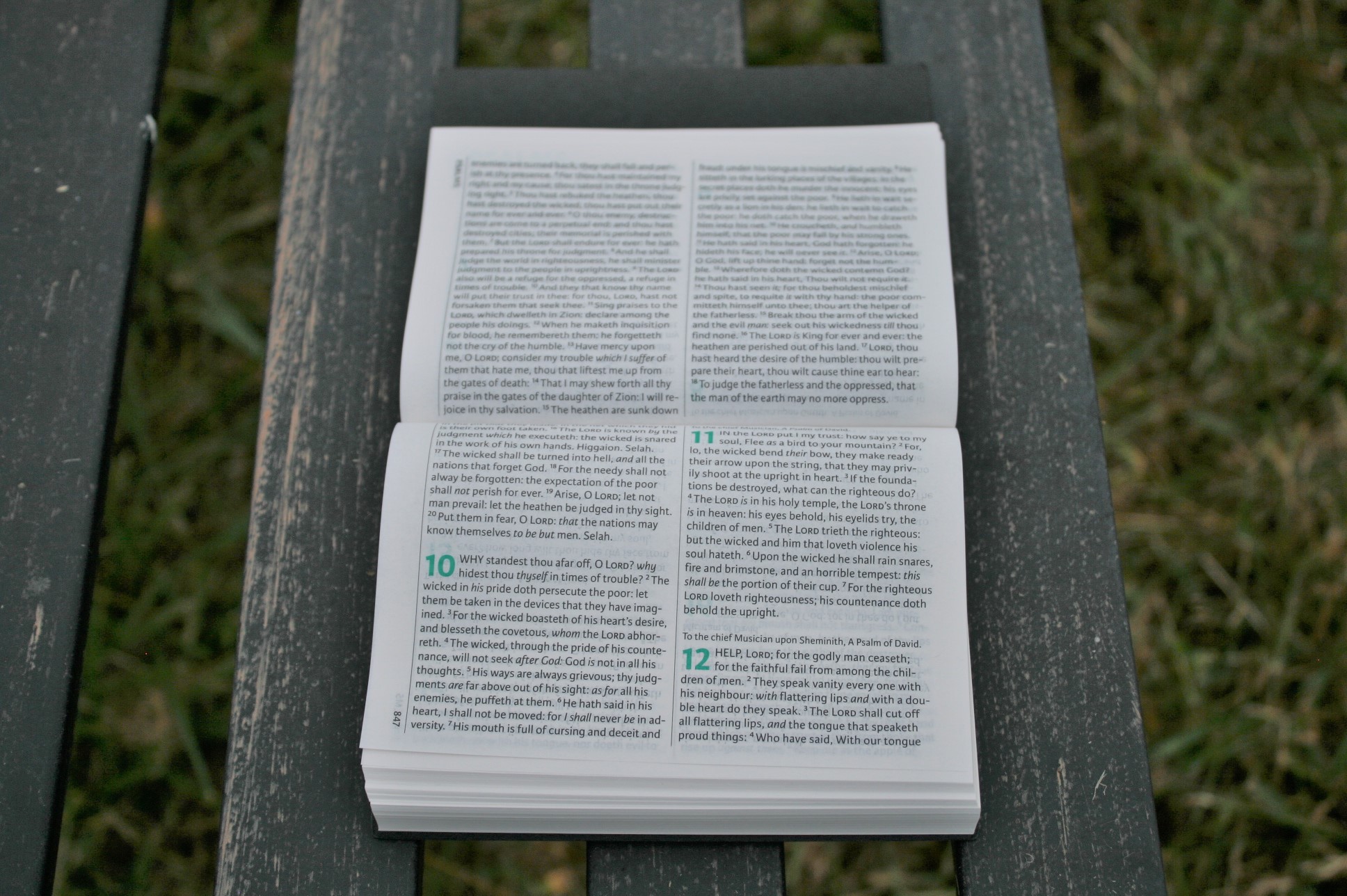
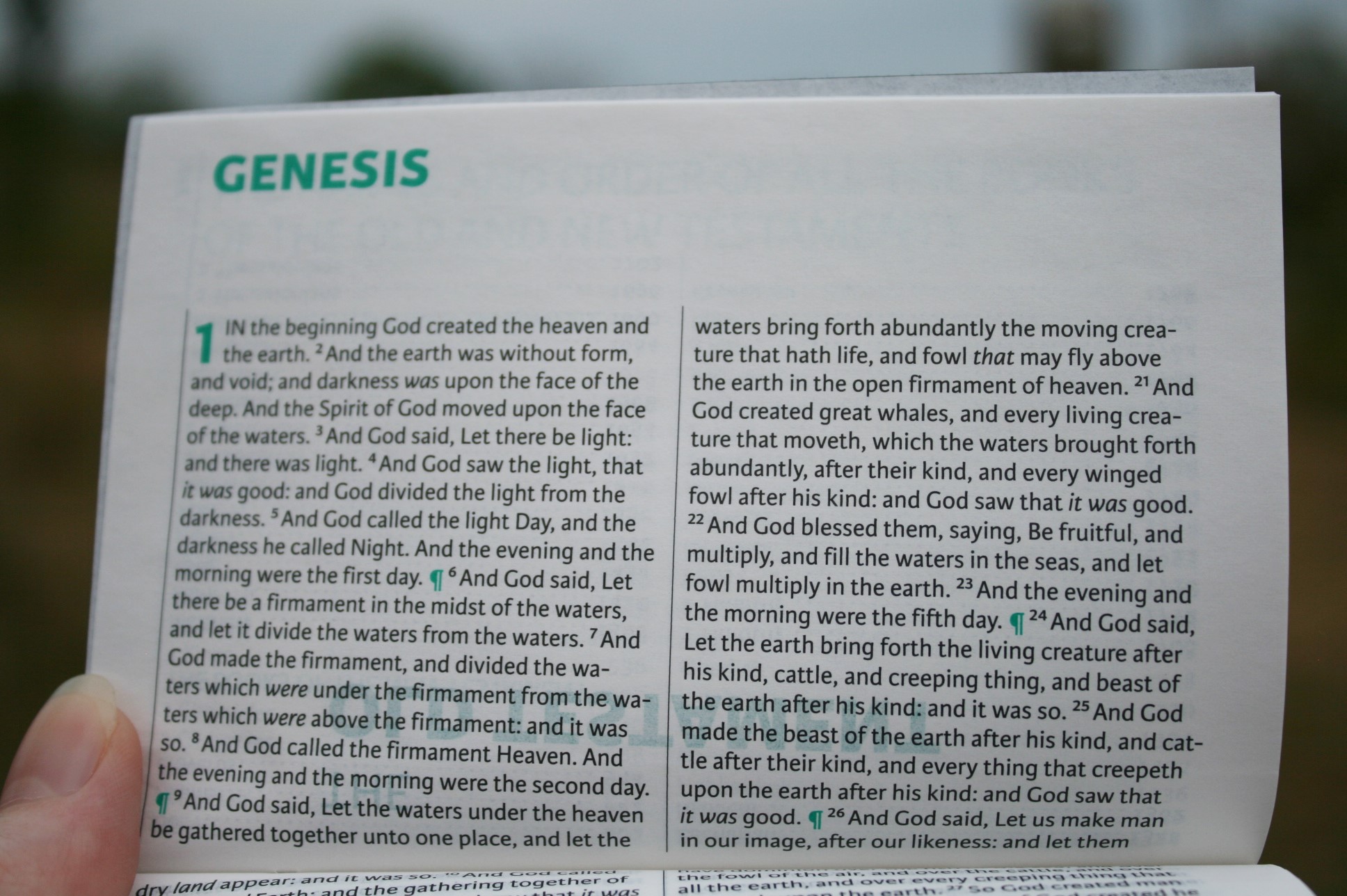
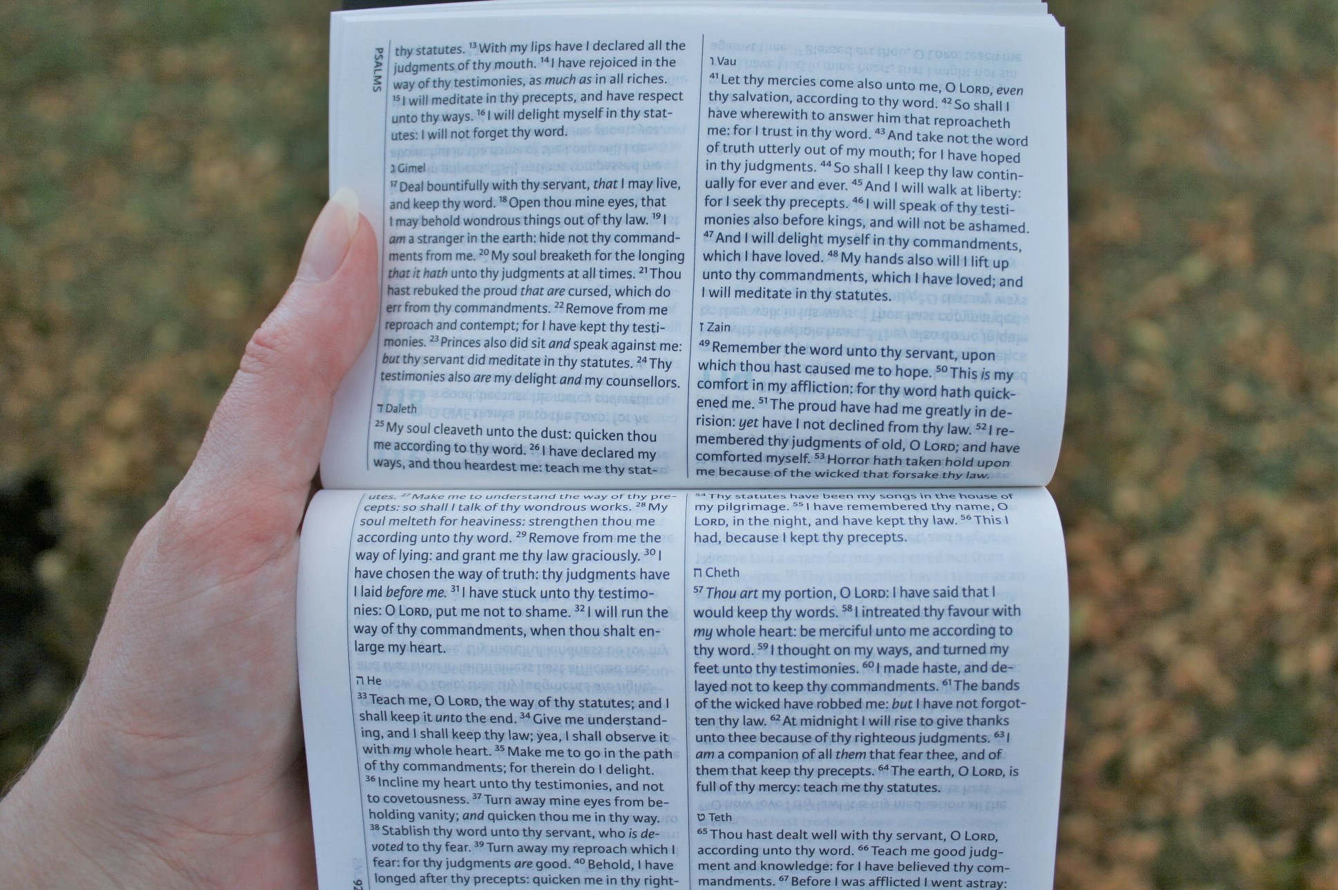
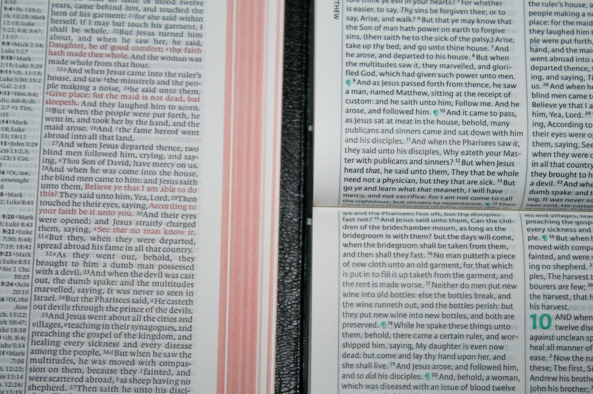
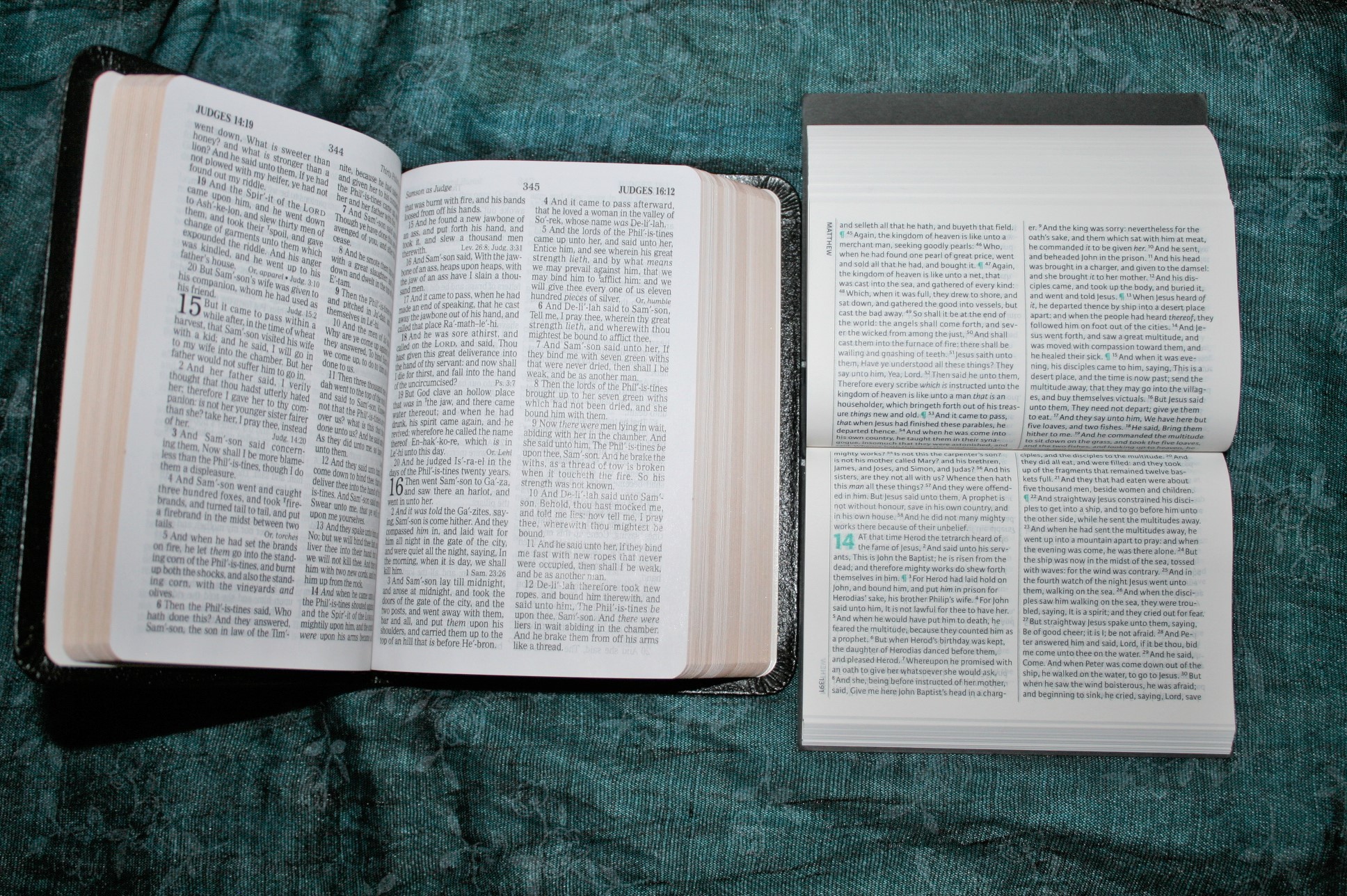
The text is presented in two columns that run top to bottom. The text is not right-justified, so all of the words and characters have the same spacing. This is a text-only edition.
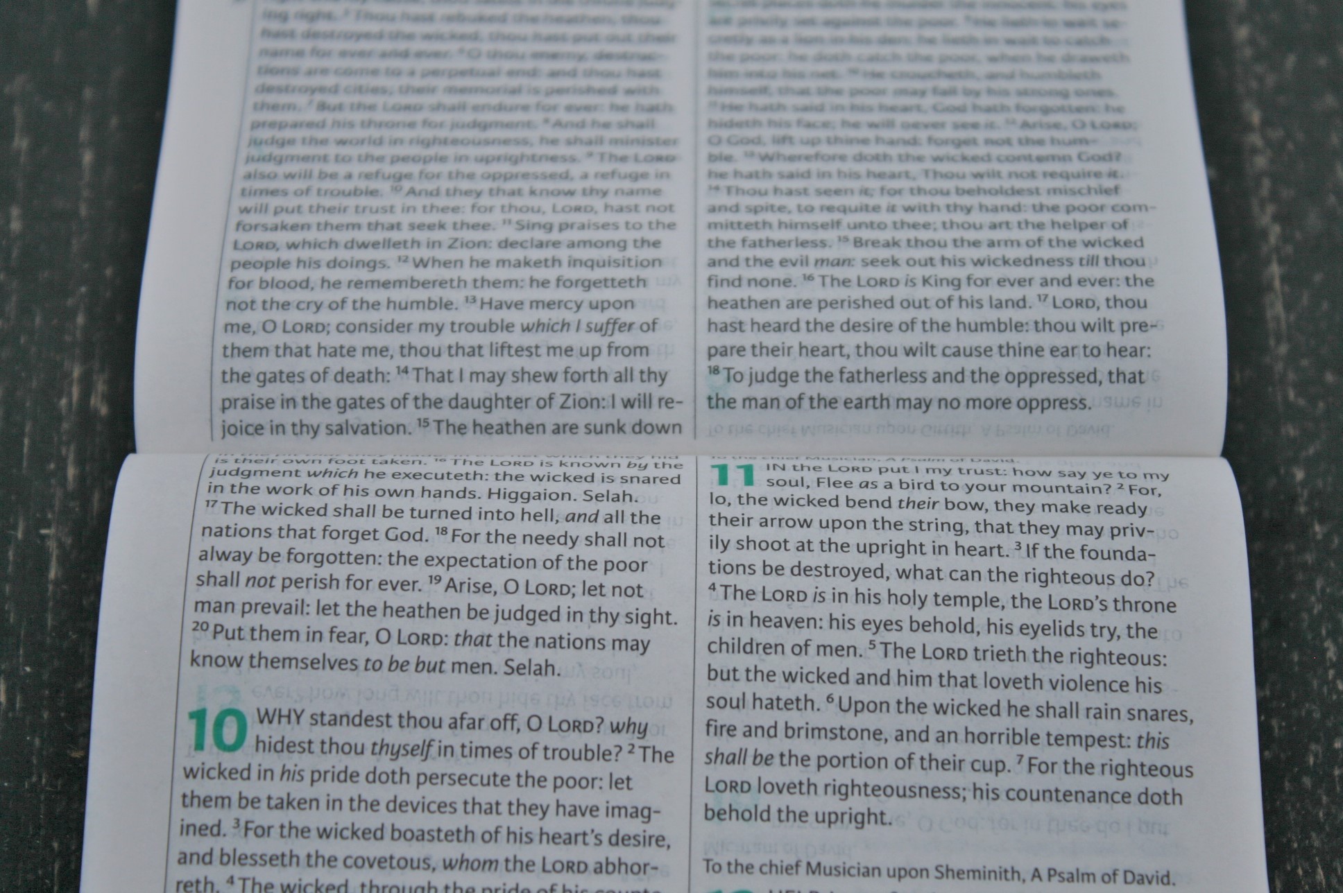
The font is around 6.5 point. It’s small but the font’s design improves readability at this small scale. The leading (space between the lines) also help improve readability. It’s black letter with a medium darkness that’s consistent throughout. It doesn’t include pronunciation marks. It does have italics for supplied words.
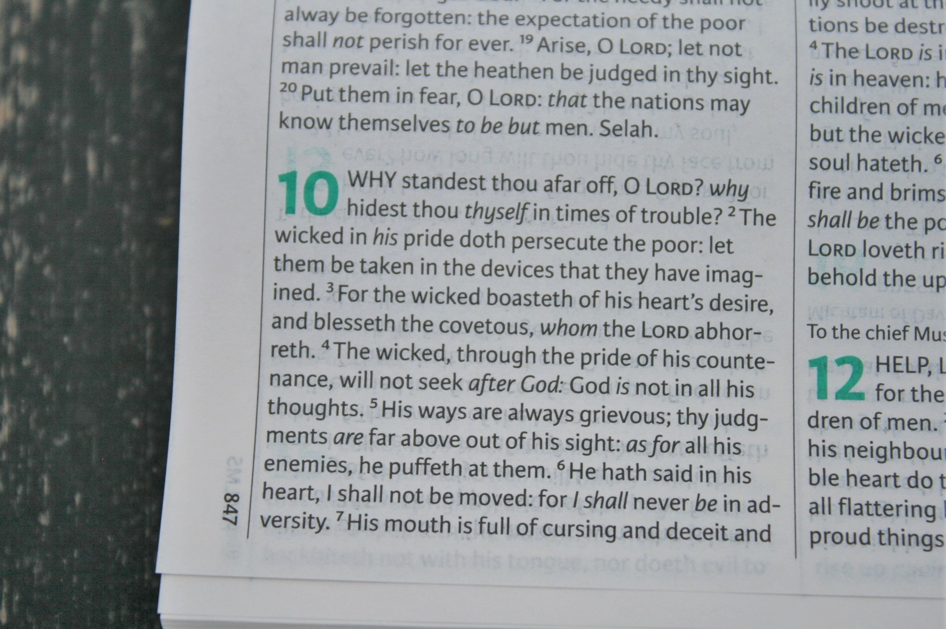
Verse numbers are small and easy to ignore while reading, but they’re also easy enough to find because they have space around them helping them stand out a little. They didn’t hinder readability too much. With no other markings in the text and with verses not set apart on separate lines I found it easy to read.

Columns are 1.8” wide with 50 characters across, which gives space for around 10 words per line.

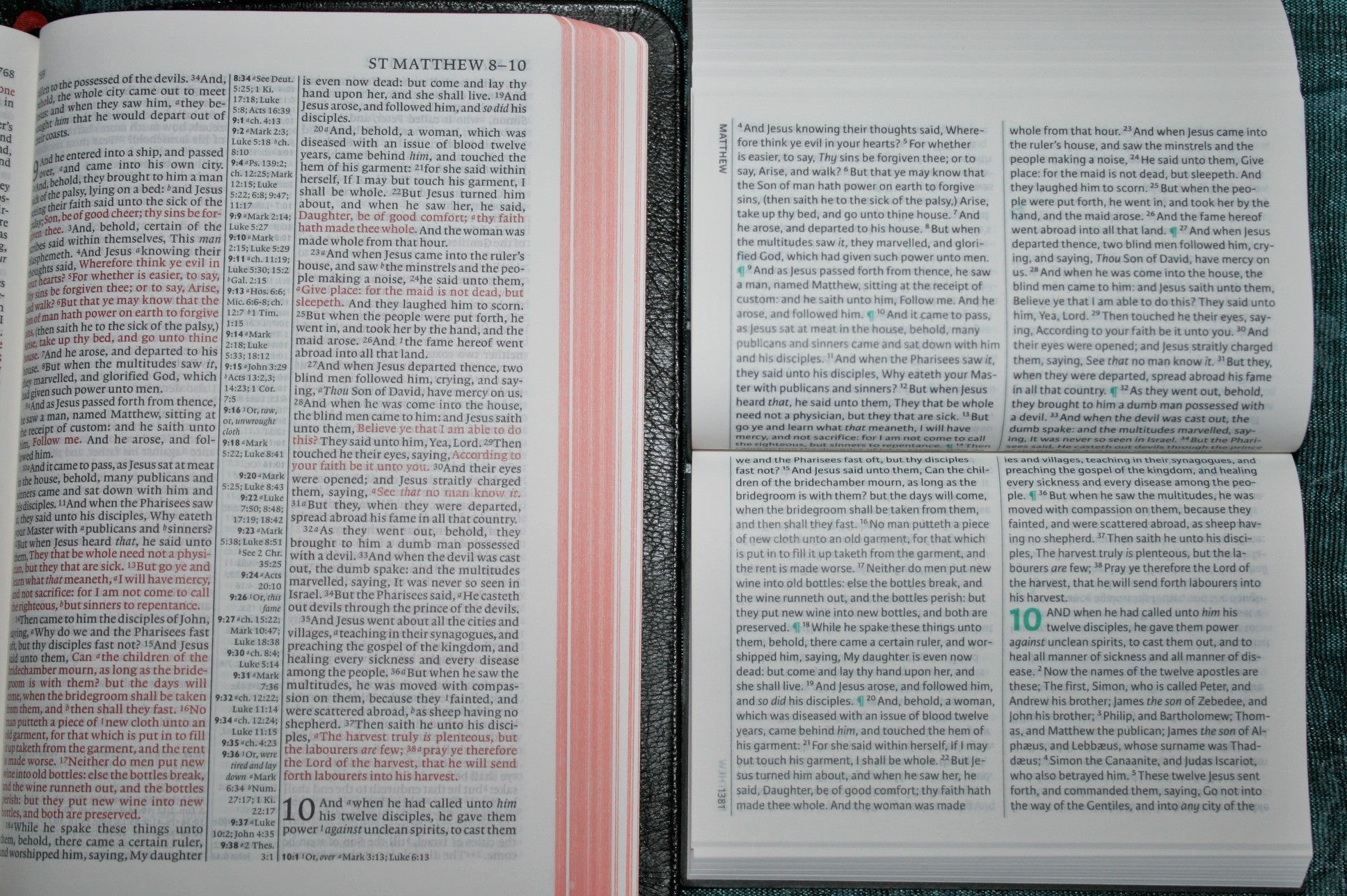
The design actually makes a large page area for the text. Most double-column Bibles actually show 4 columns – 2 on each page that’s facing you. This page mimics just one of those pages. It’s almost like a text-only Pitt Minion but you’re only seeing one of the two pages at a time. This saves a lot of horizontal space.

Paragraph markers (pilcrows) appear in the middle of a line. There are no pilcrows after Acts 20. The chapter numbers and pilcrows are in green. Book titles are simplified to just the name rather than including the writer. Paul’s letters include the endings that tell where it was written from. They are highlighted with a small green pilcrow.
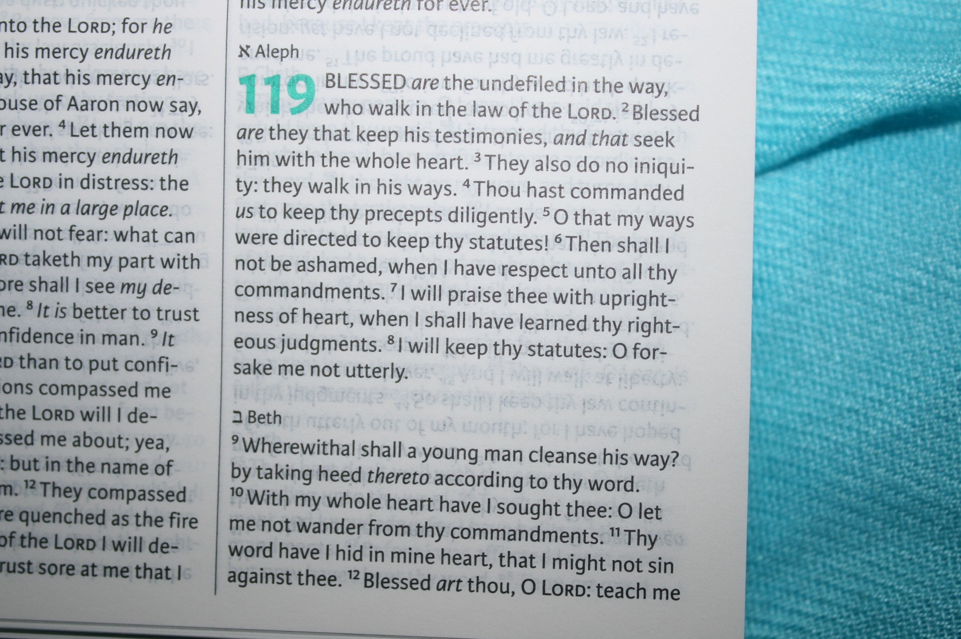
Psalms’ introductions are included as well as the Hebrew alphabet in 119 with both English and Hebrew spellings.
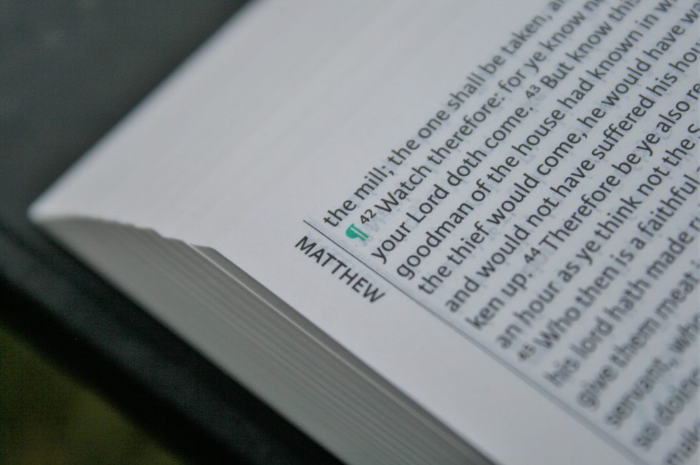
Page numbers and book names are placed to the far right and follow the landscape format. I find it easier to turn the Bible counter clockwise to landscape to turn to the book or chapter I want. Book names are given, but not chapter numbers. I would like to see the numbers added to help finding chapters quicker.
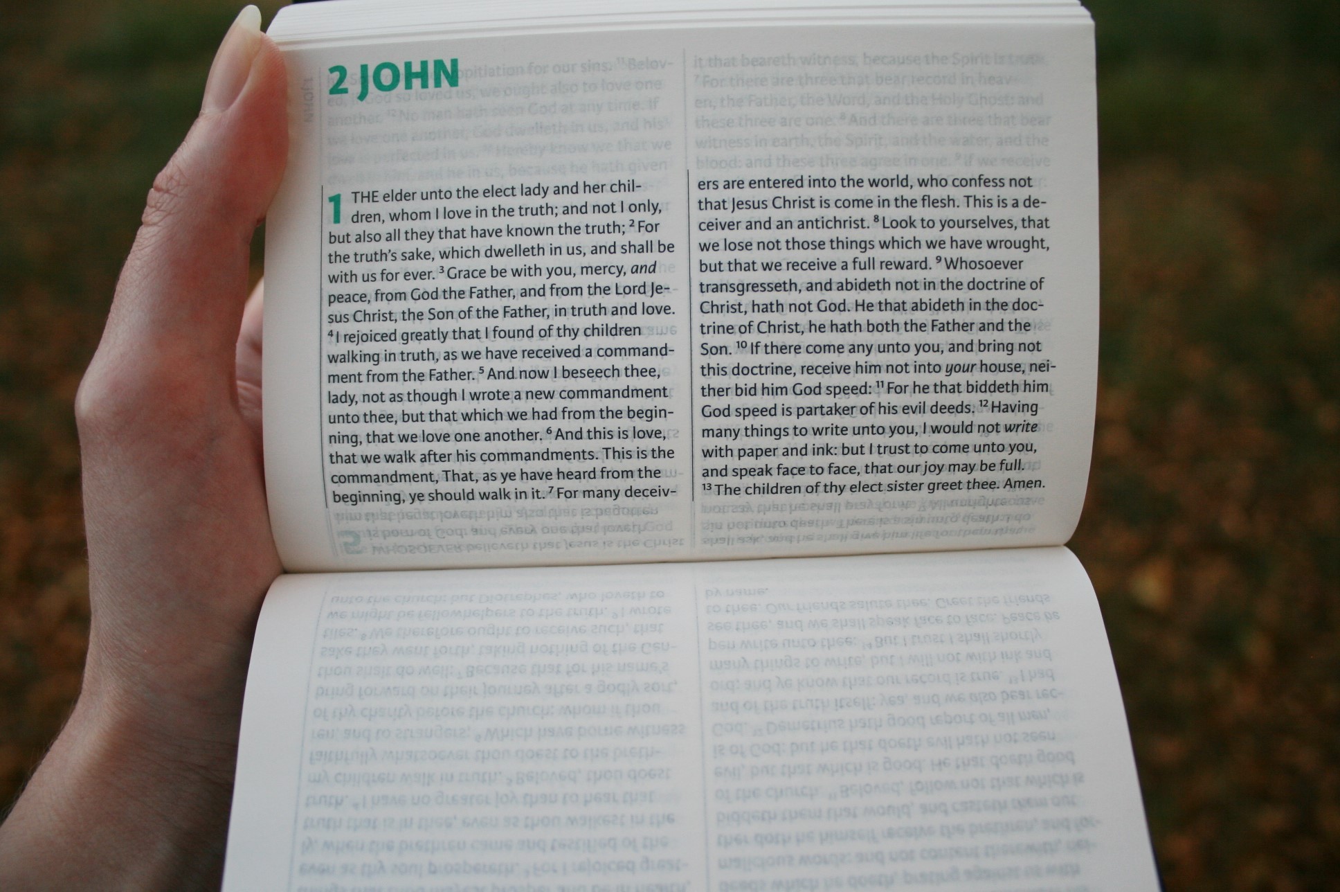
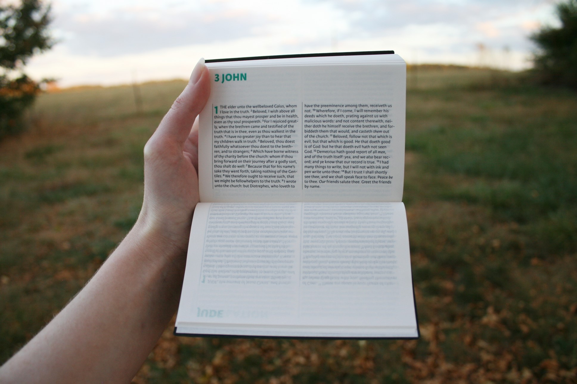
The one thing that makes the least sense to me is books start on a new page. This leaves enough blank space throughout that it makes me think they could have placed the text in paragraph format. Most likely paragraph format would have added too much bulk, but on the flip side of that the bulk could have been reduced further by placing books on the page where the last book ended. For example, 2 John takes a single page, but the page under it is blank. 3 John also takes a single page with the page under it blank.
I prefer this format to verse-by-verse for reading. There are no distractions other than pilcrows and chapter numbers. Since verses are not separated from each other, which can cause them to be isolated and taken out of context, it’s easier to see the overall context and see the text as a whole.
Reading Plan

This is the daily reading plan from God’s Word Translation and is used by permission of Baker Publishing. It’s a one-year plan that takes you through the Bible in one year in biblical order. It gives you the date and references for that date. As long as you read on those dates there’s no need to mark your place (there’s no ribbon, but I think this design works better without it).
Comparisons
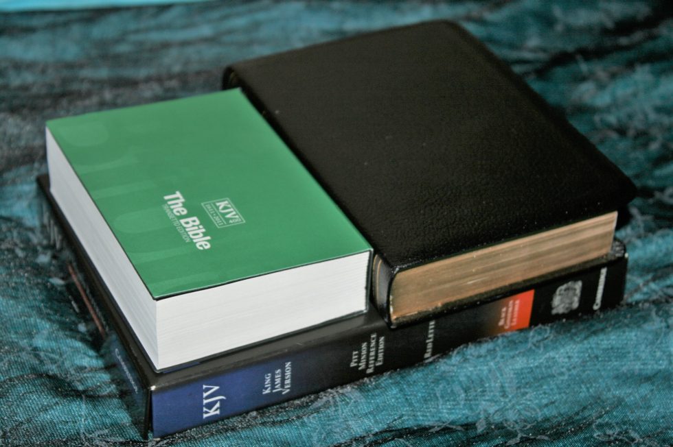
Here’s a look at how the Transetto compares to the Pitt Minion and Holman Compact KJV.
Cambridge 2nd Ed. Pitt Minion

Holman Compact

Conclusion
The KJV Transetto is the first English Bible in the flackback design. I’ve found the Transetto to be an excellent Bible for carry and reading on the go and at home. The portrait layout is easier to handle than a landscape layout. I would like to see real paragraphs, but I prefer this to vbv.
Even though the font is small I find it to be readable. The Cambridge Transetto is small, handy, practical, comfortable, affordable, and readable. These are excellent Bibles for ministering, witnessing, and giving away. I would like to see this design in all of the major translations.
Photography by hannah C brown
_________________________
_________________________
Cambridge provided this Bible free for review. I was not required to give a positive review – only an honest review. My opinions are my own.


Trackbacks/Pingbacks