LCBP Paragraph Bible – Review

There are not many single-column paragraph KJV’s on the market. When a new one comes along I take notice. I long for a layout that sets the text in a pretty layout. That’s something the KJV almost never gets. It doesn’t have to have section headings, references, or even verse numbers. Recently I’ve wanted a paragraph KJV without verse numbers. I don’t always want markings that slow down readability and comprehension. Local Church Bible Publishers’ latest Bible is a single-column paragraph in large print with no verse numbers. It costs $57. Let’s take a look.
- UPDATE – After posting this I found that it’s a reprint of an old edition (possibly Cambridge) that was originally in three volumes. LCBP combined them into one volume.
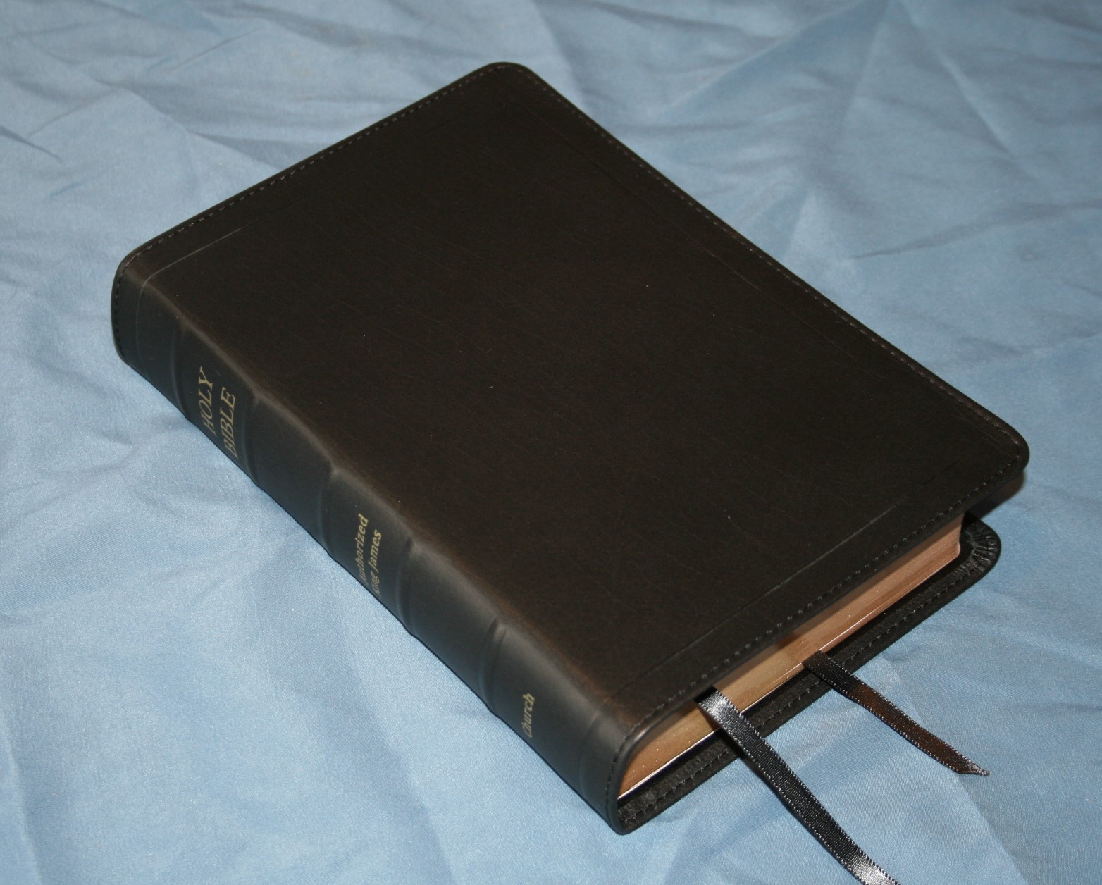
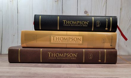
Binding

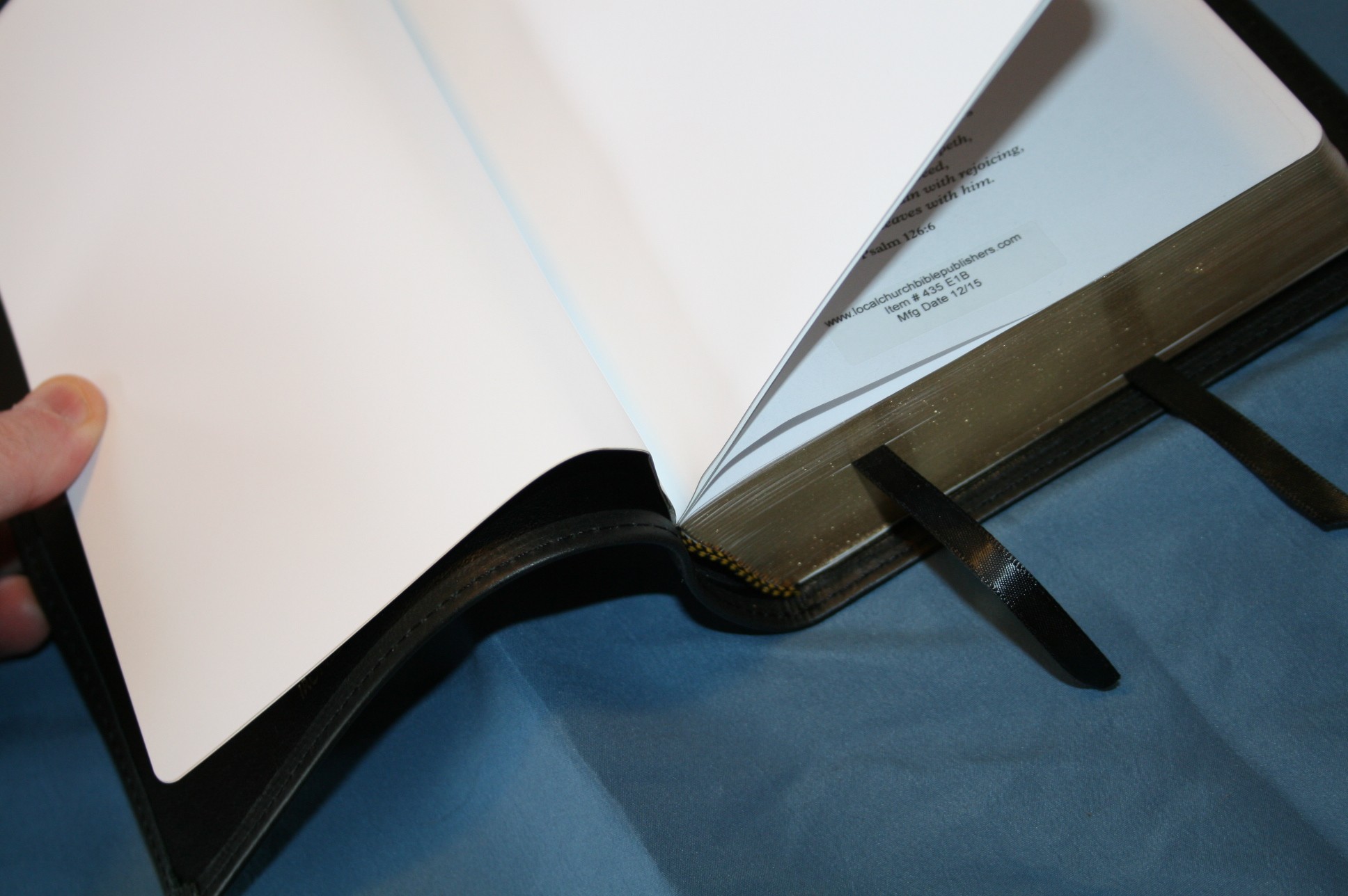
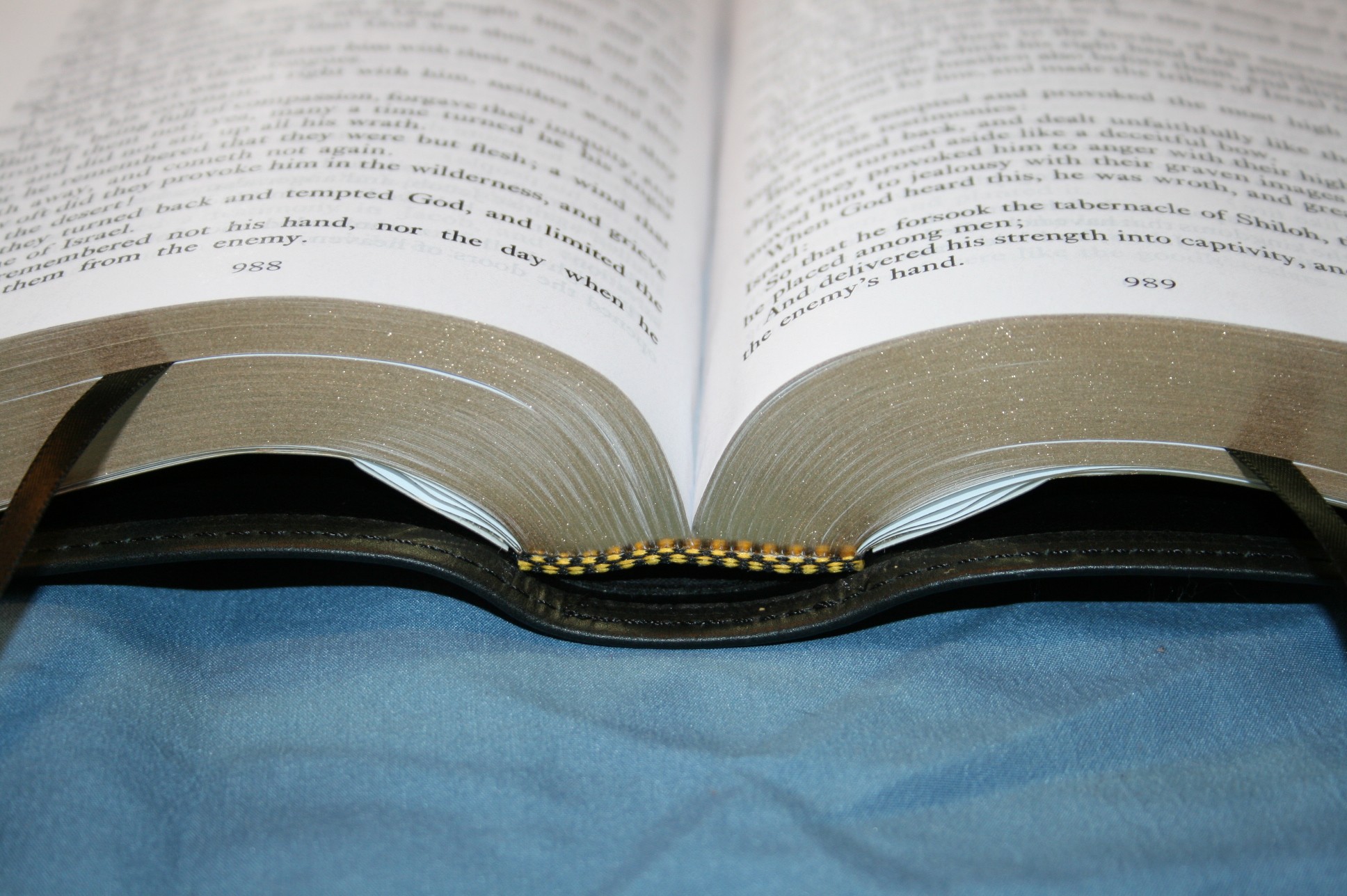
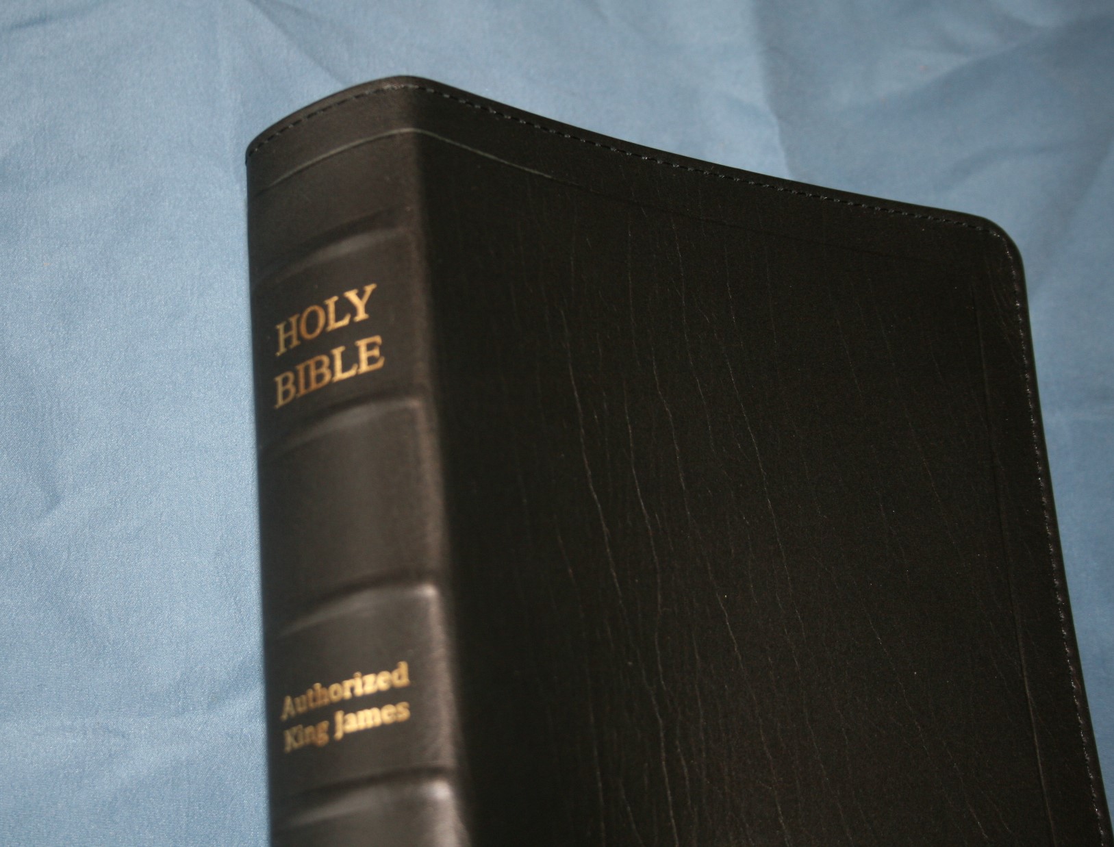
The cover is edge-lined black ironed calfskin. It has a nice grain and it feels soft to the touch. It has a polyurethane liner and is stitched around the perimeter. The hinge for the edge-lining is stiffer than any LCBP that I’ve seen. Most are not stiff at all, but this one is so stiff that it won’t stay open in Genesis. I’m sure this will break in with use, but I’m not sure how much. I’ll give an update in a few weeks or months. The binding is sewn.
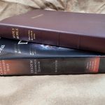
There are 5 raised hubs on the spine. The lettering is gold stamped. It has 2 black ribbons. I love the overall size. It’s 8.75 x 5.75 x 1.25, which is perfect for carry and reading. It’s great for the pulpit too. The block size is 8 x 5.5.
Paper
The paper is in the low to mid 30’s in gsm. It has more show-through than any Bible I’ve seen from LCBP. That’s not to say it’s bad. It’s probably still average or better. It does have a glare when sitting under a lamp. It’s not that bad but it is noticeable. There isn’t any glare if you don’t have direct lighting on the pages. There are 30 pages in the back for notes.
Typography
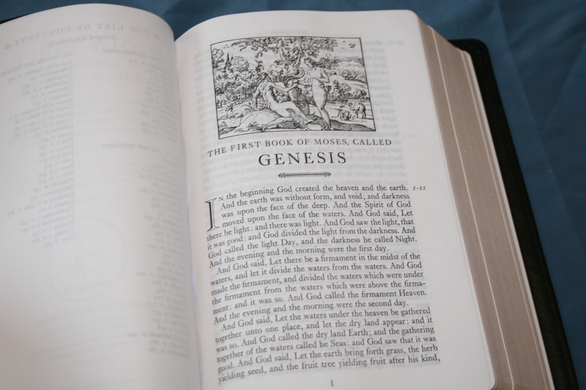
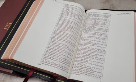
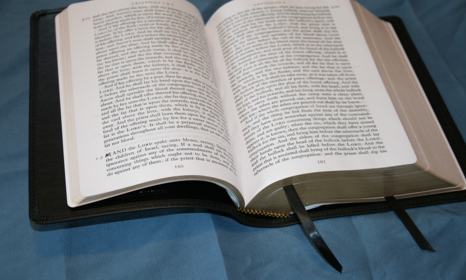
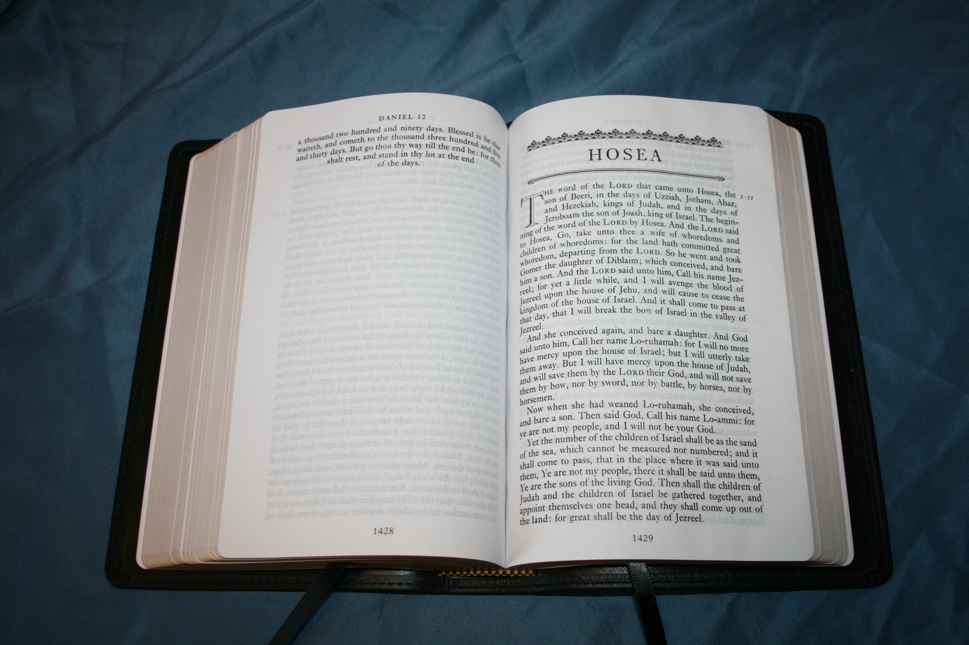
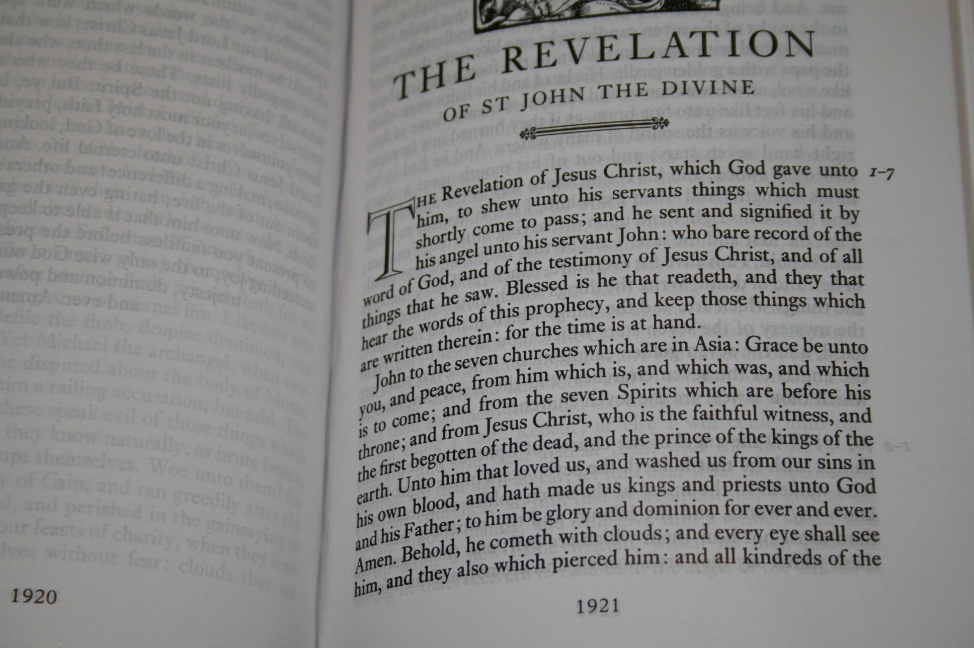
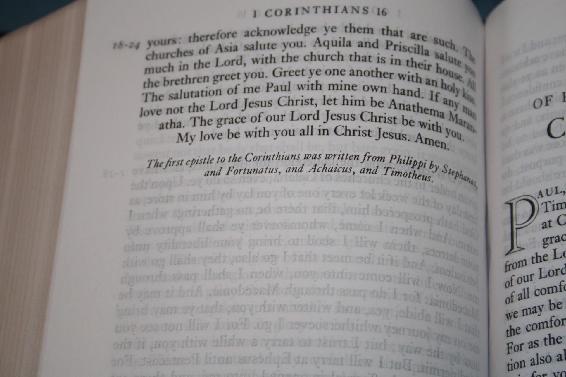
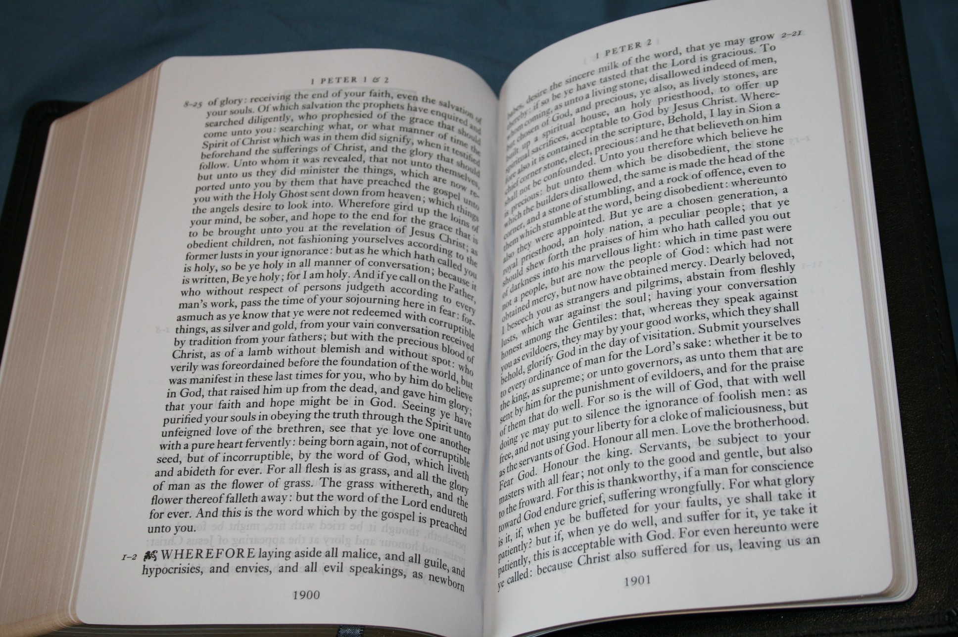
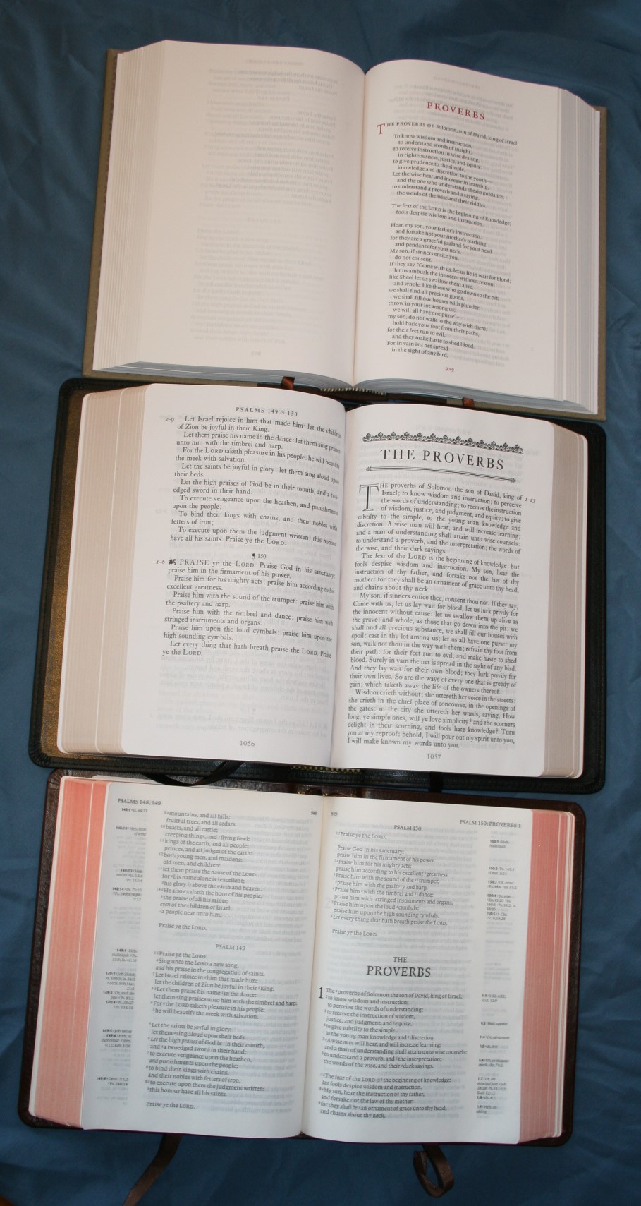
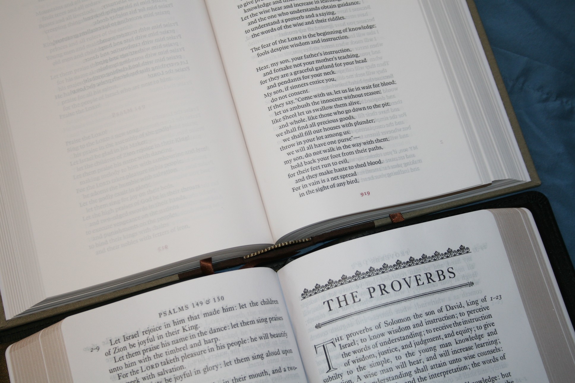
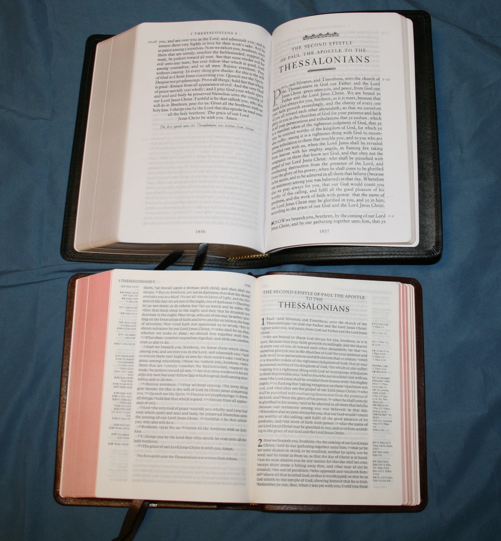
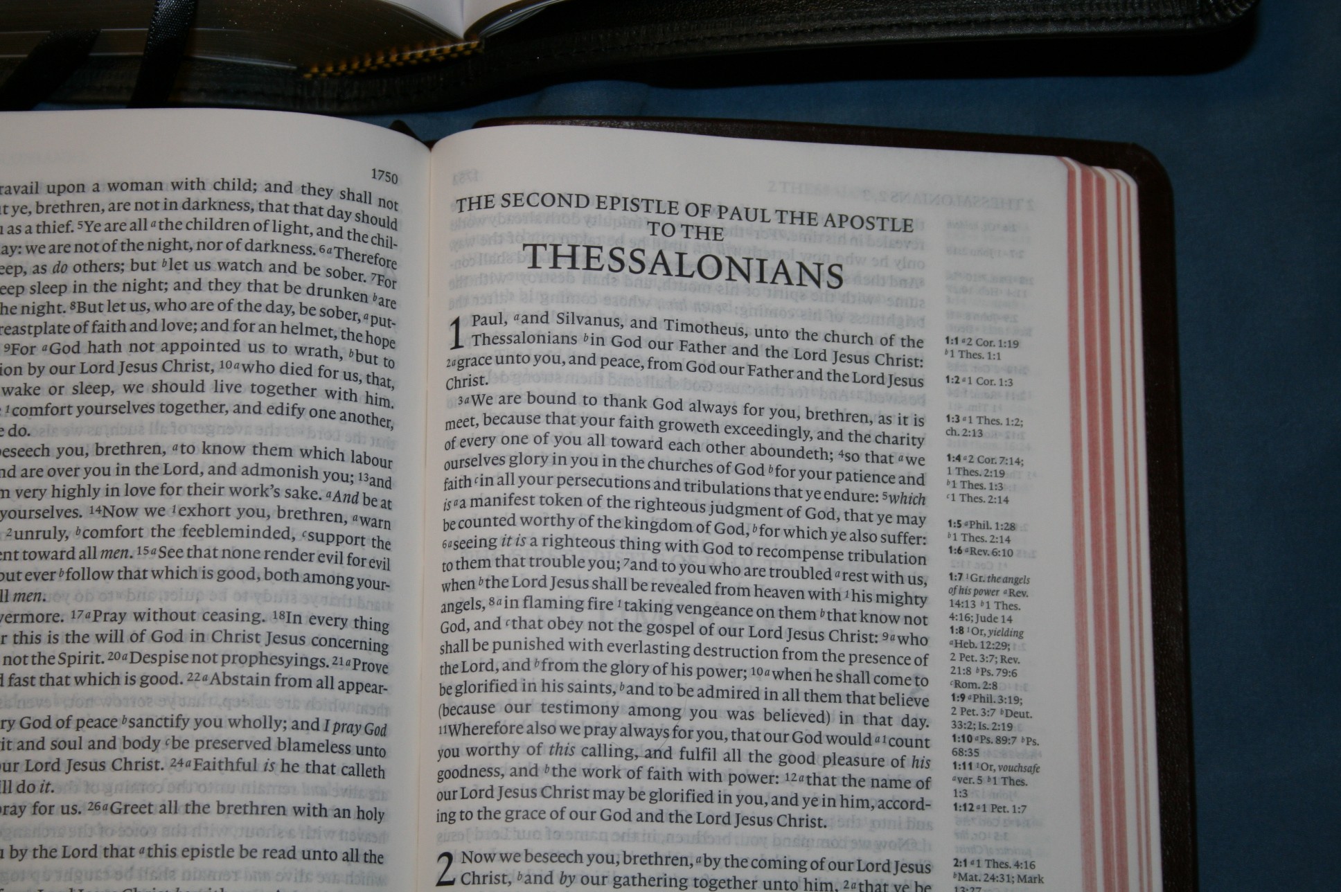
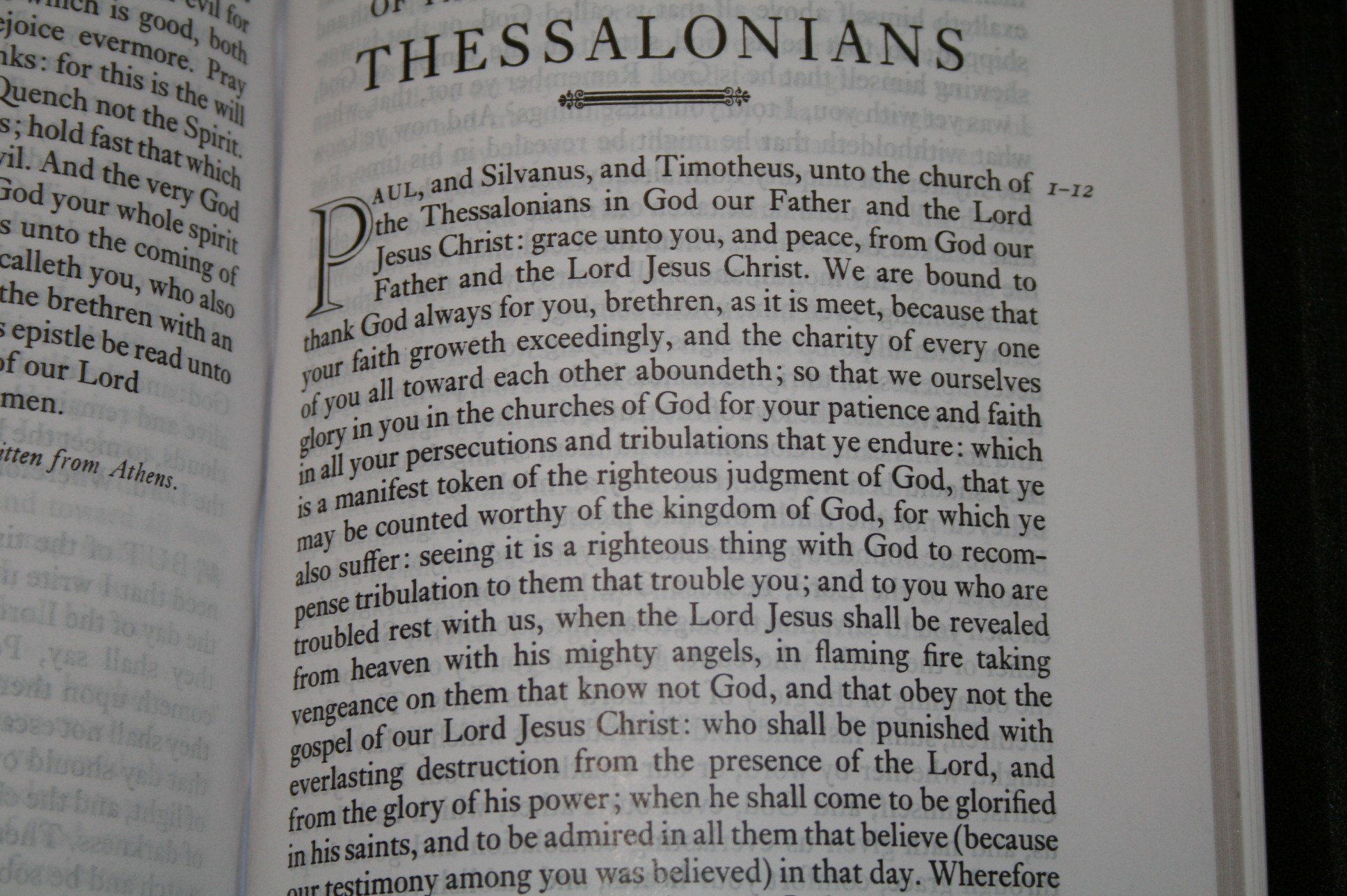
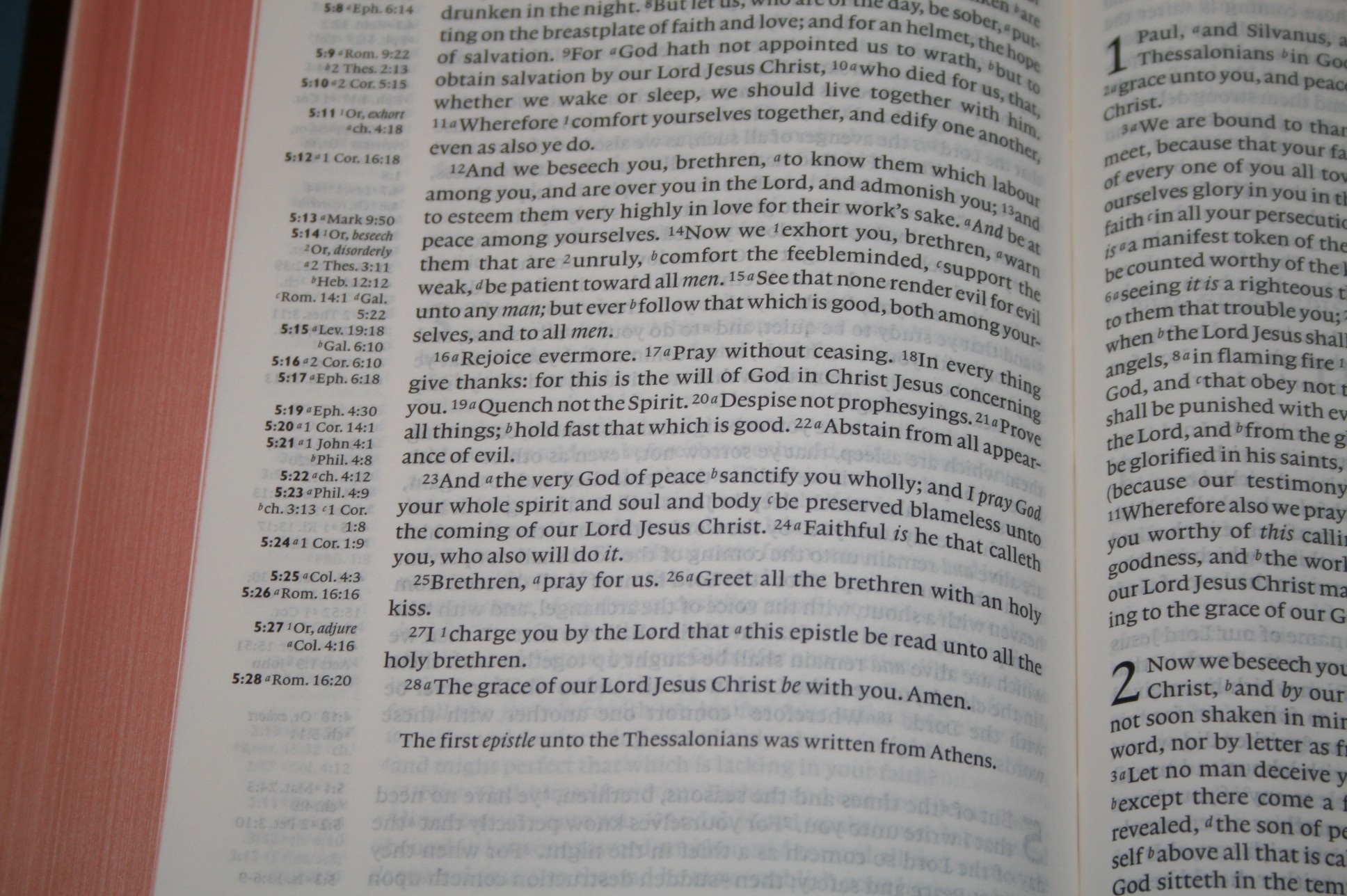
This is a single column paragraph setting. It has a lot of unique features. First, there are no verse numbers within the text. The first verse of every chapter has verse numbers in the margin. The start of a new chapter is marked with an interesting leafy symbol at the beginning of the first verse. One detail that I found interesting is the last few lines of a book tapers off, meaning there are fewer and fewer words per line at the end of a book and the lines are centered.

The typeface is sharp and bold. It has an 11-point font, making this a large print edition. The font is dark and consistent throughout. It doesn’t have italics for supplied words. This makes the text more readable, but it also takes away one of the advantages of the KJV text. It also doesn’t have pronunciation marks of any kind. The first chapter of each book has a drop-cap that takes 4 lines. The text is line-matched.
 It has 60 characters across and the column is 4”. The spacing is about perfect. The words never feel too close and there are no awkward spaces. It’s easy to read from one line to another without losing my place. It also doesn’t overdo it with hyphens. Genesis 1 has 5 hyphens.
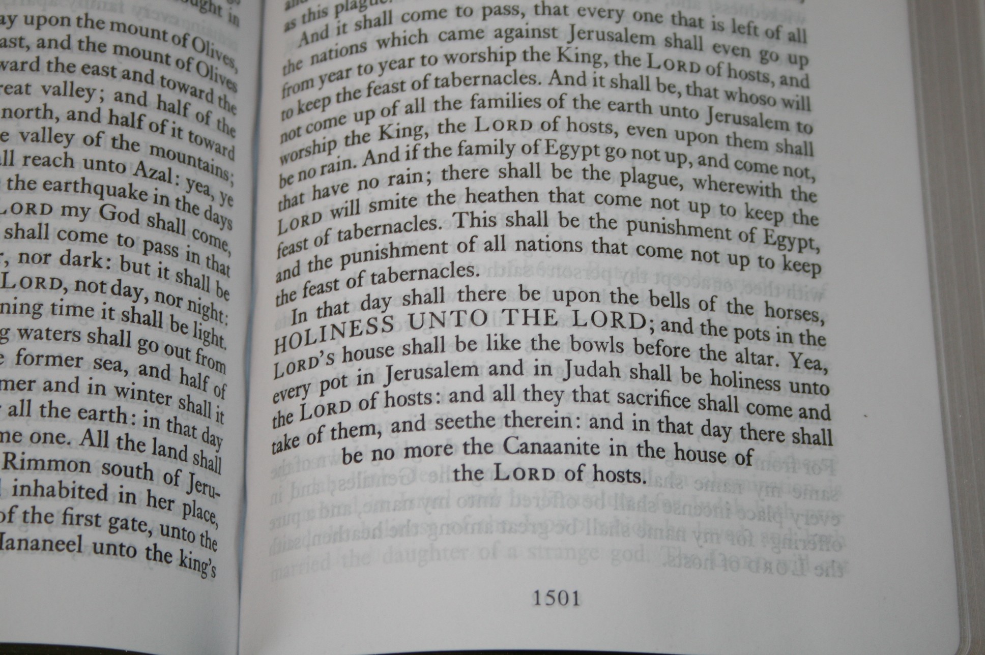
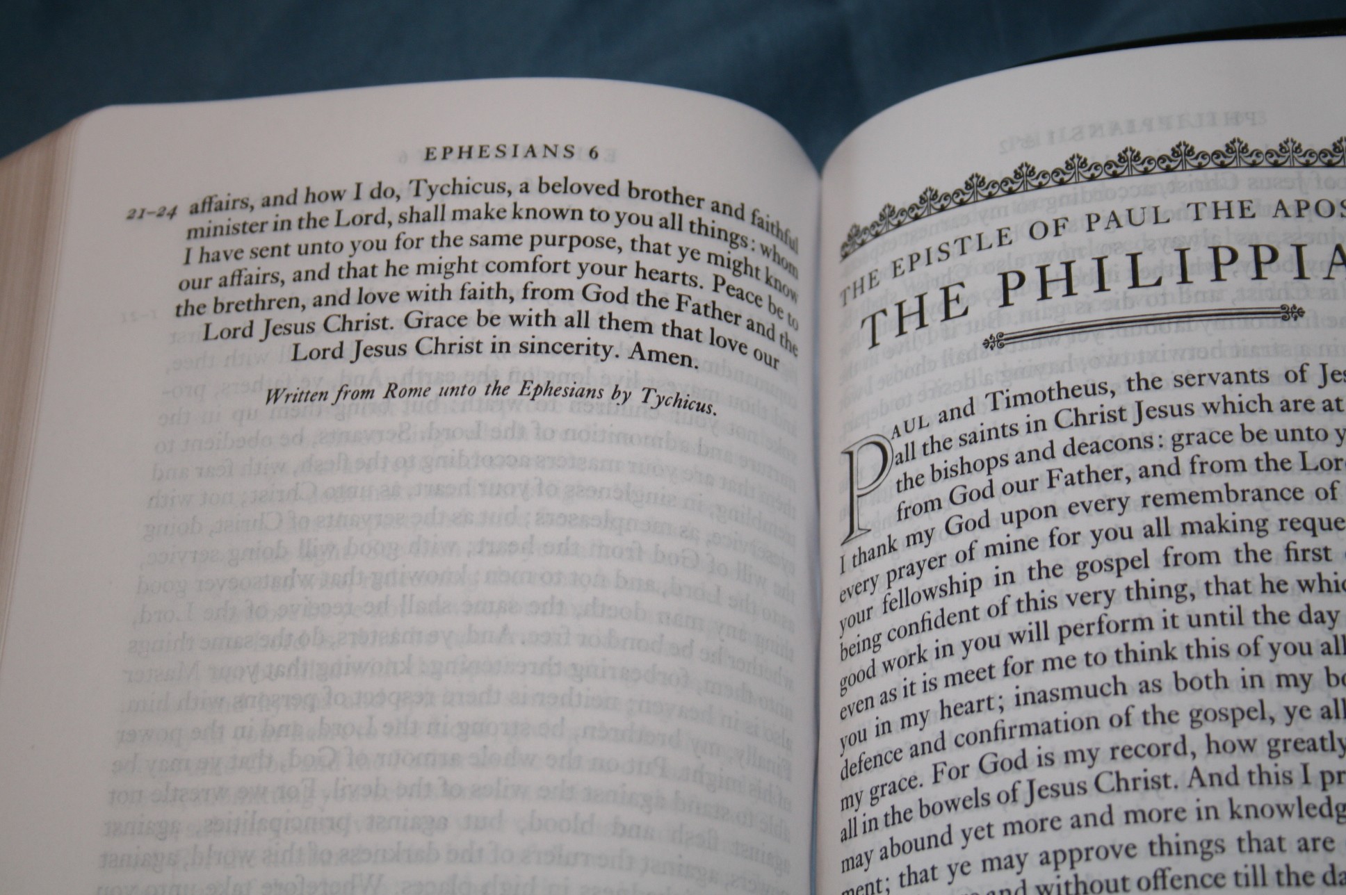
The paragraphs are too large for my tastes. They follow the tradition pilcrow placement (chapter markers) found in traditional KJV printing. The problem with this is there aren’t any paragraph markers from Acts 21 on. Starting at Acts 21, every chapter is a full paragraph (Revelation 1:4 has a paragraph). This does away with the advantage of paragraphs. For the rest of the text it has a mix of medium to very long paragraphs. Some even span two full pages.
I prefer lots of short paragraphs. Smaller paragraphs could be counter-productive in some places because they could break up the context. Keeping passages in context is the purpose of paragraphs in the first place. Still, there are lots of places where shorter paragraphs would have worked. For example, the introductions to the epistles should be their own paragraph.
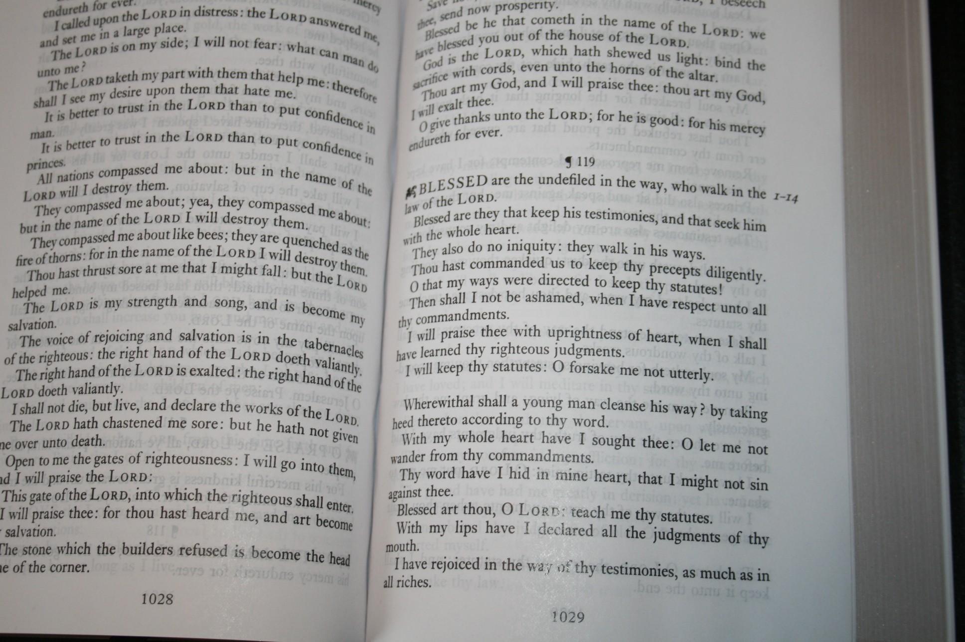 Psalms is missing the chapter titles. Some think these are inspired and others do not. I personally would have included them. It seems odd that they’re not included, but then the endings for the epistles (like those found in Cambridge Bibles), which are not considered inspired, are included. I like these book endings and I’m glad they’re included, but if it’s one or the other I prefer the Psalms chapter titles. I think both should be included. Psalms has a pilcrow next to the chapter number.
The Hebrew alphabet in Psalms 119 has been removed. Some Bibles have the actual Hebrew letters, but practically every Bible at least has the English equivalent (Aleph, Beth, etc.). I suspect they were removed because they hold to the KJV over the Hebrew. The problem is this does away with the acrostic poetry of the chapter. I would like to not only see them added back to this acrostic, but also to the other acrostic Psalms that are almost always ignored (Crossway has added them in their book of Psalms). Regardless of your stance on the King’s English vs the Hebrew, the Psalms were written in Hebrew as an acrostic and the acrostic doesn’t come across in English. It would be nice to see them included and to pay homage to the original languages.
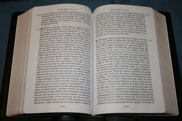
For me the biggest missed opportunity from a design standpoint is the book of Proverbs. Rather than being verse by verse like the book of Psalms, Proverbs is in paragraphs. Proverbs were written in very small thoughts. If any book in the entire Bible should be verse by verse it should be Proverbs.
Rather than follow the tradition of pilcrow placement and leaving most of the New Testament with full chapter paragraphs, I would rather see a true paragraph layout. As it is, it doesn’t take advantage of paragraphs. They had the opportunity to create the prettiest KJV on the market. Instead it’s just readable.
Artwork
I am a visual person. I love images and art. I am a fan of artwork in Bibles. I especially like artwork that doesn’t take up too much space or get in the way. There are several types of artwork in this Bible.
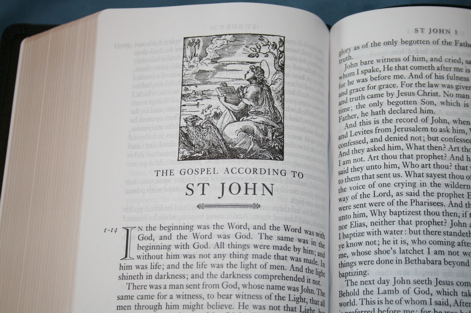
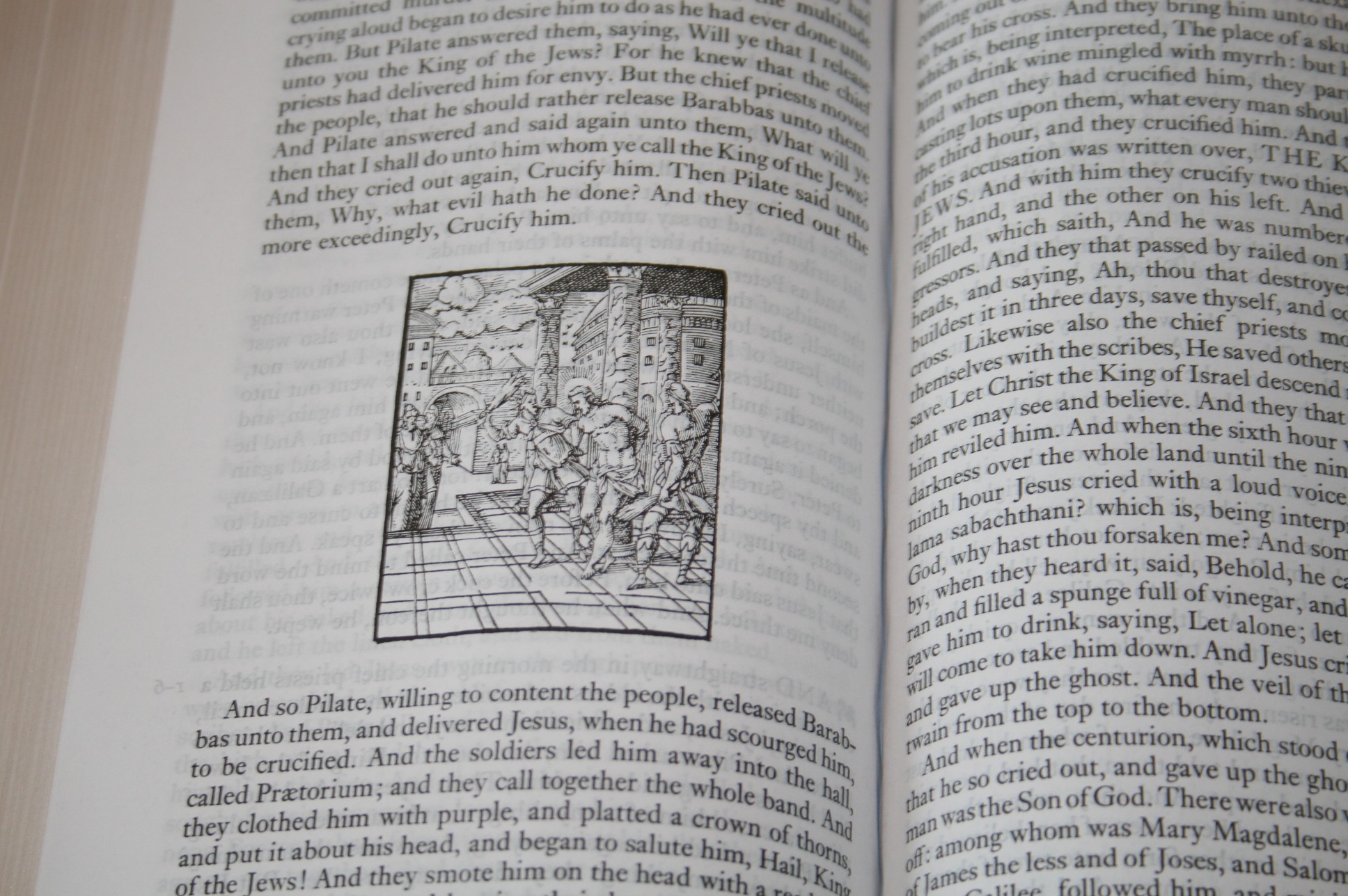

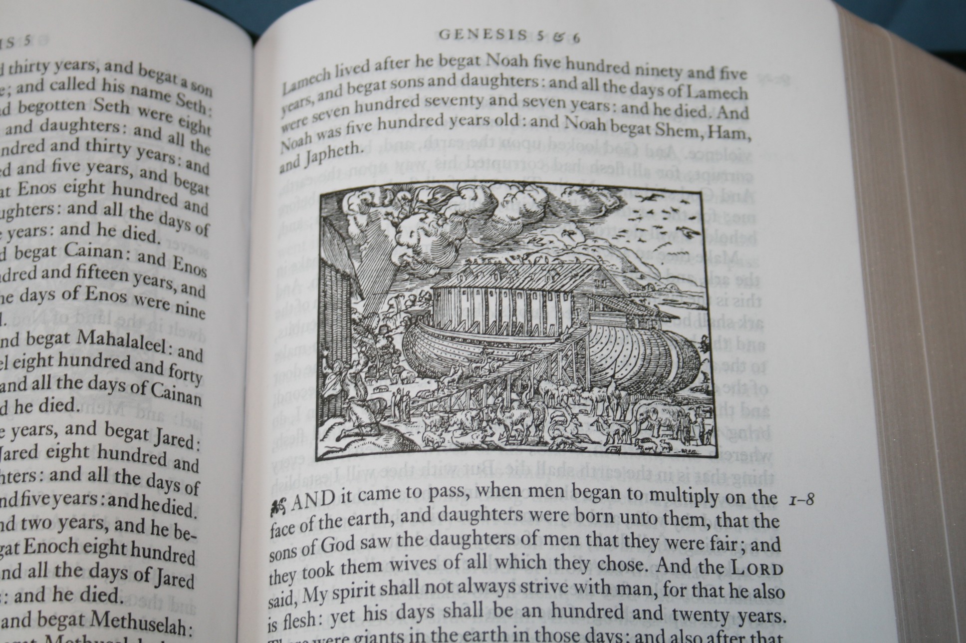
One type is old line drawings. These are placed throughout the Bible and correspond to the text. For example, in Genesis 6 is a drawing of Noah’s Ark. They are very detailed and well-drawn. I like them a lot and I’d like to see more Bibles include artwork. With all of the nice artwork that I’ve seen in Bibles I can imagine there will be plenty of people wanting to color them.
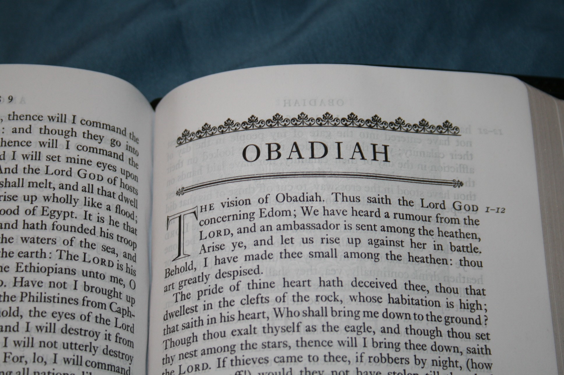
Another type is decorations around book names. Those that don’t have drawings have the decorations.
Another type is the drop-cap. These are the first letter of the first word of the book. The letters are not filled in, which I suspect will also get the coloring treatment.
All of these add elegance that reminds me of Bibles from a hundred or so years ago.
Using It
Out of the box it’s a great reader. I find the font to be perfect. I especially like reading it while it lays in my lap. Holding it in one hand is a little difficult due to the flexibility of the cover and it being a little slippery. I like to tilt my Bibles toward me instead of looking down at it.
I plan to add a few things for my own use. I want to write the verse numbers in the margin on every line where a verse starts. This way I can scan down the margin and look for the verse I want and then read that line. If I have issues figuring out where verses start then I’ll place a small dot next to the first word of the verse. This will still keep the text clean and make it more useful for preaching and teaching.
If I Could Change One Thing
I want to see smaller paragraphs. This would break the text up into smaller thoughts and make it easier to find my place on the page. This would include Proverbs which should reduce it closer to a verse by verse. This would make them much easier to read and use and makes more sense because of their writing structure.
Comparisons
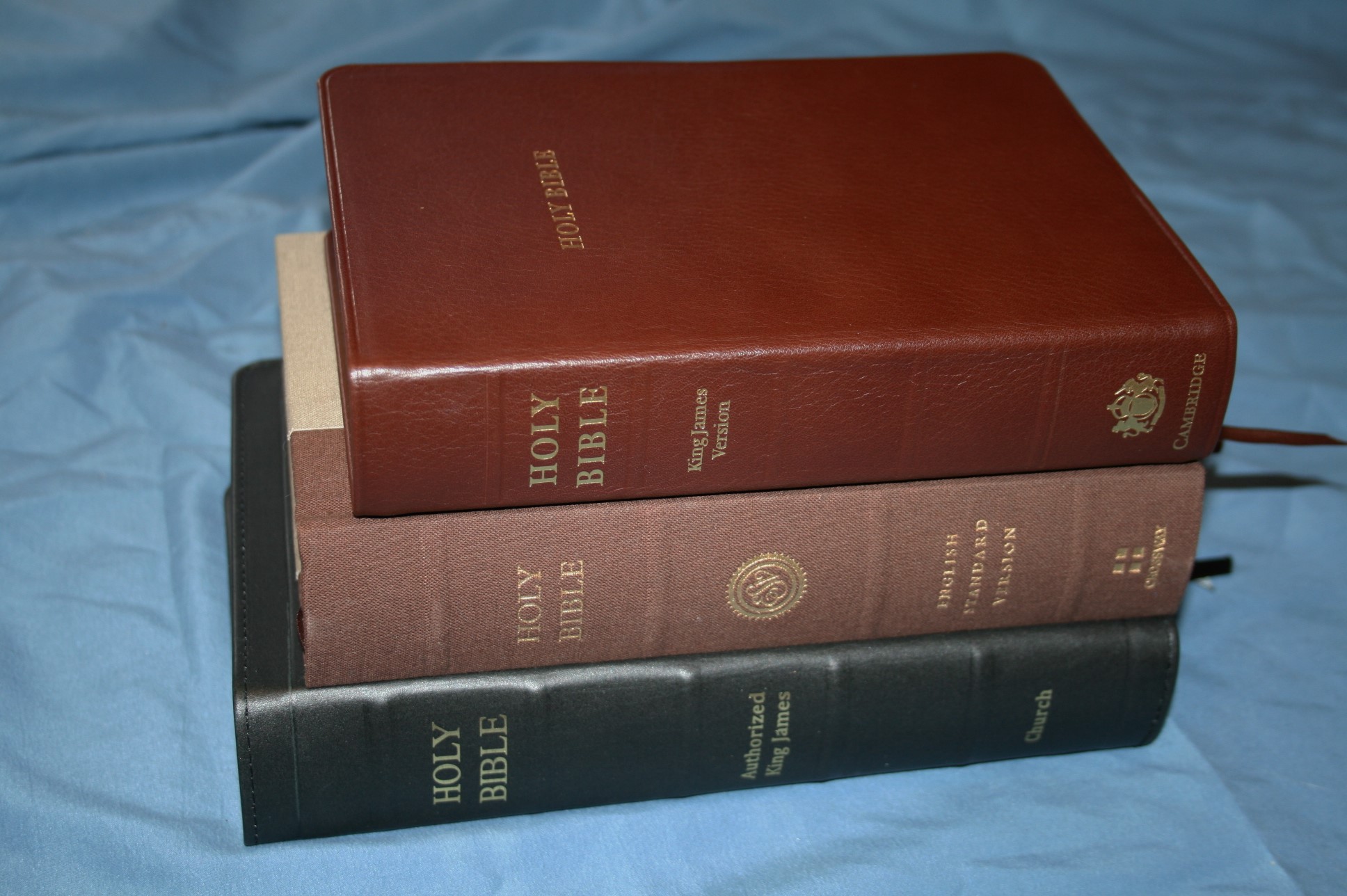
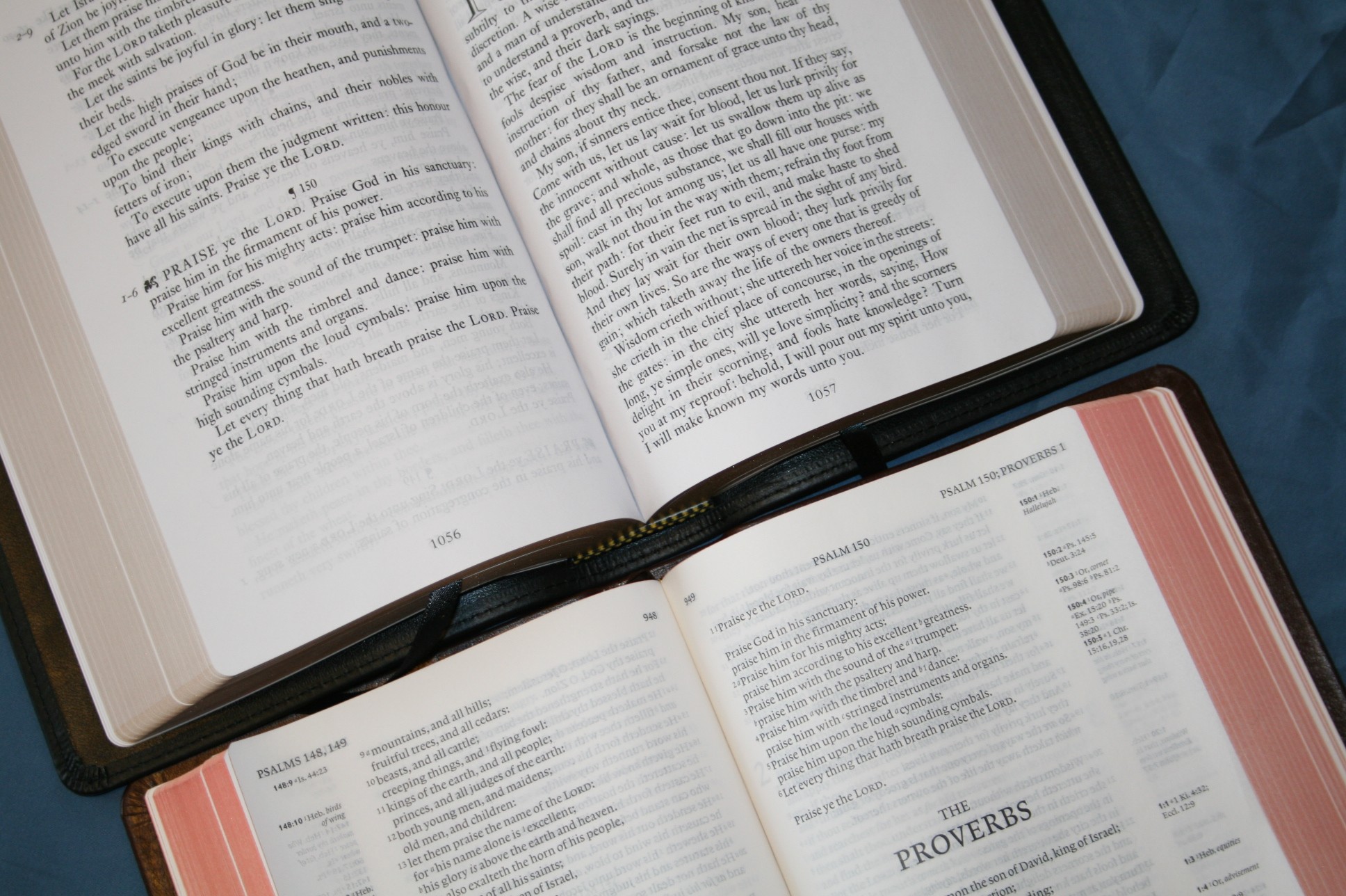
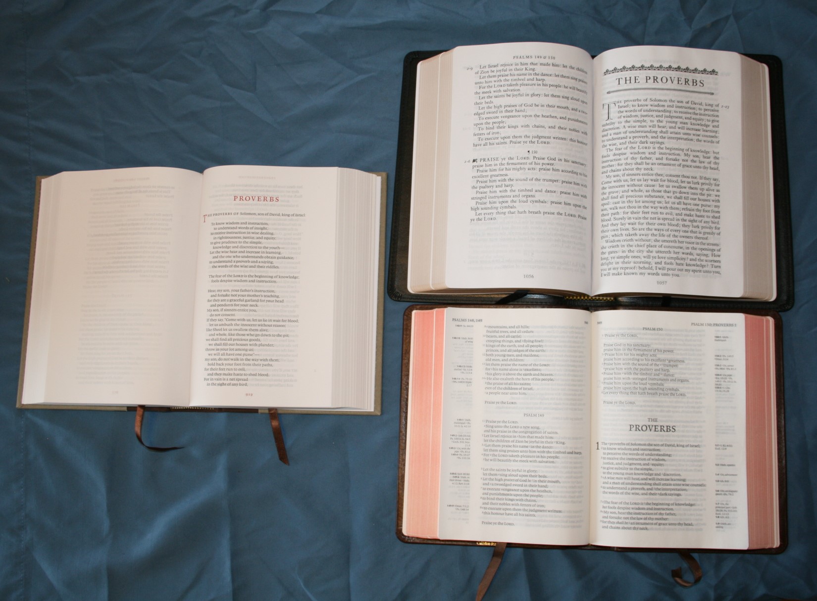
The two most obvious Bible to compare it with are the Cambridge KJV Clarion and Crossway’s ESV Reader’s Bible. Both are single-column paragraph. The Clarion has an 8.5 font, references, dictionary, maps, and smaller paragraphs. It also sets poetry in stanzas, creating the prettiest KJV layout available (although it missed a few layout opportunities too, such as poetry in the New Testament). The ESV Reader’s Bible doesn’t have any verse numbers and it has the chapter numbers moved to the margins. Verse numbers are given in the header. Verse numbers and chapter numbers are in red.

Conclusion
Even though I would like smaller paragraphs, this is still an excellent Bible for reading without distractions. My complaints are minor compared to how readable this Bible is. I plan to use the LCBP Paragraph Bible for reading, as I prefer a clean text with no distractions. I might even try using it for teaching, and preaching.


“suspect they were removed because they hold to the KJV over the Hebrew. ”
I do.
This masterpiece sold out pretty quickly
I’ll have mine tomorrow and can’t wait to emerse myself in it
Hi Bill. Congratulations. I’m sure you’ll love it. Please let us know your thoughts about it when you get it today.
They sold out really fast, in about a week, but I just looked today and they have 95 in stock.
I would love to see a paragraph version of this Bible but the size of their 115E Compact.
Hint hint….. 🙂
Hi James. Thanks for the heads up!
Wow, very neat layout! Agreed that the lack of true paragraphs creates a sense of run on. But those who push paragraph format over verse by verse would likely see this as a minor problem. I have a non verse, paragraph text on my iPad, but have not seen something in person.
Thanks for posting!
Very helpful review. Thank you. There are many beautiful features in this volume.
I am actually troubled that someone would go to all the effort of producing such a Bible and then slavishly mirror the pilcrow markings put there by, well, by whom? The entire point of a paragraphed Bible is to get discourse-level meaning across to readers via paragraph divisions—something which has become a standard typographical convention for English readers.
See my Bible Typography Manifesto. =)
Thanks Mark! I actually watched your video on typography and visited that exact page last month. It’s an amazing video and a awesome post. I learned a lot. Thanks for commenting and for the link.
Just when I thought I was finished. Now I want this text block. I adore my Clarion. I am buying this and sending it off for a rebind.
Nice review, I own several LCBP bible, the one commonality they have is the dreaded gutter crinkle. Even in your photos, if you look at the gutter, you know it’s going to snap and crackle. From what I’m understanding, these bibles tend to be bound against the paper grain. This wasn’t always so, I have a indexed LCBP that I purchased 10 years ago and it’s perfect!
I do wish they would correct this issue to otherwise very nice bibles.
Betsy
Scrivener’s text of 1873 ended paragraph markers in the same place I believe. I think it is his, without the italics and such.
That makes sense. Thanks for the info.
Hello Brother,
I am desiring a paragraph Bible for reading. I appreciate your comparison with LCBP and Clarion. I have been reading the Concord Goatskin and love the hand size. With the passing of time/use, which would you choose of the LCBP/Clarion? I have read the concerns with thin paper in Clarion. I don’t plan to use for preaching, just extended reading sessions. Any feedback is welcomed. Thanks again!
Brian Morgan
Hi Brian. The Clarion is one of my all-time favorite Bibles. I do like the LCBP Paragraph Bible and I can recommend it, but I prefer the Clarion’s layout and paper. I especially like the poetic setting of the Clarion and that it has a lot more paragraphs than the LCBP. Two others that I like are the Holman Reader’s Bible and the Nelson Single Column, but they don’t have as good of a layout as the Clarion. The Clarion is my #1 pick.
Thanks so much! I appreciate your feedback.
You’re welcome 🙂
Good Morning!
I am about to pull the trigger on the Clarion for reading, but wanted to ask how the binding is holding up on your Calfskin. I am spoiled with the Goatskin Concord and am a bit hesitant to go with Calf. Your thoughts? Thanks again!
Hi Brian. It’s holding up perfectly, but it hasn’t gotten strenuous use because I have to use so many. I do use them a lot (mostly KJV and NKJV) and they hardly have any wear at all. I’m happy with them. In fact, I like it so much that I just bought another one in calfskin.
Thanks so much!
I received my LCBP Paragraph Bible today. I’m very pleased with it, the quality is excellent and I really like the white paper and large print. The paper is thin and has a very pleasant “feel” to it which I enjoy.
Reading in this paragraph format with it’s clear, large font is very enjoyable. This will be a favorite Bible for relaxed reading.
Thanks for sharing Jeff. I’m glad you like it. It’s one of my favorites.
You mentioned that this Paragraph Bible by Local Church Bible Publisher was from an older edition containing three-volumes, and it just clicked in my head. This is the bible by Nonesuch Press. They had a three-volume and five-volume editions. I’ve seen it mentioned on J. Mark Betrand’s Bible Design Blog on the Nonesuch Bible, it looked really intriguing (though unfortunately he wasn’t a fan of it). So far I’m a fan of this, I only wish the pages were a bit thicker and less translucent.
Thanks! I’ve been considering the Nonesuch set for a few years. There are almost always a few for sale on eBay.