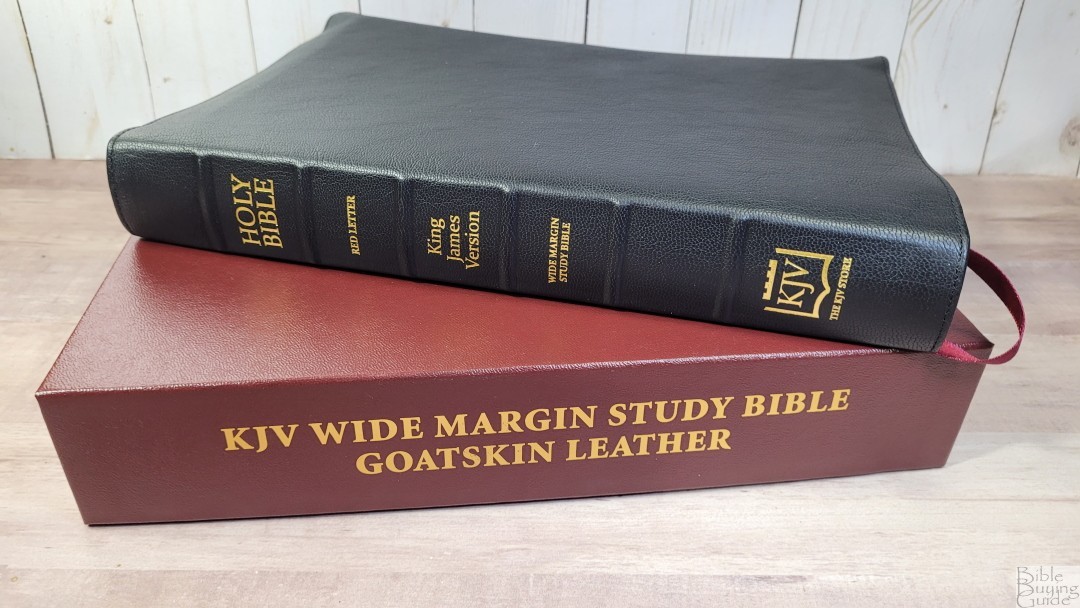
The KJV Classic Study Bible (With C.I. Scofield Notes) is a reprint of the 1917 Scofield Study Bible. This Bible is available from several publishers with several cover options. The KJV Store has released a wide-margin edition in goatskin leather. They did release a small run in goatskin in 2020, but that edition used their current text blocks. This new 2022 edition was made in the Netherlands by Royal Jongbloed. They’ve printed the text block with an improved digital file and wrapped it in goatskin to create the highest quality Classic Study Bible available. It’s not an exaggeration to say the materials and construction are on par with Schuyler and RL Allan.
The KJV Store provided this Bible in exchange for an honest review. I was not required to give a positive review, only an honest one. All opinions are my own.
_________________________________________________________
This Bible is available at The KJV Store
_________________________________________________________
Table of Contents
- Video Review
- Cover and Binding
- Paper
- Typography
- References
- Book Introductions
- Study Material
- Concordance
- Maps
- Comparison
- Conclusion
Video Review
Cover and Binding
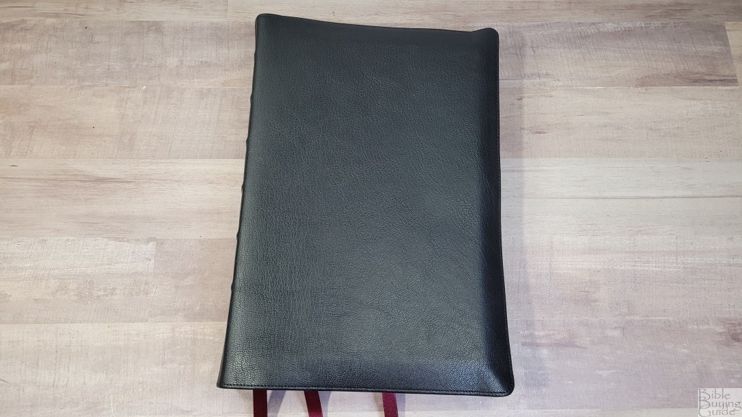
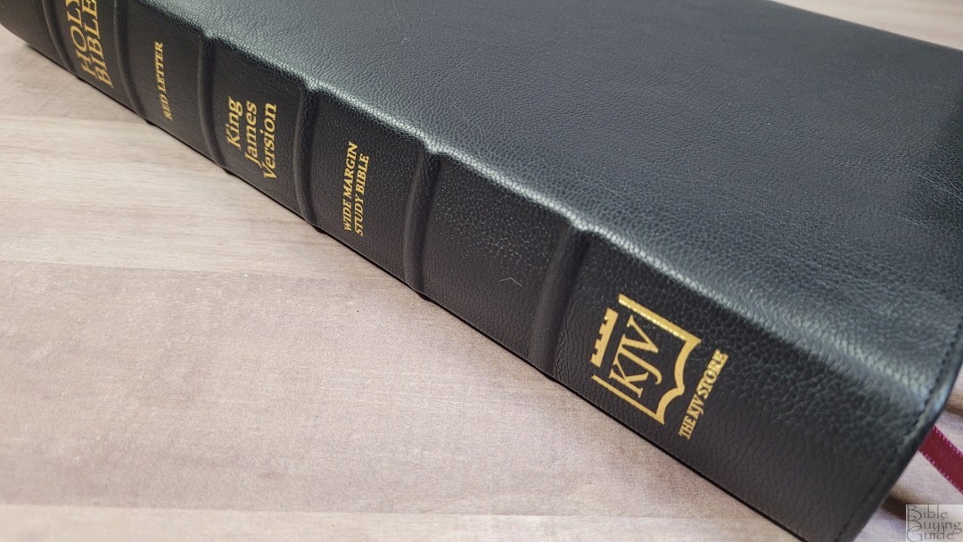
The cover is black Goatskin. It has thick leather that looks to have a natural grain. The leather is soft and flexible. You can easily roll it if you want. It has a full yapp with perimeter stitching. Nothing is printed on the front. The spine has 6 raised hubs. The text and logo are stamped in gold.
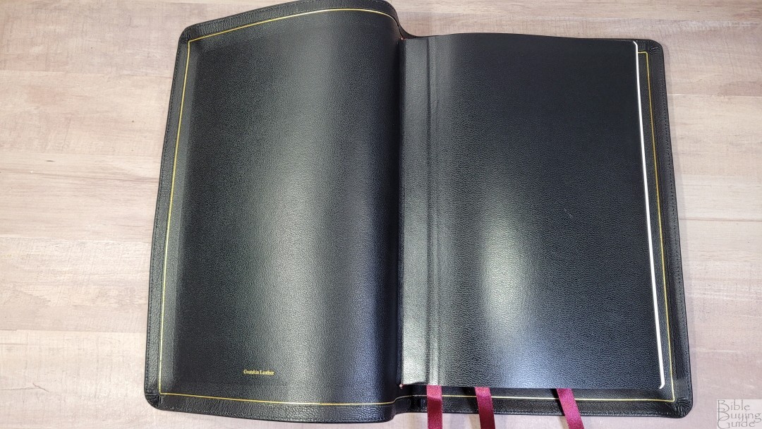
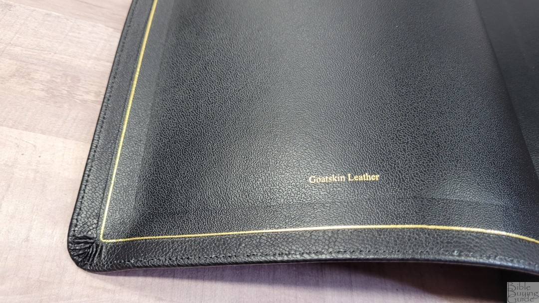
The liner is edge-lined calf split. It includes a gilt line. The tab is slightly stiff, but it does break in well. It has a lot of leather folded over from the front that covers about half the size of the yapp and meets the gilt line.
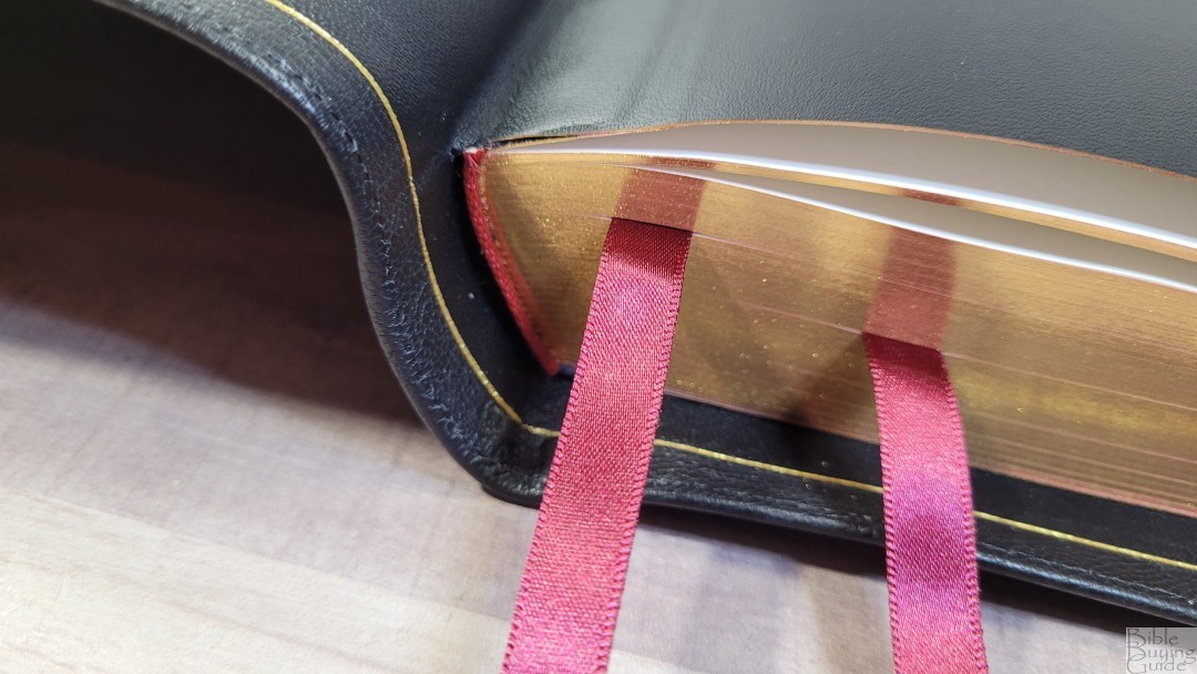
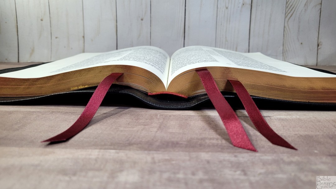
It includes 3 3/8″ double-side satin ribbons. They’re burgundy and long enough to pull to the corner to open. They seem to be Berisfords. The head/tail bands are burgundy to match the ribbons. The overall size is 9.25 x 6.75 x 1.5″. It weighs 2 lbs, 14.8 oz.
Paper
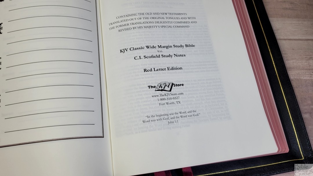
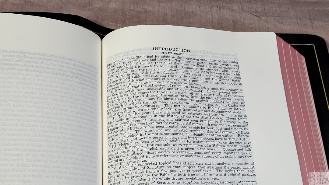
The paper is a premium French Bible paper called PrimaBible. Its 32gsm reminds me of the paper used in the Longprimer a decade ago. That was some of the best paper I’ve seen. It’s ivory in color and extremely opaque. It’s smooth and almost feels like silk. I haven’t had any issues turning the pages, but if my hands are cold, I probably would. The smoother the paper, the more difficult it can be if your hands are cold. I have had a small amount of page curl when the weather is dry and cold – heat rises.
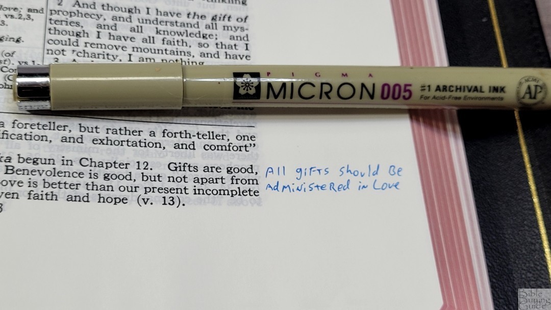

I do prefer a thicker paper for a wide-margin Bible, but this does work well. I haven’t taken extensive notes, but there is some show-through with my blue 005 Pigma Micron. It doesn’t bleed through, and the show-through isn’t bad.
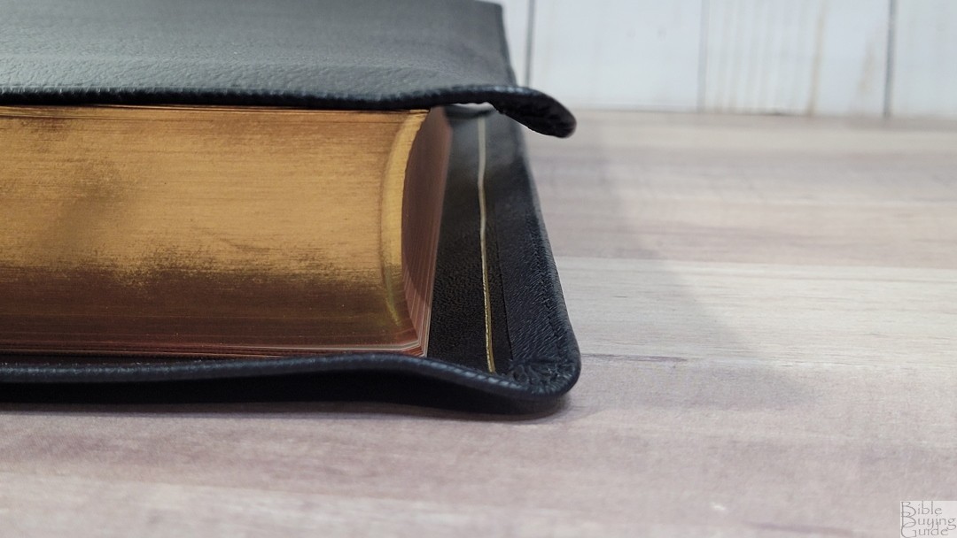
Page edges are art-gilt with red under gold. It looks the same as RL Allan.
Other Pages

In the front are family presentation pages, including family records, children, marriages, grandchildren, and deaths. It includes several thick end sheets in the front and back to build the structure. These are the older pages from Cambridge.
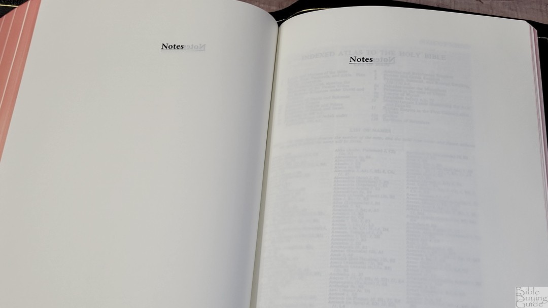
In the back are 16 pages of Bible paper for notes. The label is a touch low on the page, which causes the user to write around it.
Typography
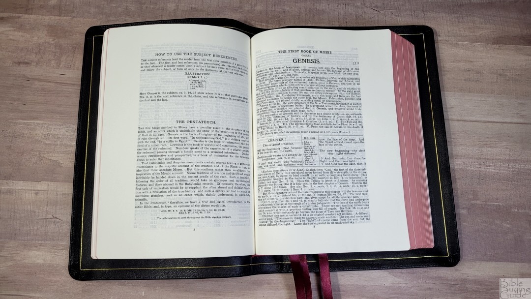
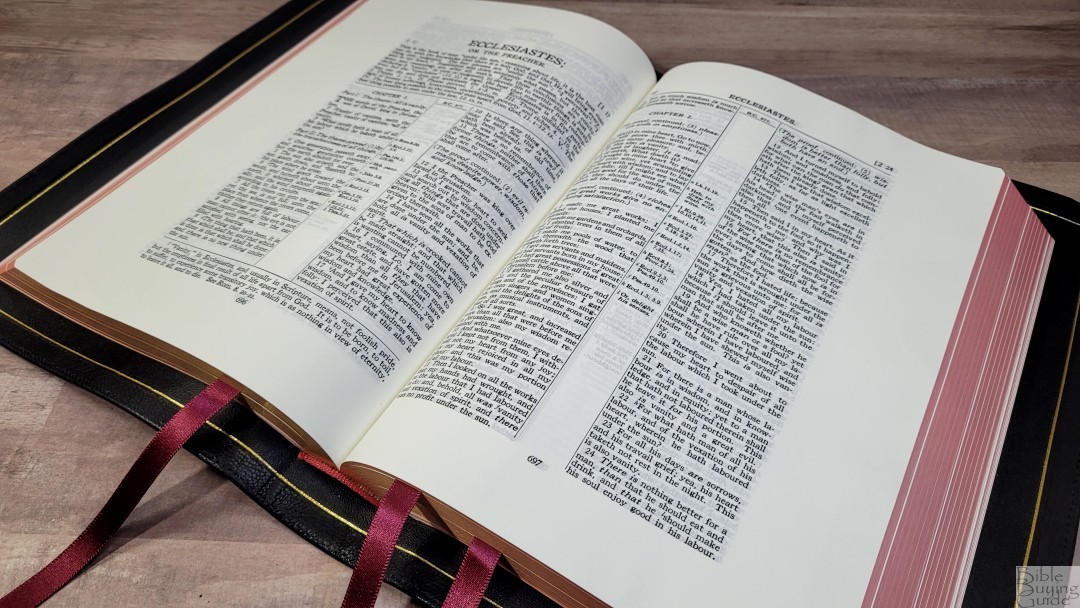
The KJV Store worked with Royal Jongbloed to improve the digital file. This edition has a cleaner and clearer print than any other Scofield that I’ve seen. The text is set to double-column verse-by-verse, with references in the center column. Commentary is placed at the bottom of the page. The header includes the chapter and verse numbers for the first and last verse on each page over the outer edge of both columns. The book title is in bold in the center. Section headings are in italics, with references for parallel passages.
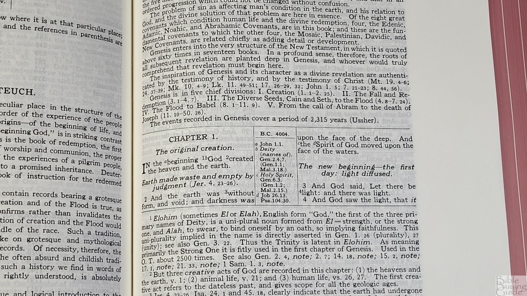
The font is 9-point. It’s sharp, dark, and clean. The red letter goes through Revelation. This is a bold red. Both are highly consistent throughout. Any variation I’ve seen is minor and only noticeable because I was looking for it. It averages around 6-8 words per line. The text never feels too crowded. Instead of placing self-pronouncing marks in the text, that information is placed in the back. This edition does not include line-matching, but the setting is over 100 years old, so it was created before line-matching was even needed.
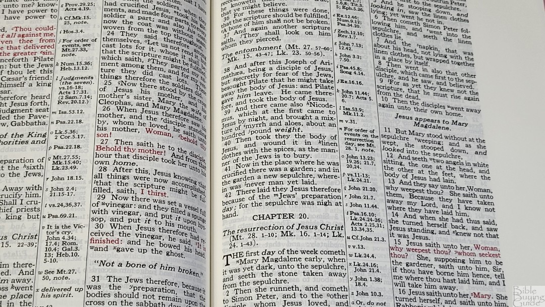
It has more section headings than most KJV’s. They divide the text into an outline and help to create paragraphs. There are so many that they can blend in with the text. Some include theology, but they do provide a good description of the text. This makes them good for preaching and study. There are also breaks within the books to show major breaks in the sections if the book has them naturally (like Psalms). The breaks go across both columns.
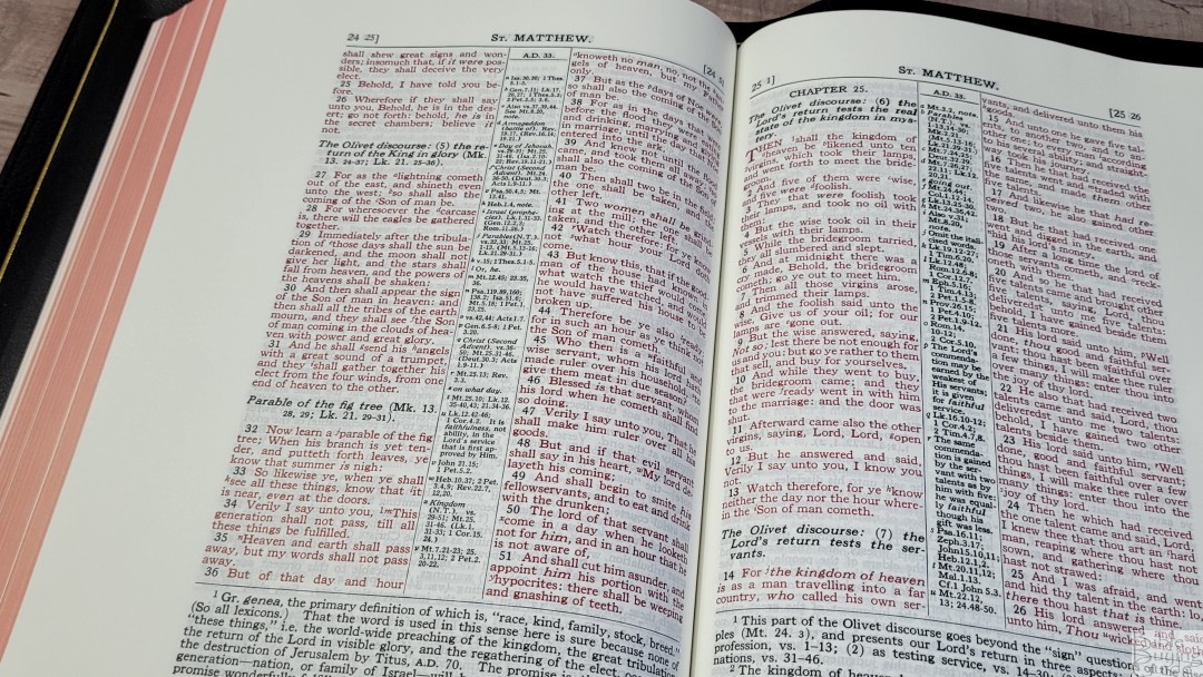
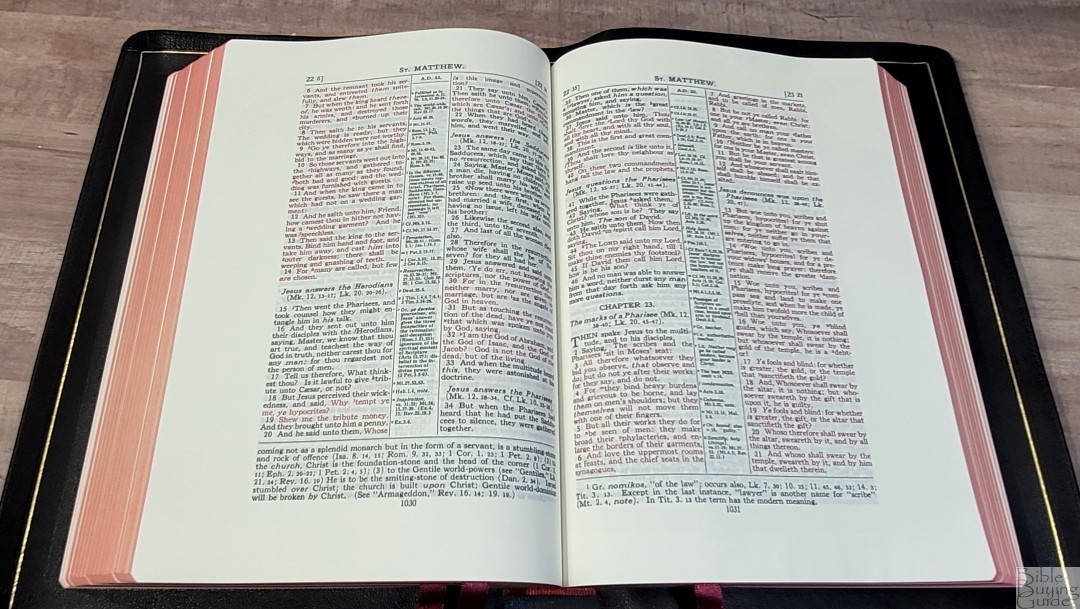
This is a wide-margin edition with wide margins on the top, bottom, and outside. There isn’t margin space for the inner margin. It doesn’t have a wide inner margin. The margins are 1/4″ inside, 1-1/2″ outside, 1″ at the top, and 1″ at the bottom. This is enough space for small notes, definitions, references, etc.
References and Footnotes
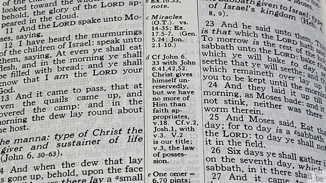
Both references and footnotes are keyed to the text with letters. You can’t tell which it is without looking. They’re not near the verses they correspond with. They follow down the left column and then the right column. A reference at the bottom of the page might go to a verse at the top of the page. They also include a date from Usher’s chronology to show when the events took place.
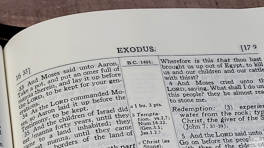
The references are interesting. They include the subject and a chain reference to the next verse. They show the first and last references in parenthesis so you can find the beginning of a chain or the summary no matter where you start in the chain. The summary appears on the page of the last verse of the chain and is part of the commentary of that page. Some of them include charts.
Here are some example references to help you compare:
- Genesis 1:1 – Jn 1:1; Diety (names of) Gen 2:4, 7; Gen 1:1; Mal 3:18
- Deuteronomy 6:4 – Mk 12:29
- Isaiah 9:6 – Lk 2:7; Jn 3:16; 1 Jn 4:9; Christ (first advent) Is 28:16; Gen 3:15; Ac 1:9; Kingdom (OT) vs 6, 7; Is 11:1-2; Gen 1:26; Zech 12:8; Israel (prophesies) vs 6, 7; Isa 11:1-3; Gen 12:2,3; Rom 11:26
- Matthew 17:20 – Mt 16:8; 21:21; Lk 176; Faith Mk 9:23; Gen 3:20; Heb 11:39
- Mark 11:23 – Mt 17:20; Lk 11:1; 17:6; Jn 14:13, 14
- Mark 12:29 – Jehovah Dt 6:4
- John 1:1 – Rev 19:13; Jn 17:5; Heb 1:8, 13; 1 Jn 5:20
- John 2:19 – Mt 2:61; 27:40
- Acts 2:38 – Ac 3:19; Mt 3:2; Ac 17:30; Mt 26:28; Rom 3:23
- Rom 10:9 – Mt 10:32; Lk 12:8; Ac 8:37; 1 Cor 12:3; Rom 1:16
- 1 John 1:1 – Jn 1:1; 1 Jn 2:13; Jn 5:24; Ac 4:20; Jn 1:14; 2 Pet 1:16, 17; Lk 24:39; Jn 20:27; Jn 1:1, 14
Section and Book Introductions
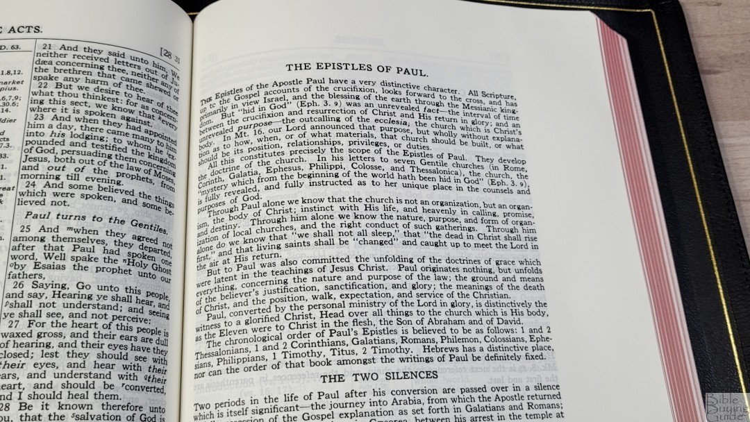
Books are grouped into genres such as poetry, prophecy, etc. These genre sections have their own introductions. They include the chronological order of the books in that genre following Usher’s chronology.
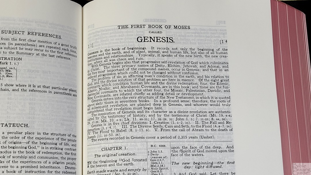
Book introductions are short, but they provide good information. They include information about the author, setting, main themes, a simple outline, major divisions, and dates based on Usher’s chronology.
Study Material
There isn’t a lot of study material throughout the Scofield Bible. The material includes commentary at the bottom of the page within the text and indexes at the back. Commentary isn’t placed on every page. This makes the Scofield a good option as a reference edition if you don’t need Scofield’s notes.
Commentary

The commentary is keyed to the verses with numbers. It provides the number in the verse and the commentary. It doesn’t provide the verse number in the commentary to know which verse it corresponds to. It can take some time to figure out which verse a note goes with. There isn’t a lot of commentary. It covers themes from the text rather than verse-by-verse commentary. Many verses don’t include notes. The notes include insights into Hebrew and Greek.
Index
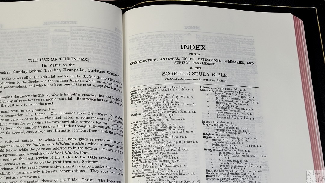
This is an 8-page index to the Scofield analyses, notes, definitions, summaries, and subjects. It covers everything except the book introductions and running analysis (section headings). It helps you find the material quickly. This is helpful for preachers with sermon prep, Sunday school teachers in preparing their classes, and other ministerial workers to prepare their material.
Dictionary of Scripture Proper Names
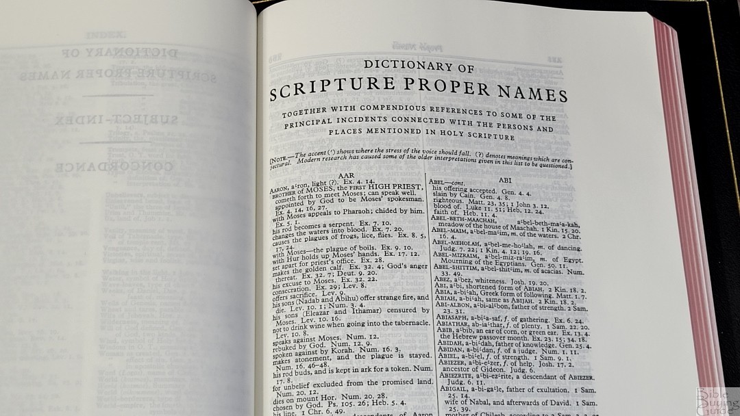
This is a 44-page index with all of the proper names in the Bible. It shows the names, pronunciation, a short description, and references. It works as a pronunciation guide, so the text doesn’t have to include it.
Subject-Index

This is a 38-page topical index. It lists subtopics and Scriptures for each. This is one of my favorite tools in this Study Bible. It’s excellent for sermon prep and personal study.
Concordance

The concordance is 162 pages with 2 columns per page. The main references are provided verse-by-verse with snippets from the verses. Several more are placed under the last reference with just their references. It has a lot of entries, making it an excellent tool for personal study and sermon prep.
Here are a few example entries with the number of references they provide:
- Christ – 15
- Christian – 3
- Faith – 133
- Faithful – 57
- Faithfully – 4
- Faithfulness – 11
- Faithless – 4
- God – 60
- God (an idol) – 20
- Goddess – 3
- Godhead – 3
- Godliness – 14
- Godly – 14
- God Save the King – 1
- Praise (n) – 41
- Praise (v) – 25
- Pray – 45
- Prayer – 39
Maps
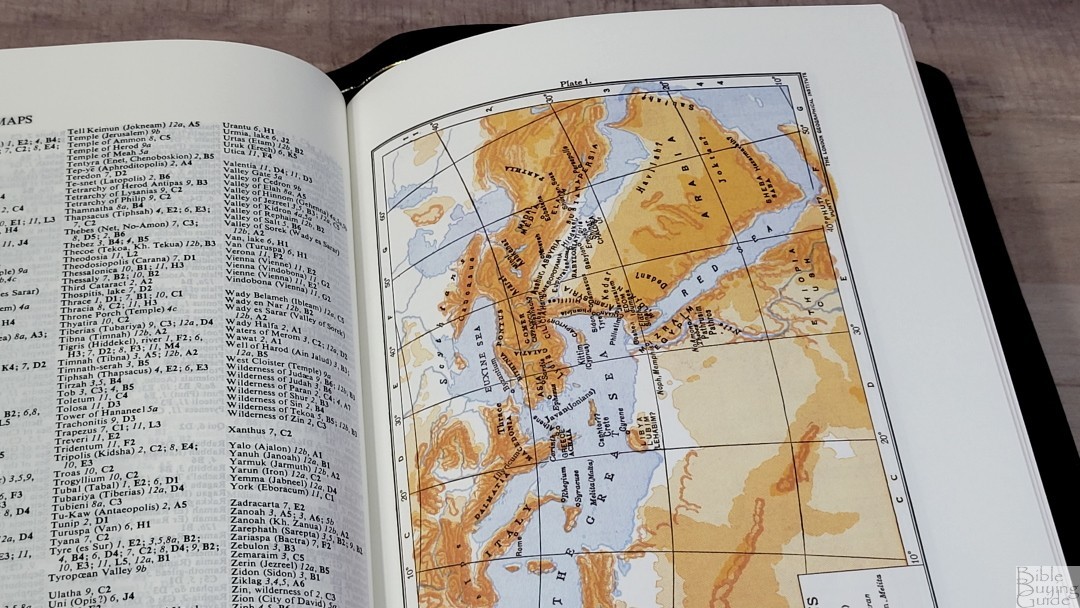
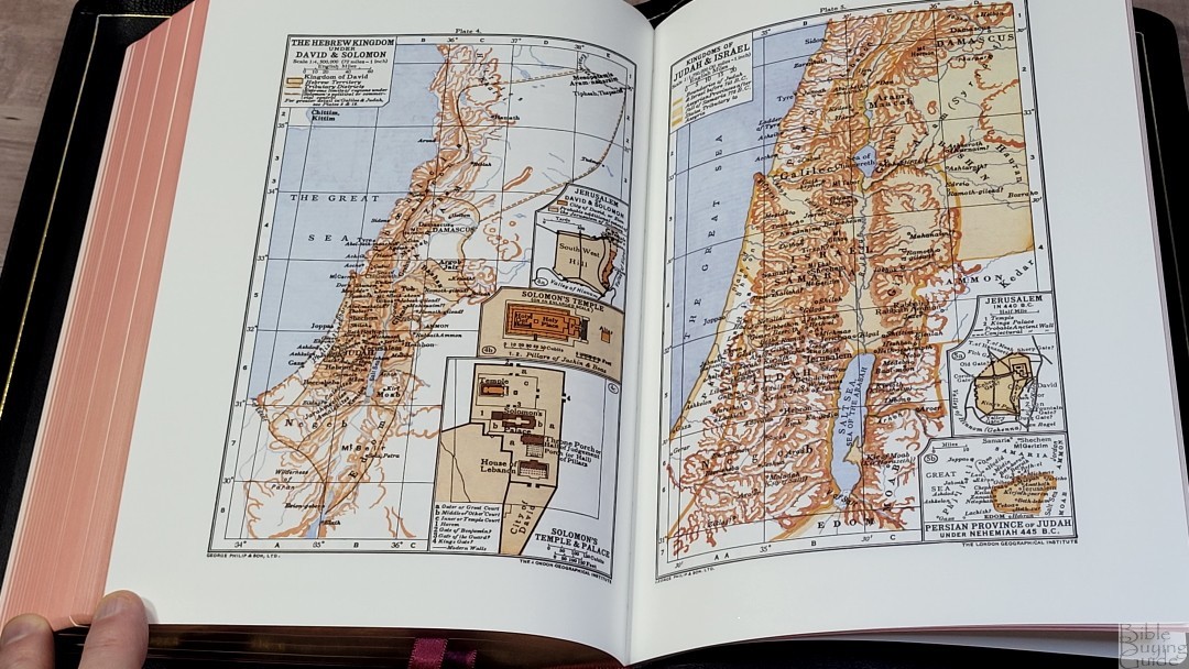
It has 12 old Oxford maps on thick pages. The colors are bold, with shades of brown for land and a light blue for water. The text is bold, which can be a little difficult to read. They contain a lot of information. The maps include longitude and latitude, elevation, distance, land structure, cities, Scripture references, dates, territories, routes, etc.

It includes a 6-page index to maps. Considering that some of the text is difficult to read, the index makes the maps a lot easier to use.
Maps include:
- Lands and Nations of the Bible
- Egypt, Sinai Peninsula, and Syria (with Plan of the Tabernacle inset)
- The Promised Land
- The Hebrew Kingdom Under David and Solomon (with Jerusalem of David and Solomon, Solomon’s Temple, and Solomon’s Temple and Palace inset)
- Kingdoms of Judah and Israel (with Jerusalem in 440 BC, and Persian Province of Judah Under Nehemiah 445 BC.
- Assyrian and Babylonian Empires
- Persian and Greek Empires
- The Ptolemaic Seleucid and Roman Empires 250-150 BC, and Palestine Under the Maccabees
- Palestine in the Time of Christ (with Temple of Herod, and Jerusalem Before 70 AD inset)
- Mediterranean Lands Illustrating the Acts and Epistles
- Roman Empires of the 1st Century After Christ
- Galilee, and Environs of Jerusalem
Comparison
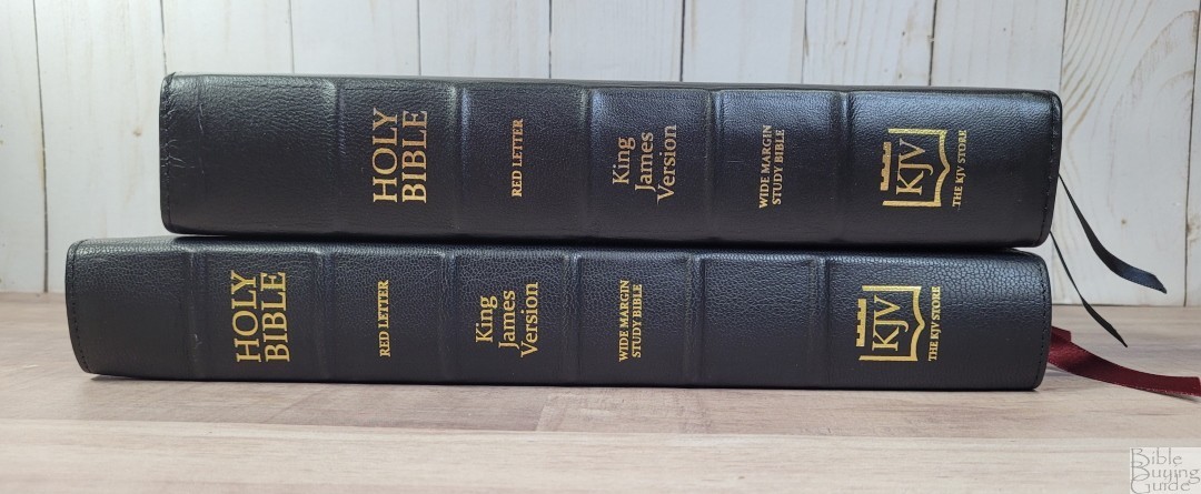
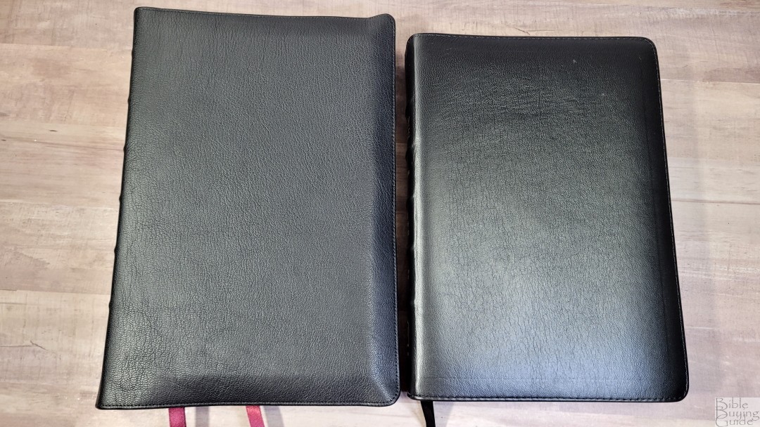
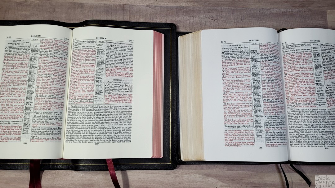
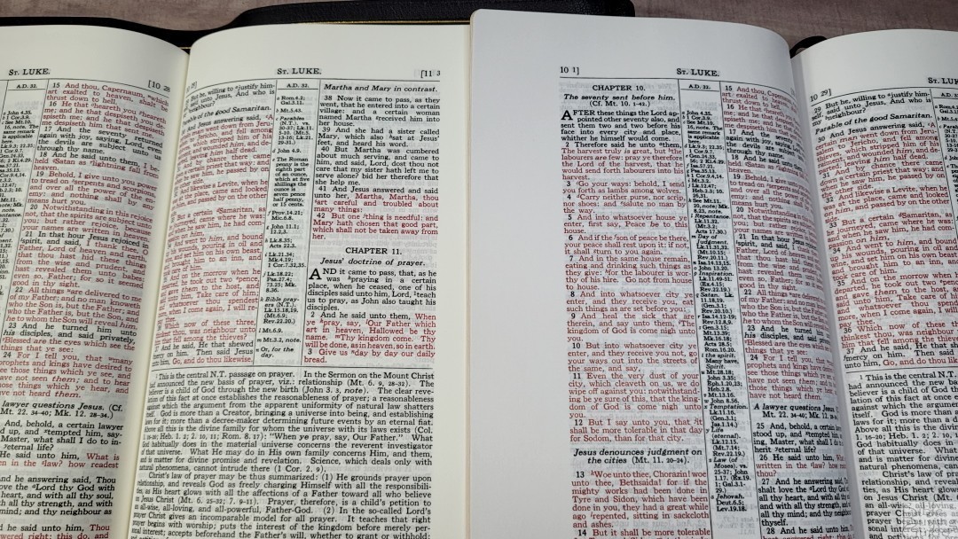
Here’s a look at the edition I reviewed in lambskin. I still like this cover, but it isn’t as tough or elegant as the goatskin. The goatskin edition has a slightly creamier color, which I prefer, and the paper is a lot more opaque and has a smoother texture. The goatskin has a slightly sharper font. The spine of the goatskin rises a touch higher, giving more room in the inner margin. The lambskin edition is great for the money, but the goatskin is a much better edition when you consider all the improvements.
Conclusion
The KJV Store has done well with this Bible. This is a Bible they can be proud of. It’s easily the best version of the Scofield that I’ve seen. It’s as elegant as anything I’ve seen from Schuyler, Cambridge, or RL Allan. It’s similar to the 32gsm Longprimer. I’m not fond of the maps, but this is an area where I’ll admit to being a cartography snob. Most Bible readers don’t use them, so this wouldn’t affect them anyway. If you’re interested in a high-quality, wide-margin version of the Scofield Study Bible, The KJV Store Classic Wide Margin Study Bible (With C.I. Scofield Notes) Goatskin Edition is easily the best choice.
_________________________________________________________
This book is available at The KJV Store
_________________________________________________________
The KJV Store provided this Bible in exchange for an honest review. I was not required to give a positive review, only an honest one. All opinions are my own.



Randy,
Thanks for the review. It appears that the lower case “g” and also the lower case “s” seem darker and stand out. Is this just the video or is it that way in real life?
Hi Thomas. They do stand out. This is a scan from the old metal press setting and some of the circular letters show more ink than others.
I want it… except that I need it in 11.5+ pt (preferably 12-14 pt). To be a perfect bible: have thicker paper ( 36gsm Minimum European paper), Study Bible (Concordance, Dictionary, index, applicable Maps/charts/tables ( weights/measurements )), thumb indexed, Bio’s for each Book &
Timelines…. But it is so close… except the paper and small print.
Hi Randy,
I am going nuts!!! :<)
Help please, I am looking for a very special Bible and cannot seem to locate anything even close. I would greatly appreciate any assistance in this regards. What I am looking for is a unique, premium study Bible with all the bells and whistles.
Here is a list of the must have and additionally desired features:
Minimum Features:
KJV
Red Letter
Smyth-sewn
Full Calves or other Premium Leather, top quality bound
3/4 – Full Yapp
10.5-11.5 Pt Text Anything smaller limits use to young/excellent eyesight ( 11.5-12 would be perfect for us older eyes )
Cross References
MINIMUM 36 GSM European paper (anything less = ghosting/bleed through & tears)
Study Bible (Bio's for each Book, Timelines, Commentary, Concordance, Dictionary, index, applicable Maps/charts/tables ( weights/measurements )) A “One Stop Shop” true Study Bible
Gilded edges
Thumb indexed
Plus any of these additional features would be awesome:
SINGLE COLUMN/PARAGRAPH STYLE ( with cross references towards the binding ) This is the easiest form of text to read.
2-3 Ribbons
Margins sized capable of small notes ( ½” to ¾” )
Commentary (Cambridge, MacArthur, Scofield or maybe Matthew Henry) ??? This text could obviously be a tad smaller, but NLT 10pt
Simple "HOLY BIBLE" centered on front, and spine, with KJV on base of spine.
In Black or even preferred the Natural Color of the leather.
Yes, it will be a slightly larger Bible, and require an XL Bible Carrier; however, it would be an AWESOME Study Bible. It would be a cherished Heirloom, passed down and greatly favored by the majority of Christians. And think of the nice options of carriers specifically made for this Bible that could be offered.
I have an OLD KJV Life Application Study Bible that I would have loved to have had rebound; however, it is a glued, non- Smyth-sewn book with thin pages and small print… so unfortunately that’s a no go.
And since I stubbornly want what I want, I will continue looking.
Is there even such a thing… this is my great pearl!
Again, Thank you for your time and efforts on this matter.
Hi Dave. Unfortunately, there isn’t anything like this avaiable. I recommend getting a new edition of the LASB and having it rebound.