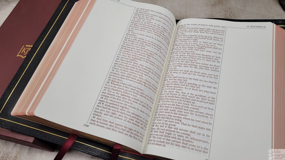
The KJV Note Taker’s Bible is one of the most popular wide-margin KJVs on the market. It’s available from several publishers, but none come close to the quality of the latest edition from The KJV Store. This edition was made in the Netherlands by Jongbloed. It includes elegant paper, a goatskin cover, three premium ribbons, and some extras not found in any other Note Taker’s Bible. The quality easily matches anything I’ve seen from R.L. Allan. If you’re looking for a high-quality wide-margin KJV in large print, read on to see why this is the one to buy.
The KJV Store provided this Bible in exchange for an honest review.
_________________________________________________________
This Bible is available at The KJV Store
_________________________________________________________
Table of Contents
Video Review
Cover and Binding
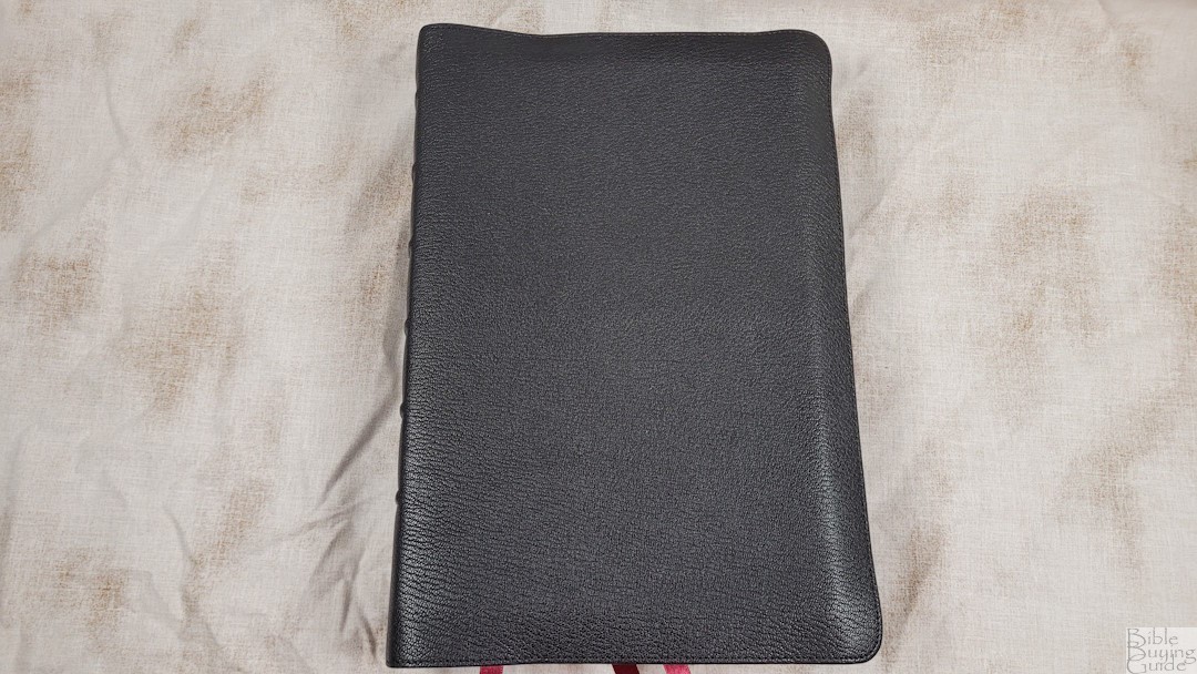

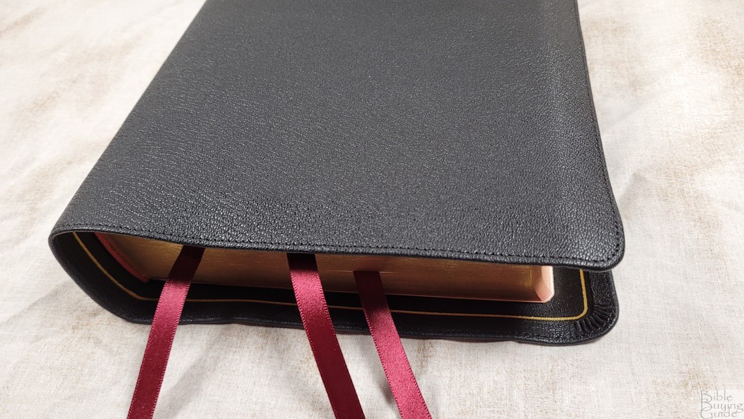
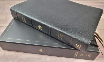
The cover is black Goatskin. This is a thick leather with a natural grain. The leather is soft and flexible. It has close to a 1-inch yapp with perimeter stitching. Nothing is printed on the front. The spine has 6 raised hubs. The text and The KJV Store logo are printed in gold.
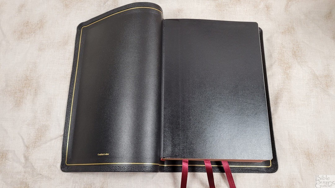

The liner is edge-lined calf split. It has a gold gilt line. The tab is not stiff, allowing the pages to stay completely open out of the box. The block is sewn and it has no trouble staying open in Genesis 1. The spine does rise a little when the Bible is opened, so the text isn’t lost in the bend of the gutter. I was surprised to see this and I’m very grateful because it makes this Bible a lot more useable than I expected.
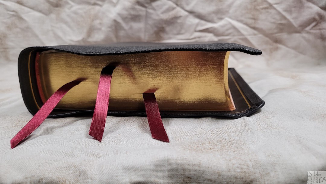
It includes 3 3/8″, elegant double-sided satin ribbons. They’re burgundy and long enough to pull to the corner to open. The head/tail bands are burgundy to match the ribbons. The overall size is 9.25 x 6.75 x 2.25″. It weighs 4 lbs, 3.4 oz.
Paper

The paper is a 36 GSM premium French Bible paper called PrimaBible. It’s slightly creamy and extremely opaque. It’s smooth and almost feels like silk. I haven’t had any issues turning the pages. This is my favorite look and feel for Bible paper. Page edges are art-gilt with red under gold.
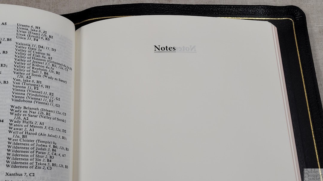
In the back are 10 blank pages that are labeled for notes. This is the same paper as the Bible pages. I’d like to see the label appear closer to the top of the page. Actually, it doesn’t really need the label, so removing it might be the best option for the most writing space.
Typography
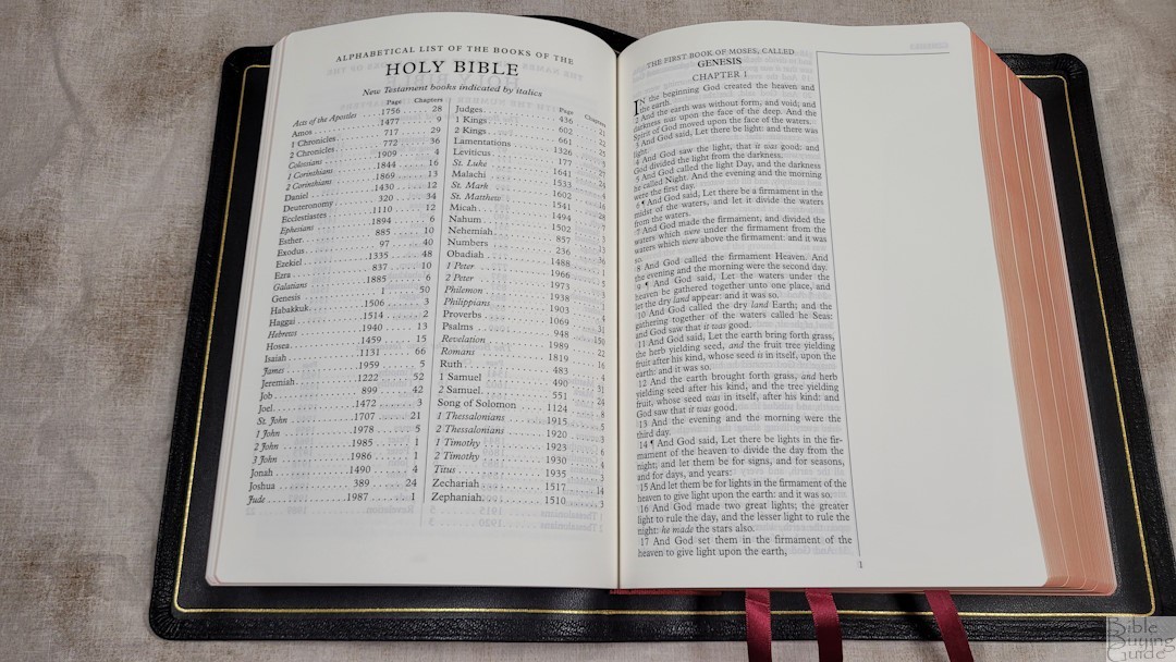

The PCE KJV text is presented in a single-column verse-by-verse layout with a 2.5″ outer margin. The margin is blank and the text and notes are separated by a verticle line. The header shows the book name and chapter number in the outer corner. Page numbers are placed in the footer under a separating line. Paragraphs are marked with pilcrows. This is a text-only edition, so it doesn’t include references, footnotes, or section headings.
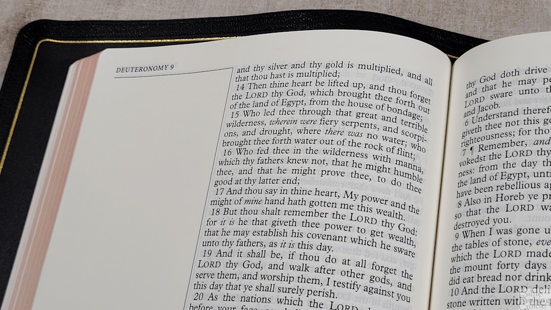
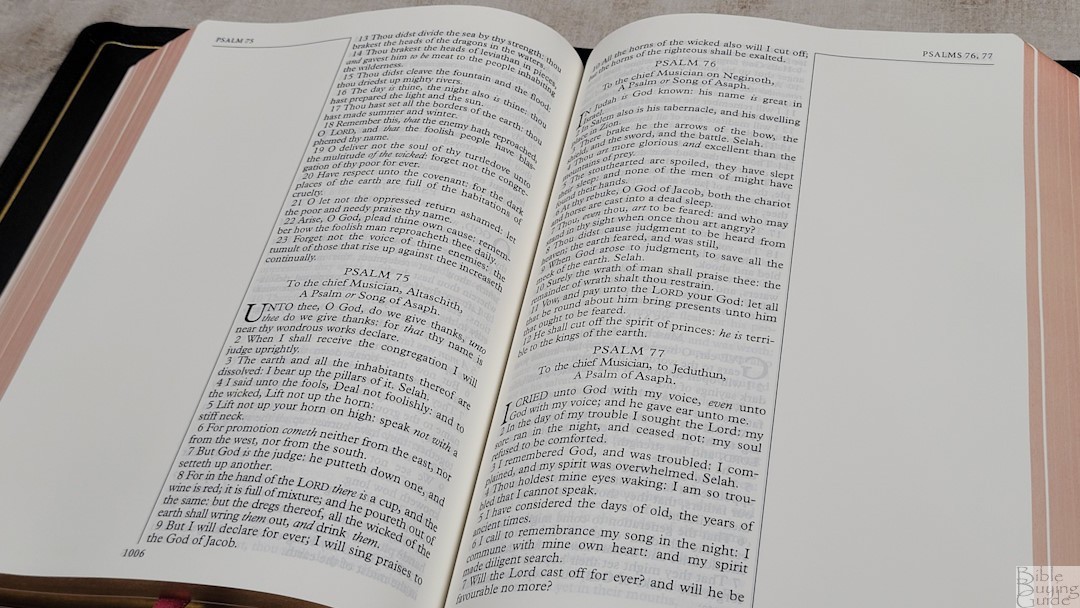
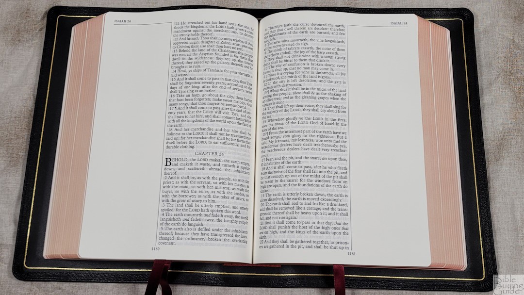

The text is large print at 11-point. This is a red-letter edition. The black and red text is dark and consistent throughout the Bible. I love the shade of red. It wasn’t printed with line matching, but most lines match. Those that don’t still look great and have very little show-through.
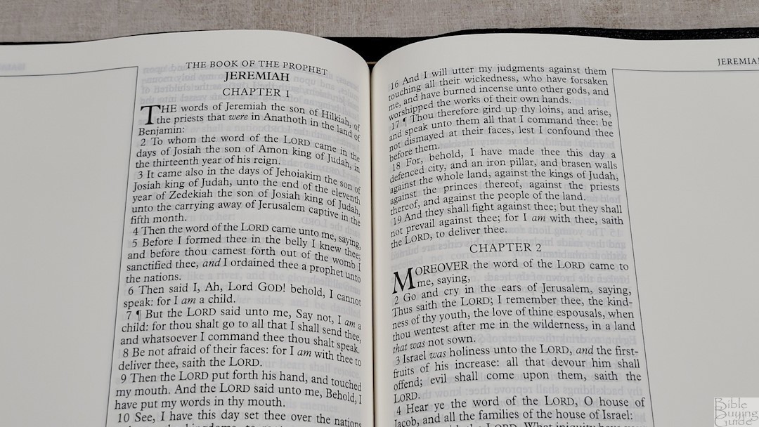


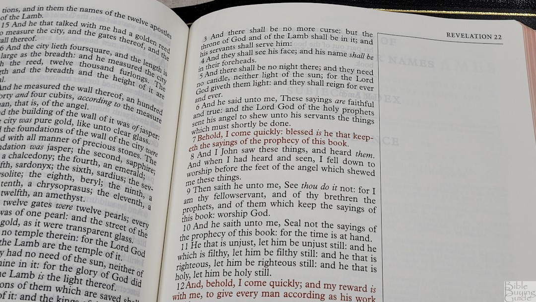
It has around 10 words per line on average. This word count is great for public reading. The text never feels cramped or crowded. some lines have extra spaces between the words, but it never looks awkward. Verses are indented and are easy to find. The text does not include self-pronouncing marks, so the text is clean and easy to read. Italics marked the supplied words.
Wide Margins
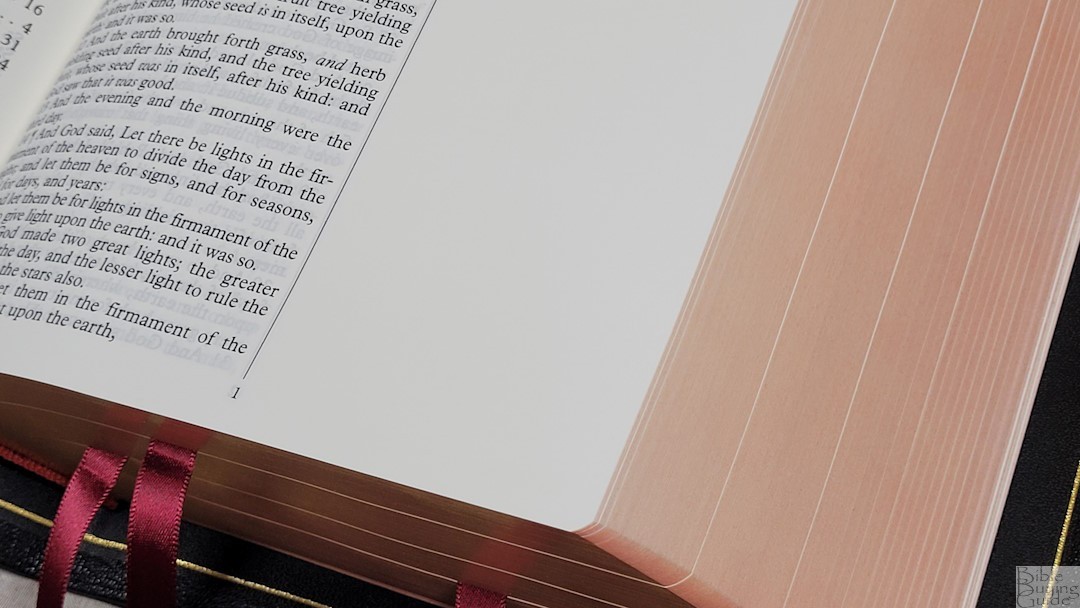
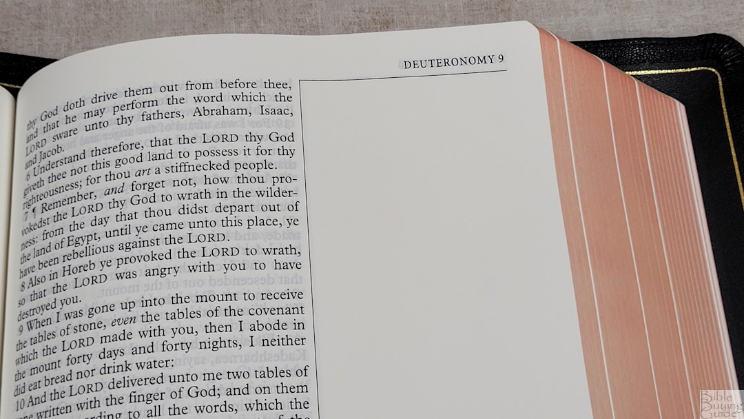
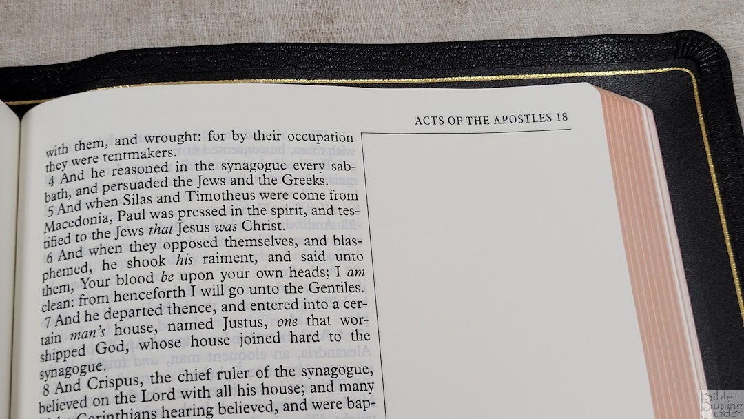
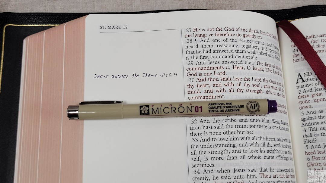

The Note Taker’s has 2.5″ margins in the outer margin, making it one of the best Bibles for preaching, teaching, writing notes and insights, studies, cross-references, chain references, study systems, sermon outlines, journaling, and more. This is my favorite layout for wide-margin Bibles. I find wide margins in the outer margin to be the easiest to use. And, since this is a single-column v-b-v edition, it’s easy to write the notes next to the verses. The inner margin is .375″. This helps bring the text out of the gutter so it doesn’t get lost in the bend. This is especially important for an edge-lined Bible. It has .5″ margins for the top and bottom, which is enough room for topic names, definitions, page summaries, etc.
Other Pages
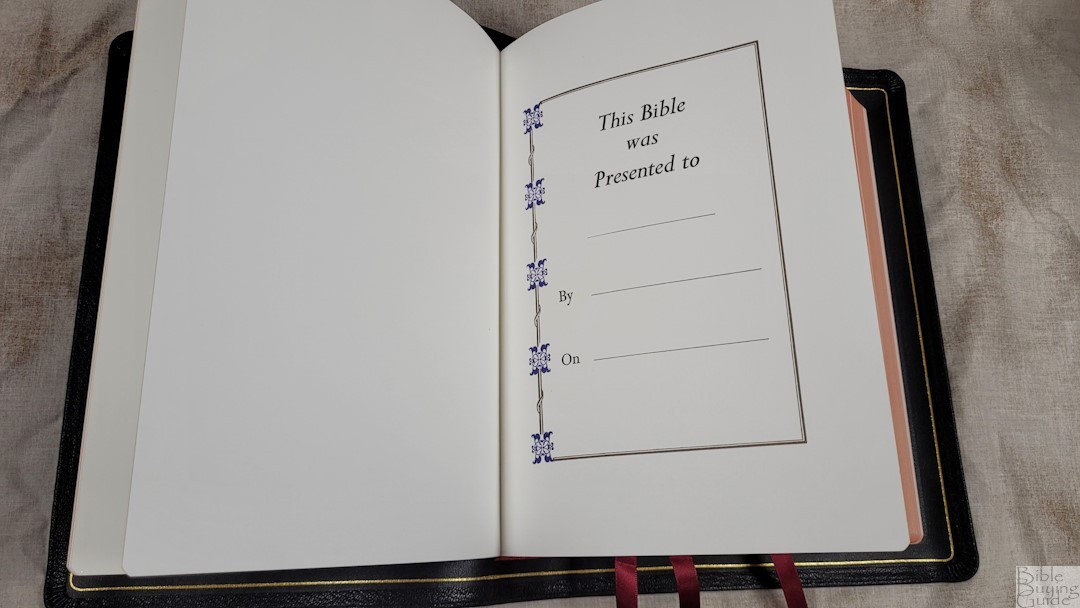

In the front are the presentation and family pages printed on thick paper. The family pages include the family record of the husband and wife, children, marriages, grandchildren, and deaths. The regular family pages are printed with blue and gold highlights. The page for deaths has black and gold highlights. It also includes several thick blank pages in the front and back to give it more structure. These are great for notes.
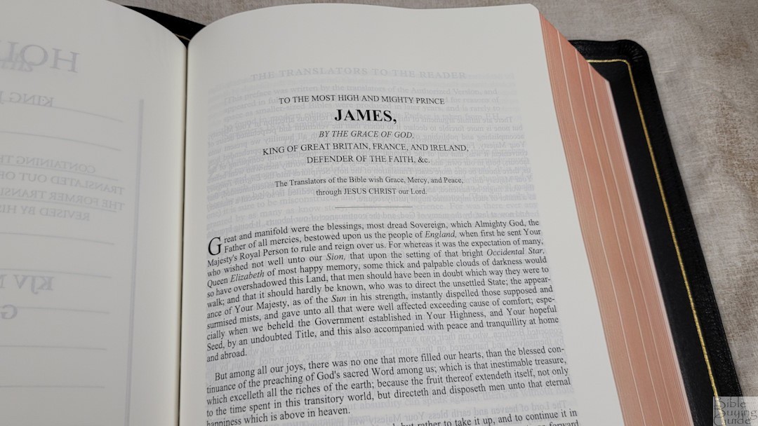

This edition also includes the Translators to the Reader and the Epistle Dedicatory to James. It’s good to see this included as it’s an important document that should be read by every KJV reader or anyone interested in the Bible translation process.
Dictionary of Scripture Proper Names

This is a 44-page index that includes all of the proper names in the Bible. It shows the name, pronunciation, a short description, and the references where the name is mentioned. This also works as a pronunciation guide so the text doesn’t have to include it, which keeps the text clean and readable.
Subject-Index
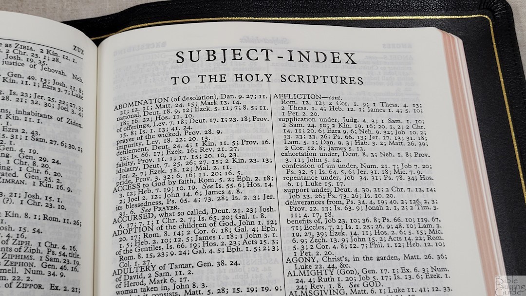
This is a 38-page topical index. It includes subtopics and Scriptures for each topic. This is an excellent tool for sermon prep and personal study and helps set this edition above all the other KJV Note Taker’s Bibles. This is especially helpful considering the Note Taker’s doesn’t have cross references.
Concordance

The concordance is 162 pages with 2 columns per page. It shows the main references in verse-by-verse with snippets. Then, more are placed under the last reference with just their references. It includes a lot of entries, making this an excellent concordance for personal study and sermon prep.
Here are a few example entries with the number of references they provide:
- Christ – 15
- Christian – 3
- Faith – 133
- Faithful – 57
- Faithfully – 4
- Faithfulness – 11
- Faithless – 4
- God – 60
- God (an idol) – 20
- Goddess – 3
- Godhead – 3
- Godliness – 14
- Godly – 14
- God Save the King – 1
- Praise (n) – 41
- Praise (v) – 25
- Pray – 45
- Prayer – 39
Maps
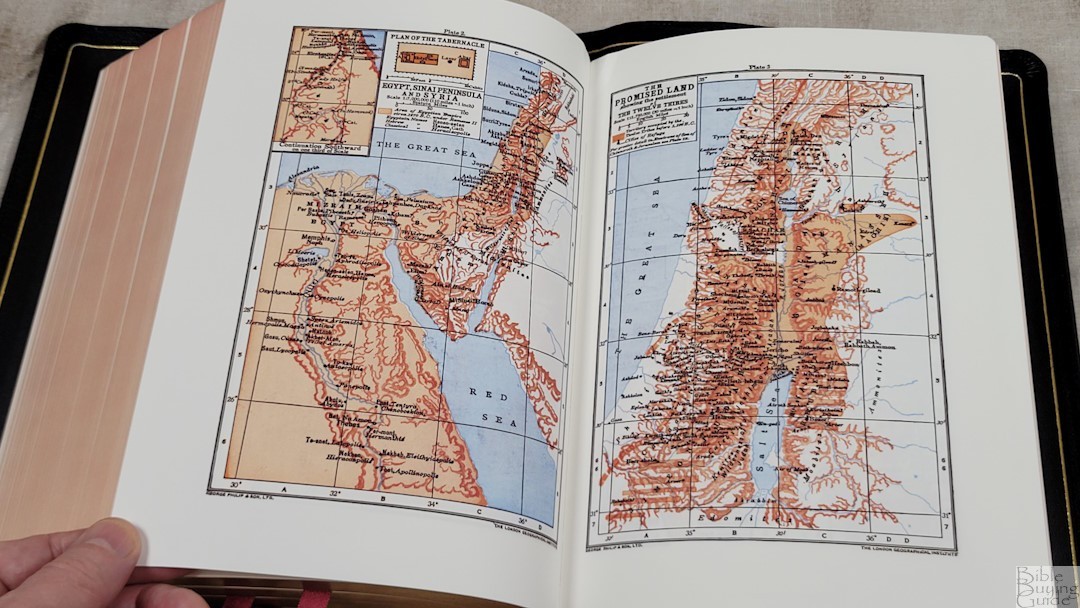

It has 12 old Oxford maps printed on thick non-glossy pages. The colors are bold with shades of brown for land and a light blue for water. The text is also bold and it can be a little difficult to read. These maps have a lot of information. The maps include longitude and latitude, elevation, distance, land structure, cities, Scripture references, dates, territories, routes, etc.
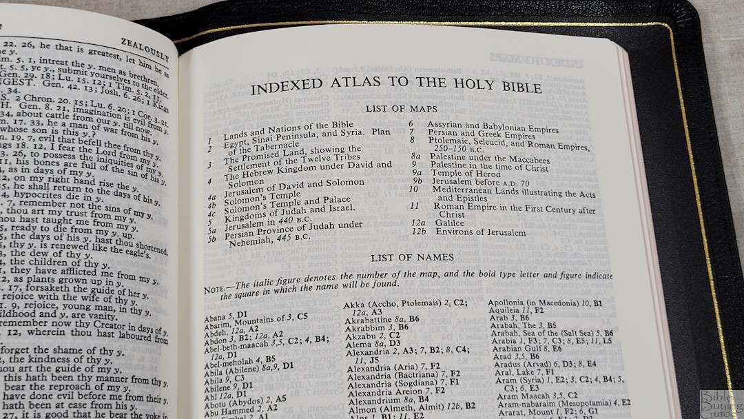
It includes a 6-page index to maps. This makes the maps a lot easier to use.
Maps include:
- Lands and Nations of the Bible
- Egypt, Sinai Peninsula, and Syria (with Plan of the Tabernacle inset)
- The Promised Land
- The Hebrew Kingdom Under David and Solomon (with Jerusalem of David and Solomon, Solomon’s Temple, and Solomon’s Temple and Palace inset)
- Kingdoms of Judah and Israel (with Jerusalem in 440 BC, and Persian Province of Judah Under Nehemiah 445 BC.
- Assyrian and Babylonian Empires
- Persian and Greek Empires
- The Ptolemaic Seleucid and Roman Empires 250-150 BC, and Palestine Under the Maccabees
- Palestine in the Time of Christ (with Temple of Herod, and Jerusalem Before 70 AD inset)
- Mediterranean Lands Illustrating the Acts and Epistles
- Roman Empires of the 1st Century After Christ
- Galilee, and Environs of Jerusalem
Comparison
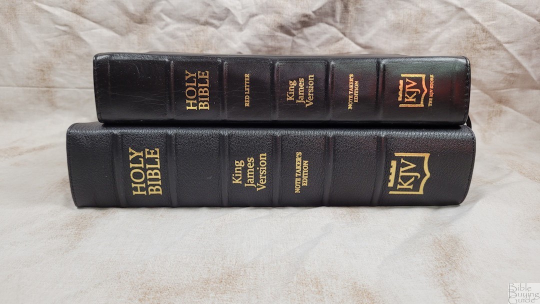


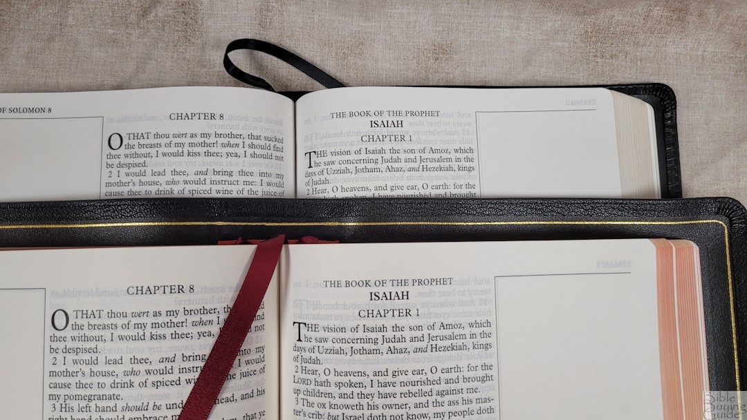
Here’s a look at how the Goatskin Note Taker’s compares to the Lambskin Note Taker’s from The KJV Store. The lambskin edition has a thinner leather cover, and two ribbons, and the paper isn’t as elegant. The red letter is a brighter red. It has pages for notes and Cambridge maps. It doesn’t have the Oxford tools found in the goatskin edition. Page edges are gold gilt. Even though it isn’t as elegant as the goatskin edition, I still recommend it. It’s over a pound lighter and it’s $119 vs $225 for the goatskin, making it a great choice for someone wanting to carry something around 3lbs or wanting to start writing in a cheaper Bible before moving to the more expensive Bible.
Conclusion
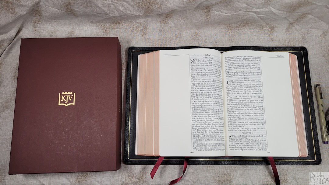
This Note Taker’s from The KJV Store, printed by Jongbloed and wrapped in goatskin, is the best version of this wide-margin KJV that money can buy. Even though this one is larger and heavier, it even beats my previous favorite, the lambskin edition (also from The KJV Store). The paper is excellent for marking and reading. The tools in the back are from Oxford. They’re the same as found in the Classic Study Bible. If you’re interested in a high-quality wide-margin KJV, this one is an excellent choice.
For information about marking in your Bible, see my book Easy Bible Marking Guide.
_________________________________________________________
This Bible is available at The KJV Store
_________________________________________________________
The KJV Store provided this Bible in exchange for an honest review.



As always Randy excellent review! I used to have a LCBP Notetakers and while I admired many things about it, the reflective paper was a deal breaker for me. Especially since so much of the Notetakers text is at the crest of the page. When I saw the KJV Store was releasing a true leather lined Goatskin with this premium paper I decided to order it and give it another try. This paper is just ideal with little to no reflectivity. Solves this issue for me completely. The wide margin I am currently using and taking notes in is a Schuyler Canterbury which is also wonderful. It has 38 gsm paper which I believe is from the same company. However the 36 gms KJV Store Goatskin paper feels just as thick if not thicker than the 38 gsm on my Schuyler. I do prefer the 36 gsm paper in this case. The paper was perfectly selected IMO. The lack of show through and the clarity of the text along with larger font site actually makes this Bible an excellent plain text reader at a desk or an adjustable angle lap desk. And I totally agree with you that the red letter has an absolute impeccable balance of being nice deep red while being just as easy to read as the black. And very consistently printed as is the black. Really, this Bible is a homerun for many of us King James studiers.
If I could change anything, it would be a smaller yapp. While the 1″ yapp is beautiful and high quality and some will love it, I like the more practical shorter yapp for using this as your work horse Bible. I thing the yapp on the Schuyler Canterbury Wide Margin is ideal. Also the maps are not the best but the great index make them useful anyway.
By the way Randy, I think you would do good reviews of Bible Atlases. I personally much prefer to use an external Bible Atlas rather than maps in my Bible. Perhaps you could do a review and recommended your favorite Atlases and why or if people should get one vs just using the one in their Bible.
Hi Blake! Thanks for the copmarision. Well-done (as always). Also, thanks for the suggestion. I love Bible atlases and I’d love to reivew them. I’ll see what I can do.
Thank you for reviewing this Bible. It is a good one for notes takers such as I. Something else that I noticed, and it’s not bad, is that the back resources are taken straightly from the old Scofield Bible, including the maps.
Thanks for your excellent review. Do you notice any page cockling in the gutter with this edition? You mentioned this is a PCE text, but KJV store says it’s not PCE (Pure Cambridge Edition) in their review. Not at all a deal breaker, but is the S in Spirit in 1 John 5:8 capitalized or lower case? Just curious. Thanks.
Hi Chris. It doesn’t have cockling. It will be a day or two before I can check 1 John, but I’ll get back to you on that.
Hey Randy, thanks for the reviews! Got thinking as I was reading, who makes your favorite Bible concordance? Who has the “biggest and best?”
Your reviews are so helpful Randy. Thank you. My question is this. I have a weird issue with inner margins. I like to be able to hold the page in a way that makes the text completely flat. So edge-lined Bibles don’t allow that. I’d hate to spend the money here and have that problem. Can you give some insight on that here? If you try to hold the text flat do the pages from the side of the Bible get in the way?