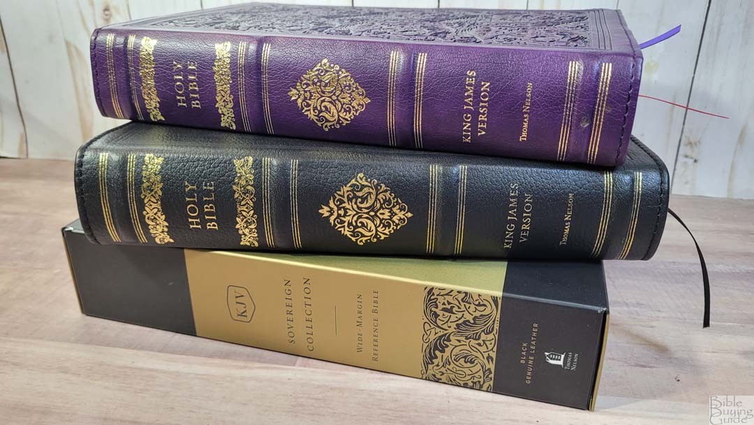
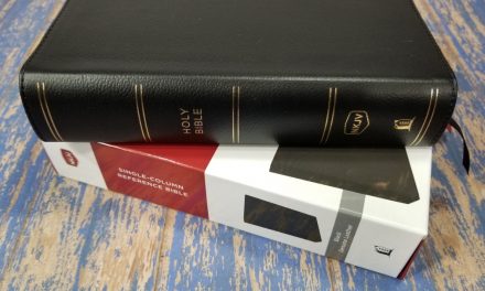
The Thomas Nelson Sovereign Collection just got the wide-margin treatment. Like the regular editions, it’s available in KJV and NKJV, and in several cover options. They made a few tweaks to the Sovereign’s design and made a few improvements to the physical design that makes me claim this as one of the best wide-margin editions available. In this Bible review, I’m looking at two editions: one in genuine leather and one in imitation leather. All are made in India.
Thomas Nelson provided these Bibles in exchange for an honest review. I was not required to give a positive review, only an honest one. All opinions are my own.
_________________________________________________________
This Bible is available at (includes some affiliate links)
Amazon
– Purple Leathersoft | Black Genuine Leather
Christianbook – Purple Leathersoft | Black Genuine Leather
For marking tips, see my book Easy Bible Marking Guide
and many local Bible bookstores
_________________________________________________________
Table of Contents
- Video Review
- Binding
- Paper
- Typography and Layout
- References
- Book Introductions
- Extras
- Concordance
- Maps
- Comparisons
- Conclusion
Video Review
Binding
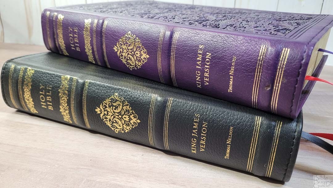
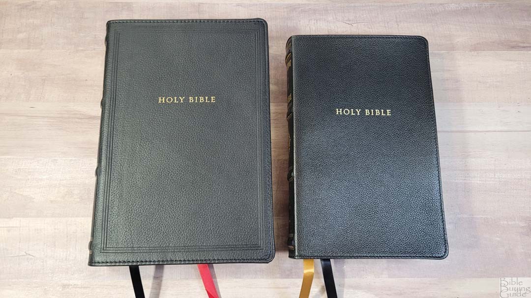
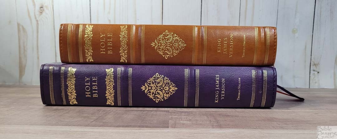
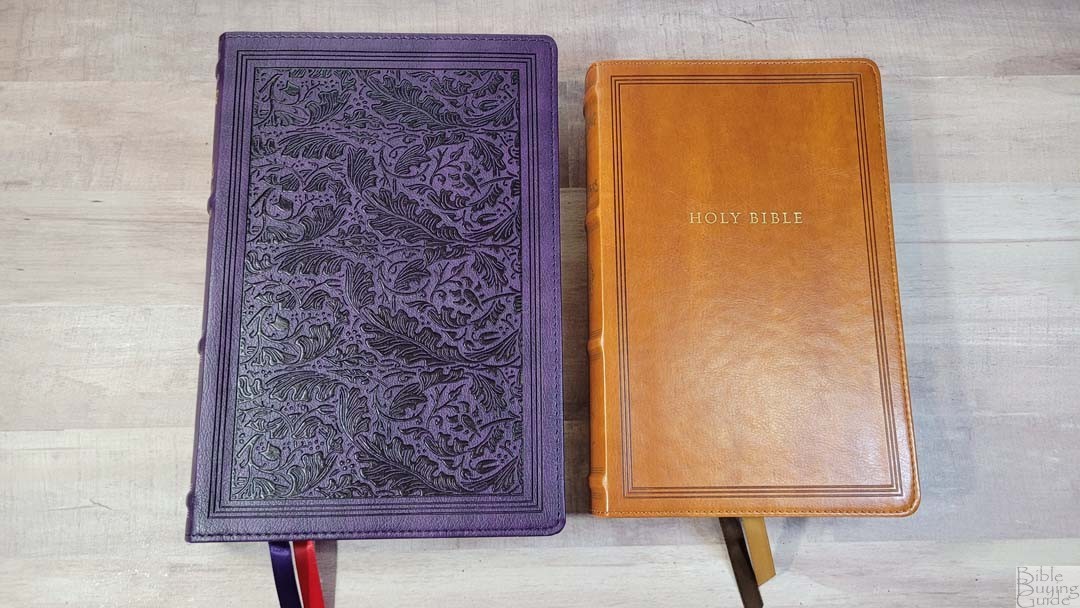
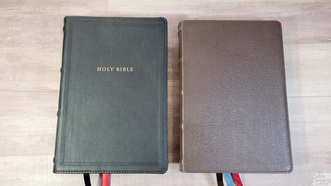
The KJV Wide Margin Sovereign Collection is available in genuine leather and Leathersoft. I’m reviewing back genuine leather and purple Leathersoft.
Black Genuine Leather
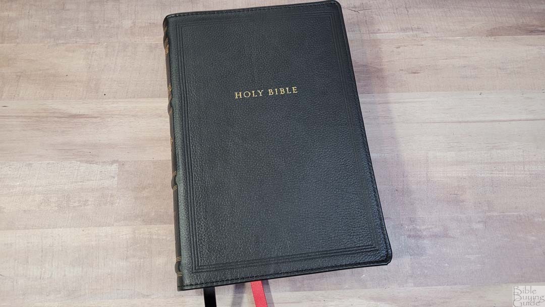
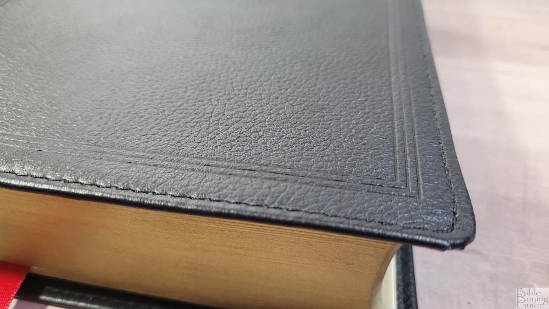
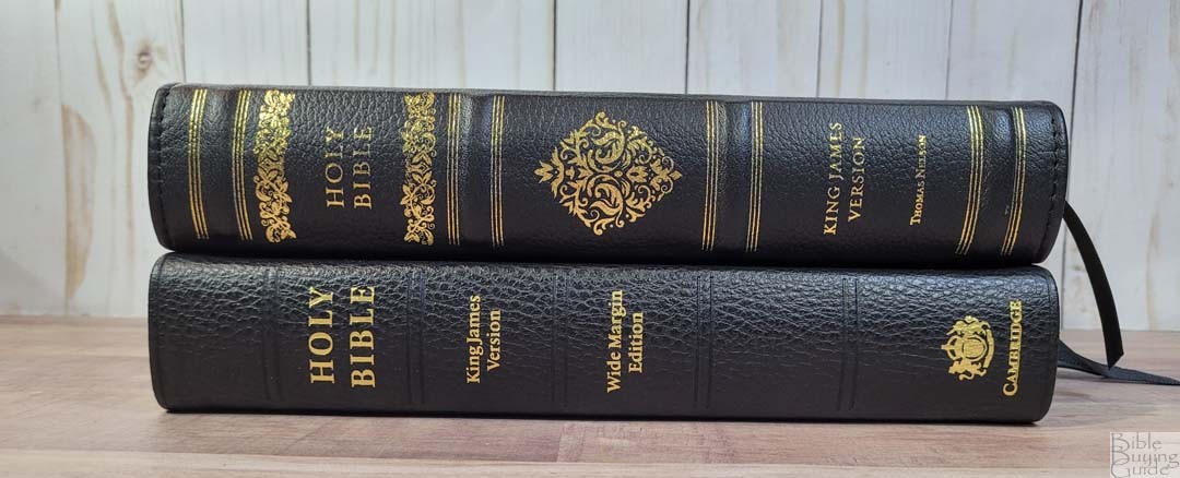
The black genuine leather is soft to the touch and has a pebbly grain that looks and feels elegant. It has Holy Bible printed on the front in gold and a debossed frame around the edges on the front and back. It also includes perimeter stitching.

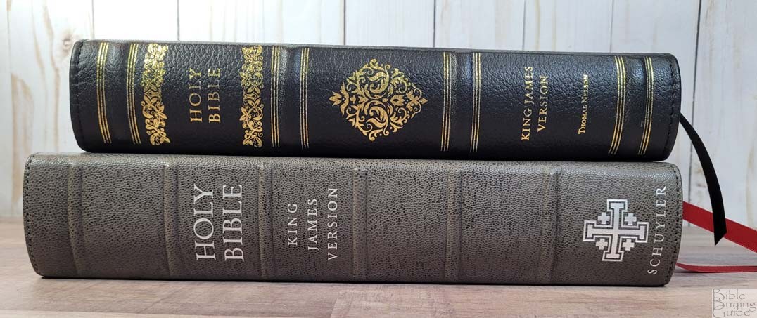
The spine is rounded and has 4 thick raised hubs with gold lines at the top of the bottom of each hub. A fancy decoration is printed above and below Holy Bible and a diamond decoration is printed in the center in gold. All the text is printed in gold.

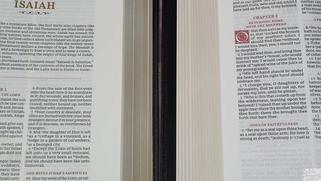
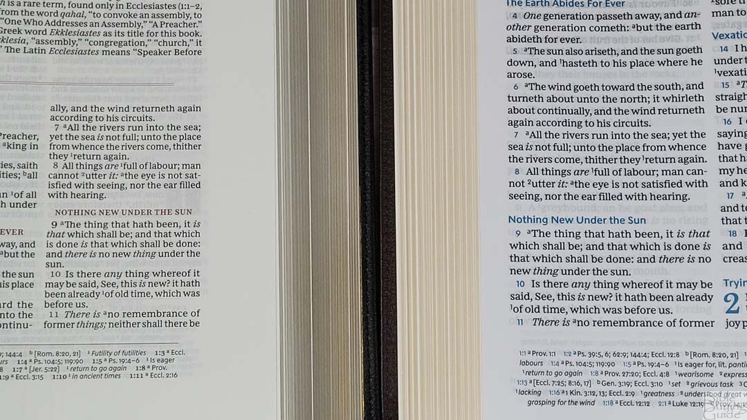
The liner is one of the main factors that I consider an improvement. The edge-line tab of the regular edition caused the spine to stay down when opened, causing the text to bend into the gutter. The wide-margin edition doesn’t have that problem. It has a paste-down vinyl liner and lays almost perfectly flat on every page. This is crucial for a wide inner margin. It’s sewn and it’s flexible but not floppy. It has minor cockling in the front and back. I notice the sound of the pages turning more than the wrinkling. It can make it slightly more difficult to write in the inner margin. This doesn’t show in the photos and won’t keep me from using it, but I wanted to mention it.

It has black head/tail bands and two thick double-sided ribbons: 1 black and 1 red. The overall size is 6 5/8 x 9 11/16 x 1 3/4″ and it weighs 3 lbs, 0.6 oz.
Purple Leathersoft
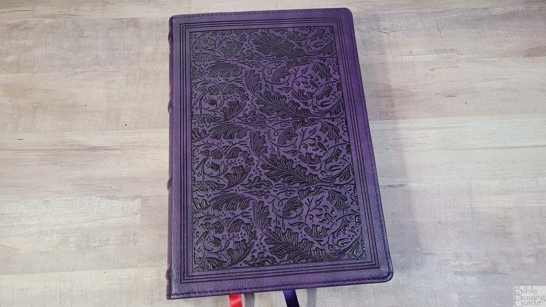
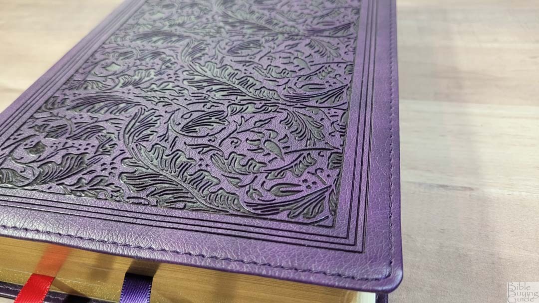
The purple is dark and it looks like real leather. It has a fancy floral design debossed onto the front and back surrounded by a three-line frame. It has perimeter stitching.
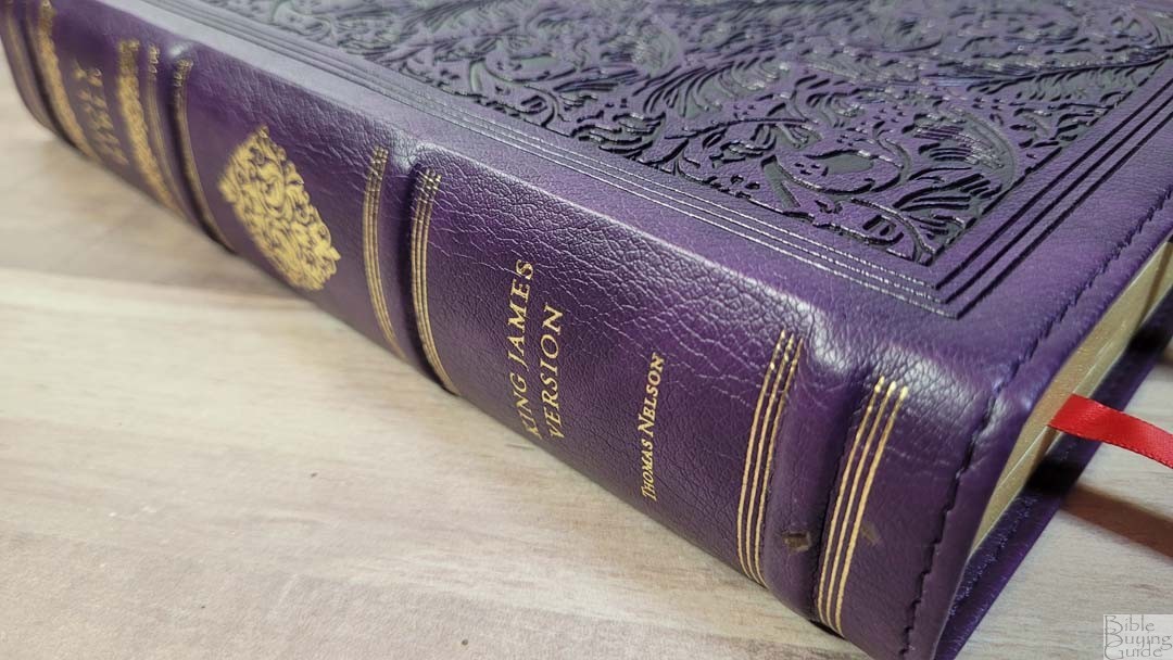
The spine has 4 thick raised hubs with gold lines printed at the top of the bottom of each hub. A fancy decoration is printed above and below Holy Bible and a diamond decoration is printed in the center in gold.
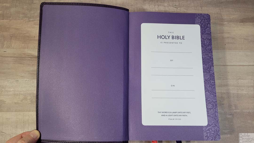
It has a purple paste-down paper liner that works as the presentation page. The back end sheet has a floral decoration down the outer edge. The text block is sewn, but the cover is stiff so it will need to be used a little bit before it will stay open at the beginning of Genesis. It has even less cockling than the genuine leather edition. It’s just enough to notice if you’re looking for it.
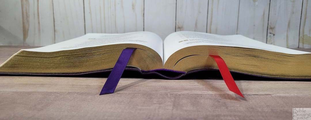
It includes purple head/tail bands and two thick double-sided ribbons: 1 purple and 1 red. The overall size is 6 5/8 x 9 11/16 x 1 3/4″ and it weighs 2 lbs, 15 oz.
Paper

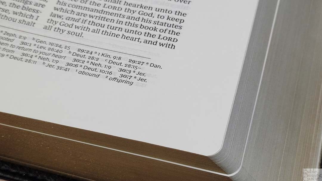
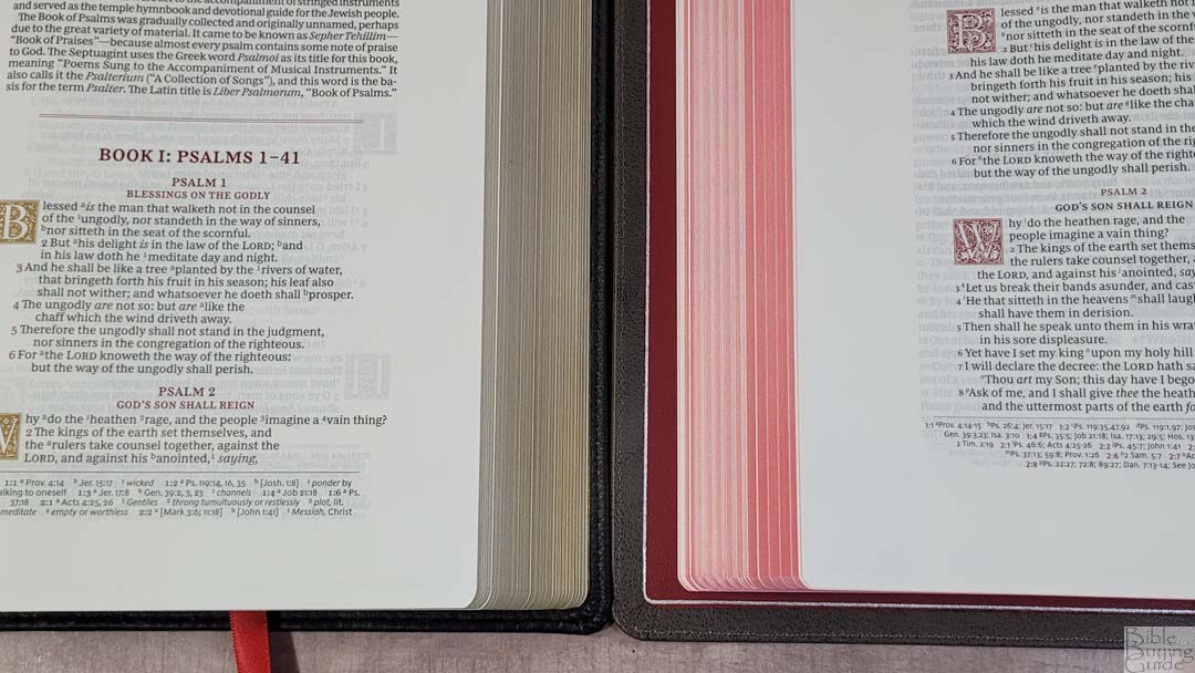
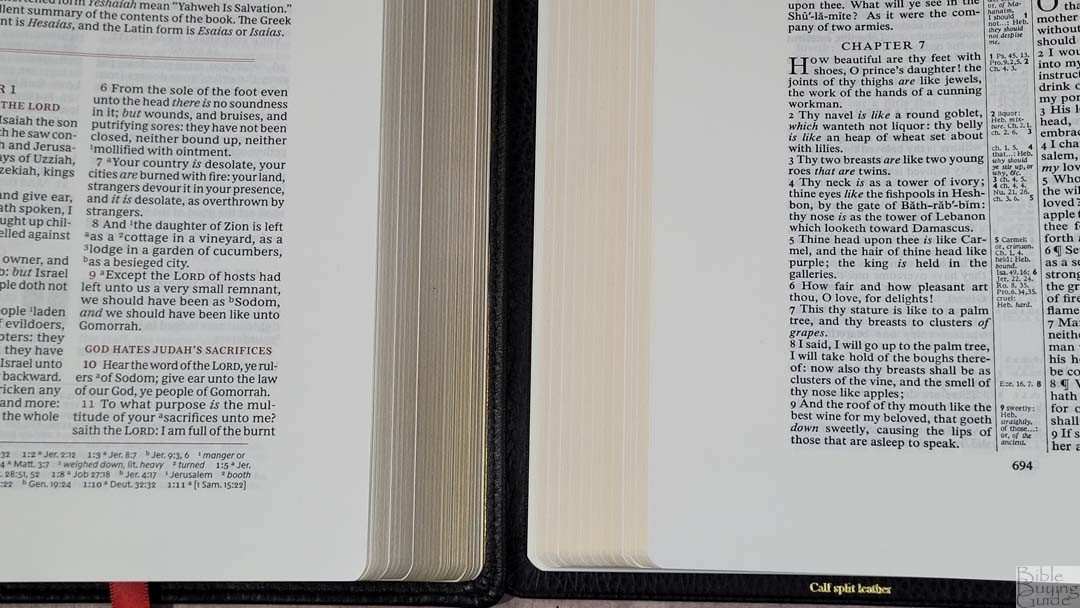
The paper is 39gsm. It’s white in color but has a slight eggshell tint and it’s a touch more opaque. It has a rough texture that I find to be easy to turn. It doesn’t include extra pages for notes, but that would have made it even thicker, so it makes sense not to add more. I prefer this paper to the regular edition.
This is good paper for note-taking. I’ve added notes with a 05 Pigma Micron. The show-through is noticeable but normal.
Typography and Layout
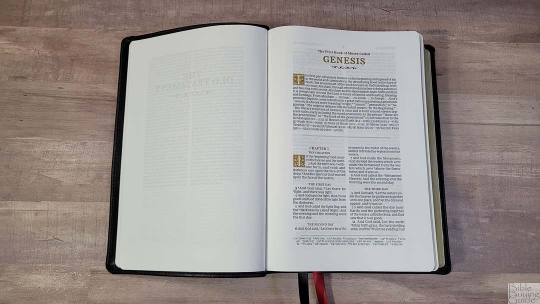

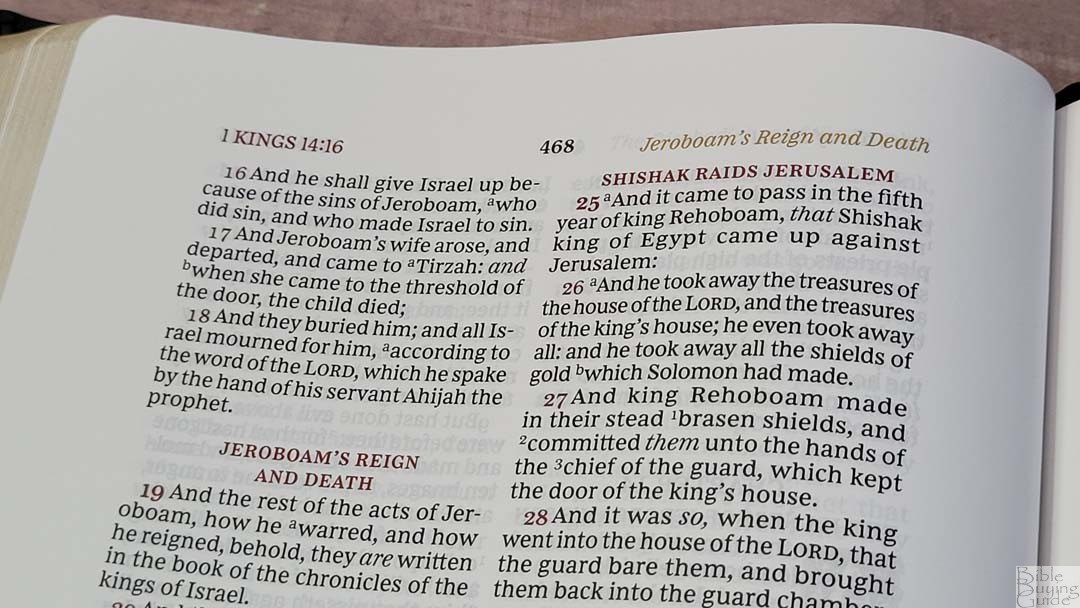
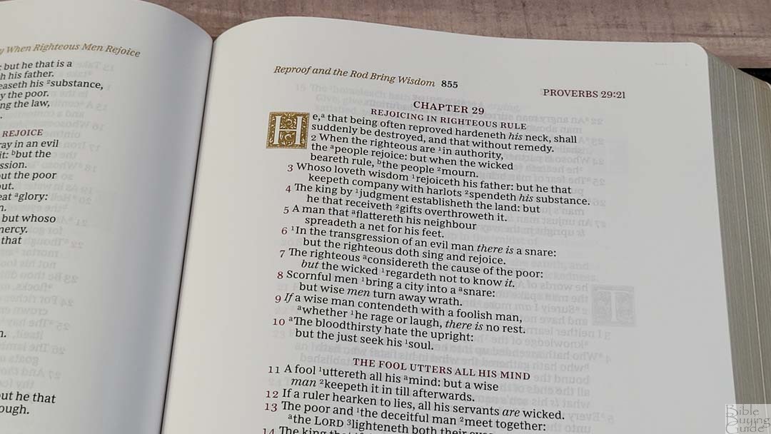
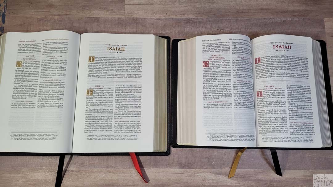
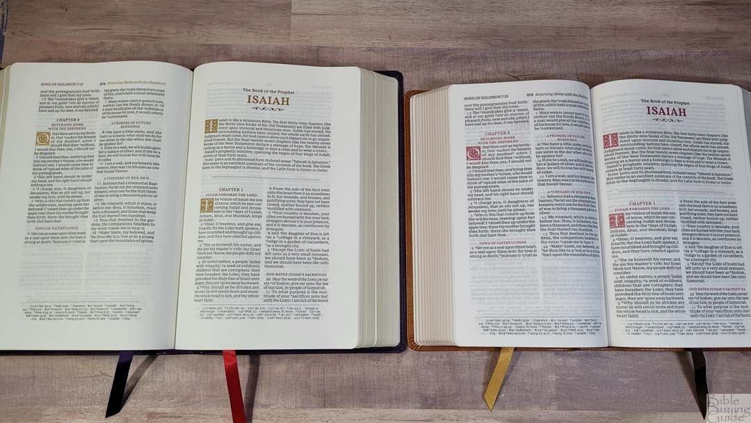
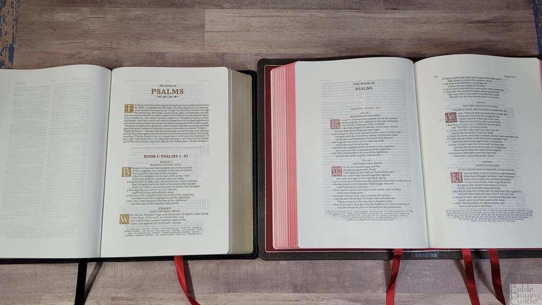
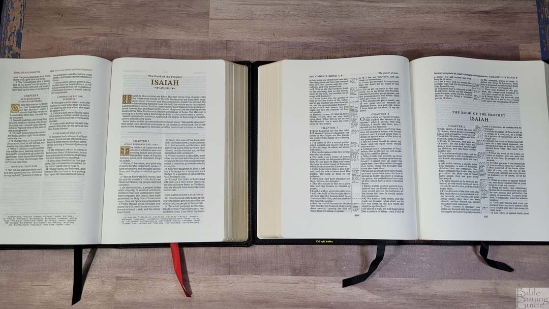
The KJV text is presented in a double-column, verse-by-verse format with Psalms and Proverbs set in a single column in stanzas. Cross-references, translation footnotes, and updated words are placed in a single column in the footer. The header shows the book name, chapter, and verse number in the outer margin, the page number in the center, and a page summary in the inner margin. The page summaries and drop-caps are in gold. All other highlights are in red. The layout closely follows the design of the Schuyler Canterbury.

The font is a 9-point Comfort Print designed for the Thomas Nelson KJV by 2K/Denmark. This is a red-letter edition. The black and red are about medium/dark in darkness and they’re highly consistent throughout. It has between 6-8 words per line on average. The spacing between the letters, words, and lines makes for a comfortable reading experience. It’s printed with line matching, meaning the lines of text are printed in the same location on both sides of the page to improve readability. Paragraphs are marked with bold red verse numbers.
Psalms and Proverbs
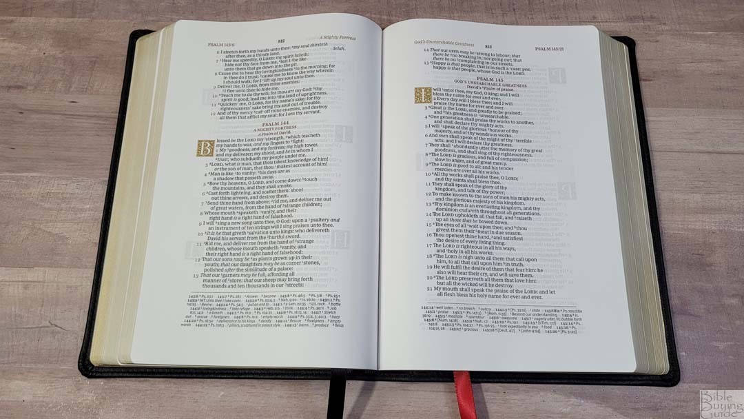
Psalms and Proverbs are in a single column with stanzas. This design wastes less space than most poetic settings. The drop-caps are placed to the left of the text so the text doesn’t indent too far. This keeps it uniform. It’s highly readable and works great for a poetic setting. I’d like to see all the poetry use this layout. I’d also like to see formatting applied to personal letters like those in Acts or Ezra.
Wide Margins
The margins are 1 inch on the sides, 7/8″ on the bottom, and 5/8″ on the top. The 1″ of the inner margin is actually usable. It looks to have extra space in the inner margin to give the page the right balance. This size is excellent for those that just want to add some notes but don’t need extensive notes. I like this because it doesn’t make the notes the main focus of the page and I don’t feel like I’m carrying around empty space that I won’t use. Books start on a new page, so this also provides some writing space.
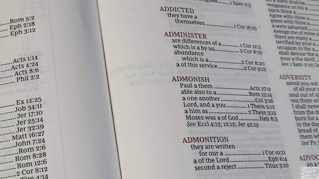
References and Footnotes
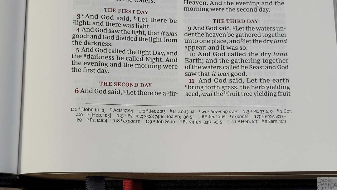
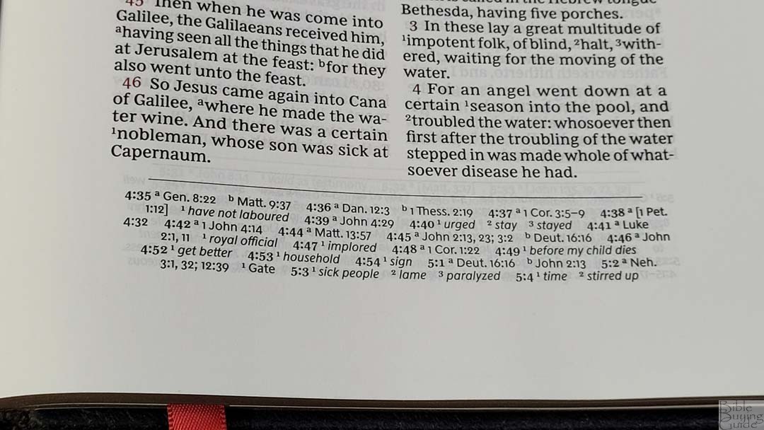
The cross-references and footnotes are placed in the footer in a single column. They’re mixed together and include updated words and definitions for archaic words and words that have changed in meaning, creating a glossary on the page. I like this feature. All of these words are notes I’d normally add to the margins, so it helps to have them already printed on the page. It has fewer references than many reference editions from Thomas Nelson. It has enough for basic Bible study, but you’ll need other resources for deeper study.
Here are a few example references to help you compare:
- Genesis 1:1 – Jn 1:1-3, Ac 17:24
- Deuteronomy 6:4 – 1 Cor 8:4, 6
- Isaiah 9:6 – Lk 2:11, Jn 3:16, Mt 28:18, Jd 13:18, Titus 2:13, Eph 2:14
- Matthew 28:19 – Mk 16:15; Lk 24:47
- Mark 12:29 – Dt 6:4, 5
- John 1:1 – 1 Jn 1:1, Rev 19:13, Jn 17:5, 1 Jn 5:20
- John 3:16 – Rom 5:8; Is 9:6
- Acts 2:38 – Lk 24:47
- Romans 10:9 – Lk 12:8
- 1 John 1:1 – Jn 1:1, 14, 2 Pet 1:16, Lk 24:39, Jn 1:1, 4, 14
Book Introductions
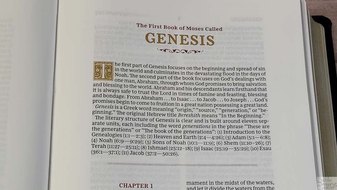
Each book has a small introduction with 2-3 paragraphs. They include an overview of the book, discuss the main characters, give insights into the book’s name, and include a simple outline with references to the major portions of the book. Some have a sentence about the author or other features of the book. They’re short and concise, which keeps them from getting in the way and provides enough information to be helpful. They also include the gold decorative drop cap.
Extras
In the back are several lists that help in reading and studying.
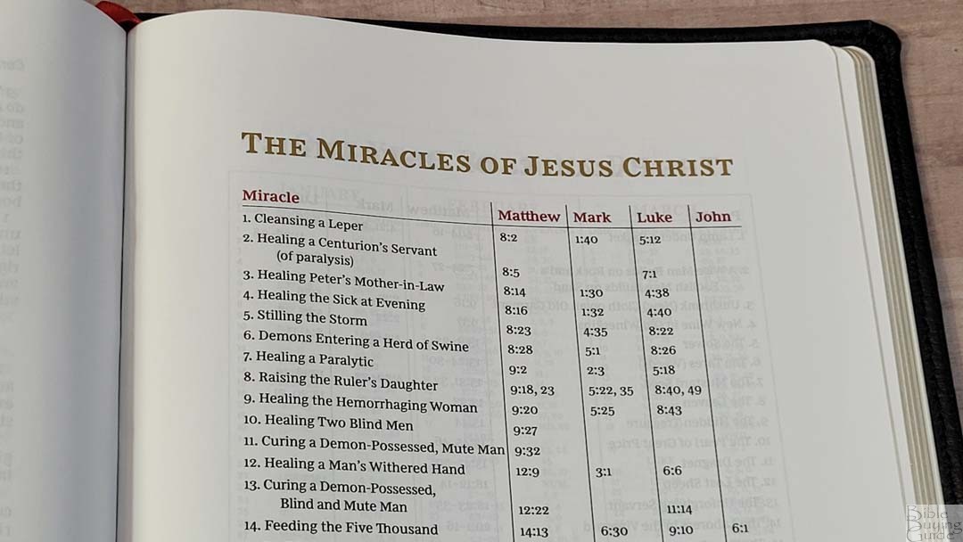
Miracles of Jesus – This is a one-page table with 37 miracles with lists of references for each of the Gospels.
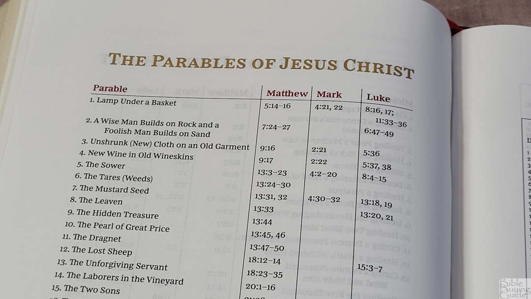
Parables of Jesus – This is a table with 39 parables that lists the verses where they appear in the Gospels.
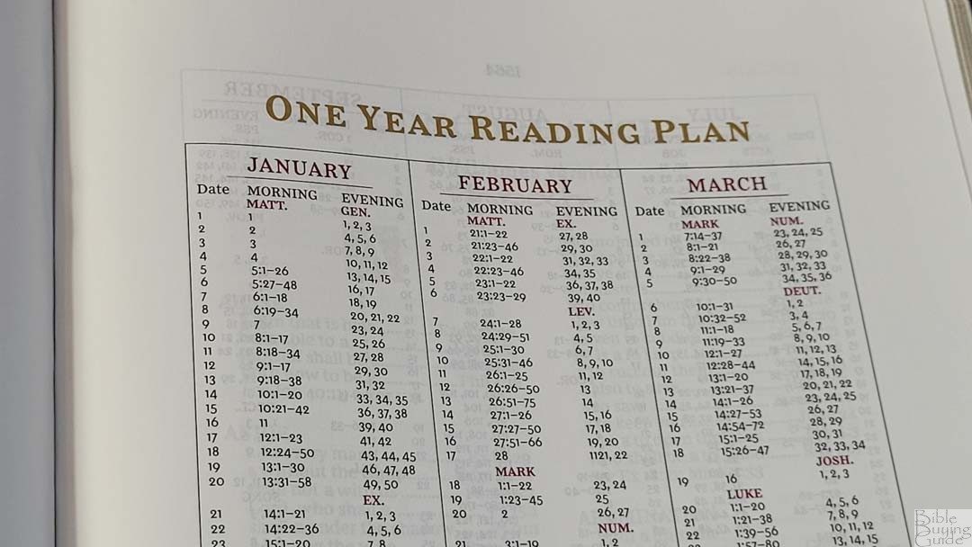
One Year Reading Plan – This is a 2-page reading plan with the month, date, and reading for each day. It includes 2 readings per day to take you through the Old and New Testaments every day. February includes the 29th, so you’ll need to read extra for three out of four years.
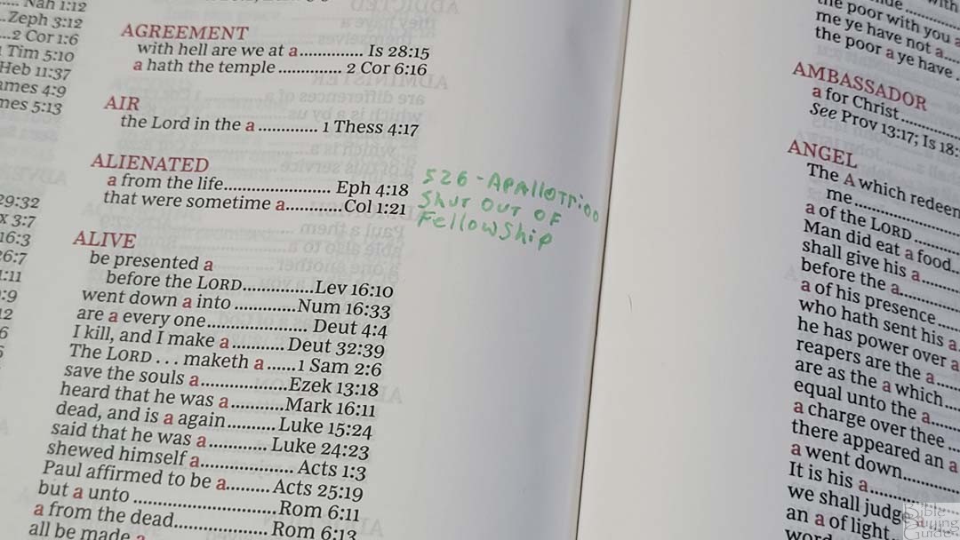
Concordance
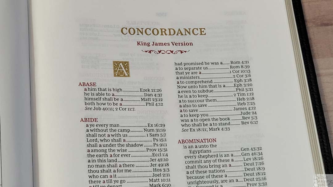
The concordance is 120 pages with 2 columns per page. The concordance also includes wide margins, so you can easily add more if you want. This is also a good place to add word studies. It includes the decorative drop-caps in gold and the entries are in red. It doesn’t include names (with the exception of Jesus, which has 3 entries), but it does have a decent amount of references for study and sermon prep. Here are a few example entries with their number of references to help you compare:
- Christ – 18
- Christian – 3
- Faith – 96
- Faithful – 41
- Faithfully – 1
- Faithfulness – 4
- Faithless – 3
- God – 56
- Godhead – 3
- Godliness – 8
- Godly – 11
- Praise(n) – 32
- Praise(v) – 15
- Pray – 38
- Prayer – 36
Maps
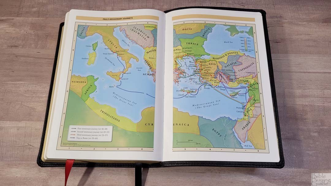

In the back are 7 Zondervan full-color maps on 8 thick, semi-glossy pages. They do not include an index, but they are annotated well. They include distance, elevation, topography, ancient cities, journeys, battles, events, dates, and Scripture references. They’re bright and colorful. I like these maps and I’m grateful they’re included. I’d love to see an index added.
Maps include:
- World of the Patriarchs
- Exodus and Conquest of Canaan
- Land of the Twelve Tribes
- Kingdom of David and Solomon
- Jesus’ Ministry
- Paul’s Missionary Journeys
- Jerusalem in the Time of Jesus
Comparisons
Here’s how the KJV Wide Margin Sovereign compares to several similar Bibles. Several of these are in different price ranges.
Regular Sovereign
The regular KJV Sovereign is the non-wide margin version of this Bible. It has a 9.5 font, but it’s hard to tell the difference even when they’re side-by-side. All the tools and the paper are exactly the same. The only difference is it had red highlights instead of red and gold. It has the same thickness, but the footprint is smaller and its spine is more squared. It’s available in Leathersoft and genuine leather.

The genuine leather edition is edge-lined vinyl and it isn’t as soft and doesn’t open as well as the wide-margin edition.

The Leathersoft has a smoother finish but stays open well.
Schuyler Wide Margin Canterbury

The Schuyler Canterbury is the design the Sovereign Series follows. The Wide Margin Canterbury includes decorative drop caps, single-column Psalms, cross-references across the footer, and red highlights. The Wide Margin Canterbury is made with higher-quality materials and construction quality. It’s larger, has thicker paper, a darker red, and wider margins. It’s only available in edge-lined goatskin. The Canterbury is also available in a large size and personal size, making a great combo.
Cambridge Wide Margin Concord
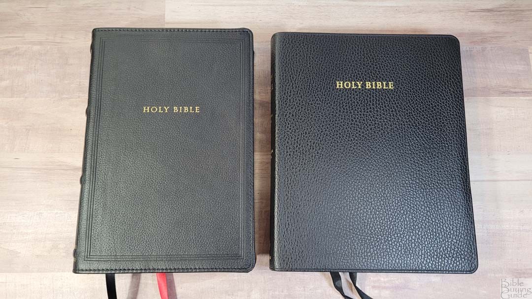
The Cambridge Wide Margin Concord has the same height, but it’s a lot wider. It’s also a touch thinner. It has thicker paper, wider margins, and around 80 pages in the back for notes. The typeface is slightly smaller, but it’s also darker, so it’s just as easy to read.
Maclaren


The KJV Maclaren isn’t a wide-margin edition, but it makes a great comparison because of the similar layout. Both have colored highlights and references across the footer. It has the same footprint, but it’s slightly thinner. The typeface is much larger and it has more cross-references. They have the same footnotes with a glossary. The Maclaren doesn’t include book introductions, single-column Psalms or Proverbs, a concordance, or other helps. It’s available in Leathersoft, genuine leather, and goatskin.
Conclusion

The Thomas Nelson KJV Wide Margin Sovereign is one of the best wide-margin editions available. It matches the regular edition, which follows many of the Canterbury design elements with a setting that looks elegant at a lower price point. The margins are large enough for small notes and this keeps the overall size manageable. This makes it excellent for carrying, reading, and preaching. Moving the printing to India was a wise decision. Anyone interested in an affordable wide-margin KJV would like the Thomas Nelson KJV Wide Margin Sovereign.
_________________________________________________________
This Bible is available at (includes some affiliate links)
Amazon
Christianbook – Purple Leathersoft | Black Genuine Leather
For marking tips, see my book Easy Bible Marking Guide
and many local Bible bookstores
_________________________________________________________
Thomas Nelson provided these Bibles in exchange for an honest review. I was not required to give a positive review, only an honest one. All opinions are my own.


Thank you for the review. I’ll be purchasing the black wide margin. I’m new to the KJV, and I’ll need those margins to write more modern meanings for archaic words (we have the non wide margin edition, and im still getting used to looking at the footnotes…which are helpful, but also not as easy to navigate as my other Bibles).
I originally wanted the pretty purple edition…until some nut pointed out the 666 in the design. I’m not a conspiracy theorist, and believe it’s unintentional…but she was correct…once you see it, you can’t unsee it, ha!
Beautiful Bible! I wish it didn’t have the book introductions. I have an old Nelson KJV wide margin that is falling apart and I want to replace it. It is my favorite Bible. But I don’t want the book introductions that are in this new one. The size, font, and margins look great.
Usually I agree with your reviews. I have greatly appreciated them over the last few years and I have purchased a few based upon your recommendations.
However, I cannot agree with your review of this Bible. It seems to me that your excitement over the printing location has blinded you to obvious, ugly flaws with the printing itself
This is the worst printing of a Bible from Thomas Nelson that I have seen in recent years. Some pages are so faded that they are barely readable. My copy came with flawed building and the cover was bent in multiple places. The paper was wrinkled throughout many pages and there were smudges on some pages as well. The print is light even in the best lighting and does not look professional. I am saddened because I thought this was the one for me. Have your thoughts changed since your review?
No. Mine doesn’t have the flaws you’re describing. I pointed out the flaws of mine in this review. I recommend exchanging yours.
Randy, I apologize if I came off as strong. I do enjoy your reviews immensely and thank you for your hard work. Every Time I Think of buying a Bible I come to your site to see what you have to say about it.
It is possible that I received a poor copy but all one has to do is to look at online reviews and see that the complaints about this Bible are fairly regular. However, I will say that your review of the single column and paragraph additions from Thomas Nelson are spot on. Both of these bibles are incredible and are some of my favorite produced in recent years.
Thanks JoDog. You weren’t too strong. You were just being honest. I appreciate the follow-up and the kind words. I haven’t seen the other reviews, but one issue I have noticed is some variation in quality from one model to another with those made in Korea. I do recommend having yours replaced. It would get you a better Bible and help them tighten the tolerance.
Randy can you tell me if this has the overcast stitching? Thanks.