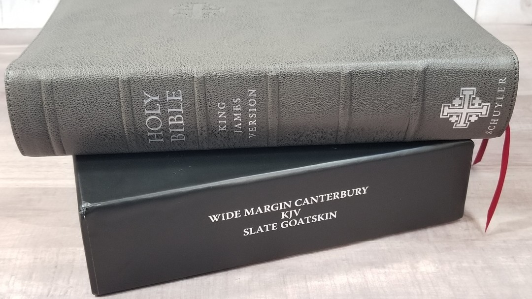
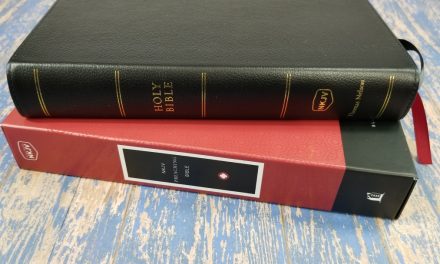
Schuyler’s popular Canterbury KJV is now available in a wide margin edition. It’s set in a 9.5 font that follows the same pagination as the regular size and the personal size Canterbury’s, but without the syllabic pronunciation marks. It has red-letter and wide margins on all four sides of the text. It includes a writable 38gsm paper. It’s available in black calfskin with a paste-down liner, and in leather-lined goatskin in several colors: Black, Antique Marble Brown, Imperial Blue, Slate, Dark Green, Firebrick Red. It’s also available in black calfskin. I’m reviewing Slate, made in the Netherlands by Royal Jongbloed.
This Bible was purchased for review.
_______________________________
Buy from Evangelical Bible
_______________________________
Table of Contents
- Video Review
- Cover and Binding
- Paper
- Typography
- Wide Margins
- References
- Concordance
- Maps
- Front Matter
- Comparisons
- Conclusion
Video Review
Cover and Binding
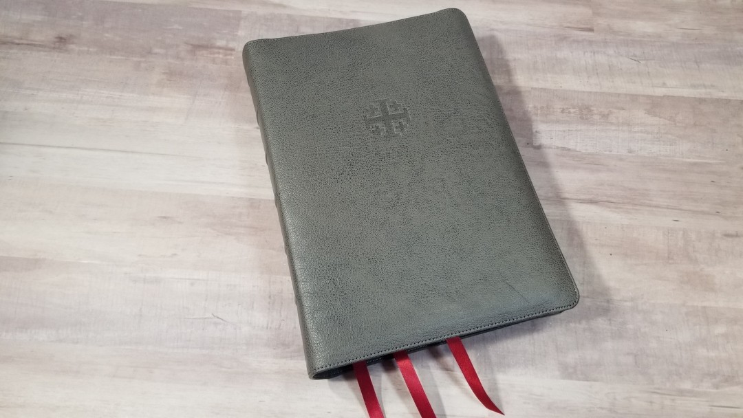
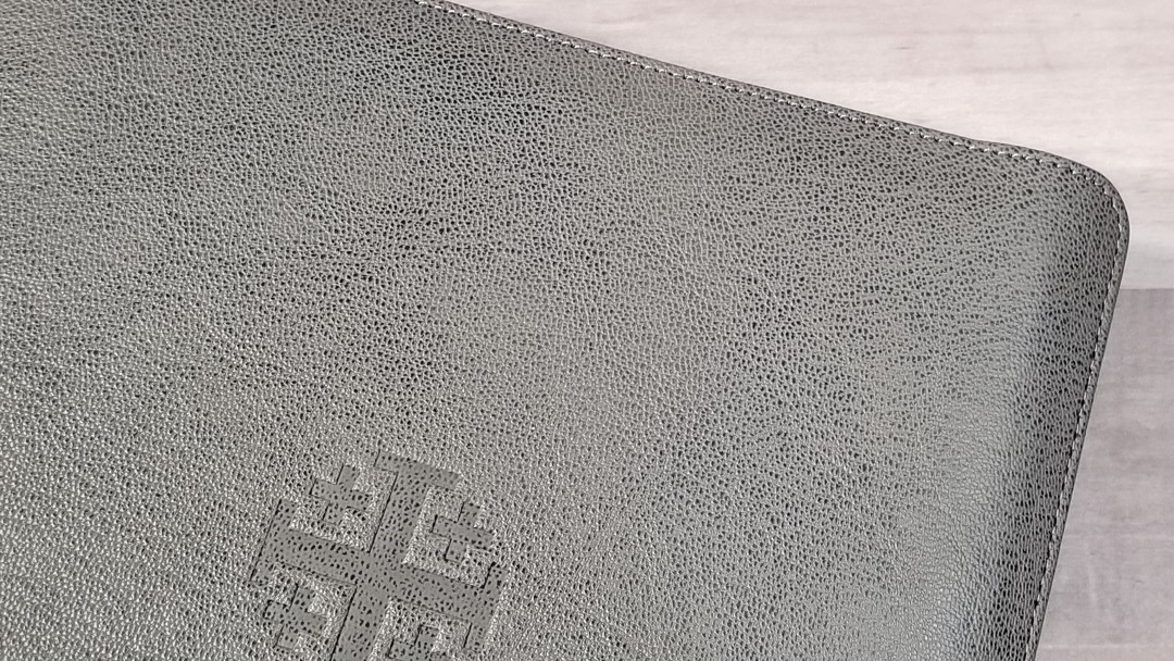
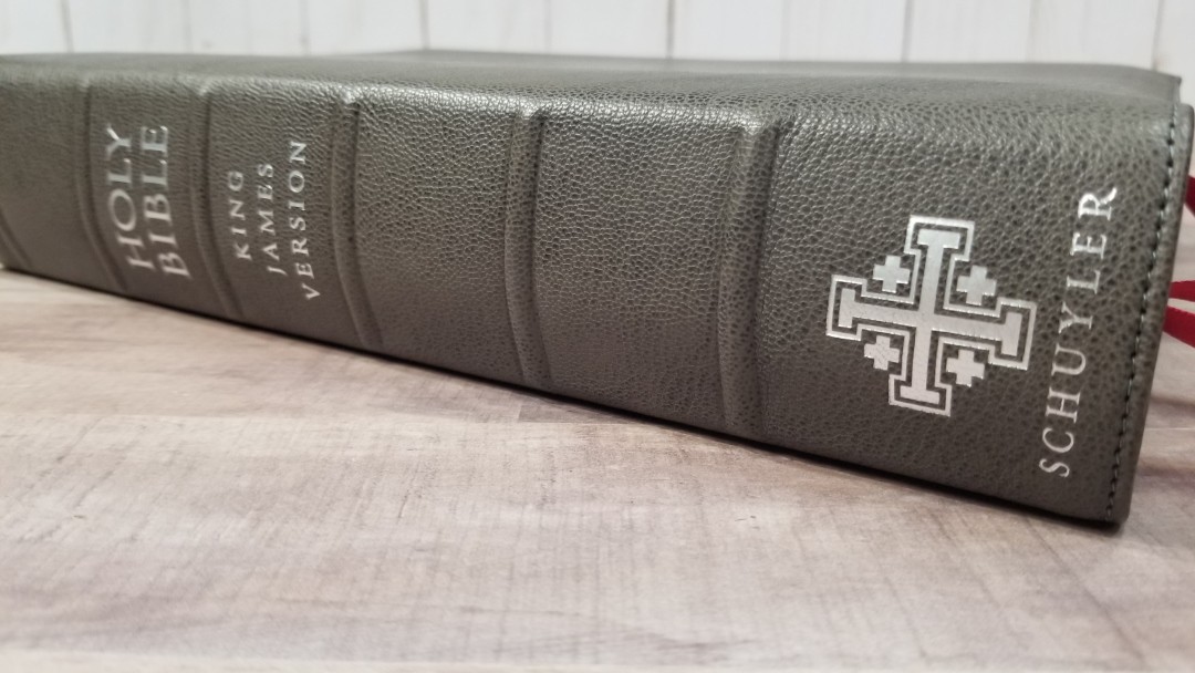
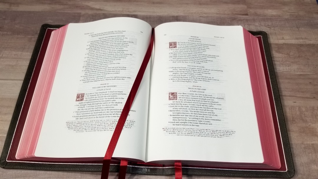
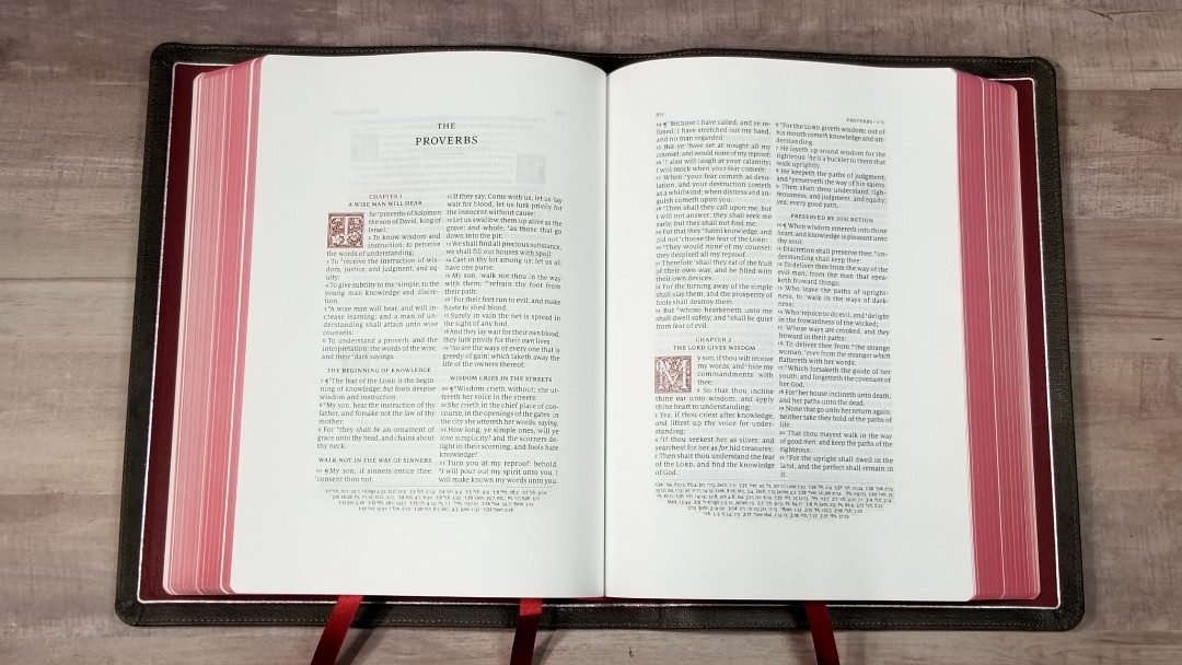
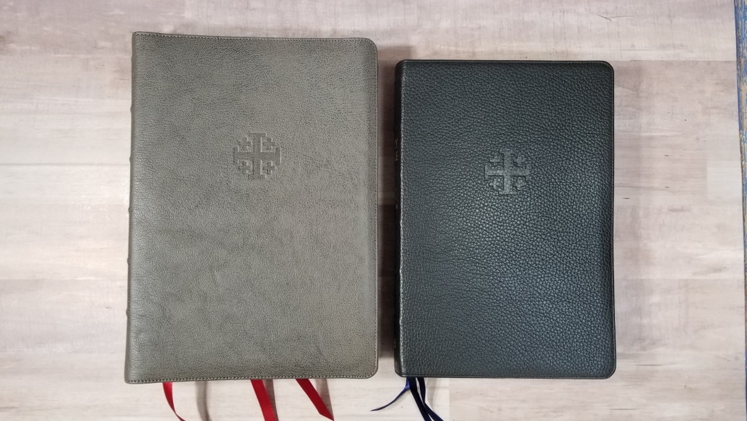
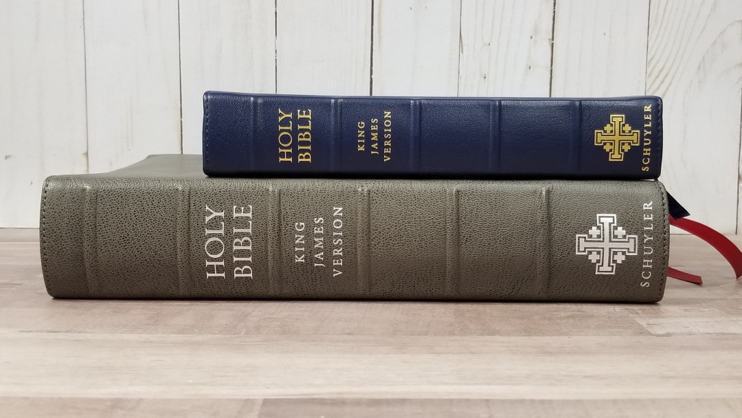
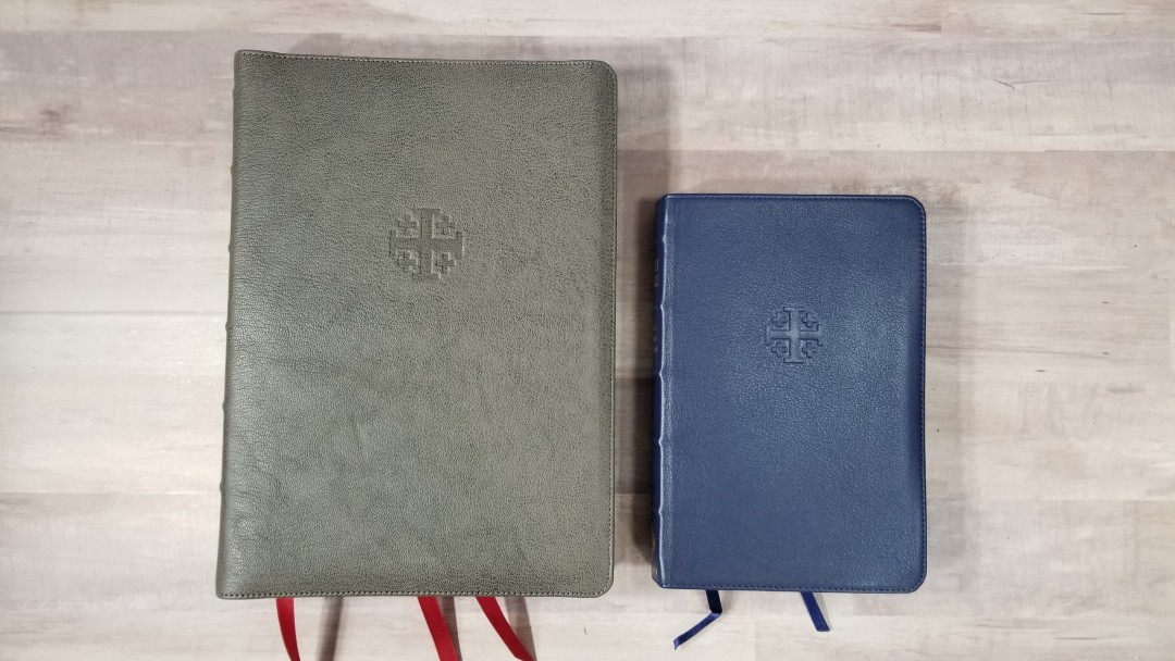
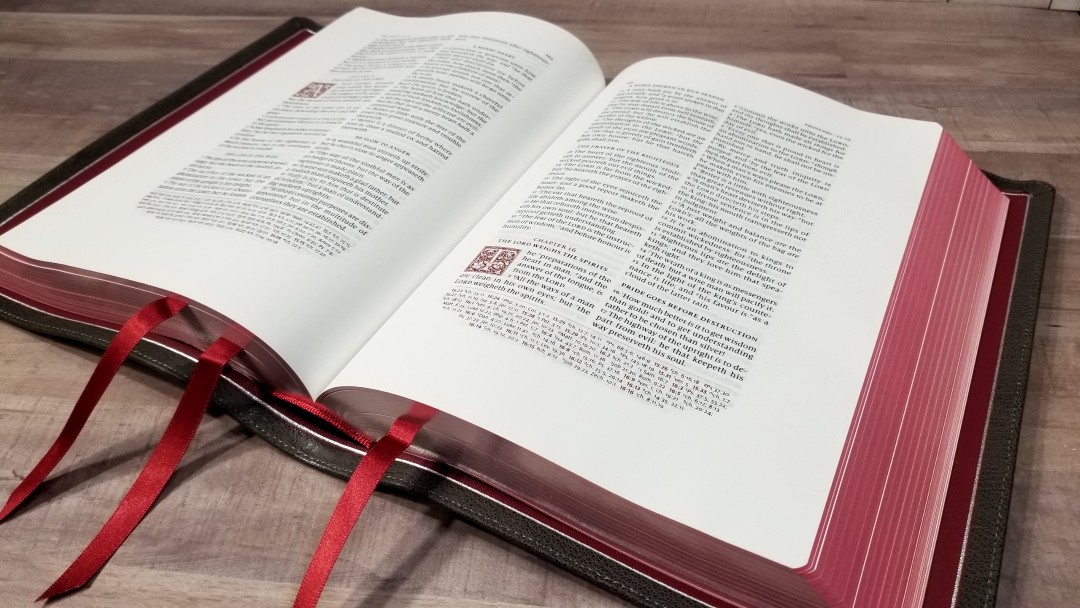
The cover is a natural grain goatskin. The Slate is an interesting color. It actually has a range of colors that mix to create a lot of visual texture. It has perimeter stitching and a yapp (overhang to protect the page-edges). The Jerusalem Cross is dry stamped onto the front. The spine has HOLY BIBLE, KING JAMES VERSION, and the Schuyler logo printed in silver. It has 6 raised ribs.
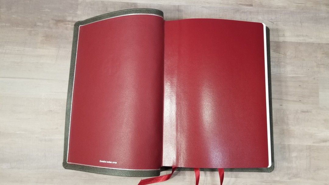
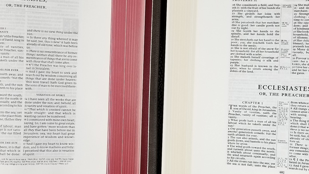
The liner is red calf split. It looks like cherry red. I love this color. It’s edge-lined and the inner liner is also red. It has a silver gilt-line that runs around the inside perimeter.
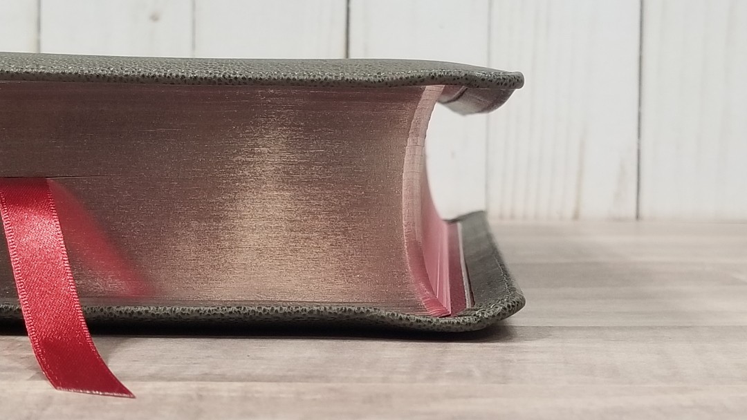
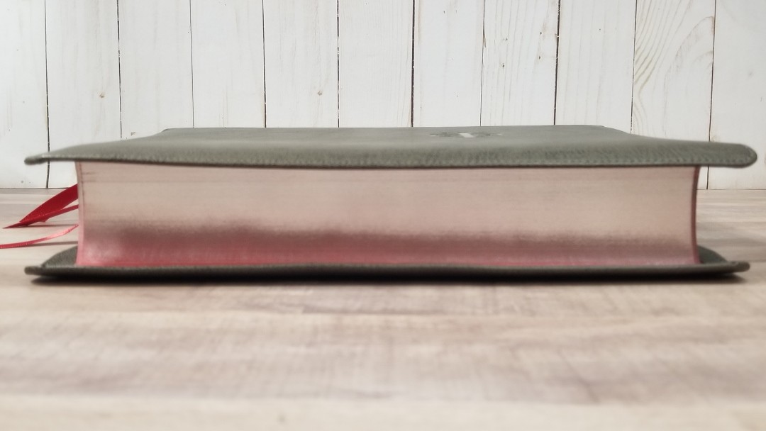
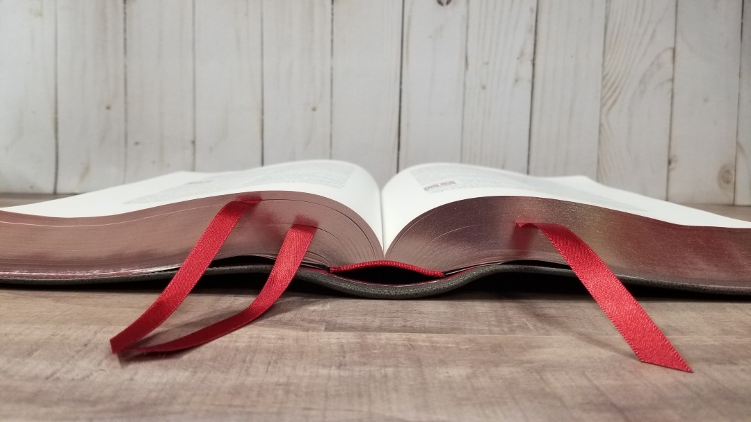
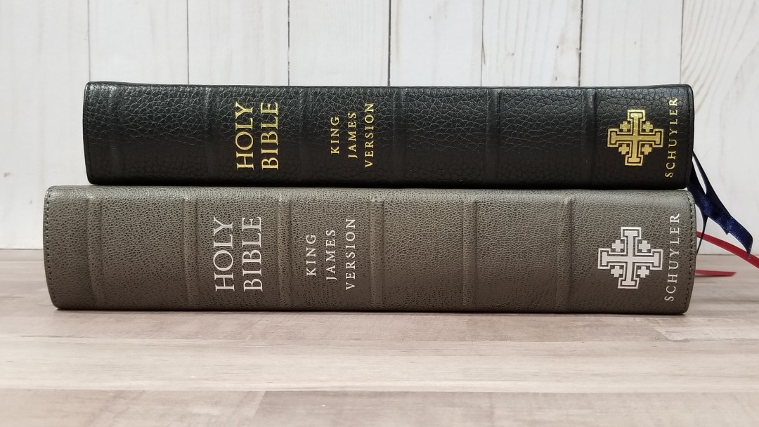
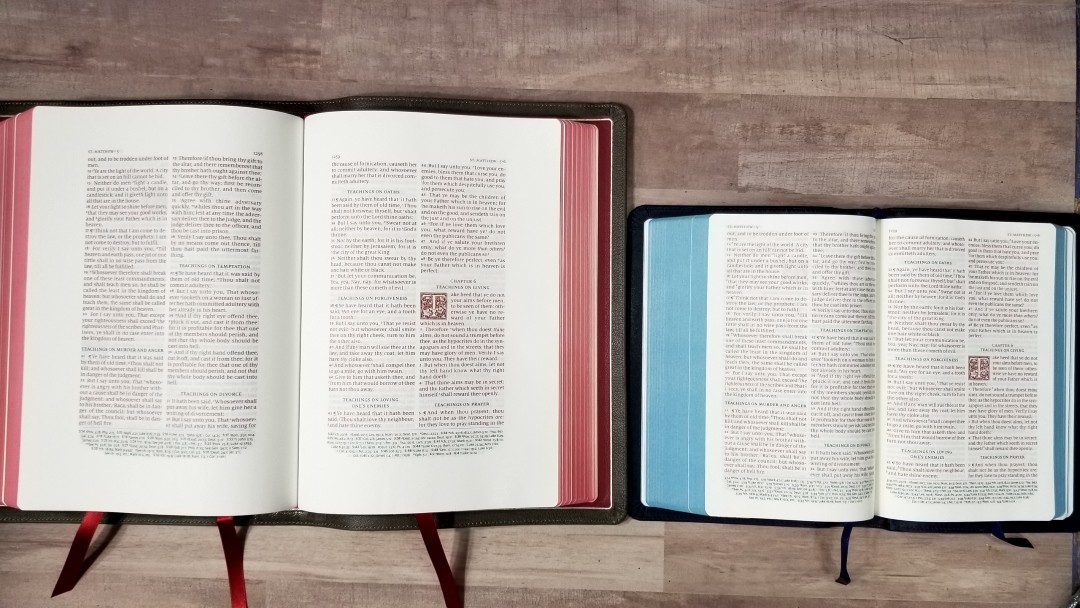
The trim size (size of the text-block) is 6.8″ x 9.4″ x 1.75″. The overall size is 7.4 x 10.4 x 2″. The yapp does bend a little to be smaller. This is the size with it bent in a touch. It weighs 3 lbs, 11.2 oz. This makes it the size of a large study Bible, which is perfect for study, preaching, teaching, group study, etc. It has 3 3/8″ red ribbons. They look great against the red under silver page edges.
Paper
The paper is 38gsm Thinopaque from Finland. This paper was chosen specifically for writing, marking, and highlighting. It has an eggshell color, or a slight cream, and is a joy to read from and write in. There is no glare under direct light. The paper’s texture is slightly rough (it has a ‘tooth’ that’s made for writing). I find the pages to be extra-easy to grab and turn. The opacity is about the same as the regular Canterbury. The show-though is mostly noticeable when there isn’t something printed on both sides of the page. The art-gilt is red under silver. To my eye the font and paper have the perfect contrast. It’s comfortable to read for long periods of time.
Paper in the Back
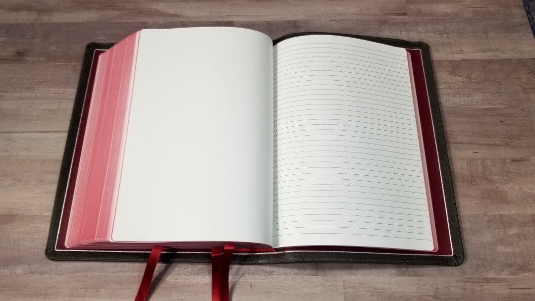
There are lots of pages in the back for notes. It has 10 blank pages made with the same 38gsm paper. These pages have no markings of any kind. It also has 32 pages thick ruled notebook paper for even more extensive notes.
Typography
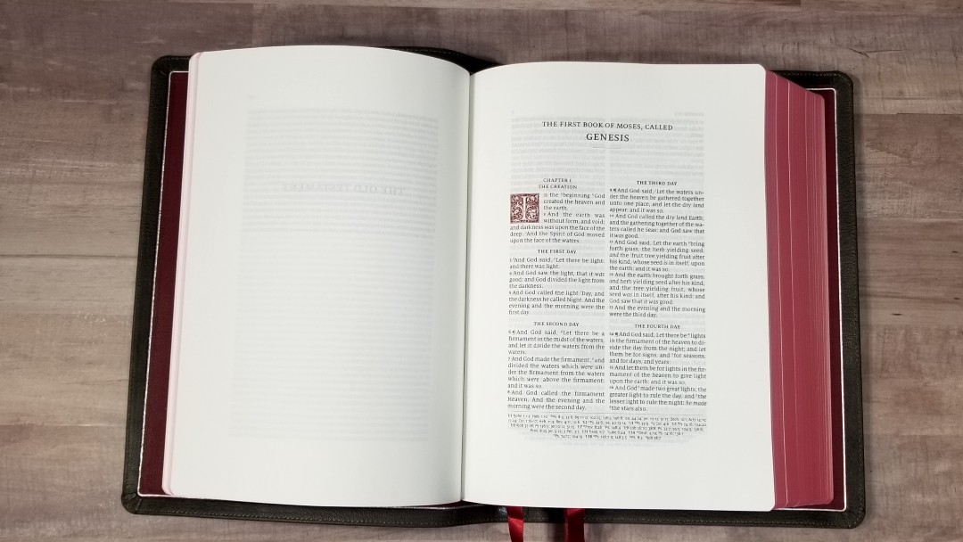
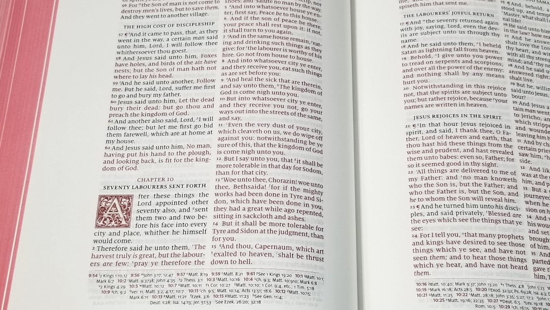
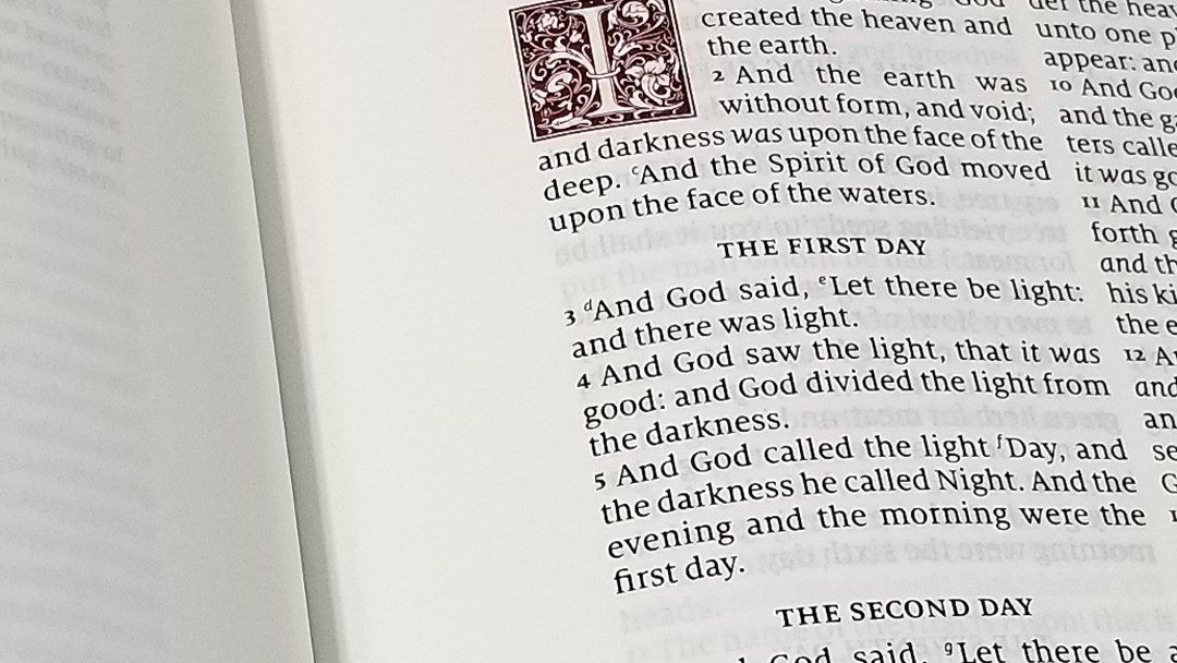
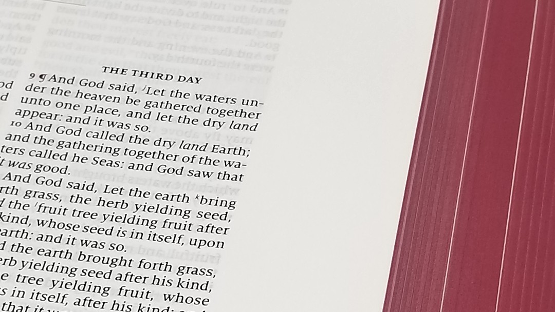
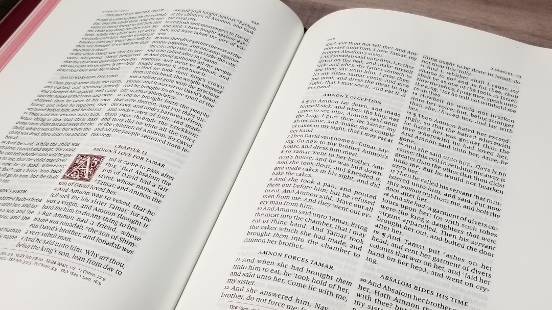
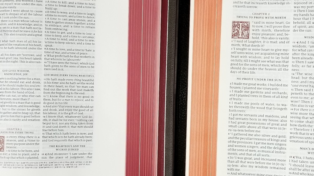
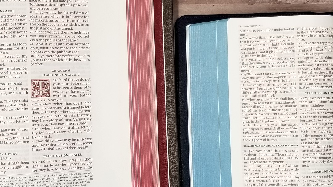
The text is presented in a double-column verse-by-verse format with a decorative drop-cap for each chapter. Psalms are set in a single column. The header includes the page numbers in the inner margin, and the book name and chapter numbers in the outer margin. Cross-references are placed in a single column in the footer and are separated from the text with a line. All highlights, including verse numbers and drop-caps, are in red. Section headings are in black.
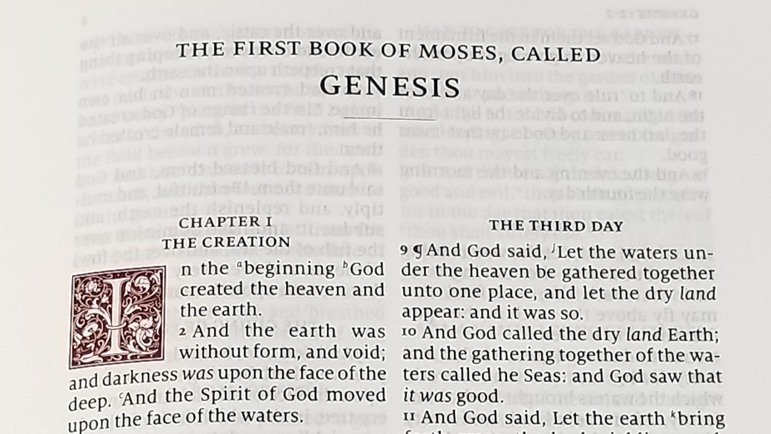
The font is 9.5-point Milo. It has a good amount of line-spacing, to help with reading and underlining. This is a red-letter edition. The red is dark like I prefer. This is some of the best red-letter I’ve seen. Both the black and the red are consistent throughout.
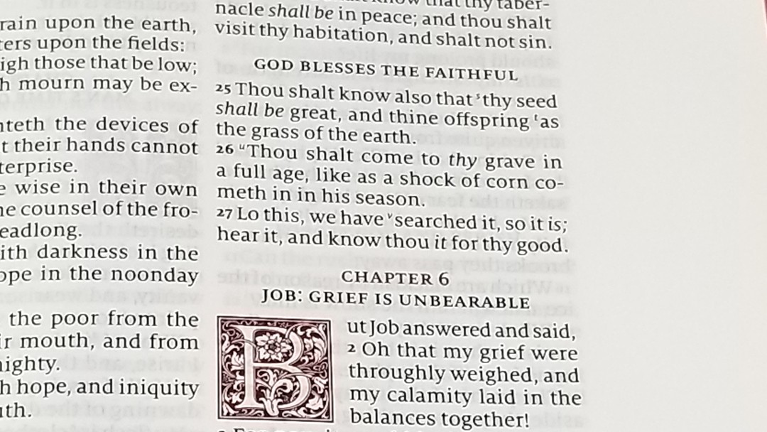
It’s printed with line-matching so the lines on both sides of the page are printed in the same place on the page. The red verse numbers stand out, making them easy to see when looking for them and easy to ignore when reading. It includes pilcrows for paragraph markers, but the section headings also help break up the text into paragraphs. They’re printed in all-caps and stand out, making them easy to see.
The columns have around 6-8 words. The words are spaced apart comfortably without any words too close together or too much space between them. It has italics for supplied words. The pronunciation marks in the regular size and personal size Canterbury’s have been removed, creating a cleaner text. Books start on a new page, which can be used for notes if you want.
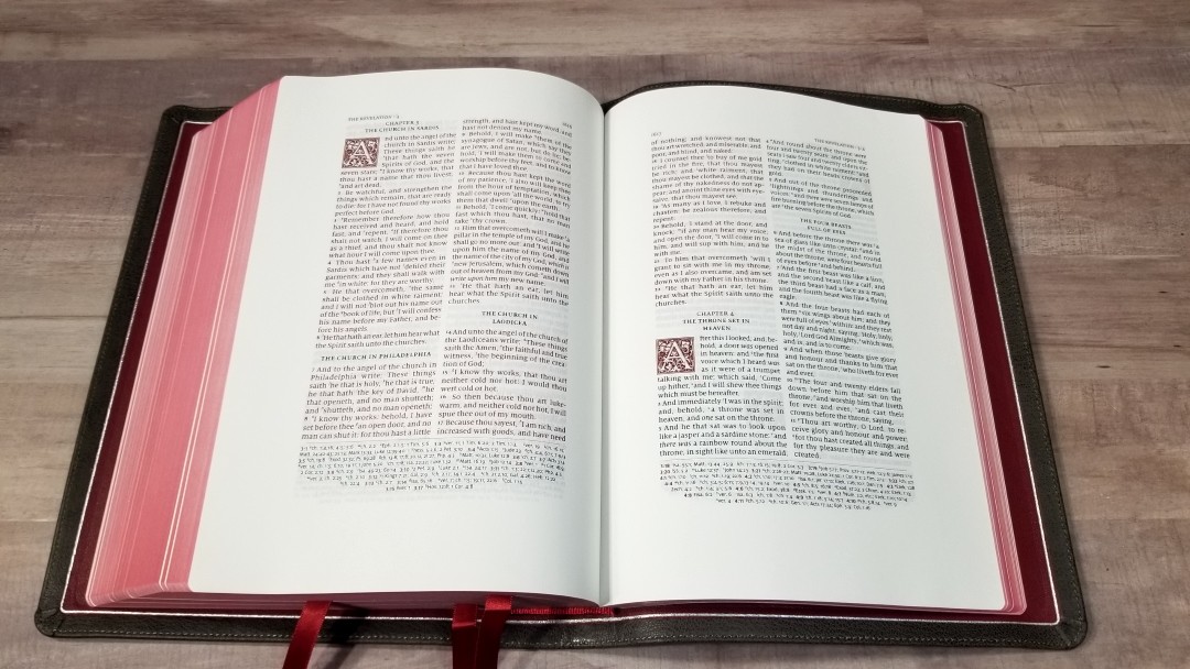
References are keyed to the text with letters. The letters are small enough to be easy to ignore but still readable at the same time. I like that cross-references are placed in the footer because the text doesn’t have to share horizontal space with references, allowing for a larger font and a cleaner design. The ornamental drop-caps are LTC Goudy Initials fonts. They’re printed in red and include designs such as flowers, leaves, and vines. Most take 5 lines. Psalms take 4 lines.
Wide Margins
Of course, the real purpose of this Bible is the wide margins. Here are the margin measurements:
- Outer Margin: 1.37″ (35 mm)
- Inner Margin 1.29″ (33 mm)
- Top Margin: 0.95″ (25 mm)
- Bottom Margin: 1.22″ (31 mm)
The inner margin is a little more difficult to use. I’d like to see these measurements reversed to make the inner margin easier to write it. The margins are wide enough for references, definitions, outlines, notes, etc. I haven’t written in it because I haven’t decided how I want to use it yet. I’m leaning toward a legacy Bible or a preaching Bible. I might try a combination of both.
References
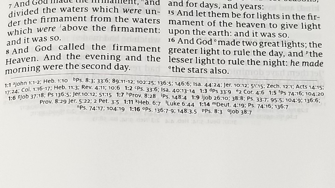
It has 55,000 cross-references placed horizontally across the footer. They taper toward the bottom of the page. This grounds the page and looks elegant. They’re keyed to the text with letters. The pilot chapter and verse numbers are printed in red.
Here are a few verses with their references to help you compare:
- Genesis 1:1 – Jn 1:12; Heb 1:10; Ps 8:3; 33:6; 89:11-12; 102:25; 136:5; 146:6; Isa 44:24; Jer 10:12; 51:15; Zech 12:1; Acts 14:15; 17:24; Col 1:16-17; Heb 11:3; Rev 4:11; 10:6
- Exodus 20:3 – Deut 5:7; 6:14; 2 Kings 17:35; Jer 25:6; 33:15
- Deuteronomy 6:4 – Isa 42:8; Mark 12:29, 32; John 17:3; 1 Cor 8:4, 6
- Isaiah 9:6 – ch 7:14; Luke 2:11; John 3:16; Matt 28:18; 1 Cor 15:25; Judg 13:18; Titus 2:13; Eph 2:14
- Matthew 17:20 – ch 21:21; Mark 11:23; Luke 17:6; 1 Cor 12:9; 13:2
- Mark 11:23 – Matt 17:20; 21:21; Luke 17:6
- Mark 12:29 – Duet 6:4; Luke 10:27
- John 1:1 – Prov 8:22-23, etc; Col 1:17; 1 Jn 1:1; Rev 1:2; 19:13; ch 17:5; Prov 8:30; 1 Jn 1:2; Php 2:6; 1 Jn 5:7
- Acts 2:38 – ch 3:19; Lk 24:47
- 1 John 1:1 – ch 2:13; Jn 1:1; ch 4:14; Jn 1:14; 2 Pet 1:16; Lk 24:39; Jn 20:27
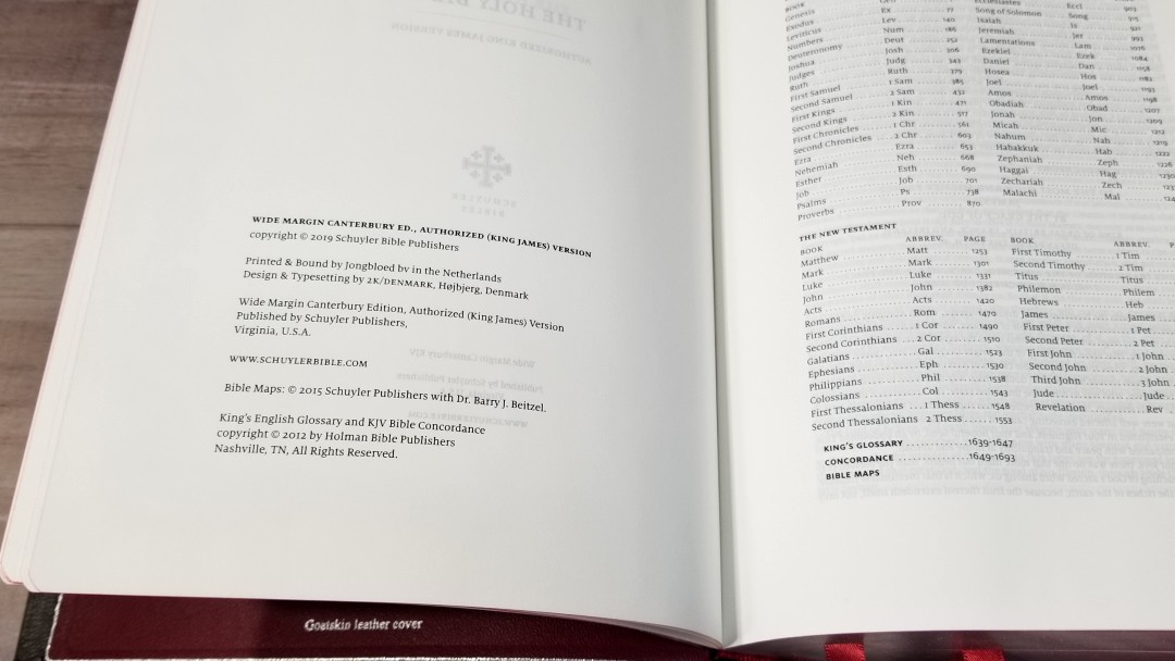
Glossary
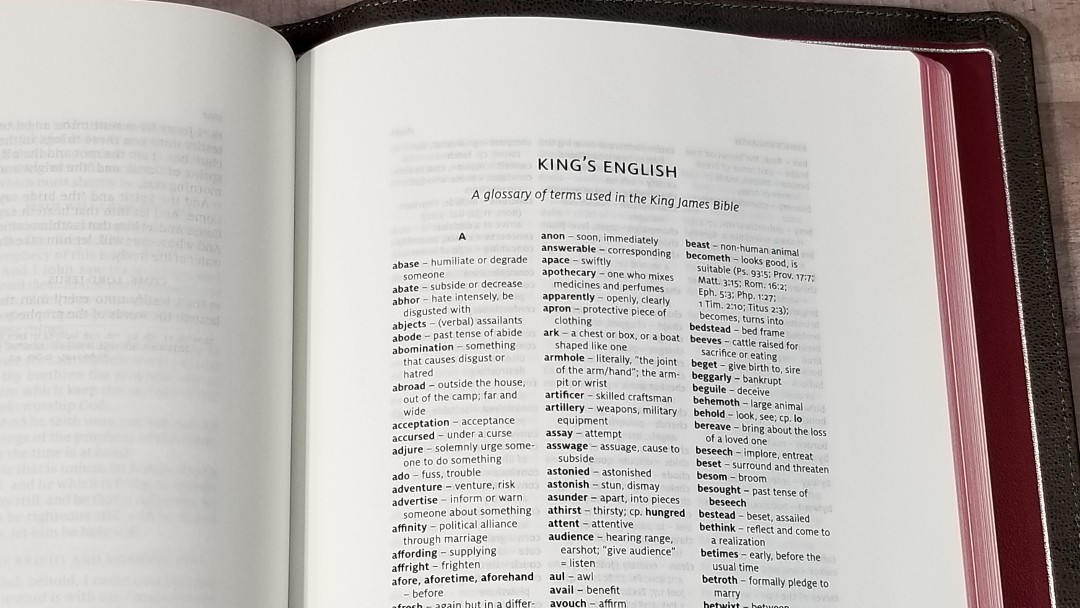
It has a 9-page glossary of words that have changed in meaning or are no longer in use. I’m glad to see this included because we don’t always realize that a word has changed meaning and it’s not always easy to know that from the context. I plan to write them on the pages with the words, or at the very least mark the words so I know to check the glossary.
Concordance
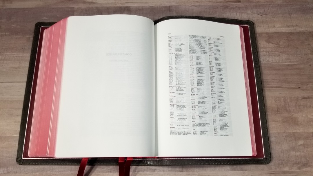
The concordance is 43 pages with 3 columns per page. The entries are in red. It includes biographies of key people with references for key events in their lives.
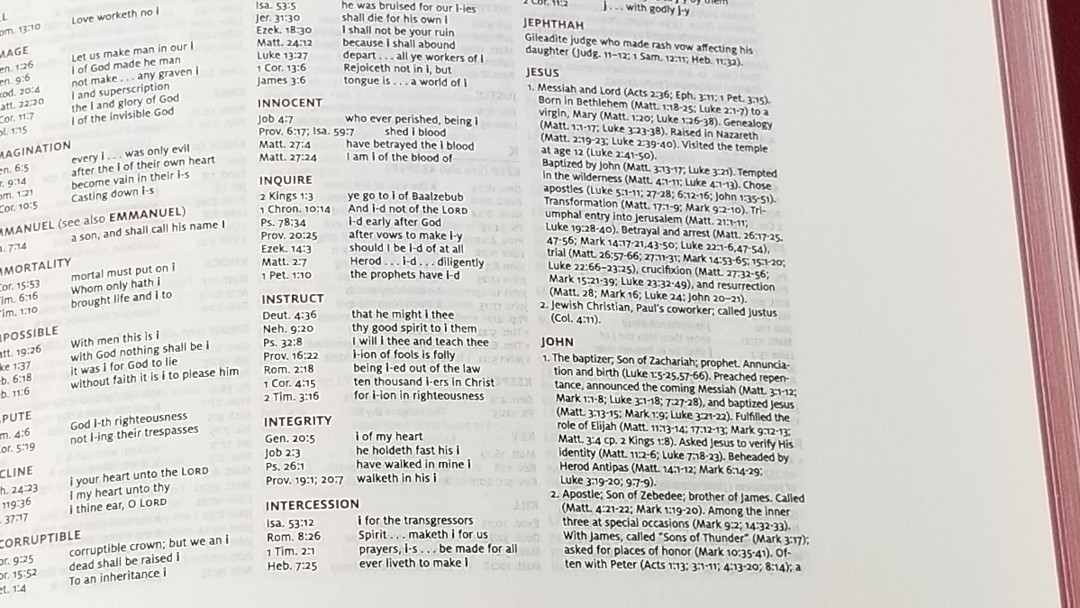
This is a good concordance for study, but the print will be too small for some. They’ve included the wide margins in the concordance, which reduced the size of the already small font in the regular edition. Anyone that needs large print will have trouble using this concordance. I’d guess the entries at 4-point and the text with references at 3-point, but they could be smaller than that. Even with my bifocals, I have trouble seeing the text. I’d like to see them remove or reduce the wide margins from the concordance and produce it with a larger font in the way Cambridge does with their Pitt Minion-based wide margin Bibles.
Here are a few example entries with the number of references for each one to help you compare:
- Christ – 6
- Christian – 3
- Faith (see also Faithful, Faithless) – 40
- Faithful – 26
- Faithless – 2
- God (see also Gods) – 40
- Godhead – 2
- Godliness – 5
- Godly – 4
- Gods – 7
- Praise – 7
- Pray (see also Prayer) – 17
- Prayer – 12
Maps
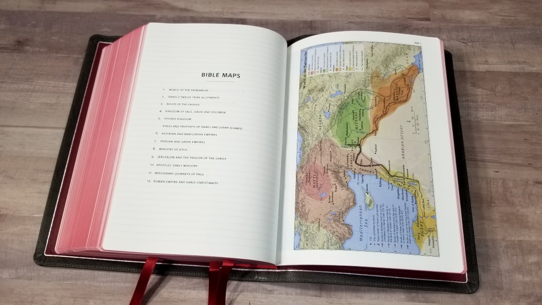
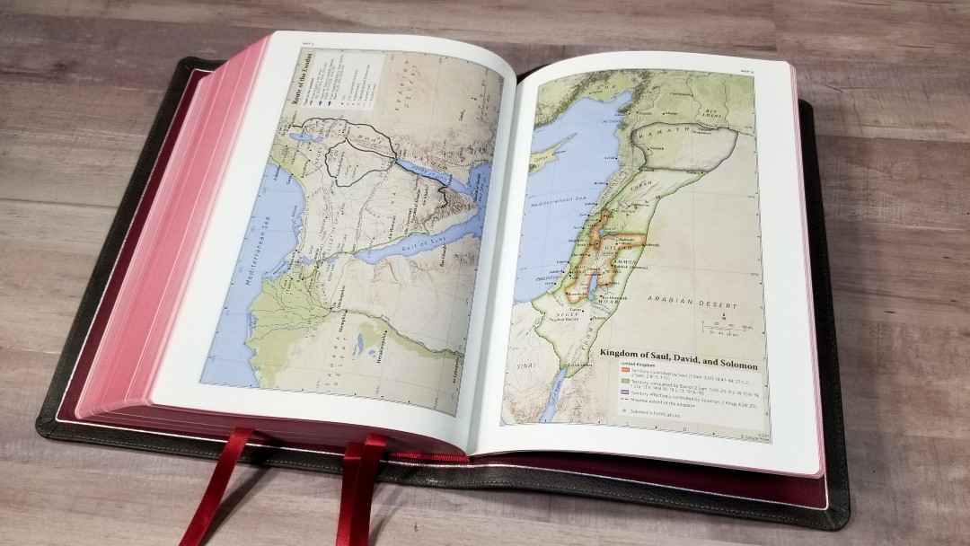
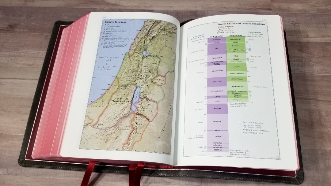
It has 12 maps printed on thick paper. They are colorful and look elegant. These are my all-time favorite colors for maps. They’re annotated well and include borders, cities, distance, topography, Scripture references, places of worship, capitals, water, roads, canals, seaports, ancient inscription sites, events of Jesus’ life, Apostles’ ministries, places of writings, etc.
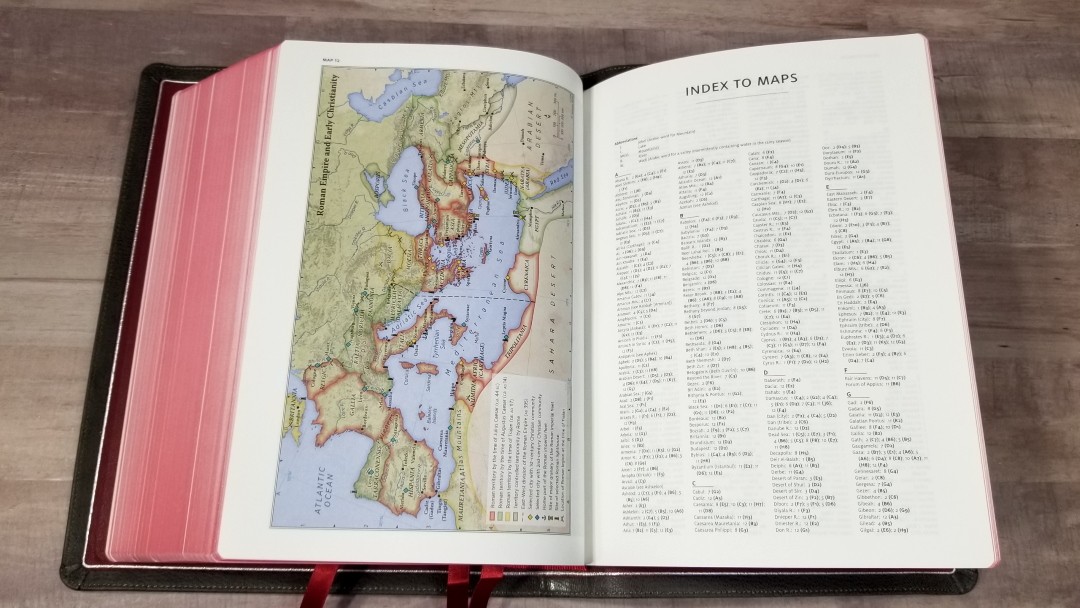

It also has a 3-page index to maps.
Here’s the list of maps (and one chart):
- World of the Patriarchs
- Israel’s Twelve Tribe Allotments
- Route of the Exodus
- Kingdom of Saul, David and Solomon
- Divided Kingdom
- Kings and Prophets of Israel and Judah (Chart)
- Assyrian and Babylonian Empires
- Persian and Greek Empires
- Ministry of Jesus
- Jerusalem and the Passion of the Christ
- Apostles’ Early Ministry
- Missionary Journeys of Paul
- Roman Empire and Early Christianity
Front Matter
In the front, we find the presentation/family pages the, Epistle Dedicatory, and the Translators to the Reader.

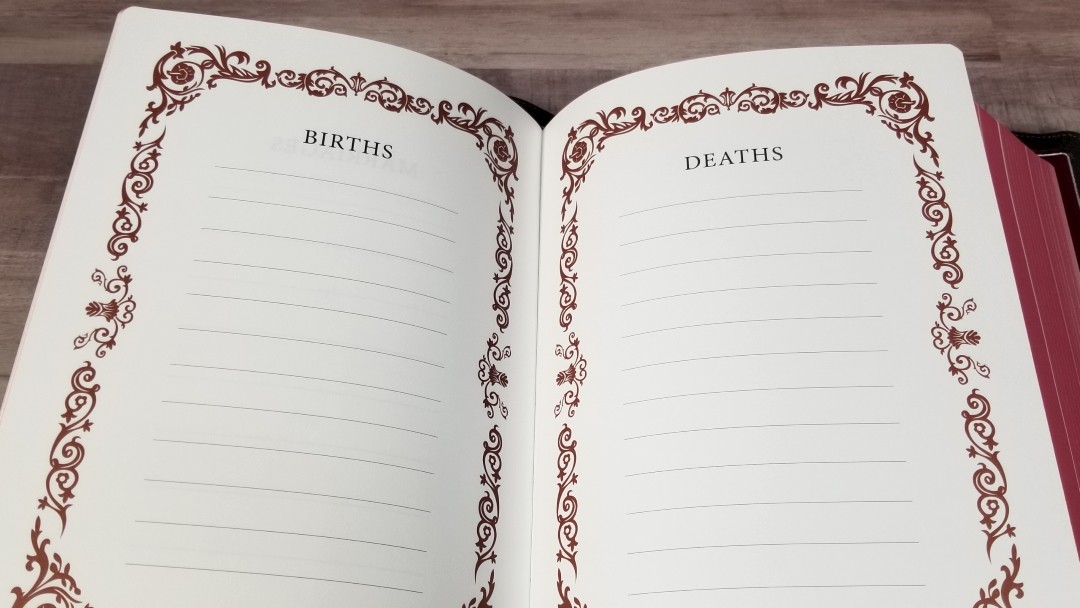
The presentation and family pages include the presentation page, marriages, births, and deaths. They’re printed with a floral graphic in dark red that frames the page.
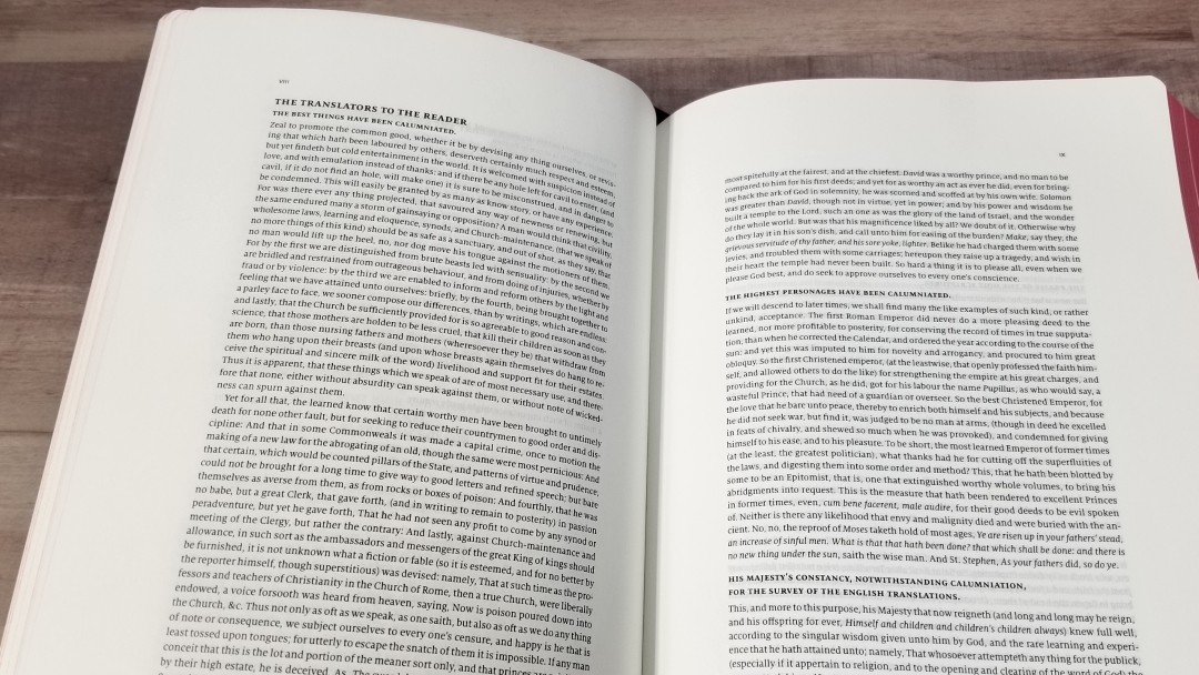
The Translators to the Reader is an important document and I’m glad to see it’s included.
Comparisons
Here’s how the Wide Margin Canterbury compares with the regular edition, personal size, and the Cambridge Wide Margin Concord.
Canterbury

The full-size Canterbury is a larger print Bible in 11-point. It’s black-letter and includes pronunciation marks. It has 36gsm paper. It’s a great choice for reading, study, and preaching.
Personal Size Canterbury
The Personal Size Canterbury is a carry sized edition that’s great for travel and visitations. It has 28gsm paper, pronunciation marks, and is red-letter. It doesn’t include the concordance.
Concord Wide Margin
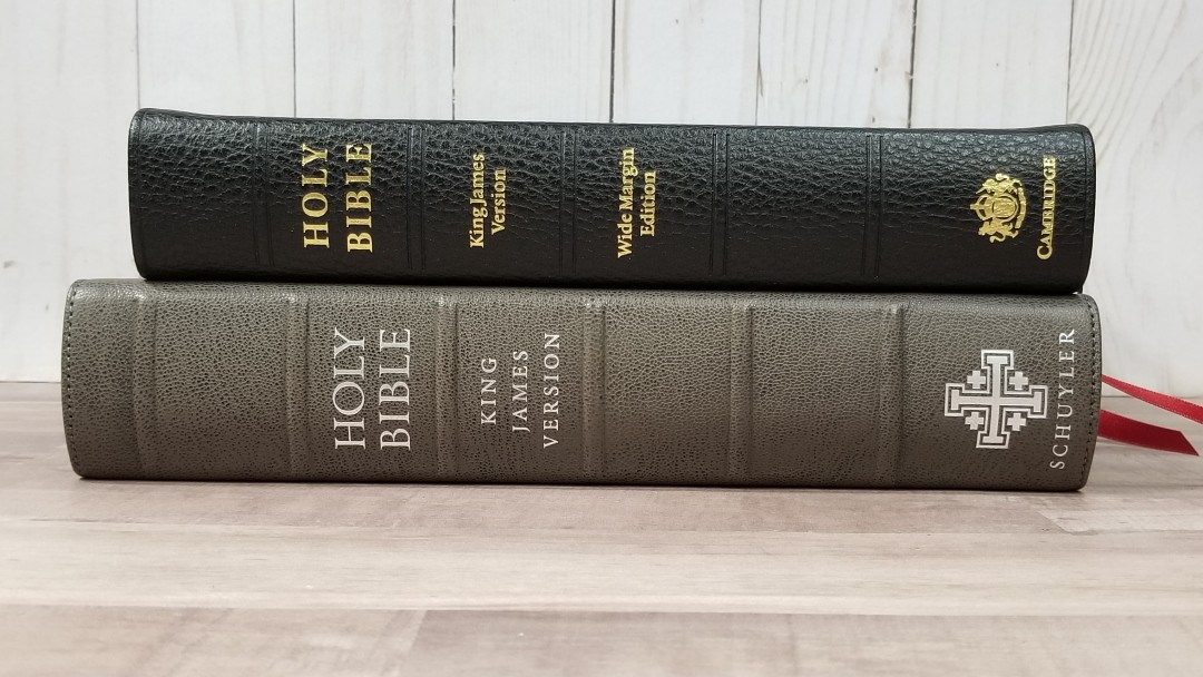
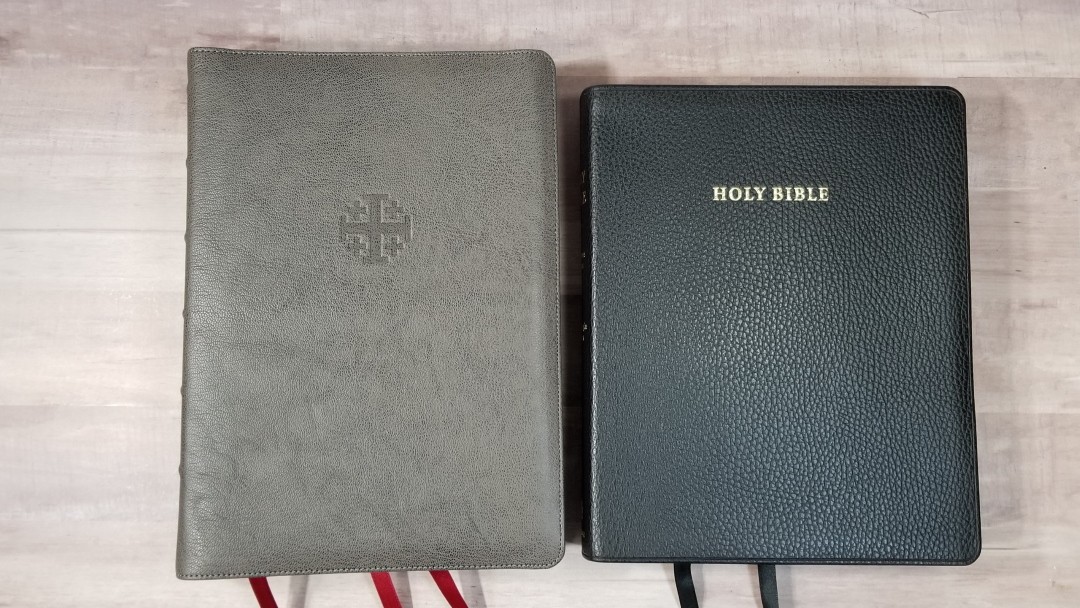
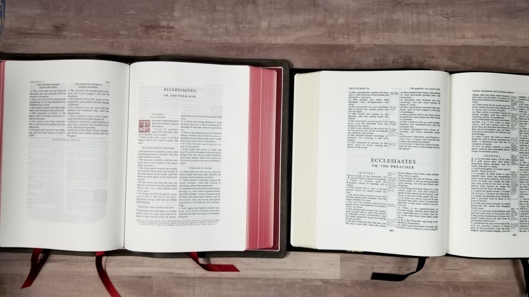
The Wide Margin Concord is slightly smaller. It has a smaller font, but the font is darker. Both have the same paper (but I’ve heard the newer Concords have 40gsm). Both have a glossary, concordance, maps, and note pages. The Concord has the translator’s footnotes, while the Canterbury has section headings.
Conclusion
The Wide Margin Canterbury is a well-made Bible. The print is larger than most wide margin reference editions and it’s the only wide margin KJV designed with line-matching. A few others do match here and there, but they weren’t purposely designed with it. The 2K/Denmark design is elegant and draws me in. I find the font size to be easy to read and preach from.
I love almost everything about the Wide Margin Canterbury. My one complaint is the size of the font in the concordance. If I could change one thing, I’d remove the wide margins in the concordance and make it the same font size as the regular edition. It is a large Bible, but being a wide margin reference edition on 38gsm paper that’s to be expected.
The Slate goatskin looks interesting. I’d buy it again. I love the red liner (even more than I expected to). Construction and materials are the highest quality available, which is no surprise considering it was built by Royal Jongboed in the Netherlands. The paper was made for writing, making this an ideal Bible for personal study, teaching, preaching, and creating a legacy Bible. If you’re interested in a high quality and well-designed wide margin KJV, the Wide Margin Canterbury is a great choice.
_______________________________
Buy from Evangelical Bible
_______________________________
This Bible was purchased for review.


Excellent and so informational.
thanks Randy…
Thanks Richard!
Hi Randy, first thanks for all you do, it’s so helpful. I was wondering how this compares to Allen’s goatskin wide margin. I’m patiently waiting to see if they’’ re coming back out again. Would love your feedback. Thanks again, blessings Bill
Hi Bill. I’ll do a comparison soon. Thanks!
Great review as always. Now that you have preached from this Bible, do you like it for pulpit use as much as the Nelson KJV Preaching Bible?
God bless you brother! Preach the word!
I do like it as much. It doesn’t have the notes, so it isn’t as useful until I write them myself, but once I do it should be even more useful.
I thoroughly appreciate your work and the help it is to people looking for the right Bible. I’m looking for one Bible for study and preaching. Where would you rank this one in that regard?
Thanks Jeff! I’d place this one really high on that list. The main concerns would be the size of the font and the overall size of the Bible itself. If you don’t need large print and the size of the Bible doesn’t matter, then this might be my top choice.
Thank you, Randy. One more thing: I, like you, believe that the Note Takers layout is superior in wide margin Bibles. I also want top quality paper. In your opinion (if price isn’t an issue), which do you give priority to: the Note Takers layout or supreme paper quality? I am trying to choose between the KJV Store Note Takers, the CBP Platinum Note Takers, and the Schuyler Canterbury Wide Margin. Thank you.
Hi Jeff. Sorry for the late reply. For my own tastes, I’m a fan of high-quality paper. I do think the paper in the Notetakers is good for the money, but I’m willing to pay more for better paper. I wouldn’t buy a Bible with good paper if I didn’t like the layout at all. In the case of the Canterbury, I do like this design enough to use it instead of the single-column with a wide outer margin.
Hi Randy
In terms of comparison with the Oxford Brevier 7wm or 5WM, which of the 2 in your opinion takes the price?
Hi Henrick. I’ve only seen the 5wm, so I can’t really give a fair comparison. I do like the goatskin edition that I have. I’d buy it again.
Question for you Randy. Between the Schuyler Canterbury wide margin and the Cambridge Concord wide margin which is easier to read? For me readability in a wide margin will be high priority due to farsightedness with getting older. Thank you.
Hi Blake. I think the Canterbury is a little easier to read because of the larger font. The Concord is darker though, so that does help balance them out.
I’m in the same boat. I’m starting to lean toward larger fonts and I’m finding these wide margins to be a little smaller than I want them to be. I don’t have it, but I think the CBP wide margin text or Notetakers would be good choices. For better paper, the Hendrickson wide margin is excellent. It isn’t available in a quality cover, unfortunately.
Thank you for the insight Randy. I have a plain text LCBP wide margin this is getting pretty filled up. It has been a very good Bible for study with supplemental tools like SwordSearcher and blue letter app. Mine has a margin on a 4 sides of the text where the newer ones from LCBP and CBP has no margin in the gutter. I definitely prefer the margin on all 4 sides. I think the Notetakers is an excellent option but I struggle with the middle of the text being at the peak of the page curve which does not work well with the reflective paper. I may go for the Canterbury wide margin. I can still read my Cameo comfortably with my reading glasses and I am thinking that it will at least read as easy as the Cameo.
It is noticeably larger than the Cameo, so it should work fine. The Concord wide margin is the same size as the Cameo.
Another question Randy regarding the Allan 5WM as an alternative to the Cambridge or Schuyler Canterbury wide margins. You mention the Concord WM is similar in size to the Cameo. Is the Allan 5WM also similar size to the Cameo? Are the Allan 5WM center column cross references as readable as the Cameo? I like the heavy paper of the Allan 5WM and if the text and center column references are as easy to read as Cameo then it would work.
Hi Blake. Yes, the font size of the Allan is the same size as the Cameo. The references are just as readable.
Much appreciated Randy. Looking for a real workhorse for main study Bible and while the Schuyler and Cambridge WM Bible would get the job done it seems as though the 45 gsm Allan WM paper would be a real pleasure to use if I can read the text comfortably and I can read the Cameo comfortably. Also I do not have a Clarendon in my collection and I have heard the referencing system for the Clarendon is excellent. I would use all my cross reference Bibles as satellites for my wide margin when doing deep study and I already have a Concord. I know the Clarendon WM does not have a concordance but I do not use the concordances in the back of my Bibles but use rather SwordSearcher, phone, or my Cruden’s.
You’re welcome! The Brevier Clarendon is an excellent choice. I’m with you on the concordance. I do like to have them, but I end up using my digital tools more often than paper.
That really helps know that Concord wide margin is comparable to Cameo in readability. I need glasses now for all my Bibles and since I can read the Cameo just fine with my glasses then the Concord wide margin can definitely be considered as an option for me. I really like the generous amount of blank pages and lined paper for notes in the Concord WM. Would eliminate the need to use a separate journal for me. Going to read your Concord wide margin review and look at some videos and pray about which one to get. Really appreciate you Randy.
When will we see this Bible in the 2016 ESV? I would be absolutely thrilled with that, and I’m sure many others would as well!
They haven’t mentioned a date for that one yet. I’m sure it’s coming, I just don’t know when.
Great review. Is the schuyler kjv wide margin bible a PCE text and is it Smyth sewn?
Thanks! Yes on both.
After I saw this review I am hoping to find one!!
I am looking to purchase a like new Slate KJV Canterbury. Anyone have one for sale?
Good morning Mr. Brown. I am a Bible student in my sophomore year. I am looking for a wide margin study bible. I do wear glasses and price can be an issue. I have seen your reviews on the Thomas Nelson Sovereign and the Schuyler Canterbury both wide margin. I have also looked at the Cambridge wide margin. What is your recommendation for use as a study and preaching Bible that can last for the next 5 years? Thank you
Hi Craig. Congratulations on your sophomore year! Any of those you mentioned should be great for the next five years. The Schuyler and Cambridge should last several times longer than that. If you find it difficult to read smaller text, then I’d avoid the Cambridge. It’s 8-point and it’s the smallest on this list. The Schuyler has about the same size font as the Thomas Nelson. The advantage of the Schuyler is the quality is unmatched. The advantage of the Thomas Nelson is the book block is smaller, which might be better for carrying and preaching. It’s also available in multiple cover options in several price ranges. If you’re okay with slightly less quality (but good enough for 5 years), the I’d go with the TN. If you’re okay with the extra cost and size, the Schuyler is a better choice because it will last much longer. Personally, I use the TN because I like the size.