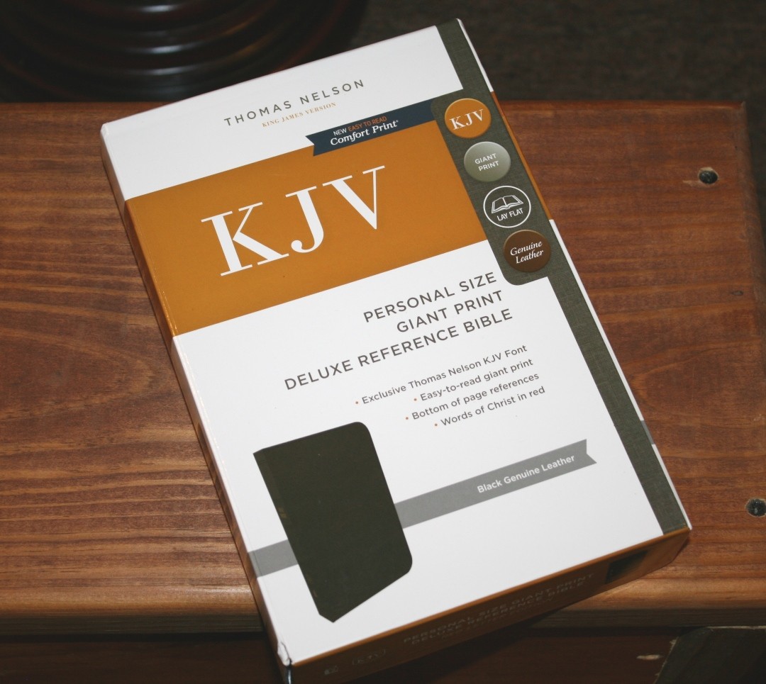
Thomas Nelson’s KJV Personal Size Giant Print Deluxe Reference Bible creates a modern layout, presenting the large Comfort Print text with references in the footer. It’s available in several covers, including this deluxe edition (ISBN: 9780785215608) which I’m convinced is cowhide. It’s made in China.

Thomas Nelson provided this Bible in exchange for an honest review. I was not required to give a positive review, only an honest one. All opinions are my own.
_________________________________________________________
This Bible is available at (includes some affiliate links)
and many local Bible bookstores
_________________________________________________________
Video Review
Cover and Binding

The cover is labeled as genuine leather. I’m guessing it’s actually cowhide (one of my favorite leathers for Bibles). It’s soft to the touch and has an elegant grain. It has a matte finish. It’s very flexible. The vinyl liner does keep it from being extra floppy though. With that said, it is floppy for a paste-down liner.
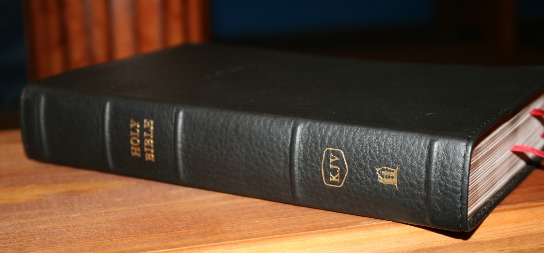

It has HOLY BIBLE stamped into the front, and HOLY BIBLE, NKJV, and the Thomas Nelson logo printed on the spine in gold. The spine includes 5 raised ribs.
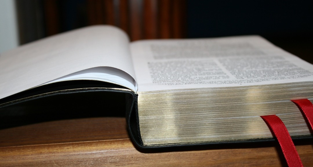
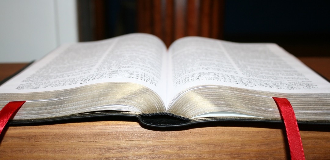
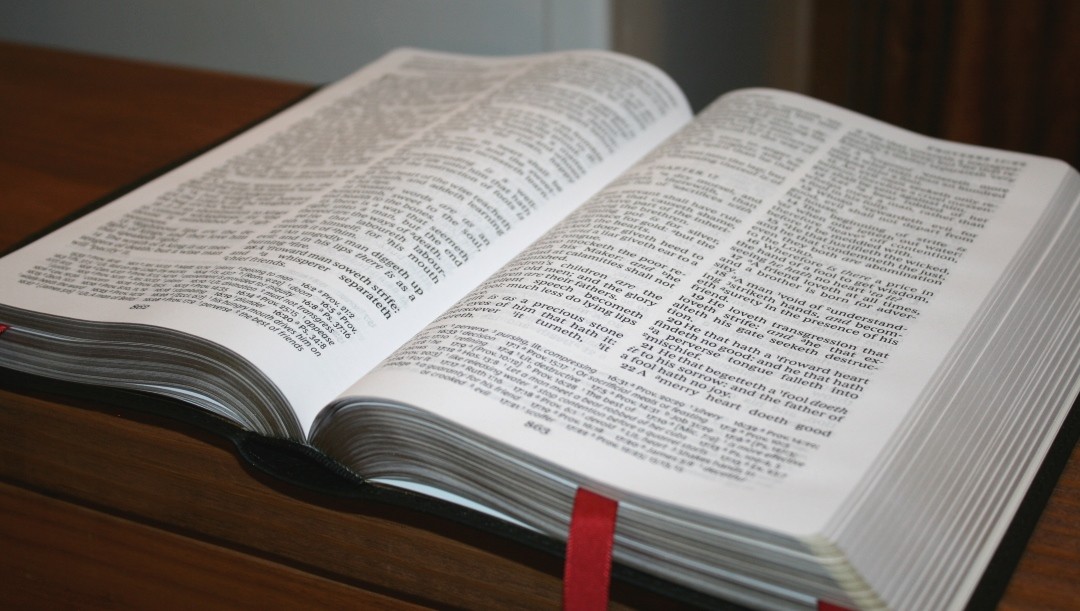
The text block is sewn and has no trouble staying open on the first page of Genesis. It has 3 thick red satin ribbons. The overall size is 8.75 x 5.75 x 1.5″. It weighs 1lb, 15.6oz. This is an excellent size for a Bible for all-around use.
Paper
The paper is white in color and has a slightly rough texture. It has no glare under direct light. I’m guessing the paper to be around 32gsm. It’s decently opaque, but it does have more show-through than I would like for this price-point. It had no trouble turning pages. I think this would be good paper for marking.
Typography
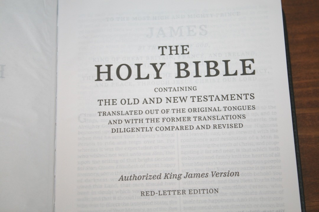
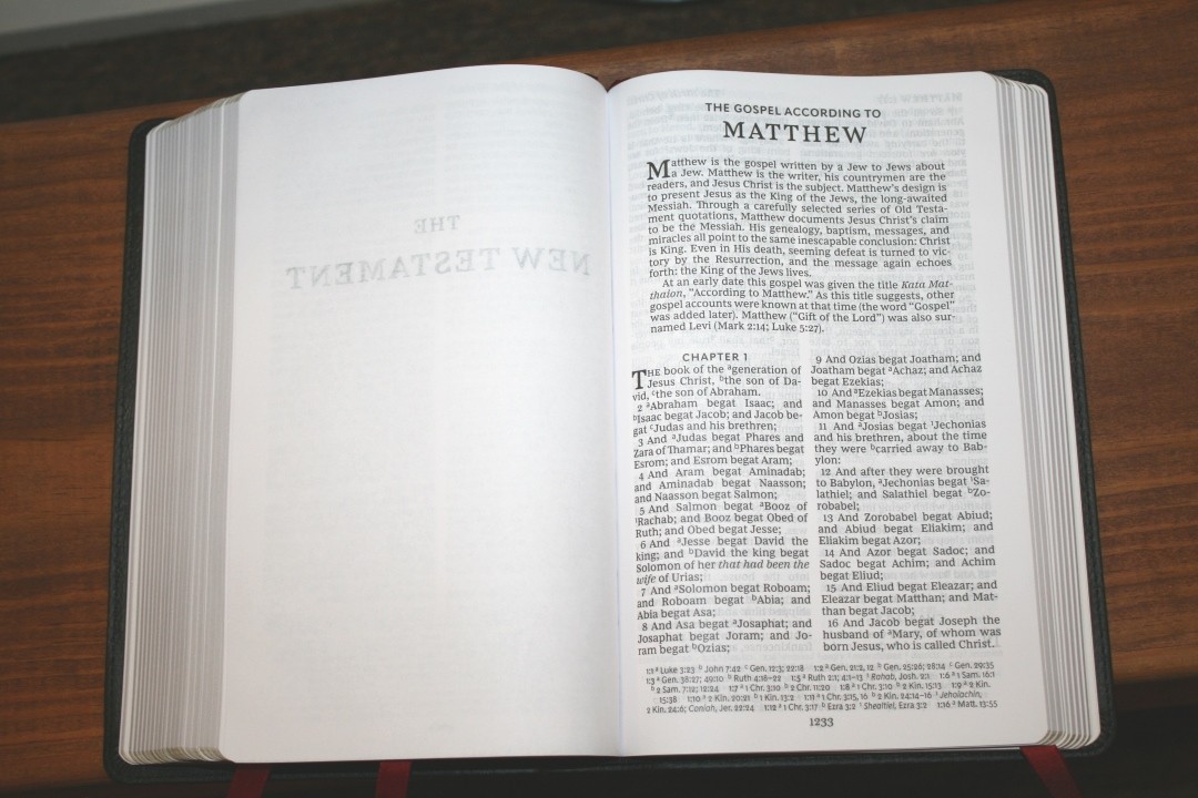
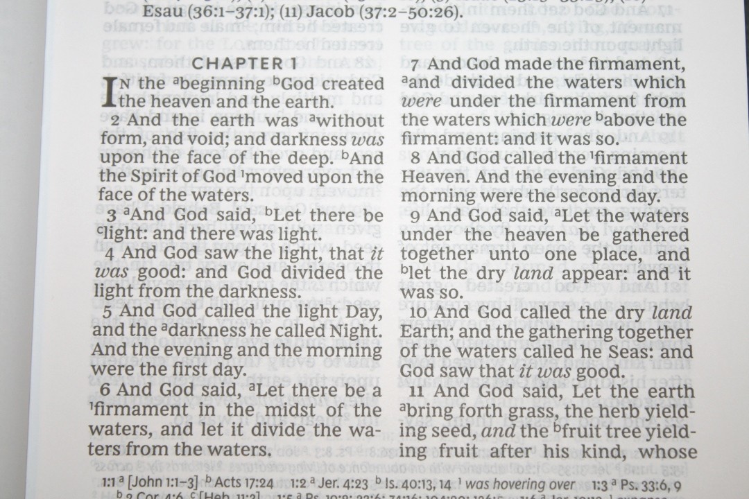
The text is presented in double-column, verse-by-verse, format. Cross-references and footnotes are placed in a single column in the footer with page numbers centered under them. The header shows a page summary in the inner column and the book name, chapter, and verse number in the outer column.
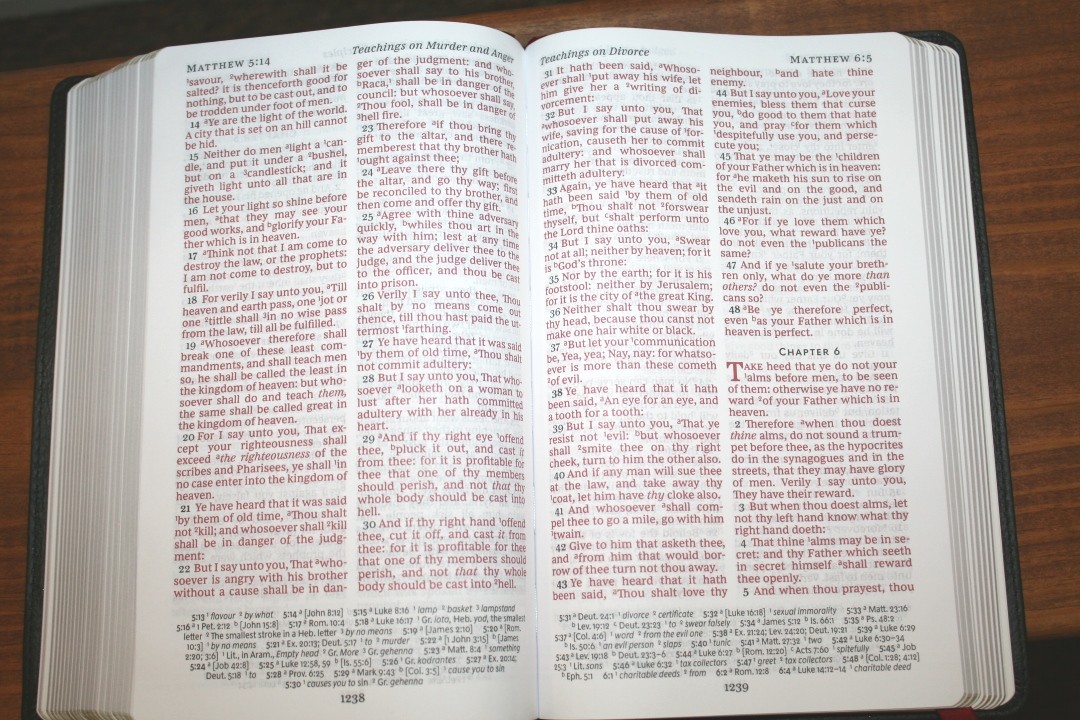
The typeface was designed by 2K/Denmark. The font is 11.5 counting leading. To my eye, it looks like it’s around 10-10.5 point. The black and red letter fonts are dark and consistent throughout. I love this red. Each verse is indented so they’re easy to find.
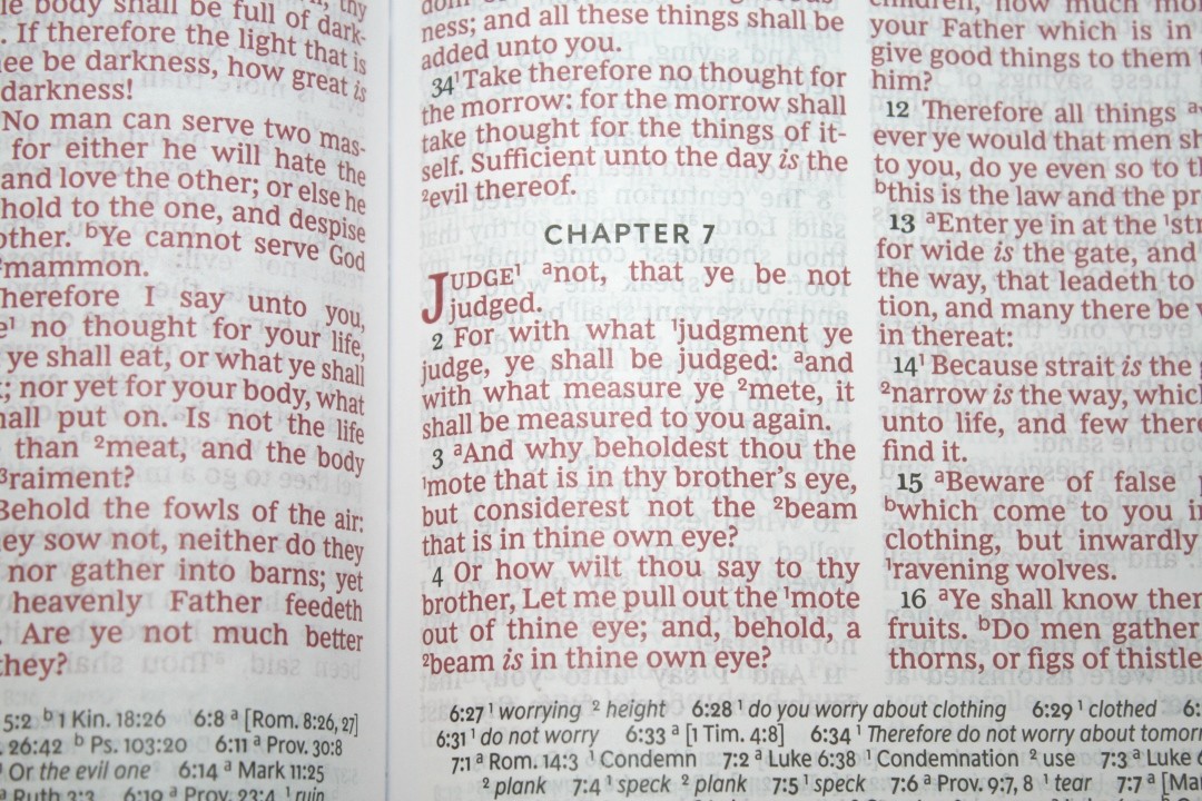
I like the references and footnotes in the footer. This keeps the text from having to share horizontal space with references and gives room for a larger font without having a wider footprint. It has around 30 characters across with around 6 words per line. References are keyed with letters and footnotes are keyed with letters. I found them small enough to not blend with the text, which also makes them hard to ignore.
References and Footnotes
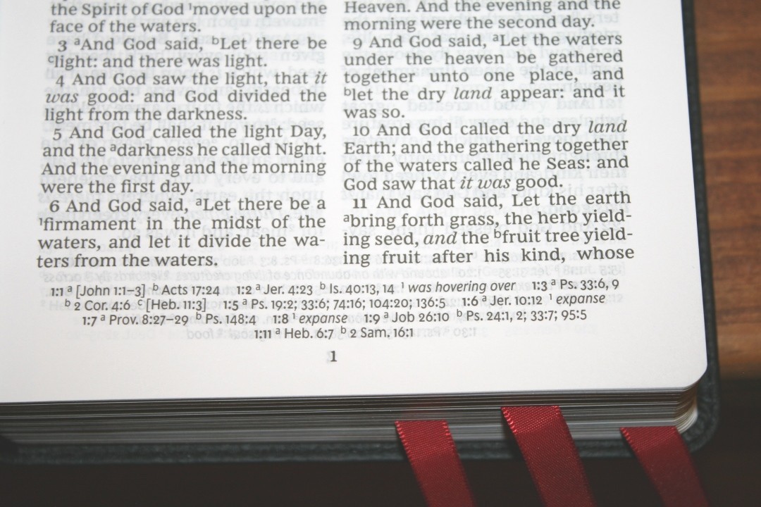
References and footnotes are placed at the bottom of the page in a single column. They include the chapter and verse numbers. It has a couple of spaces before each chapter number to help them stand apart from each other. The footnotes are placed with the cross-references, with the cross-references first.
Here are some example references to help you compare:
- Genesis 1:1 – John 1:1-3; Acts 17:24
- Deuteronomy 6:4 – 1 Cor 8:4,6
- Isaiah 9:6 – Luke 2:11; John 3:16; Matt 28:18 Judg 13:18; Titus 2:13; Eph 2:14
- Matthew 17:20 – Luke 17:6
- Mark 11:23 – Matt 17:20; 21:21
- Mark 12:29 – Deut 25:5
- John 1:1 – 1 John 1:1; Rev 19:13; John 17:5; 1 John 5:20
- John 2:19 – Matt 26:61; 27:40
- Acts 2:38 – Luke 24:47
- 1 John 1:1 – John 1:1; John 1:14; 2 Pet 1:16; Luke 24:39; John 1:4,14
The footnotes are those from Thomas Nelson. They include updated words of archaic words and those that have changed in meaning. This works as a glossary on the page where you need it.
Book Introductions

Book introductions are short- usually 2-3 paragraphs. They provide an overview of the book, highlight the main characters, provide insights of the book’s name, and provide a simple outline with references to the major portions of the book. Some include a sentence about the author or other important features of the book. They’re short, so they don’t get in the way, but they still have enough information to provide a simple introduction.
Extras
It includes a few extras in the back for reading and study.
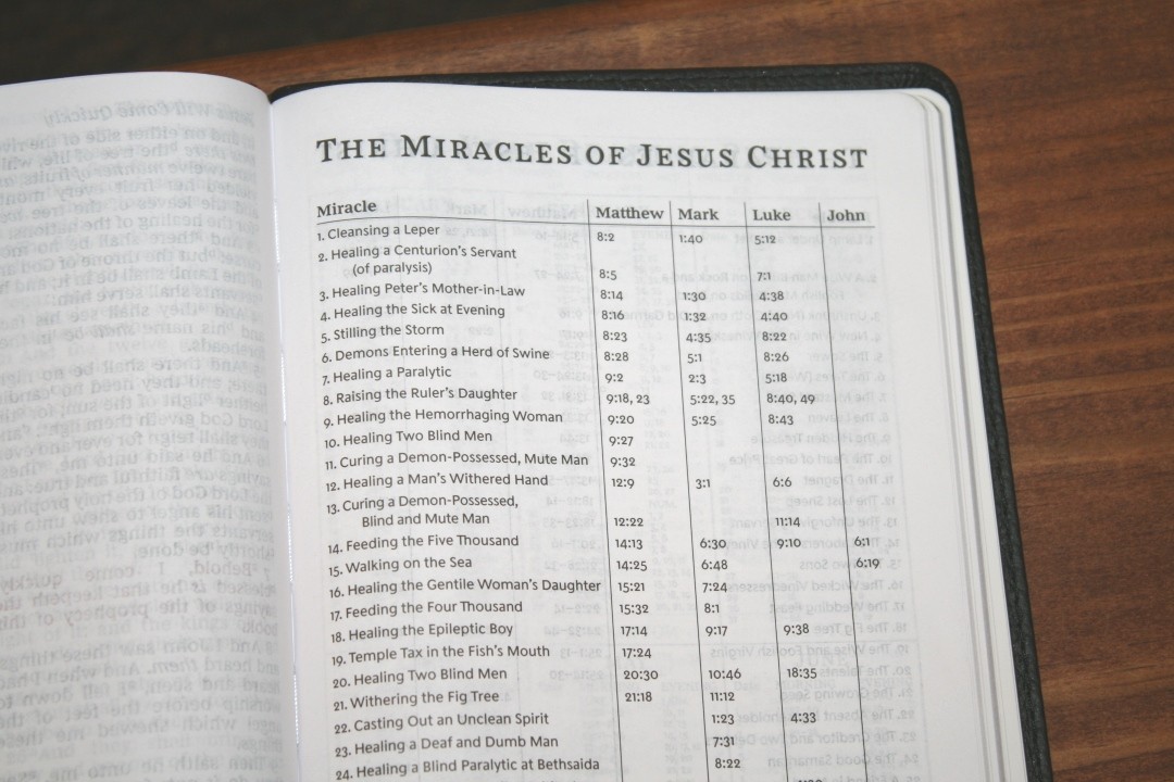
Miracles of Jesus – this is a one-page table that shows 37 miracles and lists the references for each of the Gospels.
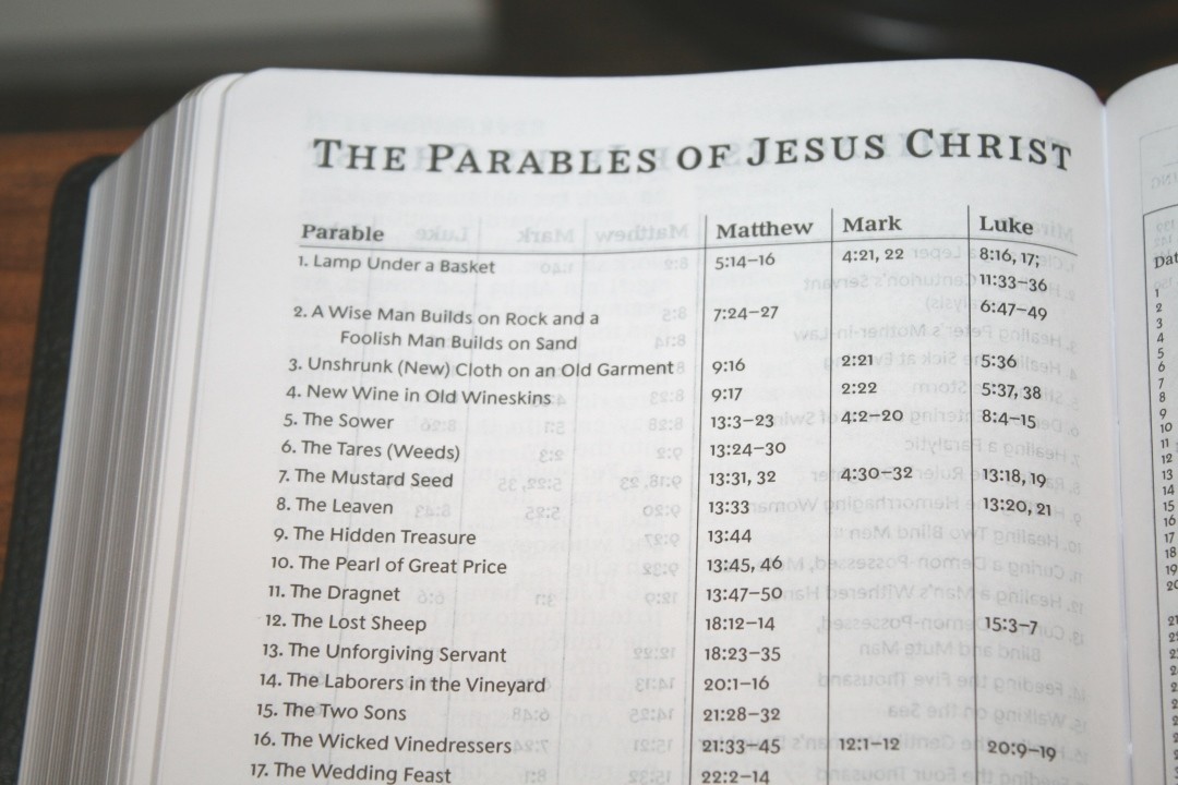
Parables of Jesus – this table shows 39 parables and lists the verses where they appear in the Gospels.
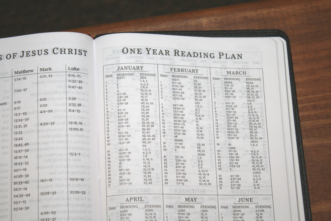
One Year Reading Plan – this is a 2-page reading plan that shows the month, date, and reading for each day. It provides 2 readings per day to take you through the Old and New Testaments every day.
Concordance

The concordance is 88 pages with 3 columns per page. It doesn’t include names (with the exception of Jesus), but it does have a decent amount of references for study. Here are a few example entries with their number of references to help you compare:
- Christ – 15
- Christian – 3
- Faith – 94
- Faithful – 38
- Faithfully – 1
- Faithfulness – 4
- Faithless – 3
- God – 54
- Godhead – 3
- Godliness – 8
- Godly – 9
- Praise(n) – 30
- Praise(v) – 12
- Pray – 36
- Prayer – 34
Maps
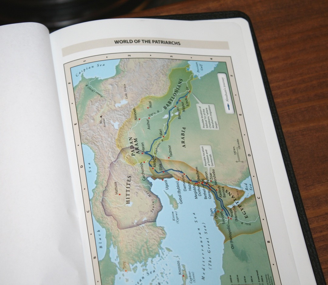

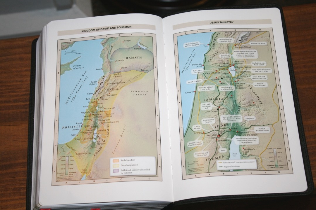
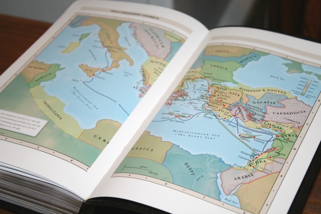
It has the standard Thomas Nelson maps- 7 full-color maps on 8 thick, semi-glossy pages. It doesn’t have an index, but they are annotated well. They include distance, elevation, topography, ancient cities, journeys, battles, events, dates, and Scripture references. I like the colors. They’re colorful without being cartoonish.
Maps include:
- World of the Patriarchs
- Exodus and Conquest of Canaan
- Land of the Twelve Tribes
- Kingdom of David and Solomon
- Jesus’ Ministry
- Paul’s Missionary Journeys
- Jerusalem in the Time of Jesus
Conclusion
The Thomas Nelson Personal Size Giant Print Deluxe Reference Bible is an excellent semi-premium Bible. Although this is a deluxe edition, it’s not a premium edition. It’s not in the same league as the Premier Collection samples that I saw at this year’s UNITE in Nashville. The text-block does look and feel like many of the editions I’ve seen from China, but it doesn’t feel like a cheap Bible.
I love this cowhide cover. I can’t call this a giant print Bible. I think of 10-12 point as large print and above 12-point as giant print. I love the layout and the typeface, and the footnotes are great for providing insights on the archaic words. The layout is similar and the size is between the full-size and personal-size Canterbury. The materials are lower quality, making it feel like a scaled-down Canterbury.
This is an excellent choice as an all-around Bible for carry, reading, and preaching. I’ve carried it around and I’ve preached and taught from it. It’s never felt too large or too small. I recommend the KJV Personal Size Giant Print Deluxe Reference Bible to anyone interested in a good quality reference edition without having to pay a premium price.
_________________________________________________________
This Bible is available at (includes some affiliate links)
and many local Bible bookstores
_________________________________________________________
Thomas Nelson provided this Bible in exchange for an honest review. I was not required to give a positive review, only an honest one. All opinions are my own.


Thomas Nelson’s “ Signature Series “ had a pretty good brief run with their single piece calfskin bibles. They were bound in either the USA or Netherlands. Maybe their trying to make a comeback.
Very true. You’ll love the Premier Collection.
How does it compare to the Westminster or Westminster Compact? I’ve still not seen a KJV reference bible that beats them, especially for the price.
Hi Jason. The Westminster has higher quality leather and paper. Its overall size is between the two but it has a larger and darker font. I find it easier to read. Of course, it doesn’t come close to the number of references.
I’m creating a video comparison. I’ll add a link here.
Here’s the video:
https://youtu.be/V56iyG5n33w
What is the ghosting lily with this Bible? How would it compare in quality to something like the Cambridge kjv?
Hi Emma. It has a little too much for me. It has a lot more show-through than anything I’ve seen from Cambridge.