
The New King James version is one of my favorites but it falls short when it comes to premium editions. Schuyler’s edition has always intrigued me. It’s a reprint of the Nelson single-column paragraph edition. When Schuyler released a second edition I decided it was time to review it.
Pros
- Jongbloed
- Goatskin leather
- Nice paper
- Large font
Cons
- Line-matching incomplete
Features
- NKJV
- 8 presentation pages
- Goatskin leather
- Leather lined
- Sewn binding
- 32 GSM paper
- 10.5 font
- Black letter
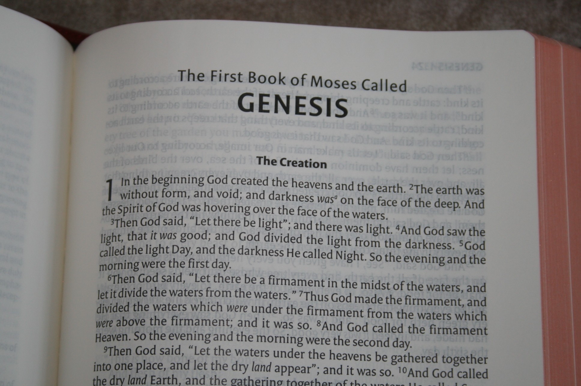
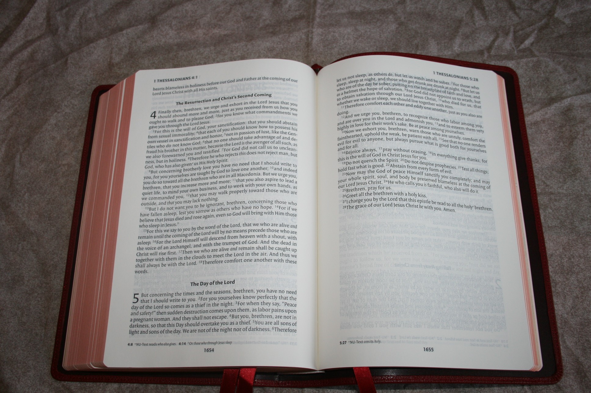
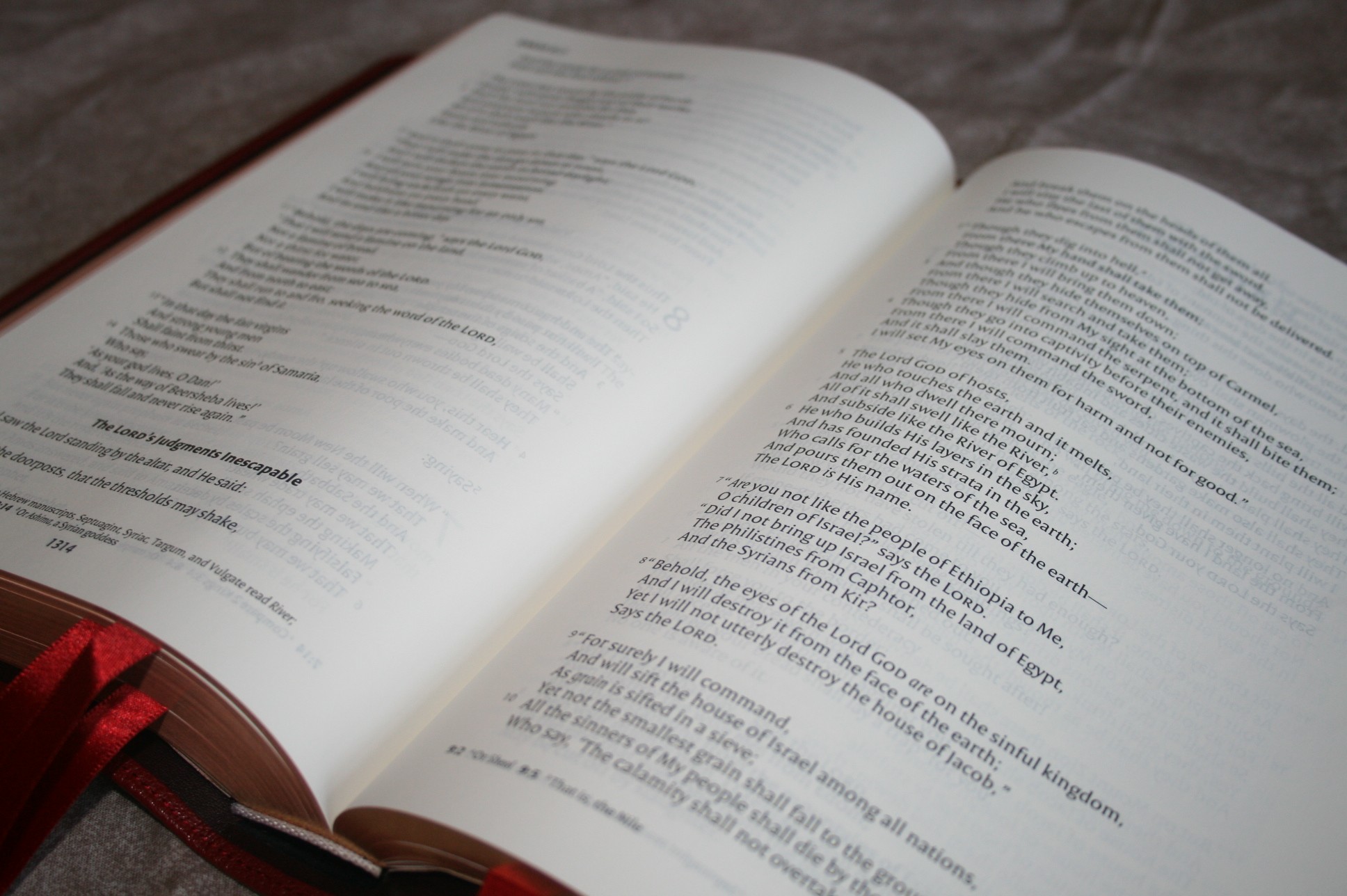
- Single-column paragraph
- Translation notes
- Concordance
- 16 pages for notes
- 8 pages of maps
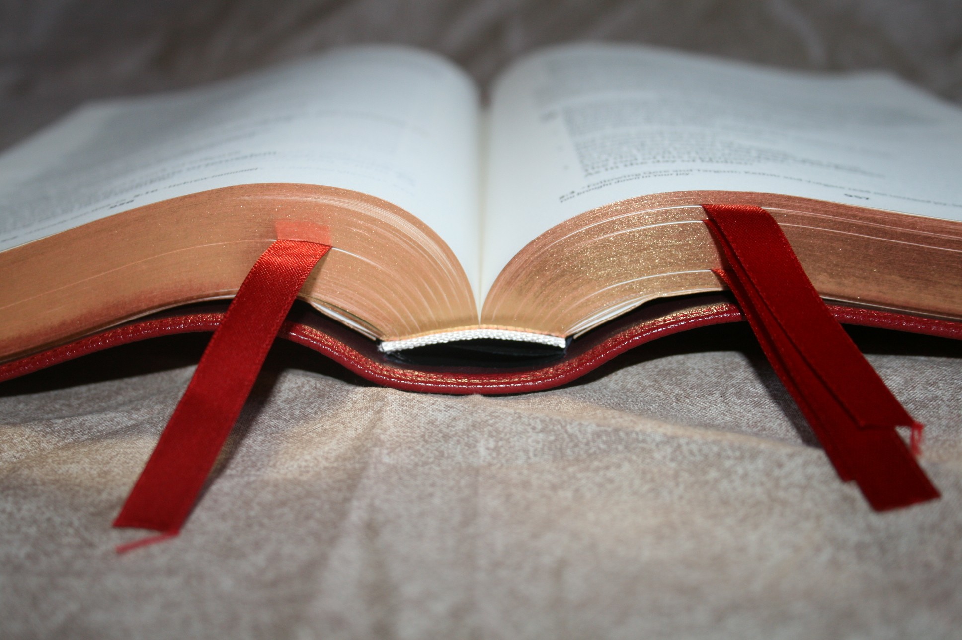
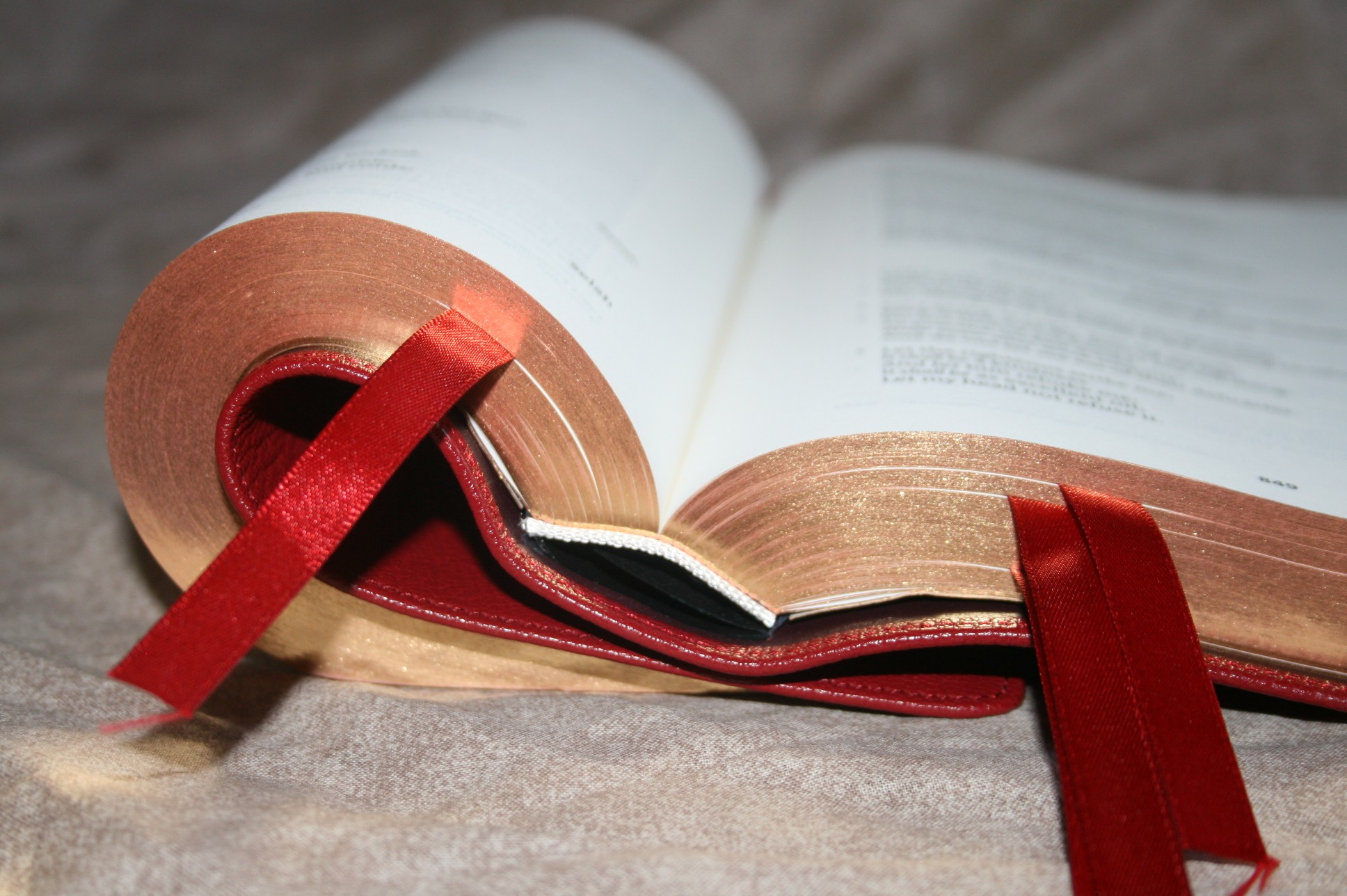
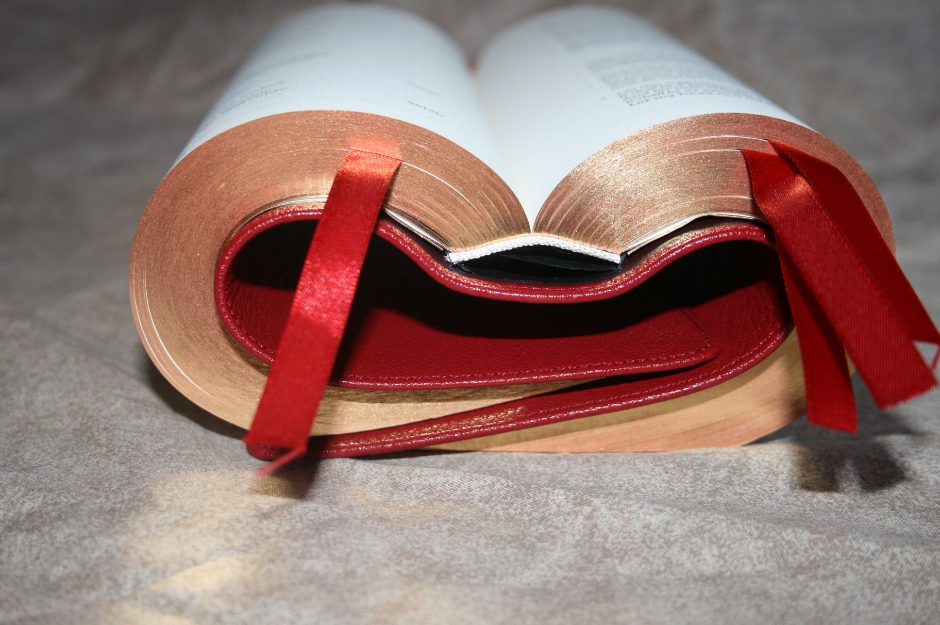
- 4 ribbons
- Art-gilt red under gold
- 9.75 x 6.5 x 1.6
- Printed and bound in the Netherlands by Jongbloed
Cover and Binding
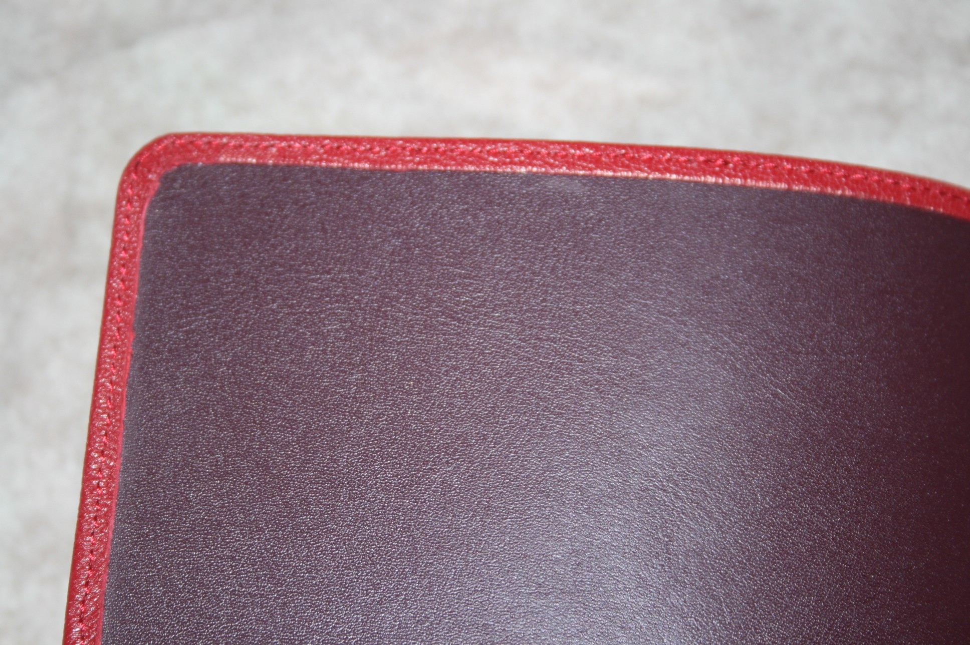
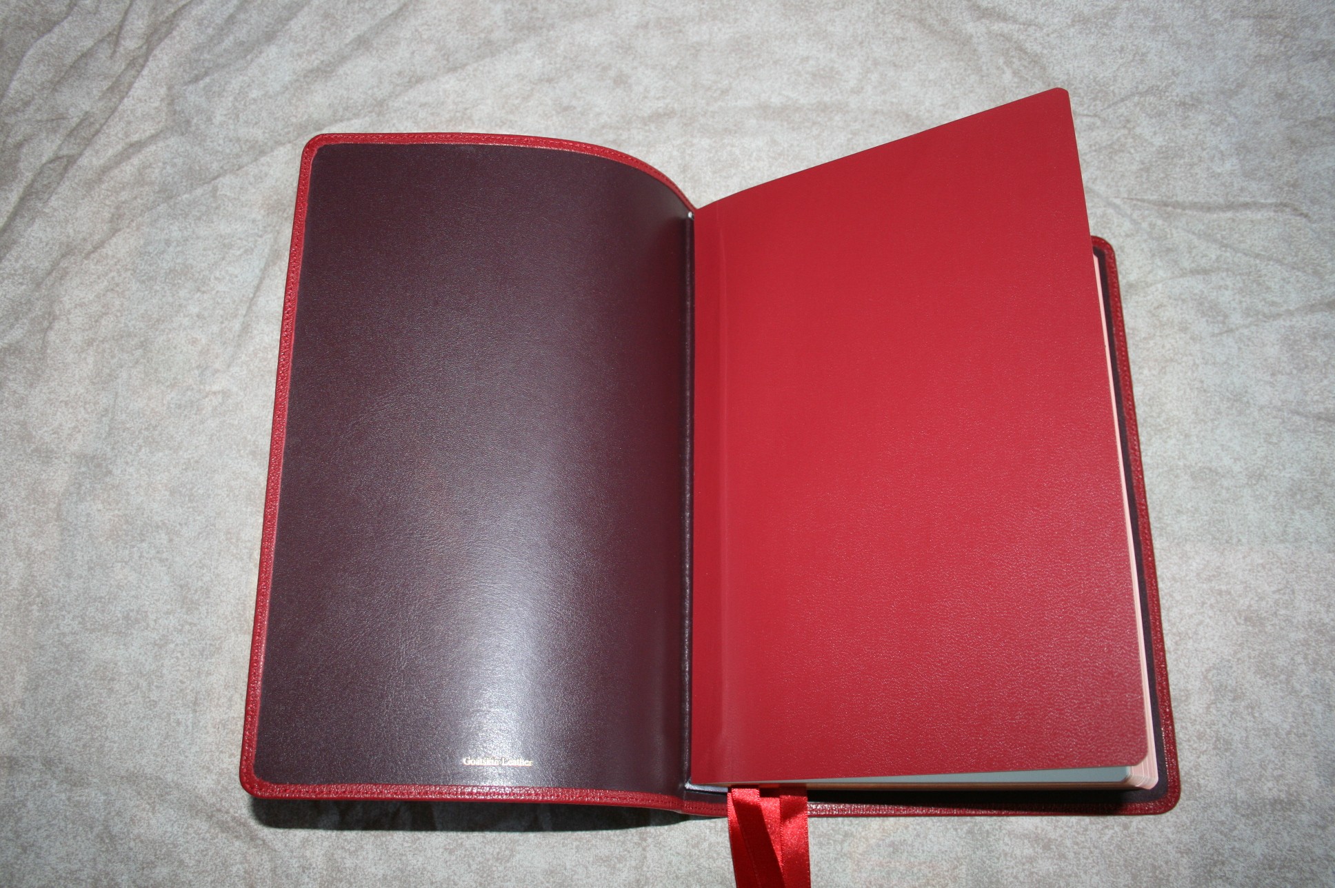
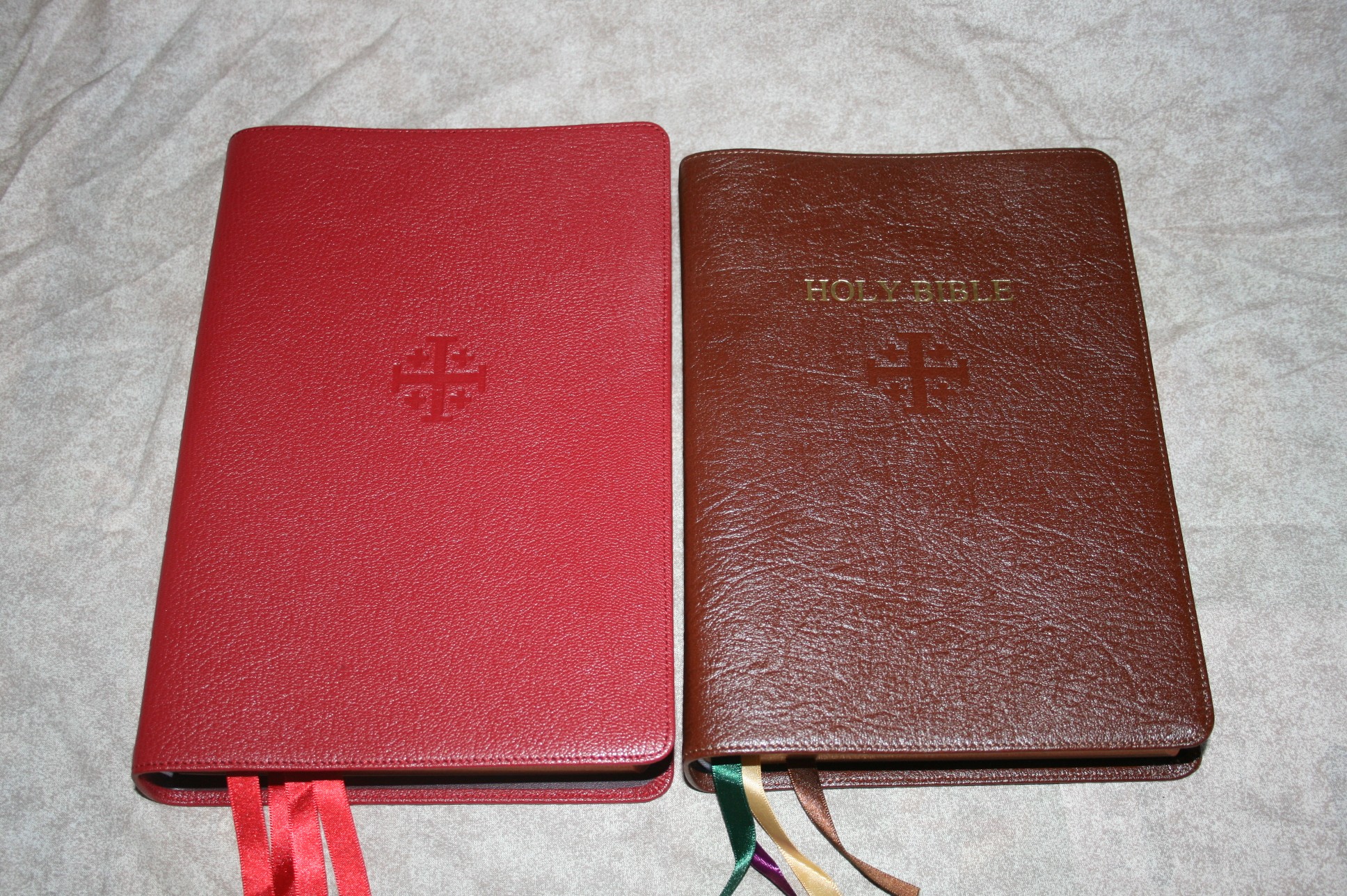
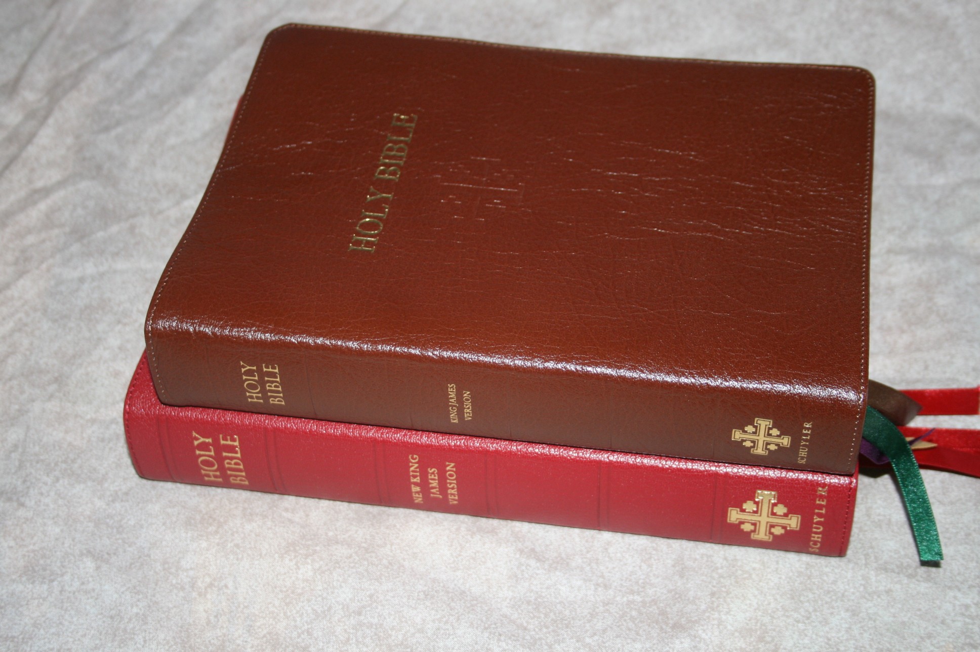
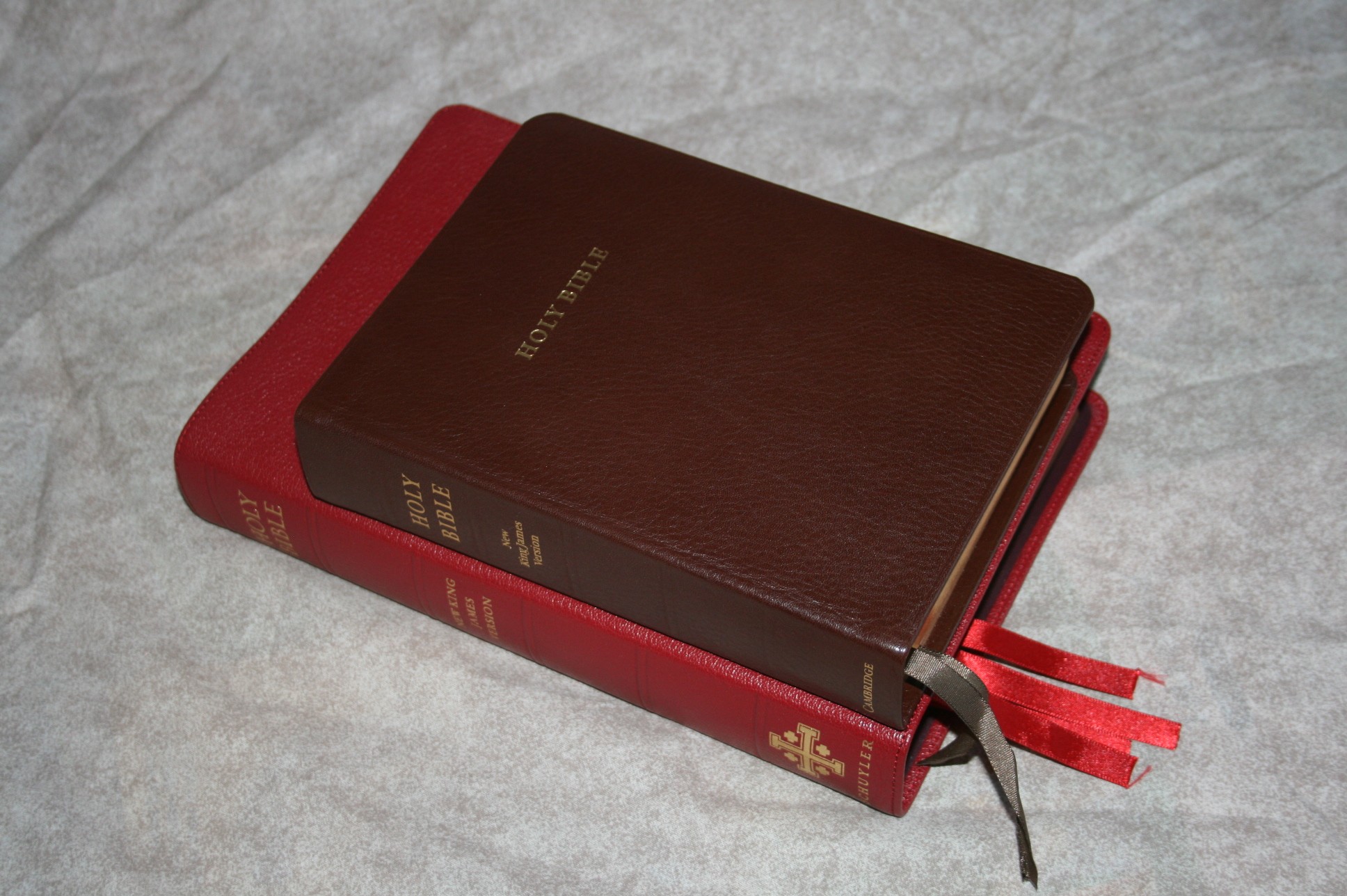
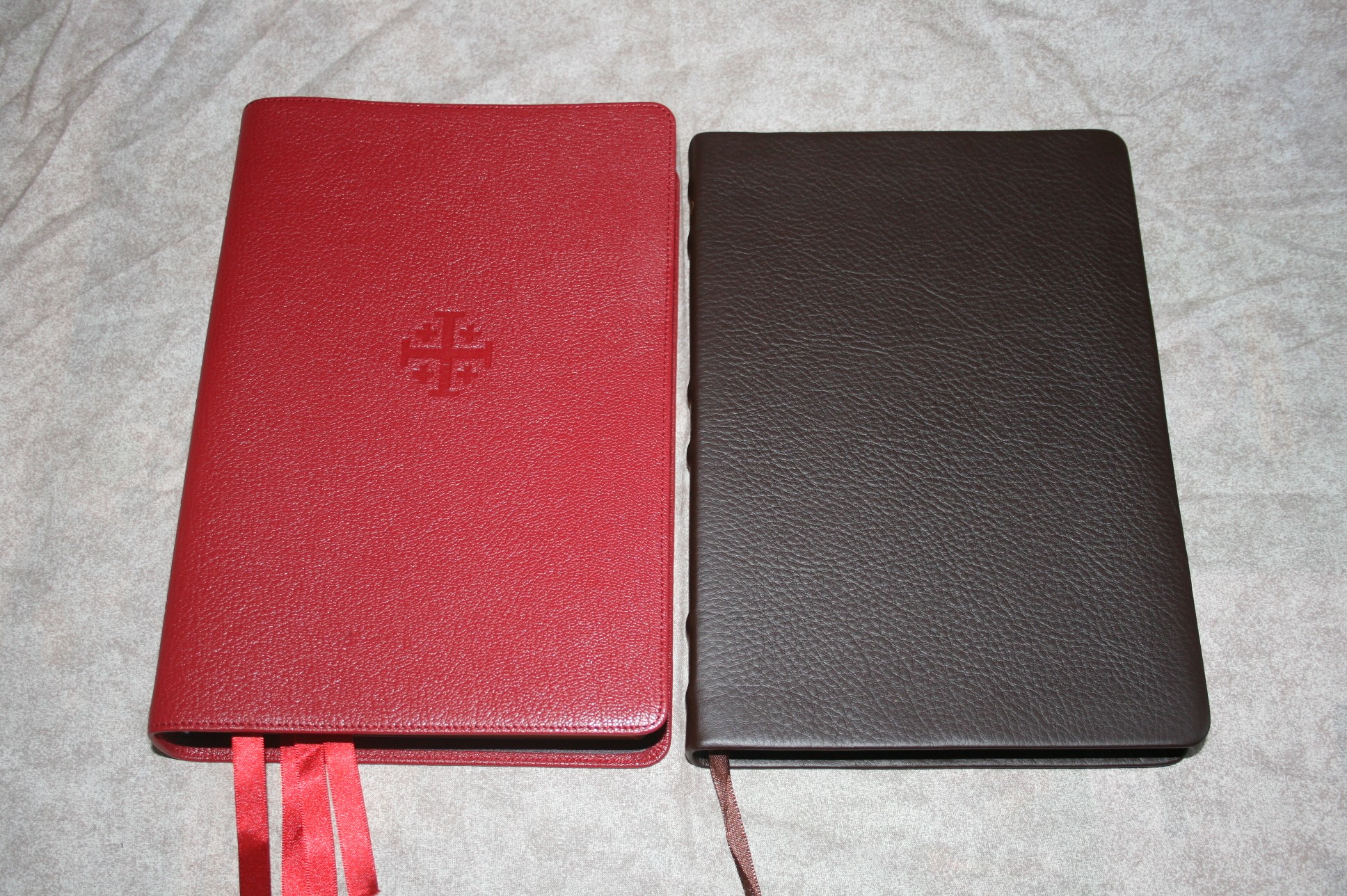
The cover is firebrick red goatskin. The color is rich but not too bright. The grain is natural and really nice. The cover is soft and flexible. It is perimeter stitched. The liner is also leather and is edge-lined as expected. It has no trouble lying flat, or any position I placed it in for that matter.

Paper and Print
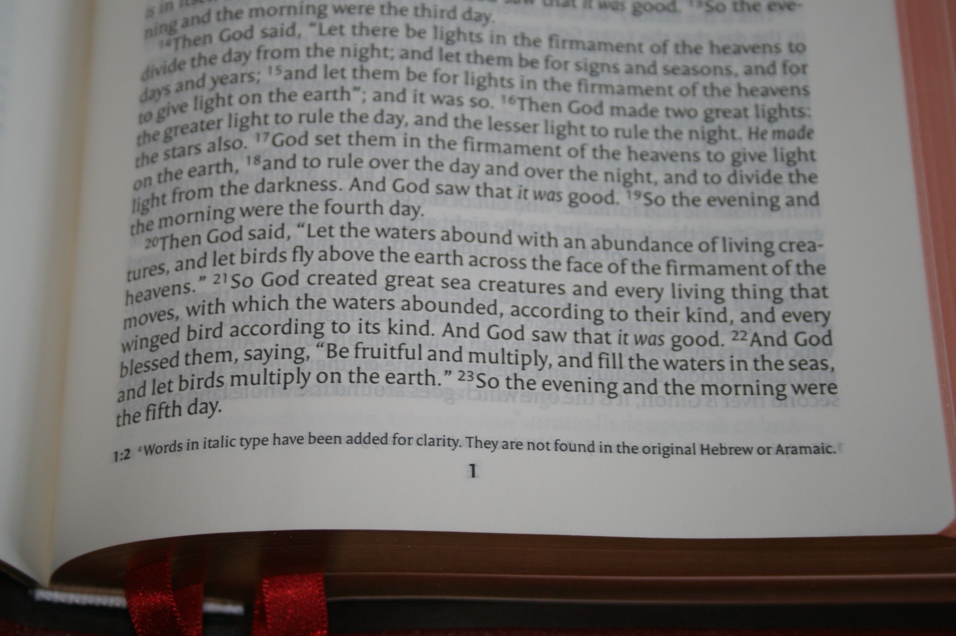
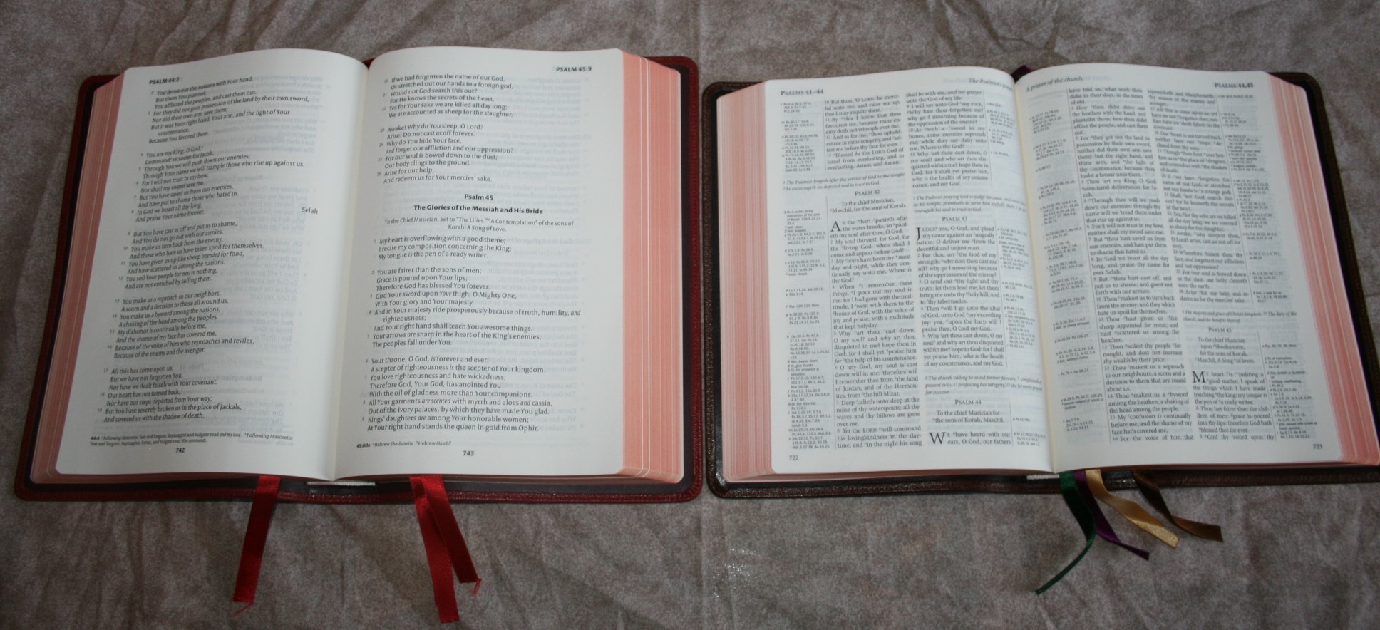
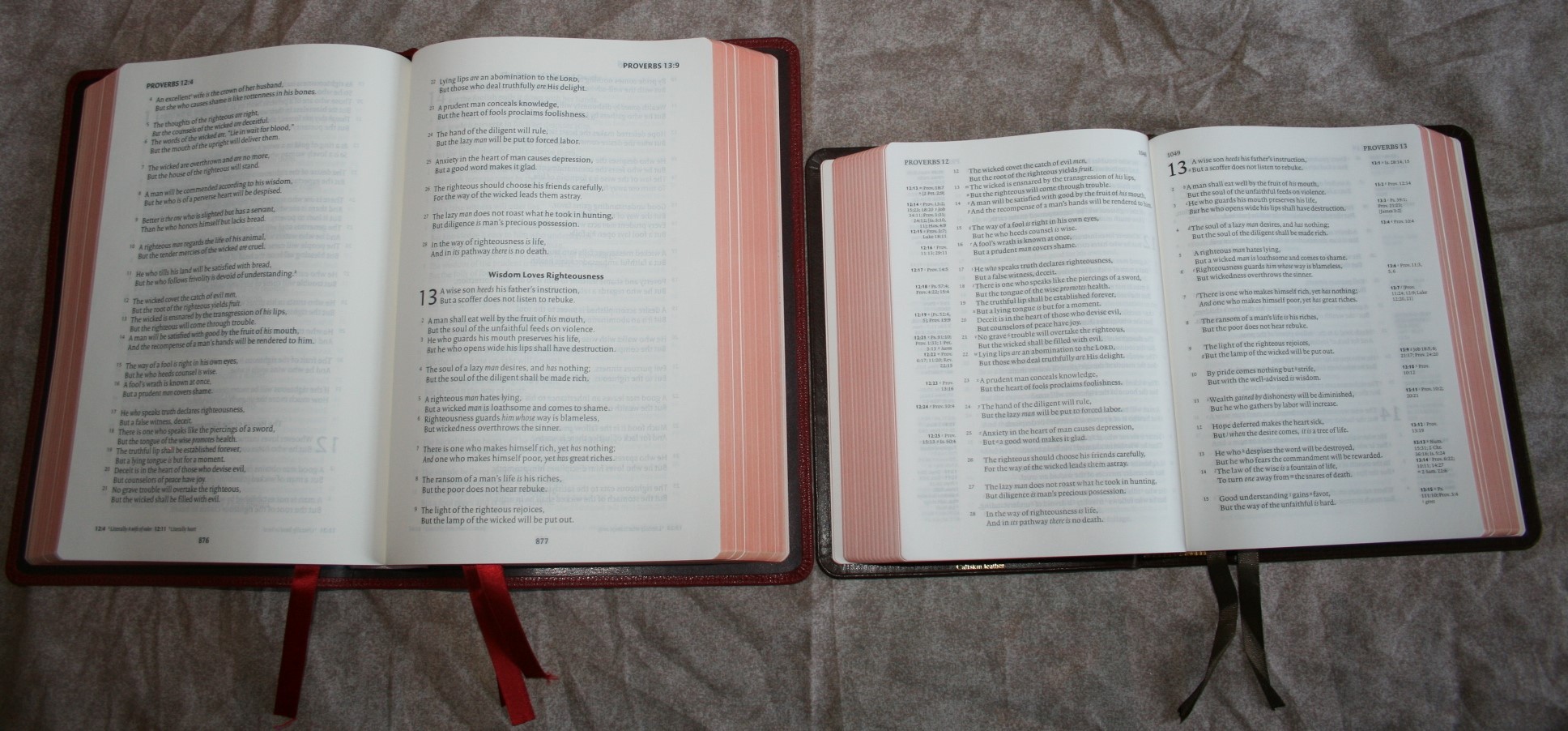
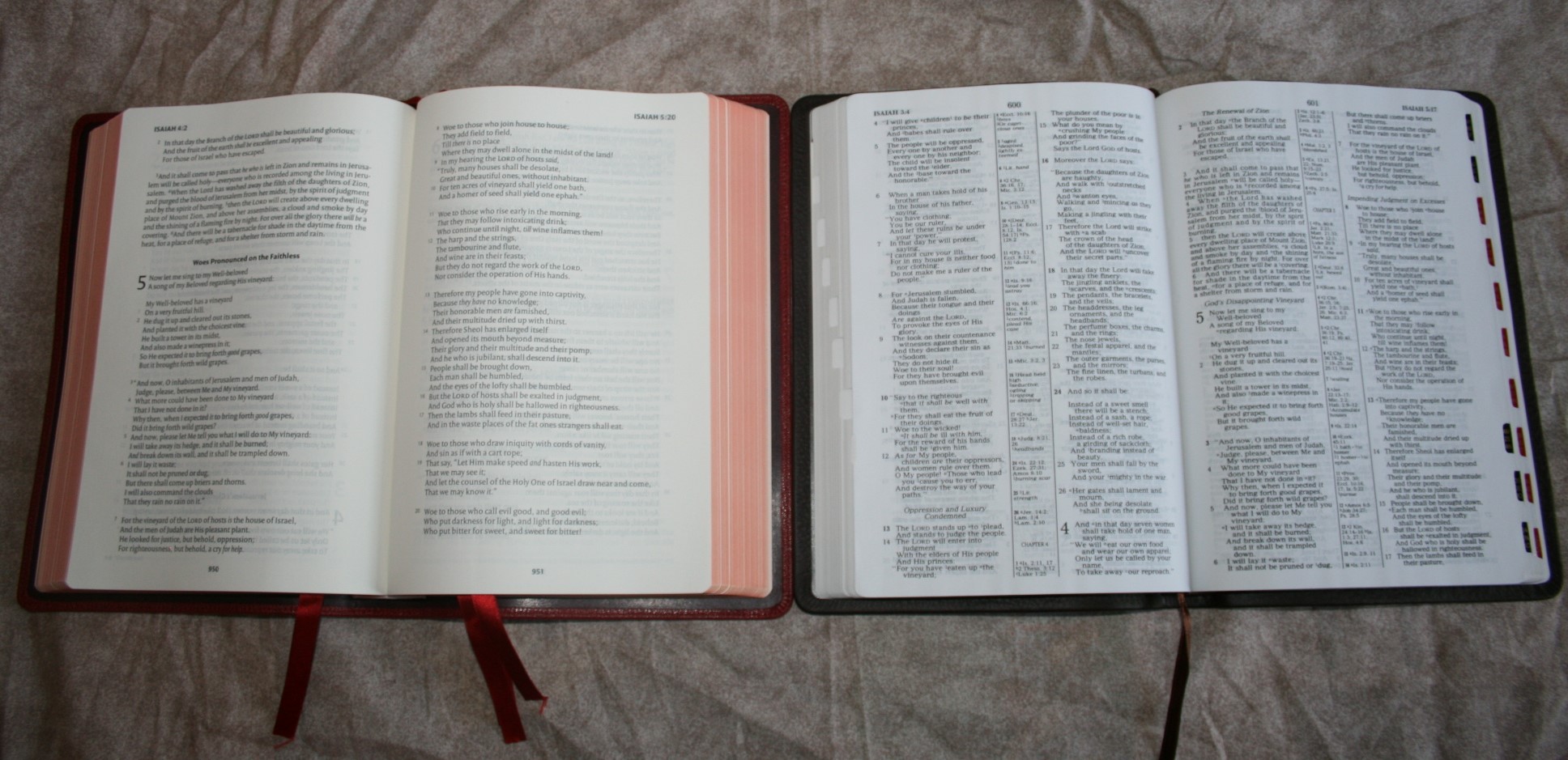
The paper is thick, 32 GSM, and has that cream tone that I love. There’s just something about that paper that has that look and feel. The print quality is outstanding. The 10.5 font is sharp and consistent throughout. The font is sans-serif. I only have one complaint- the line-matching is incomplete. Most pages have it; and they are a joy to read. The pages that do not have it is noticeable and kind of stands out because the rest of the text has it. It’s still easy enough to read, but the lack of line-matching looks out of place and took me out of the reading experience a few times until I got used to it.
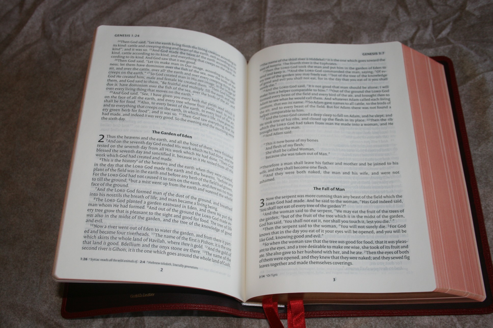
Layout
This is a single-column paragraph format. Poetry is set to verse and OT quotes in the NT are offset. Section headings are bold and centered. The section headings only appear at the beginning of a chapter, so there are no distractions within the text.


Notes and References
The standard NKJV footnotes are placed in the footer and are keyed to the text with letters. The NKJV has my favorite translation notes because it gives the textual variants and tells you which manuscripts they refer to. It uses NU for Nestle-Aland and United Bible Societies 4th edition Greek texts, and M for the Majority Text. Other notes include the Septuagint, Vulgate, Masoretic, Bomberg, Targum, Syriac, Theodotion, and maybe even a few others. Notes also include weights and measures, alternate names for places and people, referenced passages, parallel passages, OT quotes, and alternate renderings in Hebrew and Greek. The notes are easy to use and are placed out of the way so they’re not distracting.
Helps
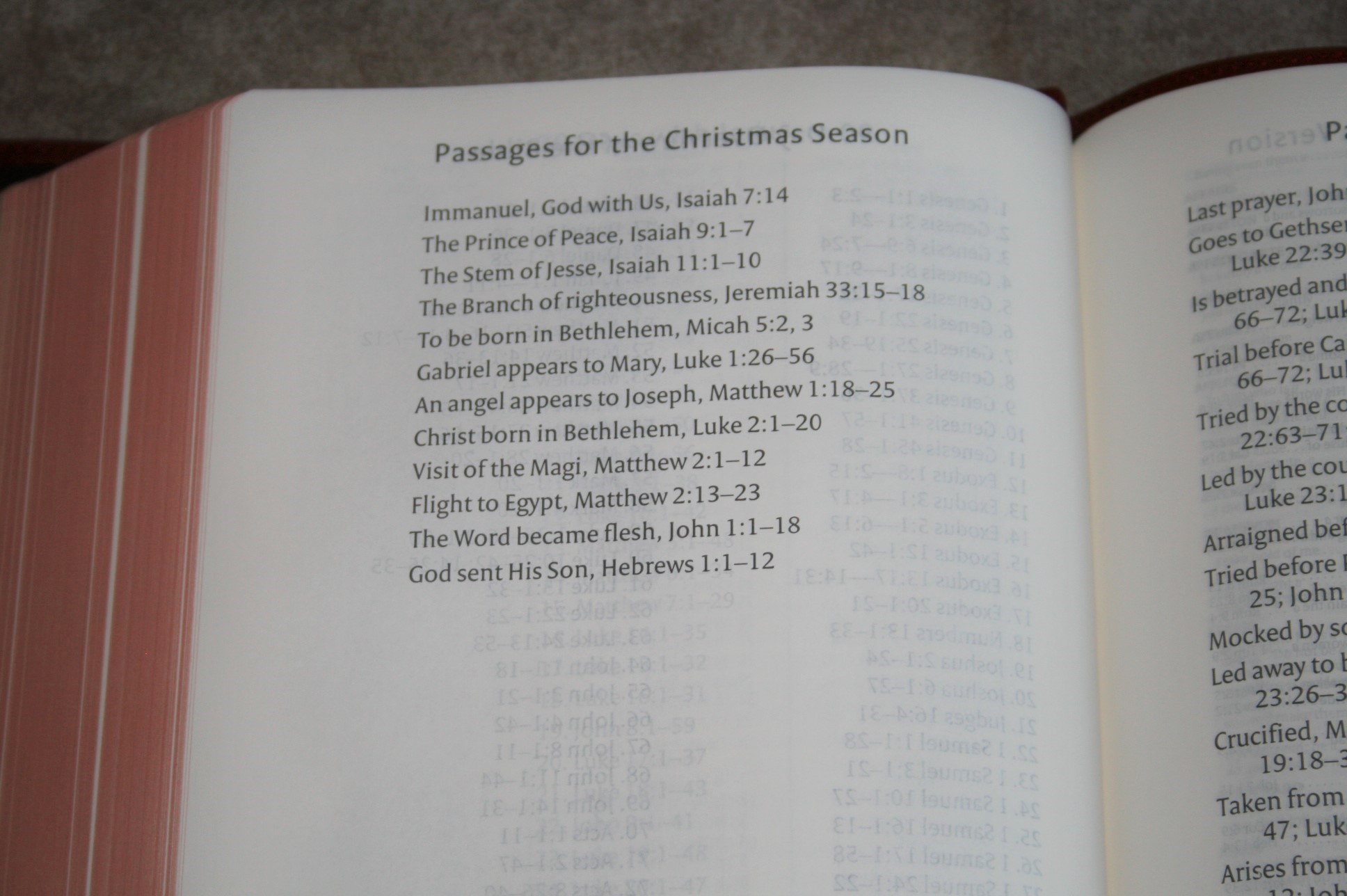
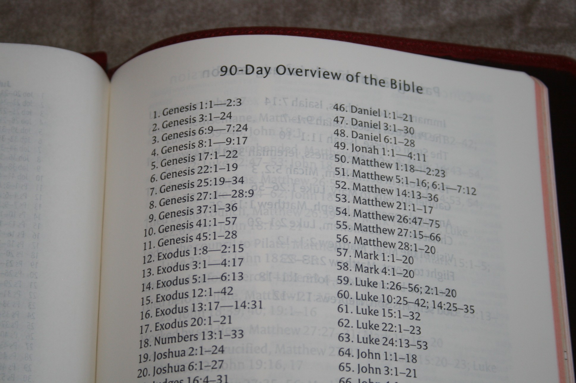
There are a few helps in the back. Nothing for serious study, but the sections for Christmas and Easter might be helpful for sermon prep and personal study.
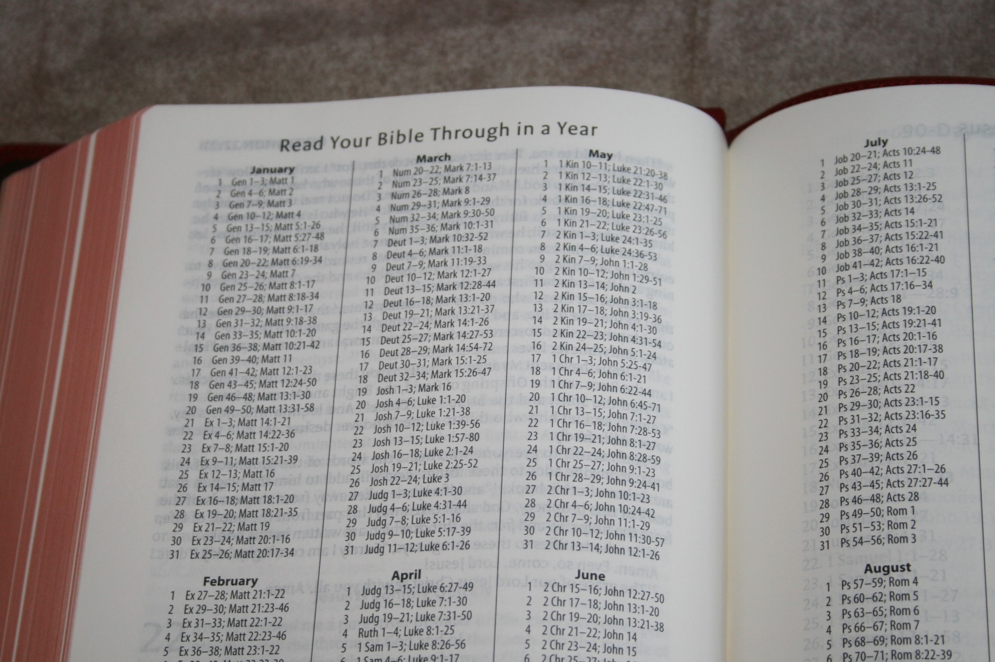
- Read the Bible Through in a Year – one reading from the OT and one from the NT each day
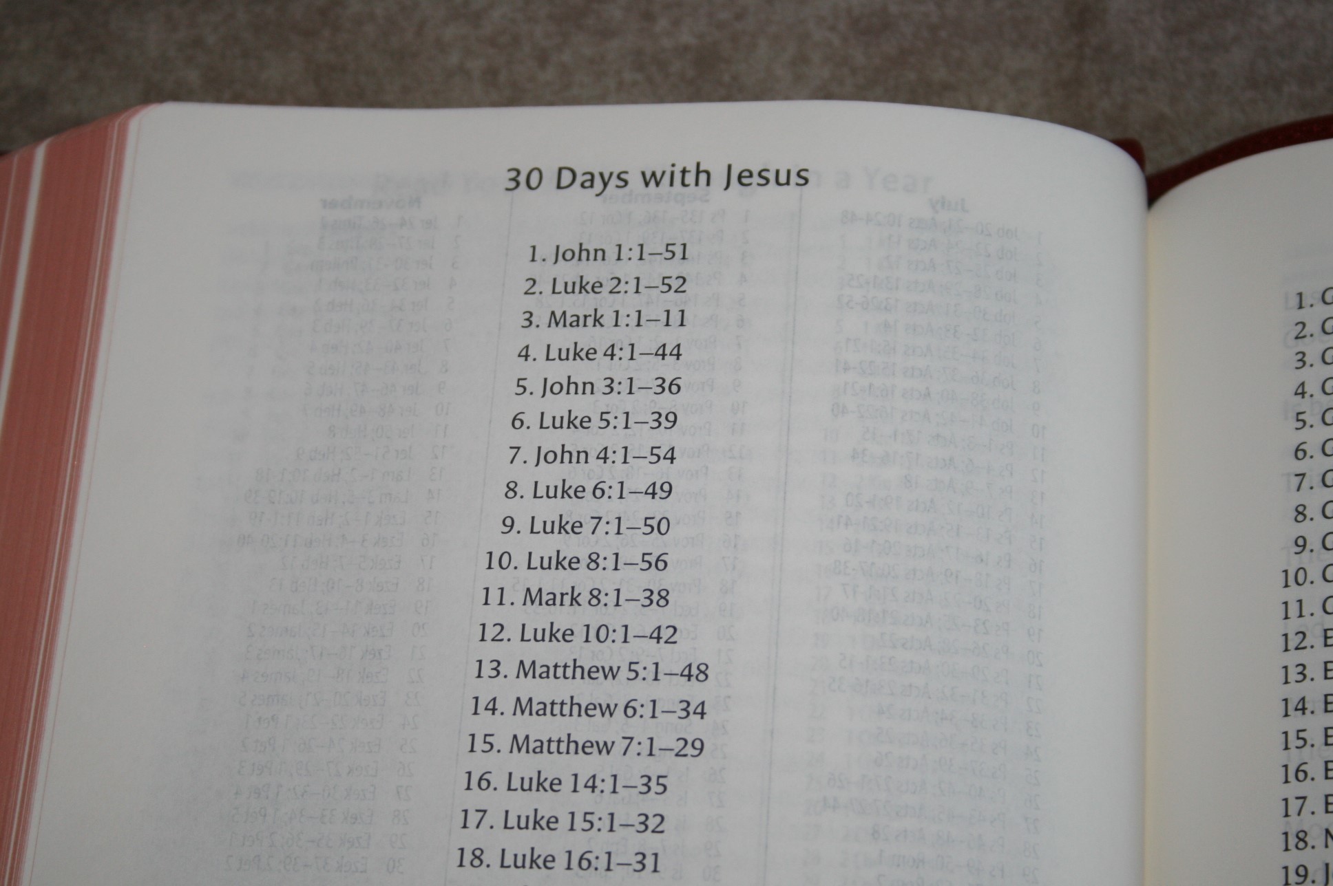
- 30 days with Jesus
- 90-Day Overview of the Bible
- Passages for the Christmas Season
- Passages for the Easter Season
- 16 pages for notes.

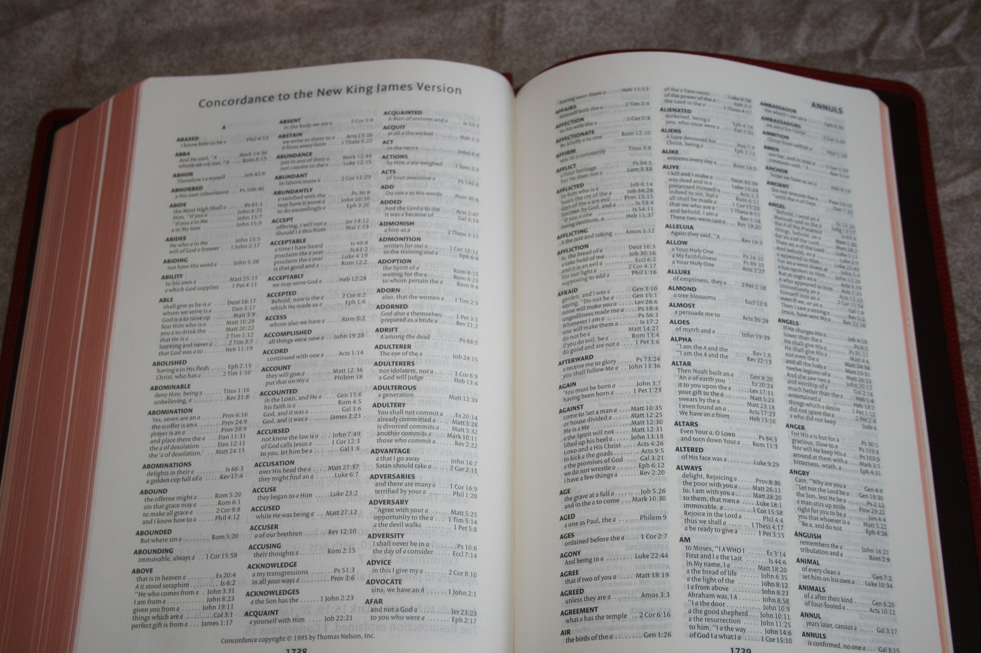
Concordance
The concordance is 61 pages with three columns per page. It’s not the largest concordance but it does have more entries that I expected. There are 38 entries for God.
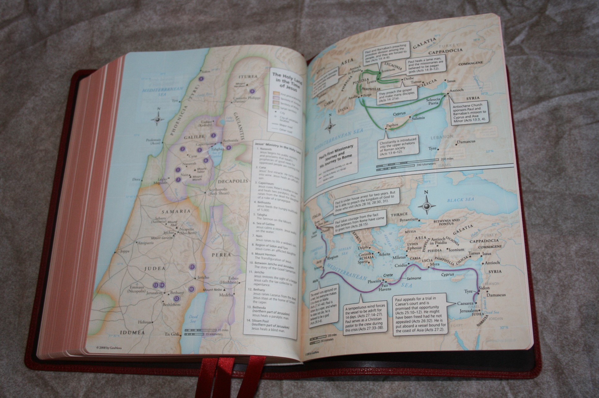
Maps
There are 8 pages of full-color maps. There isn’t an index, but they are labeled well. The paper isn’t the heavy card-stock but it is thicker than the regular Bible paper and non-glossy. I prefer this to the glossy paper.
Ribbons
There are four red ribbons. They’re the same style and size as the Schuyler KJV ribbons. Unlike the KJV, which as multicolor, these are all the same red. I would have preferred multiple colors as they are great for study and teaching/preaching. Still, having four ribbons is awesome. They are wide and definitely long enough.
How I used it
Reading
I really enjoyed reading this one. I read from it while carrying it around my backyard, sitting under a tree, sitting in the car, standing in various rooms in the house, and sitting in my favorite chair. I had no trouble reading in every light that I tried. I usually held it with two hands but sometimes I held it with one hand and let it drape across my arm. What I liked most about reading it is the font, the paper, and the fact that there are no real distractions. I also enjoy reading the Clarion, but I have to look at every note. This one does have the notes, but I don’t find myself keying in on them. There are headings at the beginning of each chapter, but none throughout the chapter. It can feel a little large and heavy though. Reading is my favorite use for this Bible.
Study
The only study tools in it are translation notes and a concordance. I got a lot of use out of them but I always found that I needed cross references. I would sometimes want to reach for another Bible. I do most of my study sitting at a table where I have room for other tools and I put them to use a lot during study with this Bible. The text itself was a joy to study from. I didn’t try to mark in it but I don’t think this would be a problem. There isn’t a lot of help for sermon or classroom prep, but it is a good Bible to use for the text portion of your study and prep-work.
Carry
This Bible much larger and heavier than I expected. I carried it almost every time we went somewhere. I had no trouble using it on the go, but it is on the large and heavy side and it always reminded me of that.
Preaching
I have mixed feelings about preaching from this Bible. On one hand the font is easy to read and the paper is easy to turn. It looks great under the lighting that we have. The references weren’t too difficult to see because the verse numbers are large enough to spot. It did take an extra second or two but it wasn’t bad. Where I had the most trouble was the width of the paragraphs. I stand with the Bible on the left side of the pulpit and my notes on the right. This places the Bible at a slight angle I had trouble knowing which line to read when I got back to the beginning of a line.
Conclusion
This Bible has been a joy to read. I’ve used it as my primary reading Bible for the past few weeks and it will continue to be my primary reading Bible for quite some time. My favorite features are the font and the paper. It is a little larger and heavier than I would have liked, but it’s not too heavy or too large. Its size is still manageable. I found it especially suited for reading and study. The Schuyler NKJV is the most elegant NKJV available.
The Schuyler NKJV is available in black, brown marble, imperial blue, and firebrick red.
Click here to buy: Schuyler NKJV
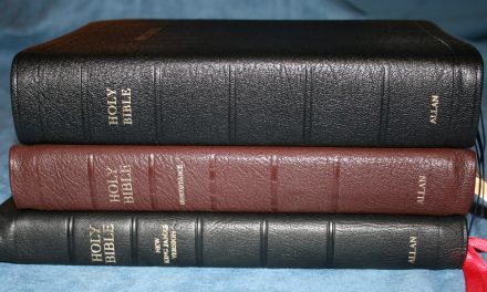
Comparisons
Here are a few comparisons between the Schuyler KJV, Cambridge Clarion NKJV, and Holman Large Print Ultrathin NKJV (the same text-block as the Allan)


Interesting that you noticed troubles with the paragraphed format while preaching, Randy. That lines up with my experience. While it is true that verse-by-verse format may interrupt the flow of thought for a reading Bible (though I, at least, haven’t had much trouble with that), when I’m preaching, the interruption is actually beneficial. I’m not trying to figure out the text. I’m trying to locate specific passages within it.
Hi Matthew. Thanks for commenting. When I’m reading from the Bible I like to place my finger on the last verse I’m going to read so I don’t have to look back at my notes to know how far to read. With paragraph format I have to search for the end of the passage, which means I’m searching for two verses – the first and last. The references in this one are fairly easy to see, but it still takes extra time and I can lose my train of thought (and that’s not hard to do). I hadn’t thought of it the way you put it, but you’re exactly right- the verse-by-verse interruption is beneficial for preaching.
I prefer verses separated for preaching as well. I do like paragraph style for devotional reading though. I like the Fire Brick Red color. Do you think the quality is as good as the Clarions?
Hi Ryan. My Clarions are calfskin, so I can’t compare with the goatskin editions as far as the cover. For paper there’s no contest – the Schuyler wins hands down. The Clarion is easier to hold and read for long periods of time, but again, that’s my calfskin edition that lays flat in my hand. The Clarion is a more complete Bible with its references. Verses are easier to find in the Schuyler, but that’s to be expected since the font is so much larger and bolder. I like the firebrick red a lot better than I thought I would. It looks even better in person.
Dear Randy:
I’m with you about verses being useful for study. I also have trouble finding my place without some reference point. I recently re-read Milton’s great, Paradise Lost, no verse references, but each line is numbered. I myself need this kind of aid in comparing passages with passages. I think this is why we have chapters and verses, they help with study and memorization.
Yours in Christ
Don Denison
Randy,
I am looking to purchase a New King James bible. I need something with readability but also the ability to take notes. Which would you recommend the most of these options, this NKJV Schuyler, the Cambridge Clarion NKJV, or the Cambridge NKJV wide margin? (I am poor and can only afford to purchase one haha).
sincerely,
Shawn
Hi Shaw, For notes the best choice is the Cambridge wide margin. It’s about the same size as the Schuyler but has a much smaller text (about 7.5). It has references and translation notes and plenty of writing space. The Clarion is the best for just reading and carry if you want the smaller size, but for taking notes the wide margin is the only one I would consider.