R. L. Allan and Son’s is a Scottish company that produces extremely high quality specialty Bibles. R. L. Allan holds the Royal License to publish the Authorized Version (KJV) in Scotland. The Highland Goatskin KJV Longprimer, designed and typeset in 1952 by Oxford University Press in New York, is Allan’s signature Bible.
The Longprimer is a chain reference topical study Bible. Its features are exactly what I’ve been longing for. I’ve been on a quest to find the perfect size font with the perfect amount of boldness. I wanted the best paper and center-column references that included translation notes. I wanted a high-quality binding. I wanted notebook paper in the back to write on. And, I wanted a specific size- not too big, not too small. I had very little hope of finding my list of features in any one Bible. The Longprimer delivered that list of features even better that I could have imagined.
Features
- 10/11 bold font
- Black Letter
- Self-pronouncing Text
- Opaque paper
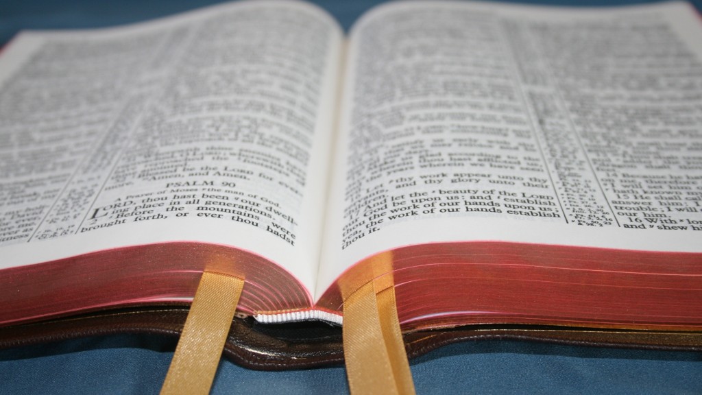
- Red Under Gold (Art Gilt)
- Smyth-sewn
- Overcasting
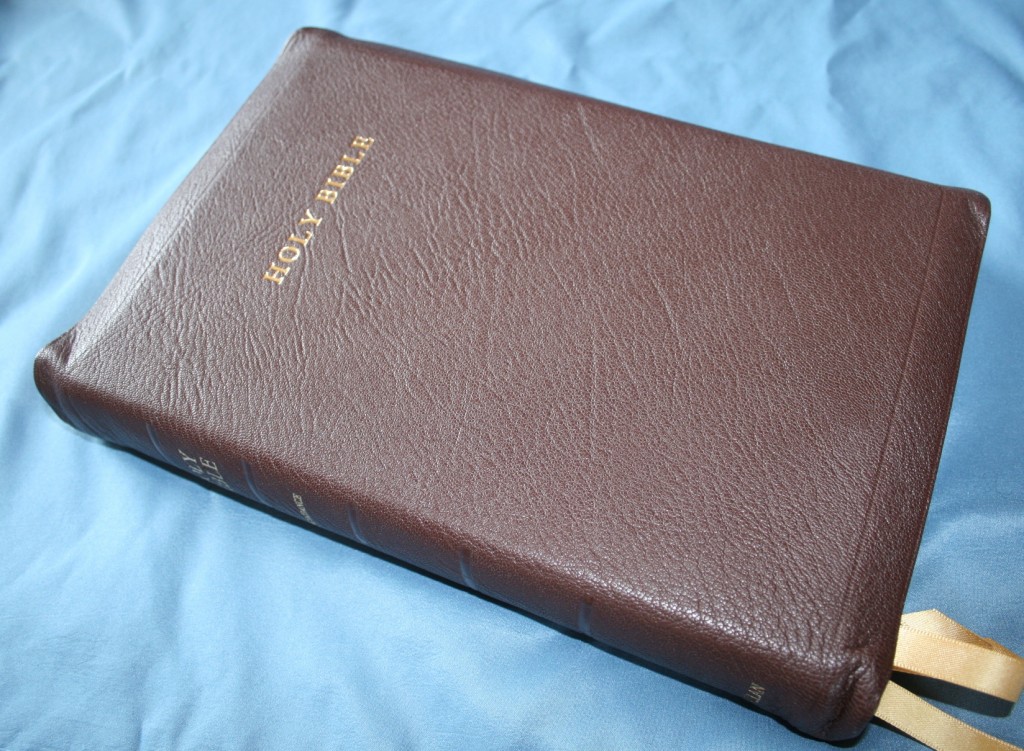
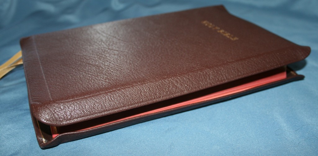
- Natural Highland Goatskin
- Full Yapp
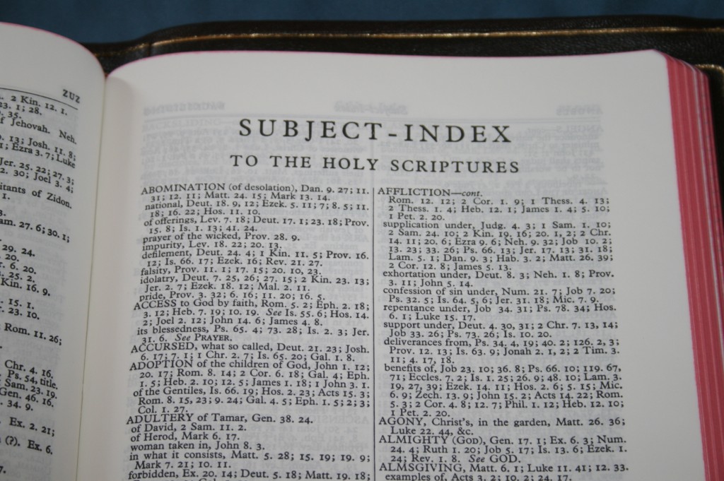
- 37 page Subject Index
- 43 page Index of Proper Names
- 161 page Concordance
- Oxford Cross References (100,000)
- 16 pages of Oxford Maps
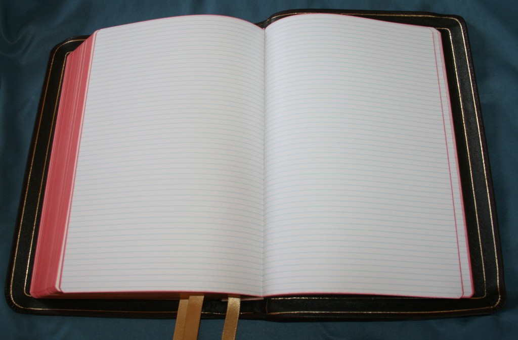
- 32 pages of notebook paper
- 3 honey gold ribbons
- 8.75×6(plus yapp)×1.5 with .5 outside margin
Cover and Binding
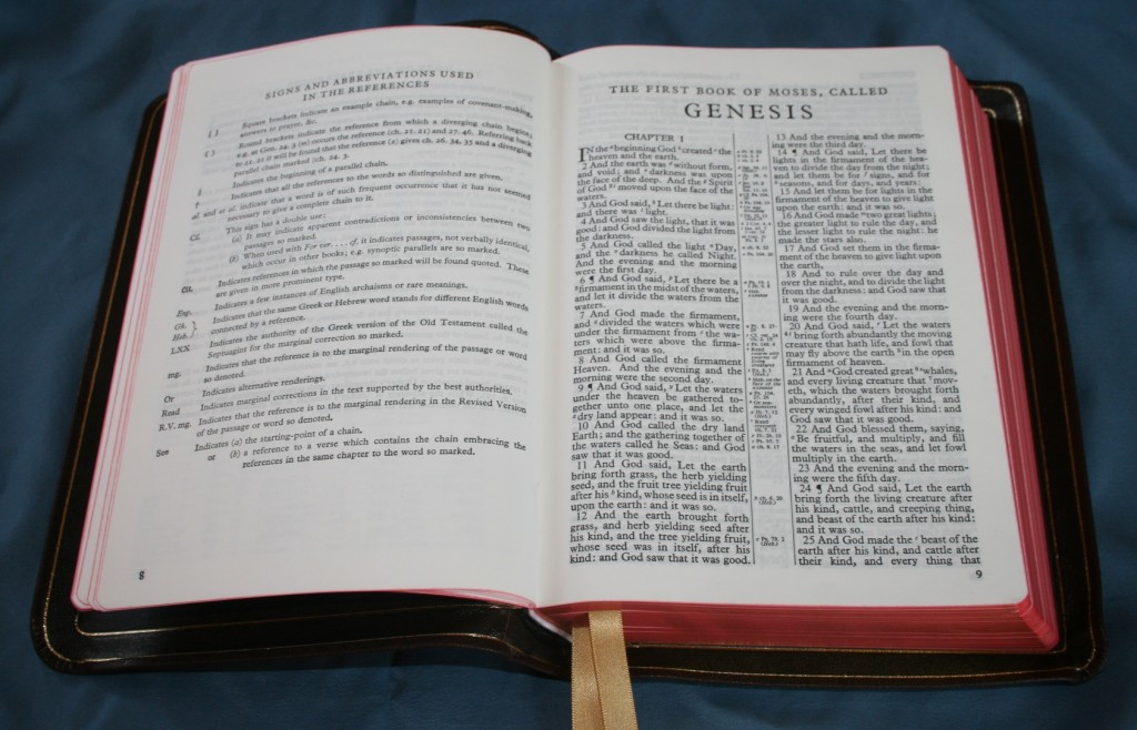
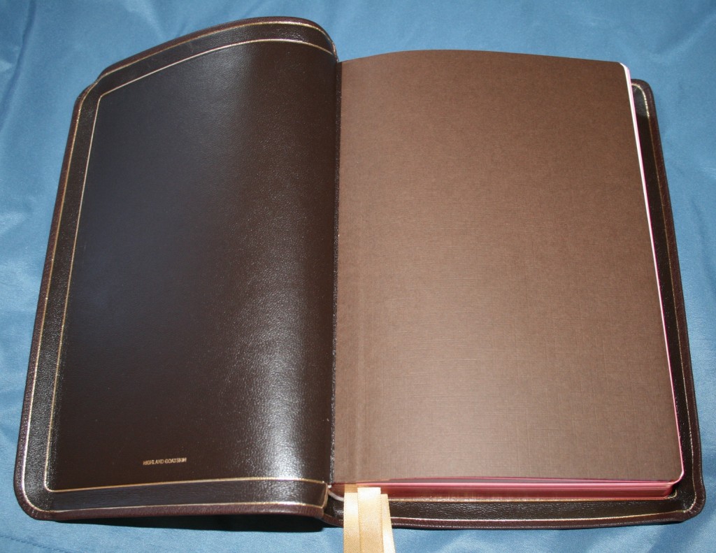
The brown highland goatskin is my favorite (I’m reviewing model 53 BR), although the black looks just as amazing. The cover is soft and the sewn binding is superb. One of my tests is to open the Bible, lay it on the table, and step back. My Bible must stay open where I left it. I must be able to read my Bible without having to hold it open to the page I’m reading. The Longprimer lays open so naturally that it has no trouble staying open the Genesis 1:1 straight out of the box.
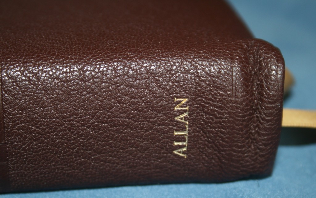
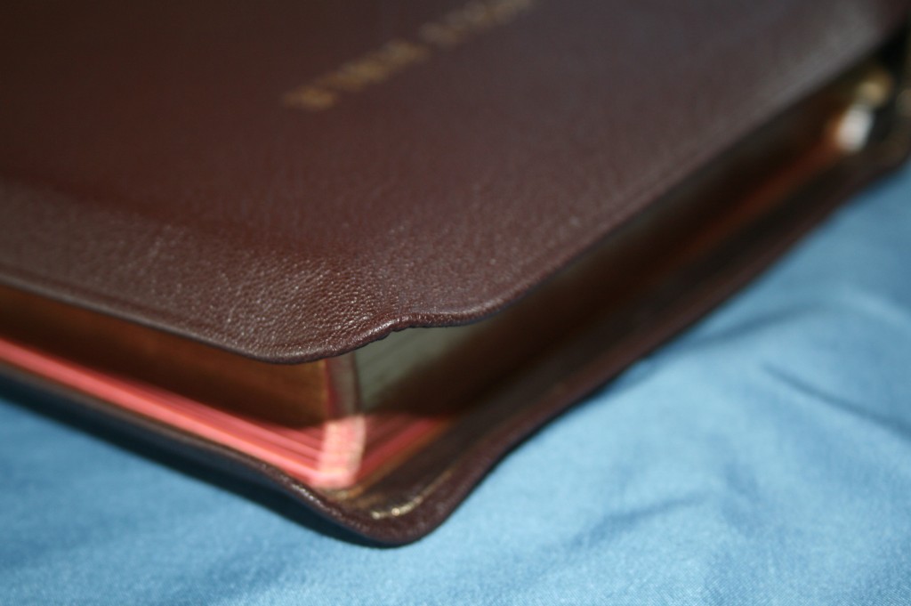
The cover of an Allan goatskin Bible is authentic animal skin in every way- from the grain to scares from cuts. The covers of most Bibles have a simulated grain (pressed into a mold or simulated in some other way). The grain in Allan Bibles is the natural grain from the animal skin, which may even include a cut from a natural encounter (barbed wire fence, fight, etc.). This shows the true authentic nature of the cover and is not considered a defect. The natural skin cover adds to the beauty and uniqueness of Allan Bibles. The grain of the brown edition is fantastic. The inside cover is also leather-lined. This is the softest and most flexible cover I own.
There are two gold lines of edging, known as gilt-lines, inside the cover- one that outlines the cover and another that outlines the book-block. These lines add to the elegance of the cover and look very nice.
The binding is Smyth sewn (pronounced with a long i, as in knife). It has an extra feature that most Bibles today don’t have- a feature known as Overcasting. This is an extra line of stitching in the front and the back of the Bible. Also, there is a flap of leather that is glued into the inside front and back papers. This helps take the stress off the binding.
The Longprimer has an almost full yapp. This is where the leather hangs over the edges of the paper. With full yapp, the front and back covers will overlap the book-block and touch each other (think of a zippered cover, only without the zipper). The yapp allows the leather to protect the paper.
Paper
The paper acid-free and thin, but still opaque. It’s thinner than I expected judging from the pictures I’ve seen. The paper isn’t at all shiny, and has a faint cream tone (more noticeable when compared to other Bibles), making it easy on the eyes.
Typography
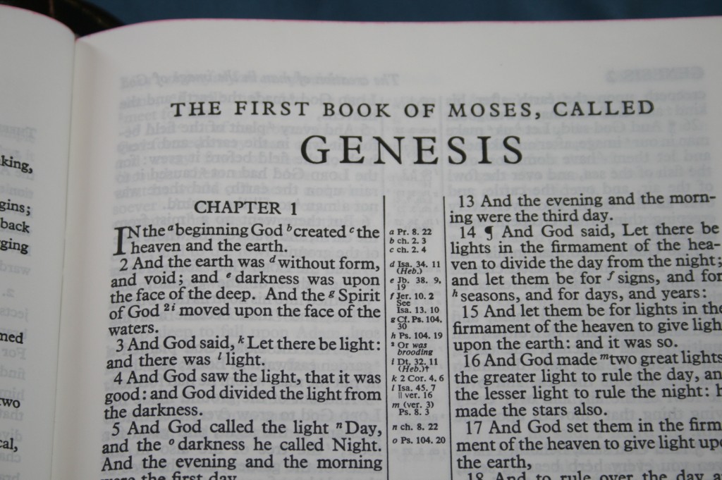
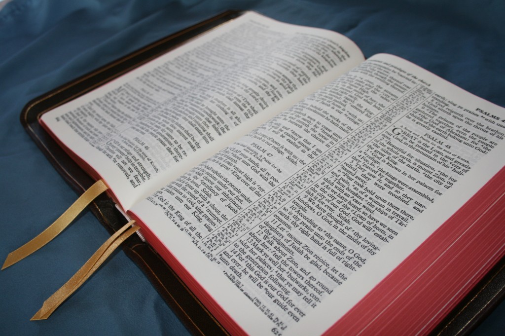
The fonts are perfect. They are 10-point and very bold and readable. I would expect this level of boldness to cause ghosting, but the ghosting is very minimal. The fonts are beautiful and the text is self-pronouncing. With this paper and font combination I can read for hours with little to no eye-strain.
The Longprimer does not have the added words in italics. I’m OK with this because translators have to add words to convey meaning in every translation. If not, then it’s a transliteration, and the KJV is not a transliteration. For me, italics can sometimes be more distracting than helpful, so the Longprimer has a better text for reading. In Bibles that have italics I’ve found words in italics that are actually in the Greek or Hebrew, and I’ve found words that are not in italics but are also not in the Greek or Hebrew, so they’re not always accurate. I do like my Bibles to have italics, but I don’t consider it a deal-breaker if it doesn’t because I would go to the Greek or Hebrew anyway.
There are 32 pages of lined paper in the back for writing notes. The lines are much closer together than regular notebook paper, and considering that I write very small I should be able to get lots of notes in there. I really like this because I can make the Longprimer my personal study Bible. This is a feature I would like to see become a standard in Bibles.
I love red under gold (art gilt edges). I like the copper look that it gives (and I adore the blue under gold of the blue limited edition).
Ribbons
There are three honey-gold ribbons that are wider than the average Bible ribbon. They are long enough to pull to the corner and open the Bible with no trouble. I like that there are three. I’ve come to depend on my ribbon markers for reading and study, so having three ribbons will be very helpful.
Center-column references and notes
There are 100,000 references that are keyed to the text, meaning that the text has letters and numbers that correspond to the references. There are also textual notes- notes about the Greek or Hebrew manuscripts, and translation notes. The center-column also includes dates, which is really helpful for keeping the chronology straight.
Index of Proper Names
Every name in the Bible is referenced in the Index of Proper Names. This index includes the name, explanation and information about the person, and references where that person is found. There are 43 pages of proper names.
Subject Index
The 37 page Subject Index makes the Longprimer a fine topical study Bible (my favorite type of study Bible). There are many topics and each has many chain-references to study. If I were out somewhere and I wanted to discuss or study a topic, I would be glad to have the Longprimer with me.
Concordance
The 161 page concordance is one of the better concordances that I’ve used. There are 81 entries for God. Also, each verse starts on a new line and includes references to parallel verses. This makes searching the concordance easy.
Maps
I love maps in my Bible and the more the better, but I want them in full color and to be drawn as pretty as possible. The Longprimer delivers 16 pages of Oxford maps to my map-loving delight.
Conclusion
Every feature in the Longprimer is performed to an exceptional level. R. L. Allan sets the bar extremely high. For me, the Longprimer is the perfect size and weight, with the perfect size font, perfect paper, perfect features, and perfect cover. The Longprimer gets the highest marks in every category.
The Longprimer is a true masterpiece; a work of art; a Tour de force in Bible publishing. It is one of those Bibles that you buy because you want it to last a life-time. This Bible can be a life-long companion. Are they expensive? Yes. Do they last through a life-time of Bible study? Yes. Are they worth every penny? Yes. R.L. Allan’s Longprimer is one of those Bibles that you cherish for life. I don’t ever want to be without my Longprimer.
Click here to buy from Bibles-Direct.com
Click here to buy from EvangelicalBible.com
Bibles-Direct provided this free review copy. I was not required to write a positive review- only an honest review.










Hello,
I am in agreement with all that you have said about the KJV Longprimer. Am quite comfortable and adaptable with a variety of fonts and sizes, but the Longprimer does have a very distinctive, comfortable, and quite pleasing appearance to its text. This is what stands out most to me and some of that may be related to not having the italicized words, although italics would be my preference as well not having pronunciation for proper words. But this was known before purchase. The only negatives are the occasional broken character or an overly bold reference character that is misleading, i.e. an “s” that looks more like an “8”. These are very infrequent occurrences.
I did have an issue with my example, which I forego to mention except to say it was a very rare happening. A phone call to Evangelical Bible promptly resolved it to my satisfaction concluding the very cordial conversation. Their customer service was outstanding and I would have been remiss not to mention it.
The paper thickness (don’t know about the paper weight) is about the same as the LCBP #115, #180, #355 as well as the TBS Westminster. 100 sheets (200 pages) has the following average thickness.
LCBP = .132 inch; TBS Westminster = .132 inch; Longprimer = .138 inch.
While the paper of all three bibles are close to the same thickness but of difference appearance, did not see any material difference in ghosting. The lined pages for notes in the Longprimer are much thicker than the bible paper (~.0014 inch) being about .0024 inch thick each page.
I would say that the text block in the Longprimer is of easily better overall quality than my Clarendon, particularly the printing. I would rate the cover and its workmanship better on the Clarendon. The paper on the Clarendon is much thinner, and more delicate to handle, (.096 inch average for 100 sheets) and has more significant ghosting. They both make a nice complementary pair. Like them both.
The red dye on the edges does infringe upon the page surfaces. I do not find this objectionable and suspect this contributes to the richer red coloring of the pages when they are fanned out compared to if the dye was solely restricted to the edges only?
The size of the Longprimer is about the limit of which I feel comfortable hand holding. The weight can be a little tiring after a while. Great for reading from a desk or table.
While I did not notice it at first due to the lighting when first examining my new Longprimer, thought that it was free of any gutter cockling. Not so. It has some very light cockling in about the front 20% of the text block. Not an issue, but it does exist. I am very pleased with my example, though it be less than “perfect”!
Kindest Regards to All,
Hi John. Thanks for the paper measurements and comparisons. I’ve been tempted to try the Clarendon. I love the Longprimer. If it was the only Bible I could ever have I would be satisfied with it. I’ve also seen the ink smudges in the printing that makes an S look like an 8. It’s photocopied now, but it’s a carry-over from the days of using a printing press. Sometimes there would be too much ink and it would smear. The references are a little difficult for me to see but the text is amazing. You’re right about the red die. I love the copper tone of art-gilt edges.
I really like my Longprimer 53. I recently received a 63. At first I had some minor complaints, but I have have grown to like it much more. Oh boy is it readable! But it is big too. I still believe Schuyler makes the best KJV though, but I would still never get rid of my Allan bibles. I carry my 53 more than any of my bibles. Its almost like a thinline with a very flexible cover. I highly recommend Allan bibles!
Hi Christopher. I wondered about the size of the 63. I love the size of the 53. It’s easy to carry and handle. I agree with you about the Schuyler KJV. That’s a fine Bible. I love the clean text, and the notes and references make it a great choice for study and general use. It’s hard to beat that dark font of the Longprimer though.
It is impossible to beat the font in the 63. Its fabulous. In my opinion it is catered to pulpit preaching or possibly small note taking. Ive decided to keep my 53 and 52 Longprimer and to sell my 63. I like it a lot, but I know it will only collect dust on my desk. For someone who preaches and stays behind a pulpit, the Longprimer 63 cannot be beat.
Hi Christopher. I might be interested in your 63.