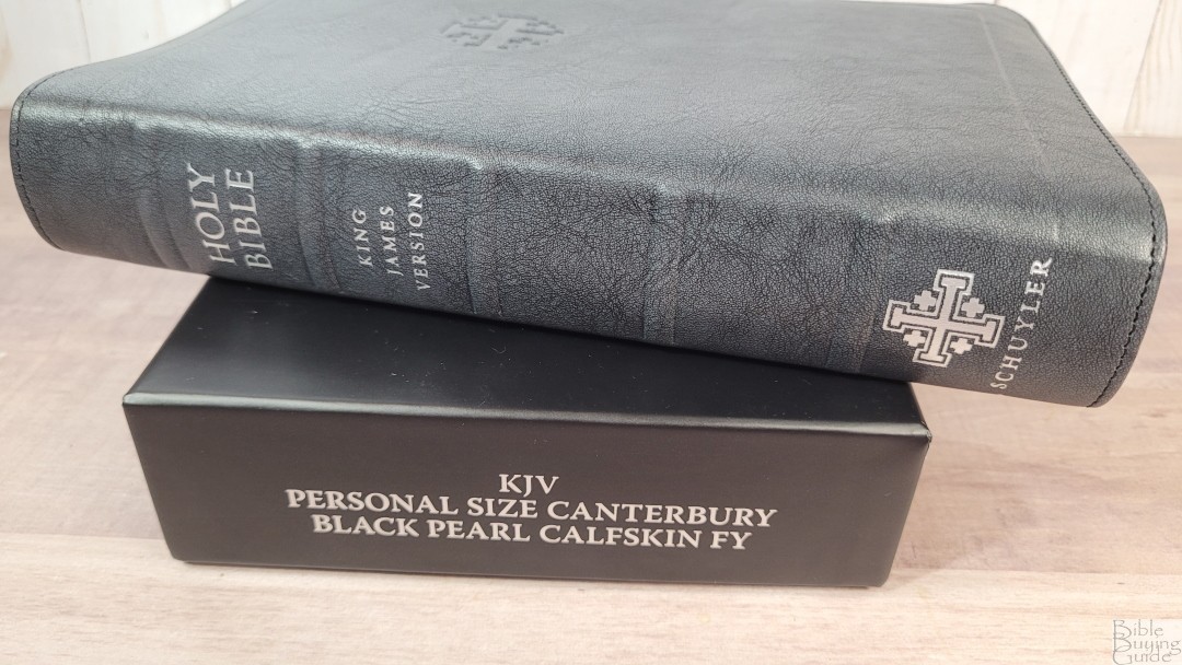
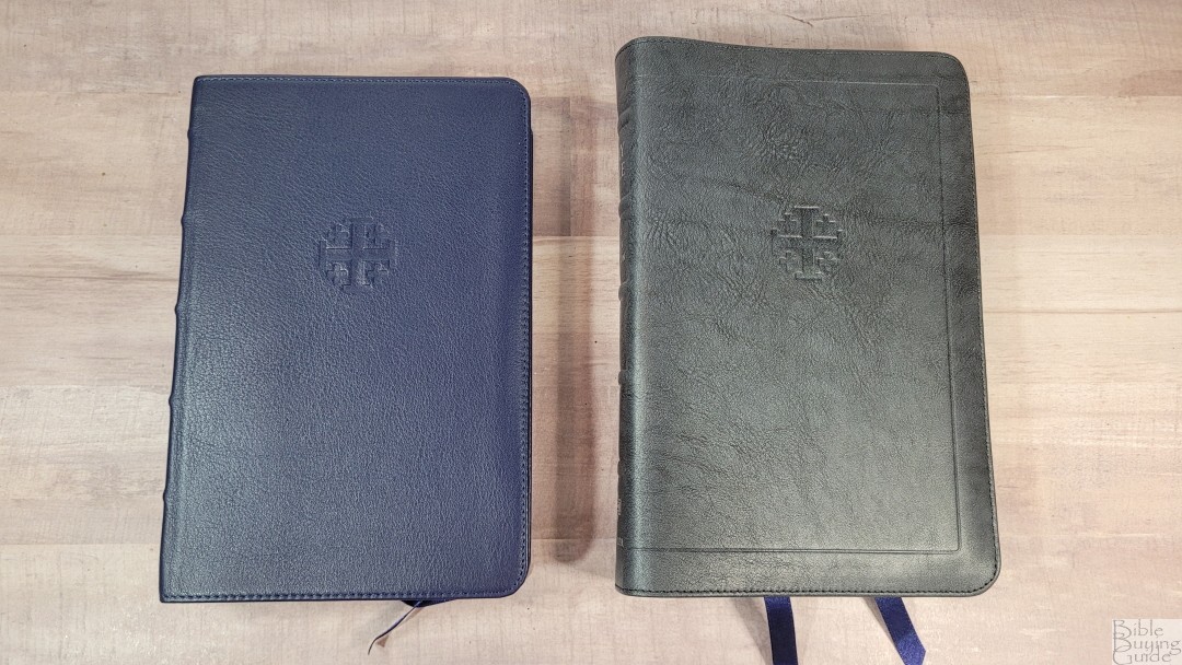
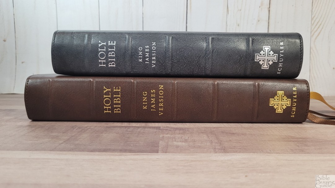
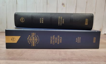
The Personal Size Canterbury has been one of my favorite Bibles since it was released in 2018. I’m a fan of the Canterbury design, but there are always been a feature that I hoped they would change. Schuyler has now made that change for this new edition. It’s available in several colors of goatskin including dark purple, imperial blue, black, and firebrick red with a zipper. It’s also available in a few calfskin covers including marbled mahogany and the newest color, which I’m reviewing- black pearl. Like all Bibles from Schuyler, it’s made in the Netherlands by Royal Jongbloed and typeset by 2K/Denmark.
This Bible was purchased at a discount for an honest review. I was not asked to give a positive review. All opinions are my own.
_______________________________
Buy from Evangelicalbible.com
_______________________________
Table of Contents
- Video Review
- Cover and Binding
- Paper
- Typography
- References
- Glossary
- Concordance
- Maps
- Front Matter
- Comparisons
- Conclusion
Video Review
Cover and Binding
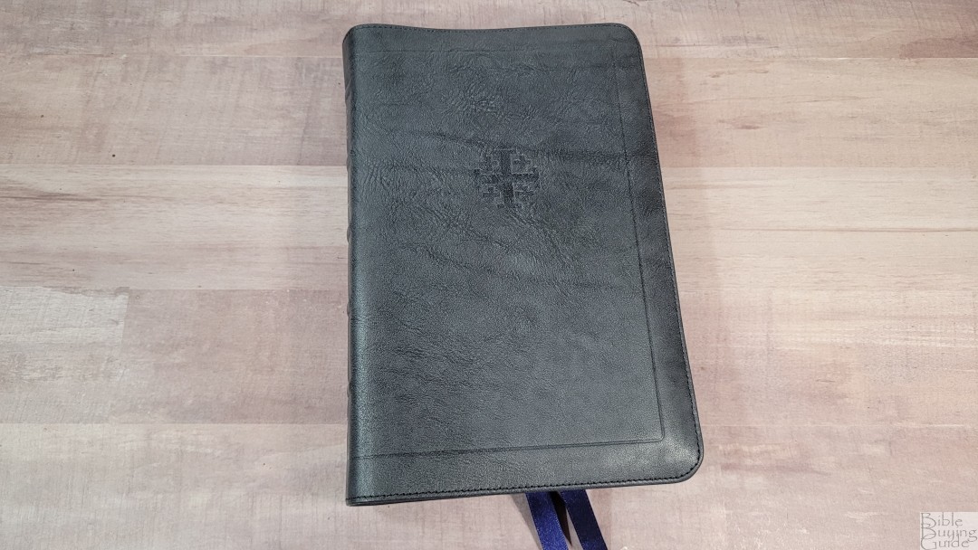
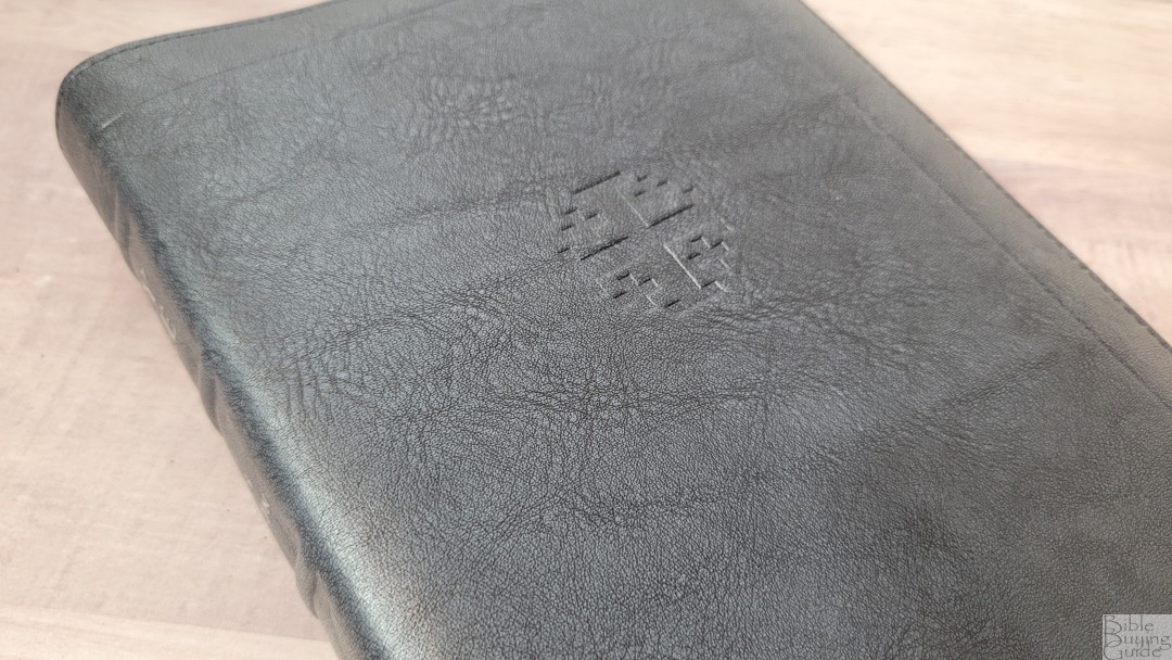

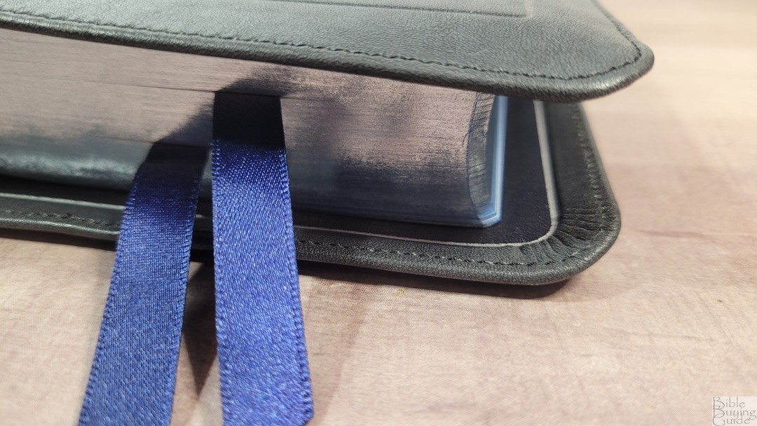
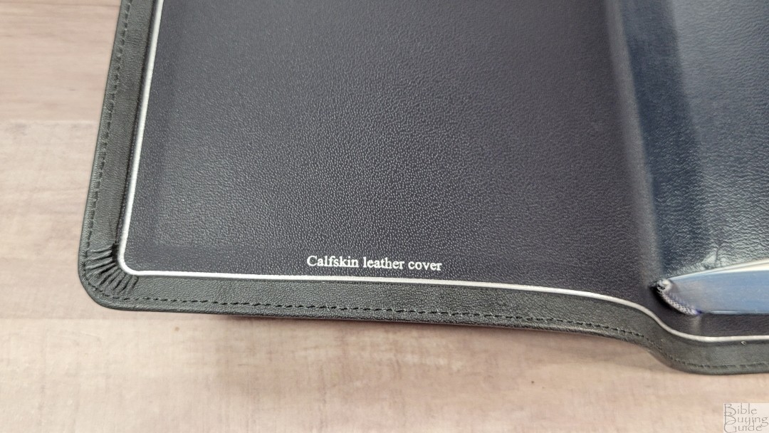
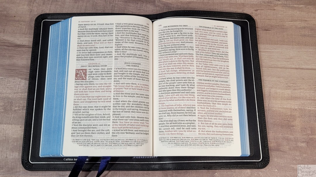
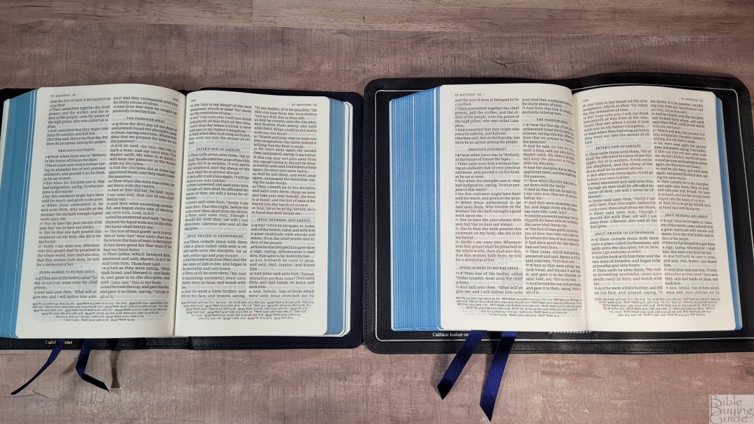
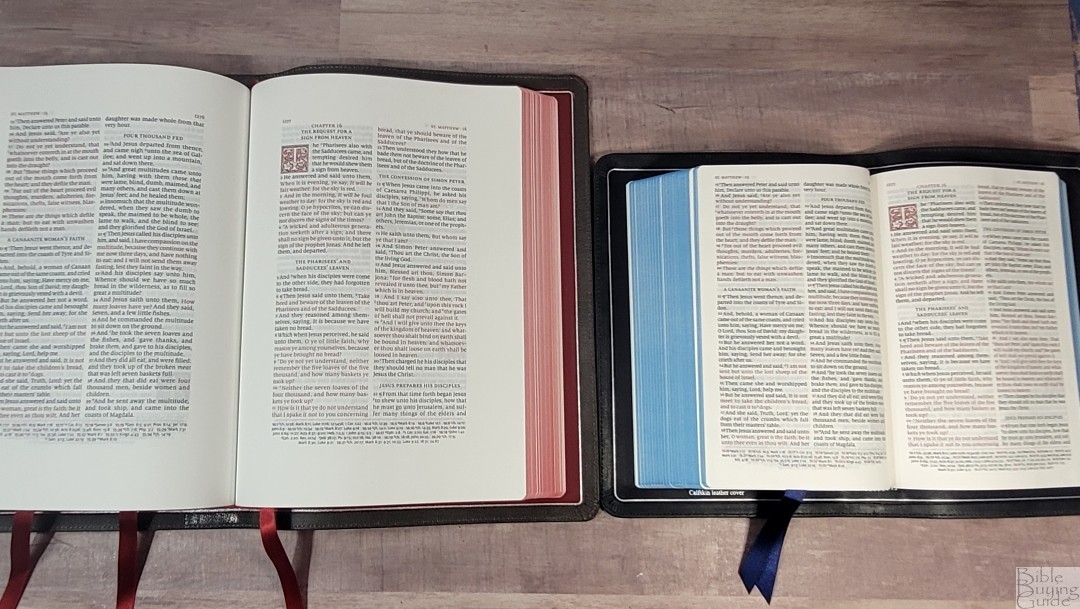
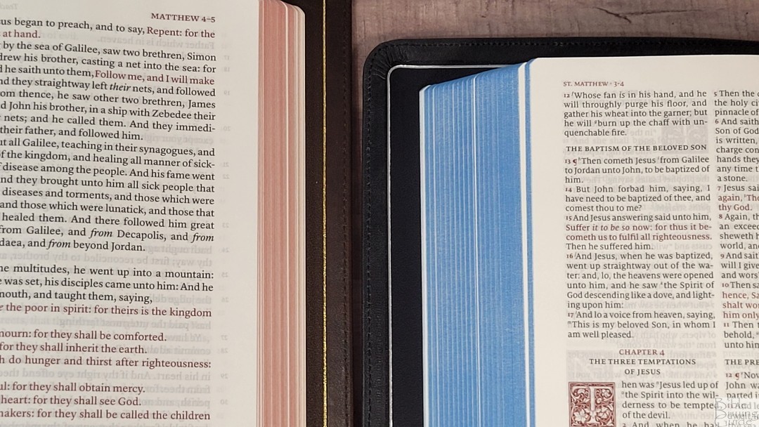
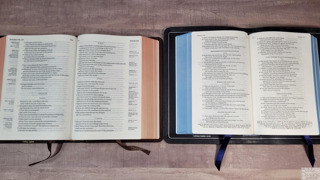
The Italian calfskin is thick and feels elegant. The texture of the calfskin is smoothish with a rough grain that looks and feels natural. It’s dark gray in color and has some color and texture variation that gives it a unique look. This leather is flexible, but it’s still easy to hold open with one hand. It has perimeter stitching, a debossed line around the edge of the text block for the front and back, and the Jerusalem cross debossed on the front. The spine includes five raised hubs and text printed in silver. It has a full yapp that touches on all sides.
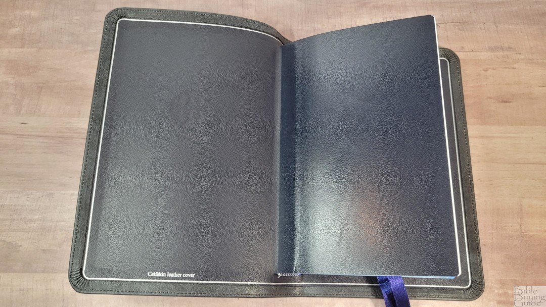
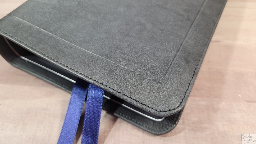
The edge-lined calfskin leather liner is navy with a silver gilt line around the inside perimeter. I like this color combination with the Black Pearl. The edge-lined tab is a little stiff at first. It is starting to break in after use. The block is sewn and it does stay open to Genesis 1.
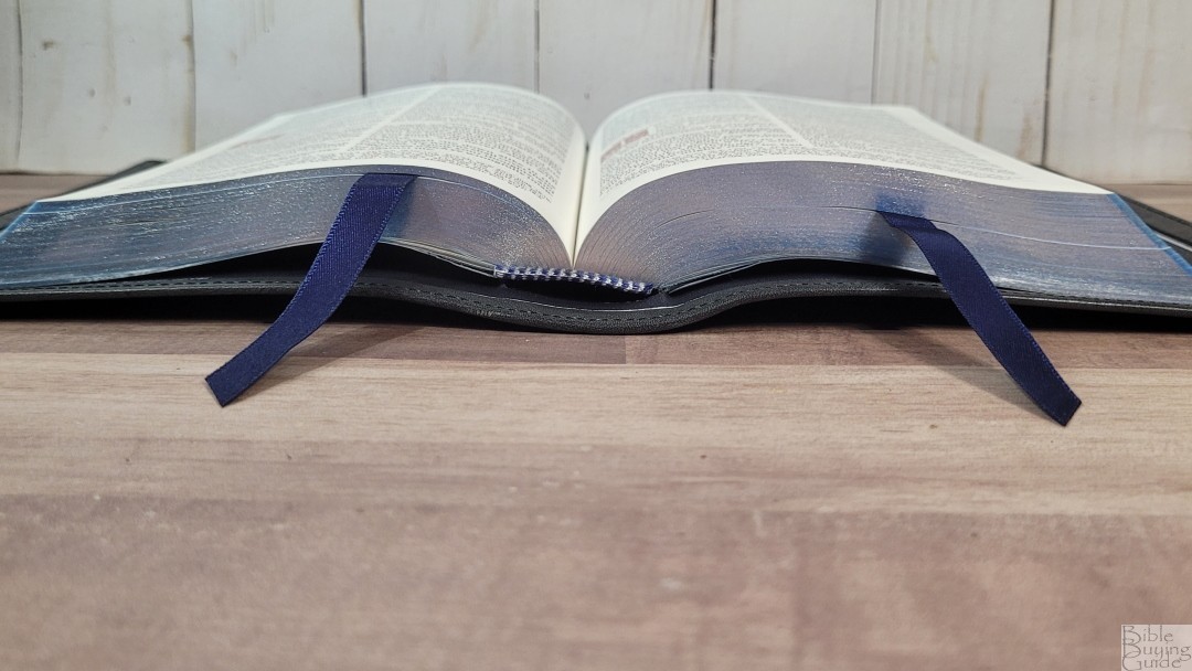
The overall size of the cover with the yapp touching is 5 x 7 1/4 x 1 3/8″. It weighs 1 lb, 8.4 oz. It has 2 3/8″ navy ribbons. They’re long enough to pull to the corner to open the Bible and they look great against the blue under silver page edges.
Paper
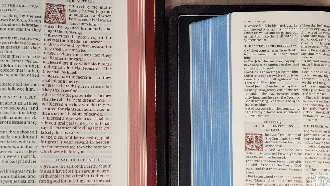
The paper is 28gsm Indopaque. This is a smooth paper that looks and feels elegant. It has a slight cream color with no glare under direct light, and the opacity and color are great for reading. I had no issues turning the pages.

In the back are 11 lined pages for notes. The pages have the same paper as the rest of the text. I haven’t tried writing on the pages yet, but I’m curious how well it would work for sermon outlines, references, word studies, and ministry notes.
Typography
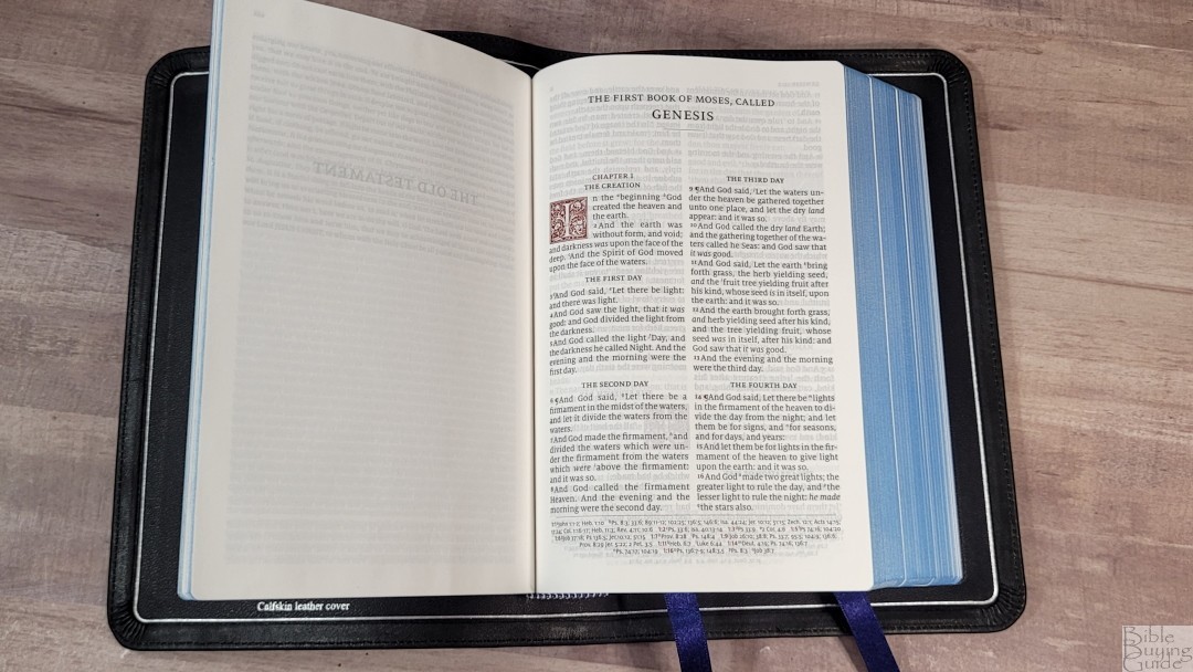
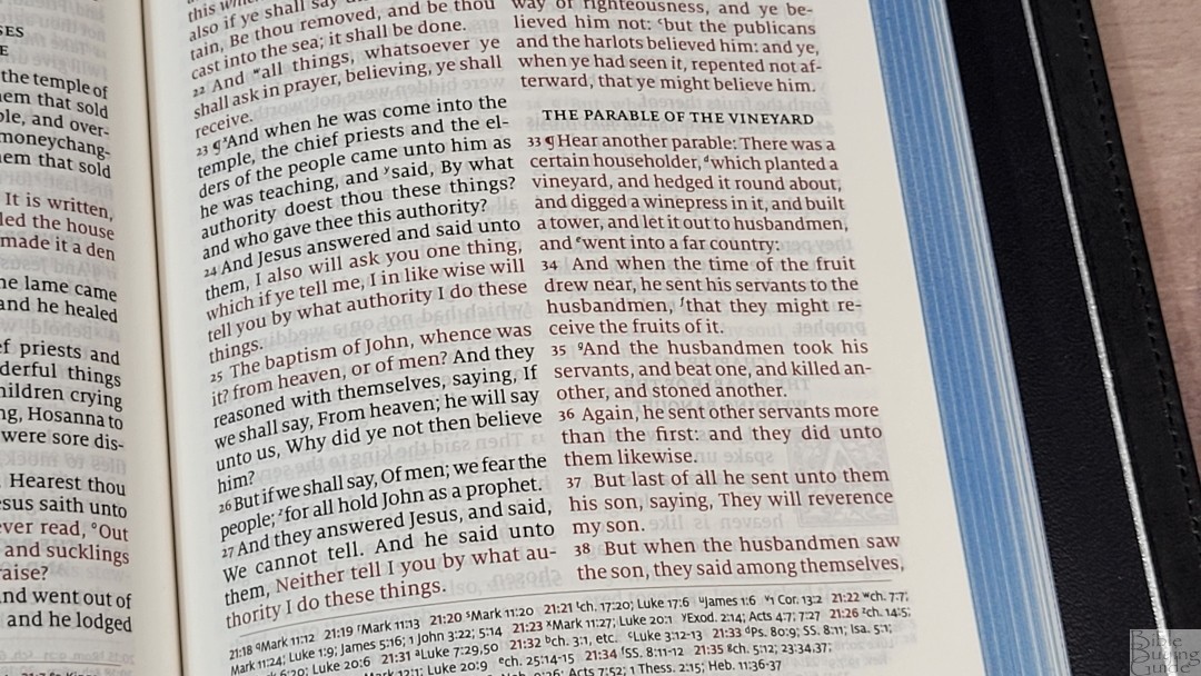
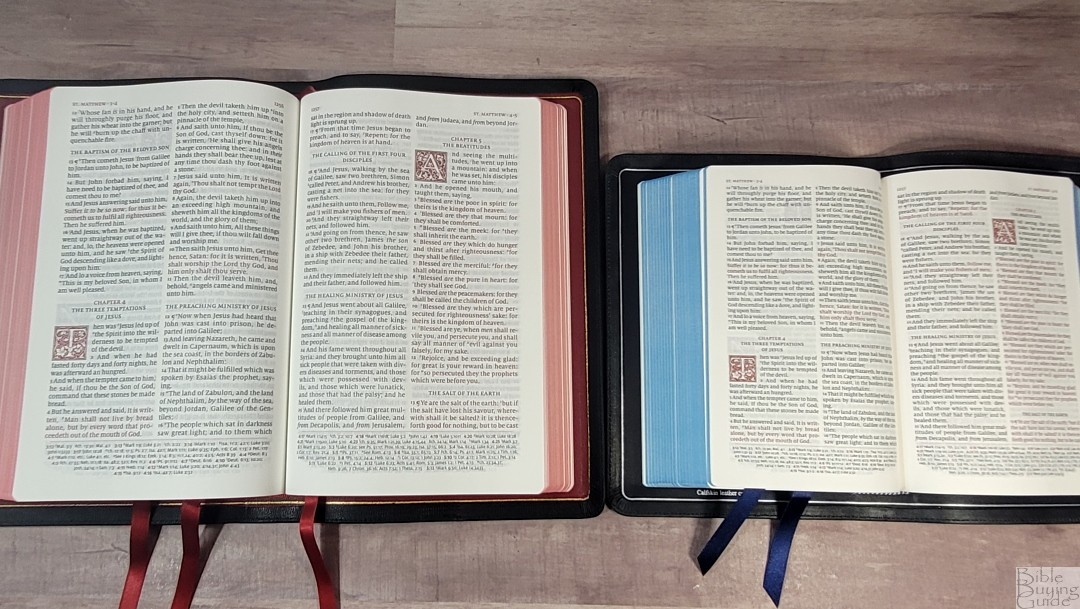
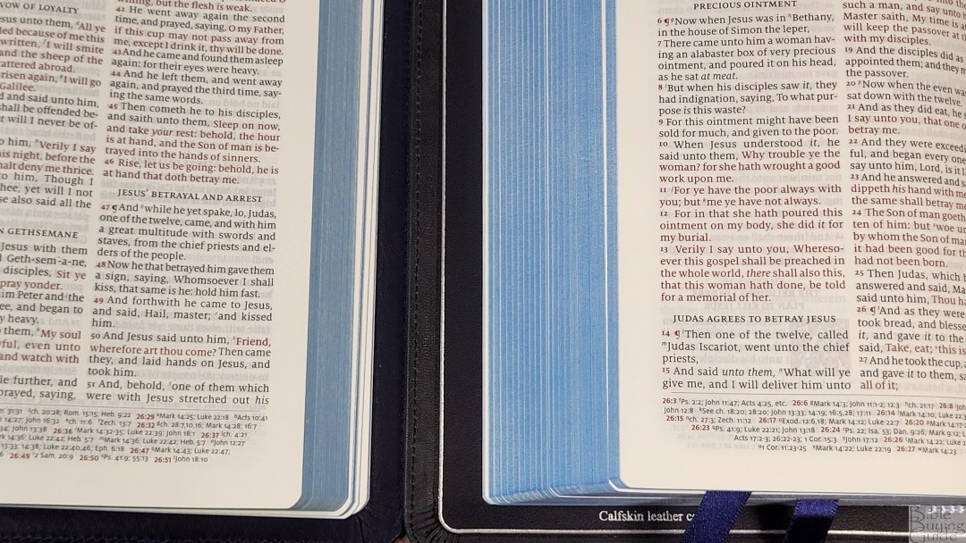
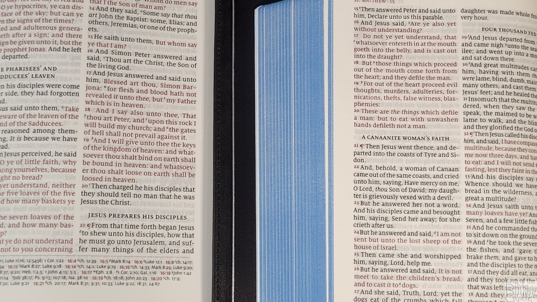
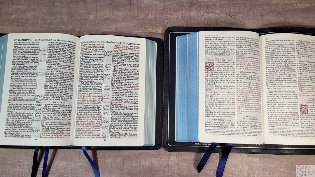
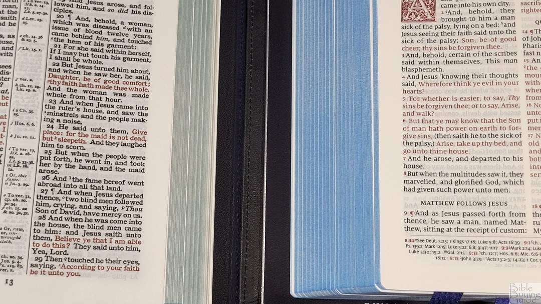
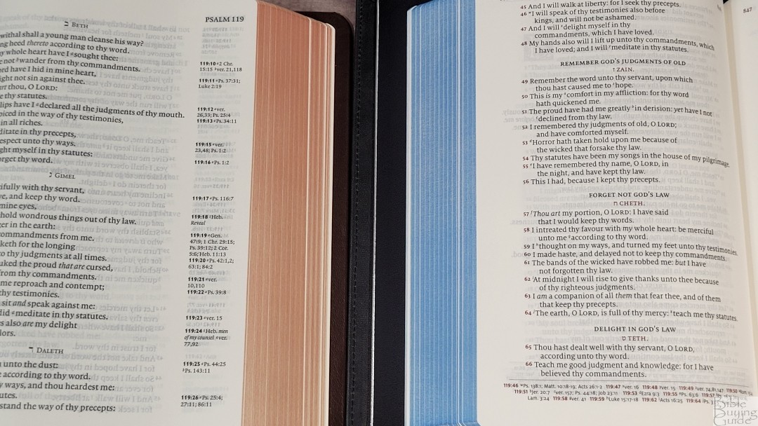
The text is presented in a double-column verse-by-verse format with Psalms set in a unique single-column setting. The header places the page numbers in the inner margin. Book names and chapter numbers are placed in the outer margin and cross-references are placed in the footer. Chapter numbers, drop-caps, verse numbers, pilcrows, the header text, the footer dividing line, and the chapter and verse numbers in the footer are all printed in a bold red.
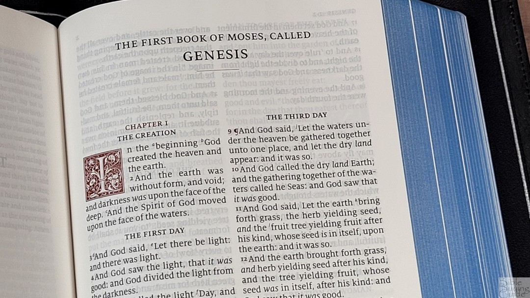
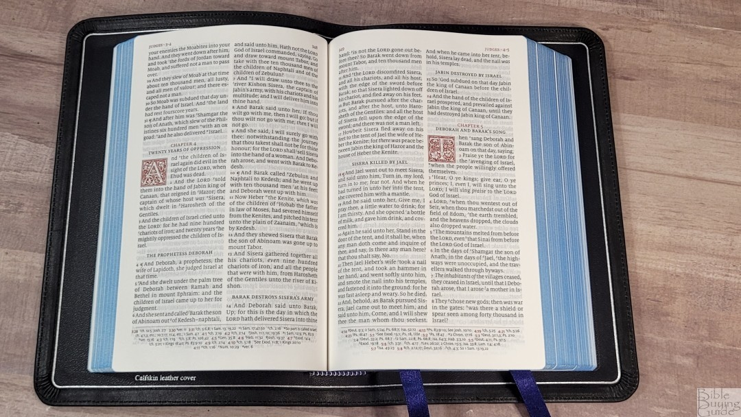
The font is 8.5-point Milo with extra space between the lines. This is a red-letter edition. The red is darker than most red-letter print. Both the black and red print are dark and consistent throughout. What set’s this edition apart from the previous one is the removal of the self-pronouncing text. This text is cleaner and easier to read. The book of Psalms is set in a single-column layout with the poetic lines separated for a more poetic flow.
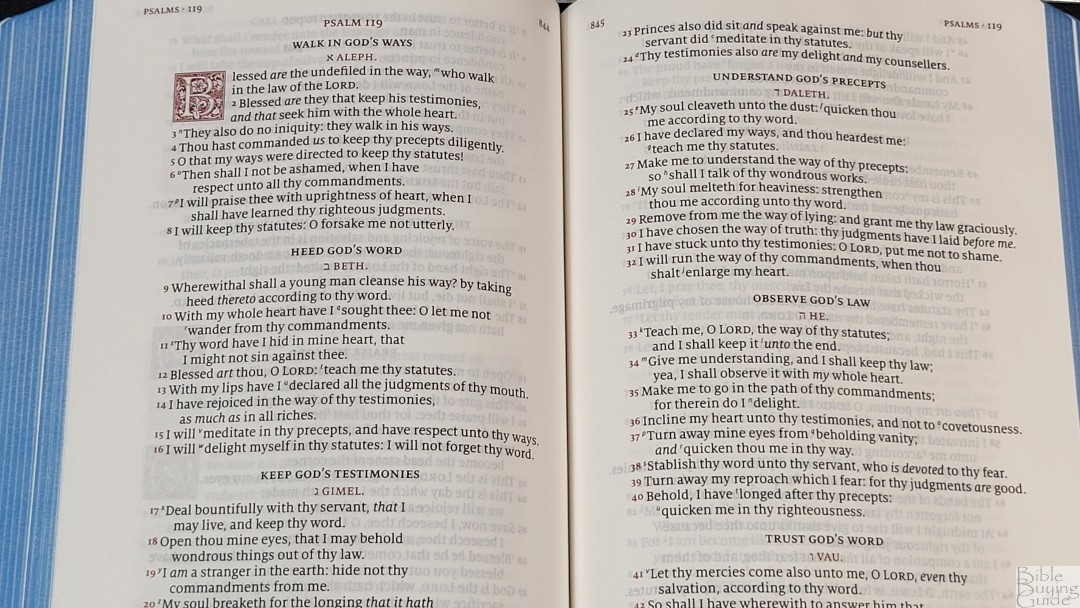

It has an average of 8 words per line. The text never feels cramped or crowded. It has italics for supplied words. The inner margin is wide enough to bring the text out of the gutter, so the text never gets lost in the bend. The text is printed with line-matching, so the lines on both sides of the page are printed in the same location on both sides of the page. This greatly improves readability and the paper is opaque enough that the text doesn’t appear gray because of the text on the other side of the page.
Decorative Dropcaps
The ornamental drop-caps are LTC Goudy Initials fonts. They take five lines everywhere except for Psalms, which takes 4 lines. Cross-references callers are large enough to use, but they’re also small enough to ignore them easily. When reading aloud or preaching I don’t pause when reading because of awkward spacing as I do in many other reference editions.
References
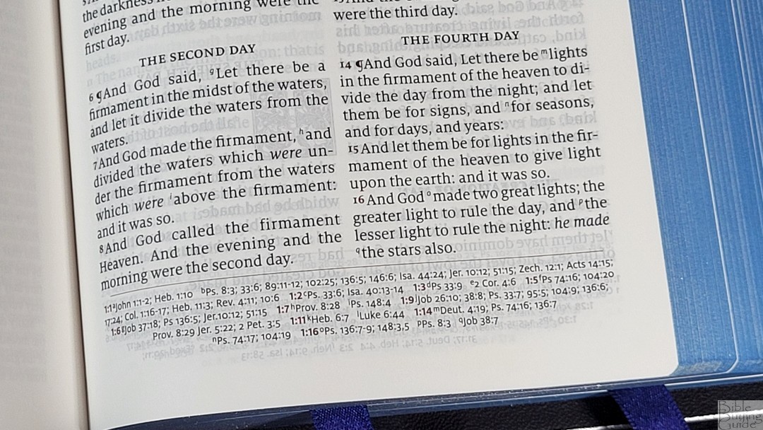
The Canterbury has 55,000 cross-references. They’re pritned horizontally across the footer and they’re separated from the text by a line. They taper toward the bottom of the page to ground the page. They’re keyed to the text with letters and include the chapter and verse numbers in red.
Here are a few verses with their references to help you compare:
- Genesis 1:1 – Jn 1:12; Heb 1:10; Ps 8:3; 33:6; 89:11-12; 102:25; 136:5; 146:6; Isa 44:24; Jer 10:12; 51:15; Zech 12:1; Acts 14:15; 17:24; Col 1:16-17; Heb 11:3; Rev 4:11; 10:6
- Deuteronomy 6:4 – Isa 42:8; Mark 12:29, 32; John 17:3; 1 Cor 8:4, 6
- Isaiah 9:6 – ch 7:14; Luke 2:11; John 3:16; Matt 28:18; 1 Cor 15:25; Judg 13:18; Titus 2:13; Eph 2:14
- Mark 12:29 – Duet 6:4; Luke 10:27
- John 1:1 – Prov 8:22-23, etc; Col 1:17; 1 Jn 1:1; Rev 1:2; 19:13; ch 17:5; Prov 8:30; 1 Jn 1:2; Php 2:6; 1 Jn 5:7
- John 3:16 – Rom 5:8; 1 Jn 4:9
- Acts 2:38 – ch 3:19; Lk 24:47
- 1 John 1:1 – ch 2:13; Jn 1:1; ch 4:14; Jn 1:14; 2 Pet 1:16; Lk 24:39; Jn 20:27
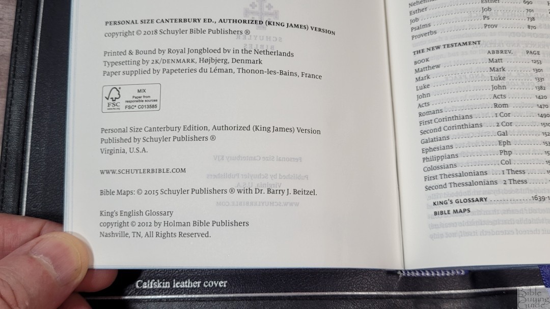
Glossary
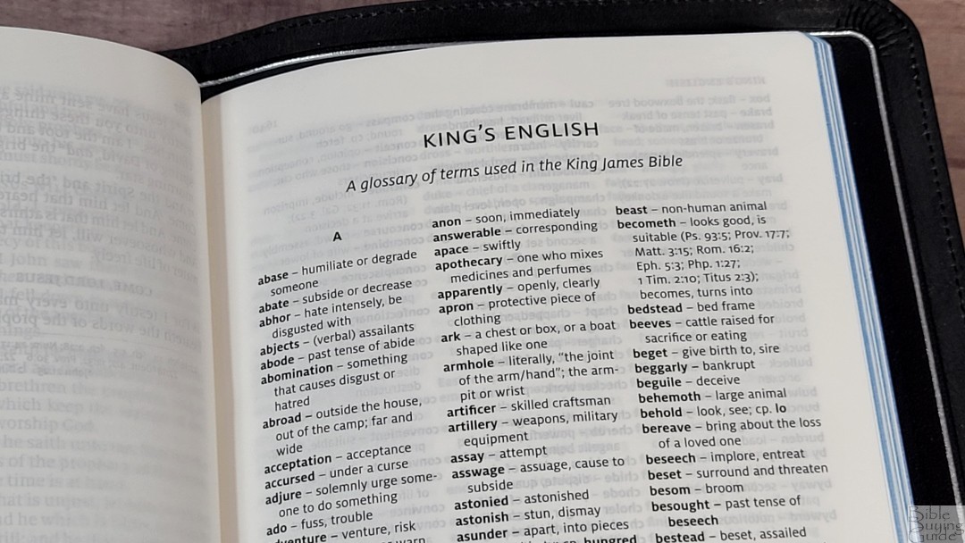
In the back is a 9-page King’s English Glossary from Holman Publishers. This glossary covers words that have changed meaning or are no longer in use. Some include references where you can see the words in context. I’m glad this is included and it should be included in more KJV’s. We don’t always realize that some words have changed in meaning and it’s not always easy to pick up on that from the context. I highly recommend reading through it since the text doesn’t alert you to the words.
Maps
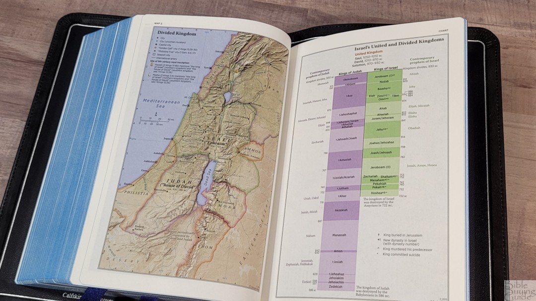
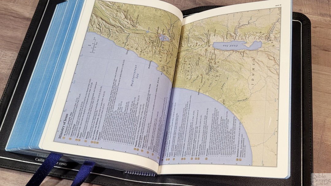
In the back are 12 maps printed on thick non-glossy paper. The maps are colorful. They’re annotated well and they’re easy to follow. Several of the maps take two pages. These maps do not include space in the gutter, making them difficult to read where the two pages meet. This is my favorite paper and colors for maps. Maps include borders, cities, distance, topography, Scripture references, places of worship, capitals, water, roads, canals, seaports, ancient inscription sites, events of Jesus’ life, Apostles’ ministries, places of writings, etc. Like the original personal size edition, it does not include an index to maps.
Here’s the list of maps (and one chart):
- World of the Patriarchs
- Israel’s Twelve Tribe Allotments
- Route of the Exodus
- Kingdom of Saul, David and Solomon
- Divided Kingdom
- Kings and Prophets of Israel and Judah (Chart)
- Assyrian and Babylonian Empires
- Persian and Greek Empires
- Ministry of Jesus
- Jerusalem and the Passion of the Christ
- Apostles’ Early Ministry
- Missionary Journeys of Paul
- Roman Empire and Early Christianity
Front Matter
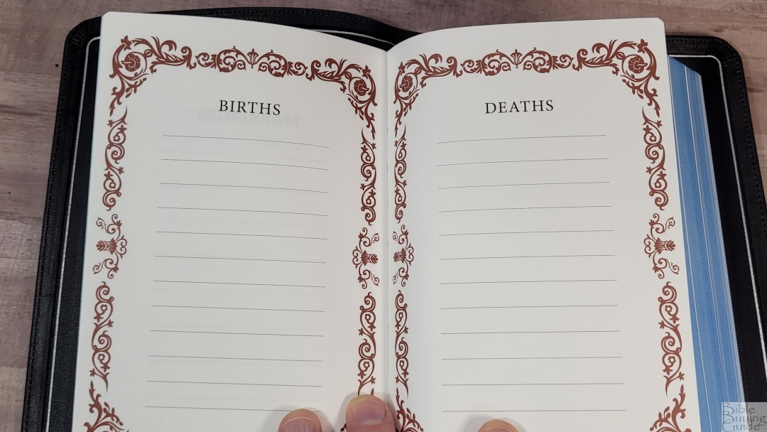
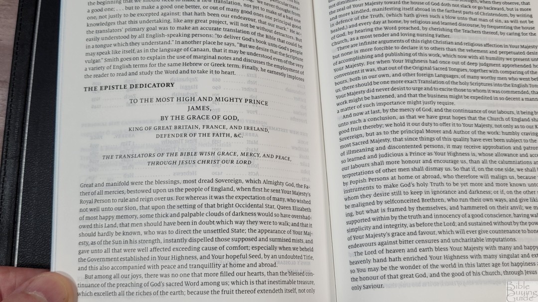
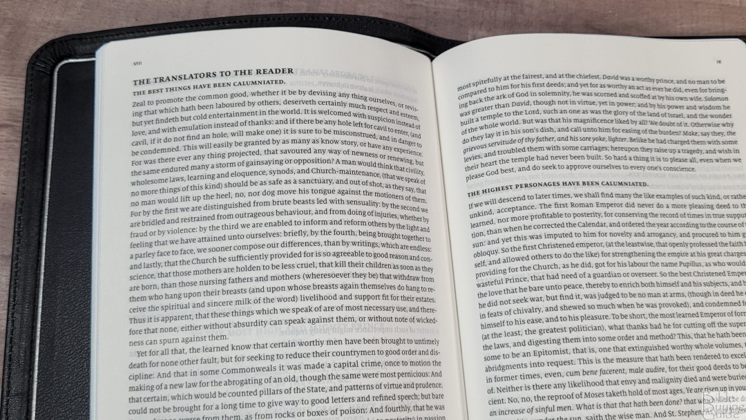
In the front are the presentation/family pages the, Epistle Dedicatory, and the Translators to the Reader. The presentation and family pages include the presentation page, marriages, births, and deaths. They’re printed with a floral graphic in dark red that frames the page. The Translators to the Reader is an important document for the King James Version and I’m glad to see it’s still included.
Comparisons
Here’s a look at how the new edition of the Personal Size Canterbury compares to the original and several other editions.
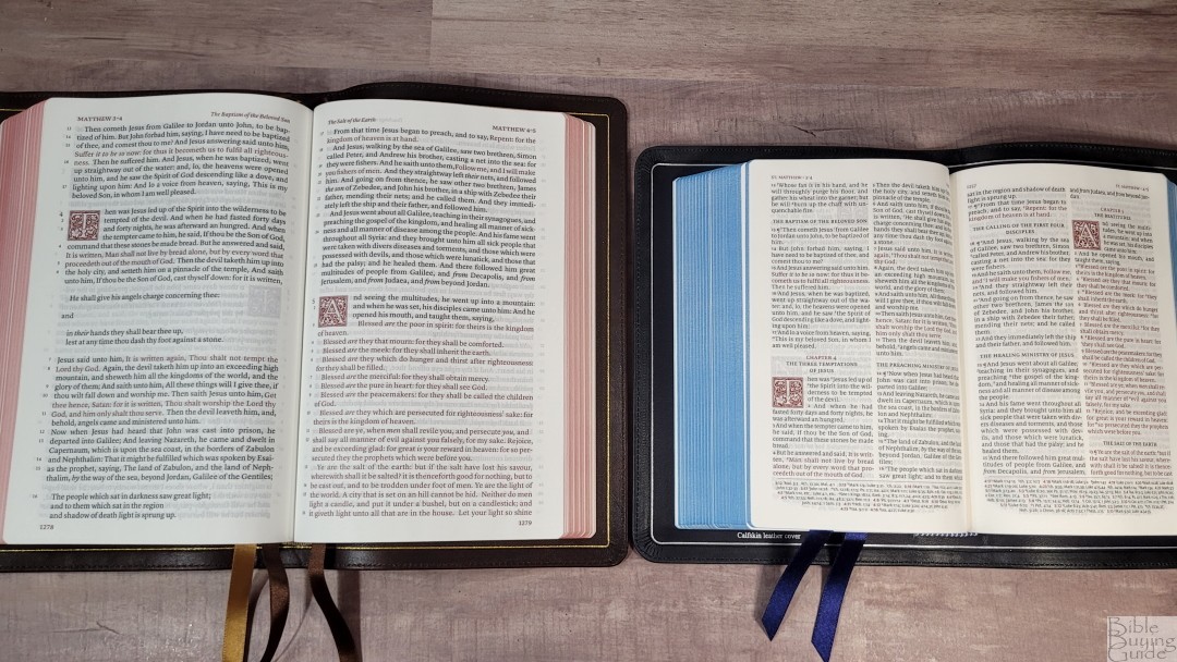
Full Yapp Canterbury
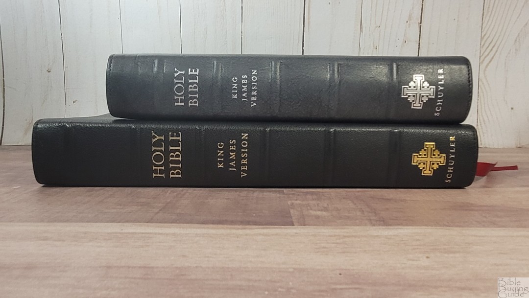
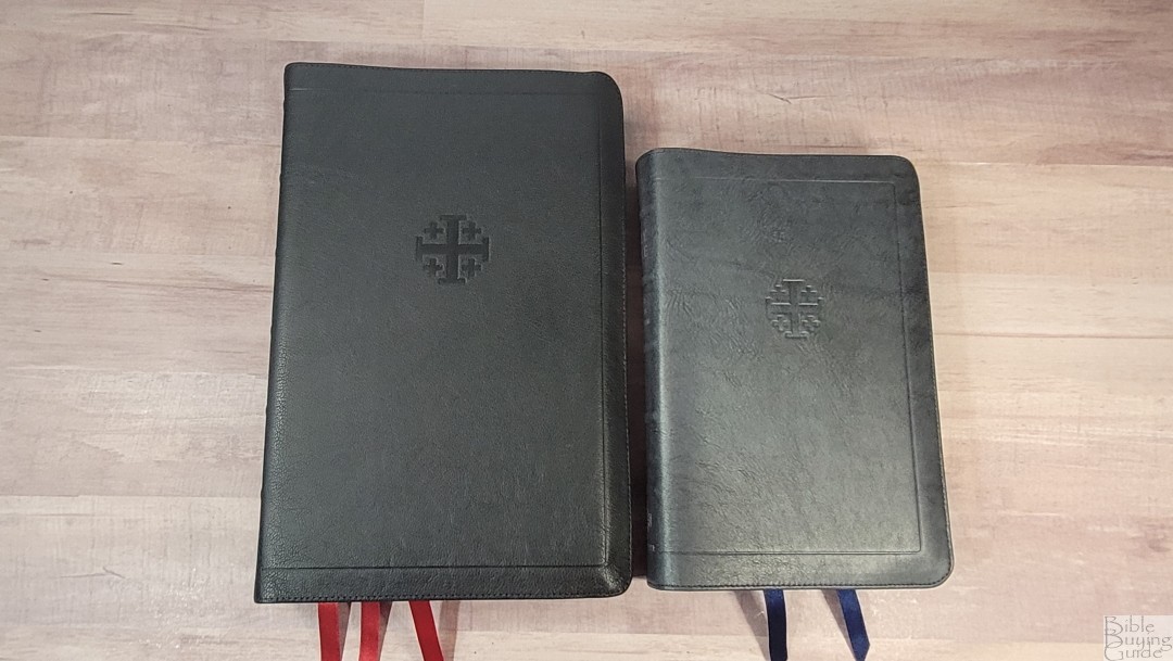
The full yapp Canterbury is goatskin. The grain looks very similar, but the goatskin is more flexible. Both have a clean text with no self-pronouncing marks. They make a great combo if you want a large edition for preaching and study and a smaller edition for carrying and ministry on the go.
Personal Size Canterbury in Blue Calfskin

The first edition Personal Size Canterbury in blue calfskin has a paste-down liner. Schuyler has moved away from this type of liner. It has three 1/4″ ribbons and includes the self-pronouncing marks. The paper and print are the same.
Schuyler Wide Margin Canterbury
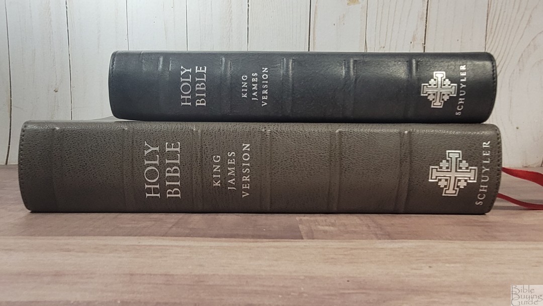

The Schuyler Wide Margin Canterbury in Slate is a goatskin cover. It’s gray but it has a brown shade with dark gray undertones. This edition also removes the self-pronouncing marks. The text is slightly larger than the PSC. These two makes a great combo with the wide margin for study and preaching and the personal size for carrying.
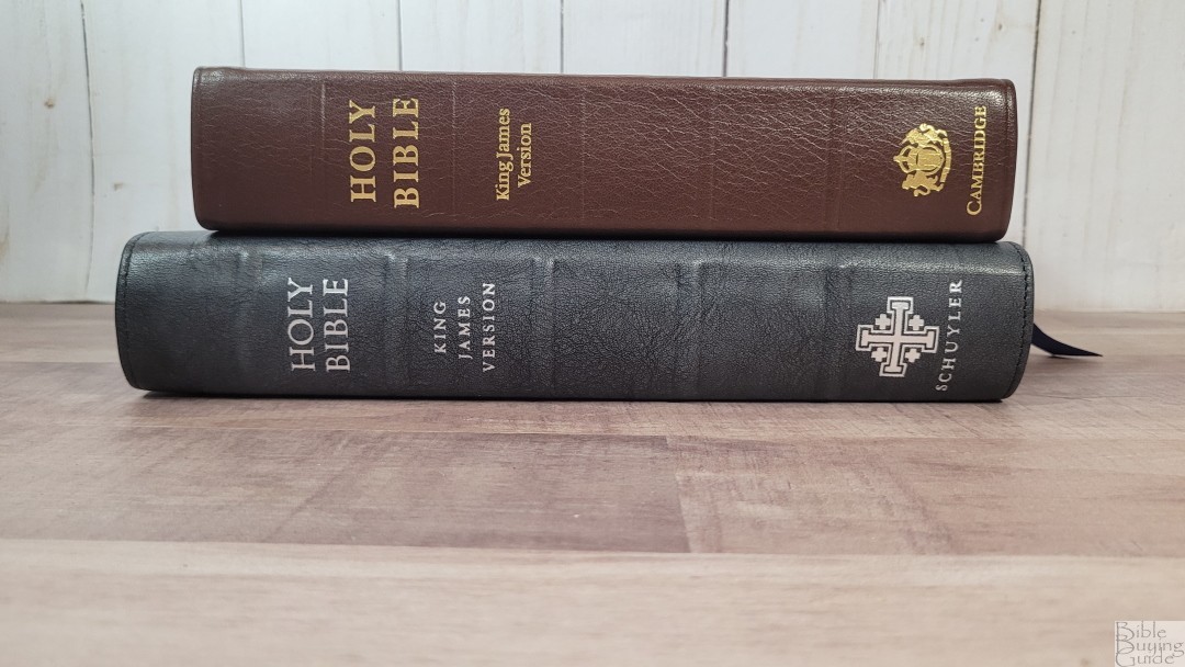
Schuyler KJV Treveris in Marbled Mahagony Calfskin

The KJV Treveris in Marbled Mahagony calfskin is the same Italian calfskin leather but in a different color. I’m also a fan of the Marbled Mahagony. Both are great choices, Black Pearl is my current favorite of the two. Both Bibles have the same paper, but they’re very different. The Treveris is designed for reading.
Cambridge Cameo
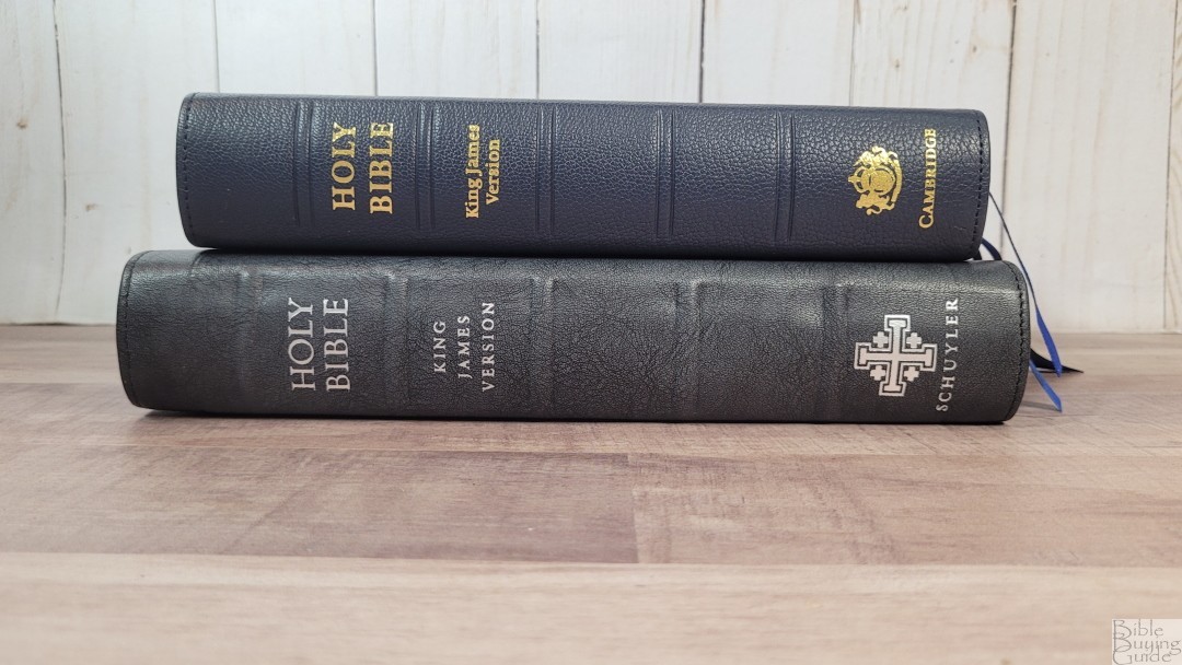

The Cambridge Cameo in blue goatskin is another premium personal-size reference Bible that’s great for all-around usage. It has the same paper and the font is about the same size. The layout is 100 years old. Its text is more compact and it includes the more extensive type of self-pronouncing text. The print is a lot bolder for both the black and red letters. This makes it easier to read for short periods of time, but it can be hard on the eyes for longer periods of reading.
Cambridge Clarion

The Cambridge Clarion in brown calfskin is another personal-size reference Bible that’s great for all-around use. The layout is a single-column paragraph, making it ideal for reading but it’s more difficult to find verses quickly.
Conclusion

The new version of the Personal Size Schuyler Canterbury is an excellent edition of the Canterbury. The materials and craftsmanship are of premium quality. I love the Black Pearl color. This is the first PSC with a full yapp. It doesn’t make the Bible feel large and it doesn’t get in the way of using it. Removing the self-pronouncing marks makes the text cleaner and easier to read. It doesn’t include a concordance or an index to maps, but I still find it to be an excellent all-around Bible that’s ideal for carry. If you’re interested in a high-quality personal size reference KJV, I highly recommend the latest edition of the Schuyler Personal Size Canterbury in Black Pearl.
_________________________________________________________
This Bible is available at Evangelicalbible.com
_________________________________________________________
This Bible was purchased at a discount for an honest review. I was not asked to give a positive review. All opinions are my own.


Very well written review. I have my own copy on the fedex truck as I write this. Looking forward to using it. I also have the full size black perl Canterbury. I agree the black pearl is an awesome color.
Thanks Tim! Please let us know how you like it.
Another great review! Appreciate all your hard work. I ordered the Bible today feel Evangelical Bible should put you on the payroll. You have no doubt sold a lot of Bibles for them. This is the 3rd Bible that I have bought after watching your review. This particular Bible has a very unusual & attractive color, along with the yap, leather liner, & the absence of the self-pronouncing words, also the size make this a hard Bible to pass up.
Thanks again
Thanks Doug! I appreciate it very much!
Randy, your review of the PSC on Black Pearl Calfskin is what made me first look at Schuyler.
Is the Cambridge Cameo larger or smaller than this new run of PSC’s?