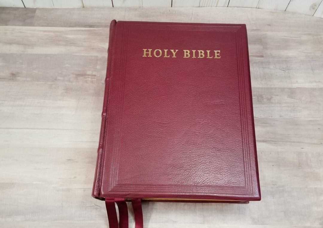
The KJV Lectern Bible Pica Antique Reference Edition from Cambridge is a Bible made specifically for use in the lectern or pulpit. It’s a large Bible with extra-thick paper and a large dark font that’s a joy to preach and read from. It includes a presentation page, Epistle Dedicatory, Translators to the Reader, and index in the front. It does not include any material after Revelation, so you won’t find a concordance or maps. This edition does not include the Apocrypha. This is model KJ986:XB, burgundy, ISBN: 9780521508223, made in the UK.
Note – my review copy shows wear on the gilt because it’s a show floor sample, so the gilting has worn with all of the hands that have touched it and the many miles that it’s traveled across the world. I’m surprised this Bible looks as amazing as it does.
Cambridge provided this Bible in exchange for an honest review. I was not required to give a positive review, only an honest one. All opinions are my own.
_________________________________________________________
This book is available at (includes some affiliate links)
and some local Bible bookstores
_________________________________________________________
Table of Contents
Video Review
Cover and Binding
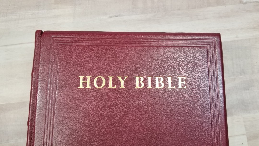
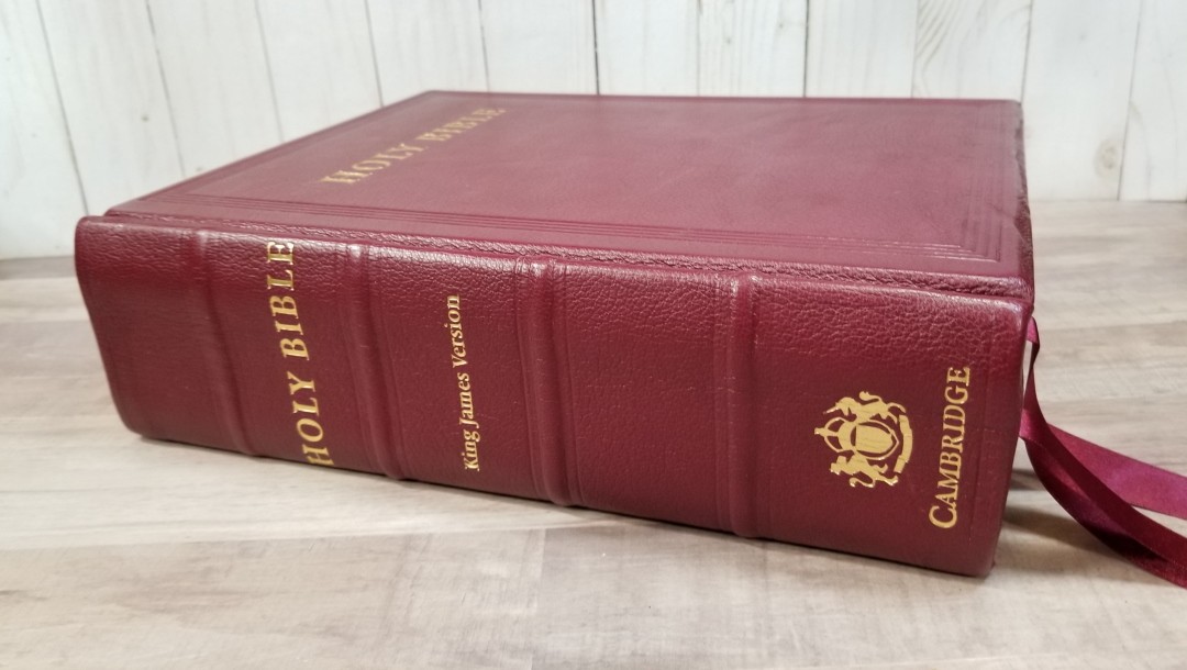
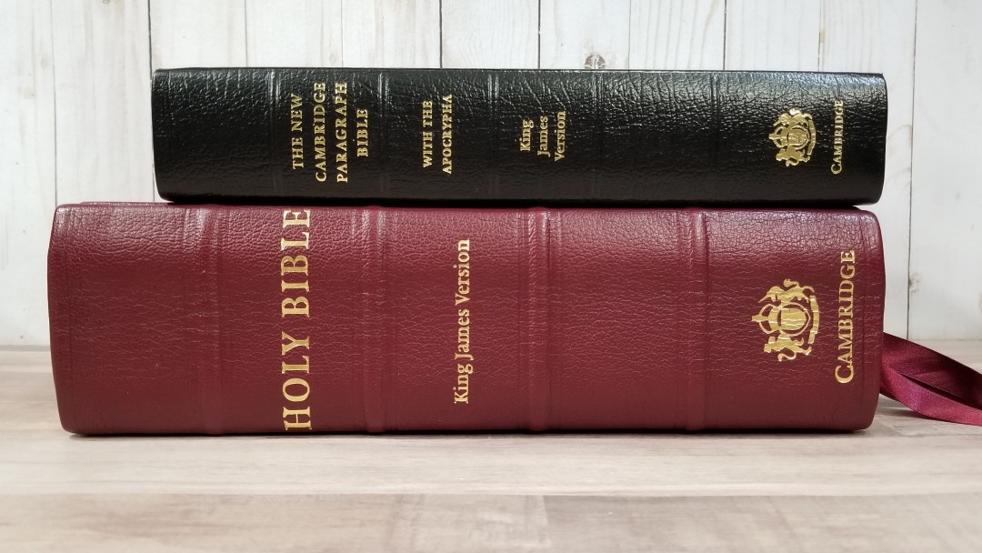
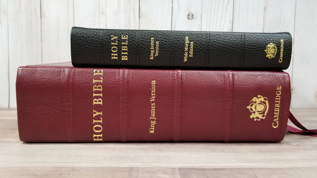
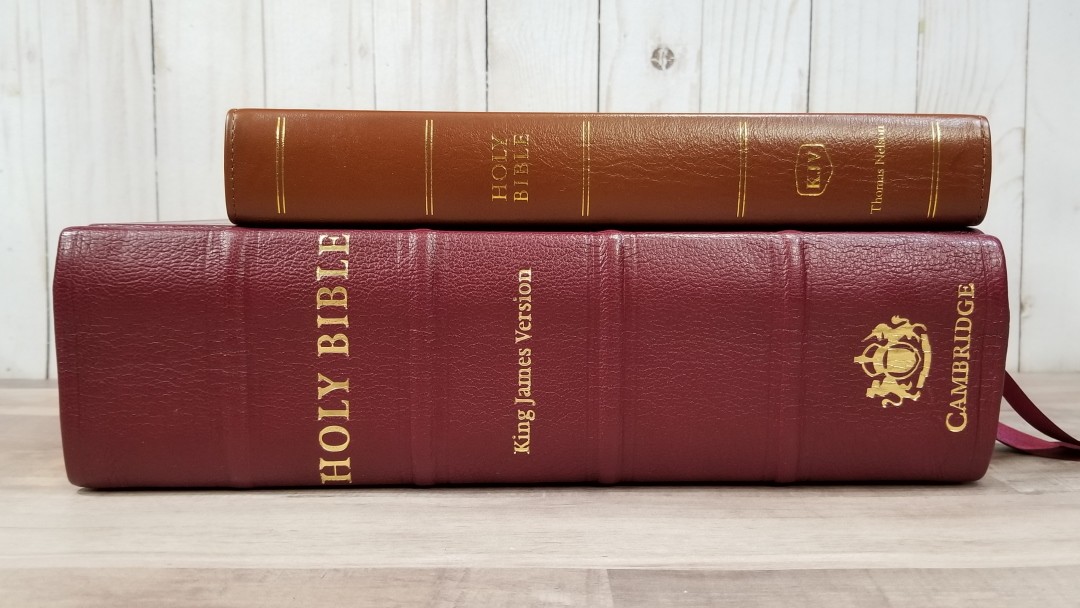
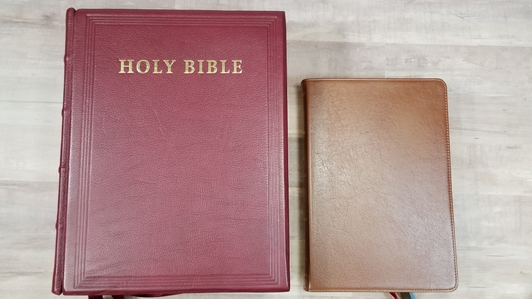
The cover is burgundy goatskin over board. It’s about 1/4″ thick and it’s highly textured. It has tools decorative edges around the front surrounding the words HOLY BIBLE printed in gold. The spine includes four raised ribs, HOLY BIBLE, King James Version, the crest, and Cambridge.
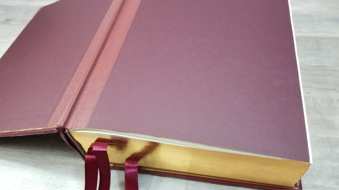
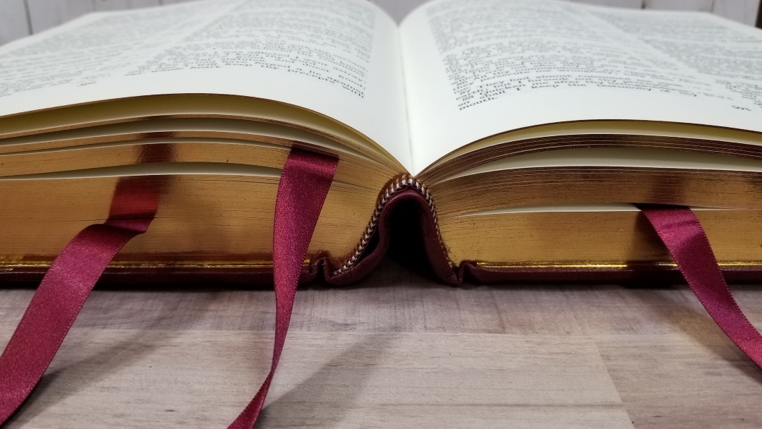
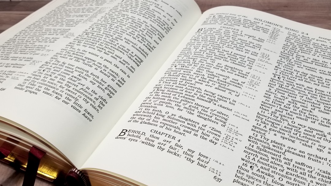
The liner is reinforced paste-down. It looks and feels sturdy. The burgundy end-sheet is textured. A gold gilt-line traces around the outside area where the liner meets the thick board. It’s Smyth sewn. The spine does bend upward when the Bible is opened, so it stays open flat on every page.
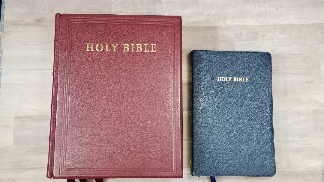
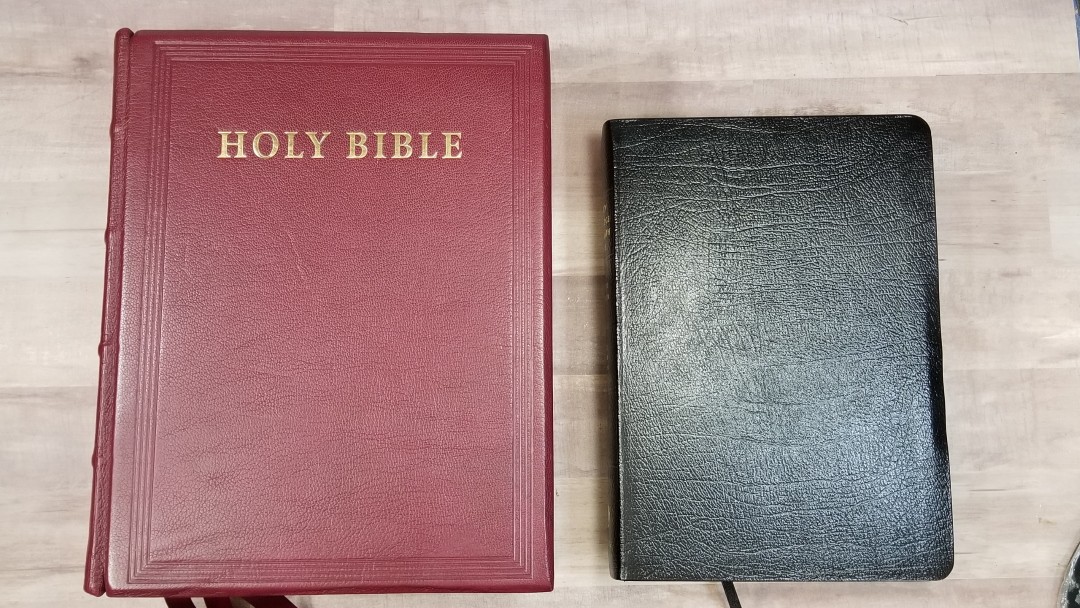
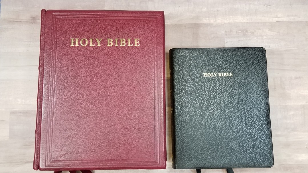
The overall size is 12.0 X 9.5 X 3.5″. It weighs 10 lbs, 12.8 oz. It has three 5/8″ thick burgundy satin ribbons. They’re elegant to the touch, extra long to make them easy to use, and cut at an angle on the ends. I’m not sure of the brand, but they look and feel like Berisford’s ribbons. It’s printed in the UK at CPI Antony Rowe and bound at Ludlow Bookbinders.
Paper
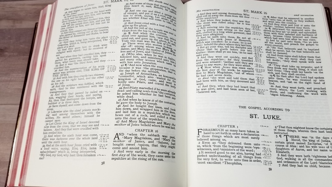
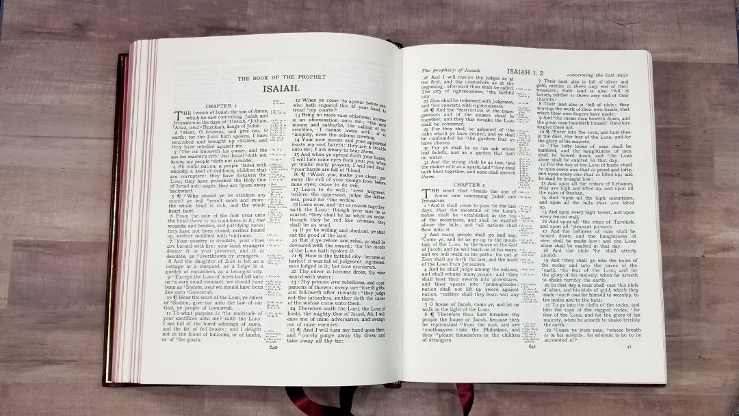
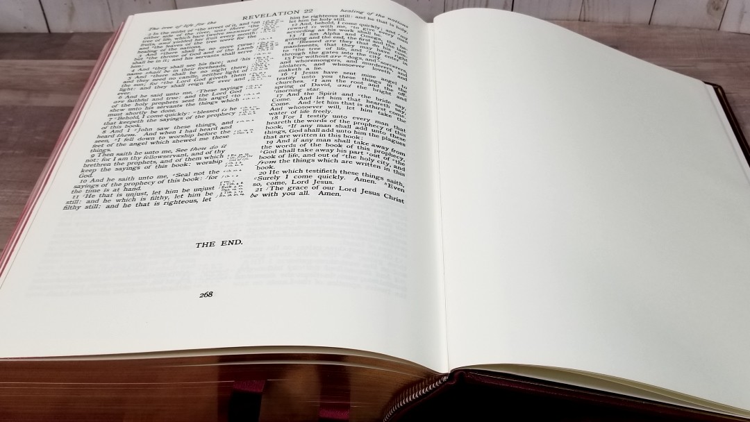
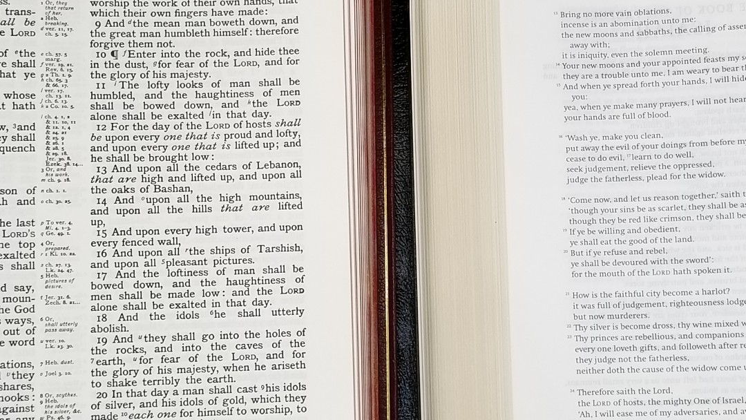
This paper has spoiled me. I like and use paper in all thicknesses, but this paper stands out. It’is 100gsm and has a slight cream color that’s a total joy to read from. This paper is the easiest to read from and the easiest to turn of any Bible I’ve ever touched. The paper is so opaque that show-through isn’t even a consideration. The page edges are art-gilt. The corners are squared rather than rounded. This is typical of hardcover books.
Typography
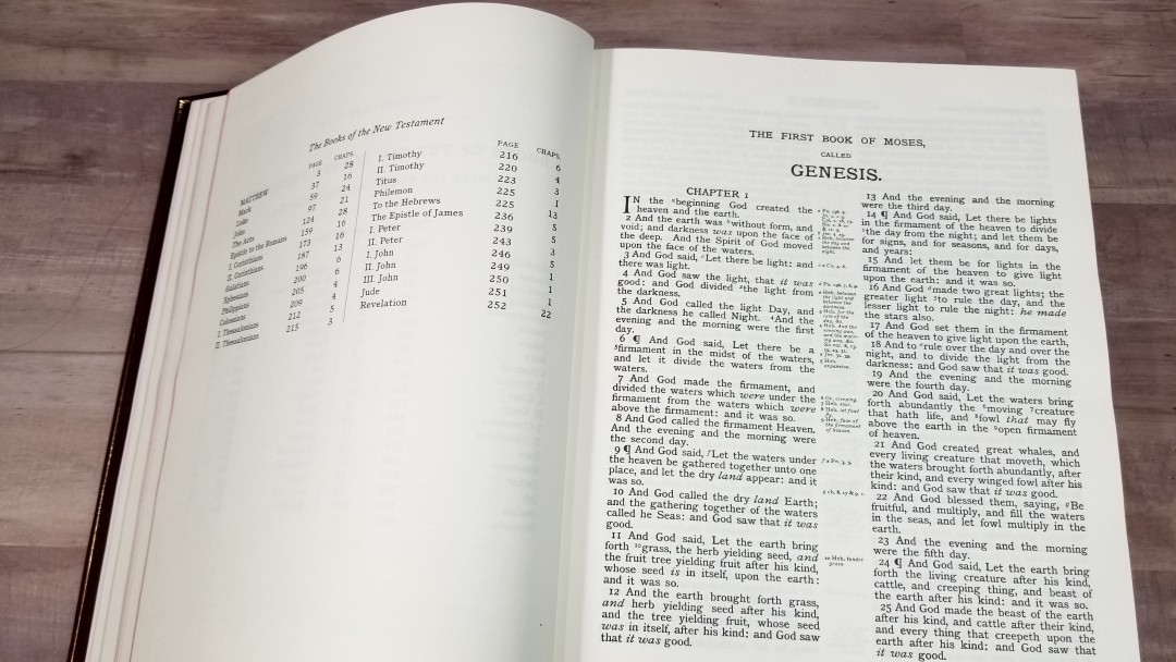
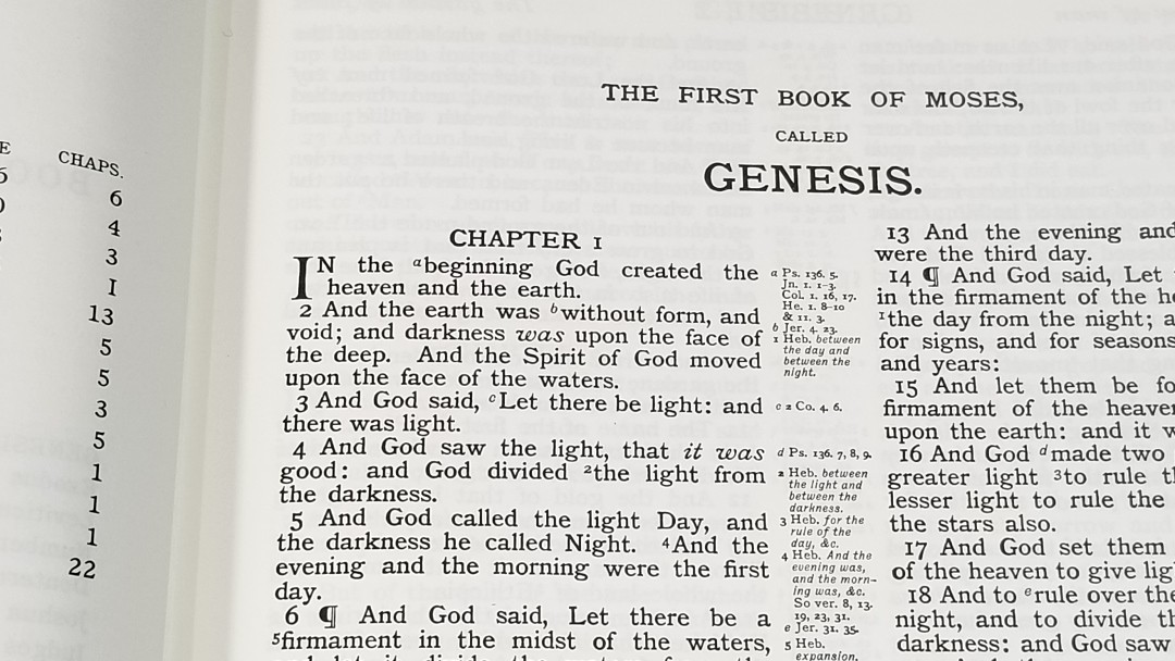
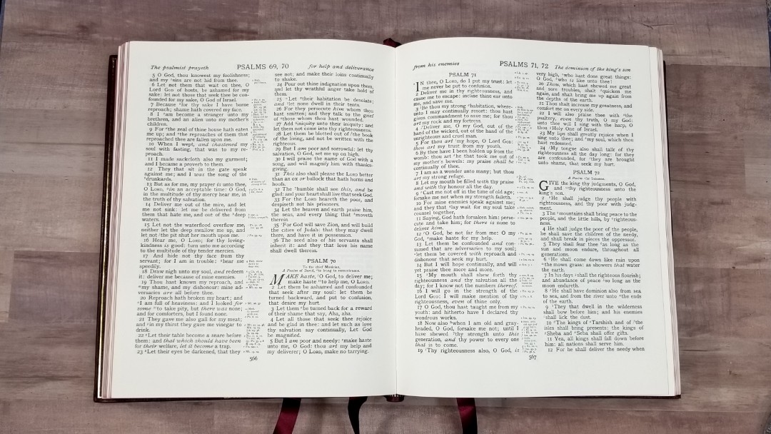
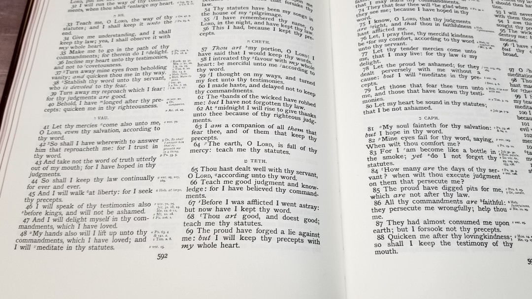
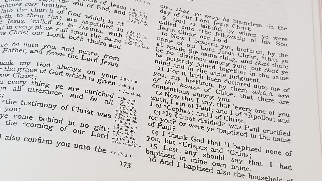
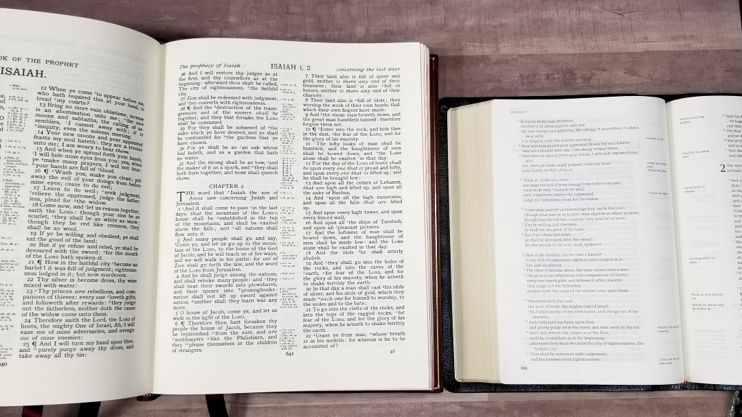
The text is presented in a double-column verse-by-verse format with center column references. The header shows the book name and chapter numbers in the center and page summaries over both columns. The page number is centered in the footer.
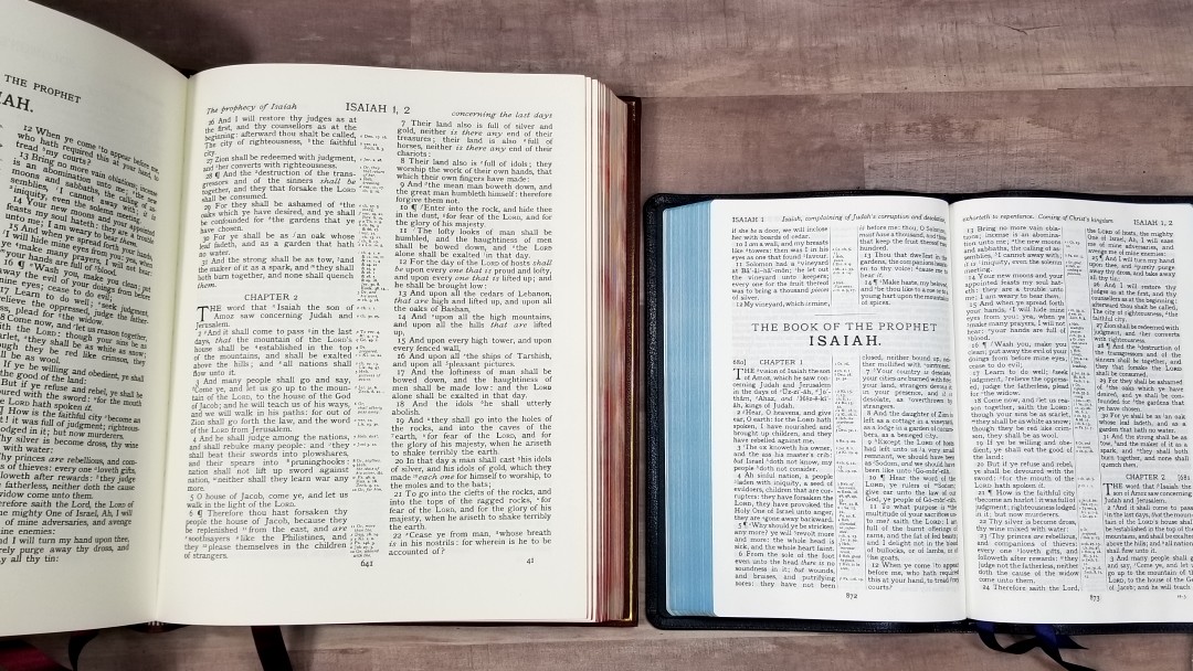
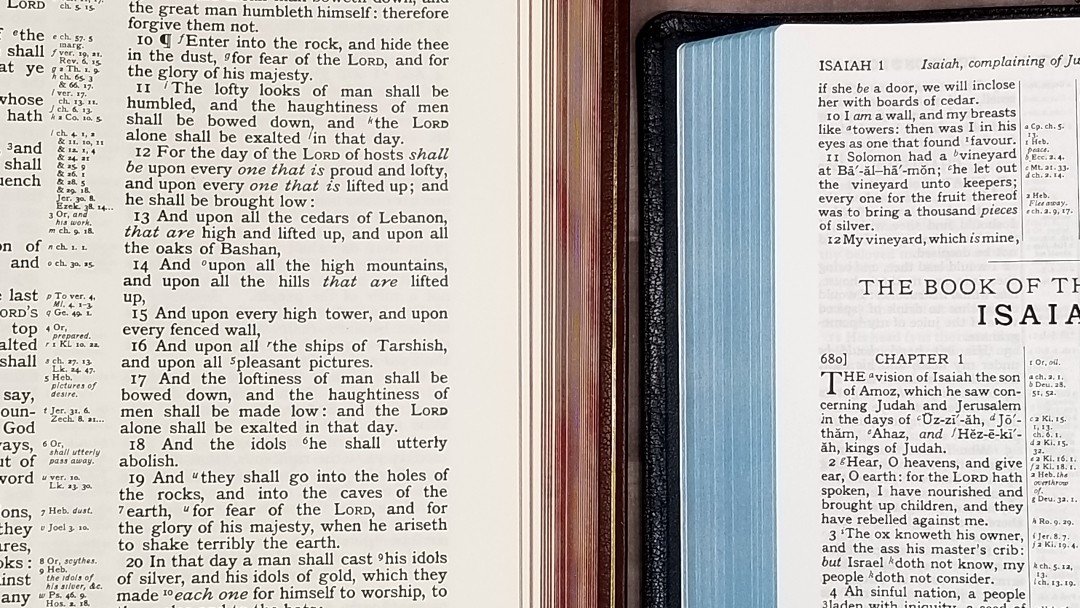
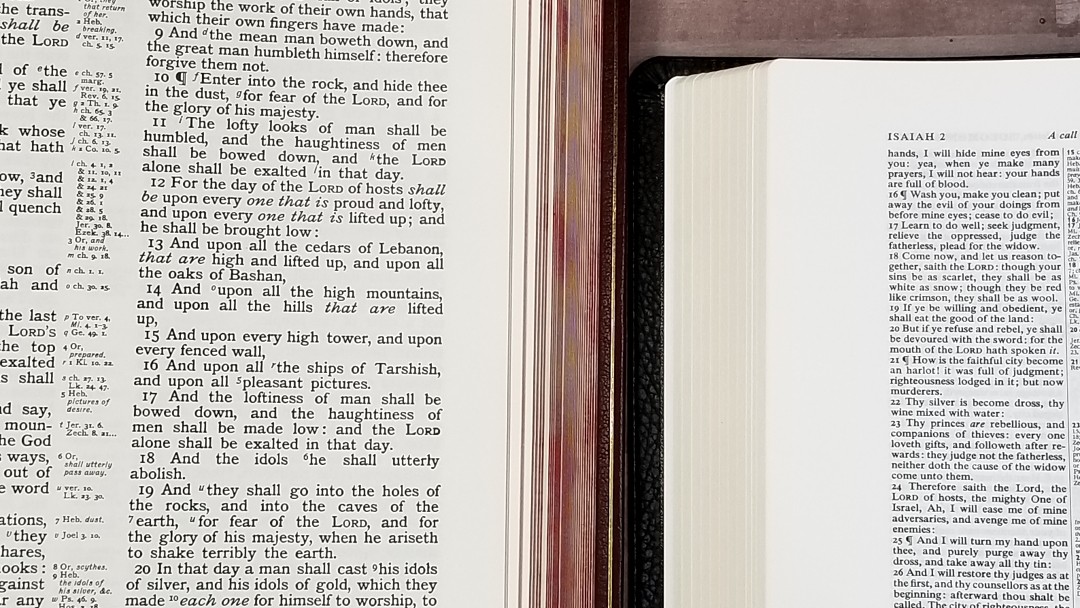
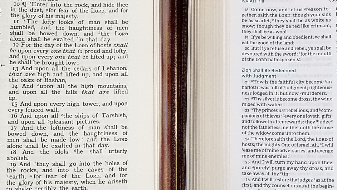
The font is 12-point Antique Pica. This is a thick font that I find easy to read. It’s black-letter and it’s very dark. It’s consistent throughout. It has about 8-10 words per line and includes reference keys, footnote keys, pilcrows to mark paragraphs, and italics for supplied words. It does not include self-pronouncing marks. Each verse is indented, so they’re easy to find quickly.
The text never feels too crowded. None of the words are too close and it has enough space between the lines for comfortable reading. It actually has 3/4″ wide margins on the sides and a 1 1/5″ margin on the bottom in case you want to write some small notes. This helps bring the text out of the gutter even more than it already does.
References and Footnotes
References are keyed to the text with letters. They go from one column across to the other, so you might have an a on the right, b and c on the left, d on the right, etc. The references are not large print, but I did find them easy to read. The footnotes of the standard translator’s notes that include explanations of Greek and Hebrew words where necessary for clarity.
Here are some example references to help you compare:
- Genesis 1:1 – Ps 136:5; Jn 1:1-3; Col 1:16, 17; Heb 1:8-10; 11:3
- Deuteronomy 6:4 – Mk 12:29; Isa 42:8; Jn 17:3; 1 Cor 8:4, 6
- Isaiah 9:6 – Lk 2:11; ch 7:14; Mt 28:18; Judges 13:18; Eph 2:14
- Matthew 28:19 – Mk 16:15, 16; Isa 52:10; Lk 24:47; Ac 2:39;
- Mark 12:29 – Dt 6:4, 5
- Luke 24:47 – Ac 13:38; Isa 49:6; Mal 1:11; Ac 2:14-47
- John 1:1 – Gen 1:1; ch 17:5; Col 1:17; 1 Jn 1:1; ver 14; Rev 19:13; 1 Jn 1:2; Phil 2:6
- John 3:16 – Rom 5:8; 1 Jn 4:9; Rom 8:32; ch 1:18
- Acts 2:38 – Lk 24:47; ch 3:19; 20:21; ch 8:15, 16; 22:16; Mt 26:28; ch 10:45
- 1 John 1:1 – Jn 1:1; ch 2:13, 14; Rev 1:2; Jn 1:14; Lk 24:39; Jn 1:4
Comparisons
I’ll compare this to a few other KJVs that are often used in the pulpit, and the next largest KJV Bible I’ve seen from Cambridge.
Turquoise
Here’s a look at how the KJV Lecturn Bible compares to the other large print reference KJV from Cambridge that’s likely to be used in the pulpit: the Turquoise. The Cambridge Turquoise font is 1 point smaller and it has fewer words per line that are slightly closer, but the Turquoise actually holds its own. The self-pronouncing marks do make the Turquoise slightly harder to read. The opacity of its 28gsm Indopaque paper is amazing.
New Cambridge Paragraph Bible
The New Cambridge Paragraph Bible is a large Bible that’s often thought of as ‘pulpit size.’ It is a large Bible, but it looks small next to the KJV Lectern Bible. It’s font is clean and clear, but not as dark. I love the 40gsm paper. Of course, it’s single column paragraph setting with fixed sentences, poetry set to stanzas, and personal letters indented place it in a class by itself.
Wide Margin Concord
The Wide Margin Concord has 38gsm paper and is a large Bible, but it has a lot smaller font. It’s an excellent choice for study and use in the pulpit if you don’t need large print and you want a lot of space for notes.
Thomas Nelson KJV Preaching Bible
Here’s how the KJV Lecturn Bible compares with the KJV Preaching Bible from Thomas Nelson. Its typeface is noticeably smaller, but it’s dark and clear. The 36gsm paper is opaque and easy to turn, making it excellent for preaching. I like overall size.
Conclusion
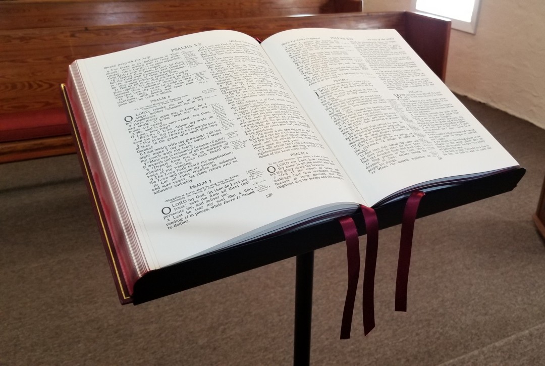
The KJV Lectern Bible from Cambridge is a joy to preach from. It is very large and it takes some time getting used to the wide and tall pages. It took me no time at all to get used to that paper and print. I love this text. The print is dark and easy to read from behind the pulpit. I didn’t find the reference and footnote keys distracting and the extra space in the text is noticeable when reading. The image above shows the Bible on my hand-made pulpit.
The image above shows it sitting on a music stand. It does hang off the edges just a little, but it has no trouble staying in place and it’s easy to use this way. I actually found this easier to use because I could adjust the height. This is a large and expensive Bible. The price and size make this ideal for larger Churches, hospitals with an area for chaplains, and even desk use. Of course, it isn’t the kind of Bible anyone would carry around while preaching. If you or your Church can afford it, or if you run across one in your price range, I recommend getting it.
_________________________________________________________
This book is available at (includes some affiliate links)
and possibly local Bible bookstores
_________________________________________________________
Cambridge provided this Bible in exchange for an honest review. I was not required to give a positive review, only an honest one. All opinions are my own.










Am interested with the Bible
I wish Cambridge would make this Lectern Bible in a Turquoise size. It ticks all the boxes for me. It has the Epistle Dedicatory and the Translators to the Reader, the text is free from self pronouncing marks and looks excellent. I love that all you get are the Epistle Dedicatory and the Translators to the Reader, the KJV Bible text, good footnotes and references, and that’s it. This really should be in a Turquoise size Bible.
Good morning. Are you able to print the Lectern Bible in a different language other than English?
Hi Susan. You can check with the publisher (Cambridge) at their website: https://www.cambridge.org/bibles/