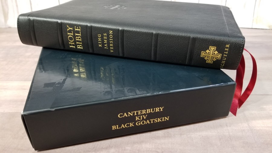
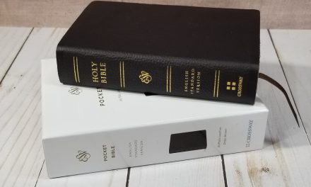
The regular size Canterbury was Schuyler’s first originally designed KJV. It has been around for several years and it’s still one of their most popular Bibles. It has a few features that set it apart from most KJV’s – ornamental drop-caps and verse numbers in red. The original Canterbury had 36gsm paper, making it about the thickness of a standard-sized study Bible. It’s now produced in a thinner, but more expensive, 28gsm Indopaque paper from France.
It’s available in several colors of goatskin and in black calfskin, including a black goatskin in full yapp, which is the edition that I’m reviewing. It comes in a specially designed clamshell box with the Canterbury Cathedral on the front. Like all Bibles from Schuyler, it’s made in the Netherlands by Royal Jongbloed and typeset by 2K/Denmark.
This Bible was purchased for an honest review. I was not asked to give a positive review. All opinions are my own.
_______________________________
Buy from Evangelicalbible.com
_______________________________
Table of Contents
- Video Review
- Cover and Binding
- Paper
- Typography
- References
- Glossary
- Concordance
- Maps
- Front Matter
- Comparisons
- Conclusion
Video Review
Cover and Binding
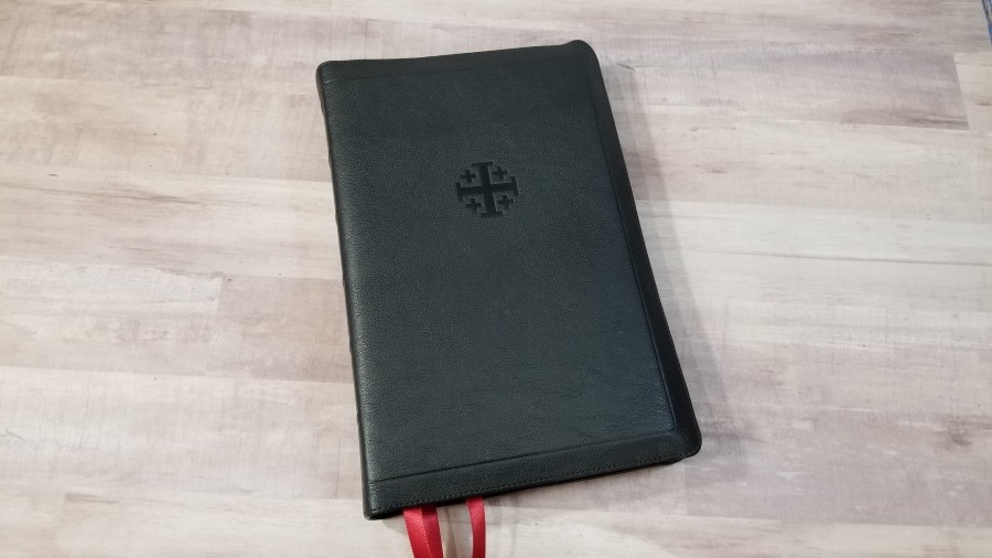
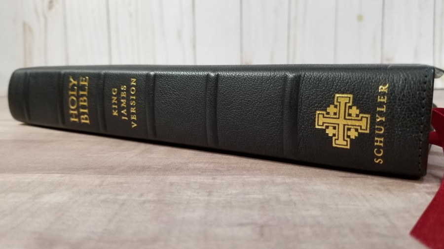
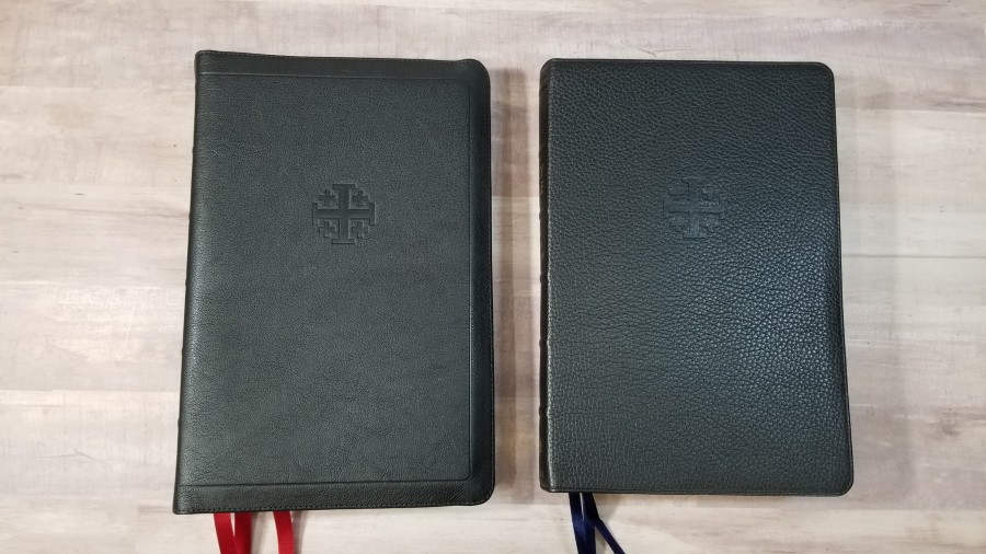
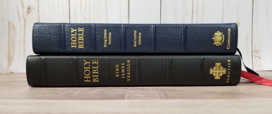
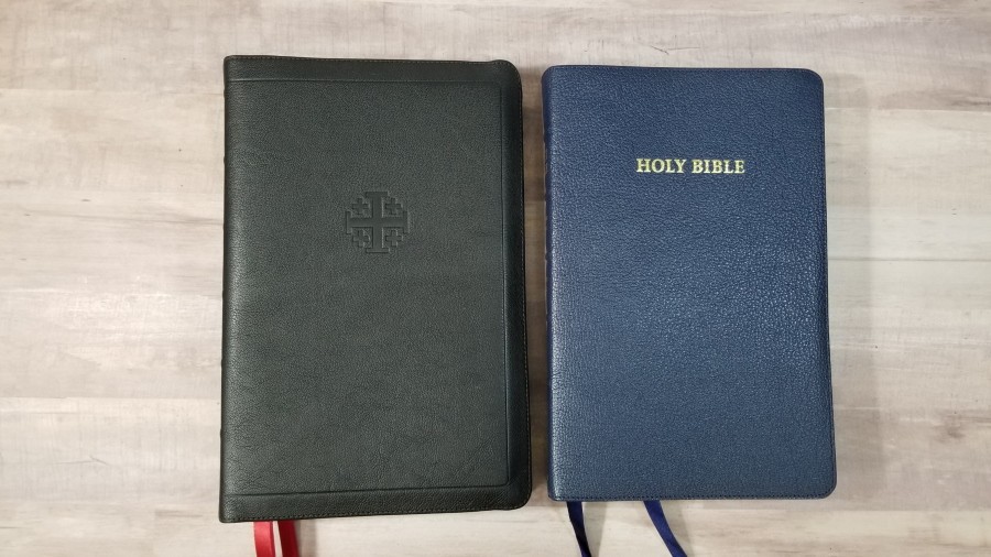
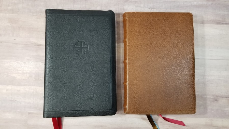
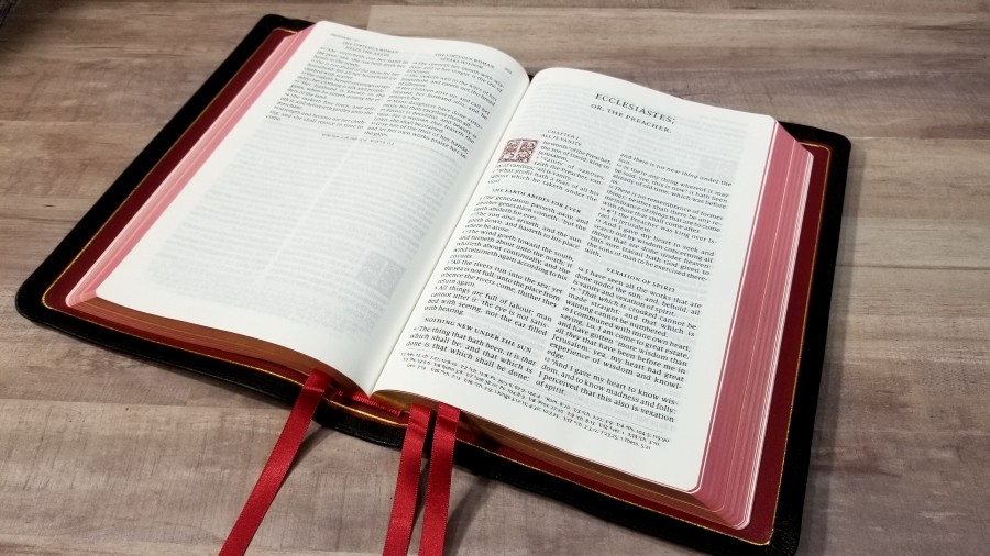
The cover is a natural grain black goatskin. It has perimeter stitching and a full yapp (overhang to protect the page-edges), which is an unusual combination. The Jerusalem Cross is dry stamped onto the front. It also has a decorative line stamped into the front and back around the perimeter. The spine has HOLY BIBLE, KING JAMES VERSION, and the Schuyler logo printed in gold. It has 6 raised ribs. This leather feels thick and elegant. It’s floppy, but not so floppy that I find it difficult to handle.

The yapp on the side touches. The yapp at the top and bottom almost touch.
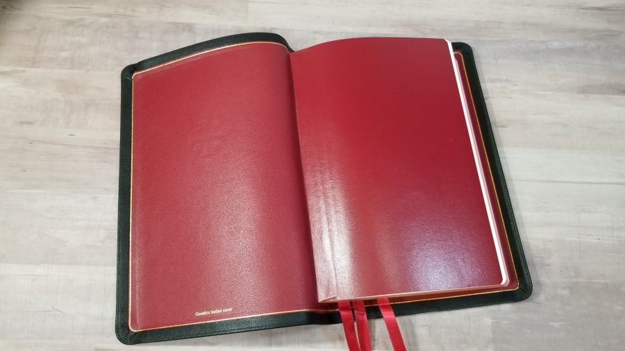
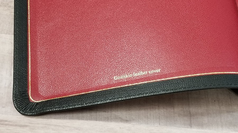
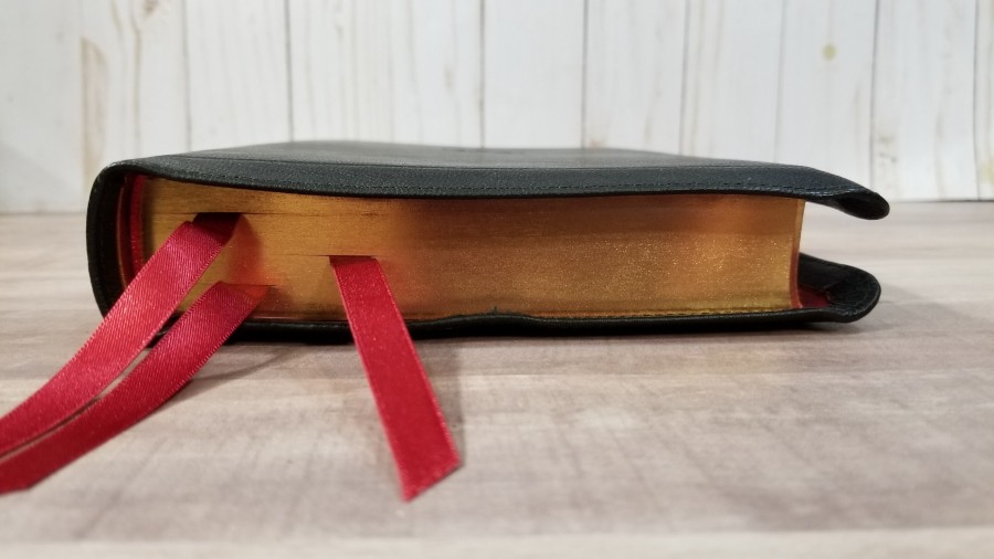
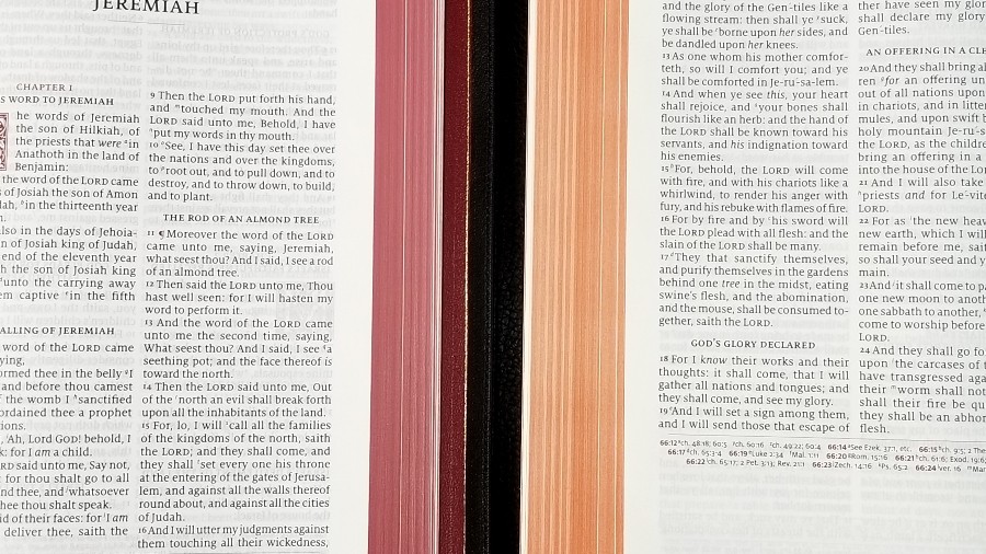
The liner is red calf split leather. It looks like cherry red. I love this color and color-combination. It works perfectly with the black goatskin, red ribbons, and red under gold art-gilt edges. It’s edge-lined with an inner liner that’s the same red. It has a gold gilt-line that runs around the inside perimeter that gives it a finished look and makes it pop. This is the type of finishing touches that I like.
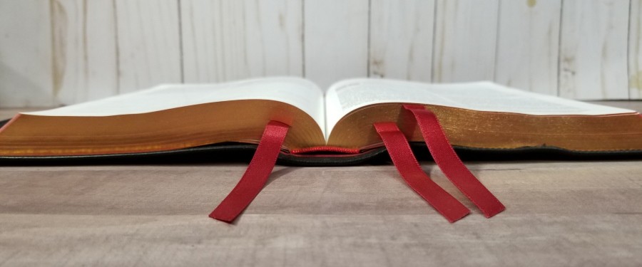
The overall size of the cover with the yapp touching is 6 1/4 x 9 1/8 x 1 3/8″. It weighs 2 lbs, 7.6 oz. It doesn’t feel like a large Bible. It’s almost exactly the same size as the Cambridge Turquoise, which is ideal for carry if you need a larger print reference edition. It has 3 3/8″ red ribbons. They look great against the red under gold page edges.
Paper
The paper is 28gsm Indopaque. It’s smooth to the touch and has a slight cream color with no glare under direct light. It’s highly opaque and the color is great for reading. I had no issues with the pages being too smooth or too thin to turn. The paper is noticeably thinner than the previous edition, but the opacity is about the same. This is an excellent paper to help keep this Bible thin. It makes the Canterbury much easier to handle if you carry around larger Bibles. The art-gilt is red under gold.
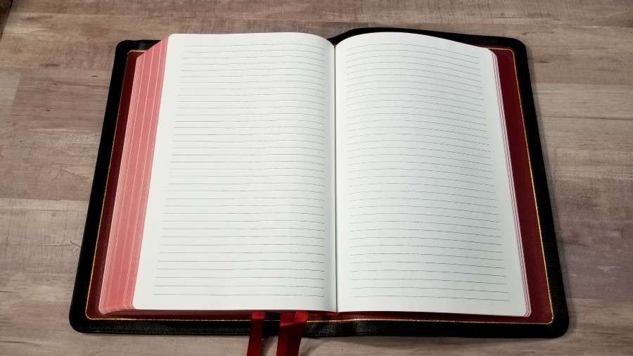
It has 11 lined pages in the back for notes. The pages have the same paper as the rest of the text. I haven’t tried writing on the pages yet, but I’m curious how well it would work for sermon outlines, references, word-studies, and ministry notes.
Typography
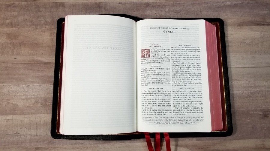
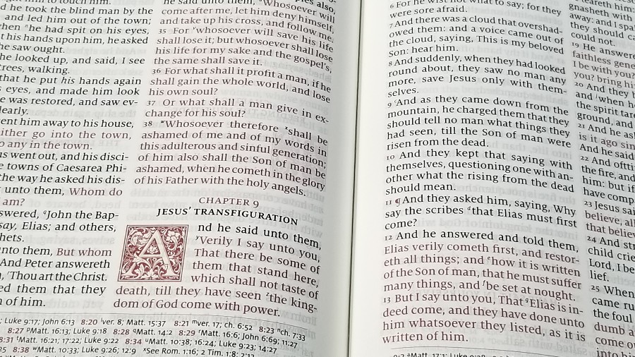
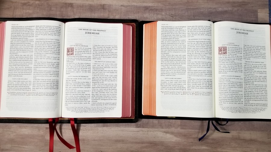
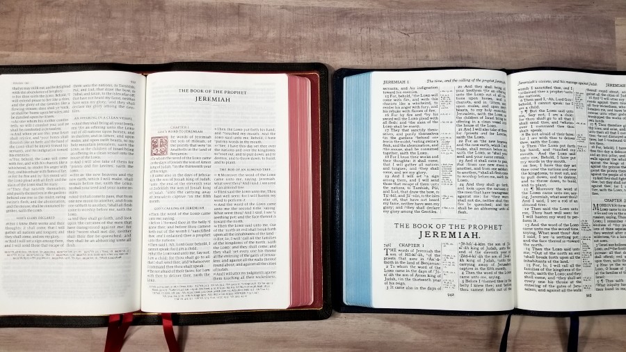
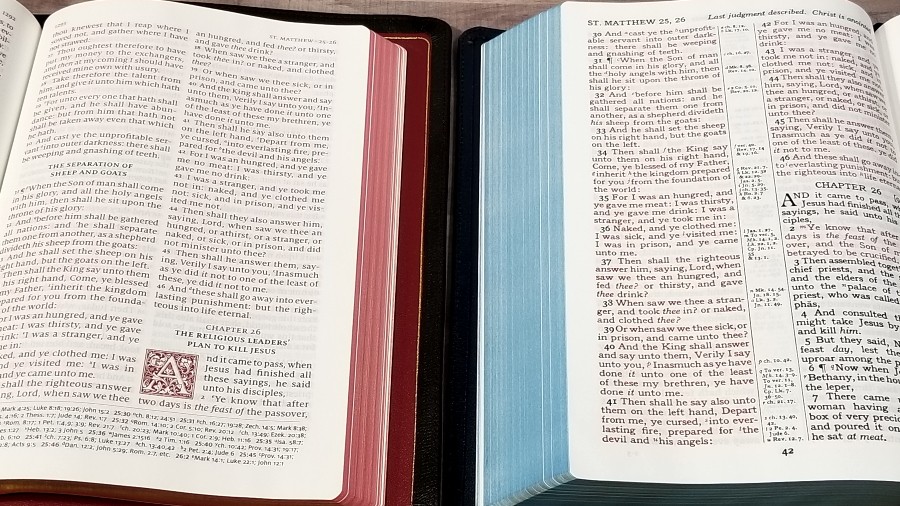
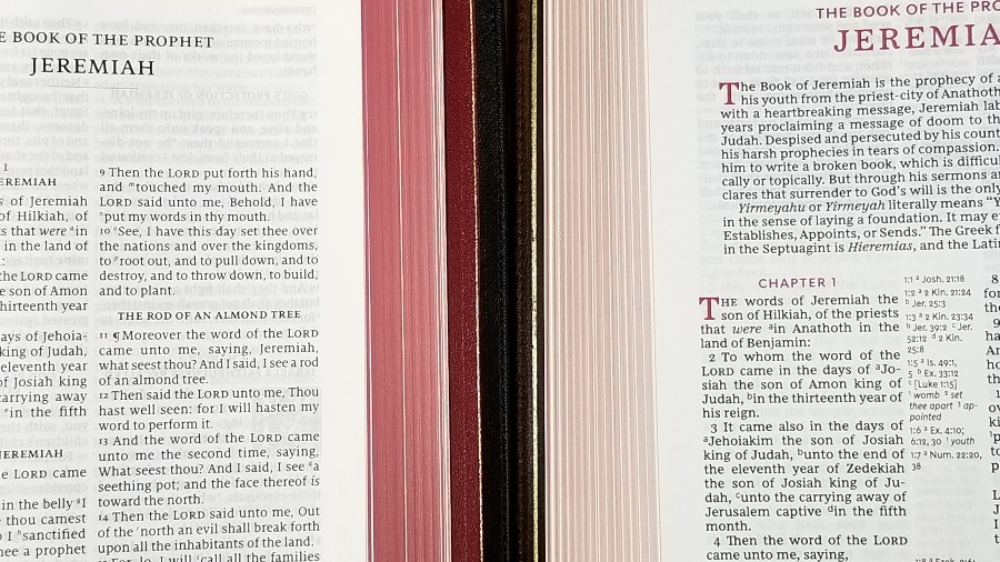
The text is presented in a double-column verse-by-verse format with Psalms in a single column setting. The header places the page numbers in the inner margin and the book name and chapter numbers in the outer margin. Cross-references are placed in the footer. Chapter numbers, drop-caps, verse numbers, pilcrows, header text, the footer line, and chapter and verse numbers in the footer are all printed in a bold red.
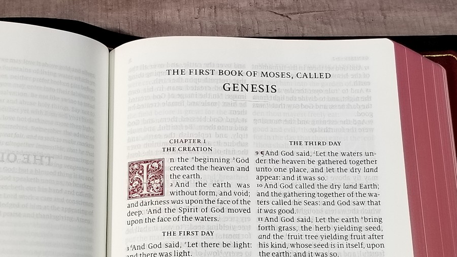
The font is 11-point Milo with a more than average space between the lines. This is a red-letter edition. Both the black and red are dark and consistent throughout the text. It’s printed with line-matching, meaning the lines on both sides of the page are printing in the place front and back. This greatly improves readability The paper is opaque enough that the text doesn’t appear gray because of the text behind it.
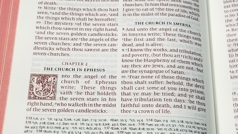
It has around 8 words per line. Words never feel cramped. It has italics for supplied words. Unlike the previous edition, this one follows the wide margin Canterbury and does not include self-pronouncing marks. The inner margin is wide enough to bring the text out of the gutter, so the text never gets lost in the bend. This is even more noticeable in this edition because of the thinner spine.
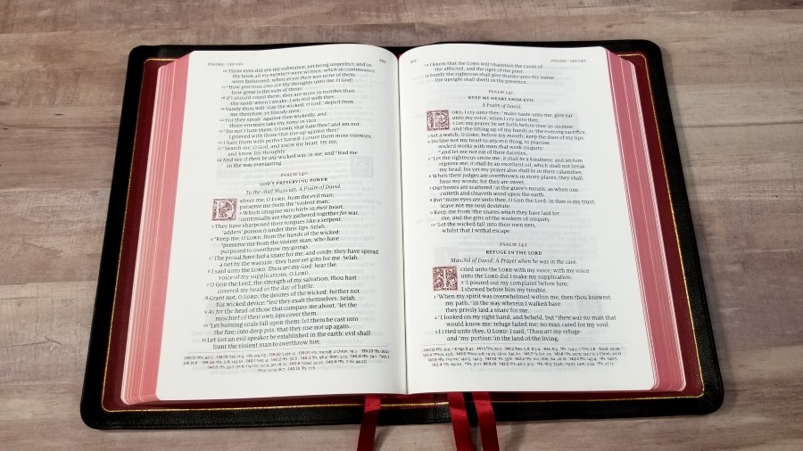

Psalms is set in a single column layout. The poetic lines are separated for a more poetic flow.
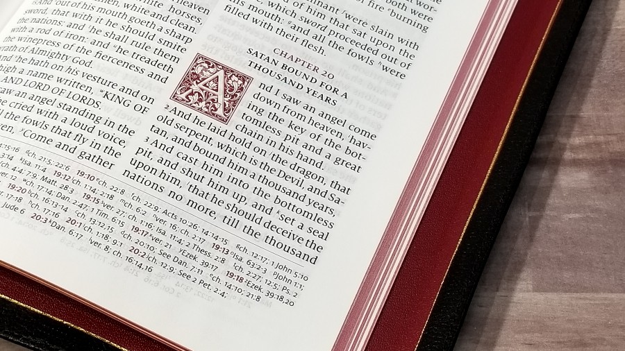
The ornamental drop-caps are created with LTC Goudy Initials fonts. They take five lines everywhere except for Psalms, which takes 4. Cross-references are keyed with letters. I find them large enough to use, but I can also ignore them easily. For preaching, I don’t pause when reading because of awkward spacing, as I do in many reference editions.
References
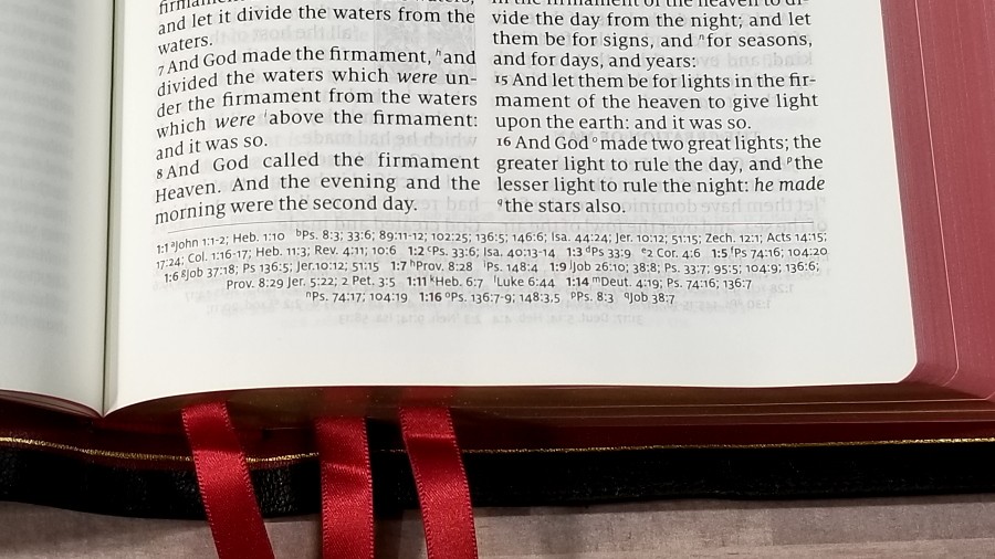
The Canterbury has 55,000 cross-references. They’re placed in the footer horizontally across the page and separated from the text by a line. They’re keyed to the text with letters and include the chapter and verse numbers in red. They taper toward the bottom of the page to ground the page.
Here are a few verses with their references to help you compare:
- Genesis 1:1 – Jn 1:12; Heb 1:10; Ps 8:3; 33:6; 89:11-12; 102:25; 136:5; 146:6; Isa 44:24; Jer 10:12; 51:15; Zech 12:1; Acts 14:15; 17:24; Col 1:16-17; Heb 11:3; Rev 4:11; 10:6
- Deuteronomy 6:4 – Isa 42:8; Mark 12:29, 32; John 17:3; 1 Cor 8:4, 6
- Isaiah 9:6 – ch 7:14; Luke 2:11; John 3:16; Matt 28:18; 1 Cor 15:25; Judg 13:18; Titus 2:13; Eph 2:14
- Mark 12:29 – Duet 6:4; Luke 10:27
- John 1:1 – Prov 8:22-23, etc; Col 1:17; 1 Jn 1:1; Rev 1:2; 19:13; ch 17:5; Prov 8:30; 1 Jn 1:2; Php 2:6; 1 Jn 5:7
- John 3:16 – Rom 5:8; 1 Jn 4:9
- Acts 2:38 – ch 3:19; Lk 24:47
- 1 John 1:1 – ch 2:13; Jn 1:1; ch 4:14; Jn 1:14; 2 Pet 1:16; Lk 24:39; Jn 20:27
Glossary
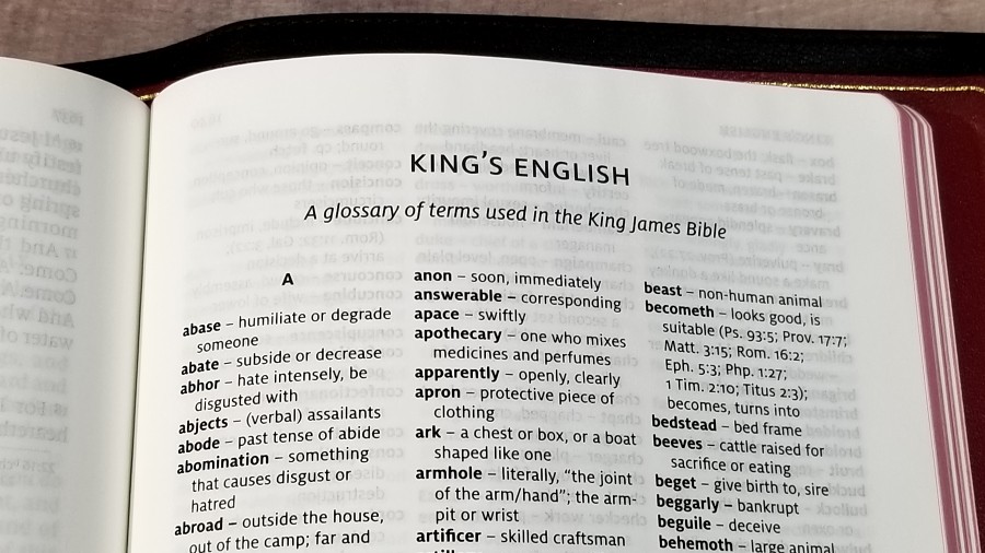
It includes the 9-page King’s English Glossary from Holman Publishers. This glossary covers words that have changed meaning or are no longer in use. Some of them include references where you can see it in context. I’m glad this is included and it should be included in more KJV’s. We don’t always realize that some words have changed in meaning and it’s not always easy to pick up on that from the context. I highly recommend reading through it since the text doesn’t alert you to the words.
Concordance
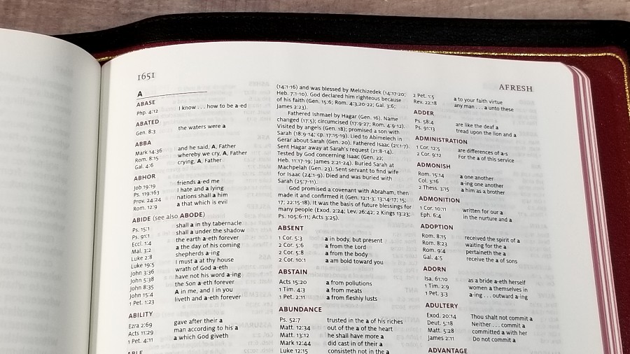
The concordance is 43 pages with 3 columns per page. The entries are in red. It includes biographies of key people with references for key events in their lives, making this a good concordance for study and sermon prep. The print is small, though, so it might be difficult to read if you need a larger print.
Here are a few example entries with the number of references for each one to help you compare:
- Christ – 6
- Christian – 3
- Faith (see also Faithful, Faithless) – 40
- Faithful – 26
- Faithless – 2
- God (see also Gods) – 40
- Godhead – 2
- Godliness – 5
- Godly – 4
- Gods – 7
- Praise – 7
- Pray (see also Prayer) – 17
- Prayer – 12
Maps
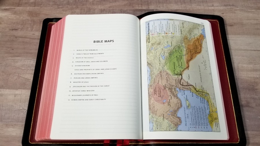
It has 12 maps printed on thick paper. They are colorful and are amazing to look at. These are my favorite colors for maps. They’re annotated well and they’re easy to follow. Several of the maps take two pages. These maps do not include space in the gutter, making them difficult to read where the two pages meet.
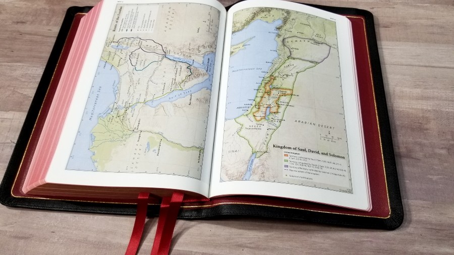

Maps include borders, cities, distance, topography, Scripture references, places of worship, capitals, water, roads, canals, seaports, ancient inscription sites, events of Jesus’ life, Apostles’ ministries, places of writings, etc. It also includes a 3-page index to maps, making them even easier to use.
Here’s the list of maps (and one chart):
- World of the Patriarchs
- Israel’s Twelve Tribe Allotments
- Route of the Exodus
- Kingdom of Saul, David and Solomon
- Divided Kingdom
- Kings and Prophets of Israel and Judah (Chart)
- Assyrian and Babylonian Empires
- Persian and Greek Empires
- Ministry of Jesus
- Jerusalem and the Passion of the Christ
- Apostles’ Early Ministry
- Missionary Journeys of Paul
- Roman Empire and Early Christianity
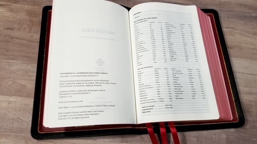
Front Matter
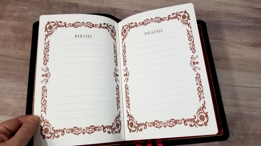
In the front, we find the presentation/family pages the, Epistle Dedicatory, and the Translators to the Reader. The presentation and family pages include the presentation page, marriages, births, and deaths. They’re printed with a floral graphic in dark red that frames the page.
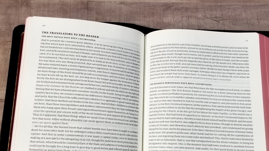
The Translators to the Reader is an important document for the King James Version and I’m glad to see it’s still included.
Comparisons
Here’s a look at how the newer and thinner Canterbury compares to a few other large print reference KJV’s.
Original Canterbury
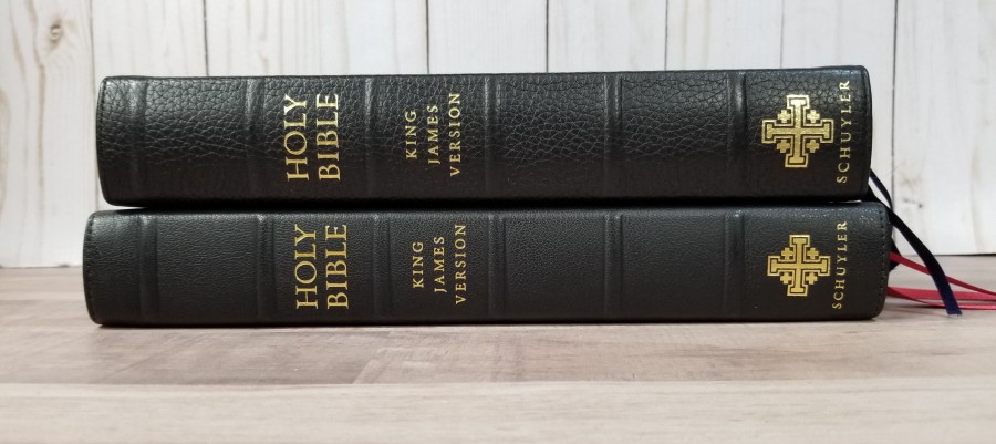
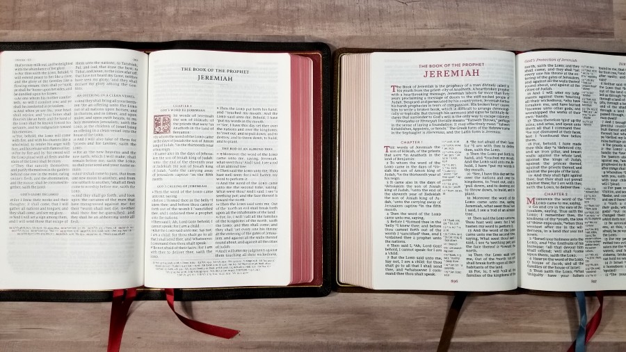
The original Canterbury has 36gsm paper with a creamier color. The amount of difference of the contrast is noticeable when the two are side-by-side. The new Canterbury is on the left and appears darker. The amount of show-through is about the same. The 28gsm might have a touch more show-through, but I can only tell that if they’re sitting next to each other. The difference is understandable when you reduce the paper by 8gsm, and it’s a good trade to get a thinner and lighter Bible. The thinner paper of the newer edition makes it around 9 oz lighter and 1/4″ thinner. The art-gilt is also darker. The original includes self-pronouncing marks for names. It’s black letter.
Cambridge Turquoise

The Cambridge Turquoise has the same paper and almost the same dimensions. It has an 11-point font, a center-column reference system with fewer references, self-pronouncing marks, and no section headings, but it does include the translator’s footnotes. It’s a reprint of a setting from the 1920s, so we have the old hot metal press vs the digital fonts of the Canterbury. Both are red-letter. It’s also printed by Royal Jongbloed.
Thomas Nelson KJV Giant Print Reference Bible Premier Collection

Thomas Nelson’s KJV Giant Print Reference Bible is a 12-point font with 72,000 center-column references, translator’s footnotes, book summaries, self pronouncing marks, red highlights, and a glossary on the page. It has 36gsm European paper. The Comfort Print font was designed by 2K/Denmark. It’s black-letter. It’s printed in China.
Conclusion
The new version of the Schuyler Canterbury is an excellent edition of the Canterbury. The French-milled Indopaque paper is a great choice for bringing down the weight and thickness of the Bible without sacrificing quality, and I prefer the contrast that it has with the font to the original.
The full yapp doesn’t make the Bible feel larger like I first expected. The font size is great for reading and preaching. The overall size is great for carry without feeling like you’re carrying a study Bible. I still find the concordance font to be too small for most of the older crowd, but it is useful for study and sermon prep.
This is one of those Bibles that draws me to it and keeps me reading. I rarely carry a large Bible, but I enjoy carrying this one. If you’re interested in a high-quality large print reference KJV, I highly recommend the latest edition of the Schuyler Canterbury.
_________________________________________________________
This Bible is available at Evangelicalbible.com
_________________________________________________________
This Bible was purchased for an honest review. I was not asked to give a positive review. All opinions are my own.


Really appreciate your excellent review of this new Canterbury. I will have the money in a few weeks to purchase a Schuyler Treveris. However looking at this one makes me wonder about it to. I noticed on the Treveris description page it mentions 28 gsm paper but does not say Indopaque. Are you able to tell if the paper on Treveris is the same as the new Canterbury?
It’s the same paper in both Bibles.
Good then that means that they have the same paper as my Cambridge Turquoise which is excellent indeed. I have been reading through my Turquoise at a pace of completing in 5 months. The more I use the Turquoise the more I love it. Those Turquoise references are printed so clear it is hard to to keep looking at them. That is an excellent thing for a reference Bible but not ideal for a reader. So still plan on getting the Treveris as it will be a nice reader companion to my Turquoise. Thank you Randy
You’re welcome! I love the Treveris (and Indopaque paper).
Red letter and no self-pronouncing marks are improvements over the original Canterbury, in my opinion. Schuyler’s self-pronouncing marks have always been something of a half-hearted effort in any case.
Improved thinness is another plus, since it did not sacrifice anything in the process in terms of ghosting, legibility or ease of turning pages. The black cover and red inner lining look amazing.
Thanks for the review, Randy.
very mice bible
Would you be able to tell me how large the margins are in the full yapp Canterbury?
Thank you.
Hi Eric. The inner, outer, and top are 1/2″. The bottom is 3/8″.
Randy thanks for the reviews you put out.
I wish I would have known about this Schuler before I bout the Thomas Nelson I got which is the KJV in brown goat skin, it was the first so called premium Bible I have purchased.
I have what I call my beater Bibles which have been used for study and research which are highlighted and full of notes but Bibles like these would be a reader only for my such as the Thomas Nelson I have the same one you used as a footprint comparison in the video for the Schuyler full yapp.
I do have one question here as far as that comparison with the Thomas Nelson are the font size pretty close?
I tried to look closely in the video and they certainly do seem close to me.
The Nelson is pretty comfortable for me as I wear glasses but usually if I’m going to be doing some deep research reading I use the 18 point font Holman Bibles with the super giant font.
These are back in stock at Evangelic again and I plan to order one soon if you see this replay and are able to answer about the font I would appreciate it.
The Nelson Bible is alright but with the yapp being so short I’m always leery of the page edges and fear I’ll ding or scratch them up I guess maybe that is a bit overboard but that’s me when it comes to a nice Bible.
Tim
Thanks Tim! The Thomas Nelson font is a hair larger, but it’s hard to tell the difference even when they’re side-by-side. The main difference is the weight. The TN is a heavier font, making it appear darker on the page. I do find the Schuyler to be dark enough and it’s great for reading, but the TN stands out a little more, which I prefer.
Hi Randy,
Would you know if there are any plans to release the Treveris in a wide margin edition? Can you put in a good word 🙂 ?
Hi Mark. They don’t have plans for it, but I’ll mention it. That’s an excellent idea!