Cambridge has just released their Topaz setting in the King James Version. Even though there are lots of double-column, verse-by-verse, reference KJVs available, this one was highly anticipated. KJV readers were right to be excited. Although it is missing one important feature that I consider to be crucial, it does have a feature that sets it above most KJVs. It also has a feature that I find to be a touch quirky. I’ll explain as I go.
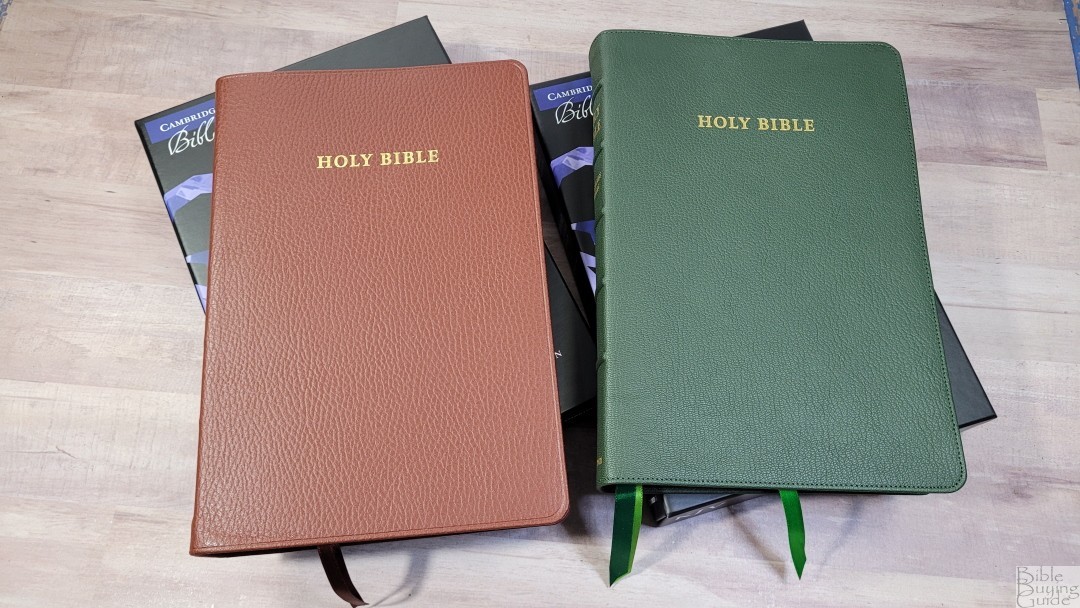
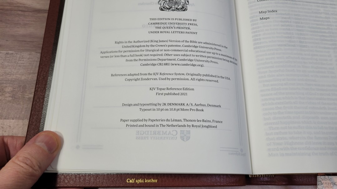
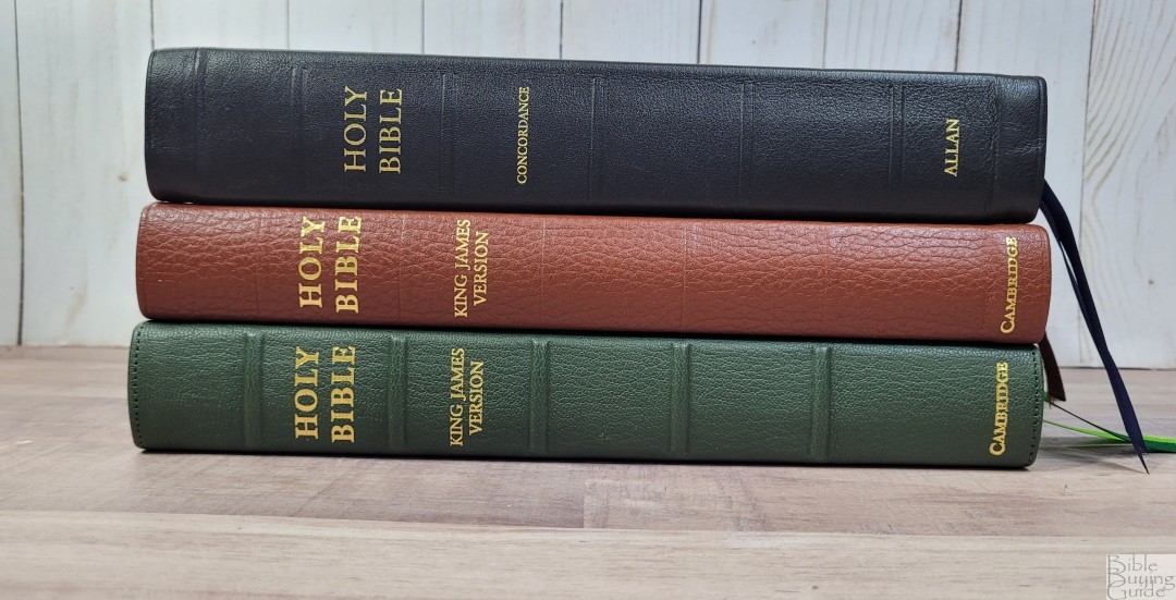
It’s available in black, blue, or green goatskin and black or brown calf-split. I’m reviewing the brown calf-split, ISBN 9781009111065, and the green goatskin, ISBN 9781009111034, both made in the Netherlands by Royal Jongbleod, and designed and typeset by 2K/Denmark.
Cambridge provided these Bibles in exchange for an honest review. I was not required to give a positive review, only an honest one. All opinions are my own.
_________________________________________________________
This Bible is available from
_________________________________________________________
Table of Contents
- Video Review
- Cover and Binding
- Paper
- Typography
- References
- In the Front
- Concordance
- Maps
- Comparisons
- Conclusion
Video Review
Cover and Binding
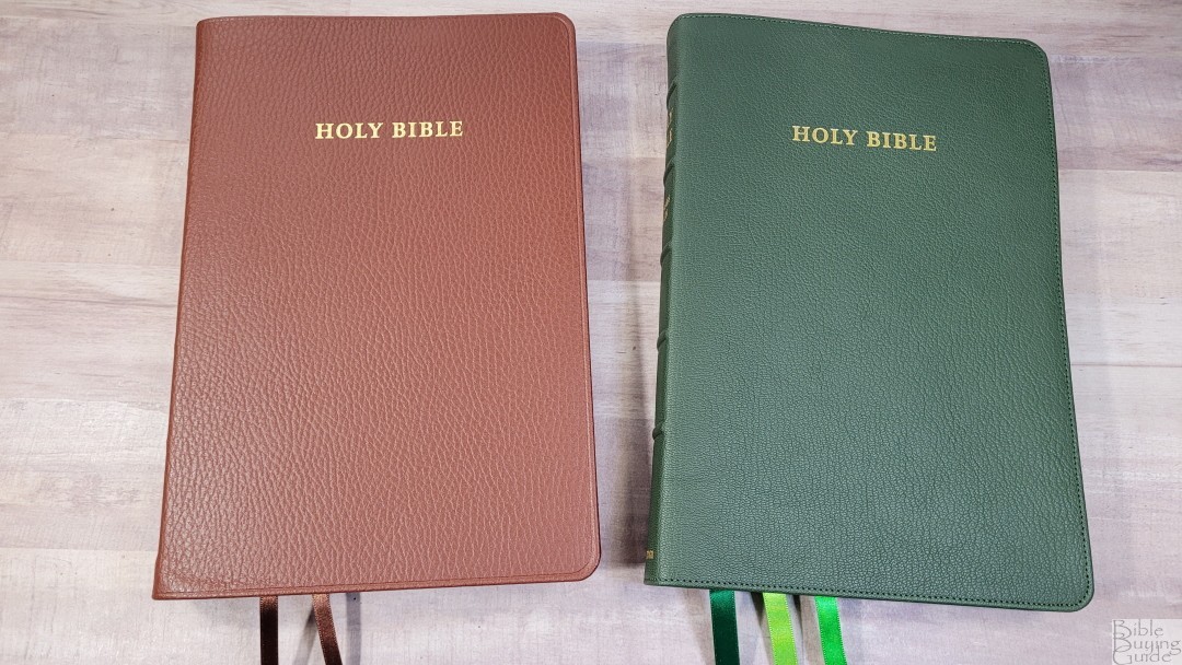
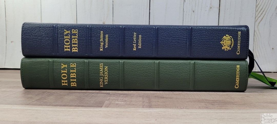
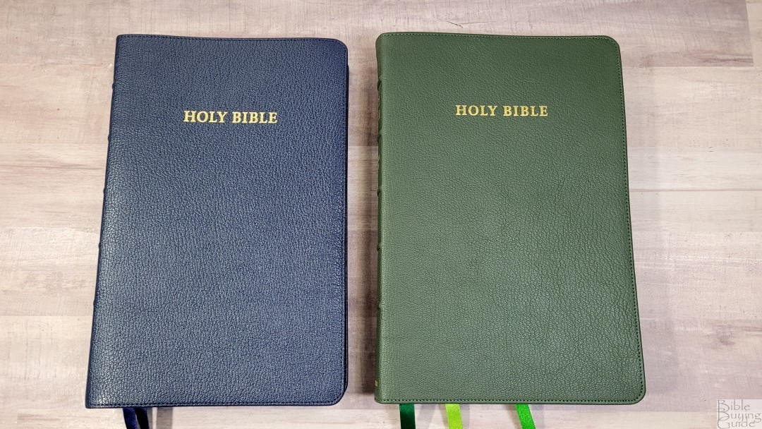
I’m reviewing the green goatskin and the brown calf-split.
Green Goatskin

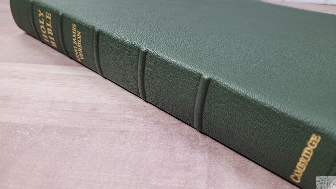
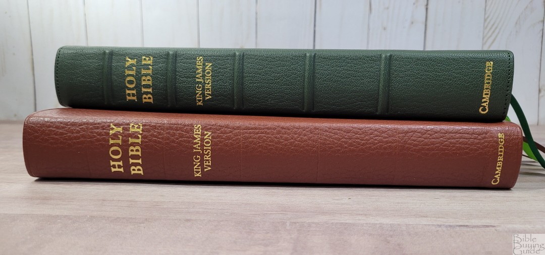
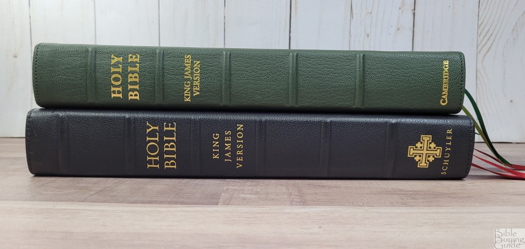
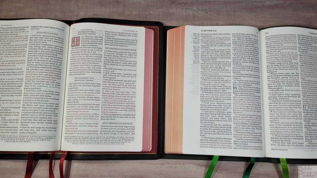
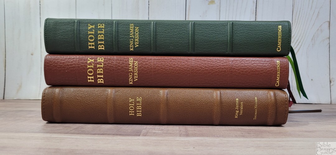
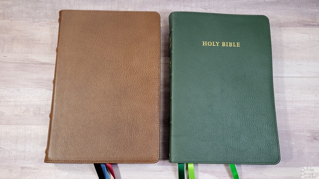
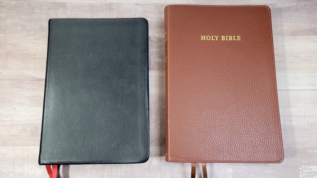
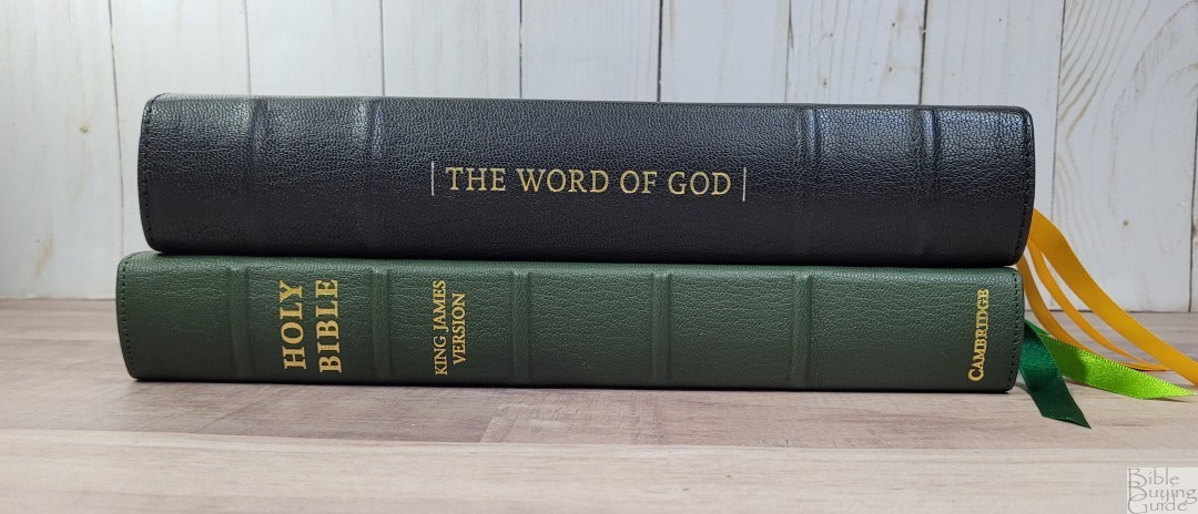
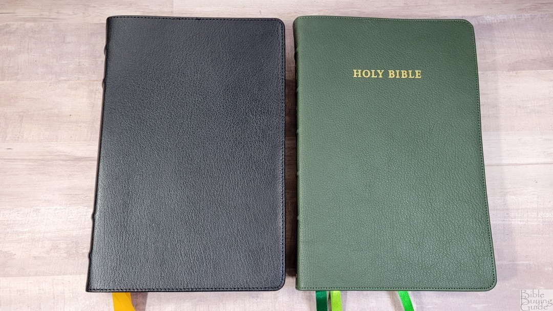
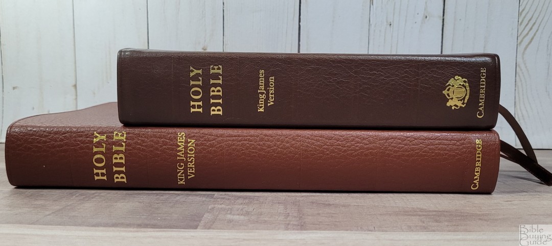
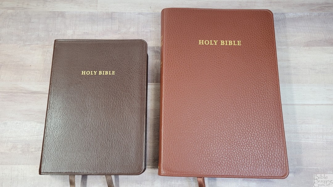
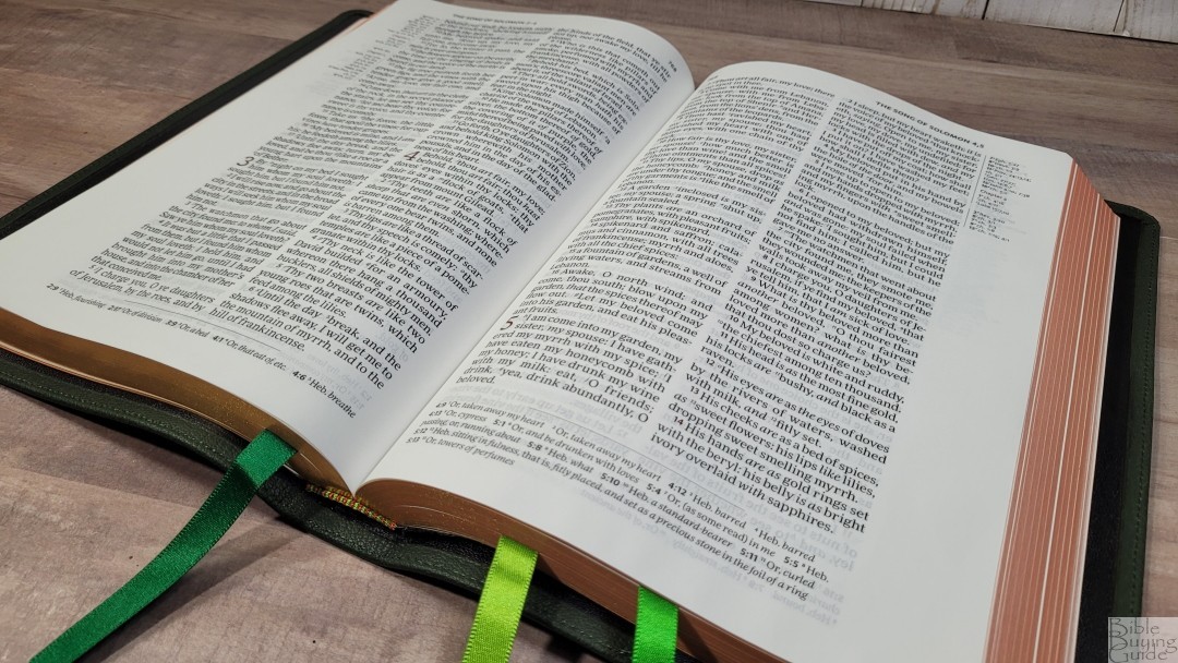
The green goatskin has a pebbly grain that looks and feels natural. The green is a dark shade. It’s slightly olive, but darker. It has perimeter stitching and a 1/4″ yapp. The front has HOLY BIBLE stamped in gold. The spine has five small raised hubs and HOLY BIBLE, KING JAMES VERSION, and CAMBRIDGE stamped in gold. It’s flexible, but not overly floppy. I had no trouble carrying it, holding it, or reading from it.
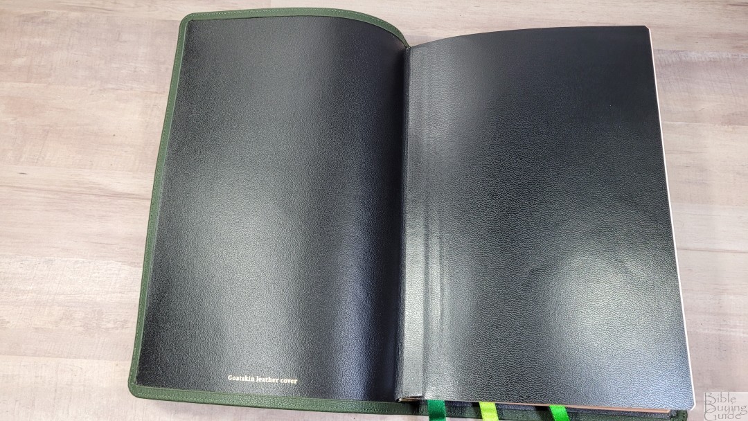
The liner is edge-lined calfskin. The edge-lined tab is not as stiff as the previous editions of the Topaz. The liner looks a touch plain without a gilt line. The text-block is Smyth sewn. It has no trouble staying open in Genesis. It will try to close at first, but it breaks in easily. The spine doesn’t remain too flat when opened, so the text is brought out of the gutter.
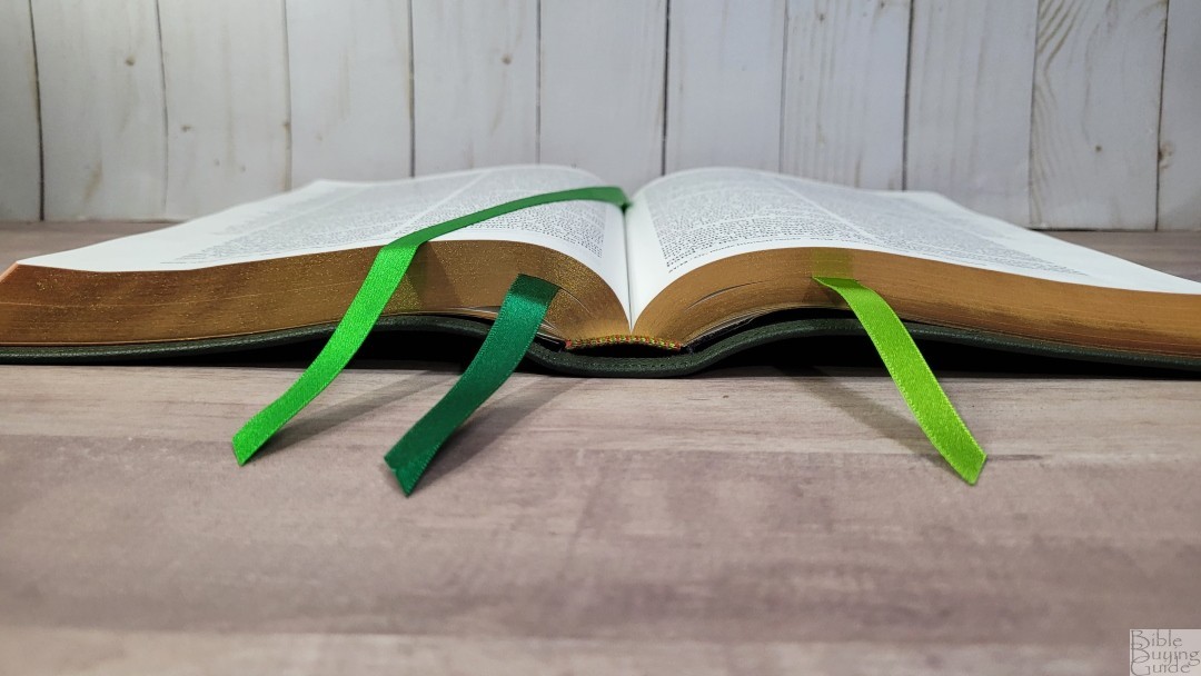
It has three double-sided satin ribbons in various shades of green. They’re long enough to pull to the corner to open the Bible easily. They’re 3/8″ wide. the head/tail bands are green and white. The overall size is 6 5/8 x 9 7/8 x 1 1/4″. It weighs 2lbs, 5oz. The green goatskin edition has art-gilt edges with red under gold.
Brown Calf-split
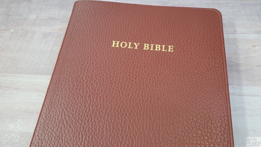

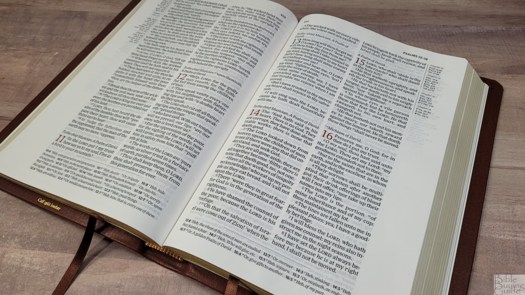
The brown calf-split looks like mahogany. This is one of my favorite colors on a Bible. It’s stamped with a pebbly grain that looks and feels natural. It has an indent around the perimeter and a 3/8″ yapp. The front has HOLY BIBLE stamped in gold. The spine has 5 rib indications and HOLY BIBLE, KING JAMES VERSION, and CAMBRIDGE stamped in gold.

The liner is pasted-down with brown vinyl. It looks to be reinforced. The text block is sewn and it has no trouble staying open on any page. The cover and liner have the right amount of stiffness to make it easy to hold in one hand to carry and read.

It has two brown 1/4″ double-sided satin ribbons. They’re long enough to pull to the corner to open the page easily. The head/tail bands are brown and gold. The overall size is 6 3/4 x 9 7/8 x 1 1/4″. It weighs 2lbs, 4.6oz. The brown calf split is standard gold.
Paper
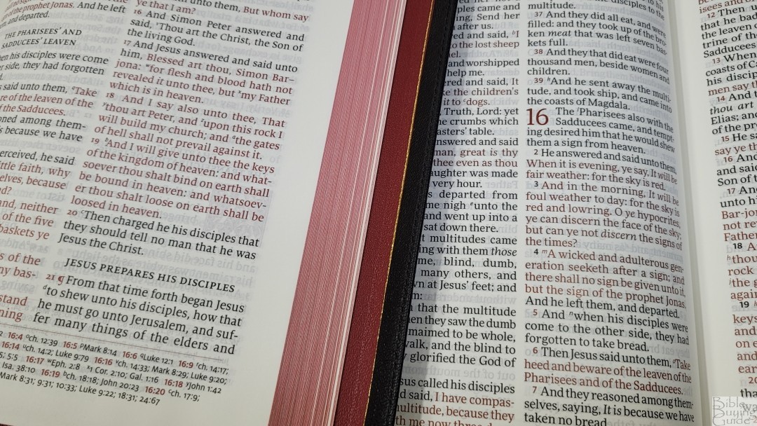
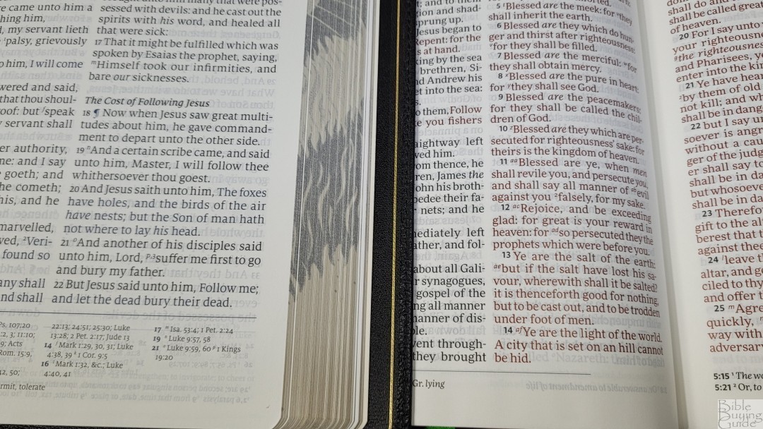
The paper is 28gsm Indopaque by Papeteries du Leman, Thonon-les-Bains, milled in France. This is a Royal Jongbloed exclusive. It’s the same premium paper that’s used in many premium Bibles produced in the Netherlands by Royal Jongbloed. It’s ivory and it’s highly opaque. The opacity is improved with titanium pigment. It feels coated, making it silky to the touch. I find the paper easy to turn, but it can be challenging if you’re not used to thin paper. It has no glare under direct light and the color and opacity are easy on the eyes.
Typography
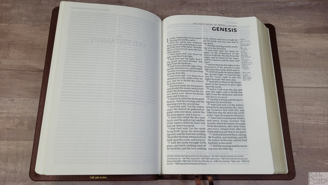
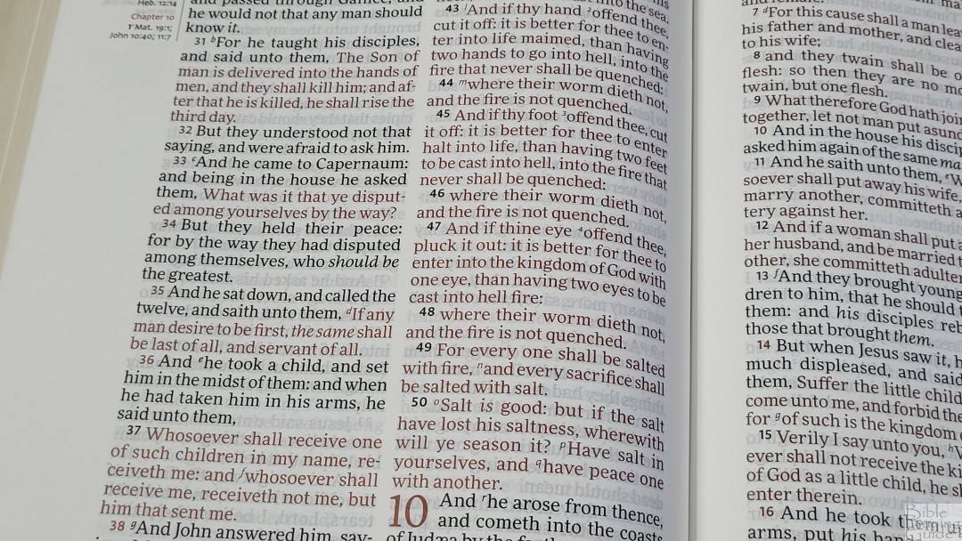
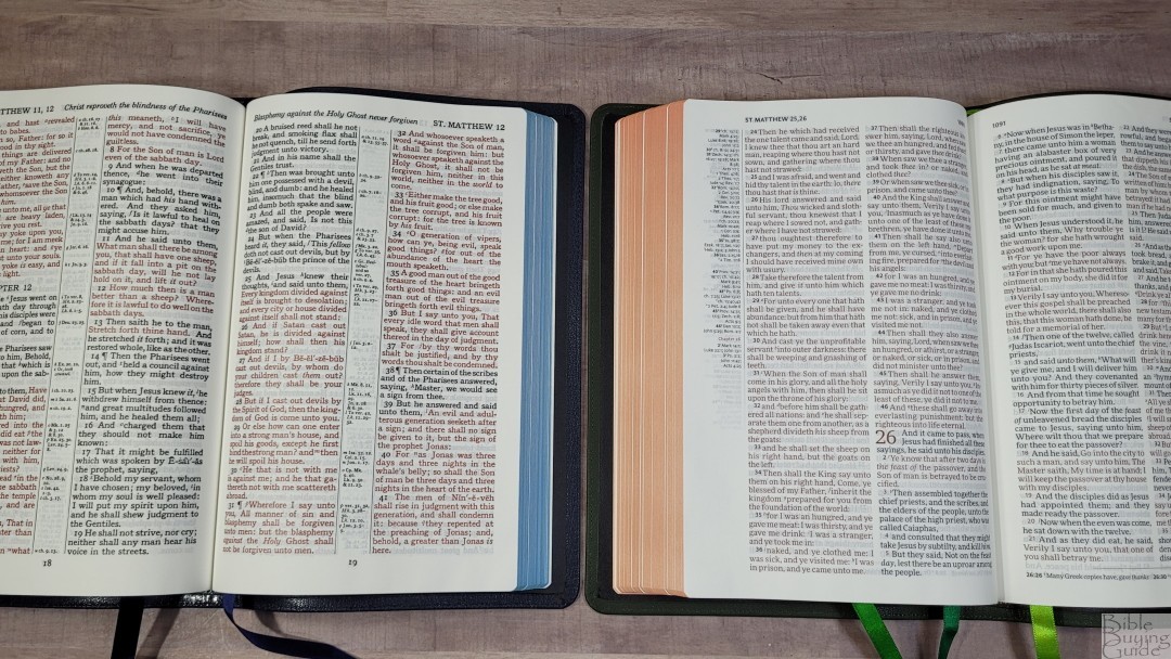
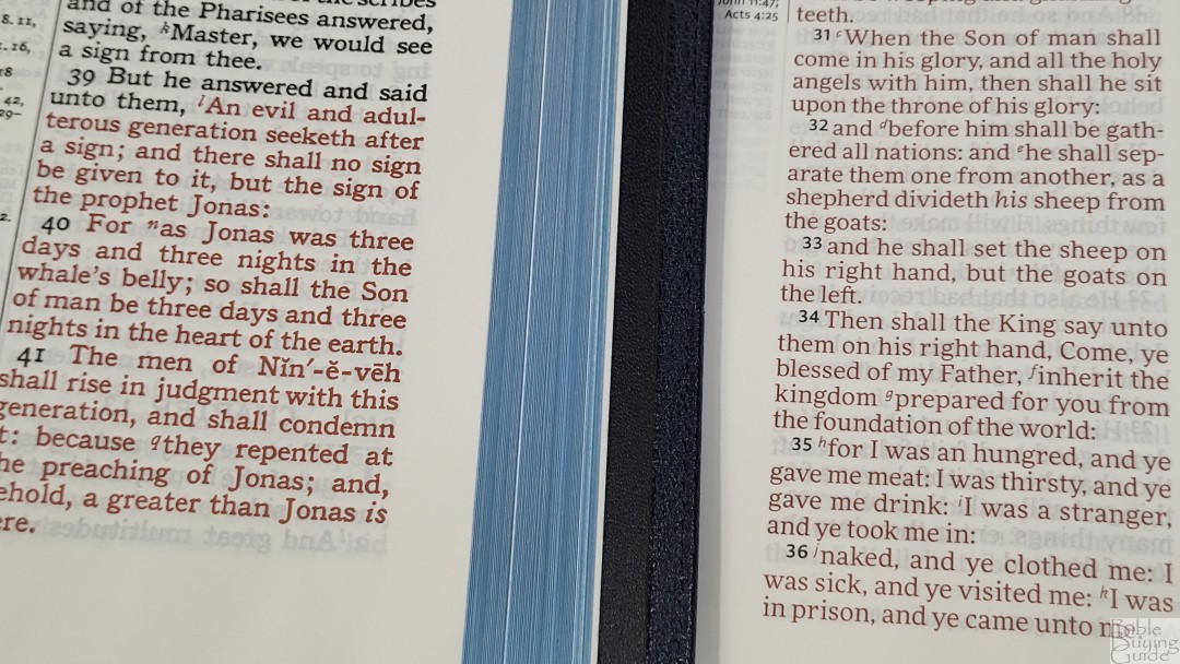
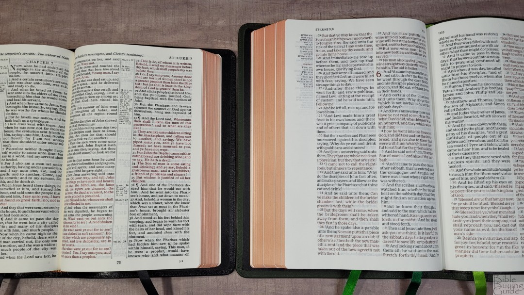
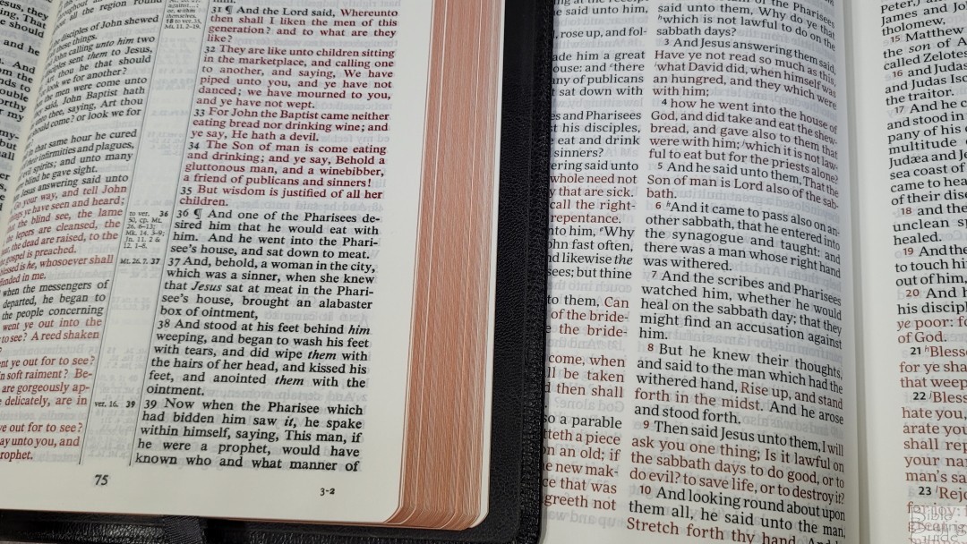
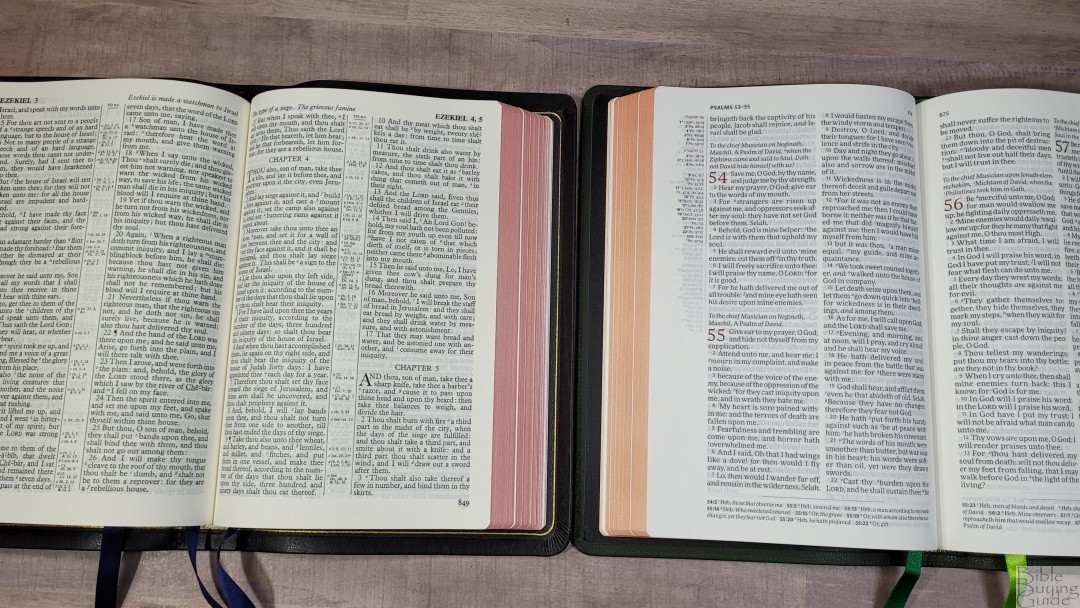
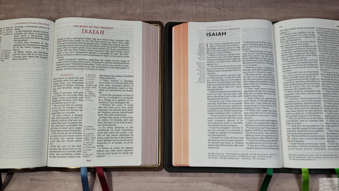
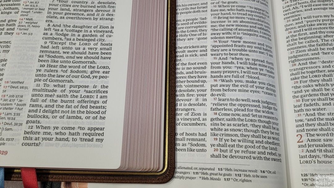
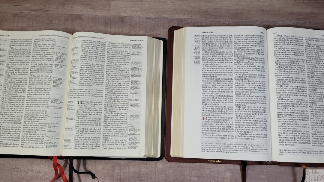
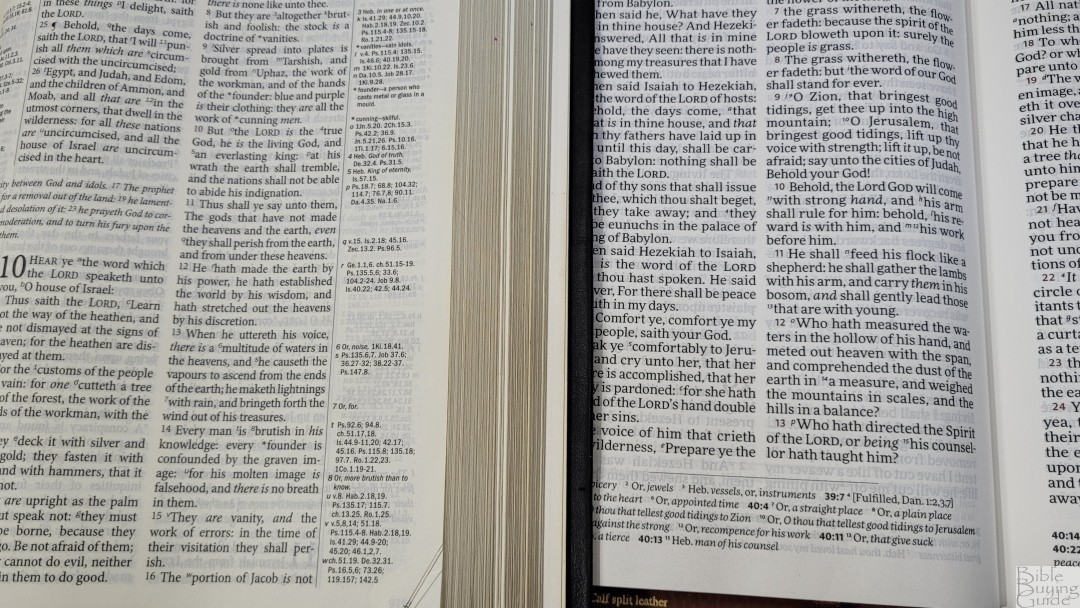
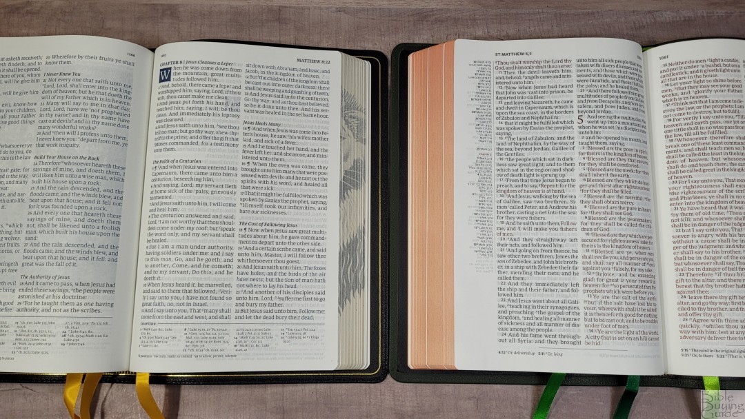
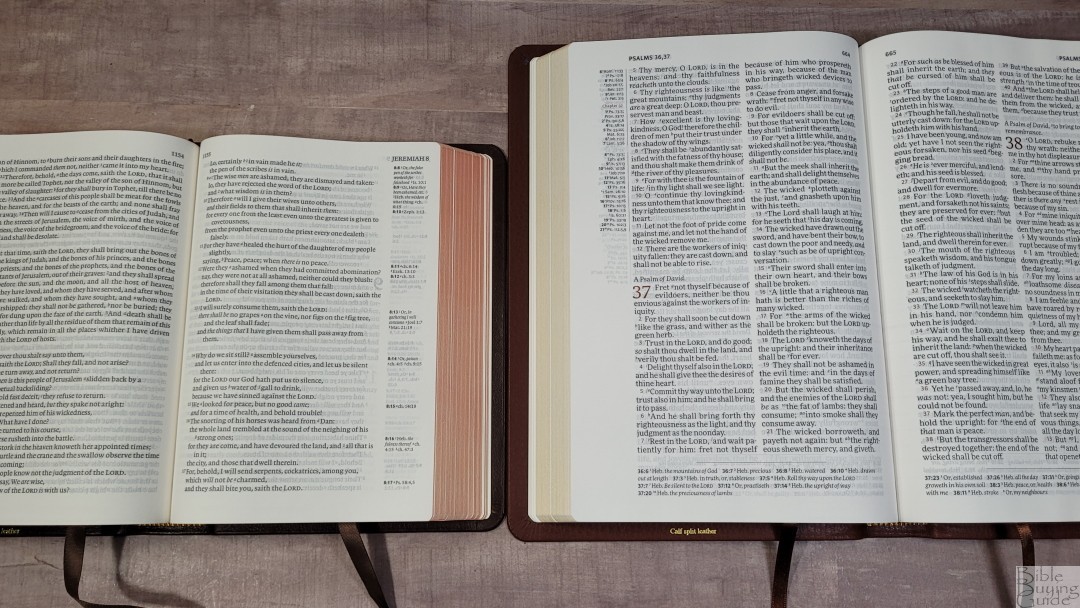
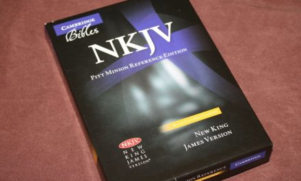
The KJV text is presented in a double-column, verse-by-verse format. Chapter and verse numbers are printed in dark red. Verses that start with red-letter text have black verse numbers. Verses that continue the previous sentence start with a lower-case letter. For me, this is a breakthrough. It helps retain the context of sentences instead of placing the emphasis on man’s addition of verse numbers. Across the top, we see the page numbers in the inner column and the book name and chapter number over the outer column. References are placed in the outer margins and footnotes are placed in the footer. Unlike most KJVs without section headings, this one does not include page summaries in the header.

The layout was designed and typeset by 2K/Denmark with the More Pro Book typeface in a 10-point red letter. The red letter is only for the words of Christ while on Earth, so there’s no red letter in Revelation. The black and red are dark but not bold. It’s ideal for reading. I can read this for hours without eye strain. It was slow-printed to improve the print quality. Both the black and red text are highly consistent. Supplied words are in italics. It doesn’t include pilcrows for paragraph markers. The other Topaz translations had section headings to help, but this one does not, so there’s no way to identify them. The footnote and reference keys are superscripts. I found them large enough to see and small enough that they don’t cause too many unnatural pauses when preaching.
It has around 6-7 words per line with enough space between the words and the lines to be comfortable to read. It was printed with line-matching, so the lines are printed in the same location on both sides of the page. This reduces show-through and improves readability. It has a good amount of extra space in the inner margin to bring the text out of the bend of the page and onto the flat part of the page. It also helps that the spine is only 1.25″, which is one reason I prefer this thickness.
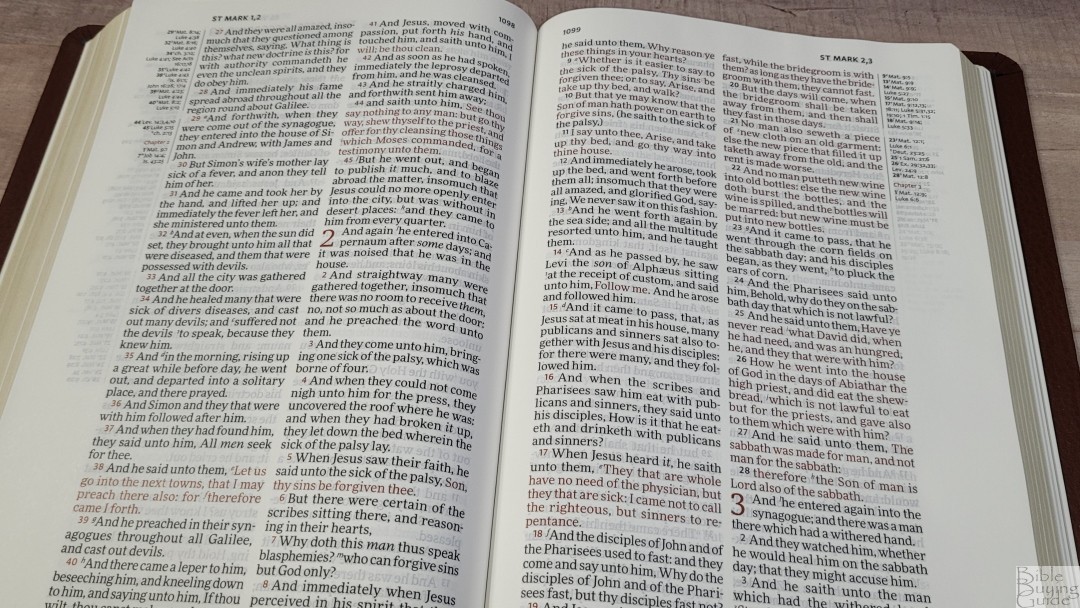
Cross-references are placed in the outer margin to keep all four columns of text together. This keeps you from having to jump over non-biblical text to continue reading. This leaves a lot of empty margin space, 1 1/8″ and about a half-page high on average, that can be used for notes. I love that the references and footnotes are separate. This makes them easier to find.

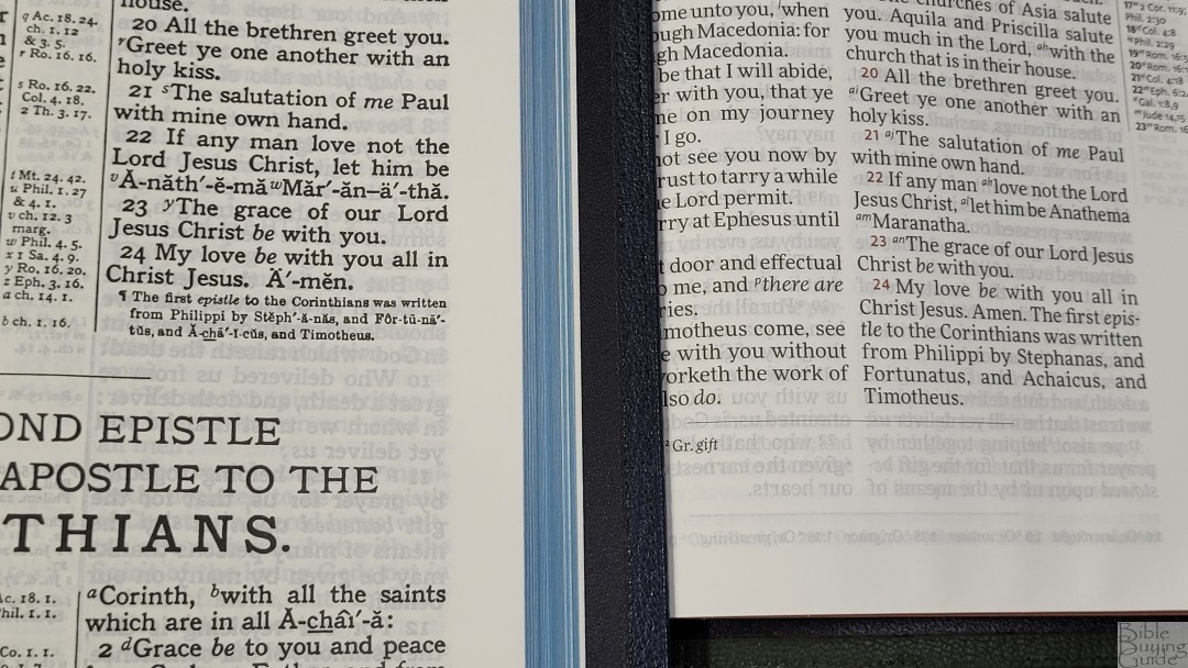
The thing I find quirky is the endings that Cambridge adds to the epistles have been added to the end of the last verse of each epistle. These are normally found after the end of the books in Cambridge KJV Bibles. Now, they look like they’re part of the Scriptures.
References and Footnotes
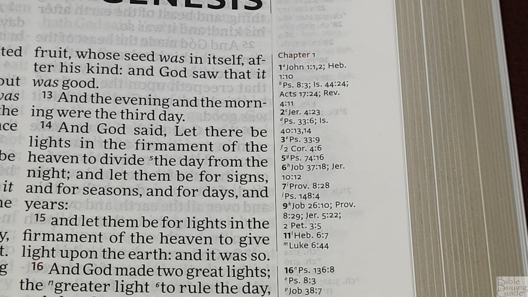


Cross-references are placed in the outer margin to keep the text on both sides of the page together. They start at the top of the page. A space separates them for the left and right columns. They include the chapter number in red as a title with all the verses listed under it. The pilot verse numbers are in bold. These are the same 45,000 references from Zondervan that are used in the Pitt Minion and Clarion.
Here are some examples to help you compare:
- Genesis 1:1 – Jn. 1:1, 2; Heb 1:10; Ps 8:3; Is 44:24; Ac 17:24; Rev 4:11
- Deuteronomy 6:4 – Jn 17:3; 1 Cor 8:4, 6
- Isaiah 9:6 – ch 7:14; Lk 2:11; Jn 3:16; Mat 28:18; 1 Cor 15:25; Judg 13:18; Titus 2:13; Eph 2:14
- Matthew 28:19 – Mk 16:15; Is 52:10; Lk 24:47; Ac 2:38, 39; Rom 10:18; Col 1:23
- Mark 12:29 – Dt 6:4; Lk 10:27
- John 1:1 – Pr 8:22; 1 Jn 1:1; Pr 8:30; ch 17:5; 1 Jn 5:7
- Acts 2:38 – Lk 24:47; ch 3:19
- Romans 10:9 – Mat 10:32; Lk 12:8; Ac 8:37
- 1 John 1:1 – Jn 1:1; 14; 2 Pet 1:16; Lk 24:39; Jn 20:27
The translator’s footnotes are placed at the bottom of the page in a single column. They’re separated from the text by a line. They include the chapter and verse numbers in black and they’re keyed to the text with numbers. They’re printed in a larger font than the references. I am grateful that the footnotes are separated from the references. This makes the references and footnotes easier to find and use.
In the Front
Here’s a look at what’s in the front.
Presentation and Family Records
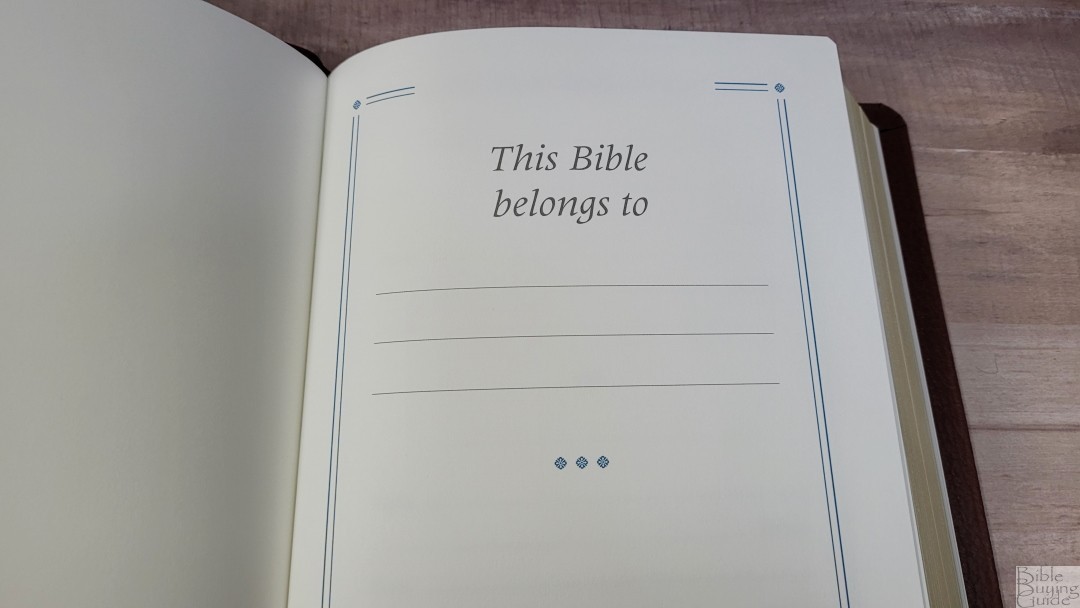
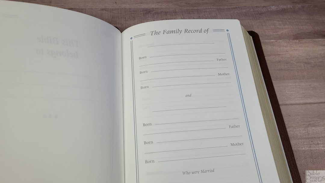
In the front are several pages for records printed on thick, non-glossy pages. The presentation page shows who the Bible belongs to. It also includes the family record of the husband and wife, children, marriages, grandchildren, and deaths. There are a few blank pages before the family pages. All of this thick paper helps give the Bible structure.
Translators to the Reader
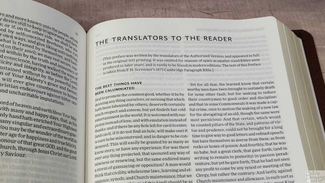
The KJV Topaz includes the Translators to the Reader. It’s printed in a double-column layout with a smaller font, but it’s sharp and clear. It has bold section headings that make it easy to follow. I’m always glad to see this document included and I’m grateful to see it here.
Concordance
The concordance is 112 pages with 2 columns per page. This is the same concordance that’s used in the newer Turquoise. It’s a newly typeset version of their older paragraph concordance in a digital font. The text is small, but it has a lot of space between the lines that help make it easier to read. The main entry is in a semi-bold font and the references are indented.
Words with more than one part of speech are marked with their part of speech and have different entries for each one. The word Praise is a good example because it can be either a noun or a verb. It shows both separately and they’re marked with (n) or (v).
This is a good concordance with a lot of entries. I am surprised to see a concordance instead of the Reader’s Companion that’s found in the Pitt Minion and Clarion. I do prefer the definitions that it includes, which would have been a good tool for the Topaz considering it doesn’t have a glossary.
Here are a few examples with their number of entries:
- Christ – 36
- Christian – 3
- Faith – 54
- Faithful – 27
- Faithfully – 3
- Faithfulness – 6
- Faithless – 4
- God – 76
- Goddess – 3
- Godhead – 3
- Godliness – 4
- Godly – 2
- God-ward – 3
- Praise (n) – 11
- Praise (v) – 14
- Pray – 45
- Prayer – 22
Maps
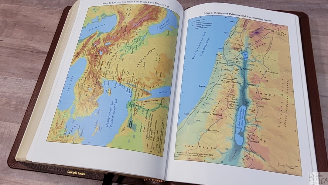
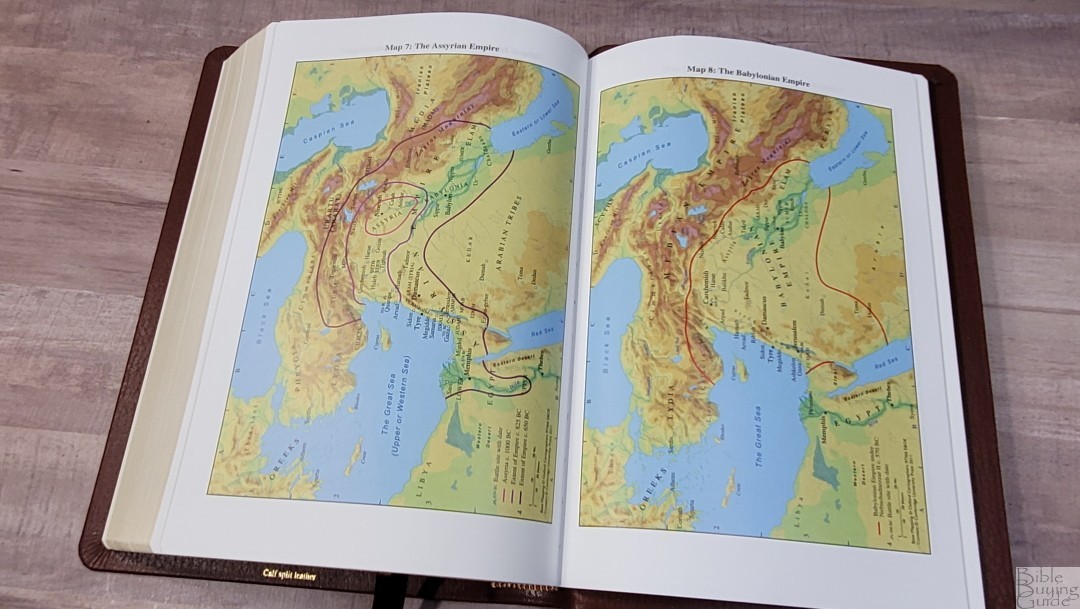
In the back are 15 pages of maps on thick matte paper. They’re printed in vibrant colors and they’re highly detailed. They show borders, import commodities, dates, routes, passes, settlements, distance, topography, mountains, cities of refuge, cities, tribes, vegetation, kingdoms, battle sites, satrapy, city walls, city gates, older city walls, seven Churches of Asia, etc.
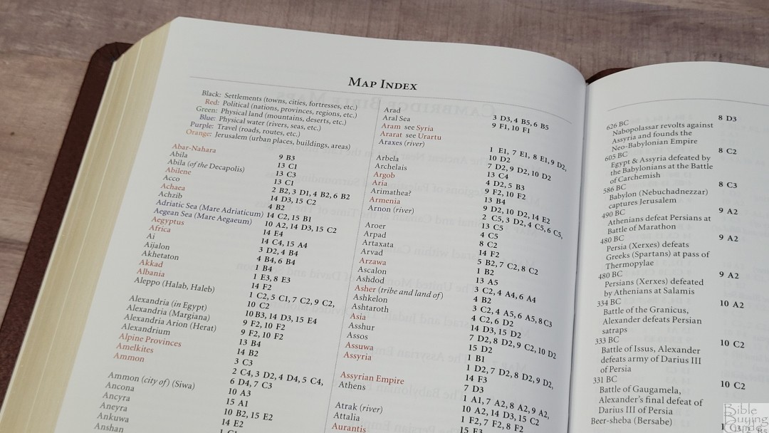
It also includes an 8-page color-coded index to the maps printed on the same paper as the maps. They show the settlements, political (nations, provinces, and regions), physical land, physical water, travel, and Jerusalem. I think the Cambridge color-coded index to be one of the best available. I’m always glad to see a map index included.
Maps include:
- The Ancient Near East in the Late Bronze Age
- Regions of Palestine and Surrounding Areas
- Sinai and Canaan at the Time of the Exodus
- Israel within Canaan
- The United Monarchy of David and Solomon
- Israel and Judah: The Divided Monarchy
- The Assyrian Empire
- The Babylonian Empire
- The Persian Empire
- The Hellenistic World after Alexander
- Jerusalem in Old Testament Times
- Jerusalem in New Testament Times
- Palestine in New Testament Times
- The Roman Empire
- The Eastern Mediterranean in the First Century AD
Comparisons
Here’s how the Cambridge Topaz compares to a few similar Bibles.
Cambridge Turquoise
The Turquoise is Cambridge’s older large print reference KJV. This Bible has been a staple for a hundred years. Their latest version of it has the same paper as the Topaz and has red-letter. It was typeset by hand and printed with a hot metal press. The font is darker and includes self-pronouncing marks. The Topaz has the same footprint, but it’s a touch thinner. The Topaz design is more refined. Both are excellent choices. Both have the same leather, paper, and ribbons. It’s also made in the Netherlands.
Cambridge Concord


The Concord is a setting from the 1950s. It’s a hand-sized Bible with a medium-sized print. It has around 44k references. It doesn’t include reference and footnote keys in the text, keeping the text clean. In the back are a glossary, concordance, dictionary, and maps. The font is much smaller. The materials are the same, except the goatskin Concord has a synthetic liner and the ribbons are of lesser quality. The font is darker and it’s available in black and red letter. I consider the Concord to be a gold standard in KJVs. It’s also made in the Netherlands.
Schuyler Canterbury

The Canterbury has the same paper and leather (minus the full yapp and gilt-line). Its font is larger and it’s about the same darkness. This is a red-letter edition. Psalms are in a single-column setting. The 55k references are placed in the footer. It doesn’t include footnotes, but it does have section headings and pilcrows. Decorative drop caps, verse numbers, and other highlights are in red. It doesn’t have self-pronouncing text. In the back is a glossary, pages for notes, and maps. It’s also made in the Netherlands.
RL Allan Longprimer


The Longprimer that I have is the 36gsm version. Aside from the paper and calfskin differences, the Longprimer is shorter, thinner, and thicker. Its lower-case font is smaller, but the upper-case fonts are the same size. The Longprimer has more references, a dictionary of proper names, a subject index, concordance, maps, and notebook paper. The text includes self-pronouncing marks. It’s also made in the Netherlands.
Thomas Nelson Giant Print KJV Premier Collection
The Giant Print KJV Premier Collection has 36gsm paper and goatskin. It includes page summaries, book introductions, center-column references, a glossary on the page, red highlights, black-letter, a few charts, a reading plan, concordance, and maps. The font is 12-point and it’s slightly darker. It’s a notch under the quality of the Topaz, but its price reflects that difference. It’s made in China.
TBS Westminster Reference Bible
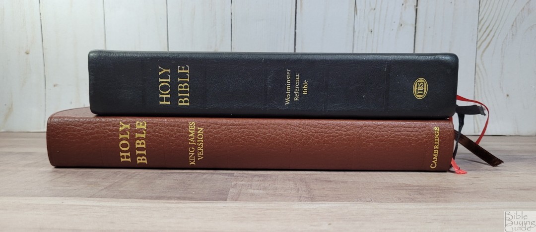
The Westminster has 32gsm paper, 200,000 cross-references, a glossary on the page, page summaries, chapter summaries, a pronunciation guide in the back, a reading plan, maps, and the same concordance as the Topaz. The font is smaller, but they do make a large print edition. It’s a much larger Bible. The leather is paste-down calfskin. The footprint is smaller and it’s a touch thicker. This edition was made in the Netherlands, but it’s now made in Belarus.
Humble Lamb Lion
The Lion has 36gsm paper and a goatskin cover. The footprint is close to the same but it’s a lot thicker. The font is slightly larger, but it’s lighter. The words of Christ are in blue. References are placed in columns in the footer and extensive definitions are placed under the references. It also includes a concordance, maps, and artwork throughout the Bible by Gustave Doré. It’s made in China.
Clarion

The KJV Clarion has the same paper and leather, but the goatskin has a synthetic liner. It has an 8.75 font, a paragraph format with poetry and letters indented, and a lot smaller footprint, but it’s thicker. It’s designed to be a personal size Bible for carrying and reading. The Clarion has the same references, footnotes, and maps, but it has a Reader’s Companion which is a combination dictionary/concordance. It’s also made in the Netherlands.
Conclusion
The Cambridge KJV Topaz Reference Edition is a well-made Bible. Royal Jongbloed and 2K/Denmark always come through with quality construction and design. Both covers are great choices. My favorite feature is the lower-case letters for verses that continue the previous sentence. My least favorite feature is the Cambridge author notifications added to the last verse of Paul’s letters. I’d love to see a glossary added.
Aside from those complaints, I consider the KJV Topaz to be an excellent KJV. The size is perfect for anyone that wants a large print without having a large Bible. It’s excellent for preaching, teaching, and study. If you’re interested in a high-quality KJV, the KJV Topaz is a great choice.
_________________________________________________________
This book is available from
_________________________________________________________
Cambridge provided these Bibles in exchange for an honest review. I was not required to give a positive review, only an honest one. All opinions are my own.


You gotta be kidden me with this. We’ve been waiting almost 3 years since the esv topaz came out and this is what we get? Chapters run-together, no pilcrows, no page subject headings, and it doesn’t have all the words of Christ in red. Cambridge should be ashamed.
Randy,
Thank you for your review.
Some of these editions are nice, even very nice: but they have two flaws in my (British) eyes :
1. the American fad of red-lettering is at best a gimmick and at worst a stumbling block;
2. the cross-references cannot compete with those in the TBS Westminster Reference Bible.
In fact, the Westminster is by far my preferred edition of the AV/KJV.
A gimmick? A stumbling block? Are you on drugs? If you’re offended by having the words of our Savior in red then you need to get saved.
I need to email the Trinitarion Bible Society and find out if I am allowed to use a red pen to highlight and write in my bible. Probably not. TBS also rejects all chain-reference and study bibles so those belong in the dumpster too.
Agreed. I’m American and can’t stand red lettering. It’s almost as if you can’t escape it. Give me a simple black letter text.
Red lettering is indeed a hindrance for me. I equate it to a neon sign in a way. While you focus on the red letter text, you can miss important things in the surrounding text.
My position regarding red letters for the words of Christ has changed somewhat. I’ve seen both bold and weak red letters. If a publisher is going to issue a red letter edition KJV, the red lettering needs to be a deep dark red so the reader can differentiate between the black and red letter text.
Thank you for the review, Randy. Excellent, as always. I believe the Cambridge royal seal on the spine for KJV only versions was mistakenly left off. This omission is to be corrected in a future printing.
Reese Taylor, Don’t be foolish ; some like, but others dislike, red letters! ALL the words of Scripture are inspired (and it is not always possible – eg John 3 – to say where one speaker/commentator finishes and another starts.
Beau Jackson, The TBS certainly do not reject cross-reference Bibles – witness the Westminster! And I have never heard that they forbid Bible marking!
So now it’s personal preference after insulting people’s personal preference calling it “a fad” and “at best a gimmick” and “a stumbling block.” Your reasoning that all scripture is inspired has nothing to do with liking the words of Christ in red. Can’t you recognize the ridiculous, extremist ideology of the Trinitarian Bible Society? If you want to get technical the Bible clearly states the New Covenant is a better covenant based on better promises (Hebrews 8:6). Furthermore, in the Greek it’s perfectly clear to me that Jesus is continuing his discourse from vs 10 to 21. I would encourage you to steer clear of the Trinitarian Bible Society. They do more harm than good.