I’ve already taken a look at the features of the Concord. Rather than reiterate what I’ve already discussed, I want to look at what makes this one different. So in this review, I’ll focus on the cover, paper, print quality, art-gilt, and maps, and show how they compare to the previous editions that I’ve reviewed.
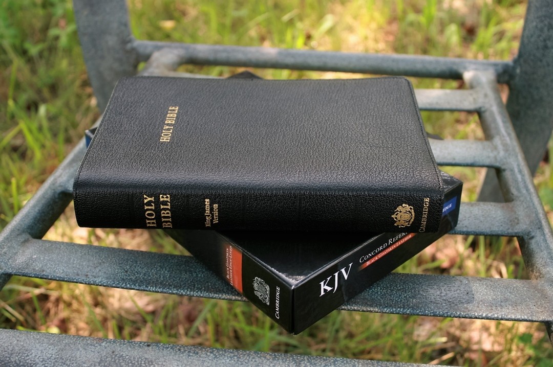
This edition is model KJ566:XE, ISBN 9780521707961
For reference, here are the Concord reviews in the order they were published including their model numbers to help compare the differences:
- Wide Margin in French Morocco
- Calf Split with red-letter and thumb-index – model KJ563:XRI
- Calf split, review by Matthew Everhard
- Personal Size in French Morocco
- Wide Margin in Calf Split
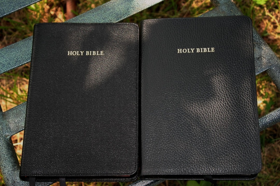
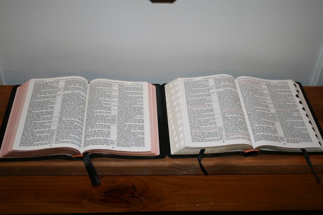
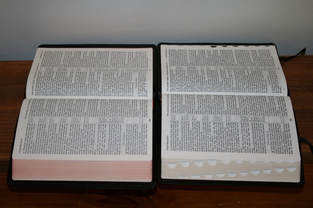
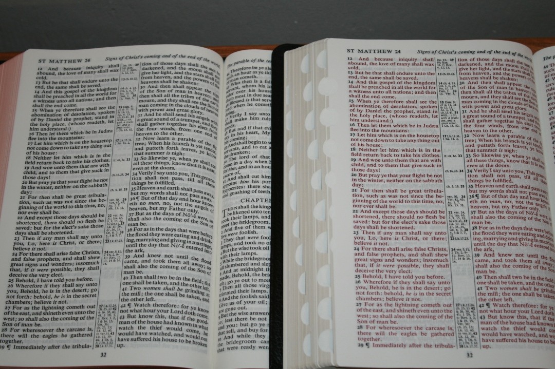
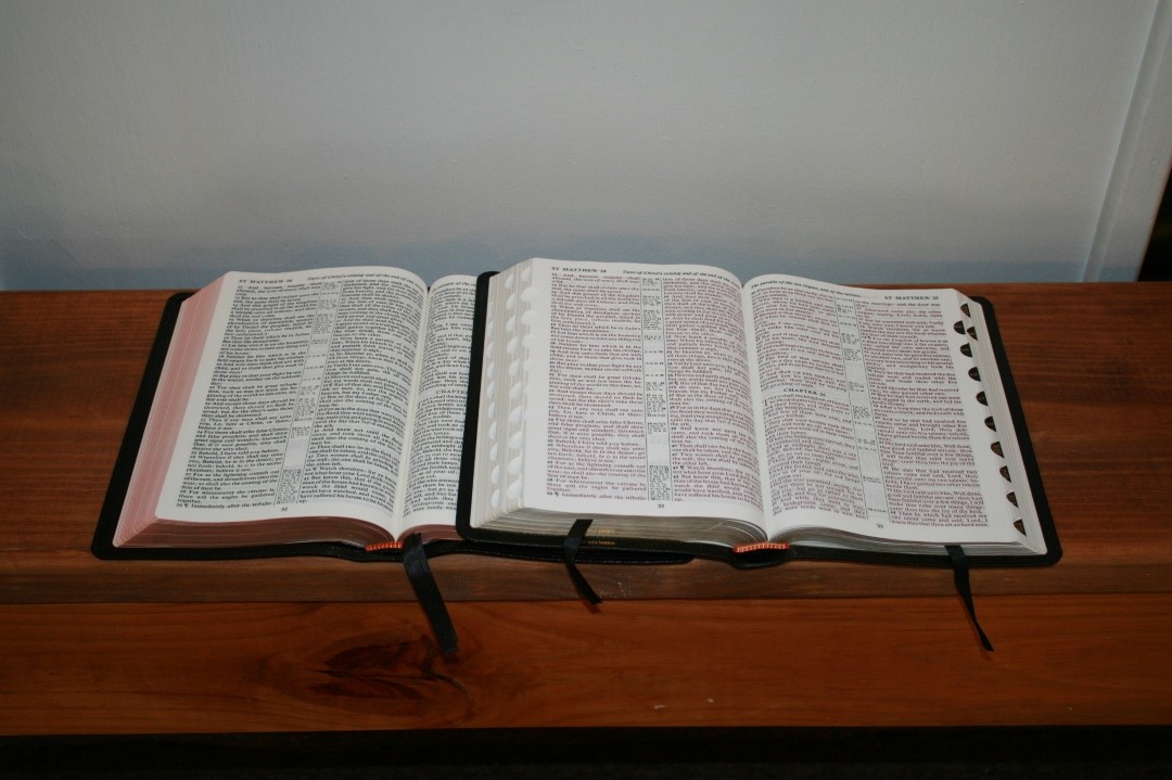
I will mostly compare to the calf split edition and highlight what is different. In comparison photos, the goatskin is on the right or on top.
__________________________
Buy From Amazon
__________________________
Binding
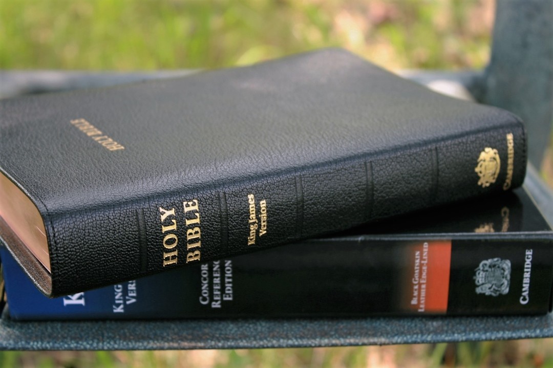
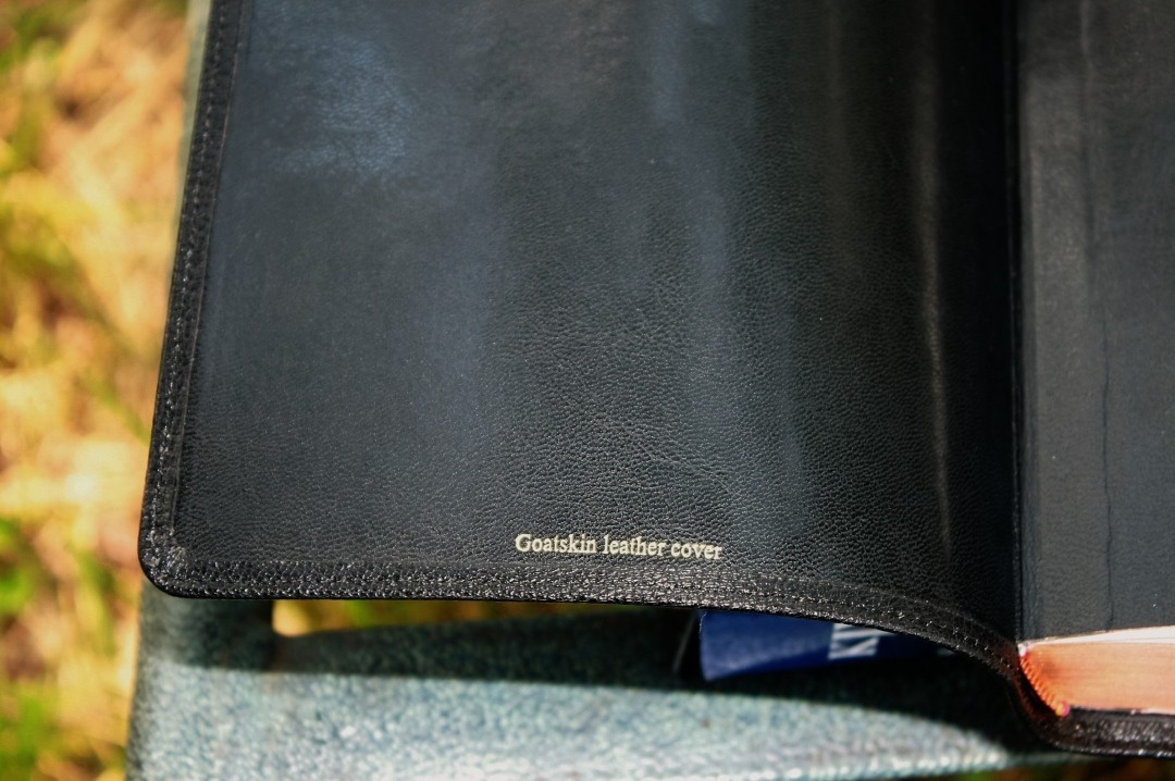
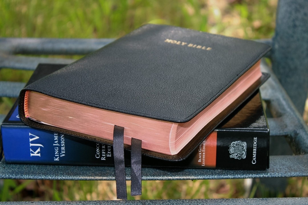
This edition is black goatskin with an edge-lined synthetic liner. The grain is small and pebbly which is the natural goatskin grain. It looks and feels elegant. It’s soft and flexible, but not so flexible that I have trouble handling it.
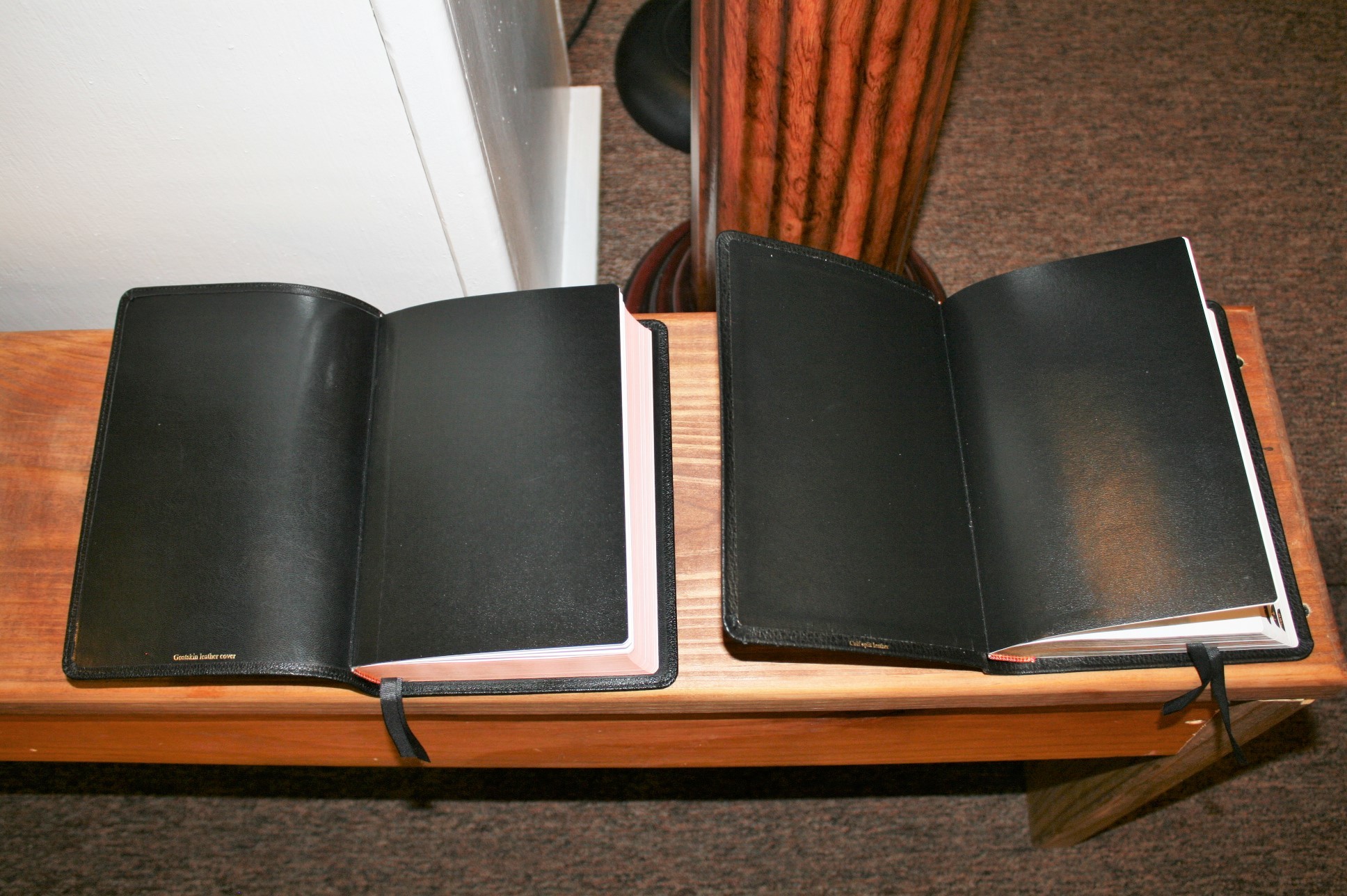
The edge-lined tab isn’t too stiff and doesn’t get in the way of the Bible laying open. The size of the tab is appropriate for the size of the Bible. The Bible I’m reviewing has already been broken in, so you might not see this flexibility of the tab out of the box.
The cover is stitched around the outer perimeter with small stitching. Spine hubs are etched into the spine to give the appearance of hubs. Real hubs would be nice but these do look good and add a little something extra to catch your eye.
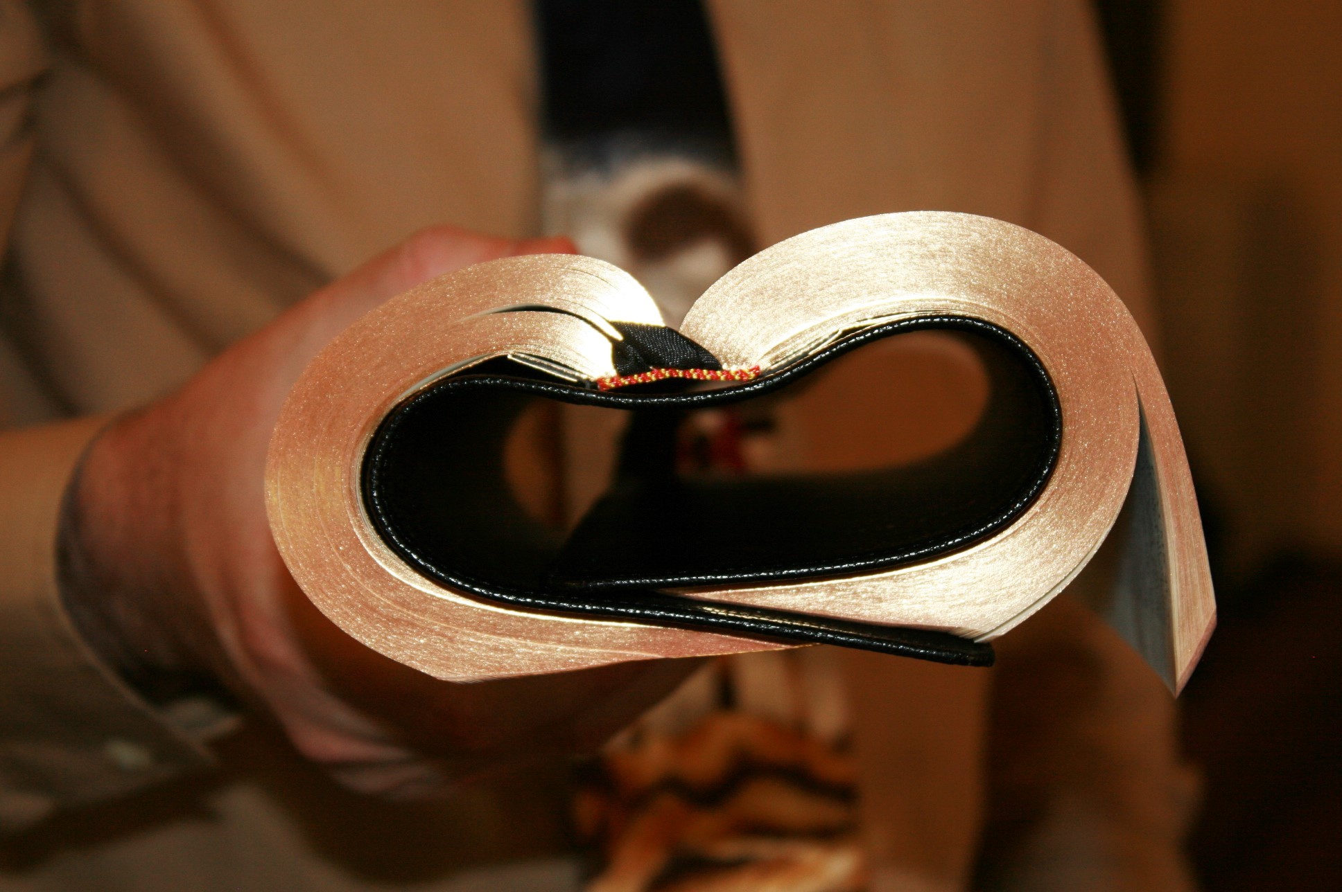
It’s flexible but not so flexible that I can’t hold it in one hand for reading. For long periods of reading, I like to hold the Bible in one hand and tilted toward me so I don’t have to look down. I find the calf split easier to handle, but the goatskin isn’t too flexible for this.
In Church, I like to hold the Bible flat in one hand and turn pages with the other hand. We often go through many verses quickly and rolling the Bible like a newspaper is simply too awkward and time-consuming. With Bible studies, I like to lay the Bible open in my lap while I make notes in a journal that I’m holding. The Concord’s goatskin cover isn’t so flexible that it fights against you in Church.
Here’s the calfsplit for comparison:
Paper
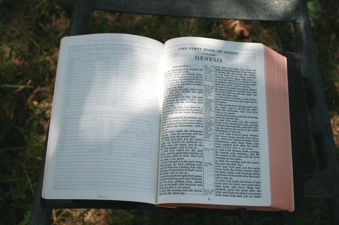
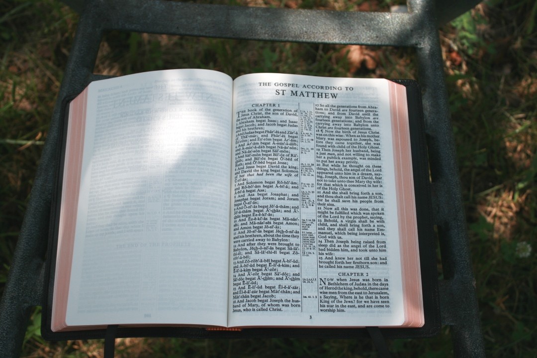
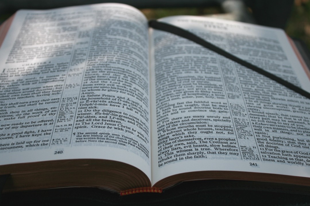
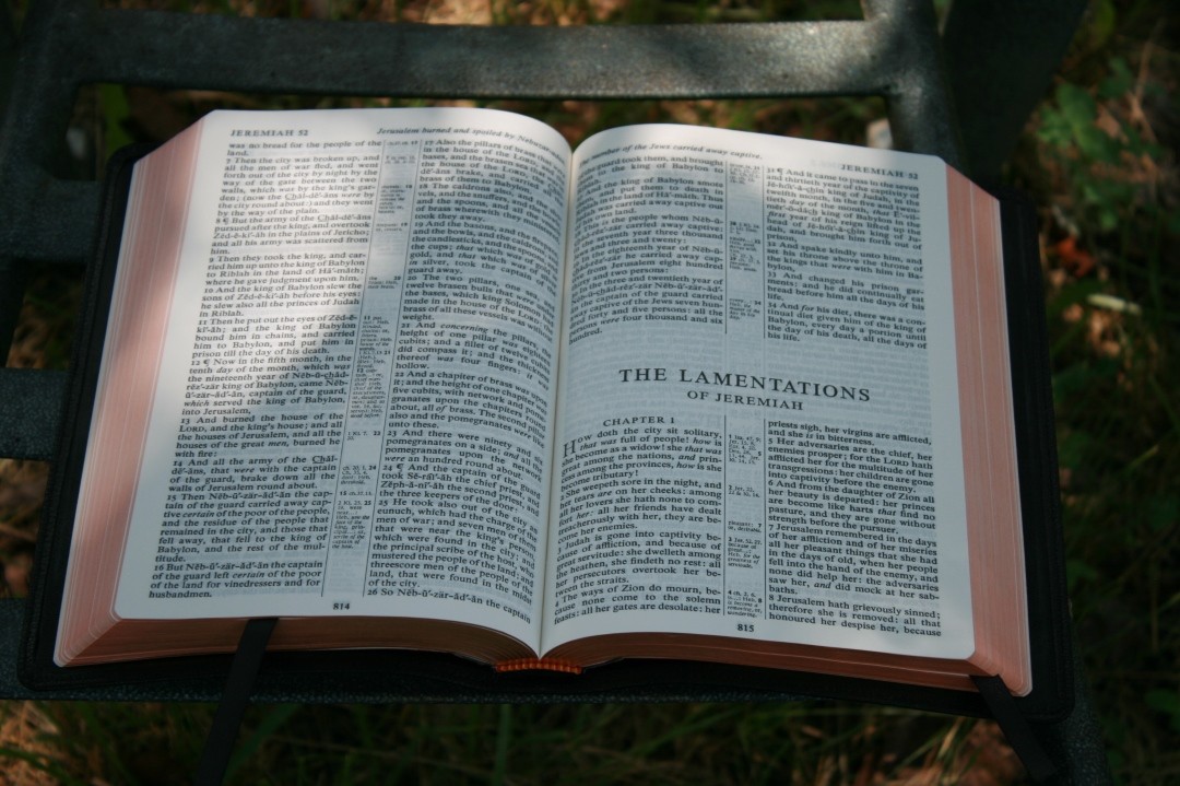
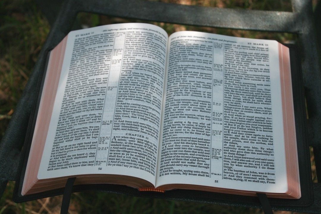
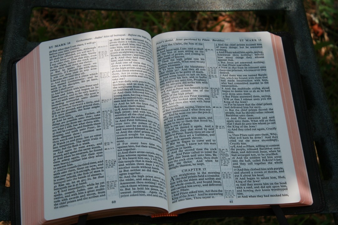
The paper is creamier than the calf split edition. It might even be more opaque, but just barely. I love paper with a slight cream tint and this paper gets it right. The weight is the same – around 30gsm. I have no issues turning the pages.
I love reading the 9 point Times Semi Bold 421 font on this paper. The only paper I like better in any of the Concords is the wide margin edition with its 38gsm writable paper, but that goes without saying. This paper helps keep this edition thinner, which I like a lot.
The goatskin edition is on the left and the calfsplit is on the right.
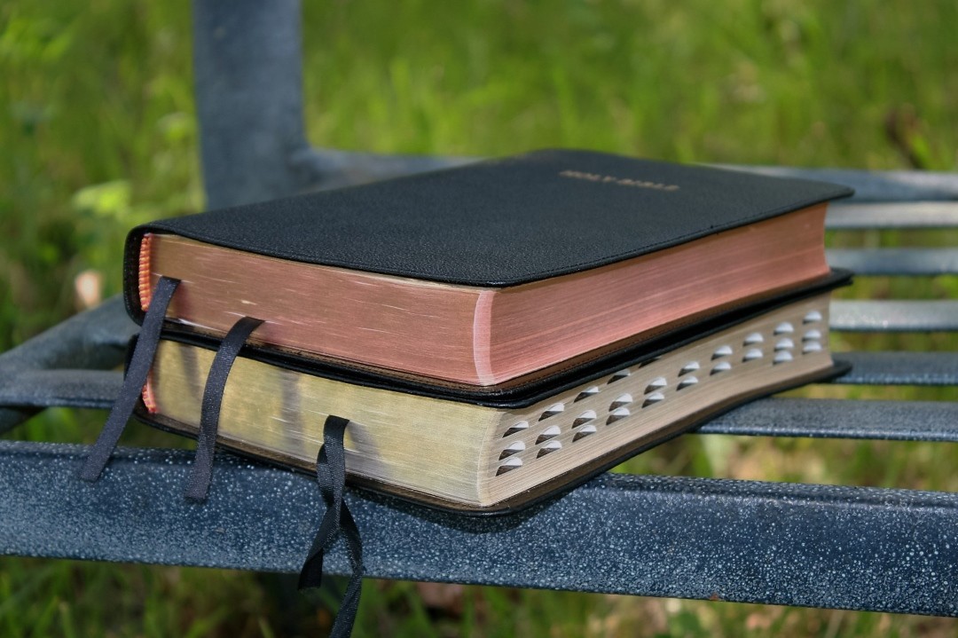
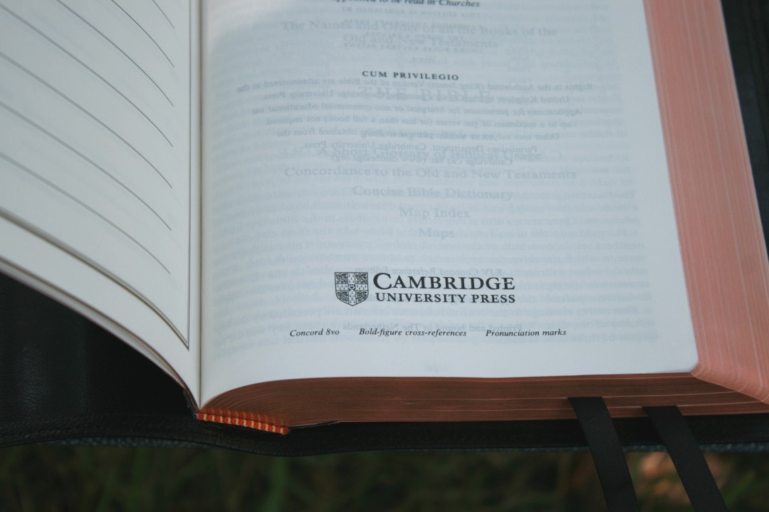
The edges have art-gilt with a beautiful copper color that changes to salmon when the Bible is opened. The red die doesn’t seep into the page. It looks elegant and clean.
This edition is black letter. It’s also available in red. The red only covers the words of Christ while on Earth, so Revelation is black letter. The print quality has some slight variation but it’s just barely noticeable.
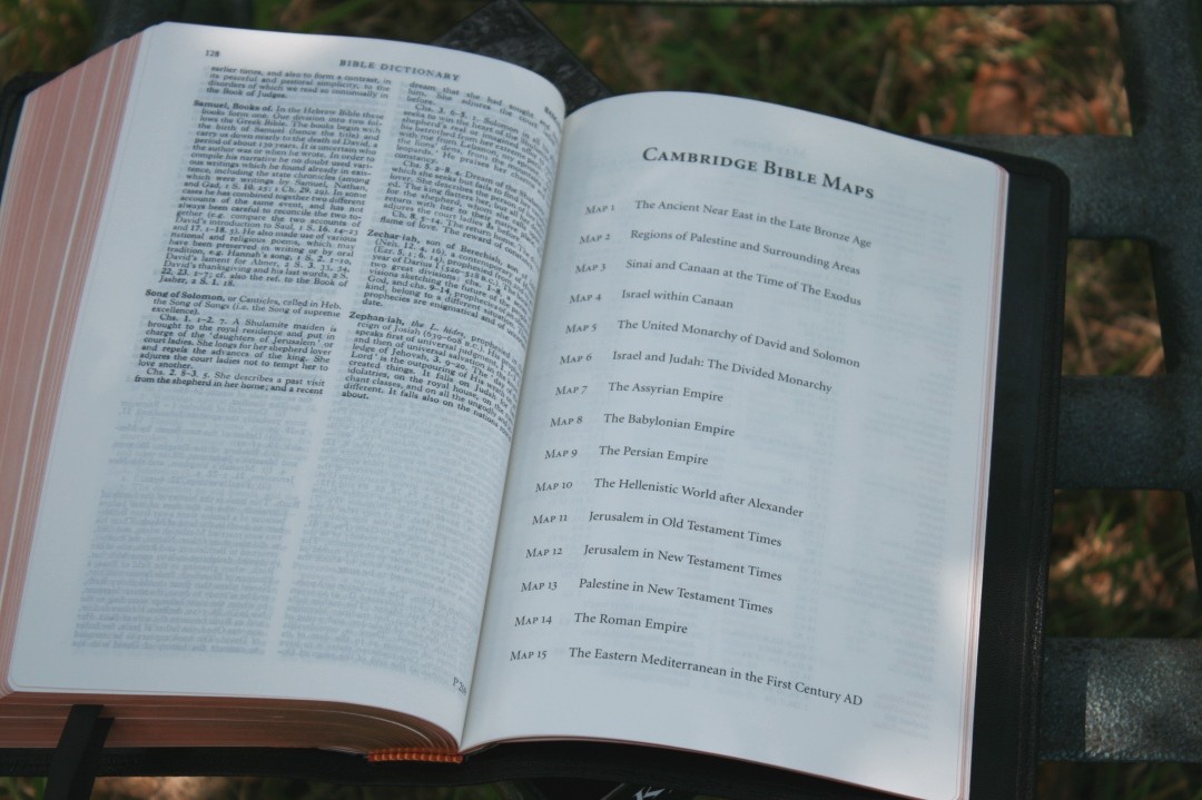
Maps
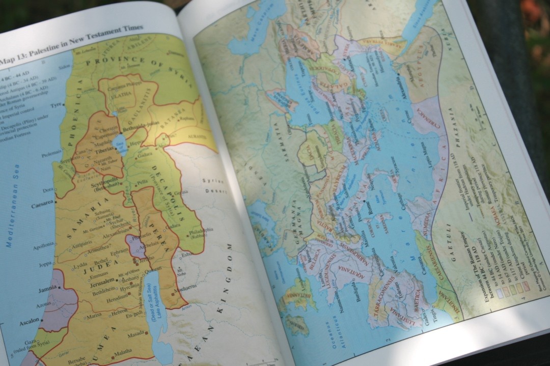
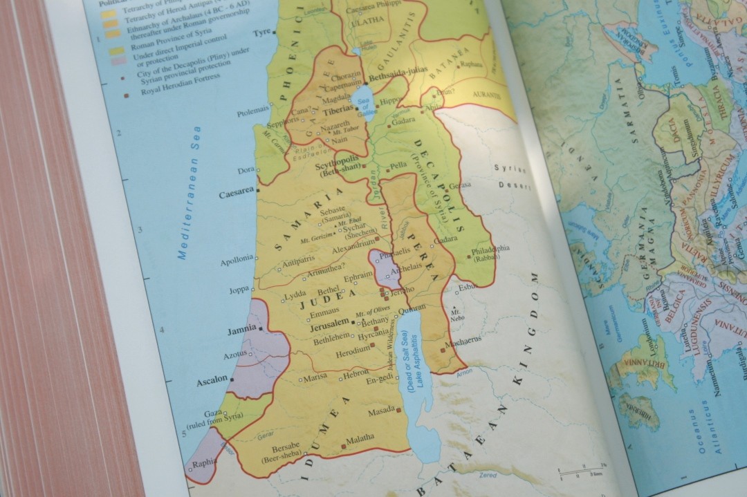
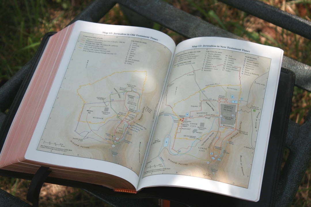
The maps in this model are not the same as my calf split edition. This edition uses the newer maps with the color-coded index to maps. It’s the same maps as my calf split wide margin Concord. If you’re looking for specific maps you’ll need to check the model that you’re getting.
Conclusion
Being the world’s oldest publisher Cambridge got it right with the Concord. It’s a design from the 1950’s so it has the typical KJV layout (double column, verse by verse), but with the clean and bold text, it’s highly readable and usable.
I prefer covers with enough stiffness that I can hold the Bible open in one hand and read both pages and turn to verses quickly. Although this cover is flexible, it’s not so flexible that it’s unwieldy. It’s soft and elegant and has become my favorite Concord.
The calf split edition is a nice Bible but the goatskin is worth the extra cost and is the one I recommend the most.
Inside photography by hannah C brown
__________________________
Buy From Amazon
__________________________
This Bible was purchased for this review.














My dreams bible! I think that I already watched all the review videos and blog posts about this particular bible. hehe
Sadly, I live in Brazil, so it is basically impossible to put my hands on a bible like that.
$200 dollars is basically the salary of an entire month here.
I love the KJV. It’s majestic.
Thanks for the review!
If you had a choice between a kjv Concord goatskin or a KJV Clarion in goatskin which would you pick as an everyday Bible if you could only pick one?
That’s a tough one. I prefer the paragraph layout for reading, but I see the advantage of verse-by-verse for study, teaching, preaching, and following along with others. I prefer the thinner size of the Concord, but I think I’d go with the Clarion just for the paragraph setting because of how it keeps sentences together.
I have the wide margin goatskin Concord and love it. I’ve been wanting to get the regular size one for some time to read and then use the wide margin to put notes in. The inner margins appear to be very tight and almost unreadable in the reviews I see of the regular Concord but it’s hard to tell without one in hand. What do you think about the inner margins?
It’s not as tight as it looks in photos. The text does go into the bend, but it’s still very readable. It has about 1/4″ of margin space. It’s only an issue if you prefer the text perfectly flat, but if any amount of bending is okay, this should be fine.