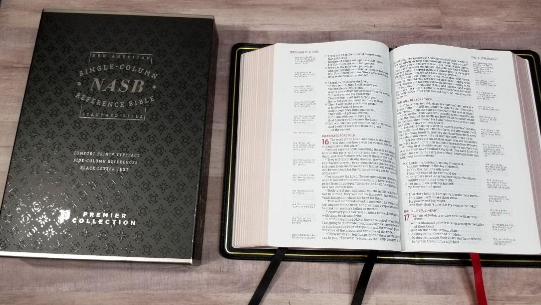
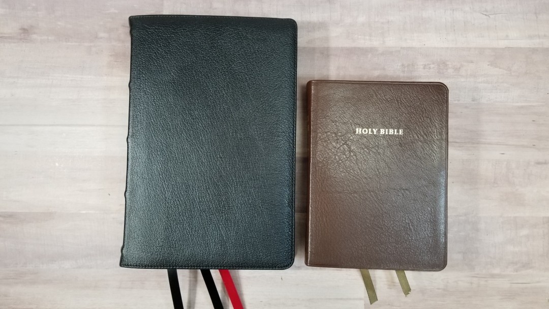
The NASB Comfort Print Single-Column Reference Bible is a design that’s been around for a long time, but it’s now been typeset with Zondervan’s exclusive NASB Comfort Print typeface. It provides the 1995 edition of the New American Standard Bible with 95k cross-references and wide outer margins. It’s available with several cover styles. I’m reviewing the black goatskin edition, ISBN: 9780310451181, printed in China with materials from around the world.
Zondervan provided this Bible in exchange for an honest review. I was not required to give a positive review, only an honest one. All opinions are my own.
_________________________________________________________
This book is available at (includes some affiliate links)
and many local Bible bookstores
_________________________________________________________
Table of Contents
- Video Review
- Cover and Binding
- Paper
- Typography
- References
- Book Introductions
- Extras
- Concordance
- Maps
- Comparisons
- Conclusion
Video Review
Cover and Binding
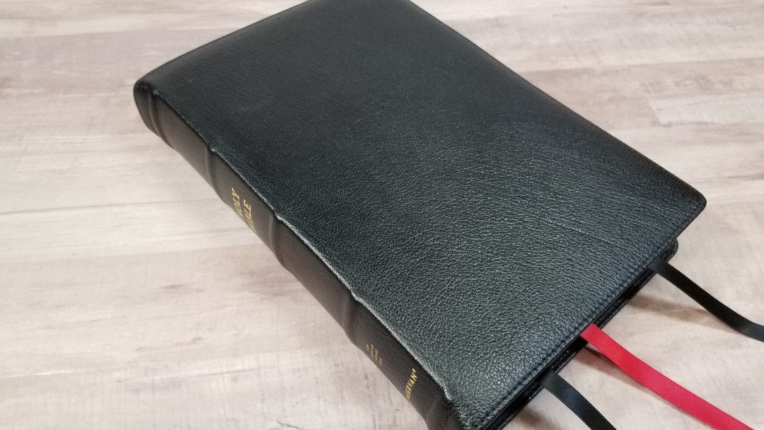
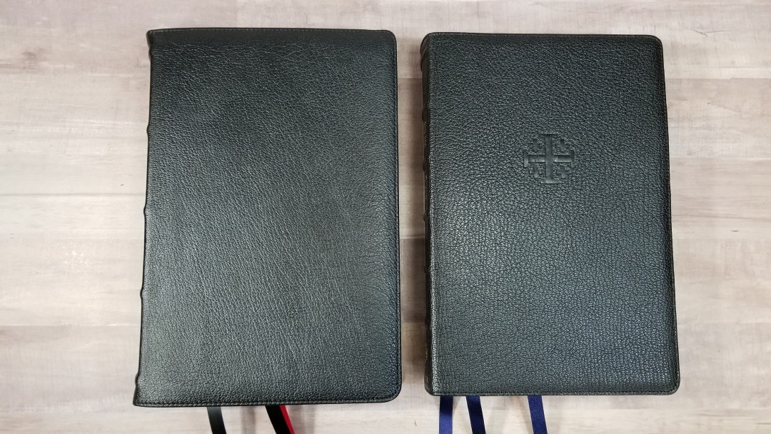
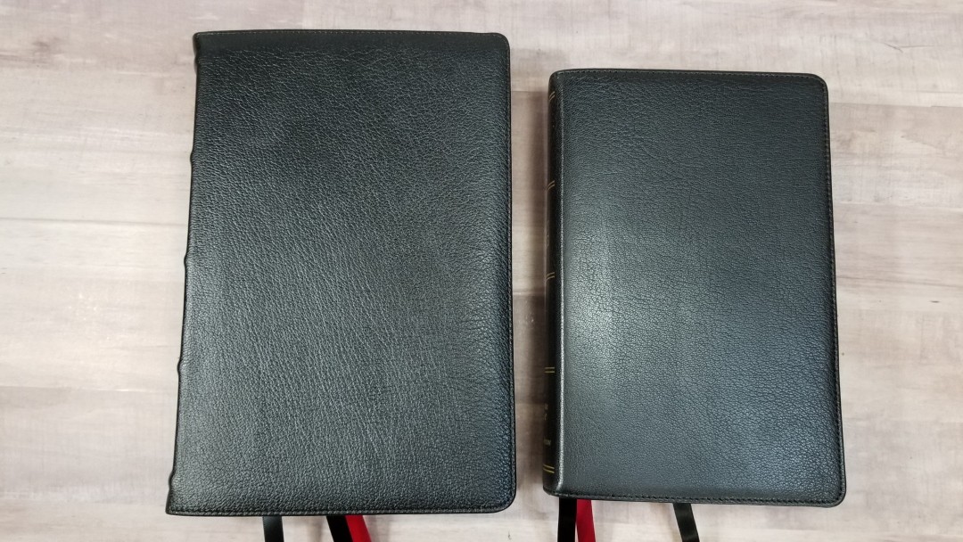
The cover is hand-bound black goatskin. It’s soft to the touch and has an elegant grain. It’s stitched around the perimeter and has a little bit of a yapp. It’s highly flexible, but I had no trouble holding it open in one hand. The front has no printing.
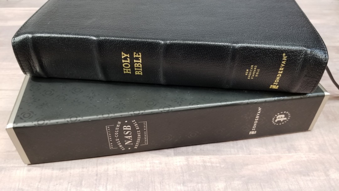
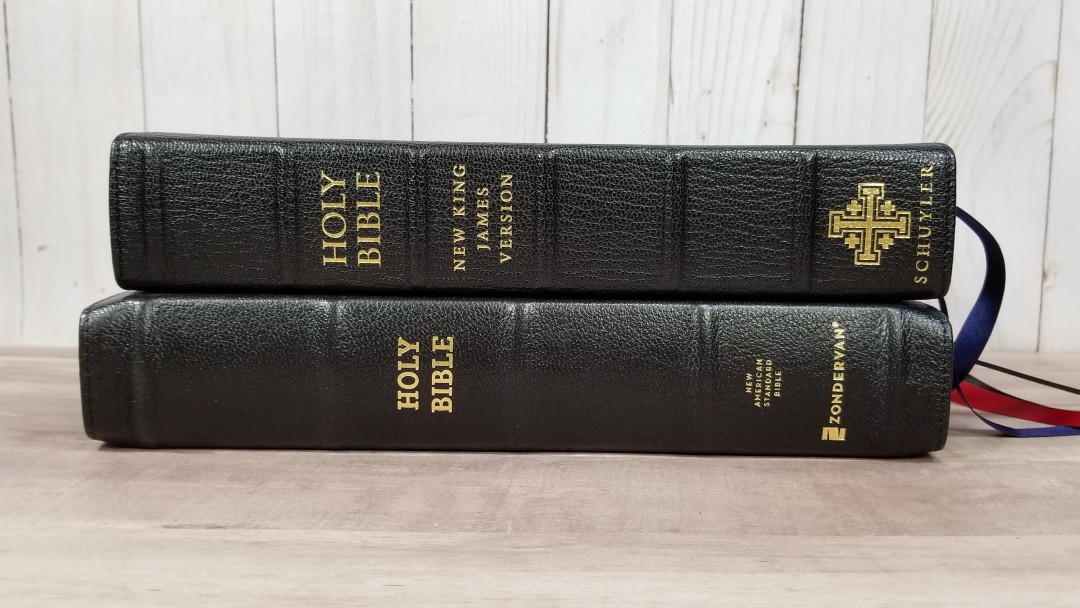
The spine has 5 raised hubs and HOLY BIBLE, New American Standard Bible, and the Zondervan logo printed in gold. Even though it prints the full name of the translation rather than the initials, it’s printed in small text that doesn’t look out of place on the spine.
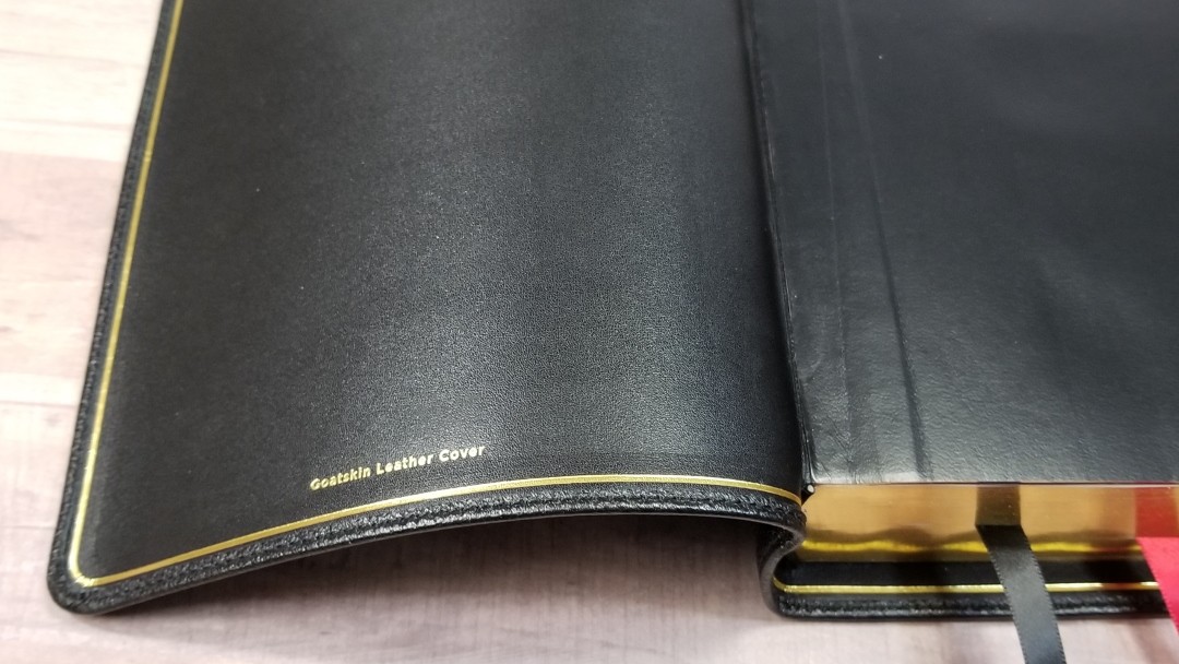
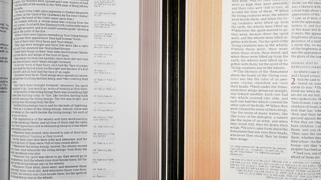
The liner is edge-lined leather. It includes a gold gilt-line around the inside perimeter. I love the look of a gilt-line. It gives the Bible a finishing touch. The tab is a little stiff for the first signature.
It’s Smyth-sewn and has no trouble laying open to any page, but it will have a hump in the first few chapters until the tab breaks in. It also has overcast stitching in the front to add strength.
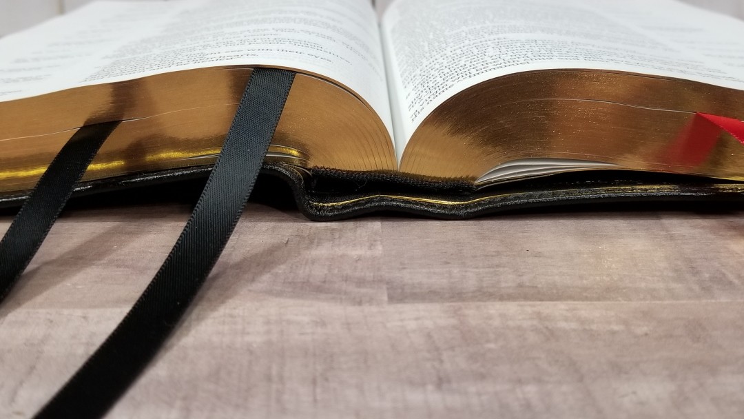
It has three 3/8″ double-sided satin ribbons. Two are black and one is red. The head/tail bands are black. The overall size is 10 1/4 x 6 7/8 x 1 3/4″ and it weighs 3 lbs, 5.5 oz. It comes in a textured box that looks and feels elegant.
Paper
The paper is the same 36gsn premium European Bible paper used in all the other Bibles in the Premier Collection. It’s slightly off-white in color and it’s highly opaque. The texture is smooth but just rough enough to grab and turn easily. I like reading and preaching with this paper. I think this paper is excellent for note-taking. The way the first signature is laying in this photo is normal. This is caused by the overcasting.
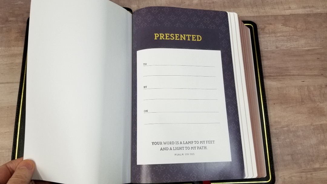
It has 9 pages in the back that can be used for notes. Since this is a wide margin edition, I’d like to have a few more pages in the back for notes. The Presentation page is full-color. The edges are red under gold art gilt.
Typography
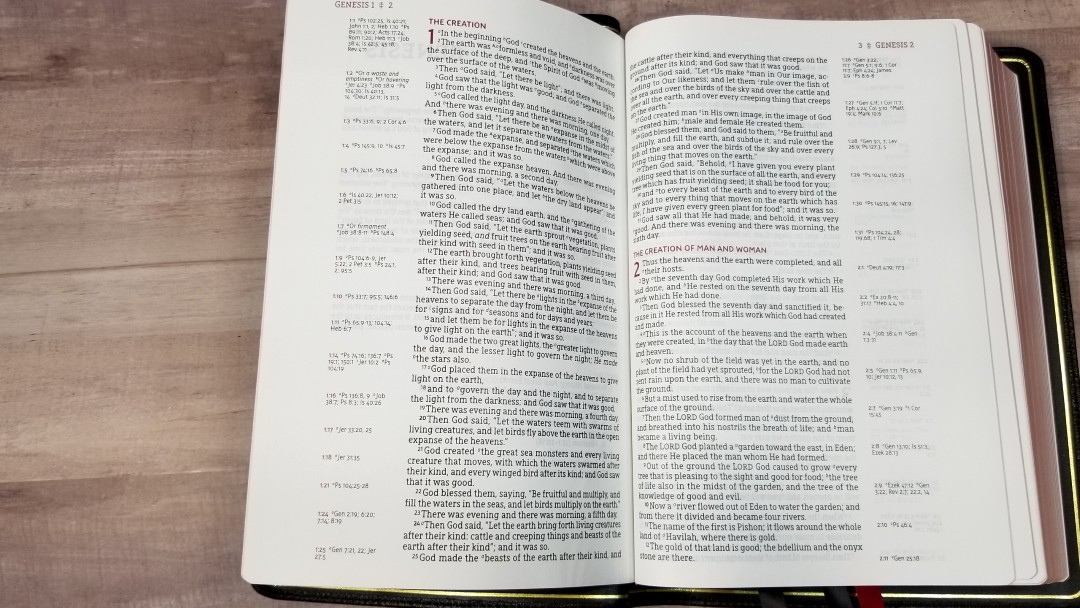
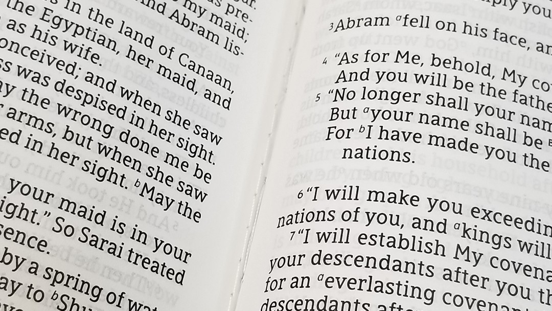
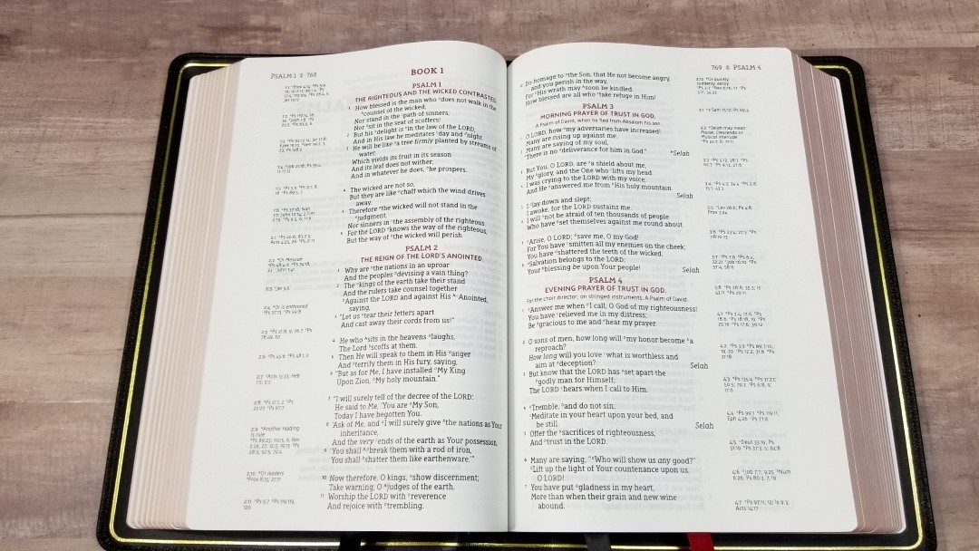
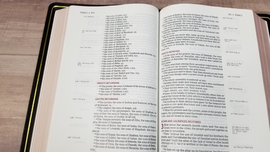
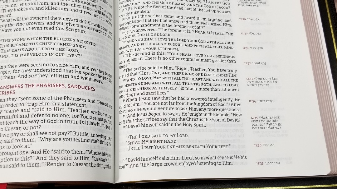
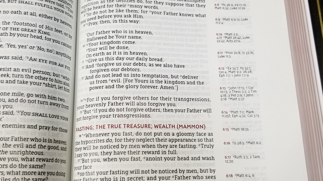
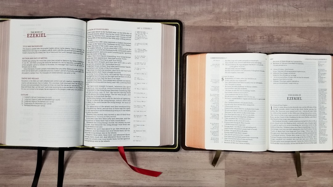
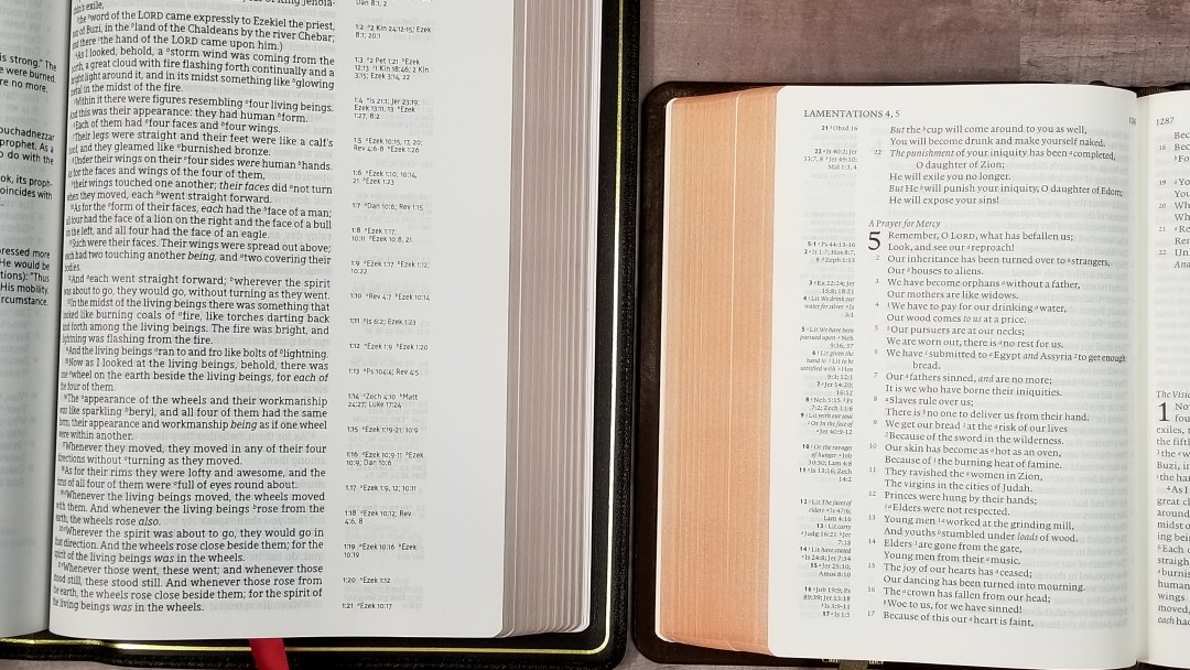
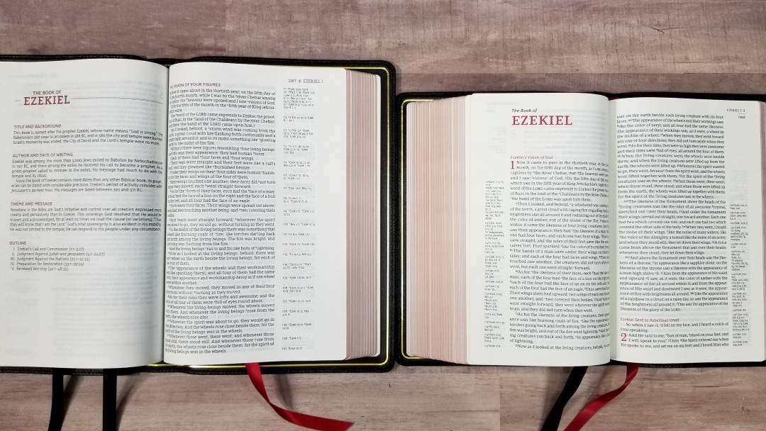
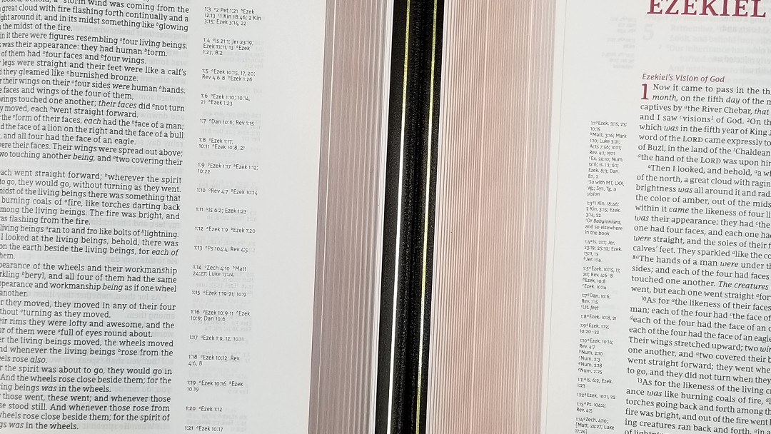
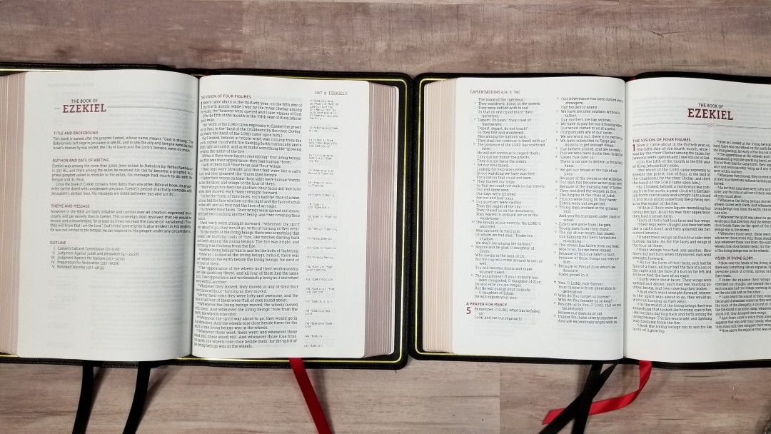
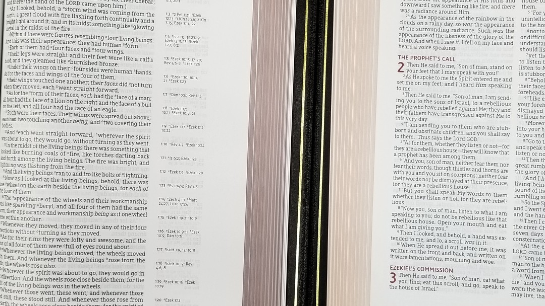
The text is presented in a single column verse-by-verse with cross-references in the outer column. The outer margin has extra space for notes, making this a wide margin edition. The header shows the page number, book name, and chapter number printed in red. A black icon separates the page number from the book name.

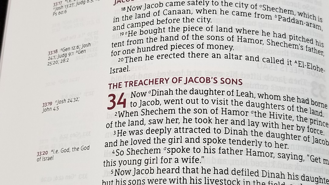
The font is 10.5 black letter. This is the Comfort Print typeface that 2K/Denmark designed exclusively for the Zondervan NASB. Most lines have between 10-12 words. I found this easy to read and highly consistent throughout. The font design is interesting, with the upper-case letters J and N, and the lower case f standing out to me the most. Lower case letters are taller than in most Bibles and still read large. Letters with a verticle line (such as T, I, M, etc.) have a pronounced serif that I notice more than in other translations. The line-spacing is comfortable for reading and underlining. The words are never crowded.
At first, I was concerned about how far the text goes into the gutter. I would like more gutter space, but it’s not as bad as I thought it would be. The text doesn’t disappear in the gutter, but it does bend a litter further than I want it to. The text is printed with line-matching, meaning the lines are printed in the same space on both sides of the page to improve readability.
The beauty of this layout is that it’s not just verse-by-verse. It places poetry in stanzas, indents a few personal letters (in Acts, but not Ezra), offsets lists, and places Old Testament quotes in the New Testament in all-caps. All page highlights including the header text, section headings, chapter numbers, and cross-references are in a deep red that stands out. The text does include footnote and reference keys, but they’re small and easy to ignore when you don’t want to use them. Supplied words are in italics. The verse numbers are small and not very bold. They don’t stand out and can be slightly difficult to spot. This can make them easy to ignore when reading, but I find that to be more important in paragraph settings that are made for reading.
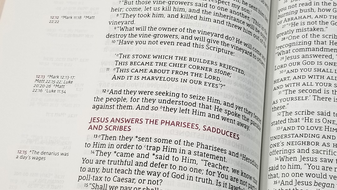
Asterisks are used to show that the words in Greek are historical presents even though the English is in the past tense. I prefer this because it’s better English, but at the same time, the purpose of the historical presents aren’t lost in translation. For example, it uses the phrase “*said to him” in places where modern translations have “was saying to him.” I prefer “said” to “was saying”, but I also want to know when historical presents are used. The asterisk tells us this.
I love having the cross-references near the verses they correspond to. The wide margins are great for preaching notes, word-studies, references, etc. It can be a little awkward having your notes that far from the text and having cross-references between your notes and text. The only other option would be to place the references in the inner margin, but I’m not sure how I’d like that. This design works well enough in my opinion.
References and Footnotes
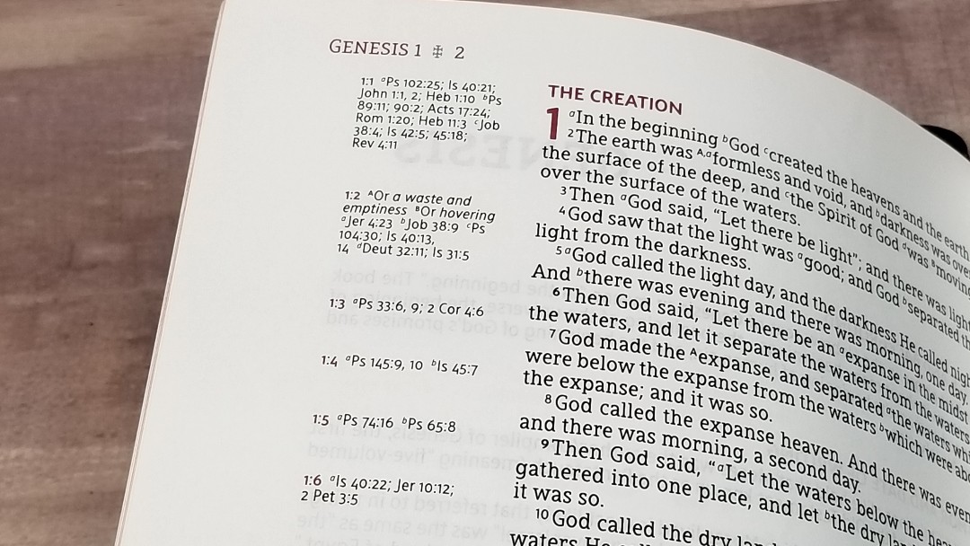
It has 95,000 (I think) cross-references placed in the margin next to the verses they correspond to. This is a lot of references and they’re great for study and sermon prep.
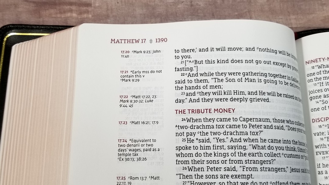
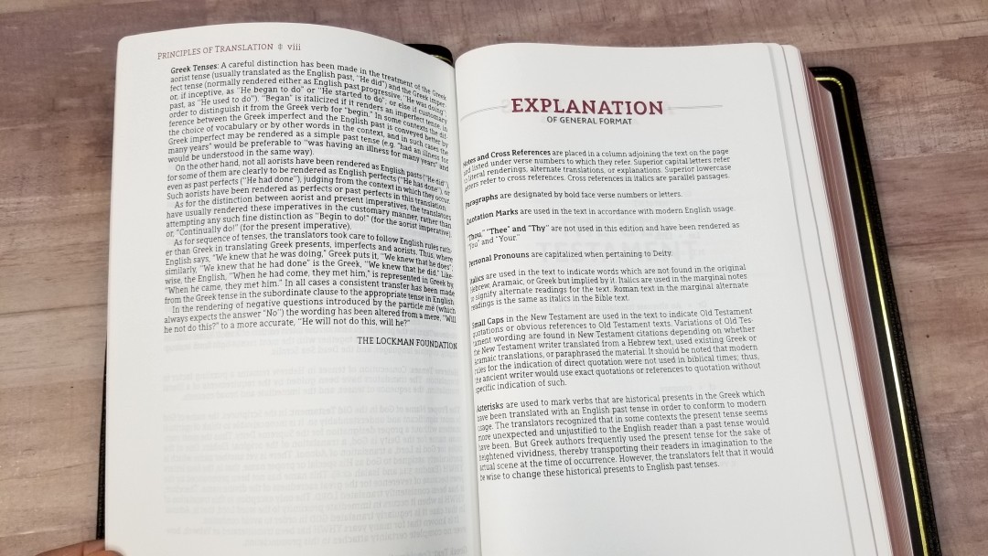
Most of the original translation footnotes are included. They’re placed before the references and are marked with upper case letters. They provide insights into words, alternate renderings, weights and measures, manuscript notifications, etc. It seems that most of the literal footnotes (marked Lit) have been removed. Manuscript variations where phrases or entire verses are placed in brackets have a note about the manuscript variation, with the exception of Matt 6:13. It does include the brackets, but not the footnote.
Here are some example references to help you compare:
- Genesis 1:1 – Ps 102:25; Isa 40:21; Jn 1:1, 2; Heb 1:10; Ps 89:11; 90:2; Acts 17:24; Rom 1:20; Heb 11:3; Job 38:4; Is 42:5; 45:18; Rev 4:11
- Deuteronomy 6:4 – Matt 22:37; Mk 12:29, 30; Luke 10:27; Deut 4:35, 39; John 10:30; 1 Cor 8:4; Eph 4:6
- Isaiah 9:6 – Is 7:14; 11:1, 2; 53:2; Luke 2:11; Jn 3:16; Matt 28:18; 1 Cor 15:25; Is 22:22; Is 28:29; Deut 10:17; Neh 9:32; Is 10:21; Is 63:16; 64:8; Is 26:3, 12; 54:10; 66:12
- Matthew 28:19 – Mk 16:15; Mt 13:52; Ac 1:8; 14:21; Mt 25:32; Lk 24:47; Ac 2:38; 8:16; Rom 6:3; 1 Cor 1:13, 15; Gal 3:27
- Mark 12:29 – Deut 6:4
- John 1:1 – Gen 1:1; Col 1:17; 1 John 1:1; 1 John 1:14; Rev 19:13; John 17:5; 1 John 1:2; Phil 2:6
- John 3:16 – Rom 5:8, Eph 2:4; 2 Thess 2:16; 1 Jn 4:10; Rev 1:5; Rom 8:32; 1 Jn 4:9; Jn 1:18; 3:18; 1 Jn 4:9; Jn 3:36; 6:40; 11:25
- Acts 2:38 – Mark 1:15; Luke 24:47; Acts 3:19; 5:31; 20:21; Mark 16:16; Acts 8:12, 16; 22:16
- 1 John 1:1 – John 1:1f; I John 2:13, 14; Acts 4:20; I John 1:3; John 19:35; 2 Peter 1:16; I John 1:2; John 1:14; I John 4:14; Luke 24:39; John 20:27; John 1, 4
Book Introductions
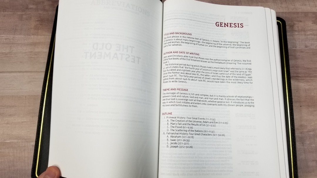
Each book has a short introduction that’s broken up into sections. The sections include:
- Title and Background
- Author and Date of Writing
- Theme and Message
- Outline
The book name and section titles are in red. I love the way the sections are divided. This keeps the page easy to understand at a glance. Each section only has a paragraph of information, but it’s all helpful in understanding the setting, audience, and purpose of writing.
Extras
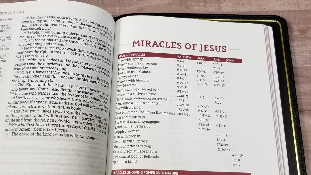
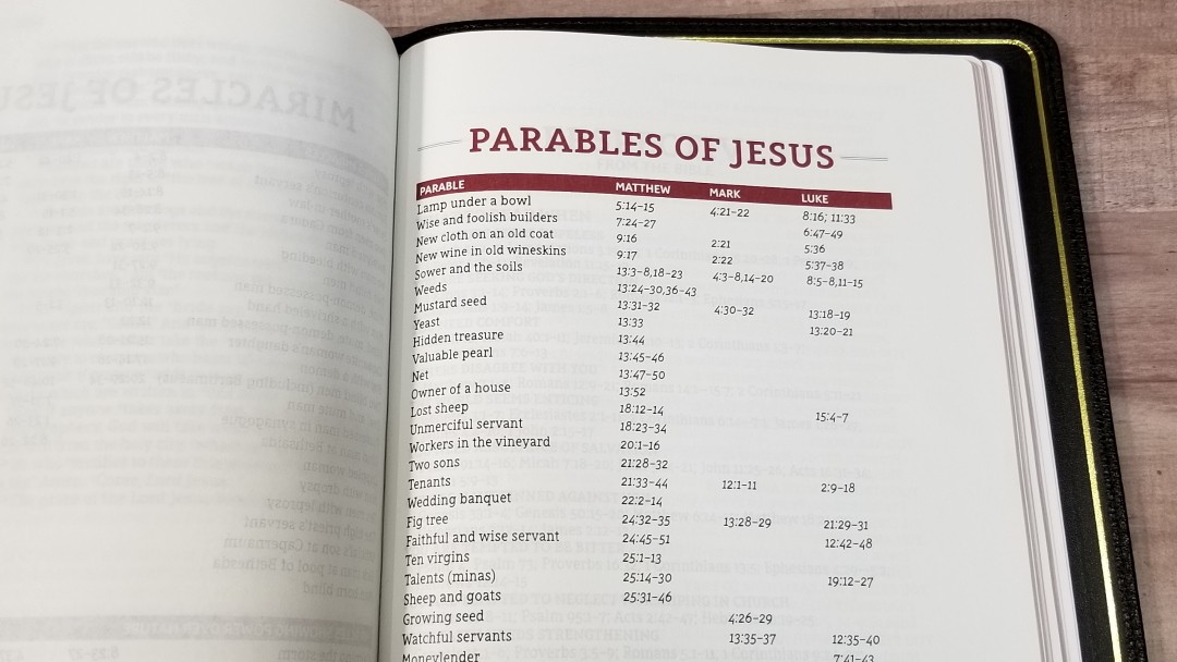
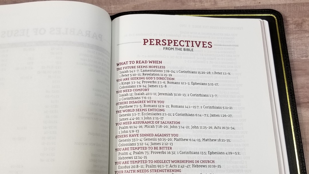

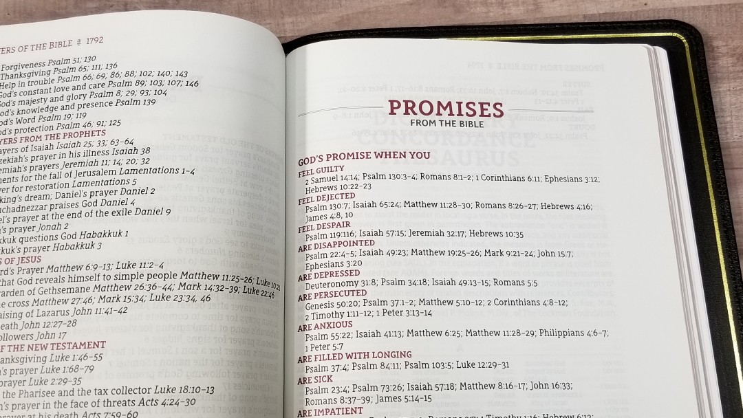
Just before the concordance, there are several pages with lists of Scriptures. Most are a single page. The one called Perspectives is a deeper list that includes topics and subtopics. They’re excellent for personal study and sermon prep. They include:
- Miracles of Jesus
- Parables of Jesus
- Perspectives from the Bible
- Prayers of the Bible
- Promises from the Bible
Concordance
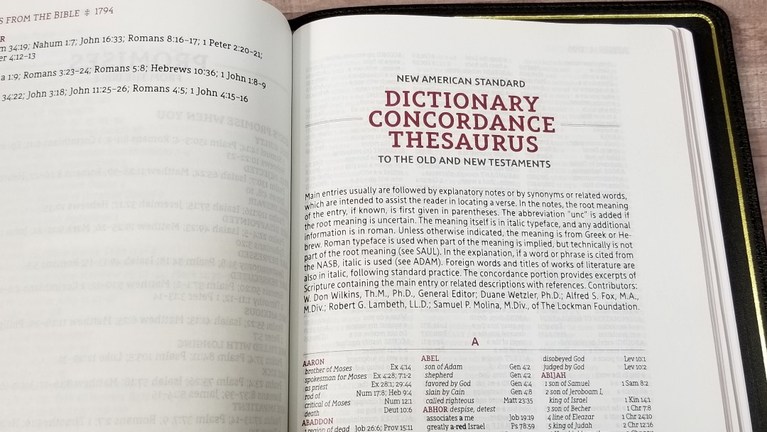
The concordance is 103 pages and includes a thesaurus/dictionary (with most of the words from Hebrew or Greek definitions), making it a useful study tool. Some entries include root words, meanings, and parts of speech. Foreign words and titles of Literature are in italics. It also includes the names of people and places.
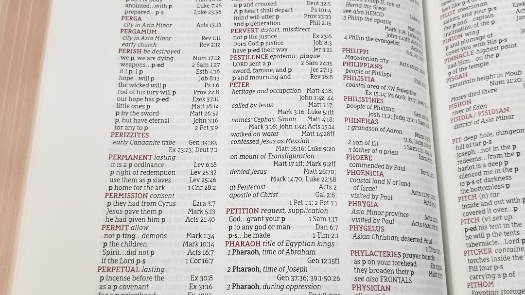
Here are some example entries with thier number of references to help you compare:
- Christ Messiah – 17
- Christian follower of Christ – 3
- Faith believe, trust – 36
- Faithful loyal, trustworthy – 15
- Faithfulness loyalty – 7
- Faithless unbelieving – 4
- God Deity, Eternal One – 37
- Dod false deity, idols – 8
- Goddess female diety – 3
- Godless pagan, without God – 5
- Godliness holiness – 5
- Godly holy – 6
- Praise (n) acclamation, honor – 10
- Praise (v) extol, glorify – 12
- Pray ask, worship – 19
- Prayer – 15
Maps
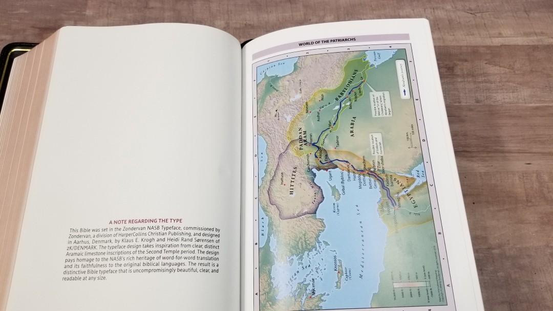
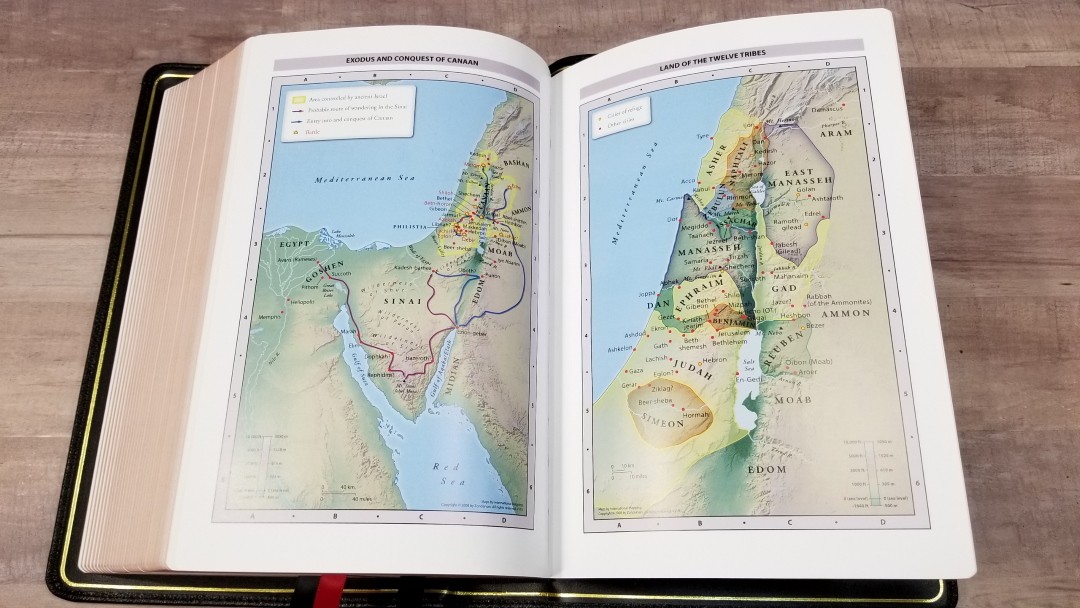

It includes 8 pages with 7 full-color maps Zondervan maps. The maps are printed on thick glossy paper. The maps show topography, distance, routes, borders, possible locations of lost places, battles, elevation, cities, and locations for the events of Jesus’ ministry. It doesn’t include an index but the maps are annotated well and I find them easy to use.
Maps include:
- World of the Patriarchs
- Exodus and Conquest of Canaan
- Land of the Twelve Tribes
- Kingdom of David and Solomon
- Jesus’ Ministry
- Paul’s Missionary Journeys
- Jerusalem in the Time of Jesus
Comparisons
Here’s a look at how the SCR compares to a few other side-column reference editions and another Premier Collection NASB from Zondervan.
NASB Clarion

The NASB Clarion is a hand-sized Bible with a paragraph layout with side-column references. It’s not as dark and the paper is much thinner. It doesn’t have space for notes. It’s a great choice if you need a carry edition.
NKJV Quentel

The 36gsm Quentel has about the same overall size, but it has a larger font and a double-column layout with references in the footer. Even though it also has 36gsm paper and a goatskin cover, it’s materials are of a higher quality. It’s price reflects the quality difference.
NKJV Single Column Reference Bible

The first edition NKJV Single Column Reference in the Premier Collection uses the same materials. The NASB adds spine ribs and overcast stitching (the 2nd edition NKJV in brown also adds these features). Both have a single column layout with side-column references. The NKJV places all of the references together at the bottom of the page, leaving space at the top of many pages for notes. The NKJV has a smaller font and a paragraph layout.
NASB Preacher’s Bible


The Zondervan NASB Preacher’s Bible has the same footprint but it’s a thinline. It presents the text in double-column verse-by-verse format, has a 10-point font, and does not include references, a concordance, or maps. The materials and build quality are the same.
Conclusion

Zondervan’s NASB Single Column Reference Bible is an excellent version of the NASB SCR. The materials do look and feel high-quality. I’m especially impressed with the paper and print. The large and dark font and the paper’s color and opacity help make this Bible easy to read. The tools are great for study and sermon prep and the note space helps make it a great choice for study and note-taking. I would like to see a little more gutter space, but this isn’t a deal-breaker for me. I also wouldn’t mind seeing the missing footnotes added back in. The NASB Single Column Reference Bible is a great choice for anyone interested in an NASB for study, preaching, and teaching.
_________________________________________________________
This book is available at (includes some affiliate links)
and many local Bible bookstores
_________________________________________________________
Zondervan provided this Bible in exchange for an honest review. I was not required to give a positive review, only an honest one. All opinions are my own.


Hi Randy. Many thanks for your extensive and informative review. I have been considering this Zondervan SCR Bible for a while, The only thing that gives me hesitation is that the text, based on the pictures, runs close to the gutter. You made mention of this but said it wasn’t a deal breaker. My question is, does this affect the readabilty of this Bible? From the pictures, it appears the text bends down to the gutter, giving the impression that it may be awkward to read. Do you see this as a problem, and if so, would it be minimized by the Bible flattening out with use? Thanks again, and God bless.
Thanks Paul. For me, it only slightly affects readability enough to notice, but it depends on how I’m holding it. If I’m holding it in my hands or in my lap, then I tend to angle the page to flatten it and the bend is gone. I don’t even think about doing this, so it isn’t something I have to go out of my way to do. The only time I notice the bend is when the Bible is sitting on a flat surface. Even then, the text doesn’t bend out of view. It’s really only an issue if I’m standing or sitting to one side to the point that a page is not in front of me. I’m not sure if it would flatten out with use.
Love the layout. Wish Nelson would produce a KJV in this same style and format.
Randy, Comparing your images with the text of the older side-column reference editions, I see a decided reduction in the marginal notes! Do we know why this was done? Seems to be a retrograde step!
They’re using a reduced set of notes. It removes the redundant notes and a few other things. I’m not sure why they chose the reduced set.
Randy, Co
Comparing your images with the text of the older side-column reference editions, I see a decided reduction in the marginal notes! Do we know why this was done? Seems to be a retrograde step!
They’re using a reduced set of notes. It removes the redundant notes and a few other things. I’m not sure why they chose the reduced set.
Hi, Randy,
I love your reviews and have found them interesting and helpful.
I would like to get a premium NASB and have seen the Zondervan which has many great qualities, but I don’t like the gutter issue and actually want ALL the notes and footnotes. I’m tempted by the clarion: I know the format and the strengths and weaknesses of it, but I cannot find out whether or not it carries all footnotes, references, use of capitalisation and parentheses to clarify editorial choices. I wonder if you are able to clarify this for me.
Kind regards,
Steve
Hi Randy,
Thank you for what you do. Your bible reviews and some of the most in depth. My question is do you know the number of cross references? Zondervan on their Facebook page told me it is slightly abridged also and not the full 95,000+. Can you shed some light on this.
Thank you!! I’m not sure of the number. I’ll see what I can find on this.
I’ve asked my contact. They said they have received your question on Facebook and are looking into it. I’ll also post it here.