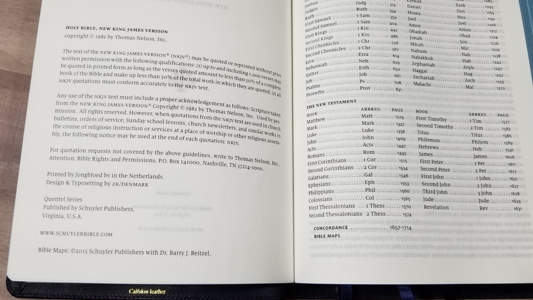
The latest edition of the regular size Schuyler NKJV Quentel provides everything found in the original edition with the exception of paper. This edition replaces the original’s 36gsm with 28gsm Indopaque, a more expensive paper milled in France, to make this edition .3″ thinner. The NKJV Quentel is available in both goatskin and calfskin in several colors. I’m reviewing the navy blue calfskin edition. It was made in the Netherlands by Jongbloed and typeset by 2K/Denmark.
This Bible was purchased for review.
________________________________________________
Buy from EvangelicalBible
________________________________________________
Table of Contents
Video Review
Cover and Binding
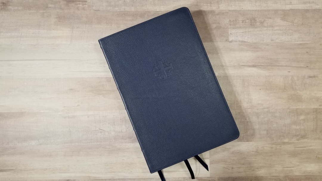
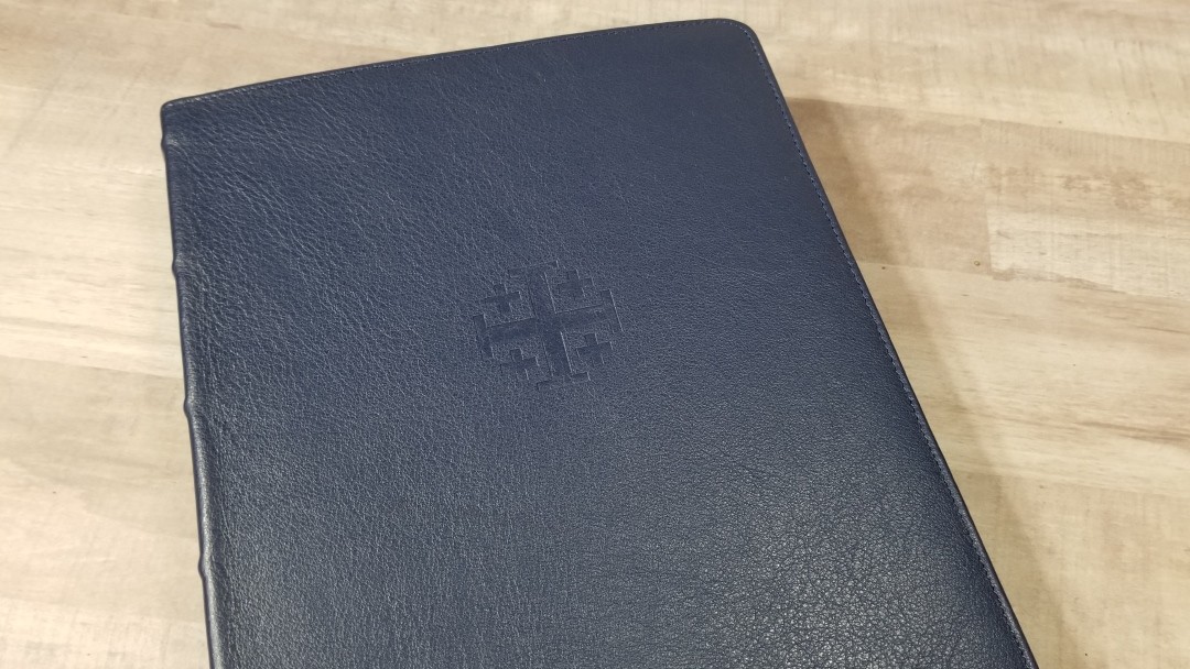
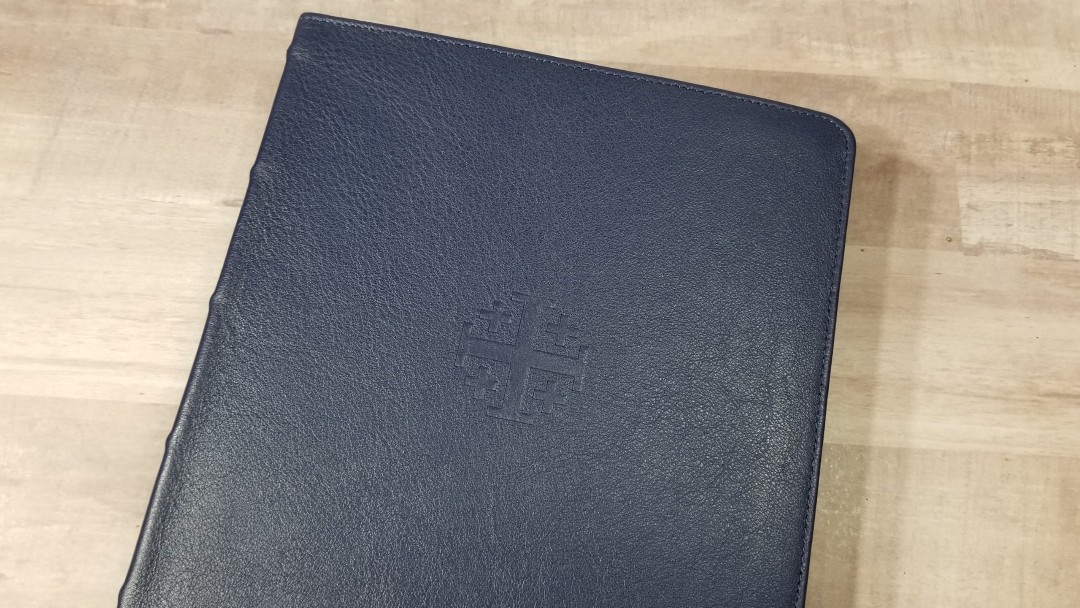
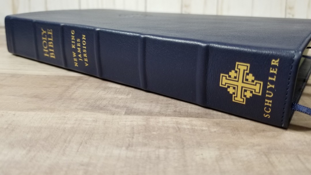
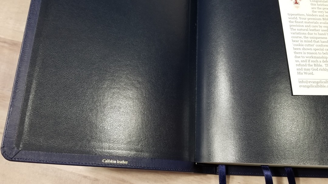
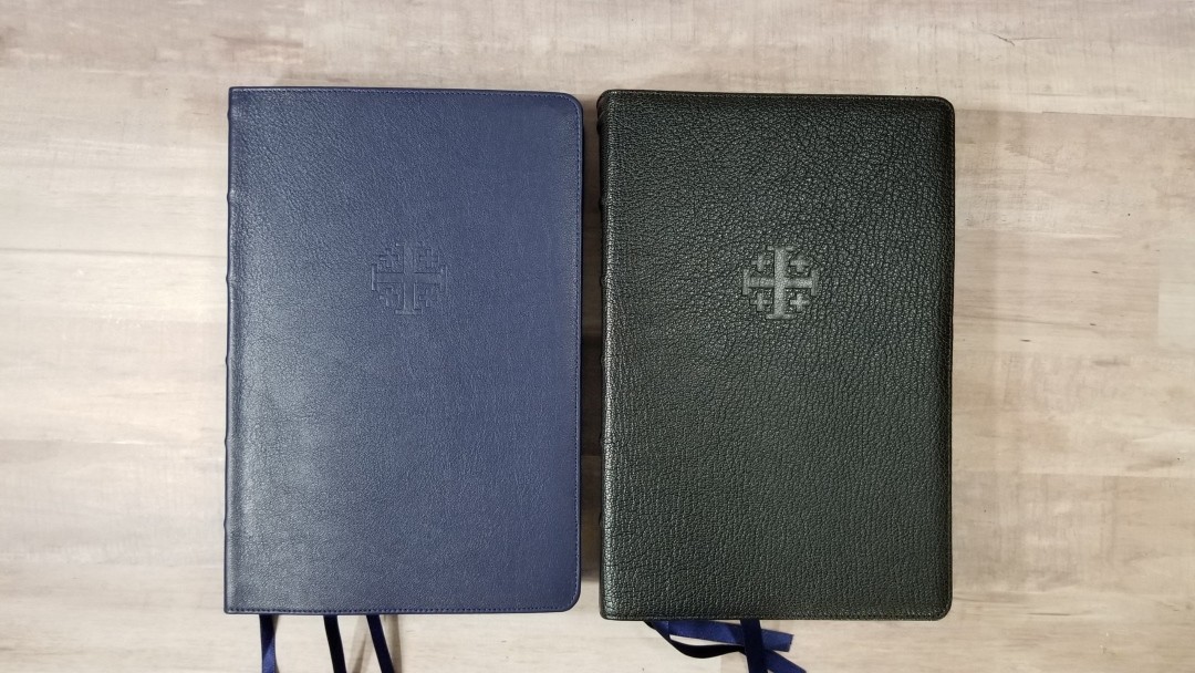
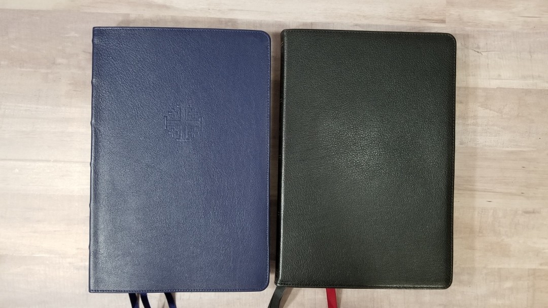
The cover is navy blue Meriva calfskin with a dark blue vinyl paste-down liner. The calfskin is smoother than the ESV and NASB personal size editions that I have and matches the personal size NKJV and KJV. It’s still soft even though it’s smooth.
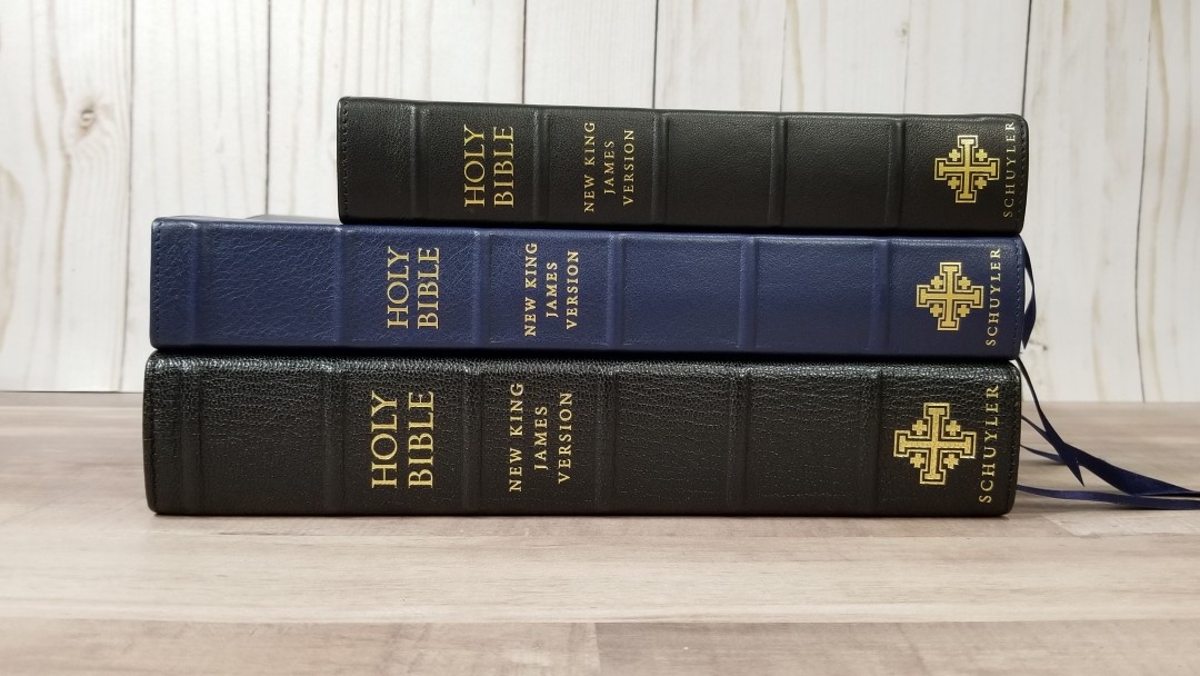
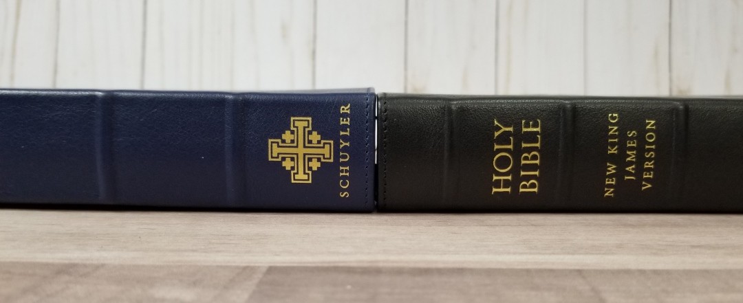
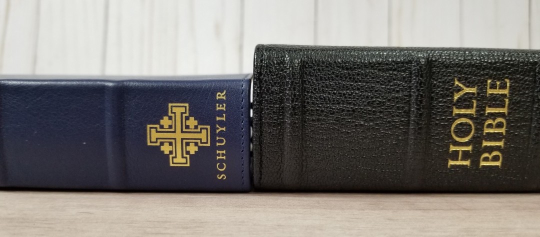
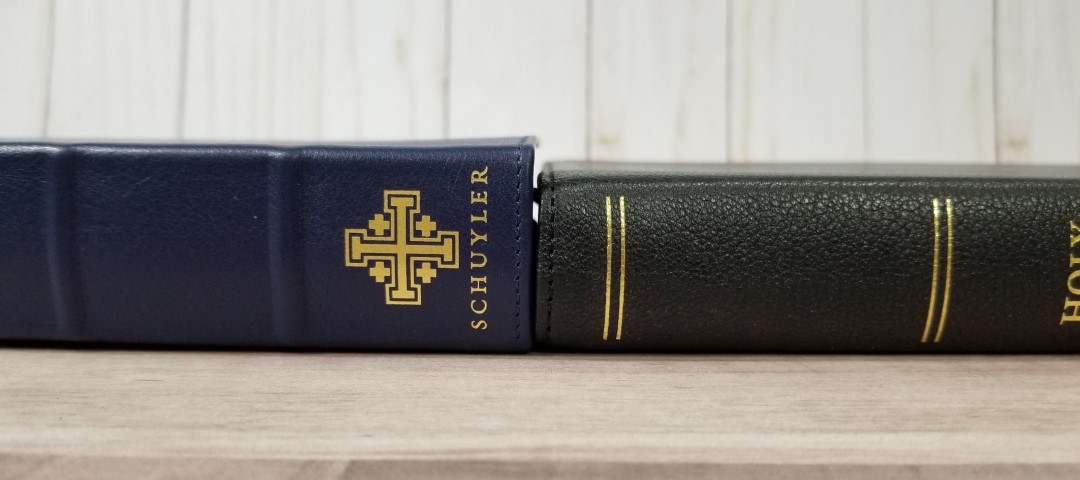
It has perimeter stitching and has a 9mm yapp (overhang). The front has the Jerusalem cross is debossed, and the spine has 6 raised ridges that separate the various sections. It has Holy Bible, New King James Version, the Jerusalem Cross, and Schuyler printed in gold.
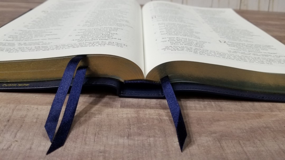
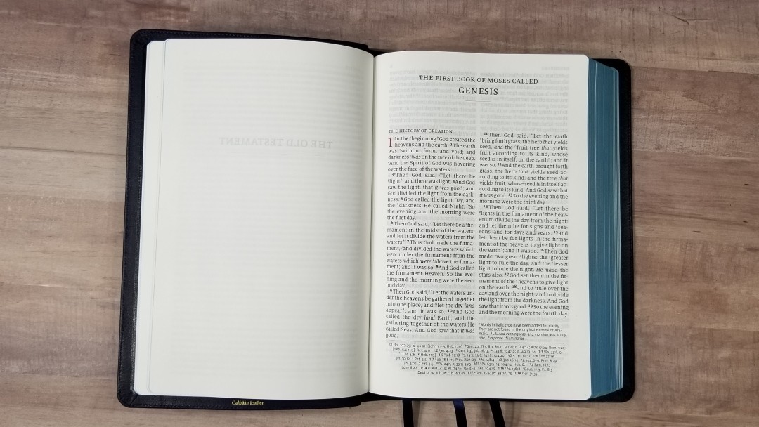
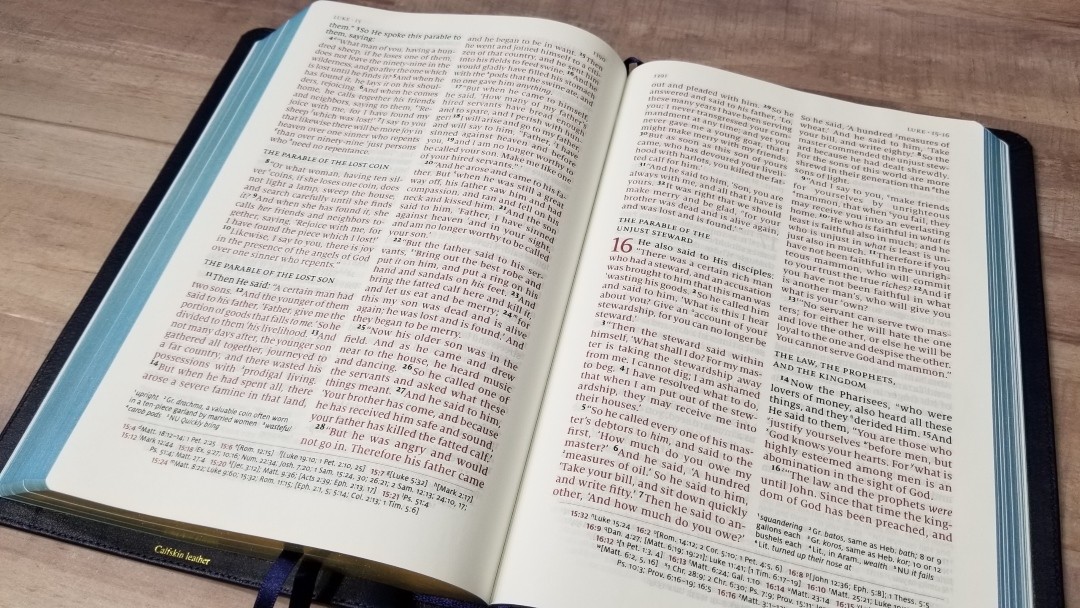
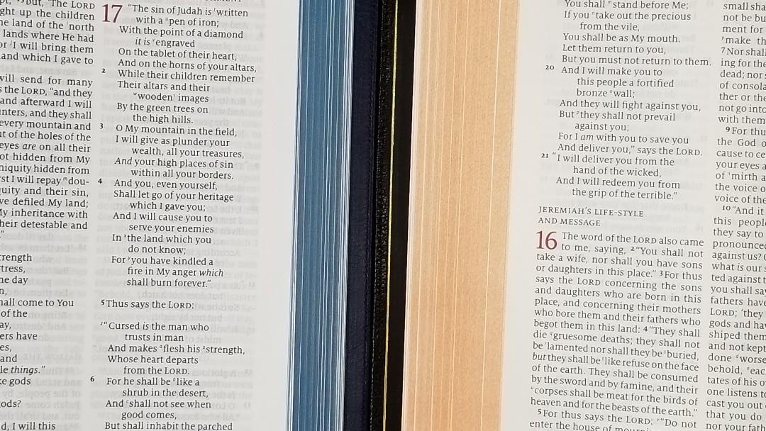
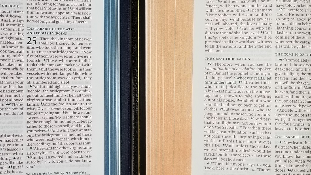
The text-block is Smyth-sewn. It stays open on the first page with no trouble. It includes navy head and tail bands, three 5mm navy ribbons, and blue under gold art-gilt edges.
The text block size is 6.14″ x 9.1″ x 1.1″. The overall size is 6.6 x 9.75 x 1.3″. It weighs 2lbs, 7oz. This size is excellent for reading at a desk or in a chair, and for preaching. I even read in the car with no trouble. I take a Bible with me a sit in the car to read when we go to the store. I usually take a personal size Bible for this, but this thinner Quentel worked great. I had the NKJV PSQ with me, but I never felt the need to change to it.
Paper
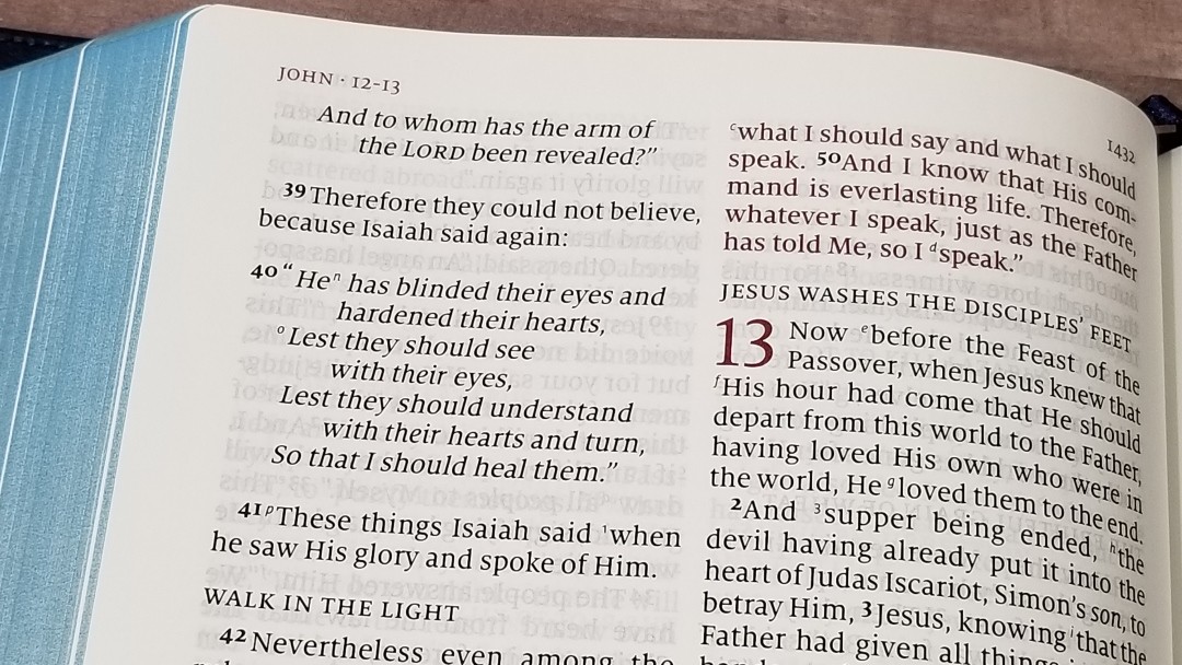
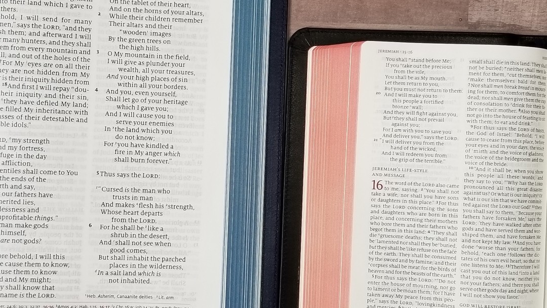
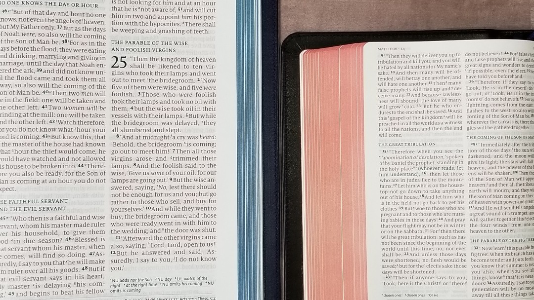
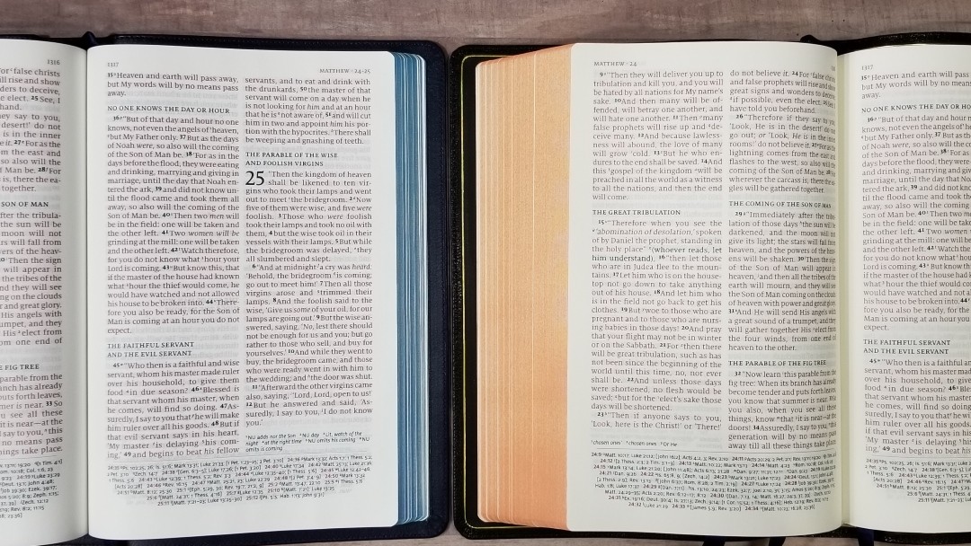
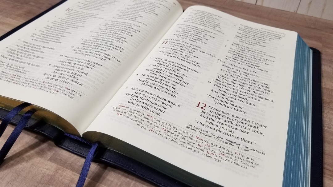
The paper is 28gsm Indopaque, which is a high-quality premium paper that’s extremely opaque for how thin it is. It’s white in color and has a coating. It has no glare under direct light. This makes the Quentel much thinner than the original. The paper in the original is easier to turn, but I had no trouble with this paper. This is excellent paper for reading.
It doesn’t include lined pages in the back for notes, but it does have several thick end-sheets to give it structure that can be used to write on. This is great for using the Quentel to teach or preach from, add your own thoughts, prayers, lists of events, etc. The red under gold art-gilt edges are nice and dark.
Typography
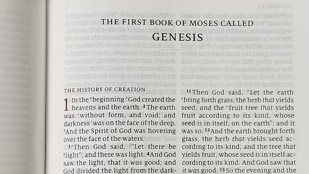
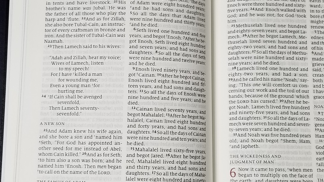
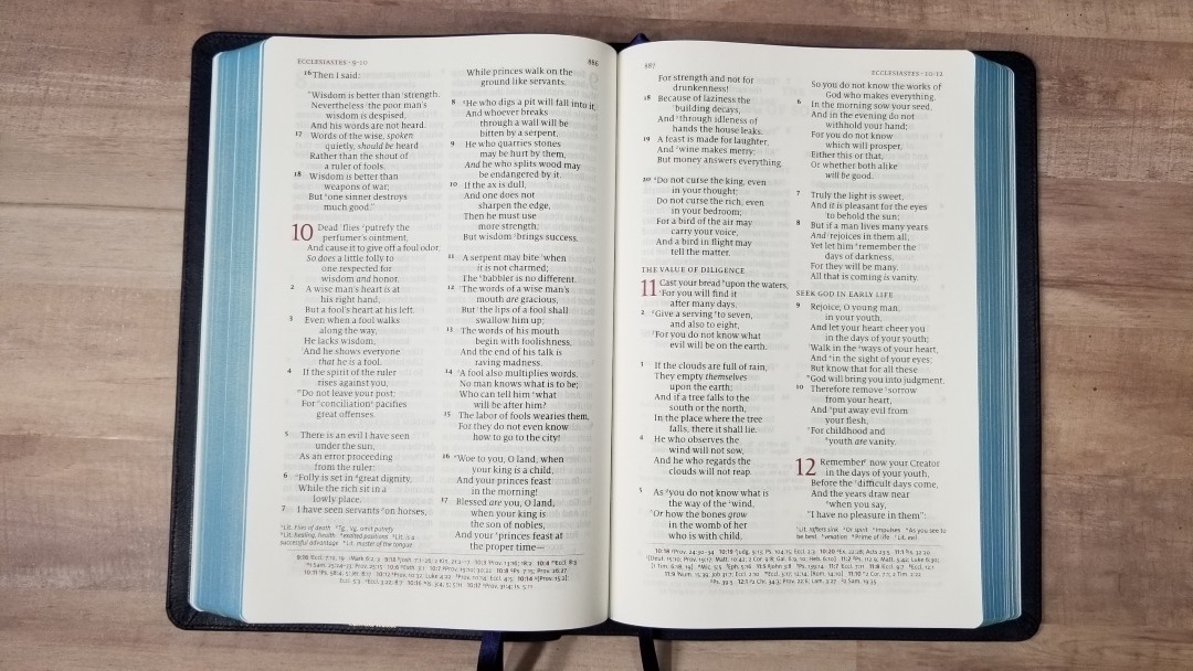
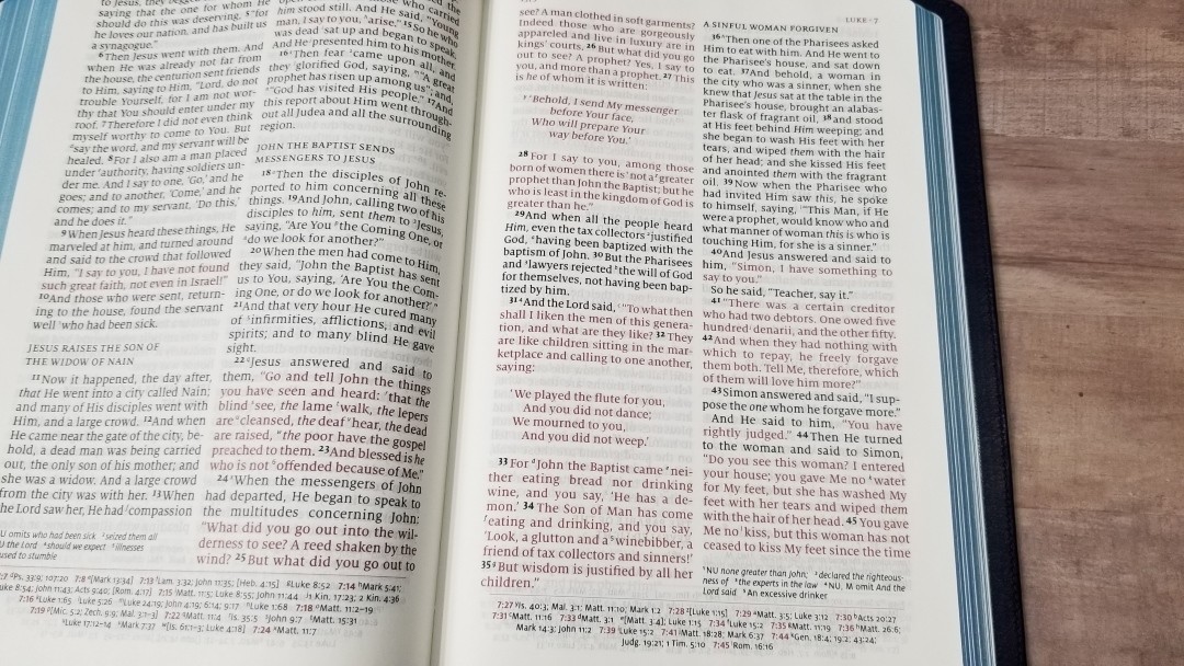
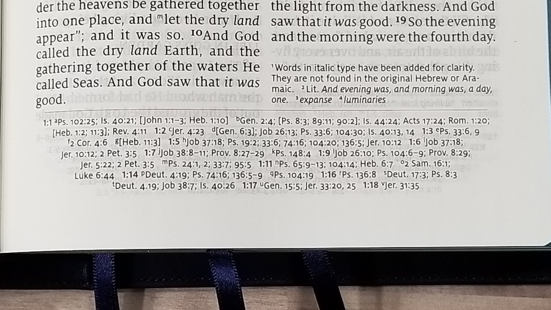
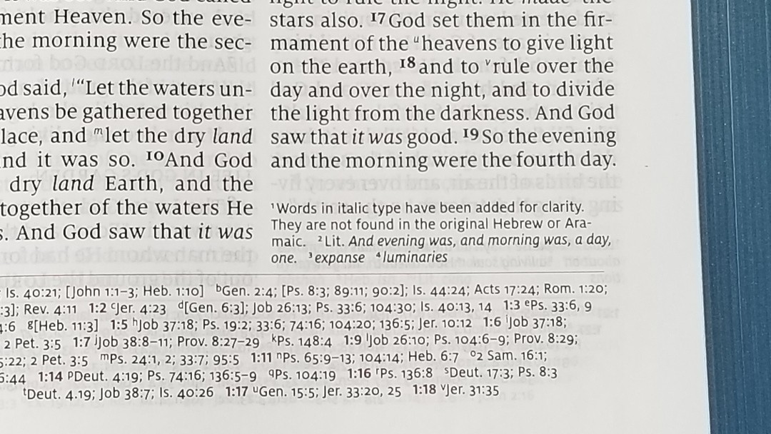
The text is set to double-column, paragraph format with poetry in stanzas and letters indented. The header includes book names and chapter numbers in the outer margin and the page number in the inner margin. Translation footnotes are placed under the last verse in the inner or outer column. Cross-references are placed across the footer. The text in the header, chapter numbers, and pilot numbers for the references are printed in red. The cross-references are separate from the text by a red line.
The text is an 11-point Milo serif font with the words of Christ in red. The black and the red are medium to dark in darkness. They’re both noticeably darker than my original NKJV Quentel and are highly consistent throughout the Bible. This typeface is sharp and easy to read. It has around 7 words per line on average. The words have good spacing. It never feels cramped and it doesn’t have too much space to look awkward.
Even though it only has around 7 words per line, poetry looks amazing. This is difficult to do with a two-column layout and is one of the reasons I like single columns. The poetic lines are separated in natural places where the thoughts break, so nothing looks out of place. This is one of the strengths of 2K/Denmark as Bible text designers.
It’s printed with line-matching, meaning the lines on the front and back of the page line up to reduce the effect of show-through and make the text easier to read. The text doesn’t have a gray tint behind because the paper is opaque enough to reduce the show-through. It has a wide inner margin to keep the text out of the gutter. This helps keep the lines flat on the page.
Chapter numbers are in a red drop-cap. This makes the chapters stand out. Section headings are in all caps. They stand out from the text and are easy to use when scanning the page, but they’re also easy to ignore for reading. Old Testament quotes in the New Testament are placed in oblique type. This can look too similar to italics, but it does make them easy to spot. Letters and numbers key the text to the references and footnotes. They’re small enough to ignore while being large enough to use. The verse numbers are larger than the cross-reference and footnote keys and are much darker. I find them easy to ignore for reading, but they’re also easy to find when searching for verses. I had no trouble preaching from it.
References
It includes 60,000 cross-references (I didn’t count them, though. I’m just taking their word for it). They’re printed in the standard Quentel tapered design where the lines get shorter as they go down the page in order to ground the page. The chapter and verse numbers printed in red so they’re easy to find. I had no trouble finding them quickly, but they’re not as easy to find as center-column (for me, anyway). These are excellent for study and sermon prep.
Here are some examples to help you compare:
- Genesis 1:1 – Ps 102:25; Is 40:21; Jn 1:1-3; Heb 1:10; Gen 2:4; Ps 8:3; 89:11; 90:2; Is 44:24; Acts 17:24; Rom 1:20; Heb 1:2; 11:3; Rev 4:11
- Deuteronomy 6:4 – Deut 4:35; Mark 12:29; John 17:3; 1 Cor 8:4, 6
- Isaiah 9:6 – Isa 7:14; Luke 2:11; John 1:45; Luke 2:7; John 3:16; 1 John 4:9; Matt 28:18; 1 Cor 15:25; Rev 12:5; Judg 13:18; Titus 2:13; Eph 2:14
- Matthew 17:20 – Mat 21:21, Mk 11:23, Lk 17:6, 1 Cor 12:9
- Mark 11:23 – Matt 17:20; 21:21; Luke 17:6
- Mark 12:29 – Deut 6:4, 5; Is 44:8; 45:22; 46:9; 1 Cor 8:6
- John 1:1 – Gen 1:1; Col 1:17; 1 John 1:1; John 1:14; Rev 19:13; John 17:5; 1 John 1:2; 5:20
- John 2:19 – Mat 26:61, 27:40, Mk 14:58, 15:29, Lk 24:46, Acts 6:14, 10:40, 1 Cor 15:4
- Acts 2:38 – Luke 24:47
- 1 John 1:1 – John 1:1; 1 John 2:13, 14; Luke 1:2; John 1:14; 2 Pet 1:16; Luke 24:39; John 2:27; John 1:1, 4, 14
Footnotes
The standard NKJV footnotes are placed under the last verse in the outer column for most books. There are at least a couple that has them under the inner column. They provide detailed information about manuscript variances from the Nestle-Aland / United Bible Societies, Majority Text, Septuagint, Targum, Vulgate, and Syriac. They also have the literal renderings from Hebrew and Greek.
I’m glad they’re included because the NKJV has some of the best footnotes. I’ve always found them helpful for study. I like that they show the actual manuscript name and you can decide for yourself if they’re the best or not. I consider this one of the strengths of the NKJV.
Concordance
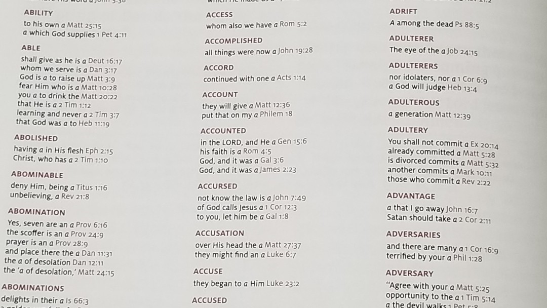
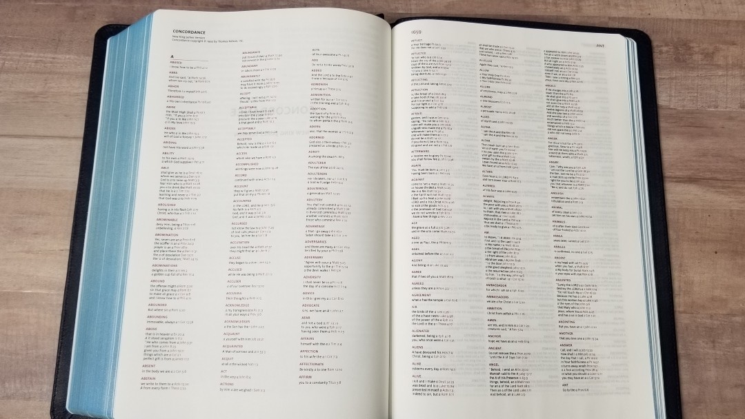
The concordance 57 pages with three columns per page. I find it easy to use, but the font is noticeably small. The entries and verses are red. It has a lot of entries and is great for study and sermon prep.
Here are a few examples with the numbers of entries for each one:
- Christ – 13
- Christian – 1
- Christians – 1
- Christs – 1
- Faith – 40
- Faithful – 20
- Faithfulness – 5
- Faithless – 2
- God – 38
- Goddess – 2
- Godhead – 2
- Godliness – 4
- Godly – 3
- Gods – 5
- Praise – 25
- Praised – 4
- Praises – 2
- Praiseworthy – 1
- Praising – 3
- Pray – 14
- Prayed – 2
- Prayer – 16
- Prayers – 5
Maps
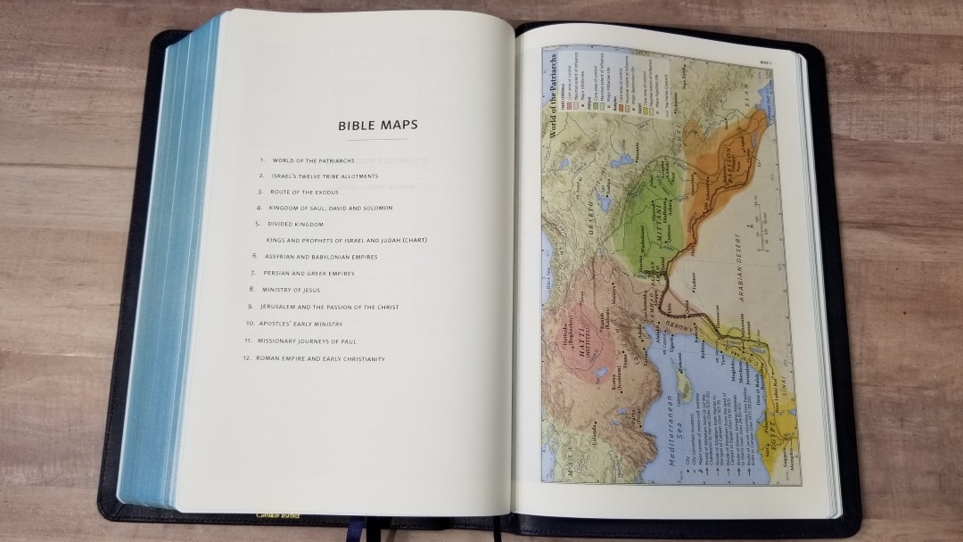
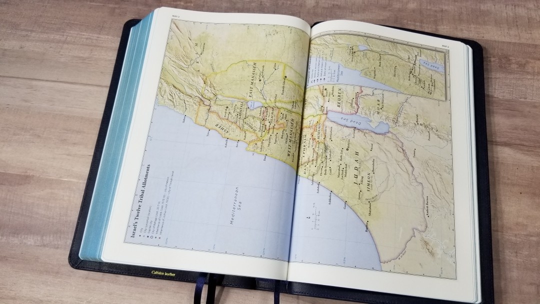
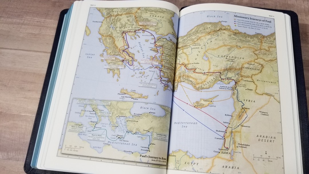
It includes the 12 Schuyler maps and chart designed by Dr. Barry J. Beitzel. They’re printed on thick, non-glossy, paper. They’re printed in earth-tones and are beautifully drawn. This my personal favorite colors for maps. There are a few that span two pages, but they don’t have space between the page. This causes some of the map to be lost in the gutter. That’s the one thing I’d like to see changed.
They include cities, routes, distance, topography, areas of control (color-coded), capitals, cities of refuge, inheritance, battle sites, Scripture references, travels of Israel, kingdom territories, sites of royal inscriptions, dates, locations of events, locations where Paul wrote letters, lighthouse site, and more. It also includes a map index. I’m glad to see that they kept the index. This makes the maps much easier to use.
Maps include:
- World of the Patriarchs
- Israel’s Twelve Tribe Allotments
- Route of the Exodus
- Kingdom of Saul, David and Solomon
- Divided Kingdom
- Kings and Prophets of Israel and Judah (Chart)
- Assyrian and Babylonian Empires
- Persian and Greek Empires
- Ministry of Jesus
- Jerusalem and the Passion of the Christ
- Apostles’ Early Ministry
- Missionary Journeys of Paul
- Roman Empire and Early Christianity
Comparisons
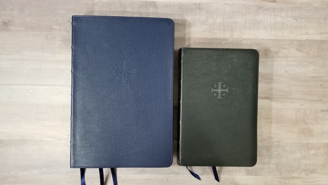
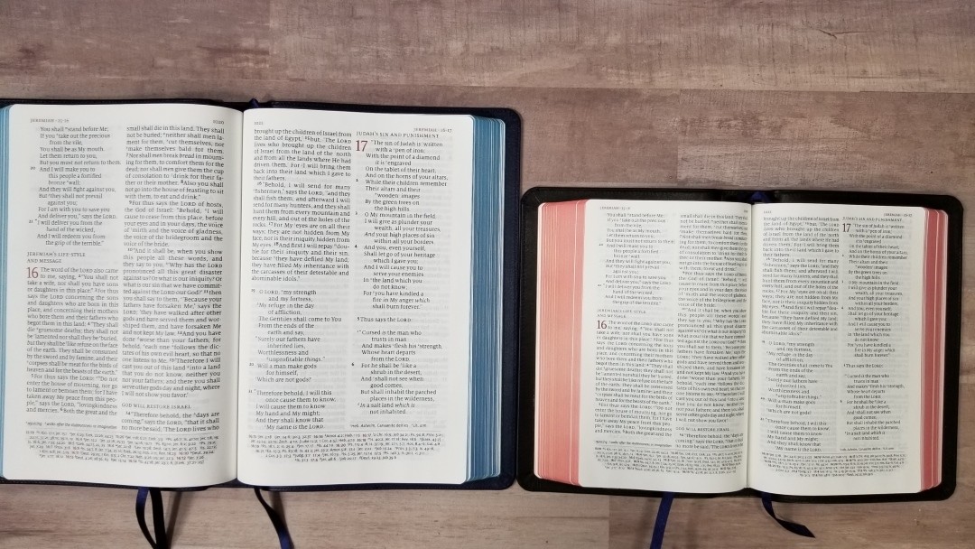
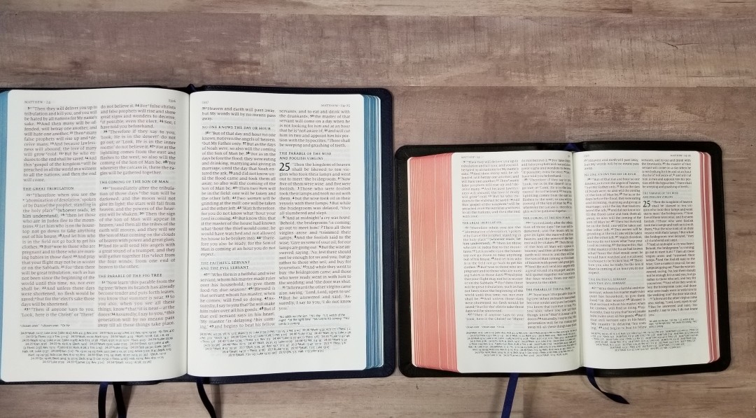
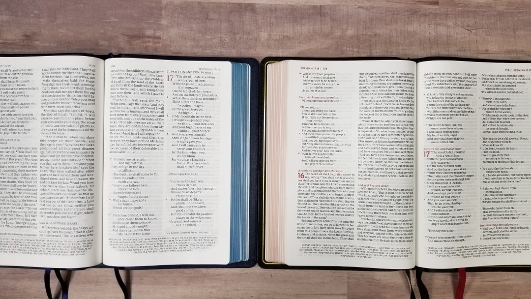
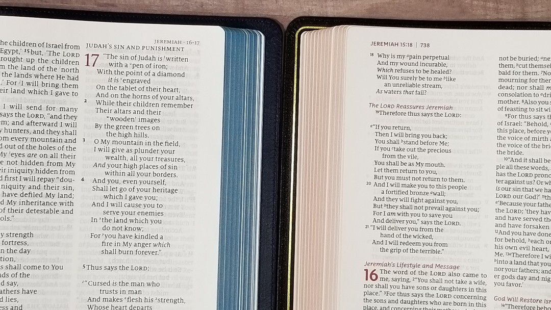
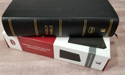
Here’s how the thinner NKJV Quentel compares with the original edition, the NKJV Personal Size Quentel, and the Thomas Nelson Premier Collection Large Print Thinline NKJV.
Schuyler NKJV Personal Size Quentel
The NKJV PSQ has the same pagination as the regular edition. Its calfskin leather has the same smooth grain. The paper is the same, 28gsm Inopaque. This one doesn’t include a concordance or map index, but it has several pages for notes. The personal size is a great companion to the larger edition.
Schuyler NKJV Quentel
The pagination and font size between the original Schuyler NKJV Quentel and the new thinner edition is exactly the same. The original size has thicker paper (36gsm vs 28gsm), but the opacity is about the same. The font is lighter than the thinner edition. Also, with the wider spine, the text bends further into the gutter. It’s 9oz’s heavier at 3lbs vs 2lbs, 7oz.
Thomas Nelson Premier Collection NKJV Large Print Thinline Reference Bible
The Thomas Nelson Premier Collection NKJV Large Print Thinline Reference Bible has about the same footprint, but it’s slightly thinner and lighter. It has 36gsm paper, but not as high a quality as the Quentel. The font is noticeably smaller at what looks close to 10 point when compared to the Quentel’s 11 point. The text is also tighter, with more words per line and less space between the lines.
Conclusion
The thinner edition of the NKJV Quentel is an excellent Bible. I’ve always loved the design, paper, and print of the Quentel. The double-column design is great for reading, study, and preaching. The darker text is a welcome improvement. The verse numbers are easy to find at a glance. The 60,000 cross-references stay out of the way when you don’t need them, but they’re easy to use when you do need them. The concordance and maps add to the usability as a reference edition. The navy blue calfskin looks nice and I’m personally drawn to the stiffer cover. I find them easier to handle and I find that they stay open flatter on page one.
The thinner size makes it easier to use unless you only need to use it on a table, desk, or pulpit. It’s only 9oz lighter, but I’m more drawn to the thinner spine. Fortunately, it isn’t too thin to feel comfortable holding it. I had no trouble reading from it or turning the pages, although I do notice the difference in paper thickness when turning the pages. I think the Indopaque would be great for highlighting, but the 36gsm seems to be a better option for marking. The show-through seems to be the same as the regular edition even though the paper is slightly brighter in color.
The new NKJV Quentel is an easy Bible to recommend. It’s designed and made well. It’s a great choice for carrying, reading, Bible study, teaching, and preaching. The NKJV Quentel is still one of my favorite NKJV’s, and this one has the potential to become my most-used Bible.
________________________________________________
Buy from EvangelicalBible
________________________________________________
This Bible was purchased for this review.
Do you have the thinner version of the Schuyler NKJV Quentel? Let us know what you think about it in the comments below.


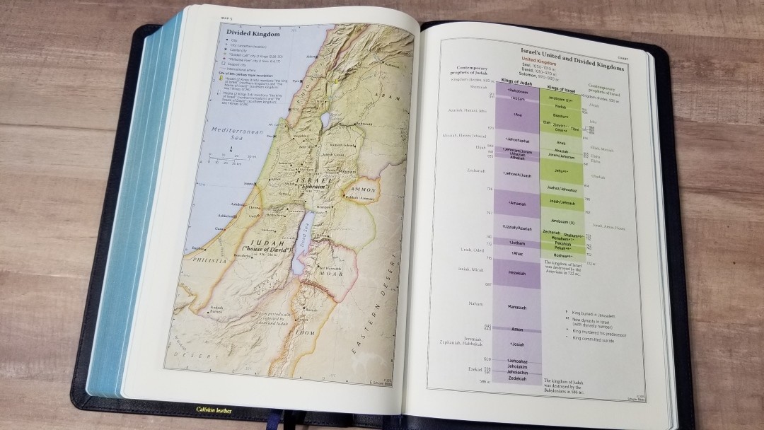





The chart of the divided kingdom and kings of Judah / Israel is one of the nicest things ever added to the maps section of any bible. I’ve used it on several occasions.