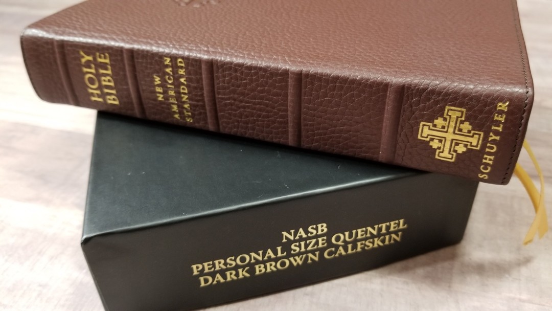
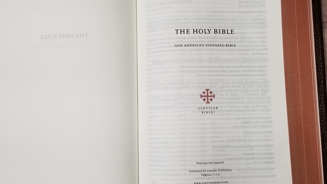
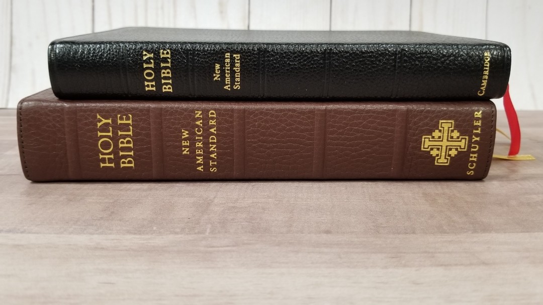
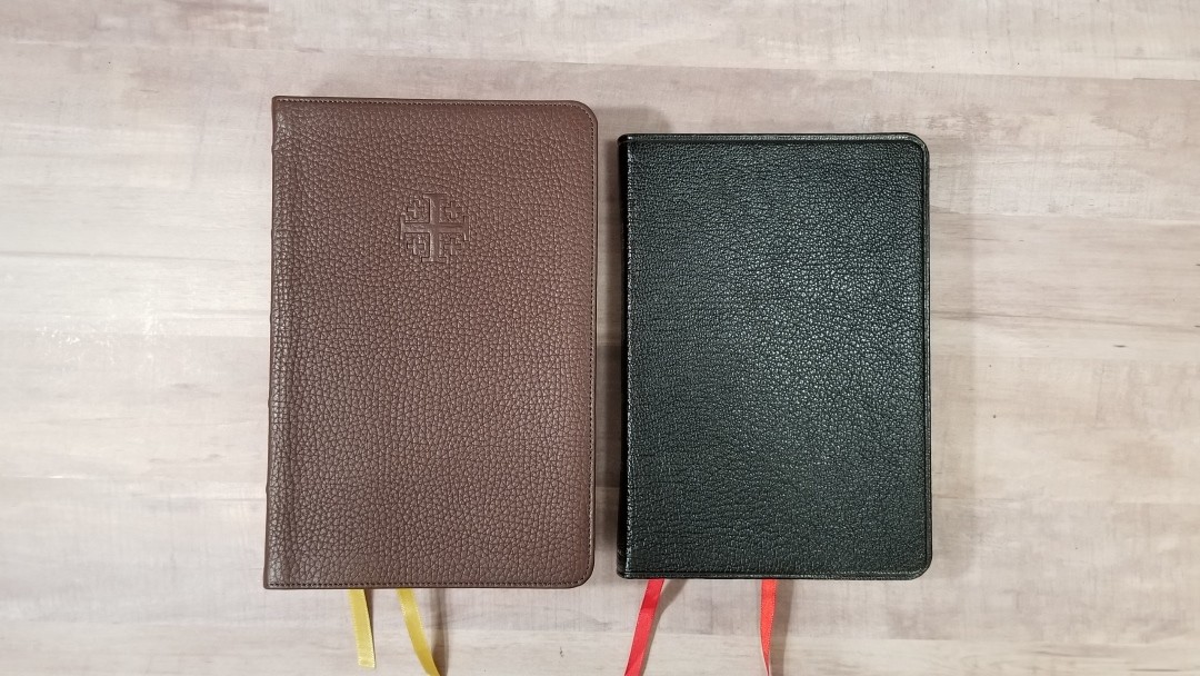
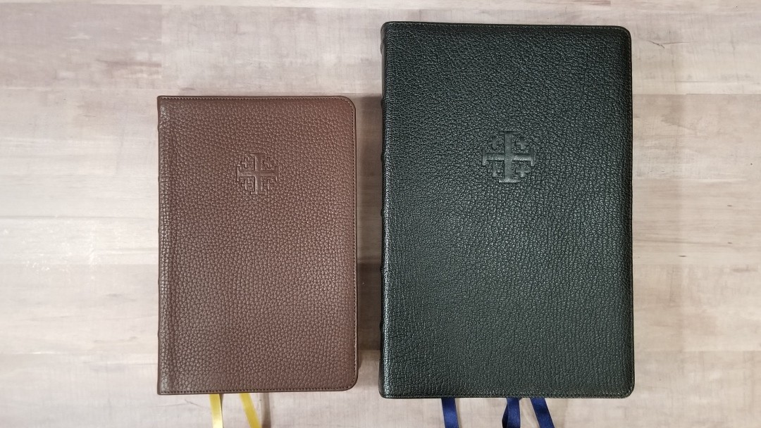
The Schuyler NASB Personal Size Quentel is a reduced version of the regular size Quentel. It has the same pagination but with thinner paper. Like all of the personal size Quentel Bibles, this one does not have a concordance. It’s available in both goatskin and calfskin in several color options for each. In this review, I’ll take a look at the brown calfskin edition. Like all Quentel editions, it was made in the Netherlands by Jongbloed and typeset by 2K/Denmark.
This Bible was purchased for review.
________________________________________________
Click here to buy from EvangelicalBible
________________________________________________
Table of Contents
Video Review
Cover and Binding
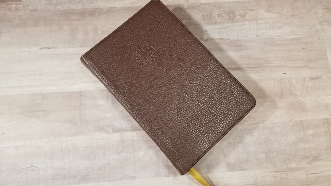
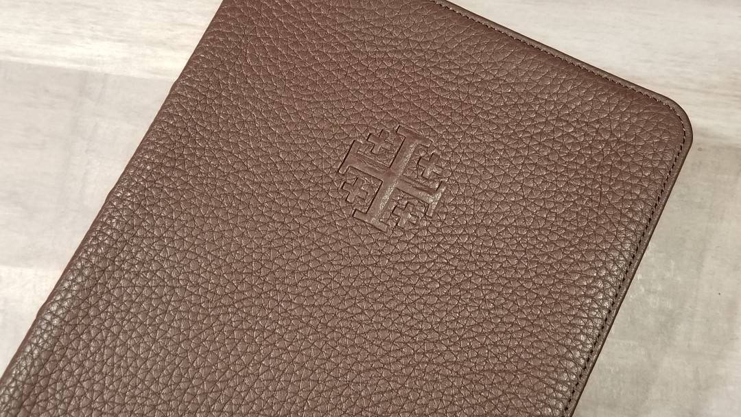
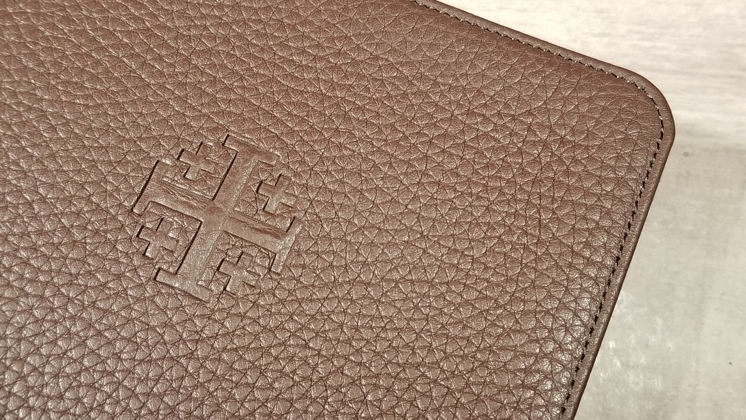
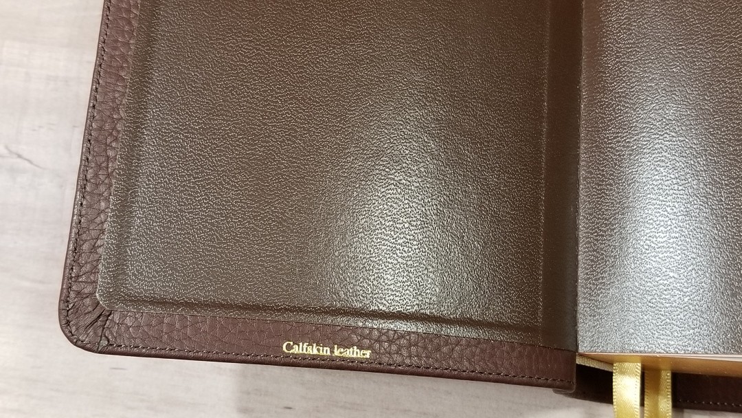
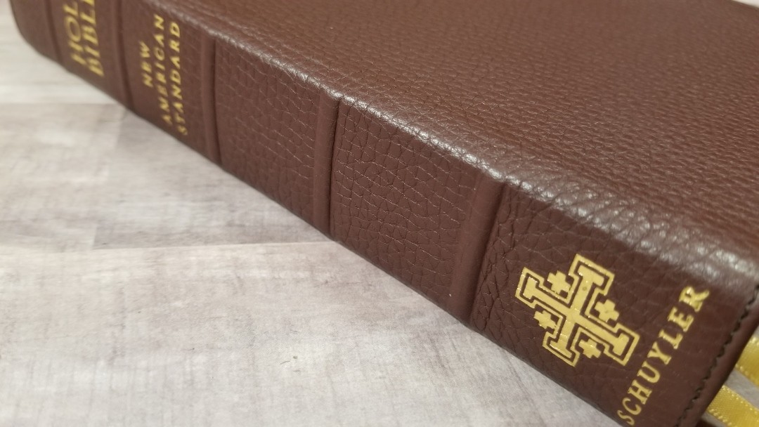
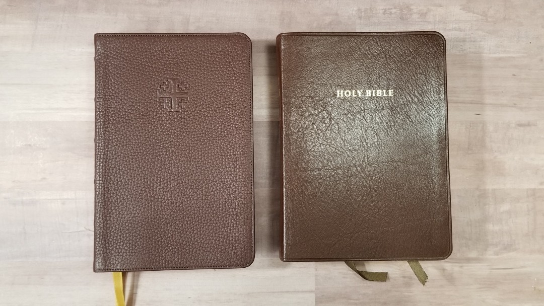
The cover is dark brown Buttero calfskin with a brown vinyl pasted liner. The leather is soft to the touch and has a deep pebbly grain. It’s soft to the touch but it isn’t floppy like goatskin. The cover is stitched around the perimeter. The front has the Jerusalem cross debossed. On the spine are 5 raised spine ribs with Holy Bible, New American Standard, the Jerusalem Cross, and Schuyler printed in gold. It has a 9mm yapp (overhang).
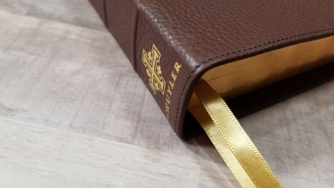
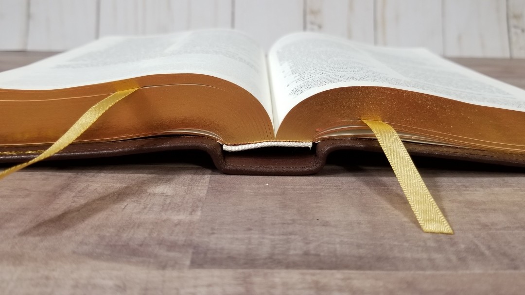
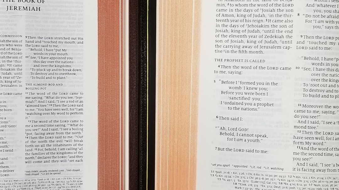
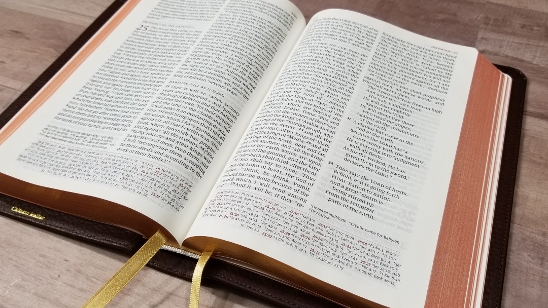
It’s Smyth sewn and easily stays open on any page. It includes white head and tail bands, two 5mm gold ribbons, and red art-gilt edges. The overall size is 7.8 x 5.18 x 1.3″. It weighs 1 lb 7 oz. This size is perfect for carry and for reading in one hand.
Paper
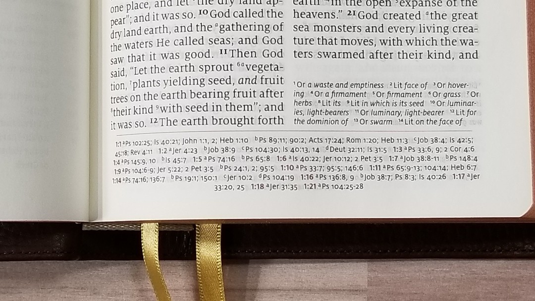
The paper is 28gsm Indopaque. It’s white in color and feels like it’s coated. It’s looks and feels elegant. The coating makes it feel thicker than 28gsm. It’s extremely opaque for how thin it is. I’ve used it for several months and haven’t seen any significant page-curl. I found the pages easy to turn and a joy to read from.
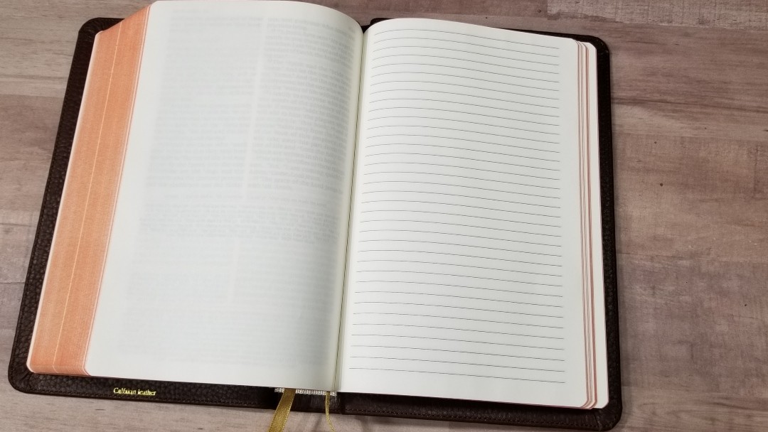

It has 10 lined pages in the back for notes. I’m glad to see lined pages. I’d like to see more publishers do this. This is great for using this Bible to teach from on the go. The art-gilt edges are red under gold.
Typography
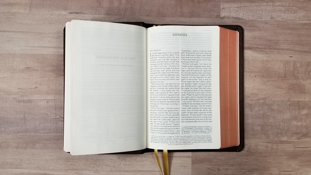
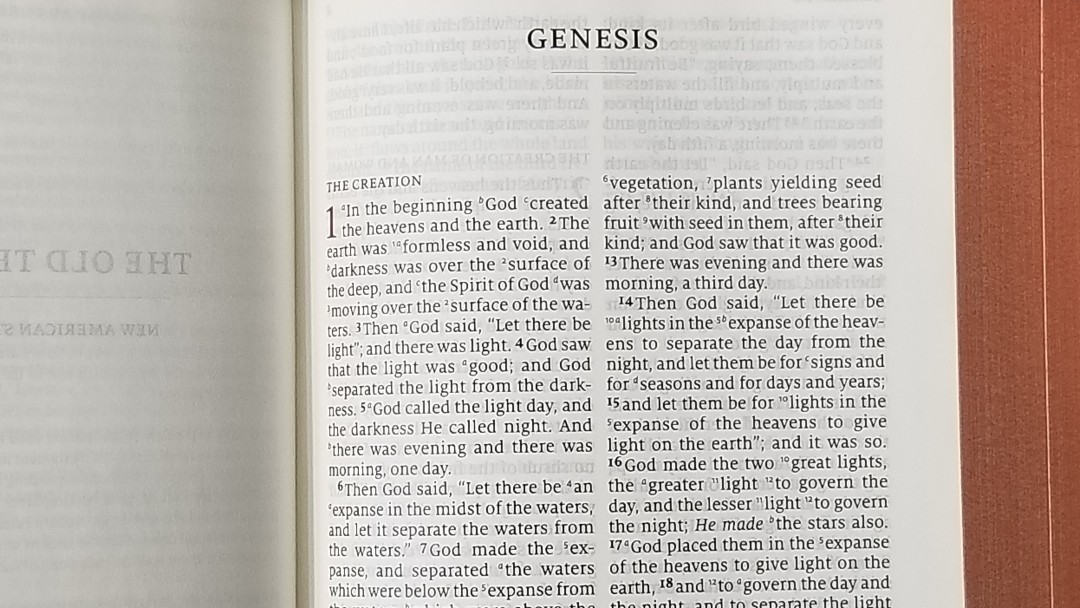
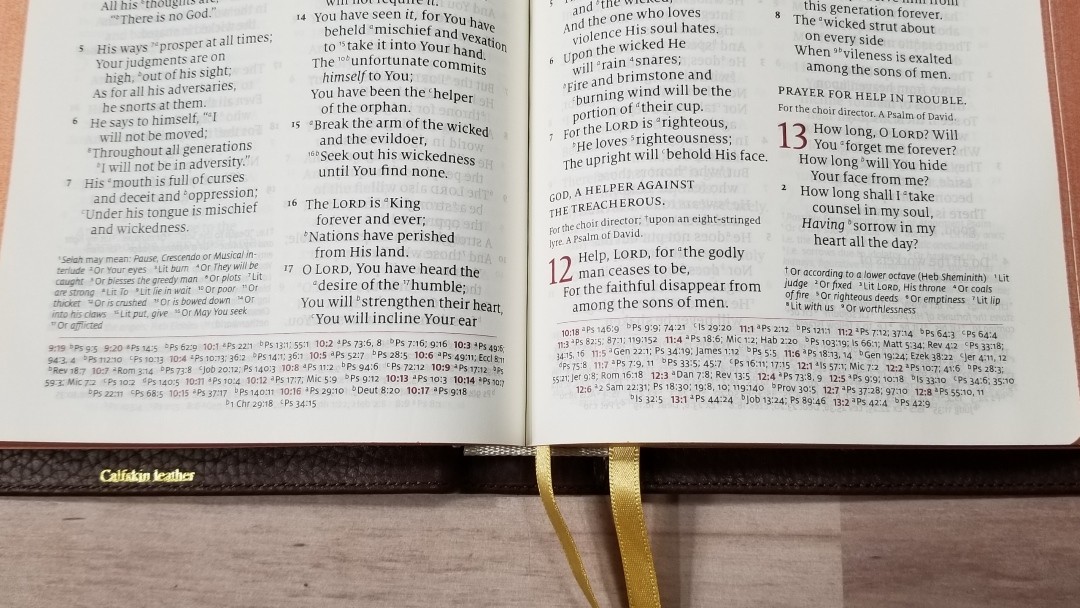
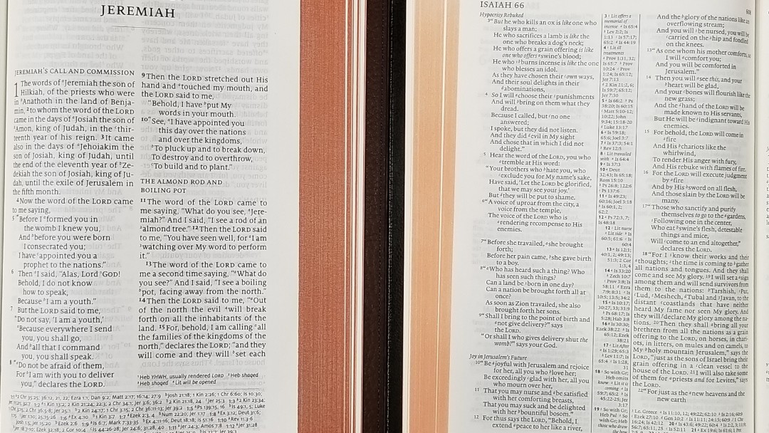
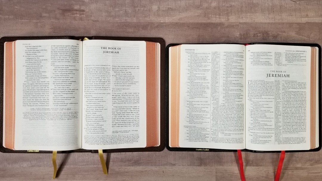
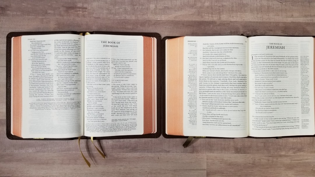
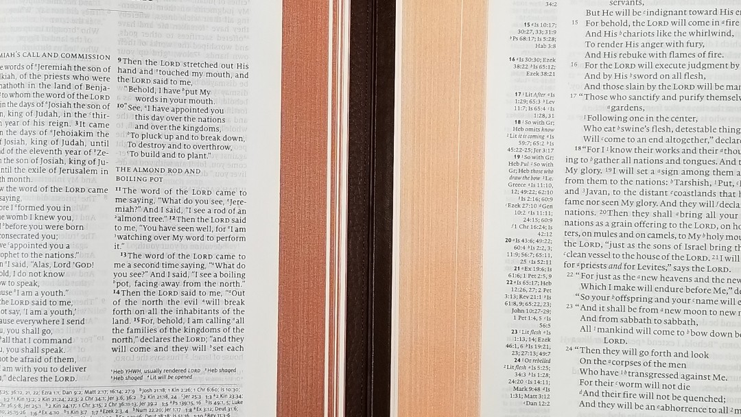
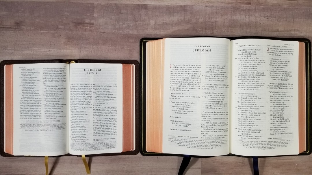
The text is in double-column, paragraph format with poetry set to stanzas. The header shows the book names and chapter numbers in the outer margin and the page number in the inner margin. Translation footnotes are under the last verse in the outer column, and references are placed horizontally across the footer. The cross-references are separated from the text by a red line. The header, chapter numbers, and chapter and verse numbers for the cross-references are printed in red.

The typeface is a black-letter 8.5-point Milo serif font with a good amount of leading to make the text highly readable. It’s about medium to dark and it’s highly consistent throughout. It’s printed with line-matching, meaning the text on both sides of the page line up to reduce show-through and make it easier to read. The paper is opaque enough that there’s no graying behind the text.
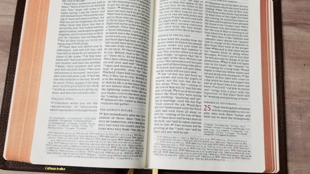
It has around 7 words per line. The word spacing looks natural with no extra spaces. The inner margin is wide enough to keep the text from bending into the gutter. Italics are used for supplied words. Paragraphs are marked with bold verse numbers or letters. OT quotes in the NT are in small caps. Asterisks are used to show when verbs are historical presents in the Greek but translated in the past tense in English. Personal pronouns for Deity are capitalized.
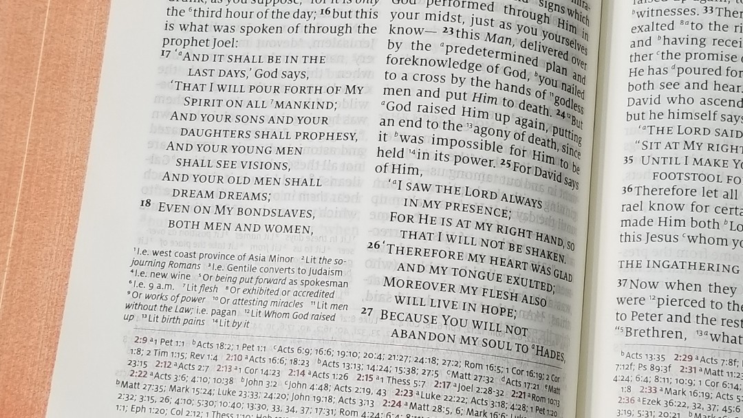
The chapter numbers are in a red drop-cap. This makes the chapters stand out. The text includes reference and footnote keys. They’re small enough to ignore, but they’re still large enough to use. The verse numbers are large and dark. I also find them easy to ignore when reading, but they’re easy to find when searching for verses. Section headings are in all caps and stand out from the text. I find them easy to use when searching and easy to ignore for reading.

Like all Quentels, the poetic settings look amazing. The poetic lines don’t break in awkward places. It looks natural. This is impressive when you consider how difficult it is to get poetry to look right in double column layouts and the fact that it only has around 7 words per line. 2K/Denmark did an excellent job on this design.
References
It has 95,000 cross-references. The pilot chapter and verse numbers are in red. This is an excellent set of cross-references for study and sermon prep.
Here are a few examples of references to help you compare:
- Genesis 1:1 – a Ps 102:25; Isa 40:21; Jn 1:1, 2; Heb 1:10; b Ps 89:11; 90:2; Acts 17:24; Rom 1:20; Heb 11:3 c Job 38:4; Is 42:5; 45:18; Rev 4:11
- Deuteronomy 6:4 – a Matt 22:37; Mk 12:29, 30; Luke 10:27 b Deut 4:35, 39; John 10:30; 1 Cor 8:4; Eph 4:6
- Isaiah 9:6 – x Lit be a Is 7:14; 11:1, 2; 53:2; Luke 2:11 b Jn 3:16 c Matt 28:18; 1 Cor 15:25 d Is 22:22; e Is 28:29 f Deut 10:17; Neh 9:32; Is 10:21 g Is 63:16; 64:8 h Is 26:3, 12; 54:10; 66:12
- Matthew 17:20 – x Lit as a Matt 21:21f; Mk 11:23f; Luke 17:6; b Matt 13:31; Luke17:6; c Matt 17:9; 1 Cor 13:2; d Mark 9:23; John 11:40
- Mark 11:23 – Matt 17:20; 1 Cor 13:2
- Mark 12:29 – Deut 6:4
- Acts 2:38 – a Mark 1:15; Luke 24:47; Acts 3:19; 5:31; 20:21; b Mark 16:16; Acts 8:12, 16; 22:16
- John 1:1 – a Gen 1:1; Col 1:17; 1 John 1:1; b 1 John 1:14; Rev 19:13; c John 17:5; 1 John 1:2; d Phil 2:6
- 1 John 1:1 – a John 1:1f; I John 2:13, 14 b Acts 4:20; I John 1:3; c John 19:35; 2 Peter 1:16; I John 1:2 d John 1:14; I John 4:14 e Luke 24:39; John 20:27 f John 1, 4
Footnotes
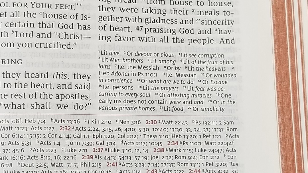
Translation footnotes are placed under the outer column on each page. They cover more literal renderings, alternate translations, readings from variant manuscripts, and explanatory equivalents. They also include references to where something is quoted from. It uses terms such as Gr, Lit, Or, and “Two early mss”, but not “best mss” or “oldest mss”. The footnotes are excellent and are great for study and getting insights into the translation. I would like to see the manuscripts identified as the NKJV does.
Maps
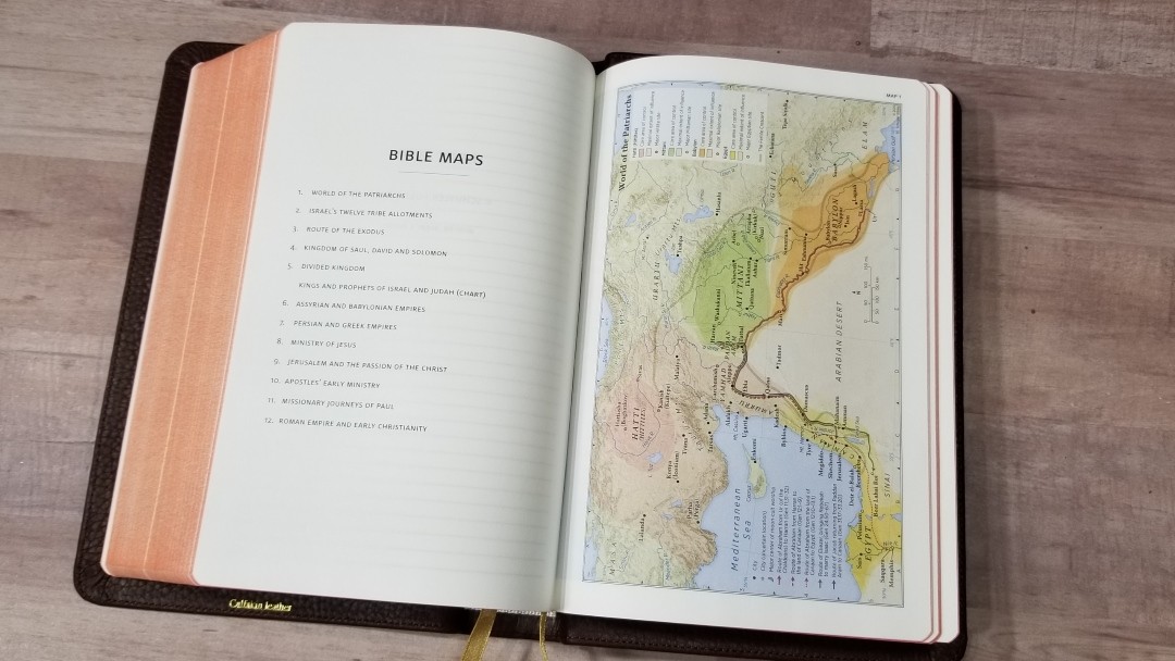
It includes 12 Schuyler maps designed by Dr. Barry J. Beitzel, printed on thick, non-glossy, paper. These maps use earth-tones. This is my favorite colors for maps. They’re sharp and well-drawn. I’ve always loved cartography and these maps are some of my favorites.
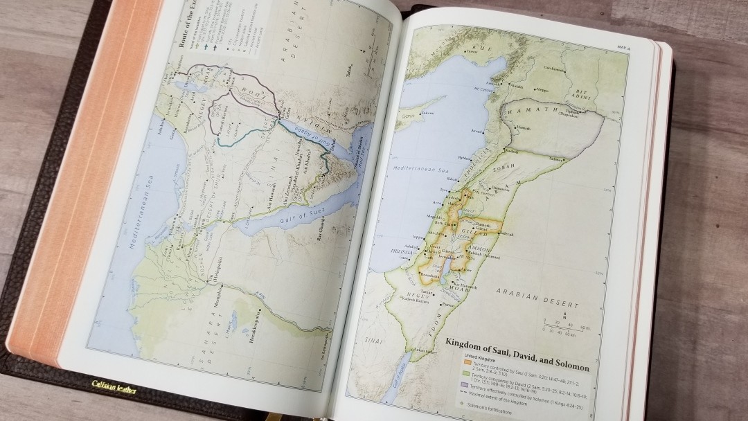
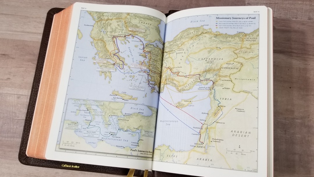
They include cities, routes, distance, topography, areas of control (color-coded), capitals, cities of refuge, inheritance, battle sites, Scripture references, travels of Israel, kingdom territories, sites of royal inscriptions, dates, locations of events, locations where Paul wrote letters, lighthouse site, and more. It doesn’t include the map index. The font was too small to reduce it down in size to fit the pages, but I’d like to see it reworked if needed so it can be included. Map indexes save a lot of time and make maps more useful.
Maps include:
- World of the Patriarchs
- Israel’s Twelve Tribe Allotments
- Route of the Exodus
- Kingdom of Saul, David and Solomon
- Divided Kingdom
- Kings and Prophets of Israel and Judah (Chart)
- Assyrian and Babylonian Empires
- Persian and Greek Empires
- Ministry of Jesus
- Jerusalem and the Passion of the Christ
- Apostles’ Early Ministry
- Missionary Journeys of Paul
- Roman Empire and Early Christianity
Comparisons
Here’s how the NASB Personal Size Quentel compares with the NASB Pitt Minion, NASB Cambridge Clarion, and the Schuyler NKJV Quentel.
NASB Pitt Minion
The Pitt Minion has a similar footprint as the Personal Size Quentel, but it’s a lot thinner and has a smaller font (6.75 vs 8.5). It includes a concordance, so it might be better suited for deeper study or sermon prep. I love the Pitt Minion, but I find it more difficult to read. The poetic setting isn’t designed as well as the Quentel because line breaks are not as well thought-out, which is a shame because it has more words per line to work with. The PM is easier to carry, but the PSQ isn’t difficult to carry.
NASB Cambridge Clarion

The Clarion also has a similar footprint as the PSQ, but it’s thicker. It has a slightly larger font (8.75 vs 8.5) and a single-column layout. I find the PSQ easier to handle, but I love the single column layout of the Clarion. It places the references near their verses, but there are so many that it doesn’t always line up well. I prefer the overall size of the PSQ to the thickness and footprint ratio of the Clarion.
Schuyler NKJV Quentel
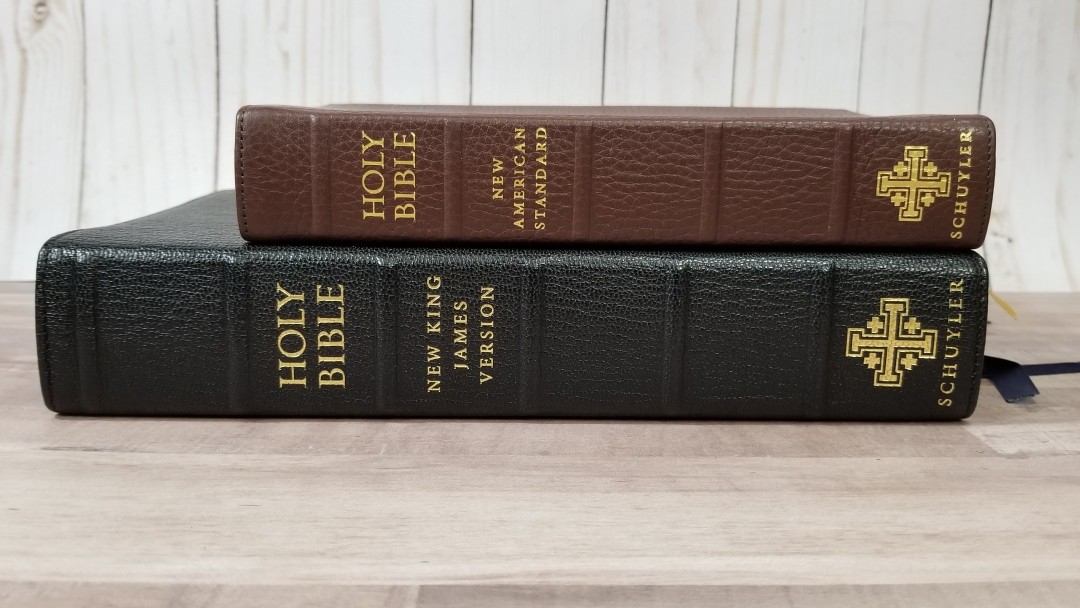
The pagination between the regular size Quentel and the PSQ is the same. I don’t have the NASB in regular size, but it’s similar to the NKJV here. The regular size NKJV has thicker paper (36gsm vs 28gsm), a larger font (11 vs 8.5), a concordance, map index, and three ribbons. The opacity is about the same even though the personal size is 8gsm thinner. The regular size NASB now has 28gsm paper. The first thin edition did not include the concordance, but the next edition will. The regular and personal size makes a great combo.
Conclusion
The Personal Size Quentel is one of my all-time favorite series of Bibles. I love the design, paper, print quality and font design, and overall size. The double-column layout looks amazing when reduced to personal size. I find the 8.5 font easy to read. It’s an excellent Bible for reading and study. The 95,000 cross-references are easy to use and out of the way. It does not include a concordance or the map index. I’d love to see the index included in the personal size editions. I’m sure I use maps more than most Bible readers, though, so I’m probably in the minority on that. It does have 10 ruled pages for notes.
I love that it matches the regular edition. This makes an excellent combo so you can have a large print to read, study, and preach from, and a smaller edition to carry and read on the go. I’ve preached and taught from the personal size edition with no trouble. This is a good choice for evangelists and missionaries.
The NASB Personal Size Quentel is easy to recommend to anyone wanting a hand-sized NASB that’s designed and made well, and that’s great for reading, carrying, study, teaching, and preaching.
________________________________________________
Click here to buy from EvangelicalBible
________________________________________________
This Bible was purchased for this review.
Do you have a Schuyler NASB Personal Size Quentel? Let us know what you think about it in the comments below.


It is most use full to me and great composed