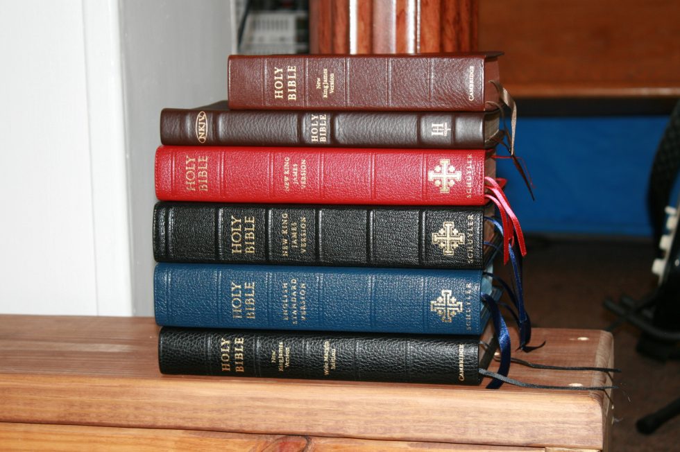
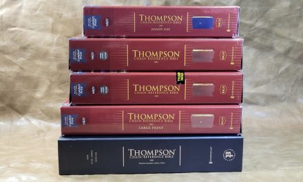
From the top – Cambridge Clarion, Holman Large Print Ultra Thin, Schuyler Single Column, Schuyler Quentel, Schuyler Quentel ESV, Cambridge Wide Margin
The Schuyler NKJV Quentel is one of the few high quality NKJV’s available. It’s a premium edition produced by Jongbloed in the Netherlands to the highest standards. The NKJV Quentel boasts 36gsm paper, art-gilt edges, 11-point font, red-letter, goatskin cover with edge-lined real leather liner, spine ridges, 3 luxurious ribbons, 12 new maps by Dr. Barry J. Beitzel, index to maps, cross references in the footer, NKJV footnotes and section headings, and a large concordance. It’s available in both red and black letter and in several covers including black, dark green, dark brown, imperial blue, and firebrick red.
Price: $222.00 | Buy from Evangelical Bible
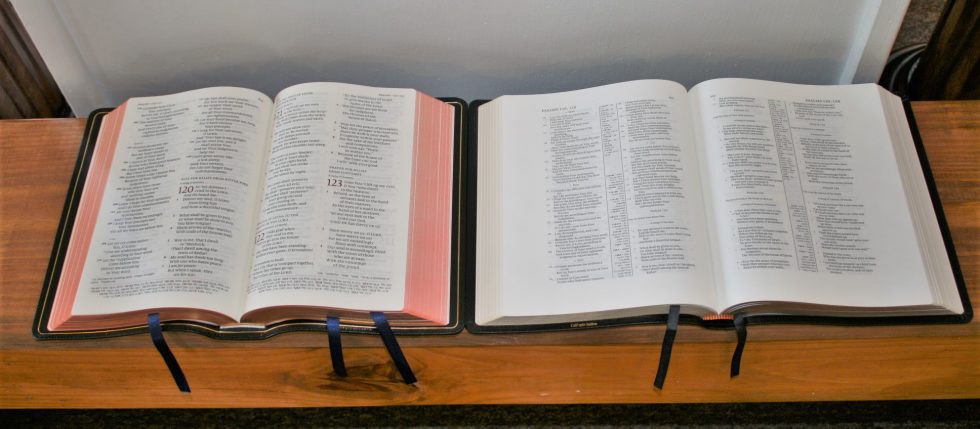
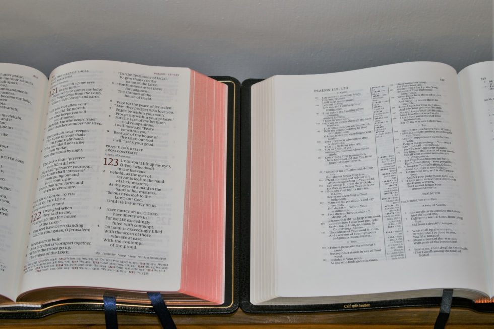
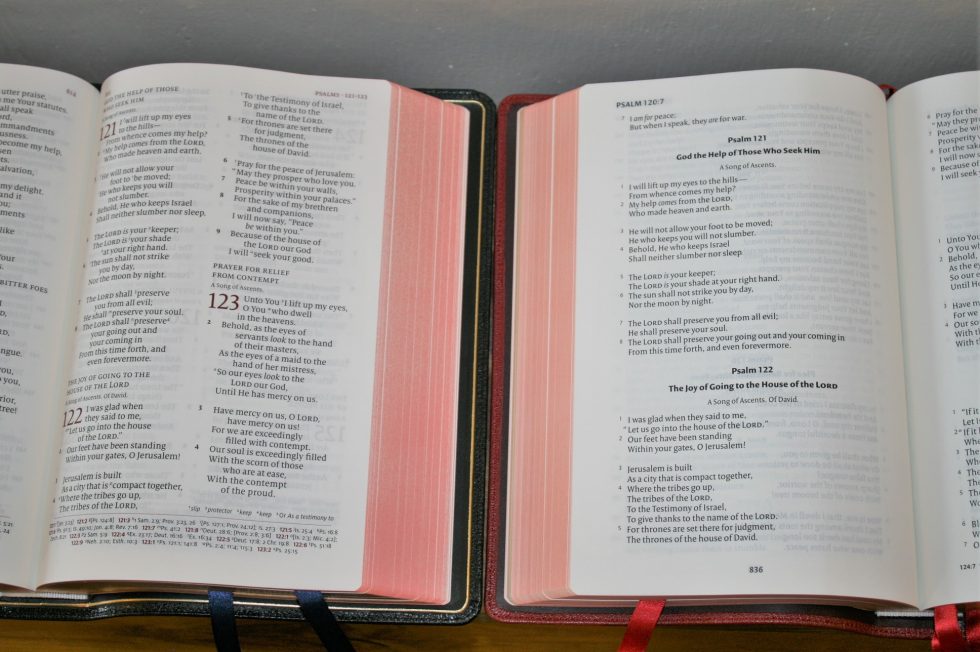
In all of these comparisons the NKJV Quentel is on the left.
Schuyler ESV Quentel
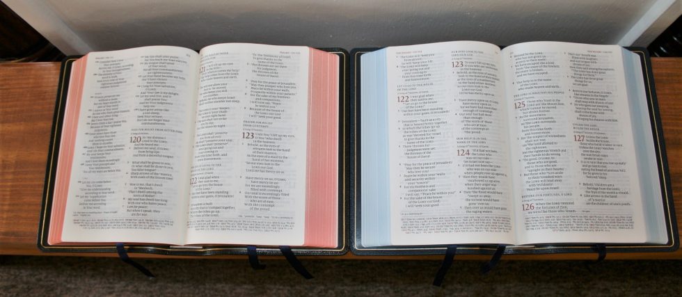
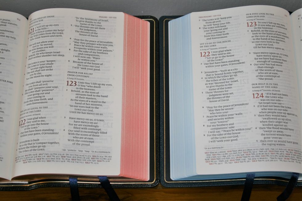
This is the first generation ESV Quentel. The color of the paper is slightly different between the two. The NKJV has a slightly more cream tone which I prefer to the white of the 38gsm in the first edition ESV. The NKJV is slightly thinner, has a leather lining, and spine hubs. The ESV is black letter.
Holman Large Print Ultra Thin
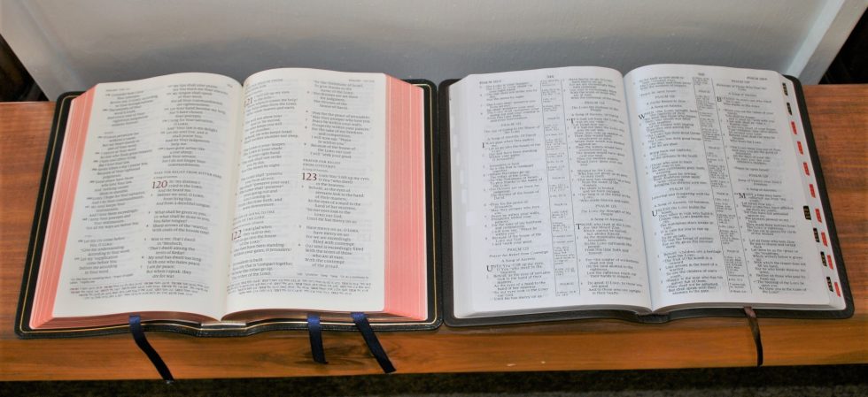
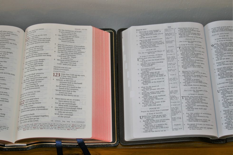
The Holman Large Print Ultra Thin NKJV is verse by verse with poetry in stanzas and letters indented, has a 9-point font, red-letter, thinner paper, and a thinner text block. It’s a semi-premium Bible that’s a great choice for someone on a budget or looking for something smaller and lighter than the Quentel. However, the typeset is smaller and feels more cramped.
Cambridge Clarion
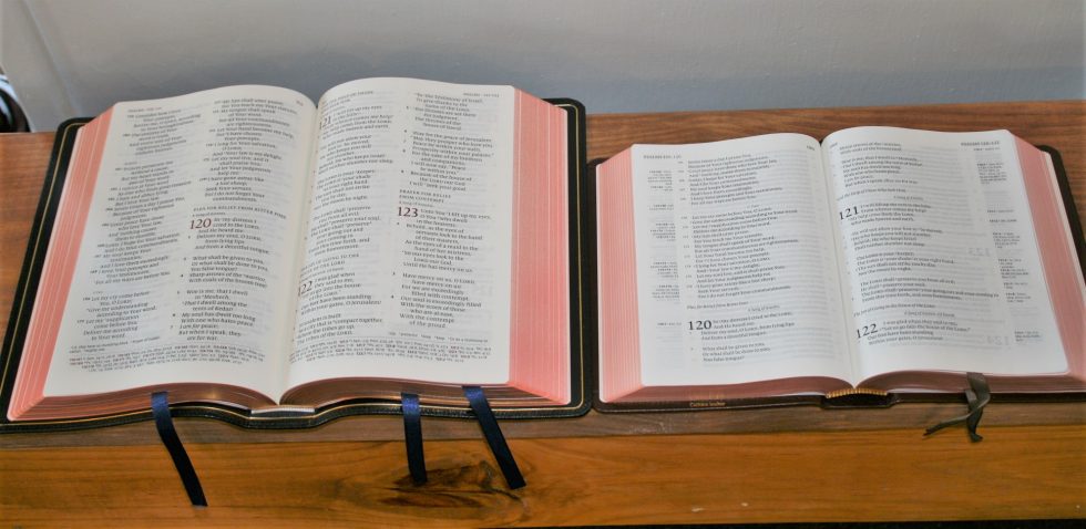
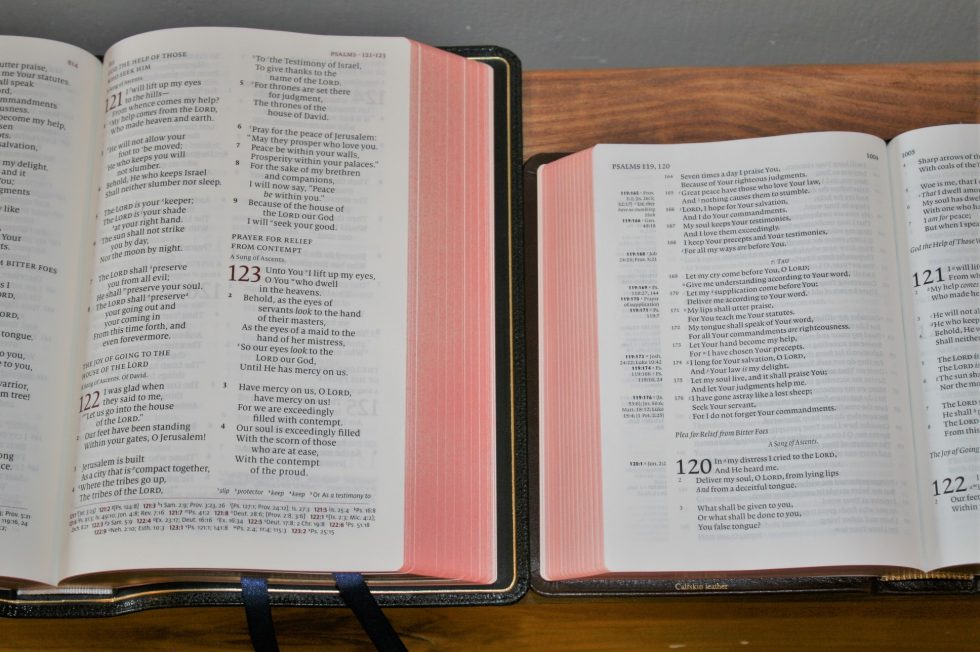
The Cambridge NKJV Clarion is a hand-size edition in single column with much thinner paper and a smaller black-letter font at 8.75. It’s a great choice for something that easy to carry. The thin pages will have page-curl issues if the airflow is right. I love the Clarion for private reading but for preaching I have trouble finding verse numbers and sometimes I read the wrong line due to the wider column that bends into the gutter. I might give the Clarion the advantage in the poetic settings because of the single column. Although, because of the attention to detail the Quentel has a beautiful double-column poetic setting.
Cambridge Wide Margin
The Cambridge NKJV Wide Margin is wider but is thinner and has a smaller red-letter font at 7.9. Its 38gsm paper is made for writing. They’re comparable in overall size and weight but the Cambridge has to sacrifice font size for margin space, making the Quentel far more readable.
Schuyler Single Column NKJV
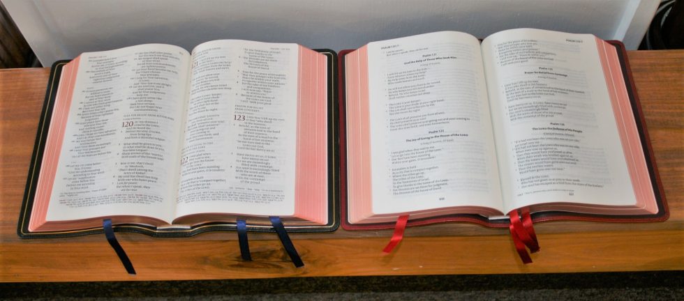
The Schuyler Single Column NKJV is of course a single column setting. It doesn’t have cross references and it only has a single heading at the beginning of each chapter. It has a 10.5 black-letter font and 32gsm paper. It’s a great choice if you want a single-column setting in large print. It even has a little bit of margin space. As much as I like it, if I could only choose one it would be the Quentel for its elegant setting and tools.
Thoughts
Overall the Schuyler NKJV Quentel is a well-designed Bible that fills a much-needed gap for the NKJV translation. There are only a few good choices available and with its paper, print, and cover, the Quentel stands alone in providing a luxury reference edition in large print.
Price: $222.00 | Buy from Evangelical Bible
How do you think the NKJV Quentel compares?






Sorry Randy, although I’m not a fan of red letter, your review was great as always!
Red letter, obviously aimed at the US customer & a small percentage at that; original text had no distinction between the word of Christ & the rest of the scripture, as the whole Bible is the Word of God.
Add to that the problem that we don’t always know who’s talking. For example, NIV 2011 has John 3:16 in black letter, and the ESV has the speaker in Revelation 4:1 in red. I’ve only found one Bible with Rev 21:6 in red. As far as popularity it probably depends on where you are in the US. Here in the south east it’s hard to find a Bible in black letter.
“obviously aimed at the US customer & a small percentage at that”
Here we go…more biased fallacy stated as fact. Most people in the US prefer red-letter. There are lots of people around the world who prefer red-letter. I know publishers who won’t even consider some translations in black-letter because their sales would plummet. Of course the whole bible is the Word of God, but we live under the New Covenant, and having the Words of our Redeemer in red is a feature that people really like. Black-letter only individuals make a bad name for themselves by being legalistic and belittling the likes of others. The original Greek manuscripts didn’t have any punctuation. So I assume you aren’t a fan of periods, commas, exclamation points, and question marks either.
The whole Bible is the word of God and therefore the words of “the Word”–our redeemer. If you’re going to do a red letter Bible, the whole book should be in red. 🙂
I purchased both black letter and red letter. Although I am “used to” red letter, I am not wedded to it. I am in my late 60’s
with ‘older’ eyes. The red is gentler than most, without being pink or faint. By being softer, it does not have the contrast
that a brighter or deeper or richer red would provide. Because of my eyesight, I lean towards the black letter. I would
simply suggest that anyone considering the red try to find as close up a photo of the red as you can find and make
your decision on that basis. Younger eyes may not have the issues some of us older folk have. Either way, if you can live with the size and weight, there simply is no better edition that I know of.
I just bought my first Bible on Amazon for $60 about 3/months ago. It’s really nice with real leather red cover and gold gilded pages. However, I did not know there were so many versions and I bought the most popular which happened to be the (KJV) and unfortunately it has been tough to read without an iphone app to translate the “Old English” words that we don’t use anymore. I’m looking into NIV, NKJV or ESV… I’m leaning to NIV with ESV being a close second. However, at 44yrs old and my experience with the Bible (not much unfortunately), I want the words of Jesus in red and I feel it’s important for me at this stage of my journey. I never thought of spending that much on a Bible, however with my previous lifestyle the amount of money I spent on utter garbage is beyond words. I think if you’re going to splurge so to speak, then no better way to do it on the word of God.
Would love to have a NKJV, verse by verse layout, with wide margins. Will Schuyler produce one?
It’s possible they would produce the Stridon in NKJV. They haven’t announced anything yet.