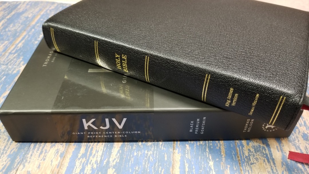
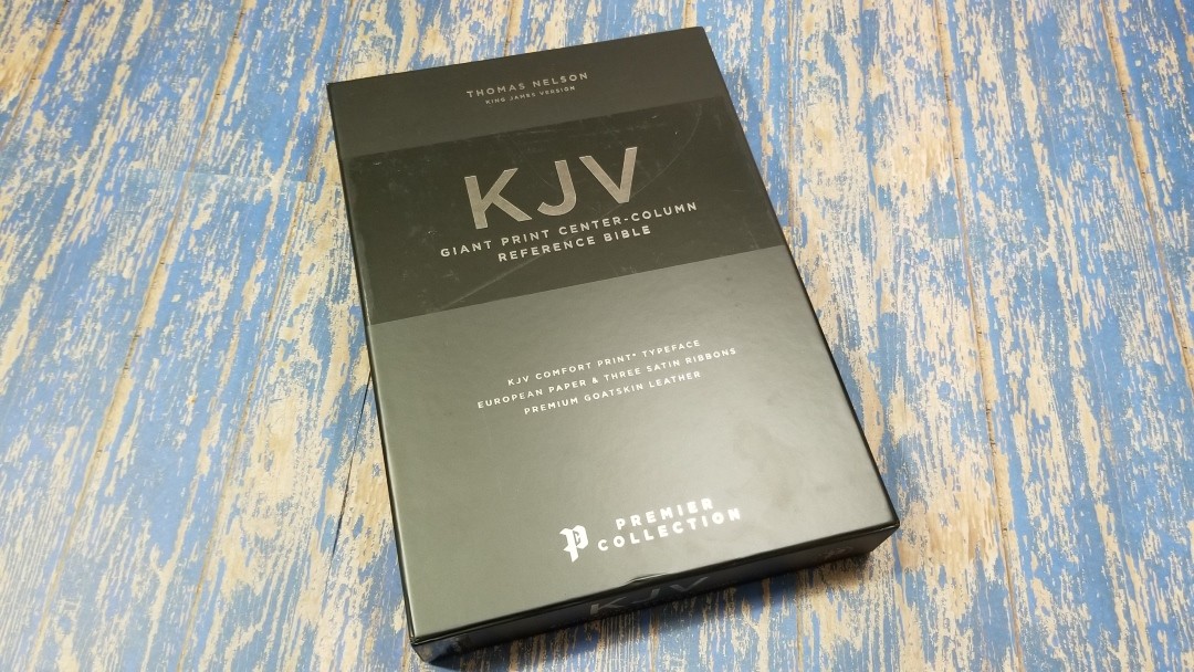
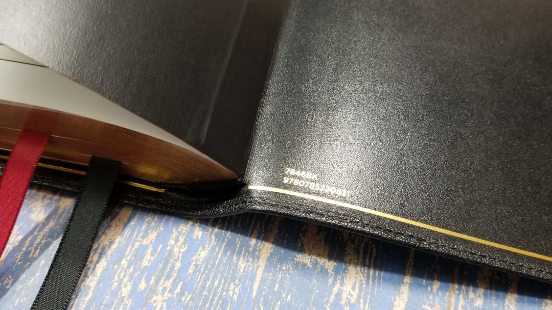
Thomas Nelson’s KJV Giant Print Center-Column Reference Bible is, currently, the only KJV available in the Premier Collection. This is a traditional, verse-by-verse, King James Version printed with Comfort Print type designed by my favorite Bible designers- 2K/Denmark. This is a goatskin edition, ISBN: 9780785220831, made in China with premium materials.
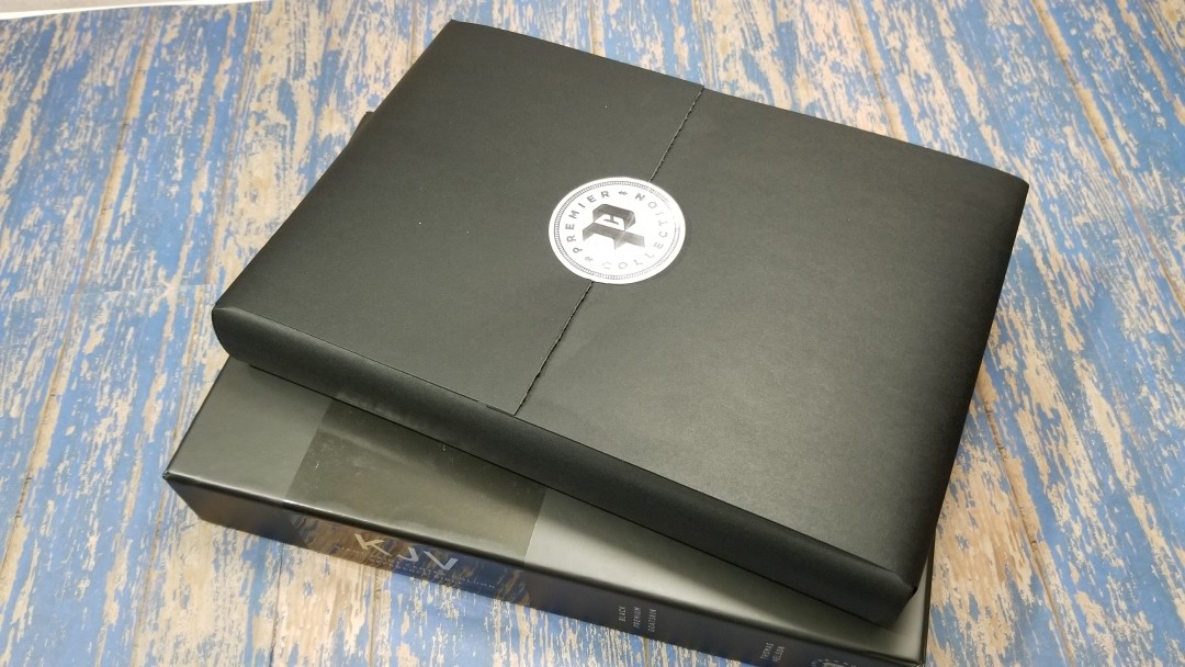
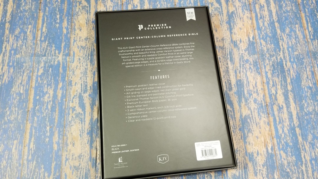
Like all the editions from the Premier Collection, it comes in a premium 2-piece box and it’s wrapped inside the box with an elegant wrapping and seal.
Thomas Nelson provided this Bible in exchange for an honest review. I was not required to give a positive review, only an honest one. All opinions are my own.
_________________________________________________________
This Bible is available at (includes some affiliate links)
and many local Bible bookstores
_________________________________________________________
Video Review
Cover and Binding
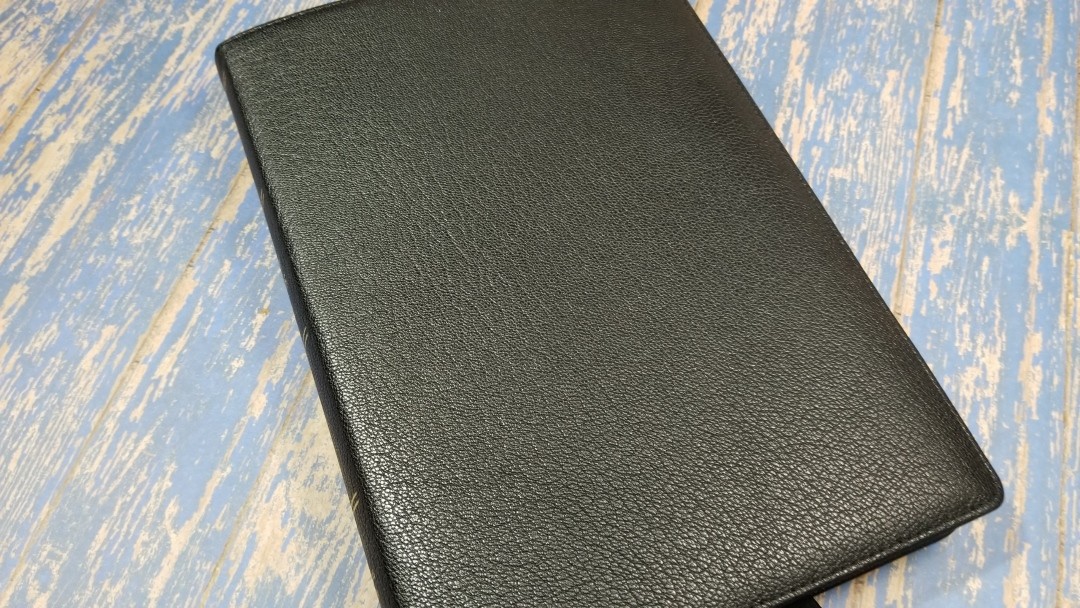
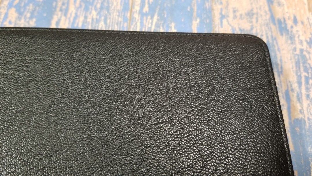
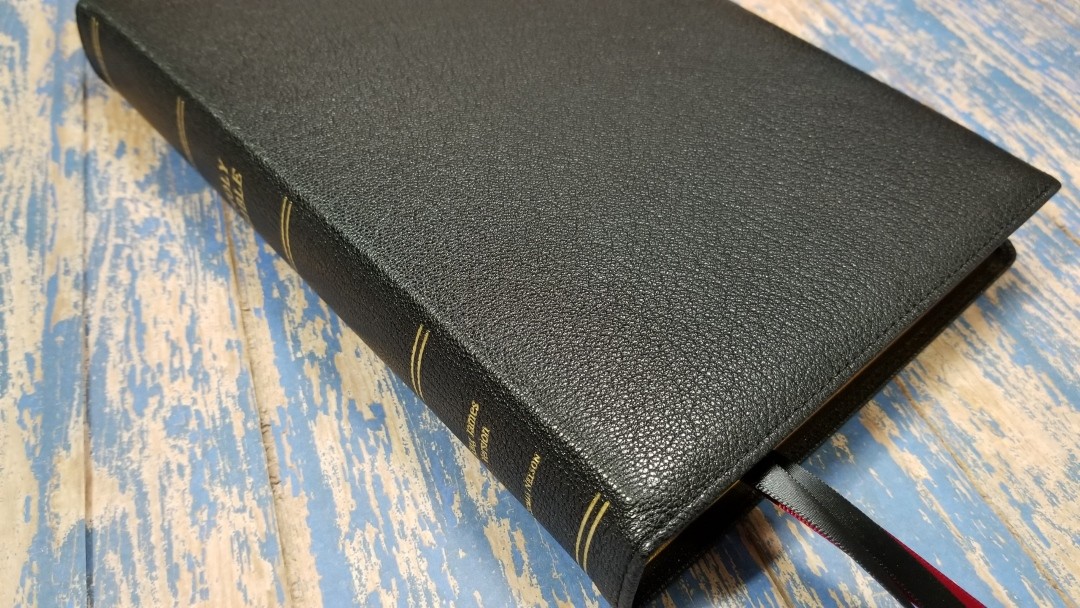
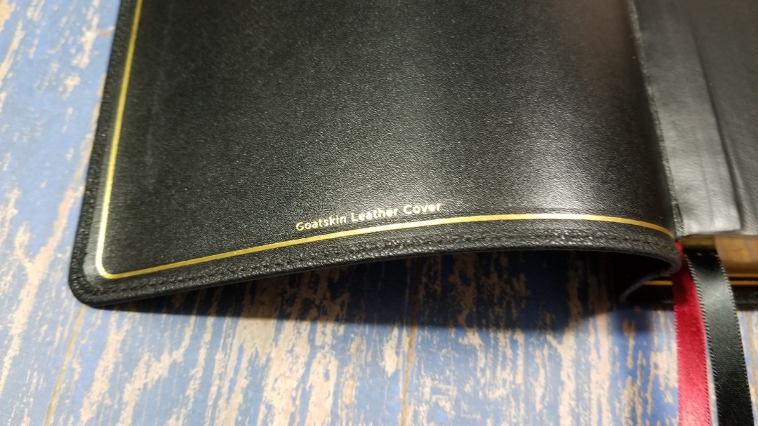
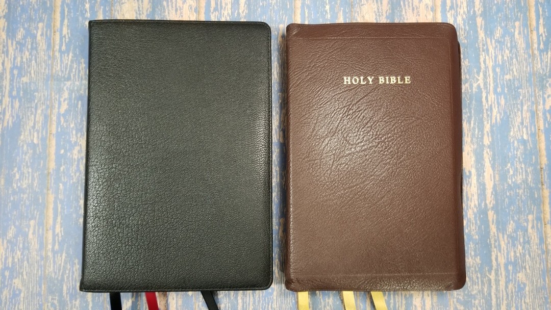
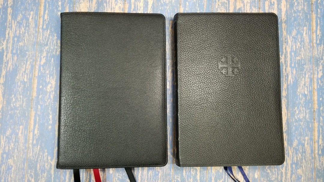
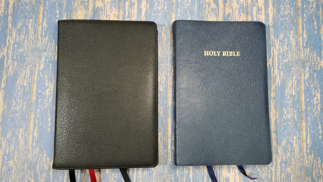
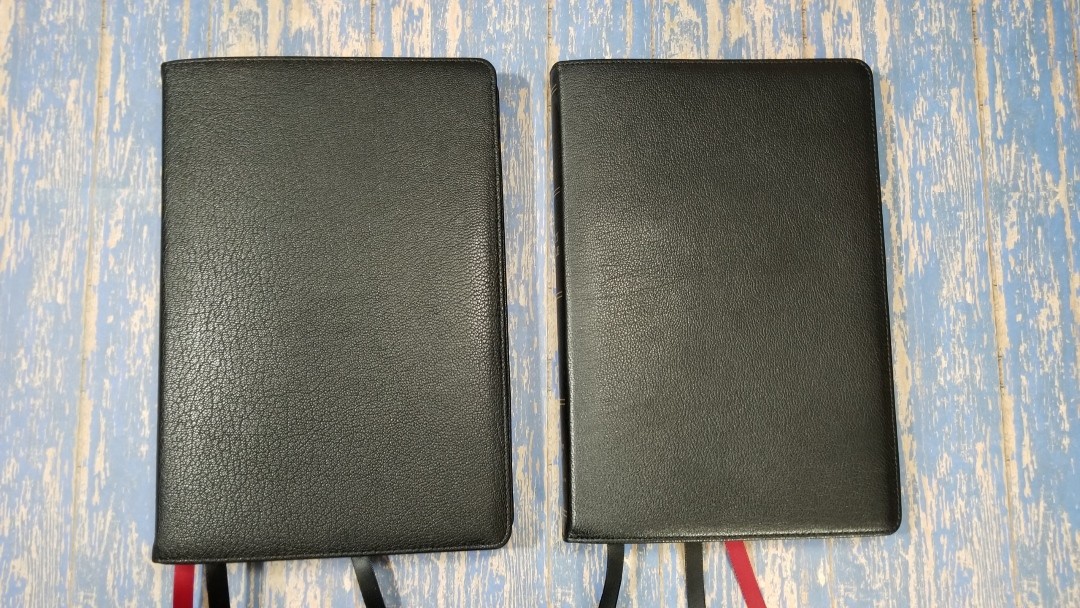
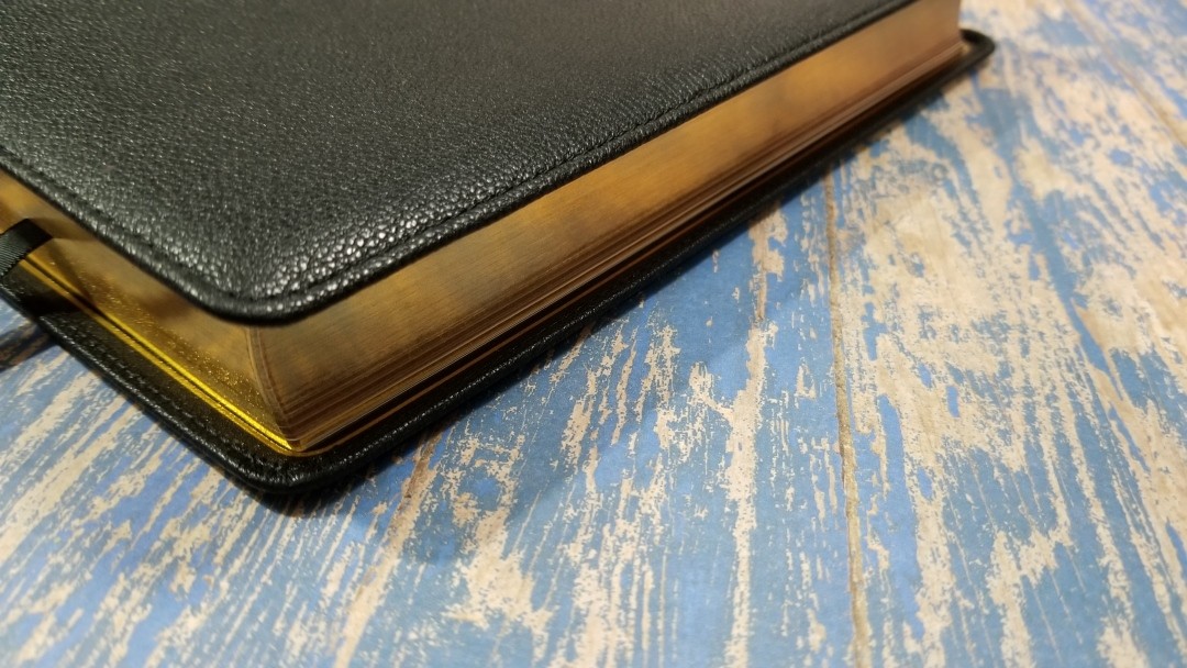
The cover is black goatskin leather with a leather edge-lined liner. It has a soft feel and a nice grain. It’s slightly thinner than those in a higher price range, but it doesn’t feel too thin. A gold gilt line traces the perimeter of the liner. It’s perimeter stitched and has a small yapp. This is by far the best goatskin I’ve seen at this price-point. This grain is more pronounced than the other Bibles I’ve seen in the Premier Collection.
The front has no writing. The spine has HOLY BIBLE, KING JAMES VERSION, and THOMAS NELSON printed in gold along with 5 gold markings to indicate spine ridges. They aren’t raised or stamped, but they do look great against this goatskin.
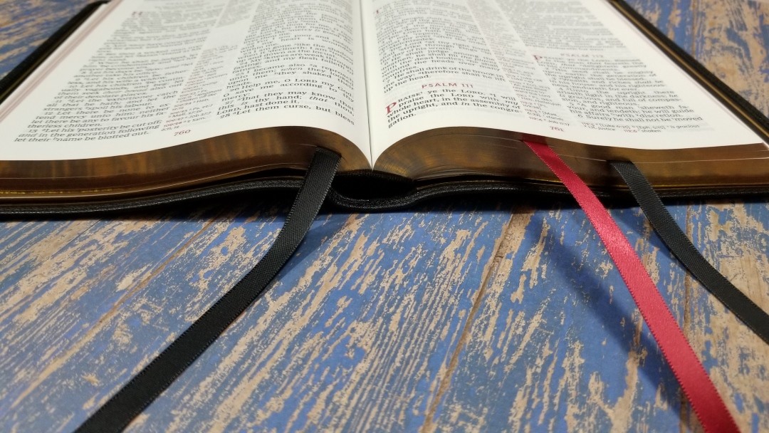
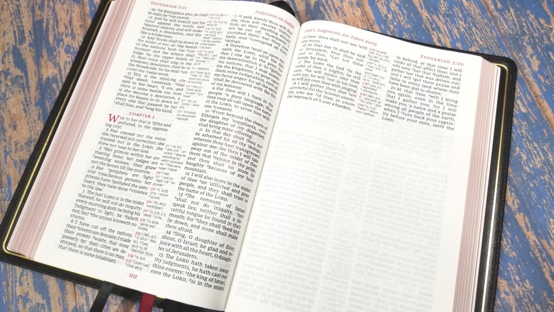
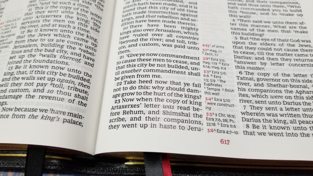
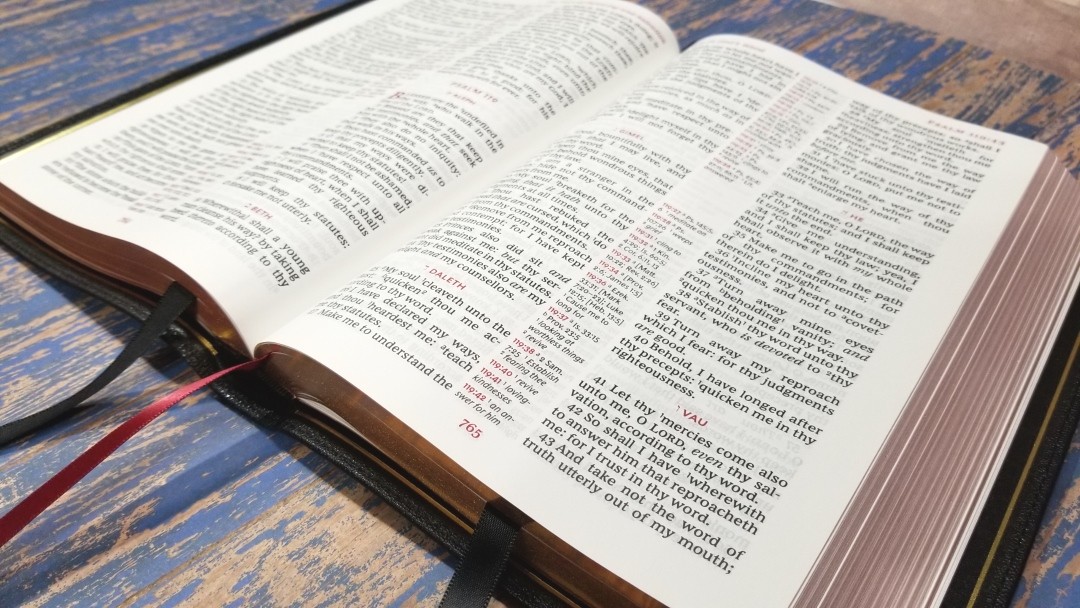
The text block is Smyth sewn and has no trouble staying open to the first page out of the box. The pages lay flat, so there’s nothing lost in the gutter. It has 3 10mm ribbons: 2 black and one red. They’re extra long and are cut straight. The overall size is 9.75 x 6.75 x 1.4″ and it weighs 2 lbs, 11 oz. This size is great for carry, study, reading, preaching, etc.
Paper
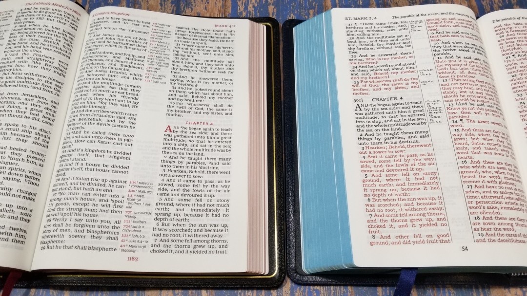
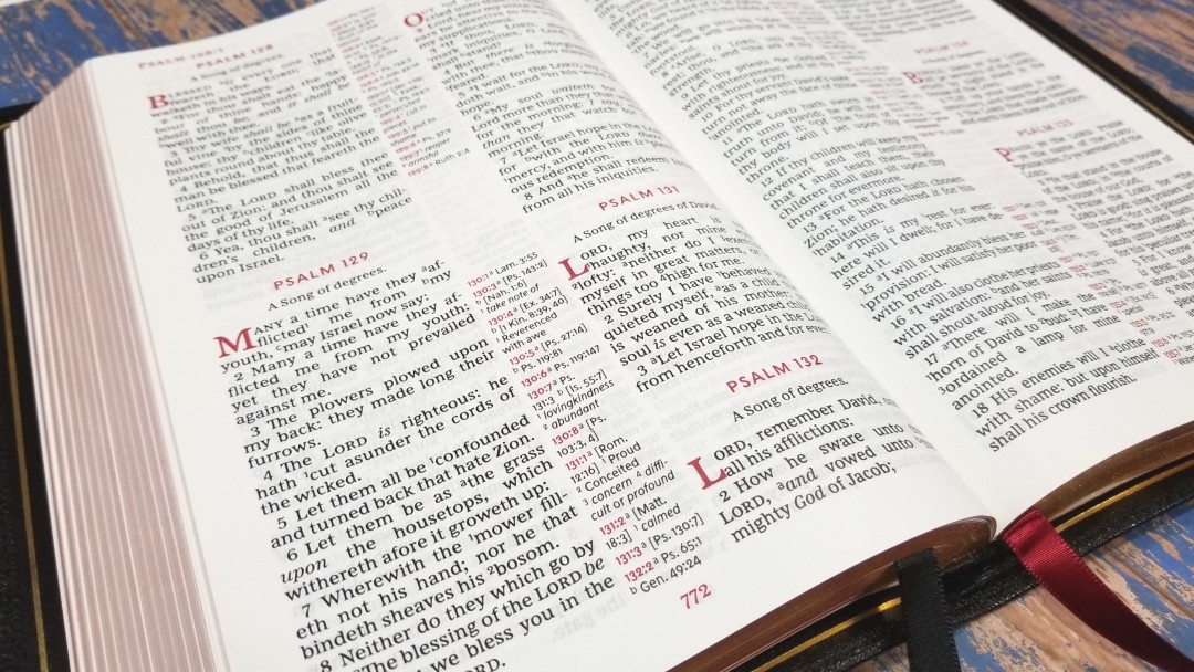
The paper is premium European at 36gsm. It looks and feels elegant. It’s white in color and it’s extremely opaque. It has no glare under direct light. It has a smooth texture. I find this paper easier to turn than most Bible paper and I can separate the pages easily by rubbing them together. The page edges are art-gilt with red under gold. The red is salmon in color and it’s smooth and consistent.
Typography
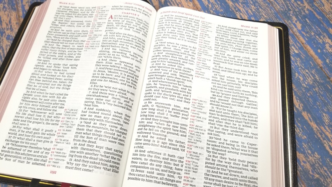
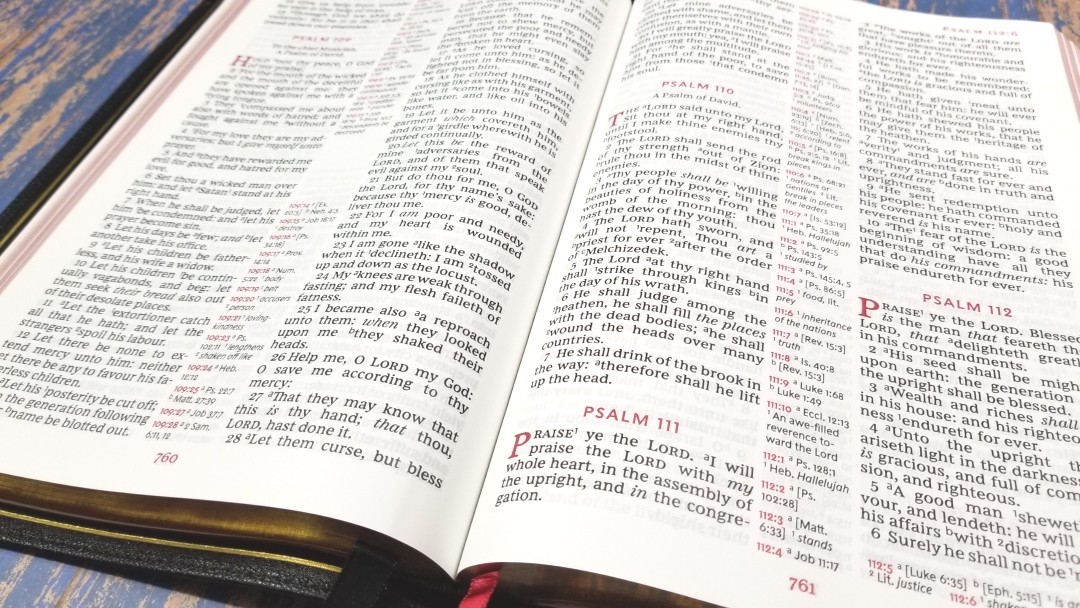
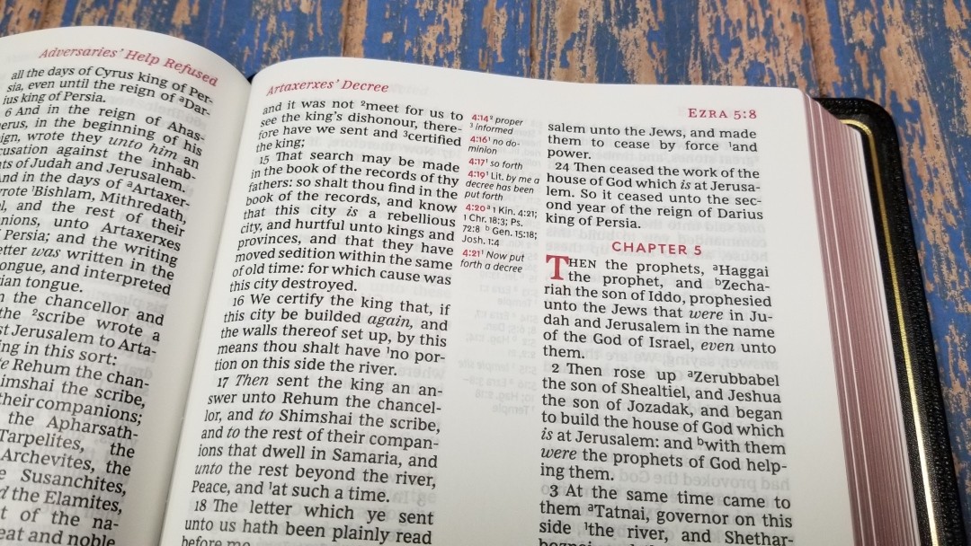
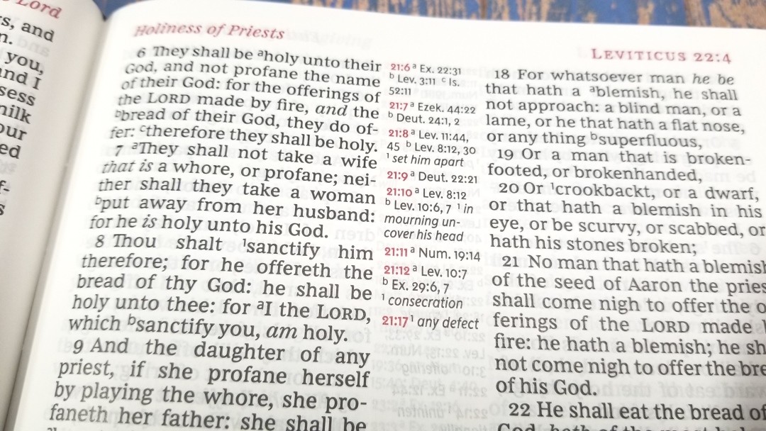
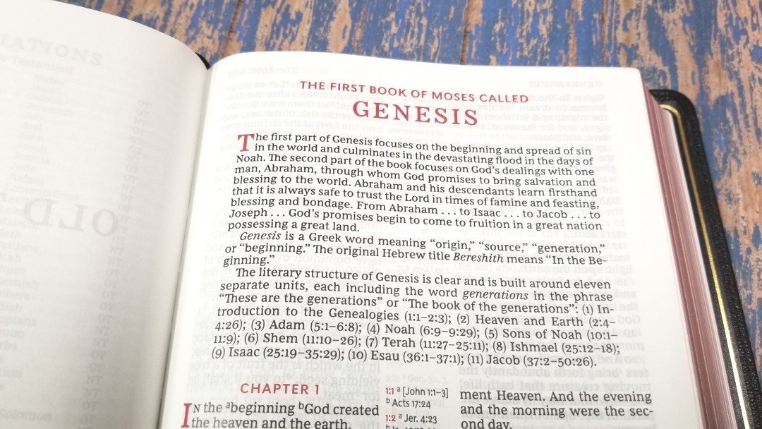
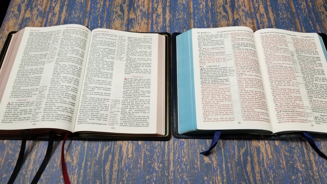
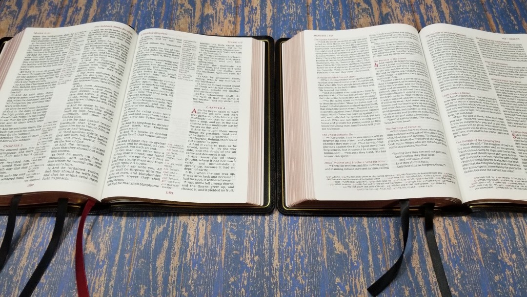
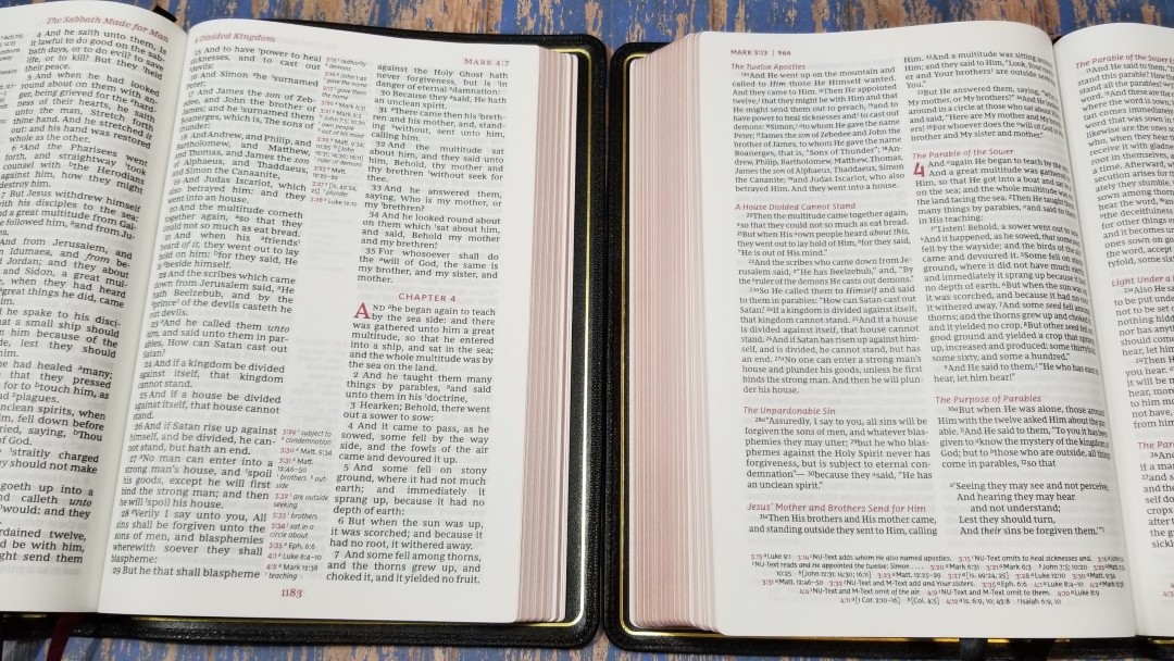
The text is presented in verse-by-verse format with center column references. The header includes the book name, chapter number, and verse number in the outer margin and a page summary in the inner margin, while the footer contains the page number in the center- all printed in deep and rich red. The chapter numbers, drop caps, and the pilot chapter and verse numbers in the center-column are also printed in this red. The red really makes the page pop.
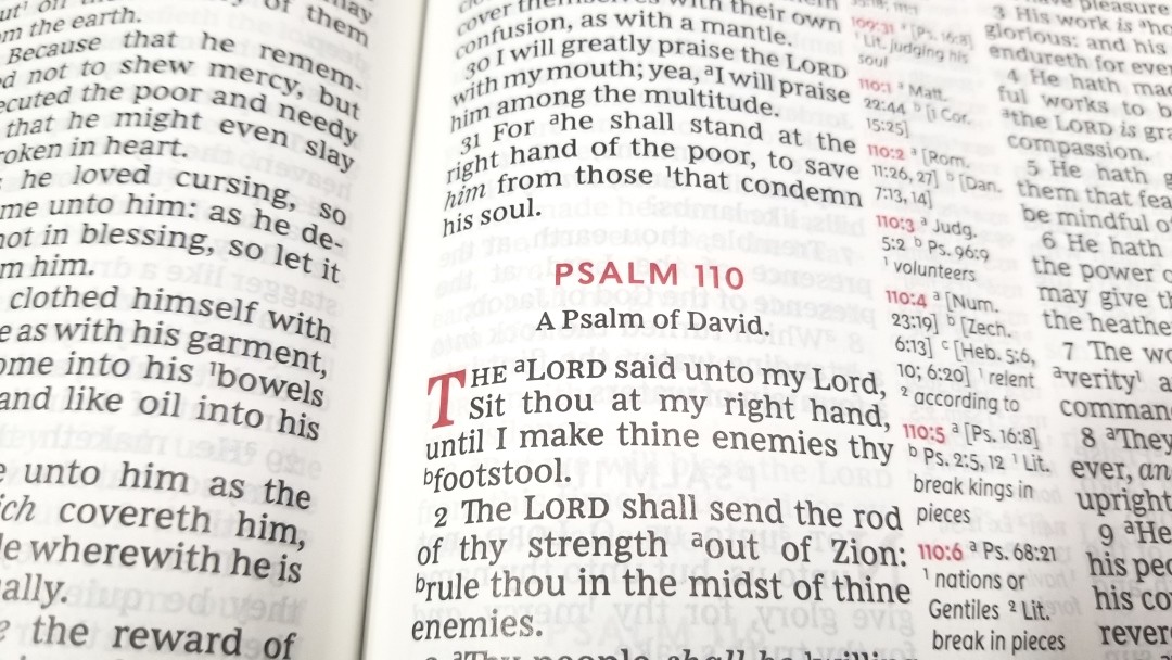
The typeface is the Comfort Print designed by 2K/Denmark. I like this font. The box shows it as 12-point font, but it looks closer to 11-point to my eyes. It’s black letter and it’s dark and consistent throughout the Bible. It does not include self-pronouncing markings in the text. Supplied words are in italics. The text does include footnote and reference keys. They’re small enough to ignore easily but large enough to see clearly. I can’t always ignore them though.
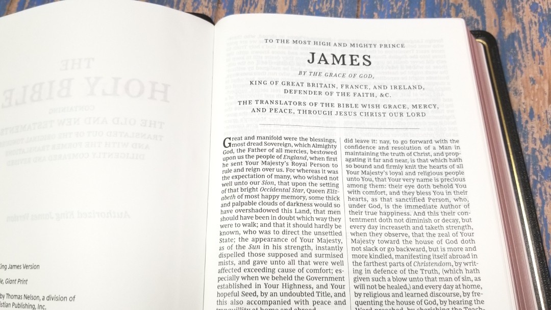
It has around 32 characters per line which allows for around 5-6 words per line. The spacing and print quality is great for reading. Words and letters never feel too close or too far apart. Verse numbers are indented making them easy to find. Books start on a new page, which is great if you want a little space for notes.
References
References and footnotes are placed in the center column with those for the left column at the top and those for the right column at the bottom. This creates a gap in the center on most pages, which can be used for notes. They include the chapter and verse number followed by the reference key. The pilot chapter and verse numbers are in red. They’re larger than most references. I find them easy to read. The red highlights make them easier to find at a glance. It has enough references for basic study.
Here are some example references to help you compare:
- Genesis 1:1 – Jn 1:1-3, Ac 17:24
- Deuteronomy 6:4 – Dt 4:35, Mk 12:29, Jn 17:3, 1 Cor 8:4, 6
- Isaiah 9:6 – Lk 2:11, Jn 3:16, Mt 28:18, Jd 13:18, Titus 2:13, Eph 2:14
- Matthew 17:20 – Lk 17:6
- Mark 11:23 – Mt 17:20, 21:21, Lk 17:6
- Mark 12:29 – Dt 6:4, 5, Is 44:8, 45:22, 46:9, 1 Cor 8:6
- John 1:1 – 1 Jn 1:1, Rev 19:13, Jn 17:5, 1 Jn 5:20
- John 2:19 – Mt 26:61, 27:40
- Acts 2:38 – Lk 24:47
- 1 John 1:1 – Jn 1:1, 14, 2 Pet 1:16, Lk 24:39, Jn 1:1, 4, 14
The footnotes are the Thomas Nelson footnotes that provide updated words for archaic words or words that have changed in meaning. This is excellent for reading, study, and preaching because the info is right there on the page. They also include some definitions of Greek or Hebrew words, including weights and measures.
Book Introductions
Each book has about a half page introduction that covers a basic overview of the book, discuss the meaning of the book’s name in its original language, tell about the literary style, show what’s unique about the book, etc. Some provide more detail than others and some include more information that others don’t include. For example, some provide an outline. They’re well-written and provide some excellent information to help describe the context and setting.
Miracles and Parables of Jesus
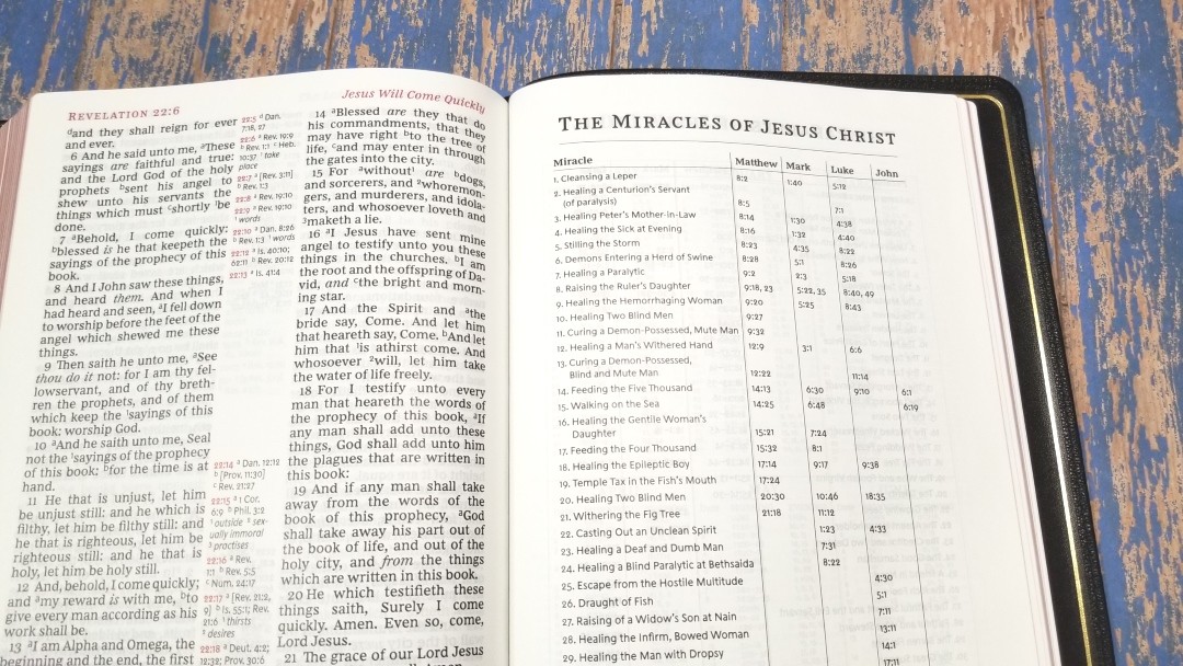
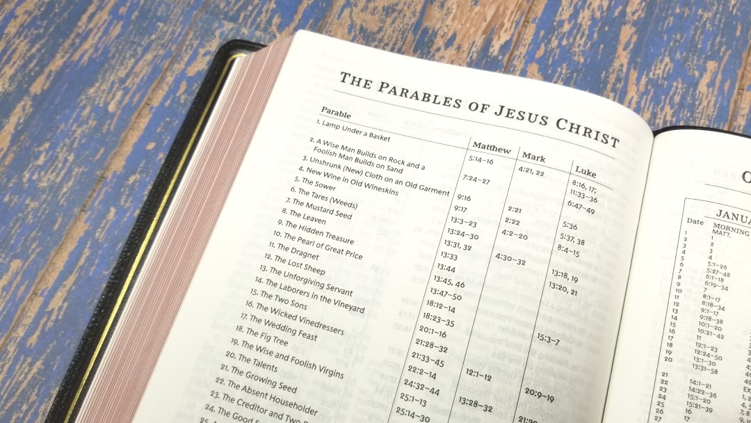
There are a couple of tables that list 37 miracles and 39 parables of Jesus. They give a description of the miracle and include the references within each book where the miracle is discussed.
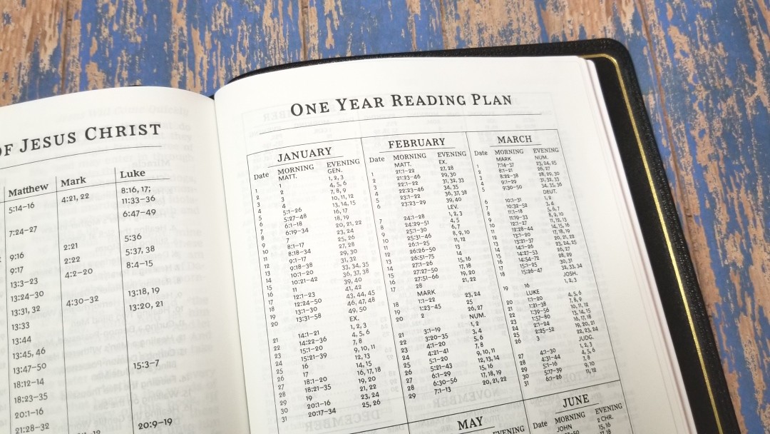
Reading Plans
It has a one-year reading plan that provides you with two readings per day for 365 days. They include morning and evening readings with one being from the OT and one being from the NT. It provides the month, day, morning reading, and evening reading.
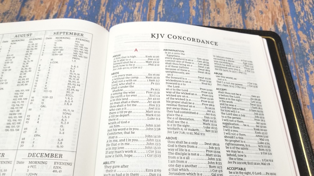
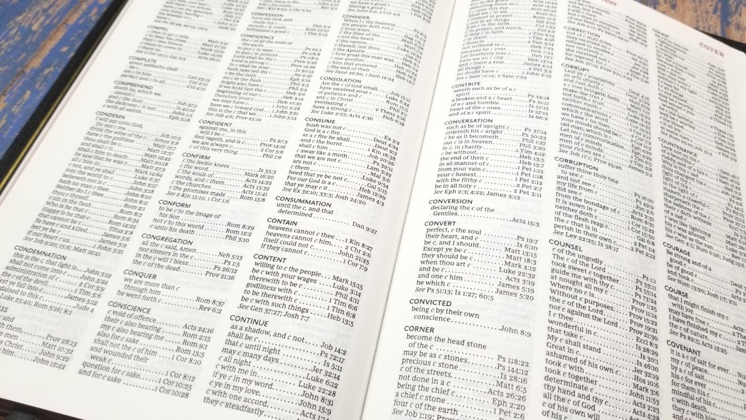
Concordance
The concordance is 68 pages with three columns per page. It’s about a medium sized concordance. It is great for basic study and sermon prep, or at the very least it’s great for getting you started. Here are a few example entries when the number of references to help you compare:
- Christ – 15
- Christian – 3
- Faith – 94
- Faithful – 38
- Faithfully – 1
- Faithfulness – 4
- Faithless – 3
- God – 54
- Godhead – 3
- Godliness – 8
- Godly – 9
- Praise(n) – 30
- Praise(v) – 12
- Pray – 36
- Prayer – 34
Maps
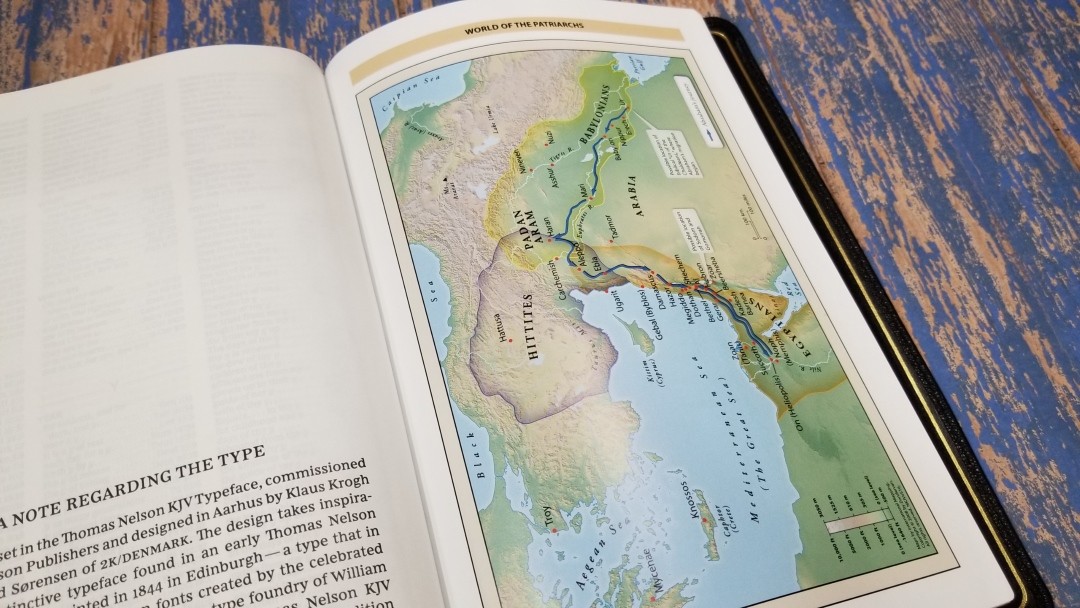
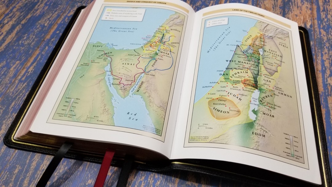
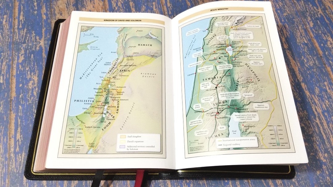
In the back are 7 full-color Zondervan maps printed on 8 thick glossy pages. It doesn’t include an index but they are annotated well and I found them easy to use. I love the bright earth-tone colors. They include topography, distance, routes, borders, possible locations of lost places, battles, elevation, cities, and locations for the events of Jesus’ ministry.
Maps include:
- World of the Patriarchs
- Exodus and Conquest of Canaan
- Land of the Twelve Tribes
- Kingdom of David and Solomon
- Jesus’ Ministry
- Paul’s Missionary Journeys
- Jerusalem in the Time of Jesus
Comparisons
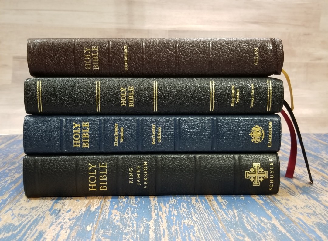
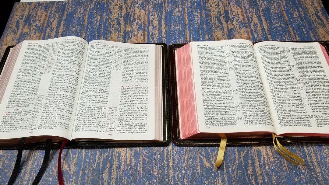
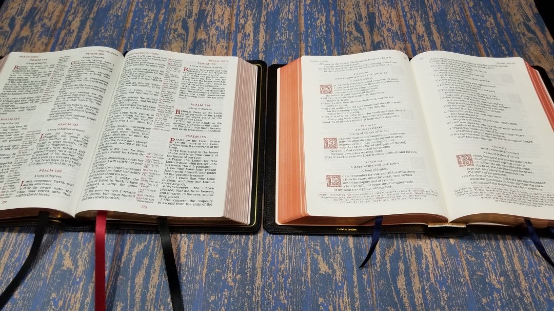
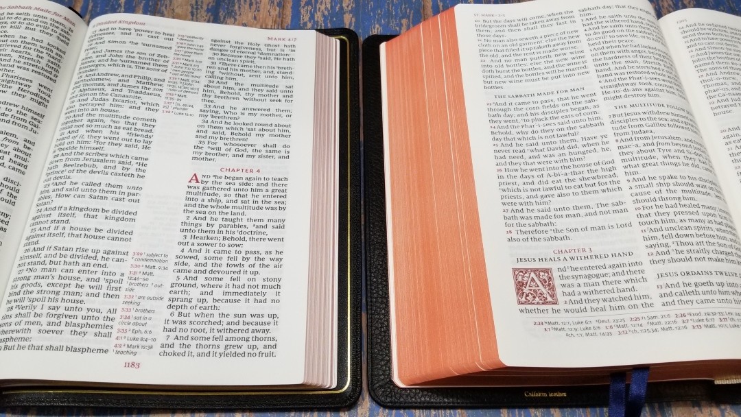
Here’s a comparison with several large print reference premium editions: the Longprimer, Canterbury, the Turquoise, and the NKJV Thinline Reference Bible from the Premier Collection. Most are in a higher price range, but their price and materials reflect that. The Thomas Nelson still holds its own and is great for the price.
Longprimer
The Longprimer has a dark 10-point font. This is the older edition that has 32 gsm paper. It has self-pronouncing marks but no italics for supplied words. The center column is much smaller. It includes notes about manuscript variations.
Canterbury
The Canterbury uses an 11-point font. It places the references in the footer, giving the text more room. It doesn’t include footnotes. The paper has a coated feel and an ivory ting (which I like a lot). Psalms is printed in single column.
Turquoise
The Turquoise is very similar in size, darkness, and word-count per line. It’s red-letter and includes self-pronunciation marks and italics. It has 28gsm paper, but it’s just as opaque as thicker paper.
Premier Collection NKJV Thinline Reference Bible
The Premier Collection NKJV Large Print Thinline Reference Bible has a smaller font and places references and footnotes in the footer. This allows for more characters per line and creates a beautiful reading experience. I find the KJV easier to preach from and the larger font is great for reading.
Conclusion
Unless you need wide margins, this Bible is ideal for preaching because the pages stay open on their own, the dark print is easy to read from, updated words are on the page, and the pages are easy to turn. If you want a small amount of note space you can use the open area in the center of the page and the space at the end of most books.
This is actually a higher quality version of the Thomas Nelson Giant Print KJV Reference Bible that I reviewed earlier in the year. I loved that Bible, but I wanted it in a higher quality cover. My prayer was answered and then some. I not only got the higher quality cover I wanted, but it also includes higher quality paper, print, construction, ribbons, and elegant highlights. As much as I love this Bible, I also want to see a single-column KJV that matches the NKJV Single Column with one difference – I want the verse numbers in red instead of the cross-reference and footnote keys.
The Premier Collection KJV Giant Print Reference Bible is an amazing Bible at an amazing price. The Premier Collection is the highest quality that I’ve seen at this price-point. It has an excellent goatskin cover, elegant paper, a nice dark print that’s easy to read, and it even has a few tools to help in study. The red highlights are gorgeous and help set this Bible apart. This is an easy Bible to recommend.
_________________________________________________________
This Bible is available at (includes some affiliate links)
and many local Bible bookstores
_________________________________________________________
Thomas Nelson provided this Bible in exchange for an honest review. I was not required to give a positive review, only an honest one. All opinions are my own.









Hi Randy, I appreciated your bible review. I am tired of buying bibles and it sounds like the Premier Thomas Nelson Giant Print reference bible is what I am looking for. I have low vision and it is hard to find quality bibles with giant or super giant print. What I have been looking for is a giant print KJV with top quality leather and FULL YAP, smyth sewn. Is there any particular bible that you might recommend that would fill the bill?
** my email address should be all in lower case not upper.
Hi Timothy. The only Bible I know of with a full yapp is the Longprimer. It’s a 10-point font. If you want a larger print, I think your best option is to have one rebound.
Randy, you should make mention of the fact that this edition, unlike the NKJV editions is NOT line matched.
“As much as I love this Bible, I also want to see a single-column KJV that matches the NKJV Single Column with one difference – I want the verse numbers in red instead of the cross-reference and footnote keys.”
I agree 100% Randy. I hope Nelson listens!
Is it lined matched?
It isn’t line-matched.
Hi Randy, I’ve watched a lot of your reviews and they are truly awesome. I would love to have one these Bibles but unfortunately fir two reasons I’m not able to. One is that because of where I’m from, I live in Jamaica and you dont have these bunked here, I would have to buy them from the US but only amazon ships to Jamaica and the cost to ship here is most of the times more expensive than the item itself, also Christianbook.com ships here and there cost is for better at around $25, but that leads me to my second issue, the cost while I hear you guys that cist is excellent and I don’t doubt that for me as a young pastor of small church of less than 20 members, the cost is still prohibitive, the cost the Bible itself would work out to be like nearly half of my monthly salary. So my question is although I’d love to own a Bible like this, so I don’t have to be buying them often, I just simply cannot afford to, what’s a good KJV Bible you would recommend at an affordable price that’s well built and would last a reasonably long time?
Hi Edward. Probably the highest quality for the lowest price would be Local Church Bible Publishers or Church Bible Publishers. I’m not sure if they ship to Jamaica or how much it would cost.
Great review Randy! I am curious if you had a choice between this Nelson and a Cambridge goat Concord as a daily driver which would be your choice??????
Thanks! Hmm. The giant print is easier to see but the Concord is easier to carry. Both are awesome. I personally carry smaller Bibles, so I’d have to choose the Concord.
Hi Randy,
Thank you for doing these reviews. I wish I had discovered this site before some of my other bible purchases. I have a question for you. Do you know of a KJV bible that is two-column, with center-column reference, that has word helps like this one, but that also has pronunciation helps? Maybe I’m asking for too much because I have these sort of things in different bibles (TBS Westminster, Cambridge Concord, Schuyler) but not in one single bible.
Anyways, you’ve done so many reviews that I figured if there was one out there, you’d be the person to ask. Thank you for your help.
Thanks Dan. I don’t know of any that have center-column with word helps and pronunciation marks on the page. You’ve already mentioned the Bibles I’d recommend as alternatives. If I see anything I’ll be sure to let you know.