
Barbour’s KJV Cross Reference Bible follows the large print ultra-thin format. It brings some basic features into a standard sized package with a focus on the text. The edition I’m reviewing is the hard cover, ISBN: 9781630583576, with an MRSP of $24.99. You can get in at Amazon for around $16. At that price, this Bible is a steal. Even though it’s well worth that price, I would gladly pay twice that if one thing was changed.
Cover and Binding
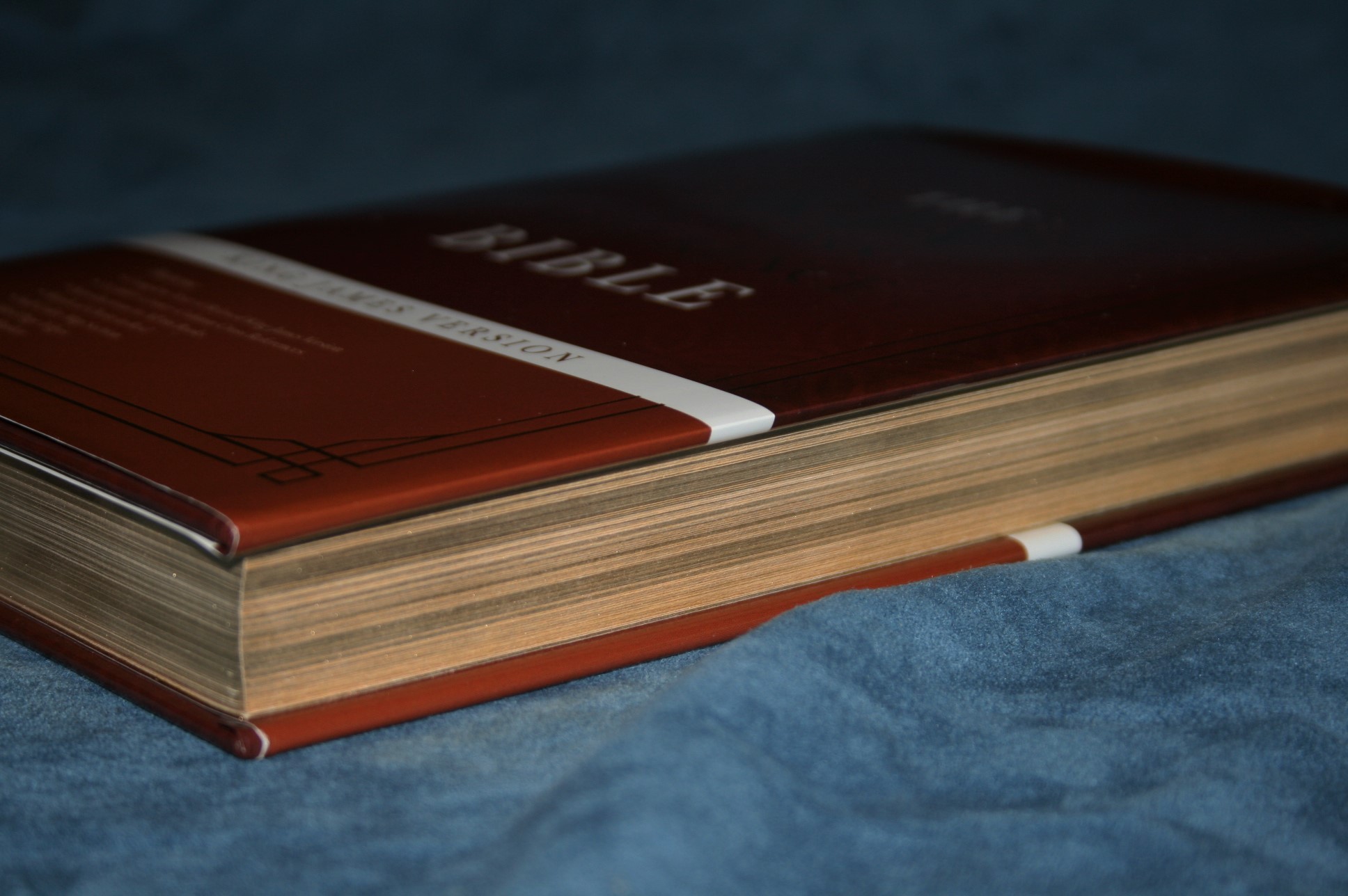
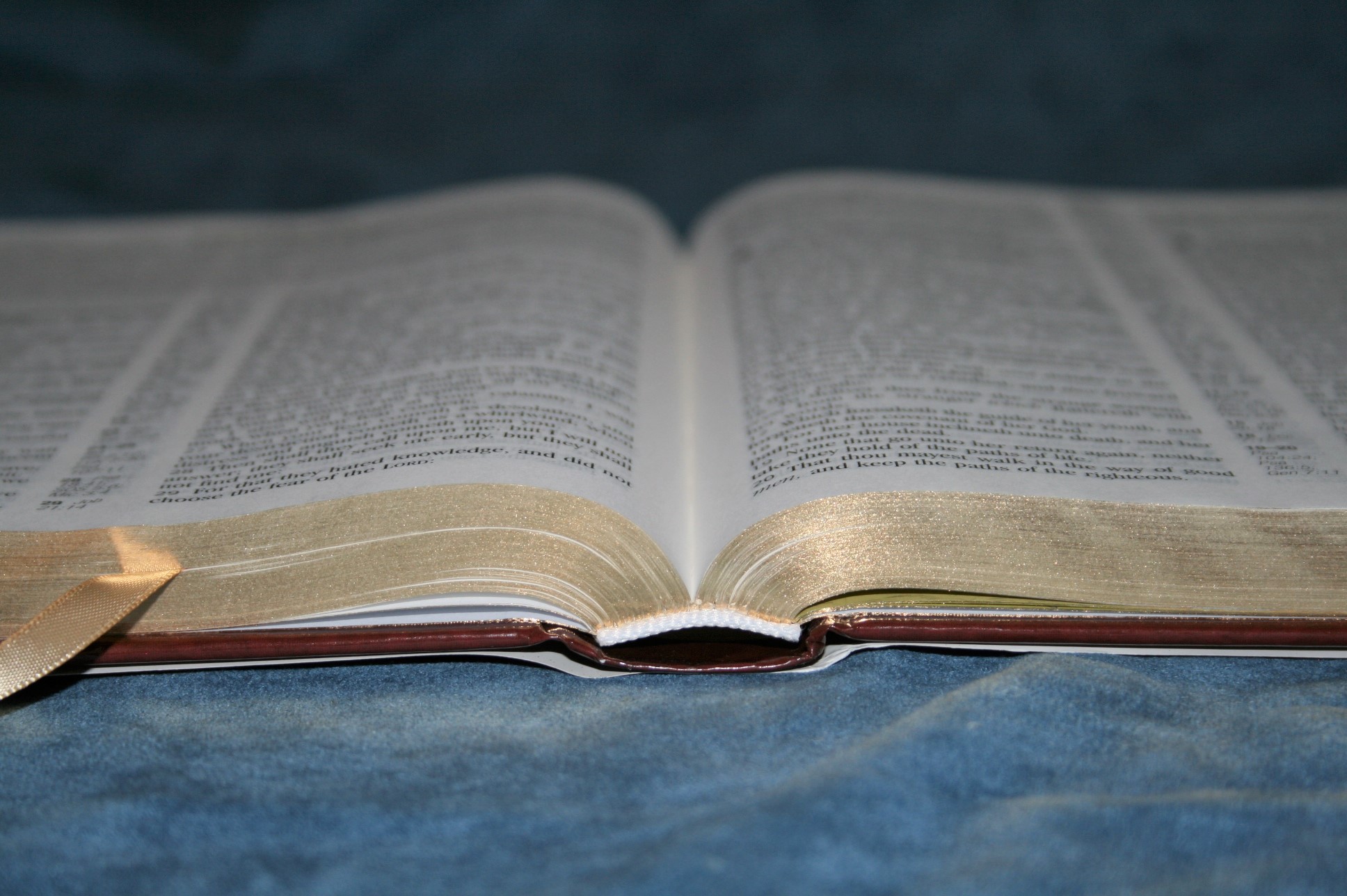
This is a hard cover edition with sewn binding. It comes with a dust jacket that can be removed to reveal the exact same cover underneath. Although it’s made in China it doesn’t feel cheaply made. It lays nice and flat anywhere you turn it. What’s interesting to me is even the hard cover edition has gilted edges and a ribbon. Overall dimensions are 6.75 x 9.5 x 1.125.
Paper and Print
The paper is thin (as expected, since this is a thin Bible). It’s not as opaque as I like but it is normal for this thin of a Bible. I’m guessing the paper thickness is around 26gsm (but don’t hold me to that). Most of the time the opacity isn’t an issue because many of the lines match up. Where the lines don’t match they make me want a little more opacity. It isn’t enough to keep me from using this Bible, but I do notice it more than I want to. The paper has a slightly cream color which helps improve readability.
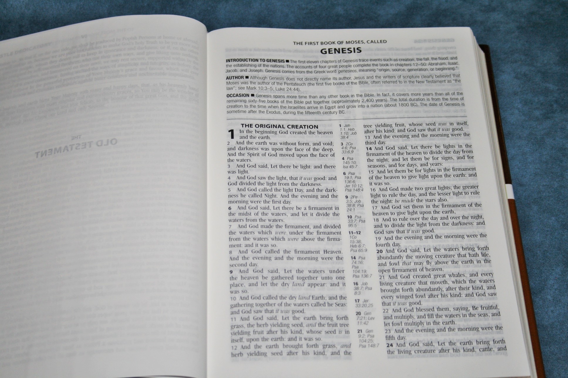
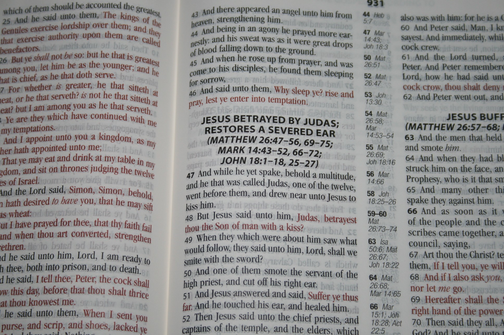
The font is around 10/11 point (to my eye) with a generous amount of room between the lines. The red letter is darker than most. I prefer a dark red like this one. The print is dark and consistent throughout. Supplied words are in italics. The italics almost stands out a little too much. There are no pronunciation marks, so the text is very clean. The font looks old, which I prefer to overly modern, but it isn’t my favorite style font. It won’t keep me from reading it but if it were available with a different font I would take it.

The columns are wide for the size of the font. This means more characters per line, which means better word-spacing. This is the kind of column design that I prefer for reading. The columns are 48 characters across and 2.43 wide. Paragraphs are indicated by bold verse numbers.
The inner column is large enough to bring the text out of the gutter so the text is always easy to see. It also helps that it’s thin. This is an advantage that large print thin-line editions have over the personal size giant print editions that are shorter but thicker.
The section headings and chapter numbers are larger and bolder than the regular text. Section headings also include references to parallel verses. I love this because it creates a harmony of the gospels within the text. What’s unique though is this is included in the Old Testament.

Books start on a new page, giving you space to write any thoughts, lists, or notes, charts, drawings, prayer requests, etc., at the end of many books. The header includes book name, chapter, and verse numbers. I like having the verse numbers in the header because it’s easier to find verses quickly for public reading.
References
The references are placed in the center-column. The chapter number is centered in bold and the verse numbers are to the left side in bold. There are no reference keys within the text. I have come to prefer this. Why? Keys make it easier to know which reference goes with which portion of the text and they show that there is a reference for that specific portion of the text. Why wouldn’t I want them?
They show there is a reference to that specific portion of the text. This makes the text cluttered and harder to read. I don’t use the references enough to clutter my text with reference keys. If I need a reference for a verse I will go through them all. That takes longer but I would rather do that and have a cleaner text that’s better for reading (both public and private). Reference keys are helpful, but I prefer not to have the distraction. Of course that’s just my opinion, but for me Barbour got this right.

Now on to the references themselves. There are 33,000 references. This is a blend of 25,000 cross references and 8000 within the section headings. That isn’t an over-abundance of references but quality is better than quantity. With that said, here are a few samples from the center column references so you can decide the quality for yourself:
- Genesis 1:1 – Jn 1:1, Heb 1:10, Job 38:4
- Matthew 17:20 – Mat 13:31, Mk 9:23, 11:22-23, Lk 17:6
- Mark 11:22 – Mat 21:21
- Mark 11:23 – Mat 17:20
- Luke 17:6 – Mat 17:20, Mk 4:34
- John 1:1 – Gen 1:1, Pro 8:23
- John 2:19 – Mat 16:21, Mk 14:58, 15:29
- 1 John 1:1 – none
And here is a list from the same verses of references in the section headings (only 3 of the passages had references). I’ve given the verse number where the section heading is placed.
- Matthew 17:14 – Mk 9:14-29, Lk 9:37-43a
- Mark 11:22 – Mat 21:21-22
- Luke 17:1 – Mat 18:6-10, Mk 9:42-50
What is missing is translation footnotes. I realize that KJV readers have become more vocal about not wanting anything else in the text, but this edition already has section headings. I consider the footnotes to be a part of the translation and they should be included. Of course I also understand that you can’t fit everything inside the package, so they have to decide between footnotes and other features.
Book Introductions
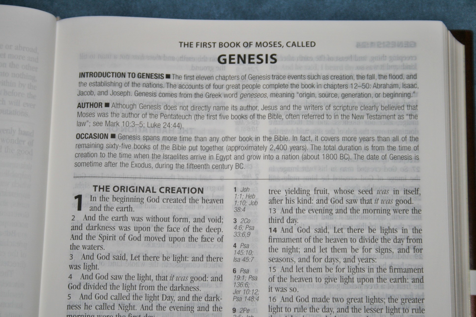
Book introductions are divided into three parts with one paragraph each:
- Introduction – this gives a quick overview about the purpose of the book.
- Author – tells who the author was or possible authors were.
- Occasion – tells the setting, culture, audience of the book.
These give key verses and some facts that help in reading the book. They’re succinct and well written. They’re also short so they don’t take up a lot of space.
Dictionary / Concordance
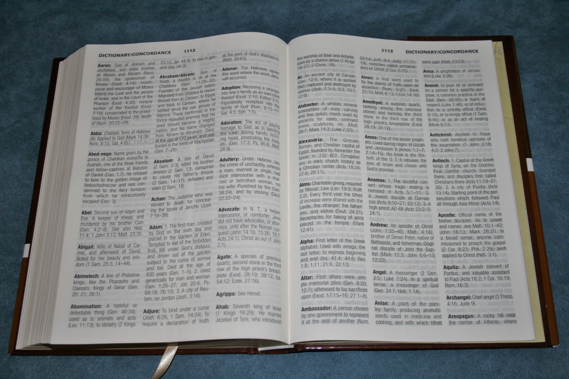
The dictionary / concordance combo is 33 pages with 3 columns per page. It mostly contains people, places, difficult phrases, archaic terms, and key terms. Some entries I found interesting are (the number in parenthesis is the number of verses given):
- Adonai (0)
- Alpha (6)
- Cracknels (1)
- Do you to wit (1)
- Godhead (3)
- Jehovah (2)
- Jehovah-jireh (1)
- Jehovah-nissi (1)
- Jehovah-shalom (1)
- Messiah (8)
- Omega (4)
It serves better as a dictionary than it does a concordance. I would like to see archaic words that have changed meaning added. It is useful for some simple definitions and information on the go.
Maps
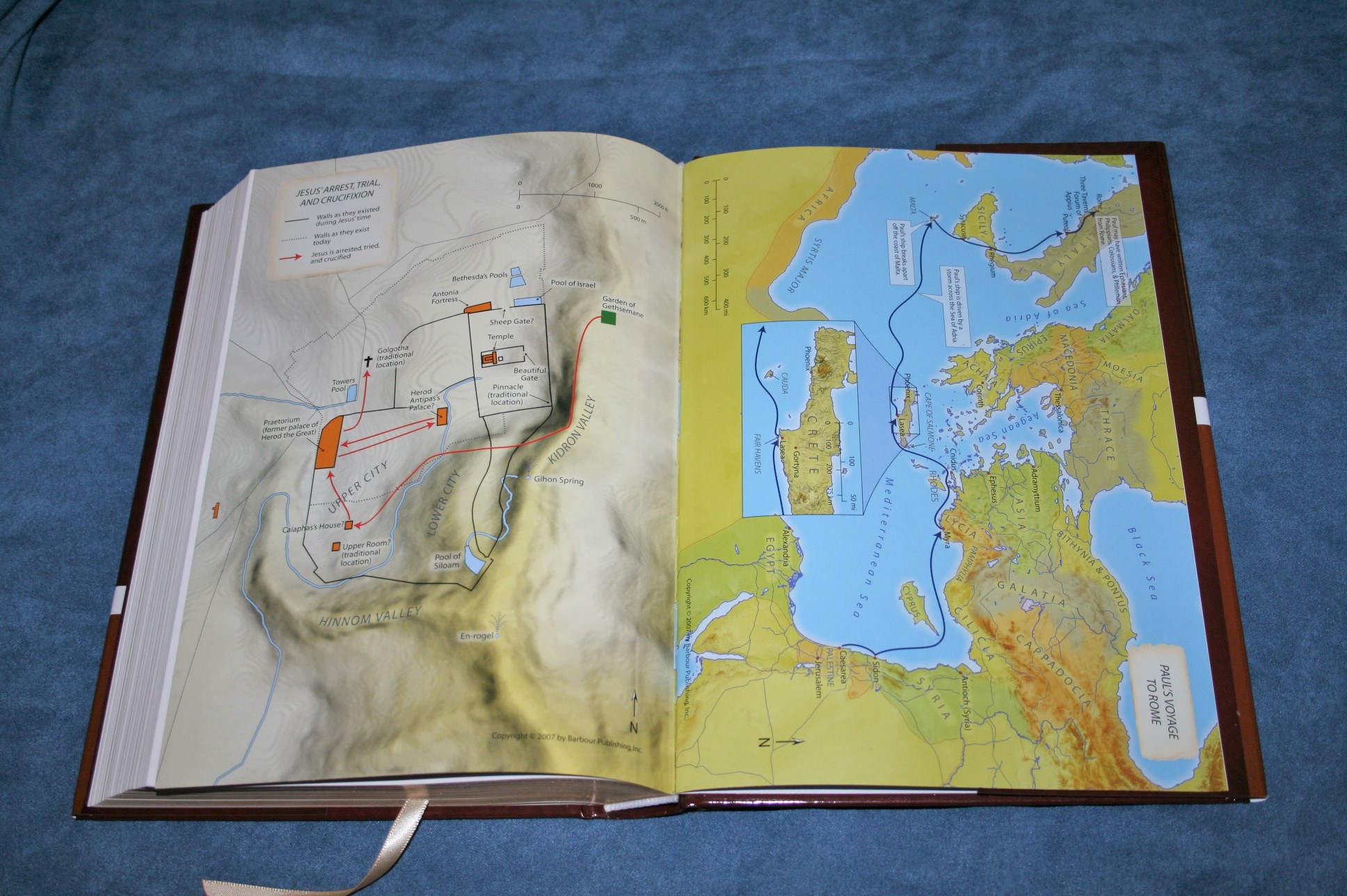
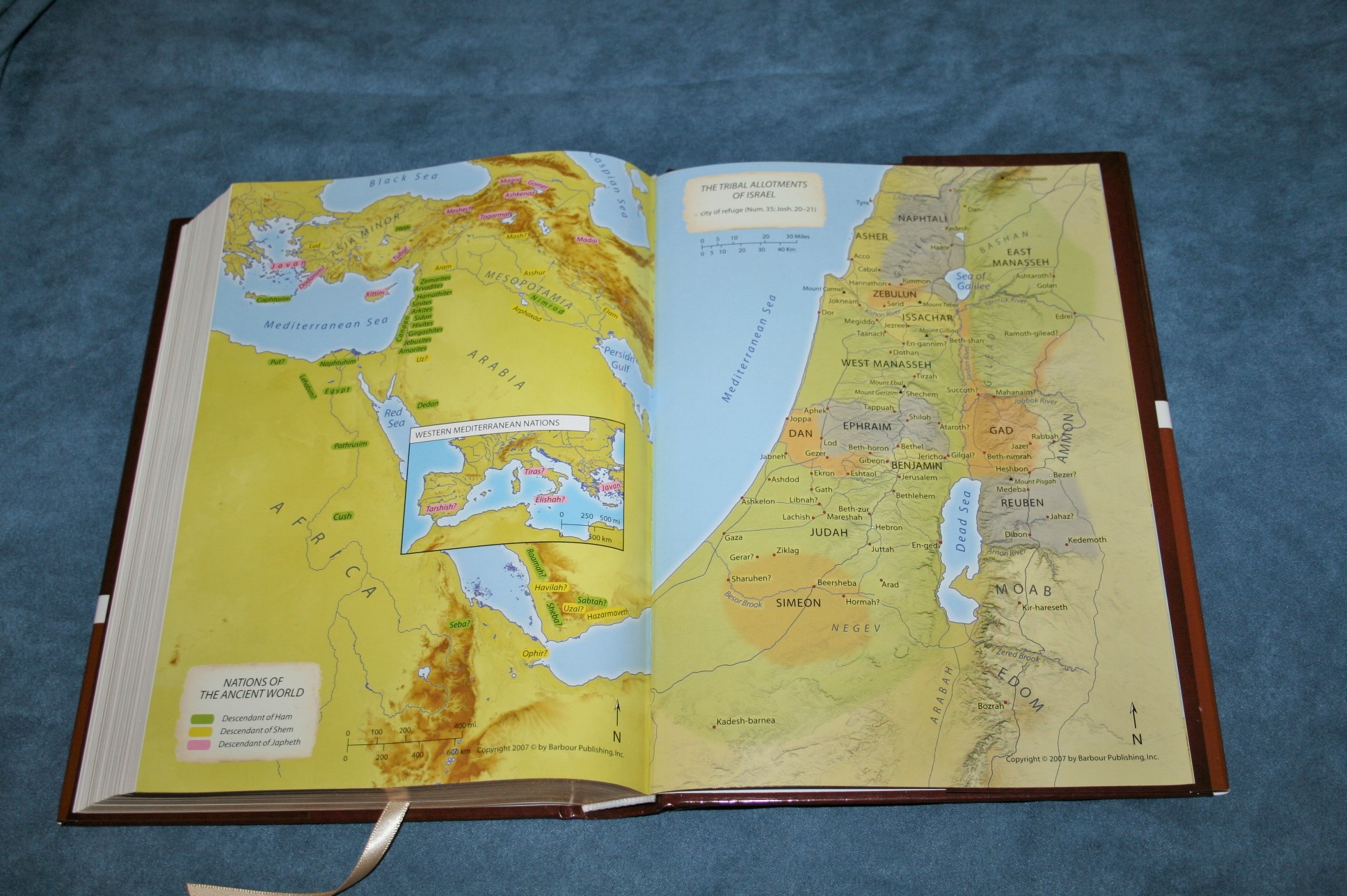
There are 8 full-color maps on thick glossy paper. Maps include:
- The Holy Land
- Nations of the Ancient World
- The Tribal Allotments of Israel
- The Prophets of Israel and Judah
- The Holy Land in the Time of Jesus
- Jesus’ Arrest, Trial, and Crucifixion
- Paul’s Voyage to Rome
- The Churches of Revelation
There isn’t an index but they are labeled well enough that I could find most of what I wanted quickly.
Conclusion

Overall I think the Barbour KJV Reference Bible is a winner. I would like to see translation notes added and a slightly more opaque paper. If I could only change one thing it would be the paper. It’s nice enough, but I like a little more opacity. It would make it more readable and better for preaching. The paper is still better than some I’ve seen at its price. I have no other complaints with this Bible. The layout is a winner for me. I enjoy reading a clean text with generous line and word spacing. At $16 from Amazon, the Barbour KJV Reference Bible is easy to recommend.
Barbour Publishing provided this Bible free for review. I was not required to give a positive review – only an honest review. My opinions are my own.


I completely agree with you on the reference layout. I prefer it this way. I love a clean text for reading. This is like the Cambridge Concord. I like thinlines for carry. I may have to give this a try and at that price it will be hard to pass on.