Crossway’s Single Column Legacy is one of those Bibles I consider to be a flagship. It was first available in imitation leather and then calfskin, but for the last few years, it has only been available in a goatskin Heirloom edition made in the Netherlands. It’s now available again in TruTone, which shares the text-block of the latest version of the Heirloom edition. In this review, I’ll take a look at the latest version of the TruTone and goatskin editions. Both are made in China.
Crossway provided this Bible in exchange for an honest review. I was not required to give a positive review. My opinions are my own.
_________________________________________________________
This book is available at (includes some affiliate links)
and many local Bible bookstores
_________________________________________________________
Table of Contents
-
Video Review
Cover and Binding
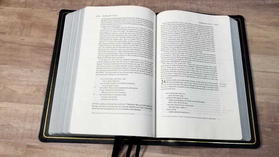
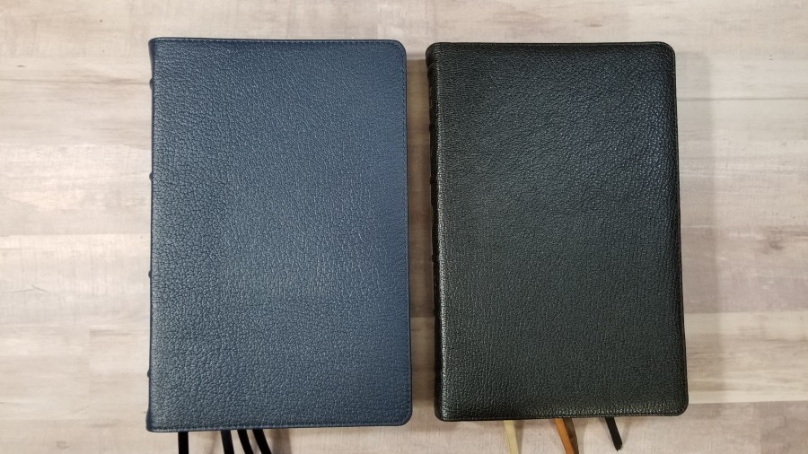
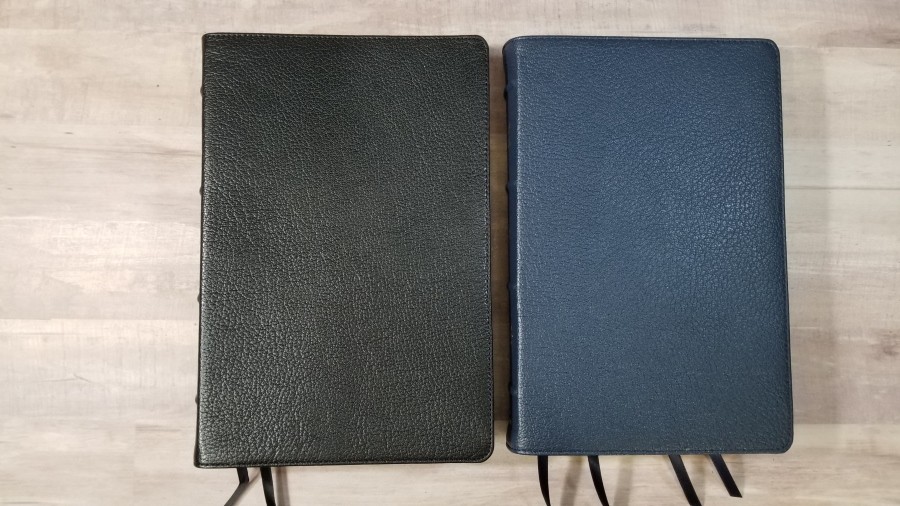
Here’s a look at each cover. Both are Smyth sewn. Both covers need to be used for a while before they’ll stay open easily in the first pages of Genesis.
Blue Goatskin
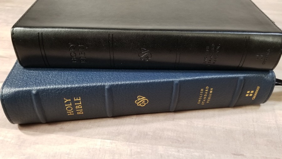
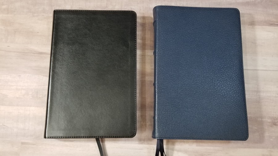
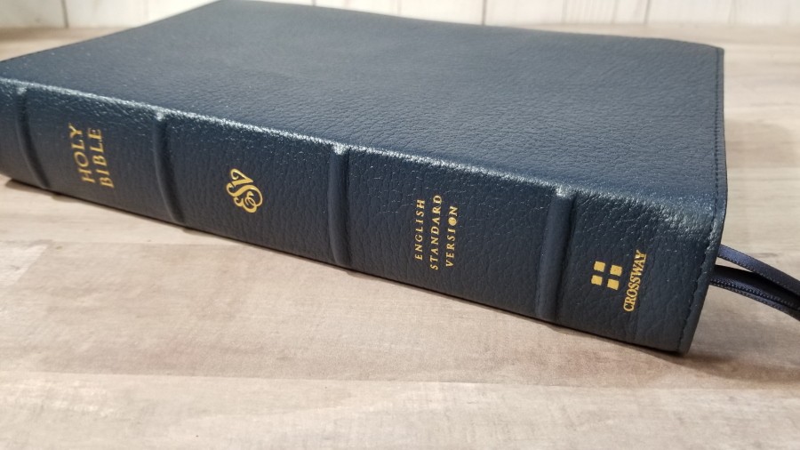
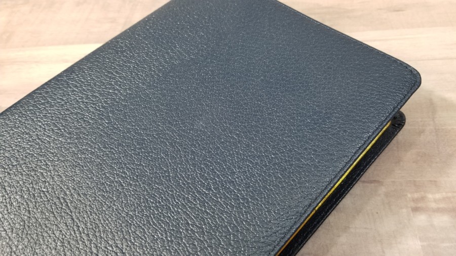
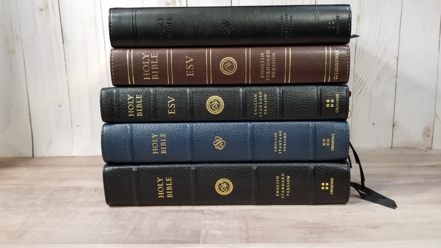
The cover is blue goatskin leather. The blue is extra dark and almost looks black in certain lighting. The leather is thick and has a deep grain. It has perimeter stitching. Nothing is printed on the front. The spine has 4 spine ribs with HOLY BIBLE, ESV, English Standard Version, and the Crossway logo printed in gold. The gold looks elegant against the dark blue. The line looks to be real leather.
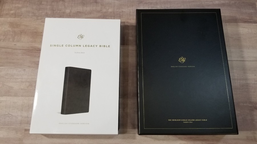
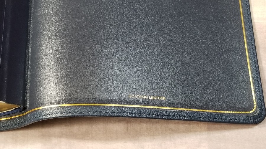
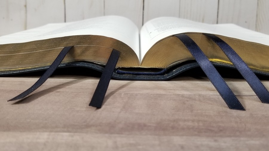
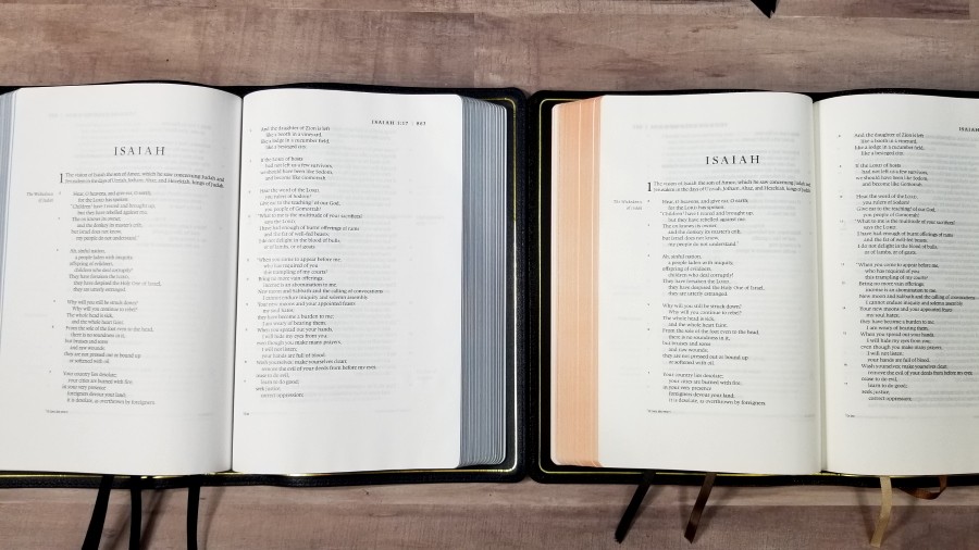
It’s edge-lined and has a gold gilt line around the inside of the cover. It’s flexible, but I still find it easy enough to handle. It has 4 black single-sided .25″ ribbons. At .25″, they don’t seem to get in the way of each other. They’re long enough to pull to the corner to open the Bible. The overall size is 9.75″ x 6.5 x 1.25″. It weighs 2 lbs, 4.1 oz. The goatskin edition includes a thick 2-piece box and the Bible is wrapped in velvet.
Black TruTone
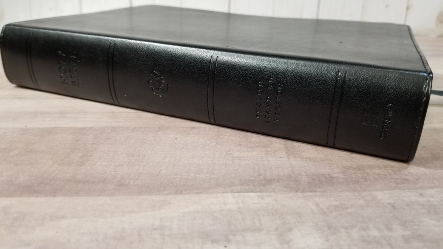
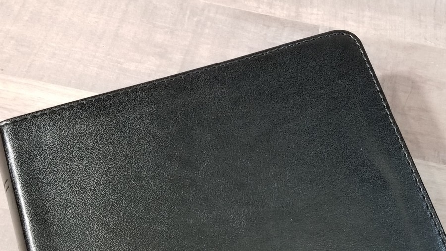
The black imitation leather has a slight grain that gives it a little bit of texture. It also includes perimeter stitching. There is nothing printed on the front. The spine includes 4 non-raised spine rib indications and debossed text. No extra color is added, so nothing on the spine stands out.
The liner is a thick paper that’s pasted-down. It’s easy to hold open in one hand to read. It has one .25″ black ribbon that’s long enough to pull to the corner to use. The overall size is 9.75″ x 6.5 x 1.25″. It weighs 2 lbs, 4.1 oz.
Paper
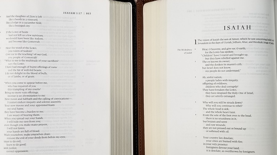
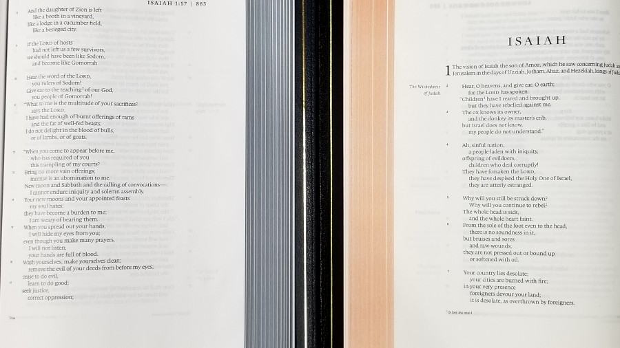
Both editions seem to use the same paper. It’s somewhere in the mid-30s in gsm. It’s not to the level of quality as in the previous Heirloom edition (French-milled Indopaque. You can see the difference in particles when you hold them up to a light to compare them), but it’s still a high-quality paper. It has a slight cream color (my favorite color for paper). It’s highly opaque and has no glare under direct light.
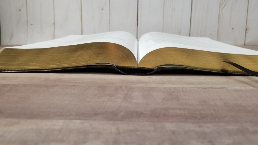
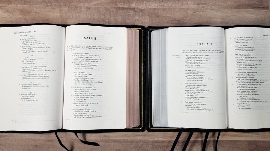
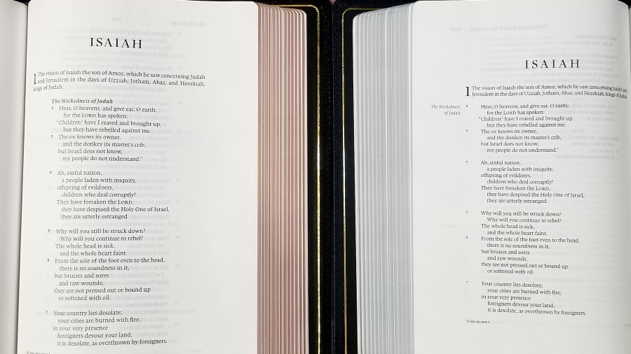
The texture is just rough enough to make the pages separate easily when rubbing the pages together. I like this paper a lot. I think it would be good for highlighting and note-taking. I’m especially glad to see the TruTone edition with the same paper as the Heirloom edition. The page edges for the blue goatskin are a faint blue art-gilt. The black TruTone has gold gilt.
Typography
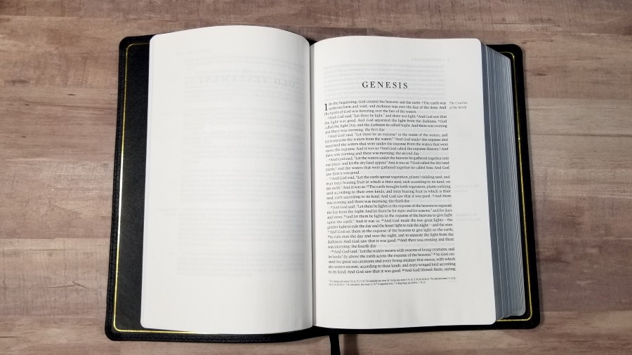
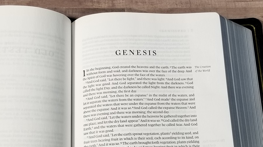
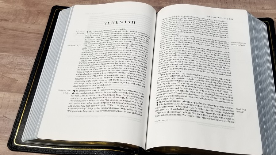
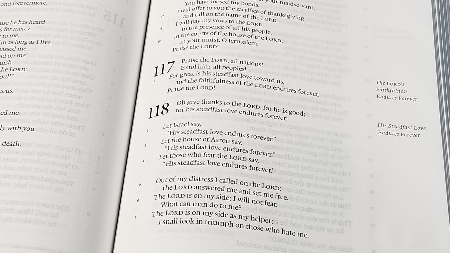
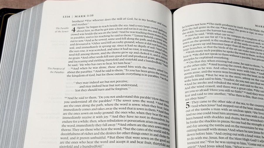
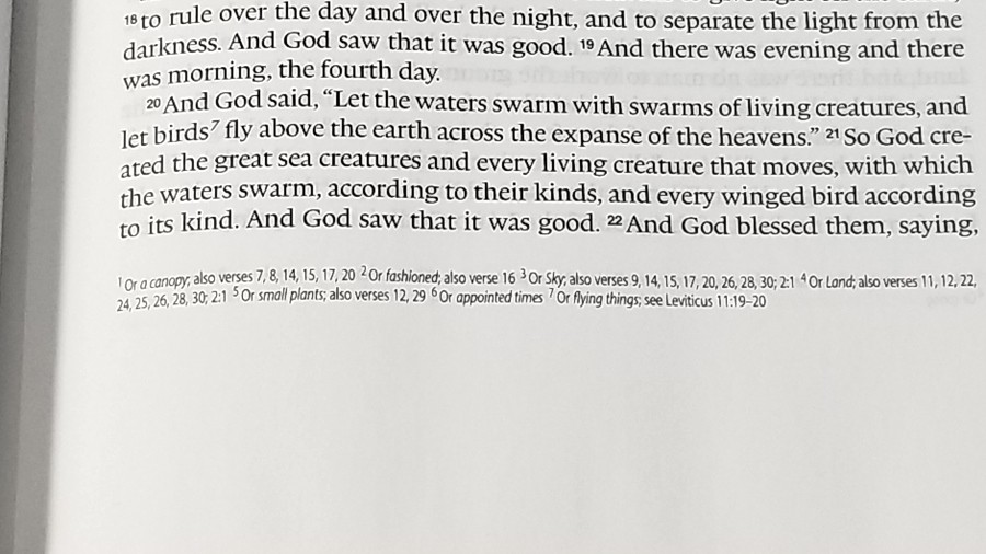
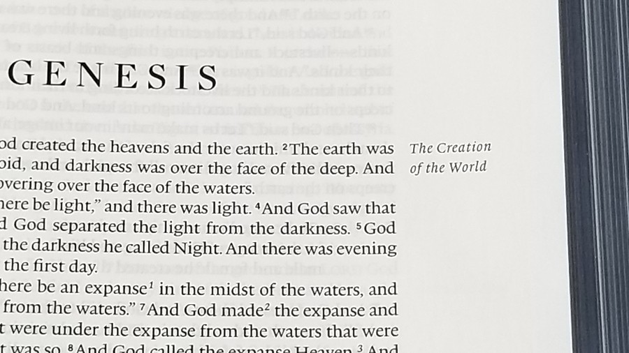
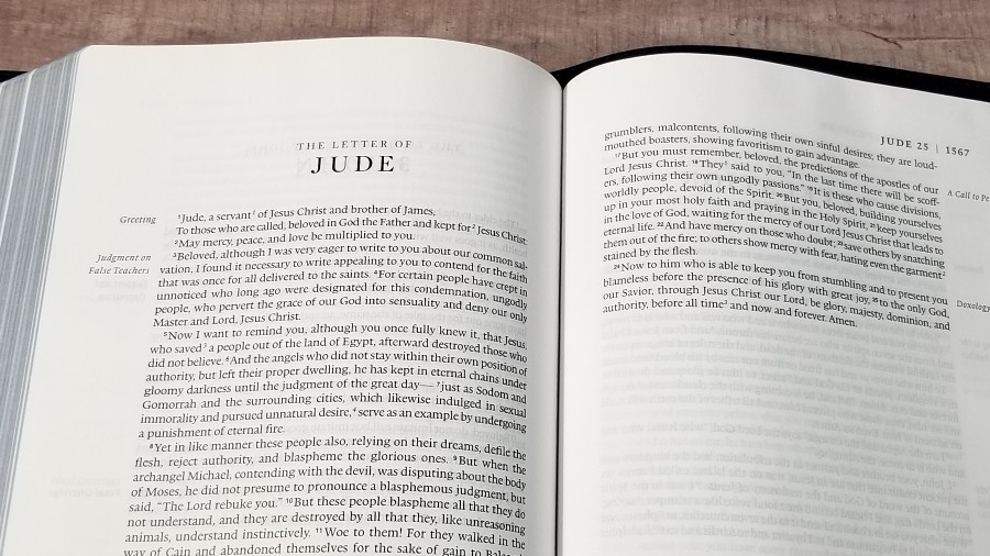
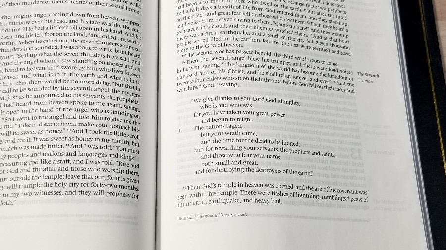
The text is presented in a single column with poetry in stanzas and the section headings in the outer margin. The header shows the page number in the outer margin and a verticle line separating it from the book name, chapter number, and verse number. The footer contains the translation footnotes.
The font is a black-letter 9-point lexicon with a 10.75 leading. It’s black-letter. It’s dark and consistent throughout the text. The verse numbers are small enough to ignore but while reading, but they’re not too difficult to find them when you’re searching for them. I find this font size and spacing to be excellent for reading.
The layout follows the idea of the Renaissance perfect page, with a 2:3 ratio page geometry. It has around 14 words per line, and it includes wide margins to give is space. The outer margin has 1.25″, the inner has .625″, the top has 1″, and the bottom has .875″. The inner margin helps bring the text out of the gutter and keeps the lines straight across the page.
It’s printed with line-matching, meaning the lines are printed in the same location on both sides of the page. This reduces show-through, which is mostly visible in the poetic sections. The paper is opaque enough that the line-matching doesn’t make the text seem gray. Prose and poetic settings are easy enough to read, but the poetic setting is what really shines with this word-count.
Translation notes are placed in the footer. They include information on the Hebrew, Greek, Septuagint, weights and measures, parallel passages, OT references in the NT, translation variants, etc.
This is an excellent layout for reading. I find it a little difficult to preach from because of the long lines and the small verse numbers, but I like this layout enough that I could get used to it.
Other Pages
Presentation
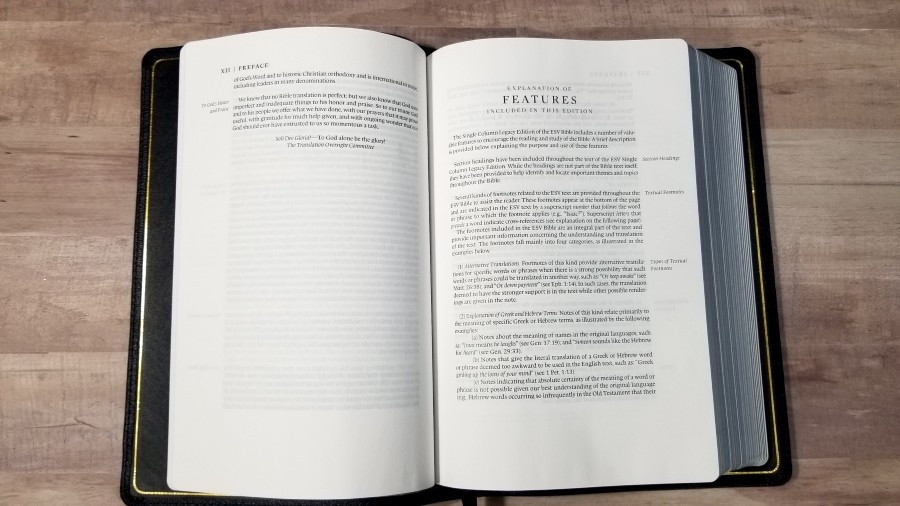
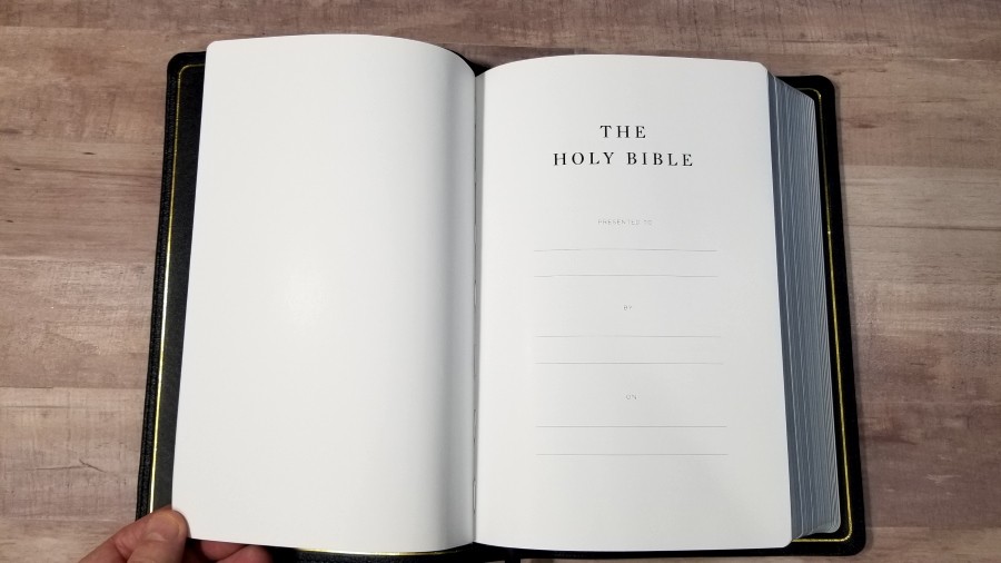
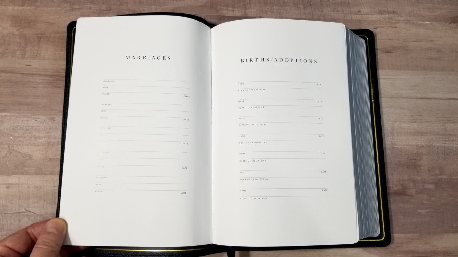
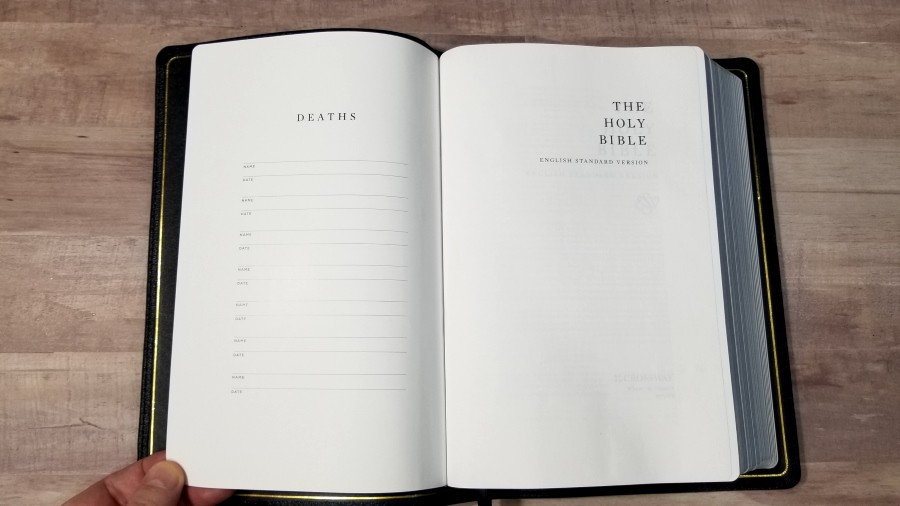
There are several pages in the front printed on thick, glossy pages. They include Presentation, Marriages, Births/Adoptions, and Deaths.
Table of Weights and Measures
In the back is a one-page table that shows the biblical unit, approximate American and metric equivalents, and biblical equivalent. The footnotes also have them, but it’s still helpful to have it in a table that’s easy to access.
Concordance
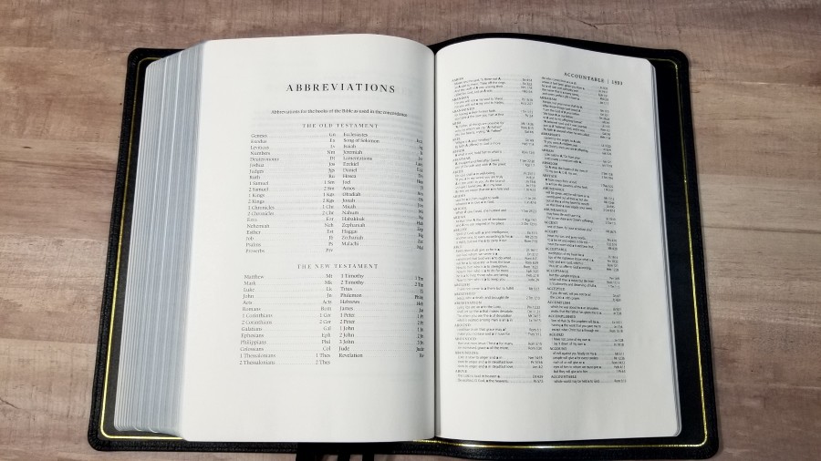
The concordance is 72 pages with 2 columns per page. It’s a good concordance for sermon prep and study. The concordance also includes wide margins so you can add even more references or word studies if you want. Here are some sample entries and the number of references given:
- Christ – 16
- Christ’s – 4
- Christian – 2
- Faith – 28
- Faithful – 10
- Faithfulness – 6
- Faithless – 1
- God – 49
- Godliness – 4
- Godly – 3
- Gods – 2
- Praise – 19
- Praised – 2
- Praises – 2
- Pray – 11
- Prayer – 10
- Prayers – 6
- Praying – 3
Maps
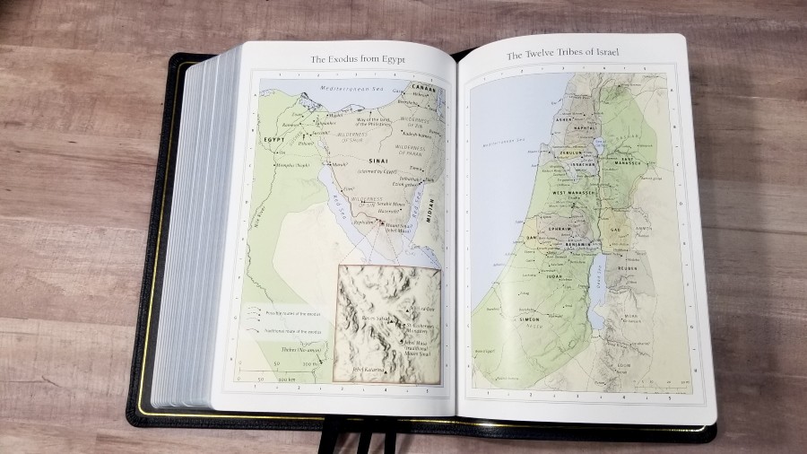
It has Crossway’s standard 8 pages of maps printed on thick glossy paper. The colors are earth-tones with lots of light green and tan. It doesn’t have an index, but the maps are annotated and easy to use. They include routes, distance, borders, rivers, kingdoms, references, dates, and simplified topography.
Maps include:
- The World of the Patriarchs
- The Exodus from Egypt
- The Twelve Tribes of Israel
- Israel Under Saul, David, and Solomon
- Jerusalem in the Time of Jesus
- Palestine in the Time of Jesus
- Paul’s First and Second Missionary Journeys
- Paul’s Third Missionary Journey and His Voyage to Rome
Comparisons
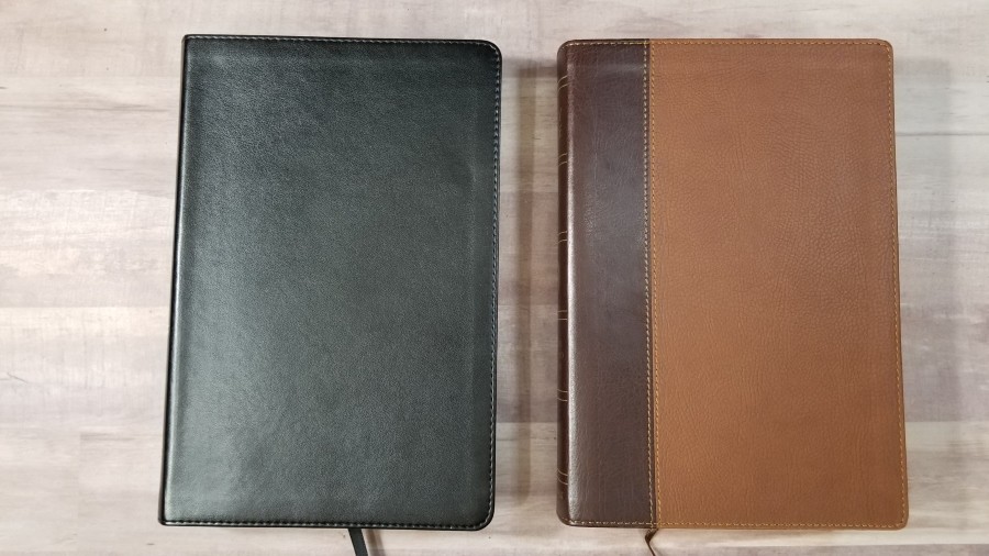
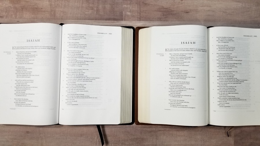
Here’s a look at how the new Legacy series looks next to the original Single Column Legacy, the previous Heirloom Legacy, and the Preaching Bible.
Original TruTone Single Column Legacy
The original Single Column Legacy has the same layout but different materials. It was made by LEGO and had 36gsm paper, which was more opaque and had a different texture. It’s not available anymore, but it can sometimes be found used.
The Previous Heirloom Legacy
The last version of the Heirloom Legacy was made by Royal Jongbloed. It had high-quality paper, but it was also thinner paper. This made this Bible noticeably thinner and lighter. It also had slightly better ribbons in four different colors. I’d place it a little higher in overall quality.
ESV Preaching Bible
The ESV Preaching Bible has slightly better paper. It’s a larger Bible, but the difference isn’t as dramatic as it was before. Both are made in China. The quality is about the same.
Conclusion
The new TruTone and Heirloom Legacy are excellent Bibles. Even though the Heirloom edition isn’t to the level in quality as the previous edition, it’s still a good quality Bible. I’m especially glad to see it back available in a more affordable edition. I’m also glad to see that both editions use the same text-block. We don’t get an even lower quality in paper in the TruTone edition. This also makes the TruTone edition a good option for a re-bind, so you can buy it cheaper to see if you like it, use it for a year or two, and then have it rebound in any leather you want. The goatskin on the Heirloom edition seems to be the same quality as before, so if you can afford goatskin, it’s a good choice to start with.
The layout of the Legacy has always been one of my favorites. It’s highly readable and it has about the best poetic layout available. The verse numbers are not the easiest to find, but they are there. I find it easy enough to study from and even better for reading. I still recommend the ESV Legacy to anyone looking for an ESV that focuses on readability.
_________________________________________________________
This book is available at (includes some affiliate links)
and many local Bible bookstores
_________________________________________________________
Crossway provided this Bible in exchange for an honest review. I was not required to give a positive review, only an honest one. All opinions are my own.











Trackbacks/Pingbacks