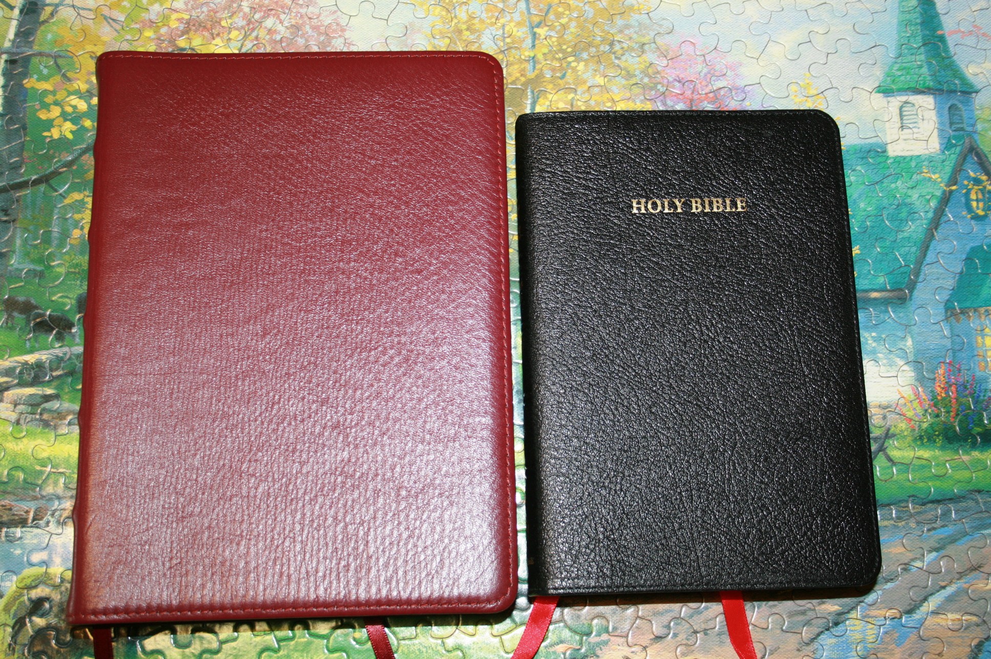
The Cameo is one of my favorite KJV’s. It has an 8-point font that’s bold and readable and the overall size makes it great for reading and carry. LCBP also produces several versions of it including a wide margin edition. Here are some photos that show how the two editions compare.

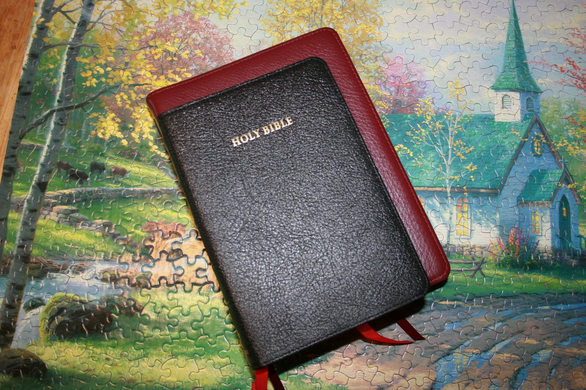
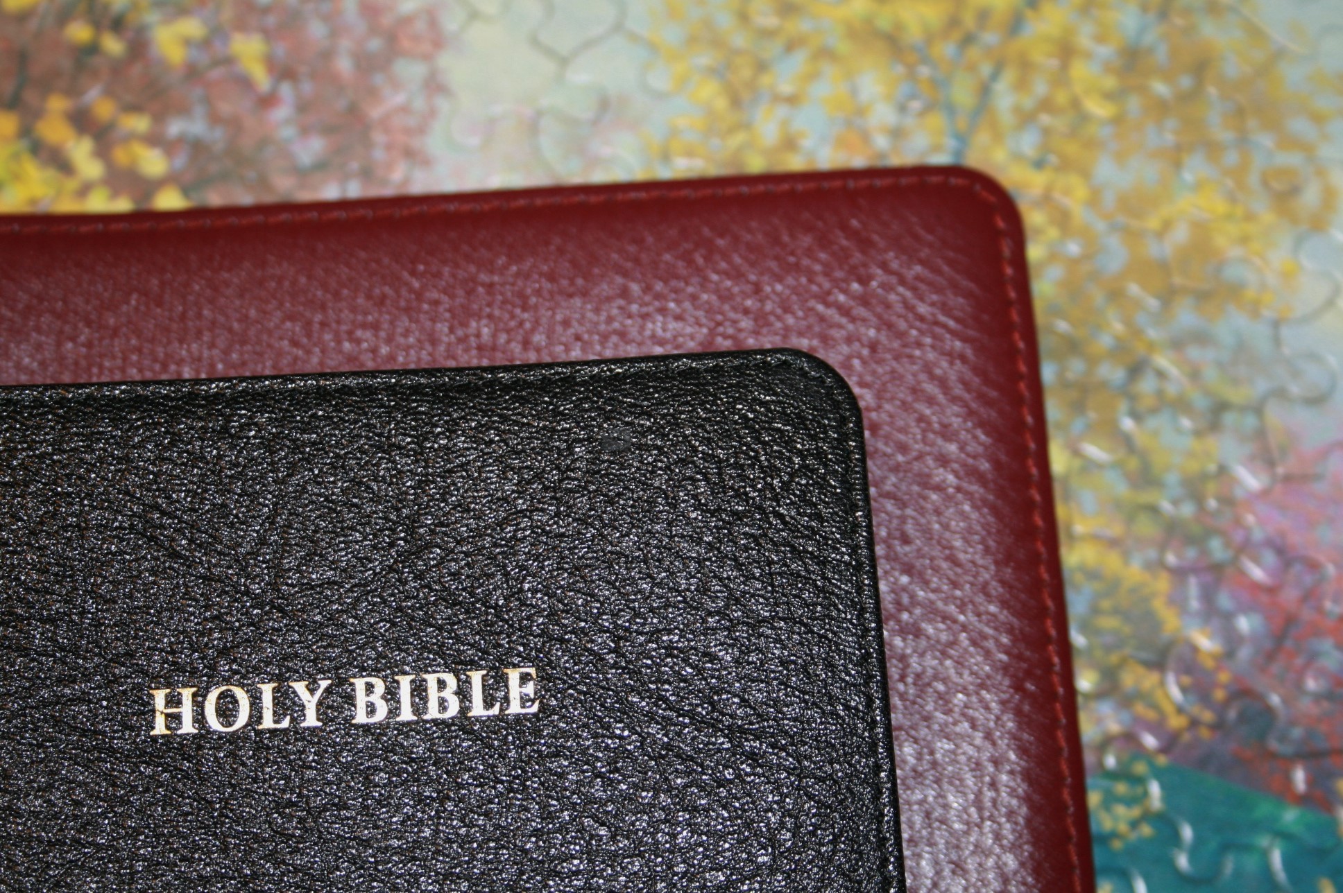
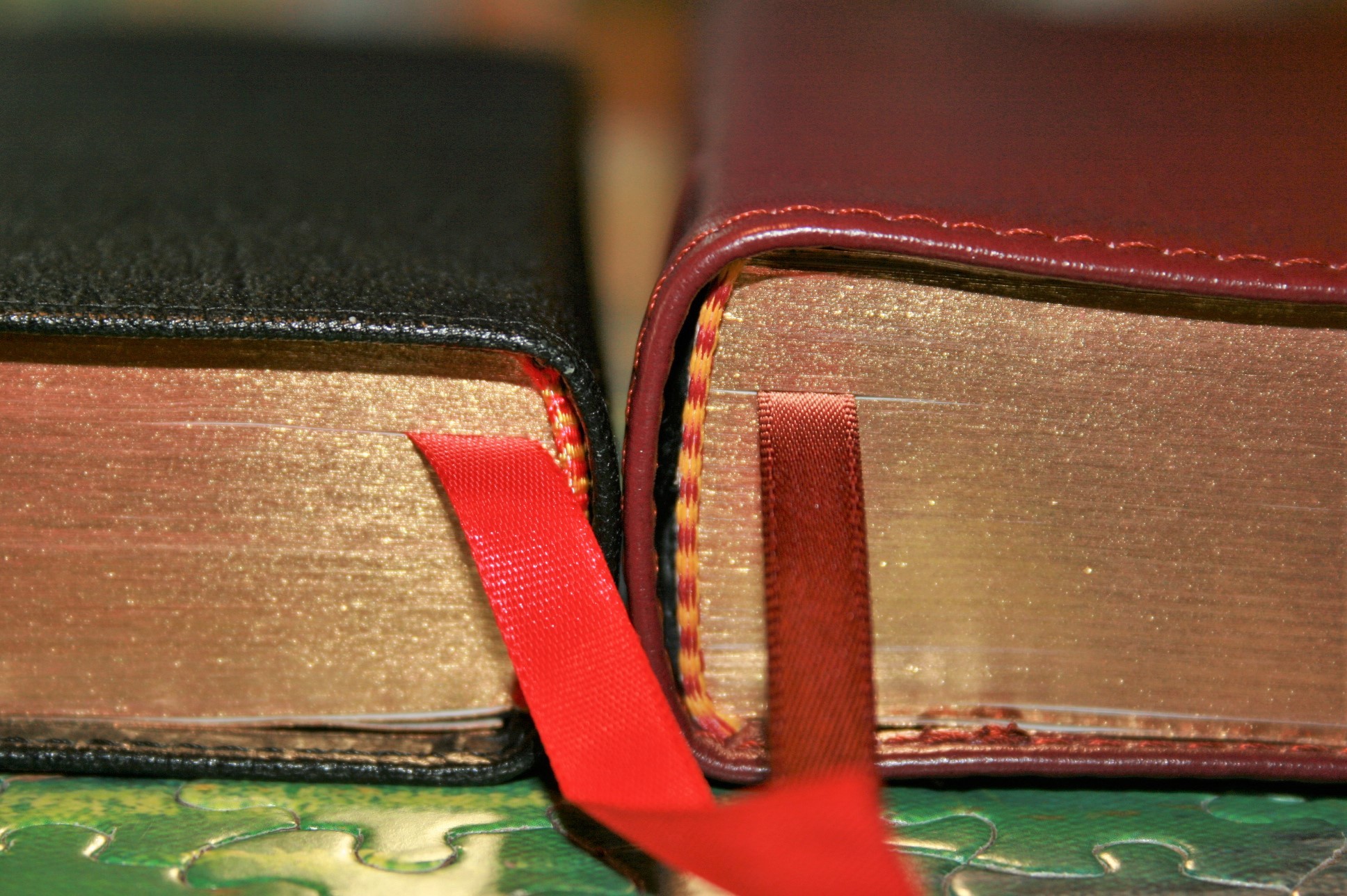
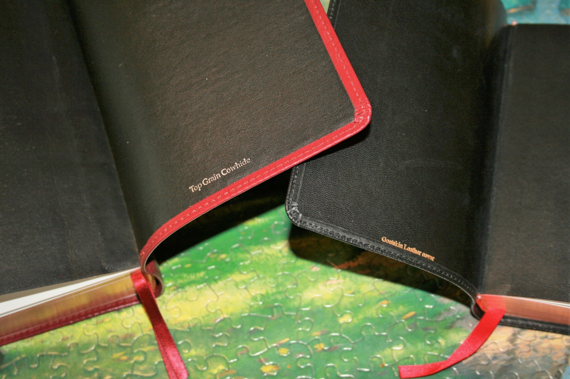
The Cambridge is black goatskin and the LCBP is the Signature Series cow hide. Both are edge-lined and sewn around the outside edges.

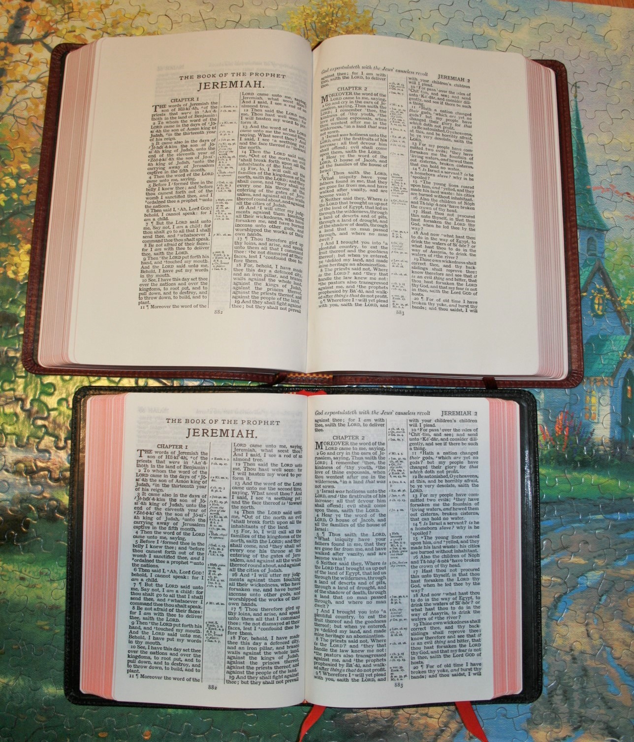
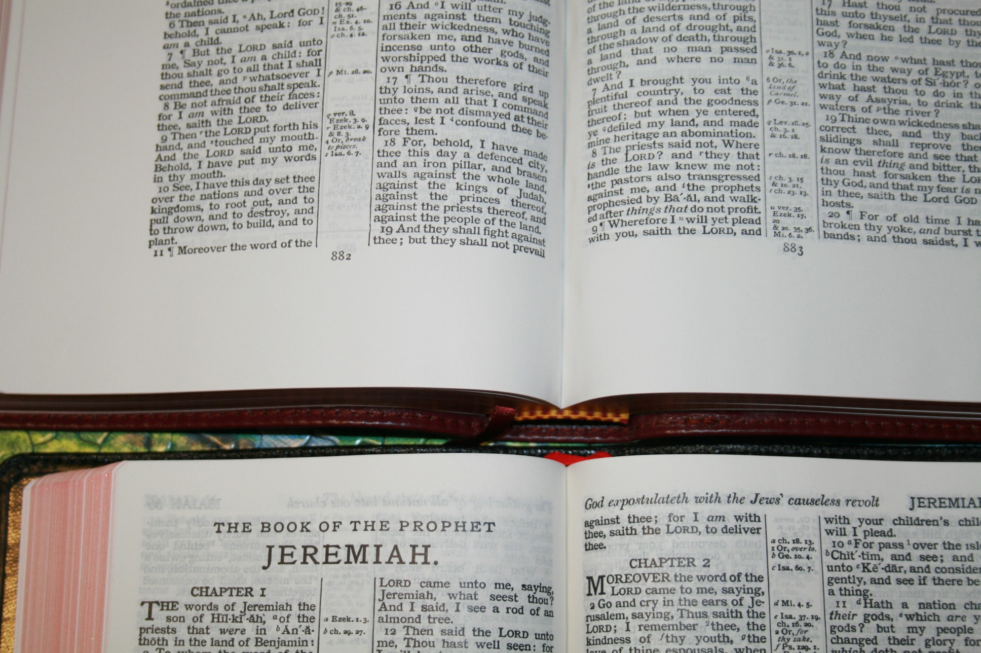
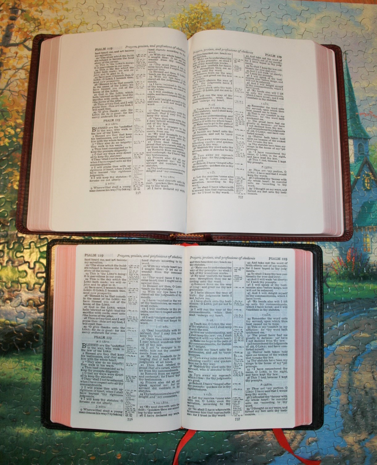
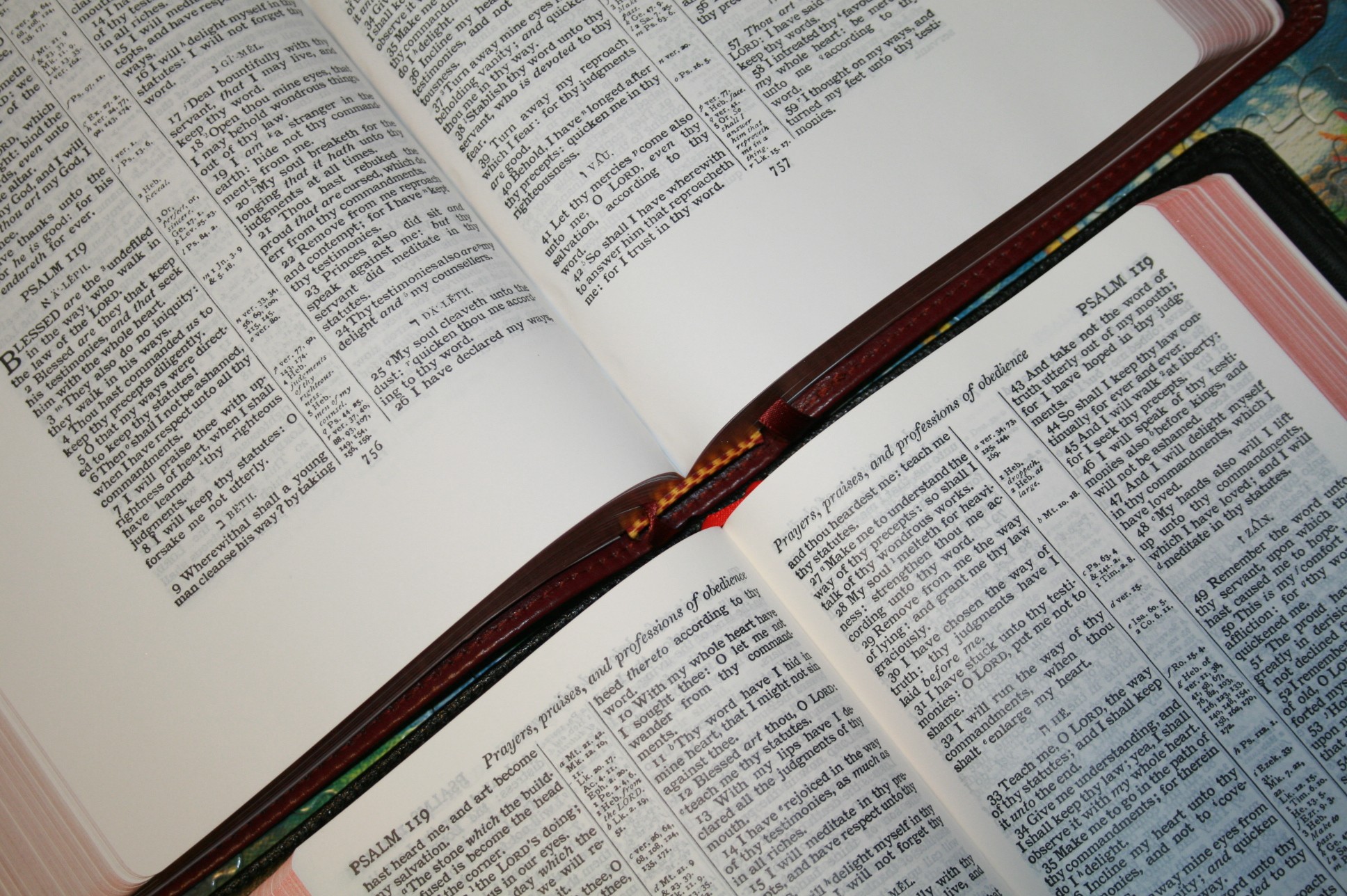
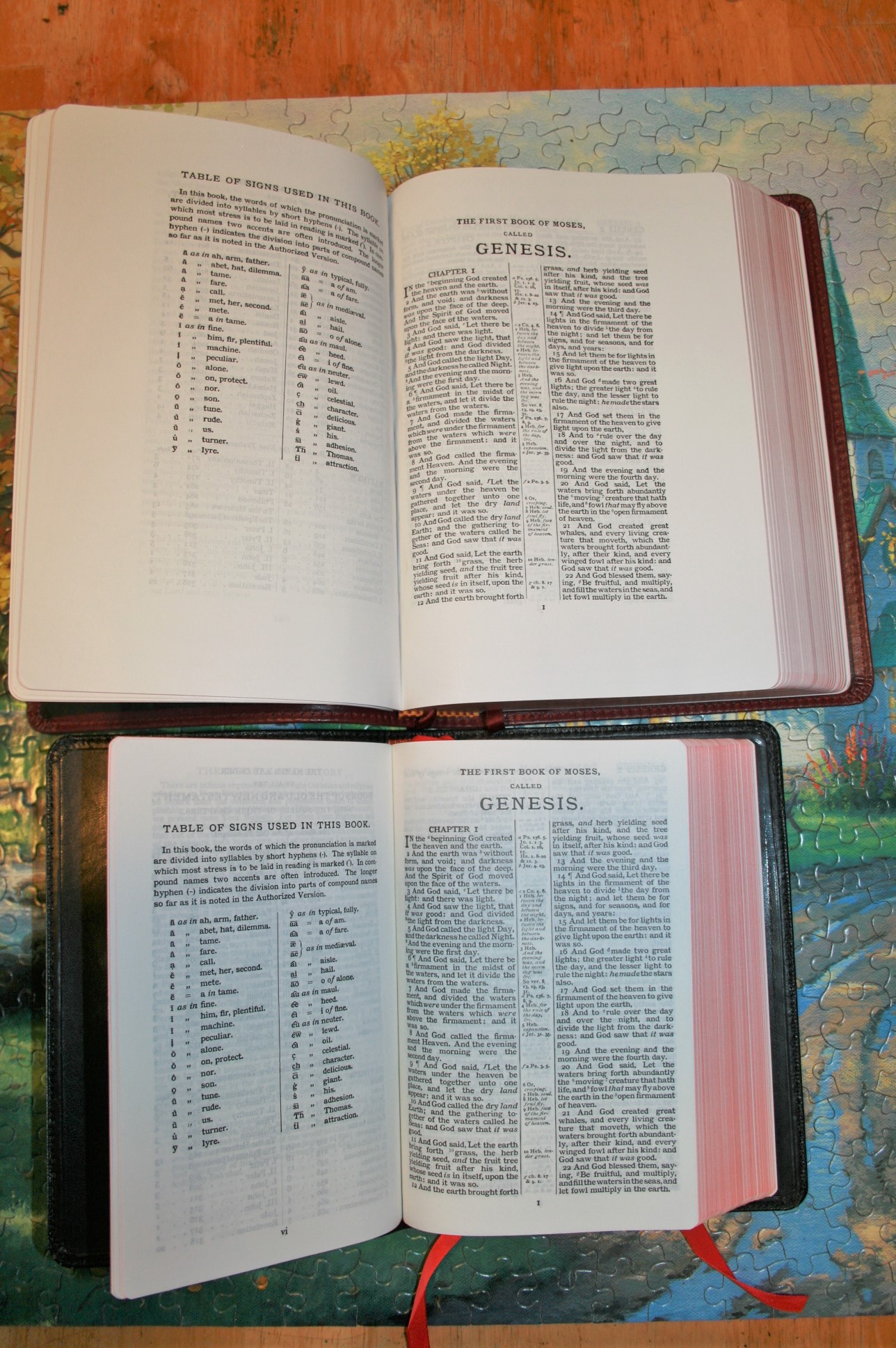
The print in the Cambridge edition is darker, but the LCBP looks sharper. The Cambridge paper is made to be thin, while the LCBP is made for writing. Both have their advantages.
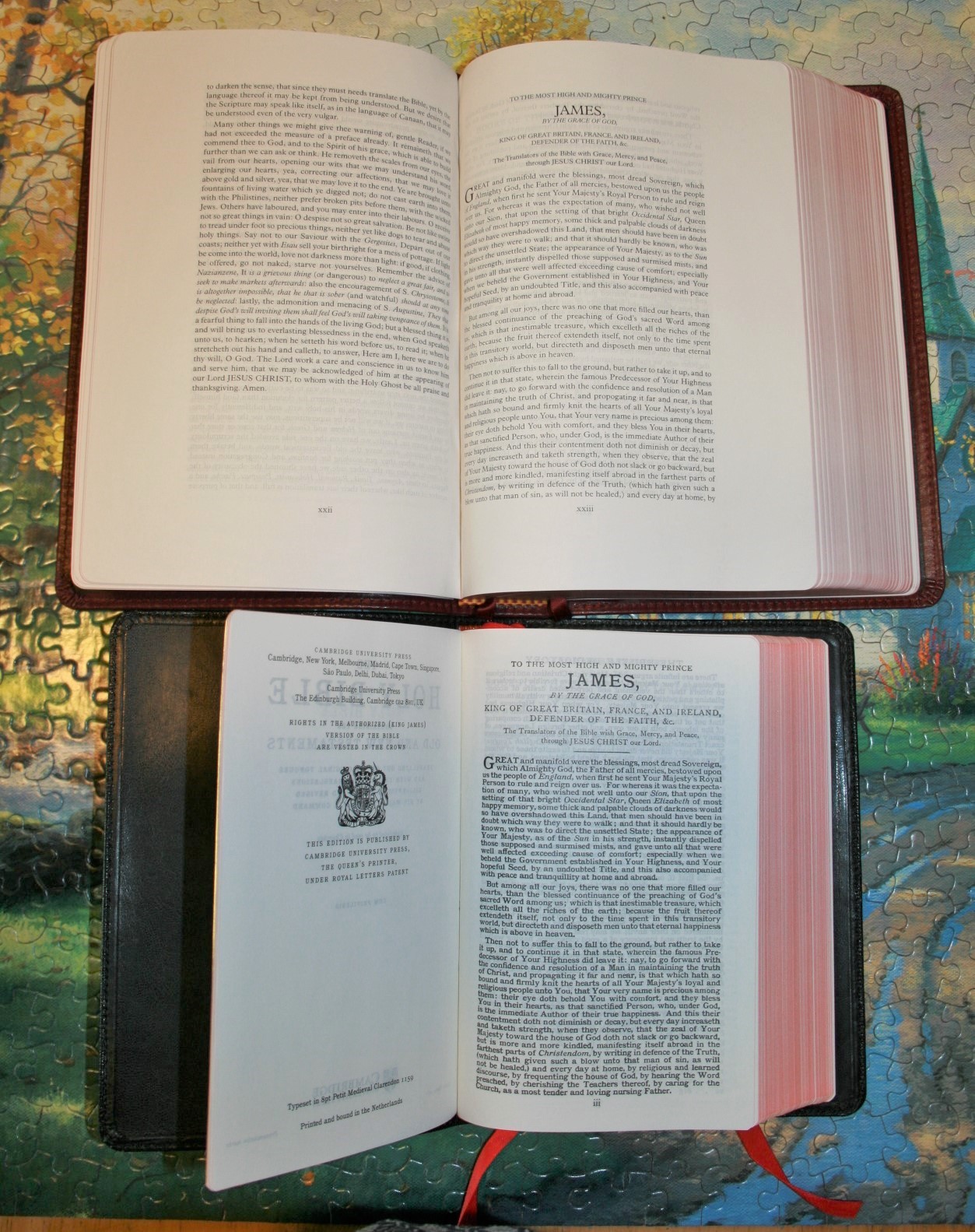
Both have the Epistle Dedicatory. LCBP adds the Translators to the Reader.

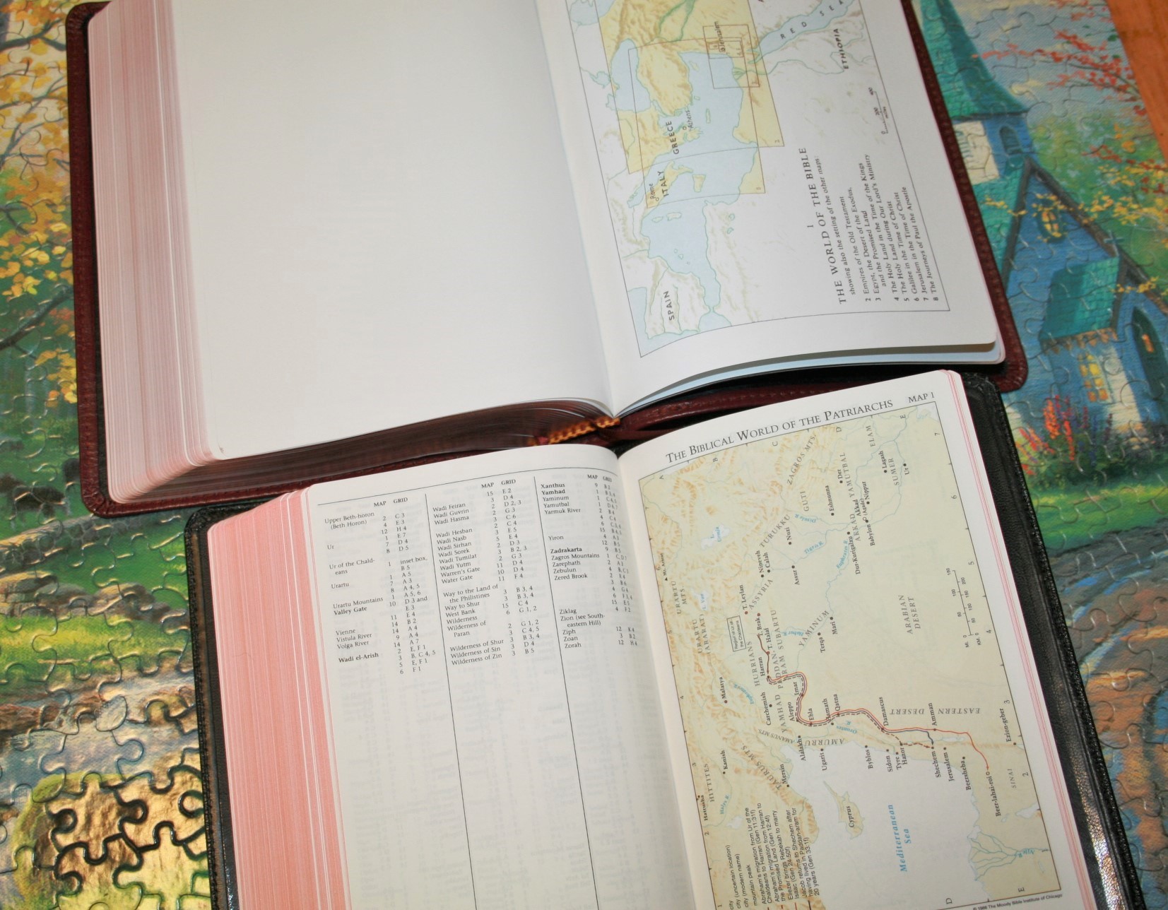
They have different concordances and maps.


Its a beautiful bible and I’m so happy its in good hands, I will be getting a 110 redletter signature topgrain its nice and sturdy. At first I wasn’t to sure about their new leather but honestly its a good step up and looks amazing, I can’t wait to get my new one to review cause I’m looking forward to seeing the red letter against that burgundy 😉
I disagree that the new cowhide is nicer than the polished calfskin. It is attractive and durable. The new Signature Series is art gilded and that is a plus. They need to tweek the red much darker in the future.
To be honest the red is darker than my pictures show. I need to adjust them for color correction. I made some adjustments before uploading, but for some reason they didn’t save and I didn’t notice it.
Hard to beat the LCBP value. You could buy 2-3 LCBP bibles for the cost of 1 Cambridge.