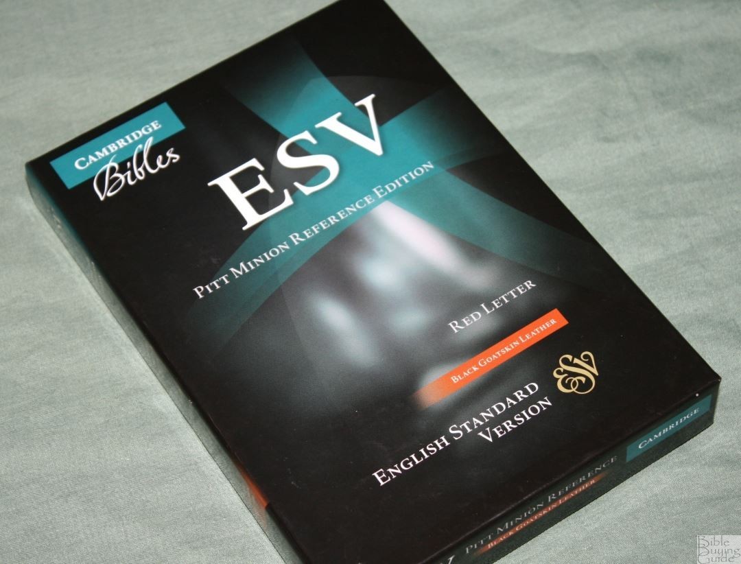
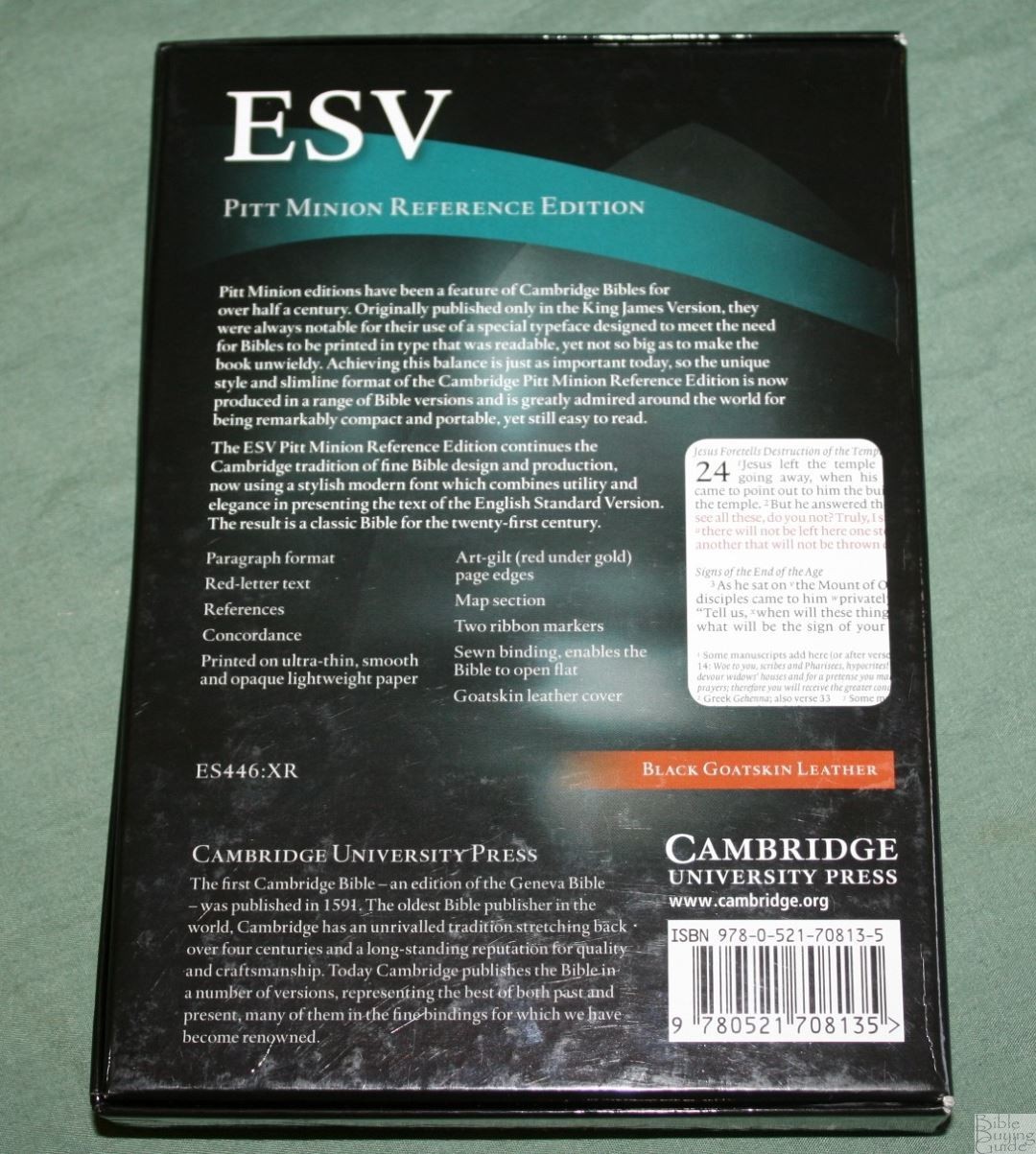
The Cambridge Pitt Minion is a standard in small high-quality Bibles and for good reason – it’s a full reference edition that’s easily carried while presenting a readable, yet small, typeface. The result, if you’re okay with small type, is a Bible that can easily become the only Bible you need. In this review, I take a look at the English Standard Version (ESV) in black goatskin. It’s also available in brown goatskin, black calf split, and black imitation leather.
Pros
- Easy to carry
- Goatskin cover
Cons
- Some will have trouble with the small type
Features
- 2011 ESV
- Goatskin cover
- Sewn binding
- 27/28 gsm paper
- 6.75-point font
- Red letter
- Red under gold art-gilt edges
- Concordance
- Index to maps
- 16 pages of maps
- Presentation page with no text (lines only)
- 2 ribbons
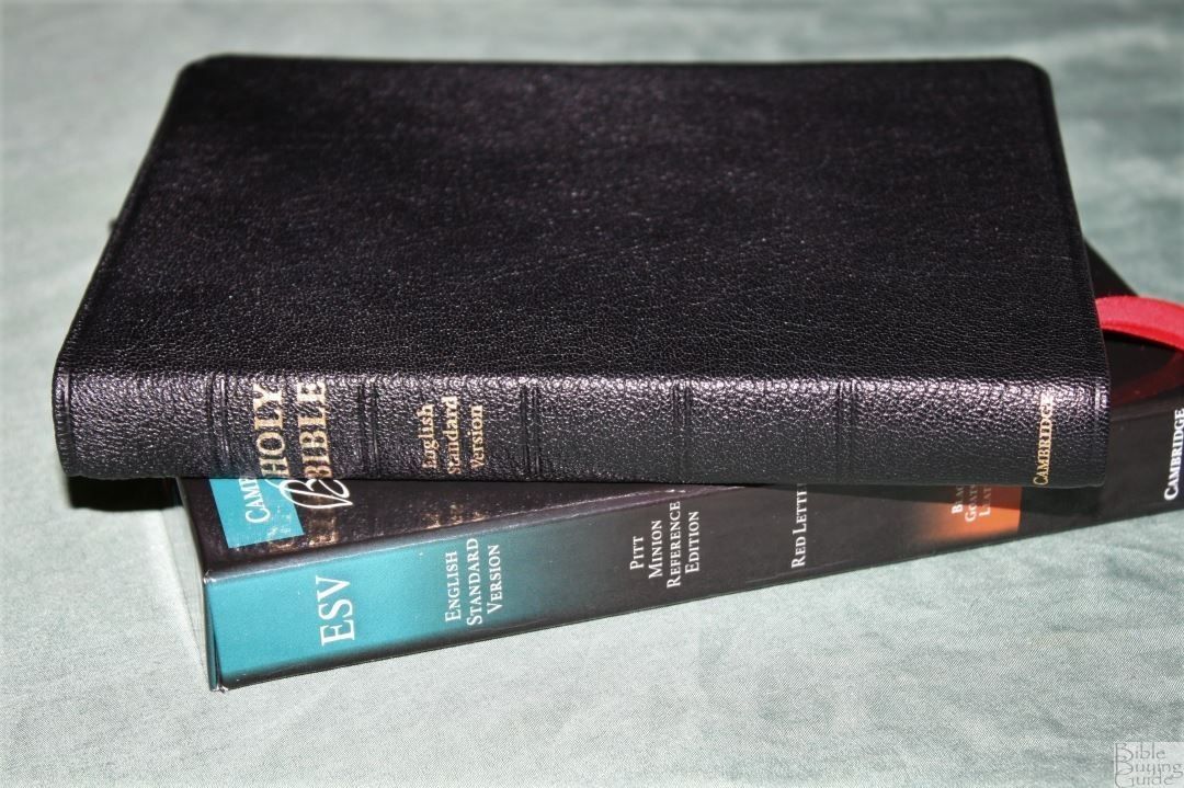
- 7.3 x 5.25 x 1” (cover)
- 6.8 x 4.6 x .75” (paper)
- ISBN: 9780521708135
- Printed and bound in the Netherlands by Jongbloed
__________________________________________________
Buy from Amazon
__________________________________________________
Cover

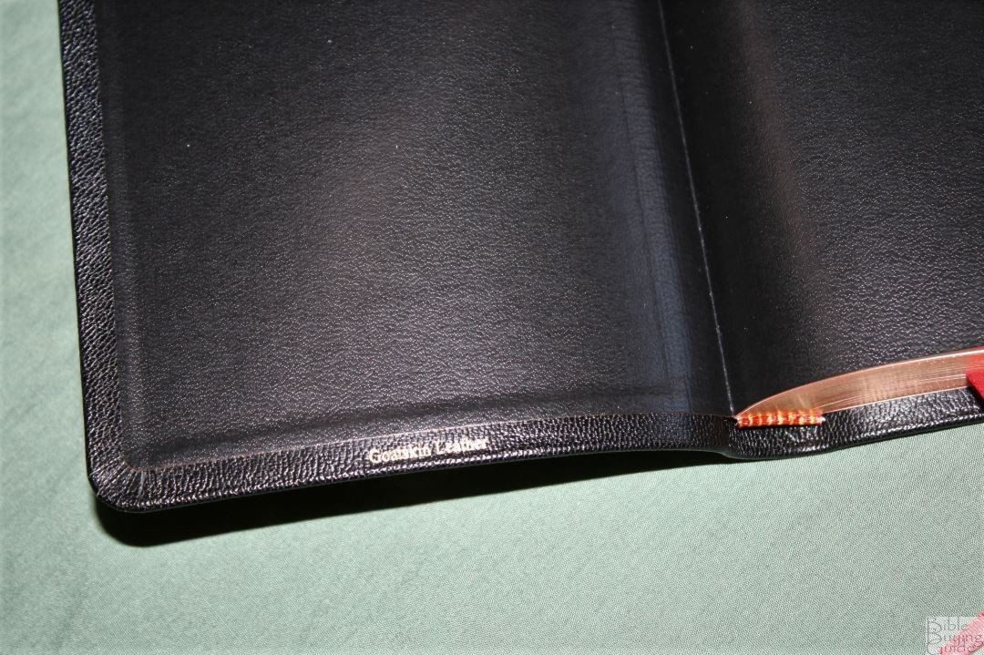
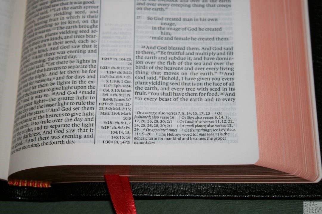
The cover is goatskin with a paste-down liner. This stiffens the Bible and makes it easier to hold and carry. It has a natural grain that looks and feels soft to the touch. It’s sewn and lays open, flat but this cover is stiffer than the other goatskin Pitt Minions that I’ve seen and takes a few more minutes before it lays completely flat. But it will lay flat.

It has a pressed line around the perimeter that gives it some extra style. No words are printed on the front cover. The spine shows Holy Bible, English Standard Version, and Cambridge. It has 5 marks to indicate spine ribs, but it doesn’t actually have raised ribs. The spine is slightly rounded while the text-block is flat.

The goatskin edition has two cardinal red ribbons that are long enough to pull them to the corner and still have something to hold onto.
Paper
The paper is 27 gsm with a slight cream tint. It’s highly opaque doesn’t have enough show-through to be distracting. I had no issues turning the pages.
I’m reviewing this at the end of November. This is the time of year here in TN that I see a lot of page-curl and this one does have it. It hasn’t been so bad that I can’t use it, but it is there at least sometimes.
Typography

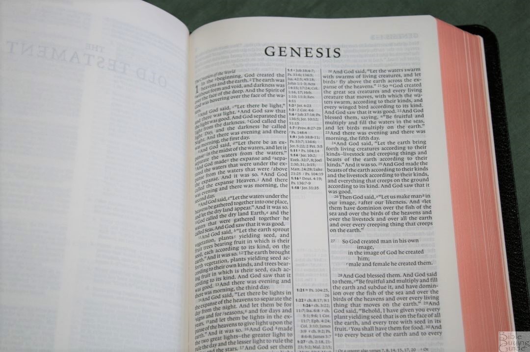
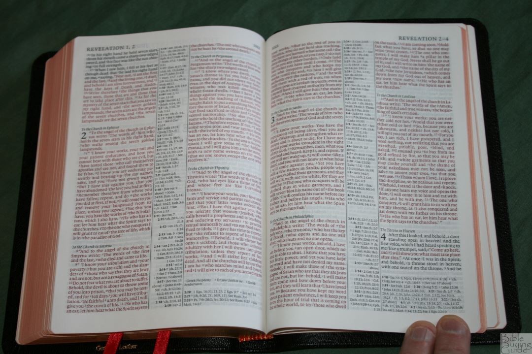
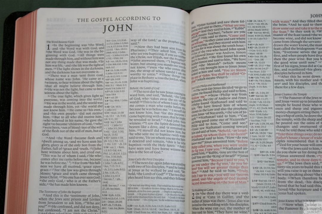
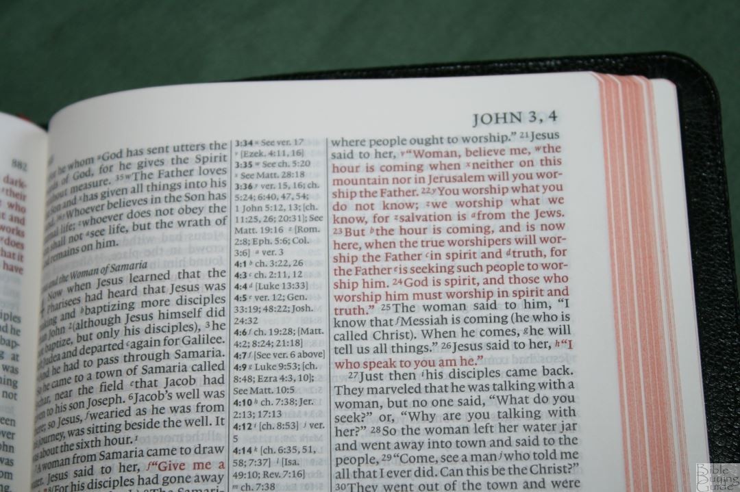
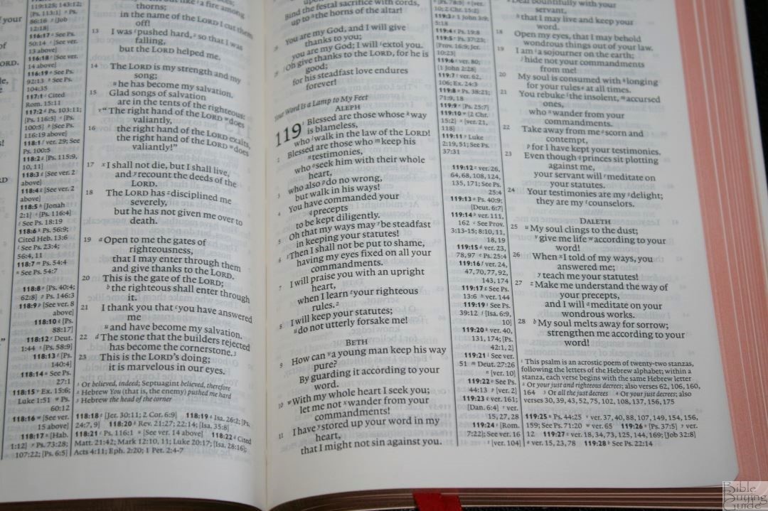
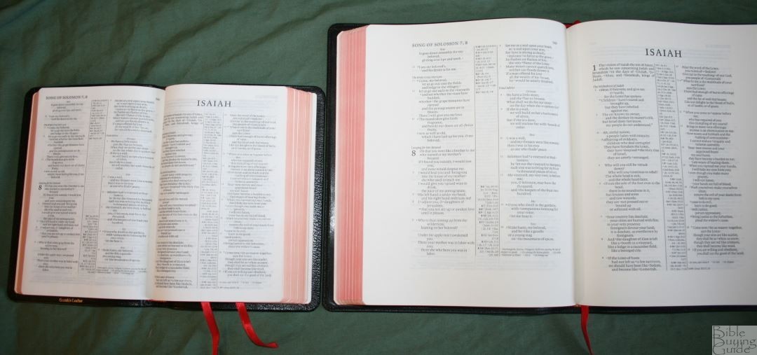
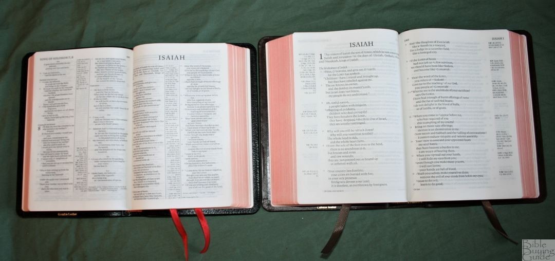
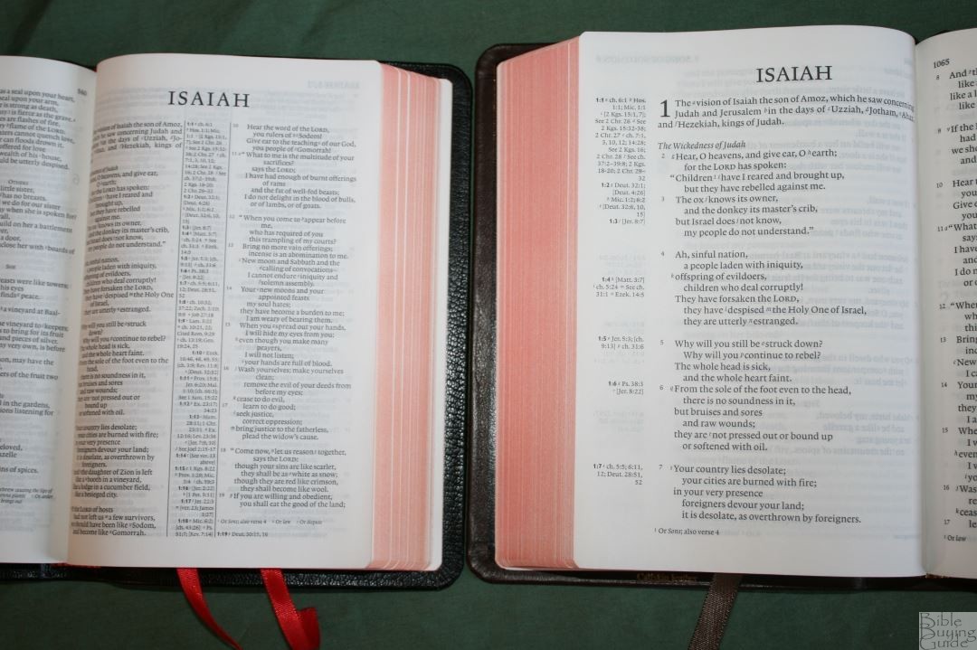
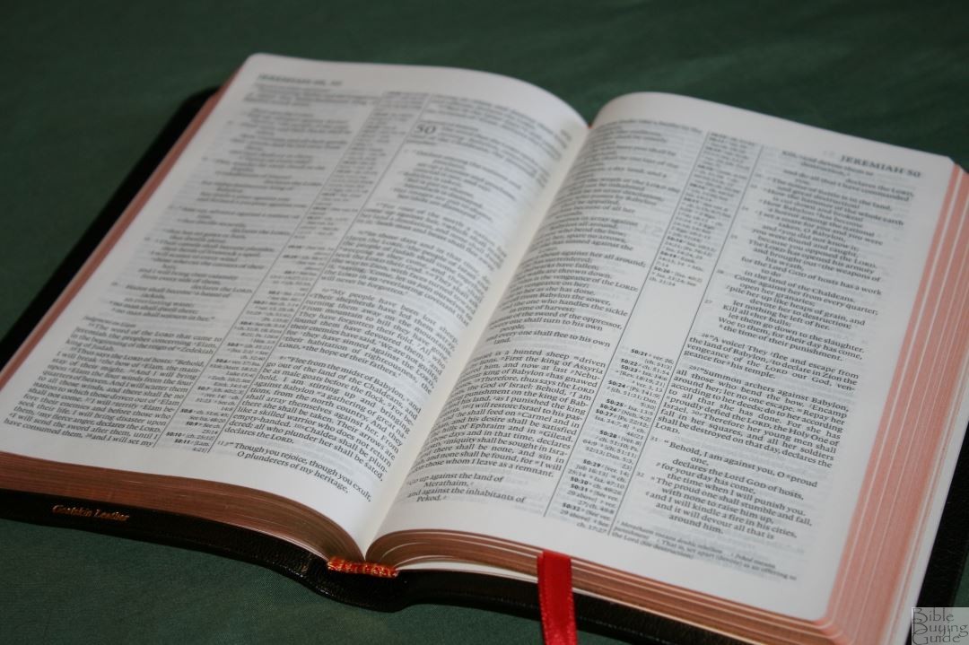
The text is set in a two-column, paragraph layout with center-column references. Poetry is set to stanzas. Poetry suffers a little from the double column format. Many verses have a single word on a line when they could have broken the sentence in a more poetic place like you would with a song.
The text never gets lost in the gutter. You can see it bend, but what little bend there is (due to how thin the Pitt Minion is) isn’t enough to bend the text out of view.
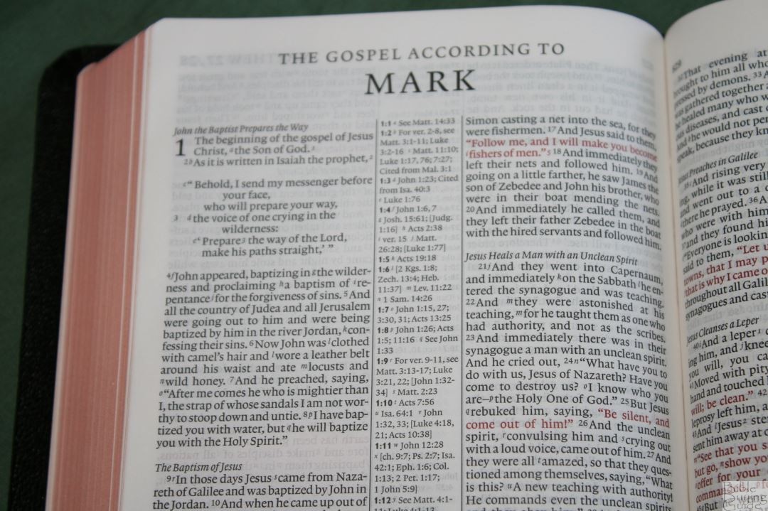
The font is a 6.75 Lexicon 1 with a 7 point leading and is printed with line-matching (the lines are printed in the same location on both sides of the page). The line-matching and the font’s design greatly improves readability. Even though it’s small, the boldness of the print and the opacity of the paper help with readability. It’s small, but not tiny. The lines are a little close for my tastes. This requires a little more concentration to read, but I find it readable and I enjoy reading from it.

The print is consistent throughout the Bible. It’s about a medium darkness or lightly darker and remains readable for hours at a time. I never found myself wanting it darker or lighter. The red is about a medium to medium/dark and is also consistent throughout. I find this shade of red to be highly readable. It never made me want black letter instead.
The verse numbers are smaller than the regular text. This can make it difficult to find verses but it also improves readability. This is better for reading than for study or preaching because it can take extra time looking for a verse.
The pagination is the same as the wide margin edition. I like this because if you’re used to the Pitt Minion then you’ll be used to where the verses are laid out on the page. They make a great combo – one for carrying and reading and one for study, teaching, and preaching.
Columns are 1.7” wide and contain 42-43 characters and around 7 or more words per line. It has 62 lines per page. The columns are a touch smaller than other Pitt Minions that I’ve seen. This is due to its center reference column being wider.
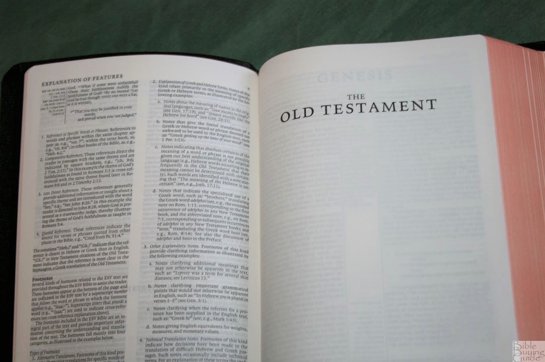
Section headings are in italics. They set the sections apart while at the same time they’re not bold and don’t call attention to themselves, making them easy to ignore. The header contains the book names and chapter numbers that appear on that page over the outer column, and the page number over the inner column. The next book starts on the same page where the previous book ended.
Every now and then I confused a verse number for a footnote. The numbers for footnotes are at the end of a word, but if the words are close it almost reads like it could be a footnote or verse number. They do make them different enough (footnotes are italic). I just have to remember that when reading.
The reference and footnote keys are small enough that they don’t get in the way of reading. Even when reading aloud I haven’t had a lot of stumbles as I have with other reference editions. My personal preference is to have no keys within the text itself, but if they’re going to be there then I want them like the Pitt Minion (and Clarion).
References
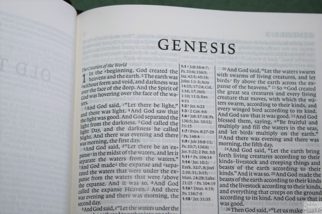
References appear in the center column under the chapter and verse number they correspond to and are keyed to the text with letters. References for verses in the left column are at the top and references for the right column are at the bottom of the center column.
Sometimes there are too many to fit. When this is the case the rest is placed at the bottom of the page under the translation notes, under the last verse in the right column, creating two different places to look for references. I’d like to see them all in the footer or under the last verse (maybe in each column). This would give more space for the text and poetry could look better.
There are a lot of good quality references that cover both words and themes. Here are a few examples of references to help you compare:
- Genesis 1:1 – Job 38:4-7; Ps 33:6; 136:5; Isa 42:5; 45:18; Jn 1:1-3; Ac 14:15; 14:24; Col 1:16, 17; Heb 1:10; 11:3; Rev 4:11
- Deuteronomy 6:4 – Cited Mk 12:29; [Isa 42:8; Zech 14:9; Jn 17:3; 1 Cor 8:4, 6]
- Isaiah 9:6 – Lk 2:11; [Jn 3:16]; ch 7:14; [Mt 28:18; 1 Cor 15:25]; ch 22:22; [ch 28:29]; ch 10:21; Deut 10:17; Neh 9:32; Jer 32:18; [Ps 72:17]; ch 63:16; [Jn 14:18]; Ps 72:7; [Eph 2:14]; see ch 1:6-9
- Matthew 17:20 – [Jn 11:40]; see ch 6:3; ch 21:21, 22; Mk 11:23; Lk 17:6; [ch 13:31]; ver 9; [1 Cor 13:2]; Mk 9:23
- Mark 11:23 – Mt 17:20; [Ps 46:2; 1 Cor 13:2; Rev 8:8]; Rom 4:20; 14:23; Jm 1:6; [ch 16:17; Jn 14:12]
- Mark 12:29 – Lk 10:27; cited from Dt 6:4, 5; Rom 3:30; 1 Cor 8:4, 6; Gal 3:20; Eph 4:6; 1 Tim 1:17; 2:5; Jm 2:19; 4:12; Jude 25; [Mt 19:17; 23:9]
- John 1:1 – Gn 1:1; [Col 1:17; 1 Jn 1:1; Rev 1:4, 8, 17; 3:14; 21:6]; Rev 19:13; [Heb 4:12; 1 Jn 1:1]; 1 Jn 1:2; [ch 17:5]; Phil 2:6
- 1 john 1:1 – see Jn 1:1; [ch 2:13, 14]; Ac 4:20; Jn 19:35; ch 4:14; Jn 1:14; 2 Pet 1:1; Lk 24:39; Jn 20:27
Footnotes
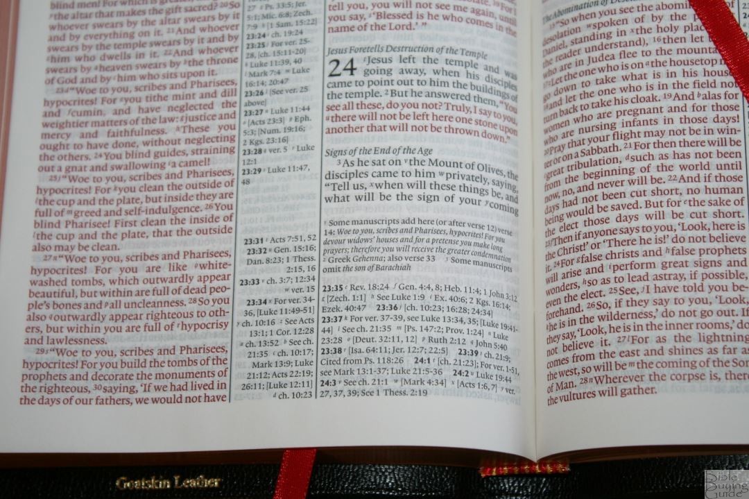
The footnotes are placed under the last verse on the page and are keyed to the text with numbers. They don’t include a reference to verse they go to. It can be difficult to find the verse that something in the notes corresponds to because the numbers in the text are hard to find.
Footnotes include alternate translations, literal translations, Hebrew and Greek terms, special uses of Greek words, the meanings of names, words where meanings are uncertain, clarification of additional meanings, grammatical points, supplied pronouns, English equivalents of weights and measures, and manuscript variations. The footnotes are useful for personal study and for sermon prep.
Concordance
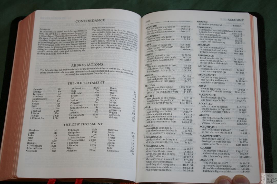
The concordance is 70 pages with 2 columns per page and has lots of entries, although it doesn’t have as many as the wide margin edition that I reviewed last year. It contains 1700 entries and 5900 references. There is a lot of good material here that greatly helps in study and sermon prep.
Sample entries include:
- Christ – 18
- Christ’s – 3
- Christian – 2
- Christians – 1
- Faith – 21
- Faithful – 12
- Faithfully – 3
- Faithfulness – 6
- Faithless – 3
- God – 57
- Godliness – 3
- Godly – 3
- Gods – 3
- Praise – 10
- Praising – 3
- Pray – 8
- Prayer – 7
- Prayers – 2
- Praying – 5
Maps

There are 15 full-color maps complete with an 8-page color-coded index to maps. The colors in the index show settlements, political, physical land, physical water, travel, and Jerusalem.
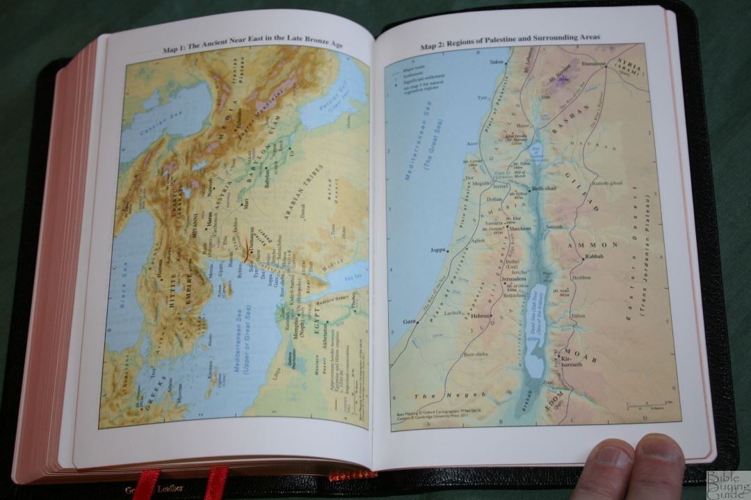
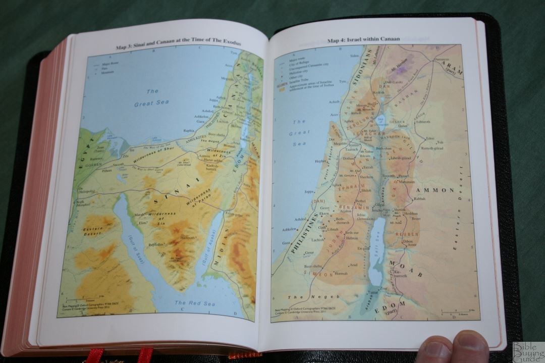
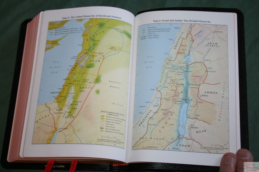
The maps are colorful and printed on thick, non-glossy paper (my favorite paper for maps). They show routes, birders, water, distance topography, vegetation, cities, dates, battle sites, etc.
Maps include:
- The Ancient Near East in the Late Bronze Age
- Regions of Palestine and Surrounding Areas
- Sinai and Canaan at the Time of the Exodus
- Israel with Canaan
- The United Monarchy of David and Solomon
- Israel and Judah: The Divided Monarchy
- The Assyrian Empire
- The Babylonian Empire
- The Persian Empire
- The Hellenistic World after Alexander
- Jerusalem in Old Testament Times
- Jerusalem in New Testament Times
- Palestine in the New Testament
- The Roman Empire
- The Eastern Mediterranean in the First Century AD
Thoughts on Using It
At first, I thought the font would be too small for my eyes, but with my bifocals, I can read it for hours at a time with no issues. The narrow space between the lines (leading) does require more concentration, but I can read it just fine. Its size and weight are great for holding in one hand, which is my preferred method of reading. It never has to be forced open. It lays open and flat in my hand just right.
I carried this Bible everywhere I went and it did everything I needed it to. It isn’t too large and it has all the tools I would look for in a reference Bible. The overall size is so handy that I’m willing to deal with the smaller text. For me, this is the perfect size for a general-use Bible. It’s not really a compact Bible but it does fit snugly in the inside pocket of my suit jacket, making it ideal to carry anywhere including schools, hospitals, Churches, prisons, etc.
The references, footnotes, concordance, and maps make it a great choice for study. For preaching and teaching, I prefer a larger font but I did preach from it a few times without any issues. Finding verses does take an extra second or two though.
Comparisons
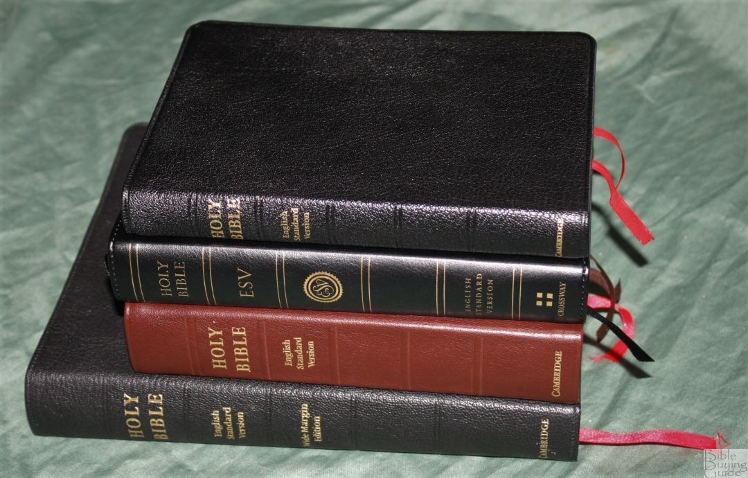
Here are a few Bibles to help you compare. The first is the Cambridge Wide Margin ESV which uses the exact same pagination. The second is the closest Crossway ESV I have to the Pitt Minion – the Personal Size Reference. The third is the other great choice from Cambridge – the Clarion.
Wide Margin


Here’s a look at how the Pitt Minion edition compares to the wide margin edition. Since they have the same pagination they make a great combo – one for carry and reading, and one for study and preaching. It’s available in edge-lined goatskin, or calf split with paste-down liner.
Personal Reference Bible
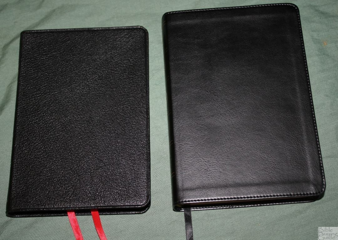


Crossway’s Personal Reference Bible is a small ESV with a similar footprint of thickness. It’s a touch thicker. It has a single column setting with references in the inner margin and footnotes in the footer. It’s a nice little Bible and is very readable, but the paper and cover of the Pitt Minion are much higher quality.
Clarion
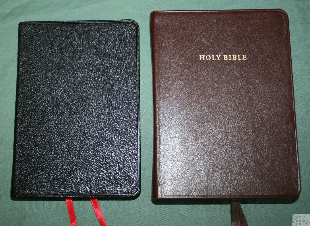
The Clarion is a single column edition with the same font in a larger size. The footprint is the same as the Pitt Minion, but it’s a touch thicker. It uses the same paper and is available in paste-down calfskin or calf split, and edge-lined goatskin. It’s a great reader that’s easy to carry, but it’s not as easy to carry as the Pitt Minion.
Conclusion
The Pitt Minion is one of my favorite Bibles. The ESV edition continues the excellence for a hand-sized reference Bible that’s both portable and usable. The small print will be an issue for some but if you can tolerate small print then this overall size is just about perfect. I’ve become fond of using smaller Bibles and the Pitt Minion feels just right.
The ESV Pitt Minion is a great Bible for carry and reading and the ESV edition is hard to beat. It’s a great all-arounder and I highly recommend it for anyone looking for a high quality ESV reference Bible in a small size.
__________________________________________________
Buy from Amazon
__________________________________________________
Cambridge University Press provided this Bible free for review. I was not required to give a positive review – only an honest review. My opinions are my own.


Very good review. Thanks for including good photos of the maps. In my opinion, the Cambridge maps using Oxford base maps are the best maps I’ve seen in any reference Bible, and rivals those found in study Bibles. Incredibly detailed. The color-coded index really adds to the maps’ usability. I have the ESV Pitt Minion in brown goatskin, and I’ve also had one in calf split leather. Both are great. One question for you though, how did you get the Pitt Minion to lay flat? I can’t get my goatskin edition to do that unless I open the Bible to the middle section. In fact, I can’t even get mine to stay open on the desk until I reach about page 200 (1 Samuel). Did you bend the Bible back a bit to condition it?
Thanks Bruce! I have the same problem. You can see my fingers in several photos where I have to hold it open. It’s much stiffer than my other Pitt Minions.