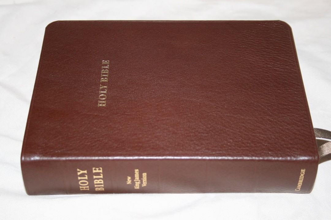
The NKJV Clarion Reference Edition from Cambridge is the latest edition of Cambridge’s popular Clarion series. The NKJV edition keeps the familiar setting that has made the Clarion so popular: sharp digital font, single-column, paragraph layout, reference on the outer margin, all in a durable and easy to carry hand-size Bible.
Pros
- Hand size
- Readable font
- Sewn binding
- Calfskin leather
Cons
- Verse numbers can be difficult to see when searching for verses
Features
- NKJV
- Calfskin leather
- Sewn binding
- 8.75 font
- Black letter
- Single column
- Paragraph format
- Side-column cross references
- Translation notes
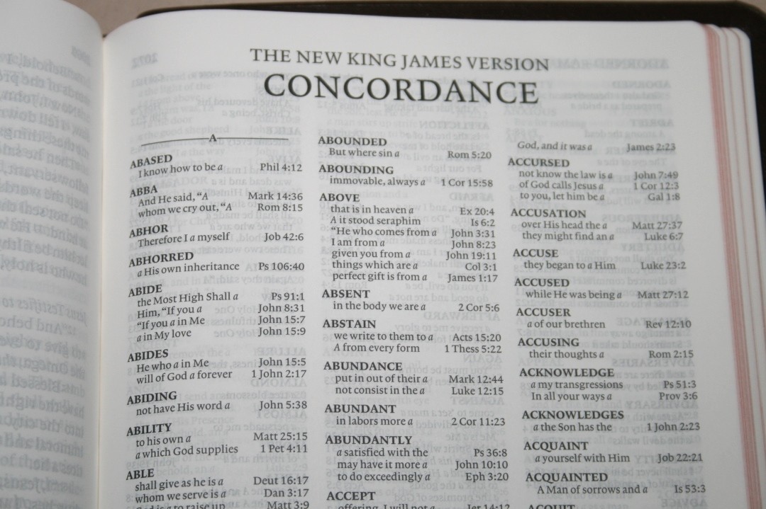
- Concordance
- Section headings
- Preface to the New King James Version
- 15 color maps
- 2 ribbons
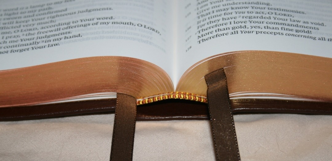
- Art gilt edges
- 2145 pages
- 7.5 x 5.5 x 1.5
- ISBN: 978-1-107-66442-5
- Printed in the Netherlands by Jongbloed
- Price: $106.99~169.99
Where to Buy
Amazon – Cambridge NKJV Clarion
Cover and Binding
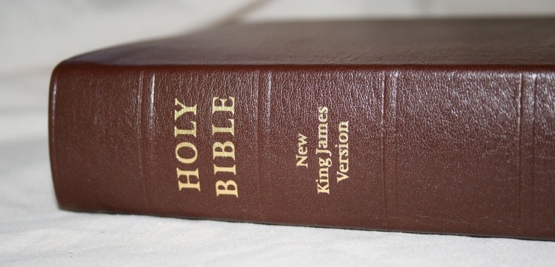
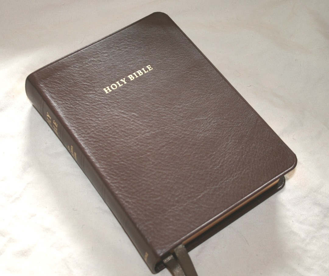
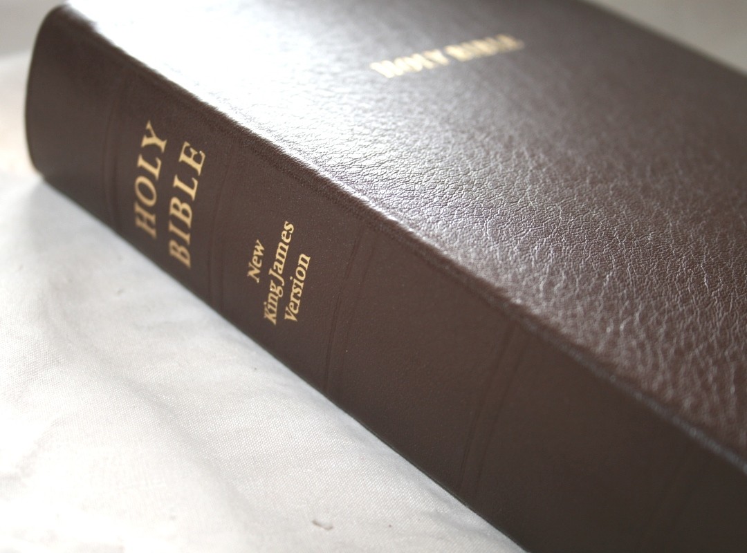
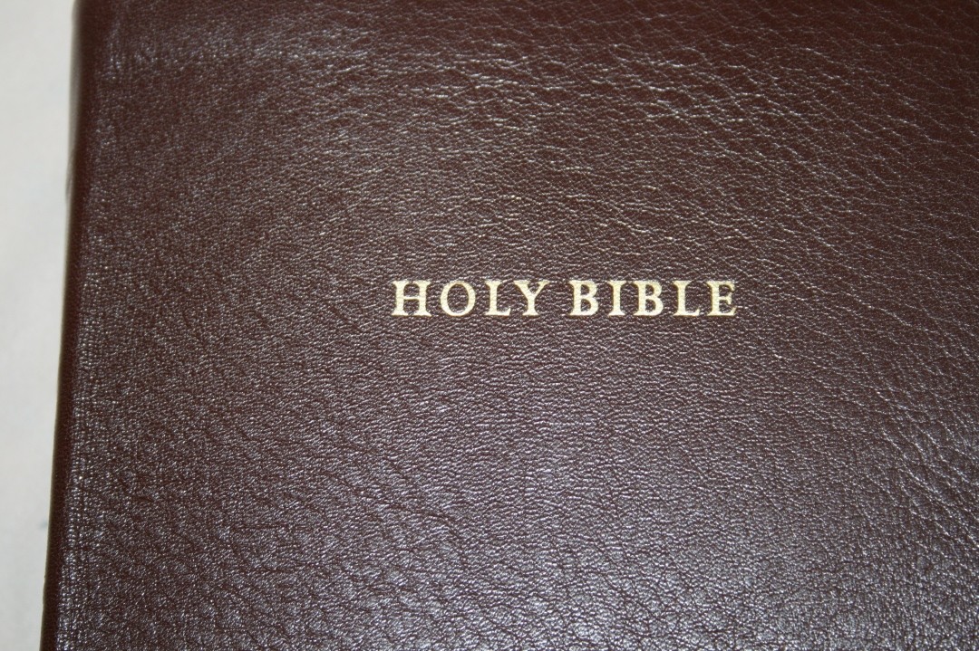
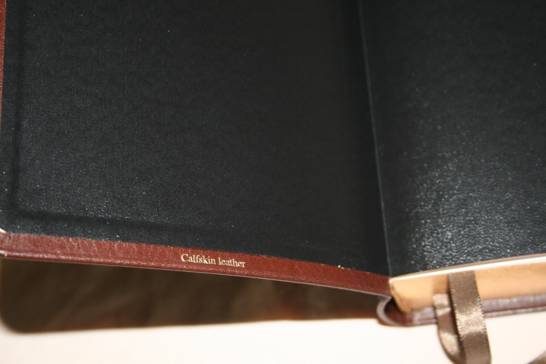
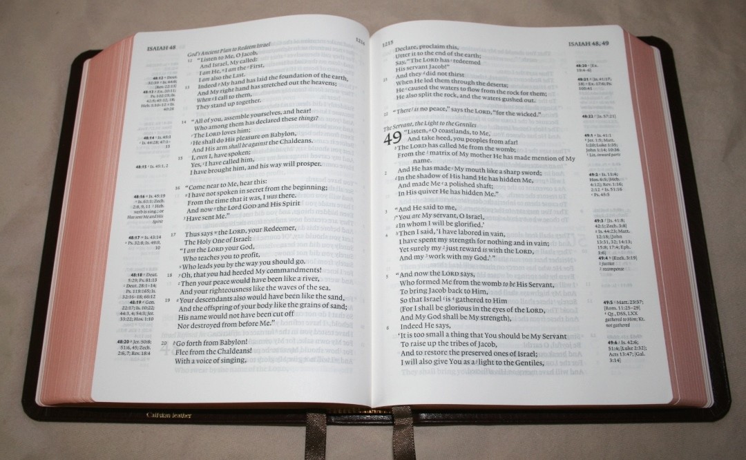
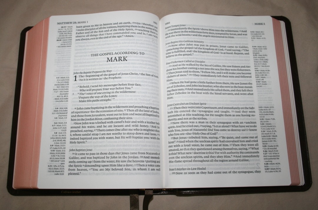
When Baker Publishing asked me which edition I wanted to review I chose the brown calfskin. Goatskin is always tempting, but for a hand-size Bible that I’m going to hold in one hand a read I like the cover to have enough stiffness to allow the Bible to lay flat in my hand. Not like a hard-cover, but not too floppy either. This cover has the perfect combination of soft and flexible with a small touch of stiffness. The cover is a smooth brown calfskin that has just enough grain to give it a textured look and feel. It is very soft. The liner is vinyl. The binding is sewn so it will lay flat even in Genesis 1.
Paper
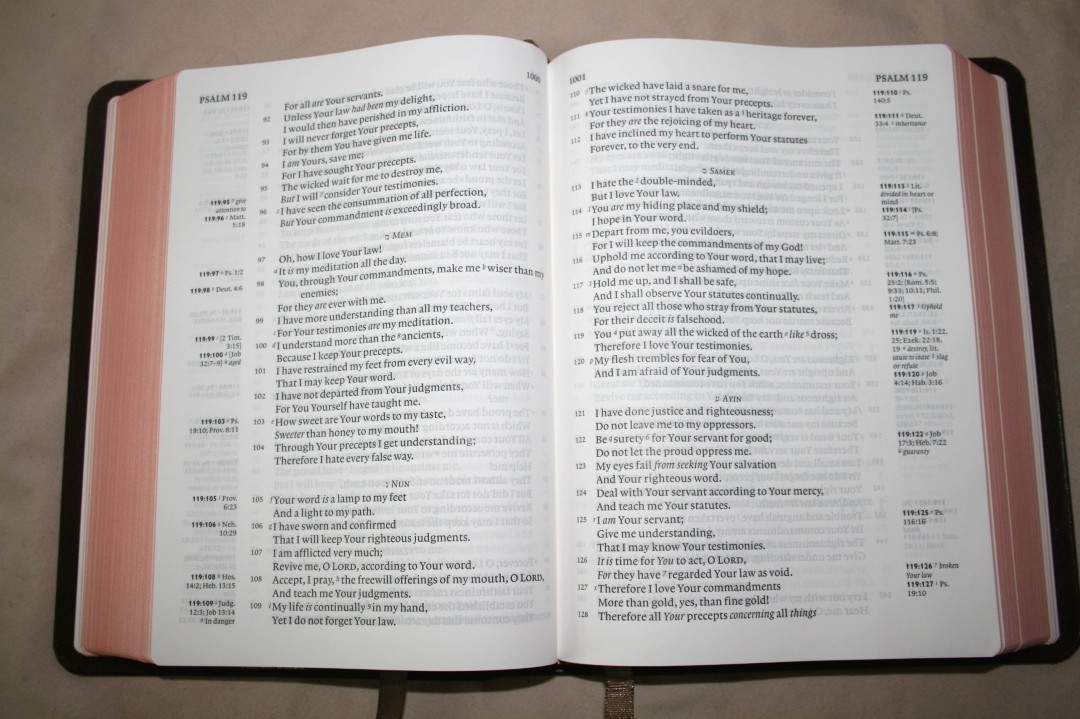
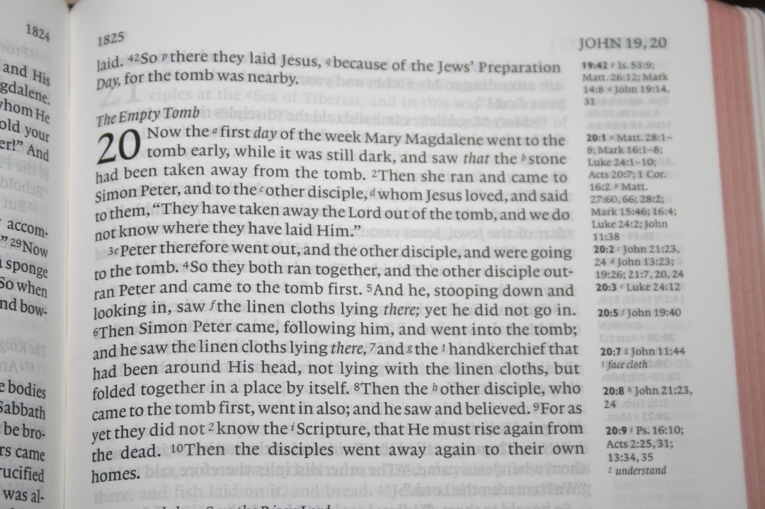
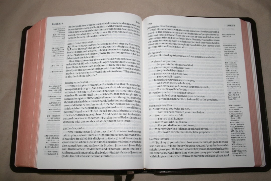
I could be wrong, but the paper feels thicker than the other editions to my fingers. It also looks slightly more opaque (but again I could be wrong). It does not have the curling problems the other editions have. The paper is thin and still does have some show-through, but I haven’t found it to be distracting at all. The paper has a slight cream tint which I like a lot.
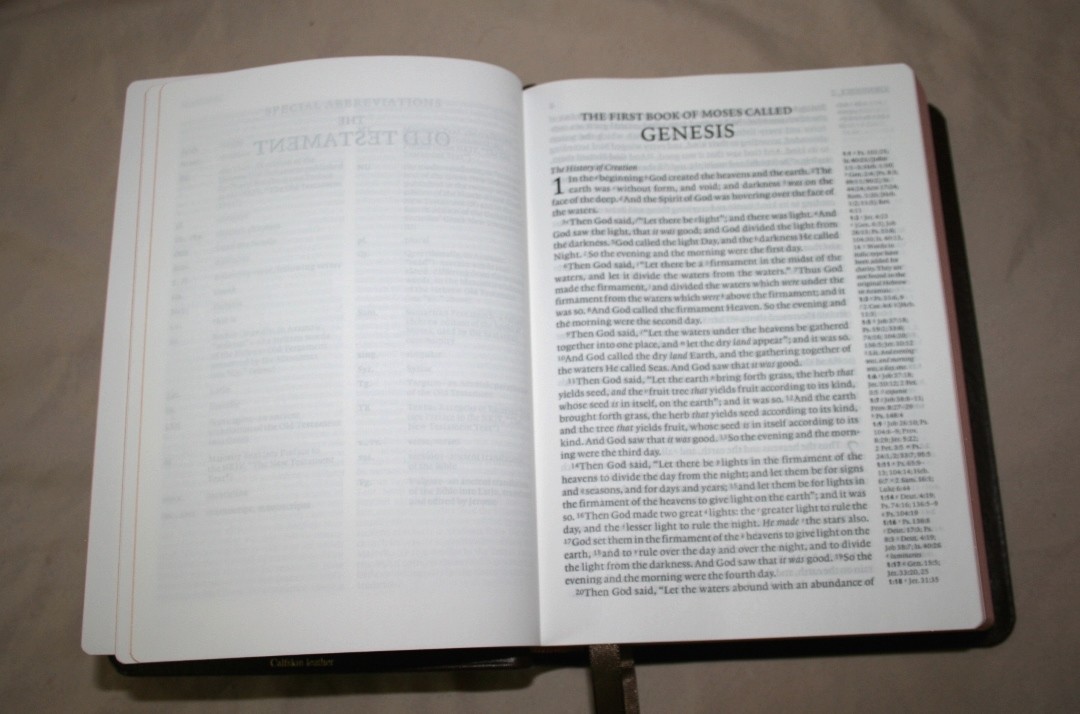
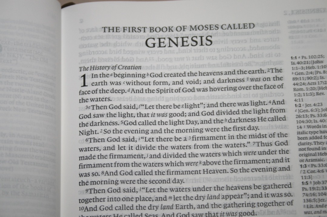
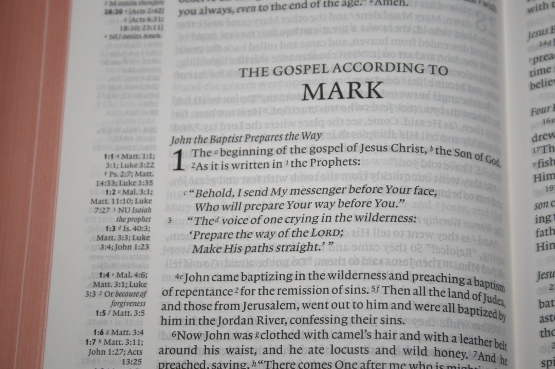
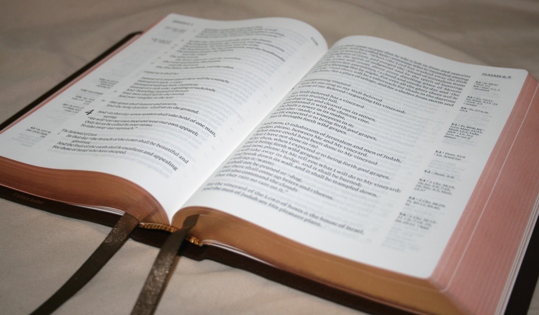
The font is 8.75 Lexicon No. 1 A by Blue Heron Bookcraft. It has a 10.5 leading (the font size plus the size of the space between the lines). This generous leading and sharpness of the font gives the font a larger appearance and makes it, in my opinion, one of the most readable fonts available. It is black-letter and has about a medium boldness. The print quality is consistent throughout. The Clarion uses line-matching printing techniques so that text is printed in the same location on both sides of the page, keeping the page as clean as possible, greatly enhancing readability.
Layout
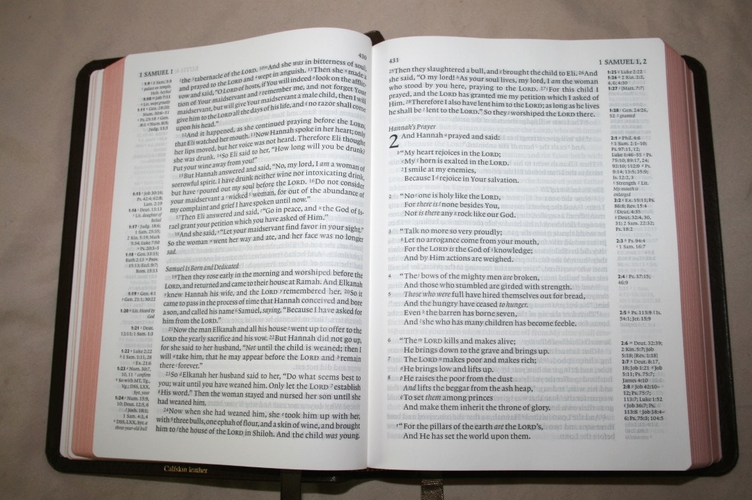
The text is presented in single-column, paragraph format with section headings in the text. Poetry is in verse format and Old Testament quotes are offset and printed in italics. References, along with translation notes, are placed to the outer margins. At the top of the page there are page numbers on the inner margin and book names with chapter numbers on the outer margins.
References and Notes
References are the 1982 standard NKJV references from Thomas Nelson Publishers. There are plenty of references in the NKJV- with 14 references for Genesis 1. References are keyed to the text with letters. The reference in the margin includes the chapter and verse number in bold.
Translation notes are also the standard NKJV notes from Nelson Publishers. I like the NKJV translation notes. It includes notes from the Alexandrian (the Critical Text – which is the Nestle-Aland Greek New Testament and the United Bible Societies fourth edition) marked with “NU-Text”, and the Majority Text marked “M-Text”. These notes show variation between all the major manuscripts. The textual notes are one of my favorite features of the NKJV translation. I’m glad to see the references and notes were included in the Clarion.
Section Headings
The section headings are those included with the NKJV text. The presentation of the headings makes them blend well within the text. They are printed in italics and look to be the same size font as the text. They don’t get in the way, making them easy to ignore, but they’re also easy to use.
Concordance
The concordance is the 1995 New King James Concordance from Thomas Nelson Publishers. It is 75 pages and has 3 columns per page. There are 38 entries for “God”. Although names such as Peter and Paul are not included, there are 23 entries for “Jesus”.
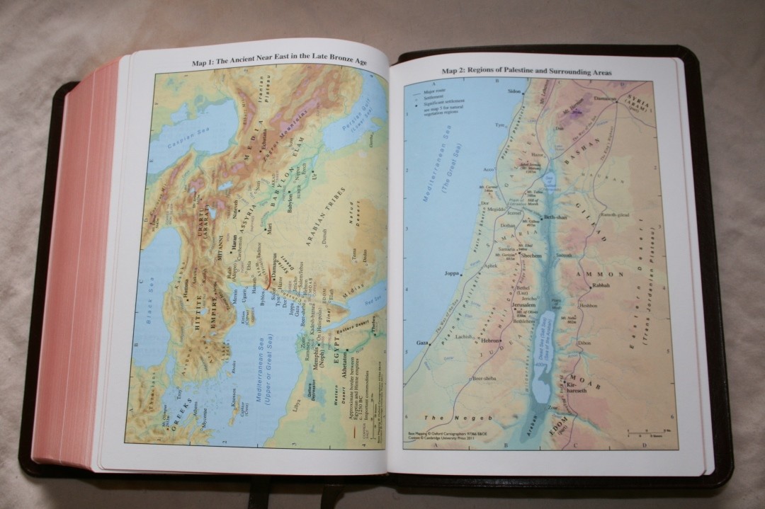
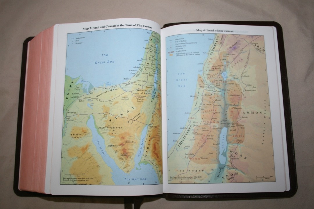
Maps
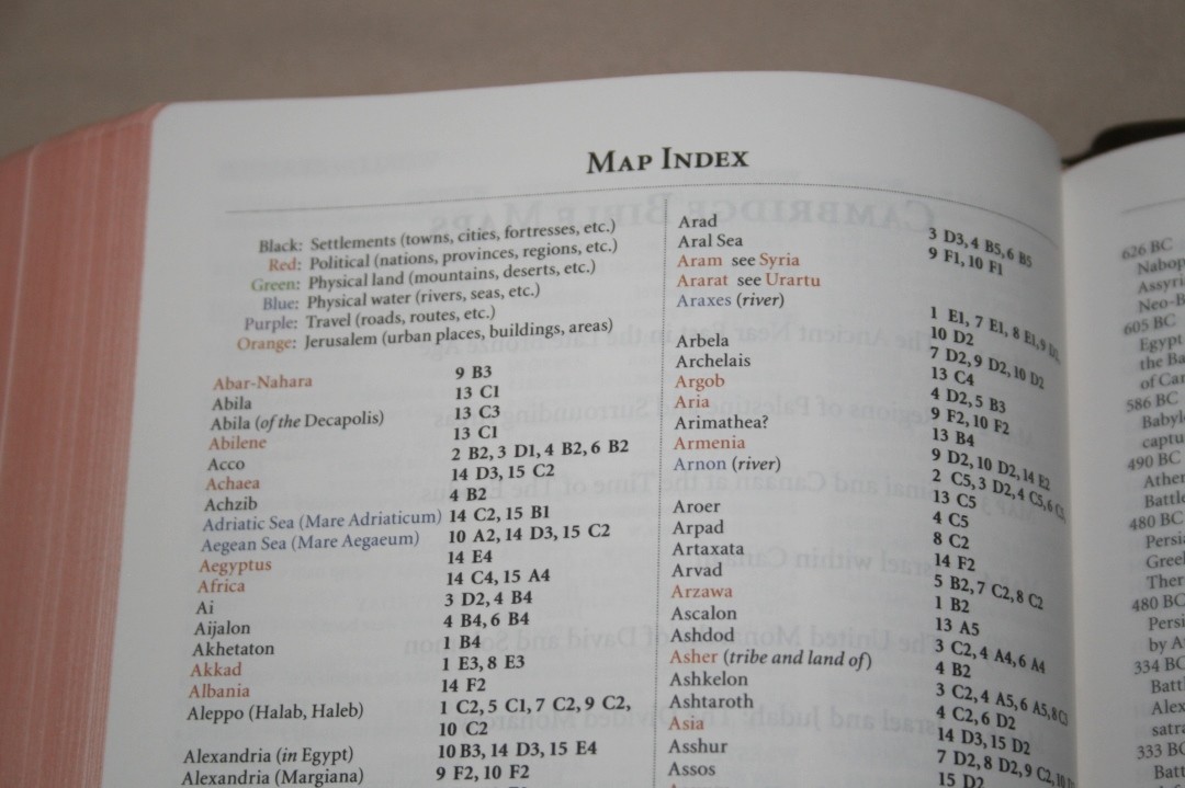
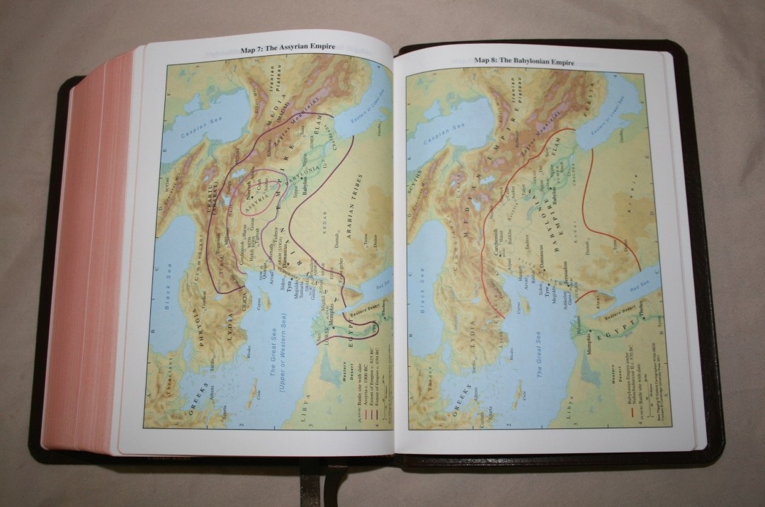
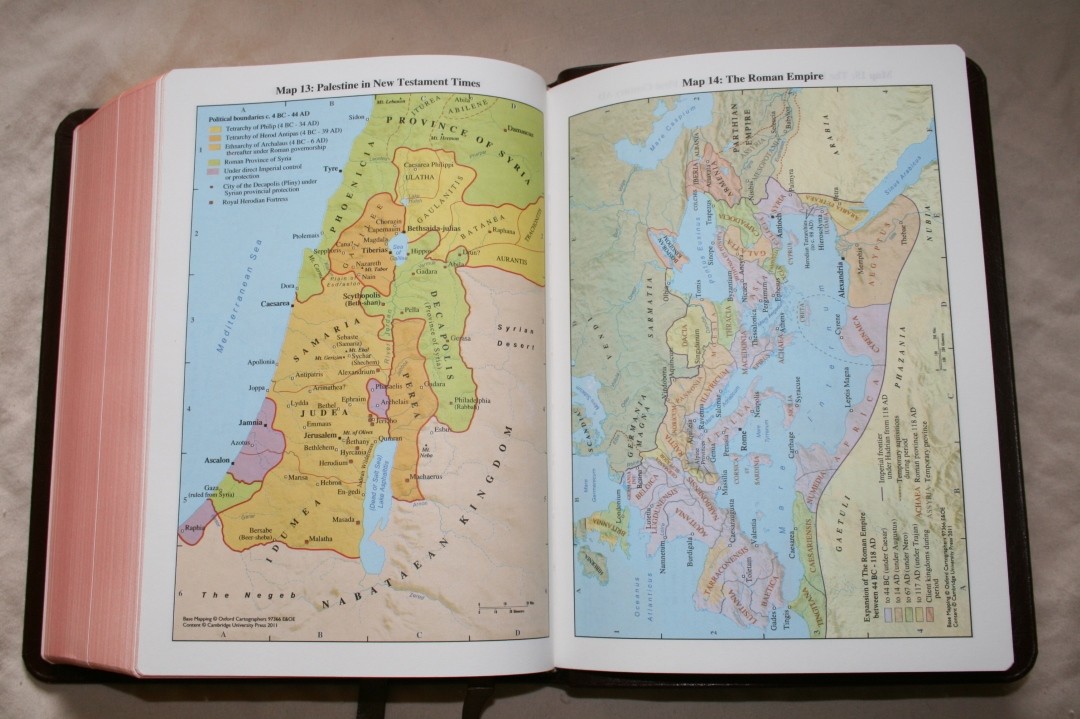
The maps in the NKJV Clarion are different from the maps in the other editions. These are the updated maps found in the 2nd edition KJV Pitt Minion. There are still 15 maps, but they are more colorful. This also includes the updated index to maps, which has a color code for:
- Settlements
- Political
- Physical land
- Physical water
- Travel
- Jerusalem
Maps include:
- The Ancient Near East in the Late Bronze Age
- Regions of Palestine and Surrounding Areas
- Sinai and Canaan in the Time of The Exodus
- Israel with Canaan
- The United Monarchy of David and Solomon
- Israel and Judah: The Divided Monarchy
- The Assyrian Empire
- The Babylonian Empire
- The Persian Empire
- The Hellensitic World after Alexander
- Jerusalem in Old Testament Times
- Jerusalem in New Testament Times
- Palestine in New Testament Times
- The Roman Empire
- The Eastern Mediterranean in the First Century AD
Ribbons
There are two brown ribbons. They are .25 inches wide and are more than long enough to be useful. The ribbons feel like the right size and quality for a Bible this size.
Conclusion
The NKJV Clarion Reference Edition Bible from Cambridge has a lot to offer. It’s the perfect blend of layout, readability, and portability, and it’s a much needed, and welcome, addition to the Clarion line of Bibles. The NKJV Clarion is perfect for reading, study, and carry; and I can easily recommend it for teachers, preachers, and laymen.
Where to Buy
Amazon – Cambridge NKJV Clarion
Baker Publishing provided this Bible free for review. I was not required to give a positive review- only an honest review. My opinions are my own.











Great review. One question. I can’t tell from photos. Is the art gilt red or brown? Some times it looks brown other times, red.
Thanks Dave. The art gilt is red. Thanks for pointing that out. I need to make more color adjustments :0)
Bummer. I really have a hard time with Red. Just looks odd to me. Oh well.
If you buyt the split calf in black instead of the goat or brown, then there is not colour under the gilding
If you buy the split calf in black instead of the goat or brown, then there is no colour under the gilding
Great review!! I bought this very Bible and loved it. However, mine did, in fact, haved the dreaded page curl problem. Baker Book House, who is the distributor for Cambridge, does not consider the page curl problem to be a defect. I have returned mine and they have graciously agreed to, at least, try to find one that does not have the problem. If you want a very nice NKJV Bible, buy it. But, beware of the page curl problem.
Hi Frank. Thanks for letting us know.
Forgive my ignorance; I may be asking a question for which the answer should be obvious. I am new to quality bindings.
First, some info: I want a small or personal size lightweight Bible for daily reading that is very soft and pliable and has excellent readability for my older eyes. I am considering the Clarion.
I want either NKJV or NASB. I’m much more familiar with NKJV and probably won’t be able to make myself change to NASB, but the NASB is said to be the more accurate translation.
My question: From reading other reviews here, I understand that the black goatskin edition is the only one that is edge bound. Does the brown calfskin have a book board cover under the synthetic lining? I want a very supple Bible but I don’t especially like the look (or price) of the black goatskin. I can do without the sewn edges but I don’t want a stiff cover that has to be broken in. I’m very careful with my things and would feel like I was damaging it. The besf-bound Bible I’ve had is an inexpensive (on sale) 1984 NIV in Renaissance leather, which feels absolutely fabulous to me. If I could find a NKJV or NASB in Renaissance, I’d be fine with that. But I can’t, so here I am looking at much more expensive Bibles. I am not a Bible collector, so this will probably be my one and only expensive Bible purchase.
Any thought on NKJV vs NASB in general, and specifically re the Clarion editions? Any other suggestions?
Also, any recommendations for a personal size in verse format edition in NKJV, for church carry. The suppleness wouldn’t have to be quite as good for that one, but I still don’t want a stiff binding. I have trouble quickly locating passages in paragraph format during church services. The Bible I’m using is falling apart.
Many thanks! I’m glad I found this very helpful website. God bless…
Hi cec. The Clarion is an excellent choice. I’m not sure if the brown calfskin has a book board under the synthetic lining. If it does it is very thin. It’s similar to calf-split and french morocco, but a lot thinner. I don’t think it would break in very easily. I’ve had the KJV and ESV Clarion’s since they came out and they feel about the same stiffness as when I got them (but I don’t use them everyday). If you want a flexible cover I really think the goatskin is the better choice.
As far as NKJV vs NASB I like the NKJV because it’s very readable and it’s what I’m used to, but the NASB is more accurate. If I were choosing one just for study I would consider the NASB, but if I were using it for both reading and study I would go with the NKJV. Evangelicalbible.com has a good chart that shows the accuracy of translations:
http://evangelicalbible.com/shop/index.php?main_page=index&cPath=179
The Clarion is my favorite NKJV, but another NKJV I would consider is the Holman:
http://evangelicalbible.com/shop/index.php?main_page=index&cPath=45_197
It’s in verse format but it’s a little larger than you’re looking for. The RL Allan edition is awesome:
https://biblebuyingguide.com/allan-king-james-version-classic-reference-edition-black-highland-goatskin-review/
I’m starting to get used to using the NKJV Clarion in paragraph format and the size of the Clarion can’t be beat for carry and reading.
Randy
Thank you so much for your reply and the links, Randy.
I’ve looked at both the Holman and the Allen. They are a bit larger than what I had in mind, but I’m probably being too picky. The Allan is awesome, but sooo expensive. I guess I could justify the expense if it were to be both my reading and church Bible.
I think the Holman might work for my church Bible, but not sure about for daily reading. How nice is its cover? The genuine leather covers I’ve seen are stiff as boards.
I almost can’t put my Renaissance NIV down because it feels so good in my hands! I’m not against the 1984 NIV translation, btw, but want a more literal one. I don’t know why other (reasonably priced) publishers don’t use that type of leather.
Most reviews say that paragraph form is really the better and easier way to go for daily reading. But, I’m wondering how much difference that would make. ??? Also, the Clarion’s size is more like what I had in mind, but the font is smaller.
Regarding which translation, I’m now thinking of buying the Zondervan NASB Study Bible later, for study. Is that a good study Bible? Recommendations for a better one? (I want one that includes additional factual info and clarification, not someone’s advice or position.) It’s under $60, so I could still get a new NKJV to replace the one that’s in such bad shape.
How well do you think the Allan (NKJV) would function as my daily reading Bible? I think the font would be easier to read than the Clarion, but the verse format less so–but then I’m not sure if the format matters “that” much. Is it a lightweight Bible?
I would appreciate any and all thoughts about the NJKV Allan vs the Clarion for use as my primary Bible. decisions, decisions…
Again, thanks.
The NASB Study Bible is amazing. I have been using it since late last year and it is my daily carry Bible, even though it is large due to the study aids. I just recently bought the Cambridge NASB Clarion in calfsplit and the size is easier to tote, and I am growing to like the paragraph format. I am thinking of getting the NKJV Clarion now…
Hi Randy,
I am hoping you can help me out! I am DESPERATELY trying to find a QUALITY bound NKJV Bible with margin room to make notes. An ‘all in one” Bible that will be my ONLY Bible (i.e. not one Bible for reading, another for study, etc…)
The Cambridge wide margin is huge (and I’ve heard the text is small and cramped in it anyway). I LOVE the concept of the Clarion but it appears that writing notes in it is not possible. Do you know of a quality bound, NKJV with room to write notes that isn’t a behmoth of a Bible or poorly bound??? Thanks!
Dave
Hi Dave,
Unfortunately, the only quality NKJV that I’m aware of with writing room is the Cambridge wide margin:
https://biblebuyingguide.com/cambridge-wide-margin-hardcover-nkjv/
I’ll look around. If I find anything I’ll let you know. I’d like to have this Bible too.
Randy
Hi Randy,
So I purchased the new Schuyler NKJV. WHAT AN AWESOME BIBLE!!! It’s single column. Has WONDERFUL goatskin leather. Has a very unique font and paper. Art-gilded edges. 3 ribbons. And ample margin space to make notes. The one draw back? No cross references! Sigh… once again so close and yet so far away from ‘the perfect Bible’. 🙂
Hi Dave,
I know how you feel. There are several Bibles I could point to and say it would be perfect if it had just one more feature. The problem is that we’re not being petty… we really do need that one more feature. If you feel like writing a review of this Bible I’ll be glad to post it.
Thanks Randy! Much appreciated! Let’s keep on praying for a Wide Margin Clarion! 🙂
So I got my NKJV Brown Calfskin and absolutely LOVE IT! Thought I still wish it was half an inch bigger in each direction to allow for notes. 🙁 But the one draw back on an otherwise perfect Bible is the insistance on starting new books on the same page as the end of the prior book. WHY do publishers do this?? The Bible is 66 separate ‘books’. Doesn’t it make sense to start each book on its own page? I just don’t understand why publishers do this?
I’m glad you like it. This one is my daily reading Bible and one of my favorite Bibles ever. I like the way I can hold it in one hand. It’s small without really losing anything (except wider margins). It would be awesome to have wider margins. I’ve also complained about books not starting on their own page. It really can’t save that much paper. I also think that paper in the back for writing should be standard.
Thanks for the quality reviews! I have benefitted in reading a number of them, and your pictures are especially helpful.
Just wanted to comment on this particular Bible, which I did end up getting (in the brown calfskin leather) that mine had the page curling problem. Sometimes it does, sometimes it doesn’t, I’m guessing related to either embient temperature and or humidity. Sitting on an airplane the page would actually roll up on itself when the air stirred. Just a heads up for anyone. I know you try your best in the reviews, and during your time with this edition it just didn’t show up.
Hi Chris. Thanks for your response and kind comments. I’ve came to the same conclusion that the pages curl with air-flow and maybe temperature or humidity. Mine has curled when I’m sitting in a room with an air conditioner or sitting in the car with the windows down. I’ve also had it to curl with the heat on. I’ve recently seen this problem with other Bibles including the Pitt Minion, Cameo, and even the Schuyler KJV (but only slightly). Some days there is no curling at all and some days it’s annoying beyond belief. I do wish that I had seen the problem during this review. I’m planning to add an update.
Randy
Thanks for your review. I founded it to be very informative. Much blessings.
Does this bible have any room for taking notes or is this basically for reading.
Hi Nate. There is no room for taking notes. It does have good references, footnotes, concordance, and maps, making it a good Bible for reading, carry, and study.
This looks like a fantastic Bible! Thank you for this great review, I will probably buy it!
Randy,
I have a Thompson Chain reference bible which has references off to the side does this bible have about the same amount of references? is there as much blank space as well?
Thanks.
Hi Shawn. It probably has about the same amount. The Clarion has cross references, so it can take you to several verses – forwards or backwards – for the same topic. The Thompson has chain references which only take you to the next verse in the topic. The Clarion has the standard Nelson NKJV references and there is a lot of them, but I’m not sure how many. Thompson has 100,000, so it probably has more. I think the Thompson more space due to the width of the column of text. Thompson might take an inch of height for a single verse. If there are two chain references you might have .5 inches left to write in. The Clarion is paragraph format and has a much wider column of text. In that same inch of height you might have 2 or 3 verses. By the time you have multiple cross references for 3 verses the room is taken up. There is a little room here and there. I haven’t seen the NKJV Thompson, so I can’t make a direct comparison.
Hello,
I had another question. I take trips to tropical places for mission work, such as Fiji. With the thin paper would the humidity ruin this bible if I used it in such conditions?
Hi Shawn,
Excellent question. I’m not sure what kind of effect it would have. I’ve asked my contact at Cambridge. I’ll post the response here when I get it.
Hi Shawn. Here is the response I got from Cambridge:
“Yes it could well cause the leaves to expand and distort and possibly ultimately break the binding. The nature of the paper and its thinness makes it more liable to ‘suck up’ moisture.”
I appreciate their honesty in this.
Randy,
I am looking for a NKJV reference bible. I looked at the Clarion and the font just isn’t large enough for my 60 year old eyes. What good quality NKJV do you recommend that has at least a 10 pt. font? I prefer a leather bound edition. Thanks.
Mark
Mark,
This is the best I’ve found that comes close. It has a 12-13 point font but it’s bonded leather: http://www.christianbook.com/nkjv-center-column-reference-bonded-leather/9780718015787/pd/015789?event=HPT
I like this one by Holman, but it’s only a 9-point font: https://biblebuyingguide.com/holman-nkjv-large-print-ultrathin-bible-review/
There are several personal size large print editions, but they only have a few references here and there. If I find any others I’ll post the links here.
Randy
I’ve just spent the afternoon in Cambridge’s bookshop, comparing the bibles. I would have bought a goat skin clarion but for these niggles:
The text block wasn’t uniformly shaped head and tail. One end might be nicely rounded while the other was flat or even bulging out the other way, leaving a gap between headband and cover
Gold lettering was a hit hit and miss on one copy I saw. Flaking!
While the split calf lining was neatly covering the turnedover corners, on the goat skin version it didn’t cover the little notches cut to make the corners of the cover neat, and I worried they’d lift over time. Very compressed but you could see all the structure I like a lining to cover that.
Impressed at font clarity, even though small if my old eyes, it didn’t fell it.
Just bought a brown calf skin.
Discount price, but a few nobly bits, so maybe it was a second? A graze on the back cover, could have been done while the animal was alive, I’m not sure. This bible has a healed stripe, very appropriate.
There was a lump inside the leather on the front edge of the spine which I thought might be a stitch knot, as it was level with one of the stitching holes. Turned out it was a nob of hard glue. I managed to dislodge it with a fine knitting needle. It lodged on the other side but I managed again to poke it out. Slight depression where it was but I’ve got rid of the giant braille effect which would have driven me nuts!
The brown paper, stuck over the stitching and ribbons is bunched over the (rather bunched) ribbons, causing a slight kink in the headband, which does disturb the lie of the pages at the foredge. I’ve complained about this before, and seen several wonky edged clarions on display, but I think this binding is generally just to soft that the merest thing sends it off. But I don’t think a foredge should be convex, however you cut it.
But anyway, it’s clear, legible despite my +2.75 reading prescription, and not ostentatious in the brown. I am having to buy quality bibles because of the ink smell (lack of) and feel they can look a bit fancy, so this is good. Classic but not too obvious. I couldn’t take my Schuyler Quentel to bible study. Too grand.
VERY glad of the black text NKJV.
I now understand from another review on here and recognise that the calf and split calf bindings are Paste off and the goat is edge lined, hence the differences.
Right, this is my reader and I’m going to be brave and mark it! EEK!
Thanks for all the info here, it’s such a great help
I own this exact bible and I really like it. Great for carrying around. While there is no room for notes, do you think underlining and highlighting is a good idea?
I have the wide margin Cambridge NKJV but it’s just too big to carry around all the time, plus I wish the font were a little bigger. I prefer the Clariion.
I wonder how it stacks up against the Schuyler Quentel NKJV.
Hi Tommy. I’ve seen a few with underlining. For pictures you can see the article Can You Write in a Cambridge Clarion? I haven’t tried it myself. I prefer thicker paper for marking, so I wouldn’t recommend it based on my own personal preferences.
As far as comparing it to the Schuyler Quentel, I have a few comparison photos that I’ll post as an article. They both have their advantages. The Quentel has thicker paper and a larger font, but also is larger and heavier. The Clarion has a lot smaller footprint and is easier to carry, but has a smaller font and thinner paper. I prefer the Clarion for holding and carry, but I prefer the Quentel for reading and preaching.
Thanks, Randy. I may pick up a Quentel. I’ve been tempted for a while, now.
I highly recommend it. I’ve posted the comparisons.
Are there any blank pages for notes in the Schuyler, like in the front or back of the book?
It has two thick end-sheets in both the front and back and 1 blank page of Bible paper, making 10 pages for writing counting the front and back of the page.
Thanks, Randy.
Hello Randy,
I’ve had the Open Bible Edition, KJV red letter (Jesus words), in brown calf’s leather, by Nelson.
It has study guides, a Biblical Cyclopedic Index, Interesting & unusual facts about the Bible, First mentioned things in the Bible, Teachings & illustrations of Christ, Prayers of the Bible, Prophecies of the Messiah Fulfilled in Christ, The Parables Jesus told, The English History of the Bible, The Greatest Archaeological Discoveries of the 20th Cent & their effect on the Bible, An outline history of the Apostles, A Guide to Christian workers, The Laws of the Bible, Concordance, and plenty of pages for personal notes, Maps of the Holy Land etc…it is an amazing Bible!
I cannot find another one anywhere…and I’d love it in the NKJV or the NSAB if possible. Could you tell me if this is available? I’d like one for myself and my daughter.
Thank you sir.
God Bless You. Debra
Hi Debra. Unfortunately I don’t think they make it in NASB. They do have it in NKJV, but I’m not sure if the current edition still has everything yours did. You can see it here: NKJV Open Bible at Amazon, NKJV Open Bible at Christianbook.
I enjoyed going through the comments and your reply. Is Cambridge Clarion NASB Bible available? If so what would be the price?
Could you put up a picture from the Bible Companion on Job and 2 Peter so people can make an informed judgment concerning the publisher’s comments whether or not they want to buy this bible?
Do you mean for the KJV? The NKJV doesn’t include a Reader’s Companion.
I didn’t know that. Yes, for the KJV.
Thanks. I’ve added the photos to the calfskin KJV review (and changed the image size while I was at it). I’ll add it to the goatskin KJV review soon. I appreciate the suggestion.
Thanks! It looks like the NKJV Clarion has been discontinued. Christianbook.com does not have it anymore. Amazon only has left the black calf-split.