
Cambridge has just released their popular KJV Cameo in two new goatskin covers- blue and green. Both include three ribbons, leather liners, and art-gilt that matches the color schemes. In this Bible review, I’ll take a look at the blue Cameo, model KJ456:ZRE, ISBN 9781009158022, made in the Netherlands by Royal Jongbloed. I’ll also compare it to several Cambridge Bibles and a few from other publishers.
Cambridge provided this Bible in exchange for an honest review. I was not required to give a positive review, only an honest one. All opinions are my own.
_________________________________________________________
This Bible is available at (includes some affiliate links)
and many local Bible bookstores
_________________________________________________________
Table of Contents
- Video Review
- Binding
- Paper
- Typography and Layout
- References and Footnotes
- Concordance
- Bible Atlas
- Comparisons
- Conclusion
Video Review
Binding
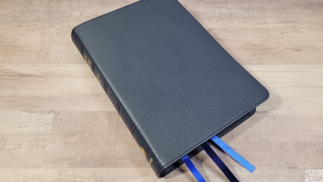
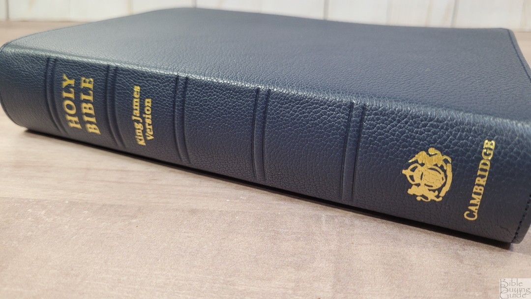
The blue is very dark. It’s much darker than the blue Turquoise. It has a raised pebbly grain and it’s soft and flexible while remaining flat in the hand. The front cover has no printing. The spine has 5 spine hubs and the text is stamped in gold. The gold looks elegant against the dark blue. The spine is slightly rounded, which is my preference for spines. Fortunately, this doesn’t create a deep gutter when the Bible is opened.
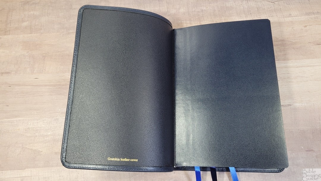
The liner is edge-lined with Shakira calf split leather. It’s more flexible than the previous edition which had a synthetic liner. The block is Smyth sewn. The edge-lined tab is a little stiff. It does stay open in Genesis, but it will need some more use before it stays open completely flat in Genesis.
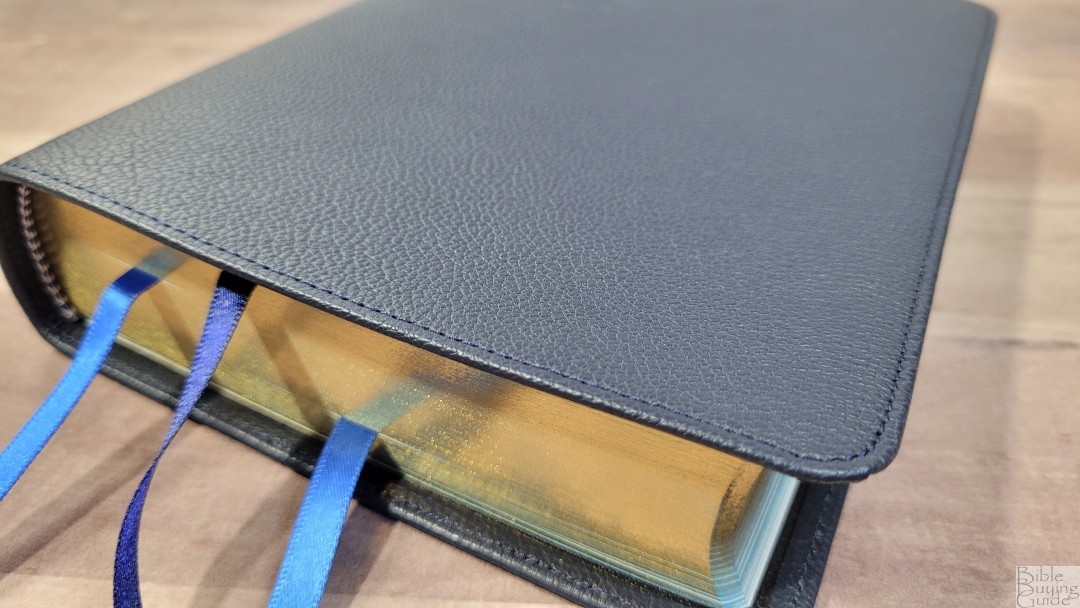
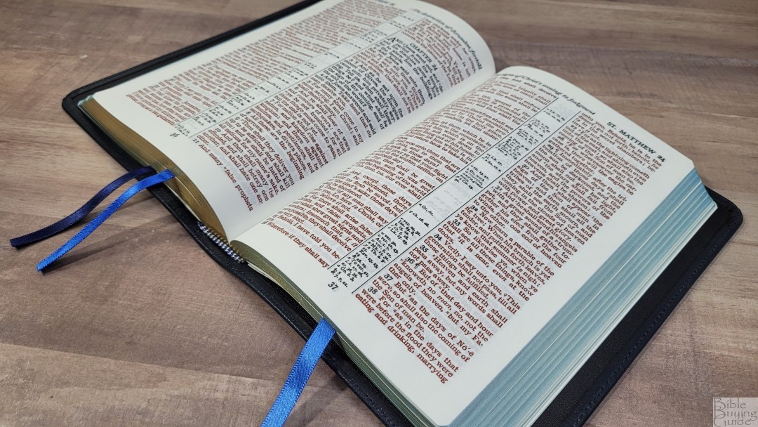
Cambridge has upped their game with ribbons. The blue and green Cameo’s have three ribbons in multiple shades that match their covers. The blue has a dark blue ribbon, a dark/medium blue ribbon, and a ribbon with a medium shade of blue. They’re .25″ wide and come 2″ out of the Bible. This is enough length to easily pull it to the corner to open any page. The three ribbons don’t get in the way of each other and the length and width feel natural for the size of this Bible. The head and tail bands are white and blue.
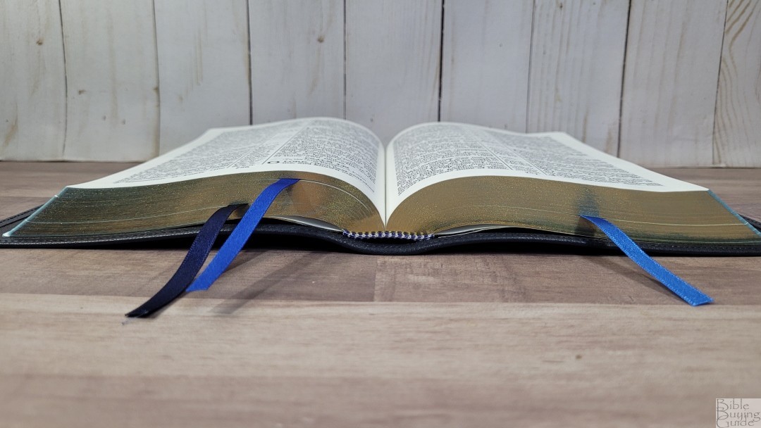
The overall size is 5.25 x 7.5 x 1.378″ at the spine. It weighs 1 lb, 6.2 oz. This is the perfect size for carrying and traveling.
Paper
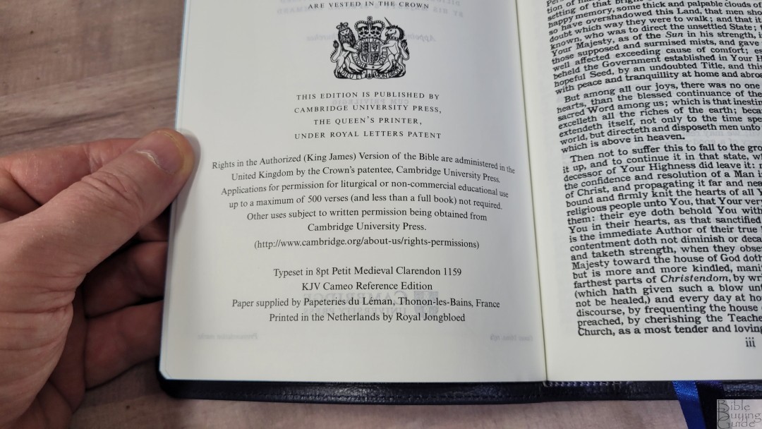
The paper is the same 28gsm Indopaque from France. It has a white eggshell color with a slight cream tint that’s great for reading. It’s highly opaque due to the titanium pigment. Showthrough is very minimal even with the bold font. The paper’s texture is smooth to the touch. It looks and feels elegant. There is no glare under direct light.

The page edges are art-gilted with blue under gold. The blue looks aqua, which goes well with the blue cover and ribbons, but it’s also a stark contrast since it’s the only blue that’s this light of a shade. It matches the blue Topaz.
Typography and Layout
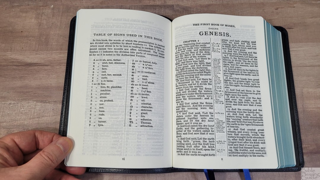
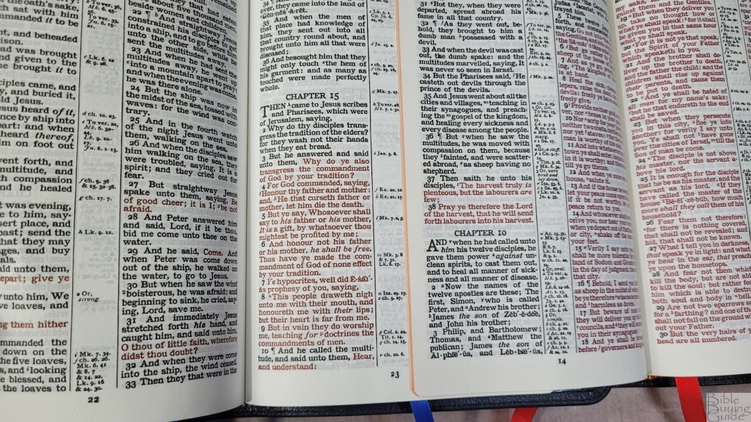
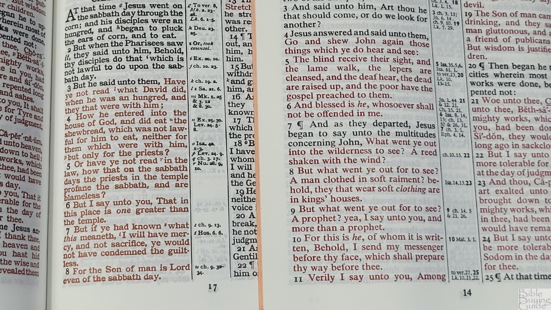
The 1769 KJV text is presented in a double-column, verse-by-verse format with center-column references near the verses they correspond to. Each verse is slightly indented to make them easier to find. The header includes the book name and chapter number in the outer margin and a summary for each column in italics in the inner column. The footer has the page number in the center.
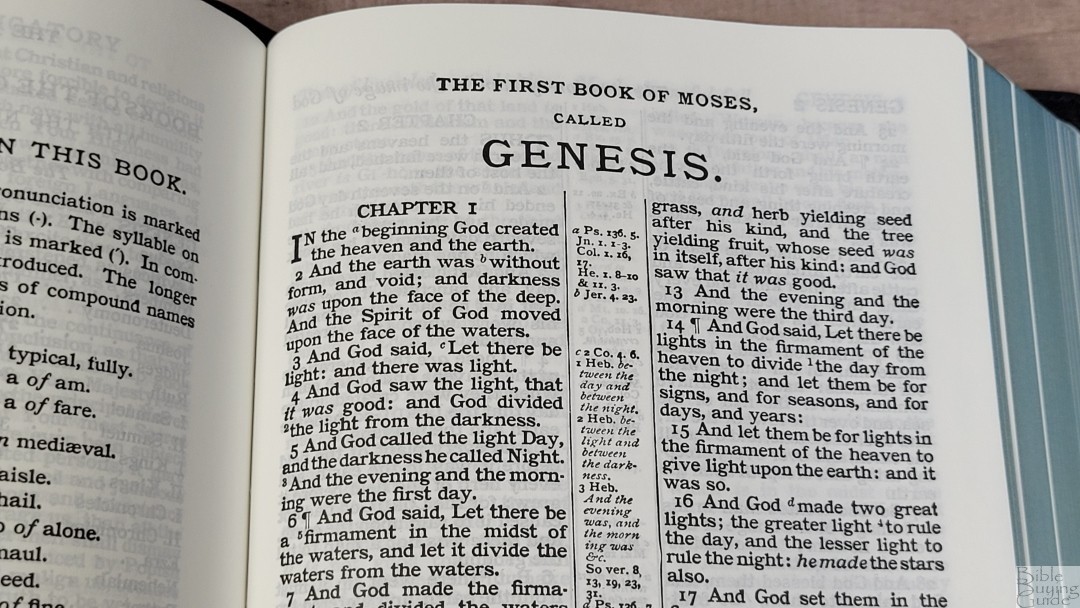

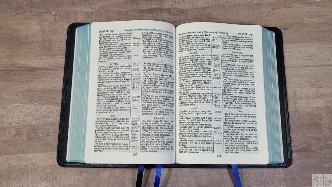
The typeface is an 8-point Petit Medieval Clarendon. The lines have around 5-7 words on average. This is an old hot metal press setting. It’s bold and the type is thick, so there might be a few letters that fill in more than others. It was typeset by hand around 100 years ago. There are a few lines here and there with words that are almost too close and a few with extra space to get them to fit on the page. This is a red-letter edition of the words of Christ while on Earth. This doesn’t include Revelation. The black and red letters are bold and dark. This is my favorite red for red-letter Bibles.
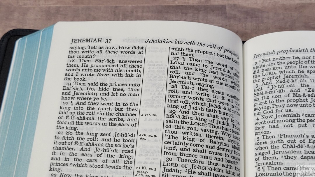
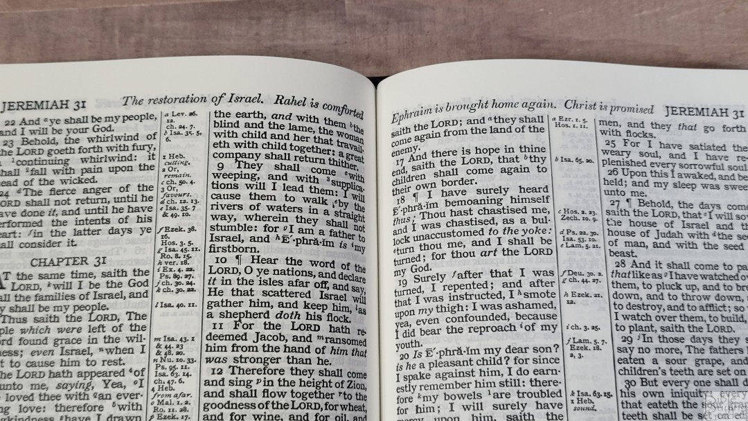
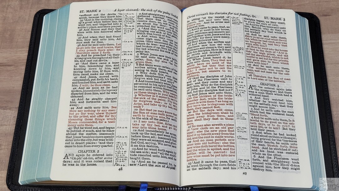
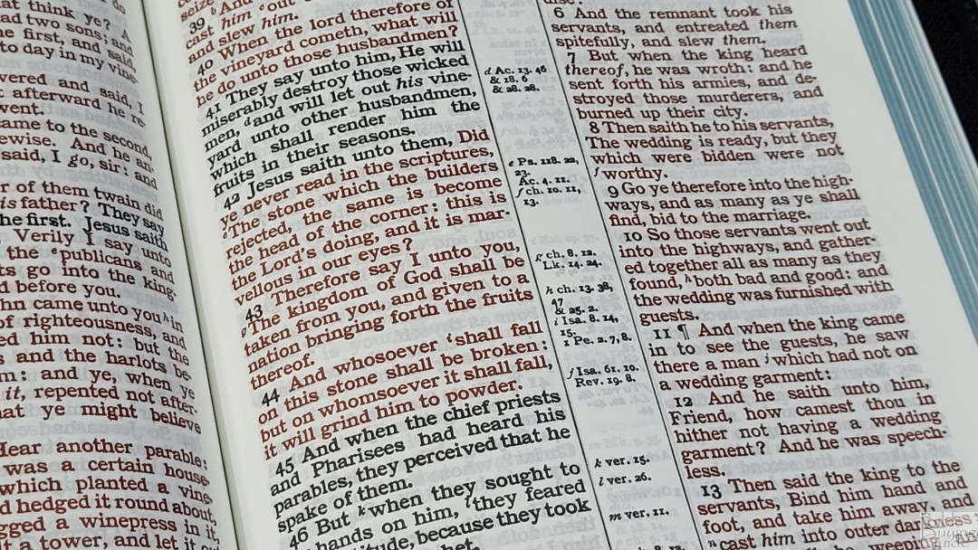
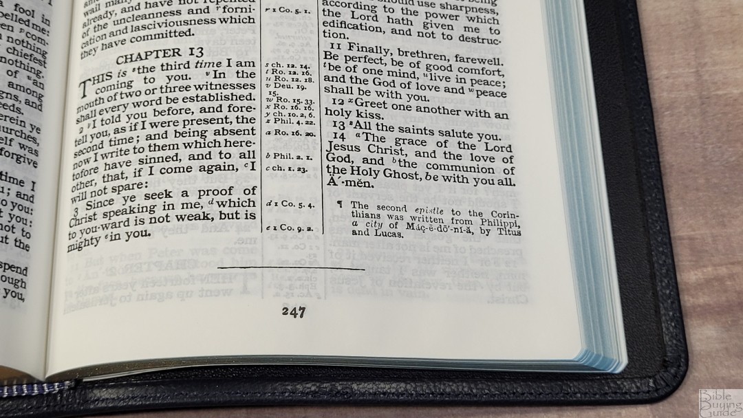
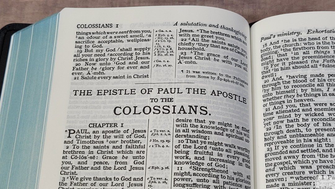
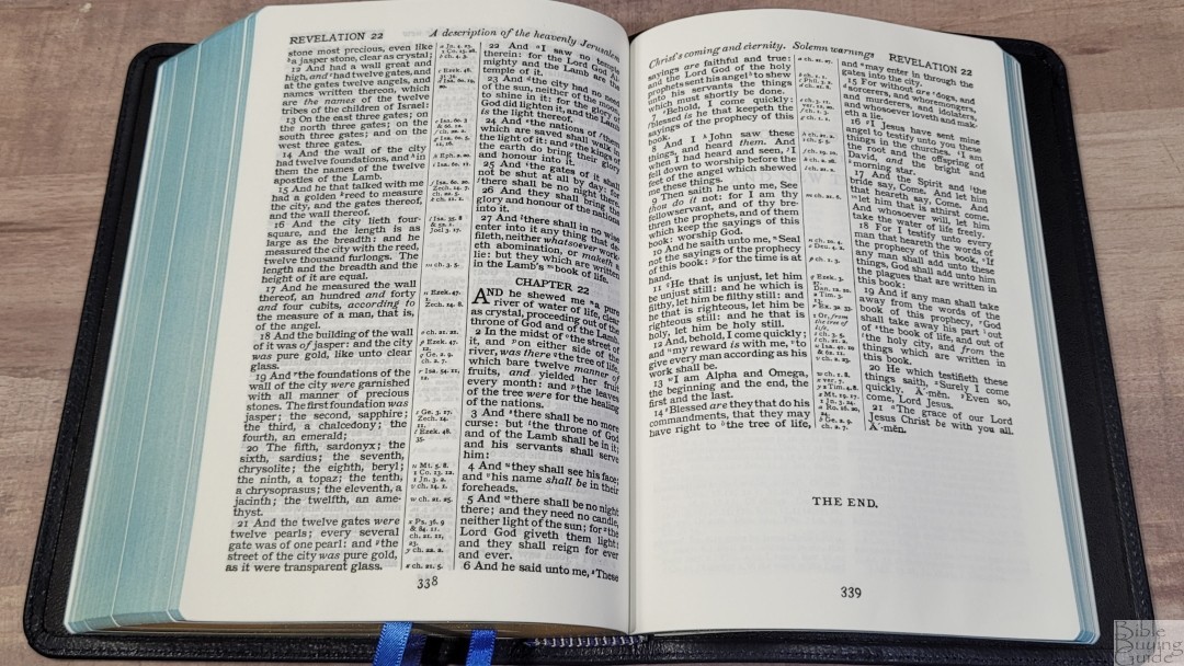
This text does not include line-matching. This Bible was typeset before line-matching was needed- back when the paper was ultra-opaque at 22gsm. The text includes self-pronouncing marks. This does affect readability in my opinion, but it is helpful for studying and reading aloud. The inner margin is large enough to bring the text out of the gutter. Pilcrows are used for paragraph markers through Acts 20. Supplied words are in italics.
References and Footnotes
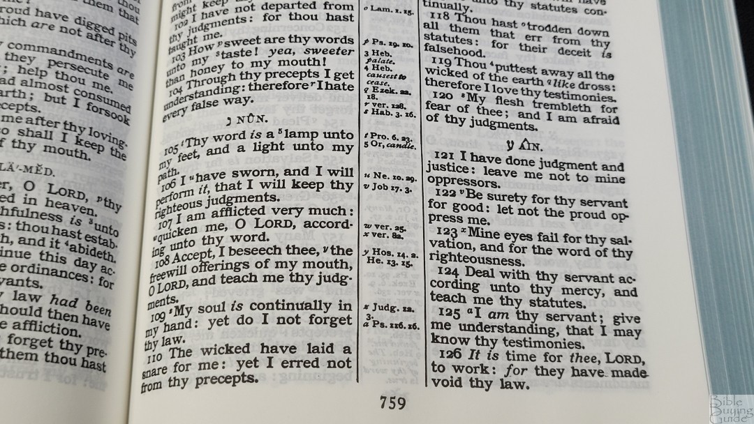
The cross-references and footnotes are placed in the center column near the verses they correspond to. References are keyed with letters and footnotes are keyed with numbers. They’re labeled from left to right across the column with the highest point first. So, you might have an a and b for a verse in the left column, a c for a verse in the right column, and a d for the same verse in the left column. It’s easy enough to use, but it is different from today’s designs. Since the Cameo did have an edition with the Apocrypha, there are a few references to the Apocryphal books even though this edition does not include the Apocrypha.
It has a good amount of references for study and sermon prep. Here are a few example references to help you compare:
- Genesis 1:1 – Ps 136:5, Jn 1:1-3, Col 1:16-17, Heb 1:8-10, 11:3, Jer 4:23
- Deuteronomy 6:4 – Mk 12:29, Isa 42:8, Jn 17:3, 1 Co 8:4, 6
- Isaiah 9:6 – Lk 2:11, ch 7:14, Judg 13:18, Eph 2:14
- Matthew 28:19 – Mk 16:15, 16; Is 52:10; Lk 24:47; Ac 2:39; ch 18:20
- Mark 12:29 – Deu 6:4-5
- John 1:1 – Gen 1:1, ch 17:5, Col 1:17, 1 Jn 1:1, ver 14, Rev 19:13, 1 Jn 1:2, Phil 2:6
- John 3:16 – Rom 5:8; ch 1:18
- Acts 2:38 – Lk 24:47, ch 3:19, 20:21, ch 8:15-16, 22:16, Mt 26:28, ch 10:45
- Romans 10:9 – Mt 10:32; Lk 12:8
- 1 John 1:1 – Jn 1:1, ch 2:13-14, Rev 1:2, Jn 1:14, Lk 24:39, Jn 1:4
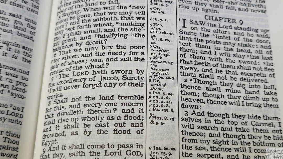
The translator’s footnotes include information on the original languages and alternate renderings. They don’t help with words that have changed in meaning, but they’re still helpful for study and sermon prep.
Concordance

The concordance is 137 pages with 2 columns per page. This is the same concordance that’s used in the Turquoise. The main entry is in a semi-bold font and the references are printed in a paragraph format. I find the paragraphs a little difficult to follow, but this does allow for more entries without taking up a lot of space. Words with more than one part of speech include an abbreviation for the part of speech and have a different entry for each one. For example, the word Praise shows the noun and verb separately and they’re marked with (n) or (v).
Here are a few examples with their number of entries:
- Christ – 36
- Christian – 3
- Faith – 54
- Faithful – 27
- Faithfully – 3
- Faithfulness – 6
- Faithless – 4
- God – 76
- Goddess – 3
- Godhead – 3
- Godliness – 4
- Godly – 2
- God-ward – 3
- Praise (n) – 11
- Praise (v) – 14
- Pray – 45
- Prayer – 22
Bible Atlas
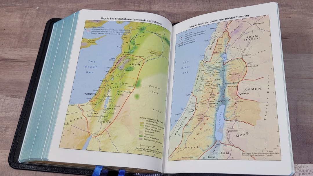
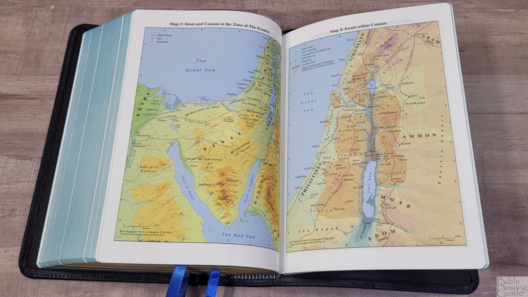
In the back are 15 pages of maps printed on thick non-glossy paper. They’re extremely detailed and colorful. They include borders, import commodities, dates, routes, passes, settlements, distance, topography, mountains, cities of refuge, cities, tribes, vegetation, kingdoms, battle sites, satrapy, city walls, city gates, older city walls, seven Churches of Asia, and lots more.
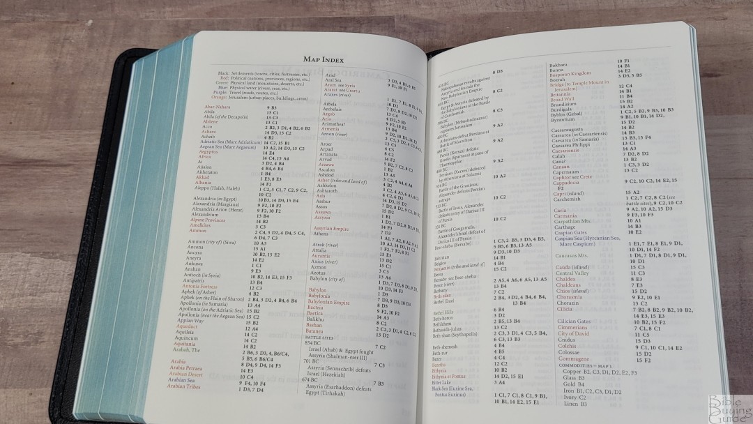
It also includes an 8-page color-coded map index printed on the same paper as the maps. They show the settlements, political (nations, provinces, and regions), physical land, physical water, travel, and Jerusalem. This is one of the best indexes available. I’m glad to see it included because it makes the maps much easier to use.
Maps include:
- The Ancient Near East in the Late Bronze Age
- Regions of Palestine and Surrounding Areas
- Sinai and Canaan at the Time of the Exodus
- Israel within Canaan
- The United Monarchy of David and Solomon
- Israel and Judah: The Divided Monarchy
- The Assyrian Empire
- The Babylonian Empire
- The Persian Empire
- The Hellenistic World after Alexander
- Jerusalem in Old Testament Times
- Jerusalem in New Testament Times
- Palestine in New Testament Times
- The Roman Empire
- The Eastern Mediterranean in the First Century AD
Comparisons
Cameo in Black Goatskin
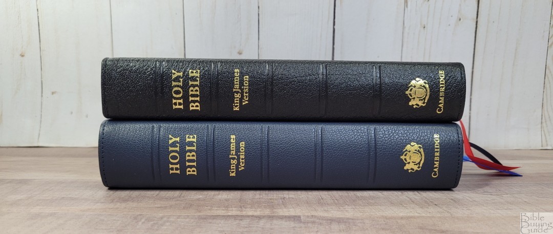
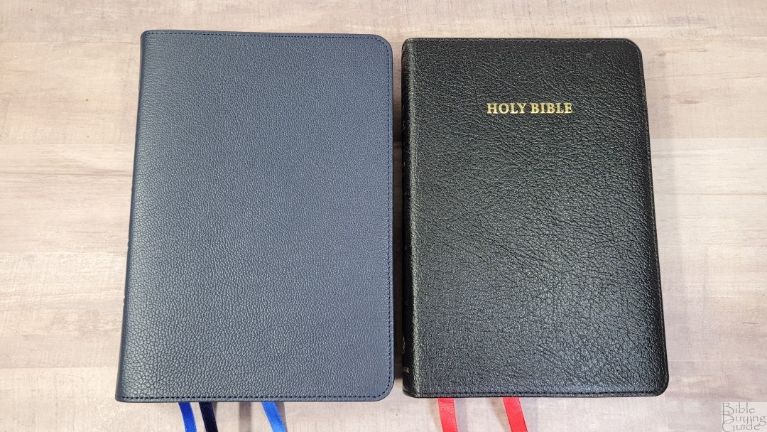

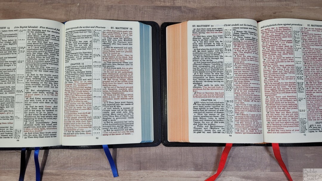
My original Cameo from 11 or 12 years ago has a goatskin cover, but it has a synthetic liner. This makes its cover stiffer and it won’t stay open as easily. The liner is starting to show wear. The paper and print seem to be the same. I much prefer the leather liner and three ribbons of the newer edition. It’s a worthy upgrade.
Concord
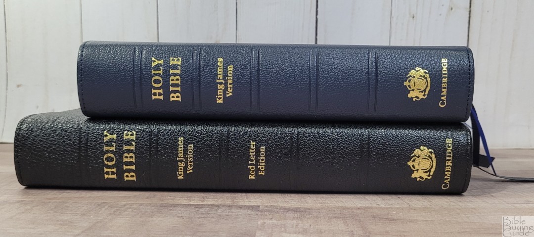
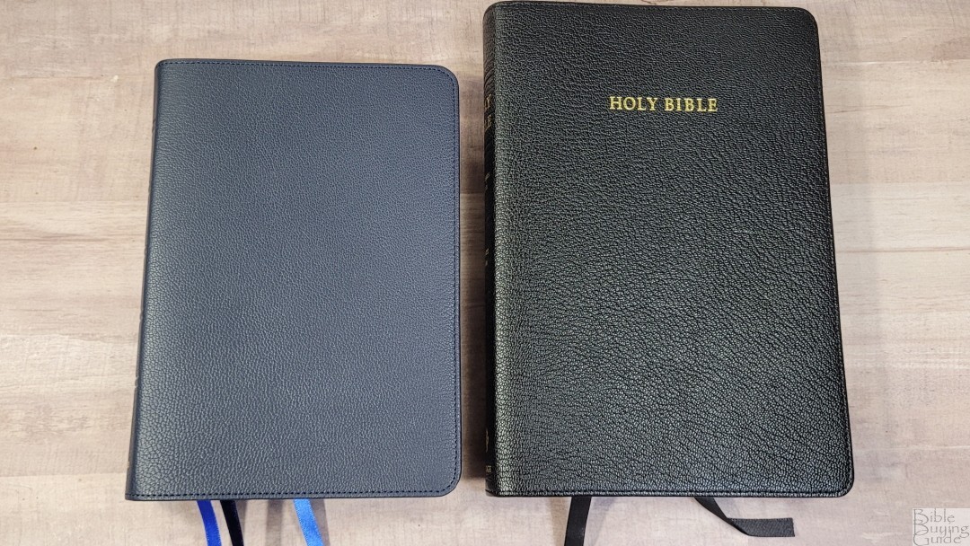

The Concord is a newer design (from the 1950s). It has a larger footprint and a larger font with more space in the text, but the block is thinner. The paper is the same. It has the same concordance and maps and adds a glossary and dictionary. The Concord is a better choice if you need a larger font or the extra material, but it’s not as handy to carry. It’s one of my all-time favorite Bibles.
Clarion
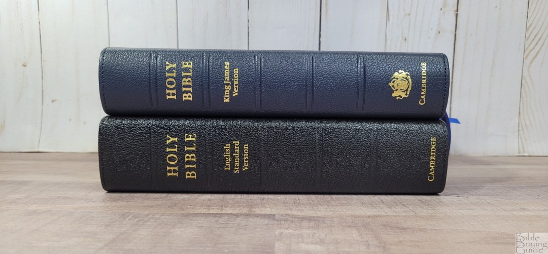
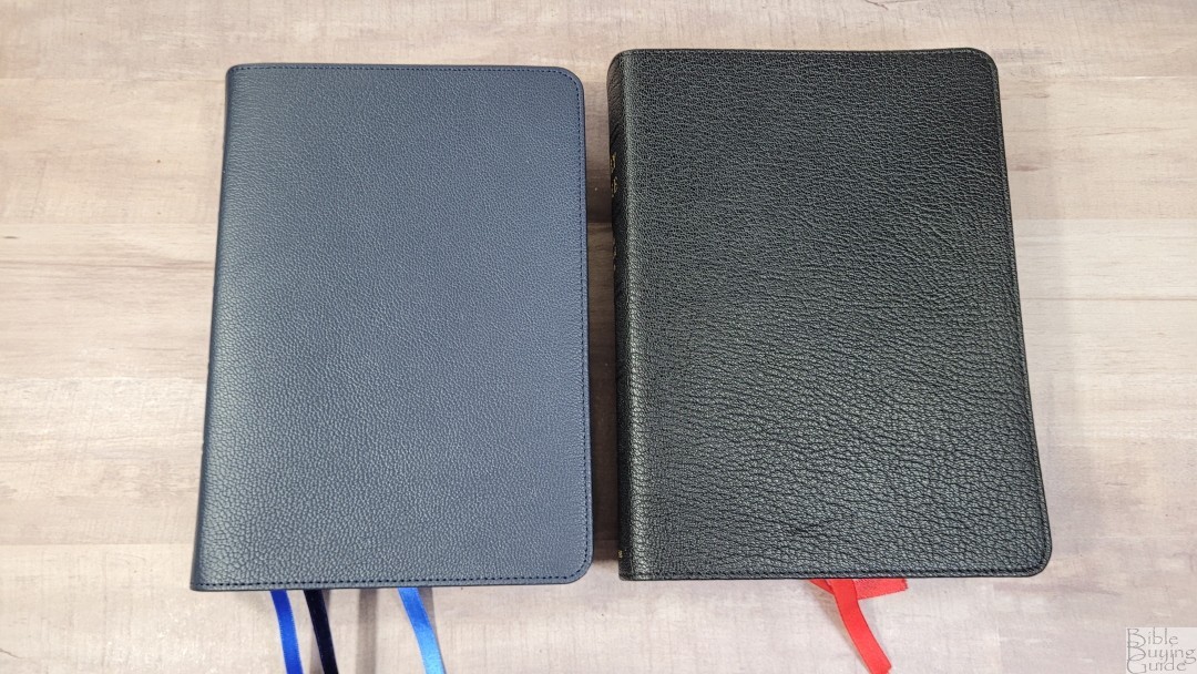
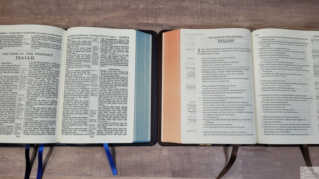
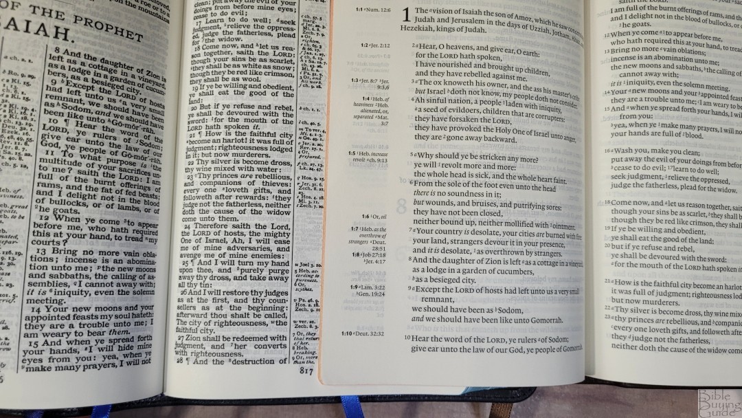
The KJV Clarion (ESV goatskin cover shown, and KJV interior from the calfskin edition) is a much different design with a side-column reference, single-column, paragraph layout in black letter. The font isn’t as dark, but it has more whitespace in the text. It’s a better choice for reading. The footprint is slightly wider and the block is thicker.
Pitt Minion
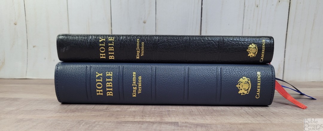
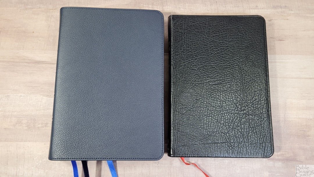
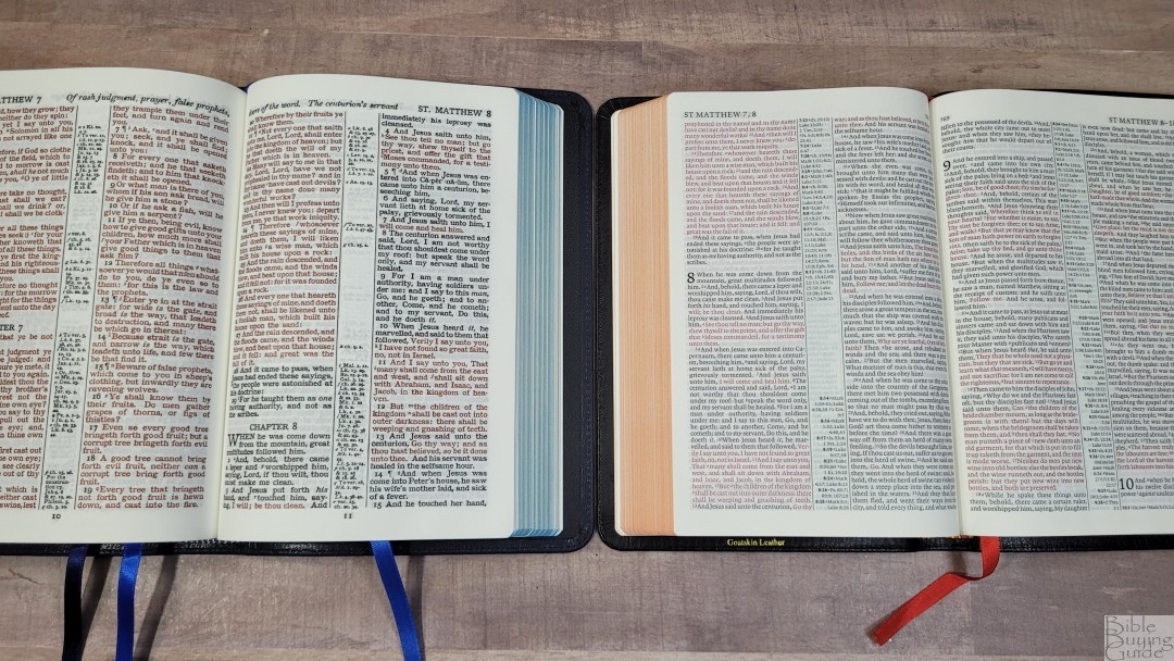

The KJV Pitt Minion is a paragraph edition with a much smaller typeface. It’s also about half the thickness. It’s an elegant Bible, but the small typeface is difficult for older eyes to see. They have the same paper and maps. The Pitt Minion includes a Reader’s Companion instead of a concordance.
Topaz
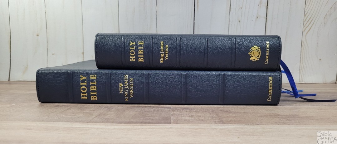

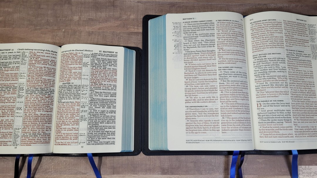
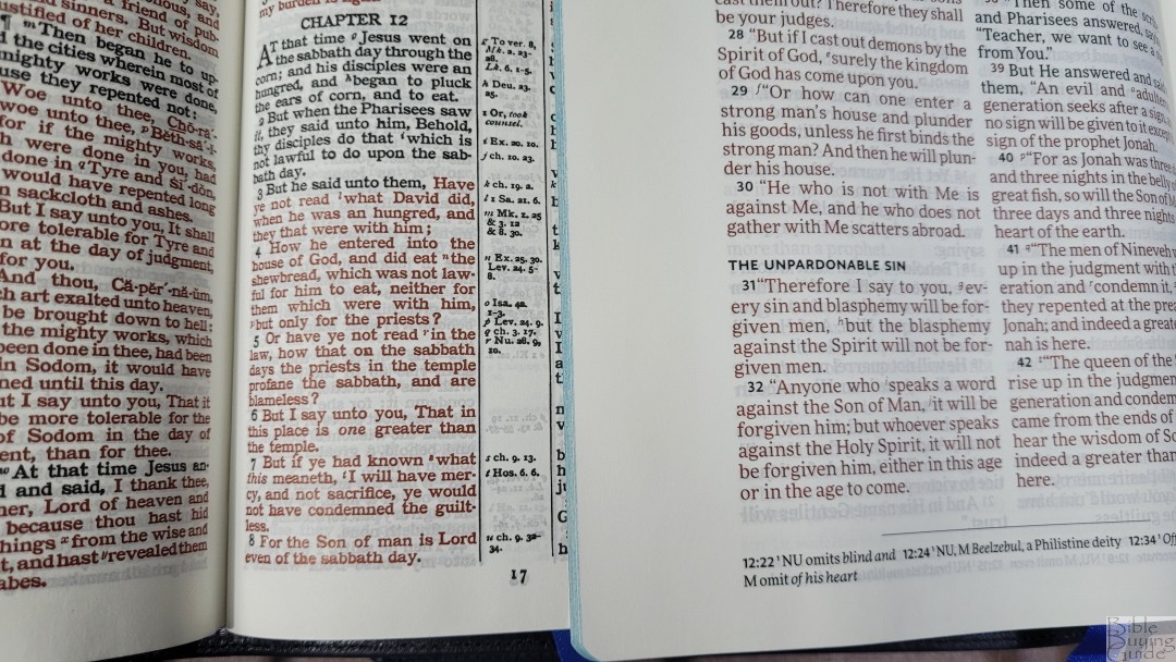
I’m comparing the NKJV Topaz because I have it in blue goatskin. The goatskin on the Cameo has a more pronounced grain. The ribbons are the same color, they’re just more narrow on the Cameo. The liner is the same. They also have the same paper and same art-gilt. The Topaz has a larger and cleaner print, but it’s not as portable as the Cameo.
Turquoise
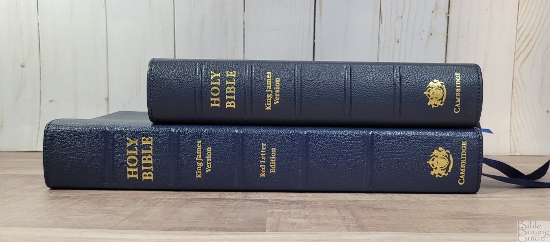

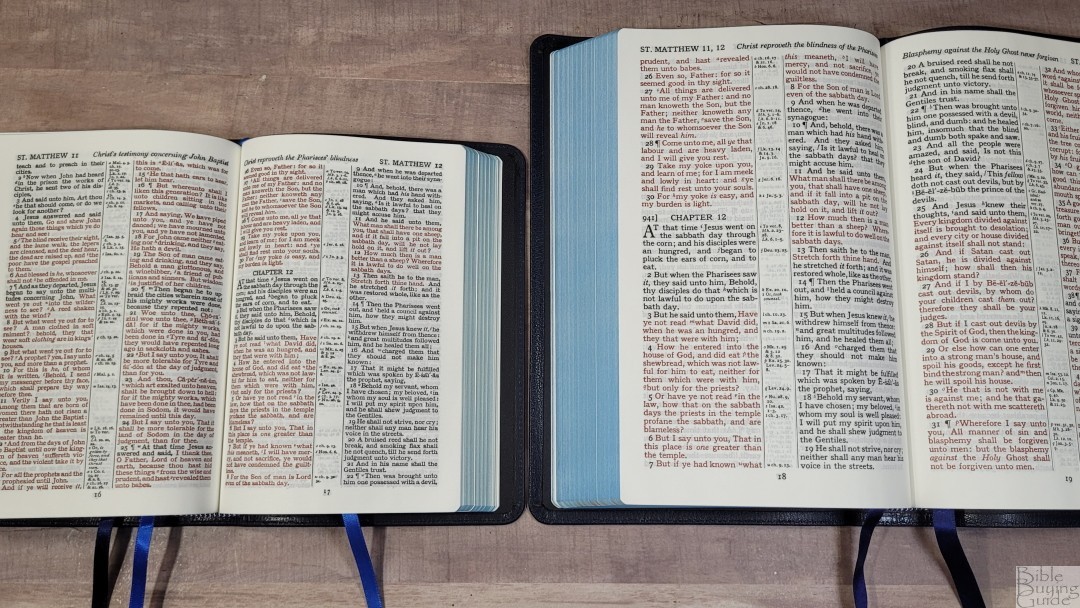

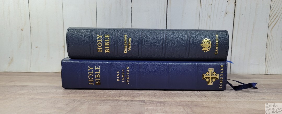
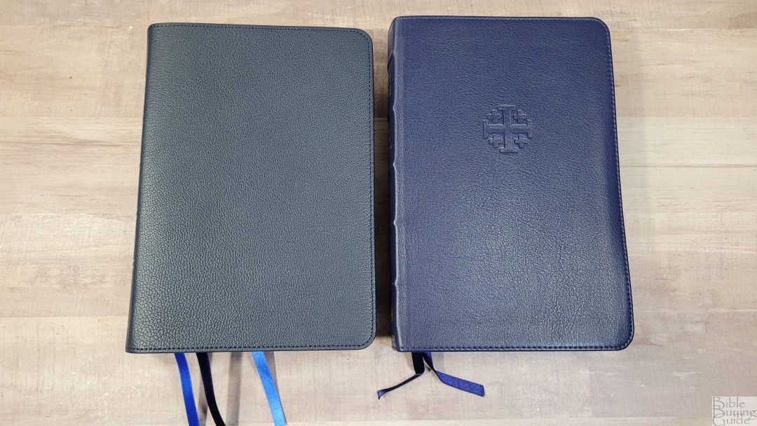
The Cameo is close to a personal size Turquoise. They have a similar font, the same references and footnotes, both were typeset by hand around 100 years ago, and both were hot metal press editions. The pagination is not the same, though. But, if you like one you’ll like the other. The blue goatskin on the Turquoise is brighter and the blue art-gilt is darker. They have the same paper.
Personal Size Canterbury

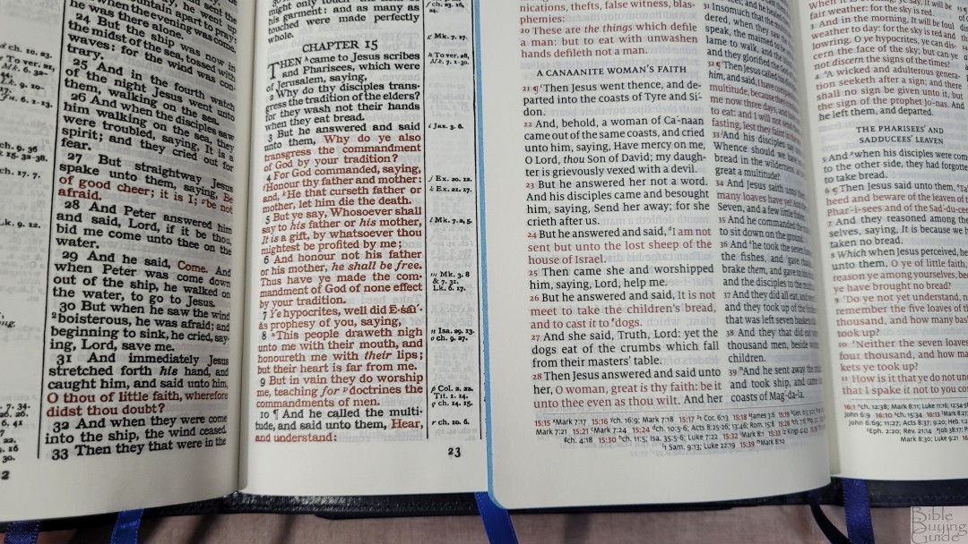
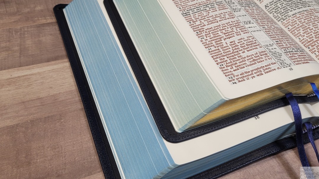
The Personal Size Canterbury is almost a modern Cameo. They have about the same footprint and paper. The font is about the same size. The Cameo is much darker, but the Canterbury is a cleaner digital font. The Canterbury has section headings, but no translation footnotes. It also doesn’t include a concordance.
Conclusion
The Cambridge Cameo in blue goatskin is gorgeous. The Shakira calf split leather liner alone is worth the upgrade. I like the new ribbons. Three ribbons feel natural for this Bible. The layout is still the same as the Cameo you’re used to and it’s presented with a bold black and red font that pops off the page. If you’re looking for a reference KJV that’s great for carry and all-around use, the Cambridge Cameo in blue goatskin is easy to recommend.
_________________________________________________________
This Bible is available at (includes some affiliate links)
and many local Bible bookstores
_________________________________________________________
Cambridge provided this Bible in exchange for an honest review. I was not required to give a positive review, only an honest one. All opinions are my own.




I got my first Cameo back in 1990. It had an Indian Calfskin cover which held up very well, and a paste-down liner which did not. But the Cameo format has been my familiar, comfortable friend since those days. I bought a black goatskin edition in 2020, and was surprised to see it still contained a synthetic liner. These new leather liners will be a marked improvement. Looking forward to taking possession of the Blue Cameo in a few days. Thanks for the great review; you covered everything quite well; as usual!
Thanks Mark!!
Great review, Randy, and this new 2022 edition of the Cameo looks beautiful.
I notice Cambridge still have their 2011 edition of the Cameo with Apocrypha available on their website. But do you know whether they’re going to give it the same makeover and bring out a 2022 Cameo with Apocrypha soon too? If you’re not sure, would you mind asking your contact at Cambridge?
Thanks Jonathan! I haven’t heard, but I’ll ask.
Hi Jonathan. I’ve heard back from Cambridge. They don’t plan to produce the Cameo with Apocrypha in the new goatskin covers.
Thanks a lot, Randy, for checking with Cambridge on the Apocrypha edition of the Cameo. Shame they’re not going to do one, for I’d certainly buy one if they were!
Randy, I enjoyed your interview so much that I ordered the Bible from evangelical.com.
I am in agreement with you on synthetic liners, I have one in a Concord Bible, & wish that it was a leather liner.
Thanks for a great review!
Thanks Doug!