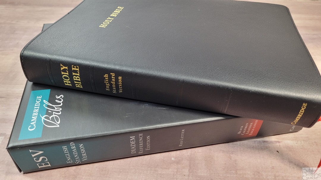
The Cambridge ESV Diadem shares the same layout as the Pitt Minion, but it’s 20% larger. Like the hardcover edition that was released last year, it adds tools in the front that the Pitt Minion doesn’t have. The hardcover edition was printed on 36gsm paper with a black letter text. The leather edition improves on the hardcover with a premium coated paper, more ribbons, and is printed and bound in the Netherlands by Royal Jongbloed. It’s available in edge-lined calfskin and pasted-down calf split, but with and without the Apocrypha. I’m reviewing the black calfskin without the Apocrypha, ISBN 9781108816083.
Cambridge provided this Bible in exchange for an honest review. I was not required to give a positive review, only an honest one. All opinions are my own.
_________________________________________________________
This Bible is available at (includes some affiliate links)
and many local Bible bookstores
_________________________________________________________
Table of Contents
- Video Review
- Binding
- Paper
- Typography and Layout
- References
- Footnotes
- Concordance
- Bible Atlas
- Extras
- Apocrypha
- Comparisons
- Conclusion
Video Review
Binding
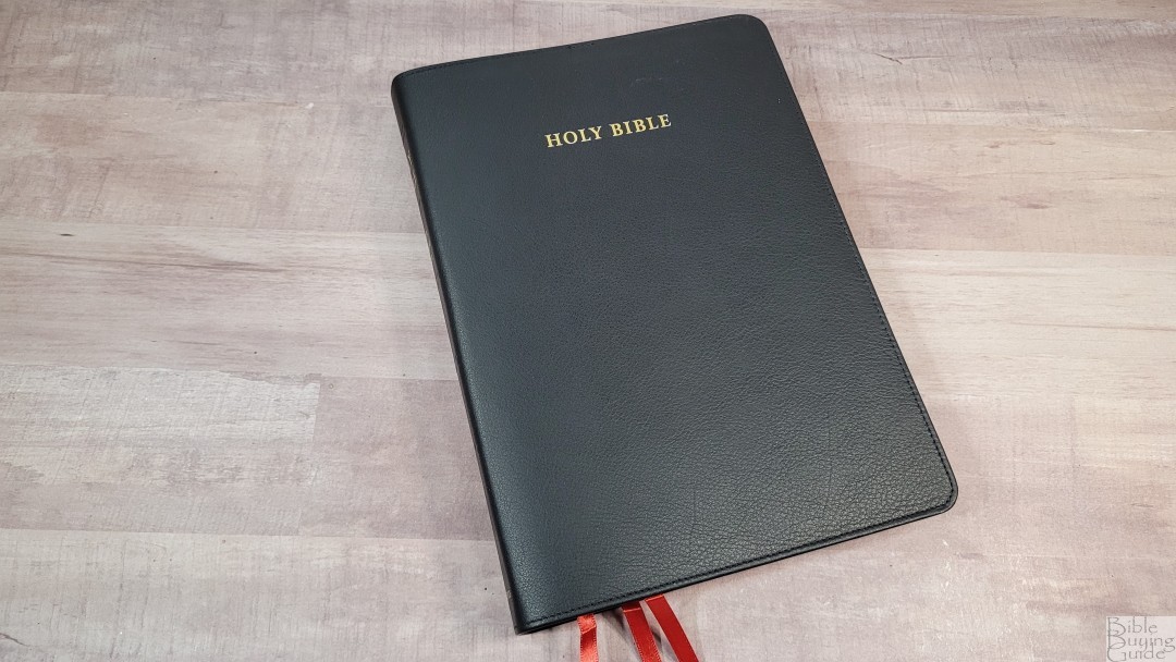

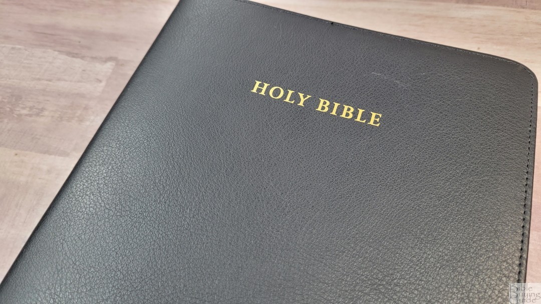
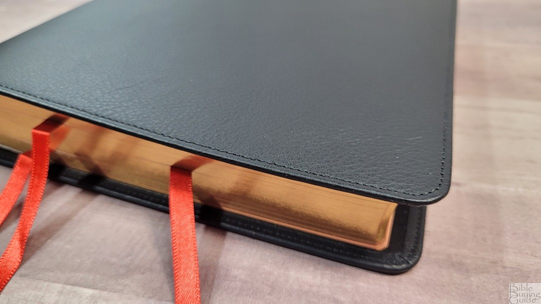
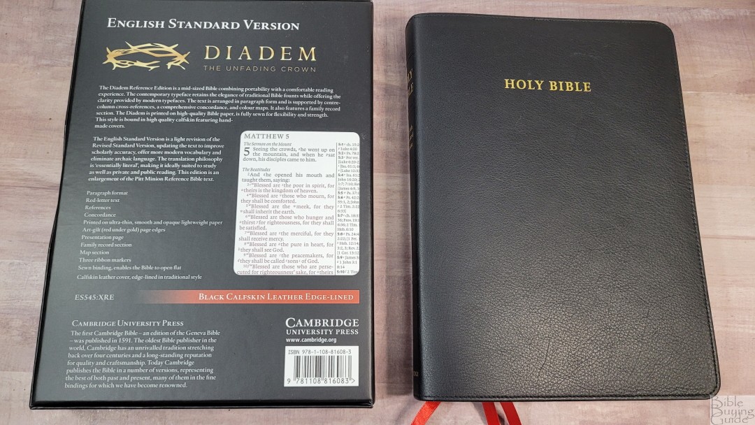
The black calfskin has a smooth grain similar to the brown calfskin Clarion. The texture is not as deep and grainy as the goatskin. It’s the same leather that’s used in the Topaz, with perimeter stitching and a liner that’s edge-lined with a synthetic material. It’s soft and flexible.
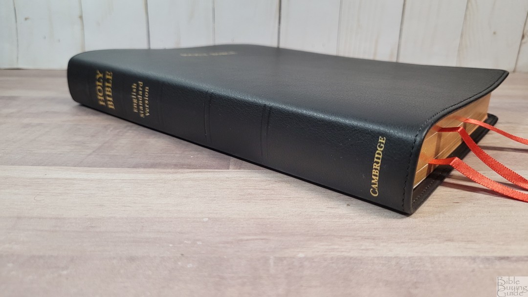
The front has HOLY BIBLE printed in gold. The spine has HOLY BIBLE, ENGLISH STANDARD VERSION, and CAMBRIDGE printed in gold. It has 5 non-raised spine rib indications. It has a 3/8″ yapp.

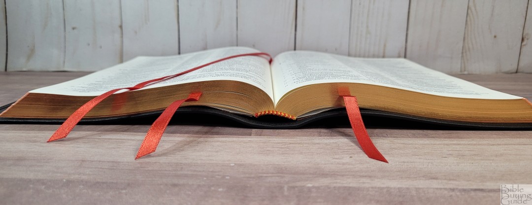
The block is sewn and has no trouble staying open to any page. Even out of the box, it stays open with no trouble. This is much better than most edge-lined editions I’ve seen. It has 3 cardinal red ribbons at 1/4″. They’re long enough to pull to the corner to easily open the Bible. The overall size is 6 3/8 x 8 7/8 x 1 1/8″ and weighs 1 lb, 11.2 oz. This shape is slightly wider than most reference editions. The size and shape feel well-balanced.
Paper

The paper is 32 gsm from Papeteries du Leman, Thonon-les-Bains, France. It looks and feels like a thicker version of the Indopaque paper that’s used in most Bibles from the Netherlands. It has a coating and feels silky smooth to the touch. I had no trouble turning the pages. It’s highly opaque and has a slight cream shade. This is my favorite color for Bible paper, which is part of what draws me to premium editions. I prefer this to the whiter shade of the hardcover edition of the Diadem. Page edges are art-gilt with red under gold.
Family Pages
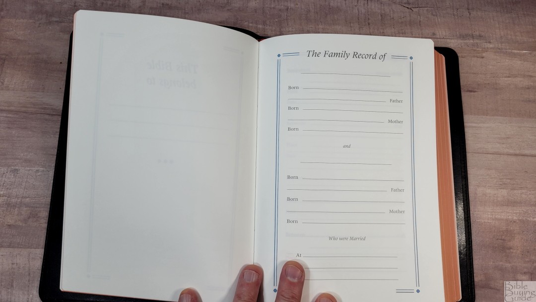
In the front are the standard Cambridge family pages. They include a presentation page, family records, children, marriages, grandchildren, and deaths. These are printed on thick, non-glossy pages that are easy to write on.
Typography and Layout
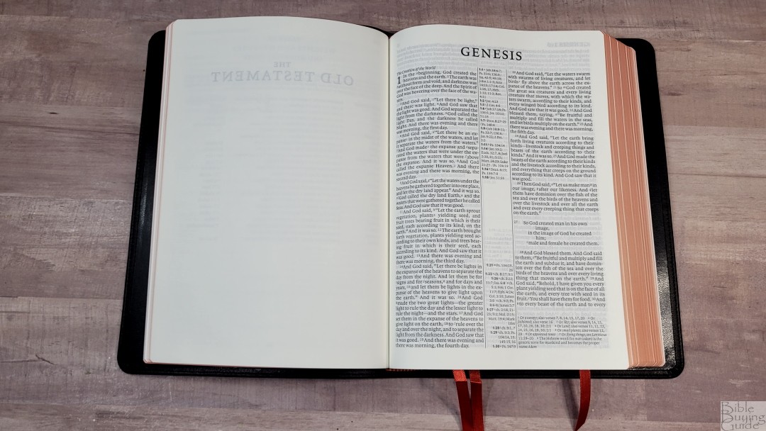

The layout matches the ESV Pitt Minion and Wide Margin editions, which makes a great combo for multiple versions of the same Bible. The 2016 ESV text is presented in a double-column, paragraph layout with center-column cross-references and poetry set to stanzas. Translation footnotes are placed under the last verse and under the last verse when they don’t fit in the center column. The header includes the book name and chapter number in the outer margin and the page number in the inner margin. The page numbers start over for the New Testament. Section headings are in italics. I find them easy to use when I want to use them and easy to ignore when I’m just reading.
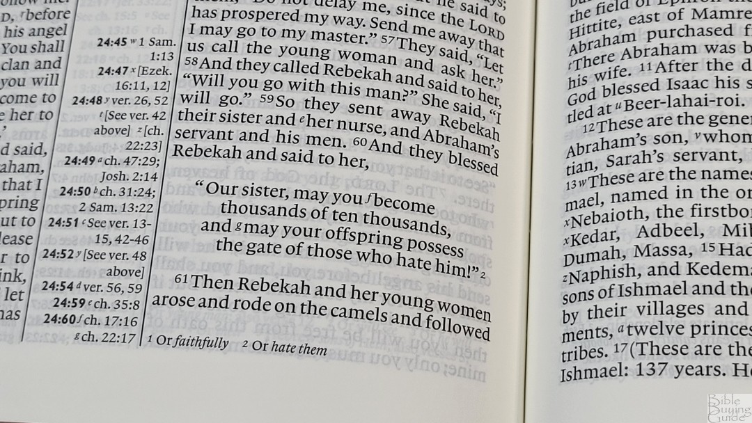

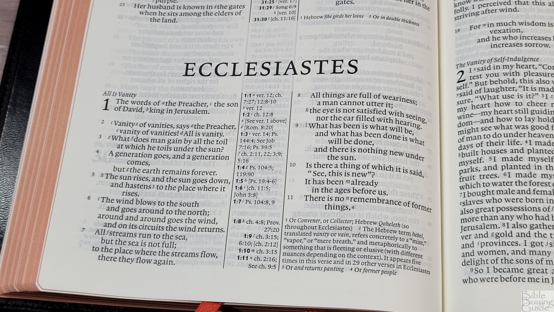
The font is an 8.2 Lexicon with an 8.5 point leading (the size of the font plus the space to the next line). This is a red-letter edition. Both the red and the black are about a medium to dark shade in darkness. They’re consistent throughout. It has around 8 words per line. It was printed with line-matching, so the lines of the text line up on both sides of the page to reduce show-through. The text is a touch tight, but I do find it easy enough to read. It has enough inner margin so the text never bends into the gutter.
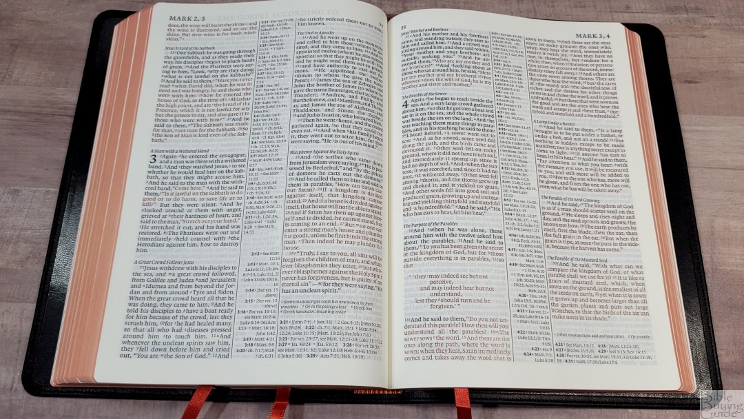
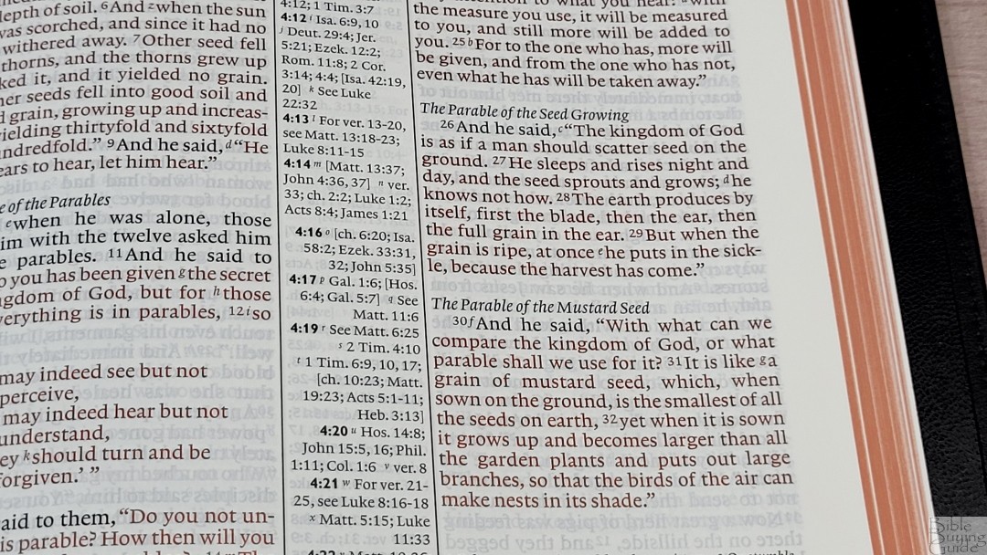
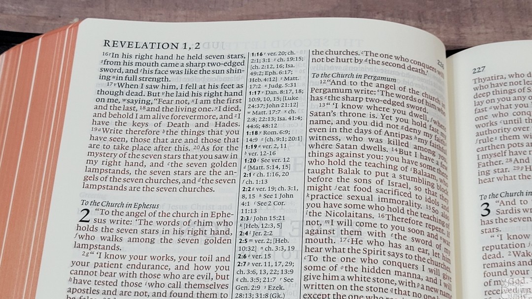
The poetic setting looks good, but rather than cutting the lines in good places, they go all the way to the edge of the column and then indent to the next line. This causes many poetic lines to have one word. Verse numbers are small and light, so they can be difficult to find quickly.
I find this an excellent layout for reading at home and on the go. It’s a good size for preaching if you don’t need large print, but the verse numbers might take an extra few seconds to find.
References
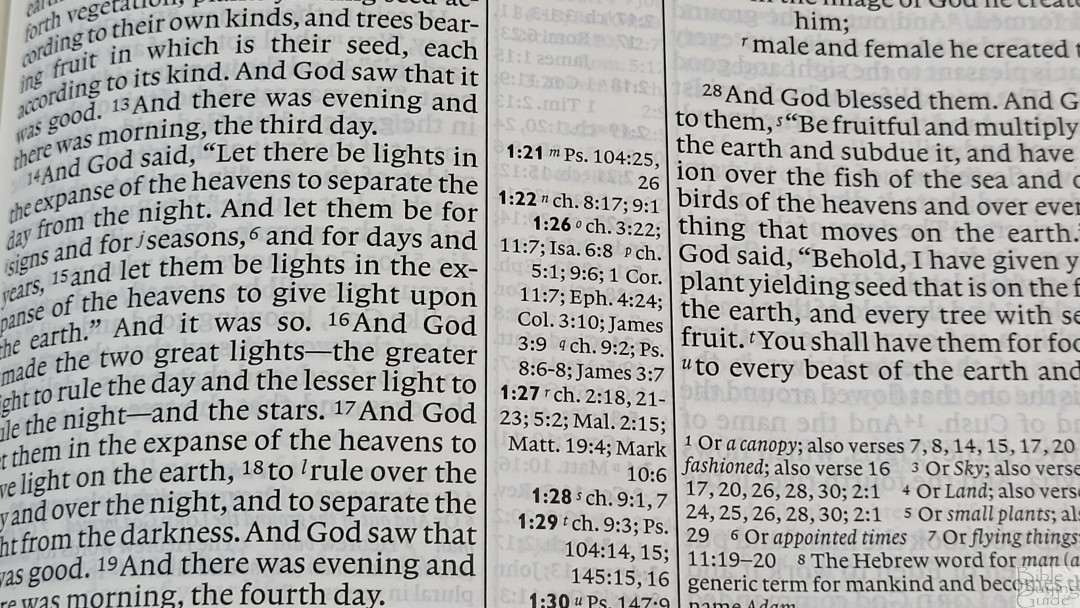
Cross-references start in the center column with those for the left column left-justified and placed at the top, and those for the right column right-justified and placed at the bottom. The corresponding references are bold, making them easy to find. If there are more than will fit in the center column, the rest are placed under the footnotes, under the last verse on the page. This means there are multiple places to look for cross-references, but it does work well.
Cross Reference Examples
There are a lot of references. They cover words and themes, making this an excellent Bible for personal study and sermon prep. Here are a few examples of references to help you compare:
- Genesis 1:1 – Job 38:4-7; Ps 33:6; 136:5; Isa 42:5; 45:18; Jn 1:1-3; Ac 14:15; 17:24; Col 1:16, 17; Heb 1:10; 11:3; Rev 4:11
- Deuteronomy 6:4 – Cited Mk 12:29; Isa 42:8; Zech 14:9; Jn 17:3; 1 Cor 8:4, 6
- Isaiah 9:6 – Lk 2:11; Jn 3:16; ch 7:14; Mt 28:18; 1 Cor 15:25; ch 22:22; ch 28:29; ch 10:21; Deut 10:17; Neh 9:32; Jer 32:18; Ps 72:17; ch 63:16; Jn 14:18; Ps 72:7; Eph 2:14; see ch 1:6-9
- Matthew 28:19 – Mk 16:15, 16; ch 13:52; Lk 24:47; ch 24:14; Mk 11:17; Rom 1:5; Ac 8:16; 2 Cor 13:14
- Mark 12:29 – Lk 10:27; cited from Dt 6:4, 5; Rom 3:30; 1 Cor 8:4, 6; Gal 3:20; Eph 4:6; 1 Tim 1:17; 2:5; Jm 2:19; 4:12; Jude 25; Mt 19:17; 23:9
- John 1:1 – Gn 1:1; Col 1:17; 1 Jn 1:1; Rev 1:4, 8, 17; 3:14; 21:6; Rev 19:13; Heb 4:12; 1 Jn 1:1; 1 Jn 1:2; ch 17:5; Phil 2:6
- John 3:16 – Rom 5:8; Eph 2:4; 2 Thes 2:16; 1 Jn 3:1; 4:9, 10; see ch 1:29; Rom 8:32; ch 10:28
- Acts 2:38 – ch 3:19; 20:21; 26:18, 20; Lk 24:47; ch 22:16; ch 8:12; see Mk 16:16; ch 10:48; see ch 8:16; see Mk 1:4; ch 10:45; ch 8:15, 20; 11:17; see Jn 7:39
- Romans 10:9 – Mt 10:32; Lk 12:8; 1 Cor 12:3; Phil 2:11; see Ac 16:31; 1 Pet 1:21; see Ac 2:24
- 1 John 1:1 – see Jn 1:1; ch 2:13, 14; Ac 4:20; Jn 19:35; ch 4:14; Jn 1:14; 2 Pet 1:1; Lk 24:39; Jn 20:27
Footnotes

The footnotes are placed under the last verse and are keyed to the text with numbers. They show the number for the footnote, but not the verses they go to. They include alternate translations, literal translations, Hebrew and Greek terms, special uses of Greek words, the meanings of names, words where meanings are uncertain, clarification of additional meanings, grammatical points, supplied pronouns, English equivalents of weights and measures, and manuscript variations. The footnotes are useful for personal study and for sermon prep.
Concordance
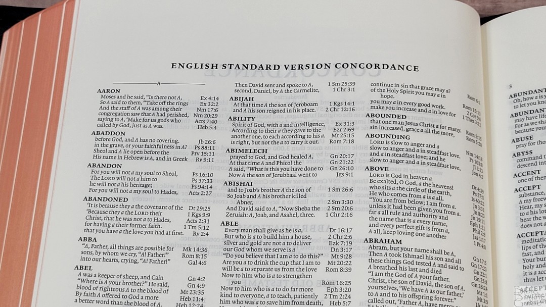
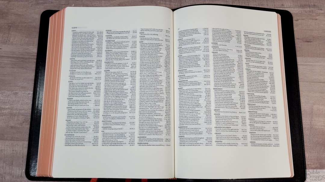
This is a large concordance with 89 pages and 3 columns per page. It has over 3000 entries with 14,000 references, which is twice the size of the Pitt Minion and similar to the one in the Wide Margin. It includes proper names of the most prominent people and places. This is a good concordance for personal study and sermon prep.
Sample entries include:
- Christ – 17
- Christ’s – 3
- Christian – 2
- Christs – 1
- Faith – 36
- Faithful – 12
- Faithfulness – 7
- Faithless – 2
- God – 56
- Goddess – 2
- Godliness – 6
- Godly – 4
- Gods – 4
- Praise – 11
- Praised – 4
- Praises – 3
- Praising – 4
- Pray – 13
- Prayed – 5
- Prayer – 11
- Prayers – 7
- Praying – 4
Bible Atlas

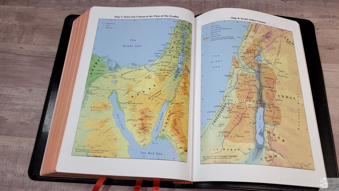
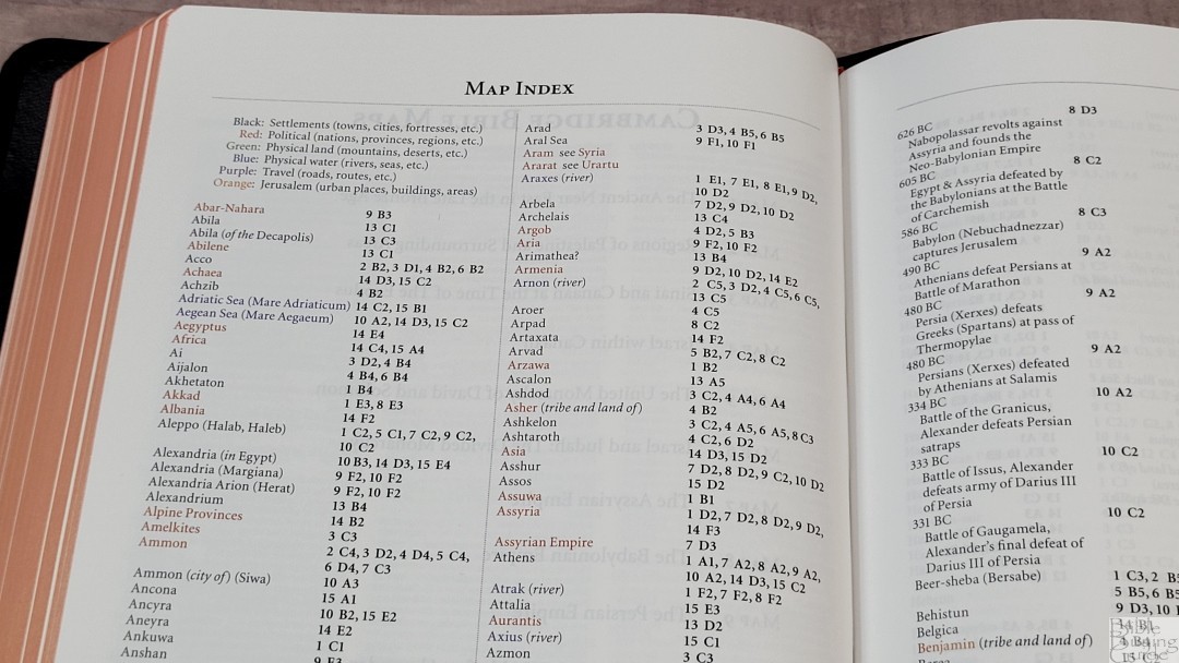
In the back are 15 full-color maps with an 8-page color-coded index. The maps are colorful and I find them easy to read and use. They’re printed on thick, non-glossy paper, which is my favorite paper for maps. They show routes, birders, water, distance topography, vegetation, cities, dates, battle sites, etc. The color-coded index shows settlements, political, physical land, physical water, travel, and Jerusalem.
Maps include:
- The Ancient Near East in the Late Bronze Age
- Regions of Palestine and Surrounding Areas
- Sinai and Canaan at the Time of the Exodus
- Israel with Canaan
- The United Monarchy of David and Solomon
- Israel and Judah: The Divided Monarchy
- The Assyrian Empire
- The Babylonian Empire
- The Persian Empire
- The Hellenistic World after Alexander
- Jerusalem in Old Testament Times
- Jerusalem in New Testament Times
- Palestine in the New Testament
- The Roman Empire
- The Eastern Mediterranean in the First Century AD
Extras
In the front are a few extra features that are not found in the Pitt Minion or wide margin edition.
Chronology of Rulers During Biblical Times

This is a 2 1/2 page table that divides the rulers into several categories. It shows the name and date they ruled. Categories include:
- Rulers During Old Testament Times
- Judah
- Israel
- Hasmonean Dynasty
- Rulers During the Time of the New Testament
- Roman Emperors
- Rulers of the Herodian Territories
- Governors
Table of Weights and Measures

This is a one-page table with the biblical unit, equivalent American and metric units, and a biblical equivalent. It’s a simple table with 22 units and includes weights, measures, and money. These are also included in the ESV translator’s footnotes. This table is in the back of the Pitt Minion and Wide Margin editions.
Comparisons
Here’s how the calfskin ESV Diadem compares to several other ESVs from Cambridge and a few other publishers.
Hardcover Diadem

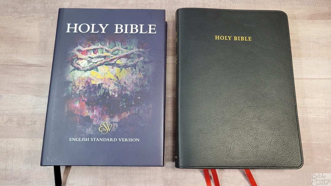
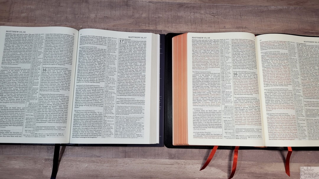
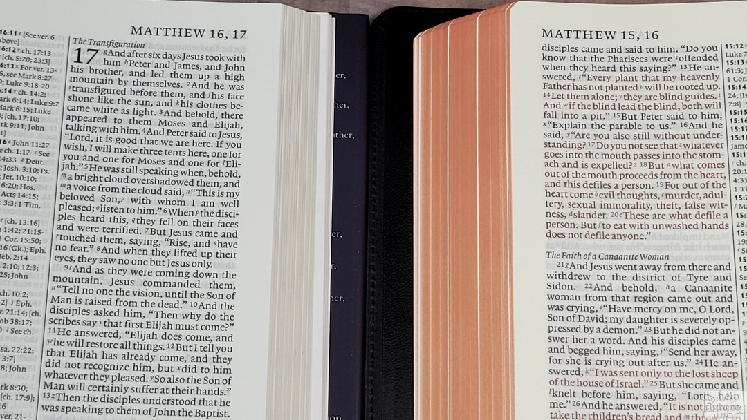
The hardcover ESV Diadem was one of my favorite Bibles of 2021. It has the same features as the calfskin edition, but with thicker, less elegant, paper and 1 ribbon. This is a great way to try the Diadem to see if you like it or have one to carry around and another to use at home.
Pitt Minion
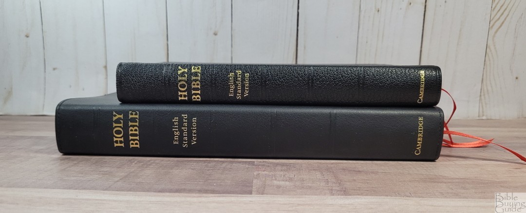
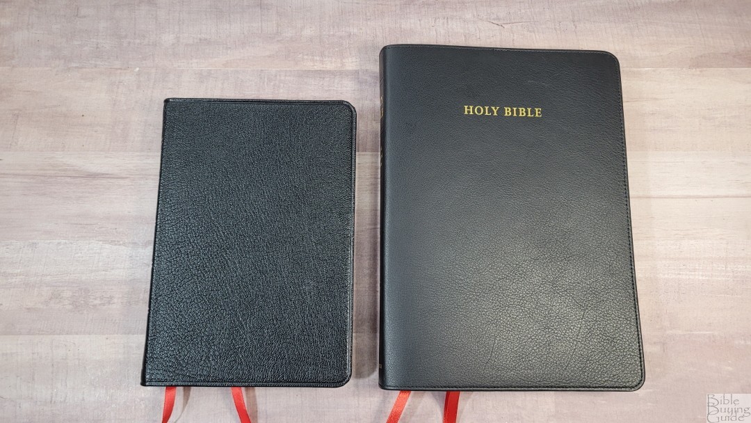
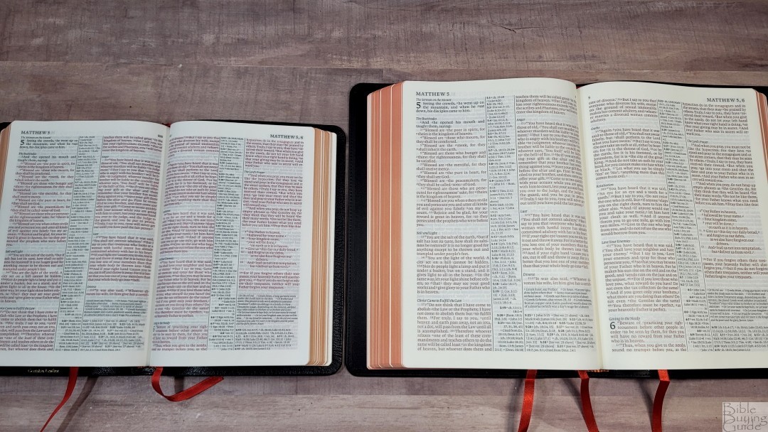

The Cambridge ESV Pitt Minion has the same pagination, but it’s 20% smaller. It’s also thinner due to the 28gsm paper. It has the same references and maps but it has a smaller concordance. The red letter is brighter than the Diadem. I’m more drawn to the darker red of the Diadem. The Pitt Minion is a fine Bible, but the font is too small for many older readers. The Diadem will be a much better choice.
Wide Margin
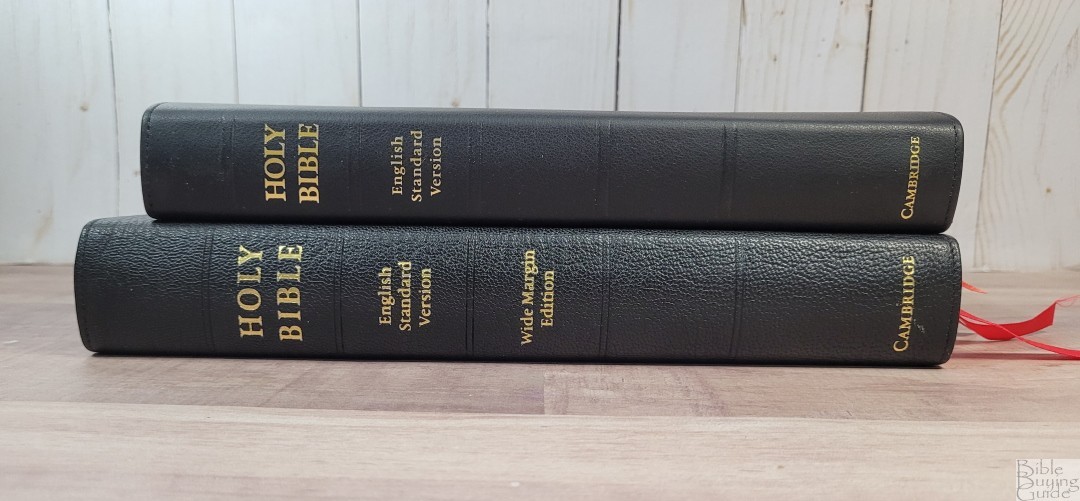
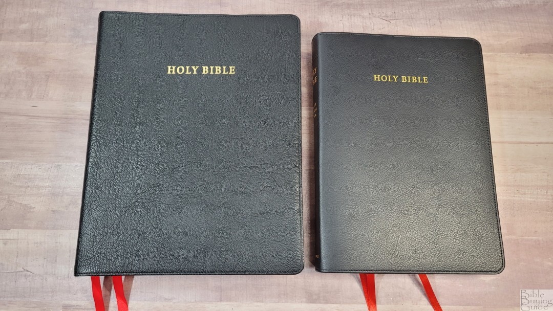
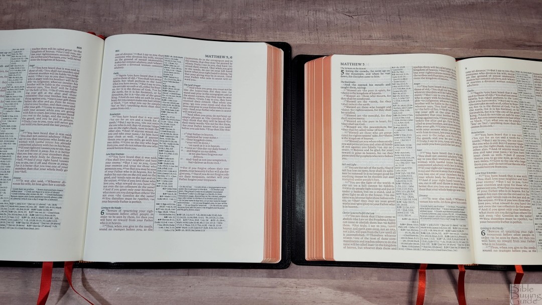
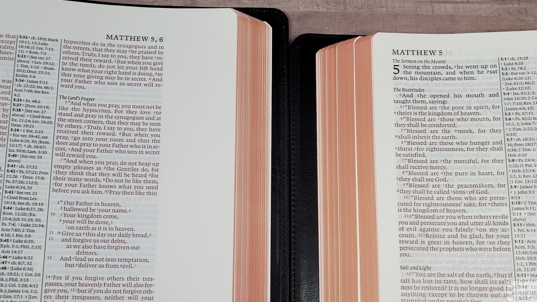
The Cambridge ESV Wide Margin also has the same pagination. The paper is thicker, but the font is a touch smaller. This footprint is much larger due to the wide margins and it’s thicker due to the thicker paper. Its red letter is bolder, but not as bright as the Pitt Minion. The opacity of the paper makes its text stand out more. They make an excellent combo. I think anyone that finds the font of the Diadem to be large enough would also find the wide-margin’s font large enough.
Clarion

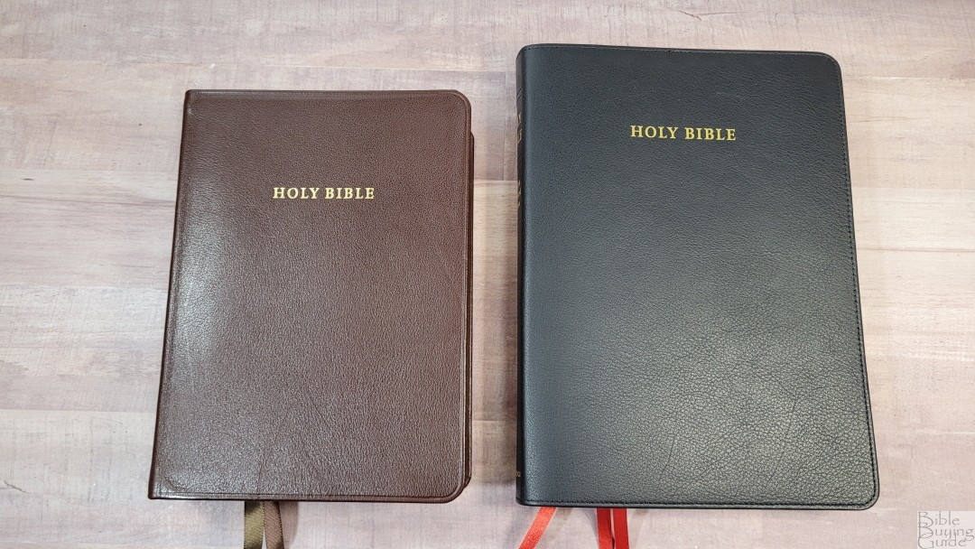


The Cambridge ESV Clarion is a single-column reference edition. It includes the same references, concordance, and maps as the Diadem. The font 8.75 with a 10.5 leading, which is larger with more white space. The footprint is smaller and it’s 3/8″ thicker, which makes it look larger. The brown calfskin looks the same except it’s a touch shinier. It has a paste-down liner. The goatskin edition has the same synthetic liner as the Diadem. Both are excellent Bibles. The Clarion is a better choice for those who prefer single-column and the Diadem is a better choice for those who prefer double-column.
Topaz
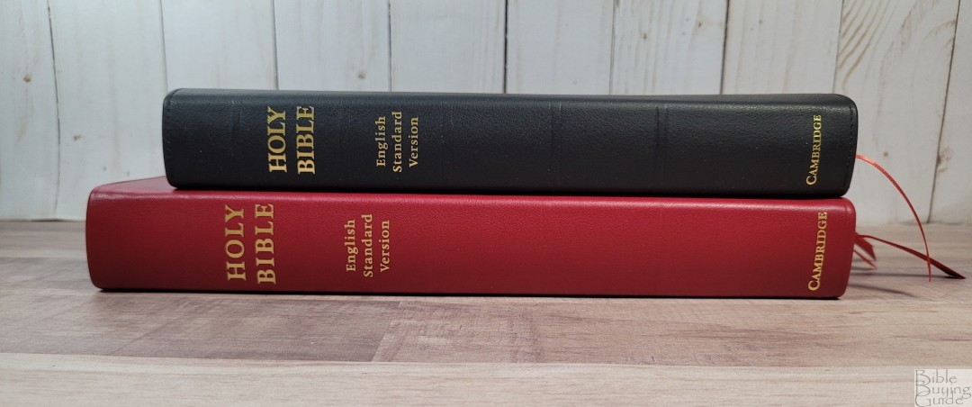

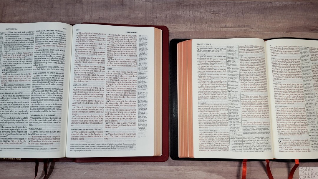
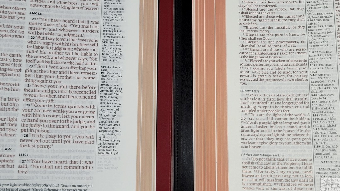
The Cambridge ESV Topaz is a large print double-column, verse-by-verse ESV with no text formatting It’s printed on 28gsm Indopaque paper. It includes the same references, concordance, and maps as the Diadem. The footprint is larger than the calfskin Diadem and it’s slightly thicker. The black and red letters are darker in the Topaz. The larger print and layout make it a better choice for preaching.
Concord
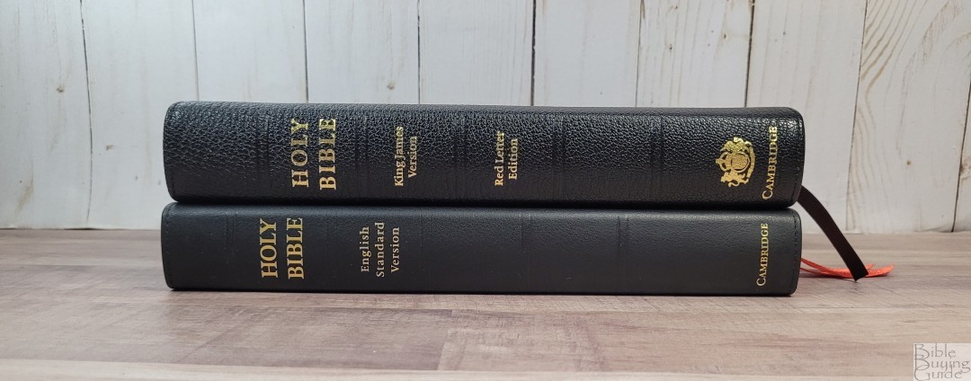

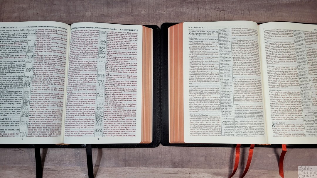
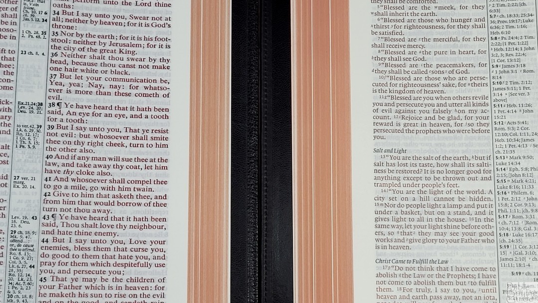
The Cambridge Concord is a hand-sized KJV double-column reference Bible designed in the 1950s. It has a slightly smaller overall footprint and it’s slightly thicker. It includes 28gsm paper. The font is a touch larger and much darker. The calfskin Diadem looks and feels like an ESV Concord.
PSQ

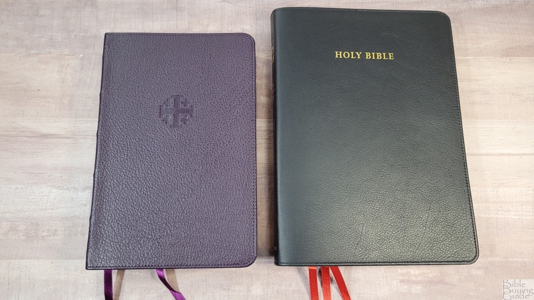
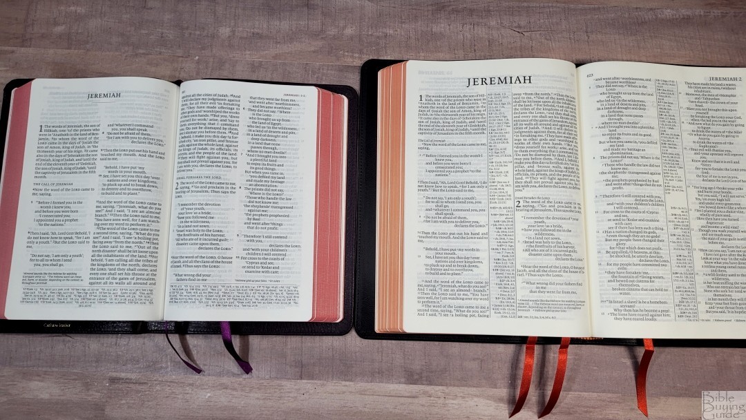
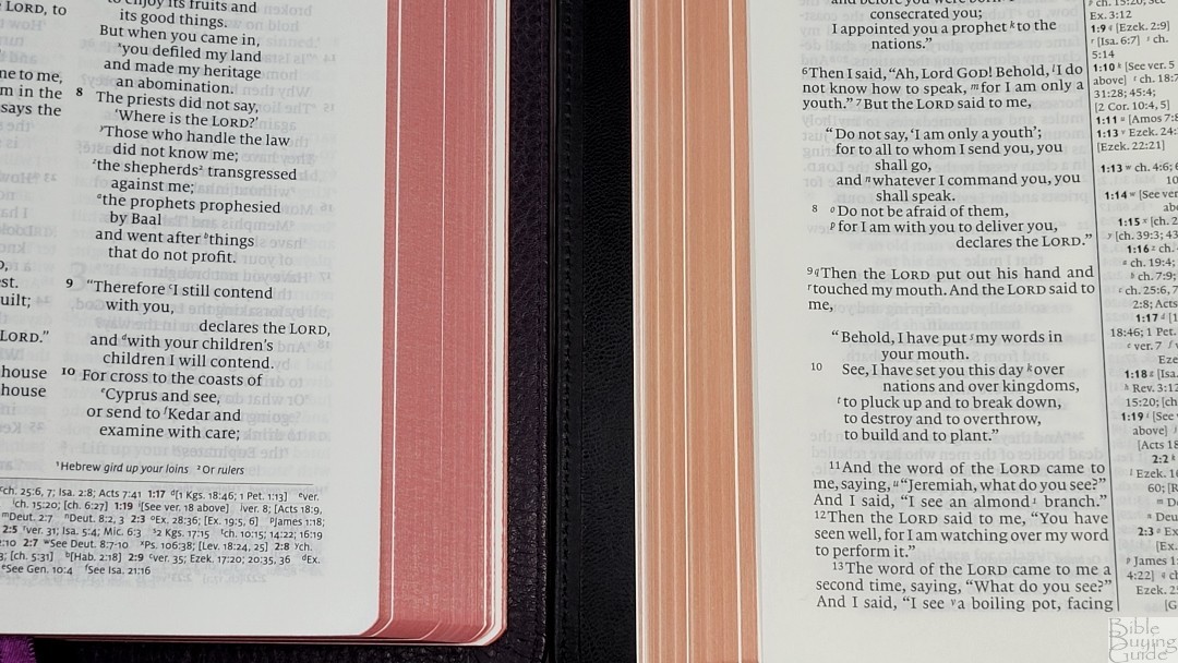
The Schuyler ESV Personal Size Quentel has 28gsm paper. It has a lot smaller footprint and is a touch thicker. The font is slightly larger and darker and has more white space. It has few references and does not include a concordance. The maps are from Schuyler. The calfskin edition is no longer available, but it has a more pronounced grain a paste-down liner.
Crossway Thinline Heirloom
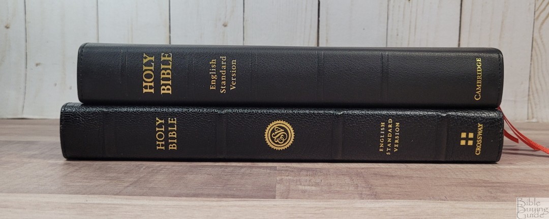
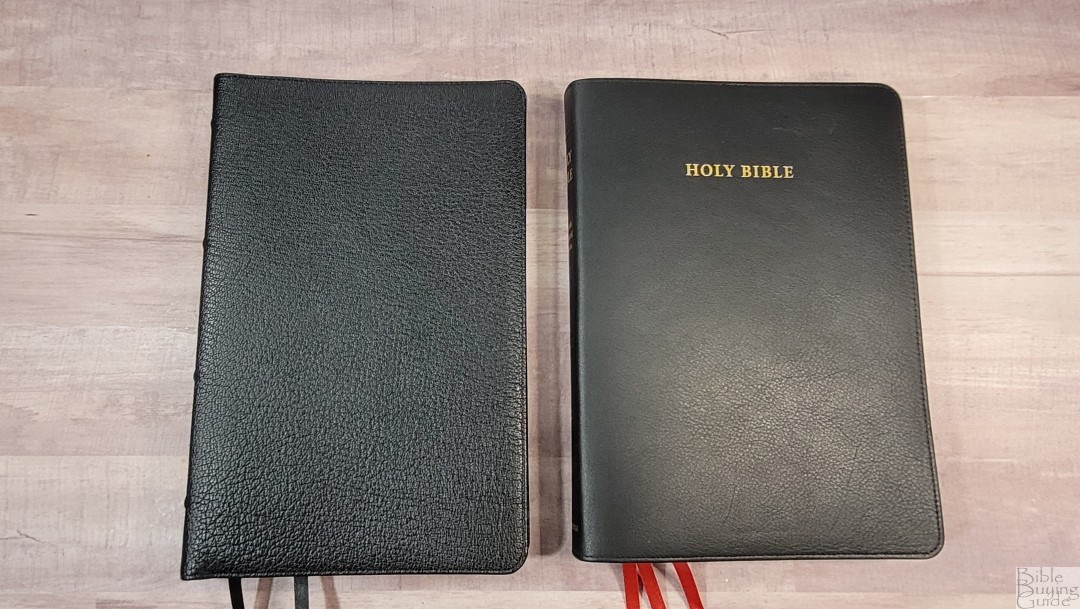
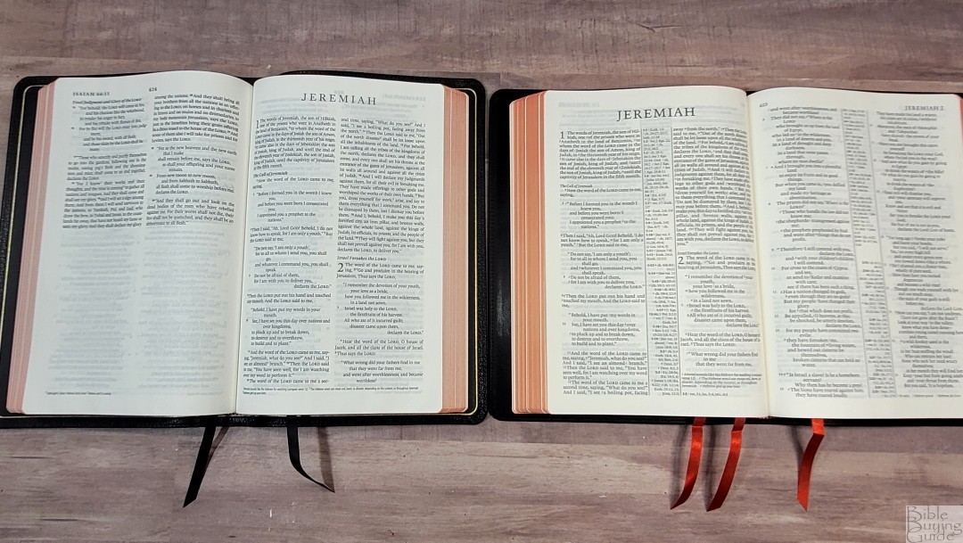

Crossway’s Thinline Heirloom is a text-only edition, but it’s the closest match in size, shape, and design. It has 28gsm paper, a goatskin cover, and a double-column, paragraph layout. It does not include line-matching. The fonts are the same, but the Crossway has more white space in the text. The footprint is taller and not as wide, and it’s not as thick, but they’re very close in size. The text of the Diadem compares well even though it has cross-references.
Conclusion
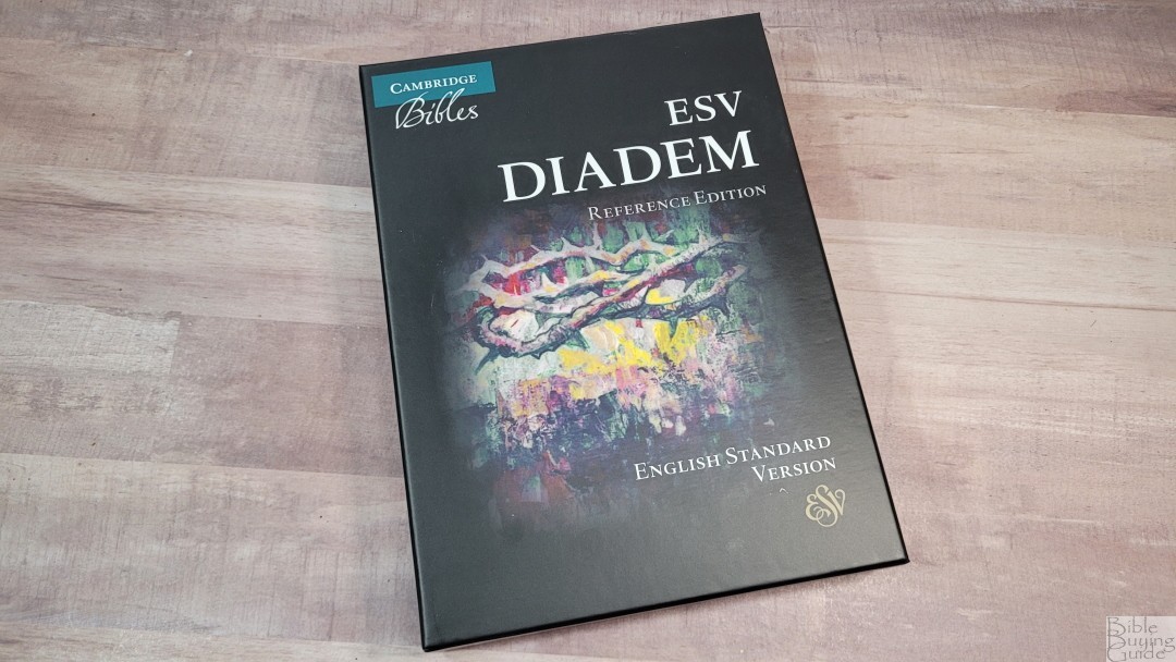

The Cambridge ESV Diadem in black calfskin is easily one of the best ESVs available. This is the closest thing to an ESV Concord that I know of, making it a great size for carrying, reading, and ministry. If you’re interested in a mid-size ESV reference edition, or you’re a fan of the Pitt Minion or ESV wide margin and you want an edition with a larger print, the Diadem is the Bible for you.
_________________________________________________________
This Bible is available at (includes some affiliate links)
and many local Bible bookstores
_________________________________________________________
Cambridge provided this Bible in exchange for an honest review. I was not required to give a positive review, only an honest one. All opinions are my own.




Does the leather edition come in black letter text? or is that just the hardcover?
Only the hardcover is black letter.
Is the synthetic liner durable? That is my one hang up with this Bible. I saw a video by Matthew Everhard showing how the synthetic liner of his wide margin was starting to break apart. I didn’t know if you had any extensive experience with cambridge bibles having these liners. Thanks.
It would last for a few years, but it will wear as Pastor Matt shows in his video.