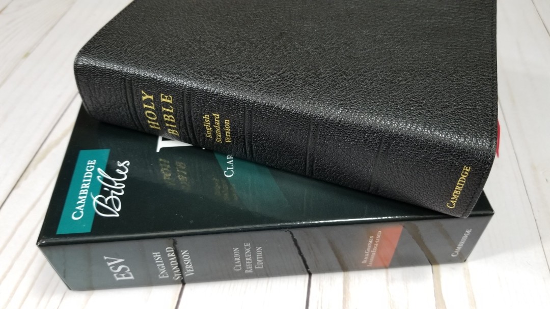
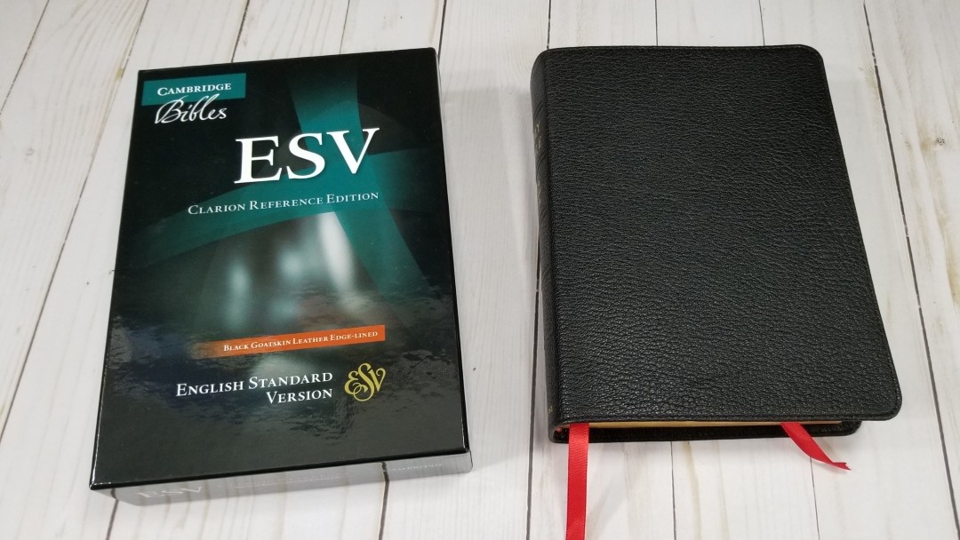
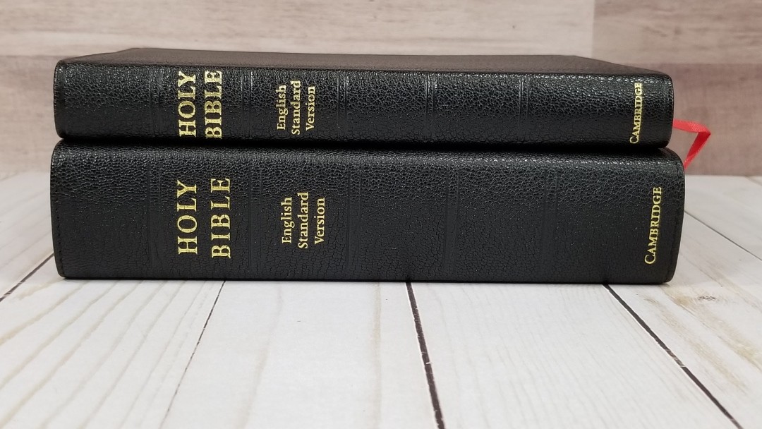
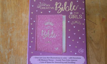
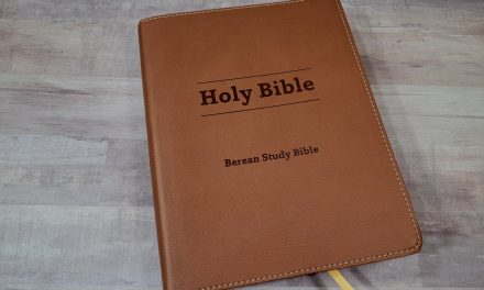
The Clarion Reference Edition is Cambridge’s standard edition for a medium size print Bible. I reviewed the brown calfskin when it released and I’ve considered it one of my favorite ESV’s ever since. Cambridge later upgraded the paper to the Indopaque from France (at least for the goatskin model). Paper can make or break a Bible design for me, so I wanted to review the goatskin edition of the ESV Clarion with better paper. I’m reviewing model ES486:XE, ISBN: 9780521182911, printed and bound in the Netherlands by Royal Jongbloed.

Cambridge provided this Bible in exchange for an honest review. I was not required to give a positive review, only an honest review. All opinions are my own.
_________________________________________________________
This book is available at (includes some affiliate links)
and many local Bible bookstores
_________________________________________________________
Table of Contents
- Video Review
- Cover and Binding
- Paper
- Typography
- References and Footnotes
- Concordance
- Maps
- Comparisons
- Conclusion
Video Review
Cover and Binding
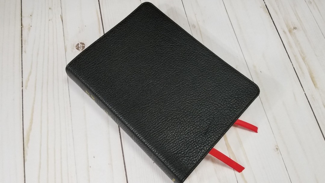
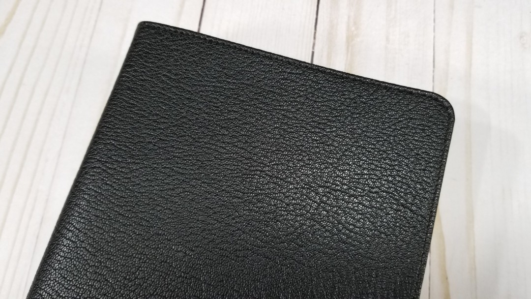
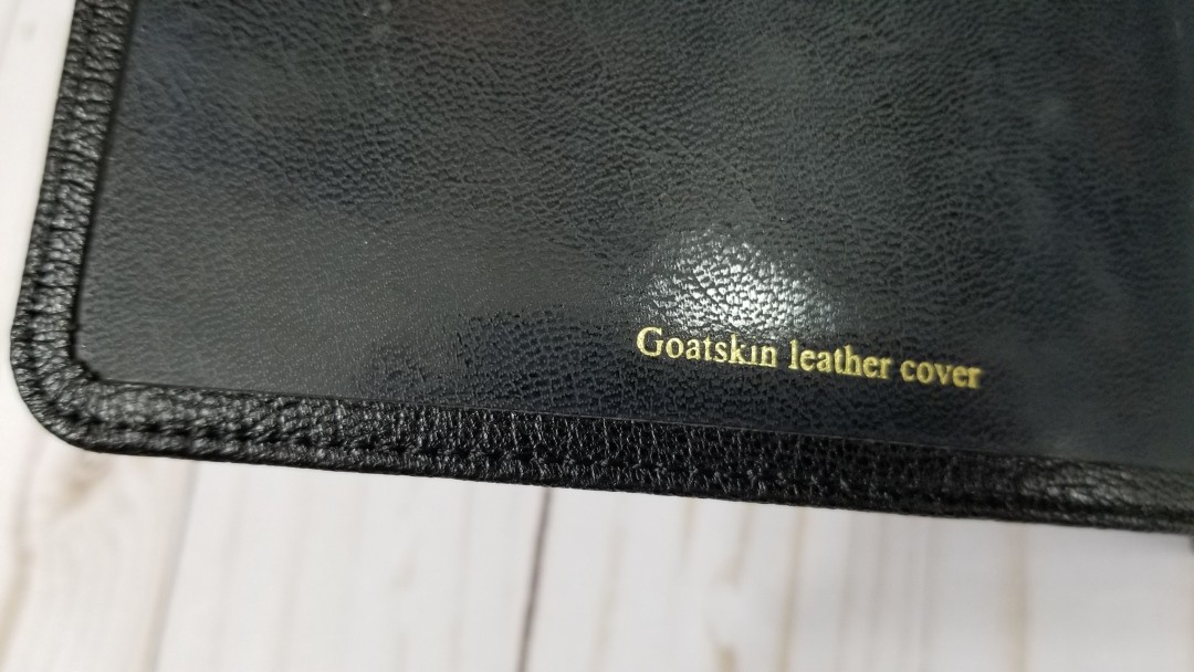
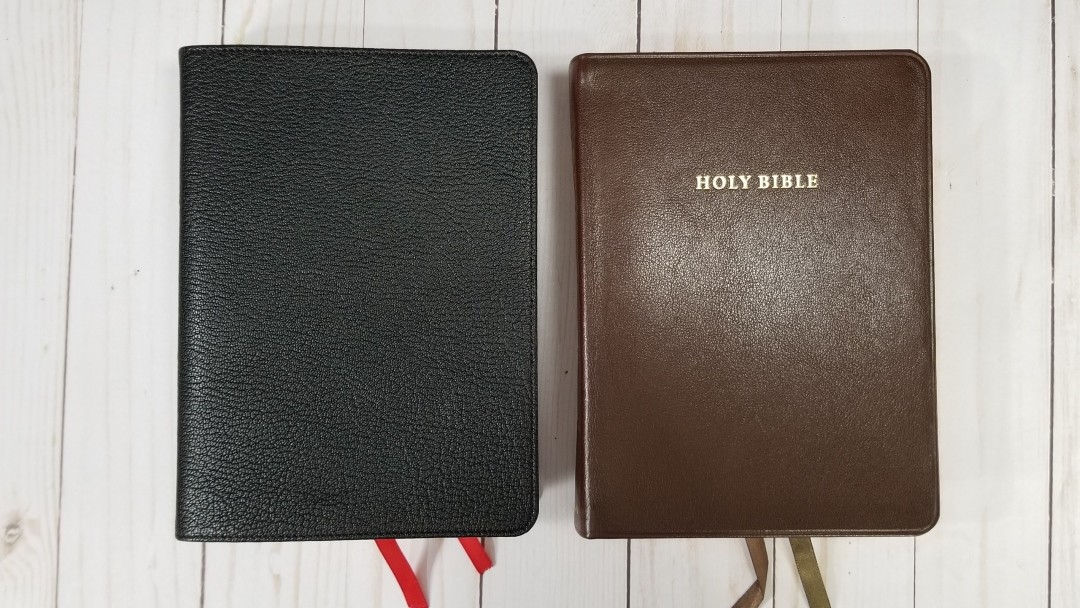
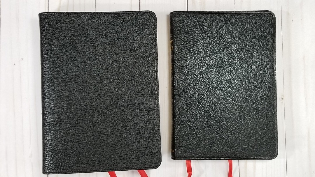
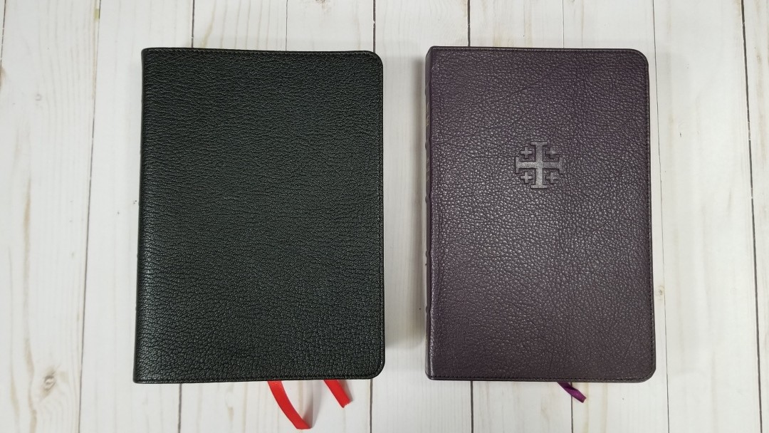
The cover is goatskin. It has a nice pebbly grain and perimeter stitching. The front has no printing, while the spine includes HOLY BIBLE, English Standard Version, and Cambridge printed in gold. The goatskin is flexible, but I didn’t find it too floppy to handle. It is a little slippery though.

The text-block is Smyth sewn. It’s edge-lined with a synthetic liner. The edge-line tab is a little stiff and will need to break in with some use before it will stay open in Genesis, but it does break in well. The spine doesn’t rise as high as the calfskin when opened, so the pages have more of a curve. This allows the text to bend further into the gutter. I was able to shift it around when holding it so the page I was reading stayed flat.
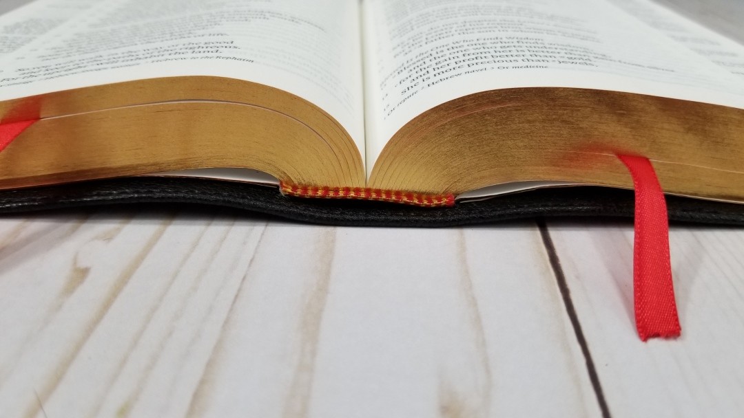
The head/tail bands and red and gold, and it has 2 thin cardinal red ribbons. The ribbons are long enough to pull to the corner to open the page. Their size feels right for this Bible. The overall size is 5.5 x 7.5 x 1.5″ and it weighs 1lb, 12oz. The footprint and thickness feel slightly chunky but I do find this size to be great for handling.
Paper
The paper is 28gsm Indopaque by Papeteries du Leman, Thonon-les-Bains, France. This is the premium paper used in many of the top premium Bibles including the Turquoise, Pitt Minion, Schuyler Personal Size Canterbury/Quentel series, Longprimer 43, Crossway Heirloom series, and many others.
It’s ivory in color and it’s very opaque for 28gsm. I find it to be a joy to read from. It has no glare under direct light. It can be difficult to grab a single page to turn when it’s new, but it does get easier to handle with use. The pages are art-gilt with red under gold.
Typography
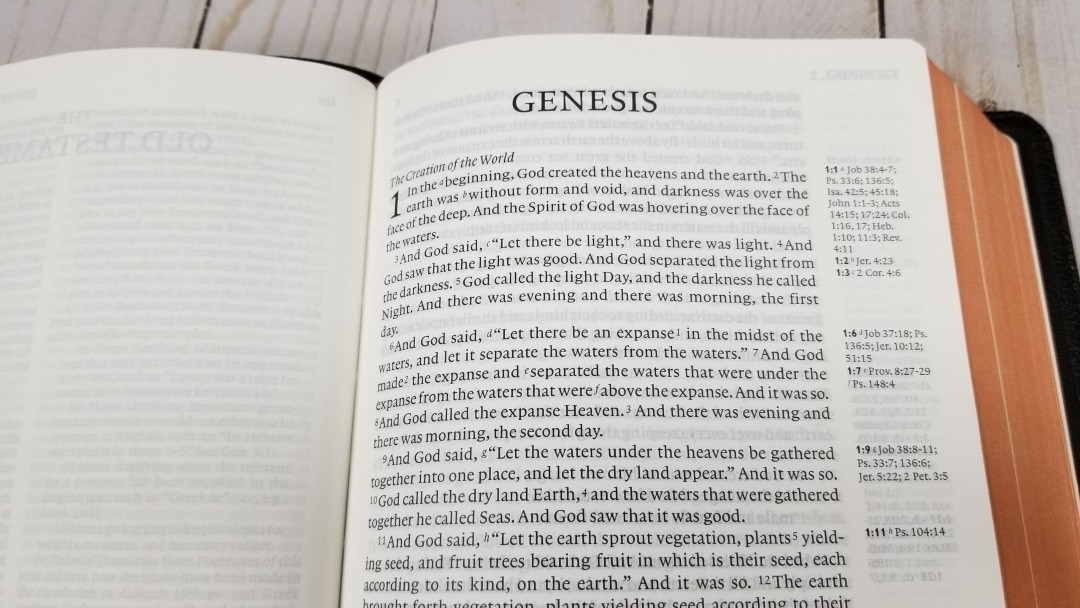
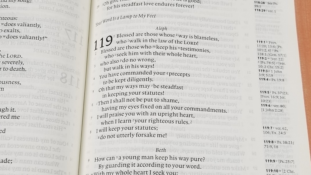
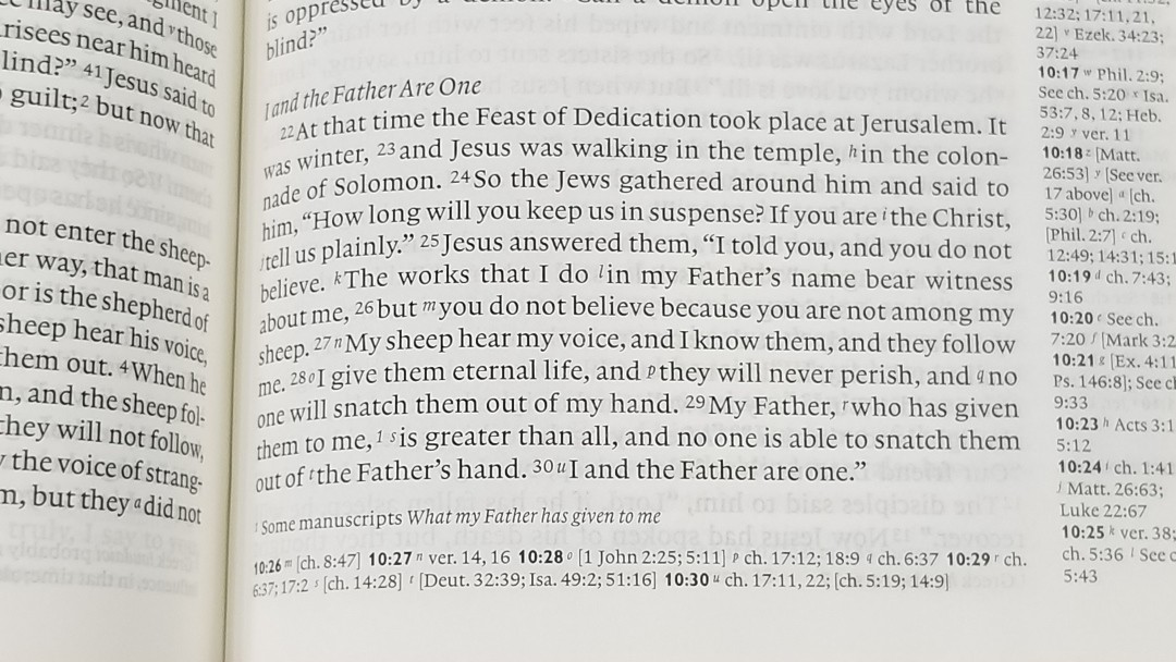
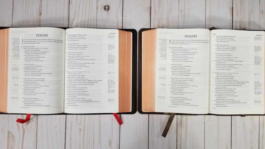
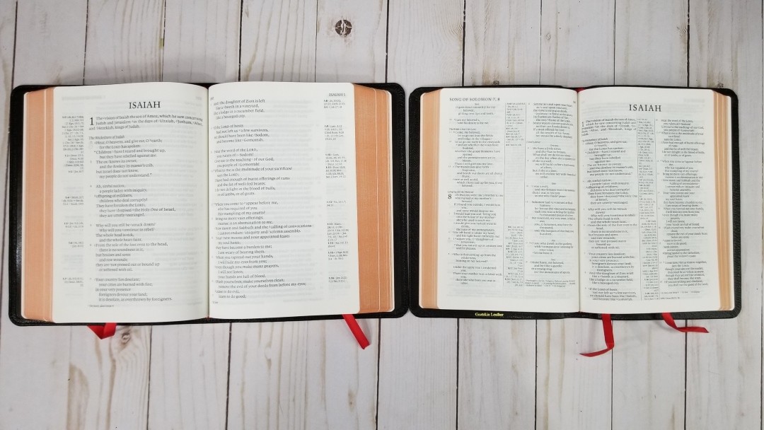
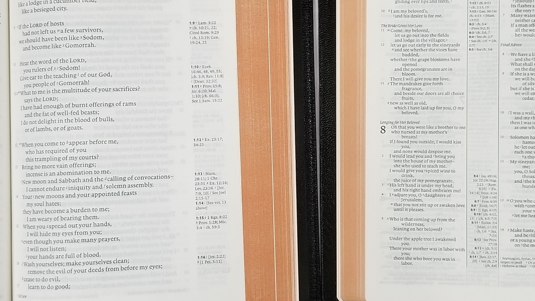
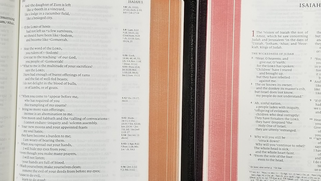
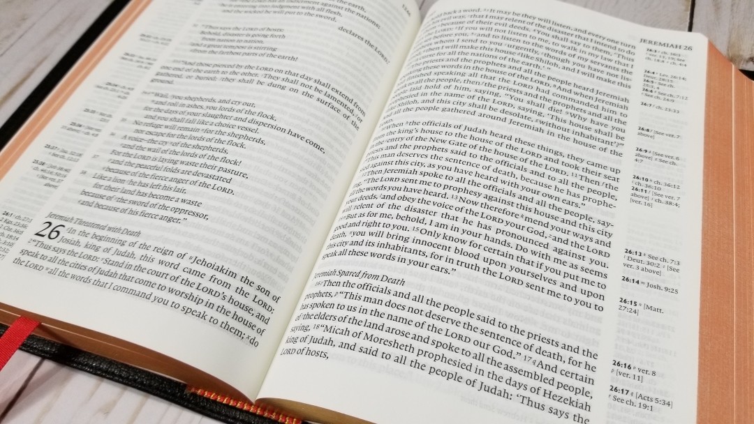
This is a single-column paragraph layout with poetry in stanzas. Cross-references are placed in the outer margin close to the verses they correspond to, and footnotes are placed under the last verse. The header includes the book name and chapter numbers in the outer margin, and the page numbers in the inner margin.
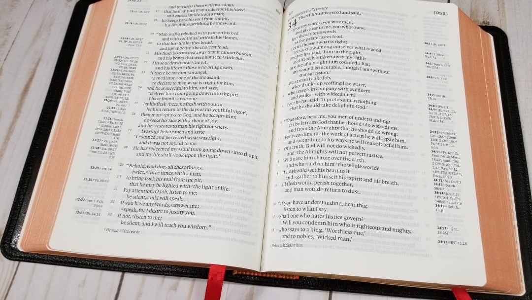
The font is 8.75 Lexicon No. 1, typeset by Blue Heron Bookcraft. It has a leading of 10.5, which makes the text comfortable to read. It’s black-letter and has about a medium darkness, which is consistent throughout the Bible. It has around 12-14 words per line. I love the poetry in this layout.
The text includes cross-reference and footnote keys. I usually find them easy enough to ignore for reading. They’re light so they don’t stand out. At first, this makes the references difficult to find quickly. If the cross-reference is near the verse then this helps in finding them quickly.
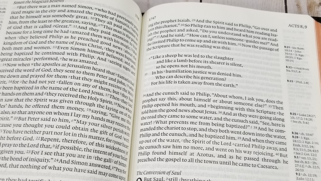
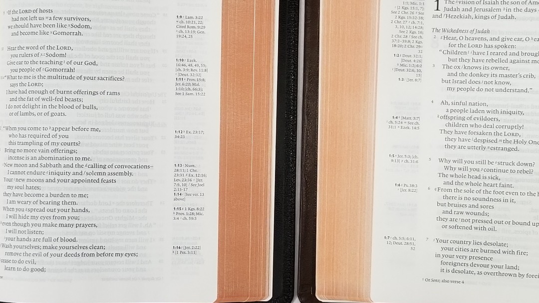
It’s printed with line-matching (meaning that the lines on both sides of the page are printed in the same location). This greatly improves readability. The color and opacity of the paper help with this too because the paper where the lines are printed are still white.
The Clarion is one of my all-around favorite designs and this one doesn’t disappoint me.
References and Footnotes
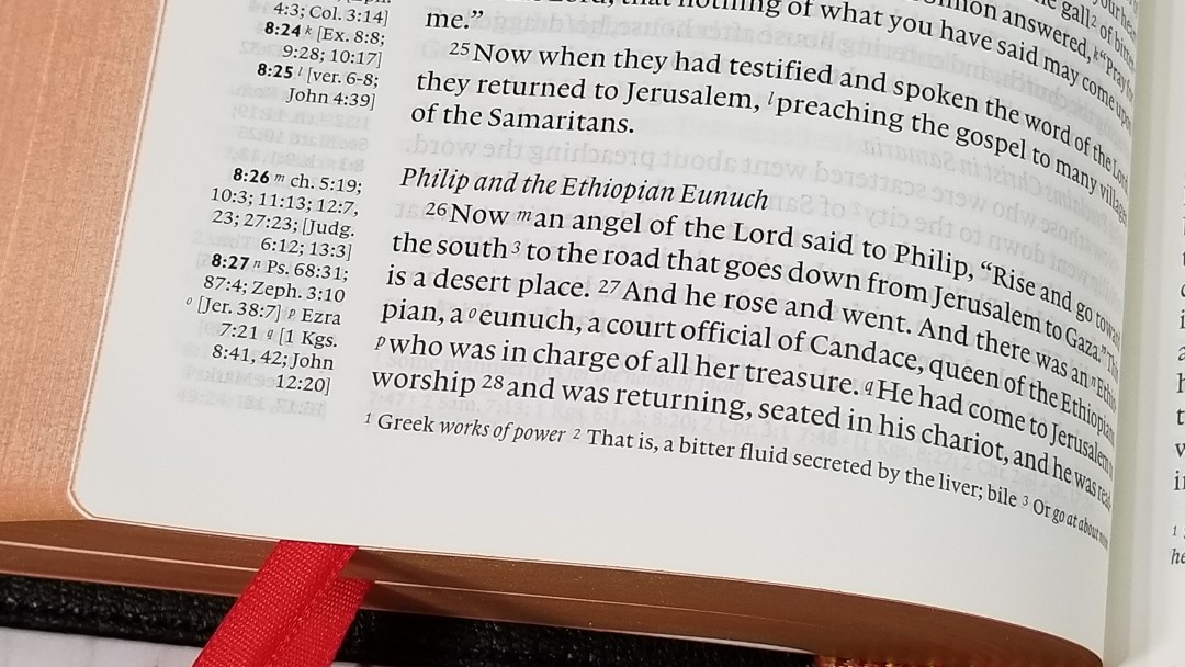
It includes the standard ESV reference. It has a lot of them. These are the same references as the ESV Pitt Minion. The pilot verse in the margin is bold. I use this bold reference to find verses quickly in the text. I like that the references and footnotes are separated from each other. This gives more room for references and the footnotes are easier to find.
There are a lot of good quality references that cover both words and themes. Here are a few examples of references to help you compare:
- Genesis 1:1 – Job 38:4-7; Ps 33:6; 136:5; Isa 42:5; 45:18; Jn 1:1-3; Ac 14:15; 14:24; Col 1:16, 17; Heb 1:10; 11:3; Rev 4:11
- Deuteronomy 6:4 – Cited Mk 12:29; [Isa 42:8; Zech 14:9; Jn 17:3; 1 Cor 8:4, 6]
- Isaiah 9:6 – Lk 2:11; [Jn 3:16]; ch 7:14; [Mt 28:18; 1 Cor 15:25]; ch 22:22; [ch 28:29]; ch 10:21; Deut 10:17; Neh 9:32; Jer 32:18; [Ps 72:17]; ch 63:16; [Jn 14:18]; Ps 72:7; [Eph 2:14]; see ch 1:6-9
- Matthew 17:20 – [Jn 11:40]; see ch 6:3; ch 21:21, 22; Mk 11:23; Lk 17:6; [ch 13:31]; ver 9; [1 Cor 13:2]; Mk 9:23
- Mark 11:23 – Mt 17:20; [Ps 46:2; 1 Cor 13:2; Rev 8:8]; Rom 4:20; 14:23; Jm 1:6; [ch 16:17; Jn 14:12]
- Mark 12:29 – Lk 10:27; cited from Dt 6:4, 5; Rom 3:30; 1 Cor 8:4, 6; Gal 3:20; Eph 4:6; 1 Tim 1:17; 2:5; Jm 2:19; 4:12; Jude 25; [Mt 19:17; 23:9]
- Acts 2:38 – 3:19; 20:21; 26:18, 20; Luke 24:47; ch 22:16; [ch 8:12]; See Mark 16:16; ch 10:48; see ch 8:16; See Mark 1:4; ch 10:45; [ch 8:15, 20; 11:17]; See John 7:39
- John 1:1 – Gn 1:1; [Col 1:17; 1 Jn 1:1; Rev 1:4, 8, 17; 3:14; 21:6; 22:13]; Rev 19:13; [Heb 4:12; 1 Jn 1:1]; 1 Jn 1:2; [ch 17:5]; Phil 2:6
- 1 John 1:1 – see Jn 1:1; [ch 2:13, 14]; Ac 4:20; Jn 19:35; ch 4:14; Jn 1:14; 2 Pet 1:1; Lk 24:39; Jn 20:27
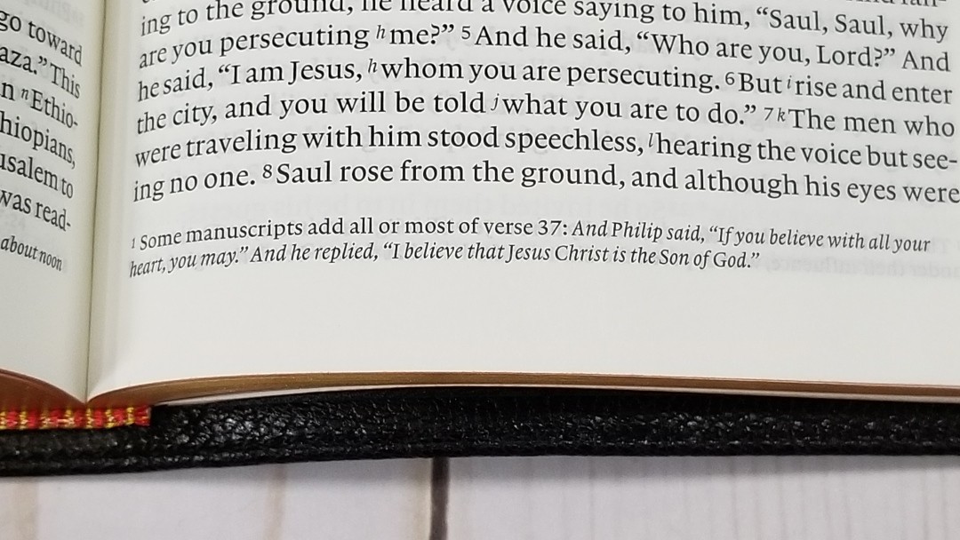
The footnotes are placed at the bottom of the page and are keyed to the text with numbers. They include alternate translations, literal translations, Hebrew and Greek terms, special uses of Greek words, the meanings of names, words where meanings are uncertain, clarification of additional meanings, grammatical points, supplied pronouns, English equivalents of weights and measures, and manuscript variations. The footnotes are useful for personal study and for sermon prep.
Concordance
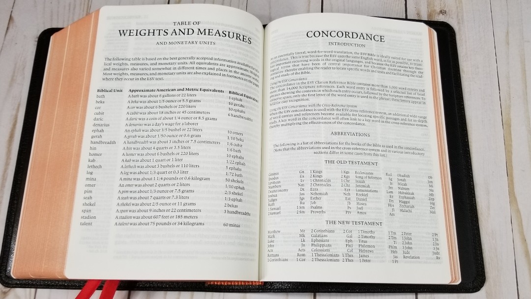
The concordance is 98 pages with 3 columns per page. It has lots of entries. It contains 3000 word-entries and 140,00 references. There is a lot of good material here that greatly helps in study and sermon prep.

Sample entries include:
- Christ – 17
- Christ’s – 3
- Christian – 2
- Christs – 1
- Faith – 36
- Faithful – 12
- Faithfully – 3
- Faithfulness – 7
- Faithless – 2
- God – 56
- Goddess – 2
- Godliness – 6
- Godly – 4
- Gods – 4
- Praise – 11
- Praised – 4
- Praises – 3
- Praising – 4
- Pray – 13
- Prayed – 5
- Prayer – 11
- Prayers – 7
- Praying – 4
Maps
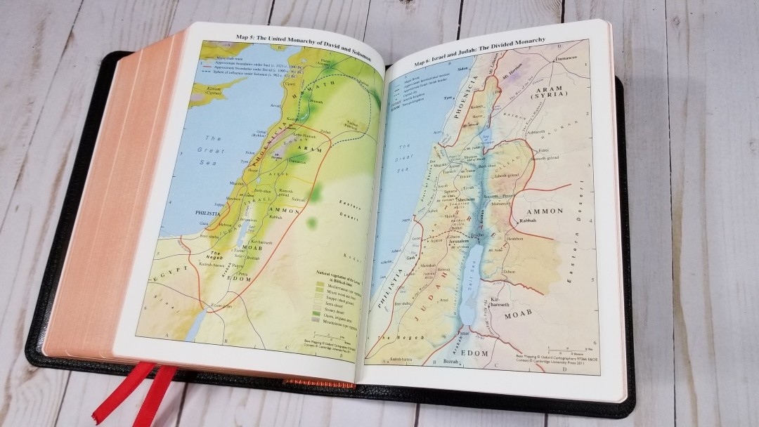
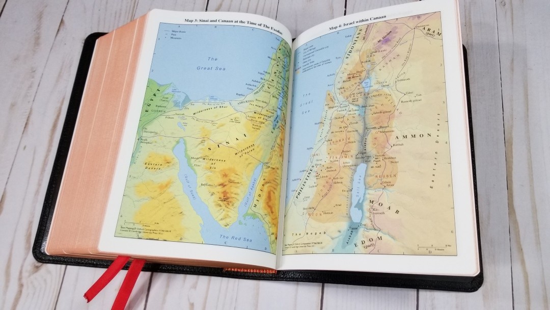

It has 15 pages of maps on thick, non-glossy, paper. They are bright and colorful, but they’re not overdone. They include borders, import commodities, dates, routes, passes, settlements, distance, topography, mountains, cities of refuge, cities, tribes, vegetation, kingdoms, battle sites, satrapy, cities walls, city gates, older city walls, seven Churches of Asia, etc.
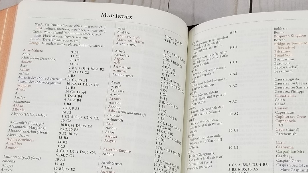
It also has an 8-page color-coded index to maps to identify settlements, political (nations, provinces, and regions), physical land, physical water, travel, and Jerusalem. I’m always glad to see a map index. I find the Cambridge color-coded index to be one of the best indexes.
Maps include:
- The Ancient Near East in the Late Bronze Age
- Regions of Palestine and Surrounding Areas
- Sinai and Canaan at the Time of the Exodus
- Israel within Canaan
- The United Monarchy of David and Solomon
- Israel and Judah: The Divided Monarchy
- The Assyrian Empire
- The Babylonian Empire
- The Persian Empire
- The Hellenistic World after Alexander
- Jerusalem in Old Testament Times
- Jerusalem in New Testament Times
- Palestine in New Testament Times
- The Roman Empire
- The Eastern Mediterranean in the First Century AD
Comparisons
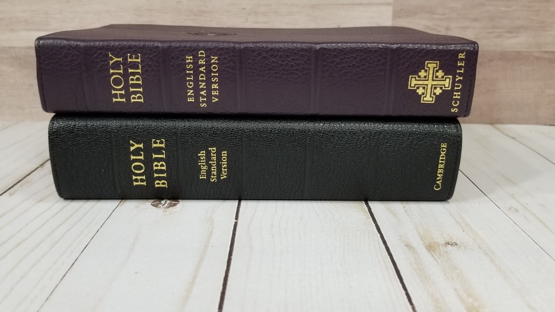
Here’s a look at how the ESV Clarion compares with the calfskin Clarion, Pitt Minion, and the Personal Size Quentel.
Calfskin Clarion
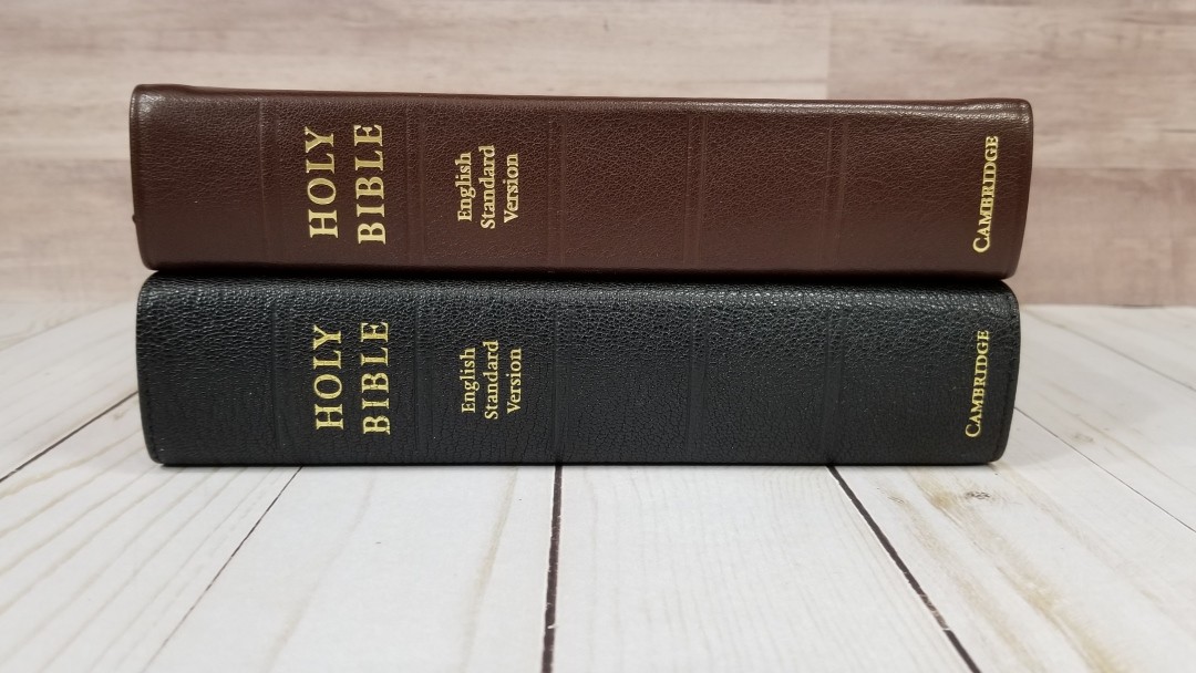
The paper in my older calfskin ESV Clarion isn’t as nice as the goatskin. I find the calfskin cover easier to hold, but I like the paper in the goatskin edition enough to use it instead.
Pitt Minion
The ESV Pitt Minion has close to the same footprint and half the thickness. It has a two-column layout with the same references, concordance, and maps. The font is 6.75 and is red-letter. This is an amazing Bible for anyone that can read the smaller print.
Personal Size Quentel

The Personal Size Quentell is similar in size. It has a double-column layout with references and footnotes at the bottom. It’s thinner than the Clarion. It does not have a concordance. It does have maps but it doesn’t have a map index. It has several lined pages for notes.
Conclusion
I love the Clarion’s design. The single column paragraph setting with cross-references in the outer margin create a design that’s readable and usable. The focus is on readability. The text does include reference and footnote keys, but they’re easy enough to ignore for reading. The verse numbers are light, which makes them a little difficult to find at a glance. The bold verse numbers in the margins are great for finding the verses in the text. This works on most pages, but where there are lots of references the verses don’t line up as well.
The construction and materials look and feel high-quality. I find the calfskin easier to hold open in one hand than the goatskin, but the goatskin is easy enough to use. The spine doesn’t rise up in the center as high as the calfskin edition when opened. This would allow the page to lay flatter. I like the paper in the goatskin edition enough that I’d switch to the goatskin.
The ESV Clarion Reference Edition is one of my all-time favorite ESV’s. I recommend the goatskin edition to anyone looking for a high-quality hand-sized ESV reference Bible in single-column.
_________________________________________________________
This book is available at (includes some affiliate links)
and many local Bible bookstores
_________________________________________________________
Cambridge provided this Bible in exchange for an honest review. I was not required to give a positive review, only an honest review. All opinions are my own.


Did they upgrade the NKJV Clarion paper as well?
I haven’t seen that one. I’ll ask my contact.
Cambridge has confirmed that the NKJV goatskin edition does have the same 28gsm paper as the goatskin ESV.
Hi Randy, apologies in advance for the somewhat off-topic comment in this old review. I was wondering, do you know if the NKJV Clarion in goatskin is still in production? While the other translations are all available in goatskin, the NKJV doesn’t seem to appear on the main online stores, or the Cambridge website.
I’ve no problem searching for a used copy, but it’s going to be challenging to make sure it’s the upgraded indopaque paper.
Thanks in advance for anything you may know, and thanks for your great reviews!
Hi Rob. I’m not sure. I’ll see what I can find.
Hi Rob. I heard back. The goatskin has been discontinued. They’re getting information about when the others will be back in stock.
Thanks, Randy! I’ve been thinking of a NKJV bible to complement my TBS Reformation bible, and the Cambridge Clarion NKJV or the Thomas Nelson NKJV Compact Single Column Reference Bible. If the Goatskin NKJV Clarion has upgraded paper, how would you think it would compare to the Thomas Nelson CSCRB? Of course I would imagine there is quite a disparity in cost between the two.
Hi Jason. Overall, I prefer the paper and construction quality of the goatskin Clarion. It feels more elegant and it’s higher quality. It has a larger print too. The Compact is a great choice for the price and I’d say it’s good enough. If I wanted higher quality I’d go with the Clarion. If I wanted to go cheaper I wouldn’t hesitate to grab the TN Single Column Compact. Their prices do reflect their quality, but the TN doesn’t feel too cheap.
Hi Randy, hoping you see this. Thanks for the picture of the back of the box, so I can see this is Black letter, which I’m looking for.
Do you happen to know please whether the brown calf or black split are also black letter in the ESV version? People keep leaving this out of their reviews, and I couldn’t find it on Cambridge’s site either! 1107648297
Thank you
Hi Belinda. Good question. The Clarion is only available in black letter in any cover or translation.
Hey, Thanks Randy! Impressed you monitor your old posts, that’s so good of you.
Well I’m glad for the black letters too – my old eyes are grateful!
Hello, I just received a black goatskin ESV. My other two goatskin bibles are goatskin lined. Is it a concern this being a synthetic lined Bible? I want it to last for many years.
Hi Michial. I’ve never had any trouble with any of my synthetic liners. I don’t think it’ll last as long as leather liners, but it should still last for many years.
Is the synthetic liner on the goatskin Clarion a concern? Will it last?
Randy, thanks for your reviews, they’ve been super helpful! Do you know if the goatskin NASB has the upgraded paper like the ESV does?
Hi Benjamin. As far as I know, it does. I don’t have it to confirm, though.