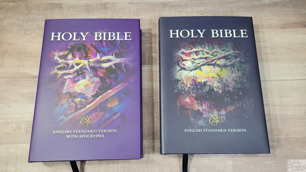
The Cambridge Diadem is a new family of Bibles based on their famous Pitt Minion. Starting with the ESV, it provides the Pitt Minion reference Bible in a layout that’s 20% larger. It also adds a couple of things in the front that the Pitt Minion doesn’t have. This Bible will be available in hardcover and leather, with and without the Apocrypha. The hardcover editions have 36gsm paper in black letter, while the leather will have 32gsm with red letter. The hardcover editions will be available this year. The leather editions are coming next year. In this review, I’ll look at both of the hardcover editions of the Cambridge ESV Diadem, one with and one without the Apocrypha. They’re printed in Belarus by World Wide Print Corp.
Cambridge provided these Bibles in exchange for an honest review. I was not required to give a positive review, only an honest one. All opinions are my own.
_________________________________________________________
This Bible is available at (includes some affiliate links)
Amazon
– Regular edition – With Apocrypha
and many local Bible bookstores
_________________________________________________________
Table of Contents
- Video Review
- Binding
- Paper
- Typography and Layout
- References
- Footnotes
- Concordance
- Bible Atlas
- Extras
- Apocrypha
- Comparisons
- Conclusion
Video Review
Binding
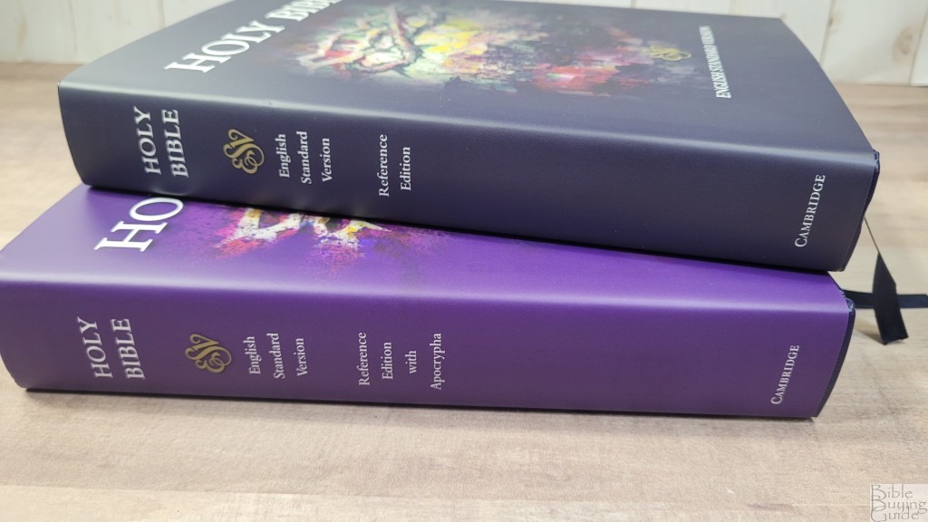
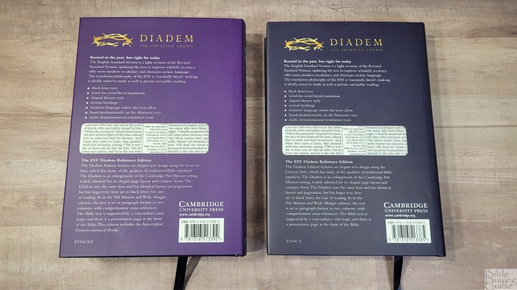
Both editions are hardcover. They include dust jackets with cover artwork. Both covers have an oil painting in the center with the text above and below it on the front. I’m a fan of art, so I’m glad to see they’ve added it. The dust jacket of the regular edition is black with artwork of the crown of thorns. The edition with the Apocrypha is purple and has a painting of Jesus in profile wearing the crown of thorns. On the back of both covers is the project description with specs and a photo of the text.
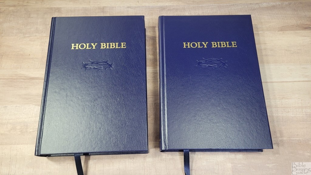
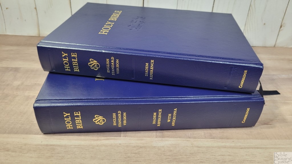
The cover under the dust jacket is the same for both editions. They’re navy blue. They’re textured and include a dry stamped debossed crown on the front under Holy Bible stamped in gold. The spine has the text and logos stamped in gold and three debossed spine indications.
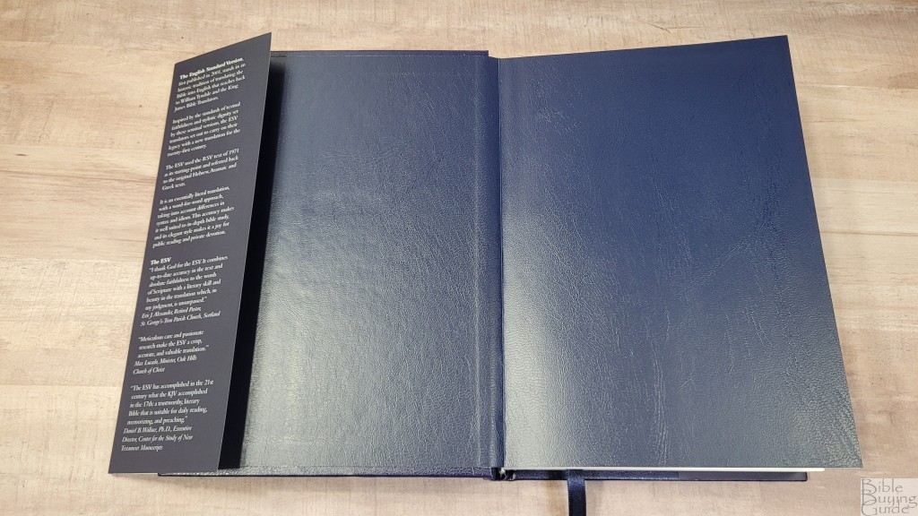
The liner is an extra-thick paste-down vinyl. It’s navy and matches the cover. This is the thickest end sheet I’ve seen in a Bible. Both editions are sewn and have no trouble staying open flat to any page.
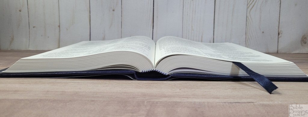
Both have a single navy ribbon that’s just over 1/4″. They’re long enough to pull to the corner to open the Bible easily. The overall size for the regular edition is 6 x 8.5 x 1.25″ and weighs 1 lb, 14.9 oz. The Apocrypha edition is 1.5″ thick and weighs 2 lbs, 3.8 oz.
Paper
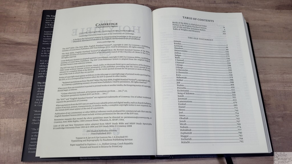
The paper for the hardcover edition is 36gsm. The upcoming leather edition will have 32gsm. This 36gsm paper is slightly rough but still feels elegant. It has the right texture for my fingers to grab and turn easily with one hand. The pages do not stick together. It’s off-white in color and it’s highly opaque. It has very little show-through. It’s mostly noticeable in the poetic settings. The paper is opaque enough that the text is not affected by the text on the other side of the page. This paper is excellent for reading. It’s also good for highlighting and marking. The page edges are white and the corners are square cut.
Typography and Layout
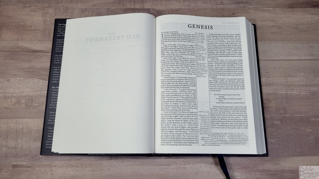
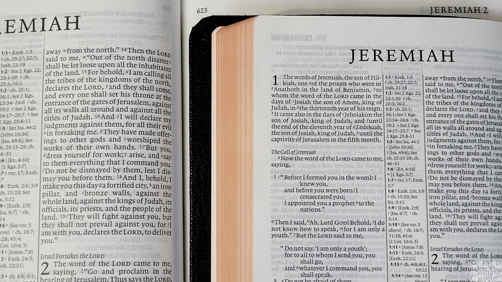
The layout matches the ESV Pitt Minion and Wide Margin editions. This is great if you want to use multiple versions of the same Bible. The 2016 ESV text is presented in a double-column, paragraph layout with poetry is set to stanzas. center-column references. Cross-references are placed within the center column. The translator’s footnotes are placed under the last verse. When there are too many, the rest are placed under the last verse. The header shows the book name and chapter number in the outer margin and the page number in the inner margin. Section headings are in italics and don’t stand out to get in the way. The page numbers start over for the Apocrypha and the New Testament.
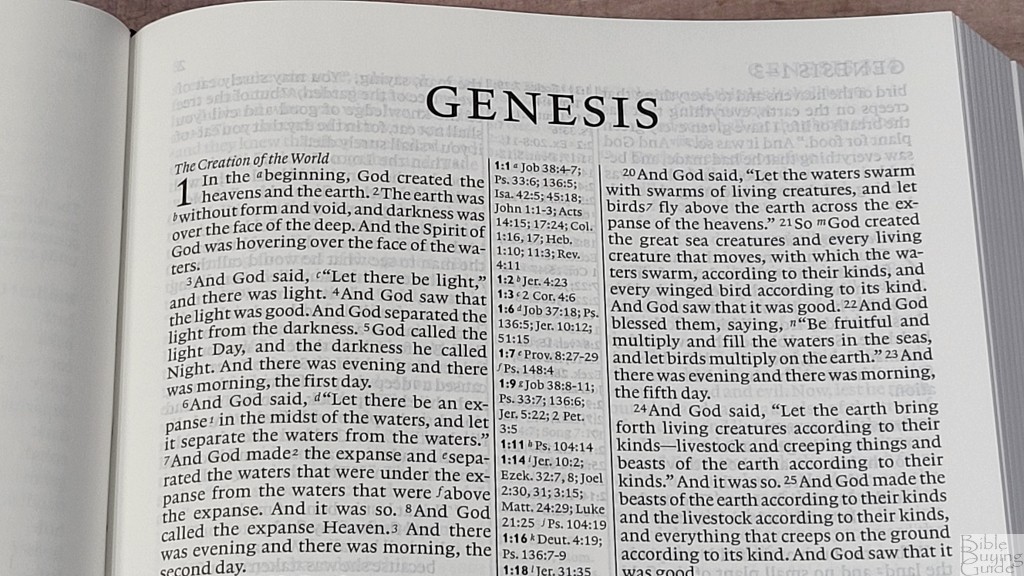
The font is an 8.1 Lexicon with an 8.5 point leading. The hardcover edition is black letter. It’s about a medium in darkness and it’s highly consistent. This larger text is easy to read. The text does feel a little tight, but it’s not that bad when you’re reading it. It has around 8 words per line and it was printed with line-matching, meaning that the lines of text are printed on the same line on both sides of the page to reduce show-through.
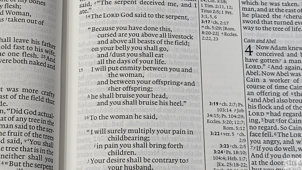
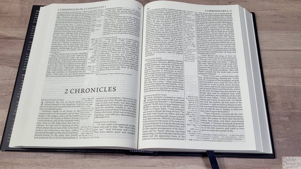
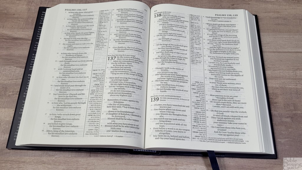
The inner margin is large enough that the text never gets lost in the gutter. Verse numbers are small and light. They can be a little difficult to find quickly. The cross-reference and footnote keys are small enough to ignore while reading. The poetic settings do have a lot of lines with a single word.
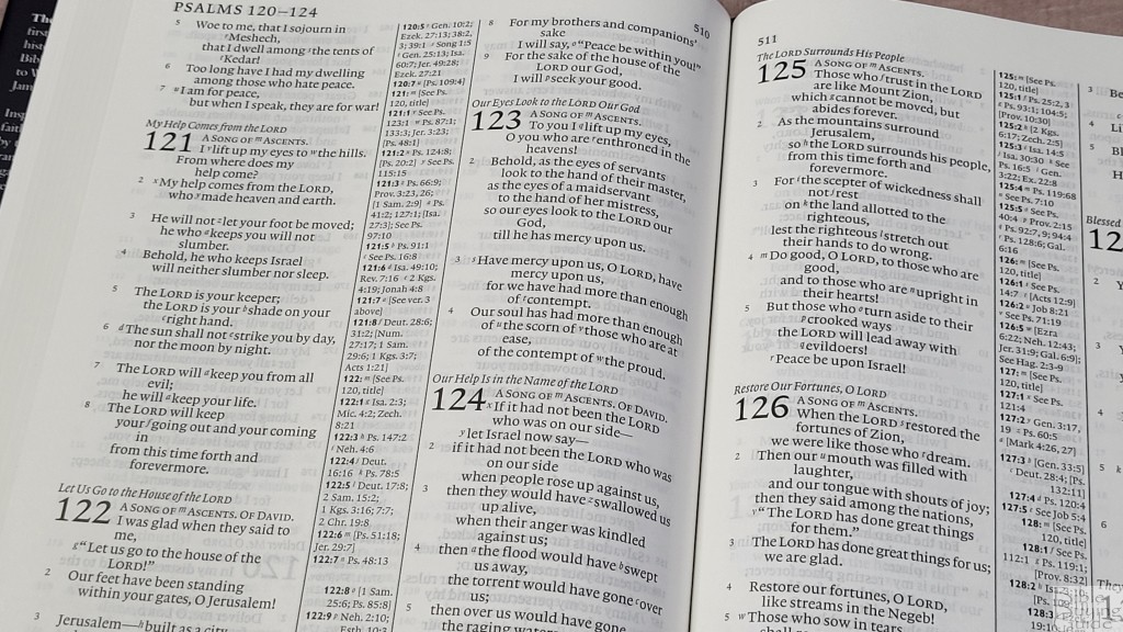
The overall size and layout make this an excellent Bible for reading. The small verse numbers can make finding verses take a few extra seconds to locate. There are a lot of words on a page, so the text is a touch dense. The lines are slightly tight for underlining. It might not be ideal for preaching. It really shines for carrying, personal reading, and study.
References
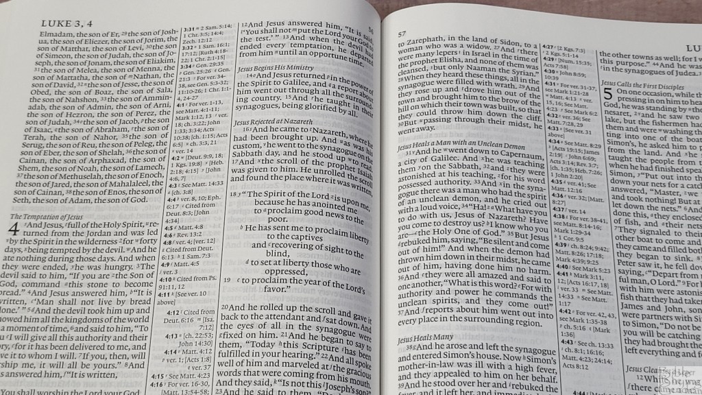
Cross-references are placed in the center column. Those for the left column are left-justified and placed at the top, while those for the right column are right-justified and placed at the bottom. The corresponding references are in bold so they’re easier to find. If there are more than will fit in the center column, the rest are placed under the footnotes, which are under the last verse on the page. This works, but it does mean you might have to look in more than one location to find them.
Examples
There are a lot of references. They cover both words and themes, making this an excellent Bible for personal study and sermon prep. Here are a few examples of references to help you compare:
- Genesis 1:1 – Job 38:4-7; Ps 33:6; 136:5; Isa 42:5; 45:18; Jn 1:1-3; Ac 14:15; 14:24; Col 1:16, 17; Heb 1:10; 11:3; Rev 4:11
- Deuteronomy 6:4 – Cited Mk 12:29; Isa 42:8; Zech 14:9; Jn 17:3; 1 Cor 8:4, 6
- Isaiah 9:6 – Lk 2:11; Jn 3:16; ch 7:14; Mt 28:18; 1 Cor 15:25; ch 22:22; ch 28:29; ch 10:21; Deut 10:17; Neh 9:32; Jer 32:18; Ps 72:17; ch 63:16; Jn 14:18; Ps 72:7; Eph 2:14; see ch 1:6-9
- Matthew 28:19 – Mk 16:15, 16; ch 13:52; Lk 24:47; ch 24:14; Mk 11:17; Rom 1:5; Ac 8:16; 2 Cor 13:14
- Mark 12:29 – Lk 10:27; cited from Dt 6:4, 5; Rom 3:30; 1 Cor 8:4, 6; Gal 3:20; Eph 4:6; 1 Tim 1:17; 2:5; Jm 2:19; 4:12; Jude 25; Mt 19:17; 23:9
- John 1:1 – Gn 1:1; Col 1:17; 1 Jn 1:1; Rev 1:4, 8, 17; 3:14; 21:6; Rev 19:13; Heb 4:12; 1 Jn 1:1; 1 Jn 1:2; ch 17:5; Phil 2:6
- John 3:16 – Rom 5:8; Eph 2:4; 2 Thes 2:16; 1 Jn 3:1; 4:9, 10; see ch 1:29; Rom 8:32; ch 10:28
- Acts 2:38 – ch 3:19; 20:21; 26:18, 20; Lk 24:47; ch 22:16; ch 8:12; see Mk 16:16; ch 10:48; see ch 8:16; see Mk 1:4; ch 10:45; ch 8:15, 20; 11:17; see Jn 7:39
- Romans 10:9 – Mt 10:32; Lk 12:8; 1 Cor 12:3; Phil 2:11; see Ac 16:31; 1 Pet 1:21; see Ac 2:24
- 1 John 1:1 – see Jn 1:1; ch 2:13, 14; Ac 4:20; Jn 19:35; ch 4:14; Jn 1:14; 2 Pet 1:1; Lk 24:39; Jn 20:27
Footnotes
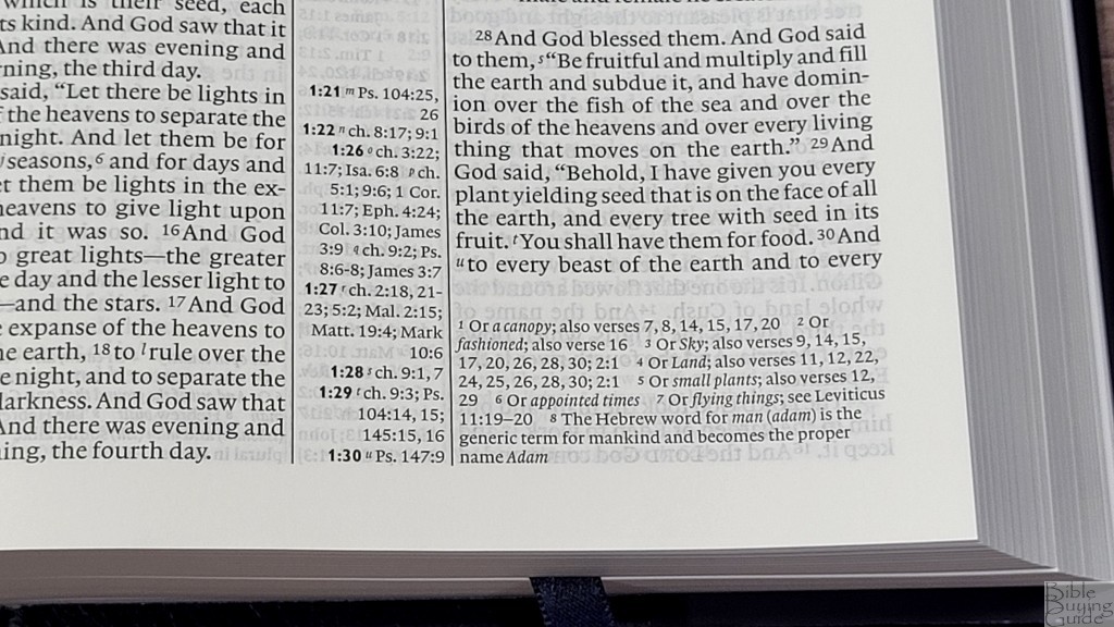
The footnotes are placed under the last verse on the page above the references and are keyed to the text with numbers. They don’t have the verse numbers they correspond to, but they do include the numbered keys. The footnotes include alternate translations, literal translations, Hebrew and Greek terms, special uses of Greek words, the meanings of names, words where meanings are uncertain, clarification of additional meanings, grammatical points, supplied pronouns, English equivalents of weights and measures, and manuscript variations. They’re useful for personal study and for sermon prep.
Concordance
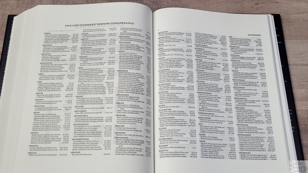
The concordance is 89 pages with 3 columns per page. It has over 3000 entries with 14,000 references. This is twice the size of the Pitt Minion. It’s similar to the one in the Wide Margin. It has fewer in some entries and more in others. It includes proper names of the most prominent people and places. This is a good concordance for personal study and sermon prep.
Sample entries include:
- Christ – 17
- Christ’s – 3
- Christian – 2
- Christs – 1
- Faith – 36
- Faithful – 12
- Faithfulness – 7
- Faithless – 2
- God – 56
- Goddess – 2
- Godliness – 6
- Godly – 4
- Gods – 4
- Praise – 11
- Praised – 4
- Praises – 3
- Praising – 4
- Pray – 13
- Prayed – 5
- Prayer – 11
- Prayers – 7
- Praying – 4
Bible Atlas
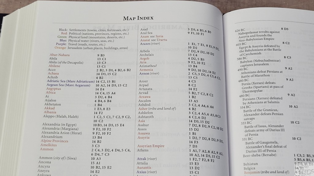
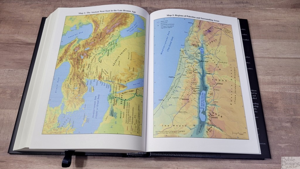
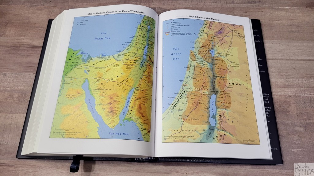
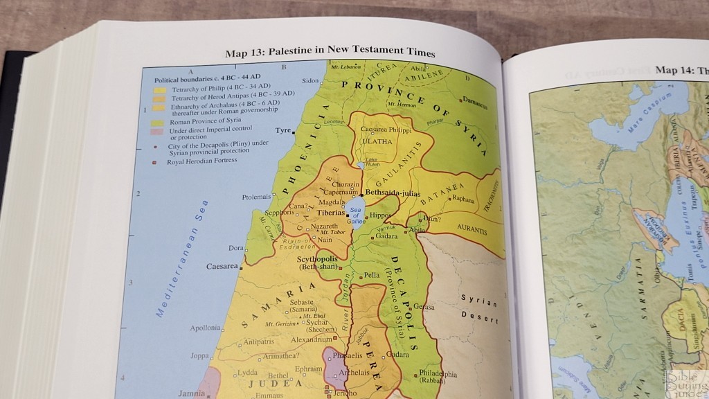
In the back are 15 full-color maps with an 8-page color-coded index. The maps are colorful and easy to read. They’re printed on thick, non-glossy paper. This is my favorite paper for maps. They show routes, birders, water, distance topography, vegetation, cities, dates, battle sites, etc. The index is color-coded to show settlements, political, physical land, physical water, travel, and Jerusalem.
Maps include:
- The Ancient Near East in the Late Bronze Age
- Regions of Palestine and Surrounding Areas
- Sinai and Canaan at the Time of the Exodus
- Israel with Canaan
- The United Monarchy of David and Solomon
- Israel and Judah: The Divided Monarchy
- The Assyrian Empire
- The Babylonian Empire
- The Persian Empire
- The Hellenistic World after Alexander
- Jerusalem in Old Testament Times
- Jerusalem in New Testament Times
- Palestine in the New Testament
- The Roman Empire
- The Eastern Mediterranean in the First Century AD
Extras
There are a few extra features in the front.
Chronology of Rulers During Biblical Times

This is a 2 1/2 page table that divides the rulers into several categories. It shows the name and date they ruled. Categories include:
- Rulers During Old Testament Times
- Judah
- Israel
- Hasmonean Dynasty
- Rulers During the Time of the New Testament
- Roman Emperors
- Rulers of the Herodian Territories
- Governors
Table of Weights and Measures
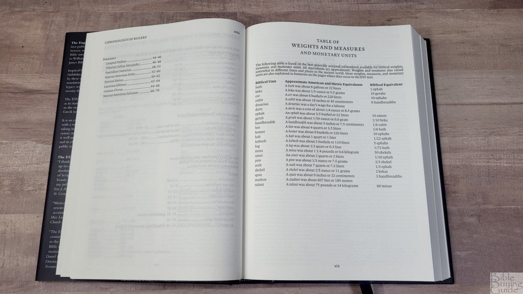
This is a one-page table with the biblical unit, equivalent American and metric units, and a biblical equivalent. It’s a simple table with 22 units and includes weights, measures, and money. These are also included in the ESV translator’s footnotes. This table is in the back of the Pitt Minion and Wide Margin editions. For the Diadem, it was moved to the front.
Apocrypha
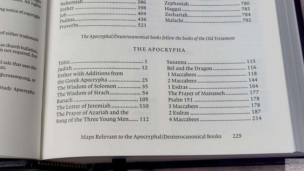


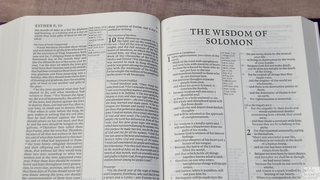
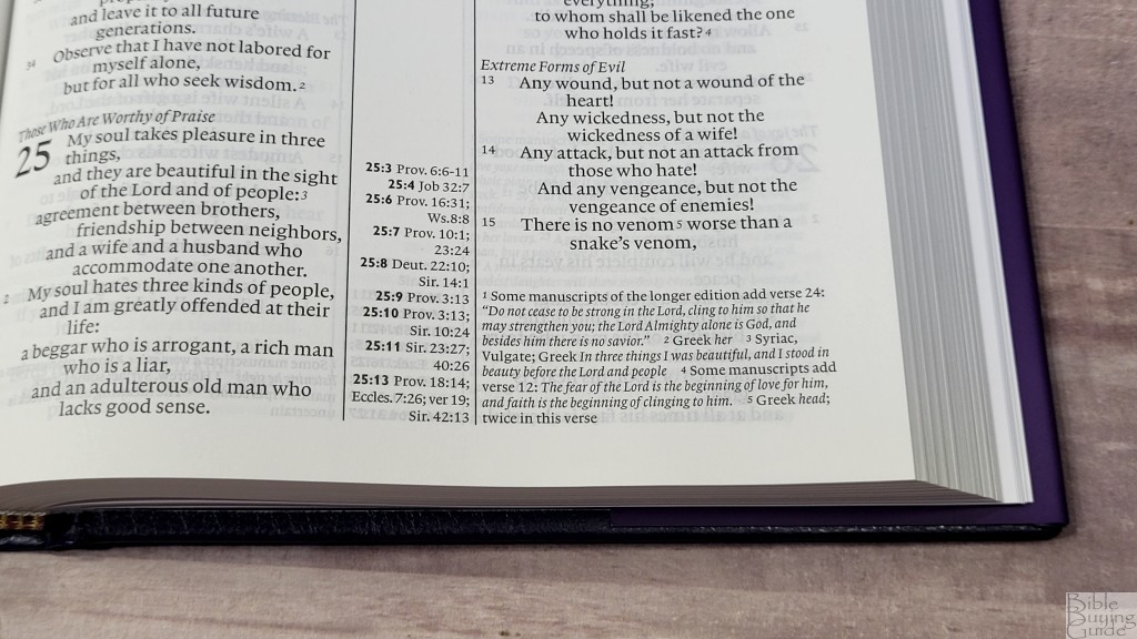
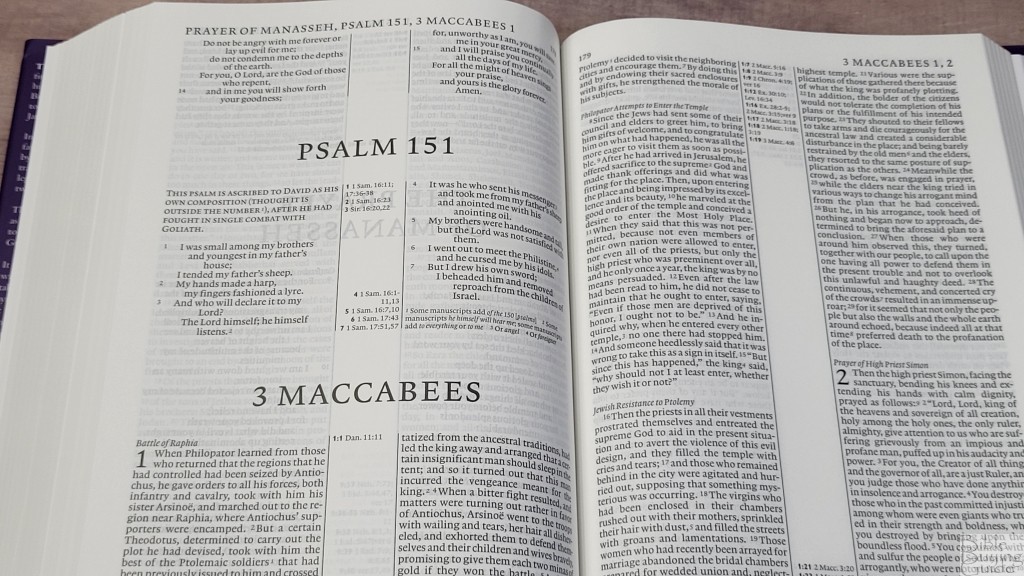
The edition with the Apocrypha places 20 complete books or additional chapters between the testaments. They include:
- Tobit
- Judith
- Esther with Additions from the Greek Apocrypha
- The Wisdom of Solomon
- The Wisdom of Sirach
- Baruch
- The Letter of Jeremiah
- The Prayer of Azariah and the Song of the Three Young Men
- Susanna
- Bel and the Dragon
- 1 Maccabees
- 2 Maccabees
- 1 Esdras
- The Prayer of Manasseh
- Psalm 151
- 3 Maccabees
- 2 Esdras
- 4 Maccabees
The edition with the Apocrypha includes cross-references and footnotes. The 66 canonical books do not reference the Apocrypha. In the front is an introduction that tells how the ESV version of the Apocrypha was developed.
Maps
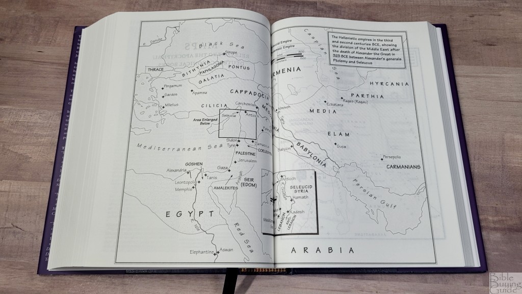
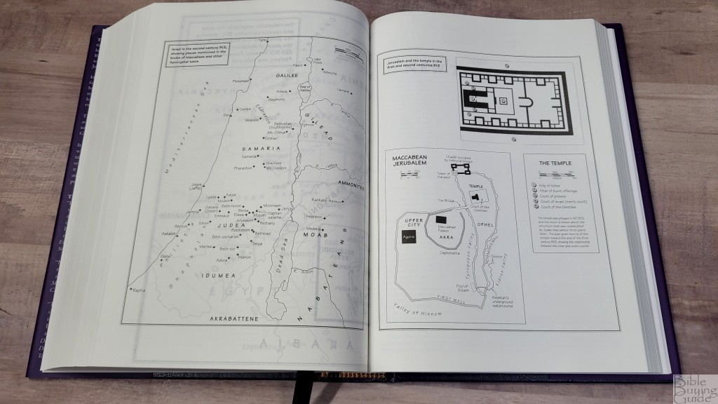
The Apocrypha also includes a few maps. They’re bl;ack-and-white line drawings and are relevant to the Apocrypha.
Comparisons
Here’s how the hardcover editions of the Cambridge ESV Diadem compare to several other Bibles from Cambridge and a few others. These Bibles are in a much higher price range.
Pitt Minion
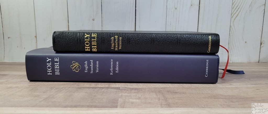
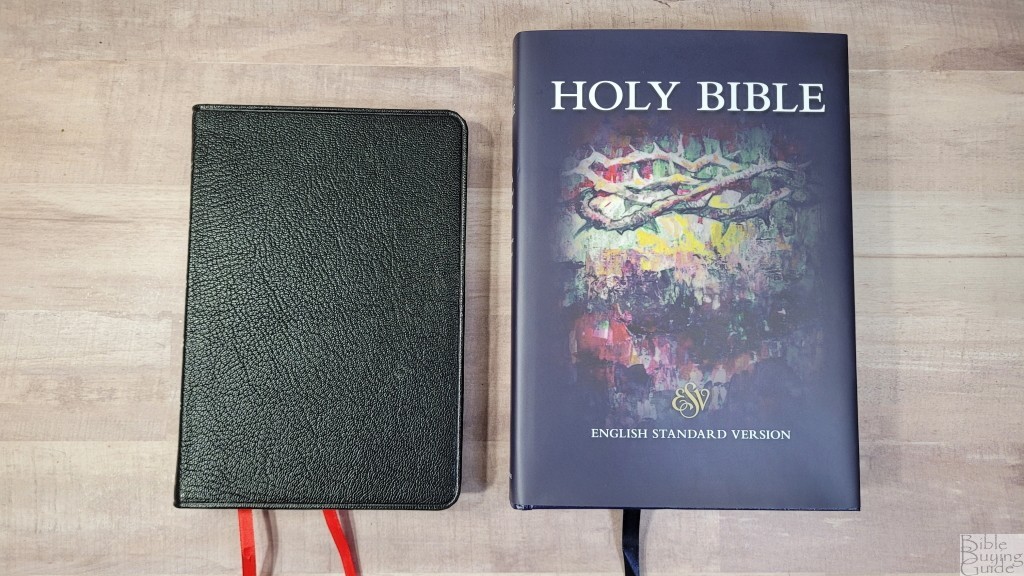
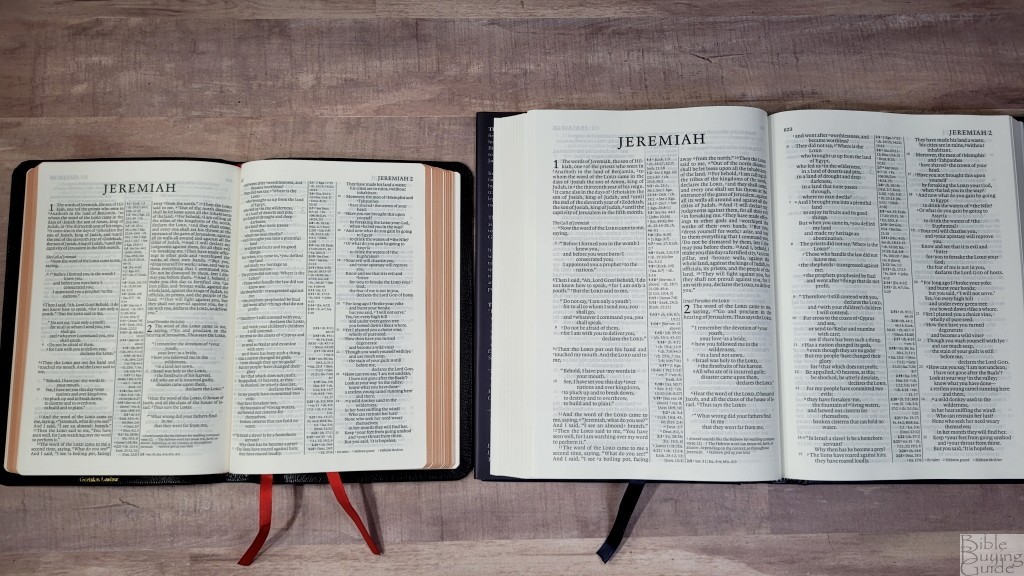
The Cambridge ESV Pitt Minion has the same pagination, but it’s about 20% smaller. This is a significant difference in the overall size. It’s much thinner, too, due to the 28gsm paper. It has the same references and maps but has a smaller concordance. This is a red-letter edition, which will match the leather version of the Diadem. That 20% reduction in size can make the difference between readable and not. If you’re in the older crowd, as I am, you might love the design of the Pitt Minion but find it difficult to read. The Diadem will be the answer for many people.
Wide Margin
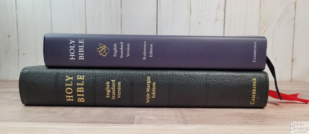
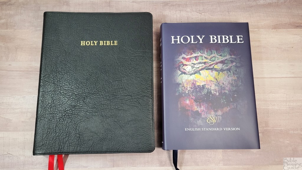
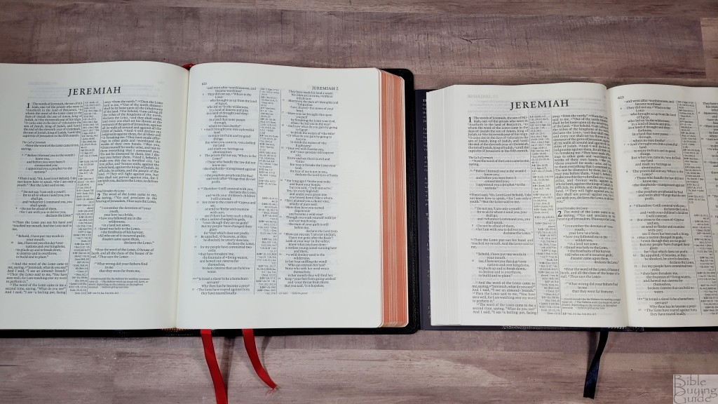
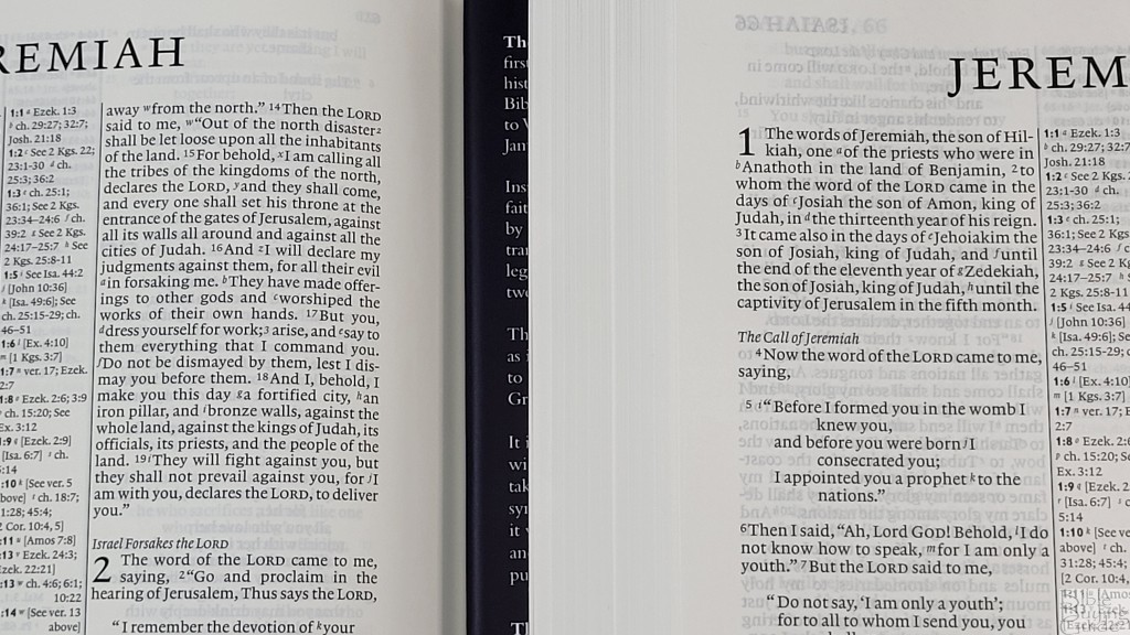
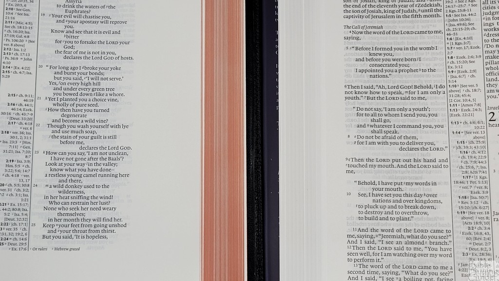
The Cambridge ESV Wide Margin also has the same pagination. The paper is thicker, but the font is slightly smaller. It has the same references, concordance, and maps. This footprint is much larger due to the wide margins. It’s thicker due to the thicker paper. This is a red-letter edition and will match the leather versions of the Diadem.
Clarion
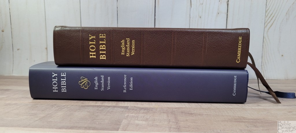
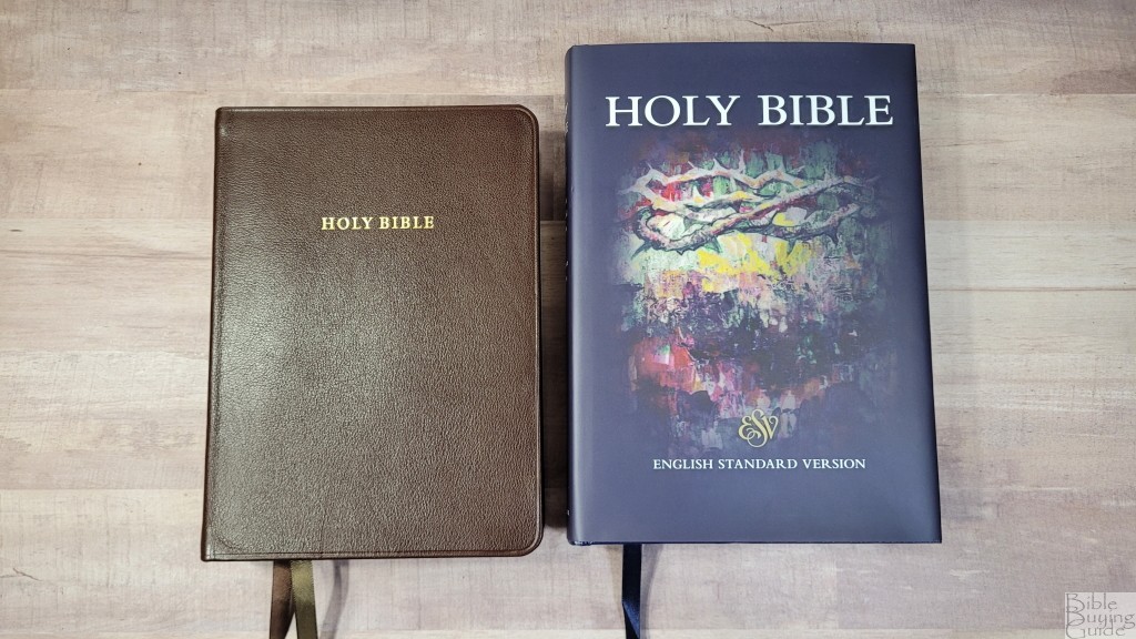
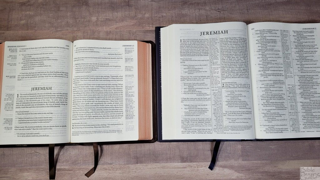
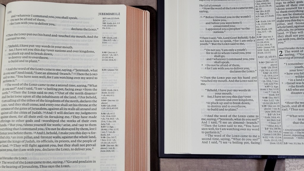
The Cambridge ESV Clarion is a single-column reference edition. It has the same references, concordance, and maps. The font is larger and the footprint is smaller. It’s 1/4″ thicker than the standard edition of the Diadem and has 28gsm Indopaque paper. It’s not available in hardcover. The text is 8.75 with a 10.5 leading. This makes it look larger. I find it easier to read, but the difference is minor. The Clarion is a better choice for those who prefer single-column and the Diadem is a better choice for those who prefer double-column.
Topaz
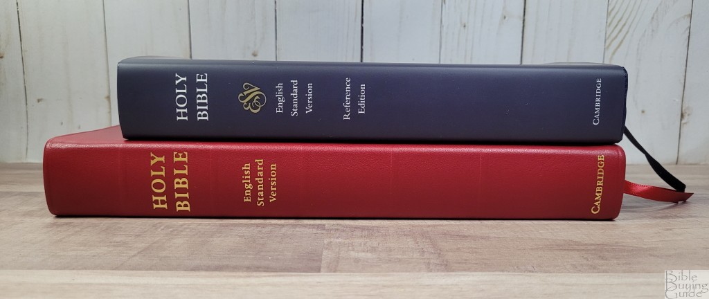
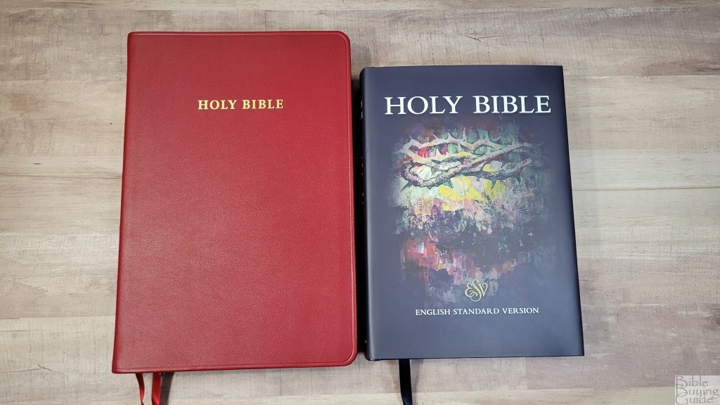
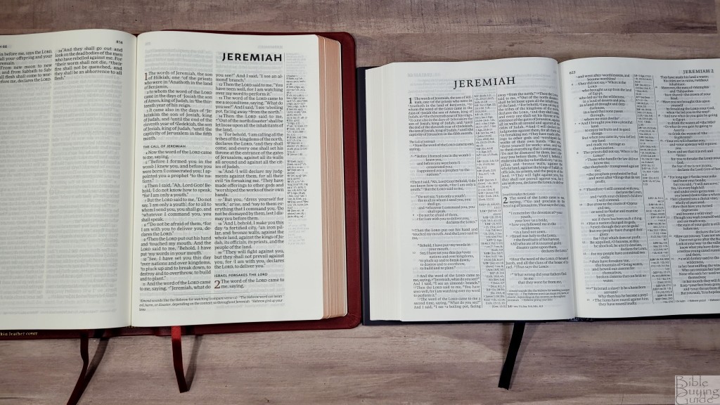
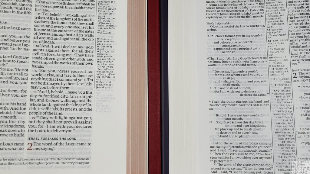
The Cambridge ESV Topaz is a large print double-column, verse-by-verse ESV with no text formatting. It has the same references, concordance, and maps. It has 28gsm Indopaque paper. The thickness is the same as the Diadem, but the footprint is larger. It’s a better choice for public reading.
PSQ
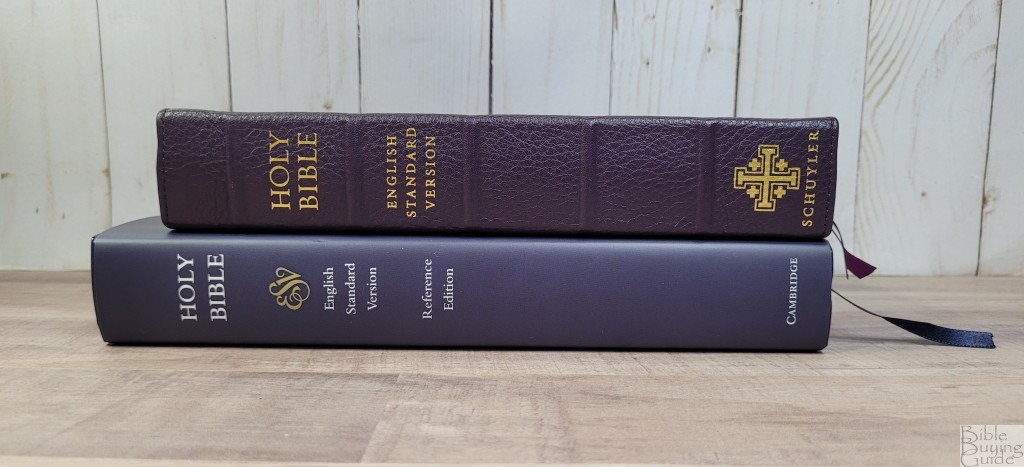


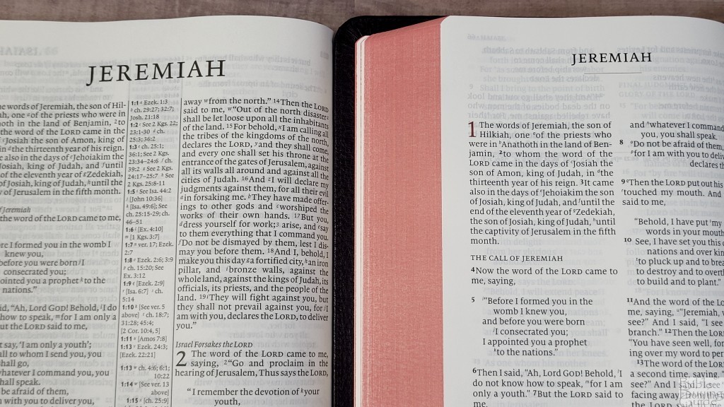
The Schuyler ESV Personal Size Quentel has 28gsm paper. It has a lot smaller footprint and is about the same thickness. The font is a touch larger and darker. It has few references and does not include a concordance. The maps are from Schuyler. This Bible is easier to carry and hold, and the font doesn’t suffer from the smaller size.
Personal Size New Cambridge Paragraph Bible with Apocrypha
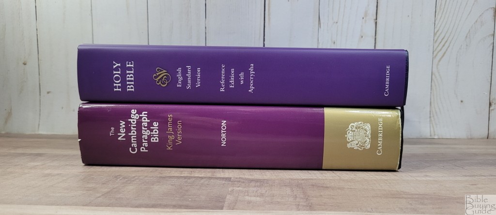
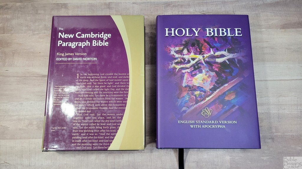
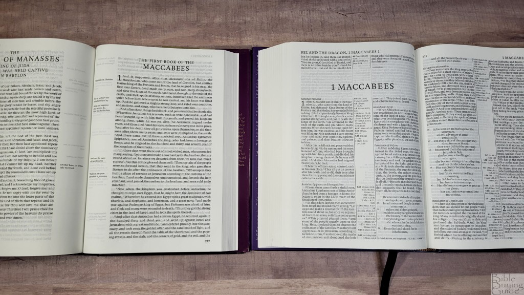
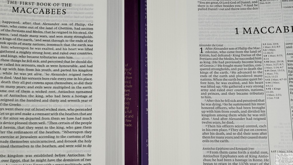
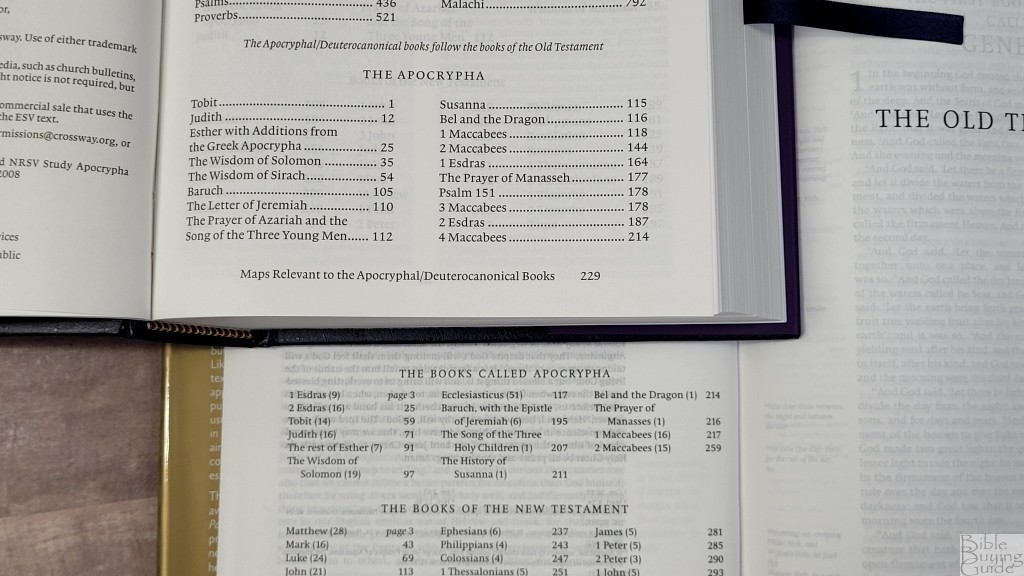
Diadem on top
The Personal Size New Cambridge Paragraph Bible with Apocrypha is a completely different design, but it’s the only other Cambridge I own in hardcover with the Apocrypha, so I wanted to show them together. The Diadem has 4 more books or chapters than the NCPB. Both place the books between the chapters. The two Bibles are almost the same size. The Diadem has thicker and more opaque paper and a smaller font. Aside from the translation footnotes, the NCPB doesn’t contain any study tools.
Concord
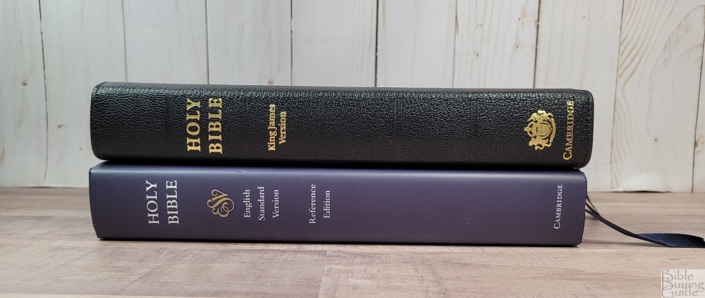
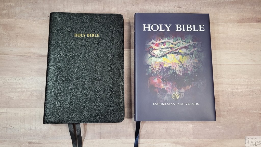
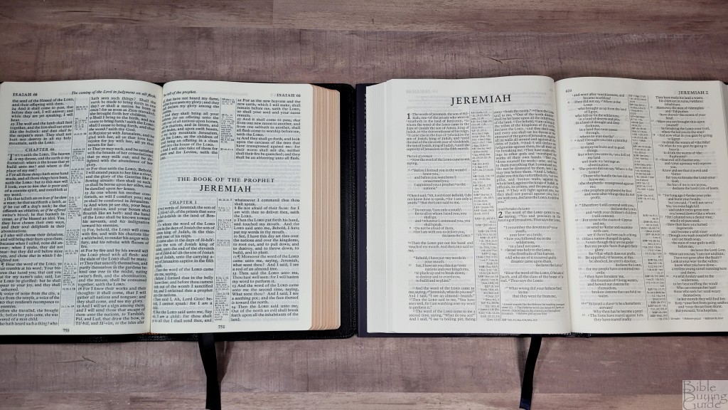
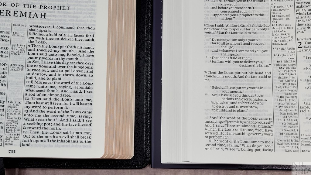
The Cambridge Concord is their standard hand-sized KJV double-column reference Bible from the 1950s. It has the same footprint and includes 28gsm paper. The font is slightly larger and much darker. I’ve always wanted the Concord in other translations. For me, the Diadem takes this title.
Conclusion
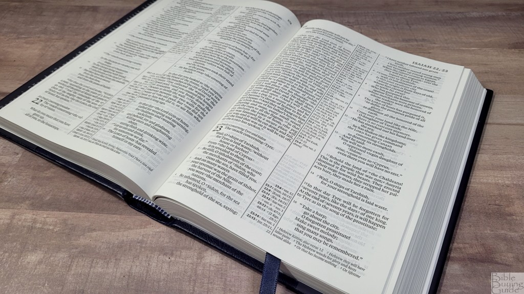
At first glance, the Cambridge ESV Diadem has a difficult spot within the Cambridge line-up. It’s not a small Bible to slip into your bag like the Pitt Minion. It’s not a large Bible for public reading like the Topaz. The Clarion is already in the carry and read reference edition space, but that’s exactly where the Diadem fits. It competes with the Clarion, but the layout isn’t as clean because of the tight double columns. The text isn’t as large. The footprint is taller. However, the Clarion couldn’t be produced on thicker paper like the Diadem. Also, it shares its layout with the Pitt Minion and Wide Margin editions. That gives us a three-way combo that’s hard to beat.
The Diadem is an excellent hand-sized Bible. The quality of materials and construction are as good as anything I’ve seen. It makes a combo with both the Pitt Minion and Wide margin editions. If you’re looking for a mid-size ESV reference Bible, the Cambridge ESV Diadem is easy to recommend.
_________________________________________________________
This Bible is available at (includes some affiliate links)
Amazon
– Regular edition – With Apocrypha
and many local Bible bookstores
_________________________________________________________
Cambridge provided these Bibles in exchange for an honest review. I was not required to give a positive review, only an honest one. All opinions are my own.



Excellent review as always Randy!
An enlarged Pitt has been a long time coming and it looks like Cambridge hit the sweet spot as far as sizing goes. Love the extra features on this one, but I’ll wait to see the leather before committing to purchasing another Bible.
Thanks for your awesome service!
Jim
Thank you!!